Categories
Expert Tips Interviews Kids Rooms

Pitter patter: Latest Dulux colour trend perfect for a nursery

While autumn colour trends often rely on the usual suspects of burnt orange, mustard and deep brown, the Dulux 2017 autumn colour trend is a much more serene, muted affair with light and mid-tones dominating alongside greige. And while it’s a look that suits just about any space, we think it’s the perfect complement to a gender-neutral nursery.

Ceiling & upper wall colour: Dulux Beige Mystery. Lower walls, skirting & trim: Dulux Parchment Paper. Chimney breast: Dulux Suede Effect in Eco Chic.

“We’re seeing soft colours used more often in children’s spaces now, it’s less about traditional colours such as pinks and blues and these autumn hues are perfect if you’re painting before you know your baby’s gender. Any of these colours would look beautiful in either a boy’s or girl’s nursery as they are the epitome 
of gender neutral,” says Dulux colour expert Andrea Lucena-Orr.

She explains the importance of carefully considering the choice of colour in a baby’s space. “Aim to reduce stimulating or strong contrasting colours and intense patterns in a child’s nursery or bedroom to create a calming ambience. Pacifying palettes of soft muted hues are best for a nursery as the subtle undertones within many of these colours can help a baby to relax and may hopefully encourage sleep.” You can add in a warm colour such as Dulux Pinkham if the room feels a little too neutral.

Dulux creative consultant and stylist Bree Leech, explains that layers of texture also help to create a sense of intimacy and warmth. “Tactile materials are also an important feature in spaces for small children as they develop their sense of touch.” She loves the softy, dreamy matte texture that the Dulux Suede Effects paint has (seen here on the fireplace in ‘Eco Chic’). “You can use them to create the perfect finish for the whole room or just a feature such as the chimney breast or alcove,” says Bree.

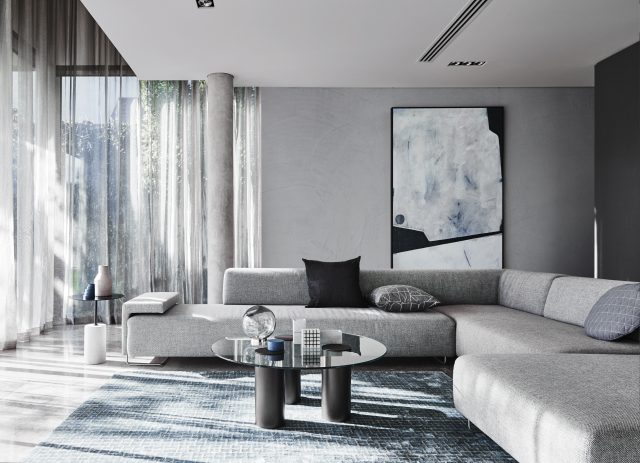
Children’s rooms aside, the Dulux autumn palette is a truly versatile one that could be used anywhere in the home. “If you’re looking to create a tranquil and calm environment, try any of these colours – they definitely should not be restricted to nursery use only. This palette could be used in an older child’s bedroom, a playroom, a quiet sitting room or casual living space and even a master bedroom,” says Andrea.

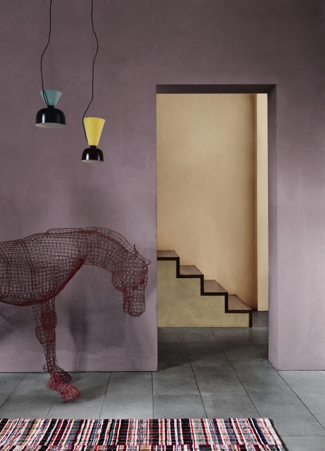
Photography: Lisa Cohen | Styling: Bree Leech & Heather Nette King for Dulux Colour Trends 2017

Categories
Interiors Addict

Texture & connectivity: Discover the Dulux 2017 colour trends

It’s always interesting when Dulux releases its new colour trends, given their close correlation with consumer behaviour, and the 2017 collection is no exception. Created in response to the brand’s research, which this year centred on the idea of connectivity, the palette features a mix of soothing neutrals, texture and some bold hues too.

160617_Dulux_Sentience_10351MAIN_FINAL
The ‘Sentience’ palette featuring Dulux ‘Pupu Springs’ (main wall), Dulux ‘Land Light’ (cupboards on the left & joinery details), ‘Beige Mystery’ (joinery bottom) and Dulux ‘Pinkham’ (window box).

“Each year we take away an overarching concept from our research and in 2017 the emphasis on connection, tactility and balance prevails. There is an ongoing desire to create havens that cater to all our senses which will see the prominence of textures blended with muted hues next year,” says Dulux Colour Expert, Andrea Lucena-Orr.

Much has been made of the current interiors obsession with nature and texture (both of which are an antidote to our digital lives), and as we spend more and more time in a ‘virtual’ sphere, it makes sense that we’re craving connectedness and comfort and that starts in the home.

160616_Dulux_Chroma_9930Main_FINAL
The ‘Chroma’ palette featuring Dulux ‘Deep Arctic’ (main wall) and Dulux ‘Hay Wain’ (wall return)

But texture and earthiness doesn’t necessarily signal bland, as demonstrated by the bold blues and greens in the range. “Deeper blues and greens such as Dulux Deep Arctic are predicted to be the dominant colours in 2017 and we will also see a rise in the popularity of earthy greens such as Dulux Army Fatigues. Greys and greiges, which have evolved to feature subtle undertones, will also be in demand,” says Andrea.

The ‘Sentience’ palette is a direct response to the research and combines subtle pastels with soft neutrals and textural finishes. “Textures in washed earth tones, using Dulux Suede Effects, imitate the earth’s natural materials such as clay, minerals, stone and wood,” says Andrea.

160621_Dulux_Construct_0104MAIN_FINAL
The Dulux ‘Construct’ palette featuring Dulux Concrete Effect in ‘Pale Elements’

The textural theme continues with the ‘Construct’ palette which includes inky blues combined with metallic and industrial accents, created with the new Dulux Concrete Effect and Dulux Metallic Effect ranges. “The combination of those deep blues, subtle greys and the rawness found in concrete with splashes of copper offers the perfect components to create understated luxury – a look anyone can achieve,” says Andrea.

Burnished reds will also feature (a reflection of the new tribal interior trend) and the ‘Entwine’ palette embodies this. “As a result of our research, we are seeing colours such as red, burgundy, brown and oranges being combined with an unexpected twist of zesty yellow or blue, inspired by landscapes from South America to the Middle East,” says Andrea.

160514_DULUX_Entwine_9405lights_FINAL
Dulux ‘Entwine’ palette featuring Dulux Suede Effect paints in ‘Palermo’ and ‘Manila’

Possibly my favourite of the palettes, ‘Chroma’ takes inspiration from the Memphis and Bauhaus movements and is a riot of colour featuring peach, melon, yellow and teal. “Use colour in areas within the home that are high impact. For instance, the entrance where you greet your visitors or the main living space where you spend the majority of time. Even the smallest touch of colour can help personalise your home,” says Andrea.

Photography: Lisa Cohen | Styling: Bree Leech & Heather Nette King

See more online.