Categories
Design Expert Tips Interiors Addict

Design predictions for 2023 that will inspire you

With people spending more time at home than pre-pandemic, our wants and needs of a home are changing. Our predominantly all-white and all-dark homes are ready for something new. To help show us the way, Rebecca Burrows, interior designer at home builder Henley, looks into her 2023 design crystal ball to unpack a suite of design predictions guaranteed to delight and inspire.
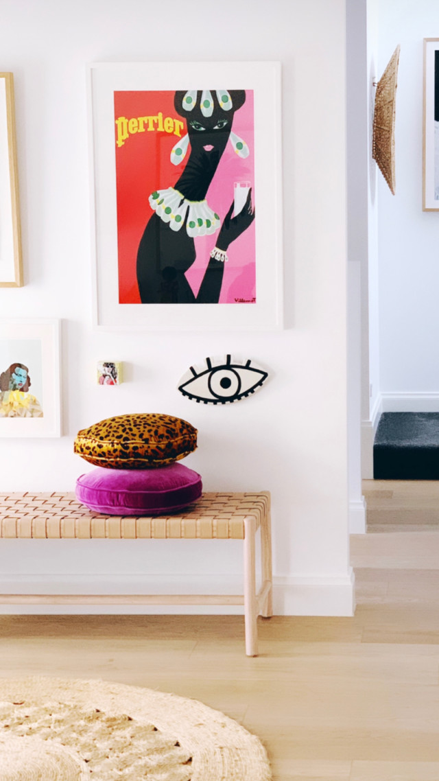
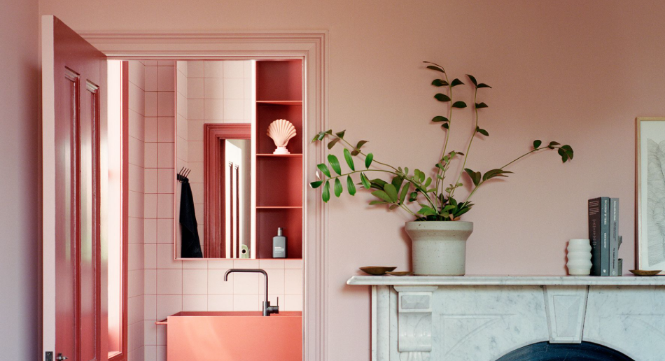
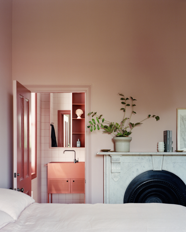
Be bold with colour

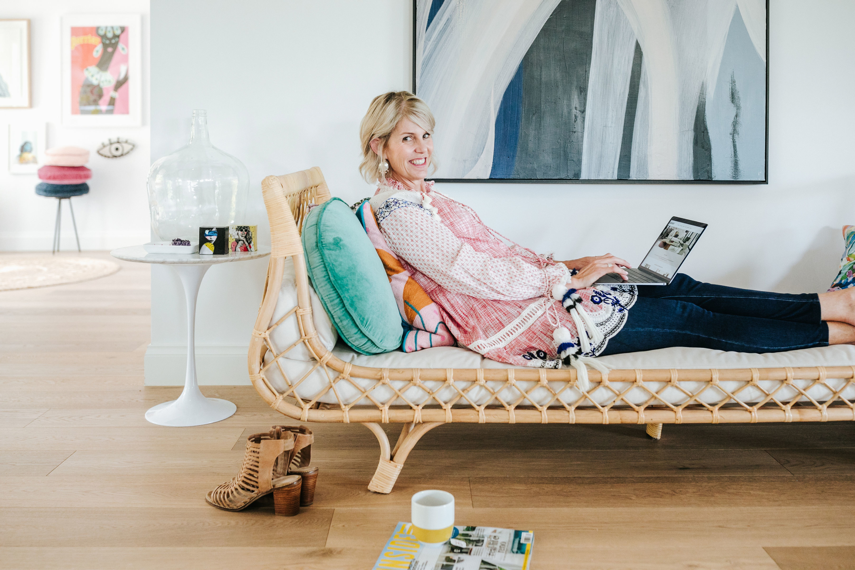
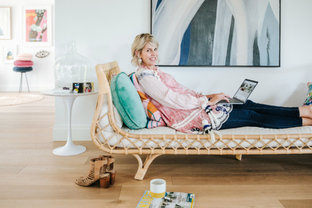
Rebecca says: “There’s definitely been a move away from white on white. Be brave, be bold and bring in some colour through your cabinetry, furniture or decor items.

“There is a wide spectrum of colours to play with and choose from. If you’re afraid of colour and don’t want to try bright or dark deep jewelled tones, try soft pastel colours. Subtle pinks, greens and blues are popular and offer a nice, calming effect and add a bit of fun to your space.”
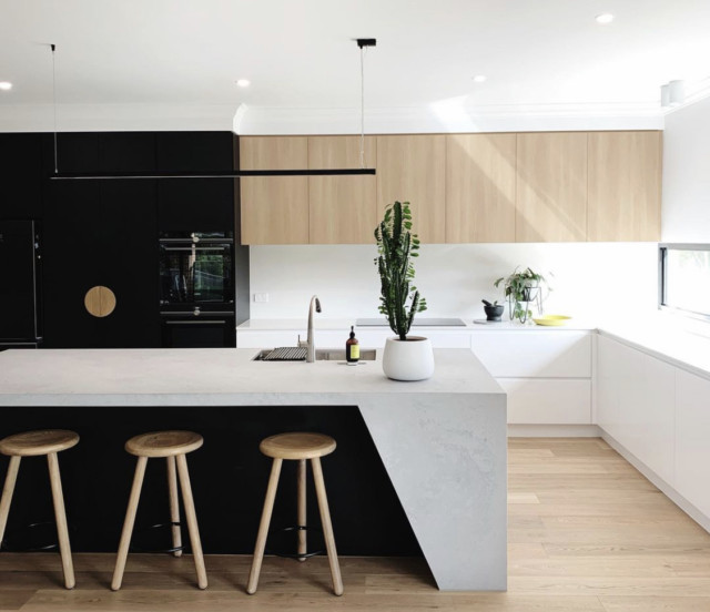
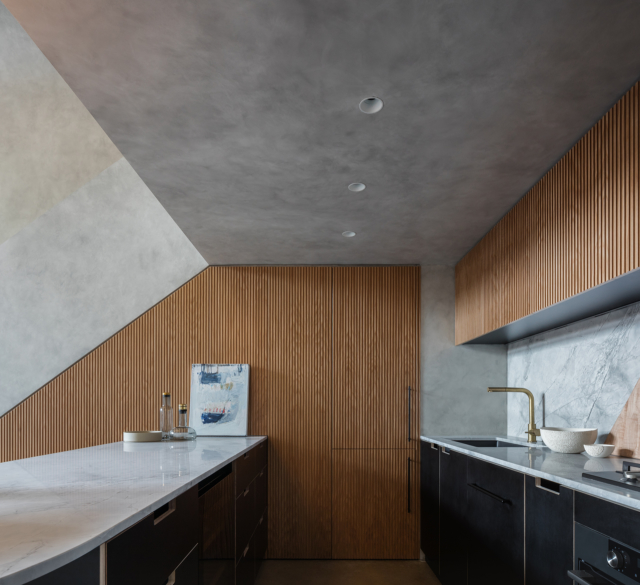
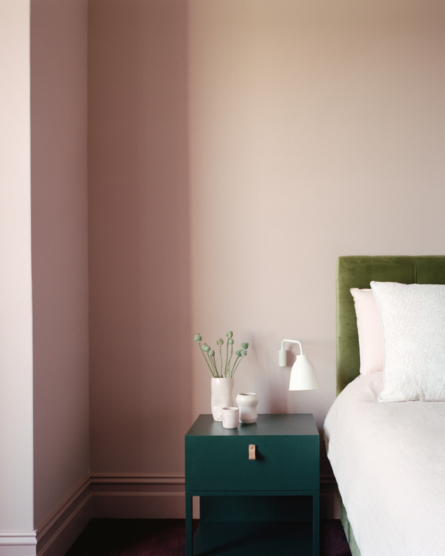
Earthy neutrals

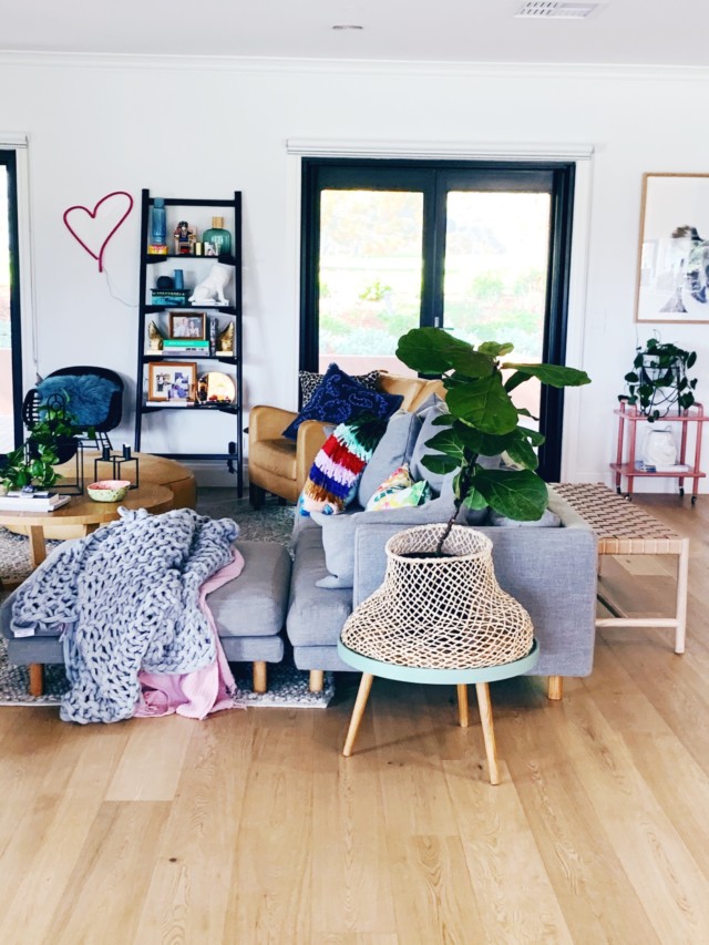
“If bold colours are not your thing, palettes with soft earthy neutrals, muted greens, deep mustards and warm browns are beautiful.  

“After a decade, there has been a shift away from greys, white and black. This new colour palette from nature reconnects us with the outdoors – these colours are much warmer and create a relaxed, welcoming space. With this shift, matte black tapware is being replaced with brushed nickel, gun metal and bronze.”

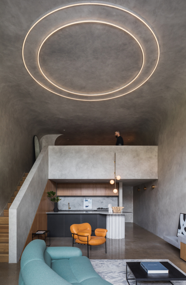
Tapping into textures

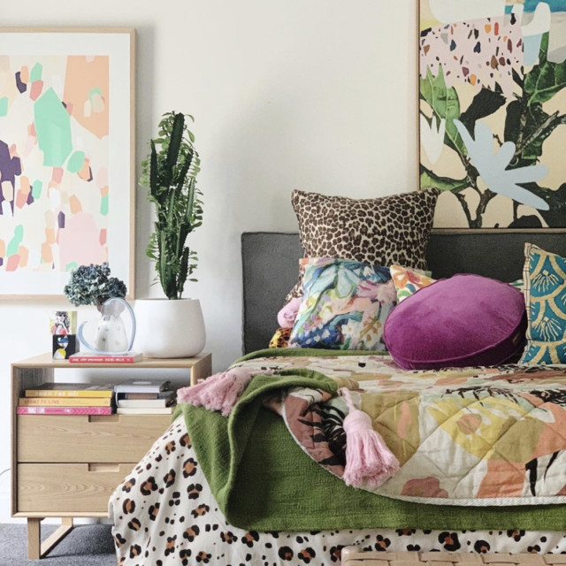
“We love using different textures. Layering textures will add visual interest to your space. Use textures from nature like, sisal, grass cloth, hessian, clay, stone and wood.  Their natural organic shapes add interest. Textured fabrics like leather and boucle are also popular.”

Express yourself

According to Rebecca, it is important to be fun, creative and joyful with your interiors.  

“The minimal and uncluttered look is still popular but with a twist. Home décor is taking on a more individualised style, rather than looking like a perfect display home.  

“Your home should reflect your personality, passions and interests. Express your personality throughout the space. Avoid mass produced designs and use décor items that are handmade by artisans; or use special treasures you’ve found on a favourite holiday. Items don’t need to be perfect – the more unique, the better. Beauty comes form imperfection and you can mix and match different elements together.”
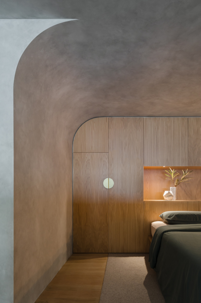
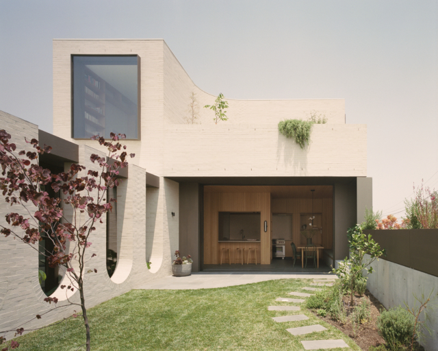
Organic shapes

“We’ve seen a big shift to curved edges – curves are soft, fluid and organic. Cold, modern elements like sharp edges and glossy finishes are being replaced with soft curves. i.e. vanity basins, kitchen islands, coffee tables.”

For more on Henley

Categories
Expert Tips Interiors Addict Styling

Benjamin Moore colour of the year 2023 revealed

Looking ahead to 2023, what paint colour trends do you think will take over in Australia? Luckily for us we can find out with Benjamin Moore releasing their 2023 colour of the year. And in 2023 their colour of the year is…

Raspberry Blush 2008-30

Raspberry Blush! It’s a saturated red-orange that enlivens our surroundings while awakening our senses with charismatic colour. This vivacious colour is unapologetic in its boldness as it encourages a confident colour statement.

“Colour is coming back into Australian homes and Aussies should feel empowered to move away from pure white walls. Raspberry Blush and the Colour Trends 2023 palette deliver whole bodied paint colours that can be used to form statement transformations for incredible results,” commented Brian Hamilton, general manager for Tenaru, the Australian distributor of Benjamin Moore paints.

Raspberry Blush

Leaning into deeply saturated colours with undeniable charisma, the Colour Trends 2023 palette celebrates the use of colour to influence dramatic transformations. As living spaces are often an expression of individuality and personal style, Australians should move towards a bold statement and the palette empowers designers and homeowners to take colour to unexpected places.

Here are seven other Benjamin Moore paint colours from the Colour Trends 2023 palette:

  • Conch Shell
  • Wenge
  • Cinnamon
  • New Age
  • Starry Night Blue
  • North Sea Green
  • Savannah Green
Savannah Green 2150-30

To commemorate this year’s selection, Benjamin Moore enlisted Canadian electro-funk duo Chromeo to underscore the upbeat and optimistic tone of the palette and the dynamic role colour plays in self-expression, much like music. Chromeo’s new single, Raspberry Blush, celebrates the positivity and enjoyment of life that both colour and music can influence. Designers and DIYers alike can experience the Colour Trends 2023 palette through eight specially curated playlists that reflect the personality of each colour and the spirit of the palette on Spotify. It’s certainly different!

For more information

Categories
Art Interiors Addict Interviews

Perth artist’s stunning work held in collections across the world

“I want painting to be revelatory, to be insightful and hopeful, and to show me who I am and where I am. And I love for it to connect me to others who also find meaning or beauty in what I make,” says Perth artist Jordy Hewitt who has built a formidable reputation since her art career began just over a decade ago.

Jordy Hewitt
Jordy Hewitt with pieces from her latest series Chorus

Raised in Perth, Jordy pursued careers in both photography and music before shifting her artistic focus to drawing and painting. Not one to procrastinate, she began exhibiting her work before commencing formal study. “Maybe because I was a little bit older, and looking to have children soon, I started exhibiting before I went to university and continued showing throughout the degree because I wanted to get started out in the world with it,” says Jordy who graduated with a Fine Art degree from Curtin University in 2014.

It’s an approach that has paid off as just over a decade into her career, her work is held in private collections the world over; everywhere from Hong Kong to Norway, London, New Zealand, Italy, Japan and the UK.

Anthologie
Jordy’s work is hung across the globe. Photography: Jack Lovel

But when it comes to describing her work, Jordy is reluctant. “I dislike describing it! What do I say that doesn’t sound crass or like a cliché, and that doesn’t instantly take the magic out of it? Painting is the language painters speak,” says Jordy who, when asked what her work is like, typically holds up her Instagram profile as a visual short cut. She draws inspiration from a broader interest in magic and the unfolding of life, psychology, symbols, patterns, archetypes, self-work and evolution.

Nic Brunsdon East Fremantle House
Photography: Dion Robeson

A creative from childhood, Jordy draws parallels between her early singing and photography pursuits. “I think it’s interesting how photography is about instinct and confidence to get the shot in the moment and my process of painting is also about that concentrated and directed expression of energy. There’s nowhere to hide – you must give everything of yourself to it, otherwise it’s no good,” says Jordy.

Terrarium House
Photography: Toby Scott

Chorus is her latest series and it’s a bolder, more extroverted departure from her previous work – something she attributes to heading back into work in a full-time capacity after five years of raising small children. “For viewers I think because I don’t dictate meaning specifically in the interpretation of my work, it’s hopefully a sensual or emotional experience. However you react to, or encounter my paintings, is interesting and valid.”

Jordy with work from her latest collection
More pieces from Chorus

For more on Jordy Hewitt

Categories
Expert Tips Interiors Addict Interviews

Latest Haymes Paint palette an antidote to the pandemic

The latest Haymes Paint colour palette has dropped and, as with many things lately, it’s inspired by the pandemic. But rather than dwelling on the negative aspects it is rooted in a desire to leave uncertainty behind and move towards a new, more optimistic, chapter. Designed to reflect a fresh approach to life, and renewed energy, the latest colour forecast is aptly titled Energy Shifts.

“Everyone will have a personal preference for the energy in each palette. There is never a one size fits all approach to colour and our life experiences actually really impacts our colour preferences. So understanding why you are gravitating toward a specific colour will help when selecting colour for your home because it will give you insight into how that colour is going to make you feel and the energy it will bring to your home,” says Haymes Paint colour and concept manager, Wendy Rennie. The new collection is comprised of three palettes – Live Wire, Light Play and Carefully Nurtured.

Live Wire
“This palette has a lively and bright energy to it. The colours are clear and vibrant, evoking a sense of joy and playfulness. The key to making these colours work in the home environment is to pair them with a crisp white to create a bright and cheerful contrast without overwhelming the senses with too much colour,” says Wendy of the Live Wire palette.

This palette also draws inspiration from the 60’s and 70’s making the colours the perfect choice to complement vintage or retro interior choices such as a feature vintage-inspired tile or vinyl flooring. 

Light Play
The Light Play palette features deeply intense colours paired with lighter tones – a nod to light and shade and how they influence our energy. “Light Play is an exploration of how colour and texture can combine to create a considered atmosphere within the home space. The contrasts within this palette also show the way energy can shift throughout the home by the colour and texture choices within a room,” says Wendy.

Carefully Nurtured
Carefully Nurtured is a harmonious colour palette that offers balance in tone, value and hue. “Each colour works with the other to create a perfect colour range that really feels calming for the mind. The colours chosen for this palette have a connection to the outside world, with soft greens and warm neutrals dominating this scheme,” says Wendy. Peach skin tones and pops of yellow add vibrancy the otherwise more subdued scheme.

Photography: Martina Gemmola

For more

Categories
Design Expert Tips Interiors Addict Interviews Styling

Dulux latest: 2023 colour forecast reflects a post-pandemic shift

Just as skirt lengths and lipstick sales can be indexed to the social and political landscape, so to can interior trends. And, after a chaotic couple of years, it’s not surprising to find that many of us are feeling a desire to live more simply and authentically. We’re stripping away the superfluous (we’re truly thinking about how we spend our time and who with) to create space for more meaningful connections and the Dulux Colour forecast 2023 is reflective of this.

“Colour forecasting for interiors is an evolution. While fashion is an important influencer, the shifts in interiors are more subtle and nuanced. The palettes we can expect to see in our homes in 2023 are predominantly warm and nurturing, with nature continuing to be a key driver of trends. Brighter hues continue; however, they are deeper than last year,” says Dulux colour and communication manager Andrea Lucena-Orr.

Dulux Revive
Revive palette

The forecast is based on year-round research into the latest global and local trends that are predicted to influence Australian design and how we live. Led by Dulux colour and communication manager Andrea Lucena-Orr, in conjunction with Dulux colour forecaster and stylist Bree Leech, the latest forecast has been informed by seminars (including Future Laboratory London and Milan Design Week) as well as trend reports, editorials, fashion, product and design launches as well as customised research through Dulux’s extensive networks in the UK, Italy and France.

Connect palette
Connect palette

“We have all reacted to the upheavals of the last couple of years in different ways – some people crave lightness and whimsy, whilst others seek order and reassurance. The three palettes in the Dulux Colour Forecast 2023 reflect these differing needs, allowing you to create beautiful living spaces that reflect where you are in your life’s journey,” says Andrea.

Balance
A refined palette of serene marine inspired hues, gentle greens and accents of deep garnet, Balance evokes the ocean and shoreline. “Balance is very much inspired by a ‘less is more’ philosophy, with minimal detailing and a restrained approach to decorating. Instead, the focus is on immersive colour and the beauty of complex, structured patterns found in nature, such as a simple seashell or fern frond,” says Dulux colour forecaster and stylist Bree Leech.

Dulux Balance palette
Balance palette

Balance inspired styling includes lush textures (velvet and silk), furniture with exaggerated, curved silhouettes, abstract art and décor pieces with organic shapes and delicate pleating. “Balance has an elegant, understated feel that would work beautifully in an inner-city apartment or terrace home,” says Bree.

Balance palette
Balance palette

Connect
By contrast, the Connect palette is all about the great outdoors and features earthy tones of moss, wasabi, sandstone, muddied yellow-green and burnt charcoal. “It speaks of calm, comfort and an honest approach to living, and brings in many of the pastimes we experienced during lockdown, such as a hiking, cooking, quilting and gardening. Muddied yellow-green has something of a nostalgic, country-house feel, cinnamon is grounding, whilst rich, purple-brown adds an indulgent and contemporary twist,” says Andrea.

To complete the Connect look, the palette looks fabulous when with rustic furniture (in timber, leather or rattan) as well as stone flooring and bespoke, modern lighting made from recycled materials. 

Dulux Connect
Connect palette

Revive
The most playful of the palettes, Revive features an array of uplifting, bright tones including rose pink, blue, sunshine yellow, emerald, violet and burnt orange – all designed to lift the mood after a tense couple of years. “As we emerge from trying times, we’re looking for lightness and a sense of freedom to revive our spirits. So, when it comes to our homes, it’s out with the rule book, and in with the possibilities to create something truly magical,” says Andrea. 

Revive palette
Revive palette

“Pairing retro influences with futuristic features, such as pixel patterns and digital art, the Revive palette cleverly merges the past and present. And with its colourful, look-at-me accent walls and statement seating, it creates the perfect Instagrammable moment,” says Andrea. 

Revive palette
Revive palette

Photography: Lisa Cohen | Stylist: Bree Leech

For more

Categories
Art Interiors Addict Interviews

Self-taught artist celebrates thirty years in the biz!

“Because I never learnt formally, I have no rules. I taught myself and each work leads to the next; I have a loose plan when I start a new canvas but I don’t draw it out first. It’s like an adventure!” says Melbourne artist Anna Blatman who did stints as a receptionist, manicurist and waitress as well as a year in a kibbutz before pursuing her art career full-time some 30 years ago.

Artist Anna Blatman
Artist Anna Blatman with one of her works

Initially selling from a market stall in the Melbourne CBD, Anna would sell up to 40 small paintings a week and was the primary earner for her family, taking only six weeks off when each of her two children were born. “I like to say I was one of the first mum artists where I was a mum and a painter. I wasn’t one of those artists up drinking red wine into the early hours!” says Anna who eventually purchased a studio in Elsternwick where she still works today.

Anna Blatman

Not far from her home, Anna paints at the studio almost daily and views the practice like meditation. “When you’re painting, you can’t think of anything else apart from mixing colours and applying them,” says Anna who begins each work without a specific plan and enjoys the unexpected outcomes that often arise. The works are sold through her gallery as well as through various homewares stores and galleries throughout Australia. Anna also undertakes regular commissions.

Anna Blatman prints
Anna Blatman prints for Artist Lane

About 12 years ago, Anna was approached by the print company Artist Lane who transferred her originals to print and it was through this relationship that Anna’s work can now be found on Temple and Webster and The Block Shop. “I had always wanted to sell prints but was just waiting for the right person to come along,” says Anna. The artist’s work is also licensed to several companies that use it on a variety of homewares products sold throughout Australia.

Anna Blatman suitcase
Anna’s work has featured on many different homewares products

“I love to play with colour and I try and keep the subject matter close to my heart. I love flowers and I’m very nostalgic. For instance, I love vintage pots of flowers, but I like to make them modern,” says Anna who, aside from regular painting, also runs small group painting workshops at her Melbourne studio. “They are fun for me as I usually work by myself,” says Anna who has also found popularity with art teachers across the globe – connections that were made through Instagram.

“Art teachers are always looking for different things to do with their students and a lot of art teachers around the world are now teaching kids how to do my birds and snails,” says Anna who presumes they are drawn to her aesthetic because it’s happy, colourful and bold. “I’m a bit of a big kid I guess but the kids’ works are bloody good!”

Students at one of Anna's workshops
Students at one of Anna’s workshops
Anna Blatman
Anna’s birds are used regularly as inspiration in art classes across the globe

For more on Anna Blatman

Categories
Design Styling

Pantone Colour of the Year 2022: Very Peri

A striking violet-blue shade that reminds me instantly of hydrangea, the Pantone Colour of The Year 2022 was recently announced – Very Peri. Taking its name from periwinkle blue, the gorgeous hue is a direct response to the period of transition and upheaval the world has been experiencing. And in a reflection of just how unprecedented these times have been, Pantone has created a brand new colour to mark the occasion.

“Displaying a carefree confidence and a daring curiosity that animates our creative spirit, inquisitive and intriguing PANTONE 17-3938 Very Peri helps us to embrace this altered landscape of possibilities, opening us up to a new vision as we re-write our lives. Rekindling gratitude for some of the qualities that blue represents complemented by a new perspective that resonates today, PANTONE 17-3938 Very Peri places the future ahead in a new light,” says Pantone.

Lounge Lovers Bronte sofa in periwinkle linen: I love a bold, coloured sofa and this one ticks all the right boxes. Inspired by the Pantone announcement, the sofa isn’t available just yet but interested buyers can join the waitlist.

“Pantone’s inspiration for Colour of the Year was partly informed by the impact of COVID-19 lockdowns – something Australians have known all too well. During this time, our couches and living rooms became more important to us than ever. It’s the first time in 22 years that Pantone has created a bespoke colour for the year, and with its links to creativity, joy and imagination, it feels very positive after the last two years,” says Lounge Lovers’ head of merchandising, Kylie Burgon. $2,499.

Lounge Lovers sofa

Desenio Amour poster: Perfect for those looking for a subtle nod to the bold hue, this cute neon-themed print is a steal with prices starting from $17.97.

Desenio print

Mustard Made lilac lockers: An Aussie success story (did you know they just launched in the US?), Mustard Made debuted a lilac range earlier this year proving they were right on trend. From $229.

Mustard made

Fenton & Fenton Spikey Crystal Vase in Blue & Violet: Equal parts vessel and art piece, this two-toned crystal creation makes quite the statement with, or without, flowers. $450.

Fenton & Fenton

Lisa by Sofia Bonafti, unframed art print: Part of The Block Shop offering, this quality giclee art print has been produced on luxurious 100% cotton rag textured art paper and is perfect for adding a splash of Very Peri to your living room. $79.

Block Shop

Wattyl Turkish Bazaar: The brave among us might consider using the hue in the form of paint and Wattyl’s Turkish Bazaar is a perfect match. “Wattyl Turkish Bazaar is a colour consumers can really have fun with – be it painting a single feature wall in a bedroom or living area or introducing pops of the colour in the form of cushions, throws or ceramics,” says Wattyl.

Wattyl
Image courtesy of Pantone

Arthide Oleada periwinkle rug: Available in oval, circular and rectangular iterations, this rug is really rather special. A fabulous way to add a pop of periwinkle to your interior, this rug is made from cow hide laid in a soft, geometric pattern. From $1,495.

Arthide
Arthide
Categories
Appliances Design Designers Expert Tips Kitchens

Low key scared of colour? Here’s how to use it for a timeless kitchen reno

The Coastal Farmhouse is the latest project by Heather and Sarah, the design duo behind Oak and Orange. The heart of the home is the kitchen; modern yet comfortable and relaxed, featuring old-world rustic charm with new clean lines. It was achieved through their signature sage green paired with fresh white and timber accents and low maintenance, high quality appliances.

The project brings together the simplicity of country living with the raw beauty of the coast in one family haven.

Here, the renovation duo share their trademark tips for incorporating colour into your next kitchen renovation.

Go for a traditional shade over an on-trend shade

Although green is currently very on-trend, we opted for a more traditional classic shade of green that would best suit the farmhouse style and timeless appeal. We considered both lighter and darker shades of green but ended up choosing a stunning sage because it’s so soft and calming. In choosing the colour it was important to consider the abundance of natural light in the kitchen as well as how the sage green would suit the flooring colour.

Make sure your fittings and appliances complement your colour scheme

If you’re going with coloured cabinetry, check your colour against your tapware, benchtops, splashback, appliances and flooring before you lock in your selections. The end goal should be a really cohesive look that makes the feature colour shine. Keeping the other materials around it neutral will help achieve this. Something we like to consider very early on in planning when working with coloured cabinetry is the finish of the appliances. Our standout feature in the kitchen would have to be the Westinghouse 609L French Door Refrigerator – the fingerprint-resistant dark stainless steel perfectly contrasts the crisp white and sage green cabinetry surrounding it.

Use colour in moderation

We pride ourselves on designing homes that have character and personality, without compromising on practicality and functionality. We think the key here is not to be scared to use a touch of colour in moderation while making sure all your selections work together for a cohesive look. The key to working with colour is ensuring you add other elements that complement the colour but don’t compete with it.

Explore more of The Coastal Farmhouse by Oak and Orange.

For more on Westinghouse appliances

Categories
Art Interviews

New artist Xander Holliday is a banker by day, painter by night

“I wear many hats, banking by day and artist by night! My art career was more of a hobby to begin with – a creative outlet to throw some colours around for a bit of fun,” says Xander Holliday who first picked up the brushes four years ago and is the newest addition to the esteemed Greenhouse Interiors artist stable.

'Eclipse'
‘Eclipse’ by Xander Holliday

While Xander now works in banking, he previously worked in retail where he sold homewares and art, an experience that was the catalyst for giving an art career a go. “I literally had an ‘I could do that’ moment and then I did!” says Xander who lives in the Hunter Valley with his partner Shaun and works out of a home studio alongside his precious pair of mini dachshunds Gus and Abe.

'Ancient vase'
‘Ancient vase’ features a unique violet painted frame

And what makes Xander’s story even more interesting is that he is a self-confessed art school dropout. “I studied art after leaving school but struggled to see where it was heading,” says Xander who studied fashion design and worked as a hairdresser before coming full circle back to art. He credits social media with furthering his art career by unlocking many fabulous opportunities that allowed him to build a stockist base and online store. 

Before picking up a brush Xander began working digitally after teaching himself Adobe Photoshop and creating designs and illustrations with a stylus and iPad. “It was an easy way to manipulate shapes and play with colours,” says Xander who based a lot of his early paintings on illustrations that he had created digitally – an approach that has had a strong impact on his aesthetic.

Xander's studio
“Having a studio at home allows me to find pockets of time whenever possible,” says Xander.

Colour filled, bold, graphic, and fun, Xander’s work is a celebration of colour but he’s mindful to ensure that it’s accessible too. “I want people to be able to see my work hanging above their couch,” says Xander who was rather chuffed when interior stylist Jono Fleming decided to do that very thing after purchasing a piece with a cobalt blue frame recently. 

“That piece that was feeling unresolved, so I painted the frame cobalt blue to extend the work beyond the canvas. The piece now hangs in Jono Fleming’s living room which was enough validation for me to keep going!”

Artist Xander Holliday
Xander Holliday

Photography by Armelle Habib | Styling by Julia Green and Aisha Chaudhry for Greenhouse Interiors, assisted by Linda Hutchinson and Jillian Nielsen

Shop online

Categories
Design Expert Tips Interviews Styling

Julia Green’s new coffee table book is a gorgeous celebration of colour

Part travel compendium, part colour celebration, Vivid: Style in Colour is a gorgeous new interiors coffee table book compiled by interior stylist and colour queen Julia Green alongside her long-time collaborator, the photographer Armelle Habib. 

“The fear of colour and using it is palpable. I speak to people every day that are scared of colour and don’t know where to start. So, after 11 years of styling and writing about colourful interiors, it was time to put it all together and create a ‘bible’ that would hopefully instil people with colour confidence,” says Julia, who embarked on the project with Armelle during Melbourne’s gruelling first COVID-19 lockdown.

The book includes eight chapters divided by colour – orange, red, blue, green, pink, yellow, neutrals and black – and it’s filled with plenty of gorgeous interiors and practical advice alongside travel vignettes that illustrate how different palettes are interwoven in our lives. And with international travel off the cards for a while yet, it’s a wonderful escape for those suffering with wanderlust.

“Armelle, my collaborator, and I have both travelled extensively and really wanted to share some of our favourite images. It’s like armchair travel which is more pertinent now than ever before,” says Julia. 

Gathered over a decade, from all corners of the globe, Armelle’s beautiful travel photographs showcase how colour is used around the world. There’s the blues and greens of Sicily, that reference the Mediterranean, and the bold bright shades that are an antidote to the desert surrounds in Morocco. “Colour is a universal language, but each country uses it differently, so it was fascinating to see the colours emerge, and understand why,” says Julia.

Brimming with inspiration and practical advice there’s short essays on colour in styling and design as well as an exploration of the science of colour and colour psychology. There’s also information about using colour to connect or divide spaces, layering colour for depth and texture as well as building your confidence around embracing the colour spectrum.

“There is a lot to say about the psychology of colour but in the end, colour is emotive – it is energy made visible. I like to think that each colour represents an emotion and to ensure the colours selected match the mood you want for a space,” says Julia.

The book also features interviews with leading colour proponents including Martyn Thomson (Sydney), Jessica Bettenay (Melbourne), Marielle Ienna (Palermo), Los Enamorados (Ibiza) and the fabulous LRNCE from Marrakech. “It made sense to capture some of our favourite designers from across the globe that are colour confident and give the images some rigour with words and advice on how to break it down for people to use in their own homes,” says Julia.

And as for Julia’s favourite colours, she explains that it’s like choosing a favourite child. “If I had to narrow it down  I’d select green for the ‘life’ it represents and the energy it brings to a room,” says Julia who is a massive fan of pink too, in all its many iterations. “I love its versatility and find it is a colour that works back with so many others as a companion. Both bright and soft versions bring different things to the table, but I am up for them all.”

Julia’s top five colour tips

  • Only surround yourself with what you love and don’t listen to others – it’s your space.
  • Start slowly with colour. You can easily build on it but it’s always harder to edit.
  • Use old fashioned magazine cut outs, Pinterest or even social media to collect images you love and look for colour patterns within them. Often the answers are within your own instincts.
  • Seek professional advice for bigger decisions, if you need reassurance before outlaying large sums of money.
  • Pantone has an excellent app that will show you companion colours if you are unsure of what to use when pairing them up.

Photography: Armelle Habib

Buy the book online

Categories
Art Interviews Shopping

The New Zealand artist using colour to spark joy

Painting from a light-filled studio in the Waitakere ranges outside of Auckland, Jen Sievers is a New Zealand artist on a self-described mission to ‘paint joy.’ “I infuse my work with the joy I feel while I paint it and aim to make that viscerally experienced by the people who hang my work in their homes. If you’re not smiling when you’re looking at them, they’re not doing their job,” says Jen.

Jen Sievers
The artist Jen Sievers perfectly complements her work

After growing up in South Africa, Jen had a stint doing a fine art degree before attending a specialist school for advertising and design where she completed a three-year degree. This led to a 15-year career as a graphic designer and art director which formed the basis for her eventual art practice. “I honestly believe that my work as a designer was my best training – it taught me colour and composition, and I learned about the creative process,” she says.

Jen works with acrylics on canvas, thinning them out to create vibrant watercolours, and applying more impasto style layers on top. Her eye-catching style is largely abstract, and is often executed on large canvasses.

Jen Sievers
Jen with one of her beautiful works

But it was after becoming a mother that Jen was eventually lured back to the easel and brush. While her toddler was napping, she grabbed a paintbrush, her child’s craft paints and a piece of ply from the garage. “By the end of that two-hour session, I knew I’d found my purpose was to paint,” says Jen who also explains that a breast cancer diagnosis in 2019 really cemented her decision to give up a full-time graphic design career for a painting one. 

“Luckily, it was curable with minor surgery and radiotherapy, but my diagnosis offered me an unexpected gift. It gave me perspective and ‘permission’ to finally quit my day job to become a full-time artist,” says Jen who threw herself into the practice spending evenings and weekends experimenting with colour and painting everything from abstracts to portraits, landscapes and anything else she could imagine. 

'Phoebe' is one of Jen's latest works
‘Phoebe’ is one of Jen’s latest works

And while Jen has made a name for herself in New Zealand, her career has taken off in Australia since becoming a Greenhouse Interiors stablemate in 2018 – her use of colour making her a perfect fit for the brand. “My colours are contemporary and playful, and often have a peaceful, calming feel to them. I love using bold sweeping lines and plenty of textures and layers,” says Jen who has branched out recently and released a series of works of house plants.

Jen in her studio
Jen in her studio

“I’m surrounded by native bush in my home studio, and the studio itself is filled with house plants. I love thinking of each of them as having their own personality and distinct vibe, so I captured this idea in my work. The result is a fresh, colourful ode to the humble house plant all wrapped up in my signature feeling – joy.”

'Carmen'
‘Carmen’ is one of Jen’s latest works

Photography: Samantha Donaldson

For more on Jen Sievers

Categories
Art Interviews Shopping Styling

Greenhouse Interiors’ autumn/winter ’21 collection a triumph of Australian art

Greenhouse Interiors‘ autumn/winter ’21 art collection campaign landed this week and boy is it a beauty. Brimming with the brand’s trademark colour, the meticulously styled imagery not only celebrates the artist stable’s latest output, but it provides plenty of interiors inspo too. “Our vibe is always colourful, regardless of the season. Our artists all have their own distinct style, but the common thread is always a celebration of colour despite the varying compositions,” says Greenhouse Interiors’ Julia Green. 

Greenhouse Interiors newcomer Amanda Ketterer’s gorgeous work can be seen on the left.

And while longtime Greenhouse Interiors artists are featured (think Georgie Wilson, Kate Mayes and Anna Cole), there are plenty of talented new artists represented too. “We have a swag of new clever creatives. Deborah Moss resides over the ditch in New Zealand and is inspired by her natural surroundings, especially trees! Lucy Cashmore is a new Melbourne artist, who painstakingly spends hours and hours creating graphic bold colourful works that are then framed in coloured perspex to great effect,” says Julia.

Lucy Cashmore
This gorgeous perspex framed artwork is by newcomer Lucy Cashmore
Artwork by Deborah Moss
One of newcomer Deborah Moss’ moody, abstract pieces

Recently joined Amanda Ketterer produces fluid-like abstract compositions while newbie Rishelle Kent’s magical paintings of the countryside sell before Julia has a chance to even promote them. “Madeline Jovicic’s style is playful and whimsical with references to food street carts, sardines and gelato stands amongst other fun subject matter!” says Julia.

Madeline Jovicic's works will transport you to Italy
Brittany Ferns’ mermaids are featured on the left while Madeline Jovicic’s works (right) will transport you to Italy

Other recent recruits include Nadia Dusselberg who paints joyful childlike subject matter in a sophisticated way, while Tegan Frank’s aerial beach scapes really evoke the Australian summer. “Her works already have a long wait list and have been super popular,” says Julia.

Tegan Franks
It’s easy to see why the works of Tegan Franks are super popular

And as always, the styling takes centre stage; an approach that Julia believes is key to helping clients visualise how artwork translates inside real homes. “Visualisation is not an easy thing for some, so seeing the work in context can be really helpful. We would like to think the imagery is aspirational but achievable,” says Julia who creates two styled art campaigns every year.

Work by Anna Cole
Anna Cole’s ‘Green Pastures’ is a striking, graphic piece

And for those looking to add to an existing collection, or start from scratch, Julia cites several artists who create pieces at affordable price points but says that Britt Ferns is a current favourite. “You cannot go past Britt Ferns if starting out or wanting to add a textured, considered work to a gallery wall.”

'Lovers Loop' by Laura Horrocks Lovers Loop by artist Laura Horrocks is a soft pink hued abstract
‘Lovers Loop’ by Laura Horrocks Lovers Loop by artist Laura Horrocks is a soft pink hued abstract

But if large and eye-catching is more your jam, the works of Georgie Wilson, Kate Pittas, Jen Sievers, Lou Martin, Kate Mayes, Morgan Jamieson and Katie Wyatt pack a fabulous visual punch. “Their works make for beautiful statement pieces for a home. Despite their differences, they all are eye catching, and all of these artists are very comfortable and accomplished at painting in large scale to great effect.”

Morgan Jamieson's 'Look up and see the palm trees'
Morgan Jamieson’s ‘Look up and see the palm trees’ is a gorgeous statement piece

Photography: Armelle Habib | Styling: Julia Green for Greenhouse Interiors, assisted by Aisha Chaudhry, Kate Moss and Jessica Retallack 

Shop online

Categories
Architecture Design Designers House Tours Interviews Real Renos RENO ADDICT

Art Deco Melbourne home renovation a colourful blend of old and new

“I’m a maximalist at heart and colour makes me smile,” says Erin Katsavos whose Art Deco Melbourne home renovation caught our eye recently, in large part due to its beautiful colour and materials palette. We were even more enthralled to learn that the scheme was derived from a couple of Jai Vasicek art prints that were purchased before house plans had even been drawn up. 

“Everything was chosen from the colours in the paintings. In fact, I think it’s a great idea to buy your art first and then design your house around it!” says Erin.

Art Deco house
The kitchen/dining features one of the Jai Vasicek prints that inspired the home’s colour scheme
Kitchen
Kitchen

The home’s original Art Deco exterior is painted with Dulux ‘Ecology Green’ which sets the tone for the scene that lies within – a gorgeous mix of dark and mint green accented by blush and pops of brass.

Exterior
The front of the home

“It was so nice to work with Erin’s bold colour choices. They have great impact and impart a real sense of warmth and earthiness throughout the home,” says Amanda Oakley of Mayché, the company responsible for the home’s build.

Master bedroom
Master bedroom

Located in Ascot Vale, and originally built in 1930, it was the period features that drew Erin to the home when she purchased it a few years ago with her husband Evri. Working closely with Anna Todorova of Instyle Design, the team at Mayché were tasked with retaining as many original features as possible at the front of the home while creating a contemporary extension at the rear, complete with open plan living and ample light. 

Master bathroom
Master bathroom

A vital part of the renovation was the creation of a parent’s retreat at the front of the home – hugely necessary given Erin and Evri are parents to a blended family that includes six children. “We had to include a parent’s retreat so that they could have some down time! We incorporated this at the front of house which is connected to the master bedroom via double doors,” says Amanda.

Parent's retreat
Parent’s retreat

The timber in the front four original rooms remains untouched – it wasn’t sanded and varnished as part of the renovation. “It gives the rooms such a warm feeling as it has all the little nicks that show it has lived a life. I love that we have kept so many of the home’s original features because many of these houses are painted white to give them that popular Scandi feel,” says Erin.

Parent's retreat
Another Jai Vasicek print can be seen from the parent’s retreat. Look at those gorgeous doors!

The home has five bedrooms, three living areas and a fabulous outdoor space that includes a pool and entertaining area. “We love the open plan kitchen, dining and living area with its large sliders and windows that look onto the pool and alfresco. The burnished concrete floor finish in here looks absolutely amazing too,” says Amanda.

Outdoor entertaining and pool
Powder room
Powder room

And with that many family members you can imagine that practical storage solutions are a must. “One of my favourite design elements is the custom bench seat joinery in the living room as I can hide the toys away in the hidden seat,” says Erin.

Living room
A custom bench seat provides clever toy storage

One of the children’s bedrooms features an upcycled IKEA bunk bed that Erin spray painted before covering it, and the nearby wall, in decals from Blonde Noir. “They have great designs. Those decals are so awesome because you can peel them off, leaving nothing behind, and move them making them great for rentals too. You can even store and reuse them later,” says Erin.

Children's bedroom
Children’s bedroom
Children's bathroom
Children’s bathroom

The bathrooms are a visual treat complete with Meir tapware, Concrete Nation basins, terrazzo and mirrors from West Elm. “The biggest splurge was the real terrazzo in the adult bathroom which I chose just for me. As you can imagine, with so many children, there’s not a lot that I get to do for me these days!” says Erin. 

Master bathroom
Master bathroom: Look at those gorgeous details

Overall, it’s the seamless flow from old to new that really stands out in this home. “I remember doing a walk-through during construction with Evri and he was amazed at how it all flowed and thought it was hard to remember where the old house ended and the extension started.  We focus on attention to detail and this home showcases it perfectly,” says Amanda.

Lounge room
Lounge room

Photography: Dylan James | Styling: Karin Bochnik

For more

Categories
Art Design Designers Interviews RENO ADDICT

Former Melbourne property stylist now styles homes for living

After eight years of styling homes to sell, Melbourne interior stylist Kylie Tyrrell decided she would much rather style spaces to live. “If I had to dress one more bed with white linen, I was going to die a slow death!” says Kylie. No longer a property stylist, Kylie is relishing the new direction her business Goldchalk Styling has organically taken of late.

“I get to use colour, which I love, and I feel I can show off a client’s personality rather than rolling out cookie cutter fit-outs, over and over again,” says Kylie who has certainly embraced the rainbow in her newly renovated Melbourne ‘forever’ home. 

Kylie Tyrell
Interior stylist Kylie Tyrrell in her new home

Kylie’s first contact with her new home was when she styled it for sale five years ago. And while she loved it, it was not quite right for her family at the time (she had three young children and the house is multi-level). Unsurprisingly she was thrilled when it eventually returned to the market. 

“We had fully renovated our previous home and were thinking of extending or moving. As a busy family of five, we were seriously running out of space,” says Kylie who quickly snapped up the home after viewing it and falling for it all over again.

Bedroom
Bedroom

Within ten weeks, the home had new flooring, new paint and a brand-new entertainers’ kitchen. “It was a dream to renovate and style a home that truly reflected me – a blank canvas really!” says Kylie.

Lounge room
Lounge room

When it comes to styling tips, Kylie is a huge believer in art’s ability to transform a room. In fact, Kylie believes it’s better to hang something up rather than nothing at all. “So often I see people afraid to hang art on freshly painted walls, or couples not agreeing on art. People waste so much time trying to choose the right art, and then fail to choose anything at all,” says Kylie who believes art is about adding to the overall look of a room, rather than the individual piece itself.

“It’s about hanging it in unexpected places, or off centre, to create interest. I often choose the art for a room before the furnishings,” says Kylie.

Goldchalk
Gallery wall

And as it has been for many others, the recent Melbourne lockdown measures have really made Kylie appreciate her home and its styling. “It was always our safe haven but now it’s so much more. It’s our shared office space, classroom, a place to gather for meals, a place to escape and recharge — it really has become everything,” says Kylie.

Kylie's new kitchen is a neutral antidote to the other areas of her home
Kylie’s new kitchen is a neutral antidote to the other colourful areas of her home

Ultimately though, Kylie sees interior styling as the icing on the proverbial that can make a huge difference to the way that you feel and connect with a home. “It’s the one place where you can show off who you are without reservation.”

For more

Categories
Competitions Design Designers

Dulux Colour Awards 2020 winners announced

The 2020 Dulux Colour Awards winners have been announced! The winner of the single residential interior category was Perfect Storm (NSW) by Green Anvil Co, Killing Matt Woods and Set For Art, a truly breathtaking apartment if you ask us! And perhaps not surprisingly, it’s the latest in more than a handful of awards the “concrete bunker” home has already won.

The judges said: “Avoiding the ubiquitous industrial cliché, this warehouse renovation is instead a Brutalist–inspired marvel. Its minimalism and clean, clutter-free aesthetic signals a commitment to the vision by both the clients and their design team.

“The use of a single colour and finish, with the appearance of concrete, on all painted surfaces, has a surprisingly warm cocooning effect, which is amplied by the soft curve where walls meet ceilings. It is utilitarian chic at its best – intimate, moody, balanced – and awarded for its simplicity and singularity.”

We love the project that was commended in this category too: Ruckers Hill House (VIC) by Studio Bright. This home, conversely, had a much more obvious and personal use of colour.

“At first sight, the unashamed distinction between old and new in this period home refurbishment and new addition is striking for its balance. Upon closer inspection, the embrace of individuality and its expression in saturated colour are equally remarkable elements of this project,” said the judges.

“Palettes have been devised to reflect the personal nuances of each room’s main occupant: the yellow of a beloved football team, a powder blue for its subtle femininity, and greens as backdrops for teen paraphernalia.

“The main bedroom incorporates its owner’s eclecticism, in contrasting pinks and greens. It is a unique palette that has driven design decisions and been cleverly employed to distinguish between the old and new architectural components, as well as the unique personalities within.”

See the full list of 2020 winners.

Photography: Kat Lu (Perfect Storm) and Rory Gardiner (Ruckers Hill House)

Categories
Design Expert Tips

Dulux colour forecast 2021: soothing colours for challenging times

With most European design and architecture shows cancelled this year, the Dulux Colour Forecast for 2021 has been informed by extensive virtual research into global trends to stay abreast of key product updates and launches.

This includes research from Maison & Objet in Paris and Stockholm Design Week & Furniture Fair, a virtual tour on Dezeen, reports from London’s Future Laboratory, and more.

The forecast comprises of three soothing palettes, inspired by nature along with moments of stronger colour to lighten the mood and brighten our outlook. “Surrounding colour can be a remedy for the soul in challenging times,” says Andrea. “This year’s soft, earthy neutrals, muted greens and gentle mauve-greys provide a reassuring connection with nature, whilst richer and brighter hues, such as coral and stormy blue awaken our senses and allow for moments of optimism.”

The global pandemic has changed our relationship with our homes – not just on a practical level, the lines between our work and home have blurred beyond recognition. This also affects us on an emotional level,” says Andrea Lucena-Orr, Dulux’s colour and communications manager. “We need exible spaces that can multi-task as spaces to conduct our professional lives and perform household tasks, however, at the same time we need our homes to provide balance, calm and a sense of comfort and security.”

Retreat is a palette of warm whites, brown-based neutrals and dusty blues that conveys a sense of a soft luxury, alongside vintage-inspired tones of burgundy and deep ocean blue.

RETREAT palette. Styling by Julia Green and photography by Armelle Habib. Wall in Diffused Grey, ceiling in Whisper White.

“The Retreat palette feels tranquil and sentimental – reminiscing tradition, whilst hinting at better times to come,” says Andrea. “It speaks of renewal and growth. As work-life boundaries blur, we look to style our interiors to be hybrid and high-functioning; spaces are mindfully curated with versatile pieces in authentic designs and materials, and art and decoration that has personal meaning.”

With gentle, buff neutrals and touches of tan, soft olive and muted ochre, the Nourish palette captures our renewed appreciation for natural beauty.

NOURISH palette. Styling by Julia Green and photography by Armelle Habib. Walls in Warm Neutral, skirting, architrave and fireplace in White Exchange Half, ceiling and cornices in Vivid White, cabinet in Skip To.

“These colours allow for moments of stillness and quiet; an opportunity to reduce the stress and digital fatigue we’re currently experiencing,” says Andrea. “Use them to delineate areas in your home where you can switch off and ground yourself in the moment. Pair them with simple, handcrafted pieces with raw textures and matte finishes.”

NOURISH palette. Styling by Julia Green and photography by Armelle Habib. Wall in Olive Blend, cornices, ceiling and skirting in Tuft.

Reset is an uplifting and optimistic palette of enriching and brighter hues; rich blue and coral, warm rust and playful mash-ups of pink and terracotta hint at 70s nostalgia and evoke memories of travel and fun.

RESET palette. Styling by Julia Green and photography by Armelle Habib. Back wall in Snowy Mountain Half, side table and planter in Light Ceramic.

“As we retreat indoors, fond memories of past adventures and discoveries inspire our home spaces,” she says. “Life may be slower, but there’s joy to be had in a less frantic pace. We draw closer to family and our local community, building new connections with those around us. There is much to be grateful for and building resilience is our latest attribute.”

RESET palette. Styling by Julia Green and photography by Armelle Habib. Wall behind artwork in Treeless, cupboards in Light Ceramic, IKEA stools in Hot Chillie

Styling is eclectic and inviting; old and new sit side by side, furniture is durable and generously proportioned, and soft furnishings are tactile and forgiving – think boucle and quilting.

Andrea’s tips on which palette to pick & how to use it

“Months of being stuck indoors staring at the same four walls creates the urge to pick up a paint brush that’s impossible to resist,” says Andrea. “Taking inspiration from the 2021 palettes is a great place to start when choosing colour for your home. You’ll also need to consider existing colours in your scheme, such as sofa upholstery, carpet tones and joinery finishes, to ensure the colour(s) you love will sit comfortably together.”

  • The important decision is to understand what look and feel you’re trying to create. For a subtle, neutral look, Nourish is a good palette to work with. For something moodier and more dramatic, try the Retreat palette. If you’re keen to incorporate bold tones that won’t overwhelm a space, consider the brighter hues in the Reset palette. And don’t forget, you can always select colours between the palettes to create a look that’s all your own.
  • Simple ways to introduce colour include painting your front door, creating an accent wall behind your bed or in a study nook, or adding a cheery, welcoming colour to your hallway. Many of the colours in this year’s forecast will work beautifully on exteriors too.
  • My top tip is if you’re just starting on your colour journey, start with one space and complete it – this will give you the con dence and encouragement to keep going. The bedroom is a great place to kick o your colour adventure as it’s so personal, which gives you the freedom to experiment. From there, introduce colour to create di erent moods in the various rooms in your home – for example, add shades that make you feel creative and inspired in your home office and something cosy and relaxing in the living room.
  • Small or large volumes of colour – it’s up to you. Once you start on your colour journey and experience the positive emotional connections, you’ll never want to stop!

For more on Dulux

Categories
Design DIY Expert Tips

Colour trends 2020: paint has power to cocoon us

The power of colour to de-stress, nurture and cocoon will be a key antidote to the uncertainties of a post-Covid world, according to colour experts across the globe.

Sarah Stephenson, paint brand Wattyl’s colour expert, says many of us will satisfy our craving for wellness, happiness and safety by surrounding ourselves with colours that invoke calmness and security, as well as those that forge a stronger connection with nature.

Wattyl has just announced four new palettes for 2021 that deliver an uplifting injection of carefully curated colour, cleverly walking the line between timeless and contemporary. “These palettes, designed with a focus on wellness and nurturing, are for painting on walls, for soft furnishings and other decorative elements, from bedlinen to artworks. Colour really can transform our home into our sanctuary, something most of us are craving,” said Sarah.

The palettes span the spectrum from uplifting lights and nourishing earth tones, to shadowy darks and humble whites.

Nourishing earth tones

Colours: Brandy Snap and Moccacino

Natural earth tones will become even more important in a post-Covid-19 world – these warm, nourishing plant-based colours will help us to reconnect with nature and the outdoors. Terracotta tones, such as Brandy Snap, continue to be a much-loved and important element in interiors as they feel timeless, authentic and natural.

This trans-seasonal colour palette sees paler, beige tones being replaced with richer, warmer honey tones and classic neutrals being swapped for mid-tone blues. Greens of 2021 are deep and olive in tone.

Nourishing earth tones will create a mood of warmth and cosiness, at once friendly and organic – something we all crave in these challenging times.

Uplifting lights

Colours: Snow Rose and Light Aqua

Pastels, traditionally associated with calm, comfort and a desire for a balance between body and mind, take on new meaning, leaving the sugary tints behind in favour of beautifully dusted pastels that evoke a deeper sense of harmony.

Wattyl’s gentle pales add a warmth and tactility to minimalist spaces, especially when paired with natural silks, organic cottons and soft wools in relaxed forms.

Shadowy darks

Colours: Dark Dream and Black Hole

The rise of tinted blacks and saturated darks is a direct response to the current mood of fear and anxiety – they have become even more relevant in these post-pandemic times. These richer, darker hues can feel luxurious and cocooning – the mood is one of timeworn comfort encompassing a classic mix of eras, with an embrace of botanical decorative elements, while ribs and curves feature in architectural details and furniture.

Humble whites

Colour: Ice Volcano

Minimalism continues to reign supreme in many homes, but it is warming – it is less pristine in both detail and styling. Personality and emotion are introduced into the mix by virtue of authenticity, craft and history in both design and materials – without any loss of functionality.

Comforting hues, natural materials and softened forms are key to the look, adding a calming and restorative feel to these pared back spaces. The principles of wabi-sabi design – imperfect beauty – add further depth, think artfully worn surfaces and considered imperfections.

Using a limited palette of colour and materials, such as timber, leather and vegetable-dyed textiles creates a mindful ambience, one of simplicity and purity.

Low VOCs

The air we breathe in our homes is equally important to our wellbeing – Wattyl I.D Advanced Ultra Low VOC interior paint far exceeds green building requirements with less than 1g of VOCs per litre (up to 16 times lower than other ultra-premium brands). Wattyl I.D Advanced is available in water-based matt, low sheen and satin finishes plus Ceiling White. Available nationally from Wattyl Paint Centres, Mitre 10, Home, Timber & Hardware and other leading paint specialists.

For more information

Categories
Homewares Styling

Stylist Jason Grant creates new paint colours for Murobond

Now with 70 paint colours to his name as part of his collaboration with Murobond, creating new hues is as exciting a process as ever for Byron-based stylist Jason Grant.

This week sees the launch of his sixth collection, Paradigm Shift, created in isolation during lockdown. But like the others, it’s mostly inspired by nature. “I like to take it all in and notice all the details, and of course I see all the colours,” he says. “The new colours highlight earth elements and nature’s beauty.”

Jason art directed, produced, styled and photographed the collection solo in his studio during isolation. “I was doing some deep thinking too,” he said. “The palette is named Paradigm Shift, a concept that I discovered and spiralled into. It’s the notion of a major change that happens when the usual way of thinking about doing something is replaced by a new or a different way – a concept that inspires me and gives me hope and hope is what we need. I’ve always been a hippy at heart, focusing on positivity and high vibrations.”

He loves how a paint can transform room, an object or even a mood. “Nothing beats a fresh coat of paint for a new lease on life. It’s all in your mindset.”

Although it had been a while since he created new colours for Murobond, Jason said it came easily. “It comes naturally because I love that I get to do this. With everything I do, I love to create the process to create the result.

“Creating colours gets easier. I work in quite an analogue way, first conceptualising then creating the colour references that we colour match. This time we pretty much nailed the colours that were in my head first go.”

Because he likes to tell stories with words as well as pictures, Jason enjoys coming up with the colour names too. “These colours are inspired by a few clever people and a few favourite moments or objects.” Names include the very Aussie Flowering Gum, Wattle Seed and Davidson Plum, as well Guacamole, Vagabond, Kai and more.

“I love them all,” Jason says. “Flowering Gum in a soft pink; Vagabond, the subtle light shade of uplifting grey; and Kai, based on the leaf of a gum tree, are three standouts.”

Jason’s currently busy with a variety of projects, creating content for brands, working on a few residential and commercial spaces, including a restaurant. The biggest interiors trends he’s seeing for 2020 are creating the ultimate in home comforts, simple things becoming luxuries and simplification of living.

Jason is part of Denfair’s virtual design event this week. Tune into his online masterclass Live Your Best Creative Life, on Thursday at 12 noon.

Shop Paradigm Shift on the Murobond website | Check out Jason’s website

Jason was one of Interiors Addict’s first interviewees 9 years ago: