Categories
Decorating 101 Expert Tips RENO ADDICT Reno Trends Shopping

The 2021 colour trends to shape our interiors revealed by Haymes

Haymes Paint has launched its latest colour library, Awakening, offering a first glance at the vibrant new shades that will define the year’s interior trends.

As the world adjusts to the new normal, Haymes Paint hope to inspire people to embrace change. We are grounded, reinvigorated, and ready to break free (literally!).

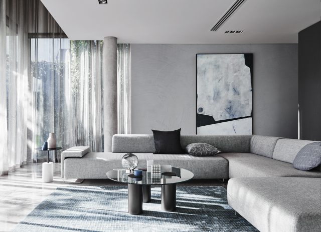
A set of three unique colour palettes: Game Changer, In the Moment and Clearview, dares customers to break the status quo while maintaining a sense of calm and wellbeing throughout their spaces. The range features hues that combine the concepts of strength and change. These concepts evoke passion and a sense of drive to embrace new opportunities as we emerge to new experiences and realise the true essence of what it means to be alive.

Haymes Paint colour and concept manager, Wendy Rennie, says: “Our new colour library is influenced by Australia’s slow rekindling after what has been an unimaginable time. We wanted to use colours to inspire our customers to create a space that is uniquely theirs and embrace the new way we live and grow in our homes.”
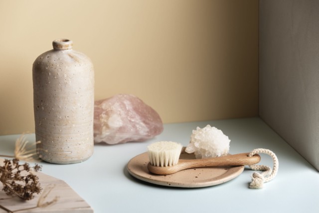
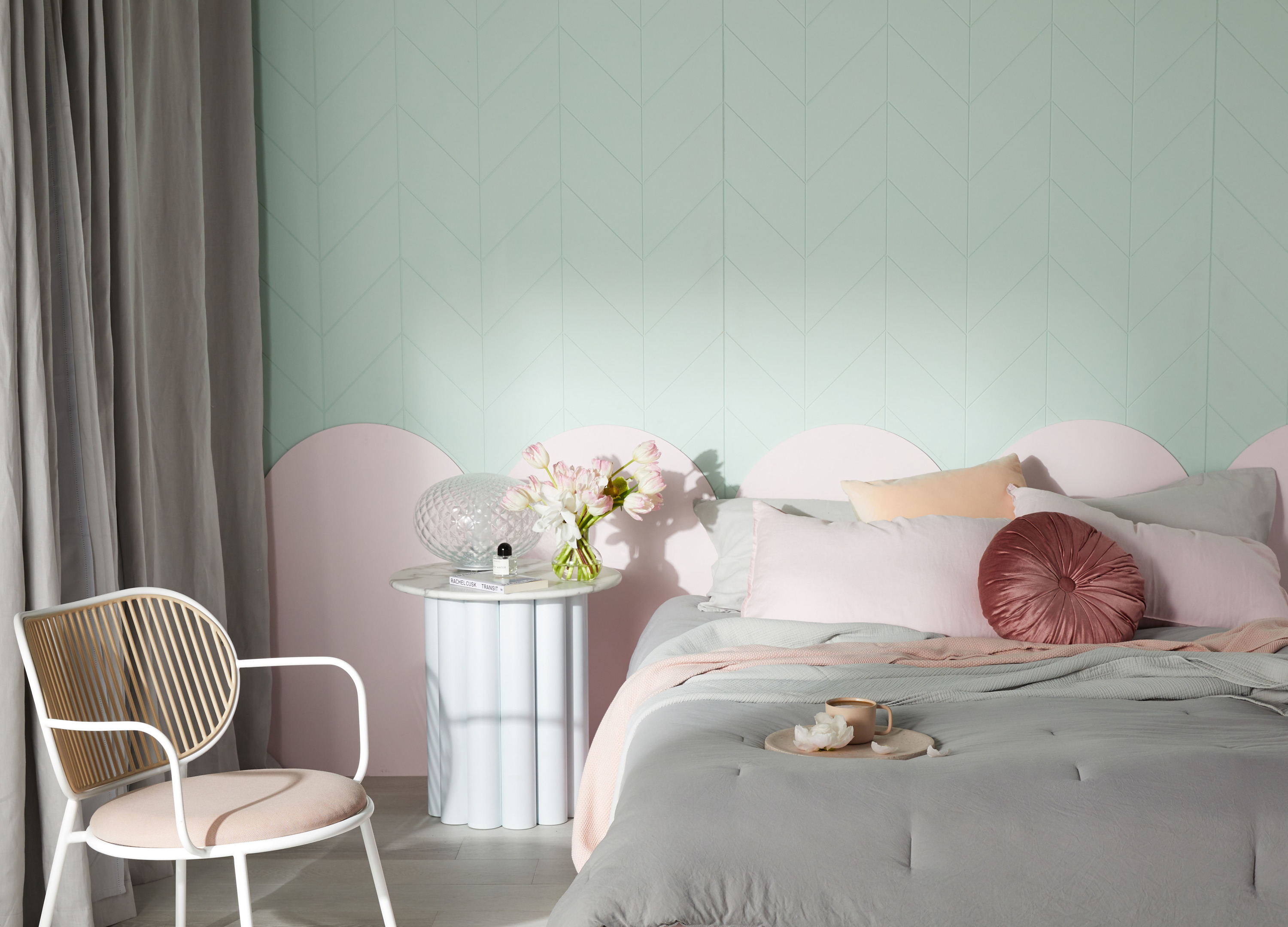
Game changer

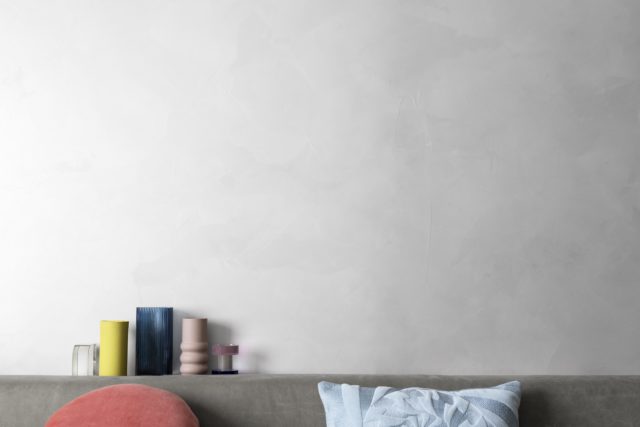
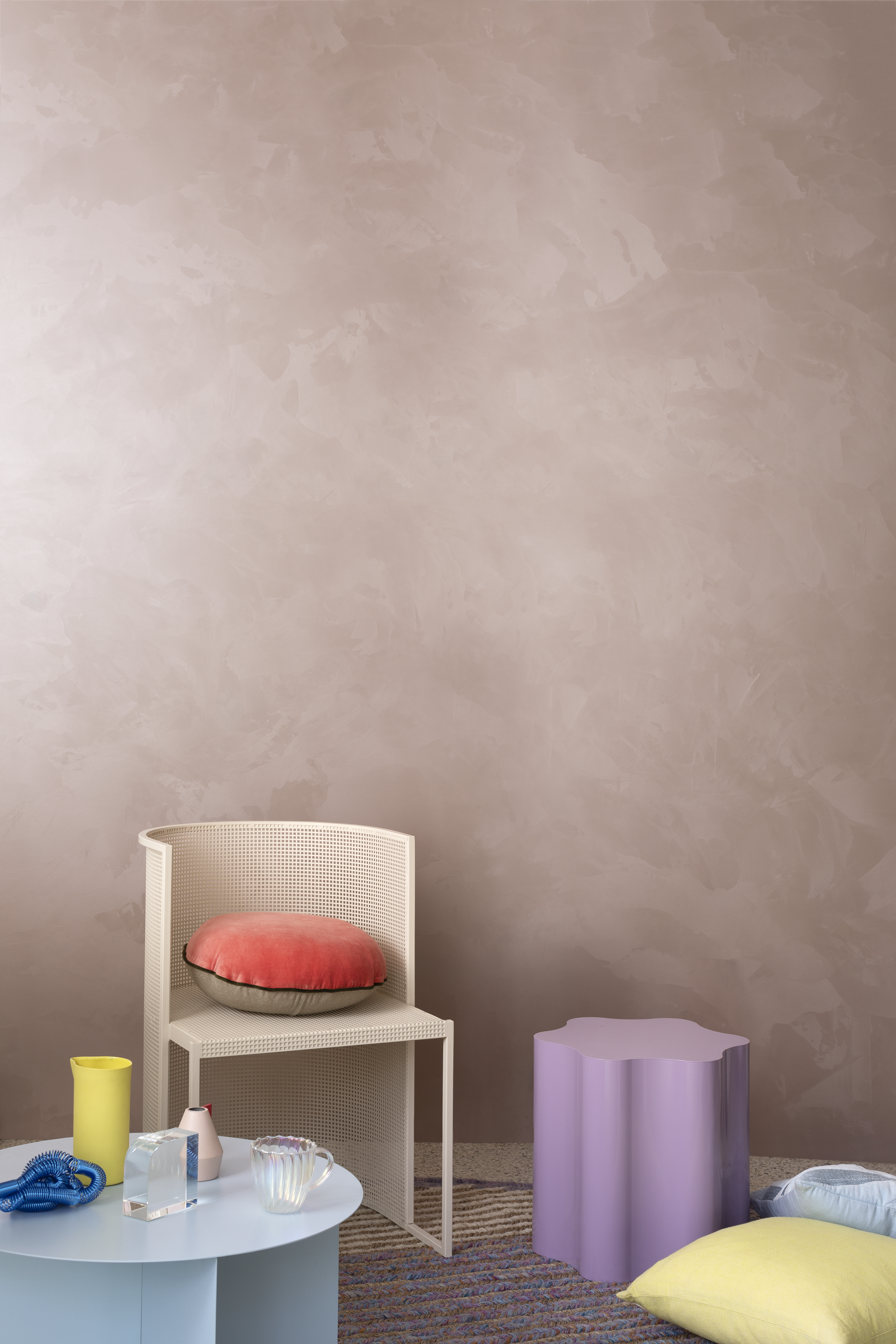
The Game Changer palette encapsulates newfound freedom to be yourself and challenge everything with a playful vibrancy and fresh optimism. Powdered blue, shades of sunset pinks, aqua greens, and mustard yellows will bring a sense of fun and lively energy into our homes.

Game Changer encourages us to break free from the limitations that have constricted our creativity and find the courage and drive to be truly free and original.
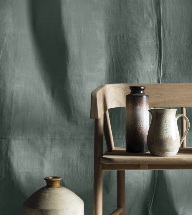
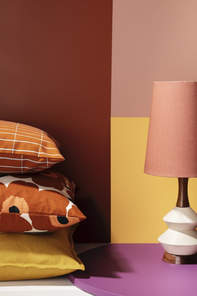
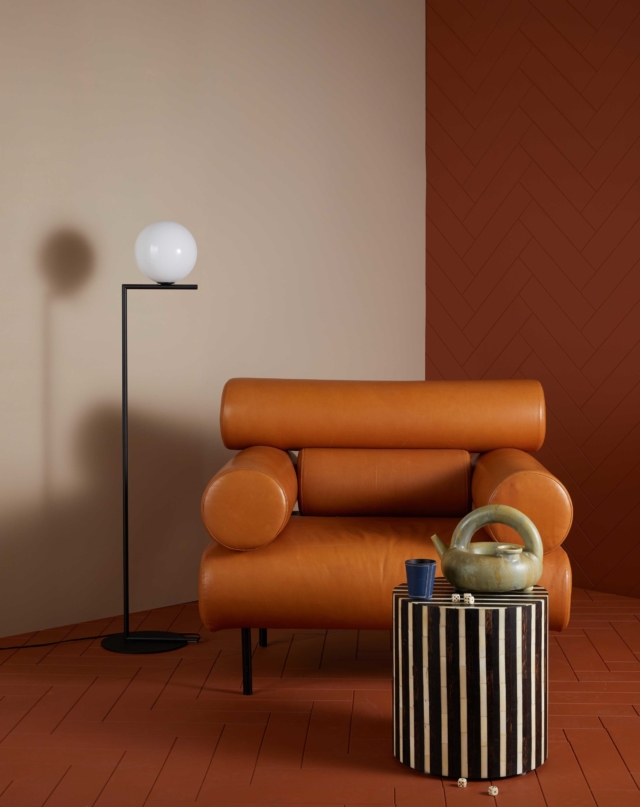
In the Moment

A fresh take on the Australian landscape, the In the Moment palette features an array of varying shades of rust, earthy browns, burnt oranges, and organic neutrals to promote a sense of groundedness. The array of tones reminds us to find value in what we have around us.

Using layers and tactility, we can create spaces within our homes that reinforce a sense of security. Our surroundings are truly linked to our wellbeing and it’s the details of the things we love that provide us with the strength to face the new normal, by creating a home that is connected to the essence of the Australian landscape with a robust aesthetic.
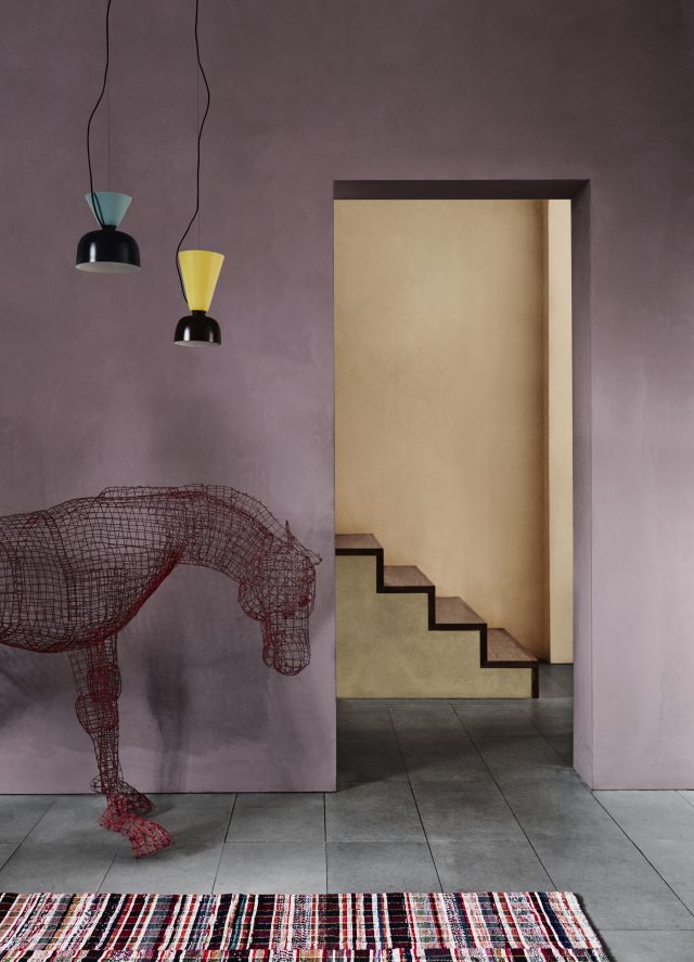
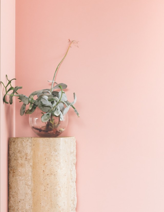
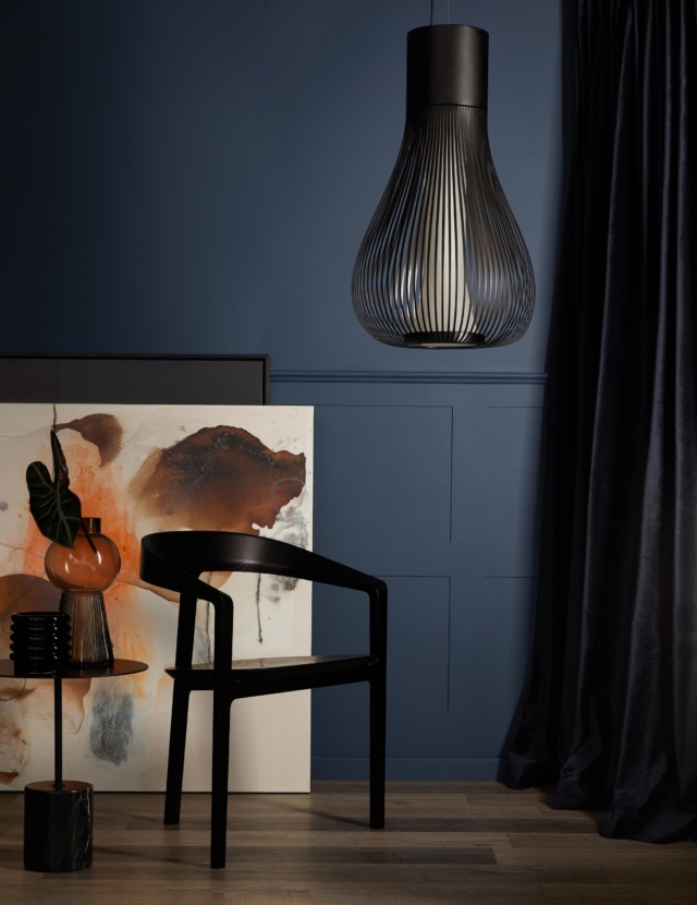
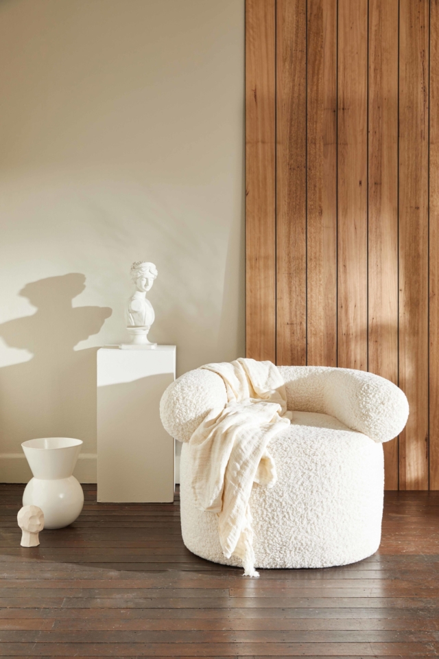
Clearview

Clearview represents the idealised tree change, sea change, and everything in between. Whether it’s an aesthetic we can now adapt to the style and feel, or a true location change, this palette brings these ideals to life. Its colours range from deep tones of ink blues and dark forest greens to light greys and powder blues. The new normal is to look for ways to promote idealism and to live in a way that is reflected in our day-to-day lifestyle, the core of what makes us feel the most fulfilled. Clearview enables us to create an everyday feeling of harmony, as we live more aware and in sync with what it is that truly aligns with our core values.

Haymes Paint is the largest Australian made and owned paint manufacturer. It has maintained its head office and manufacturing in the same town where it all began, a decision which has been instrumental in providing employment and growth in Ballarat and has allowed the business to maintain its local identity.

Categories
Architecture Design Designers House Tours Interviews Styling

Homes full of colour: 2021 Dulux Colour Awards finalists

The Dulux Colour Awards are always a feast for the eyes and this year’s finalists are no exception, despite being produced against the challenging background of a global pandemic. 105 finalists were selected from a pool of 437 entries across Australia and New Zealand, with six categories up for grabs including commercial and residential interiors and exteriors. It’s obviously the latter that interests us and there are some truly amazing finalists in this year’s list.

Sydenham residence
Sydenham Residence by Keta Interiors. Photographer: Martina Gemmola
Clifton Hill
Clifton Hill Residence by Studio Tate. Photographer: Armelle Habib

“We can’t help but view this year’s projects through a slightly different lens. While our focus is always on recognising innovation and excellence in the use of colour, our appreciation of the quality of work is heightened given the challenging climate in which these projects were created and completed,” says Dulux colour and communications manager Andrea Lucena-Orr.

Owston Hill by Meagan White
Owston Hill by Meagan White Architect. Photography: Jack Lovel

And while several trends were identified, the move towards biophilia in design was singled out as a recurring theme – getting back to nature is no doubt a response to what feels like an uncertain world. “There’s a resulting swing towards more nurturing tones and natural finishes. The prevalence of concrete, stone and timber, as well as warm metals, paired with warm earthy hues and deep greens and blues, indicates the need for a return to nature and its grounding effect in chaotic times,” says Andrea.

Erskine House
Erskine House by Kennedy Nolan. Photographer: Derek Swalwell
Brunswick Apartment by Murray Barker and Esther Stewart. Photographer: Benjamin Hosking

It wasn’t all earthy tones though with plenty of vibrant blues, terracotta, coral and dirty yellow tones featuring too. “Despite these tendencies to earthy, natural tones, there is still an evident willingness to be playful with the use of colour, in unexpected highlights and accents. We commend designers and architects on their capacity to remain highly creative and to lead their clients to embrace innovative concepts when faced with such challenging and extenuating circumstances,” says Andrea.

Pony
Pony by WOWOWA Architecture. Photographer: Martina Gemmola
Art House by Lynne Bradley Interiors
Art House by Lynne Bradley Interiors. Photographer: William Horner

Timeless, monochrome schemes featured heavily too with plenty of dark cocooning exteriors (think deep greys, charcoals and black), contrasted with light, warm interiors. “These combinations are no less innovative, but they are suggestive of designers and clients seeking reassurance, permanence and security,” says Andrea.

Yarraville
Yarraville Residence by Wall Architects. Photographer: Aaron Pocock Photography
Cunningham street residence by Studio Four. Photography: Shannon McGrath
Cunningham street residence by Studiofour. Photography: Shannon McGrath

The judges will select winners and commendations across the six categories, with awards and prize money being handed down at a Melbourne gala event (live streamed interstate) later in the year.

For more

Categories
Bedrooms Before & Afters Decorating 101 Kids Rooms Reno Trends Shopping Styling

This cosy bedroom transformation is the perfect inspiration for winter

Warm, grounded colours that speak of security and comfort are set to dominate winter decorating trends, according to Dulux forecasters.

“There’s a collective yearning for reassurance and a return to simpler times,” says Andrea Lucena-Orr, Dulux colour and communications manager. “We want our homes to provide comfort, a sense of safety and to remind us of better days ahead. And this will be reflected in more than just colour in 2021 – expect to see a rise in plush, comfy seating, handcrafted furniture with an artisanal feel and a greater focus on ‘purposeful decorating’ rather than just decorating to make an aesthetic statement.”

The Retreat palette – one of three trend colour palettes identified in the 2021 Dulux Colour Forecast – captures the mood of this coming winter.

“These earthy tones and muted colours are all drawn from nature – think oceanic blues, nourishing greens, soft greys and touches of mustard,” Andrea explains. “They bring the outside in – ideal for a time when most of us are stuck indoors for long stretches – and plug into the growing movement for wellness in design.”

To give you ideas on how you can use these comforting hues in your own home, Dulux worked with stylist Bree Leech to re-energise a child’s bedroom using colours from the Retreat palette.

“You want your child to love spending time in their room – it should be somewhere they can escape, relax, read and play. The quickest and easiest way to switch up the mood is with colour,” Bree says.

Bree kept the big-ticket items in the room – the bed, bedhead and solid timber bedside table, and focused on updating the room with bold colour. She chose shades that worked with the neutral tones in the foundation pieces, adding plenty of textures to dial up the cosiness. She started by adding deep blue to the walls and a gentle neutral to the ceiling and window detailing.

“We opted for pale greige rather than a classic white for the ceiling and windows to soften the contrast with the blue. A sharp colour contrast can be very effective in a space, but in a room that’s all about relaxation, you want it to be a little less pronounced,” she explains.

“Inky blue works well here – it’s cosy and timeless and sits beautifully alongside the natural materials in the room, such as the timber and woven-rattan,” adds Bree. “A woven wall hanging adds accents of rust and quirky bedside lighting creates a playful mood, adding contrast against the deep blue.”

Artwork: “Fast Forward” by Liam Snootle

“To make the space feel more inviting, I layered the bed with cosy cushions and snuggly, fringed woollen blankets. Curvy furniture is a great addition to break the architectural angles in the room to make it feel more relaxed,” she says.

Bree created a place to read in a sunny spot by the window, complete with a velvet-upholstered armchair and a pair of side tables, perfect for keeping a book or two nearby. “Don’t be afraid to bring in pieces from another room, like this armchair, so long as they serve a purpose and fit with your colour palette,” she says.

Artwork (top): “Long Doggie Print” by Rachel Castle

“If you’ve been all about white for as long as you can remember, get a taste of using stronger colours by starting with a single wall – say the wall behind the bed,” says Andrea. “This can also stretch your new confidence into using colour elsewhere in your home.”

If you’re inspired by this amazing bedroom transformation, Bree has provided some tips for redecorating your child’s bedroom.

Bree’s kids’ bedroom styling tips

Invest in quality: Kids are tough on furniture, so it’s worth paying more for well-made pieces that will last. You can save money on smaller items, such as bedlinen, art prints and rugs.

Add an upholstered bedhead: It makes for a comfortable spot to sit up and read.

Size it right: As a guide, when choosing a rug for a child’s bedroom it should fit two thirds under the bed and extend at least 30cm beyond the sides of the bed – any smaller and it will look lost in the space.

Think multi-purpose: Children’s rooms are often small, so seek out flexible pieces that can be used in different ways, such as an ottoman that doubles as storage and seating.

Make storage easy: Add in baskets for toys and cupboards or shelves to hide mess away.

Wall paint: Dulux Winter Sea, Vintage Linen, and Five Fingers Peninusla.

Stylist: Bree Leech. Photographer: Lisa Cohen

For more information.

Categories
Decorating 101 Design Expert Tips Home Office Styling

Paint: the cheaper, easier way to refresh your home office

With most of us spending more time working from home than ever before, there has never been a better time to show your workspace some love. “Your study should be a space of calm and concentration, but most importantly somewhere you actually enjoy spending time,” says Andrea Lucena-Orr, Dulux colour and communications manager.

“We all need different things from our study/home office, depending on the type of work we do – you may want it be a serene spot where you won’t get distracted, or an energising and uplifting one that inspires creativity,” Andrea explains. “This is where colour comes in; if your study is drab and lifeless, a lick of paint is the fastest, cheapest and most effective way to switch up the mood and make it a space you’ll love.”

To show you just how easily it’s done, stylist Julia Green has used colours from the Dulux Colour Forecast 2021 to style three different study areas.

“Who amongst us hasn’t worried about their workspace not being camera-ready when it’s time for that video conference call?” Julia asks. “Fortunately, you don’t need a big budget or lots of time to add style to this space.”

Andrea adds: “Colour can be used in clever ways too. For example, if you don’t have room for a separate study and want to delineate a study nook within an open-plan room, simply choose tones for your nook that are different to, however harmonise with, the palette in the adjoining living/dining areas. You can then use folding screens to tuck your workspace away when it’s time to switch off.” 

Whilst the three looks Julia created are all very different, she kept certain elements consistent throughout. “With each look, we fully committed to the colour palette, carrying it through from the walls and artwork to décor items, in order to give it a curated and intentional feel,” she explains.

“Natural light is important for wellbeing, so we used soft sheers on the window that let in filtered light. We added a statement artwork to each look – this anchored the desk set-ups and gave the user something beautiful to look at. Touches of greenery help clean the air and provide that all-important connection to nature.”

Design 1: Inspiration station

Colours: Dulux Aura and Natural White | Art: Charlotte Taylor via Greenhouse Interiors

For the first look (above), Julia took her cues from the Reset palette and painted the walls a soft grey-mauve, and the ceiling a warm white. These were combined with pink clay and punches of terracotta in artwork and accessories. “These colours will brighten your outlook without being a distraction – the perfect tones to surround yourself with if you’re in the business of ideas,” says Julia. 

Design 2: Serene study spot

Colours: Dulux Five Fingers Peninsula and Whisper White | Art: Georgie Wilson via Greenhouse Interiors

When it came to the second scheme, Julia looked to the calming colours in the Retreat palette. She made a feature of the back wall by painting it a rich, oceanic blue, paired with a warm white on the ceiling. “Bold colour contrasts generally energise a room, but there’s a lovely muddiness to this blue that makes it feel tranquil and relaxed. It’s a classic scheme that would work beautifully in a traditional or contemporary home,” she says.

Design 3: Cosy workspace

Colours: Dulux Morrocco Tan and White Exchange Half | Artwork: Leah Bartholomew via Greenhouse Interiors

For the third scheme, Julia layered earthy neutrals from the Nourish palette for a look that speaks of warmth and comfort. The earthy hue of the wall combine with tonal shades of tan and clay in the artwork, rug, and furniture. Woven detailing in the rattan screen and desk chair add texture.

“We all respond so differently to colour – the key is finding the hues that speak to you and then having the courage to pick up that paint brush,” Andrea explains. “Like anything, it can feel daunting the first time, but chances are once you start your colour journey, you’ll never look back.”

Julia’s study styling tips

Consider mood: Choose colours to suit the mood you want to create. Warm tones will create a cosy, nurturing feel, while brighter hues are energising and inspiring – ideal for creative thinking. 

Personalise: Family photographs and mementos from your travels can add character to your study and make it feel more welcoming.

Buy quality: A comfortable and supportive office chair and an adjustable desk lamp that allows you to see what you’re typing or writing are must-haves for a home office. 

Greenery: Add plants or fresh flowers to purify the air and provide a connection to nature. 

For more information.

Photography: Armelle Habib | Styling: Julia Green

Categories
Shopping

Paint trends 2021: Haymes Paint announces tranquil new palettes

Haymes Paint has launched its Volume 14 colour library, with new shades designed to reflect the shifting home trends in the wake of this tumultuous year.

Calm Mind palette

Embrace is inspired by the concept of embracing the ever-changing and unexpected challenges of the current world, and finding solace within the home space through colour. The movement is characterised by tones that elicit comfort and reassurance, aimed to create nurturing environments as a respite from the – often overwhelming – uncertainty that has defined our lives recently.

Calm Mind: Shell Pink

Comprising of three unique colour palettes: Grounded, Calm Mind and Happy Home, the range features hues that have been crafted to reflect the natural world, and produce a calm and joyful interior; attitudes that are expected to be a staple of the paint trends predicted for 2021.

Colour and concept manager, Wendy Rennie, says: “This year’s colour release has been interesting to put together as the world and climate we live in has changed dramatically.

Grounded: Arboretum

“The current focus on wellbeing is more important than ever and using colour as a way of connecting us to emotions and improving the environments we are in will help people to make an impact where it counts most, showing us that home truly is where the heart is.”

Grounded

The grounded palette draws inspiration from the earthy tones of the natural world, offering an escape from the speed and stress of our everyday lives. Its rich colours range from deep tones of ink blue to warm sandy neutrals and olive greens, emulating the calming force of the ocean, the earth and forest.

Grounded: Rubicon

These colours promote the creation of spaces within our home that reinforce this important connection to nature, and the sense of serenity and “groundedness” that will act as central tenets of 2021 interior design trends.

Calm Mind

Despite what is going on in the world around us, by looking inwards we can attempt to recapture our innate sense of calm and peace. The focus of this palette is to restore balance and inspire harmony, through emulating a “spa retreat” feel within the home. Soothing tones of creamy green and blue blend with muddied peach, pink and rusts to create a tranquil fusion of colour that nutures the mind and soul.

Calm Mind palette

The new normal is to look for ways to promote self-care and relieve stress within environments you can control, and the Calm Mind palette was created to highlight just this; the power that the intentional choice of colour can have in creating a tranquil living space.

Happy Home

The Happy Home palette encapsulates a relaxed approach to interiors by introducing an uplifting array of tones and hues created to promote joy. Bold blues, rusty reds and pops of bright yellow bring a sense of fun and hope back into our homes.

Happy Home palette

The palette inspires interiors that are characertised by quirky styling, bold colour blocking and smack of zesty exuberance. This theme is all about youthful design elements and injecting energy into spaces to reinvigorate the senses.

Imagery styled by Ruth Welsby with photography by Martina Gemmola.

For more on these 2021 palettes

Categories
Design

Paint colour trends 2021: Wattyl forecast organic, reassuring tones

This year, the way in which the home functions has fundamentally altered, as it has played a more meaningful role than ever in our daily lives. Wattyl have reflected this in their newly-released 2021 colour forecast, which takes the form of four unique palettes, spanning a wide array of shades.

These predictions highlight the way in which curved or rounded shapes, soft textures and considered colour palettes have become the go-to options for creating a sense of calmness and serenity while also proving useful in establishing different areas within an open living space.

The richer, darker hues of the Shadowy Darks palette – Dark Dream, Black Hole, Deep Forest and Seductress – are luxurious and cocooning and create a mood of timeworn comfort, especially when teamed with textured wall panels such as Easycraft’s Ascot Vogue dado panel, velvets, corduroy and dark timbers. Shape and texture become the heroes!

Uplifting Lights, a collection of four beautifully dusted pastels – Snow Rose, Light Aqua, Cave and China Mauve – add a warmth and tactility to minimalist spaces and lend themselves to soft curves in furniture and detailing that are balanced with the geometric chevron profile on the main wall. 

The tonal equality between hues such as Wattyl Snow Rose and Light Aqua inspire a balance between body and mind – the perfect combination for bedrooms.

Nourishing Earth Tones will be even more important in a post-Covid-19-world, their warm, nourishing plant-based colours helping us to reconnect with nature and the outdoors. Terracotta tones such as Wattyl Brandy Snap are given extra depth and visual interest when applied to a textured wall lining  and mirrored in furnishing textiles such as leather, linen and wool. 

Other beautifully organic, earthy hues within the palette are Moccacino, Run Forest, Denim and Honey Honey. 

Humble Whites – and minimalism in general – continue to reign supreme in many homes but the look is warming; becoming less pristine in both detail and styling.  Personality and emotion are introduced to this palette by virtue of authenticity, craft and history – attributes we crave in a post-Covid-19 world.  Materials such as timber, vegetable-dyed textiles and hand-made ceramics are key to the mix and create a mindful ambience, one of simplicity and purity.  

Humble whites such as Wattyl Lushious White, Confetti Shower and Ice Volcano sit quietly – and comfortably – next to timber lined walls that imbue the space with a sense of authenticity and earthiness.

Paint can be such a wonderful way to transform a living space, and the use of curves, texture, and colour can be utilised in order to fundamentally shape an interior that is calming, nurturing and multi-functional.

For more on these 2021 colour palettes

Categories
Interviews

Paint trends 2020: Wattyl forecasts two distinct looks

As colour palettes they couldn’t be more disparate, but that’s because Wattyl’s 2020 trend release draws on two very different themes; the fast-paced digital world and our desire to get back to nature. “We are moving forward, whilst looking back. The digital and the natural are so close – and yet worlds apart!” says Sarah Stephenson, Wattyl’s colour and design expert.

WATTYL
Wattyl’s earthy ‘Natural Connection’ palette

Bright Future
With its saturated, bright and bold primary colours, this palette evokes the paintings of Piet Mondrian. “There is a growing focus on artificial and digital tones that pop on screen as much as they do in real life.  The youthful, tech brights of Bright Future create the feeling of an art installation,” says Sarah.

Bright Future
The ‘Bright Future’ palette

Cobalt blue (Space Odyssey), bold red (Firefly), bright yellow (Secret Shrine) and orange (Made in Mars) sit alongside the calmer almost duck egg blue (Pretty Polly) and charcoal (Grey Ember). A palette for the brave, these colours would work best in a child’s playroom or a commercial space.

Bright Future

Bright Future

Natural Connection
By contrast, the Natural Connection palette is rooted in the gorgeous organic tones that bring us back to earth and many of the shades would look glorious at home.

'Natural Connection'
The ‘Natural Connection’ palette

“Our homes become sanctuaries with a priority for calm and comfort.  The harmony of mid-tone colours creates a calming, cosy environment,” says Sarah of the palette that is comprised of six colours that draw on grounded, mineral hues, textured surfaces and sustainable materials.

The 'Natural Connection' palette
The ‘Natural Connection’ palette

There’s a gorgeous pinky-terracotta tone (Red Ochre), a shade that evokes red wine (Sea Grape), a pinkish purple (Ridgey), a gold tone (Indiana’s Gold) as well as the cooler toned teal (Point Byron) and Moccacino which looks just as lovely as it sounds.

The inspiration behind the 'Natural Connection' palette
The inspiration behind the ‘Natural Connection’ palette

For more

Categories
Expert Tips

Dulux colour forecast 2020: Restrained, nature-inspired

It’s hard to believe that we’re looking at the 2020 trend forecasts already but the Dulux one hit our inboxes recently and it’s a beauty. The result of extensive trend research by the brand’s colour and communications manager Andrea Lucena-Orr and stylist Bree Leech, the nature-inspired palette draws on our desire to escape the digital onslaught and reconnect with the natural world – botanical, mineral and oceanic.

“These colour trends are influenced by what’s happening in the world around us. With more focus on mental health, the wellness movement continues to gain momentum, as does an emphasis on natural materiality,” says Andrea of the collection titled ‘Essence’ that consists of four palettes: Comeback, Grounded, Cultivate and Indulge.

Dulux Grounded
The Grounded palette

“Colours for 2020 are more restrained than in previous years. Brights are pulled back and influenced by nature. They appear in smaller doses – think feature walls and details – and are often used tonally as a backdrop for hero furniture pieces. Neutrals are soft and sophisticated, with a gently faded feel that speaks of stillness and calm. Clay, with its warm, earthy appeal, is emerging as a key neutral,” says Andrea.

Comeback
This palette features rich ocean and mineral inspired shades of blue-green, azure and amber alongside warm tones of burgundy, rust and clay. “There’s a lightness and fluidity to the ocean tones in this palette that speak of creativity and adventure, while the warm, earthy shades add cosiness. It’s the ideal backdrop to combine furniture from different eras – from mid-century through to the 1980’s – in elegant and refined shapes,” says Andrea.

Dulux Comeback

The title of the palette, Comeback, reflects a shift in how we view luxury. The current Kondo-esque ‘less is more’ approach is seeing us turn away from cheap, mass-produced pieces to seek out quality and it is often found in recycled and vintage wares.

Dulux Comeback

Dulux Comeback

Grounded
The most neutral of the palettes this one runs from soft grey and biscuit to muddy lavender with a touch of warm coral for opulence.  “We’re seeing a more tonal palette for 2020, and Grounded is a perfect example. It has a soft, neutral feel that creates a sense of relaxation in a space, with gold and coral adding touches of luxe,” says Andrea.

Dulux Grounded

This palette really picks up on the textural, natural materials trend with a view to the positive effects they can have on our mental health – bringing the outside in is key whether it’s growing our own food or cultivating an indoor plant collection.

Dulux Grounded
That lavender tone is rather beautiful within the neutral mix

Cultivate
My favourite of the palettes, Cultivate is a celebration of green with layering of different shades of the the hue looking rather effortless in the inspiration shots. From soft olive and pistachio to forest green it’s a rather sumptuous yet calming look that is offset by tones of plum, curd and chalky blue.

Dulux Cultivate
This scene makes a very solid argument for green on green. So beautiful!

“The colours and textures in Cultivate are easy to work with and have a warmth that really conveys the essence of ‘home.’ They look beautiful paired with raw, mid-tone timbers, natural stone and transparent, coloured glass,” says Andrea.

Dulux Cultivate

Indulge
As the name suggests, this palette brings together a rather decadent array of colours including rich burgundy, eggplant, earthy brown, faded terracotta and soft coral. Mmm.

Dulux Indulge

“This palette is not for the faint-hearted – it’s dramatic and exciting and is guaranteed to add wow factor to a master bedroom, dining room or living room. Pink, a key colour of the last few years, makes an appearance, but in a more neutral tone that’s closer to tan, alongside a warm, dusty rose.”

Dulux Indulge
Faded terracotta and soft coral make a heavenly combination

Dulux Indulge

Photography: Lisa Cohen | Styling: Bree Leech

For more | Australian bathroom trends: August 2019

Categories
Expert Tips Interviews

Paint trends 2019: Colour & concrete star this winter

While a paint refresh is often reserved for the warmer months, there’s no reason why you can’t head down that route in winter. Given we spend more time indoors in winter (often looking for a rainy-day project!) a new paint scheme might be just the thing to revitalise your home. From bold emerald green and navy to concrete finishes, there’s plenty of comforting and cocooning options for every taste as the temperatures drop.

I love the warm wintry vibe of this front door that's painted in Dulux Aquanamel in 'Italian Clay'
I love the warm wintry vibe of this statement front door painted in Dulux Aquanamel in Italian Clay

Shades of grey
“If your style is monochromatic, tonal layering of putty greys is subtle and beautiful, easy to achieve and is an effective look for any living space. To create visual interest, experiment with texture, which can be perfect as an accent wall – a concrete finish, such as Dulux Concrete Effects in Pale Elements, is popular and works well in a modern or contemporary home,” says Dulux colour expert Andrea Lucena-Orr who likes to pair that finish with Dulux Wash&Wear in Milton Moon, a lovely neutral grey.

Dulux 'Concrete Effect' in 'Pale Elements' creates the textural effect of polished concrete on the fireplace in this room.
Dulux ‘Concrete Effect’ in Pale Elements creates the textural effect of polished concrete on the fireplace in this room. Dulux Wash&Wear in Milton Moon complements the look.

Dulux Concrete EffectDramatic colour
Contrary to popular opinion, vibrant shades aren’t simply the domain of summer as these images styled by Bree Leech attest – a bold splash of navy and emerald green proves a winning combination when paired with a neutral white shade.

Dulux
Paint colours: Dulux Wash&Wear in Old Money (staircase), Dulux Aquanamel in Genie (front door) and Dulux Wash&Wear in Apricot Fool (hallway)

“To add a level of vibrancy, yet still retain a classic look, use whites such Dulux Lexicon on your walls and ceilings and introduce plenty of colour to your stairwell, front door or accent walls – peach tones, forest greens and deep blues are colours that can be seamlessly intertwined to enhance the space and add your own personality.”

Dulux

Photography: Mike Baker | Styling: Bree Leech

For more | Are natural, non-toxic paints the way of the future?

Categories
DIY Expert Tips Interviews RENO ADDICT Styling

Autumn styling tips & paint predictions from Dulux

Titled ‘Repair,’ the latest instalment of the 2019 Dulux Colour Forecast has arrived in time for autumn and the nature inspired palette is full of gorgeous green and gold shades. “Repair is my favourite palette of 2019. Its rich greens and accent of burnished gold feels comforting and uplifting and together they create a wonderful backdrop for interesting collections and spaces that tell a story. The colours are drawn from nature and plug into our collective desire to slow down and reconnect with the natural world,” says Dulux colour and communications manager, Andrea Lucena-Orr.

Dulux
Paint colours: Dulux Wash & Wear in Sea Creature, Plasticine and China White

“Striking combinations, such as verdant green, chocolate, umber and sienna set a playful, optimistic tone, while soft, green-based grey has emerged as the neutral – and the ideal pairing for these nature-based hues,” says Andrea.

Dulux
Paint colours: Dulux Wash & Wear in New Neutral and Cornstalk

And there’s no doubt that the cooler months demand a different approach inside – particularly as we’re inclined to spend more time there. “Evenings snuggled up on the sofa or entertaining friends around the dinner table take on a whole new appeal. The colours and textures we surround ourselves with play a huge role in creating that warm and cocooning vibe that we crave,” says Andrea.

Dulux
Paint colours: Dulux Wash & Wear in Ohai Half and China White

“There’s a sense of quiet luxury to this look, but it doesn’t come down to extravagant finishes or accessories,” says Andrea who suggests layering natural colours and textures to recreate it. Think richly grained timber, aged leather, cork and velvet. “There’s also a mindful appreciation of the humble and handcrafted simple pieces – whether they’ve been collected on your travels or found in vintage stores,” says Andrea who shares her autumn styling tips below.

Dulux
Paint colours: Dulux Wash & Wear in Golden Grain and China White

ANDREA’S AUTUMN STYLING TIPS

Combine natural finishes: Warm timber, leather and woven rattan can create a cosy and eclectic feel.

Add a twist: Paint a bedhead or feature wall in an exhilarating shade of blue-green or ochre to spice up this palette’s warm green and earthy tones.

Create interesting displays: Scour antiques fairs and second-hand stores for unusual collectibles.

Layer up textures and prints: Think cosy knits, aged leather, velvets and block prints.

Introduce concrete: This finish will add an interesting twist to green tones and timber. Use Dulux Concrete Effect paint to upcycle small accessories or to create a feature wall.

Set up a cosy corner: A comfortable armchair or a window seat with a few soft cushions is the perfect spot to spend an autumn afternoon with a good book.

Dial down the lighting: Reduce harsh overhead lighting at night and set a cosy mood with a variety of table and floor lamps.

Finish off with greenery: A trailing devil’s ivy on a bookshelf or a large, potted long-leaf fig in the corner of a room can provide a sense of calm and reinforce a natural element.

Dulux
Colours: Dulux Wash & Wear in Sea Creature, Plasticine and China White

Photography: Mike Baker | Styling: Bree Leech

For more | How to prepare for painting a room

Categories
Interiors Addict

Haymes Paint summer colour trend embraces light & shade

We brought you the latest from Haymes Paint a little while ago but this month sees the brand reinterpret the colours within the context of family life. With names such as ‘Contribute,’ ‘Comfort’ and ‘Cohabitate,’ the palettes certainly do suggest a sense of home and togetherness and we caught up with Haymes Paint colour and concept manager Wendy Rennie who helped put them in context.

“We have re-edited our three Colour Conscience palettes, shifting the colours and ideas to provide different interpretations of how colour function can infuse to create thoughtful solutions within the home, providing the ultimate backdrop for the family to enjoy life whilst harnessing the essence of their own lifestyle,” says Wendy.

Cohabitate
As the name suggests, with its soothing pastel hues, this palette is ideal for shared zones within the home. “Cohabitate offers the ultimate in a light and airy pastel palette, perfect for any multifunctional zone, encouraging all generations to come and spend time together,” says Wendy.

Haymes Paint Cohabitate palette
That gorgeous peach shade screams summer to me.

“Cohabitate offers the perfect summer palette with its use of soft and calming pastels from yellow, blue, grey, peach and pink tones all blending together seamlessly.”

Haymes Paint Cohabitate palette
Comfort
In contrast to the ‘Cohabitate’ palette, the rich tones of the ‘Comfort’ palette are ideal for the lounge room, home theatre and even bedroom. “Comfort provides the ultimate palette to create a perfect sanctuary in the home. The intimacy and the depth of the colours can create the overall feeling of rest and ‘colour cocooning’ giving the feeling of security and peace. Switching off to outside demands, and feeling completely comfortable in your surrounds instils a sense of peace and calm,” says Wendy of the rich palette.

Haymes Paint comfort palette

“Comfort incorporates colours that are sensual, tonal and evocative – rich red wine tones and soft dusty nude peach infused pinks blend seamlessly with deep contrasting greens, providing a soft and inviting environment.”

Haymes Paint comfort palette

Contribute
“The Contribute palette uses smart ideas and design to create beautiful warm spaces. Using rich and inviting colours that play on texture, tone and materiality extends the connection with our external environment, providing security and peace in the surroundings,” says Wendy of the palette that features grey tones that range from lighter, putty inspired colours to ones infused with deep brown.

Haymes Paint contribute palette

“The Contribute palette is monochromatic, embracing the natural shapes, colours and textures of our very own landscape.”

Photography: Martina Gemmola | Styling: Ruth Welsby

For more | Expert advice: How to paint a door

Categories
Interiors Addict

Summer 2019 paint trend: Soothing colours from Dulux

Just in time for summer comes the ‘Wholeself’ palette which is the next instalment in the 2019 Dulux Colour Forecast. With mindfulness a central theme, this summer trends palette focusses on soft minimalism and nurturing chalky hues.

Dulux summer trend

“The Wholeself palette is all about slowing down and tuning into the things that really matter. Wellness has emerged as a major theme in the design world for 2019, with many of us looking to switch off our digital devices and focus on nurturing our tired bodies and spirit. The Wholeself palette brings this theme to life,” says Dulux colour and communications manager, Andrea Lucena-Orr of the palette that comprises powdery pinks, warm neutrals, muted citrus tones and minty blue-green.

Dulux summer trend

“It has a serene yet cocooning feel, with gentle colours and subtle textural layerings, that hint at creative exploration and new beginnings. Powdery peach/pink has emerged as a key base colour, with accents of clay, gold and blue-green adding a fresh, modern spin,” says Andrea.

Dulux summer trend

“This palette is a significant shift from the playful brights and rich, luxe tones of last year. Rather than looking outward for inspiration, this season’s understated colours and intriguing textures draw you inwards and encourage moments of stillness and mindfulness,” says Andrea who explains that the palette is easily paired with white, neutral grey and greige paint.

Dulux summer trend

“When choosing colours from this trend palette, think about how they’ll work with your existing furniture, flooring and soft furnishings. You should also factor in the room type and any colours in adjoining spaces. One area this palette works particularly well is the bedroom. In this space it can create a calm and restful feel,” says Andrea.

Dulux summer trend

The soothing, mindful colour palette also points to a larger life philosophy that is all about embracing what we already have in 2019. “Expect to see a paring back of the overdone or unnecessary; the idea is to surround yourself with furniture and accessories that serve a purpose and bring you happiness. Environmental awareness will be an important thread running through design in 2019 – rather than discarding those pieces we no longer have a use for, we’ll be encouraged to repurpose or reimagine them in a new way,” she says.

Dulux summer trend

Andrea’s summer styling tips

  • Edit out the unnecessary; surround yourself with only those pieces you truly love and use.
  • Curves are key; choose furniture with rounded edges and soft, sumptuous cushioning.
  • Balance out soft pastels with warm, mid-tone timbers.
  • Add in contrasting natural materials, such as a stone, wool and linen in the form of side tables, accessories and cushions.
  • Inject small doses of unexpected brights, such as citrus, mint and gold, through decorative accessories such as vases and tableware.
  • Give new life to an old piece of furniture, by painting it in a complementary tone, or a contrasting accent colour.

Photographer: Lisa Cohen | Styling: Bree Leech

For more | How to choose white paint for walls

Categories
Interiors Addict

Haymes Paint latest showcases delightful sorbet tones

‘Colour Conscience’ is the latest addition to the Haymes Paint colour library (Volume 11 to be exact) and it features three distinct palettes that bear distinctly un-paint-like names. ‘Cohabitate,’ ‘Contribute’ and ‘Comfort’ run the gamut from sweet pastel colours to masculine, monochromatic schemes.

Cohabitate
Cohabitate palette

Cohabitate is a fresh, uplifting, sorbet-hued palette and the most strongly feminine of the three. Think peachy pink (‘Streamwood’), warm grey (Greyology 3), a gorgeous pale blue (‘China Blue’) and the yellow-toned ‘Antique White’ which are all about creating spaces that nuture, foster togetherness, recharge and reinvigorate their inhabitants.

Cohabitate palette
Cohabitate palette

Haymes Paint suggests styling these colours with blonde woods, terrazzo inspired flooring and accessories, gloss and matte finishes and geometric shapes.

Cohabitate palette
Cohabitate palette

In contrast, Contribute is all about moody monochromatic colours – dark greys (‘Castlegate’), deep browns and mid-tone neutrals (‘Memory). So while there’s a distinct lack of colour variety to this palette, Haymes suggests it’s all about layering up mixed materials for a strong, textural feel.

Contribute palette
Contribute palette

Style this monochromatic palette back with natural materials such as marble, stone, travertine and wood alongside stainless steel, greenery and ceramic items for a moody, luxe vibe.

Contribute palette
Contribute palette

Comfort combines dark green (‘Black Olive’) and teal (‘Viking’) with two-tone reds (‘Berry Juice’ and ‘Nostalgia Rose’) for a sumptuous feel designed to cocoon.

Comfort palette
Comfort palette

Encouraging calm, these dark intense tones inspire rest and quiet and look fabulous paired with tactile materials such as velvet and rattan. Lush, dreamy bedding layers including textured throws and cushions finish off the look.

Comfort palette
Comfort palette

For more | How to paint a door

Categories
Interiors Addict

The latest Haymes colour forecast is a diverse mix

Reflecting the eclectic nature of contemporary interiors, the latest Haymes Paint colour forecast is a real mixed bag, but in the best way possible. From earthy tones to moody jewel tones and primary colours, the latest collection (Volume 10) is organised into three themes and is anything but dull.

Streetscape palette
The Streetscape palette features muted primary tones

“Volume 10 is our most diverse collection yet, with the introduction of texture to The Colour Library. All three themes feature some tactile new colours and texture from our Artisan Range, which launched late last year,” says Wendy Rennie, colour and concept manager at Haymes Paint.

Unearthed palette
The Unearthed palette

“A one size fits all attitude is no longer applicable in a modern, multi-cultural society. We wanted Volume 10 to feature contrasting palettes and textures to highlight the different ways that we as individuals navigate our daily lives,” says Wendy.

Verge palette
The Verge palette features a sumptuous berry colour

Unearthed
The most subdued of the three themes, Unearthed is inspired by rural Australian landscapes and, more specifically, the earth under our feet. Mud, soil and bark were the organic inspiration behind this soothing mix of hues that includes warm charcoal, tan, rich red and rust tones.

Unearthed palette
Unearthed palette

The Unearthed palette
Unearthed palette

Verge
The moodiest of the three palettes, Verge is the perfect fit for the forthcoming cooler months with its sumptuous, dark hues. Berry, plum, teal and midnight make for a sultry mix that is all about calm.

Verge theme
Verge palette

Verge palette
Verge palette

Streetscape
Urban inspired, Streetscape features a muted take on primary colours with coral, mustard, bright blue and aqua the stars. Haymes Paint looked to the streets and laneways of our larger cities for inspiration with this palette that is designed to capture the energy of inner city, multicultural life.

Streetscape palette
Streetscape palette

For more | A kitchen and bathroom revamped with just paint

Categories
Interiors Addict

New Haymes Paint collection celebrates colourful neutrals

Like us, when it comes to paint, you’re probably tired of seeing the usual suspects – variants of grey and white. But if we’re honest, these ‘safe’ colours can be rather uninteresting and even more so when you consider that the colour wheel offers so many other choices. We get it though, neutrals allow you to mix things up in a way that stronger colours often don’t which is where the latest Haymes Paint release comes in.

Wall painted in ‘Siesta,’ floor painted in ‘Shell Pink’ and sofa upholstered in the fabric equivalent of the Haymes Paint ‘Gem’

Titled ‘Blended Neutrals’ (Volume 9 in their colour library series), the collection is comprised of peachy, fleshy tones combined with warm blues that prove that neutrals don’t have to be bland. “I’ve developed this palette of nine neutrals to inspire, influence and engage consumers to use more colour in their homes. It’s a palette that contains hints of pink, peach and blue, which contrast well with the greys, injecting life and soul to interior spaces,” says Haymes Paint colour and concept manager Wendy Rennie who explains that the range was inspired by a recent trip to Milan.

Haymes Paint in ‘Sun Dew,’ a warm powder blue

Challenging the accepted definition of what constitutes a neutral, the washed-out tones are super versatile. “This more playful and relaxed approach to neutrals provides an opportunity for people to shift their approach from always using greys and whites to seeing how colour can be translated into making spaces warm, balanced and liveable,” says Wendy.

Wall painted in ‘Siesta’ and floor painted in ‘Shell Pink’

“What I love about this palette is that it creates a wonderful conversation around the definition of neutrals and how we can use them in our homes to create playful, unique and relaxed spaces,” says Wendy.

Wall painted in ‘Sun Dew’ and chair on left upholstered in the fabric equivalent of the Haymes Paint ‘Gem’

The hero colour of the palette, Siesta, is a soft peachy tone that perfectly illustrates the way in which subtle colour is as utterly versatile as a traditional neutral. “Siesta can be used to create a relaxed and comfortable vibe in a bedroom, open plan living space or even a bathroom,” says Wendy. We’re sold!

For more

Categories
Expert Tips Interviews Kids Rooms

Pitter patter: Latest Dulux colour trend perfect for a nursery

While autumn colour trends often rely on the usual suspects of burnt orange, mustard and deep brown, the Dulux 2017 autumn colour trend is a much more serene, muted affair with light and mid-tones dominating alongside greige. And while it’s a look that suits just about any space, we think it’s the perfect complement to a gender-neutral nursery.

Ceiling & upper wall colour: Dulux Beige Mystery. Lower walls, skirting & trim: Dulux Parchment Paper. Chimney breast: Dulux Suede Effect in Eco Chic.

“We’re seeing soft colours used more often in children’s spaces now, it’s less about traditional colours such as pinks and blues and these autumn hues are perfect if you’re painting before you know your baby’s gender. Any of these colours would look beautiful in either a boy’s or girl’s nursery as they are the epitome 
of gender neutral,” says Dulux colour expert Andrea Lucena-Orr.

She explains the importance of carefully considering the choice of colour in a baby’s space. “Aim to reduce stimulating or strong contrasting colours and intense patterns in a child’s nursery or bedroom to create a calming ambience. Pacifying palettes of soft muted hues are best for a nursery as the subtle undertones within many of these colours can help a baby to relax and may hopefully encourage sleep.” You can add in a warm colour such as Dulux Pinkham if the room feels a little too neutral.

Dulux creative consultant and stylist Bree Leech, explains that layers of texture also help to create a sense of intimacy and warmth. “Tactile materials are also an important feature in spaces for small children as they develop their sense of touch.” She loves the softy, dreamy matte texture that the Dulux Suede Effects paint has (seen here on the fireplace in ‘Eco Chic’). “You can use them to create the perfect finish for the whole room or just a feature such as the chimney breast or alcove,” says Bree.

Children’s rooms aside, the Dulux autumn palette is a truly versatile one that could be used anywhere in the home. “If you’re looking to create a tranquil and calm environment, try any of these colours – they definitely should not be restricted to nursery use only. This palette could be used in an older child’s bedroom, a playroom, a quiet sitting room or casual living space and even a master bedroom,” says Andrea.

Photography: Lisa Cohen | Styling: Bree Leech & Heather Nette King for Dulux Colour Trends 2017

Categories
Interiors Addict

Texture & connectivity: Discover the Dulux 2017 colour trends

It’s always interesting when Dulux releases its new colour trends, given their close correlation with consumer behaviour, and the 2017 collection is no exception. Created in response to the brand’s research, which this year centred on the idea of connectivity, the palette features a mix of soothing neutrals, texture and some bold hues too.

160617_Dulux_Sentience_10351MAIN_FINAL
The ‘Sentience’ palette featuring Dulux ‘Pupu Springs’ (main wall), Dulux ‘Land Light’ (cupboards on the left & joinery details), ‘Beige Mystery’ (joinery bottom) and Dulux ‘Pinkham’ (window box).

“Each year we take away an overarching concept from our research and in 2017 the emphasis on connection, tactility and balance prevails. There is an ongoing desire to create havens that cater to all our senses which will see the prominence of textures blended with muted hues next year,” says Dulux Colour Expert, Andrea Lucena-Orr.

Much has been made of the current interiors obsession with nature and texture (both of which are an antidote to our digital lives), and as we spend more and more time in a ‘virtual’ sphere, it makes sense that we’re craving connectedness and comfort and that starts in the home.

160616_Dulux_Chroma_9930Main_FINAL
The ‘Chroma’ palette featuring Dulux ‘Deep Arctic’ (main wall) and Dulux ‘Hay Wain’ (wall return)

But texture and earthiness doesn’t necessarily signal bland, as demonstrated by the bold blues and greens in the range. “Deeper blues and greens such as Dulux Deep Arctic are predicted to be the dominant colours in 2017 and we will also see a rise in the popularity of earthy greens such as Dulux Army Fatigues. Greys and greiges, which have evolved to feature subtle undertones, will also be in demand,” says Andrea.

The ‘Sentience’ palette is a direct response to the research and combines subtle pastels with soft neutrals and textural finishes. “Textures in washed earth tones, using Dulux Suede Effects, imitate the earth’s natural materials such as clay, minerals, stone and wood,” says Andrea.

160621_Dulux_Construct_0104MAIN_FINAL
The Dulux ‘Construct’ palette featuring Dulux Concrete Effect in ‘Pale Elements’

The textural theme continues with the ‘Construct’ palette which includes inky blues combined with metallic and industrial accents, created with the new Dulux Concrete Effect and Dulux Metallic Effect ranges. “The combination of those deep blues, subtle greys and the rawness found in concrete with splashes of copper offers the perfect components to create understated luxury – a look anyone can achieve,” says Andrea.

Burnished reds will also feature (a reflection of the new tribal interior trend) and the ‘Entwine’ palette embodies this. “As a result of our research, we are seeing colours such as red, burgundy, brown and oranges being combined with an unexpected twist of zesty yellow or blue, inspired by landscapes from South America to the Middle East,” says Andrea.

160514_DULUX_Entwine_9405lights_FINAL
Dulux ‘Entwine’ palette featuring Dulux Suede Effect paints in ‘Palermo’ and ‘Manila’

Possibly my favourite of the palettes, ‘Chroma’ takes inspiration from the Memphis and Bauhaus movements and is a riot of colour featuring peach, melon, yellow and teal. “Use colour in areas within the home that are high impact. For instance, the entrance where you greet your visitors or the main living space where you spend the majority of time. Even the smallest touch of colour can help personalise your home,” says Andrea.

Photography: Lisa Cohen | Styling: Bree Leech & Heather Nette King

See more online.