Categories
Design Expert Tips Interiors Addict Interviews Real Renos RENO ADDICT Styling

Summer ’22 paint trends and expert styling tips

Proving the transformative power of colour yet again, the latest Dulux makeover is a bright, bold confection designed to showcase this summer’s hottest paint trends. A predominantly white lounge room and tween bedroom were overhauled using the Revive palette – one of three palettes from the Dulux Colour Forecast 2023.

“As our world opens up and we adapt to new ways of doing things, we’re looking for lightness and joy in our surroundings. This is a time for reconnecting with the ones we love, and we want guests to walk into our homes and feel a sense of happiness and celebration. At the same time, after two years of restrictions, many of us are yearning for fun, freedom and the chance to try new things,” says Andrea Lucena-Orr, Dulux colour and communications manager.

BEFORE lounge
BEFORE lounge
AFTER lounge
AFTER lounge

The formerly all-white lounge room was overhauled with Dulux Paper Brown paint on the walls and Dulux Breezy Half on the ceiling. “The brown instantly added warmth and character while the soft blue ceiling really brightens up the space. “Taking the ceilng colour part-way down on the wall, as we’ve done here, is a design trick to make the ceiling feel higher,” says Dulux colour forecaster and stylist Bree Leech.

The Revive palette perfectly captures the mood with vibrant hues including a rich blue (Dulux Integra), lively green (Dulux Diorite) and a whimsical lilac (Dulux Perplexed) paired with over-scaled patterns, voluptuous furniture and bold, abstract artworks inside the renovated lounge room. “If you’ve never swayed from whites and neutrals before, using saturated colours like these can feel daunting, but there’s really nothing to fear,” says Bree.

Sideboard
A colourful vignette is displayed on the lounge room side board

Bree styled the room with a mash-up of futuristic and retro influences including curvy, statement seating in 80’s inspired electric blue paired with a 70’s inspired textural feature chair and foot stool in mustard. A powder blue sideboard topped with a bright green vessel completes the scene. “Design trends today are heavily influenced by the idea of ‘creating a moment,’ whether it’s the perfect Instagrammable photo or a great Zoom backdrop,” says Bree of the inspiration behind the room.

BEFORE bedroom
BEFORE bedroom
AFTER bedroom
AFTER bedroom

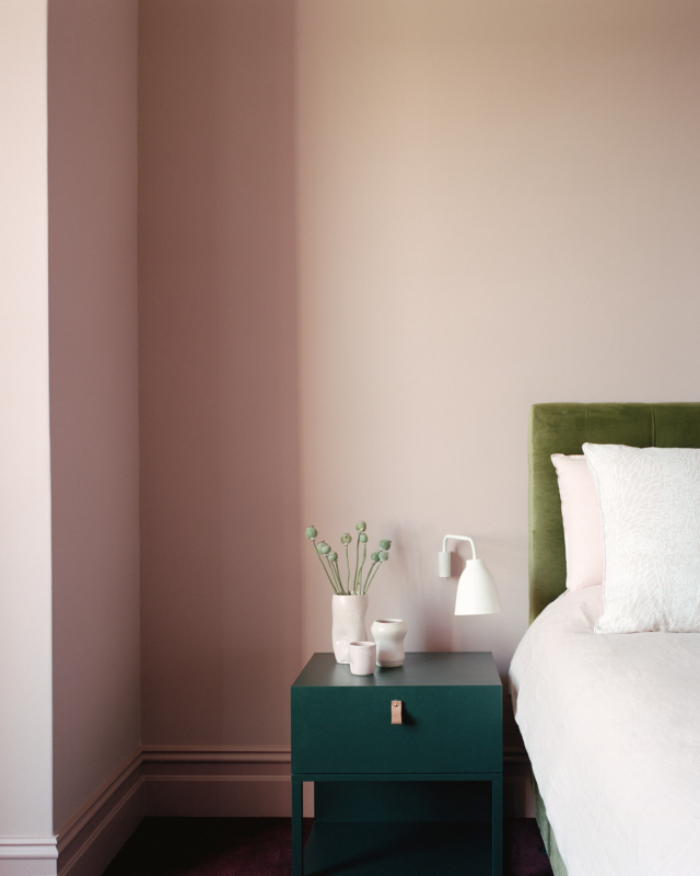
In the nearby tween bedroom, Bree balanced calm with a sense of fun. “As a sleep space, we wanted this bedroom to feel restful, so we painted the walls in soothing and immersive Dulux Integra. For something a little unexpected, we used Dulux Diorite on the skirting boards, window trims and door, rather than traditional white.”

AFTER bedroom door
AFTER bedroom door

Bree’s summer styling tips

  • Add colour in unexpected spots: The element of surprise can be a powerful decorating tool; consider adding colour to your ceiling, timber window frames, door edges or the back of shelves.
  • Exaggerated curves: Whether it’s a curvaceous sofa, a chubby accent chair or rounded coffee table, this look calls for curves.
  • Be bold with pattern: Forget the so-called rules on mixing patterns – have fun combining thick or thin stripes, geometrics, over-sized floral prints and more, all in the one space.
  • Keep artworks casual: Think unframed, abstracts and digital artworks casually propped, even overlapping, on a shelf or sideboard.
  • Textural contrast: Add depth and interest to your rooms décor by mixing different textures, such as boucle armchairs, thick woven rugs, imperfect ceramics, matte finish joinery and touches of high-shine metallics in furniture legs.
  • Highlight interesting furniture shapes: Having a backdrop in a contrasting colour allows pieces like curvy, statement seating to shine.
  • Scheming: The Dulux curated palettes are designed to be used as schemes for paint, as well as soft furnishings, artwork and décor – to ensure all colour references work cohesively.

Photography: Lisa Cohen | Styling: Bree Leech

For more

Categories
Design Expert Tips Interiors Addict Interviews Styling

Dulux latest: 2023 colour forecast reflects a post-pandemic shift

Just as skirt lengths and lipstick sales can be indexed to the social and political landscape, so to can interior trends. And, after a chaotic couple of years, it’s not surprising to find that many of us are feeling a desire to live more simply and authentically. We’re stripping away the superfluous (we’re truly thinking about how we spend our time and who with) to create space for more meaningful connections and the Dulux Colour forecast 2023 is reflective of this.

“Colour forecasting for interiors is an evolution. While fashion is an important influencer, the shifts in interiors are more subtle and nuanced. The palettes we can expect to see in our homes in 2023 are predominantly warm and nurturing, with nature continuing to be a key driver of trends. Brighter hues continue; however, they are deeper than last year,” says Dulux colour and communication manager Andrea Lucena-Orr.

Dulux Revive
Revive palette

The forecast is based on year-round research into the latest global and local trends that are predicted to influence Australian design and how we live. Led by Dulux colour and communication manager Andrea Lucena-Orr, in conjunction with Dulux colour forecaster and stylist Bree Leech, the latest forecast has been informed by seminars (including Future Laboratory London and Milan Design Week) as well as trend reports, editorials, fashion, product and design launches as well as customised research through Dulux’s extensive networks in the UK, Italy and France.

Connect palette
Connect palette

“We have all reacted to the upheavals of the last couple of years in different ways – some people crave lightness and whimsy, whilst others seek order and reassurance. The three palettes in the Dulux Colour Forecast 2023 reflect these differing needs, allowing you to create beautiful living spaces that reflect where you are in your life’s journey,” says Andrea.

Balance
A refined palette of serene marine inspired hues, gentle greens and accents of deep garnet, Balance evokes the ocean and shoreline. “Balance is very much inspired by a ‘less is more’ philosophy, with minimal detailing and a restrained approach to decorating. Instead, the focus is on immersive colour and the beauty of complex, structured patterns found in nature, such as a simple seashell or fern frond,” says Dulux colour forecaster and stylist Bree Leech.

Dulux Balance palette
Balance palette

Balance inspired styling includes lush textures (velvet and silk), furniture with exaggerated, curved silhouettes, abstract art and décor pieces with organic shapes and delicate pleating. “Balance has an elegant, understated feel that would work beautifully in an inner-city apartment or terrace home,” says Bree.

Balance palette
Balance palette

Connect
By contrast, the Connect palette is all about the great outdoors and features earthy tones of moss, wasabi, sandstone, muddied yellow-green and burnt charcoal. “It speaks of calm, comfort and an honest approach to living, and brings in many of the pastimes we experienced during lockdown, such as a hiking, cooking, quilting and gardening. Muddied yellow-green has something of a nostalgic, country-house feel, cinnamon is grounding, whilst rich, purple-brown adds an indulgent and contemporary twist,” says Andrea.

To complete the Connect look, the palette looks fabulous when with rustic furniture (in timber, leather or rattan) as well as stone flooring and bespoke, modern lighting made from recycled materials. 

Dulux Connect
Connect palette

Revive
The most playful of the palettes, Revive features an array of uplifting, bright tones including rose pink, blue, sunshine yellow, emerald, violet and burnt orange – all designed to lift the mood after a tense couple of years. “As we emerge from trying times, we’re looking for lightness and a sense of freedom to revive our spirits. So, when it comes to our homes, it’s out with the rule book, and in with the possibilities to create something truly magical,” says Andrea. 

Revive palette
Revive palette

“Pairing retro influences with futuristic features, such as pixel patterns and digital art, the Revive palette cleverly merges the past and present. And with its colourful, look-at-me accent walls and statement seating, it creates the perfect Instagrammable moment,” says Andrea. 

Revive palette
Revive palette

Photography: Lisa Cohen | Stylist: Bree Leech

For more

Categories
Before & Afters Design Expert Tips Interiors Addict Interviews Real Renos RENO ADDICT Styling

Before & after: Stylist shares how she made over rental home

We’re massive proponents of colour around here, and today’s before and after is a great reminder of just how transformative it can be. It’s the work of Dulux trend forecaster and stylist Bree Leech who, bored with her rental pad, decided to overhaul it with a few clever tricks and plenty of joyful colour.

“Our dining room had a feature that didn’t work for us, and I’d wanted to fix for some time! It was a neutral space that had a cut-out in the wall so you could look through to the adjoining room. The cut-out feature was serving no real purpose and the dining area itself just felt a bit flat,” says Bree. 

Seeking a happier more inviting space, Bree got her hands on some fluted panels to cover the cut-out feature before painting them in Dulux ‘Harmonious’ which she selected from the brand’s Wonder palette, part of its latest trend forecast. “I chose colours from the Wonder palette for this space as they best represent my personal style. The palette is fun and joyful – everything I wanted for this room.”

Dulux
A stripe rug from Halcyon Lake brought another fun element into the space

The stylist then selected some new timber chairs and painted them with Dulux Aquanamel paint in ‘Plunder’ before adding a rug and lots of colourful objects and vessels filled with flowers. “It’s really helped bring the space to life and is now somewhere the whole family enjoys spending time,” says Bree.

Dulux

Bree’s top styling tips

  • When it comes to scheming, going bold with colour can really pay off but equally, small changes can make a big difference. If you want to introduce smaller pops of colour, choose furniture items or highlight small areas of a wall, door or even your ceiling.
  • Remember, colour is not just for walls! Painting dining chairs or a table is also a great way to achieve this look whilst renting. Add artwork that references your colour scheme to bring it all together.
  • When selecting colours, always have an overall mood or style in mind and select colours that help bring this idea to life. It’s helpful to have a visual you can refer to like a mood board, materials board or a Pinterest board. This helps keep your colour scheme cohesive and gives you a reference point to work out your proportions as this can dramatically change the mood of the space. 
  • Working with existing fittings and fixtures can often mean a clash in colourways. While you may not be able to pull up the carpet or replace the kitchen benchtop, you can always add rugs for a tonal effect to get you closer to your desired palette.
Dulux
Bree’s shelves are bursting with colour

Photographer: Mike Baker | Stylist: Bree Leech | Colours: Dulux Harmonious (wall panel) and Dulux Plunder (chairs) | Suppliers: Wall panel – Surround by Laminex and rug – Halcyon Lake

For more

Categories
Architecture Design Designers Interiors Addict

2022 Dulux Colour Awards: Winners showcase sophisticated colour

The 2022 Dulux Colour Awards were handed out in Melbourne on 1 June at a live-streamed gala function that saw a handful of winning projects chosen for their exceptional use of colour and creativity in design.

“Our renowned industry awards program recognises the epitome of colour use in design and architecture, and it is especially significant that we acknowledge and celebrate the array of exceptional projects this year, given the challenging circumstances in which they were created,” says Dulux colour and communications manager Andrea Lucena-Orr.

Autumn House by Studio Bright. Photographer: Rory Gardiner.
Autumn House by Studio Bright got two commendations. Photographer: Rory Gardiner.

And while the competition spans commercial, workplace and retail spheres it’s the residential winners that we are obviously most interested in. The winner of this year’s ‘Residential Interiors’ category is Lachlan Seegers Architect for its Erskineville House project and judge David Welsh praised the success of the project’s vision which was ‘to bind the home’s atmosphere with the ever-changing presence of nature.’ 

Erskineville House by Lachlan Seegers Architect. Photographer: Rory Gardiner.

“In an elegant, unforced manner, a soft palette of pale yellow, warm grey and hues of green supports the narrative and moderates the atmosphere of the interiors. The result is a subdued, cocooning moodiness that gently changes and evolves with the movement of natural light. We commend the architect’s commitment to the vision in what appears to be a simple response but is, in fact, a highly considered and finely wrought design,” says David of the home that is centred around a beautiful Spotted Gum.

Erskineville House by Lachlan Seegers Architect. Photographer: Rory Gardiner.

Studio Bright’s Autumn House received commendations in both the ‘Residential Interior’ and ‘Single Residential Exterior’ categories. “Tasked with creating a new extension to a Victorian original with an 80s’ addition, the architects have struck a fine balance between cohesion and distinction, largely orchestrated by their colour selection,” says David.

Autumn House
Autumn House by Studio Bright. Photographer: Rory Gardiner.

“Bathrooms of sea blue and mint green are calming, standalone sanctuaries. Extending the respective palettes to joinery and furniture throughout, the varied tones, textures and touchpoints combine to create an immersive, sensory experience,” says David.

Autumn House by Studio Bright. Photographer: Rory Gardiner.

Kart Projects’ House K was the winner of the ‘Single Residential Exterior’ category and was celebrated for its use of colour to distinguish between the old and new parts of the home. “Rejecting the oft-used strategy of blending old and new in residential additions, this design not only opts for an obvious delineation, but a bold, forthright one, with colour as the primary mechanism,” says judge Cushla McFadden.

The original part of the home was restored with a muted, respectful nod to its heritage while the new extension features dark cladding combined with a statement making orange red.

House K by Kart Projects | Architecture.  Photographer: Rory Gardiner.
House K by Kart Projects. Photographer: Rory Gardiner.

“Though largely concealed from the front, the addition’s bold scheme is hinted at in a bright orange-red sweep of fence along the street front. The volumetric demarcation, which is also continued within the home, provides a colour-blocked backdrop to the developing landscape,” says Cushla.

House K by Kart Projects. Photographer: Rory Gardiner.

For more on the 2022 Dulux Colour Awards

Categories
Design Expert Tips Interiors Addict Interviews Kids Rooms RENO ADDICT

Latest Dulux makeovers embrace warm winter palette

The latest inspo pics from Dulux landed this week and they showcase the brand’s Restore palette from the 2022 Dulux Colour Forecast. Comprised of rich, soothing colours, the palette was explored by Dulux colour forecaster and stylist Bree Leech when she undertook a multi-room makeover in a renovated 1980’s brick home. 

“We chose to make over three rooms – a toddler’s bedroom and two entry areas – showing the versatility of the palette to energise different interior spaces,” says Bree. Starting with the home’s toddler room, she overhauled that space twice – there’s feature colours of both New Penny and Natural Flora paired with a base colour of Hog Bristle Half (a warm white chosen to soften the spaces).

Toddler room BEFORE
BEFORE toddler room
Dulux
AFTER toddler room (option one): Dulux New Penny features on the room’s v-groove wall.

“Both accent colours add interest and make the bedroom more inspiring for a young child but are also colours that they can keep as they grow,” says Bree who added even more texture and warmth to the room via pale timber, woven cane and natural fabrics including linen, cotton and wool. “We also amped up the texture by adding a thick pile rug to the already carpeted floor,” says Bree.

Dulux
AFTER toddler room (option two): Dulux Natural Flora features on the room’s v-groove wall.

Bree also worked on the home’s two entry spaces with the intention of making them feel more inviting, sophisticated and memorable. “The entries have gorgeous, exposed beams and curved arched doorways; we wanted to celebrate both architectural features and did so through colour and décor,” says Bree.

Dulux
Dulux Ferry features on the entry ceiling

The main entry features a dramatic splash of Dulux Ferry on the ceiling while the secondary space truly shows the power of paint – Bree replaced a stark white shade with Dulux Finnegan before finishing the space with art and handmade ceramics to imbue it with further character.

Dulux
BEFORE entry
Dulux
AFTER entry. Dulux Finnegan elevates the space.

Winter colour tips from Dulux colour expert Andrea Lucena-Orr 

  • When considering colours for your walls, always factor in existing fittings and decor that will remain once the makeover is complete. This may be flooring, cabinetry, window colour, furniture, etc. – knowing what colours and textures will remain will help drive your colour decisions with paint. 
  • Determine whether your room relies on a lot of natural or artificial light to help add warmth and atmosphere to the space. For example, south facing rooms will do well with warmer colours to offer comfort. If the space faces north, you may want to select softer, cooler colours in the palette to keep that sense of light and brightness. 
  • Paint’s not just for walls – try it out on décor and accessories like ceramic sculptures, pictures frames and lamps! This is a subtle but impactful way to add new life to a room, especially for those who may not feel ready to inject colour on a larger scale. 
  • Always test colours before you purchase your paint to ensure you’re happy with the final colour choice. Dulux sample pots are available in hardware stores nationwide or via the Dulux website. Leave your painted samples up for at least two or three days to ensure the colour(s) work in your space and under different lighting conditions, both natural and artificial and view in different weather conditions i.e., bright sunny day versus a dull grey day. 

Photography: Lisa Cohen | Stylist: Bree Leech

For more

Categories
Design Interiors Addict

2022 Dulux Colour Awards finalists: Moody colour trending

My favourite awards on the design calendar, the Dulux Colour Awards always deliver an incredible amount of interiors inspo for the colour obsessed. Currently in its 36th year, this year’s 103 finalists were drawn from Australia and New Zealand with the highlighted projects displaying innovative use of colour across commercial and residential spaces.

Grid House
Grid House by Doherty Design Studio. Photographer: Timothy Kaye.
Grid House
Grid House by Doherty Design Studio. Photographer: Timothy Kaye.

“We were excited to see such an exciting and imaginative use of colour in this year’s entries. Architects and designers have really pushed the boundaries with colour application to create inspiring, engaging – and often surprising – interior and exterior spaces,” says Dulux colour and communications manager, Andrea Lucena-Orr.

Nelson Road House
Nelson Road House by Bloom Interior Design. Photographer: Armelle Habib.
Nelson Road House
Nelson Road House by Bloom Interior Design. Photographer: Armelle Habib.

I couldn’t help but notice the strong embrace of more dramatic tones in the residential category – with particular emphasis on greens and blues. “Deeper tones of blue and green were popular amongst residential interiors, showcasing diverse moods in areas and differentiating functional use in a space – from deep and dark, to bright and lively – applied to cabinetry, trims and walls to create a peaceful, relaxing interior setting,” says Andrea who noted that washed walls are emerging as a trend, bringing moody sophistication to interiors. 

Sorrento House by Fiona Lynch Interiors. Photography: Dave Kulesza
Sorrento House by Fiona Lynch Interiors. Photography: Dave Kulesza.
Nido House
Nido House by Angelucci Architects. Photographer: Dylan James.

This year’s judging panel includes Adriana Hanna, director of architecture at Kennedy Nolan; Cushla McFadden, director at Tom Mark Henry; Olivia Macfarlane, director at UNDERCURRENT NZ; Adam Pustola, principal at Lyons Architecture; and David Welsh, principal at Welsh+Major. 

Arch Deco
Arch Deco by Hindley & Co Architecture and Interiors. Photographer: Tatjana Plitt.
Bondi Terrace by Studio Quarters. Photographer: Prue Ruscoe.

The winners announcement will take place at a gala event in Melbourne and will be live streamed via the Dulux Facebook page. Details of the event will be announced in the coming months. 

Malvern House by Lande Architects. Photography: Derek Swalwell
Malvern House by Lande Architects. Photography: Derek Swalwell.
Casa Luna
Casa Luna by Biasol Studio. Photography: Timothy Kaye.

For more on the 2022 Dulux Colour Awards

Categories
Bedrooms Decorating 101 Designers Expert Tips Interviews RENO ADDICT Styling

Julia Green on renovating with paint & latest styling secrets

As many of you will know, interior stylist Julia Green has transformed a 600 square metre heritage warehouse in Geelong into a stunning retail concept flagship store for her business Greenhouse Interiors. A gorgeous space, complete with fully functioning kitchen, bathroom, bedroom and lounge (where every room is shoppable – whoop!), Julia partnered with Dulux to create the bedroom, using the Flourish palette from the paint brand’s 2022 colour forecast.

Julia Green
Julia Green in the Greenhouse Interiors flagship bedroom space. Artwork ‘The Chandelier Project 003’ by Regan Glazner for Greenhouse Interiors.

“Our aim was to demonstrate how much difference just a touch of colour can make. The Flourish palette was perfect for this. It’s sophisticated without any sense of ego or pretension; sometimes earthy, sometimes daring, and easy to style. It’s also highly versatile with hues that are both soft, beautiful, and timeless,” says colour guru Julia who loves singing the virtues of a paint change when it comes to renovating. 

Julia Green bed
Bedside details

“Not all renovations start out as a blank canvas, in fact, many people buy renovated homes that are not styled to their liking. That’s where a fresh coat of paint and injection of colour can really come in handy. It’s one of the best ways to change up the look and feel of your home, without committing to a full-blown renovation,” says Julia.

Julia used Dulux Clay Pipe Half (a soft neutral with pink undertones) and Dulux Kenepuru Sound (a deep, rich blue with a hit of purple) on the walls and incorporated other tones from the Flourish palette through furniture and styling objects. All in all, it’s a warm and inviting result.

Julia Green

Julia’s top styling tips

  • Adding colour to your home can be transformative, so don’t be afraid to experiment and explore. It may not always work out the first time, but it’s worth persisting until you achieve the perfect balance.
  • Colour evokes emotions, so it’s best to consider how certain hues make you feel – whilst you may love a bold red, living with a whole room of it may be overwhelming. The good news about paint is, if you don’t love it, you can always paint over it. If in doubt, ask a friend or get a second opinion from a trade specialist – they are there to help!
  • Don’t be afraid to mix the old with the new and use bolder hues as accents rather than solid colours en-mass to avoid being too overpowering.
  • When decorating, always start with a blank canvas and add one piece at a time to ensure the balance is right. Sometimes how you edit your space can be more important than adding the homewares itself, so go slow.
  • Purchase Dulux A4 swatches, colour stickers or sample pots from the Dulux website of from your local paint shop to accurately test the colours around the room and view them at different times of day. That way, you’ll feel assured you’ve selected a colour(s) you’ll love.
Julia Green
One last look at the gorgeous space

Styling: Julia Green | Photography: Armelle Habib| Assistants: Justine Lanigan and Jessica Retallack

For more from Dulux

Categories
Before & Afters Decorating 101 Expert Tips Interiors Addict Interviews Living Room Real Renos RENO ADDICT

90s revival: Is burgundy paint the latest interior trend?

Dulux colour forecaster and stylist Bree Leech put the brand’s Flourish palette to the test recently with an autumnal inspired makeover that proves the power of colour. Flourish is part of the 2022 Dulux Colour forecast and it pairs warm and natural shades including Dulux Basic Coral and White Dune Quarter with the bold, rich tones of Dulux Murray Red and Discretion. All in all, it’s a striking result. Especially when you consider the clever use of burgundy (Murray Red) – a colour not seen since the feature walls of the 1990s!

BEFORE
BEFORE lounge room
AFTER
AFTER lounge room. Artwork (large) ‘2021 Serpent Series’ by Barbara Kittallides. Artwork (small) ‘Clay Bird’ print by Stacey Rees via Modern Times.

To help showcase the colour palette, Bree overhauled a modern, open plan living and dining space by incorporating soft pinks, warm whites and rich reds – all of which built on the room’s existing features.

“The space is a beautiful, light-filled modern extension in a family home with great architectural details – we wanted to showcase this by using the natural, muted tones from the Flourish palette on the wall as a tonal backdrop to the stronger accent colour and then punctuate the interior with bold, daring colours in the decor to create a more distinct look and feel,” says Bree.

BEFORE dining room
BEFORE dining room
AFTER dining room
AFTER dining room. ‘Connor Ives C’ artwork by Elsbeth Shaw via Studio Gallery.

When applying colour, Bree recommends starting with a tonal palette that connects with your main furniture pieces. “To add an edge to the interior, select some smaller statement pieces that feature bold colours and interesting finishes, such as natural stone and coloured glass, to provide contrast, however, still complement and harmonise your overall colour scheme.” She also highlighted bold colour in the room’s artwork and soft furnishings. In these spaces, blue, black and cream really serve to add contrast within the spaces.

AFTER lounge
AFTER lounge. Artwork (large) ‘2021 Serpent Series’ by Barbara Kittallides. Artwork (small) ‘Clay Bird’ print by Stacey Rees via Modern Times.

Autumn colour tips from Dulux colour expert Andrea Lucena-Orr

  • Autumn palettes tend to consist of warm hues – both neutral and rich tones – and you can layer beautiful variations of these colours to add depth to your space. 
  • Consider the intent of the space. Softer warm hues of pinks and earthy reds can create a light and cosy atmosphere whilst selecting the deeper hues of blues and greens can create a calm and moody space. 
  • Ensure you love the colour(s) before you make your final decision. As we know, colours can differ greatly due to lighting and surrounding colour, so make sure you sample your colours before you commit to a purchase. 
  • If you want to replicate the Flourish palette, test a a couple of key colours you initially gravitate towards and leave them up on your walls for 2-3 days to ensure the colour(s) work in your space and under different lighting conditions, both natural and artificial. You can also add some other colours from the palette in the shape of furnishings and décor items. 
  • For an autumnal bedroom look, bring more depth into the scheme by adding the gorgeous Dulux Murray Red to your bedroom walls with Clay Pipe Half and Discretion tones as inspiration for your bed linen. 
AFTER
AFTER kitchen

Photographer: Lisa Cohen | Stylist: Bree Leech

For more on Dulux

Categories
Design Expert Tips Reno Products

5 ways to create sanctuary zones at home using colour

When we’re working from home, it’s all too easy to spend entire days hunched over a computer – a habit that we know isn’t good for either our physical or emotional health. Research tells us that taking time to step away from our desks, to clear our mind, stretch and recharge – even for a few minutes – makes us happier, healthier and more productive.

Dulux Australia: Green wall – Dulux Pale Sage; White trim – Dulux Lexicon.

In today’s world, it has never been as important to create sanctuary spaces within our homes, spaces where we and our families can disconnect and instead focus our attention on self-care activities such as reading, journaling and yoga, taking extra care of our physical and mental wellbeing.

An easy and effective way to create these sanctuary zones at homes is through the use of colour. The team at Dulux, lead by colour and communications manager Andrea Lucena-Orr, have created a helpful and comprehensive colour guide focused on using natural-inspired colours to create calming and soothing zones at home with ease.

1. Unwind in your yoga zone

Gentle earth-based greens make us feel relaxed and connected to nature – perfect for creating a dedicated yoga zone in your living area. Try painting the walls a soft green, such as Dulux Pale Tendril, while adding in touches of grounding clay colours on upcycled décor pieces carrying the colour through soft furnishings for a sense of flow and balance. Keep the look simple and clutter-free, with pale timbers, natural textures and a medley of indoor plants. Then, roll out the yoga mat, light a candle, breathe deeply and relax.

Dulux Australia: walls – Dulux Pale Tendril; trim – Dulux Lexicon Half.

2. Chill out in your cushion corner

If you’re concerned about your little ones spending too much time on their devices, how about setting up a cosy chillout zone in the corner of their bedroom or playroom where they can read a book, do a puzzle or play quietly – all it takes is a lick of paint and some comfy cushions. Begin defining the area by painting a section of the wall, Andrea recommends using a serene light blue, such as Dulux Vanilla Ice, and using a cool white on the remaining walls, such as Dulux Vivid White to create a gentle contrast. To finish the look try adding pops of inky blue, such as Dulux Grid, on accessories and décor pieces, Andrea says, as well as soft furnishings to help ground the space.

Lastly, increase the comfort factor with a soft, textured rug and layers of generous, squishy cushions that your little one can snuggle into.

Dulux Australia: white walls & trim – Dulux Vivid White; Blue Teepee – Dulux Vanilla Ice Half.

3. Let your sofa cove nurture your soul

By creating your own little oasis at home, where you can practice your daily meditations, you can significantly improve your wellbeing. Designate a spot where you’ll feel comfortable and settled, such as a nook in the living area or a corner of your bedroom. “Decorate it with natural, earth-based colours that make you feel safe and cocooned, such as Dulux Clay Pipe Half and Dulux Teahouse on the walls, and a warm white, like Dulux Natural White, on the ceiling and trims,” Andrea says. You’ll want minimal distractions in your meditation space, so take a ‘less is more’ approach to furnishings. Opt for pared-back furniture in organic materials, positioned with plenty of breathing space around them. Make comfort a priority; choose a curvy armchair in a tactile fabric such as boucle, layered with sheepskin or faux-fur throws and cushions, and a textured rug underfoot. From there, dim the lights, light a candle and turn your attention inward.

Dulux Australia: Beige wall – Dulux Clay Pipe Half; Charcoal wall – Dulux Teahouse; Trim – Dulux Natural White.

4. Imagine and travel in your reading nook

With travel off the agenda, for now, books are your child’s ticket to faraway places. Help make this quiet activity a joy by carving out a dedicated reading corner. “Set the scene with a welcoming and laid-back palette of mossy green across a feature wall (try Dulux Pale Sage), with accents of forest green and clay in furniture and accessories,” Andrea says. Arrange a daybed or spare sofa with blankets, throws and cushions of differing shapes and sizes, add a side table to store books, magazines and indoor plants to emphasise a natural connection. “Mindfulness is a great way to help our kids – and ourselves – build resilience, self-awareness and gratitude we need to navigate these difficult times,” says Andrea. “Just be sure to choose the space for your mindfulness zone thoughtfully – ideally it should be away from busy spots such as the kitchen and TV room so you can really tap into your zen.”

Dulux Australia: Green wall – Dulux Pale Sage; White trim – Dulux Lexicon.

5. Empower your children to repose in their bedroom oasis

Having spent so much time at home in the past year, chances are your teenager is sick of the sight of their bedroom. Help them fall back in love with their personal space by giving it a quick and uplifting colour refresh. Styling the room with calming pinks, soft layered textures and fresh flowers makes it feel captivating and inviting and, according to colour psychologists, will help in creating a positive outlook. “Create a unique bedhead by painting a circle shape on the wall behind the bed in a dusty pink such as Dulux Victoriana, and remaining walls in a more subtle, tonal shade of Dulux Porcelain Half,” Andrea says. Keep the room bright and open by painting the trims and ceiling in Dulux Natural White. Pile the bed high with soft, tactile bedding – think natural linens, cottons, chunky woollen blankets and decadent velvet cushions – to create a chillaxing bedroom they’ll love,” Andrea adds.

Dulu Australia: Outer circle wall – Dulux Porcelain Half; Inner circle wall – Dulux Victoriana; Trim – Dulux Vivid White.

Find your perfect colour to create a sanctuary at home

Categories
Decorating 101 Design Designers DIY Expert Tips RENO ADDICT Reno Products Styling

Transform your bedroom with stylist Lucy Glade-Wright’s design secrets

Interior stylist and director of Hunting for George, Lucy Glade-Wright has partnered with Dulux to demonstrate how colour and styling can transform your bedroom, taking your space to the next level.

When it comes to redesigning your home, there aren’t many spaces as versatile as the bedroom. Whether it’s soothing colour schemes, luxurious bedding, or interesting decor pieces, there are countless ways to refresh your room.

Lucy transformed her own bedroom, from an 80’s timber shack into a cosy bedroom sanctuary using Dulux colour New Penny.

Here are Lucy’s top styling secrets to transform your bedroom.

Embrace colour – Colour is an incredible tool, so don’t be afraid to use it. The Restore palette (2022 Dulux Colour Forecast) features colours that are strong yet soothing, providing the perfect base to style your room.

Artwork left – The Best of Days by Steph Wallace – Bungalow Trading CO; Artwork right – Small Surprise by Min Pin Designs – Pepite / Min Pin Designs.

Simplicity is key– Keep your styling elements and décor to a minimum, allowing the colour within the space to breathe. You want your furnishings to complement the space, not compete with them.


Ignite your senses – When styling your bedroom, choose elements, objects, textures and tones that warm your soul. Layer textural elements to create an inviting interior. Choose objects and materials that have an organic, natural feel to them. A great way to do this is through bedlinen and curtains, woven rugs and upholstered furniture, or handmade ceramics and artwork.

Artwork – Something New Something Different by Nick Olsen – Studio Gallery.

Check before you paint – Make sure to view your desired paint colour in the room first before painting. Colour can vary depending on its environment, lighting and other primary elements in the room so it’s important to make an educated decision based on this. Pick up some A4 samples or sample pots from your local Bunnings store to accurately test the colours around the room at different times of the day. That way, you’ll feel assured you’ve selected a colour(s) you’ll love.

Establish a colour palette – When selecting colours for your additional furnishings and decor, stay within a similar colour palette and tone to create a cohesive, sophisticated look.

Artwork left – The Best of Days by Steph Wallace – Bungalow Trading CO; Artwork right – Small Surprise by Min Pin Designs – Pepite / Min Pin Designs.

Start your bedroom makeover.

Final 3 images: Dulux Summer forecast 2022 Wonder palette | Styling by Bree Leech and photos by Mike Baker

Categories
Design Styling

Dulux colour forecast 2022: Comfort and optimism in uncertain times

With the events of the last 18 months changing the way we interact with the world in an irrevocable way, it’s no wonder that many of us have rekindled our relationships with our homes. Let’s face it, with much of the country in lockdown we haven’t really had much choice! So, it came as no surprise to read that the Dulux Colour Forecast for 2022 has been shaped by the COVID-19 pandemic.

“When it comes to future trends, comfort is key. We want our living spaces to calm and nurture us, so we can process everything we’ve experienced over the last year, and at the same time, help us rediscover our zest for life looking forward,” says Andrea Lucena-Orr, Dulux colour and communication manager.

The sumptuous Flourish palette is part of the trend forecast
The Flourish palette is part of the colour forecast. This room features Dulux Dark Door, Benang and Red Terra.

After months of arduous restrictions, a couple of key trends have emerged – people have a desire to be bold, expressive and try new things in their homes while simultaneously seeking comfort and security. Furthermore, people are not only seeking great design and functionality from their homes but improved wellbeing and quality of life too.

Dulux Restore palette
The soothing Restore palette is part of the colour forecast. This room features Dulux Winter Terrace.

“Having spent so much time isolated and on devices, we find ourselves craving authentic connection. In our homes, we desire textured, natural materials and finishes that ground us and provide those tactile experiences we’ve been missing. We are excited to spend time with friends, family and colleagues, and find ourselves viewing the simple and mundane parts of life – things we once took for granted – with a new sense of wonder and excitement,” says Andrea.

Reflecting the trends, the latest Dulux colour forecast is comprised of three palettes – Restore, Flourish and Wonder.

Restore
Containing earth-based neutrals alongside more rugged, natural tones, the Restore palette is awash with gorgeous colours including buttercream, pumice, deep blue, clay, rich forest green, moss and a charcoal purple. 

“This palette is inspired by our innate need for authentic connection and experience. Interiors have become our cocoon and a place where we can practice wellness and self-care rituals. We’re choosing less, however, focusing on more quality items that last and provide comfort above all else,” says Andrea.

Dulux Restore palette
Dulux Restore palette. Dulux Opononi Double and Black Caviar feature in this room.
Dulux Restore palette
Dulux Restore palette. The walls are Dulux Rice Crop and joinery is Dulux Finnegan.
Dulux Restore palette
Dulux Restore palette. The walls and ceiling (left) are Dulux Stowe White and the right wall is Dulux New Penny.

Flourish
With its bold colours including petrol blue, desert red and vintage gold, the Flourish palette captures our desire to break free from restrictions in every sense. “As we move towards more freedoms, these colours enrich our feelings of empowerment and spark our imagination. With this comes unrestricted expression, inclusivity, and a celebration of the diversity in our community,” says Andrea.

Dulux Flourish palette
Dulux Flourish palette. The room features Dulux Dark Door, Deep Leather, Bongo Drum and White Dune Quarter.
Dulux Flourish palette. The room features Dulux Kenepuru, Gold Vintage and White Dune Quarter.
Dulux Flourish palette
Dulux Flourish palette. Colours include Dulux Clay Pipe Half, Discretion and White Dune Quarter.

Wonder
As we emerge from plenty of time spent indoors, there’s a sense of reawakening and celebration as we prepare to connect with friends and family. The Wonder palette is a visual representation of this with its playful, summery, 80’s inspired tones of cornflower blue, lilac, lemon, green and rose gold. 

“These colours set the stage for regeneration and growth, with unexpected tones drawn from the natural world around us. As we add more colour to our interiors, our imaginations are rekindled.”

Dulux Wonder palette
Dulux Pax is part of the Wonder palette
Dulux Wonder palette
Dulux Edvard features in the Wonder palette
Dulux Sandpaper features in the Wonder palette

Photographer: Lisa Cohen | Stylist: Bree Leech

For more

Categories
Bathrooms DIY Expert Tips Interviews Laundry Real Renos RENO ADDICT Reno Products

Budget renos: Amazing bathroom and laundry updates for $700 each

With the cost of renovating wet rooms ranging anywhere from $10,000 to $30,000, it’s little wonder that people often delay the process or avoid it altogether. And while some people are handy on the tools, most of us must look to a professional when it comes to laying tiles, grout and replacing outdated cabinetry.

But one budget option worth considering is the always-evolving world of renovation paint, as demonstrated by the fabulous bathroom and laundry makeovers we’re bringing to you today. Incredibly, both of them were carried out for just $700 each.

BEFORE bathroom
BEFORE bathroom
AFTER bathroom
AFTER This gorgeous bathroom was transformed using Dulux Renovation paint in Rainford and Italian Clay

Created with the Dulux Renovation range, these wet rooms were updated for a fraction of the cost of engaging a professional. With a simple paint brush, paint roller or a spray gun application, the product can be used to refresh everything from tiled flooring and walls, plastic and vinyl cabinet doors, through to stone or laminate benchtops. There’s even a nifty grout pen that will whiten stained and painted grout, meaning you can avoid re-grouting altogether.

As for this particular bathroom makeover, an all-white space was completely transformed with pastel paint colours and pops of timber for a gorgeous nature-inspired look. And it’s a look endorsed by Dulux colour and communications manager Andrea Lucena-Orr. “Those looking for a little nod to decades past can try peach tone colours or pink neutrals like Dulux Vintage Beige on cabinetry and cupboards to draw the eye up and away,” says Andrea.

BEFORE bathroom
BEFORE bathroom
AFTER bathroom
AFTER bathroom

Unsurprisingly, when it comes to bathroom renovations, white is an enduring favourite, particularly on the walls and vanity tiles. “White is flattering on the skin under both natural and artificial light – important where mirrors are frequently used – and can make a space appear bigger than it actually is,” says Andrea.

BEFORE laundry
BEFORE laundry
AFTER
AFTER This laundry was transformed using Dulux Renovation paint in Vintage Beige and Ticking

As for the laundry makeover, the soothing grey-toned Dulux Ticking made all the difference to the dated beige bench tops. “Adding a bold accent colour, like a deep blue or light grey, to your bench tops can help delineate the space and give the room a contemporary and fresh appeal. Finish the look with a woven laundry basket and wooden hangers to tie in with your natural timber windows,” says Andrea. 

Styling: Heather Nette King | Photography: GOS4 MEDIA and David Mitchener

For more

Categories
Architecture Design Designers House Tours Interviews Styling

Homes full of colour: 2021 Dulux Colour Awards finalists

The Dulux Colour Awards are always a feast for the eyes and this year’s finalists are no exception, despite being produced against the challenging background of a global pandemic. 105 finalists were selected from a pool of 437 entries across Australia and New Zealand, with six categories up for grabs including commercial and residential interiors and exteriors. It’s obviously the latter that interests us and there are some truly amazing finalists in this year’s list.

Sydenham residence
Sydenham Residence by Keta Interiors. Photographer: Martina Gemmola
Clifton Hill
Clifton Hill Residence by Studio Tate. Photographer: Armelle Habib

“We can’t help but view this year’s projects through a slightly different lens. While our focus is always on recognising innovation and excellence in the use of colour, our appreciation of the quality of work is heightened given the challenging climate in which these projects were created and completed,” says Dulux colour and communications manager Andrea Lucena-Orr.

Owston Hill by Meagan White
Owston Hill by Meagan White Architect. Photography: Jack Lovel

And while several trends were identified, the move towards biophilia in design was singled out as a recurring theme – getting back to nature is no doubt a response to what feels like an uncertain world. “There’s a resulting swing towards more nurturing tones and natural finishes. The prevalence of concrete, stone and timber, as well as warm metals, paired with warm earthy hues and deep greens and blues, indicates the need for a return to nature and its grounding effect in chaotic times,” says Andrea.

Erskine House
Erskine House by Kennedy Nolan. Photographer: Derek Swalwell
Brunswick Apartment by Murray Barker and Esther Stewart. Photographer: Benjamin Hosking

It wasn’t all earthy tones though with plenty of vibrant blues, terracotta, coral and dirty yellow tones featuring too. “Despite these tendencies to earthy, natural tones, there is still an evident willingness to be playful with the use of colour, in unexpected highlights and accents. We commend designers and architects on their capacity to remain highly creative and to lead their clients to embrace innovative concepts when faced with such challenging and extenuating circumstances,” says Andrea.

Pony
Pony by WOWOWA Architecture. Photographer: Martina Gemmola
Art House by Lynne Bradley Interiors
Art House by Lynne Bradley Interiors. Photographer: William Horner

Timeless, monochrome schemes featured heavily too with plenty of dark cocooning exteriors (think deep greys, charcoals and black), contrasted with light, warm interiors. “These combinations are no less innovative, but they are suggestive of designers and clients seeking reassurance, permanence and security,” says Andrea.

Yarraville
Yarraville Residence by Wall Architects. Photographer: Aaron Pocock Photography
Cunningham street residence by Studio Four. Photography: Shannon McGrath
Cunningham street residence by Studiofour. Photography: Shannon McGrath

The judges will select winners and commendations across the six categories, with awards and prize money being handed down at a Melbourne gala event (live streamed interstate) later in the year.

For more

Categories
DIY Expert Tips Interviews Kitchens Real Renos RENO ADDICT

DIY reno solution: How to overhaul your kitchen for just $700!

We love an affordable DIY renovation solution around here so when Dulux shared a couple of budget kitchen makeovers with us recently, we couldn’t click through fast enough. Created for just $700 each with the Dulux Renovation range, the results are rather impressive. And with the average kitchen renovation costing around $21,000, and taking upwards of a month to complete, it’s no surprise that many of us are turning to paint for a fast and inexpensive solution.

BEFORE
BEFORE
AFTER
AFTER. Dulux Five Fingers Peninsula is paired with Dulux Whisper White.

A water-based interior paint range, the Dulux Renovation range is ideal for wet and high-use zones such as the kitchen. The formula is tailored to cabinets, tiles, benchtops, grout and floors making it the ideal solution for a budget kitchen reno. And rather than waiting for lengthy cabinetry installs or bench top and tile replacements, the product lets you renovate a kitchen over a few days.

BEFORE
AFTER
AFTER

And when it comes to colour selection, Dulux colour and communications manager Andrea Lucena-Orr has plenty of advice for would-be kitchen renovators. “Whether it is a high-end, luxurious look and feel you wish to create (as might be seen in your favourite restaurant) or a more relaxed, lived-in space for the whole family to enjoy, the right colours and products can make all the difference,” says Andrea. 

For those who favour classic looks, Andrea suggests pairing Dulux Domino or Malay Grey on the benchtop or tiled floor and pairing it with a warm white like Dulux Natural White on splash back tiles. “This creates a classic and sophisticated look that can be tweaked over time with kitchen accessories and stainless-steel appliances,” says Andrea.

BEFORE
BEFORE
AFTER
AFTER. This kitchen’s bench tops were transformed with Dulux Malay Grey

From navy to teal and cornflower, blue kitchen cabinetry has been steadily increasing in popularity of late and it’s a look that is fairly easy to achieve according to Andrea. “Mid-tone blues, reds and pinks can be used for a daring and playful effect in the kitchen. For example, cornflower blues on cabinets or cabinet doors, complemented with soft grey on handles, can be tied together with a warm white like Dulux Whisper White on the tiles and walls for a statement look,” says Andrea.

For more

Categories
Decorating 101 Design Expert Tips Home Office Styling

Paint: the cheaper, easier way to refresh your home office

With most of us spending more time working from home than ever before, there has never been a better time to show your workspace some love. “Your study should be a space of calm and concentration, but most importantly somewhere you actually enjoy spending time,” says Andrea Lucena-Orr, Dulux colour and communications manager.

“We all need different things from our study/home office, depending on the type of work we do – you may want it be a serene spot where you won’t get distracted, or an energising and uplifting one that inspires creativity,” Andrea explains. “This is where colour comes in; if your study is drab and lifeless, a lick of paint is the fastest, cheapest and most effective way to switch up the mood and make it a space you’ll love.”

To show you just how easily it’s done, stylist Julia Green has used colours from the Dulux Colour Forecast 2021 to style three different study areas.

“Who amongst us hasn’t worried about their workspace not being camera-ready when it’s time for that video conference call?” Julia asks. “Fortunately, you don’t need a big budget or lots of time to add style to this space.”

Andrea adds: “Colour can be used in clever ways too. For example, if you don’t have room for a separate study and want to delineate a study nook within an open-plan room, simply choose tones for your nook that are different to, however harmonise with, the palette in the adjoining living/dining areas. You can then use folding screens to tuck your workspace away when it’s time to switch off.” 

Whilst the three looks Julia created are all very different, she kept certain elements consistent throughout. “With each look, we fully committed to the colour palette, carrying it through from the walls and artwork to décor items, in order to give it a curated and intentional feel,” she explains.

“Natural light is important for wellbeing, so we used soft sheers on the window that let in filtered light. We added a statement artwork to each look – this anchored the desk set-ups and gave the user something beautiful to look at. Touches of greenery help clean the air and provide that all-important connection to nature.”

Design 1: Inspiration station

Colours: Dulux Aura and Natural White | Art: Charlotte Taylor via Greenhouse Interiors

For the first look (above), Julia took her cues from the Reset palette and painted the walls a soft grey-mauve, and the ceiling a warm white. These were combined with pink clay and punches of terracotta in artwork and accessories. “These colours will brighten your outlook without being a distraction – the perfect tones to surround yourself with if you’re in the business of ideas,” says Julia. 

Design 2: Serene study spot

Colours: Dulux Five Fingers Peninsula and Whisper White | Art: Georgie Wilson via Greenhouse Interiors

When it came to the second scheme, Julia looked to the calming colours in the Retreat palette. She made a feature of the back wall by painting it a rich, oceanic blue, paired with a warm white on the ceiling. “Bold colour contrasts generally energise a room, but there’s a lovely muddiness to this blue that makes it feel tranquil and relaxed. It’s a classic scheme that would work beautifully in a traditional or contemporary home,” she says.

Design 3: Cosy workspace

Colours: Dulux Morrocco Tan and White Exchange Half | Artwork: Leah Bartholomew via Greenhouse Interiors

For the third scheme, Julia layered earthy neutrals from the Nourish palette for a look that speaks of warmth and comfort. The earthy hue of the wall combine with tonal shades of tan and clay in the artwork, rug, and furniture. Woven detailing in the rattan screen and desk chair add texture.

“We all respond so differently to colour – the key is finding the hues that speak to you and then having the courage to pick up that paint brush,” Andrea explains. “Like anything, it can feel daunting the first time, but chances are once you start your colour journey, you’ll never look back.”

Julia’s study styling tips

Consider mood: Choose colours to suit the mood you want to create. Warm tones will create a cosy, nurturing feel, while brighter hues are energising and inspiring – ideal for creative thinking. 

Personalise: Family photographs and mementos from your travels can add character to your study and make it feel more welcoming.

Buy quality: A comfortable and supportive office chair and an adjustable desk lamp that allows you to see what you’re typing or writing are must-haves for a home office. 

Greenery: Add plants or fresh flowers to purify the air and provide a connection to nature. 

For more information.

Photography: Armelle Habib | Styling: Julia Green

Categories
Design Interviews RENO ADDICT

Before and after: 70s house from neutral to colourful and fun

“Whites and pale neutrals might feel like the safe choice, but they might not always be the best choice,” says Andrea Lucena-Orr, Dulux colour and communications manager. And we couldn’t agree more. While white paint is virtually fail-safe, it can be uninteresting which is why we we’re pretty taken with this before and after when it landed in our inbox this week.

Dining BEFORE
Dining BEFORE

Using a palette drawn from the Dulux Colour Forecast 2021, stylist Bree Leech transformed a neutral 1970s home into one with so much more personality. Oceanic shades, sage green and dusty terracotta all combine to fabulous effect.

Dining AFTER
Dining AFTER

“I wanted to show how you can create an entirely new look with little more than a paintbrush. The colours in the Reset palette have a fun, retro feel that’s perfect for this 70s family home,” says Bree. Luckily for Bree, the home was light-filled and already brimming with character features (a pitched, timber-lined ceiling and arched doorways to name just two) when she commenced the overhaul. “Whilst the all-white interior was neutral and unassuming, adding colour helped highlight the home’s best features and really brought the rooms to life!” says Bree.

The home’s most dramatic transformation took place in the dining room where Bree chose an uplifting deep blue-green (Dulux Wash&Wear in Daintree) which really elevated the previously white space. “This dramatic hue gives the room a distinct mood and enriches the space. The features of the room, such as the rustic brick wall, archway and timber lining, are all amplified through the use of colour and a backdrop is created to contrast against the crisp white pendant light,” says Bree.

The nearby living room was also given the makeover treatment but in a less bold fashion. Bree chose a gentle tranquil green (Dulux Wash&Wear in Light Ceramic) to highlight the hero of the space – the wall hung shelving unit. She then added a stylish edit of artworks and vessels in tonal shades of peach and terracotta alongside pops of red and green to complement the dining room palette.

Living room before
Living room BEFORE
living room AFTER
Living room AFTER

“A plump, vintage velvet sofa adds curves and a touch of retro cool to the space. A patterned rug adds softness underfoot and helps zone the living area in the open-plan space,” says Bree.

Inspired by the home’s original chili red oven, Bree chose Dulux Wash&Wear in Gold Pheasant to imbue the kitchen with warmth. “Painting the feature brick wall in Dulux Wash&Wear Gold Pheasant added that extra warmth I was after without taking away from the best feature – the oven. The accents on this wall didn’t need to contrast, so I painted the shelving to match the wall and added an eclectic display of artwork and vessels in tonal shades,” says Bree who also painted the rangehood a lovely blush colour (Dulux Wash&Wear in Treeless), to soften the contrast between the feature wall and the white paint in the room.

KITCHEN before
Kitchen BEFORE
Kitchen AFTER
Kitchen AFTER

“I completed the look by swapping out the black timber bar stools for seating in aubergine and blush. I chose styles with soft cushioned seats to encourage those in the household to sit, linger and connect in the kitchen.”

Styling: Bree Leech | Photography: Lisa Cohen

For more

Categories
Competitions Design Designers

Dulux Colour Awards 2020 winners announced

The 2020 Dulux Colour Awards winners have been announced! The winner of the single residential interior category was Perfect Storm (NSW) by Green Anvil Co, Killing Matt Woods and Set For Art, a truly breathtaking apartment if you ask us! And perhaps not surprisingly, it’s the latest in more than a handful of awards the “concrete bunker” home has already won.

The judges said: “Avoiding the ubiquitous industrial cliché, this warehouse renovation is instead a Brutalist–inspired marvel. Its minimalism and clean, clutter-free aesthetic signals a commitment to the vision by both the clients and their design team.

“The use of a single colour and finish, with the appearance of concrete, on all painted surfaces, has a surprisingly warm cocooning effect, which is amplied by the soft curve where walls meet ceilings. It is utilitarian chic at its best – intimate, moody, balanced – and awarded for its simplicity and singularity.”

We love the project that was commended in this category too: Ruckers Hill House (VIC) by Studio Bright. This home, conversely, had a much more obvious and personal use of colour.

“At first sight, the unashamed distinction between old and new in this period home refurbishment and new addition is striking for its balance. Upon closer inspection, the embrace of individuality and its expression in saturated colour are equally remarkable elements of this project,” said the judges.

“Palettes have been devised to reflect the personal nuances of each room’s main occupant: the yellow of a beloved football team, a powder blue for its subtle femininity, and greens as backdrops for teen paraphernalia.

“The main bedroom incorporates its owner’s eclecticism, in contrasting pinks and greens. It is a unique palette that has driven design decisions and been cleverly employed to distinguish between the old and new architectural components, as well as the unique personalities within.”

See the full list of 2020 winners.

Photography: Kat Lu (Perfect Storm) and Rory Gardiner (Ruckers Hill House)

Categories
Design Expert Tips

Dulux colour forecast 2021: soothing colours for challenging times

With most European design and architecture shows cancelled this year, the Dulux Colour Forecast for 2021 has been informed by extensive virtual research into global trends to stay abreast of key product updates and launches.

This includes research from Maison & Objet in Paris and Stockholm Design Week & Furniture Fair, a virtual tour on Dezeen, reports from London’s Future Laboratory, and more.

The forecast comprises of three soothing palettes, inspired by nature along with moments of stronger colour to lighten the mood and brighten our outlook. “Surrounding colour can be a remedy for the soul in challenging times,” says Andrea. “This year’s soft, earthy neutrals, muted greens and gentle mauve-greys provide a reassuring connection with nature, whilst richer and brighter hues, such as coral and stormy blue awaken our senses and allow for moments of optimism.”

The global pandemic has changed our relationship with our homes – not just on a practical level, the lines between our work and home have blurred beyond recognition. This also affects us on an emotional level,” says Andrea Lucena-Orr, Dulux’s colour and communications manager. “We need exible spaces that can multi-task as spaces to conduct our professional lives and perform household tasks, however, at the same time we need our homes to provide balance, calm and a sense of comfort and security.”

Retreat is a palette of warm whites, brown-based neutrals and dusty blues that conveys a sense of a soft luxury, alongside vintage-inspired tones of burgundy and deep ocean blue.

RETREAT palette. Styling by Julia Green and photography by Armelle Habib. Wall in Diffused Grey, ceiling in Whisper White.

“The Retreat palette feels tranquil and sentimental – reminiscing tradition, whilst hinting at better times to come,” says Andrea. “It speaks of renewal and growth. As work-life boundaries blur, we look to style our interiors to be hybrid and high-functioning; spaces are mindfully curated with versatile pieces in authentic designs and materials, and art and decoration that has personal meaning.”

With gentle, buff neutrals and touches of tan, soft olive and muted ochre, the Nourish palette captures our renewed appreciation for natural beauty.

NOURISH palette. Styling by Julia Green and photography by Armelle Habib. Walls in Warm Neutral, skirting, architrave and fireplace in White Exchange Half, ceiling and cornices in Vivid White, cabinet in Skip To.

“These colours allow for moments of stillness and quiet; an opportunity to reduce the stress and digital fatigue we’re currently experiencing,” says Andrea. “Use them to delineate areas in your home where you can switch off and ground yourself in the moment. Pair them with simple, handcrafted pieces with raw textures and matte finishes.”

NOURISH palette. Styling by Julia Green and photography by Armelle Habib. Wall in Olive Blend, cornices, ceiling and skirting in Tuft.

Reset is an uplifting and optimistic palette of enriching and brighter hues; rich blue and coral, warm rust and playful mash-ups of pink and terracotta hint at 70s nostalgia and evoke memories of travel and fun.

RESET palette. Styling by Julia Green and photography by Armelle Habib. Back wall in Snowy Mountain Half, side table and planter in Light Ceramic.

“As we retreat indoors, fond memories of past adventures and discoveries inspire our home spaces,” she says. “Life may be slower, but there’s joy to be had in a less frantic pace. We draw closer to family and our local community, building new connections with those around us. There is much to be grateful for and building resilience is our latest attribute.”

RESET palette. Styling by Julia Green and photography by Armelle Habib. Wall behind artwork in Treeless, cupboards in Light Ceramic, IKEA stools in Hot Chillie

Styling is eclectic and inviting; old and new sit side by side, furniture is durable and generously proportioned, and soft furnishings are tactile and forgiving – think boucle and quilting.

Andrea’s tips on which palette to pick & how to use it

“Months of being stuck indoors staring at the same four walls creates the urge to pick up a paint brush that’s impossible to resist,” says Andrea. “Taking inspiration from the 2021 palettes is a great place to start when choosing colour for your home. You’ll also need to consider existing colours in your scheme, such as sofa upholstery, carpet tones and joinery finishes, to ensure the colour(s) you love will sit comfortably together.”

  • The important decision is to understand what look and feel you’re trying to create. For a subtle, neutral look, Nourish is a good palette to work with. For something moodier and more dramatic, try the Retreat palette. If you’re keen to incorporate bold tones that won’t overwhelm a space, consider the brighter hues in the Reset palette. And don’t forget, you can always select colours between the palettes to create a look that’s all your own.
  • Simple ways to introduce colour include painting your front door, creating an accent wall behind your bed or in a study nook, or adding a cheery, welcoming colour to your hallway. Many of the colours in this year’s forecast will work beautifully on exteriors too.
  • My top tip is if you’re just starting on your colour journey, start with one space and complete it – this will give you the con dence and encouragement to keep going. The bedroom is a great place to kick o your colour adventure as it’s so personal, which gives you the freedom to experiment. From there, introduce colour to create di erent moods in the various rooms in your home – for example, add shades that make you feel creative and inspired in your home office and something cosy and relaxing in the living room.
  • Small or large volumes of colour – it’s up to you. Once you start on your colour journey and experience the positive emotional connections, you’ll never want to stop!

For more on Dulux