
It’s always interesting when Dulux releases its new colour trends, given their close correlation with consumer behaviour, and the 2017 collection is no exception. Created in response to the brand’s research, which this year centred on the idea of connectivity, the palette features a mix of soothing neutrals, texture and some bold hues too.

“Each year we take away an overarching concept from our research and in 2017 the emphasis on connection, tactility and balance prevails. There is an ongoing desire to create havens that cater to all our senses which will see the prominence of textures blended with muted hues next year,” says Dulux Colour Expert, Andrea Lucena-Orr.
Much has been made of the current interiors obsession with nature and texture (both of which are an antidote to our digital lives), and as we spend more and more time in a ‘virtual’ sphere, it makes sense that we’re craving connectedness and comfort and that starts in the home.

But texture and earthiness doesn’t necessarily signal bland, as demonstrated by the bold blues and greens in the range. “Deeper blues and greens such as Dulux Deep Arctic are predicted to be the dominant colours in 2017 and we will also see a rise in the popularity of earthy greens such as Dulux Army Fatigues. Greys and greiges, which have evolved to feature subtle undertones, will also be in demand,” says Andrea.
The ‘Sentience’ palette is a direct response to the research and combines subtle pastels with soft neutrals and textural finishes. “Textures in washed earth tones, using Dulux Suede Effects, imitate the earth’s natural materials such as clay, minerals, stone and wood,” says Andrea.
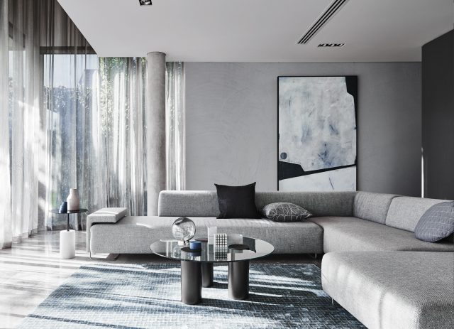
The textural theme continues with the ‘Construct’ palette which includes inky blues combined with metallic and industrial accents, created with the new Dulux Concrete Effect and Dulux Metallic Effect ranges. “The combination of those deep blues, subtle greys and the rawness found in concrete with splashes of copper offers the perfect components to create understated luxury – a look anyone can achieve,” says Andrea.
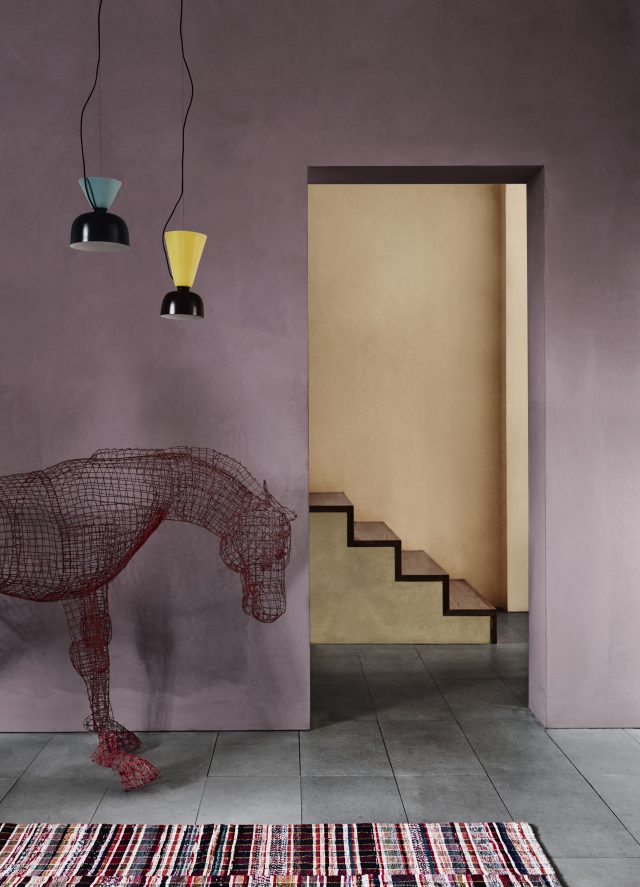
Burnished reds will also feature (a reflection of the new tribal interior trend) and the ‘Entwine’ palette embodies this. “As a result of our research, we are seeing colours such as red, burgundy, brown and oranges being combined with an unexpected twist of zesty yellow or blue, inspired by landscapes from South America to the Middle East,” says Andrea.
Possibly my favourite of the palettes, ‘Chroma’ takes inspiration from the Memphis and Bauhaus movements and is a riot of colour featuring peach, melon, yellow and teal. “Use colour in areas within the home that are high impact. For instance, the entrance where you greet your visitors or the main living space where you spend the majority of time. Even the smallest touch of colour can help personalise your home,” says Andrea.
Photography: Lisa Cohen | Styling: Bree Leech & Heather Nette King
See more online.