Categories
Furniture House Tours Jen's reno Kitchens Shopping

Sofa in the kitchen? Turns out it’s exactly what we needed!

You know they say you should live in a new home for a while before you do anything major? Because it’s only by living in it day to day and seeing how you use the space and how it works for you, that you’ll be informed to make the best decisions. And it’s so true, but let’s face it, we are impatient. Well, I certainly am!

Our L-shaped kitchen/dining has been a sticking point for us for the 3.5 years we’ve lived here. The kitchen part (renovated shortly after we moved in) is possibly my favourite space in the house so that side of the L, we had covered! The dining part however, was tricky! We’ve tried the dining table in two spots: right opposite the kitchen (let’s call that A!) and also further away by the French doors to the deck (let’s call that B!). When the dining table was in spot A, we had a credenza in spot B and vice versa. We finally realised the spot B by the back door was the best dining spot (and three tables later we have the right one!), but the credenza thing wasn’t quite right and mainly because it became a dumping ground for everything without a proper home. And having clutter opposite my beautiful, minimal kitchen? Not cool!

One day I just realised we needed a sofa there. I was thinking about how everyone naturally gravitates to this room when they come over. It has lovely light, the kitchen’s a nice space to be, it’s where the coffee is made and the drinks are poured and, as they say, the kitchen really is the heart of the home these days. But I couldn’t find quite the right one.

Enter Crafted Furniture, who make custom sofas right here in Sydney, and in only six-to-eight weeks, which is amazingly quick for a sofa these days, especially one made to your requirements.

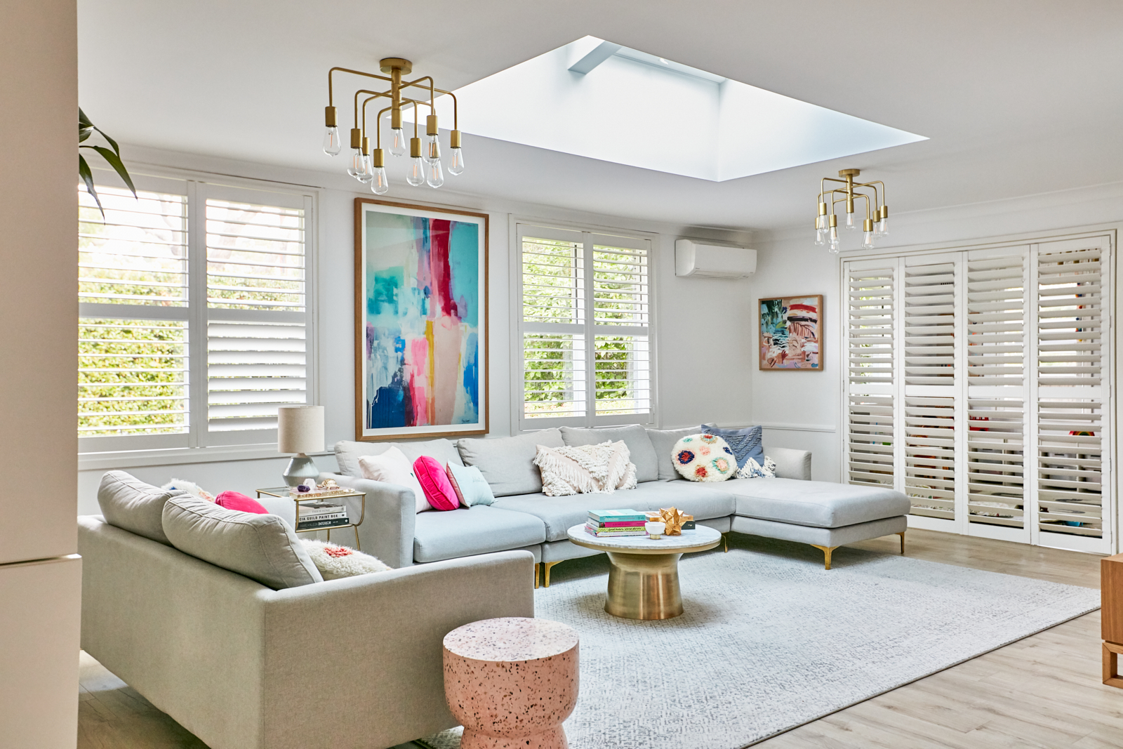
We fell in love with the Slade Slipcover Sofa after having a good browse of their newest showroom in Paddington’s Oxford Street. Its clean lines (love that arm profile!) just made sense to me for the space, it not being a traditional living room. But the plump back cushions mean it’s still super comfy and frankly, the ideal spot for a nap! So, the sofa choice was pretty easy. The trickiest part was the colour because we could really have whatever we wanted.

I’m so glad that I went against my ‘play it safe’ tendancies to choose this gorgeous blue, because I would normally go for grey or my favourite navy (but I felt the latter would dominate the space too much). Speaking of which, I didn’t want the sofa to protrude out into the space, which is a thoroughfare to the dining table, too much, and I’m talking about the way the space felt, as well as the actual physical space. So we asked for ours to be made 10cm shallower than this model would usually be. It still looks beautifully generous but it fits the space perfectly. We had more space to play with but I feel it would have felt too overbearing had we not made this small change. The length was easy: I just wanted about 30cm of breathing space at either end.

Another prerequisite was removable covers, like we have in the living room and have proven to be a godsend, especially in a room where food is allowed (by default!). This linen and cotton slipcover lifts clean off and can be machine washed on cool but personally, I’ll be getting it dry cleaned when I need to.

The showroom experience was really enjoyable and helpful. They didn’t even mind our two little terrors running around! I think when you’re investing in a quality sofa it is a good idea to go and sit on it, and when you have the opportunity to make it any size to fit perfectly, and hundreds of fabrics to choose from, it’s great to get some expert advice. We saw lots of fabric samples in store but they then sent us our favourites in the mail so we could see them in the context of our room, against the paint colours etc.

Our kitchen opposite the sofa with laundry beyond

I knew I wanted a large artwork above the new sofa and couldn’t resist a new one from Melbourne artist Kirsten Jackson. We have one of her much more vibrant works in our living room which takes centre stage and always gets so many comments! This is a lot more subtle and I’ve tied it in with the lounge and broken up the blue by adding a couple of soft pink Eadie Lifestyle linen cushions. Then I decided the pink terrazzo stump in the living room looked just perfect here so brought it in. Do you ever do that? ‘Shop’ from what’s already in your home? I highly recommend it!

We are so thrilled with this new seating area in our home. What was just a spot for the credenza (which is now in the hallway so we haven’t lost the drawer storage) now feels like a whole additional room! It is already very well used and many sticky fingerprints have already been spot cleaned off it without any drama. Phew! This area also looks so damn pretty and the colours work so nicely with the kitchen and the art. I also feel so smug that we have finally worked out how to best use this slightly awkward space for our family and visitors!

Now please excuse me while I go and listen to a podcast with a cuppa on my new favourite couch…

Photography by Joe Cheng

Crafted Furniture have a 15% off sale on until the end of the month if you’re in the market for a sofa. Check them out online or visit their showrooms in Paddington, Crows Nest or Castle Hill. You can even arrange a consultation via FaceTime, Skype or Zoom.

The owners of Crafted have over 20 years experience in the furniture business and they proudly make everything here in Australia. An additional benefit of this is you only wait an average six-to-eight weeks for your custom sofa. Crafted also work with The Sofa Project charity to help re-home your old sofa to someone in need.

Disclosure: We received a trade discount on our sofa.

Categories
Bathrooms House Tours Jen's reno

Interiors Addict bathroom reno 2: what I chose and why

There is so much to share about my recent bathroom reno and I couldn’t possibly fit it all into the reveal post, so I’m sharing a little more detail today, with why I chose the things I did and how those decisions have (thankfully!) worked out really well. Phew!

TILES: In some ways, this is the starting point; the blank canvas! In the 2.5 years of saving up and waiting to do the bathroom, I was sure I’d go for a feature patterned floor, therefore keeping the walls simple. And feature floors certainly only got more popular during that time. But when it came to it, because we were knocking the WC and bathroom together and trying to get so much (i.e. separate shower and 1700mm bath) into a still quite small space, I decided it wouldn’t be the best idea. A simpler floor has, I’m sure, given the illusion of more space. And with the other choices I made, I was very conscious of not having too many heroes (hello gold tapware and hardware, solid timber vanity and big tub!).

In my last bathroom, we used subways but I wanted something a bit different as subways are definitely everywhere! I loved the smaller and uneven look of the tiles we chose and the size makes them a bit different to the more popular larger format wall tiles. So although we went for white tiles with white grout, I felt there was enough texture there for it to still look interesting. And I couldn’t love the end result more! Until the grout went in I was a little worried it was looking like a public toilet, and I did question and re-question the decision to have them stacked rather than laid in a brick pattern. But all’s well that ends well! I also almost went for a feature tile in the niche (probably a pastel coloured version of the same tile) but with the brass trim on those, I felt that was enough. Restraint is hard though, let me tell you!

I knew I wanted something matte and simple for the floor and I love these (they’re more greige than grey although the name of them is grey). So far, they’re hiding dirt and a variety of hair colours very well! They also dry quickly which is a consideration with an open shower.

My selections

Floor tile: Noosa Matt Travertine Look Grey tile from TileCloud

Wall tile: Avalon Gloss Large Square White Tile from TileCloud

TILE TRIM: Probably one of the cheapest things in the bathroom, but one that gets a heap of comments and compliments, is the brass tile trim, which I found online. It caused me a fair bit of angst because although chrome would never have worked, it was quite a brave choice and I knew it wouldn’t match perfectly with the tapware. But white wouldn’t have looked half as good! And without a feature tile in the niches, they needed this little je ne sais quoi!

I’m totally okay with the two golds not being exactly the same too!

My selection:

L Angle brass trim from Tile Stone Paver

BATH: I cannot rave enough about this bath! I have always been against squashing a freestanding bath into a small space because I don’t think it looks great visually, not to mention the issue of cleaning behind it. So when I started to see a few of these back-to-wall or D-shape baths on the market I knew straightaway this was my perfect solution! So while it is technically freestanding, it is right up against the wall on one side.

We had a hob bath in my last bathroom which we tiled up the side of and I didn’t like how many right angles there were! Here I love that we have the curve of a freestanding tub without it really being one. It definitely adds to the sense of space as well. And a curve is always a good thing in a room full of squares and rectangles, which a bathroom usually is by default.

So there’s technically still a gap at this end to clean around, but you can’t have it all when you’re working with a tight space!

Regular readers will know I love my baths and have a soak almost every single night, summer or winter! I really wanted to have a decent sized bath if we could manage to fit it. And this one is so deep and amazing! The good thing about a deep bath is that you can lie back against it, without your head being above the top of it. It’s like a bedhead in the bath, if that makes sense! We switched out the waste it came with for a tiger bronze one from Meir to match the taps and shower.

My selection:

Eden Freestanding 1700mm Bath from Highgrove Bathrooms

VANITY: After getting custom blackbutt solid timber vanities from Ingrain Designs in our last bathroom, I didn’t even consider getting the vanity for this room from anywhere else! But while blackbutt is quite a statement, knotty timber, I wanted something more subtle here so we went for reclaimed Tassie oak (more on this in a future blog post).

The clever and stunning handle-free design of the vanity was a very easy choice! And the matching shaving cabinet above is a larger version of what we had in the old place and has so much storage (seriously, we must have increased our storage ten-fold from the old bathroom) it makes me very happy! And yes, all our regular toiletries live in here while only the fancy stuff is allowed in the bath and shoer niches. We’ll see how long this rule lasts…

I knew the timber would warm up the all-white space and work beautifully with the warm tones of the tapware and other hardware. It’s a real showstopper!

My selections:

Vanity: V1 Bathroom Vanity from Ingrain Designs (available in a choice of timbers and sizes)

Mirror cabinet: Mirror Mirror from Ingrain Designs

TAPWARE &  SHOWER: This was one of the easier choices because I’d already used a Meir tiger bronze tap in my kitchen and I love it! And as well as wanting to make the bathroom somewhat consistent with the kitchen, I was always going to choose gold! If you’ve seen the rest of our home, that will be obvious!

My selections:

Meir Tiger Bronze round wall mixers, round combination shower rail, round curved spouts, round toilet roll holder, bath popup waste, square floor grate and robe hooks (instead of towel rails).

TOILET: I’ve never cared much for fancy toilets or putting much thought into which one I’d like, but that changed with this bathroom. Bringing the WC and bathroom together meant, obviously, having a loo in the bathroom. and because space was tight it ended up right next to the bath and there was no space for a nib wall or anything like that to disguise it (although it is behind the door, so when the door’s open and you walk past, you don’t see the toilet).

This wall hung one not only adds to the sense of space, but it is so simple and compact, it just blends in. And you don’t really want to make a feature of your toilet! The white glass flush plate also adds to the streamlined and subtle look. I can’t believe how excited I got about this toilet with its in-wall cistern! Who knew?! And it’s a Philippe Starck collaboration. What more can I say?!

My selection:

Duravit ME by Starck Wall Mounted Toilet from Bathe

Viega Visign white glass flush plate from Bathe

Viega Eco Plus in wall cistern from Bathe

BASIN: I love a lot about this basin, from its generous size to its white ceramic waste (so sleek) to its beautiful and simple curved shape (see above under bath choice regarding curves!). I also learnt from my last bathroom reno that it would be best to right align rather than centre it, giving more useable space to the left side. It’s a large sink (600mm wide) but it works perfectly on the 1200mm vanity. You can’t go wrong with an established brand like Duravit and once I told the staff at Bathe what I was after, they helpfully shortlisted a few for me and it was love at first sight!

My selection:

Duravit Luv Washbowl 600x400mm from Bathe

I have so much more to share about choosing and working with our builder, our electrical choices (mostly fancy lighting!), getting the floorplan right from the start, but I’ll leave it here for today! I hope you find this useful!

This bathroom before & after

More of our home reno

Photography: Jacqui Turk

Categories
Interiors Addict

Behind the scenes of a cover photoshoot at my house!

Sponsored by AGHA Melbourne Gift Fair

I love it when Interiors Addict partners are open to fresh ideas and doing things differently and I recently had the pleasure of working with the Australian Gift & Homewares Association (AGHA) and my favourite photographer Jacqui Turk, when we shot the cover of their AGHA Melbourne Gift Fair catalogue at my house!

I thought styling fair exhibitors’ products in a real home would be a great way to showcase them, and, as the media partner of this year’s fair and a long time partner of AGHA, I thought why not do it at my house?! And that’s how the above picture came to be the cover of the catalogue which is making its way to many of you right now! You can browse it online too.

We had so much great product from exhibitors, we decided to do two separate looks; one in my living room and one in my kitchen, and although we always had high hopes, both turned out even better than expected! The living room shot though, with all its happy colour, just had to be the cover! But we also loved this kitchen shot, which probably features even more products than the other one.

The kitchen shot appears inside the catalogue and on the cover of the buyers guide

I had so much fun styling  a huge variety of things in my home and it was also quite the challenge as they were very varied and we had to make them work with what was already there too. Emma Brennan and Michiko Sukiswan from AGHA also pitched in with suggestions, styling help, much unpacking and packing and providing delicious biscuits which also doubled as great props!

There are a few things that I can tell you about photoshoots! They’re hard work and food and coffee are essential! The finished pictures look so neat and polished, but out of sight there are usually mountains of packgaing (and you’re trying to keep track of what came from which box and what has to be returned to who!). Also out of shot you’ll find lighting to make my living room look like it has the most beautiful natural light (sadly, it does not!) or people holding things up to block too much sun coming through the kitchen window (pesky shadows!). We don’t want to actually show you too much of that and spoil the magic, but you should know that as with most magazine shoots, there is a lot of smoke and mirrors at play!

That’s half the challenge though, and the reward you get from bringing together photos like these!

Are you coming to the Melbourne Gift Fair in under two weeks time? I’d love to see you there at my free Instagram masterclass (more info here). I’ll also be at the fair most of Saturday, chatting to exhibitors and sharing my favourite finds (on Instagram, where else?!).

I’ve seen for myself how many beautiful, on trend products will be available to browse and I’d really encourage to come along and meet the people behind them too.

AGHA Melbourne Gift Fair at the Melbourne Convention & Exhibition Centre (Doors 9-19), 3-to-7 August 2019. Visit melbournegift.com.au for more information.

Categories
Furniture Homewares House Tours Jen's reno

Interiors Addict gets it wrong: Jen’s new living room!

Photography by Jacqui Turk

Yes, even an interiors blogger gets it wrong. In fact, I hope half the reason my blog resonates with you is that I’m not a stylist; I’m an ordinary person who has a bit of an eye for a nice room and what works well together, but no design training and frankly, I often make some real dud decisions before I finally settle on something that works. Lucky I’m only let loose on my own home, right?!

You may recall the story of my disastrous blue master bedroom (please buy your sample pots!), but I also learnt from that experience, finally getting it bang on (if I don’t say myself) with the right navy wall colour and the custom fuchsia velvet headboard which set it off like a dream (pardon the pun).

So today I wanted to share my new and improved living room and the story behind how many things I got wrong before I got it right. And I (and my husband) am finally really happy with this room now. It only took two years (and a bit)…

I’m not going to dwell on before photos for the purpose of this post BUT I have to share just this one to show the true scale of the transformation from when we bought. There’s a reason we called her the nanna house, right?

It’s a big room –almost seven metres long– so filling it was always hard. It felt impossible to start with. I even thought about sticking the dining table in there to fill it but we already had a dining room off the kitchen so it made no sense. Getting the floating shelves installed made a huge difference. But our original, L-shaped modular lounge was all up at one end and the room felt really imbalanced. The worst thing though, was how inappropriate it was for entertaining. One L-shaped lounge with no armchairs is not conducive to conversation at all, and whenever we had people over at least one person would end up on the floor facing the sofa! I mean, it’s not like everyone sits in a line when they’re socialising! And there wasn’t really an obvious place for armchairs.

Eventually we changed that modular for two separate couches. Now, we were right in thinking that we needed a three and a two-seater lounge and we waited so long for them to arrive (as you usually have to with sofas). They were so squishy and comfy but they were huge. And even though they could physically fit, they were too big; both physically and visually. Too much couch! Even though everyone loved them!

The style also wasn’t right for the rest of our house. They were very casual and I have to admit my style is bit more (low key) glam. You know me and my gold accents! We really wanted to love those couches and make them work but sadly, they just kept bugging me (not to mention I couldn’t squeeze behind them to open the shutters).

Of course once we changed the couches to these winners, everything else needed to change too, as is so often the way! These are the Adams from Castlery and they’re amazing value. It’s also possible to create a great number of configurations and the best bit? They were in stock for immediate delivery (they’re currently available for delivery by the end of this month, but obviously stock levels are always changing). None of this 12-to-16-week waiting (which is then often delayed longer in reality)! I couldn’t have done it again! And can we talk about the gold legs? They’re so me! They actually came with a choice of silver, black or brass, which is so simple but can make a huge difference to personalising your couches to your style.

We’re really happy with these couches. We won’t be precious about them because we have kids and because they didn’t cost a fortune, but they’re still a great looking and comfy couch for this stage of our lives. The fact they have removable covers was non-negotiable and within a month of getting them, a friend accidentally spilled red wine on one of the seat cushions at a party. Well, I whipped off the cover, washed it on a cold wash, let it dry overnight and you would never know. I’m sure it won’t be the last time and next time it’ll be a child… I’ll admit it has even crossed my mind that if something really bad happened to the sofa, we could just replace one section…

So yes, you can have a pale grey sofa with brass legs in a family home. Why not?!

The previous rug went brilliantly with the old sofas but looked really bad with these. It was also wool and cotton and let me tell you, natural fibres are not your friend when spills and mess are frequent. While this room looks perfect and spotless in these photos, it isn’t always the case, and this poly rug (The Nile Grey Diamond Ivory Distressed from Miss Amara) is not only soft for the kids to roll around on (and us to sit on with them), food comes off it really easily, usually with no more than a baby wipe! I don’t think this rug looks cheap at all but frankly, $671 for a 3×4 metre rug is a steal! I’ve actually just purchased a smaller sized version for under the dining table, which may be a little too optimistic but we’ll see!

The huge Kirsten Jackson print of course plays a major part in the overall look of this room, and I chose the cushions from Sage x Clare, Langdon Ltd, west elm and Rachel Castle to complement it. The other artworks are by Jasmine Mansbridge, Casey Burrill and Celeste Wrona (sadly out of shot). The coffee and side tables and floor lamp (the tall version of my bedside lamps!) are all west elm. The lights are Beacon Lighting but now discontinued, the floating shelves are BoConcept and the wall colour is Greyology 4 by Haymes.

What I learned from getting this room wrong

  • It’s really important to measure properly for couches. Not just measuring in my opinion, but marking them out on the floor with tape. I think if I’d done this, I would have realised they were going to be too big, both too long and too deep. You can also achieve the same thing by using a to-scale floorplan, even just in pencil.
  • Couches are an important purchase and  they can really set the tone for your living room and therefore the rest of your home. Grey couches with gold feet are so me, and they really work well with the rest of the greys and gold accents in the house.
  • If you let your kids in your living room (and that’s most of us!), then an easy-clean rug is going to make your life a lot less stressful.

What I already knew and had right

  • Start with a neutral base (see grey walls, rug and couches and white shutters) and add colour with art and accessories. In my case, I also tend to add gold accents (sofa legs, lights, decor pieces, coffee and side tables).
  • Sofas with removable, washable covers are a lifesaver with kids (got to say I’ve been responsible for a few coffee spills myself too!).

And if you’re wondering how I keep it so tidy, it’s became the playroom is behind those shutter doors and it is CHAOS. As a side note, I’ve found having a more colourful and bright living room means plastic toys stick out way less!

I feel really happy coming home to this room now. It feels good to have finally got it right, I’ve been much braver with colour than usual and it definitely affects my mood in a positive way, and it’s great when we have people over. I’m also not precious about what’s in it because the things that can get dirty are easy to clean.

I’d love to know what you think and if you have any questions, feel free to ask.

See more of my home.


Categories
Jen's reno

We bought a house!

(The real estate photos originally shared in this post have been removed since we realised how easy it was to Google image search them and discover our exact address!)

Those who follow me on Instagram will have probably worked out by now that we have bought a house but I thought it was about time I actually blogged about it here as I will be sharing the reno journey with you over the coming month and years. Yes, definitely years! This is a long-term family home for us and there is plenty to do!

We have already done some updates (I have zero patience) but for the purposes of this post, I’m starting from the very beginning with the journey as to how we got here. As you can imagine if you know a thing or two about Sydney property prices, it has not been easy!

So, why did we sell our beautiful, two-bedroom apartment with recently renovated bathroom after just a year (I’m still mourning the loss of that bathroom!)? Long story short, it was a good time to sell. Another unit in our block went to auction and we couldn’t believe what it sold for. We knew ours was a better apartment and was likely to go for more and, doing the sums, it looked like we could just (by the skin of our teeth) afford to upgrade to a more long term family home; a standalone house with a yard! The dream! Not to mention the million and one issues we had with our owners’ corporation put us off living in a strata building for life (I could write a series of angry blog posts but that’s not going to help me move on!). We also have a very active toddler and hope to have another one day (no announcement, no!) and while we could have made it work, we knew more space and a yard would make life easier. Not to mention the constant fear of Sebastian managing to climb over the third floor balcony, no matter how safe and careful we were. Terrifying.

So, we sold the apartment for a great price (if you need an agent on Sydney’s Upper North Shore, James Tasker at Di Jones Wahroonga is exceptional) in early December. Happy days!

We started looking for modest three-bedroom houses in the neighbouring suburbs which we knew from our research were just within our reach financially. Then Christmas happened: nothing on the market for weeks. And weeks. When things started coming back online towards the end of January, we kept losing out prior to auction by frustratingly small amounts, but amounts we didn’t have nonetheless. We started to wonder if we had made a bad move selling the apartment as it looked like we might only have the option of buying a bigger, three-bedroom apartment or a townhouse (strata: ugh). The thing was, prices were continuing to go up all the time.

So we decided it was time to look a little further afield (still in Sydney’s north) and finally it seemed we were in with a chance on our budget. The best thing was we could get four bedrooms and a bigger house and yard if we were lucky. And we finally were.

Our “nanna house” (we used this to affectionately nickname her when discussing the other options and it stuck!) was the first house we saw in this suburb. It was packed at the first open. It had, and definitely still does have, a really good vibe and nice flow about it. It had a huge living room and a separate (yet adjoining) family room (which we immediately earmarked for a playroom we could close the door on and not worry about the mess) as well as four bedrooms. As I work from home, the extra bedroom is priceless as an office. We fell for this house, warts and all. We could immediately see ourselves living here.

The house was/is seriously dated. We’re talking original kitchen and bathroom and even the more modern (I use the word loosely) en suite is pretty embarrassing. The exterior is red brick veneer and UGLY. God bless her, this house has absolutely no street appeal. We have about four different kinds of flooring in here including cork! The same lady had lived here since 1989 and had recently, reluctantly (she loved this house) gone into a nursing home.

But we have space, so much space! And it’s peaceful. The back yard is just the right medium size for us, private and full of established trees, shrubs and flowers. The neighbours either side have kids and seem nice. We have several parks in walking distance (although Seb calls the yard a park now!) and a cafe and little shop right on the next corner (winning!). While we had been looking for a three-to-five-year home, we now have ourselves a potentially forever home.

So, there’s a lot wrong with the house aesthetically and it wasn’t exactly a bargain (clearly there’s no such thing in Sydney these days) but it is ours, it is structurally sound, it can last us forever if needs be, we are in and it feels really great to know we aren’t going anywhere for a really long time. I have had enough of moving.

We have hardly any money left and I’m doing deals and calling in favours left, right and centre to get our hideous kitchen ripped out and replaced ASAP (I’ll share more on my vision for the kitchen soon). We’d love to do both bathrooms but we will have to wait a while and save up and learn patience.

So what have we done so far? We have painted throughout (made a couple of errors there which I’ll learn from and blog about!), we’ve carpeted the playroom and bedrooms and recently had plantation shutters installed by our friends at DIY Online Blinds. These things alone have made a big difference. Next up, we’re replacing all the lights. To save on the electrician’s bill we’re replacing the existing pendants with new, more modern ones rather than going for downlights.

I’ve worked out there are a lot of little things (as well as the glaringly obvious like kitchens and bathrooms) which age an older home and will need replacing. These include lights, light switches and power sockets and door handles (maybe even doors!). And the other thing is, each time you fix up one thing, it makes something else look even worse in comparison! Not to mention the boring yet essential things which cost money and don’t make the house look any better at all (air con and termite prevention treatment being just two of them!).

Once we’ve done the kitchen, we can sort out the flooring situation. I have no doubt having the same floor throughout the living areas will make a massive difference. I’m thinking a medium-toned oak laminate of some kind. And longer term there are so many more plans, including an exterior and back yard makeover.

I’m really looking forward to sharing our reno journey with you and hope you’ll like it and learn from it! You can expect me to absolutely keep it real and if there are mistakes along the way I’ll be sharing them too!

Better get back to tightening my belt and working hard so we can afford to pay the mortgage…