
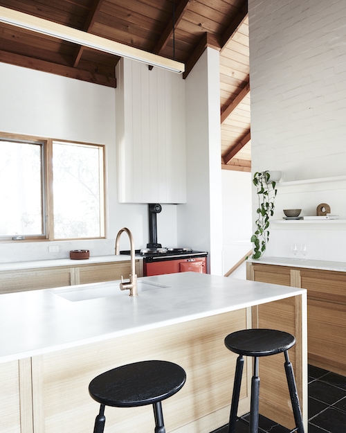
“Whites and pale neutrals might feel like the safe choice, but they might not always be the best choice,” says Andrea Lucena-Orr, Dulux colour and communications manager. And we couldn’t agree more. While white paint is virtually fail-safe, it can be uninteresting which is why we we’re pretty taken with this before and after when it landed in our inbox this week.
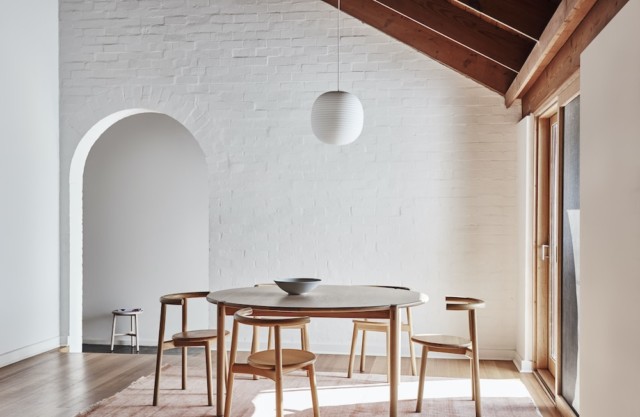
Using a palette drawn from the Dulux Colour Forecast 2021, stylist Bree Leech transformed a neutral 1970s home into one with so much more personality. Oceanic shades, sage green and dusty terracotta all combine to fabulous effect.
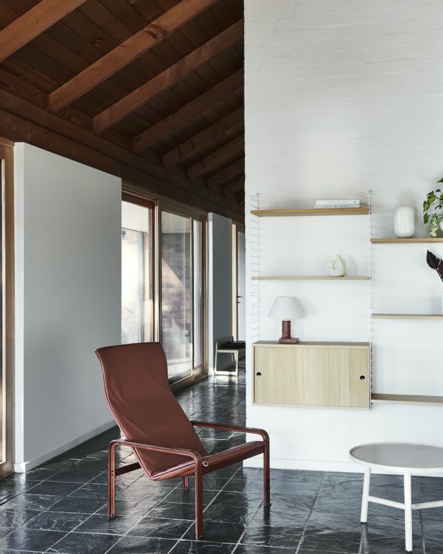
“I wanted to show how you can create an entirely new look with little more than a paintbrush. The colours in the Reset palette have a fun, retro feel that’s perfect for this 70s family home,” says Bree. Luckily for Bree, the home was light-filled and already brimming with character features (a pitched, timber-lined ceiling and arched doorways to name just two) when she commenced the overhaul. “Whilst the all-white interior was neutral and unassuming, adding colour helped highlight the home’s best features and really brought the rooms to life!” says Bree.
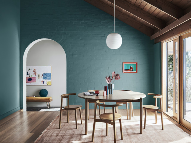
The home’s most dramatic transformation took place in the dining room where Bree chose an uplifting deep blue-green (Dulux Wash&Wear in Daintree) which really elevated the previously white space. “This dramatic hue gives the room a distinct mood and enriches the space. The features of the room, such as the rustic brick wall, archway and timber lining, are all amplified through the use of colour and a backdrop is created to contrast against the crisp white pendant light,” says Bree.
The nearby living room was also given the makeover treatment but in a less bold fashion. Bree chose a gentle tranquil green (Dulux Wash&Wear in Light Ceramic) to highlight the hero of the space – the wall hung shelving unit. She then added a stylish edit of artworks and vessels in tonal shades of peach and terracotta alongside pops of red and green to complement the dining room palette.
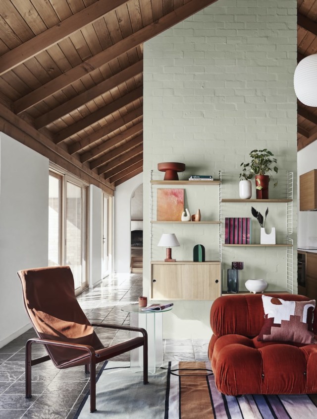
“A plump, vintage velvet sofa adds curves and a touch of retro cool to the space. A patterned rug adds softness underfoot and helps zone the living area in the open-plan space,” says Bree.
Inspired by the home’s original chili red oven, Bree chose Dulux Wash&Wear in Gold Pheasant to imbue the kitchen with warmth. “Painting the feature brick wall in Dulux Wash&Wear Gold Pheasant added that extra warmth I was after without taking away from the best feature – the oven. The accents on this wall didn’t need to contrast, so I painted the shelving to match the wall and added an eclectic display of artwork and vessels in tonal shades,” says Bree who also painted the rangehood a lovely blush colour (Dulux Wash&Wear in Treeless), to soften the contrast between the feature wall and the white paint in the room.
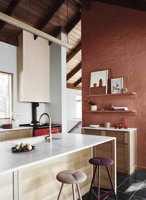
“I completed the look by swapping out the black timber bar stools for seating in aubergine and blush. I chose styles with soft cushioned seats to encourage those in the household to sit, linger and connect in the kitchen.”
Styling: Bree Leech | Photography: Lisa Cohen

One reply on “Before and after: 70s house from neutral to colourful and fun”
Absolutely gorgeous! I love the color scheme. Thanks for sharing.