Categories
Design Interviews RENO ADDICT

Before and after: 70s house from neutral to colourful and fun

“Whites and pale neutrals might feel like the safe choice, but they might not always be the best choice,” says Andrea Lucena-Orr, Dulux colour and communications manager. And we couldn’t agree more. While white paint is virtually fail-safe, it can be uninteresting which is why we we’re pretty taken with this before and after when it landed in our inbox this week.
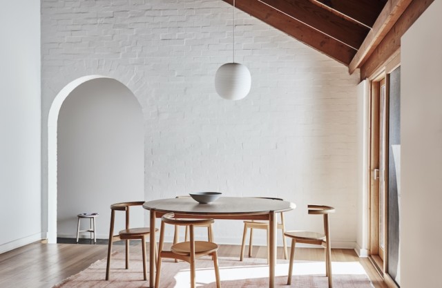
Dining BEFORE
Dining BEFORE

Using a palette drawn from the Dulux Colour Forecast 2021, stylist Bree Leech transformed a neutral 1970s home into one with so much more personality. Oceanic shades, sage green and dusty terracotta all combine to fabulous effect.
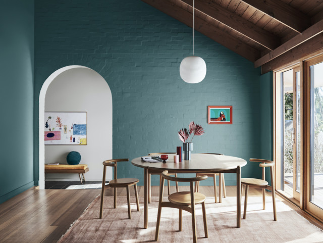
Dining AFTER
Dining AFTER

“I wanted to show how you can create an entirely new look with little more than a paintbrush. The colours in the Reset palette have a fun, retro feel that’s perfect for this 70s family home,” says Bree. Luckily for Bree, the home was light-filled and already brimming with character features (a pitched, timber-lined ceiling and arched doorways to name just two) when she commenced the overhaul. “Whilst the all-white interior was neutral and unassuming, adding colour helped highlight the home’s best features and really brought the rooms to life!” says Bree.

The home’s most dramatic transformation took place in the dining room where Bree chose an uplifting deep blue-green (Dulux Wash&Wear in Daintree) which really elevated the previously white space. “This dramatic hue gives the room a distinct mood and enriches the space. The features of the room, such as the rustic brick wall, archway and timber lining, are all amplified through the use of colour and a backdrop is created to contrast against the crisp white pendant light,” says Bree.

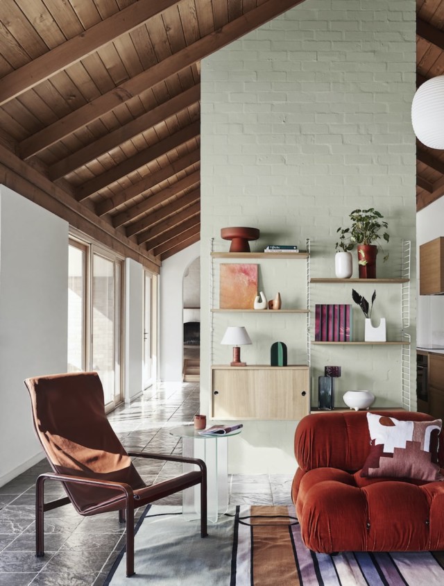
The nearby living room was also given the makeover treatment but in a less bold fashion. Bree chose a gentle tranquil green (Dulux Wash&Wear in Light Ceramic) to highlight the hero of the space – the wall hung shelving unit. She then added a stylish edit of artworks and vessels in tonal shades of peach and terracotta alongside pops of red and green to complement the dining room palette.
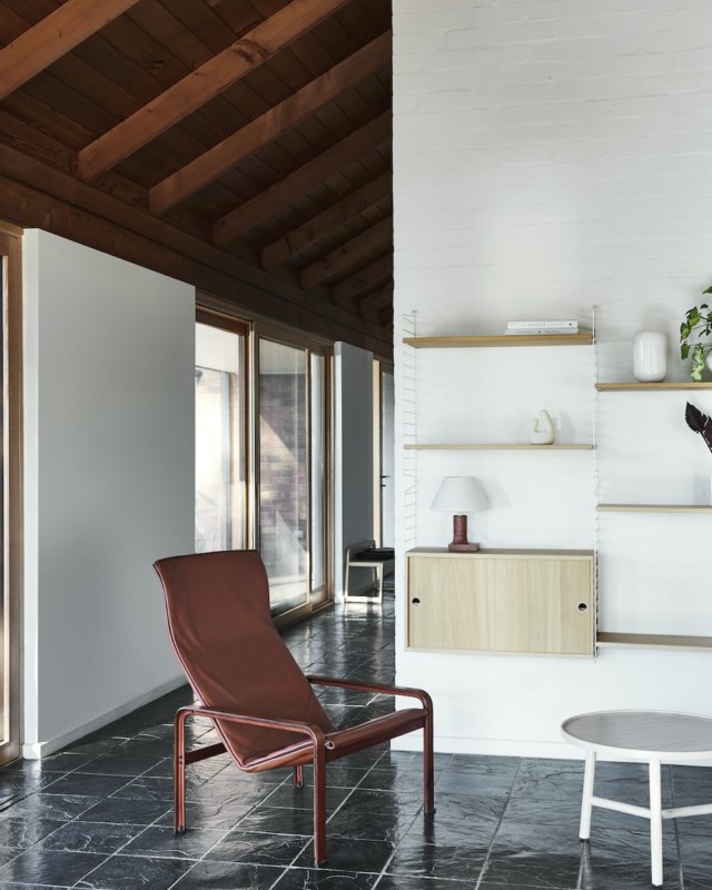
Living room before
Living room BEFORE
living room AFTER
Living room AFTER

“A plump, vintage velvet sofa adds curves and a touch of retro cool to the space. A patterned rug adds softness underfoot and helps zone the living area in the open-plan space,” says Bree.

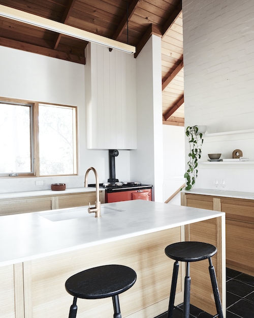
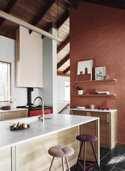
Inspired by the home’s original chili red oven, Bree chose Dulux Wash&Wear in Gold Pheasant to imbue the kitchen with warmth. “Painting the feature brick wall in Dulux Wash&Wear Gold Pheasant added that extra warmth I was after without taking away from the best feature – the oven. The accents on this wall didn’t need to contrast, so I painted the shelving to match the wall and added an eclectic display of artwork and vessels in tonal shades,” says Bree who also painted the rangehood a lovely blush colour (Dulux Wash&Wear in Treeless), to soften the contrast between the feature wall and the white paint in the room.
KITCHEN before
Kitchen BEFORE
Kitchen AFTER
Kitchen AFTER

“I completed the look by swapping out the black timber bar stools for seating in aubergine and blush. I chose styles with soft cushioned seats to encourage those in the household to sit, linger and connect in the kitchen.”

Styling: Bree Leech | Photography: Lisa Cohen

For more

Categories
Furniture Homewares

Create bespoke furniture quickly and easily with Dulux Duramax

Anything that makes DIY easier gets a big tick of approval from me, and Duramax from Dulux not only eliminates hours from the design process, but it enables you to achieve a long-lasting, fade resistant, streak-free finish in only one hour.

duramax 1
Dulux Duramax in Terracotta Chip Gloss and Namadji Gloss from $11.45.

A premium high performance enamel spray paint that provides excellent coverage on wood, metal, and most plastics, Duramax dries 10 times faster than normal spray paint and is available in 29 signature Dulux colours, as well as a wide range of specialty finishes.

duramax
Dulux Duramax in Gogo Blue Gloss and Velvet Violet Gloss from $11.45

Perfect for rejuvenating old furniture and accessories (which is so popular these days!), it is incredibly quick and easy and perfect for a weekend DIY project. “So many of us have old furniture redundantly wasting away in the garage or spare bedroom that can so easily be brought back to life with a spray of colour,” explains Dulux colour expert, Andrea Lucena-Orr. “The only limit is your imagination. Chairs, cabinets, small tables, bedheads, bookshelves, vases, lamp bases, ceramic bowls, metal accessories, pictures frames, wicker baskets – the opportunity to upcycle is endless.”

duramax1
Dulux Duramax in Passionate Blue Gloss, Gogo Blue Gloss and True Blue Gloss from $11.45

Extremely cost-effective and low risk, Duramax allows homeowners to get creative and adventurous with colour, without fear of failure.

Photography by Mike Barker

Categories
Expert Tips

Pastel and tranquil interiors forecast for summer

In their annual colour forecast, Dulux have predicted soft pale pinks and muted mauves will dominate summer and the upcoming New Year.

dulux interiors addict

Having studied design, colour and finishes from around the globe to develop the season’s predictions, Dulux’s summer palette celebrates tonal and pastel hues inspired by the soft glow of a sunset.

Dulux colour expert Andrea Lucena-Orr says these delicate soft tones used with neutral whites are perfect for creating calm and sophisticated spaces. “Key colours for summer are likely to be Dulux Wild Phlox and Dulux Stately Frills with accents in Dulux colours such as Mud Berry and Ellen. Layered fabrics and soft linen accessories will assist in creating a space that is fresh and inviting.”

dulux interiors addict 1

Homeowners looking to make an impact can try an accent wall using a combination of these colours in soft organic shapes. A touch of soft green with the addition of an indoor plant adds a living element, essential for well-being and a connection with nature. Those wanting a more subtle hint of colour in the home
 can try an overall room colour in Dulux Mud Berry offset with a soft white trim such as Dulux Lexicon Half; adding tonal pastel accessories to complete the look

Andrea’s tips for homeowners using colour this summer are: “Be bold and brave – don’t be afraid to use combination 
or contrasting colours together. With paint it’s so simple
 to customise your own space within the home and can be changed seasonally to complement the mood.”

For more colour and painting advice visit Dulux online.

Categories
Expert Tips Interviews Styling

According to Dulux, the future is pink and green!

The future is pink and green! That’s the message according to Dulux, who will release their 2015 forecast later this week. after studying trends from around the world. They’ve shared these images of the Silentshift palette, styled by architects Edwards Moore, exclusively with us.

Styled by Edwards Moore for Dulux

Dulux say pink hues partnered with pastels are set to dominate interiors. There will also be lots of colour on the horizon with bright, bold unexpected blends to more relaxed neutral combinations.

“We are going to see a lot more pink being used daringly as people become adventurous and have fun with colour,” Dulux colour expert Andrea Lucena-Orr said. “You can use a bold pink to create maximum impact or in small quantities to soften a space. Soft mushroom pinks such as Dulux Salmon Grey create a subtle, neutral scheme while a vibrant pink such as Dulux Pink Papaya can really liven up a space.”

But the future isn’t all pink, as Australians look to nature to guide us. 2015 will also be raw and rustic with more earth- inspired influences. Greys will continue to be important going forward. “Natural landscapes, raw elements and minerals, fashion and the connection between digital and rediscovering our offline lives are the most influential factors for 2015,” Andrea said. “Natural colours such as greens and neutrals with green undertones will be pivotal. This includes earthy greens, such as Dulux Grape Leaf and mineral greens, such as Dulux Porpoise Place.”

Styled by Edwards Moore for Dulux

Dulux colour experts study trends from around the world to develop their forecast, attending trade fairs in Europe, studying product and design innovation, colour and finishes and emerging global designers. They source information locally and from overseas, analysing influences such as fashion, media, world events, technology and science, social fundamentals, financial economics and politics.

Based on the trends research, The Dulux 2015 Colour Forecast, Connection, will release four palettes: Wildland, Silentshift, Earthwerks and Modhaus. They collaborated with Edwards Moore and textile designers Bonnie and Neil, under the creative direction of stylists Bree Leech and Heather Nette King, to showcase them.

Bed Edwards of Edwards Moore, said: “Before picking a colour it is important to decide what you are trying to achieve. Think about the overall ambience you want and do not think of colour as flat. In-between spaces such as corridors and circulation spaces between rooms are often overlooked. They act as transition spaces and can add delight, linking spaces in the home.”

Styled by Edwards Moore for Dulux

Above all, homeowners should remember that a fresh coat of paint is a simple and inexpensive way to add colour, personality and create a place where they feel comfortable, inspired and happy. “Colour is amazing! It can highlight items you want to focus on and can camouflage the elements you wish to hide. Colour is so versatile and flexible and can empower a space or provoke a sense of tranquility,” Andrea added. “Colour plays a pivotal role in the home as it helps define the feeling and mood of a space and it so simple to create with a simple painting project.”

Q&A with Ben Edwards and Juliette Moore of Edwards Moore

Why is colour so important?

Colour touches all of us at a basic, even primal level. It creates ambience and mood. The use and skilful handling of colour can make a project. It can create an entirely new environment, either saturated or in small suggestive hits.

What are your sources of inspiration?

Our lives and the world around us. Artists such as Bridget Riley, Damien Hirst, Jackson Pollock and Wassily Kandinsky. Fashion designers such as Gareth Pugh, Victor and Rolf and Iris Van Herpen.

How has online or digital influenced design trends and colours? It has made work more widely accessible, allowing us to draw on influences not only from within our community but from across the globe. It has also enabled us to work more collaboratively.

How can colour be used to complement surrounding furnishings and accessories? Carefully considered colour used in the building fabric can create a dialogue and relationship between spaces, and can be used to support the overall architectural language.

What are the dos and don’ts when it comes to using colour? Do not use colour as a presiding design solution. Do use colour to support the overall conceptual approach to the space. Be adventurous and try unusual combinations.

How can colour change the mood of a room or how you feel? Colour can be extremely emotive. Not just in the better known psychological properties of colours, but also in evoking memories. Similar to sounds and smell, colour can be used to connect to a memory, place or event. The choice of colour therefore is a very personal process.

What do you think is going to the most influential colour in 2015?

Pink! Soft, gentle and delicate pink.

What inspires your creativity?

Our lives, the world around us and everything we see and feel.

How can home owners use these colours in the home?

Before picking a colour it is important to decide what you are trying to achieve. Think about the overall ambience you are trying to achieve and do not think of colour as flat.

What room in the home do you think is ideal for injecting colour? Any room. In between spaces such as corridors and circulation spaces between rooms are often overlooked. They act as transition spaces and can add delight linking spaces in the home.

What is your single favourite colour from the forecast? How would recommend using this colour in the home? Dulux Pink Marble. Use this colour with more neutral natural whites and soft tones to delicately shift ambience and create calm sophisticated spaces.

Find out more on the Dulux website.