Categories
Before & Afters Design Expert Tips Interiors Addict Interviews Real Renos RENO ADDICT Styling

Before & after: Stylist shares how she made over rental home

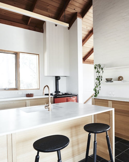
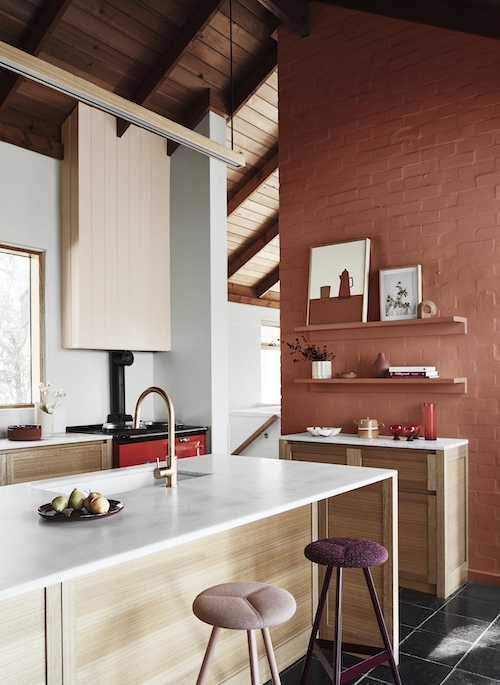
We’re massive proponents of colour around here, and today’s before and after is a great reminder of just how transformative it can be. It’s the work of Dulux trend forecaster and stylist Bree Leech who, bored with her rental pad, decided to overhaul it with a few clever tricks and plenty of joyful colour.

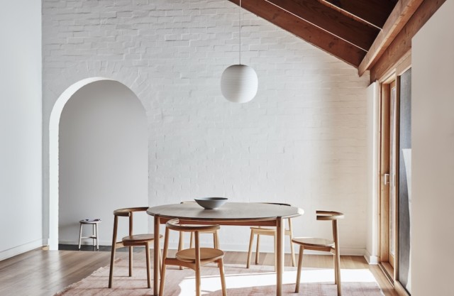
“Our dining room had a feature that didn’t work for us, and I’d wanted to fix for some time! It was a neutral space that had a cut-out in the wall so you could look through to the adjoining room. The cut-out feature was serving no real purpose and the dining area itself just felt a bit flat,” says Bree. 

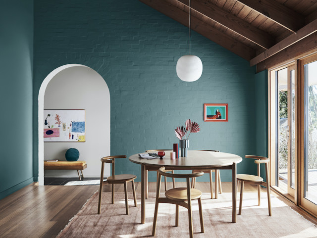
Seeking a happier more inviting space, Bree got her hands on some fluted panels to cover the cut-out feature before painting them in Dulux ‘Harmonious’ which she selected from the brand’s Wonder palette, part of its latest trend forecast. “I chose colours from the Wonder palette for this space as they best represent my personal style. The palette is fun and joyful – everything I wanted for this room.”

Dulux
A stripe rug from Halcyon Lake brought another fun element into the space

The stylist then selected some new timber chairs and painted them with Dulux Aquanamel paint in ‘Plunder’ before adding a rug and lots of colourful objects and vessels filled with flowers. “It’s really helped bring the space to life and is now somewhere the whole family enjoys spending time,” says Bree.

Dulux

Bree’s top styling tips

  • When it comes to scheming, going bold with colour can really pay off but equally, small changes can make a big difference. If you want to introduce smaller pops of colour, choose furniture items or highlight small areas of a wall, door or even your ceiling.
  • Remember, colour is not just for walls! Painting dining chairs or a table is also a great way to achieve this look whilst renting. Add artwork that references your colour scheme to bring it all together.
  • When selecting colours, always have an overall mood or style in mind and select colours that help bring this idea to life. It’s helpful to have a visual you can refer to like a mood board, materials board or a Pinterest board. This helps keep your colour scheme cohesive and gives you a reference point to work out your proportions as this can dramatically change the mood of the space. 
  • Working with existing fittings and fixtures can often mean a clash in colourways. While you may not be able to pull up the carpet or replace the kitchen benchtop, you can always add rugs for a tonal effect to get you closer to your desired palette.
Dulux
Bree’s shelves are bursting with colour

Photographer: Mike Baker | Stylist: Bree Leech | Colours: Dulux Harmonious (wall panel) and Dulux Plunder (chairs) | Suppliers: Wall panel – Surround by Laminex and rug – Halcyon Lake

For more

Categories
Design Interviews RENO ADDICT

Before and after: 70s house from neutral to colourful and fun

“Whites and pale neutrals might feel like the safe choice, but they might not always be the best choice,” says Andrea Lucena-Orr, Dulux colour and communications manager. And we couldn’t agree more. While white paint is virtually fail-safe, it can be uninteresting which is why we we’re pretty taken with this before and after when it landed in our inbox this week.

Dining BEFORE
Dining BEFORE

Using a palette drawn from the Dulux Colour Forecast 2021, stylist Bree Leech transformed a neutral 1970s home into one with so much more personality. Oceanic shades, sage green and dusty terracotta all combine to fabulous effect.

Dining AFTER
Dining AFTER

“I wanted to show how you can create an entirely new look with little more than a paintbrush. The colours in the Reset palette have a fun, retro feel that’s perfect for this 70s family home,” says Bree. Luckily for Bree, the home was light-filled and already brimming with character features (a pitched, timber-lined ceiling and arched doorways to name just two) when she commenced the overhaul. “Whilst the all-white interior was neutral and unassuming, adding colour helped highlight the home’s best features and really brought the rooms to life!” says Bree.

The home’s most dramatic transformation took place in the dining room where Bree chose an uplifting deep blue-green (Dulux Wash&Wear in Daintree) which really elevated the previously white space. “This dramatic hue gives the room a distinct mood and enriches the space. The features of the room, such as the rustic brick wall, archway and timber lining, are all amplified through the use of colour and a backdrop is created to contrast against the crisp white pendant light,” says Bree.

The nearby living room was also given the makeover treatment but in a less bold fashion. Bree chose a gentle tranquil green (Dulux Wash&Wear in Light Ceramic) to highlight the hero of the space – the wall hung shelving unit. She then added a stylish edit of artworks and vessels in tonal shades of peach and terracotta alongside pops of red and green to complement the dining room palette.

Living room before
Living room BEFORE
living room AFTER
Living room AFTER

“A plump, vintage velvet sofa adds curves and a touch of retro cool to the space. A patterned rug adds softness underfoot and helps zone the living area in the open-plan space,” says Bree.

Inspired by the home’s original chili red oven, Bree chose Dulux Wash&Wear in Gold Pheasant to imbue the kitchen with warmth. “Painting the feature brick wall in Dulux Wash&Wear Gold Pheasant added that extra warmth I was after without taking away from the best feature – the oven. The accents on this wall didn’t need to contrast, so I painted the shelving to match the wall and added an eclectic display of artwork and vessels in tonal shades,” says Bree who also painted the rangehood a lovely blush colour (Dulux Wash&Wear in Treeless), to soften the contrast between the feature wall and the white paint in the room.

KITCHEN before
Kitchen BEFORE
Kitchen AFTER
Kitchen AFTER

“I completed the look by swapping out the black timber bar stools for seating in aubergine and blush. I chose styles with soft cushioned seats to encourage those in the household to sit, linger and connect in the kitchen.”

Styling: Bree Leech | Photography: Lisa Cohen

For more

Categories
Expert Tips Interviews Kids Rooms

2020 trends: Warm neutral paint colours are back!

After a decade where cool paint tones reigned supreme, warm neutrals are back on-trend if the latest from Dulux is anything to go by. The work of stylist Bree Leach, a bland white child’s room was imbued with gorgeous warmth courtesy of Dulux ‘Pancake Mix,’ a biscuity, putty-like clay tone that completely transforms the space.

Part of the paint brand’s ‘Grounded’ palette (one of four trend palettes identified in the 2020 Dulux Colour Forecast ‘Essence’), the palette combines warm biscuit tones derived from nature with touches of muted coral, mauve and gold for a contemporary edge. Who would have thought that such warm tones could look so modern?

BEFORE
BEFORE

AFTER
AFTER: The ‘Grounded’ palette is versatile enough to work in a girl or boy’s room

“We’ve seen a much more tonal palette coming through this year. The bold colour contrasts of previous years have made way for subtle layering of natural hues. Depth is added through texture and materiality,” says Andrea Lucena-Orr, Dulux colour and communications manager.

While the original room was fairly monochrome, it did have great features for Bree to work with including a high ceiling, solid timber floor, French doors, plenty of natural light and a striking brick fireplace. The colour palette was less than optimal however; all-white, it was fairly uninviting which is not exactly the vibe that you want in a child’s room!

BEFORE
BEFORE

AFTER
AFTER. That pretty lavender paint colour offsets the warmth in the room, keeping the look rather modern.

“I wanted to add warmth and personality to the space so that its little occupant would enjoy spending time here. I aimed to highlight the room’s best features, detract from the less appealing ones, and spend next to nothing,” says Bree who kept the budget in check by retaining key furniture pieces such as the room’s toddler bed (with timber detailing), and the curvy armchair and ottoman.

AFTER
AFTER: Don’t add too much clutter to a child’s room, particularly if it’s small, as you want to give them space to relax and play.

“When you’re choosing a palette, it’s best to start with one main colour, which you can use across large expanses, such as walls, then a supporting hue and one or two accents,” says Bree.

The room’s existing warm white (Dulux Wash&Wear in Natural White) was retained for the fireplace and ceiling but Bree chose a soft clay (Dulux Wash&Wear in Pancake Mix) for the walls as a feature, to tie in with the warmth of the timber floor and the detailing on the bed. A muted lavender (Dulux Wash&Wear in Hint of Lavender) was chosen for the new door on the fireplace opening, and Bree added touches of coral in the bedding.

AFTER

“We made the bed the hero of the room by piling it high with comfy pillows and using bedlinen in shades of grey and coral. An inexpensive rug adds softness underfoot – its round shape echoes the curves in the furniture. To accentuate the fabulous fireplace, we kept it white to subtly contrast with the walls.”

Styling: Bree Leech | Photography: Lisa Cohen

For more on Dulux | Australian bathroom trends: February 2020 edition

Categories
Expert Tips

Dulux colour forecast 2020: Restrained, nature-inspired

It’s hard to believe that we’re looking at the 2020 trend forecasts already but the Dulux one hit our inboxes recently and it’s a beauty. The result of extensive trend research by the brand’s colour and communications manager Andrea Lucena-Orr and stylist Bree Leech, the nature-inspired palette draws on our desire to escape the digital onslaught and reconnect with the natural world – botanical, mineral and oceanic.

“These colour trends are influenced by what’s happening in the world around us. With more focus on mental health, the wellness movement continues to gain momentum, as does an emphasis on natural materiality,” says Andrea of the collection titled ‘Essence’ that consists of four palettes: Comeback, Grounded, Cultivate and Indulge.

Dulux Grounded
The Grounded palette

“Colours for 2020 are more restrained than in previous years. Brights are pulled back and influenced by nature. They appear in smaller doses – think feature walls and details – and are often used tonally as a backdrop for hero furniture pieces. Neutrals are soft and sophisticated, with a gently faded feel that speaks of stillness and calm. Clay, with its warm, earthy appeal, is emerging as a key neutral,” says Andrea.

Comeback
This palette features rich ocean and mineral inspired shades of blue-green, azure and amber alongside warm tones of burgundy, rust and clay. “There’s a lightness and fluidity to the ocean tones in this palette that speak of creativity and adventure, while the warm, earthy shades add cosiness. It’s the ideal backdrop to combine furniture from different eras – from mid-century through to the 1980’s – in elegant and refined shapes,” says Andrea.

Dulux Comeback

The title of the palette, Comeback, reflects a shift in how we view luxury. The current Kondo-esque ‘less is more’ approach is seeing us turn away from cheap, mass-produced pieces to seek out quality and it is often found in recycled and vintage wares.

Dulux Comeback

Dulux Comeback

Grounded
The most neutral of the palettes this one runs from soft grey and biscuit to muddy lavender with a touch of warm coral for opulence.  “We’re seeing a more tonal palette for 2020, and Grounded is a perfect example. It has a soft, neutral feel that creates a sense of relaxation in a space, with gold and coral adding touches of luxe,” says Andrea.

Dulux Grounded

This palette really picks up on the textural, natural materials trend with a view to the positive effects they can have on our mental health – bringing the outside in is key whether it’s growing our own food or cultivating an indoor plant collection.

Dulux Grounded
That lavender tone is rather beautiful within the neutral mix

Cultivate
My favourite of the palettes, Cultivate is a celebration of green with layering of different shades of the the hue looking rather effortless in the inspiration shots. From soft olive and pistachio to forest green it’s a rather sumptuous yet calming look that is offset by tones of plum, curd and chalky blue.

Dulux Cultivate
This scene makes a very solid argument for green on green. So beautiful!

“The colours and textures in Cultivate are easy to work with and have a warmth that really conveys the essence of ‘home.’ They look beautiful paired with raw, mid-tone timbers, natural stone and transparent, coloured glass,” says Andrea.

Dulux Cultivate

Indulge
As the name suggests, this palette brings together a rather decadent array of colours including rich burgundy, eggplant, earthy brown, faded terracotta and soft coral. Mmm.

Dulux Indulge

“This palette is not for the faint-hearted – it’s dramatic and exciting and is guaranteed to add wow factor to a master bedroom, dining room or living room. Pink, a key colour of the last few years, makes an appearance, but in a more neutral tone that’s closer to tan, alongside a warm, dusty rose.”

Dulux Indulge
Faded terracotta and soft coral make a heavenly combination

Dulux Indulge

Photography: Lisa Cohen | Styling: Bree Leech

For more | Australian bathroom trends: August 2019

Categories
Expert Tips Furniture Homewares Interviews Shopping Styling

Stylists Heather Nette King & Bree Leech’s spring picks

When Melbourne stylists Heather Nette King and Bree Leech join forces it’s exciting times indeed. And with the talented duo set to hit west elm’s Bondi store next week (for an exclusive styling session detailed below) we caught up with them in anticipation, where they revealed their favourite styling pieces for spring.

Heather Nette King’s spring picks

Glass Gem LED Table Lamp, $249: “I saw this and thought, my daughter is going to put in a request for this. We visited the Chapel Street store on Sunday and guess who got love eyes and begged me to buy it for her?”

west elm glass gem table lamp

Curva Lacquer Trays, from $44: “If you love all the curves we are seeing in architecture and design, but only want to commit to the trend a little bit, then this is the perfect solution. On trend and functional. Tick!”

west elm curva trays

Shape Studies Vases, from $14: “These vases will look fabulous even when you haven’t bothered buying flowers. They feel kind of earthy, with a nod to the modern mid-century look. I’d buy three, pop them on a shelf, and call it a day.”

west elm shape studies vases

Floating Lines Wall Rack, $149: “I still can’t remember to take bags to the supermarket, or my refillable bottle to work, and I keep misplacing my ear pods after a walk. I’ve a feeling this could be the answer!”

west elm floating lines wall rack

Bree Leech’s spring picks

Pascale Sofa (168cm), $879.95: “Yellow is my FAVE. The Pascale Sofa is delicious and will brighten any living space, putting a smile on your dial as soon as you enter the room.”

west elm pascale sofa

Highline Bench, $599: “The perfect bench for your entry. Sit down on something gorgeous and comfy to take your shoes off.”

west elm highline bench

Raina Cushion Cover, $59: “I love graphic pattern and warm colour together, and this has a Memphis vibe, which is one of my favourite design styles.”

Raina cushion cover west elm

Hourglass Task Table Lamp + USB, $249: “I’d use this elegant stunner to create some ambience in a bedroom or living area.”

Hourglass task table lamp west elm

As for the upcoming workshop, if you’re in Sydney and interested in learning from the two Aussie styling greats (while snacking on a cheese grazing station by Eat & Co and drinking Logan Wines), you can expect to pick up the following useful tips on Wednesday night:

  • How to create perfect, pared-back vignettes that showcase your special pieces.
  • How to understand the storage potential and flexibility offered by dual-purpose furniture items.
  • How to introduce fresh colour and accent pieces that fit into your existing look.
  • How to devise a colour palette suited to your home and taste.
  • How to totally transform your space if you’re looking for a fresh start.

Heather Nette King & Bree Leech styling session
west elm Bondi – 472 Oxford Street, Bondi Junction
Wednesday 28 August, 6:30-8:30pm

Spaces are limited, secure your spot here. Tickets are $15 with all proceeds donated to Starlight Children’s Foundation.

  Shop online | Sage x Clare’s gorgeous new spring ’19 collection

Categories
Bathrooms Styling

What’s your bathroom style? Check out these stylist picks

We love a bit of bathroom inspiration here at Interiors Addict and the latest pics from Reece have given us plenty of that. Styled by leading Australian stylists Jason Grant, Marsha Golemac and Bree Leech, the pics feature beautiful Milli tapware. Whether you’re renovating, would like to, or you’re simply looking for a bit of interiors escapism, these pics are pretty dreamy. But they also pose the question – just what is your bathroom style?

Boho 1

‘Boho’ bathroom styled by Bree Leech

With its casual vibe perfect for coastal locales, the boho trend is one that just simply never dies though thankfully, it does evolve. With the addition of the wood, Armadillo & Co rug, textured stools and potted plants, this bathroom is pretty gorgeous. But as far as inspiration goes, how fabulous is the aqua indoor/outdoor shower recess?!? We love its mid-century patterned concrete too.


unspecified

‘Simple Luxury’ bathroom styled by Marsha Golemac

If understated elegance is your thing the Simple Luxury space, styled by Marsha Golemac, should tick the boxes. The marble splashback and copper mirror are obviously on trend but the featured Milli Pure three-piece tapware set caught our eye with its smooth, subtle curves and pared-back forms. What’s even better is that the tapware is available in rose gold, matte black, chrome and gun metal. Yay!


unspecified-12

‘Neo Classic’ bathroom styled by Jason Grant

Brought to life by super stylist Jason Grant, the Neo Classic bathroom space draws heavily on the masculine, timeless appeal of black and is complemented by the use of the Milli Axon basin mixer. Not only does it have gorgeous, clean lines but the black and chrome colour combo make this a heavenly pairing. This look is so appealing because of its timelessness – it’s a look that’s almost certain to endure and when it comes to something as costly as a bathroom, that can only be a good thing.

unspecified-5

‘Coastal Living’ bathroom styled by Jason Grant

As you’ve no doubt noticed, black tapware is trending in a big way and the Coastal Living bathroom has a lovely, understated monochromatic palette only augmented by the crisp lines of the black Milli Glance basin mixer. Stylish with a capital S!

See here for more.

Categories
Expert Tips Styling

8 tips for using colour and texture in your home this summer

With Dulux having just released their colour trends for summer 2016 (it’s all about earthy tones and muddy pastels), we spoke to Bree Leech, Dulux’s creative consultant and stylist, on how to best style your home this summer.  

dulux summer 1

1. Use combinations that provide some contrast and interest such as warm and cool shades together or light and dark. Try using unexpected mixes of pastel mauves and muddy neutrals.

2. Counterbalance the softness of the hues with striking angles. Inspired by geometric forms introduce these angles through furniture detail, pattern, art or feature wall designs.

3. Dulux’s summer palette, Bio Fragility, celebrates the perfection of imperfections – soften paint lines between colours by creating a rough brushed edge that plays on this trend detail

dulux summer 3

4. Texture is an important element – use cushions with different fabrics or introduce another textural layer to the space with an area rug.

5. Add living things to your home. Feature plants that are curious and provide interest such as cacti, succulents or bromeliads.

dulux summer

6. Always consider the lighting in the space to ensure you are making the most of natural daylight to create a beautiful summer experience.

7. Remember to review existing furnishings to ensure these colours will work with fittings that cannot be changed easily.

8. Look to your surrounding environment and colours in your garden for inspiration.

For more information.

Photography by Lisa Cohen | Styling by Bree Leech and Heather Nette King

Categories
Expert Tips Styling

How a new coat of paint can transform your home this winter

By Bree Leech

It’s important to be adventurous with colours you love — don’t be afraid to use different combinations or contrasting colours together. Paint is so simple to use to customise your own space and can be changed seasonally. Below, we’ve kept key furniture pieces the same and given one room two completely different moods.

8MLuuTWWRpUYmJuWCjy7931oHIfTJXDojl7Kgeljuyo,Rtqzzrba4_qG5IzK7WPpHn6y-mDNYzujkgCwv2ItgIs,Z1E6ieoWQgdLlgKyG_Xaram_AaoaM6s0rlM45eRz3LY
Cool palette

Both quintessentially winter trends derived from Dulux’s Wildland palette, each has its own feel. We’ve simply replaced some feature pieces in the room to tie into the new colour palette for each space; but the message is you can transform your room with paint, keep your main furniture items and choose accessories to suit your new colour scheme with items such as cushions and homewares.

Cool palette (seen above) winter tips:

  • A graphic wall pattern mimics mountainous, icy landscapes; and adds subtle visual interest to the space.
  • Primitive textured furnishings in leather, wool, stone, fur and pale blonde timbers soften the geometric wall pattern and cooler, grey-based colours.

Dark-palette. Bree Leech and Heather Nette King for Dulux Colour Forecast 2015. Photo credit: Mike Baker
Dark palette

Dark palette (seen above) winter tips:

  • Sultry hues help make large spaces feel cosy.
  • Add focal points in lighter colours or warm tones to create depth and intensity.

— Bree Leech is Dulux’s creative consultant and stylist and the host of  StyleLab at Life Instyle, Melbourne.

Photography by Mike Baker | Styling by Bree Leech and Heather Nette King for Dulux Colour Forecast 2015.

Categories
Expert Tips Furniture

How to create the industrial look in your home

With industrial lighting predicted to remain big this year, trend forecaster and interior designer for Brilliant Lighting, Bree Leech, gives us her top tips on how to create the industrial look at home.

brilliant lighting interiors addict
Styling: Bree Leech | Photographer: Mike Baker

  • Create warmth in an industrial-inspired home by knowing the right lighting to choose. Pendant lights that feature glass or metal and shades in simple vintage shapes such as domes or cages are ideal. Alternatively, hang exposed bulbs on simple fabric cords with brass fittings.
  • Combine the old with the new by selecting industrial-inspired pendants with cutting edge globe technology. Hang mismatched pendants in a cluster.
  • Use warmer metals for a wholesome feel and add greenery to freshen and balance the industrial edge.
  • To achieve an industrial look, the complementing decor should feature vintage and rustic finishes, such as exposed or painted brick, polished concrete and recycled timber.
  • Keep colour schemes soft and neutral using white and green, or go for something dramatic and moody by using darker blues and greys. For a more modern vibe, add elements such as simple contemporary furniture pieces.

For more information on Brilliant Lighting’s industrial-look range.

Categories
Furniture

Get the scandi look with these affordable decorative pendants

Having lived in Denmark for the past four months, I’m lucky enough to be in the company of beautiful Scandinavian design on a daily basis. So I can confidently say that the new and affordable Nordic inspired lighting range by Brilliant Lighting is the real deal!

brilliant scandi interiors addict
Bree Leech for Brilliant Lighting. Photography: Mike Baker

Available exclusively through Bunnings Australia, the high quality range features decorative pendants that epitomise the Scandi look through materials such as pale unfinished timber and matt black metal. Using simple, limited palettes in neutral, charcoal, black and white, the lighting retails from the steal of $29.90 to $399.00.

brilliant scandi interiors addict
Bree Leech for Brilliant Lighting. Photography: Mike Baker

The perfect complement for your home, interior designer and trend forecaster Bree Leech says the simple contemporary designs from the range will help bring a little bit of Scandinavia to your household. “The Scandi look is where graphic geometry and clean lines meet organic and relaxed finishes. Modern lighting that combines any of these elements works in the Scandi look. Choose simple large industrial pendants or timber balanced-arm lamp bases with black or white shades. Other options might include single colour or timber finish graphic geometric designs that feature shards, facets, cubes or polygons.”

brilliant scandi interiors addict
Bree Leech for Brilliant Lighting. Photography: Mike Baker

Established more than 25 years 
ago, Brilliant Lighting is committed to innovative design and quality. Acknowledged as an innovator in domestic lighting, it is one of the largest and most respected names in the Australian lighting industry with a range of more than 1500 products. All Brilliant Lighting products come with a 12-month warranty and use the latest LED technology, the most efficient and durable option on the market.

For more information.