Categories
Architecture Design Interiors Addict

The Best of Houzz 2023: Australia’s most popular home designs

The annual Best of Houzz award winners are in for another year recognising the platform’s most talented renovation and design professionals. Voted for by the Houzz community, the annual people’s choice award highlights the designers with the most popular designs and highest ratings. It recognises just 3% of the more than 3 million home professionals and interior and architectural photographers on the Houzz platform. 

LNX Constructions. Photo: Anthony Richardson
Urban Creative Studio’s open plan living and kitchen design was recognised in the awards. Photo: Anthony Richardson

“We are thrilled to highlight the incredibly talented and customer-driven pros from the Houzz community through the Best of Houzz awards. The Best of Houzz awards provide a distinctive mark of credibility for homeowners looking for pros on Houzz. We congratulate all the winners for everything they’ve accomplished in 2022 and look forward to seeing their work and positive reviews in the year ahead,” says Andrew Small, managing director for industry solutions for Houzz.

This home office by Denardi
This beautiful concealed home office by Demardi was another winner in the awards.

The Best of Houzz is awarded annually in three categories – Design, Customer Service and Photography. Design awards honour those whose work was the most popular among the Houzz community while the Customer Service ones are based on several factors including a professional’s overall rating on Houzz and client reviews for projects completed in 2022. Photography badges are awarded to architecture and interior design photographers whose images were the most popular on the platform.

From a modern exterior with layers of mixed materials and finishes by Lindon Homes to a contemporary bathroom with a double walk-in shower by Build Theory, there is plenty of design inspo to be gleaned from the winners list.

Lindon Homes
The exterior of this abode, by Lindon Homes was recognised in the awards.
Design Build by Theory
Build Theory’s popular bathroom design

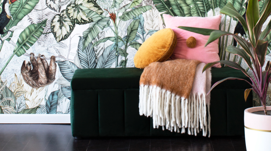
Also recognised was FURNISHD’s bright living space (featuring earthy tones and contrasting textures), a clever home office by Demardi and an outdoor terrace with fireplace and seating area by Swell Homes.

FURNISHD’s very inviting living space. Photo: Dylan James Photography

Urban Creative Studio’s open-plan kitchen and dining area was also acknowledged, as well as a spacious and light-filled laundry room by Tennille Joy Interiors and a modern staircase with a cute nook for the family dog by Rebecca Naughtin Architect.

Rebecca Naughtin Architect's stair design was recognised. Photography: Tatjana Plitt
Rebecca Naughtin Architect’s stair design was recognised too. Photography: Tatjana Plitt

Winners have been announced globally and they can now display a ‘Best of Houzz 2023’ badge on their profiles which helps homeowners identify popular and top-rated home professionals on Houzz locally and around the world. Houzz Pro members can also add the ‘Best of Houzz’ standout tag to their profile, which will appear in their directory listing and improve credibility too.

Swell Homes. Photography: DMax
Swell Homes’ lovely outdoor terrace with fireplace. Photography: DMax
Tennille Joy Interiors
Laundry by Tennille Joy Interiors. Photo: Rachel Winston Photography

Check out all the winners

Categories
Architecture Decorating 101 Design Expert Tips Furniture Interiors Addict Outdoor & Exteriors Styling

2023 outdoor trends: Mediterranean is the new Hamptons

The classic white-washed Hamptons style has long been Aussies’ go-to when building a dream house. This year, however, creative director and founder of Landart, Matt Leacy, predicts that the soft coastal aesthetic of the Mediterranean style will soon overtake it.

“One design influence that’s here to stay is Mediterranean – I would say it is the new Hamptons. While a Mediterranean influence is not new as such, it does continue to grow in popularity globally – and it’s very well suited to the Australian climate and way of life,” Matt said.

“The key is to draw inspiration from the style and to then ensure this marries well with the interiors of properties as well as existing external architecture. The design aesthetic has to work as a whole.”

What does the Mediterranean influence look like in 2023? 

Materials

Matt says to think of natural materials like timber and stone, offset by soft white renders and large sweeping curves around pools and garden beds. Aussies will be keen on a more bespoke, custom-built approach to space with hardwood furniture and linen fabrics. It also incorporates oversized planters, warm mood lighting, multipurpose seating, edible gardens, recycled materials, art pieces/sculptures and cabanas. 

“Natural materials like recycled timber, tea tree sticks, overhead shade structures, floorboards and natural stone all layered with a bit of interest and texture like crazy paving, cobbles and random shape walling that is beautifully offset by soft white renders are what we will see more of this year,” said Matt.

Colour

Colour-wise, the trend leans towards natural, earthy colours, the blues and greens – including strong emerald green. A white-based palette will also become a popular choice that works well as a base to layer natural products such as stone and timber.

Rooftop gardens

Rooftop gardens remain very popular in outdoor spaces. Done right, they’re a beautiful design feature in a garden and such a smart use of space that also has practicalities in terms of water capture and insulation for homes. 

Watering will also be back on the agenda in 2023 after what was a very wet year. La Nina is set to end around the end of February – and Australia is already experiencing a drier start to the year. “All the hand watering habits need to start re-emerging – as we’re finding gardens are drying out very quickly even at the moment when we are still getting some good rainfall. Alternatively, Aussies may opt for some amazing new technology to help keep gardens hydrated when the skies will no longer do it for them. The technology looks at the forecast and automatically irrigates the garden when it is predicted as a non-rainy day. The system can be controlled from a phone – making garden care a much simpler experience.”

Pools

Pools also remain popular, with recent reports revealing they add significant value to properties*. “Pools and outdoor kitchens are quintessentially Australian and two key elements of outdoor spaces that are not so much trend-driven but a prerequisite for most of our design briefs,” said Matt.

The popularity of the plunge pool will be one of the biggest trends in pools in 2023. Along with curves. “We’ll still be seeing more traditional rectangular shapes, and they will always have a place in our landscapes as the shape of the pool is driven by the look and feel that suits the property and the client.” 

When looking at trends for inspiration, homeowners can be influenced, but should not be entirely led by, fashion. “No design style or colour choice should be adopted just because it’s on-trend. It’s important to consider how the look of the moment works within a space and not just blindly follow trends.

“Trends inevitably date. If you can, bringing in a landscape designer to help maximise space, place all the important elements and work on a design style and plants that will thrive in your environment, is a fantastic investment,” Matt says.

For more on Landart

Categories
Architecture Design Designers Interiors Addict Interviews Real Renos RENO ADDICT

Home renovation features unique kitchen for family of foodies

Located in the inner north Melbourne suburb of Brunswick East, this double-fronted weatherboard house is home to a family of four who engaged Dan Gayfer Design to renovate it in a stylish yet understated way.

“The design brief was predominantly concerned with curating an arrangement of spaces and elements that reflected a distinct family lifestyle. As opposed to packing as much as possible into the space available, importance was placed upon facilitating the congregation of family and friends,” says Dan. 

Kitchen and dining
Kitchen and dining

The design focuses on this coming together of people in a comfortable and interactive manner, encouraging both verbal interaction and activities between one another such as games, drawing and cooking. And interestingly, reflecting the idea that big doesn’t always mean better, the family decided against adding a second-story addition. “Refreshingly, the owners were not concerned about spaces that were not relevant to their day-to-day lifestyle such as a TV room, home office, WIR or ensuite; another level simply wasn’t required nor warranted,” says Dan.

Bathroom

A key challenge of the project for Dan, and his colleagues, was ensuring that the renovation wasn’t ‘over-designed’ as the family desired a functional yet simple solution. And although requiring significant refurbishment, the existing front four rooms of the home were retained whilst a fifth room (a bathroom) was also left in its original location. The remaining structure of the building was then removed leaving significant area to play with. “In like situations, one is often inclined to pack everything they can into such a generous area – including a second storey. In response, the addition is single-storied and modest in size with a distinct sloping roof and generous verandah area at the rear; this humble structure embodies the characteristics of mid-century Australian bungalows,” says Dan.

Dining
Dining

Central to the design is the kitchen which is genuinely multi-purpose and acts as a family room, living room and dining counter. It’s a space where family and friends can gather at any time of the day, even outside mealtimes, but the design also reflects the habits of the home’s occupants who are bona fide foodies. “That this family’s lifestyle is so kitchen-centric is no surprise, they are passionate cooks who are happy to cook every meal of the day if time permits,” says Dan.

Kitchen
Kitchen

The kitchen cabinetry was finished in cost-effective laminate – a mix of Laminex ‘Raw Birchply’ and ‘French Cream’ which are integral in giving the home that soft Scandinavian inspired feel. “The faux timber colour, ‘Raw Birchply’, is realistic and is difficult to distinguish from real timber veneer. As such, it could somewhat be viewed as a bargain considering the cost of real timber veneer,” says Dan. In contrast, given their enthusiasm for cooking, the home’s owners splurged on the kitchen’s appliances; a commercial grade rangehood, commercial sized fridge/freezer and heavy-duty double sink with drainer round out the mix.

Kitchen
Kitchen

The kitchen island is an interesting design that promotes conversation – it’s more of a communal table and features a ceramic tile surface, steel edging and custom steel legs. “We are particularly pleased with the outcome for the kitchen, pantry and communal table. The kitchen design reflects not only how the family prepare, cook and serve food but also its tendency to gather and interact during these times.”

Backyard
Backyard

Photography: Dean Bradley

For more on Dan Gayfer Design

Categories
Art Decorating 101 Design Designers Expert Tips Interiors Addict Styling

A hotel suite named after you? Neale Whitaker can now claim this!

Television personality and design aficionado Neale Whitaker, has had a hotel room named after him as part of a styling collaboration. The project came about “by accident” after several years of being allocated to the same room at Melbourne’s Laneways by Ovolo, leading to it being known unofficially as his personal suite.

“It became a bit of a standing joke,” Neale says of his connection to the room, formerly known as 303.

Even this artwork, by Flynn Cowan, features Neale’s face!

“The reason I love this room is because of its corner position, which has amazing windows looking to the most gorgeous tree and old stuccoed wall outside, leading through to views of the rooftops and towers of the CBD,” Neale said.

Working alongside Australian interior design studio Luchetti Krelle, Neale incorporated some of his favourite pieces into the 80s Memphis-inspired Neale Whitaker Suite. “I sourced a whole load of styling items and a few knick-knacks to put into the room, artwork as well, fitting with Luchetti Krelle’s design narrative.”

Sculptural lamp by Sarah Nedovic Gaunt

Guests who reserve the suite can expect to stay amongst a collection of original art, limited edition objects and soft furnishings – each hand selected by Neale – as well as a 100-song Spotify playlist of his favourite tracks. “These are all the things that are incredibly important to me,” Neale says, adding that he wanted to showcase a cross section of Australian artists when curating the room. “There are three big ticket items: a large painting by artist Nunzio Miano, a Sarah Nedovic Gaunt lamp and a portrait by Flynn Cowan.”

Nunzio Miano painting

Nunzio Miano is a Melbourne-based artist whose flamboyant and generous use of colour brings high-octane energy to the scheme. The lamp by Sarah Nedovic Gaunt was the last of the highly sought-after ‘Lady’ collection, similar to a piece which Neale has in his own home. The artwork featuring an illustration of Neale himself, created by former Ovolo staffer Flynn Cowan, leans into Warhol-like themes, using repetition and colour-blocking to bring the room to life.

Book your stay

Neale Whitaker is in collaboration with Laneways hotel by Ovolo Group. For more on Laneways.

Categories
Art Design Homewares Interiors Addict Interviews Shopping

New homewares brand Gigi&Tom like jewellery for the home + win!

After a 25-year career as a retail buyer for David Jones and TK Maxx, Sydney’s Abbie Evans thought the time was right for a career pivot – she was ready to leave corporate life behind and work for herself on a business/passion project. “Home is where my heart has always been, but I felt there was a gap in the market. We’re all about dressing your home with those fabulous final touches,” says Abbie who launched the homewares brand Gigi&Tom at the end of 2021.

Gigi+Tom
Gigi&Tom’s pumpkin chair has been a top seller on the site

Promising to bring your space to life with ‘unique home fashion without the designer price tag,’ the Gigi&Tom collection is comprised of an affordable array of fun pieces that are not essentially functional but more the cherry on the top. “I approach the home as I would a great outfit. At the core you have beautiful timeless basics but you freshen that up each season with trend-driven accessories and that’s where we come in,” says Abbie. 

Gigi and Tom
The Hellenistic range has been a huge hit with customers

Their target customer is often in their first home (rented or purchased), has a keen eye for fashion but doesn’t know how to bring that sense of style into their home. “Our customer is very aesthetically driven. We launched online because our customer lives on Instagram. Our customers have a really strong sense of their own aesthetic and style but often need help translating that at home,” says Abbie who has designed the range around four key trends making it easy for customers to create their own cohesive interior looks. 

Maximalist
The brand’s Maximalist look

The current categories are MaximalistMiami DecoBiophilic and So Cal and you can purchase via category or trend which makes pulling the looks together seamless. Maximalist is all about embracing excess and features lots of jewel tones, layers and luxe textures as well as show stopping furniture while Miami Deco is described as ‘Art Deco with a gelato twist’ and combines beachy chic with retro glam and features a lot of pastel colour pops and bold shapes. 

Miami Deco
The Miami Deco look

Biophilic features organic shapes and is very nature inspired whereas So Cal is inspired by Southern Californian cool which is much more laidback, effortless and eclectic with lots of muted colours and woven textures.

The Biophilic look
The Biophilic look

With overflowing Pinterest boards, Abbie is constantly researching the latest in interior trends and she also attends major trade fairs like Maison & Objet for inspiration too. The design process starts with an array of mood boards that are created by Abbie and then handed over to her purchasing team who work with manufacturers to design and source products in relatively limited runs. “We don’t buy huge numbers of things because our customers want to be unique and they want things that are different to what their friends have,” says Abbie.

So Cal
The So Cal look
In no surprise to us, the brand has captured colour lovers in a major way.

And with prices starting from just $10, the range is very accessible. “We think everyone should be able to have beautiful things without having to pay a designer price.” 

And who are Gigi and Tom anyway? Her fur babies, of course!

Shop GIGI&TOM

Win everything in this picture!

For your chance to win every GIGI&TOM product in the below picture, from the art to the chair to the cushions, side table, candlesticks, bowl and vases (worth almost $900!), complete the form below.

SHOP THE LOOK: Retro inspired occasional armchair in olive | boucle twisted cushion in rust | olio di olivia framed canvas print | citron canvas framed print | rattan side table | wide ribbed ceramic vase | ribbed ceramic vase | Art Deco amber glass candle holder | abstract glass candle holder | orange pillar candle set | lemon ceramic bowl

Categories
Design Designers DIY Expert Tips Interiors Addict Outdoor & Exteriors

How to choose your outdoor paving pattern: 5 options

Summer means most homeowners will be using their backyards more at the moment. To add more value to your home, you may want to create an outdoor paved area, and you may be surprised how DIY-friendly a project it is!

Four-time Melbourne International Flower and Garden Show (MIFGS) gold medallist and TV personality Jason Hodges, explains the many options in laying patterns and shares his top tips for creating the ultimate paved outdoor area for your home.

Jason suggests to first look at your backyard and make an assessment of the lay of the land. An important consideration when creating a backyard is the addition of colour and texture, as it sets the scene for the entire area. “Consider which paving colour will best compliment your existing space by matching them with roof tiles, guttering, bricks or render,” he advises.

Many homeowners choose pavers as they’re easy to install and make great DIY projects. Pavers allow you to get creative with different patterns producing unique focus points for your backyard without breaking the bank. “For variety, style and impact for your home, the flexibility that pavers provide is hard to beat. With any one paver, you can create four to six different paving pattern styles allowing you to find the right match for your home,” explains Jason.

How to pick your paving pattern

The most important element for those looking to DIY their own paving project is that some areas and paving patterns require half pavers to fill gaps, and this involves cutting. “Some paving patterns will require cuts via the use of a brick saw which can be hired from a local hire shop. While the hiring is easy, the operation of the saw requires caution and all of the required safety gear, so take your time or better still, engage the help of a tradesman,” says Jason.

Hot tipIf you are using pavers that will need to be cut, Jason suggests running a border around all of the pavers so that you don’t end up with little pavers on the edge.

1. Stretcher bond

Stretcher bond is the most common paving pattern as it’s super DIY friendly, requires minimal cutting, and leaves little wastage. A traditional pattern that replicates the classic look of brickwork, stretcher bond can also easily hide imperfections in the laying pattern.

2. Stack bond

Stack bond is an excellent choice when paving feature sections such as entertaining areas and patios, where the finished product sets the atmosphere of the space. Stack bond is a great paving pattern choice for large format pavers and can make smaller layouts appear bigger – a great design hack. This pattern is simple to install; however, it can become fiddly as you must lay each paver down by one corner, making sure that all four corners align for a straight stack look.

3. Herringbone

The herringbone pattern is a savvy design choice and is on the rise of making a stylish comeback. To achieve this look, take a smaller-sized paver and interlock the pavers on a 90-degree or 45-degree angle. Herringbone is an eye-catching pattern that will make a great first impression on any space.

4. Basket weave

The basket weave pattern is a design that adds character and dimension while complementing the existing brick surfaces of your home. When picking a paver to style a basket weave, take a close look at the aggregates (exposed coloured stones in your current brickwork), and choose a paver that is complimentary to the aggregate colours. To create a basket weave pattern, simply lay two rectangular pavers the same way each time, swapping in the direction of every “set” of two pavers, and repeat.

5. Mixing colours

Mixing paver colours is a hot new trend. Pavers of different colours and sizes create a modern paved look and also have the bonus ability to hide stains as the colour varies throughout the pattern, making it a fantastic choice for families. 

Watch Jason show you how it’s done!

Jason Hodges is an ambassador for Adbri, one of Australia’s pioneering construction materials and industrial mineral manufacturing companies.

Categories
Decorating 101 Design Expert Tips House Rules Styling

The ultimate guide to designing a modern masculine home

Fact: there’s a fine line between the point where your swanky bachelor pad becomes a full-blown man cave. Rome wasn’t built in a day, and nailing stylish interiors takes time too. The key is not rushing into it, keeping an eye out for cool pieces, observing how rooms look throughout the seasons (and thus different levels of light), and above all, not being afraid to move furniture around and try different arrangements until you land on a configuration and design that works for your specific needs. 

According to Shaye Ford, interior designer at Miss Amara, when it comes to striking a balance between a masculine home that combines great style with a smart and snazzy space, these are the design elements every guy should know about to elevate his domicile.

The colour palette

If you’re looking to go all-out with this modern bachelor pad, then you might want to veer away from the bright side of the spectrum. A dark colour palette often characterises a more masculine space. Black, grey and white are obvious neutral options, but you could also go for rich, bold colours for a dramatic effect. Navy blue, deep violet, and even chocolate brown are safe choices. For accent colours, try warm metallics like copper and bronze. Whether you’re opting for one colour and combining it with lighter and darker tonal shades or using saturated colours with accents of white for high contrast, it’s worth keeping a singular palette in mind for the subsequent accessorising and furniture.

Clean lines

Modern spaces typically incorporate geometric elements, and the best way to do this is to stick to clean lines to maintain a sophisticated aesthetic. If you want to step into something more exciting though, opt for interesting geometric patterns for your furniture, rugs, and wallpaper.

Play with texture

Although keeping it sleek is the best way to approach a bachelor pad, don’t be afraid to add exciting touches via different textures within the same colour palette of your choice. Just remember that less is more, so be careful not to over-design. Bear in mind that very masculine designs can sometimes feel stark and clinical, so balance this by introducing warmth with plenty of texture, wood and layered lighting to add interest. 

Understanding symmetry

Symmetry in interior design is a vital component in a masculine space. Use this approach to create balance and a feeling of tranquillity – perfect for enhancing space in a small living room. The best way to use symmetry in a room is by having an architectural feature as a starting – or centre – point, whether a pair of identical windows or even a living room sofa. However, you can create symmetry in a non-symmetrical space with a pattern, an area rug or simply a living room accent wall.

Define the floor plan

Another handy approach to designing a room is to first consider the floor plan. With the bird’s eye view of the room in mind, it’s easier to consider the importance of statement pieces and how they will fit together. A common mistake in many homes is overcrowding. We’re not necessarily saying all interior plans should be based around minimalism, but if you’ve got a few key pieces of furniture waiting for a room, it’s worth planning the space so that items can be moved around whenever a refresh is required whilst leaving enough room for potential new additions once you’ve had the opportunity to live in the space.

Statement pieces

An area where you’ve got to be careful but is also a crucial part of expressing yourself, investing in a few statement pieces will bring your space to life. Whether it’s a mirror, an ornate table, a home bar trolley, a chair or a dramatic rug, just ensure it doesn’t jar against the room’s colour palette and fits the space.

Purchase the rugs featured above at Miss Amara

Categories
Design Expert Tips Homewares Interiors Addict

Wabi Sabi: How to embrace the art of imperfection at home

Do you ever feel like the perfection of modern interiors and decor can be a little overwhelming? If so, you may find solace in the Japanese philosophy of Wabi Sabi. Wabi Sabi is an art form that releases a need for perfection and encourages us to embrace flaws and seek beauty in the natural aging and decaying of objects and environment. It encourages us to embrace the impermanence of things, and is becoming increasingly popular in the world of interior design.

Photographer: Stephen Kent Johnson. Click for source.

In this article, Jade Bicheno, owner of online store Terra Cruda, explores the concept of Wabi Sabi, and how you can embrace it in your home and your life.

What is Wabi Sabi?

Wabi Sabi is a Japanese lifestyle and design philosophy that celebrates the beauty of raw, unrefined, and imperfect objects. It encourages minimalism and simplicity, emphasising a deep appreciation for the cycle of life. In interior design, Wabi Sabi embraces the use of natural materials and organic shapes in order to create a space that is calming and comforting. This aesthetic is all about accepting the imperfections of life and embracing them as part of the natural beauty of the world.

The history of Wabi Sabi dates back centuries, to the beginning of Zen Buddhism in Japan. The term “wabi” derives from a 16th century poet’s idea that finding joy in simple things was more meaningful than chasing after the material goods of life. This concept eventually evolved into what we now call Wabi Sabi, which celebrates objects and spaces that are naturally aged or have been left untouched.

The philosophy is rooted in appreciation for all things old, worn, and slightly imperfect.

Homewares available online from Terra Cruda

The art of embracing imperfection

From the wrinkles on a loved one’s face to the chipped paint on a wall, there is something comforting about honouring imperfection. Wabi Sabi embraces the beauty in the imperfections of life and nature, celebrating the raw and unrefined elements that make up our everyday lives.

When it comes to our lifestyle and interior design, embracing imperfection is paramount, as it highlights the beauty in things we cannot control. Living with a Wabi Sabi mindset means striving for balance between functionality and nature, and by incorporating imperfection into our homes and lifestyles, we can gain a greater appreciation for life’s little details and cultivate a sense of calm amidst the chaos.

Image: Terra Cruda

How to achieve the Wabi Sabi aesthetic

Through minimalism and thoughtful design, we can create an atmosphere that speaks to the natural chaos of life. This doesn’t mean forgoing aesthetics altogether. On the contrary, Wabi Sabi is all about seeking harmony with what is, rather than seeking refinement.

To achieve this look in interior design and decor, it is important to emphasise minimalism and the natural qualities of each element. Minimalism is key to creating a Wabi Sabi atmosphere, as it allows the focus to be on the natural elements and their unique imperfections, rather than on clutter or items with too much decoration.

When selecting furniture or decor, choose pieces that are made from natural materials such as wood, metal, stone, and clay, as these will bring out the subtle beauty of Wabi Sabi. Look for pieces that have been crafted by hand, as this will allow you to appreciate the little flaws and imperfections that are part of their charm. If you choose pieces with an aged look, it will add to the feeling of authenticity that Wabi Sabi seeks to achieve.

Incorporate plants into your interior design to add a natural touch. Avoid perfection when arranging the furniture: a slightly off-kilter table or chair gives a room character. Incorporate texture by adding woven blankets and throws, leather cushions, and tactile rugs. Keeping colours neutral also helps evoke the serene atmosphere of Wabi Sabi.

Embracing this philosophy requires us to move away from trends and opt for something timeless instead. By combining good quality materials with thoughtful execution and design, you will be able to cultivate an interior environment that is beautiful, serene and sustainable. Wabi Sabi allows us to release judgement and perfection, and instead enjoy living with less and finding beauty in things that often overlooked.

Celebrating the Wabi Sabi concepts of intentional imperfection, at Terra Cruda, Jade sources sustainable products and homewares that stray from refinement. She prefers natural materials, rough textures, blurred lines and broken rules.

Categories
Before & Afters Design Designers House Tours Interiors Addict Real Renos RENO ADDICT

Dated 90’s Port Macquarie home given stylish refresh

Another fabulous ‘before and after’ by interior designer Kathryn Trentini, this 90’s-era Port Macquarie brick and tile home was given a modern makeover recently with excellent results. The initial project brief was simply to renovate the family bathroom alongside the ensuite and refresh the other areas with paint. However, once the work started, the brief soon expanded to include the living spaces, primary bedroom and other soft furnishings throughout such as window treatments, paint throughout and furniture too.

AFTER living room
AFTER living room
BEFORE living room
BEFORE living room

“I didn’t reconfigure any of the spaces. The modernisation of the property really came through an update of the home’s finishes which was done room by room over a 12-month period,” says Kathryn, who eventually assisted with furniture procurement too.

AFTER main bathroom
AFTER main bathroom
BEFORE main bathroom
AFTER main bathroom
AFTER main bathroom

The main bedroom was overhauled with new carpet, a new upholstered bedhead and a fresh fit-out in the walk-in-robe. The nearby ensuite and main bathroom received the makeover treatment too; dated tiles and tapware were replaced with neutral, modern selections. “The owner couldn’t stand the bathrooms and wanted them changed before even moving in. The renovation gathered momentum from there,” says Kathryn.

BEFORE main bedroom
BEFORE main bedroom
AFTER main bedroom
AFTER main bedroom
BEFORE ensuite
BEFORE ensuite
AFTER ensuite
AFTER ensuite

The home’s various lounge and sitting rooms were refreshed also – primarily with wallpaper, paint and fabulous new furniture. “The owners were struggling with what to do with some of the rooms, including the one that I turned into a tech-free sitting room at the front of the house,” says Kathryn.

BEFORE no-tech lounge
BEFORE sitting room
AFTER sitting room
AFTER sitting room. Kathryn persuaded the home’s owners to make this a tech-free space.

After Kathryn thought she had wrapped everything up, she was asked to work on the kitchen as the final piece of the puzzle. “I thought the project was complete, but I was eventually asked to do a part renovation of the kitchen because the owners loved how everything else had turned out,” says Kathryn who worked alongside a cabinet maker to come up with a unique design solution that retained the existing granite benchtops. 

BEFORE kitchen
BEFORE kitchen
AFTER kitchen
AFTER kitchen

“The central point of the kitchen renovation was to save the granite benchtop as the owners liked it, it would have been expensive to install originally, and we weren’t making layout changes. I came up with a colour scheme that allowed the bench top to sing, rather than look horrid,” says Kathryn. The designer noticed a pink vein in the granite and decided to complement it with bronze handles and a terracotta feature tile. The dark cupboard fronts really helped to modernise the space too.

AFTER kitchen

Kathryn also modified some aspects of the joinery to improve functionality whilst only refreshing those parts that were still in good condition. “Whether existing or new, all cabinets received new fronts, new kick and the new splash really did reinvigorate the existing bench,” says Kathryn.

BEFORE lounge
BEFORE lounge
AFTER lounge
AFTER lounge. A Jardan sofa complements a set of Coco Flip coffee tables in this newly tranquil space.

“It’s a lovely property now. The owners are absolutely stoked with the changes and the outcome so it’s just brilliant. They are so proud of the home – you can really tell.”

Photography: Amanda Prior

For more on Trentini Design

Categories
Before & Afters Design House Tours Interiors Addict Interviews Real Renos RENO ADDICT

New bathroom & laundry layout elevates coastal home reno

Located in Kincumber, on the NSW Central Coast, this family home was overhauled recently with the team at Danielle Victoria Design Studio at the helm. Home to a family of four with two young girls, the fresh renovation centred around a couple of key areas – the main living space (comprised of the kitchen, living and dining) as well as the laundry and bathroom.

Kitchen
Kitchen

Inspired by coastal tones and the homeowners’ fresh and modern style, the renovation drew on a textured palette with fresh whites, contemporary finishes and VJ panelled walls taking centre stage. “The removal of a wall in the kitchen and living area was a big transformation. We created more kitchen storage than before by creating an island bench, wall cabinetry and designing a full-height double pantry which is essential for a young family,” says Danielle Bonello-Dunsford, principal designer. Light was maximised further within the kitchen by installing a large skylight and brand new French doors.

Kitchen
“Snowy Mountains Half by Dulux features on the walls,” says Danielle.

And while the kitchen is essentially an all-white affair, depth and interest is added through a variety of textured finishes including bespoke shaker-style cabinetry, Kethy oak pull handles, handmade splashback tiles, and Laminex Demi Round Surround panelling which is hugely effective on the front of the kitchen island bench. 

Copper accents also work to elevate the space with ABI Interior brushed copper tapware and complementary bespoke shelving. “The brackets for the open shelves in the kitchen were a little splurge from Domino Brass. They’re a custom brass finish that will patina beautifully over time,” says Danielle.

Not in the original design scope, the family decided to tackle the bathroom after the initial building works identified damp issues. “We planned quickly and ended up gutting the whole bathroom, which actually helped us achieve a much better floorplan flow and a lot of storage upgrades,” says Danielle who is very proud of the way that the new floorplan for the bathroom and laundry came together. The team shifted walls and repositioned doors to create clever storage and improved flow. 

Bathroom
Bathroom
Bathroom
Bathroom

“We opened the bathroom by stealing space from a WC previously accessed from the laundry. The client didn’t like the separate toilet and the small shower, so it was a no brainer. We brought the toilet into the bathroom, created a floor to ceiling cosmetics cupboard and created a shower nook with stunning jade green tiles,” says Danielle.

Shower
We love the statement tile in the shower

Timber accents run through into the bathroom and laundry too, with Kethy oak knobs, ABI Interior brushed copper tapware and fittings (as in the kitchen) and a bespoke vanity made with Elegant Oak by Laminex. Green tiles, from Surface Gallery, were specified to complement the surrounding greenery.

Laundry
Laundry

And it would seem the client is happy too. “Danielle exceeded our expectations, her eye for detail is incredible. The small touches and details completely transformed our space. We love our new home!” 

Photography: Tim Jones | Styling: Danielle Victoria Design Studio

Categories
Design Designers Interiors Addict RENO ADDICT

Timber moulding trends 2023: Coastal, modern farmhouse & Hamptons

Sponsored by: Intrim

The latest Intrim style series sees us look at three very different homes and the way in which timber mouldings work to create distinct aesthetics in each. First up there’s the 2021 Block contestants Kirsty and Jesse’s Country Coastal abode. Second cab off the rank is Gray & Co’s Modern Farmhouse while design duo Zephyr & Stone’s Modern Hamptons property rounds out the inspiration. From a circular architrave to unique wall battens, these examples feature some of the most beautiful use of timber mouldings that we’ve seen.

Country Coastal
An ongoing project with regular interesting reveals, former Blockheads Kirsty and Jesse have been very busy with their lake house renovation of late. A standout power couple from the 2021 season of the show, their latest project is in fact their own home. A coastal-styled residence, it’s a great one to check out if you’re as fascinated by the ‘before and after’ genre as we are. Intrim skirting boards, architraves, chair rails, VJ boards, handrails and windowsill nosings have all worked in concert to take the renovation to the next level.

Kirsty and Jesse’s Country Coastal home
Kirsty & Jesse

Intrim products used throughout include SK498 skirting boards and architraves, CR45 chair rail, VJ Board Pro 150SN03 sill nosing around the windows and IHR04 handrails.

Modern Farmhouse
Located in the NSW Southern Highlands, interior designer Graham Simmonds’ home walks the fine line between modern and country styling. The owner of Gray and Co, the Sydney interior designer and retailer has created a gorgeously warm feel throughout, in large part due to the judicious use of Intrim mouldings. Featured products include lining boards, wall battens, skirtings boards and architraves.

Gray and Co.'s stunning Southern Highlands holiday home
Gray and Co’s stunning Southern Highlands holiday home
Gray and Co.
A great use of wall battens adds interest
Gray and Co.
The texture of the lining board on the walls makes a subtle statement

Intrim products used include Lining Board LB35 (185mm x 12mm – FSC) in the main bathroom, Wall Batten SK06 (custom 42mm x 12mm) in the bathroom, as well as the skirting boards and architraves SK552 (135mm x 25mm – FSC) and SK552 (90mm x 25mm – FSC).

Modern Hamptons
Gold Coast sister duo Kasia Clarke and Ania Forster, of Zephyr + Stone, have used Intrim Mouldings to create a contemporary take on the Hamptons aesthetic in their latest project. Circle architraves, raised panel wainscoting and large skirting boards add gorgeous character and style.

We especially love the circle architrave which makes a bold statement in the bathroom in the form of a porthole window – a feature that looks fabulous both inside and out. Used throughout the home, wainscoting elevates the home’s white walls for a fresh, modern take on Hamptons style.

Zephyr + Stone project
Chair rail was cleverly used both above and below the wainscoting to give the illusion of extra tall skirting.

Intrim products used: Wainscoting: Chair Rail CR84 and Inlay Mould IN04, Circle Architraves SK466 90mm and Skirting: SK327 185mm.

For more on Intrim

Categories
Architecture Design House Tours Interiors Addict

Wabi Sabi Byron home is full of treasures and perfectly imperfect

Sikata House, one of three properties designed by The Designory team, sits within a quarter acre corner site in Byron Bay’s coveted golden grid, mirroring the sandy warm tones of the surrounding beaches, clifftops and bushlands.

Exuding all the hallmarks of the global travel experience, the home is an exploration of the concept of wabi sabi, the elusive beauty of imperfection, aptly showcased through the use of stunning handcrafted materials, vintage furniture pieces, and treasures sourced from all over the world. 

Set over two storeys, Sikata House comprises four expansive bedrooms, three bathrooms, two living areas, and lushly landscaped outdoor entertaining areas, designed for multiple families or larger groups to reconnect and unwind. 

Entering the front gate, a sense of “home” is evoked as the first room you see is the rumpus, which is the main living area. Floor-to-ceiling glass doors open up to the outdoor areas and pool, providing easy access to indoor, outdoor relaxation. Sheer curtains frame the windows, providing the space with an ethereal quality. “For the rumpus room, I wanted to be able to draw the curtains out of the way during the day or leave them floating in the breeze when the doors are open. The floor-to-ceiling S wave sheer curtain on a curved, motorised track works beautifully, as it allows the curtains to wrap back into the room and opens the space fully to the landscape,” says Melissa Bonney, company director and lead designer at The Designory.

With rest and rejuvenation the main focus for the house, the master bedroom, complete with a master ensuite and private balcony, comprises of a king size four-poster teak bed, set against the natural fibres of the S wave blockout curtain, which complements the neutral aesthetics of the house. “As a busy mum and business owner who doesn’t usually get much sleep, the blockout material is a godsend,” says Melissa.

“Having the option to select custom fabrics for each room allowed us to get creative, matching and complementing textures and tones throughout. For the remaining three bedrooms we’ve chosen blockout roller blinds to create the perfect ambiance for a restful sleep, regardless if it’s day or night.” 

The light-filled home designed specifically for entertaining, also boasts a number of open plan zones and breakout spaces, as well as a perfectly oriented, north-facing alfresco area. The addition of a Luxaflex motorised awning helps keep the sun and heat at bay and maximises the living space while providing a continuous indoor-outdoor transition. With the addition of a heated designer plunge pool alongside an outdoor fire pit, and a BBQ space, the outdoor area can be enjoyed all year round.

Sikata House evokes the rawness of the Australian coastal palette through its carefully curated design elements, creating an ephemeral feeling of beauty that pervades the home and stays with you long after you leave.

Luxaflex window furnishings feature throughout the house, blending perfectly with design elements that depict the Australian coastal palette, through the use of natural materials and textures.

Categories
Bedrooms Design Designers House Tours Interiors Addict The Block

Former Block twins Alisa & Lysandra’s latest project

Former Block twins, and interior designers, Alisa and Lysandra Fraser are back with the second season of their online series The Design Duo. The six-part series is based on a multi-million-dollar newly built home in Queensland’s Paradise Point. It’s just kicked off and it’s a great pervy insight into the sisters’ design process as they curate the bespoke waterfront residence. Today we’re bringing you a few pics of the home’s incredible master bedroom, ensuite and dressing area.

Bedroom
Bedroom
Dressing area
Dressing area

“This is our biggest ever project to date and we couldn’t be happier with the finished product. We have worked on this build for two and a half years and have put our blood, sweat and tears into this project, but seeing the homeowner’s reaction to the finished result made it all worth it – this is what reminds us why we do what we do,” says Lysandra. I think it’s safe to say that we would be pretty thrilled if this was our home too!

Bathroom
Bathroom
Bathroom
Bathroom

A local couple engaged the twins to create a timelessly designed, four-bedroom beachfront home for them and they appear to have nailed the brief. The online series documents the entire build process and gives viewers the opportunity to tune in and discover some of the twins’ best tricks of the trade along the way.

Walk in robe
Inside the master bedroom’s dreamy walk-in-robe
Walk-in-robe
Walk-in-robe

Showcasing the duo’s refined eye for detail, the high-end custom build features bespoke details and luxe fixtures and key suppliers include Reece Bathrooms, Beaumont Tiles, CDK Stone, Godfrey Hirst, Neolith, Taubmans Paint, Zip Tap, PGH, Bradford & Bosch and Luxaflex window coverings.

Alisa and Lysandra Fraser

New episodes will run weekly, and the series is set to wrap up on March 6, 2023.
Tune into The Design Duo.

Categories
Design Homewares Interiors Addict Shopping

New Kmart homewares range one of its best yet!

Kmart is kicking the year off with a bang with its February home range. It features some of its best buys yet which is really saying something. Designed and developed by Kmart’s in-house design and buying team in Melbourne, the collection features a plethora of functional furnishings, on-trend textures and colourful home accent pieces including bedding, occasional chairs, rugs, decorative vases and more.

Kmart’s February home range features these lovely wares

“Our customers are constantly looking for new and affordable ways to refresh and update the spaces within their home and we are proud to be able to bring the latest home and décor trends from across the globe to Australia. This season, it’s about creating gentle, restful nooks within the home, whilst still injecting personality via pops of colour, unique textures and nostalgic shapes and angles,” says Kmart’s divisional merchandise manager Meryn Serong.

Pots
Kmart’s lovely new pot collection
Bedding
There are excellent bedding options too

The range has been created around three key aesthetics (TimelessNatural and Urban) and the prices start from just $5. The Timeless and Natural aesthetics are all about creating calm, cosy spaces and key pieces within those ranges feature ceramics in sculptural waves and curves as well as rattan, blonde timbers and fabrics like boucle and shearling. The Urban collection features black touches as well as bold coloured glassware.

Kmart glassware
We love this coloured glassware

Highlights from the range include the said coloured glassware which comes in $14 sets and provide endless tablescaping opportunities. There are fun new sculptural candles too and the new pot and vase line-up features some stellar designs.

Bathroom
The new towel line-up is pretty gorgeous
Candles
The candle range starts from $5

The brand’s popular DIY offering has been expanded also, reflecting the increasing popularity of upcycling and DIY renovating. Fix-up finds include a new range of statement handles perfect for transforming and elevating existing furniture pieces, as well as an array of versatile wall tiles. 

Lighting
There are plenty of great new lighting options too

Shop online

Categories
Design Designers Expert Tips Homewares Interiors Addict Shopping

How to decorate your rental home in a damage-free way

Renting. Let’s face it – it’s got plenty of challenges, but there’s a certain sense of satisfaction in transforming a blank slate into something that feels cosy and ‘you’. And there are plenty of temporary ways you can style your rental property without running the risk of losing your bond and upsetting your landlord.

A serial renter in Sydney, Sophie Cartwright is a lighting designer and founder of the gorgeous new lighting brand Soffle. Today, she shares her top tips for adding personality to your rental space.

Sophie Cartwright

Use indoor plants to add a fresh feel
Adding greenery into your rental space will give it an instant lift. Choose fake florals to jazz up your coffee table, add herb pots to add a homely feel to your kitchen, and an orchid or eucalyptus plants to reinvigorate your bathroom; an easy and inexpensive way to breathe life into your space.

Create a green corner and take it with you when you move house!

Create wow factor with a statement pendant light
The main light in most rentals usually comes from a pendant light. With so many different affordable styles available, the main ceiling light is a real opportunity to stamp your personal design aesthetic on the space.

As well as providing plenty of lovely lumens, a large pendant light can be a focal point in a lounge, drawing the eye as you enter the room and tying everything together. 

Replace window coverings
Roller blinds or stained old curtains can make a rental feel very run-down. Switching these out for drapes or new curtains is a great way to introduce new colours and patterns into your home. Trial different fabrics and textures to liven up any space. 

Draperly
Photo: Draperly

Use table lamps to introduce colour and texture
When starting to design your space, texture and colour are key ways to put your unique style into a home. As well as providing a lovely layer of warm, atmospheric lighting in a room, well-chosen table lamps can also bring a pop of colour and texture whether they’re on or not!

In the room below, the scallop jute Soffle lampshade paired with a textured base creates a striking look which provides drama and contrast against the neutral backdrop of the room.

Soffle lamp shade

Spend more on versatile furniture pieces
The downside of rentals is that you’re often moving from one to the next, and for this you need versatile furniture pieces that work in any space. Sophie’s top tip is to choose pieces that will work hard for you. Think coffee tables that have heaps of storage, ottomans that can double as toy chests, or sofa sets that work well together or great separately as a sofa and occasional chairs. 

west elm coffee table
A storage coffee table, like this one from West Elm, is a great idea for small spaces.

Create a reading nook with a floor lamp
Floor lamps add height and elegance to a room, and they’re also great for dividing spaces up and creating different zones such as a reading nook. You can make these cosy corners with soft materials and a fabric lampshade, like this reading nook by Sophie, featuring Soffle’s extra-large scallop lampshade. 

We love this Soffle Scallop lamp shade

Change up your lampshade for a quick transformation
Lampshades are an easy, effective, fun (and affordable) way of quickly styling up a room. As well as complementing an existing design theme, they can also be a way of introducing bold new colours, patterns, materials and textures. 

During the summer months, choose bright colours and linen textures to freshen up your look and during the cooler months opt for dark greens, blues and heavy textures to anchor your space and add warmth.

The Soffle scallop lamp shade below, in duck egg blue, sets off the hues for the rest of the room decor below. It creates a lovely, relaxing harmonious vibe while still hogging plenty of limelight for itself.

The brainchild and nickname of founder Sophie, Soffle offers a slice of Australian design that’s committed to doing good. Soffle works in partnership with SolarBuddy, and for every lamp purchased, they’ll donate $5 towards a solar light a child can use to light up their home with brightness and comfort. SolarBuddy works with children all around the world who don’t have access to this much-needed essential.

After trawling the Australian market in vain looking for beautiful, modern and affordable light solutions, Sophie took matters into her own hands. Soffle was created for like minded people who love the sense of warmth and welcome a well placed light can create.  

Shop Soffle online

Categories
Design House Tours Interiors Addict Real Renos RENO ADDICT

Luxury lakeside living on NSW South Coast: A fab reno

The team behind this gorgeous Wollongong Art Deco home renovation is back with a similar makeover on the shores of Lake Conjola on the NSW South Coast. Lumiere Lakes is a stylish three-bedroom holiday home on the water’s edge owned by Zoe and Dane Cartwright of Illawarra’s Projection Build who modelled the design on their permanent residence with Sherson Architecture at the helm.

“We wanted to create the ideal coastal getaway – a place for friends and family to gather and enjoy the beautiful waterfront location. It’s light-filled, calm resort style living and is the dream home away from home,” says Zoe. 

Dining room
Dining room. The walls are painted with Dulux Vivid White and warm engineered timber flooring complements.

The home’s neutral palette and tranquil feel bears more than a passing sartorial nod to cult holiday destinations like Byron Bay’s Raes on Wategos and Brisbane’s The Calile Hotel. “The home features coastal Moroccan elements with modern functionality and each inclusion was chosen to make holiday living effortless and enjoyable,” says Zoe.

Lounge
Lounge

The home sleeps 10 guests across its three bedrooms – there’s a master bedroom with ensuite, another large bedroom and a custom bunk room that features two double beds and two single beds designed to sleep children from two families.

Bedroom
Bedroom
Bunk room
Bunk room

The kitchen features Organic White Caesarstone benchtops, travertine tiles and Navurban Balmoral timber veneer joinery that hides a variety of integrated appliances. The space is also home to a stylish butler’s pantry that is accessed through an elegant arch threshold.

Kitchen
Kitchen
Butler's kitchen
Butler’s pantry

The bathrooms feature Caesarstone benchtops (again in Organic White) as well as timber veneer cupboard fronts (Navurban Balmoral) as well as tiles by Inigo Jones and Co, tapware by ABI Interiors and Bjorn oval mirrors.

Ensuite
Ensuite
Ensuite
Ensuite

Nestled on a long 809 square metre block, the home features a multitude of entertaining spaces including two entertaining decks that step down to the water – a fire pit completes the space and ensures the outdoors can be used year-round. “My favourite feature of the home is the crazy pave floor finish that surrounds the fire pit space that overlooks the manicured reserve and water’s edge of Lake Conjola,” says Zoe of the area that features an outdoor entertaining kitchen too.

The gorgeous deck
The tranquil outdoor entertaining space
Outdoor firepit
Outdoor fire pit

“We wanted somewhere low maintenance that could be easily rented on the holiday property market whilst we weren’t using it. It’s built to entertain and host like a private, secluded waterfront resort.”

Photography: Nat Spadavecia, The Palm Co

Book your stay

Categories
Design Homewares Interiors Addict Kids Rooms Shopping Styling

The best new interior finds for kids + designer chair giveaway!

From bed linen to furniture, there’s always something new to discover within the kids’ interior scene. And this month, not only are we bringing you the latest children’s interior finds but we’ve also got a fabulous giveaway. Il Tutto’s bouclé recliner is the perfect addition to any chic nursery space – scroll down to go into the draw.

Ailanto Design: A collaboration between Amanda Ferragamo and the recently profiled Australian interior designer Keeley Green, Ailanto Design is a purveyor of luxury hand-designed wallpaper, fabrics and homewares for children’s rooms. All of the brand’s whimsical designs are hand-drawn by Amanda who draws on her extensive travels and family life in Italy for artistic inspiration.

Ailanto
Ailanto Design Angkor Wat wallpaper in apricot and Broad Not Bored fabric
Ailanto
Ailanto Design Cottontail wallpaper and Stripe Me Skinny fabric
Ailanto
Ailanto Design Woodland Squirrel fabric wallpaper and Stripe Me Skinny fabric

Il Tutto Paige glider recliner chair in vanilla bouclé: Il Tutto’s popular Paige recliner chair is back but this time it’s wrapped in a luxe, on-trend vanilla bouclé fabric. The chair fully reclines, boasts a high backrest and armrests positioned at the correct height for relief while breast or bottle feeding your baby. The chair retails for $889 but scroll down for your chance to win one for your nursery, or even elsewhere in your home if you don’t have a baby (it sure is stylish enough!).

Il Tutto
Il Tutto Paige chair

Lorena Canals rugs: Available locally from Momy Decor, the Spanish designer Lorena Canals has been a trendsetter in the children’s home decor market ever since she created the washable rug concept. The range is brimming with fabulous designs that are practical, cosy and lightweight so that you can easily move them around.

Momy decor rug
Kaarol washable rug, $428.
Momy Decor rug
Tropical Green washable rug, $438

Linen House Kids: The new range of children’s bedding at Linen House is rather fun and many of the designs are reversible meaning you get two looks for the price of one! With something for every child’s room there’s large spots, hearts, bears and bunnies as well as large, bold checks and more.

Linen House bedding
Roundabout quilt cover set, from $159.99.
Linen House bedding
I Heart You quilt cover set, from $159.99.

Rockabye River play mat: Eco-friendly, biodegradable, certified non-toxic, extra thick, durable, easy clean and waterproof this Australian owned and designed range of play mats are also super cute and fully reversible. 200cm x 140cm. $189.95.

Rockabye River mat
Savannah/Outback play mat
Play mat
Our Journey Home/Reef play mat
Rockabye River playmat
Savannah/Outback play mat

The winner was Kate Bowles from VIC.

Categories
Before & Afters Design House Tours Interiors Addict Interviews Real Renos RENO ADDICT

1980’s arch inspires amazing apartment before and after

When interior designer Kathryn Trentini bought this 1980’s Port Macquarie villa she saw a lot of potential and was particularly inspired by its original archway design. “I loved that the arch was still there, and it really represents that era. I feel like they were trying to be a bit fancy with that arch!” So Kathryn instead focused on this one feature and sought to infuse a modern interpretation of the 80’s aesthetic throughout the renovation.

BEFORE lounge
BEFORE lounge room
AFTER lounge room
AFTER lounge room

One of a row of four red brick villas, Kathryn originally intended to renovate the property and find a long-term tenant but changed her mind when a friend suggested she list it on Airbnb. “It is my first foray into the short-term rental space, and I think we’ve managed to celebrate the best of the original spaces while enhancing the home’s features through contemporary material choices and design ideas,” says Kathryn who has named the home Arthouse Villa in a nod to the beautiful original artworks dotted throughout.

BEFORE bedroom
BEFORE bedroom
AFTER bedroom
AFTER bedroom

There was significant space planning involved, especially in the bathroom and kitchen which were both reconfigured to make much better use of the home’s footprint. “The kitchen was u-shaped and had a tiny ledge on one wall that was completely useless. Even though the room was massive, the kitchen was really lacking,” says Kathryn. It’s certainly true that, compared to the 1980’s, we ask so much more of our kitchens these days and that is reflected in the redesign. 

BEFORE kitchen
BEFORE kitchen
AFTER kitchen
AFTER kitchen
AFTER kitchen

The new galley style kitchen features an integrated fridge, double pantry, oven with combined microwave and dishwasher and it’s also got a mini butler’s pantry where the kettle, toaster and coffee machine are stored. “That’s a great option if you can’t fit a full butler’s and it’s perfect for small apartments or for people that don’t want a whole other space to keep clean,” says Kathryn. One side of the kitchen features tall cabinetry while the other is bench height with an open shelf above. “I loved the idea of being able to display non-kitchen stuff. I see it as an opportunity to add personality,” says Kathryn.

AFTER kitchen
AFTER kitchen

A standout feature, Lo & Co honed marble handles not only link back to the arch but they are super luxe too. “The kitchen finishes are very simple really, but the handles really do add a lovely luxury element that improves the entire aesthetic,” says Kathryn who used them on one wall of cabinets and used an inexpensive painted timber dowel and brass handle on the other.

AFTER handles
AFTER kitchen
BEFORE dining
BEFORE dining
AFTER dining
AFTER dining

The bathroom design was transformed from a classic three-piece set up that included a shower, bath and vanity; Kathryn removed the bath and split the room in half and designed an arch to sit between the two zones. “I wanted something spectacular. Rather than having a vanity with a piece of glass like you would typically see, I was really trying to push myself as a designer. It was costly but it worked out well and the feedback has been great,” says Kathryn.

BEFORE bathroom
BEFORE bathroom
AFTER bathroom
AFTER bathroom
AFTER bathroom
AFTER bathroom. Kathryn sourced the vanity from Reece, wall lights from Beacon, tapware from ABI Interiors and mirror from Bunnings.

“Overall, I’ve had amazing feedback from visitors who say that they really like the unit’s sense of understated luxury. They like that it’s not precious and they feel comfortable here, but it still ticks that luxury box,” says Kathryn.

BEFORE bedroom
BEFORE bedroom
AFTER bedroom
AFTER bedroom

Photographer: Amanda Prior

For more on Trentini Design

Book your stay