Categories
Appliances Kitchens The Block

Interiors Addict TV: Tour Whitney & Andy’s Block kitchen

Sponsored by The Good Guys Kitchens | Video produced by Lauren Ellis of My Picket Fence

The judges said Andy and Whitney’s kitchen was their strongest room to date. Here we get a better look around at its fixtures and fittings.

We love their matte charcoal cabinetry, exposed painted brick and marble effect Silestone island benchtop.

And how about that integrated herb garden? Brilliant or bonkers?!

Book your kitchen design appointment online at kitchens.thegoodguys.com.au or call 1300  764 737.


Categories
Dining House Tours The Block

The Block week 8 dining room and foyer reveals

Well, that was a frustrating night of room reveals! It was definitely not a case of the best room winning if you ask me. In fact, the best two rooms (Dean and Shay’s and Luke and Ebony’s) came last and second from last on account of being unfinished. And I suppose the judges do have to judge on what they see on the night rather than the room’s potential but still! Frustration plus! What did you think?

Nevertheless, in my humble opinion, there were two fantastic (unfinished) rooms and three so-so ones. But the good moments were great!

CARO & KINGI (a close second, 25.5 points)

Shaynna loved the Melbourne wallpaper in the foyer and Neale liked the pale grey palette and the art. They didn’t like the LEDs on the floor. As Darren pointed out, they can look night clubby and cheap. And well, they kind of did! They also, as Shaynna pointed out, highlighted the dust and dirt.

carokingi1

Into the dining room and Neale loved the glass table, saying it preserved the sense of space. Darren thought the chairs were beautiful but sitting on them proved they weren’t comfortable!

carokingi2

Shaynna liked that the table was low and simple, which would draw attention to the terrace later. Darren said it showed being on level one was no disadvantage and the view was still spectacular. Shaynna wasn’t sold on the styling, which was too obviously industrial recycled. And the barnacle urn wasn’t winning any fans!

Sorry guys, I just wasn’t vibing this room, especially the table. And I didn’t like the mirror or the urn either. I just didn’t get it!

Our pick to buy: Melbourne wallpaper

WHITNEY & ANDY (first place, 26 points)

The real timber floors wowed all the judges who could see how much work had gone into them. From then on it was up and down! Shaynna said the placement of the art was too low, the lighting too harsh and that if they were going to use a poster as art they were better off having no art at all!

whitney andy 1

Into the dining room and Darren thought the ceiling was phenomenal, the star. He said the room felt really graphic and elegant and Neale said the table was cool. Shaynna said the table was engaging and Neale thought it was genius. He hated the “styling” though, saying he’d rather see nothing. Similarly, Darren liked the table but hated everything on it!

whitney andy 2

On the plus side, the judges thought they did get all the basics right this week and Shaynna said it was amazing that they finished everything. Personally, I couldn’t get too excited about this space.

Our pick to buy: Ingrain Designs dining table

SUZI & VONNI (last place, 16 points)

Oh dear. These were the first words we heard from the judges. Not the best start! Shaynna was stunned that the girls had gone for marble skirting boards (“What is that?!”) Neale and Darren couldn’t get over the poor finishes, saying they assumed they were aiming for luxury but it had been “shockingly badly done”. The judges weren’t mincing their words last night! Shaynna said the finishes were awful and that the mirror only magnified the lift door.

suzi vonni 2

The judges were perplexed by the orientation of dining table, leaving half the guests with their back to the view. But maybe that didn’t matter being that the huge and low pendant light was blocking most of it anyway!  Shaynna said the poor treatment of  the ceiling, the light fitting and the curtains all shut down the view.

Neale said that with every week, the apartment was feeling more disappointing. “I don’t think this apartment knows what it is anymore.”

suzi vonni 1

They were also underwhelmed by the other styling choices with the metal artwork causing Shaynna to ask for the second time: “What is that?!”

Neale added: “There’s absolutely no subtlety in this apartment. The styling hits you between the eyes, the light is too much and heavy. It feels like they’ve gone out of their way to hide view.”

Oh dear. Thank goodness for that Christian Cole table they won in the challenge! I just didn’t like this room. Sorry girls!

Our pick to buy: Christian Cole dining table

LUKE & EBONY (fourth place, 19 points)

The unpainted Gyprock wall was a bad start and the unfinished paintwork was disappointing. It became even more disappointing when the judges turned the corner into the dining room and saw what had been achieved.

luke ebony 1

“Oh my goodness, it’s magnificent in here,” Neale said. He added it was palatial and every time he walked into this apartment he felt like he was in the penthouse with its luxury of space due to the change in floorplan. “Removing those walls has completely auction-proofed the apartment,” said Darren. Neale said any potential buyer would walk out of the lift and be blown away.

luke ebony 2

Shaynna loved the oval dining table. Neale said that if only they’d finished they would have been team to beat (until they saw Dean and Shay’s apartment next, that is!). He said they were still in really strong position in the competition overall. How far the second chance siblings have come!

I loved the art, the styling and the light and I’m so happy to see these guys getting deservedly great feedback after their dodgy start.

Our pick to buy: Nicky Kriss art print | Black Franklin console (from the foyer)

DEAN & SHAY (third place, 21 points)

This was my favourite without a doubt, let’s forget about whether it was finished or not! This pair had awful luck with the rain delaying their spectacular floor and you had to feel for them.

shay dean 1

In the foyer, Neale absolutely loved the Silestone, timber and metal combo and Darren said it was a bit like the feel Suzi and Vonni had been (unsuccessfully) aiming for. Shaynna didn’t like it at all though! Neale and Darren loved the art choices.

Darren then rightly pointed out that the reason things weren’t finished was the “amazing” floor, which was absolutely beautiful, and they all loved the under floor heating.

Into the dining room and Darren said the styling on the table was totally over the top, theatrical, totally crazy and fantastic! Shaynna couldn’t hold her excitement in saying she loved it and it was the sexiest apartment she’d seen so far. Neale said it had a humour about it too. “I love it.” Shaynna meanwhile was still grinning from ear to ear: “I feel like I’m having a sugar high and my insides are going ‘wow’!” I hear you Shaynna, it was pretty special!

shay dean 2

Neale said it was feeling like the penthouse, they’d kept true to their slightly Scandi look but turned the dial up on the glamour. But he couldn’t ignore the fact that the foyer behind them was, sadly, a disaster.

Our pick to buy: Ben Tovin Design pendant light | Autumn leaves artwork | Pink concrete platter

So which was your favourite? Do you agree with me that the two unfinished rooms were the best? Is it fair that they were scored so low?


Categories
House Tours RENO ADDICT The Block

The Block room reveals week 2: guest bedroom and en suite

I loved the variety in last night’s room reveals. Whether good, bad or ugly, they were all pretty unique. There wasn’t much shock factor in the judging though, with the same couples coming first and last as last week! While Dean and Shay took home a sweet 10 grand again (got to pay for that 40 grand bathroom somehow!), poor Luke and Ebony were in fifth place yet again. I’m really feeling for the second chance siblings and really hope they can  get some confidence in their ability and personal style and take things up a notch next week. Fingers crossed.

Kingi and Caro: 26.5, 2nd place

I think these two are really likeable, don’t you? They’re doing so well and must be frustrating (if encouraging!) to be so close behind Dean and Shay and their $10,000 wins!

carokingi1

This pair stayed consistent with last week’s room, using a vinyl wrap on the en suite door like they did on last week’s showstopping bath tub. And there was more of Kingi’s lovely rendering on the bedroom feature wall and in the en suite vanity top, to great effect. Their raw industrial aesthetic is very obvious and they seem confident of their personal style.

carokingi2

The judges, as hoped, all touched the rendered wall as soon as they came in and all loved the dark, rich colour. Neale loved the bedside table and light combination and Darren said he could really see the vibe they were going for: edgy, urban and a little bit industrial. He said the bedhead was the right choice as it softened the texture of render and the tram graphic on the en suite door worked a treat. Shaynna said it was sensational and that the door handle spelled luxury and money.

Shaynna also complimented the labour and the way they had worked with angles of the room. Neale said they’d made the most of the space and it felt big. They all slammed the styling though and said the cushions were ordinary.

carokingi3

The en suite got positive feedback too with Shaynna noting it felt a lot bigger than it was and she loved the custom concrete top, the taps, basin and bench space. Darren said they’d squeezed more storage into the tiny bathroom than they’d seen in many main bathrooms and that it was a very successful room.

–Our pick to buy: Basic Habitat slate tray | Beacon Lighting adjustable floor lamp | Linen & Moore grey throw | Bedsides

Whitney & Andy: 18.5, 4th place

I loved the exposed whitewashed brick and the copper pendants in this room. The less said about the rest of it the better but I can’t not mention that rug?! Gah!

whitneyandy1

whitneyandy2

On entering, Neale said “wow” and Shaynna said “oooh” but not necessarily for the right reasons! Darren immediately said it was a guest bedroom because there was no way there was enough hanging space for a ‘real’ bedroom. Shaynna went so far as to say the choice to install a hanging stick rather than a wardrobe was ludicrous and while that would usually seem over the top, I have to agree! Neale said it was a big mistake and Darren said he wouldn’t try to sell the place without a wardrobe.

On the plus side, the room felt very spacious (that’ll be the lack of wardrobe!) and Shaynna liked the bulkhead all the way round, saying it showed the thought process was great. Darren liked the bedhead but said the rug was very wrong. Again, agreed! Neale said it was a very confused room. “I don’t know if I’m in an old motel or  a luxury apartment.” Shaynna went one further and called it a mishmash.

whitneyandy3

When it came to the en suite they were pleasantly surprised although the lack of doors would surely lead to flooding the first time the shower was used. Darren said it felt a little eighties.

Overall, the judges’ advice was to put this week’s rooms behind them and refocus. Owch.

–Our pick to buy: Curious Grace bedside tables | artwork | navy quilt cover set

Suzi & Vonni: 23, 3rd place

Despite all manner of tradie troubles, the Gold Coast girls finished their room as they’d hoped this week, with its polarising glass panels covered in a photographic park scene. It was a brave move which was never going to be popular with everyone! I wasn’t a fan myself but you know what, at least it was original!

suzivonni1

First up with his view was Neale, who said the other half of the room was 10 out of 10 but the glass panels freaked him out. Shaynna said the provincial look of the room didn’t go with the glass mural at all, likening it to a corporate mural in a reception centre. Eek! She also hated the plastic timber on the wall, the carpet and the mismatched handles.

suzivonni2

Darren however really loved all of it. “I think it’s cool, as a guest bedroom it’s interesting.” He said the girls’ apartment would definitely be the Palazzo Versace of the building!

Neale said the en suite was lacking in impact but he was relieved! Darren said it was very understated and they all loved the tapware and the layout. Darren was really surprised and disappointed about the unflattering lighting.

suzivonni3

Shaynna, to be fair, said she enjoyed how brave this pair are but they they needed to really rein it in a bit.

–Our pick to buy: The Monocle Guide to Better Living book | studded bedhead | round black concrete tray

Luke and Ebony: 18, last place

Last place last week and last place again this week. My interview with Ebony from before the series started is now starting to make a lot of sense. Despite reining in her plans for an entire feature wall of plum coloured pressed tin (what was she thinking?!) to two small panels, it still didn’t quite work out. Ok, that’s an understatement. I felt so sad for Ebony at the end after the scores were revealed. She’s so nice!

lukeebony1

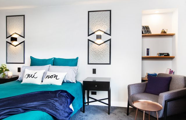
Shaynna’s face! said it all. Darren simply said: “I don’t like it,” while Neale commented: “Pressed tin: haven’t seen that for a while!” Oh dear…

lukeebony2

Neale said he couldn’t imagine why anyone would choose to use that material and while he loved the reading corner in the room, it didn’t go with anything else. Shaynna loved the bedside tables but I fear she may have been grasping at straws.

It didn’t get all that much better in the en suite. It started well with Shaynna praising the layout and Darren, the lighting, underfloor heating and storage. Neale loved the black tapware and said the execution was excellent.

lukeebony3

But they all agreed the tile choices felt dated (I happened to love that floor if not the wall tiles!). Shaynna said the siblings were not bringing out their best at the moment and Neale didn’t hold back, saying he didn’t think the room would appeal to anyone.

–Our pick to buy: Oui and Non cushion covers | Hugo armchair | Single drawer black bedside table

Dean & Shay: 27.5, first place

These two lived up to their penthouse again this week, winning $10,000 for the second time in a row! It must be really hard for the other couples to keep liking them at this point, even though they do genuinely all seem quite friendly!

deanshay1

Despite their plan for a Megan Morton x Incy Interiors black four-poster bed bein replaced with a backup ensemble, they still killed it! Neale said it felt really fresh and Darren loved it, pointing out the bed dressing, saying it wasn’t easy and they’d got it perfect. Neale said the colour palette was beautiful; a young style delivered in grown up way.

deanshay other side

The only issue was the large (tick!) wardrobe which was hard to open.

deanshay3

The en suite got plenty of ticks too, for the storage, spacious feeling, attention to detail and consistency with last week’s bathroom. Shaynna said they were proving they were the right couple to get the penthouse.

deanshay4

–Our pick to buy: Rainy Sunday flower jars | Curious Grace bedsides | Scent of Home brass candle | Lumiere Art + Co Jessa print (last two bought from Cranmore Home)

***

Did you agree with the judges this week? Which was your favourite?

Last week’s bathroom reveals.