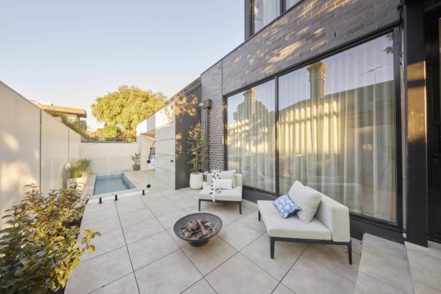
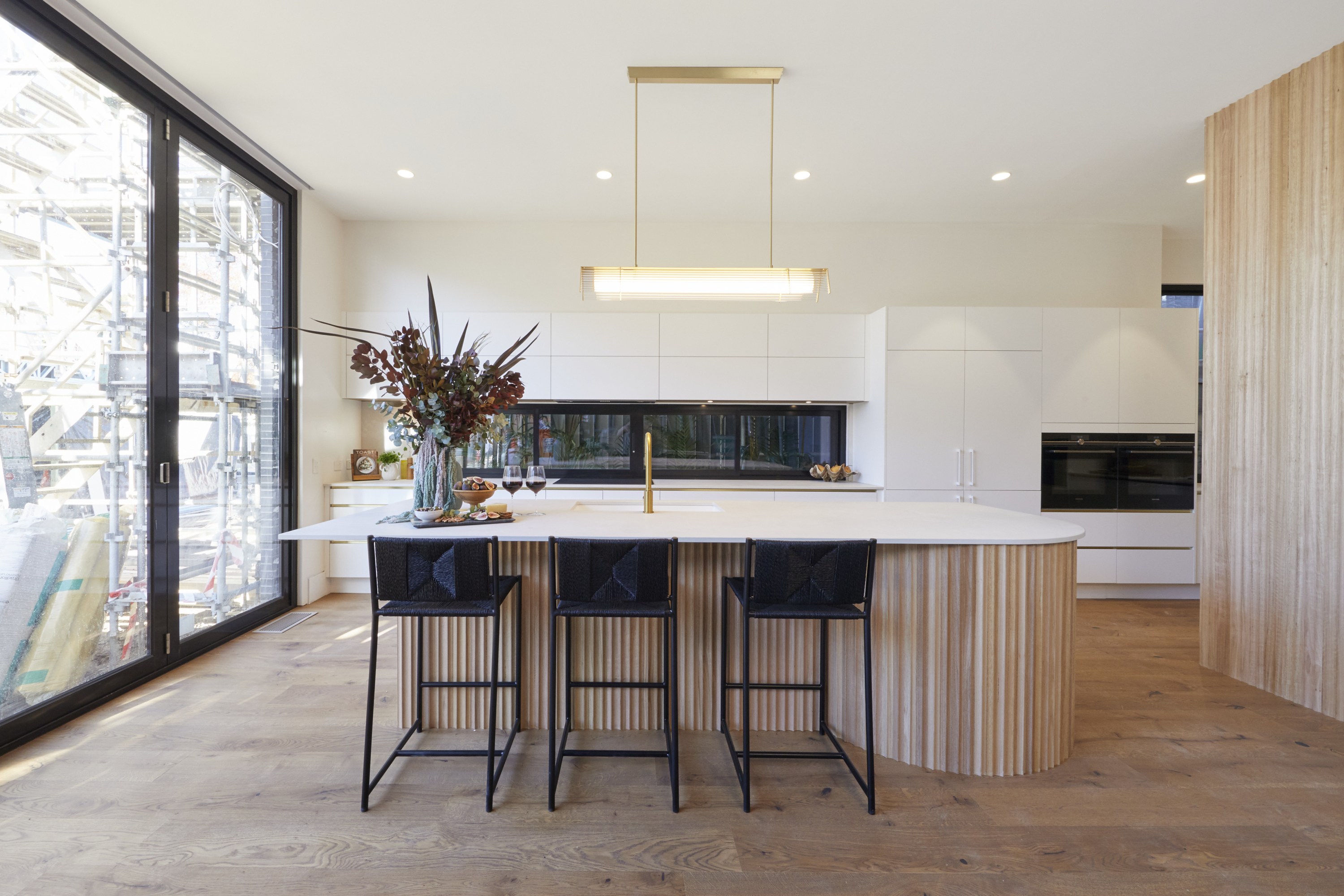
Block host Scotty Cam revealed the latest rooms in his own Tree Change house last night and they were probably a lot less masculine than we expected!
Once again he’s gone all out for a heritage feel but with the best modern comforts. The plan was to present two bathrooms and a bedroom for the resident Block boss, but after loaning his tiling team to Omar and Oz when their tiler came down with covid, he only managed one of each – but what rooms they were!
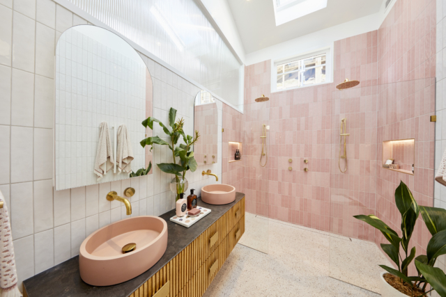
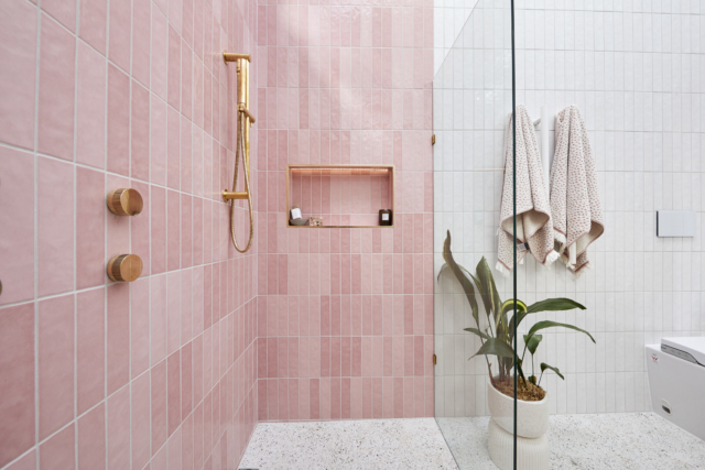
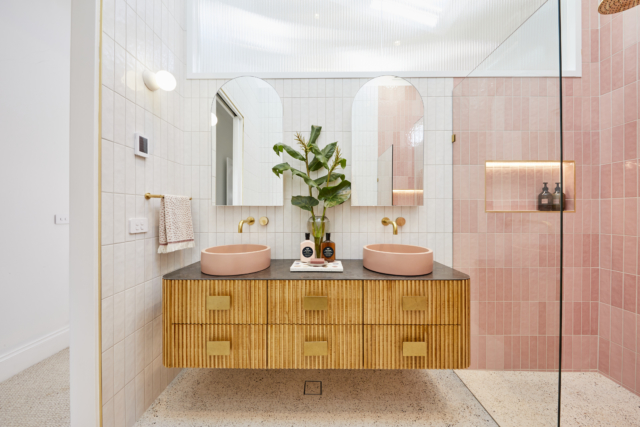
The pink theme was continued into the bathroom and we spotted plenty of items we love in both rooms, so of course we thought we’d link you up if you’re interested in buying too!
We loved the combination of brass, blush pink and rattan across these two rooms.
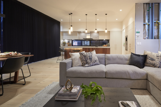
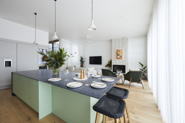
As always, The Block’s kitchen week was a great watch! I absolutely adored Kirsty and Jesse and Ronnie and Georgia’s, which came first and second. But Kirsty and Jesse absolutely deserved the win. Navy, brass and gingham wallpaper? You’re talking my language!
Tanya and Vito’s mid century kitchen was so unique and quirky but it worked! Aesthetically anyway! Mitch and Mark lost major points for having no pantry (other than food drawers) and took it so badly, swearing and declaring their lack of respect for the “out of date” judges. But the judges were absolutely right this time if you ask me. And Josh and Luke’s was very masculine but it ticked all the right boxes.
SECOND: Ronnie & Georgia
Score: 27/30 Spent: $39,396
With a generous layout epitomising simplicity of use, Neale was blown away by Ronnie and Georgia’s kitchen, calling it “impeccable” in style and “the new classic”. Darren agreed, saying the pair had created a control centre for the house that delivers from the ceiling to the floor.
With a huge butler’s pantry featuring high end appliances (but sadly no bin!) and Georgia’s personal “Georgianised” storage solutions to the huge Gaggenau refrigerator (perfectly styled of course), Caesarstone benchtops and more, this is, Darren sums up, a kitchen to fall in love with.
Shaynna personally didn’t like the big sink taking up too much space in the island bench where people like to sit and chat. They all thought the pantry doors should have opened into the pantry. Neale said the pantry didn’t have the same wow effect as the kitchen itself; a bit like the walk-in of their master bedroom. He added they had to be careful to tick all the practical boxes as well as creating rooms people fall in love with.
From the brass “M” incorporated into the Calacatta Maximus Caesarstone (not sure about that one!) to the long island bench with enough overhang for seating and a superb colour palette bringing appliances, cupboards, surfaces and more together, Mitch and Mark presented a kitchen that was uniquely their own. “Just breathtaking”, Darren declared.
Great layout, visually stunning and with an adjacent breakfast nook, it ticked a lot of boxes… except one. Where’s the pantry? And that’s where it all came undone for the judges. Darren said it was dumb, Neale said really dumb, and Shaynna said it was crazy. All the food was to be stored in drawers rather than a pantry. “This isn’t a kitchen you can work in,” Shaynna said. “I hate to say it again but style over substance,” added Neale. “I bet this did not go the way Mitch and Mark thought it would go,” Darren said. Too right! The boys really didn’t agree or take this feedback well, arguing that modern kitchens had pantry drawers and that they had no respect for the judges!
Bold, bright and fun, the kitchen is packed with personality and shows just what Tanya and Vito have been hinting at through the rest of the house. “This is a kitchen that says love me or hate me, but don’t ignore me! It’s a bold design statement” says Neale.
With the terrazzo the couple have been hinting at throughout the house as the hero on a huge custom benchtop (imported from New York no less), pink cabinetry, round skylights, a curved window, ample storage in the hidden butler’s pantry, and a feature pendant, there’s so much to catch the eye.
“Round skylights, a triangular window, an oval shaped rounded corner window. Architecturally they are really taking some risks and it’s really paying off and really beautiful,” Darren said. Shaynna said it was off the charts incredible.
“What it does is matches the house,” Darren says. “It’s full of risks and ideas. It really feels like a modern interpretation of some of the best parts of mid century design.”
But Shaynna also pointed out it had major functionality issues which the others agreed with. The fridge in the wrong place, not enough prep space on the bench and not enough space to seat people or space for a bin. “It makes me want to vomit because they imported this terrazzo specially and it’s stunning.”
Thank goodness the pantry cheered them up! The curved window blew them away, it was fun and joyful. “Tanya and Vito have really gained confidence in their aesthetic,” Neale said.
Dominated by a huge window to the tree-filled yard, Josh and Luke’s kitchen shows the twins have bounced back after recent losses and learned from their mistakes.
Black and white cabinetry softened by a Christian Cole timber benchtop feature, glass doors with a walk-in pantry for storage, state-of-the-art appliances and an island bench with more than enough space for prep and entertaining, it all added up to a welcome return to form. “It’s sexy and refreshing!” Neale said.
“I’m absolutely loving their high contrast of sharp black and white and softening it with this beautiful timber,” Shaynna said. “It gives you this lovely soft natural break,” Darren added. Shaynna worried the pendants weren’t good task lighting. And there were other functionality issues too.
They felt the butler’s pantry was more of a walk-in pantry than a butler’s.
Darren thought they’d taken some notes and improved their styling. “I love that it’s a very blank canvas for you to stamp your own personality on,” Neale said.
This was so my vibe. I mean navy, brass and gingham?! I’m so in agreement with it winning!
“I am home!” said Neale. “I am dead. This is insane,” said Darren. “Wow! It’s absolutely stunning,” added Shaynna.
Stunning in navy blue with brass cabinet inserts, a brass accent cut into the edge of the Caesarstone (hot!) and brass handles, Kirsty and Jesse’s country meets Hamptons kitchen took the judges’ breath away.
“The island bench is so expansive and so functional,” Shaynna said. “Dishwasher, great sink, heaps of bench space – and an enormous bin!” She was in love. So too was Darren, with the gingham wallpaper, a perfectly placed fridge with pantries either side, and his much-loved five zones exactly where he wanted them. “Here we are standing in a room that has every single thing we’ve been looking for,” he said.
That gingham wallpaper in the pantry!
“It’s so beautifully resolved,” said Darren. Shaynna loved the alcohol display which could easily be used as a study nook. Neale added: “For Kirsty and Jesse, all roads have led to here. It’s beautiful.” Darren was worried his head would explode because he loved everything so much! “My hair is standing on end, that’s how perfectly they have done the five zone kitchen in this space!”
The Block 2021 room reveals: guest bedroom and re-do’s
A nice bit of variety on The Block last night with guest bedrooms, kids bedrooms and the re-do rooms. Here are the scores, the judges’ comments and where to buy…
My new navy and gold laundry revealed: before and after
Our kitchen was the very first room we renovated in this house, almost four years ago. It was a case of “I’m not buying the house unless we can afford…
A nice bit of variety on The Block last night with guest bedrooms, kids bedrooms and the re-do rooms. Here are the scores, the judges’ comments and where to buy what you saw.
Ronnie & Georgia: 1st place
Score: 29/30 Spent: $24,680
From the traditional yet contemporary wallpaper to contrasting yet matching bedhead and cushions, Ronnie and Georgia threw a curveball at the judges with their bedroom this week, but it was one they loved. Declaring this her favourite colour palette of The Block so far, Shaynna thought this was a room with its own style, but still a complement to the rest of the house. Even the challenge artwork seemed to fit, said Neale!
Neale and Darren thought the bedsides were perhaps too low or the bedside lamps too small, but Shaynna disagreed.
Moving to the re-do room – a larger walk-in wardrobe – they were blown away by the transformation. More spacious, better fittings, this was a room that completes the master wing.
Whimsical, playful, cute and fun, the judges said and that’s just what Mitch and Mark wanted to hear for their children’s bedroom. With bunkbeds, pistachio-green wardrobes and beautifully styled to lure in a young buyer. Neale noted this is a kids room right now, but one that could be easily converted to an older child’s room or even an office easily. And that’s smart planning.
Shaynna said the roofline was too much with all the skylights as well as the large window. Darren liked it though. They loved the wardrobe and thought the styling was magic.
So too was the re-do bedroom, now a smart addition to the home with its own feel and colour scheme. Neale said it has a bit more pizazz back.
A built-in bunk, generous wardrobe and ample storage space, a desk and funky styling make this an ideal kids bedroom, perfect to show Tanya and Vito’s house could easily become their home. Neale’s big concern was how easily the room could be converted for an older child or another purpose – the built-in fixtures might make things tricky – but all agreed it’s a great value add for the home.
Shaynna said she found it a bit cold and the edges needed softening.
Re-do bathroom sans brown tiles
So too was the re-do room, now without its polarising brown tiles. Thank God! said all three judges. It’s still a room with personality, but one that won’t divide the market. Darren said it now definitely adds value to the house.
From the highs of the master wing to the lows of this bedroom, Josh and Luke’s rollercoaster Block ride continues with the judges declaring this space a mismatch of style with a colour palette that’s too cold. Some fresh styling was needed, the judges agreed, to bring it into line with the rest of the home.
Let’s face it, nothing went with anything!
Then to the re-do bathroom. Once again the styling and colour palette weren’t what the judges were hoping for, with the floor to ceiling toilet screen the only obvious change… and not one they loved. Shaynna said it looked worse and Neale couldn’t really see what was different.
A Hamptons style kids’ room, styled for a little girl right down to the Dolly Parton storybooks on the shelves, Kirsty and Jesse’s room had a definite style and a definite theme in mind. Not even an upside-down lampshade could dampen the judges’ enthusiasm with Shaynna loving the valance, Neale the Grafico wallpaper and all agreeing it’s a space that shows what a home this can be – while still able to be converted to other uses.
Also converted, was their opinion of the guest bedroom, with Kirsty and Jesse’s re-do bringing a new shade of blue, new bedding, new bedsides and more, winning them over.
This week on The Block, they revealed the master en suites. Read on for the scoring and to see the rooms. FIRST: Ronnie & Georgia Score: 29/30 (after using their…
The Block 2021 room reveals: 4 cinemas & a steam room
I’m going to leave this week’s drama and cheating scandal at the door because if you watched The Block this week, I’m sure you’ve already had enough! Onto the media…
This week on The Block, they revealed the master en suites. Read on for the scoring and to see the rooms.
FIRST: Ronnie & Georgia
Score: 29/30 (after using their gnome point) Spent: $22,000
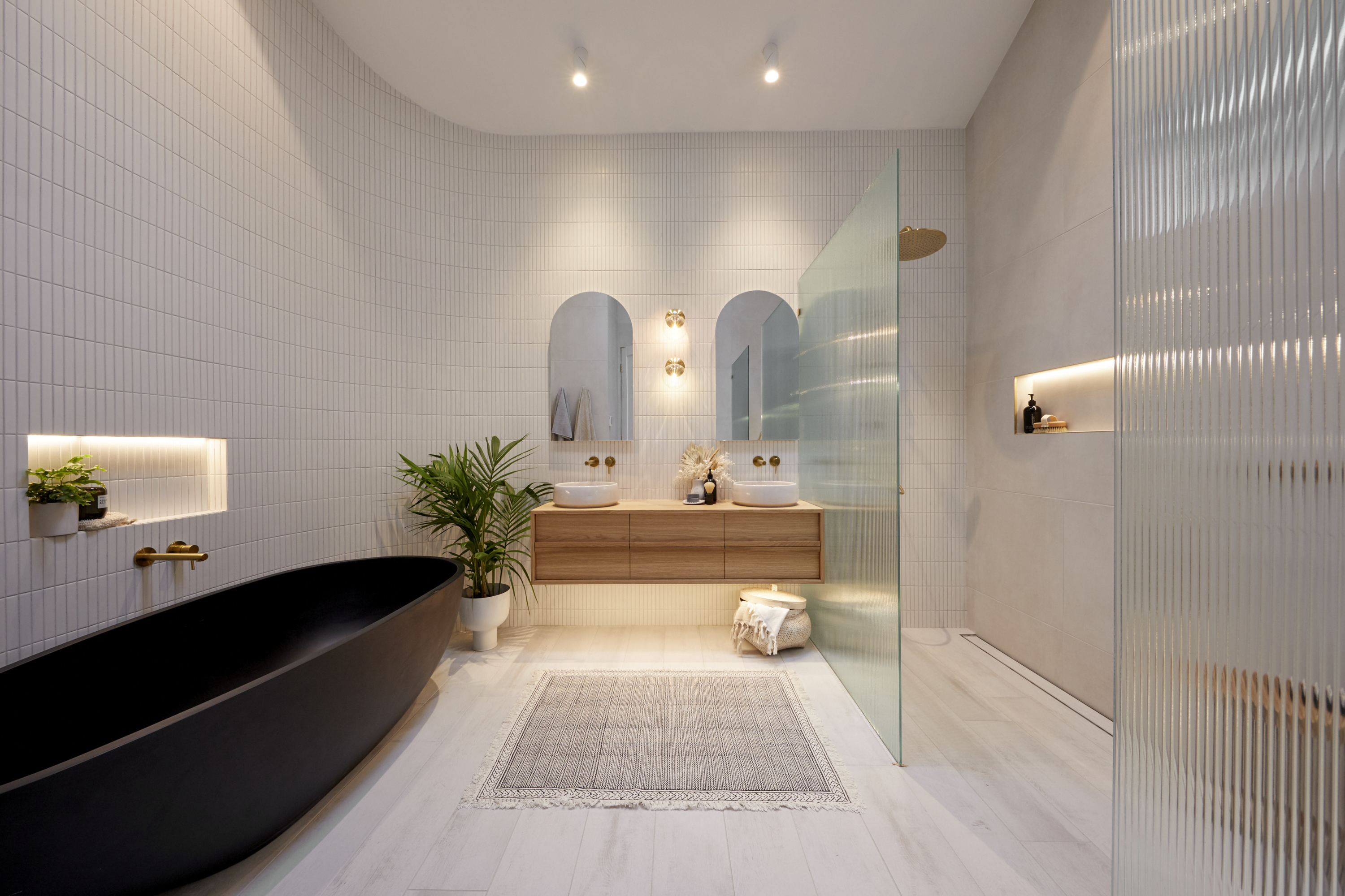
Welcome back to what Shaynna calls Ronnie and Georgia’s trademark sophistication – a calming and beautiful colour palette in a room that takes advantage of the sweeping ceilings and Velux skylights to create a large, but comfortable master ensuite that’s perfectly matched to the room it serves. From the Zuster cabinetry with cleverly separated basins to the perfectly placed plain white wall breaking up the tiled areas – and saving costs – it is a room Neale believes has massive buyer appeal.
LAST: Mark & Mitch
Score: 22/30 Spent: $26,790
In a rare mis-step from the planning kings, Mitch and Mark’s bathroom left the judges a little confused this week, with Darren pointing out the space between the basins and the shower screen was too tight, the screen itself too large. It was, he said: “a planning disaster!”. But not all was lost, with Shaynna loving the colour palette, the tile choice and styling that makes it “a jewellery box of a room”. And Neale agreed, saying there was much to love… if only the layout could be fixed.
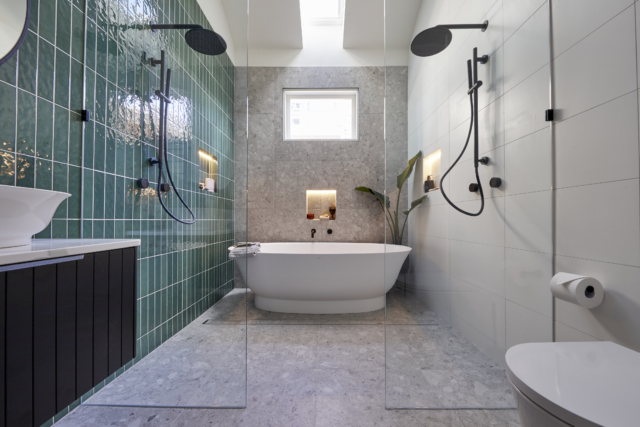
FOURTH: Tanya & Vito
Score: 22.5/30 Spent: $17,458
From brown tiles to a black toilet, sensible planning and functionality throughout, Tanya and Vito’s bathroom grabbed Darren from the second he entered. And on the styling front, Shaynna agreed, with the bold colour choices stamping a unique style on the room that shows just how different the team’s aesthetic will be. But will that be too polarising come auction day, Neale wondered. Is it deco? 70s? Or something blending multiple influences? Will there be enough people who share the couple’s love of colour, retro chic and multiple hero pieces? Time will tell!
SECOND: Josh & Luke
Score: 28.5/30 Spent: $41,980
Walking through the wardrobe to a hidden oasis, the judges were immediately impressed by Josh and Luke’s styling choices in a room that marries their master bedroom to a secluded garden creating something the judges were definitely not expecting – a master wing. “We’ve been transported from a wardrobe to something much better than Narnia!” Darren said as he took in the room Shaynna described as real estate gold! And at the centre of it all was the huge outdoor bathtub, a choice all agreed was controversial (especially with Melbourne winters) but managed to work so well.
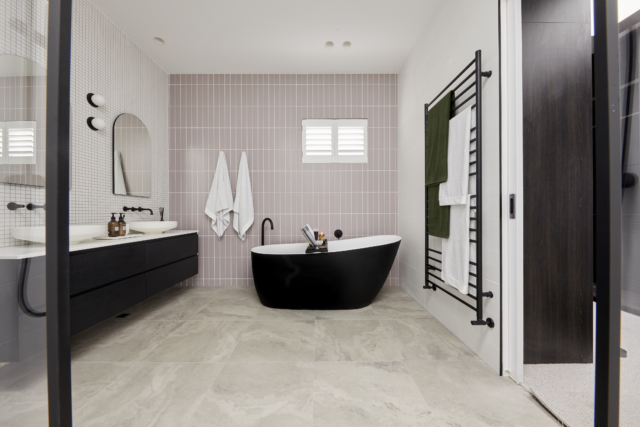
THIRD: Kirsty & Jesse
Score: 26/30 Spent: $28,045
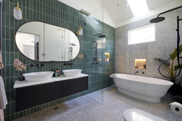
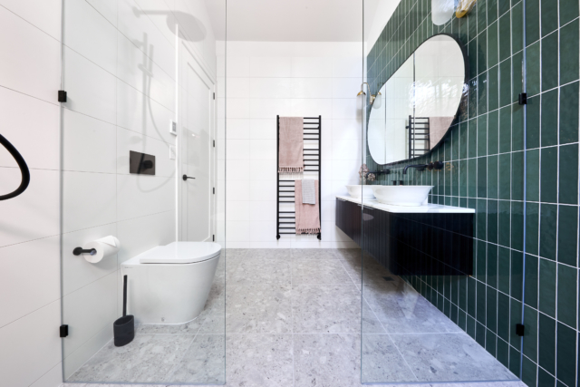
From the fresh indigo blue and gold colour choices to the refined tile choices, concrete basins set in a veined marble-look benchtop and Kirsty and Jesse’s Hamptons style blended with a touch of Colonial, this is a room, Shaynna says, that shows the team has definitely grown up. Some fixture placements gave the judges concern – the bath was always going to get wet, Shaynna warned – but overall this is, Neale says: “a damn good bathroom that feels fresh, glamorous – and is really fulfilling the brief!”
The Block 2021 room reveals: 4 cinemas & a steam room
I’m going to leave this week’s drama and cheating scandal at the door because if you watched The Block this week, I’m sure you’ve already had enough! Onto the media…
The Block 2021: master bedroom & walk-in robe reveals
This week didn’t see the faves as the obvious frontrunners. Ronnie and Georgia came fourth while Mitch and Mark came second. And Josh and Luke managed to pull first place…
The Block Archives – The Interiors Addict
Our readers love The Block and so do we! Read all the latest from the Channel 9 renovating reality show. Come back each week to read about the latest room reveals and how you can shop the looks!
Matt Meinchelli, who Scotty dubs “the miracle worker”, is a familiar face on The Block, working as the builder for winning teams in both 2017 (Elyse and Josh) and 2019 (Tess and Luke). He understands the important role that a builder plays in any renovation, but especially on The Block, to bring a homeowner’s dream to life – whatever they may be.
Builder Matt Menichelli shares what he’d have scored the bedrooms
When it comes to master bedrooms, Matt says he’s a big advocate for functionality. “The layout of a master bedroom needs to be practical and versatile to cater to different couple’s needs. The owner of the home will typically occupy this room so a statement piece is always a good way to wow potential buyers.” He adds that when renovating your own master bedroom, it’s important to create a space you want to spend time in and feel comfortable in.
The ceiling skylight detail was a standout, along with the tactile feature wall. They also had a great colour scheme.
What did you not like about this room?
The overall height was overkill. The room was only 4mx4.5m so a 6m ceiling throws out the proportions. A 3.5m ceiling would have been perfect. I also think the walk-in robe was far too small – again, proportions were all wrong.
Did you agree or disagree with the judge’s feedback / scores?
I think the judging was a bit too harsh. I would have given them an 8/10.
House 2: Mitch & Mark
What did you like about this room?
It was a very cosy space with the ceiling coffer to complement the skylight. The walk in robe was also well designed. I did also like the oversized door leading outside.
What did you not like about this room?
I personally prefer slightly deeper tones – the colour scheme was a bit soft and light for me. Would have liked to see more space at the toe of the bed for a reading chair also.
Did you agree or disagree with the judge’s feedback / scores?
I think the scores were fair. I would have given them an 8/10.
House 3: Tanya & Vito
What did you like about this room?
They played into the mid century style well. They also had a really different bedhead which I like!
What did you not like about this room?
The entry nook. It was a waste of space and feels jarring when walking in. The walk-in robe was too bland as well.
Did you agree or disagree with the judge’s feedback / scores?
I would have given it a 7.5/10.
House 4: Josh & Luke
What did you like about this room?
It is a perfect sized space. It has a really good walk-in robe for functionality and style. The subtle polished render and great ceiling detail with commercial style linear lighting also adds to the room. The robe space sets you up for a very special ensuite.
What did you not like about this room?
I think the three series artwork needed a bit more punch as it was too washed out. I also think the bench seat and buffet table needed more bulk as the room felt a bit empty, and the mirror TV was overwhelming.
Did you agree or disagree with the judge’s feedback / scores?
I think the boys received a fair score. I would have given them 9/10.
House 5: Kirsty & Jesse
What did you like about this room?
The room has a great colour scheme and I really liked the raked ceiling detail, filling the space with natural light. Convex wall panelling is something really special as well that gives a modern twist on the old dado panels.
What did you not like about this room?
I don’t think the cornice details were necessary, and the walk-in robe was far too small. The bedside tables and chest of drawers also didn’t suit the room.
Did you agree or disagree with the judge’s feedback / scores?
I think they received fair scores. I would have given them 7.5/10.
–Matthew Menichelli is a builder and owner of Elevate Building Group and hipages tradie on The Block. hipages is the online platform that connects Australia with trusted tradies to simplify home improvement.
The Block 2021: master bedroom & walk-in robe reveals
This week didn’t see the faves as the obvious frontrunners. Ronnie and Georgia came fourth while Mitch and Mark came second. And Josh and Luke managed to pull first place…
The Block 2021 room reveals: guest en suite
Pretty damn good for week two, don’t we think? Mitch and Mark went from last place last week to win this week. Nice one! Although I must admit Ronnie and…
It’s the last reveals of the season! And I must admit I haven’t watched them yet so today’s writeup comes courtesy of our friends at The Block Shop. You’d better believe I’ll be tuning in for the auctions though! This week saw Sarah and George pick up the perfect 30 out of 30. Read on to see how all the couples fared!
Harry and Tash | Last | 22.5 /30
The huge oak tree is the real hero in the backyard of Harry and Tash in House No.1. It was a pared back effort this week as they had to change some original plans because of budget issues.
The pool tiles were a perfect choice but the space but it was obvious to the judges that Harry and Tash ran out of money because of their lack of styling.
Harry and Tash installed a wall between the front and back gardens, which the judges thought was the wrong decision but they are sticking with it. Tash believes privacy from the front of New Street is more important. So after some ups and some downs, the build is done for the Melbourne father and daughter.
Sarah and George | First | 30/30
Where do we start with this amazing effort by Sarah and George? The lovely Japanese Maple tree in the courtyard immediately caught the eyes of the judges, as did the black timber fence.
In the backyard the outdoor table was a perfect addition as was the pizza oven. The pool area could easily be a magazine shoot or Instagram post, with a beautiful tile choice. Sarah and George ended up winning the Ford Puma, which is perfect as they were on the hunt for a new car once The Block was over. Talk about a strong finish to the build.
Daniel and Jade | Fourth | 24/30
How about that stunning magpie themed artwork in the courtyard? The judges loved it.
They did feel that the space could have been more comfortable and better laid out. Walking into the backyard they loved the sculpture and the effect of the Velux skylights.
The outdoor shower was a great idea, but it lacked a bit of functionality because of where it was positioned right above the dirt in the garden. While the pool was lovely, the judges felt Daniel and Jade could have done more with sprucing it up a bit.
Luke and Jasmin | Second | 29.5/30
This loss by half a point really hurt the Perth married couple as they threw literally everything into the last week on The Block.
The daybed in the courtyard was very well received, perfect to lay on with a book and glass of wine. The judges thought the execution across the board this week for of a gold standard. The pizza party pit, amazing.
Jasmin’s styling choices in the pool area were spot on. So while they didn’t win yet again, there was a lot to be proud of this week for Luke and Jasmin. They started slow on The Block, but finished very well.
Jimmy and Tam | Third | 27.5/30
The coral painted breeze block wowed the judges in the courtyard, setting the scene for another positive week for Jimmy and Tam.
Their choices of plants, cactus and bamboo, was a hit. Shaynna loved the simplicity of the backyard. The pool had a couple of daybeds that would be perfect to lay on, on a hot Melbourne summer day.
They judges did feel the space next to the pool was not right, but Jimmy and Tam maintain it is all about storage.
So another strong week for Jimmy and Tam in what has been a very strong few months on The Block with their 1950s unique house.
There was a lot of rushing this week as the couples took on the massive task of what come called a “mini house”. While some of the garage/studios were very…
Daniel and Jade get first ever win in kitchen week on The Block 2020
Daniel and Jade bagged their first win in kitchen week after using their extra gnome point. It was a very competitive kitchen week on The Block, with high scores and…
Interior designer and stylist Jono Fleming has been a busy bee this week, taking Jimmy and Tam’s lowest-scoring living/dining room and coming up with not one but two alternative layouts!
Jono Fleming
Another week and another room reveal has come and gone on The Block and look, maybe I’m a little biased because I have a very loud (but curated) colourful living room, but everything seemed a little bit safe and generic on Sunday night. It seems that all the teams have thrown away any semblance of referencing specific eras which is a real shame because there are some really beautiful inspiration ideas they can take from these decades.
Today though, I’m focusing on our lowest scoring team of the evening and that is the Jimmy and Tam and the 1950s house. They made a bold call not to include a dining table in their space and it didn’t pay off. It was an odd choice because there was in fact plenty of space in their room so let’s unpack the 1950s living room a bit and see what other options they could have gone with.
Shaynna said these chairs were set up like camping chairs!The lack of dining table was a big no-no for the judges
The 1950s saw a boom of the model home and people started to have more space in their homes and living areas. The furniture was less stuffy and ornate than the eras before, it was all about bolder colour, timber frames and interesting shapes. Curved sofas became a way to create flow around a room, with organic shaped coffee tables adding to the free form furniture design. Influence from Scandinavia was here and teak framed armchairs with felt or woolen fabrics dominated every home. It’s an often referenced era in design, the real start of the ‘mid century modern’ look.
Jono’s first mood board and alternative layout for Jimmy and Tam’s space
To take this into a modern age is really simple. The 1950s room reveal had some great reference points in their build. The brick fireplace was inspired and really hit the nail on the head for the era, the armchairs from Freedom were very appropriate but then the rest fell a bit flat. The 50s introduced bolder colour to the home, sofas were no longer only floral prints, they were big, bright, deep tones. Yellows, reds and teals were all of the norm. Darren Palmer suggested the Valley sofa from Jardan which happens to come in the most divine teal however, Jardan is all custom made (all made in Australia!) and comes with long lead times so that probably wouldn’t suit for the quick timelines on The Block. However, curved sofas are starting to pop up through many different brands. It helps create flow in a room and makes it less boxy.
To solve the dilemma of not enough space for a dining table, the team could go with the option to build in their seating in a banquette on one side. It not only saves space but you can include storage underneath the seat, and it looks extremely bespoke to have a custom piece of joinery like this. Neale Whitaker made a big point about lamps in the homes and I couldn’t agree more. Lamps in the 50s in particular were extremely important. They went from being solely functional to extremely decorative. There are so many interpretations on the market of retro and updated lighting, we’re truly spoilt for choice!
Getting the right layout in a room can be hard. The key is to approach it in different ways, the obvious plan may not work. By switching it up, playing around, and looking to the past for different design ideas, it can all help to create a unique and functional design for your home, packed with personality.
Kitchen week is always one of the biggest on The Block. They say kitchens can sell homes and as someone who likes to cook a lot, I can definitely relate…
What would Jono do: bath tubs over the decades
Interior designer and stylist Jono Fleming shares his views on the latest Block room reveals, how bath tubs have changed over the decades and if they’re worth investing in. Over…
Kids room decor: What would Jono do?
Inspired by the latest The Block room reveal, each week, interior designer and stylist Jono Fleming shares his thoughts… I’m breaking all my rules this week and not even referencing…
Finally, we got to see how the main open plan living/dining/kitchen spaces come together as a whole! There were mixed reviews from the judges last night but Harry and Tash took out the win and I have to say, I think the judges chose well. Here’s the recap…
Harry and Tash | Winners | 28.5 /30
The judges couldn’t believe how big the space looked. Shaynna said the furniture positioning made it seem grand. Neale said he felt like he was walking in and seeing the work of a professional interior designer. “There’s a level of sophistication and cohesion in this room that blows me away.” Shaynna said the void was impressive.
Darren said the furniture choices and the spaces left empty made the best use of the dappled light. “I love this, I love it so much,” he said. Neale said: “It really creates a strong sense of itself.” The lighting bothered him though. There was nothing apart from downlights and this wouldn’t allow for any ambience in the evening.
They noticed the dodgy paintwork around the fireplace but otherwise it was perfect. “They should be proud,” Shaynna said.
Darren loved the wide fireplace with its statement brick and solid concrete. He wasn’t sure it felt beachy though. Shaynna liked it however. Neale said he loved the brick which gave it a sense of heritage and age. He felt the monochrome colour palette was starting to become overkill though, and a little cold and unwelcoming.
Neale was harping on about the lack of lamps again. And Shaynna said there wasn’t enough interest at eye level. She said she just wasn’t feeling it.
Darren said the dining table was too small for a house with a huge entertainer’s kitchen. He agreed it needed more emotional drawcards too.
Neale said they’d done a lot well but it needed more. “It’s a case of injecting a bit more warmth so that it feels like just that: a living space.”
Darren was in sultry, moody heaven! Shaynna said the curved wall took confidence and was stunning, especially with the lighting. Neale said they’d done it again after their impressive kitchen.
Darren thought the dining table was gorgeous and Shaynna went one further and said it was sexy! But still no lamps for poor Neale!
Shaynna said the rug needed to be the next size up and to have a bit of pile to it. Neale thought the styling was a little ordinary. And Darren noted there was zero art but it was one of very few spaces where it wouldn’t have benefited from it, so that was okay. Darren said this was the sort of space which would help sell a house.
Neale and Darren agreed it did feel like a beach house and it matched the kitchen. Darren said they’d used the palette, the materials and the curved profile really well. He said the perfect luxury beach home would look like just like this. Neale said it was a really appropriate continuation from the kitchen.
Shaynna thought the room worked well with the rest of the house and loved the timber on timber and the pendant light.
None of them could get over the fireplace shoved in the corner though. “It’s quite obvious it’s in the wrong spot,” said Shaynna. Darren said it was nonsensical and Neale said it would be very expensive to rectify. Neale said it was a dealbreaker and that a lot of people would walk in, see it in the wrong place and think it would be expensive to shift.
It wasn’t off to a good start with the judges all saying the living space felt too small. And the missing dining table of course! Neale said it felt incredibly compromised. Darren and Neale said in a family home with 4 or 5 bedrooms it was a real misjudgement not to include one. Shaynna asked “what were they thinking?!” Neale said it wasn’t adequate for a house of that size.
Shaynna said the armchairs looked like they were set up for camping and it really needed to be rectified. A modular would work better. Darren said the space between the kitchen and the sofa was wasted. Neale said it was very, very odd. “It doesn’t feel like I’m in a living room.” Darren said they hadn’t allocated the right amount of space for the lounge.
Darren suggested they bought an expensive curved modular from Jardan to fix it! Neale said it was a “complete fail”. Ouch!
Who will win The Block 2020? Mitch and Mark weigh in.
Last year’s flamboyant The Block contestants Mitch Edwards and Mark McKie, are back this week to share their thoughts on who has the best chance of winning the show come…
Daniel and Jade get first ever win in kitchen week on The Block 2020
Daniel and Jade bagged their first win in kitchen week after using their extra gnome point. It was a very competitive kitchen week on The Block, with high scores and…
The Block 2020 kitchen week: What Would Jono Do?
Kitchen week is always one of the biggest on The Block. They say kitchens can sell homes and as someone who likes to cook a lot, I can definitely relate…
Well, I have to say, I was IMPRESSED by The Block contestants this week. Seriously impressed! There were high scores across the board and deservedly so! My personal favourite had to be Luke and Jasmin’s with its curved wall and reeded glass, joint first place with Jimmy and Tam (after the latter used their golden gnome bonus point to tie). But they were all pretty fab, weren’t they? And I love how different they were.
Joint second:Harry and Tash | 28.5/30
The tile choices were praised by the judges. They said the room was so much better and the opposite of their last bathroom, which was slammed.
Neale said it felt like a contemporary bathroom with definite references of the era. He said he wanted the basins for his own house! And Shaynna absolutely loved the bath, which couldn’t be more appropriate for the era!
None of them liked the wall sconce right above the tiles. And of course Darren noticed the shower glass being too short again!
They said the styling was superb; pared back and simple.
It was a tough week for the couple after Sarah’s grandmother passed away. But with the help of their trades, they rallied together to deliver a beautiful and spacious bathroom.
Neale said: “Just when you think it couldn’t get any better, wow!”
Darren said it was just as bloody good as nextdoor. “These tiles are so beautiful. It’s really impactful and also really calming.”
Shaynna said there were technically too many types of tiles but somehow it all blended beautifully. “When you’re confident, know the rules and break them.” She was worried the splash out from the shower could be too much though.
The judges struggled to find anything to fault. Neale said, after learning about their family tragedy on top of the pandemic, that it was incredible they had delivered what they had.
“I’d be proud if I owned this home; I’d be proud if I created this bathroom,” said Darren. “This is exceptional.”
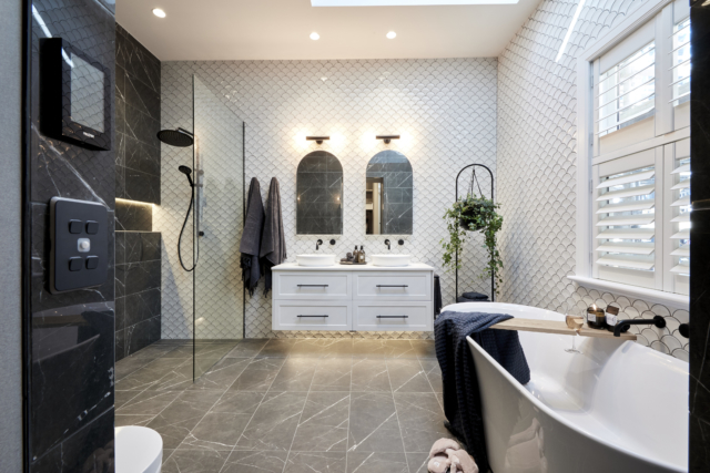
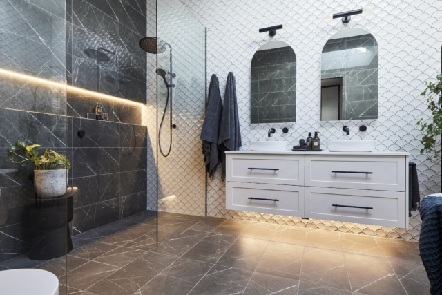
Fish scale tiles on not one but three walls! It was a brave move.
Darren loved the entrance through the wardrobe into the en suite. Neale said the fish scale tiles were beautiful. “I never thought I’d see as much of it and love it!” Darren said they made perfect sense.
Shaynna loved the layout and the drainage. And she loved the subtle curves, such as the bath, contrasting the hard lines.
Darren thought the vanity could have been a lot bigger.
But the tiling was exceptional, and the paintwork was excellent, there was no sense of hurry and it was another fantastic bathroom.
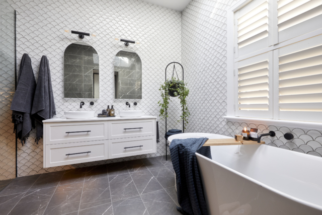
That curved wall! Oh my! This was my favourite, even though it was hard to pick this week.
Shaynna and Darren both said “What?!” as they walked in. In a good way! Neale followed it up with “Wow!”
“It’s so elegant, I’m just blown away how beautiful it is,” said Darren.
“I would not have expected a black bath but I love it,” said Shaynna. Darren said it was the one contrast point that was needed.
Neale said it was exceptional. “They have give us a very, very modern bathroom but remained faithful to those period cues.” He rightly pointed out that one of the vanities was much too close to the shower screen though. And the toilet roll holder was not well placed either.
Minor faults in an otherwise perfect bathroom.
Darren said the execution and craftsmanship was amazing. “They’ve taken a big risk but it has paid off.”
Joint first: Jimmy and Tam | 28 +1 with gnome = 29/30
Darren noticed it didn’t have a bath tub because it was smaller. But Shaynna said she preferred a bigger walk-in robe. They’d need to ensure they had a bath in their next bathroom though.
Shaynna said the colour palette was divine. Darren said it was a clever move to match the vanity to the bed and bedside tables. “They’re interesting tiles but they’re not expensive. It’s clever.”
Neale said the sconces were a little disappointing. And Shaynna said the lighting wasn’t functional at all. But that aside, the bathroom was great.
“Jimmy and Tam know exactly how to build a space that makes your heart sing; makes you happy,” Shaynna said.
Neale said the woman in the Slim Aarons print would be very happy in this bathroom.
Overall, the judges said they felt privileged to have been at The Block that day. “I can’t remember seeing five such consistent bathrooms this early on in the compeitition,” Neale said. They agreed it was remarkable, especially considering the world was going into lockdown around them and they were away from their families.
Next week: a bedroom and a bathroom!
The Block 2020 master bedroom reveals
Let’s recap who scored what, the judges’ comments and our picks to buy. Winner: Harry & Tash | 25.5/30 The father and daughter duo really needed their first win, especially…
The Block 2020 guest en suite reveals
Jimmy and Tam won for the second week in a row last night. Impressive stuff! And I have to agree their 1950s bathroom (below) was the best. Let’s recap what…
The Block 2020 first room reveals
Not only is The Block all about houses this season, they’re also period houses! And we’re onto the first room reveals already! That’s what we’re all here for, right?! It…
This week’s room reveal roundup comes to you from our friends at The Block Shop!
MITCH AND MARK: SCORE: 22/30: JOINT LAST
Mitch and Mark continued their mid-century ‘Palm Springs Luxe’ theme in their living/dining area, producing a gorgeous on-trend, bright and luxurious room. The first thing the judges noticed when they stepped inside was the fact the couple had chosen to replace their ‘Cottage Garden’ light-box windows from last week with beautiful, framed surf photography.
Their decision to pare back this large feature wall went down well. “That was a good call,” said Shaynna, who thought Mitch and Mark had styled their room, which included a stunning white brick feature fireplace, blue velvet dining chairs, a white terrazzo table and brown leather couch from Freedom, immaculately.
TESS AND LUKE SCORE: 22/30: JOINT LAST
Tess and Luke had various setbacks this week, but overcame every conceivable obstacle to produce a stunning, contemporary living/dining space. The hero in their room was that beautiful custom-made timber table, which they built to butt up against their huge island bench, making it the focal point of the room.
Elsewhere, they used a mellow palette of whites and creams, including an oversized cream couch, earth-toned circular coffee table, light-coloured rug and grey occasional chairs to work as a contrast to their black brick feature wall and fireplace. That wall, in turn, played beautifully with the light from their oversized void, which Shaynna said would prove a huge selling-point for their home.
ANDY AND DEB SCORE: 28/30: SECOND
Andy and Deb produced another exceptional space this week, ther gorgeous pared-back living area seeing them take out second place. The judges fell in love with the room, which continued with the couple’s trademark ‘coastal luxe’ vibe.
They particularly liked how everything flowed from the kitchen, as well as the placement of their large timber table and contemporary chairs, configured to run adjacent to their island bench. Neale loved their light, bright colour palette, cane coffee table, cane occasional chair, white in-built cabinetry and the white sofa and jute rug. But the thing that piqued his interest the most – and had all three judges rejoicing – was the placement of their stunning piece of commissioned Indigenous art.
EL’ISE AND MATT SCORE: 24.5/30: THIRD
El’ise and Matt had a rough time in the judging last week, with Shaynna, Neale and Darren questioning a lot of their decisions with regards to their kitchen. This week they were back on track, revealing a stunning, contemporary and homely living/dining space, complete with burnt orange sofa, petrified wood nest of tables, a brick feature fireplace and a selection of stunning artworks.
“They’re back!” Neale said, upon stepping into their luxe oasis, which also sported a dark charcoal sofa, grey rug and olive hued cushions to match their green kitchen seats.
JESSE AND MEL: FIRST SCORE: 29/30
Jesse and Mel are back! This week we took out a win for their near-perfect living/dining room. Like Deb and Andy, Jesse and Mel decided to orientate their dining table adjacent to their kitchen bench, a decision that won them favour with the judges, who loved the open, contemporary feel. They particularly loved that the couple held back 500mm from their kitchen to allow extra room in their living area, making theirs the most functional and usable living space of anywhere on this year’s Block.
They particularly loved the fireplace, which the couple made to be the architectural focal point of the room by incorporating custom black marble benchtops and cabinetry. Unlike so many of the other couples, theirs was a fire that could be enjoyed while sitting on the oversized couch, or the two stunning blue occasional chairs, while still watching the television.
Kitchen week is always popular on The Block and last night’s reveals didn’t disappoint, with some seriously impressive spaces. Take a closer look below…
I gotta say, I wasn’t mad about any of the rooms this week. None were bad at all, I was just underwhelmed in general. And there were a lot of items in them that I out and out hated!
Thank goodness Mitch and Mark at least shook things up by being brave with the floorplan change. I suspect the other contestants will get a bit snippy about all that once they’ve had a chance to digest what it might mean for their own homes. An entertaining living room sandwiched between two master bedrooms doesn’t seem a recipe for a good night’s sleep!
Once again, I think the photos of these spaces seriously let them down and I’d suggest you watch the reveals on catchup if you missed them to get a better idea!
For now, here’s a recap of the scores and the judging…
House 1 Mitch & Mark 27/30 first place
The talk of the night was the guys deleting the master bedroom from the third floor altogether, effectively making their four-bedroom home a three-bedder. Controversial! Instead, they created an entertaining living space with a cathedral ceiling with skylights. And boy, did that ceiling look good!
The judges were stunned. Shaynna said she was confused but she loved it. Darren was speechless. “Holy cow,” he said. Shaynna thought it was probably the most exciting twist she’d ever seen on judging The Block. While Neale said Mitch and Mark were designing the house for themselves and he was confused at how to judge it.
Shaynna said it was all elegance and class. Neale added: “It’s Palm Springs, it’s the epitome of glamour. I think we’re meant to be sitting around the pool here (personally I’m not sure there’s any other excuse for that rug!). It’s a make believe pool house.”
They then started to discuss the reality of the floorplan change and the fact this entertaining room with veranda would be next to and on the same floor as the other homes’ master bedrooms. “There are deep ramifications,” noted Neale.
Was it a strategic masterstroke to devalue the others’ homes (I think not)?
First impressions were largely good for this one. Darren lay on the bed to look out of the skylight and he loved its position. He said the colours were spot on. “It’s edgy and cool and art driven, there’s interest, pattern and texture. I’m proud of their evolution from last week to this week.”
Shaynna adored the artwork which had set the colour palette for the whole room, while Darren said he didn’t see anything he didn’t like.
Neale said the mirror was wrong and in general, it was just too cluttered. He loved the shaker profile of the wardrobe doors and said it was his favourite walk-in so far. Darren said he thought they’d made the perfect (his and hers) walk-in robe.
Neale said: “What a lovely calm room. They took on board that message that they needed to be grown up and they have run with it.” Darren was so happy to see more interest and more texture. “It feels fresh, contemporary and very liveable.”
Shaynna said the paint colour was divine, but she wasn’t a big fan of the bed and bedsides, saying they were a bit Nanna!
While they loved the aesthetics of the walk-in, practically speaking, the amount of storage was a bit of a letdown.
They all loved the gorgeous period ceiling, “I’m in love with that,” said Darren. “I feel like Tom Cruise jumping on the couch right now. The wallpaper is painterly. To sit this beautiful tone of green against all the blues and purples is a really really elegant colour palette. It’s gorgeous.”
Neale said it felt very wlemcing and real. “I think El’ise and Matt really understand the meaning of home and the emotion of what that means.”
Shaynna thought the paintwork was very well done and thought the art was breathtaking. Neale said if there was a negative it was that it was quite small.
Into the robe, Darren said he loved champagne metallic joinery but “it’s a bitch to clean!” Shaynna said it is was definitely glamorous and beautiful. “It has got my heart.”
Although they had sacrificed some bedroom to make the robe bigger, they hadn’t added extra storage, which Neale said was disappointing.
Shaynna said it was a great decision to have the bed face the veranda and Darren said there was a lot to love; the cornicing, lighting layout and the pelmet.
But it went downhill from there.
The judges were starting to see a pattern. Shaynna said: “They’re taking a real estate cookie cutter approach.” Neale added: “This room feels like it’s ticking boxes. I’ve seen it before.”
Darren said it was perhaps cowardly to repeat the upholstered wall behind the bed idea from last week’s bedroom and it felt like deja vu.
Shaynna didn’t like the desk or the big mirror opposite the bed, although she did love the “sexy” TV hidden within it.
Neale thought it felt ordinary. “I’m sorry, I’m completely underhwlemed. They really impressed me that first week but I’m not feeling that this week. Jesse and Mel are becoming the team who are constantly disappointing.” Ouch!
And Jesse’s rough, unfinished floor was of course criticised in the walk-in.
The more I look at these rooms, the more I personally dislike a lot about them but I’m not sure I’m ready to be that person that criticises when I wouldn’t have a hope in hell of pulling off what the couples do in such short timeframes. What do you think? Do you want to hear my opinion even if it’s not positive? I’m not a big fan of being a big meanie so I often think if it’s not something nice, don’t say anything at all!
It was an important space on last night’s Block room reveals: the formal living. Up front, I have to say I don’t think the following images do the rooms justice as they certainly looked a lot better on TV than they do in the photographs. These things can be so hard to capture sometimes! But overall, it was another strong week so early in the competition and I agreed with the judges’ first place for El’ise and Matt.
House 1: Mitch and Mark
28.5 out of 30, second place
“Honey I’m home” were the first words out of Darren’s mouth. “Me too,” said Neale.
“I am loving these guys’ sense of colour,” said Shaynna. “These guys are Hollywood. It’s lush, it’s over the top and I love it.”
They loved the herringbone floor and the inset carpet with the brass detail. “It looks really finessed,” said Darren.
Neale said it felt like it had been there forever, which was a big compliment.
The only issue Shaynna had was that everything was directed around the fireplace and it shouldn’t have been flush to the floor. Darren didn’t like the marble-look shelving because it didn’t feel as authentic as everything else in the room.
But it was otherwise good news with the judges saying this was the standard they’d expect towards the end of the competition, not this early on. “They’ve made a masterpiece of it,” said Darren. “It’s amazing.”
They all hoped they had the stamina and budget to continue in the same vein.
First up, it was the first time this couple had finished a room!
“It’s another wow room,” said Neale, on first impression. Darren loved the flooring, the colourscheme and the lighting plan.
Neale said the art was hung much too high. Shaynna said structurally and in the major details , it was great. But they weren’t getting the sense of scale or style right. While the pendant light was incredible it was hung much too high. “Whoever is doing the styling is panicking. They don’t really know what they’re doing.”
Neale’s first instinct was that it was a very elegant but blank canvas. “As blank canvases go it’s a very good one. I want to come in here, roll my sleeves up and finish the room for them!”
Shaynna said the dark shelves were a mistake and felt too heavy. Darren said it was 80% there. “They need to add more.”
Neale said: “Give me some things that make it feel like a home. This certainly isn’t the room to pull back on.”
It was off to a great start again. The green wall was immediately popular with all three judges and the artwork choices were “genius”.
Darren said: “Everything in here feels like the right scale for the space. They’ve found a really nice balance to make these grand spaces feel personal.”
Neale said there was a sense of Colonial. “I love the fact they’ve introduced one small lamp. You could actually have some ambience at night.”
Shaynna however said it didn’t feel cosy enough. It was too white and bright and they should have used that green on all the walls. “They probably weren’t brave enough but maybe they should have been,” Neale added.
He thought the shelving was beautiful though, and the styling. They all agreed the LED lighting on the shelving wasn’t the right choice. They also questioned why they created a niche for the curtains when it wasn’t actually hiding what it should have!
Darren said: “I love that Andy and Deb have done everything that we said in the first two judgings.” Neale said they had hung on to their style but it had grown up.
Shaynna was gobsmacked. She loved that it was the first house to do all the detailing like cornicing and the ceiling rose. Neale said: “This is pretty spectacular. This is giving Mitch and Mark a serious run for their money.”
Darren loved the colour palette. “It feels like a modern take on what this building requires which is a kind of gentle understanding of heritage detailing,” he said, and added: “I’m fizzing out!”
Then they all lost it over the Venetian plaster on the walls. Shaynna loved that the fireplace was elevated to the right height and had a mantel.
“It seems like a real home,” said Neale. “Because they’re the sort of layers you build up over time.”
“This couple’s sense of romance and heritage excites me,” says Shaynna.
There weren’t many negatives. Neale said the hallway side of the room was a little under styled. But that was it!
The pair changed the floor plan, adding a hallway. And spending a lot of money on doors (and other things!) in the process.
“They’re incredible doors,” said Neale. “That’s a serious amount of work,” said Darren. “To put that amount of money and effort into a door is huge on week two. This looks super contemporary to me, right out of a luxury designer showroom.”
Neale said it didn’t feel as homely as some of the other rooms. Shaynna loved the ceiling rose and the light combo but hated the marble tile border around the edge of the floor. Darren agreed and said it jarred with the rest of the room.
While there were many beautiful things in the room, Shaynna said the mirror and fireplace didn’t work together. Neale said it felt a little forced: “I feel like I’m in some kind of corporate waiting room. It’s not feeling warm and fuzzy.”
Darren said Jesse had taken a very real estate approach to decorating. “It does present well but it doesn’t have the homeliness and the lived in story we’ve appreciated in some of the other houses.”
Shaynna said the accessories were bargain basement and didn’t elevate everything else in the room.
“To me this feels the least connected to St Kilda and the least connected to the heritage of the house,” said Neale. “This could be anywhere.”
On a positive note they agreed their project management skills were outstanding to have achieved that level of detail and on time.
As someone who has just made all the final selections for my own (main) bathroom reno, starting soon, I watched these Block reveals extra closely and let’s just say I felt pretty good about my decisions after the judging!
I don’t want to be mean but boy, that real estate agent (and trained tiler) Jesse was cockier than ever this week, wasn’t he? And then he and Mel came… last! Just saying…
Overall though, I thought it was a really impressive week and I liked three out of five bathrooms a lot (a combo of Mitch and Mark’s and Andy Deb’s might even be my perfect bathroom!). I also agreed with the judges on most of their comments and scores. So, let’s recap!
House 1: Mitch and Mark, 27.5 out of 30, SECOND PLACE.
Mitch described it as: “The week from hell, the best week of my life and the week of achieving the unachievable.” And didn’t they do well?! I really loved their understated glamour bathroom; a vision in white and gold! And, just like last week, it scored them second place.
Shaynna said it was very impressive and she loved the styling. All the tiles were absolutely stunning
Darren said it was a really stunning palette and he liked the remote control toilet. Shaynna however said it was unnecessary in a guest en suite and they needed to measure where they spend their money.
Neale said he felt like he’d stepped into a 1940s film set with Hollywood glamour. “It totally demonstrates the power of the old cliche, less is more.”
The paintwork left a little to be desired. In fact, maybe two coats! But that was Darren’s only negative about the room.
House 2: Tess and Luke, 20 out of 30, FOURTH PLACE.
It was this couple’s second week of not finishing and they were clearly disappointed. But the judges had some pretty good feedback regardless. And I thought they did a nice job, even if, like Neale, I feel it’s nothing I haven’t seen many times before.
Darren said he loved it though. “I think it’s really appropriate to the colour scheme next door. I really like the feature tile against something otherwise so fresh and white and clean.”
While Neale loved the height of the ceiling and the timber paneling, his first thought was that it was nothing new. Shaynna agreed and said the styling was undercooked. “They’d be better off spending less on the finishes in these rooms that aren’t important and more on the accessories to amp it up.” She wondered if the overall size of the room and things like the double vanity were a waste of money.
Darren added: “To do this size and spend this much money you’re running the risk of burning through your budget before you’re even halfway.”
There was no grout on the floor and the tiles were unfinished. Darren said they were literally hours away from being done. “Manage your project and get it finished!”
Neale said nonetheless it was a strong base to build on.
Having tied equal last last week, Andy and Deb were over the moon to take out first place with their en suite, which the judges loved. Neale even said he wanted to pick it up and put it in his own home. High praise indeed!
Darren loved the feeling of the tiles and the simplicity of it.
Neale said it was a happy, feel good bathroom and showed a different reading of luxury. “It’s beautiful.”
Shaynna felt it showed they were making better choices than the others on where to spend and where to save. “They can do budget on a beautiful level which excites me.”
From the last judging to this one, they now have three judges completely confident in them both as a team in the competition.
House 4: El’ise and Matt, 22 out of 30, THIRD PLACE.
While I loved the quirky vanity and sage green tiles, I hated the light and the floor tiles so this one didn’t quite cut it for me.
Darren also loved the “really cool vanity” and the green tiles.
Neale, while not a big fan of pendants in bathrooms, thought they’d done well with their choice. Shaynna was not convinced it was practical enough to do your makeup by. She also hated the floor tile, saying it looked like lino. I have to agree!
The longer the judges spent in there, the worse the comments got. “There are some things that are so lovely but they’re being cancelled out by things that bug me,” Shaynna added.
Neale felt they’d slightly lost the plot.
Darren didn’t agree. “This is successful in that they’ve space planned it really well, I love the black tapware and the vanity. 95% of the room I love.”
Ever confident, before the judging, Jesse said: “Yes we didn’t finish but we have delivered an amazing room given the time restraints and we’re very proud of that.”
Sadly, the judges didn’t agree. Shaynna said it was really disappointing. Neale couldn’t believe it. He said even if it had been finished, he would feel as if he was standing in a bit of a grey tomb. Ouch! “There is no relief from grey. And how long have we been seeing marble for?”
Darren said it was an amazing vanity and a beautiful basin, but suggested they painted the rest of the walls white to lighten it up.
Neale continued: “I can’t find anything in here to get excited about. I felt so excited when I walked into their bedroom. I felt like I was seeing something new. I feel like this is truly old. It feels old hat. Where is that spark? Is it the same couple who delivered that amazing bedroom?!”
Shaynna agreed she didn’t see the glamour that she’d seen in the other bathrooms. “It’s a yawn.”
I’m so excited for another season of The Block and to bring you our regular room reveal posts again! As usual, week one was a bit of a mess, with a lot of unfinished rooms, but those poor couples certainly got thrown in at the deep end! Read on to see what they managed in just a few days, what the judges thought, and our picks to buy from the products they used.
House 1: Mark and Mitch (24 out of 30 and second place)
The guys were proud of their first room with a Mid Century luxe edge, and said they could see Frank Sinatra in there! They were right to be happy as the judges were too and it was a great first room for them to start the competition with.
Shaynna was delighted to see some colour and loved the details. Neale said it was impressive and Darren couldn’t get over the scale of it.
Neale added to produce a room like this in week one, they must know what they’re doing! “The room really hits you between the eyes on so many levels.”
Darren said they obviously knew what was on trend. Shaynna said the pendant light was just beautiful, sexy and really hot! She added the colour of carpet was really bold.
Neale said it had an incredible sense of luxury and the only issue was that there were just too many heroes. Shaynna said while she loved that it was eclectic and fun, they would have to reel it in or risk running out of money very quickly.
The judges all loved the wardrobes with gold handles.
House 2: Tess and Luke (17.5 out of 30 and joint fourth place)
Not surprisingly, the couple were disappointed not to have finished (by any stretch) and Tess was the first to say she hated their room! It was also no surprise when they came joint last.
Some of the judges were pretty forgiving if you ask me, with Darren saying he could see where they were going with it, the carpet was spot on, the walnut on trend and he liked the colour palette and the layout.
Shaynna on the other hand felt underwhelmed and like she’d seen this styling before, for the past three years! “We want to see personality. Take some risks!” She also said they’d used lots of incorrect styles for the heritage of the building.
Luke’s workmanship got top marks however!
Neale thinks if it was finished it would be elegant and successful. “I’m seeing a respect for the heritage of the building.”
House 4: El’ise and Matt (21 out of 30 and third place)
The judges all agreed it was a stunning pendant light, and they were so right! Darren said there was a lot of luxury in there, despite it not being overly accessorised.
Shaynna was very impressed with all the details they added like the picture rails. Neale enjoyed the unusual little touches. “They’ve got personality, it works.”
Darren felt it gave a nod to heritage but in a very contemporary way which was successful. And they all loved the wardrobe.
House 5: Jesse and Mel (25.5 out of 30 and first place)
It really was a case of saving the best until last with this pair! “It’s finished!” exclaimed Shaynna!
Neale said it was beautiful and he had never seen a room delivered to this level in week one. “I just love it!”
Darren said it felt like a brand new build but with all the appropriate heritage details. “They’ve hit the nail on the head.”
Neale said there was little to fault but he hated the exposed lightbulbs of the bedside lamps which were searing his eyeballs!
You really couldn’t disagree with the judges’ choice of winner this week. Real estate agent Jesse and obviously stylish Mel are looking like the ones to watch!
I actually really enjoyed last night’s Block terrace reveals. They were a really mixed bag and the spaces themselves were very different too. No doubt there’ll be a lot of chatter about how they couldn’t be judged fairly because of this. Personally, Sara and Hayden’s was my favourite but the judges put them third, so what do I know?! Love to know who you rated! Here’s a recap from first to last place (and I definitely did agree on last place!)!
1st: NORM AND JESS
Score: 30/30
A room win at last! Full marks at that! Norm and Jess continually referred to themselves as the underdogs this week. But boy did they prove everyone wrong, scoring themselves their first win of the season! AND the cover of Domain!
The space came complete with architectural steel sculptural feature, concrete planters, a marble-topped BBQ, outdoor lounge, custom table, water feature – and even a faux grass area suitable for animals.
Clearly the judges were fans! “Wow, wow, wow, wow,” said Neale. Shaynna loved the dining table/hanging plant/pergola combo and said the details said luxury. Neale said everything said luxury! Shaynna said everywhere you turned there was another beautiful thing to look at. “If it feels this good on a cold wet day, can you imagine how good it’s going to feel on a good day?!” said Neale.
Shaynna’s only question was the placement of the sculpture and the seat. Neale thought they were deliberately trying to hide the seat! Darren loved the free space which he said could be the dancing zone! “When you’re out here you realise what a prime piece of Melbourne real estate this is,” said Neale. Darren was pretty much reaching for his chequebook!
I really didn’t like that bird screen and the pond was a bit of a child safety hazard, but overall, it was a great terrace, and I was happy to see them have a win. Not my fave though! And I wouldn’t have given it a perfect score myself.
Bianca and Carla called on the services of Dave Franklin, Block garden designer extraordinaire, who delivered a stunning, sophisticated space, featuring a custom-made five-metre long table made from recycled timber, BBQ at the end, those 50 year-old Zycads – and a fireplace, which utilised the original chimney from the old Gatwick. But, arguably the hero was that skyline.
Darren said the view was spectacular and they all loved the fireplace and the huge table. Neale said it was classic, modern traditional and sexy all at once. The couch was badly placed though, out in the elements.
All three judges were unanimous in their praise, particularly Neale, who said he thought The Gatwick had never looked more elegant in its 80-year history. Keeping it super chic with a wraparound bar, they featured a sitting and dining area with custom outdoor kitchen, complete with concrete bench, green marble splashback, teppanyaki BBQ and twin tubular exhaust fans.
“Now that’s what I’m talking about,” said Darren. Neale said it was “hashtag enough” and Shaynna said it had wow factor. I’m so surprised they didn’t come first or second! This was my personal favourite.
“This is what I call selling the lifestyle,” said Neale. It was the most sophisticated and resolved he’d ever seen the couple and they’d saved the best for last. “This is exactly what the terrace needs to be in terms of luxury.” Darren said they’d really showed how you could live in the outdoor space in all weathers.
Neale said buyers would remember this terrace above everything else in their apartment.
Kerrie and Spence kept it cosy and comforting on their terrace, which featured an L-shaped white and timber lounge, light grey tiles, a dark grey table with eight stools (designed to match their piece inside), dark grey circular rug, a hanging chair and lots of greenery.
Neale said he thought it was really lovely and felt like a proper room. Shaynna said it was a casual version of the lounge room inside. Neale was surprised about the lack of barbecue (the quintessential Aussie accessory for a terrace or deck?). Darren thought it could have been easily incorporated. Shaynna loved the tiered planting and hanging sculpture they created in their challenge. Darren wondered if they’d done enough though. “You have so much expense in the kitchen. I love everything about it but the styling in it is really …” Shaynna thought the bar had been set so high inside, that outside let it down a bit. Darren liked the tile and fan choices. He said the space was full of life. “Kerrie and Spence should be really proud of the job they’ve done.”
As well as furnishing the area with plenty of green – think giant fiddle figs, Monsteras and palms – Hans and Courtney chose to dress their terrace with simple white and grey furniture with timber accents, a hanging chair and a large jute rug. They finished the space with a hero piece, a copper pot aged to showcase an oxidised light green. And let’s not forget the outdoor movie projector!
The judging didn’t go their way though, despite Darren being a fan. He thought it was fresh, light and bright and tropical. Shaynna however said it was boring as “bat”! She added she was sick of white walls. (Aren’t we all this season, Shaynna?!) She went one further to call it a white clinical box.
Neale didn’t agree with Darren either. He said it was Courtney and Hans at their worst, not understanding how to use the space, which wasn’t really an outdoor room. Darren defended them though, saying it was considered and the copper pot was a great statement piece. He thought it just needed a dining setting. Neale said it needed to be furnished differently because it was a good old fashioned sunroom, not a deck. Shaynna just got more and more annoyed, saying it was a missed opportunity.
I agree with the judges that this was the weakest room. Sara could learn a thing or two about gracious losing from Courtney though, eh?!
These were probably never going to be that exciting! They’re not big rooms so we’re effectively judging bed styling, art and wardrobe choices. But I suppose by the same token, there’s no excuse for doing a bad job at this stage of the game! The scoring, equally, wasn’t particularly controversial. What did you think?
First: BIANCA AND CARLA
28.5/30
Darren said it was balanced and beautiful. Neale said the girls were so good at showing luxury through texture and tone. Shaynna loved the artwork and the wardrobes (with brass trim and timber insides). Darren said you’d be happy with that much storage in a master bedroom. Neale said guest rooms now needed to be more like hotel rooms because we all live through our laptops, so the study nook went down well. The bedside lamps seemed mean though, in comparison to their other great lighting elsewhere.
I personally liked the dark drapes and the tan leather bedhead and the simple and sophisticated colour palette. I think the judges picked the right winner.
Neale said the colour palette, height of ceiling and the styling felt so welcoming. Shaynna said she wanted them to replicate it in the master bedroom and she couldn’t get the smile off her face. Darren said it felt more sophisticated. Neale said it was a textbook example of taking many shades of grey and yet still keeping it warm and welcoming.
Shaynna said the Woollies flowers were daggy and Neale was cross that there were no bedside lights. But otherwise it was all good!
I loved those putty coloured Shaker style wardrobes, mirroring their kitchen cabinets, and the overall soft and relaxing look and feel.
Neale said they’d made the best of a small room. Darren and Shaynna loved the bed styling apart from that navy faux fur throw (yuck!). Shaynna loved the amount of storage but Neale thought the end cupboard was a little too tight.
Shaynna felt the room was trying too hard to be luxury and that they were caught between two target markets. She said the room was old fashioned and for more of an older clientele. Neale however liked it and found it glamorous and the right style for the rest of the apartment.
I wasn’t a huge fan of the dark wardrobes but found everything else perfectly pleasant if not all that memorable! The ceiling was great though!
Neale said it was another small room but it felt bigger than Courtney and Hans’ because of the orientation of the bed. Darren loved the bedhead and couldn’t stop touching it! He thought the space was planned really well with a nice big wardrobe. Shaynna loved the storage too. Darren was very excited about the air con vent integrated into the joinery. Shaynna thought there were too many woodland creatures! Neale found it hard to fault and liked the soft palette but thought it wasn’t particularly exciting or memorable. Shaynna agreed. Darren said at the end of the day, a simplified room with a simple palette was difficult.
I personally was not a fan of the cute animal prints (better for a kid’s room) and thought they were hung a bit too high.
Then they saw the bonus study space down the hall and were very impressed. Neale said it could only be an advantage to them.
Darren said the room was very vibrant. Neale said it was one of the nicest rooms they’d delivered. But he also felt claustrophobic. Shaynna agreed and thought the bed should have been placed differently. It could also feel softer and grander if they’d done sheers across the wall like they did in the master. Darren loved the concrete look wardrobe doors with the colour palette. They all liked the whimsical art choices but ultimately Neale felt that at opens, buyers might think the bedrooms were disappointing compared to the living areas.
I’ll level with you, I didn’t watch last night’s Block room reveals so I’m not privy to what went down last week. But I wanted to get you the pictures, scores and products as soon as possible, so here they are! I’ll be playing catchup by watching today!
1st: KERRIE AND SPENCE
29/30
Kerrie and Spence are on a roll! Fresh off the back of their perfect score for last week’s kitchen, they produced a sensational hallway and powder room to take out the win. As soon as the judges entered their grand entrance space, they were blown away, especially with the way the couple had managed to display their artwork.
Bianca and Carla not only wowed with their gorgeous hallway space, but they also impressed all three judges with their laundry space, complete with timber benchtops, sky-high cabinetry, mirrors and those enormously high ceilings. They also thought the girls produced a “perfect” powder room, with statement sink, and simple, stylish styling.
Right from stepping inside Norm and Jess’s grand entrance area, all three judges were in love with the space. Darren, in particular, loved the use of marble, which also flowed through into their beautiful laundry and powder room spaces.
Hans and Courtney went all out with their artwork and accessories in their hallway this week – and they certainly impressed the judges, who all agreed they had nailed the “quirky museum” feel to produce a space with plenty of “glamorous eccentricity”.
Hayden and Sara had a tough week and were not able to properly finish their rooms. But regardless, they still managed to produce three glamorous spaces. For their hallway, the dramatic, warm lighting paired with those two statement backlit pieces of art, impressed the judges, and their laundry and powder room showed great promise.