Categories
Bathrooms Interiors Addict Shopping The Block

The Block 2022 tree change: main bathroom reveals

Today, our friend and interior designer Kathryn Bamford, recaps last night’s room reveals.

Whoa what a first week on The Block! Main bathrooms as the first room to complete and a room that could win the contestants $10,000 in cash, a fully mature tree for their landscaping and (wait for it) a $250,000 Winning Appliances kitchen upgrade.

With such a whopping big prize up for grabs the pressure was on for the contestants to deliver. I’m not going to lie, I was a little nervous for the contestants especially being their first week. Kitchens and bathrooms sell homes and if you won this week you were setting yourself up to most likely to win kitchen week with that prize.

House 1: Tom and Sarah-Jane (equal second place)

With traditional cornicing and ceiling rose, a restored original light fitting and ample use of panelling, this was a bathroom, Darren said, that’s simply “very impressive!”. And cost effective too, he added, with the panelling not only beautiful, but a budget saver by limiting the space that needed tiles. We wholeheartedly agree with Neale who said “I love art in bathroom”.

There were however some issues – the open grill over the door, some mis-matched metals, a lack of storage and a shower screen that was too short, but overall it was a room, the judges agreed, that showed a high level of sophistication and one that got them excited to see more!

House 2: Rachel & Ryan (third place)


From the second the judges entered this bathroom, one thing stood out for them all – the space! “This is massive!” Shaynna said as she took in the high ceilings incorporating wide skylights, double shower, floor-to-ceiling tiles and storage galore. But was it too much? And most importantly, was it country?

The square-set features, timber vanity, basin, “artful” lighting plan and curved glass all screamed modern luxury, the judges agreed, possibly too modern for a country home. A few heritage features might have softened the effect, Shaynna said before all asked the question: Is it appropriate in a country setting? Darren seemed to be the only judge who believed so. Neale and Shaynna were after more heritage elements.

House 3: Ankur & Sharon (last place)

“It’s shiny and brassy and something about it is not feeling authentic,” Neale announced. Neither Neale or Shaynna felt good in the space. Darren disagreed. “I like it!” he said, saying the sultry and moody feeling the team had created worked for him, however he was not keen on the nib wall.

But it was a controversial space, with Shaynna worrying the historic feel of House 3 (The Grand Dame of The Block as she called it) might get lost if the team didn’t pay attention to the existing features and work to incorporate them into their build. Shaynna recommended they do some homework on the history of the house and the era. Ouch!

House 4: Jenny & Dylan (equal second place)

Down a small hallway, and through an incredible arch and into what Neale described as a “fresh, welcoming and kind of timeless bathroom”. It was light and airy, made even better, Shaynna added, by the breathtaking view outside.

Darren really liked the sense of balance, with curved mirrors playing off the archway entrance, a blind at the exact height of the picture rail and skylights breaking up the ceiling. Shaynna felt the couple really had an idea of where they were now going with the look and feel of the home.

House 5: Omar & Oz (first place)

“Wow!” said Neale when he walked into Omar and Oz’s bathroom, and the compliments kept coming. “It’s sophisticated!” Shaynna said as she took in the 90-degree herringbone wall tiles, panelling and patterned floor tiles. “It’s stunning! I love it, I absolutely love it!” Neale added. “It all works, the palette is beautiful,” Darren summed up. “This feels like a bathroom that belongs in this house and belongs on this Block.”

It wasn’t just good looks, with features like a heated floor and heating above, face-level storage, power points in all the right places and luxurious shower/bath area making this a room to set the standard for this year. The only thing the judges could fault the boys on was some stickers left on the toilet!

Shop our faves at The Block Shop

Tom and Sarah-Jane’s wall art

Omar & Oz’s stool


What did you think of the results? Do you agree with the judges?

Enter our competition with The Block Shop and Artist Lane to win a piece of art from the reveals

Categories
Bedrooms Interiors Addict The Block

The Block 2022 tree change: first room reveals & house decider

Woohoo! The first Block reveals of the season! Let’s face it, they’re usually not spectacular as the contestants have barely found their feet yet, and they only have 48 hours, whilst getting their heads around how everything works. Could I do it? Not a hope in hell! And would I go on the show? No. Way. It would end in divorce and I’d cry every night for my kids!

(Read to the end for your weekly chance to win a piece of art from the reveals!)

Add in the first ever walkout by Elle and Joel (I knew it!) after a mere two days, and last night’s was quite the episode! Five off the grid houses in the stunning Macedon Ranges (six if you include the one Scotty’s doing) is quite the project! Let’s get into the first (bed)room reveals and what the judges had to say!

Tom and Sarah-Jane came first and chose to stay in house 1 (not the coveted house 4!). Dylan and Jenny got that one. Ankur and Sharon took house 3. Joel and Elle took 20 seconds and picked to stay with house 2 (until they quit!), leaving Omar and Oz with house 5.

Elle and Joel left without even saying goodbye, saying that The Block wasn’t “on brand” for them. Sarah-Jane, who’d made her thoughts about influencers and famous people very clear already, claimed she had seen it coming because “they looked miserable the whole time”. The others weren’t impressed either. But hey, we get a new couple (Rachel and Ryan) now! I wasn’t entirely sure I was going to enjoy watching Elle and Joel…

Next week calls for a bathroom so that will be a very interesting test!

House 1: Tom and Sarah-Jane (1st place)

The judges were impressed! Darren liked the traditional/contemporary balance. Shaynna loved the original ceiling rose. Neale thought the room spoke of contestants who knew what they were doing. And he even said he would have liked a lot of the elements in his own home! Not so much the artwork though (“the only bum note”) but Shaynna and Darren were fans.

House 2: Dylan and Jenny (second place)

Neale loved the sage green paint and the VJ panelling. Shaynna LOVED that both contestants were tradies and said the execution was excellent. Darren loved the flatpack made to look like a custom built-in.

Neale though the country vibe felt like a bit of an afterthought and that they’d thrown everything at it in the hope that something would stick. Darren said they’d tried really hard but their individual good choices weren’t working well together. And Neale said olive trees shouldn’t be inside either!

House 3: Elle and Joel (4th place)

“Where are we?” asked Shaynna. Darren said it was a bit like home (Bondi, coastal and boho) and not very Macedon Ranges. Shaynna said they hadn’t acknowledged the history of the home or the area. “They have smashed the life out of this home and that breaks my heart.”

Neale said if they stick with this look it’s going to get very stale and very samey and they needed to respect the original bones of the house.

House 4: Sharon and Ankur (third place)

Darren was not a fan of the “extremely rustic approach” Sharon famously proceeded with against Scotty’s advice! Shaynna said there was a lot of effort and skill on show and a very good eye. Neale said he wasn’t expecting to see it but it was very well executed. And they advised they shouldn’t run with this concept throughout the rest of the house!

I had feared these two would get more criticism!

House 5: Omar and Oz (last place)

Darren immediately said it was a shame the door walked you straight into the bed. Shaynna loved the original boards. Neale was happy they’d worked with the heritage. But aesthetically they’d gone Scandi which was a bit generic.

They said it was a room that belonged equally in a city or by the beach. And then they spotted the modern window and were horrified that such money had been spent on it.

The fake plant did not get past them either! Neale said it felt like property styling. “We want to see something with more personality here.” They said it wasn’t luxe enough but for 48 hours it was still quite the achievement.

What did you think of the results? Do you have a favourite couple yet?

Shop our faves at The Block Shop

Tom and Sarah-Jane’s brass wall lights and London in Bloom book

Elle and Joel’s art and boucle armchair

Win this piece of art from Scotty’s en suite

Each week, thanks to The Block Shop and Artist Lane, we’ll be giving away a piece of art from the room reveals. For your chance to win this peacock, hit the link below. Good luck!

Enter the competition

The Block Shop | 9Now

Categories
Design Designers Interviews

Darren Palmer’s latest holiday home styling project

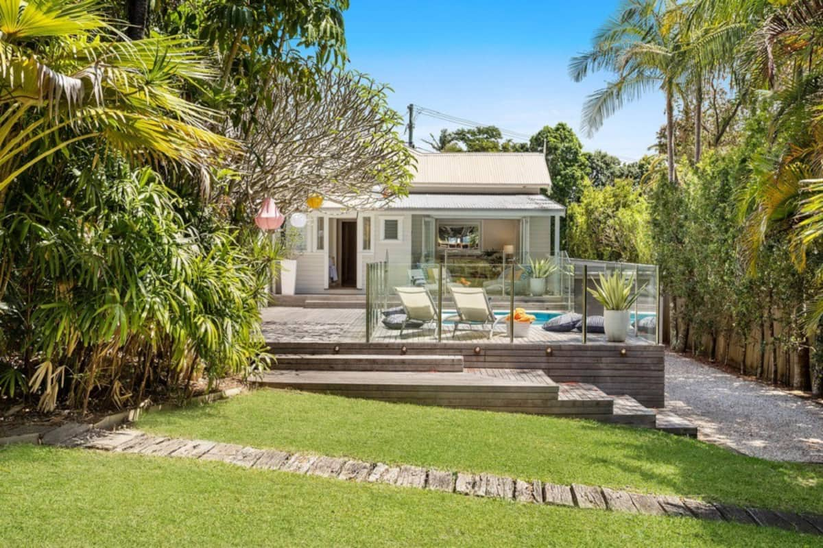
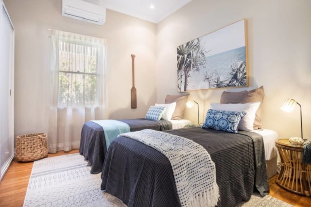
Located in a fabulous, central part of Byron Bay, this holiday home was given the makeover treatment recently courtesy of The Block judge Darren Palmer. A long-time holidaymaker in the area, Darren leant his formidable styling talents to the gorgeous home that is now available to book on Airbnb.

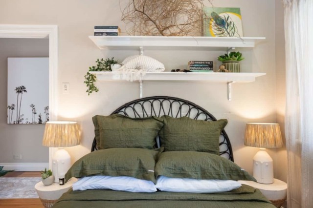
Bedroom
Bedroom

“This was literally a styling project on a rented holiday home that we thought we would like to have so we can take special trips away that aren’t overseas,” says Darren who was drawn to the home’s central Byron Bay location. Just 10 minutes’ walk to most things and only 10 minutes’ drive to everything else, the home is on a generous 1000 square metre block and is a fabulous spot from which to explore the area.

Byron Bay
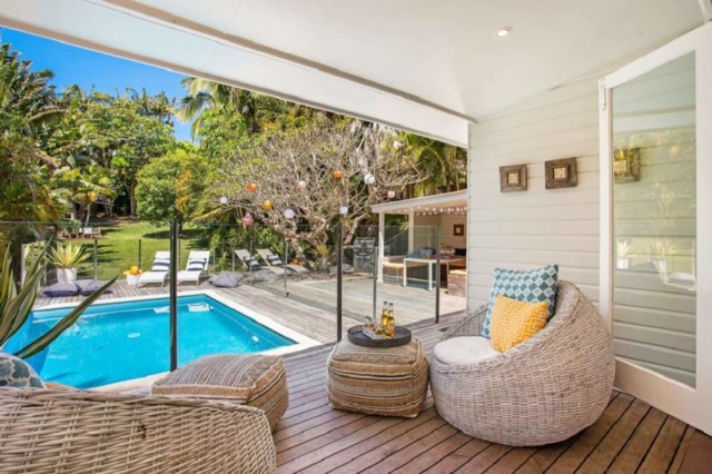
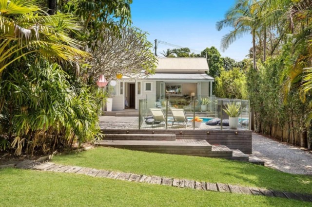
The house looks onto lush landscaped gardens and a pool

With eyes on Byron Bay since 2004, Darren always thought it was a fabulous property market but concedes that even he didn’t realise just how popular it would become. “It’s got great energy, dining at all levels and prices, and there is a holiday or beach experience for anyone whether you stay in a campervan or a multi-million-dollar ocean view home,” says Darren.

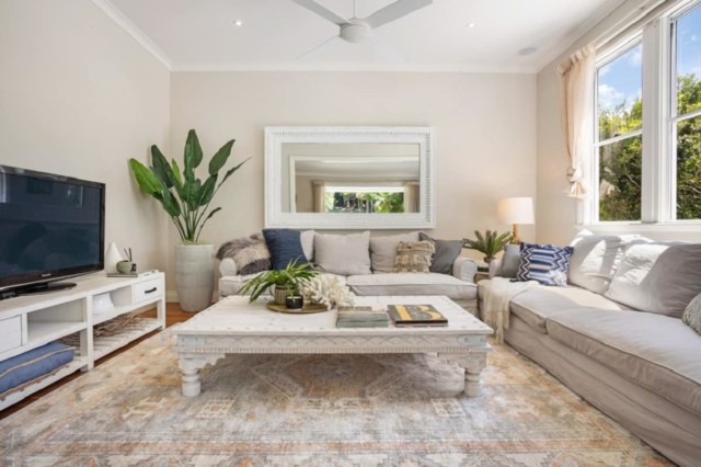
Lounge room
Lounge room

And when it came to furnishing and styling the home, Darren relied on a simple palette, earthy, woven fabrics and a variety of thrifty finds. “The inclusions were cobbled together from warehouse sales, Gumtree and stuff we had in our Hyams Beach holiday rental,” says Darren who recommends this budget-friendly approach when styling a holiday home.

Bedroom
Bedroom
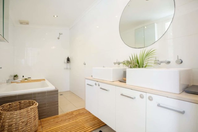
Bathroom
Bathroom

Darren also suggests approaching a holiday rental styling project with a clear vision and fairly strict budget. A big fan of upcycling and repurposing, Darren regularly scours Facebook Marketplace and Gumtree to scratch that itch. “You just need to style to the mood you want to create. It doesn’t have to be perfect to be right and it doesn’t have to be the best to be good,” says Darren.

Backyard
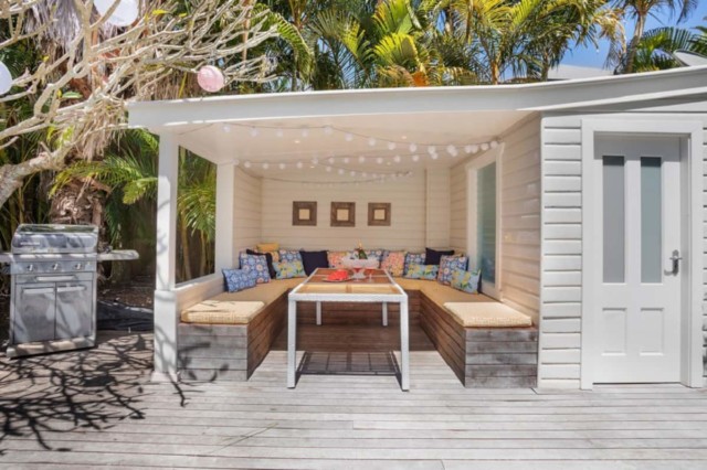
The outdoor deck

As for his favourite part of the home, he can’t go past the lush outdoor area and its heated pool. “The plants are so established, it’s crazy. The frangipani tree must be at least 100 years old and there’s heaps of grass for kids and dogs. The outdoor area is definitely the heart of this home.”

The lush backyard

Book your stay

Categories
Bedrooms The Block

The Block 2019: Master bedroom reveals

I gotta say, I wasn’t mad about any of the rooms this week. None were bad at all, I was just underwhelmed in general. And there were a lot of items in them that I out and out hated!

Thank goodness Mitch and Mark at least shook things up by being brave with the floorplan change. I suspect the other contestants will get a bit snippy about all that once they’ve had a chance to digest what it might mean for their own homes. An entertaining living room sandwiched between two master bedrooms doesn’t seem a recipe for a good night’s sleep!

Once again, I think the photos of these spaces seriously let them down and I’d suggest you watch the reveals on catchup if you missed them to get a better idea!

For now, here’s a recap of the scores and the judging…

House 1 Mitch & Mark 27/30 first place

The talk of the night was the guys deleting the master bedroom from the third floor altogether, effectively making their four-bedroom home a three-bedder. Controversial! Instead, they created an entertaining living space with a cathedral ceiling with skylights. And boy, did that ceiling look good!

The judges were stunned. Shaynna said she was confused but she loved it. Darren was speechless. “Holy cow,” he said. Shaynna thought it was probably the most exciting twist she’d ever seen on judging The Block. While Neale said Mitch and Mark were designing the house for themselves and he was confused at how to judge it.

Shaynna said it was all elegance and class. Neale added: “It’s Palm Springs, it’s the epitome of glamour. I think we’re meant to be sitting around the pool here (personally I’m not sure there’s any other excuse for that rug!). It’s a make believe pool house.”

They then started to discuss the reality of the floorplan change and the fact this entertaining room with veranda would be next to and on the same floor as the other homes’ master bedrooms. “There are deep ramifications,” noted Neale.

Was it a strategic masterstroke to devalue the others’ homes (I think not)?

Our picks to buy: Bamboo Lattice wallpaper by Grafico | Panama modular sofa by Freedom


House 2 Tess & Luke 24.5/30 joint third

First impressions were largely good for this one. Darren lay on the bed to look out of the skylight and he loved its position. He said the colours were spot on. “It’s edgy and cool and art driven, there’s interest, pattern and texture. I’m proud of their evolution from last week to this week.”

Shaynna adored the artwork which had set the colour palette for the whole room, while Darren said he didn’t see anything he didn’t like.

Neale said the mirror was wrong and in general, it was just too cluttered. He loved the shaker profile of the wardrobe doors and said it was his favourite walk-in so far. Darren said he thought they’d made the perfect (his and hers) walk-in robe.

Our picks to buy: Jess Marney Design art prints | Cubarita Wise framed art print


House 3 Andy & Deb 24.5/30 joint third

Neale said: “What a lovely calm room. They took on board that message that they needed to be grown up and they have run with it.” Darren was so happy to see more interest and more texture. “It feels fresh, contemporary and very liveable.”

Shaynna said the paint colour was divine, but she wasn’t a big fan of the bed and bedsides, saying they were a bit Nanna!

While they loved the aesthetics of the walk-in, practically speaking, the amount of storage was a bit of a letdown.

Our picks to buy: AURA Home linen


House 4 El’ise & Matt 26/30 second place

They all loved the gorgeous period ceiling, “I’m in love with that,” said Darren. “I feel like Tom Cruise jumping on the couch right now. The wallpaper is painterly. To sit this beautiful tone of green against all the blues and purples is a really really elegant colour palette. It’s gorgeous.”

Neale said it felt very wlemcing and real. “I think El’ise and Matt really understand the meaning of home and the emotion of what that means.”

Shaynna thought the paintwork was very well done and thought the art was breathtaking. Neale said if there was a negative it was that it was quite small.

Into the robe, Darren said he loved champagne metallic joinery but “it’s a bitch to clean!” Shaynna said it is was definitely glamorous and beautiful. “It has got my heart.”

Although they had sacrificed some bedroom to make the robe bigger, they hadn’t added extra storage, which Neale said was disappointing.

Our picks to buy: Undertow wallpaper by Grafico | Corbelle black pendant light by Beacon Lighting | Folded by Maria Radun art print by Art Lovers Australia


House 5 Jesse & Mel 22/30 last place

Shaynna said it was a great decision to have the bed face the veranda and Darren said there was a lot to love; the cornicing, lighting layout and the pelmet.

But it went downhill from there.

The judges were starting to see a pattern. Shaynna said: “They’re taking a real estate cookie cutter approach.” Neale added: “This room feels like it’s ticking boxes. I’ve seen it before.”

Darren said it was perhaps cowardly to repeat the upholstered wall behind the bed idea from last week’s bedroom and it felt like deja vu.

Shaynna didn’t like the desk or the big mirror opposite the bed, although she did love the “sexy” TV hidden within it.

Neale thought it felt ordinary. “I’m sorry, I’m completely underhwlemed. They really impressed me that first week but I’m not feeling that this week. Jesse and Mel are becoming the team who are constantly disappointing.” Ouch!

And Jesse’s rough, unfinished floor was of course criticised in the walk-in.

Our picks: Vertical leaner TV mirror | Buddy vases by Marble Basics

The more I look at these rooms, the more I personally dislike a lot about them but I’m not sure I’m ready to be that person that criticises when I wouldn’t have a hope in hell of pulling off what the couples do in such short timeframes. What do you think? Do you want to hear my opinion even if it’s not positive? I’m not a big fan of being a big meanie so I often think if it’s not something nice, don’t say anything at all!

Love to hear which room YOU loved?

See all our Block coverage.

Categories
Bathrooms The Block

The Block 2019: week 2 ensuite bathroom reveals

As someone who has just made all the final selections for my own (main) bathroom reno, starting soon, I watched these Block reveals extra closely and let’s just say I felt pretty good about my decisions after the judging!

I don’t want to be mean but boy, that real estate agent (and trained tiler) Jesse was cockier than ever this week, wasn’t he? And then he and Mel came… last! Just saying…

Overall though, I thought it was a really impressive week and I liked three out of five bathrooms a lot (a combo of Mitch and Mark’s and Andy Deb’s might even be my perfect bathroom!). I also agreed with the judges on most of their comments and scores. So, let’s recap!

Missed last week’s guest bedrooms? Play catch up.

House 1: Mitch and Mark, 27.5 out of 30, SECOND PLACE.

Mitch described it as: “The week from hell, the best week of my life and the week of achieving the unachievable.” And didn’t they do well?! I really loved their understated glamour bathroom; a vision in white and gold! And, just like last week, it scored them second place.

Shaynna said it was very impressive and she loved the styling. All the tiles were absolutely stunning

Darren said it was a really stunning palette and he liked the remote control toilet. Shaynna however said it was unnecessary in a guest en suite and they needed to measure where they spend their money.

Neale said he felt like he’d stepped into a 1940s film set with Hollywood glamour. “It totally demonstrates the power of the old cliche, less is more.”

The paintwork left a little to be desired. In fact, maybe two coats! But that was Darren’s only negative about the room.

Our picks to buy: The fanciest toilet flush ever | Grohe Euphoria massage rail shower | Kado Lux wall hung vanity

House 2: Tess and Luke, 20 out of 30, FOURTH PLACE.

It was this couple’s second week of not finishing and they were clearly disappointed. But the judges had some pretty good feedback regardless. And I thought they did a nice job, even if, like Neale, I feel it’s nothing I haven’t seen many times before.

Darren said he loved it though. “I think it’s really appropriate to the colour scheme next door. I really like the feature tile against something otherwise so fresh and white and clean.”

While Neale loved the height of the ceiling and the timber paneling, his first thought was that it was nothing new. Shaynna agreed and said the styling was undercooked. “They’d be better off spending less on the finishes in these rooms that aren’t important and more on the accessories to amp it up.” She wondered if the overall size of the room and things like the double vanity were a waste of money.

Darren added: “To do this size and spend this much money you’re running the risk of burning through your budget before you’re even halfway.”

There was no grout on the floor and the tiles were unfinished. Darren said they were literally hours away from being done. “Manage your project and get it finished!”

Neale said nonetheless it was a strong base to build on.

Our picks to buy: Woodrow Hourglass stump stool | LED dimmable wall bracket in black and teak by Beacon Lighting

House 3: Andy and Deb, 28 out of 30, FIRST PLACE.

Having tied equal last last week, Andy and Deb were over the moon to take out first place with their en suite, which the judges loved. Neale even said he wanted to pick it up and put it in his own home. High praise indeed!

Darren loved the feeling of the tiles and the simplicity of it.

Neale said it was a happy, feel good bathroom and showed a different reading of luxury. “It’s beautiful.”

Shaynna felt it showed they were making better choices than the others on where to spend and where to save. “They can do budget on a beautiful level which excites me.”

From the last judging to this one, they now have three judges completely confident in them both as a team in the competition.

Our picks to buy: Ivy Muse plant hanger | Neo slimline wall hung vanity by Reece

House 4: El’ise and Matt, 22 out of 30, THIRD PLACE.

While I loved the quirky vanity and sage green tiles, I hated the light and the floor tiles so this one didn’t quite cut it for me.

Darren also loved the “really cool vanity” and the green tiles.

Neale, while not a big fan of pendants in bathrooms, thought they’d done well with their choice. Shaynna was not convinced it was practical enough to do your makeup by. She also hated the floor tile, saying it looked like lino. I have to agree!

The longer the judges spent in there, the worse the comments got. “There are some things that are so lovely but they’re being cancelled out by things that bug me,” Shaynna added.

Neale felt they’d slightly lost the plot.

Darren didn’t agree. “This is successful in that they’ve space planned it really well, I love the black tapware and the vanity. 95% of the room I love.”

Our picks to buy: Alape Scopio washstand | ISSY Z1 oval mirror with shaving cabinet

House 5: Jesse and Mel, 14 out of 30, LAST PLACE.

Ever confident, before the judging, Jesse said: “Yes we didn’t finish but we have delivered an amazing room given the time restraints and we’re very proud of that.”

Sadly, the judges didn’t agree. Shaynna said it was really disappointing. Neale couldn’t believe it. He said even if it had been finished, he would feel as if he was standing in a bit of a grey tomb. Ouch! “There is no relief from grey. And how long have we been seeing marble for?”

Darren said it was an amazing vanity and a beautiful basin, but suggested they painted the rest of the walls white to lighten it up.

Neale continued: “I can’t find anything in here to get excited about. I felt so excited when I walked into their bedroom. I felt like I was seeing something new. I feel like this is truly old. It feels old hat. Where is that spark? Is it the same couple who delivered that amazing bedroom?!”

Shaynna agreed she didn’t see the glamour that she’d seen in the other bathrooms. “It’s a yawn.”

Our picks to buy: Roca Inspira round basin | ISSY Halo vanity unit

So, which was YOUR fave?

Next week: lounge rooms!

Last week’s guest bedroomsAll our Block coverage.

Categories
Bedrooms The Block

The Block 2019: week 1 guest bedroom reveals

I’m so excited for another season of The Block and to bring you our regular room reveal posts again! As usual, week one was a bit of a mess, with a lot of unfinished rooms, but those poor couples certainly got thrown in at the deep end! Read on to see what they managed in just a few days, what the judges thought, and our picks to buy from the products they used.

House 1: Mark and Mitch (24 out of 30 and second place)

The guys were proud of their first room with a Mid Century luxe edge, and said they could see Frank Sinatra in there! They were right to be happy as the judges were too and it was a great first room for them to start the competition with.

Shaynna was delighted to see some colour and loved the details. Neale said it was impressive and Darren couldn’t get over the scale of it.

Neale added to produce a room like this in week one, they must know what they’re doing! “The room really hits you between the eyes on so many levels.”

Darren said they obviously knew what was on trend. Shaynna said the pendant light was just beautiful, sexy and really hot! She added the colour of carpet was really bold.

Neale said it had an incredible sense of luxury and the only issue was that there were just too many heroes. Shaynna said while she loved that it was eclectic and fun, they would have to reel it in or risk running out of money very quickly.

The judges all loved the wardrobes with gold handles.

Our picks to buy: Glass chandelier by Beacon Lighting | Kristoffer Paulsen St Kilda prints 

***

House 2: Tess and Luke (17.5 out of 30 and joint fourth place)

Not surprisingly, the couple were disappointed not to have finished (by any stretch) and Tess was the first to say she hated their room! It was also no surprise when they came joint last.

Some of the judges were pretty forgiving if you ask me, with Darren  saying he could see where they were going with it, the carpet was spot on, the walnut on trend and he liked the colour palette and the layout.

Shaynna on the other hand felt underwhelmed and like she’d seen this styling before, for the past three years! “We want to see personality. Take some risks!” She also said they’d used lots of incorrect styles for the heritage of the building.

Luke’s workmanship got top marks however!

Neale thinks if it was finished it would be elegant and successful. “I’m seeing a respect for the heritage of the building.”

Our picks to buy: Black circular round mirror | Bodie walnut side table by Modern Furniture

***

House 3: Andy and Deb (17.5 out of 30, joint fourth place)

Darren said ignoring the unpainted walls, it was very fresh, he loved the palette and was in love with the bed.

Neale agreed but wasn’t as taken the with styling, saying it felt a little predictable.

Shaynna, looking for more oomph as ever, said the look they’re going for will work if they amp it up a bit!

Our picks to buy: Sophia four poster bed by House of Orange | Terrazzo side table by HK Living

***

House 4: El’ise and Matt (21 out of 30 and third place)

The judges all agreed it was a stunning pendant light, and they were so right! Darren said there was a lot of luxury in there, despite it not being overly accessorised.

Shaynna was very impressed with all the details they added like the picture rails. Neale enjoyed the unusual little touches. “They’ve got personality, it works.”

Darren felt it gave a nod to heritage but in a very contemporary way which was successful. And they all loved the wardrobe.

Our picks to buy: Large beaded mirror by Schots | Chandelier by Beacon Lighting 

***

House 5: Jesse and Mel (25.5 out of 30 and first place)

It really was a case of saving the best until last with this pair! “It’s finished!” exclaimed Shaynna!

Neale said it was beautiful and he had never seen a room delivered to this level in week one. “I just love it!”

Darren said it felt like a brand new build but with all the appropriate heritage details. “They’ve hit the nail on the head.”

Neale said there was little to fault but he hated the exposed lightbulbs of the bedside lamps which were searing his eyeballs!

You really couldn’t disagree with the judges’ choice of winner this week. Real estate agent Jesse and obviously stylish Mel are looking like the ones to watch!

Our picks to buy: Fabric wall panels by Nouveau Bisgrove | Navy linen duvet set by Eadie Lifestyle | All About You limited edition canvas by Liam Murphy 

***

Who was YOUR favourite?

All our Block coverage

Love renovating? Come along to my Real Renovation Tour with Naomi Findlay next month in Sydney, Melbourne and Brisbane! More info.

Categories
Design DIY Interviews RENO ADDICT Shopping

Self adhesive wall panels: perfect for adding texture

The latest offering from Carpet Court is, rather interestingly, all about walls! ‘Elevate’ is a new collection of purpose-built timber wall panels that has been developed with the DIY market in mind. Perfect for adding warmth and texture to a space, each lightweight plank is created from sustainably-sourced plantation timber and features an adhesive backing allowing you to simply peel and stick them onto most wall and ceiling surfaces. It’s the perfect Easter long weekend project, don’t you think?

Carpet Court’s new Elevate timber wall panels in ‘Storm’

“Wooden wall panels can help elevate a room lacking atmosphere, as well as add a little formality to new and modern homes. The panels are perfect for ‘zoning’ open plan homes, such as reception areas like hallways and stairways, as well as living spaces like dining areas,” says Carpet Court style ambassador and interior designer Darren Palmer. The panels each measure 1210mm x 128mm x 5mm thick and retail for $69 per square metre.

BEFORE
BEFORE

AFTER
AFTER

“For an understated approach, the panelling can add visual interest on the risers of a kitchen island bench, or act as a natural bedhead feature in a bedroom. Best of all, they can hide a multitude of imperfections, such as uneven surfaces and are strong enough to hold your valued pictures and artwork,” says Darren. The range offers 10 wood stains with both warm and cool tones and an array of wood grains in the mix.

The planks come with easy to use adhesive backings

“Proportion is key. Vertical panelling, or even wrapping one-wall panelling on to the ceiling, is an effective way to make ceilings appear taller. Conversely, horizontal panelling can widen the appearance of a narrow room,” says Darren who warns that if you’re going to use panelling in more than one room in your home you should stick to one style and colour for the sake of continuity.

Photography: Carpet Court

For more | More fabulous timber wall panels

Categories
Design Expert Tips Styling

Darren Palmer’s top 2019 design trends & flooring tips

When Darren Palmer lets us in on his favourite design trends we sit up and take notice and his top picks for this year, ‘Moroccan’ and ‘Botanical,’ are as disparate as they are inviting. “The Moroccan look is exotic and luxurious while the botanical look is all about bringing nature inside,” says Darren.

Moroccan look
The Moroccan look

Moroccan
“Think bold brights, clashing patterns and earthy, rugged textures. With its bohemian edge, this look brings a sense of energy yet warmth to a space,” says Darren.

Moroccan look
Darren has used Carpet Court’s Dreamtime carpet in clay to create this Moroccan inspired scheme

“When you’re decorating a room, it’s always a good idea to start with the floor. It’s one of the largest expanses of space in a home and will set the tone for the rest of your furnishings. The Moroccan look has warm, spicy undertones and an earthy feel, so seek out flooring in a warm neutral shade with plenty of texture,” says Darren who is also a Carpet Court Ambassador.

Moroccan look

“Timber flooring works equally well in a Moroccan scheme – again, opt for timber with warm undertones and extra-wide boards are trending right now and will add a contemporary touch to your exotic scheme,” says Darren who says that layers of accessories are key to finishing the look. “Complete the look with a medley of bright, patterned rugs and cushions, buffed leather accessories, decorative pendants and woven wall hangings,” says Darren.

Botanical
“We’re passionate about indoor-outdoor living in Australia, and this trend is all about bringing nature inside. The result is a fresh, relaxed look that’s easy to love,” says Darren.

Botanical look
Darren recommends Carpet Court’s Premium Oak flooring  in Arctic White (above) – the pale, cool-toned timber contrasts with the botanical look’s rich greens.

“The key to making this look work is not to overfill the space – you want it to feel light and airy. Choose one or two statement features, such as an oversized leaf-print wallpaper across one wall or a forest-green velvet sofa. Then, add in shelves and accessories in woven rattan and blonde timber, white plantation shutters and plenty of greenery. Finish off with touches of gold for a modern-luxe feel,” says Darren.

“If you haven’t shopped for flooring in a while, you’ll be amazed at what’s available now – there really is something for every style, budget and home set-up,” says Darren who says it’s important to consider how you’ll use the space in the first instance. “Do you need something hardwearing, easy to clean, ultra-luxurious, or able to cope with the demands of children and pets? Once you’ve narrowed down your requirements, it’s time for the fun part – choosing a flooring style that will completely transform the look of your room and home,” says Darren.

Botanical look


Darren’s flooring style tips


Textured appeal
: To add texture to your interior, consider a chunky felted loop pile carpet in this season’s on-trend colours – charcoal, silvery-grey or sand.

Family friendly: If you have children or pets, a level loop-pile carpet in a mid-tone neutral with some flecks of colour will be the most hardwearing and forgiving.

Fibre smarts: Wool carpet has a luxurious, natural appeal, but solution-dyed nylon is a great choice if you’re looking for a soft carpet with superior fade and stain-resistance for a sunny room or a home with kids.

Grab a sample: Carpet and hard flooring colours will look different from the showroom once you get them home. To work out whether a colour or timber finish is right for your interior, take a sample home and look at it at different times of day and under various light conditions.

Consider your options: Love the look of timber but want something low-maintenance and more affordable? Why not consider timber-look vinyl planks or laminate, which give you the appearance of real wood for less and can often be used in wet rooms such as bathrooms and laundries.

The touch test: To assess how soft a carpet will feel underfoot, don’t just feel it with your hands – slip off your shoes and walk on it.

For more | Step inside Darren Palmer’s latest kitchen

Categories
Design The Block

The Block 2018 last reveal: Challenge rooms

Last night saw the final reveal of The Block for 2018 and this time it was the challenge rooms. The standout space for me was Courtney and Hans’ kitchen. After walking through the butler’s pantry, Neale said he had “extreme kitchen envy” and I certainly did too!

1st: COURTNEY AND HANS
Score: 29/30

Courtney & Hans challenge kitchen

Courtney and Hans created a black and white St Kilda inspired kitchen complete with stainless steel gantries, Caesarstone benchtops, a large butler’s pantry and neon ‘3182’ St Kilda sign. Shaynna loved it, Neale called it the “kitchen of his dreams” and Darren called it “absolutely spectacular.”

“It’s a kitchen that acknowledges that the kitchen is now where we live life,” said Neale. And Shaynna said although the couple’s styling had been hit and miss throughout the season but felt this space boasted precision styling. “I actually feel that not only does it feel like someone lives here but it’s styled beautifully too,” she said.

And while the fridge, tucked away in the amazing butler’s pantry, was some distance from the main event, the judges didn’t seem to mind. In fact, after stepping into the butler’s pantry Neale said he was suffering “extreme kitchen envy.”

Courtney & Hans challenge kitchen
The fabulous butler’s pantry

Courtney & Hans challenge kitchen

Courtney & Hans challenge kitchen

My picks to buy: Rialheim ceramic pig bowl and Carla O’Brien neon postcode light.

2nd:KERRIE AND SPENCE
Score: 28.5/30Kerrie & Spence challenge terrace

With a projector screen, sofa, coffee table, bar, bespoke poster and Yamaha Smart Piano, Kerrie and Spence’s terrace was very well received by the judges. They loved the piano, large artwork and especially the way in which the bar facilitates people-watching over the street. Overall, the judges thought the room was fabulous.

Kerrie & Spence challenge terrace

Kerrie & Spence challenge terrace

My pick to buy: ‘Playbox, the Malthouse’ by Boris Bucan silkscreen print.

3rd: SARA AND HAYDEN
Score: 27/30

Hayden and Sara's challenge hallway
The judges loved the artwork in Hayden and Sara’s challenge hallway

Hayden and Sara had an epic four spaces to complete – the hall, powder room, laundry and study – and the judges acknowledged that it was quite an undertaking.

Shaynna loved the feature artwork in the hall and Neale did too. He called the mural “strong, engaging, cool and retro” but wasn’t a fan of the hall table styling. The judges loved the laundry (Darren called it “exceptional”) and felt it delivered on functionality and style. Shaynna thought the study was “fantastic” and Neale said it was the best thing they’d delivered all season.

Hayden & Sara challenge study
Hayden and Sara’s challenge study

Hayden and Sara's challenge laundry
Hayden and Sara’s challenge laundry

Hayden & Sara's challenge powder room
Hayden & Sara’s challenge powder room

My picks to buy: White Moose hippo head planter and west elm striped angle geometry bookend.

4th: NORM AND JESS
Score: 26.5/30
Norm & Jess challenge dining room

After their dull master bedroom from last week, Norm and Jess really upped their game for their challenge dining room. A hero of the space, the judges thought the large pink neon sign was “corny but oh so good.” The Christian Cole dining table was well received too with Neale calling it “stunning” while Darren liked the pendant lights above it. Overall the judges felt the room was a strong offering.

Norm and Jess' challenge dining room
Norm & Jess' challenge dining room

Norm & Jess' challenge dining room
My picks to buy: Tipi Interiors black and white bone inlay stripe stool and The Print Emporium Palm Springs Doorway 2 art print

5th: BIANCA AND CARLA
Score: 21.5/30

Bianca and Carla's challenge living room
Neale called Bianca and Carla’s challenge lounge room vibe “weird” and thought that it felt really thrown together. Shaynna felt the room didn’t match the quality of the rest of the apartment and Darren agreed. “It’s too young and low-cost,” said Darren while Neale said it felt “cheap and that it was letting the whole apartment down.”

In particular, Shaynna thought the two rugs placed on top of one another were odd, she wondered where the bespoke cabinetry was and she finished by saying that she thought the girls “checked out of The Block a week ago.” By the looks of it, they did!

Bianca and Carla's challenge living room

Bianca and Carla's challenge living room
My picks to buy: Life Interiors Dala horse and Arro Home Rigby cushion.

ALL OUR BLOCK COVERAGE


Categories
Bathrooms The Block

The Block 2018 room reveals: Challenge apartment

With a “quirky St Kilda” theme, it was a real mixed bag this week on The Block and there were some absolute shockers in the mix – ahem Kerrie and Spence! Ugly wall murals aside, Sara and Hayden delivered a gorgeous monochrome bathroom while Courtney and Hans took a punt on a wallpaper selection that really paid off.

1st: COURTNEY AND HANS
Score: 28.5/30

Courtney & Hans

Courtney and Hans chose a statement making wallpaper and the bold design was a gutsy choice that the judges adored. “I love it!” said Shaynna while Darren described it as a “colourful, eccentric and a really beautiful choice.” The judges also liked the Australiana-themed artwork and the way the bed was dressed.

Overall, the judges though the room was meticulously planned and were impressed with the styling. Shaynna called the room’s styling “kitsch…but as a compliment” and finished by saying “the room has a real sense of calm which is bizarre when you’ve got so much going on!”

Courtney & Hans

Courtney & Hans

My picks to buy: Hackney Empire stripe wallpaper and Grotti Lotti ‘Don’t fence me in’ art print

2nd: SARA AND HAYDEN
Score: 27.5/30

Hayden & Sarah

Sara and Hayden’s gorgeous monochromatic bathroom was described as “magic” by Neale and all three judges agreed it was a beautiful space. There’s no doubt the hero of the space is the Zuster vanity and the judges loved it. “That subtle hint of terrazzo is so beautiful,” said Neale.

Shaynna and Neale liked the textured tile while Darren didn’t and Shaynna also acknowledged the toilet’s discreet placement behind the door and quirky styling pieces. Overall, the judges thought the bathroom showed an incredible improvement in planning, detail and style compared to the couple’s first bathroom. “They’re at their absolute best here!” said Neale.

Hayden & Sarah
That Zuster vanity is beyond beautiful

Hayden & Sara

My picks to buy: Zuster Halo vanity unit and Kazari bronze crocodile

3rd: BIANCA AND CARLA
Score: 23.5/30

Bianca & CarlaBianca and Carla nailed the “quirky St Kilda” brief – their fun and functional bathroom featured pink palm tree wallpaper paired with simple black. Neale and Shyanna loved the wallpaper calling it fun, quirky and pretty and Darren admitted to having something similar in his house. Shaynna loved the positioning of the bath under the window, the hidden toilet (again!) and the double shower. She called the walk-through glass “really sexy.”

Darren was critical of the unbalanced vanity lighting and Shaynna noted the apparent time management issues reflected in the workmanship but overall the judges really like this room. “This bathroom fits that boutique St Kilda hotel apartment vibe. It’s got style, quirk and a connection with the urban given you can see the trams passing by through the window from the bath,” said Darren.

Bianca & Carla

Bianca & Carla
The double walk-through shower was well received

My picks to buy: Wallpaper Trader Palm Leaves wallpaper and Reece round mirror cabinets

4th: KERRIE AND SPENCE
Score: 20.5/30

Kerrie & SpenceYou could read the disappointment on the judges faces before the lights were even on in Kerrie and Spence’s room. “I feel like I’m falling down a psychedelic rabbit hole, it’s giving me vertigo and really messing with my head. It couldn’t be more abrasive!” said Darren of the room’s graffiti laneway mural. “It gives this weird sensation of being in bed in the street,” said Neale. Not exactly relaxing!

Kerrie & Spence

Shaynna gave Kerrie and Spence credit for pushing the envelope when normally they play it safe but Darren called it an “explosion of the envelope and if the mural doesn’t give you a headache then the bedhead certainly will!”

He called the bedhead a “disaster” and the judges all agreed that a shelf sticking out of the wall just above the pillows is one of the strangest design decisions they’d ever encountered in a bedroom. It wasn’t all bad though as they liked the wardrobe (particularly the fine black strip detailing) and Darren liked the art choices. Overall though, this room was a bit of a train (or tram!) wreck.

Kerrie & Spence
These Grotti Lotti artworks were the highlight of the room for me

My picks to buy: Grotti Lotti Amanda and Stevie art prints

5th: NORM AND JESS
Score: 20/30

Norm & JessNorm and Jess’ “ultimate master bedroom” was a huge space that Darren called “dull” and Neale called a “weird mismatch.” Shaynna thought the scale was off and took points off for the tiny rug, tiny couch and tiny bedside tables – the judges were particularly unimpressed by the lack of storage.

When it came to the bed styling, Darren called it a “car crash” – particularly the cushion situation. “It’s as if they just went and got all the cushions they could find and dumped them on the bed!” he said.

Shaynna wasn’t a fan of the cement board feature wall and didn’t hold back. “I hate it!” she said. The only thing she liked was the gallery wall at the entrance to the room and the room’s artwork, despite its placement. In fact, all of the judges liked the artwork but thought it badly placed given it was hung in the walk-in robe. So odd! “Norm and Jess have lost the plot!” said Neale while Shaynna called the room “Norm and Jess at their worst.” Ouch.

The room’s lovely yet tiny sofa was admonished by the judges

Norm & JessMy pick to buy: Iconiko Seaside Combi framed print and Iconiko Seaside Stripes framed

ALL OUR BLOCK COVERAGE

Categories
Design Designers The Block

Learn design with Darren Palmer’s new online course

Whether you’re keen to pursue a career in interior design or just looking for tips to use in your own home, Darren Palmer’s new MASTERSERIES course could be just the ticket. Run in partnership with The Interior Design Institute, it consists of 12 online modules, a Q&A series and plenty of downloadable resources too.

Darren Palmer
Darren Palmer

“In everything I do, I strive to educate and inspire so that anyone can create their version of their best home,” says the Block judge and interior designer. “For quite some time, I have thought the best way to do that would be through an education platform, specifically one that was housed online, in partnership with a reputable educator with a broad, worldwide customer base. I could not be more proud to be partnered with The Interior Design Institute to present my experience and insights so that anyone can apply that knowledge themselves, in their own way, in their own homes.”

Darren at home in his kitchen

“Whether you are wanting to have more interiors courage in your own home, you work in a business within the home and renovation category or you desire to become an interior designer or stylist yourself, anyone that wants to have a thorough understanding of interior design is the perfect student for the course.”

Darren shares his personal experiences and insights from his time in the industry, from starting out through to where he finds himself today, with lessons for people no matter which step of the journey they are on. “The information is complete, from processes to design theory and even running a business, so there is something in there for anyone wanting to brush up on their skills, learn new approaches or get a full view of how to operate within the industry. Because you can study at your own pace, in your own space, in whatever time you can manage, this course is a perfect solution for busy people too.”

*Note: The Interior Design Institute’s Interior Design Course must be completed before you can enrol in Darren’s MASTERSERIES course. You can complete both simultaneously.

Enrol online | Check out Darren’s recent kitchen renovation

Categories
The Block

The Block 2018: Living room reveals

Last night’s room reveals were a fairly disappointing bunch (a bit of a theme this season it would seem!) with some moments of genius scattered throughout. I was surprised by how underwhelming most of them were to be honest but I also appreciate that filling such large spaces wouldn’t have been easy. These rooms are some of the largest ever on The Block and the judges found plenty to love so here goes!

Courtney and Hans: First place, 27.5/30

“Oh my God this room just goes on forever!” said Shaynna of Courtney and Hans’ living room that is the largest living and dining space in The Block history.

The bespoke dining table impressed the judges – particularly the walnut parquetry paired with emerald velvet covered chairs. “It could be old, stuffy and too heritage but you pair this beautiful parquetry top with green velvet chairs and the whole thing gets elevated to something cool, contemporary and kind of edgy,” said Darren who found the table was his favourite thing about the reveal.

Table
The bespoke dining table got the judges’ tick of approval

For Shaynna it was all about the Jessie Breakwell artwork – the highlight of the space for me too. “The artwork is all personality,” said Shaynna.

Art
This Jessie Breakwell piece is one of the heroes of the space

Neale felt the room had a sense of grandeur and personality and all of the judges were taken with the fully stocked, James Bond-inspired pop-up bar. Shaynna complimented the lounge, said the coffee tables were a good size and thought the lounge area felt intimate despite the large space.

The pop-up bar
The James Bond inspired pop-up bar (on the right) was a hit

“Courtney and Hans have gone from zero to hero this week. I thought this would break them but it didn’t!” said Neale.

Our pick to buy: Christian Cole Arched Edge Tall Boy, GlobeWest Freya emerald arm chair and Jessie Breakwell framed canvas print


Bianca and Carla: Second place, 27/30

Featuring a gorgeous pendant light, parquetry floors, black sheer curtains and a huge piece of statement art, Bianca and Carla’s living room was my pick last night. Neale praised the girls for their “sense of drama” and he said that they “know how to create impact” and overall thought the space had a feeling of “easy luxury.”


Neale loved the pendant light above the dining room table in particular but thought that the whole dining area was very beautiful. “I love the artwork and the cabinetry. There’s a real sense of luxury,” said Neale and Shaynna agreed.

I love this gorgeous Ingrain Designs buffet
I love this gorgeous Ingrain Designs sideboard

Darren praised the pair for their thoughtful design. “The whole space is consistent because there are references back to different things across the whole apartment,” said Darren. The dining room chair legs echo the sideboard legs for instance.

Michael Bond artwork
That Michael Bond artwork is perfect in the space.

Our pick to buy: Michael Bond ‘Blue Diamond’ limited edition unframed print and our beloved Ingrain Designs’ Gatwick sideboard


Kerrie and Spence: Third place, 25/30

Sharing the joint third place spot with Jess and Norm, Kerrie and Spence pulled off a statement coffered ceiling. Shaynna liked the ceiling but questioned the couple’s choice of lighting. “The coffered ceiling gives an elegance to the room but why spend so much time creating a master craftsman ceiling if you’re just going to clutter it with feature lighting and a feature fan? The ceiling needs to sing on its own and I’m not getting the breathing space that I need to appreciate its beauty,” said Shaynna.

Kerrie and Spence's living room
Shaynna felt that the beautiful coffered ceiling was compromised by the choice of pendant lighting above the dining room table

Shaynna wasn’t a fan of the room’s styling either. “It feels a bit nineties – it’s a little bit uptight and needs to loosen up. I feel like I’m in a nineties boardroom. For this room to be perfect it needs an extra emotional layer,” added Shaynna.

Kerrie & Spence lounge room

The gorgeous floor lamp was a highlight of the space
This gorgeous floor lamp was a highlight of the space

Our pick to buy: CLU. Living Hoyts floor lamp


Jess and Norm: Joint third place, 25/30

This room really divided the judges with Neale and Darren dishing out the compliments while Shaynna picked holes in the space.

Jess and Norm living room

“The elephant in the room is the tonsil in the centre that’s not centred!” said Shaynna referring to the statement fireplace. “That is a ridiculously expensive fireplace and its placement is possibly the worst I have ever seen,” said Shaynna. Darren defended the fireplace however and said that he liked the (legally required) marble underneath it while Shaynna most certainly did not.

Indigenous coffee table
The judges were big fans of the handmade indigenous coffee table

“I’m gobsmacked that you two think this room is amazing. It’s polarising and could cost the couple at auction,” said Shaynna.

Neale thought this pendant light was very dated. "It's a visual cliche that is very out of step with the rest of the space," he said.
Neale thought this pendant light was very dated. “It’s a visual cliche that is very out of step with the rest of the space,” he said.

The room made good use of sumptuous cushions


Sara and Hayden: Fourth place, 23/30

Easily the most reviled room by the judges, Sarah and Hayden’s living space featured another contentious fireplace. “The thing that perplexes me about the fireplace is the design. It’s a compromise for a fireplace that doesn’t have the integrity of a real one with no natural element or smell,” said Darren and Neale stuck the boot in even more: “I feel that the fireplace is a metaphor for the whole room. It doesn’t feel real. I’m struggling to find elegance and excitement in there and it feels like everything is arranged around the TV.”

The fireplace on the left was much discussed by the judges
The contentious fireplace (left) had the judges talking

“I’m looking for a styling surprise, something that says ‘bespoke luxury’ and the room is all about the TV but I think it needs more than that. The styling looks like a collection of objects thrown together just to fill the space,” said Neale.

Dining room
Dining room

“Both our books are there,” noted Darren as the judges left the space and he spotted his book and one of Shaynna’s. “Well they obviously didn’t open them!” said Shaynna in what was possibly the most cutting (but true!) moment of the episode.

Our pick to buy: Aura Neptune rug and Joni Dennis fine art print

We’d love to know who YOU think should have won?

All our Block coverage

Categories
Bedrooms The Block

Block room reveals 2018: disappointing master bedrooms

So, did you watch last night’s Block master bedroom reveals? Or, as I like to call it, a really good ad for Kinsman wardrobes! I spent a lot of it with a sort of grimace on my face like Wallace from Wallace and Gromit. You know the one?! There’s an emoticon for it… I do try to be kind and not harp on like some mean know it all because let’s face it I’m a) not an expert and b) it’s bloody hard being on that show. But last night’s bedrooms were so underwhelming on the whole I felt annoyed. And then Hayden and Sara, who threatened to walk last week on account of always coming last, came first. What a surprise! Coincidence? Perhaps, but still!

None of those rooms were particularly different or inspiring. And the fact that words like ‘cute’ and ‘nice’ were used to describe the winning room, said it all really! That and the fact the judges liked all the walk-ins better than the actual rooms.

The worst for me though was Courtney and Hans’ room, by a long way. It was so huge (yet empty) and full of expensive pieces but ultimately looked cheap and wasn’t in the slightest cohesive. All I could see was bloody carpet, carpet, carpet! Speaking of which, what does everyone have against rugs this season?! Where are they?! And, while I’m ranting, enough with the velvet bedheads! I love velvet bedheads. I have one in my own master, but they’re not the only bedhead out there and they certainly aren’t the only way to give a luxury look. Ok, I’ve got that off my chest now! Let’s see something a little different, could we?

There were a few redeeming features for me, namely Jess and Norm’s killer gold LED wall lamps, Bianca and Carla’s timber besides, the wardrobes in general, the herringbone floors and the girls’ Samsung Frame TV (they’re very cool, I want!) that doubles as artwork. I’ve linked to my favourites from each room below.

So, here you go if you missed it: the judges’ comments, what the couples did and how they scored…

2nd (24/30) KERRIE AND SPENCE

Just a bit blah

Kerrie and Spence used luxurious velvets and a soft, romantic colour palette in their main bedroom, which featured dark drapes, a custom-built bedhead with seafoam fabric inlay, and huge, dark ‘his-and-hers’ walk-in robes.

But it failed to get the judges excited. Neale said: “We’re in the master bedroom of a luxury apartment. I’m sorry, I want a bit of va-va-voom. It’s a white room.” Shaynna thought the problem was scale. The bed was perfect but the bedhead too short, the artwork and pendants were in the wrong spot. Diplomatic Darren said the light fittings are not as impactful as they could have been. Shaynna said they were ridculous! “It feels a bit hospital.”

Had to agree with Shaynna on those lights and the bedhead behind the bedhead reminded me of a bad hotel one (sorry Spence!)

Neale said they were playing it too safe. “It feels like they had a great idea and then they pressed pause because they got scared.” Shaynna said it was very forgettable.

But they all loved the huge walk-in robe. Shaynna said it was amazing. Darren thought it was what buyers would remember. And Shaynna said they could easily restyle the entire thing to make it a penthouse master.

Our pick to buy: Gold tray set by Ziporah Lifestyle 

4th (22/30) COURTNEY AND HANS

Courtney and Hans’ main bedroom featured a pink bedhead, a large statement fan, a round mirror, two dark pink velvet chairs and a gold coffee table as a seating area, and THAT controversial artwork. Their deluxe walk-in robes featured a last minute marble stone bench.

This room is killing me. I don’t even know where to start.

The judges were blown away by the sheer size and couldn’t believe it had its own hallway! Darren said: “These spaces are massive!” Darren and Shaynna loved the bed, its styling and the colour palette. They said the lighting was well planned.

But that was where the good news ended.

Neale said he must have been in a slightly different room. “There is nothing in here that’s going to make me want to buy this apartment. It feels like an exercise in wasted space. The hallway serves no purpose. And that’s the worst piece of art I’ve ever seen.” Eek!

Yes Neale, you were right about the art! And what’s going on with that fan in the context of this room?!

He continued: “I know I’m sounding over the top but the choice of art dictates the emotion you feel when you walk into the room. There are elements that are nice but they don’t come together.” He thinks they should have made a bigger deal of the sheer size with a rug, couch, ottoman or floor-to-ceiling mirrors.

They all noticed the finishes weren’t up to standard either. But, once again, the robe was nicer than room itself! Neale said it was one of the most impressive walk-ins he’d ever seen on The Block. Shaynna agreed it was beautiful.

Our pick to buy: GlobeWest carved gold coffee table (I had this in my last home and it is amazing!)

1st (26.5/30) SARA AND HAYDEN

Sara and Hayden finally broke their three-week losing streak, presenting a Deco-inspired main bedroom. They achieved their look by painting a blue-grey charcoal feature wall, including an Art Deco-inspired upholstered bedhead with gold stud details, a pink fur throw and a contemporary artwork in shades of blue and pink.

Nice perhaps, but not setting the world on fire

The judges all felt something grand greeted them. Darren loved the coffered ceiling and the way it covered the curtains. Neale said it was cute. Shaynna felt a sense of relief. “The restraint they’ve shown is great.”

All the judges thought it had really worked. Darren liked the bedhead and the blue wall behind it. Shaynna said it was the right balance of Deco and contemporary but the artwork wasn’t hitting the sweet spot. “It feels everyday.” Neale said it was a little generic.

This is pleasant

They all agreed the air con vent was very well considered and planned. And they also all noticed the unfinished painting!

It was another popular walk-in. Shaynna said there was so much storage it wasn’t funny and raved about the sensor lights. Neale and Darren said the mirror wall was very clever. Darren said it had a look of finesse with all the LED strip lighting.

Shame about that cheap looking laundry hamper

Shaynna finished though by very rightly saying that last week’s en suite definitely didn’t match the room and the walk-in.

Our pick to buy: west elm balloon glass table lamps 

Joint 3rd (22.5/30) JESS AND NORM

They might have only had a small space to work with, but Jess and Norm dialed up the luxe with their extra cash from challenges, presenting a room that featured marble, parquetry, bespoke neon lights and a walk-in robe space that had all three judges singing its praises.

The bed styling and light situation is nice. Just don’t look at the TV wall!

It certainly made a good first impression. Darren said he loved everything, especially the layering of the bed, the colours and the lights.

Neale and Shyanna however, were a little less enthusiastic! Neale asked if it was a bedroom or a gold class cinema seat? “It’s all about the TV.” There was way too much going on. “If ever a room cried out for a little bit of less is more, it’s this one. Wow, what an overload. This room is giving me indigestion!”

Loving this

Shaynna was overwhelmed. “I feel so claustrophobic. Scale has got the better of them. This room needed to feel very elegant and simple but they went and filled it with too many distractions. The year 2000 wants its niches back!” Oh, how I laughed!

Those niches were the worst!

Neale said a lot of people would call it their idea of heaven but it wasn’t the master suite the apartment needed.

They all loved the walk-in (again!), calling it excellent and beautiful.

Loving this situation

Our pick to buy: Those gold LED wall lamps (fabulous!)

Joint 3rd (22.5/30) BIANCA AND CARLA

Bianca and Carla continued to impress with their subtle, moody monochrome master, but it didn’t get the great feedback of last week. The girls used a dark timber feature wall, dark drapes, custom wooden side tables, parquetry floor, charcoal-coloured linen on the bed, and a timber cabinet under their state-of-the-art (pardon the pun) Frame TV by Samsung.

50 shades of grey and I’m not loving them. Don’t go off track please, girls!

That lamp. Oh dear oh dear.

Neale said the girls certainly knew how to surprise them each week. Darren thought they’d delivered a different kind of luxury. “That charcoal tonal, monochromatic look is very tactile. For a neutral palette to be so visually interesting is tricky.” Neale agreed.

Shaynna loved the signature bedsides. They all loved the Samsung Frame TV, cleverly disguised as an artwork. Neale didn’t love the ball light and found it a little bit cold. He thought the bedsides were too small. He wanted to love the wall but was struggling. “I don’t think these girls are thinking how we actually live. It’s style over substance.”

Ingrain Designs save the day with these timber bedsides

Foreman Dan Reilly had raised the issue about them presenting their reveal without including the air con vents. The judges thought it was a bit arrogant to leave them out while everyone else was wrestling to make theirs work.

They all had issues with the execution of the feature wall which was badly painted and didn’t all match up.

Shaynna said it was so heavily masculine that there was very little that would instantly appeal to a female buyer. Neale said he really like the girls’ ideas but I do want them to spend more time thinking about functionality.

They loved the walk-in but agreed it felt half the size of the others.

Our pick to buy: Timber bedside tables by Ingrain Designs 

So, what did you think this week? Were you as underwhelmed and irritated as me or is it my pregnancy hormones?!

Categories
Bedrooms The Block

The Block 2018: guest bedroom room reveals

It was a mixed bag last night! I started off feeling a bit “meh” about all these guest bedrooms. Let’s face it; they’re not always the most exciting rooms or best showcases of what a couple can do. They felt a bit formulaic: fancy upholstered bedhead, feature armchair, lots of cushions. You know what I’m saying! But there were a couple I really loved which turned it around for me, and they were Bianca and Carla’s and Norm and Jess’s. Here’s what the judges had to say, what I thought, and what I’d buy…

I was so glad Bianca and Carla won, not just because I thought their room was the best, but because I (and at least half the country!) thought their bathroom should have won last week too! And I love how surprised and humble they were!

Bianca and Carla: 1st place, 26/30

Darren loved that they’d used timber panelling again. “That’s awesome.” Shaynna also said she loved the roof. Neale had one word: hallelujah! “Somebody has given us a room, finally, that feels modern, luxurious, glamorous and absolutely on brief,” he added.

Shyanna said the bedsides were her new favourites ever. Darren noticed they were both floating and underlit. How cool was that?!

Neale agreed it was “next level”.

Shaynna was first to notice the bad paint job though. Whoops!

They all said the walk-in was beautiful. Shaynna was in storage heaven and Neale said it felt luxurious and and bespoke. Darren said the materiality was “just so good“.

Our pick to buy: Bedside tables by our friends at Ingrain Designs (they can do no wrong!), Lincoln bedhead by another fave, Heatherly Design Bedheads (we have the same design in our new master which we’ll get round to finishing and revealing one of these days!), and Lamp de Marseille wall lights.

Courtney and Hans: 2nd place, 25/30

Neale loved the “absolutely beautiful and sophisticated palette.” Shaynna loved how they made the bed and thought they picked an amazing chair. The lack of styling on the side table didn’t go unnoticed though!

The judges loved the choice of laminate wardrobe colour and texture. Darren said the room diden’t feel at all claustrophobic. Neale’s only criticism was for the lights. He would have preferred lamps or sconces, not too-heavy pendants. Darren liked how they tied in with the other black in the room however.

On the downside, the paintwork on the ceiling was woeful. Neale said it was well on its way to being lovely but was undercooked. Darren suggested they should sheer curtain the whole window wall. Agreed!

Our pick to buy: Halo wingback chair by Space to Create, Vintage rose linen by west elm and brass crab by Mr Pinchy (I have this at home in all three sizes!). 

Norm and Jess: 3rd place, 24.5/30

This would have been my second place.

Darren said: “Lush! Oh my God! This is hot! Somebody paid attention!”

Neale said “suddenly the luxe factor has shot up”.

Darren said there was lots of colour, lots of texture, but it wasn’t overwhelming. “Can you tell I love it?!”

Shaynna said she always loves bedheads that go past the edges of the bed and behind the bedsides (thanks Shyanna, we have one of those!). “It’s absolutely gorgeous and works really well.” She loved the sconces but  thought the room would probably be a bit dark. And the powerpoint was in the wrong place. Darren was NOT impressed they’d tried to cover that mistake up!

They all thought the wardrobe was amazing, Darren loved the the panelled profile and the handles. The drapery was very well executed and while the study area joinery was well designed, the styling was a letdown.

Big picture? “The room is very good and they deserve to be in the penthouse but they must pay more attention to functionality.”

Our pick to buy: Brass wall lights from Beacon Lighting, THAT bedhead (of course) from Heatherly Design and Landry bench seat from west elm.

Kerrie and Spence: 3rd place, 23/30

The judges loved the library (so did I!), with Darren saying he was a “giant big fan” but Neale said the actual bedroom part felt a little claustrophobic. And it did!

Darren was annoyed they didn’t listen to their advice not to use a bedhead in an already cramped space. To make it worse, the bedhead overlapped the switches either side.

Shaynna loved the colour palette though and Darren said the styling was far more sophisticated than they’d shown before. Neale said it was nice. He didn’t dislike it but nothing was wowing him. They needed a little little bit more warmth, spirit and soul.

The storage however, was excellent.

Our pick to buy: Audrey bedside from west elm (I have the navy version in my master and they’re divine. Also have the dresser and cot from this range in our new baby room).

Hayden and Sara: Last place (second week in a row), 22.5/30

Shaynna said the recessed ceiling was the hero and they’d done a beautiful job with that. Darren praised the skirting, architraves, ceiling and cornicing, saying they were all beautiful. Shaynna added the execution was incredible.

It was all going so well…

Seems the furniture and styling really let the room down. Neale said it felt flat. “It feels like a room in a boutique hotel ready to be renovated. It’s boring and predictable. In paring back, they’ve thrown the baby out with the bathwater. What’s left is pretty soulless.”

It got worse. He compared the feature wall to the eighties rag-rolling paint technique. Shaynna said the shimmery velvet bedhead was fighting with it and that it felt like a display home. And not a high end one! Ouch!

I have to agree, although I’d perhaps be a little kinder. It just didn’t work! I particularly hated that feature wall and ‘matching’ bedhead combo. What were they thinking? Where was the contrast?

Shaynna said the bedsides didn’t match the size of the lights. “It’s top heavy.” Darren said they should have put the feet on the bed. Neale said it felt as if the bed had collapsed.

I had to agree that nothing in the study area made an impact. It was all just floating there, with the chair far too heavy for the desk.

Sara was NOT happy with that feedback! I foresee a lot of complaining and upset ahead.

The judges all seemed to agree that the walk in robe was probably the best bit. But Shaynna and Neale said they needed to style it at least a a bit to tell a story to potential buyers.

Our pick to buy: Brass gallery frames from west elm.

All this year’s wardrobes are by Kinsman, who also supplied the kitchens for House Rules recently.

Love to know who YOU think should have won?

Last week’s bathroom reveals

All our Block coverage

Categories
RENO ADDICT The Block

The Block 2018: judge Darren Palmer spills the beans

Leading Australian interior designer and The Block judge Darren Palmer will be back on our screens on Sunday as the new season of the show kicks off on Nine. Season 14 will see five teams transform one derelict boarding house into luxury apartments – and Darren thinks it will be the best one yet!

Our three favourite judges, Neale, Shaynna and Darren are back for The Block 2018.

The Block 2018 has been filming at the old Gatwick Hotel – a 1950s building in St Kilda, Melbourne which has had a bit of a shady past. The derelict 66-room boarding house has been dubbed a ‘flea pit’ and has even been avoided by some homeless people. In the past, the Gatwick has gotten the name ‘The Ghetto’, ‘Hotel Hell’ and ‘Hotel of Horrors’.

“This is the single biggest building project The Block has ever carried out,” says Darren. “To put it in context, the very first Block’s building footprint would fit inside one of this season’s apartments.”

Image: Eddie Jim

The Block’s producers were approached by The Gatwick’s owners to buy the dilapidated building way back in 2016. Given its prime beach-front location and the love The Block crew have for a challenge, it was a no-brainer for the team, who jumped at the chance. Channel Nine bought the decrepit property in 2017 for $10 million.

“It was a grand dame of Art Deco architecture,” explains Darren. “It used to have a ballroom and was quite a luxurious hotel when it was built. As time wore it down, its clientele changed, and it became a halfway house of sorts for people struggling or trying to get back on their feet.”

An artist’s impression submitted with plans to redevelop the site. Image: Brenchley Architects

This year will mark Darren’s ninth season as a permanent judge on The Block and he confesses that one of the things he loves most about the show is how it reinvigorates and gives new life to forgotten buildings. His least favourite part of judging? The misconceptions and rumours about the judging process…

“I recently had someone tell me on social media that they were frustrated because the producers rigged an outcome in last season. That’s just not true,” he explains. “We go into detail on every decision and share lots of information, but the show has constraints on what they’re able to show due to the time they have to tell the story.

“I can guarantee you that the producers never give us information on what happened in the week. They never tell us what to say, think or feel.”

While the self-proclaimed “Mr Nice Guy” judge aims to be as compassionate as possible while judging the contestants’ work, he admits that there’s no way to sugar coat a bad room.

“The best thing for my judging is when I’m doing or have just done my own home renos as it makes me that bit more understanding,” says Darren. “Thankfully for these contestants, I’d done a little work around my house late last year so that memory was fresh!”

The new Blockheads include pro netballer besties Bianca and Carla and reno rookies Courtney and Hans. Then there are the couples with some building experience: Queenslanders Norm and Jess, Kerri and Spence from the Barossa (who had their build on Grand Designs Australia) and outspoken Sara and her partner Hayden, a former Bisley catalogue model.

Image: Nine Network

More than 45,000 couples applied to be on The Block this season (that’s over 90,000 people) all for the chance to walk away with $100,000 prize money and any profit made when their apartments go under the hammer at a live public auction later this year.

“The Block is a once in a lifetime opportunity for people to use their skills to change their circumstances for life. That’s why we see so many people with little kids entering,” says Darren. “The toll it would take being away from your small kids is huge, so they are obviously gambling on there being a big financial payoff at the end, but as we’ve all seen, that’s not a guarantee.”

Indeed, given that the market is now cooling off, who knows how sale day will finish up this season or what bombshells the producers will drop on the contestants.

“There are two apartments that literally don’t exist when the show starts. We have proper penthouses this season and we’ve never had that before, and of course, there are always surprises, challenges and curve balls being thrown left, right and centre.”

The Block premieres on Nine this Sunday, 5 August, at 7pm

You can look forward to our usual room reveal posts on Mondays!

Categories
Designers Kitchens

Darren Palmer’s house: new kitchen tour!

We took you inside Darren Palmer’s Bondi home last year and while it looked fabulous, it was a self-confessed work in progress. Something of a kitchen expert (the one in Darren’s Edgecliff renovation was a real beauty), his latest effort is a super stylish Scandinavian inspired space. And while the home’s original kitchen wasn’t old (it was installed in 2010) it was along basic lines and Darren wanted something more high-tech.

Darren in his new kitchen

In keeping with the high-tech vibe, the kitchen features a hero wall of sleek metallic cabinetry – Darren chose the anthracite-toned Titan from Freedom Kitchens. “Metallics have been popular in interiors for a couple of years now, but the Titan cabinet doors are an evolution and expansion of the use of metallic surfaces in interiors which also lend a subtle, sophisticated sheen to the kitchen,” says Darren.

The indoor plants are a highlight of the space

Darren was drawn to the grey metallic finish as it complemented his smart new French door fridge. “The metallic range from Freedom Kitchens was the perfect way to achieve the integrated look I was after,” says Darren who further enhanced the sleek finish by using push button doors rather than handles on the upper cupboards. “I chose touch-catch doors to keep it sleek, but then tied back to the metallic with anthracite handles on the timber-look lower cabinets.”

Darren Palmer's Bondi kitchen

A standout feature, the kitchen’s myriad indoor plants really pop against the upper cupboards that feature Freedom Kitchen’s Iceland White finish. The plain white cupboards really help create Darren’s desired modern Scandinavian feel.

For more | Check out Jen’s kitchen reno budget tips

Categories
Designers House Tours The Block

Take a tour of Darren Palmer’s stylish (and smart) Bondi home

Of all the judges on The Block, it’s Darren Palmer who gets most excited about the gadgets and technology. The term ‘kid in a candy store’ comes to mind! So it’s no surprise to us that he has made his own, recently renovated Sydney home, a smart home. Care to have a look around?


Darren and husband Olivier bought the house two years ago, following Darren’s tradition of buying homes in need of love and transforming them into beautiful spaces. As part of the renovation, he laid new floorboards and painted the whole downstairs (how good are those navy doors?!). He refreshed his home electrical by installing contemporary Saturn Zen switches and powerpoints, as well as a range of smart home technology, including Push Controls and Nero from Clipsal by Schneider Electric.

Of course, while fancy looking switches improve the aesthetics of a home, it’s the functionality and the sensory experience they give you which makes the biggest impact. “What I have done in changing the switches and lighting in this house has really changed the value – it feels more expensive now,” Darren says. “You interact with these switches every single day, they help you create the different moods of light, they look fantastic and they’re a simple thing to change, but they make a massive difference.”

When it comes to smart home automation (the really fun stuff) Darren says: “One of the coolest things about working on The Block is that I get to see all the latest and greatest in technology and all this smart home stuff has blown me away!”

Once he’d seen it, he just had to have Clipsal by Schneider Electric’s NERO and Push at home. “The NERO system is cool because you can control each and every light in your house with the press of a button. Tie it with scenes and you can group things together so it interacts with you the way you want your house to interact. When we wake up in the morning, all the lights are really low and then if we’re home during the day, all the lights become brighter.

“With geofencing [radio frequency identification] we’re able to light the way so when we get home we can get out of the car and it lights up the path, and it plays a playlist for me on Sonos when I open the door. It feels much more luxurious and it brings the house to life in ways we haven’t experienced before. It’s really fantastic and it’s amazing how useful it becomes once you get used to it.”

I know Darren’s recent renovation is only halfway to achieving the vision he has for this longterm home, but we think it’s looking pretty amazing already!

Find out more about Clipsal’s smart home solutions.

Categories
Designers Homewares The Block

Darren Palmer on his new Myer range: a “pinch yourself moment”

Darren Palmer was one of the first people I profiled here on Interiors Addict so I have followed his career with great interest (and indeed pride as he has become a friend too). Not content with being a judge on top-rating show The Block, producing stunning interior design for his clients, being an ambassador for brands like Audi and penning two interiors books, he now has his own homewares range with top department store Myer. I was lucky enough to attend the launch last month and am now coveting almost everything for my home (for now, I have the navy linen on my bed and it feels amazing). And there’s a lot of navy here, which pleases me no end! The collection is a true reflection of the man behind it and there’s no surprise he has filled his Bondi home with his own wares (well, wouldn’t you?!).

Darren Palmer says his Myer collaboration is a dream come true

It’s a dream come true for Darren but he still can’t quite believe it’s happened! “A range of product has been part of my plans for several years and I’ve been approached in the past from other partners but I have really sat on my hands and waited for Myer as they were the pinnacle of partnership in my mind. No one has the reach and market that Myer has. They’re a premium, yet achievable brand, and I like to think that is positioning we share,” he says. “It’s one of those pinch yourself moments. I can’t be more grateful than I am right now. It’s the culmination of years of work and development and it’s only the beginning.”

The Darren Palmer collection Tuberose Cotton Sateen Jacquard Queen Size Quilt Cover Set in White $249.95

His first meeting with Myer was in fact years ago. “The timing and the proposition wasn’t quite right. I had to bide my time. So I waited and kept in contact with them, having faith that everything would line up in the right way at the right time. When I joined my management agency, Chic Management, they worked closely with a company that worked with Myer in licensing and they had had several successes with other big brands and well known personalities so I knew I was in good hands. I think we were working together for six months before the Myer relationship started to move ahead again, and when it did, it worked out well and swiftly.”

Just a few of the many gorgeous cushions, from $79.95.

Darren worked with Myer to craft pieces and create a range that reflected both his creative and Myer’s commercial objectives.  “It was a real team effort.”

One of my favourites: The Darren Palmer collection Agate sculpture. $79.95

The range has something for everyone with three pillars:  luxe, coastal and classic. “All the pieces work well alongside each other but also as capsules within the range. Anyone can buy with certainty that what they take home will work and really add life and layers to their home.”

Ombre metallic glass vase, $49.95

And his favourites? “I love the coral (it’s resin, before you ask). I love the Reed Belgian Flax Linen bedding collection, it’s heaven to sleep in. I love the beaten metal bowls but I really love every piece in the range.  The sheets and bedcovers are elegant and timeless, the decorative cushions are highly detailed and embellished. I love it all. It looks fantastic in my house!”

The only challenge was editing the collection and deciding what to keep back for next season.

“The range is really reflective of my style and I have every piece in my house.  My bookshelves are transformed for the better and my bed has never looked more amazing,” Darren says.

The Darren Palmer collection `Reed’ Belgian Flax Linen queen size flat sheets in Grey, Navy, White and Tobacco, $199.95 each

“This is the first of many seasons absolutely. I like to think this is the beginning of the next part of my career so I’ll just say watch this space.”

The Darren Palmer collection is available exclusively at Myer stores nationwide and online.