Categories
Architecture Design House Tours Interviews

Real home: A transparent, minimalist box on the coast

Perched on top of a hill in Victoria’s Portsea, this striking, single level minimalist family home makes a dramatic statement. A large rectangular design, the home is notable for its ample glazing (that affords a unique transparency and beautiful ocean views from every room), a six-metre cantilever on one end and the way in which the structure appears to be floating.

Portsea house
The home stands like a bold rectangular box atop and boasts transparent walls

Comprised of a rectangular box that is 30 metres long and 11 metres wide, the home’s hilltop location makes for an interesting arrival – cars must navigate through surrounding parkland and a pear tree-lined driveway before walking up a series of large concrete steps to the front door. “We really took advantage of the unique location and typology of the site to truly appreciate the surrounds. There is a beautiful sense of transparency in the building where you can look through either side of the home and absorb the views,” says FGR Architects director Feras Raffoul.

Kitchen and pool
The kitchen and pool both look to the ocean

“One of the homes most unique features is the transparency through the central part of the building.  Usually the core of the home is the solid part but it is in reverse with this design,” says Feras. The slender roof profile is another interesting feature – it matches the thickness of the floor below which gives the home the clean box-like feel.

Lounge room
Lounge room

And while the design maximises the views of Portsea beach and the surrounding parklands, the home is private too – a chief concern for the owners. “This home was designed to be appreciated all year round. There is a simple timelessness to the design of the home. The family are able to look out and see the world but remain in privacy from onlookers,” says Feras.

With three bedrooms and two bathrooms housed in one half and a living area in the other, the interior colour palette is intentionally neutral – light flooring and dark joinery feature throughout. “A deliberate decision was made to use minimalist interior materials as to not take away from the views, which each room is strategically positioned to capture,” says Feras. The bathrooms were designed to create an illusion of showering outside and large skylights ensure they are light-filled.

Bathroom
Bathroom

The gorgeous kitchen features a five-metre-long limestone island bench and the view is the star again – the space looks onto the swimming pool and beach through large sheets of frameless glass.

Kitchen
Kitchen

The unique cantilever was the most challenging part of the design. “Creating a six-metre cantilever with minimal backspace goes against engineering recommendations which require a 2/3 back span and 1/3 cantilever. We designed it with a 1/3 back span and 2/3 cantilever. The idea was to reverse the architectural language by having the glassed component of the building sitting on the land and the solid component cantilevering out from the earth to provide cover for the cars. It raises the question of what is holding it up,” says Feras.

Cantilever carport
The cantilever defies gravity and protects three cars too

Photography: Peter Bennetts

For more | A minimalist Noosa home

Categories
Architecture Design Interviews

A Star Wars inspired spectacular cliff-top home

In what is one of the more unusual architectural reference points we have come across, this incredible Newcastle home is perched high above cliffs and features dramatic balcony detailing inspired by the film Star Wars.

Front elevation
The front elevation with the Star Wars inspired balcony

“Inspired by the macrobinoculars in Star Wars: The Empire Strikes Back, the white suspended living zone was designed to bring the views into focus, like a lens, framing the vista. Capping the end is a light and transparent balcony, with all five sides – the fibreglass floor and linear arrangement of the battened ceiling, balustrade and sides, drawing the eye out” says the project’s architect Andrew Maynard of Melbourne’s Austin Maynard Architects.

Balcony detailing and that spectacular view

Set metres from the ocean cliffs of Merewether in Newcastle, the project is Andrew’s first outside of Melbourne. Unable to save the original dilapidated house on the block, a new home was commissioned by the owners, a retired couple whose only request was a window with a view. There’s nothing like overdelivering!

The home is set across three levels

“The varying heights created the opportunity for multiple platforms to view the expansive outlook over the ocean, the Merewether Ocean Baths, and the city of Newcastle,” says Andrew of the view that is captured from almost every space inside and outside the home.

The view can be enjoyed from the backyard too

Set across three levels, the home works cleverly with the topography of the site. “Stepping down a steep gradient at three levels, the house works with the landscape as it terraces down the hill towards the street. The garage is buried at the base of the property, with the entry path and garden weaving beside, up and over the top, through the green roof,” says Andrew.

The kitchen
The kitchen

A unique design feature, the top floor (which houses the kitchen, living and dining areas) appears to be propped on top of three giant white steel ‘paperclips. The level below houses two bedrooms and a bathroom and the back of the block contains the parent’s bedroom complete with walk-in robe, ensuite and study. “In the garage a lift provides direct access to all three floors, concealed within the kitchen cabinetry at the third-floor level,” says Andrew.

The 'paperclip' feature and recycled bricks
The ‘paperclip’ feature and recycled bricks are standout features

“Build a house in front of an ocean and everything becomes about the view. The house is situated on one of the most sought after streets in Newcastle. It’s quiet, high up and every house on the street strains to capitalise on the incredible vista, often at the expense of someone else,” says Andrew.

The dining room
The dining room. I love the pops of unexpected colour in the joinery.

The generous design means that it nestles into the hillside and doesn’t impact the surrounding views any more than the original home on the site. “Where the roof of the original house was pitched, the new house has a lower flat roof, giving the neighbours at the rear more ocean to look out on,” says Andrew.

The backyard
The backyard

Photographer: Tess Kelly

For more | Stylish seaside styling advice

Categories
Architecture Designers Interviews Real Renos RENO ADDICT

Real reno: A Sydney semi gets a sensitive & pretty makeover

“The overall aesthetic was to provide a light, spacious, pretty and simply elegant house for a young couple to raise their newborn child,” says architect Brooke Aitken of Brooke Aitken Design. Originally a rabbit-warren of spaces, this post-war, semi-detached brick home in Sydney’s Gladesville had a one-storey extension added recently to improve its livability and aesthetics.

Kitchen & dining

Bought unrenovated by Serena Faber Nelson of Pretty Fluffy (a fabulous site for the canine-obsessed) and her husband Andrew Faber, the impending arrival of the couple’s daughter Emme prompted the overhaul. “Serena became pregnant so an easy living family home was top priority. There were only two good bedrooms, so they needed a third, along with a beautifully spacious living, dining and kitchen area. A laundry, that had easy access to an outside line, and a good bathroom renovation, were required too,” says Brooke.

The new rear extension

“The budget was tight (as in all Sydney builds!) but we managed to keep much of the front part of the semi intact and then knock the back off the house whilst lowering it so it connected to the garden,” says Brooke. The original home had no connection to the garden at all, which is amazing when you look at it now – bi-fold doors open out from the living room and timber flooring continues straight onto the deck.

Kitchen

“I love the way that the house terraces itself from the top to the bottom, and in doing so provides a nook for the sofa to set into. It gives a wonderful sense of height when sitting on the sofa. The connection to the garden was key in the design and the family often sit on the deck outside,” says Brooke who explains that while the home is very open, it is very private too.

Andrew, Emme & Serena Faber

And unlike many modern extensions, the new addition looks seamless from the street. “We aimed to provide a sympathetic addition to the existing brick building but at the same time provide a light, sweet cottagey feel for a family home,” says Brooke. The extension references the building’s past with its painted timber weatherboarding and window details.

The new roof fits beautifully with the old

“Internally, in the living room space, we have detailed the top clerestory windows to continue the tradition of timber detailing seen in post-war cottages. Some of these windows are glazed and some are fixed timber painted panels,” says Brooke. The building’s existing external material palette of red brick and white painted timber windows continues all the way to the garden, unifying the building.

Bathroom

The bathroom was also modernised, and now features a clean monochrome palette and a feature wall of Carrera marble mosaic tiles. “The brief for the entire renovation was for it to be ‘pretty’ which is in line with the Pretty Fluffy brand,” says Brooke.

Living room

Photographer: Gene Ross

Brooke Aitken DesignCheck out our other house tours

Categories
Architecture RENO ADDICT Shopping

One of The Block’s best kept secrets: architect Julian Brenchley

When watching The Block it’s easy to forget that behind the beautiful designs of the contestants is one man: Sydney architect Julian Brenchley. The show’s architect from day one, Julian sources the houses, designs the exteriors and deals with all the necessary planning permits along the way. In other words all the stressful stuff!

This season, Julian found inspiration in the architecture of Melbourne’s Elsternwick (where the show was set). Very much a traditional brick-and-tile suburb, Julian stayed true to the neighbourhood’s aesthetic, while adding elements of modernity. The result is a showcase of the hottest trends in bricks.

Jason and Sarah’s backyard

In the homes, texture has became the hero, with dark coloured bricks complemented by metal cladding and slimline roof tiles. The look is then carried over to the pavilions (as Julian calls the two-storey additions), which feature a complementary palette of dark coloured face bricks, adding a diversity of textures and finishes.

Josh and Elyse’s backyard

Three of the five Block homes have the same bricks on the exterior walls, the PGH Balmerino Blend, a dry-pressed brick, which creates harmony within the development. The other two homes keep to the same dark tones but differ in texture, adding to the palette’s complexity. Hannah and Clint’s house showcases a blend of Mystique and sandstock brick Greenway, while Sticks and Wombat’s house has a deep dark Pewter brick range, which is a semi-glazed metallic brick.

Jason and Sarah’s backyard

While in a design sense bricks look great, commercially they are also a good choice, thanks to their low maintenance and classic appeal. “That’s been the benefit of face bricks since time immemorial,” says Julian. “You put up a face brick and as long as you are happy with the colour you won’t have to touch it until you demolish it 80, 100, 200 years later. Low maintenance is a big thing nowadays.”

For more information.

Categories
House Tours

Inside a raw and minimalist home in country Victoria

I once met a woman who spent every Saturday morning going to open houses. The thing was, she wasn’t looking to buy… she was just nosey! And while I haven’t gone as far, I too love a sticky beak (probably why I’m so suited to this job) and I can’t help but ogle at the Two Halves House in Ballarat, Victoria.

Taking the ubiquitous pitched-roof country house form and splitting it in half, the Two Halves House sets up a close relationship with its bush setting. The two halves of the house are offset from one another, improving its access to northern light. The upper pavilion houses an arrangement of bedrooms and bathrooms, and forms the more private part of the building, while the lower pavilion is the more public side of the house with a large, open living space, and views to the south.

The landscape is invited into the interior from all sides, as the split form sees the home nestle into the site and create eye-level connections to the outdoors. The material palette is minimal and raw from the outside, but warm and refined on the inside. Naturally fire-resistant Blackbutt is used for the exterior cladding and windows, while light-toned birch ply is used to line the interior walls and ceilings; a raked ceiling and skylight encourage you to look up as well as out.

If you find yourself in Ballarat on Saturday 28 October you too can be like that woman (with no judgement!) as the Two Halves House opens its doors to the public. Part of the inaugural Open House Ballarat Weekend, running 10am-to-4pm on both Saturday 28 October and Sunday 29 October, some 20 architecturally significant buildings will be open to the public.

A spin-off of the popular Melbourne variety, the free event is a chance to challenge your opinions on architecture, build your knowledge about Ballarat’s history and arm yourself with information about future developments that will impact the city.

For more on Open House Ballarat | House tours

Categories
Expert Tips Outdoor & Exteriors RENO ADDICT

How to pick the right exterior colour for your home

By Naomi Findlay

Have you ever walked past a house and thought, “what were they thinking when they chose that colour?!”.

Your design taste is on show before anyone even steps foot inside your house; it begins on the kerbside. Inside, you have the freedom to express your personality and creativity in each and every room, but your outside colours should highlight the most beautiful features of your home while getting along with everyone else’s.

Before you pick up that paint brush, here are a few tips to ensure your neighbours aren’t running to detox their eyes from a particularly offensive shade of baby blue.

Image: desiretoinspire.net

Take cues from the architecture

Your exterior colour palette should feel appropriate to the style of your home – be it a Californian bungalow, Queenslander, Art Deco or modern duplex. Draw on the unique architectural elements – such as the character, details, textures and original colours – to showcase the history of your home.

You can choose to go against the grain, but historically accurate colours will not only enhance the street appeal of your home, they will also enhance resale value. That doesn’t mean you have to adhere to strict historical guidelines (unless your council specifies it), but a Mediterranean colour palette on a Victorian terrace will just look jarring.

Use existing elements

Unless you are planning a major exterior renovation, you should always take the existing details and materials of your home into consideration. Work with the current colour and texture of the roof, driveway and stonework, as these are the hardest (and most expensive) to change. For example, some bricks are a deep red, others a bluish brown; coordinate paint so that it matches the undertones of those materials. If the bricks are warm, stay warm!

Image: metricon.com.au

Blend in with the environment

The colours of the natural greenery and surrounding landscape should harmonise with the exterior colours of your home – there’s a reason Hamptons style colour palettes work so well in coastal locations! Coastal homes take inspiration from the sand, water and sky with soft shades of white, tan, blue and yellow.

The same thing applies with neighbouring homes. Most home exteriors are neutral for a reason. Your community most likely has some sort of colour scheme already in place; find the balance between being unique in your selection and blending in beautifully with the other homes on your street.

Choose three different shades

Think of your exterior colour scheme as three pieces of a puzzle that come together to form one beautiful façade. Your main colour choice should cover (and complement) the brick/timber/render. Ideally, the windows, railings and roof edgings should contrast against the main colour. If that main colour is a dark grey, then a stark white will frame the home beautifully (or vice versa).

The front door is your opportunity to add a dash of personality and flair to an otherwise understated colour scheme. Just make sure that if you do choose to paint the front door a plum purple, you keep it confined to the door – there’s a difference between creating a little ‘oomph’ and having your home look like a life-sized doll house.

Image: insideout.com.au

Try before you buy

Never rely on paint swatches alone. Colour shades can vary significantly from the way they appear on a swatch (Jen recently learnt that the hard way– luckily it was just an interior space!). Painting the whole exterior of your home and then realising it was the wrong colour with be a very time-consuming – and expensive – exercise.

Also, remember that different paints come in different finishes – the main ones being high gloss, semi-gloss, satin and flat – which can alter the way the colours you choose will look.

Buy a sample pot and test it on an inconspicuous area. See how it looks in different types of light and under different weather conditions. This way you can determine whether you’ll be happy with the choice for years to come.

If you’re still stuck on choosing the right colours, consider asking the advice of a colour consultant – check out this budget makeover to see how handy a colour stylist can be!

–Australia’s rapid renovation expert, Naomi Findlay is an internationally renowned renovator, award-winning property stylist and speaker. She’s an industry leader in creating healthy wealthy spaces and creating wealth and profit from renovating property. Learn more about Naomi.

Categories
Designers House Tours Interviews RENO ADDICT

Real home: An architect’s daring extension in Melbourne

Built in the late 1800’s, this Victorian home was given the architectural treatment recently with the addition of a highly original rear extension. Not only is the house now much more light-filled and its configuration much more user-friendly, the rear of the home now features a dark stained, curvilinear timber wall that creates a shadow of the original house.

“The brief was for a contemporary rear extension including a new kitchen, dining, bathroom and living spaces. The existing kitchen and laundry were dark and poorly oriented and the relationship to the rear garden was limited. Retention and sensitive renovation of the existing residence was an important aspect of the project,” says the home’s owner and architect Thom McKenzie of Melbourne firm Winwood Mckenzie.

The extension boasts a gorgeous new marble kitchen

The open plan living and new marble kitchen replace a series of separate rooms while allowing more light in and a stronger connection with the garden too. A standout feature of the striking addition is a large, curved glass window and bench seat in the kitchen that sits beside two large sliding windows that form a contemporary bay window design – Thom’s favourite part of the renovation.

The contemporary bay window provides seating too

“The reinterpretation of the bay window uses curved glass in the kitchen and large sliding windows in the dining area to create window seats that catch the sun and continue the rhythm of the existing facade of the house. It creates a joyful and sun-filled domestic space and intimate connection to the garden that captures the spirit of the Victorian architecture without mimicking it. The spaces and functions are planned to capture the sun throughout day at the appropriate time,” says Thom.

In exciting news, you can wander through ‘Shadow House’ yourself as part of the upcoming Open House Melbourne program on Saturday 29 and Sunday 30 July.

For more on Open House Melbourne | For more on Winwood Mckenzie

Categories
Smart Home

Discover the best of Australian Modernism in Sydney next month

In some ways, the modernist architectural period has never been more popular. Its design signatures (clean lines, open-plan layouts and fluidity between outdoor and indoor spaces) are certainly ever-present in contemporary Australian design, but a lot of us may be unaware as to how the movement began in this country.

Magett House in Bellevue Hill (1967)

First appearing in Europe in the 1920’s and 1930’s, Modernism made its way to Australia in the form of migrant designers who arrived after World War II and, this July you’ll be able to trace back the history of the movement in Sydney, through a fabulous program, A Modernist Season. The program features exhibitions and talks at the Museum of Sydney and the iconic Rose Seidler House and a selection of private homes will be opened to the public too.

Marion Hall Best’s room for Mary Quant, 1967

“This winter, Sydney Living Museums presents a new dynamic and creative program, A Modernist Season, offering a broad exploration and experience of mid-20th century architecture and design as an important part of Sydney’s heritage,” says the program’s executive director Mark Goggin. The event celebrates the creators, designers, architects and craftspeople who helped shape the movement in Sydney.

Seaforth House, 1955

The program kicks off on 22 July with an exhibition at the Museum of Sydney titled ‘The Moderns: European Designers in Sydney’ which will celebrate the influence of immigrant designers on Australian architecture and design. “Some of the individuals featured in A Modernist Season are still well known today while others, many of the émigré designers and architects, are now virtually forgotten. We want people to immerse themselves in this hugely important period of creativity in Sydney and explore the creatives who championed this fresh, new look of design and architecture,” says Dr Caroline Butler- Bowdon, director of strategy and engagement at Sydney Living Museums.

Stroud House interior, 1959

The Australian Modernism enthusiast, and entertainment personality, Tim Ross will speak at the Museum of Sydney in July about his experiences travelling across the world to seek out the best of the movement. From festivals to museums to Rose Seidler House and Modernism Week in Palm Springs, Tim has plenty of knowledge to impart on the topic.

Pfeiffer House interior, 1955

Tim will return on 27 August as part of a mini festival day of talks and tours at Rose Seidler House, where he will lead a talk that will explore the current renewed interest in Modernism. The program also features a curated tour of the iconic Rose Seidler House and visitors will also be able to step inside the iconic Killara home of Harry and Penelope Seidler.

A Modernist Season opens on 22 July 2017. For more.

Categories
Designers Interviews Travel

The five-year-old business dominating hospitality interiors

With a high-profile body of Sydney work including The Grounds of Alexandria, Archie Rose Distilling Co. and Merivale venues Charlie Parker’s and Fred’s, the architecture and design firm Acme & Co has certainly raised the interior stakes for Sydney hospitality venues of late. And it’s a pretty impressive effort for a company that isn’t even five years old.

Acme & Co’s Caroline Choker and Vince Alafaci

The firm was established in 2013 by architect Vince Alafaci and interior designer Caroline Choker, who bring different yet complementary skills to the table. “I earned my stripes at Bates Smart Architects where I worked for eight years before establishing my own practice, which I ran for 11 years, before joining forces with Caroline,” says Vince.

The Grounds of Alexandria

Caroline has enjoyed a less traditional career path, kicking things off with a Bachelor of Visual Communication in the late 1990’s, followed by a stint as a fashion designer before earning interior design qualifications from the Whitehouse Institute of Design in 2005 and a diploma of building shortly after. “Vince and I created Acme & Co in 2013 with a vision to unify the relationship between architecture and design,” says Caroline.

Fred’s restaurant

“We started dating in 2011, but it wasn’t until we collaborated on a project together two years later that the idea of Acme & Co was born. Sharing the same aesthetics and approach to design, we immediately saw the potential in merging our respective disciplines of architecture and interiors. We naturally collaborate with each other, and know how best to use each other’s strengths to push the possibilities of our projects. We work, live and play together, and somehow it all works perfectly,” says Vince.

Archie Rose Distilling Co.

The duo view their work as highly personal, and take cues from the history of a site too. “It’s very personal for us, our inspiration really does come from our own experiences – the places we’ve travelled to, art we’ve collected, music we listen to, people we meet and the food we eat.  These experiences and memories are then translated into the spaces that we create,” says Caroline.

The Grounds’ Potting Shed

And likening it to choosing a favourite child, the pair struggle to pick a preferred project. “We find it impossible to label any particular project as a favourite. However, the four most celebrated projects to date, and some of which we are most proud, are The Grounds of Alexandria, The Grounds of the City, Archie Rose Distilling Co in Rosebery and Merivale’s Fred’s and Charlie Parker’s, on Paddington’s Oxford Street,” says Vince.

Fred’s bar

The firm has also received plenty of industry recognition, winning the ‘Emerging Design Practice’ by The Design Institute in 2014, when the company was only one year old. “Several of our projects have also won accolades in their own right, such as Interior Design Excellence, Best Bar and Restaurant Design and Best Cafe Design. We have also just been nominated for the INDE Prodigy Award which is a tremendous honour. It is always incredible to be recognised by the industry that we love,” says Vince.

The Grounds of Alexandria

For more.

Categories
Designers Interviews Kitchens

The kitchen is the hero of these new Melbourne apartments

While it’s often said that a kitchen has the power to sell a home, the new Toorak development The Springfield has taken that idea and built an entire block of apartments around it, recognising its pull for potential buyers.

One of The Springfield’s fabulous kitchens

“The kitchen is one of the first places that people inspect and need to know functions well. It is very like the idea of the fireplace in a home as it’s the place where people come together. There is warmth and there is a magic about it that draws people back. Some of the fondest memories we have are of our mother’s favourite recipe and the chats that occur around the island bench. When all this comes together with a strong aesthetic and a high degree of functionality people find it easier to make the decision to buy,” says the project’s architect Tisha Lee of K2LD Architects.

Tisha cites our collective obsession with food as a key driving factor in the kitchen renaissance too. “In recent times, we have seen a large media focus on the art of cooking and bringing restaurant style menus into the home. Several of our own key restaurants in Melbourne (Movida, Grossi, Chin Chin) have published books and television programmes such as Masterchef make it seem trendy and accessible to the average person to be able to engage with and enjoy the art of entertaining around the kitchen,” says Tisha.

But it’s not just our love of cooking, it’s the way we now live that truly puts the kitchen at the centre of the home. “The open plan nature of living has also influenced this change as well. Now the kitchen is a key part of the entertaining area and as such, the kitchen needs to not only be beautiful and inviting, but also highly functional and practical,” says Tisha.

Joinery details

The Springfield kitchens certainly deliver on the aesthetic front which isn’t surprising given they were designed in collaboration with the high-end Italian furniture manufacturer Molteni & C Dada.  Featuring honey-coloured timber, concealed finger pulls, a lavish five-metre-long marble bench top and Gaggenau appliances, they also boast full-scale Butler’s pantries. But these details don’t come cheap as some of the kitchens in the development are valued at nearly half a million dollars!

The Springfield boasts expansive, luxurious bathrooms too

“I love the attention to detail and how the practical is also made attractive. For example, the sink is complete with options for cutting, draining and sorting. It is so large that roasting pans and pots fit in with ease and never need to be left just sitting on the bench. I also like the provision for simple items such as spice holders, cling wrap containers and cutlery trays which take our ordinary objects and make them look beautiful on display. The warmth of the timber veneer is also something to celebrate making the joinery itself sit like a like crafted piece of furniture within the space. And of course, I love the exceptionally long marble island bench (five metres) where you can cook and entertain people at the same time and feel like your own Masterchef!” says Tisha.

Bathroom

For more.

Categories
Designers Interviews

Designer profile: Seada Linardi of SLAB Architecture

Born in Bosnia and raised in Croatia, Seada Linardi migrated to Australia when she was eight years old and is now one of the rising stars of Melbourne’s architectural scene. “I always wanted to be a designer and I honestly believe it was in my blood. I know it’s a cliché but there wasn’t ever any doubt as to what I would become,” says Seada who is currently building a house with her husband (and fellow architect) Jesse Linardi in the Melbourne suburb of Collingwood.

Seada Linardi

Established in 2015, Seada views SLAB as an all-encompassing design studio. “The practice is a ‘studio’ where likeminded individuals work and collaborate. We don’t just specialise in architecture – we do everything. I’m even hoping to get a fashion designer on board! So, I don’t want SLAB to just be an architectural practice – for me SLAB is a creative studio which is open to any possibility,” says Seada.

One of Seada’s most recent projects (designed in collaboration with her husband Jesse) is a warehouse conversion in Collingwood called ‘The Workshop’ which is comprised of 11 stylish lofts. The industrial spaces, developed by Oz Property Group, span four levels and feature exposed concrete ceilings and floors plus perforated metal detailing.

‘The Workshop’ development

“At the moment, I am loving the interior direction SLAB is heading and would love to take on more interior work as I think it’s more personal and you get to interact with the client on a deeper level. So, in terms of career for me, it’s about establishing a creative team who really want to produce great work. I want to be a designer who can take on anything!”

A bathroom at ‘The Workshop’ – I love that copper tapware!

As for design inspiration, Seada draws it from all over the place. “As a designer, I think you have to have a bit of a crazy mind and a lot of storage in there! Inspiration is everywhere for me – sometimes I think my mind is like Pinterest!”

‘The Workshop’ interior

For more on Seada and SLAB Architecture

Categories
RENO ADDICT

How to choose the right exterior cladding

So you’ve taken the plunge to renovate or build your new home. After hurdling with Sally Pearson precision through the initial design process, you’re now faced with the almighty decision of how to choose the right exterior cladding. After hours (and hours) of trawling Pinterest, Houzz and every home blog and magazine imaginable, it’s obvious the exterior cladding aesthetic will set the tone and street appeal for your new home. So it better be the right decision, huh?

Boutique Brisbane-based builder James Anthony Construction have compiled a cladding-hit-list of the best, most durable and economical styles so you can feel comfortable in your final selections.

How to choose the right exterior cladding

1. Custom Orb (Corrugated Iron) – Custom Orb by Lysaght is an iconic Australian roof and wall product with many benefits – it’s lightweight, strong and versatile with little-to-no maintenance. It’s favoured by many architects due to its distinct sight lines, both horizontally (as shown) or vertically, and surprisingly suits both traditional and modern architecture like a glove.

How to choose the right exterior claddingTeneriffe House by James Anthony Construction

2. Fibre Cement Sheeting – Fibre Cement Sheeting is one of the most energy efficient and environmentally friendly materials currently on the market. And let’s face it, we all want to be ‘green-thumbed’ when building! This recently renovated home achieves an urban ‘pod feel’ with 6mm Fibre Cement Sheets covered with 42mm Cover Battens which interestingly vary in width – drawing the eye to the right hand side outdoor entertaining area.

How to choose the right exterior claddingChelmer House by James Anthony Construction

3. Timber Chamferboard – In fitting with the Queensland climate and style, original Timber Chamferboard is a very popular solution, especially for cladding heritage homesteads. This home features a thicker than usual 230mm x 20mm board which can be purchased unprimed or primed pending your needs. Note it will need to be maintained every 10-years due to weather for maximum coverage.

How to choose the right exterior claddingRed Hill House by James Anthony Construction


4. Glass Paneling – Instead of blocking in the view with solid fixed panels or timber balustrading, consider glass paneling for your extended rooms and outdoor entertaining areas. They allow maximum light and sight lines to the view beyond. These beauties do come with a price tag to match and are required to be cleaned regularly (especially if you have small children). However the end open-plan result is definitely worth the hip-pocket expense!

How to choose the right exterior claddingHamilton House by James Anthony Construction

5. James Hardie, Scyon Axon – ‘Axon’ is one of the popular cladding profiles currently produced by James Hardie. It offers distinct vertically grooved pre-primed panels which look sharp and uniform in any environment. Being a Scyon fibre cement product, it acts as a great insulator plus is durable and lightweight due to the advanced cement composite (keeping your tradies happy and avoiding heavy lifting).

How to choose the right exterior claddingChapel Hill House by James Anthony Construction

This post has been crafted by Gold Coast Interior Designer Nikki Dudley in partnership with Brisbane-based boutique builder James Anthony Construction. All luxury homes featured have been designed by local Brisbane architects Biscoe Wilson & KO&Co, with photography by Kate Mathieson, Anne Langdon and Angus Martin.

Categories
House Tours Interviews RENO ADDICT

Former Catholic church converted into unique weekend escape

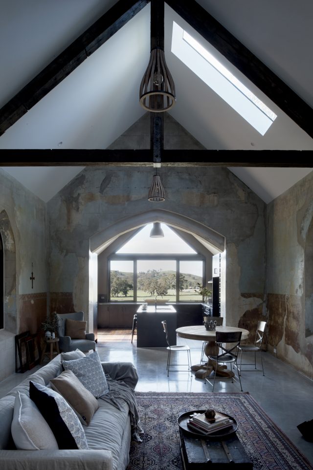
Architect and builder Josh White, of Spa Country Builders, had always been drawn to this 1884 historic church in Yandoit, Victoria, until eventually he purchased and completely transformed it. “It was basically a dream project for any builder. I had previously walked through the building when I was 18 years old and thought ‘wow this would make a great house’. It’s a well-known local landmark and is close to where I live, but little did I know that I would one day be able to turn it into a grand building.”

stegdayles-039_rgb_300
The modern extension really complements the heritage-listed church

Constructed in 1884 by Giacomo Sartori, the Catholic church had fallen into disrepair until Josh began the dramatic transformation into a two-story home. The new extension’s roofline mirrors the church’s making for a cohesive whole. “The property had a heritage overlay, but it was at the bottom of the scale and really only affected the external colour of the building which we didn’t touch. This allowed us to significantly change the use of the building from a church to a dwelling. The design brief was to work with existing roof lines and to not cut up the existing nave but rather keep it as a whole space,” says Josh.

stegdayles-012_rgb_300

“I borrowed some design ideas from traditional churches by using dark floor boards and white walls. I didn’t want to put blonde bleach floorboards down and instead opted for a dark oak hue,” says Josh of the property that is now owned by a young family who use it as a holiday home.

stegdayles-031_rgb_300

Glazing is certainly a focal point of the residence with lovely views from every room. “What really makes the whole property spectacular is that every window offers beautiful views – this is certainly something I do lean towards when looking at properties to renovate,” says Josh. All of the windows from the original church nave were restored and fitted with environmentally sourced, custom Stegbar western red cedar frames.

stegdayles-030_rgb_300

The exterior stone remained untouched too. “Another integral part of the design brief was to keep as much of the patina of the original stonework as possible. Additionally, I wanted to build a new construction that complemented the original shape and lines of the existing building and take into account the beautiful rural views.

stegdayles-012_rgb_300

“Inside the double-storey building, I think the concrete eggshell bathtub that has two large Stegbar plate windows on each side and allows you to look over the paddock and down the valley is a very special feature. The kitchen is also an extremely special design feature that has beautiful views down the lush green paddock and early morning sunlight that flows through the nave,” he says.

Categories
Architecture Design Outdoor & Exteriors Real Renos RENO ADDICT Shopping

Trend alert: Stand out from the crowd with vibrant, slimline bricks

Gone are the days of boring, brown brick that’s crying out to be covered in render. In 2016 it’s all about making an architectural statement with eye-popping, slimline bricks and the new linear range from PGH Bricks & Pavers doesn’t disappoint.

Dating back to the Frank Lloyd Wright architectural style of the early 1900s, the use of slimline bricks to play with pattern and proportion is re-emerging as a major architectural trend across Europe and Australia.

“Linear bricks can be used to create smooth lines, sharper corners and texture for a stand out home,” said Michelle Gissel, general manager of marketing and strategy at PGH Bricks & Pavers.

From aqua to mustard yellow, there’s a colour to help every design savvy renovator amplify street appeal. Stuart Vokes, director of a leading residential architecture firm, Vokes and Peters, envisions exciting new designs with the collection.

“The linear profile is a lovely shift in proportion from the typical 230mm brick. I see these being used to create unique feature walls and incorporated with standard-size bricks for textured exteriors. They would also work well as an internal or external paver,” he said.


Dry pressed linear bricks offer a matt look and are available in 10 colours, including new balmerino blend, popular mowbray blue and gledswood blend bricks.

The linear glazed brick collection features 25 colours, including colourful vibrant bricks, a strong and dark palette of academy bricks, cutting edge urban metal bricks, and the soft and cool tones of the seascape bricks.

See here for more information.

Categories
Architecture Before & Afters Design Real Renos RENO ADDICT

Real Reno: Neglected hoarder’s hovel transformed into breathtaking family home

A heritage listed, dilapidated hoarder’s home set on an incredibly steep block. It’s enough to frighten the most experienced renovator but in just eight months, two courageous brothers have transformed the junk-filled squalor into a multi-million dollar property.

“It was our second hoarder house so I was a little more confident this time. Doing a major renovation, you just ignore it and look at elevation, the view and try to get a feel for the finished product,” said owner of Graya Construction Rob Gray.

BEFORE exterior
BEFORE exterior
AFTER exterior

The finished product is a contemporary four-bedroom family home, with three bathrooms, two living areas and a pool, split over three levels. “It’s very steep and the most tricky part of the build was having to slide the two-story original house. We had to slide it down the hill and just getting the machines up and down and material in and out was a bit of a nightmare. Being on a steep block can easily add 20% to the cost of the build,” said Rob.

BEFORE backyard. Bulldozers are brought in to removes the piles of rubbish and begin earthworks
BEFORE backyard
AFTER backyard

To meet heritage guidelines, the weathered front façade has been restored and the original framework remodelled to form a spacious master bedroom on the top level, with sweeping views of the neighbourhood.

“With the heritage listing there are two options: you can essentially keep the character throughout the whole house, or you can modern it up which is what we chose to do,” Rob said. “I think the master bedroom is easily the best part of the house, the whole level is just yours. It’s huge. It’s a 3.4-metre ceiling and every person that’s seen the house is just blown away by it.”

BEFORE master bedroom
AFTER master bedroom ensuite

But it’s the rear extension, with its expansive timber lined roof and walls, that makes your jaw drop. “I love using natural timber both inside and out. It softens it up and adds texture. White gyprock can be very boring,” Rob said.

BEFORE exterior
BEFORE exterior
AFTER exterior

The second level of the home features the guest bedroom, main living area and an open-plan kitchen with “super-white” marble bench-tops that Rob says “catch the light and sharpen up the island to give it an element of architecture.”

AFTER kitchen
AFTER kitchen
AFTER living and dining

A large void and staircase lead down to the ground level, where you’ll find two more bedrooms and the rumpus, which opens out to the pool.

AFTER staircase and rumpus
AFTER ground level
AFTER ground level

Purchased in late 2015 for $750,000, it took Rob and the team just eight months to complete the renovation. “I started designing the plan when it was under contract so when it settled, I was busy on another job for four weeks then I jumped straight onto it. It was a 30-day settlement and I used that in planning and that’s a big one for anyone that’s looking to do something to on-sell is really use that time to your advantage.”

He adds: “If you are designing it for your family or designing it to sell, it’s two different processes. If you’re designing it to on-sell you have to get in the mind of your buyer. But if you’re designing it for yourself the first step is to decide how many different bedrooms, bathrooms and living areas you want then I would start looking at sizes. Compare houses on the market to what you want to build. Then work out roughly how many square metres you need to get the house that you desire before you start drawing, which people always forget to do. It is really important to talk to some builders and get some estimates on square metres. People really miss that step and it always comes back to bite them.”

Rob also suggests would-be renovators tread carefully with trends to ensure a renovation stays timeless. “There is nothing worse than a modern house where people use the latest fads and then two years down the track it just doesn’t look good and devalues the house. Try to avoid glosses. Use matt two-pack in the kitchen, matt coating on the timber floors and tiles. I did go black tapware in this house but it’s an easy cosmetic update.”

AFTER main bathroom
AFTER main bathroom

The hoarder house, in the sought-after Queensland suburb of Paddington, is now known as the water tower home and sold prior to auction to a couple with a young family.

Rob and Andrew Gray
Rob and Andrew Gray

You can find out more about Rob and the team at Graya Construction here. Photos courtesy of Scott Burrows Photography.

Categories
Designers Interviews RENO ADDICT

Texture in Toorak: We’re coveting this Melbourne real reno

When Melbourne couple Clare and James Canty went to NORTHBOURNE Architecture + Design with a desire to add a second storey to their home, their plans were quashed in favour of reworking the existing floorplan. “The owners first thought they required a second-storey extension to their existing home to create a master suite. However, during our rigorous design diagnosis stage it wasn’t necessary,” says director Sally Holbrook, who set about designing a less invasive, more cost-effective option that was speedier too. Winning!

toorak texture_living_01
Living room with new functional fire place

“Halfway through the design phase, our team found out the couple were expecting their first child. While it was very exciting for them, it reinforced time was of the essence! We finessed our proposed option by reworking the existing floorplan, making minimal changes with maximum impact, as fast as possible!” says Sally.

toorak texture_bath_03a
Main bathroom vanity with handy recessed shelf

What followed was a design process that drew heavily on the couple’s tastes. “One of the key drivers for the aesthetic approach was directly influenced by the owners’ love of patterning, texture and contrast, evident in their artwork collection and household items. These ideas were interwoven throughout the whole design, including joinery design, colour selections and material choices.” Sally replaced the entire timber floor and installed a functional fire place too.

toorak texture_nursery01
Nursery

With her team, she also set about creating lots of functional storage in every room – complete with bespoke details. “We designed unique door fronts for the bedroom wardrobes with inlaid timber details and recessed finger pull door handles. We also designed a continuous steel recessed shelf under each of the mirrored cabinets in the bathrooms – there’s a black one and a white one. We think they look great and they are very useful too.”

toorak texture_master_02
Master bedroom

Sally’s favourite part of the renovation is the master suite – a luxurious space full of unexpected details including a timber shelving unit traditionally found in a lounge room or living area.

toorak texture_master accessories wall_02
Master bedroom shelving display with wardrobe behind

“We transformed a series of existing rooms into a large master suite for the client, consisting of a large bedroom, built-in display shelving, walk-in robe and a large ensuite. One side of the walk-in robe was specifically designed not to continue up to the ceiling, acting like a room divider than a wall. This is so we could achieve a seamless ceiling between the bedroom and robe. This technique helps to create a space that feels expansive and endless, and ultimately larger,” says Sally.

toorak texture_ensuite_02
Ensuite basins – we love the textured tile that continues from floor to wall
toorak texture_ensuite_03
Ensuite

“On the bedroom side of the room divider, we introduced compartmentalised, Japanese-inspired wall display shelving in a timber finish to match the new floor finish,” says Sally who also designed a highly functional wardrobe for the couple too which includes pull-out drawers and pull-down hangers to make use of the high ceiling.

toorak textrue_robe_01d
The master suite walk-in robe & its amazing storage
toorak texture_master window
Master suite window

See more of Sally’s work here.

Photography by Eve Wilson

Categories
Interiors Addict

The mini-skyscraper home built on just 20 square metres!

Standing on just 20 square metres in inner-city East Melbourne on a 5×4 metre block, the 5×4 Hayes Lane Project’s commitment to environmentally sound, sustainable design can be seen in the way it was designed, built and now functions. The home’s owner builder Ralph Alphonso built it on a site that used to house an old shed adjacent to his former home.

5x4 Portrait

“The house is down a laneway that is adjacent to a property that I own. It was a remaining parcel of land that I subdivided and the old parcel of land dictated the size of the building,” says Ralph. Building to the boundary on three sides, with 900mm on the fourth, Grand Designs Australia referred to it as a ‘mini skyscraper’ when they featured it in their sixth series.

5x4 Bedroom

Plywood cabinetry chosen for its eco-credentials

 “I wanted an efficient house that was built in a sustainable manner but was liveable too. I didn’t want to live in an eco-house that wasn’t functional for everyday use.” The home was built with products and materials that used minimal energy to produce, constructed from hardwood timber offcuts that would otherwise have ended up as woodchip. “The offcuts are glued together to form an even stronger material,” says Ralph of the home that operates entirely on renewable energy – most of which it produces itself.

“The solar panels on the exterior of the building generate about 19 kilowatt hours of energy per day in summer which is a substantial amount of electricity for such a small site. We’re going to have battery storage soon so we’ll be storing power on site and will probably generate more power than we use and put it back on the grid,” says Ralph.

5x4 Sofa-Couch

The lounge that transforms into a dining table

For those of you wondering about any feelings of claustrophobia, floor to ceiling glass on one side and myriad windows on the others really work to reduce the feeling of enclosure. “Also, exposed ceilings increase the height above your head which makes the rooms feel larger too. These were subtle, design-driven choices made to help make the home feel larger internally,” says Ralph.

5x4 Roof-top Deck

The geo-thermally heated outdoor spa

With small internal spaces, the rooms are designed to be multi-purpose with furniture created accordingly. “The sofa turns into a dining table and its foot rests become stools. There is also a TV that pops up and hides away which means it doesn’t obstruct the home’s city views when not in use,” says Ralph.

5x4 Ensuite

“We like to think of the building as an exemplar of what can be done. We wanted to show that sustainable design can be liveable and built on a small footprint. Sustainability is also about urban in-fill and using pieces of land that aren’t being used,” says Ralph.

The home is open as part of this year’s Open House Melbourne which is taking place on 30 and 31 July. The weekend puts a spotlight on the unique spaces and places that form the foundation of the city, providing an opportunity for you to consider what makes Melbourne unique. It showcases buildings of significance in a free and accessible format so everyone can experience the value of good design and architecture, and consider what makes a liveable city

For more on the 5×4 home, see here.

Categories
House Tours

Real home: Inside a 1970’s inner-Sydney masterpiece

By Katrina Malyn | Photos courtesy of BresicWhitney

What kind of privacy can you expect in a house in a densely built-up, inner city area? The house at 8 Broderick Street, Balmain is a rare example where smart design creates a sense of unexpected solitude. It’s also a great example of how enduring smart design principles can be.

image 1

This house was recently sold by BresicWhitney and I went there to have a look before the new owner moved in.

image 2

The very first impression you get from the street is just how secluded the house is. There are hardly any windows at eye level and no welcoming entry porch. However, there is a narrow walkway to a concealed entry surrounded by wild foliage. As you approach this tall, dark brown building (it conjures a medieval castle), you suddenly realise that you are walking on a bridge and the deep gutter under your feet resembles a mote.

The architectural elements inside add to this feeling of a knight’s lodge: a heavy wrought iron gate leads to a spiral staircase with a thick solid metal handrail and the walls are rough and textured. The black fireplace adds to the austere impression.

However, the inside is a stark contrast to what you can see from the street.

image 3

What seemed impenetrable from the street is unashamedly open inside. The house turns out to be a glass box with floor-to-ceiling windows running the full length of each of the three levels.

Suddenly, a feeling of solitude envelopes you, even in the master bedroom on the top level, where two walls are fully glazed opening to tree foliage on one side and water views on the other.

We are used to thinking that privacy in a city means closing yourself off with walls. So why does the openness of this house give such an unexpected feeling of seclusion? The unusual zig-zag layout of the house and the sloping terrain prevent neighbours from looking into the private parts of the house.

The main reason, however, is that this house with its almost non-existent walls, resembles a hut on a desert island where you don’t need to protect your privacy because you are the only human there.

image 4

The impression of a hut is reinforced in the lounge room on the ground level – it has a straw ceiling. The straw, however, has been shaped into perfect squares. This is not the wild straw of a tropical island.

The ruggedness of the house serves as a perfect backdrop for modern furniture – this house was built in the 1970s but great design principles work decades later.

image 5

The main design principle that makes this house so successful today is the contrast between the understated and the unashamed. As the house was built with a bohemian lifestyle in mind, it is predisposed towards the unabashed and the bold – its exposed bedroom is a great example of this.

image 6

The interior and exterior materials are simple – concrete, timber and glass – but they are materials of luxury because of how expensive they are. Concrete and solid timber are both luxury materials and so is glass in abundance. Together this combination makes for a feeling of nonchalant luxury.

The house and its interiors are heritage listed despite the fact that it was only built in the 1970s. This unique building was designed by the acclaimed architect Stuart Whitelaw for another architect Sir Roy Grounds. The collaboration of these talented people resulted in a house that amazes even to this day.

Katrina Malyn is a designer specialising in creating houses with a view even if there is no view. Examples of Katrina’s work can be found across Sydney, and range from under $500,000 to $1 million projects.