Categories
Architecture Design Designers House Tours Interiors Addict Interviews Outdoor & Exteriors

Statement brick ‘lacework’ features in Melbourne new build

Located in Melbourne’s Mount Waverley, this expansive 600 square metre home was designed by architect Michael Ong, of MODO. Tasked with creating a ‘visually dynamic’ house to accommodate its owners (a retired couple and their two young-adult children) as well as family and friends who often visit from overseas, the abode boasts a variety of communal and private spaces. Overall, the unique, multi-generational home is tranquil yet striking.

MODO
Nestled into the landscape, the home is striking from the street

The exterior is divided into two halves; the bottom half consists of ivory-coloured concrete block, while the second storey is clad in thermally modified timber. The desire was to make the home feel as if it was grounded and embedded into the earth and had a sense of ‘mass’ and ‘weight.’ “From the street, the homeowner wanted something that was a bit dynamic and had a point of difference,” says Michael.

Kitchen
Kitchen

“We naturally investigated concrete bricks and blocks and moved away from the grey and darker tones, as we wanted a house that felt welcoming and homely. The light-coloured ivory architectural brick, from Adbri Masonry, worked wonderfully to give us a smooth yet subtly textured finish, which paired beautifully with the timber cladding and the landscape design,” says Michael.

Rear
Backyard

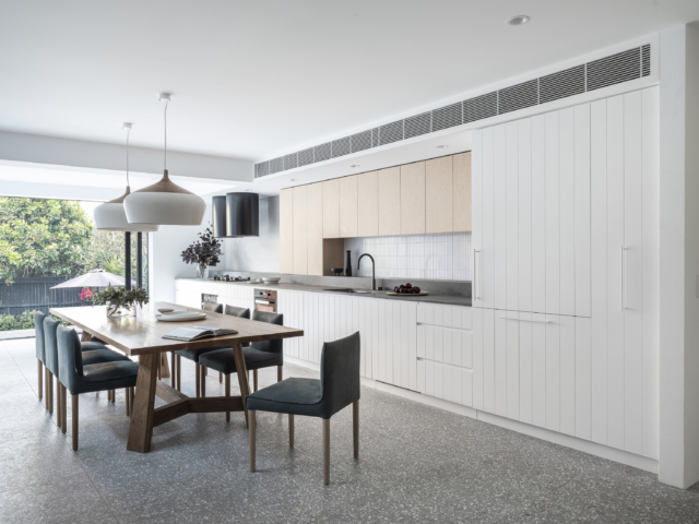
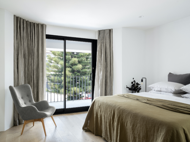
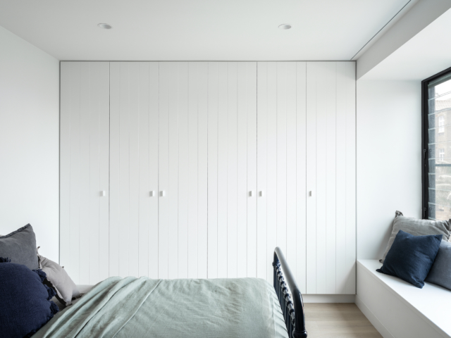
Downstairs, the home features two linear wings – one containing the guest zone and the other for the kids with its sweeping curved glass corridor link. The second floor houses the bedrooms, kitchen, living, dining, pool, sauna and gym.

Glass corridor

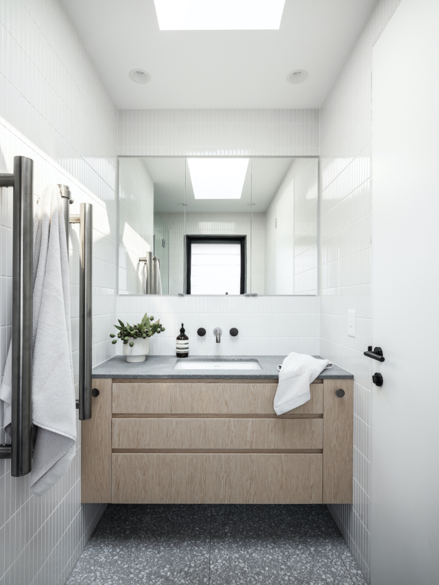
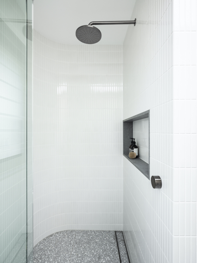
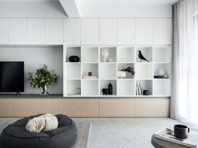
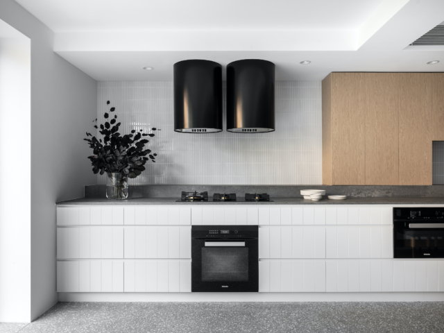
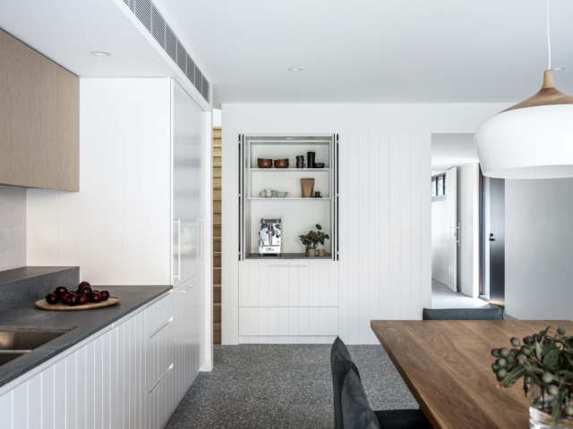
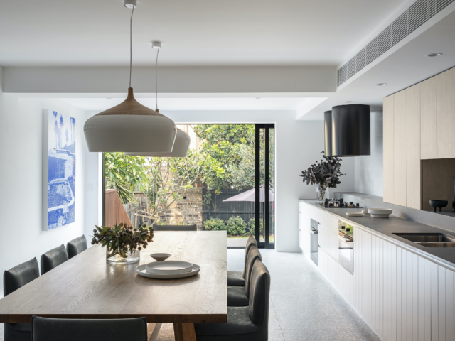
An abundance of timber interior details give the spaces an intimate feel – there’s wood walls, wooden cabinets, timber ceilings and floors as well as dark details on the fireplaces and bookshelves. The overall effect is one of restrained minimalism.

Lounge room
Lounge room

The lower floor features a gorgeous private courtyard which creates a focal point for the home. “I wanted the house to feel like it’s connected with the courtyard as the central area, so you always know where you are,” says Michael of the space that features a series of silver birch trees and a curved, insitu concrete bench. The floor above provides shade. “I like to let the building work in a way that actually provides a cover for the outdoor space instead of having to add a cover such as an awning,” says Michael.

Courtyard
Courtyard

To offset the heaviness of the home’s extensive use of brick, lace-like brickwork features throughout. “The architects did a lot of work with the bricklayer and the engineer to get the concrete brick lacework to curve. The result of the lace detailing allows more light in and draws the eye to the sculptural element within the build,” says Michael.

Lace brickwork is also used downstairs as a screen, in a smaller pebbled courtyard, accessed via the guest bedroom – the design lets light in while adding a beautiful visual element too.

Guest room
Guest room
Bedroom
Bedroom

Photography: Derek Swalwell

For more

Categories
Architecture Bathrooms Design Designers Expert Tips Interiors Addict Interviews

How to add character and warmth to a new bathroom

Most people would assume this bathroom was part of a heritage home, but you’d be incorrect. Located in Sydney’s Maroubra, it’s actually part of a new build that manages to cleverly dance the line between modern and traditional. No mean feat!

“The owners love modern country, industrial, nautical as well as landscape elements so it was a very mixed brief. One of the design challenges was in paring things back but still giving the owners a home that had a strong sense of self,” says Randwick-based architect Sharon Campbell.

A mix of traditional and modern elements, the standout is the statement green textured subway tile from Amalfi. “You see them in pubs! But instead of doing a plain brick stack we did vertical, then stacked and then a traditional brick pattern to dado height,” says Sharon of the textured tiles that echo the face brick that appears elsewhere in the home. And while that tile design cost more to lay, it’s one of Sharon’s favourite parts of the space. “I love how it feels old world yet contemporary.”

The bathroom features Astra Walker brass tapware
Sharon Campbell
Reclaimed brick lines the nearby hallway. The brass wall sconce is from Creative Lighting Solutions.

Paired with the green tile, an eye-catching Zinnia palm wallpaper from Natty and Polly was chosen to reflect the owner’s love of plants and greenery. “It’s also a bit retro and has a 70s and resort feel. I think it gives the room a nostalgic, luxurious feel and it feels a bit like you’re in a holiday home,” says Sharon. The wallpaper was also a cost-effective way of adding another big feature to the space. “When it comes to bang for buck, the wallpaper has real presence and didn’t cost that much,” says Sharon.

Sharon Campbell bathroom

Brass Astra Walker taps and Kethy handles are another highlight. “But while they are brass, luxe and traditional, the clean lines make them modern,” says Sharon. The custom vanity features black shaker joinery and a Corian benchtop while the floor is tiled in hexagonal carrara marble tiles from Terra Nova. An operable skylight bathes the bathroom in light.

Sharon Campbell

Overall, Sharon is very happy with the result and mostly because her client was thrilled. “I’m always most proud of giving the client something they’re happy with and they absolutely love it!”

For more on Sharon Campbell Architects

Categories
Architecture Design Expert Tips RENO ADDICT

Limited edition, architect designed home plans to build where and with whoever you like

“We realised that there were many people who wanted access to architectural home plans but they didn’t want to spend upwards of six months designing a home that they didn’t know the build cost of. They also wanted the freedom to have their home built by anyone instead of just the builder who offered the plans. We knew there had to be a different solution. It didn’t exist, and so we created Terren.” says founder and lead architect Paul Kegen.

Terren is the newest option in architectural home design. A brand new architectural firm offering limited edition, architecturally designed, fully engineered and thermally assessed home plans with artfully curated finishes. They’re ready to build on their client’s land by their choice of builder.

The Terren idea was born out of the founders realising there was seemingly a gap in the home design market between architect designed plans from scratch and volume builder designed and built homes.

Paul says: “As an architect, I deal with all sorts of different clients and families with, as you can imagine, a huge variance in what they want, need and are willing to spend. I started to notice this pattern of similar problems, barriers and miscommunications between clients, architects and builders. Essentially, it seemed that what most people wanted was access to beautifully designed architectural home plans but they didn’t want to subscribe to the associated time and costs involved.

“They also didn’t want to follow the volume build model that locked them into one particular builder from the outset but rather wanted the freedom and flexibility to have their home built by whomever they choose to trust. So we created Terren as an entirely new option.” Only 10 of each design will be allowed to be built; only one per suburb.

For creative director Justine Gaitz, the idea immediately resonated as she had recently been through her own fraught home design process, “I began my own build with one of Melbourne’s leading custom home/volume builders. I was under the illusion that this was a more affordable way to build but very quickly I realised that every change I made to the builder’s standard plans was considered custom.

“From big items like increasing the ceiling height to smaller choices like non-standard floor covering – by the time they added all these custom “upgrades” up (two years down the track) my house was simply not buildable for the contract price we were given. Leaving that builder and starting from scratch was obviously a devasting loss of time and money.”

Rounding out the team is Rodney Seidner, head of construction for S&K Group. “My team provides the verified build price for each Terren design. This is intended to be a realistic price which tells Terren clients how much we would build their home for from the outset. Nothing needs to be upgraded because it has all already been designed using the highest quality products.

“Of course, Terren clients can take their plans and have them built by any builder they choose – they can tender the plans or even owner build themselves. We’ll provide guidance for them for any process they choose. The point is really to bridge the gap between architects designing and builders pricing. With Terren, everything is known upfront and we find our clients really appreciate that.”

Terren’s Botanical collection includes large double-story family homes and even a single-level sprawling home with the Terren Townhouse design set to be released later this year. There are even pre-prepared floorplan changes and optional additions to enhance your family’s lifestyle if you wish to tweak them.

As you select, your verified build price will be automatically updated so you can play around and see what things really cost to build. You can even download your selections and floorplans once you are done.

The changes available on the website are just the start. Once clients meet with the Terren team they can fully customise their home to their site and family. Paul says: “We operate on an 80/20 rule. Our plans are 80% pre-designed for speed and 20% customised for flexibility. It’s still early days but so far, we have had clients who have made their Terren designs much larger and also those who have requested shrinking them for a narrower block. We have had clients add wine rooms and man caves and sunken lounges. We haven’t said no yet.”

All Terren packages are under $30,000 including GST, which they say are around half the normal price for architectural plans that would not include structural engineering, thermal assessment, landscaping and a verified build price. In order to get started and assess your land for suitability, they need a Land Survey completed by a registered land surveyor and a Soil Report completed by a geotechnical engineer; the same pre-requisites for any home design.

For more information

Categories
Architecture Design Designers Expert Tips Interviews RENO ADDICT

Knockdown or renovate? Expert tips to help you decide

Whether your family has grown in size, or your house is looking a little tired, you might be weighing up the pros and cons of renovating versus demolishing and starting afresh. It’s a quandary that Melbourne architect Anna Dutton, of Bower Architecture, sees all the time and she’d like to help our readers put some clarity around the issue.

“This week I chatted to some really lovely potential clients who had mid-century houses, and they were struggling with whether they should renovate or create a new home. It’s a question we get so often that I thought it might be worthwhile to share our thoughts with anyone else who is facing the same challenge,” says Anna.

Bower
This Bower Architecture new build sits atop a demolition site

While renovating can produce a great result from a design, sustainability and cost perspective, Anna stresses that a home must pass a simple three question test to figure out if it’s worthy of demolition or an overhaul.

Is your home structurally sound?
Is the house or building in good structural condition? Answer with a ‘yes’ if it feels solidly built and there are no large cracks appearing, no springy squeaky floors, no damp on the walls (or on your nose!) and if the walls and floors are straight or level. 

Are you happy with your home’s room sizes?
Are the majority of the rooms a good size to be re-used? Answer ‘yes’ to this one if you could imagine re-purposing most of the spaces with a continued or new use. For example, in an existing house, are the bedrooms a size that you are happy with keeping? Are bathroom spaces large enough to be re-used?

Bower Architecture new build
The owners of this home decided to start afresh because the old one had small room sizes

Does your home have good bones?
Finally, does the house or building have some architectural character and do you actually like it? It doesn’t have to be a masterpiece but if it has something interesting to you, and some charm, answer ‘yes’ to this question.

The old home on this site was poorly oriented. A new build remedied this.
The old home on this site was poorly oriented – the new build remedied this.

“For the house or building to be an ideal candidate for a renovation, you need to have answered ‘yes’ to all three of these questions. If you have answered yes to only two you could have a renovator on your hands, but it may be similar in cost to a rebuild. If it is a ‘no’ to all, a new project will probably be your best option financially,” says Anna.

And while we love a one-size-fits-all approach (I mean, who doesn’t want this issue resolved in three simple steps?), there is one factor that completely nullifies the above. And that is a matter of the heart – are you emotionally attached to your existing home? Has your home been in the family for years or has it been the backdrop to many amazing memories? “If this is the case a renovation is the only way forward even if you have answered ‘no’ to all of the questions above.”

Architecture & interior design: Bower Architecture | Photographer: Shannon McGrath | Shoot stylist: Ruth Welsby | Builder: Macasar | ​Furniture, decorating and artwork selections: Tara Wood | ​Window coverings by Nicole Bell Design

For more

Categories
Architecture Design House Tours Interviews Real Renos RENO ADDICT

Queenslander home reno: Chocolate timber melds old with new

With the Scandi trend having endured for so long, it’s fair to say that we’ve been in the grip of light timbers for some time now. Which is why it was so nice to come across this Brisbane renovation and its dark, chocolatey timber accents. Rather than simply painting over the home’s original dark timber (as so many heritage renovations do), architect Allison Smith, of Studio 15B, made a feature of it.

House
Front elevation

“The existing house had original dark stained timber windows, doors and trims and we were drawn to these aspects,” says Allison Smith of the 100-year-old Queenslander that is at the centre of the home’s recent renovation. Not only do dark timber stairs help connect the old and new areas of the home but dark joinery elements were included throughout to create a cohesive whole.

Master bedroom
Master bedroom
Bathroom
Bathroom

Most notably, a dark stained timber tongue and groove clad feature wall runs from the home’s entry and wraps around into the dining area; it’s a stylish reference to the home’s original VJ panelling. “These dark touches helped to tie the interiors together while blending original and new elements,” says Allison.

Dining
Dining

Located in New Farm, the overhaul of this home wasn’t exactly straightforward; the original home was raised and renovated, before a brand new level was built underneath. The new parts of the home are on the lower level, and there’s new small extensions to the side and rear.

“It sounds difficult and it’s not without its challengers, however it’s very common with old timber Queenslander homes so it’s a well oiled operation. It’s a great way to significantly increase the area of a home without increasing the footprint and taking up too much of the site,” says Allison.

Kitchen
Kitchen

Located on a sloping site, the ground floor sees visitors step down into the rear of the home with high ceilings an added bonus of the new design. “The slope created high ceilings in the kitchen, living and dining areas. A 4.2 metre ceiling height was achieved in the living room which allowed for a striking wall of glass that overlooks the landscaped rear and pool.”

Lounge
The lounge room looks out onto the backyard

As for the home’s owners, they had lived in the original abode for many years and while outgrowing it, didn’t want to move. “They loved living in the street and saw the value in a complete renovation that would service their needs and growing family for the long term,” says Allison who was tasked with designing a flexible family home with separate zones for the home office, entertaining, guests and family needs. 

Backyard
Backyard

“One of the main goals was to design the home in a way that did not create the feeling of two separate houses – old and new.  The new areas needed to blend with the old, retained fabric in a contemporary way,” says Allison of the home that had last been renovated in the 1970s.

Original hallway
Upstairs original hallway
Downstairs entry
The new downstairs entry and hallway

“We are proud of the way we have achieved the many brief requirements on a small lot, while still paying homage to the original home. The result is a home the clients will utilise well into the coming years.”

Photography: Angus Martin

For more

Categories
Architecture Design Designers House Tours Interviews Real Renos RENO ADDICT

North Bondi 80’s semi undergoes robust & timeless renovation

Home to a professional couple, their three young children and two lively dogs, this North Bondi semi-detached home was originally built in the 1980’s. Purchased almost exclusively for its location, the home has since undergone a highly considered renovation courtesy of architect Josephine Hurley. “When the client bought the home, it was all about the location as they knew they could work with an architect to remodel it and make it perfect,” says Josephine.

The kitchen and dining flows out to the rear garden

Key considerations included expanding the home’s liveable footprint, and improving its natural light and ventilation while making the spaces elegant, robust and timeless. “They spend a lot of time at home with their young family and they ultimately wanted a home that felt calm and relaxed,” says Josephine.

Bathroom
Shower recess: “The curved wall in the bathroom was a way of introducing something special into what is quite a restrained space,” says Josephine.

Key to the feeling of tranquillity is the neutral and consistent materials palette; white ‘kitkat’ mosaics, soft grey Italian terrazzo tiles, oak and v-groove joinery all bring gorgeous textural and tactile qualities to the home. “The tiling is consistent throughout the house. The white ‘kitkat’ mosaics from Surface Gallery feature not only in the bathrooms but also in the laundry and kitchen.”

Living room
Living room

Creating more liveable space was another key part of the brief to which Josephine responded by enclosing both rear balconies. “I reimagined the interiors to utilise every available space in what is a compact floor plan,” says Josephine. In another clever redesign, the first-floor hallway was transformed into a walk-in robe for the owner who had always wanted one, but didn’t have the space.

Master bedroom
Master bedroom
Child's bedroom
Child’s bedroom
Child's room
Child’s bedroom

The Qasair overhead extraction fans draw the eye in the kitchen; the matte black finish ties in with the black appliances. “The client enjoys cooking and was after a statement piece that also had great functionality,” says Josephine. And with so many family members, minimising clutter was essential; everything from wine to dog food has a designated storage space. 

Kitchen
Kitchen
Appliances hide behind v-groove joinery in the kitchen

The kitchen and dining spaces are elevated, allowing for full visibility and a strong connection to the outdoors. Retractable glass doors and timber bleacher steps overlook the garden and let the children and dogs run free.

“It’s always hard to select a favourite part of a property, however the combined kitchen and dining room is particularly successful as there is plenty of storage and natural light. It is a clutter-free, bright and naturally ventilated space where the family enjoys gathering together to cook, enjoy a meal and entertain with family and friends.”

One last look at that lovely inside/outside flow

For more

Photography: Tom Ferguson | Styling: Holly Irvine

Categories
Architecture Design Designers RENO ADDICT

Houzz announces Best Of Houzz 2020 winners

Shining the spotlight on just 3 per cent of its professional community, the 2020 Best of Houzz awards have been announced, honouring those whose work was the most popular on the platform. Receiving an accolade is no small thing, especially when you consider that the Houzz community includes 2.5 million active home professionals and interior and architectural photographers.

This bathroom, by Studio Black Interiors, is one of this year’s winners.

“This year’s Best Of Houzz awards go to an incredibly talented and service-oriented group of home renovation and design professionals, and we’re proud to highlight the winners on the Houzz website and app. This award is particularly meaningful as it reflects the sentiment of the millions of homeowners in the Houzz community who are hiring home professionals for their projects across Australia and around the world,” says Tony Been, managing director ANZ at Houzz.

The awards are handed out annually across three categories including design, customer service and photography. Design awards recognise the professionals that were the most popular among the Houzz community, while customer service honours are based on factors including a professional’s overall rating and client reviews submitted in 2019. Photography honours are awarded to architecture and interior design photographers whose images were the most popular.

Another winner, this kitchen is by GIA Bathrooms & Kitchens

Winners will be able to display a “Best Of Houzz 2020” badge on their page, specifying the category won, which helps homeowners identify popular and top-rated professionals. The badges are highly sought after within the Houzz professional community, as attested to by some of this year’s winners.

This serene infinity pool, another winner, was created by Living Style Landscapes

“Houzz has such a large following and is a platform for renovators and homeowners around the world. Winning the Best of Houzz Awards consecutively since 2017 is something I’m extremely proud of. Houzz continues to support my business and brings genuine clients with different size projects and budgets,” says Julianne Bull, principal designer at The Den Interiors.

Den Interiors created this winning living room

Having won several Best of Houzz awards over the years, architect Rebecca Naughtin agrees. “Prospective clients are more likely to reach out if they have confidence in your business.  A Best of Houzz badge improves our exposure, gives credibility to our profile, assures clients that we are competent professionals and boosts our team morale,” says Rebecca.

This bespoke timber staircase, by Rebecca Naughtin Architect, is one of this year’s winners.

Browse the 2020 Best of Houzz award winners | Growth in kitchen reno spend according to Houzz survey

Categories
Architecture Design House Tours Interviews

Granny flat design: A chic new build in outer Sydney

Located on five bush acres in Sydney’s Hills District, this new build is no ordinary granny flat. Comprised of two small connected pavilions, the stylish one bedroom home has all the mod cons its occupants need, while remaining close to their family who reside nearby on the block.

Granny flat
The one bedroom home is split into two pavilions – one houses sleeping and the other living

“The home is a secondary dwelling on their son and daughter-in-law’s property. They wanted to be close to family but maintain privacy,” says the home’s architect Luke Carter, director of Sandbox Studio.

Compact, environmentally sustainable and close enough to the access road, but out of sight of the ‘main’ house, the home ticks many boxes for its owners who are in their early seventies. “Though modest in size, the house is designed to open up to the landscape to create a feeling of space. To make the small-footprint home feel generous, we gave it high ceilings and lots of windows so every part of the house projects towards a view,” says Luke.

Kitchen and living
Kitchen and living

The two pavilions separate the house into two zones; a public and a private, with a corridor linking them. Simple yet robust materials give the home an industrial feel which is countered by the warmth of natural timber inside, as well as the occasional pop of colour.

Lounge
Lounge

“Recycled bricks and steel cladding address the bushfire code and lend character. The interior is also robust, using recycled bricks for the chimney, Tasmanian oak floorboards and ceiling and wall linings of unpainted fibre cement sheeting,” says Luke. The custom kitchen and bathroom vanity were made from recycled spotted timber while the only painted surfaces are two doors that provide colour in the corridor.

Bathroom
Bathroom

Environmental features include solar roof panels for power, rainwater tanks for irrigation and firefighting, double-glazed windows, insulation and an Envirocycle composting septic tank. “We are proud of the fact we have very happy clients who are really enjoying their little home in the bush. We are also proud of the fact the house has a low carbon footprint due to the passive design principles used,” says Luke.

Bedroom
Bedroom

And does Luke believe this ‘granny flat’ design is symptomatic of a wider trend? “We believe that the granny flat/studio trend is on the rise due to housing affordability and availability, along with the rise in multi-generational living.”

Granny flat

Photography: Katherine Lu | Styling: Megan Morton

For more on Sandbox Studio | How to earn money from your granny flat

Categories
Architecture Design Interviews

Two terraces combine in Melbourne ‘mountain’ home

Designed by Austin Maynard Architects and located in Melbourne, this new five-bedroom family abode incorporates the front of two pre-existing terrace homes with a fabulous rear build that is most notable for its mountain-like roofline.

“The owners were preparing to renovate and extend their tired single-fronted terrace in North Fitzroy, Melbourne, when the house next door came up for sale,” says Andrew Maynard of Austin Maynard Architects, the firm that designed the project. The newly purchased home, despite being dilapidated and unliveable, was subject to heritage restrictions that required the street frontages of both homes to remain. “We were asked to combine the neighboring properties to create a family home and garden for a family of five,” says Andrew.

The two existing terraces are linked by a glazed entry

The roofline captured from the garden at the rear

The entry leads from the front garden to a lounge, kitchen and dining room. The parents’ bedroom, walk-in robe and ensuite are located above the kitchen. There’s plenty of clever design in the kitchen including a glass splash back that slides to reveal a hidden pantry, appliance storage shelves and food preparation area behind.

Kitchen
Kitchen

Dining
Dining

Parents' ensuite
Parents’ bedroom and ensuite

Beyond the kitchen, dining room and concealed laundry, a two-storey kids’ zone houses three bedrooms and a bathroom accessed by a spiral staircase. Below is a rumpus room, study and multifunctional utility/garage space.

Rumpus room
Rumpus room

“The rumpus room opens out to the garden and also to the street, future-proofed to become self-contained with its own direct street access. Behind is a dedicated craft/study area, designed to allow for both maximum creative mess and quiet secluded revision,” says Andrew.

The kids' study has an abundance of toy storage
The kids’ study has an abundance of toy storage

Arguably the hallmark of the home, the exterior roofline looks like a series of mountain peaks – a design response that came about organically. “Initially it looks to be a fanciful design, an architectural mountain range, but at its core the house is responsive and strategic. The roof form is contextual; every rise and fall is tuned to minimise overshadowing and visual bulk,” says Andrew.

Lounge
Lounge

The roof is low against abutting gardens (to avoid overshadowing) and high where the neighbours have built against the boundary. “In creating height in all the areas, both internally and externally, the mountain profile emerged,” says Andrew of the roof that is covered in slate, chosen for the patina that will develop with age and the lichen that will establish itself on there. “It will create a beautiful canvas beyond its utilitarian function,” says Andrew.

RaeRae
Slate tiles cover the roof

Another interesting aspect to the home is the way that it engages with the often-forgotten rear laneway – created with a view to engaging with the street and neighbours, there’s large openings, direct access and windows too. “There’s lots of garages but also extensions, subdivisions and newer builds that have capitalised on the dual frontage aspect in the laneway. Rather than defend from the street, the design opens to this public space.”

The house from the laneway

Photography: Peter Bennetts

For more on Austin Maynard Architects | Another sophisticated Melbourne family home

Categories
Design Designers Interviews Kitchens Real Renos RENO ADDICT

Real reno: Blue kitchen block transforms townhouse

Located in the inner-Melbourne suburb of Balaclava, this compact 2001 townhouse was creatively redesigned recently, on time and to a tight budget, for a father and his two sons. “This was an exercise in tailoring a space to a client’s needs,” says the project’s architect Richard King of RK-D.

The architect maximised storage space and turned the former maze of rooms into a much more open plan environment with the striking blue kitchen undoubtedly the star. “My client loves the blue and how it juxtaposes with the timber floor and nearby white library,” says Richard.

Kitchen
The kitchen joinery is finished in 2-pack polyurethane (10% gloss) in Dulux ‘Crew Deck’

“A simple, blue block of built-in-joinery defines the new kitchen/pantry and WC. I wanted to create a singular element that neatly collected everything together. I also wanted for it to add a pop of colour,” says Richard who designed it in such a way that the laundry and WC are efficiently tucked away at the back while the pantry, fridge and rangehood are at the front.

“The blue wall is a cluster of built-in joinery. It’s a simple element that neatly contains everything whilst hiding its useful contents from sight,” says Richard who came up with the concept after seeing a similar wall at a London art gallery.

The laundry is concealed behind the blue kitchen
This simple white laundry is concealed behind the blue kitchen

A clever joinery solution was also employed in the adjacent lounge area – the multitasking space functions as a library, place to watch television and study area. “My client wanted to add in more storage capacity, so I designed a bespoke library/storage wall. He also wanted a space to do out-of-hours work so I included a study nook into the library wall,” says Richard.

Study nook
Study nook

The multi-purpose wall unit has a space for a large television, hi-fi system, as well as shelves to display the owner’s beloved record collection too.

Lounge
Considered lounge room joinery allows things to be stowed neatly away

Nearby, a bathroom and WC were combined to create one larger, light-filled space. “We converted an enclosed WC into a walk-in shower room and relocated the WC to the other side of the bathroom, allowing for a large freestanding bath and new purpose-built vanity,” says Richard.

Bathroom
Bathroom

The bathroom’s light material palette and reflective surfaces also contribute to a greater feeling of space. And again, the room showcases a flash of blue – a gutsy tile choice that has really paid off.

Shower and bath
I love that bright double shower!

Photography: Tom Roe Photography

For more on RK-D | Another Melbourne home that celebrates blue

Categories
Architecture Design House Tours Interviews Kitchens Real Renos RENO ADDICT

Real reno: St Kilda Art Deco home elegantly revived

Originally built in 1936, this two storey Art Deco home was beautifully renovated recently for its inhabitants who have lived in it for the last 25 years.

“Our clients raised their family in this home without any modifications over that time, but the house needed to reflect the way they live today which has changed over time. They now have adult children coming and going,” says the project’s architect Luke Fry of the home that is located in the Melbourne suburb of St Kilda East.

Backyard
Backyard. New square structures are offset by the home’s original curves and triangular shapes.

Bedroom
Bedroom

First up, the family wanted to improve upon the dark and dysfunctional spaces in the home; primarily the ground floor kitchen and dining areas. The result includes a gorgeous kitchen that is a standout space in the home – Blackwood timber joinery complements the original blackwood timber panelling found throughout the original abode. Sirius natural stone in black, brass tap ware and Japanese tiles are just some of the details that elevate this space.

Kitchen
The stunning new kitchen features layers of texture

The kitchen takes its timber cues from this original staircase
The kitchen takes its timber cues from the home’s original staircase

Another key part of the renovation brief, the family wanted to open up the rear of the home to the outdoors. Luke’s solution to this was to create a concrete deck that is accessed via a very elegant set of square steel windows complete with Art Deco inspired decorative glazing.

Dining
Dining

Door detailing
Bespoke glass door detailing

Sympathetic to the original home, the renovation certainly has a timeless quality about it, and this was achieved in part through a clever selection of finishes. “The use of light and dark materials creates moody spaces that you’d expect to find in a home of this era,” says Luke.

Bathroom
Bathroom

“The execution of this home sets a precedent for how best to renovate and prolong the life of a period home without an excessive cost or extensive demolition.”

Powder room
Powder room

Images: Derek Swalwell

For more on Luke Fry Architecture & Interior Design | Sydney Art Deco gem transformed into luxury hotel

Categories
Design House Tours Interviews

Real home: Blended family’s colourful retro Perth abode

Located 100 metres from the beach in the well-heeled Perth suburb of Swanbourne, this colourful family abode ‘LittleBIG’ is home to two doctors and their blended family that includes five children.

Lounge, dining & kitchen

“Three years ago, we were interviewed by an amazing determined young doctor and mum holding her and her husband’s new baby (number four) along with a folio of images with a mid-century vibe and a clearly defined design brief. They wanted something robust and flexible and built to a modest budget and tight schedule!” says the home’s architect Suzanne Hunt who recently won a commendation for the home in the ‘Interior Architecture’ category of the 2019 WA Architecture Awards.

Kitchen
Kitchen

With more than a casual nod to mid-century design, the home embraces individuality, colour and lovely connection to the garden.“Our clients’ brief was for a modest, flexible forever family home that would be beautiful and still robust enough to accommodate her busy family of five young children, two working parents that couldn’t use a drill, a menagerie of animals, and most importantly her love of colour, vintage second hand furniture and ceramics,” says Suzanne.

Lounge room
Lounge room

Mudroom
Entry

“The interior and exterior materiality palette for LittleBIG was designed for loads of kids and their friends who, let’s face it, have no respect for delicate architecture and interior design and their parents who have no interest in maintenance. Sustainability, low maintenance, minimalism, colour and a playful feel were the key design drivers,” says Suzanne.

So much colour!
So much colour!

Child's bedroom
Child’s bedroom

“Integrating their collections from life so far was also a priority as was integrating the owners’ continuingly growing collections. The owner has a wonderful eye for reimagining and a very handy knack for finding the most amazing furniture and fittings online. I look and find nothing!” says Suzanne.

Master bedroom
Master bedroom

Backyard
Backyard

Built on an 845 square metre wedge-shaped site, the home sits uncomfortably between six large houses in a small cul-de-sac which provided a challenge for Suzanne. “We had to think outside the box but the home takes advantage of the many positives of its location including strong early sea breezes, long distance views and the sound of the waves crashing on the sand,” says Suzanne who took care to maximise every square inch of the property for the large family.

Outside
Green and blue glazing is separated by panels of taupe and chocolate brick

Backyard

As for her favourite part of the project, Suzanne loved working with a client that was realistic with regard to budget and the site’s specific constraints. “My client realised it would require some compromises with materiality and area – there’s no wasted space, modest bedrooms, shared kids’ bathrooms and more durable teak-look Laminex rather than veneer. The house is above all else a beautiful and functional family home.”

Lounge room
Lounge room

Photography: Jody D’Arcy

For more on the 2019 WA Architecture Awards winners | For more on Suzanne Hunt Architect

Categories
Architecture Design House Tours

Real home: Rocks inspire elegant, masculine family pad

Shortlisted in the recently announced 2019 Victorian Architecture Awards and designed by Melbourne’s Splinter Society Architecture, ‘Cornerstone House’ was literally built out of the rubble. A truly unique family home, it’s located in Northcote and caught our eye due to its fabulous, original use of stone.

Large and beautiful rock features in the lounge room
Large, beautiful stone features in the lounge room

Housed on a site with a problematic soil condition (it was littered with rock and sits on an old lava flow belt), the home’s build began with the placement of large quarried rocks and ended with hand-crafted details and plenty of new stone throughout. I love how the architects took inspiration from the original site and amazingly, several six-tonne stone blocks were craned in to create the home too.

Kitchen
The kitchen. The bedrooms are located on the upper floor.

Bathroom
Bathroom

Rocks aside, slender blackened steel and timber feature too, creating a playful vibe that alternates between hard and soft. And with a largely black colour palette (there are some lovely teal flourishes), the overall vibe is one of elegant masculinity.

Cornerstone House
The beautiful stone clad fireplace

The exterior of the home
Large blocks of stone can be seen from the street too

And while the owners of the large family home (it sits on 800 square metres) wanted it to be robust, low-maintenance and private, they also wanted it to have a wow factor too – particularly when entertaining. I’d say that was achieved! The pool area alone would be an amazing place to host a party.

Pool area
Pool area

Alfresco
Alfresco

The statement living and dining spaces sit within a central green and stone paved landscape, protected by a floating, curved roof above that allows glimpses to the surrounding trees.

Dining
The dining area has a leafy outlook

The home’s monochrome palette is broken up by raw textured plaster that grabs the light in the day and illuminates at night when the home is in party mode – entertaining is key remember! Timber accents, fabric panels and red toned metallic and glazed finishes round out the material selections.

Cornerstone House

Photography: Sharyn Cairns

For more on the 2019 Victorian Architecture Awards | David Hicks on statement stone

Categories
Architecture Design House Tours Interviews RENO ADDICT

Real reno: Architect’s inner-city cottage reimagined

Located in a gritty inner-city Melbourne suburb, ‘Valiant House’ is a masculine-edged, contemporary transformation of an original workers’ cottage that befits its industrial heritage. “Many of these small workers’ cottages are being demolished in the surrounding streets to make way for townhouse developments and glitzy apartment buildings but we wanted to preserve the history of the original house,” says the home’s owner and architect Anna Rozen from A for Architecture who lives in it with her partner, two children and the family dog.

Valiant House
Dining, kitchen & living

The original home was a traditional, small, unrenovated cottage with minimal windows and zero outlook but with an expanding family, Anna was hesitant to leave the inner-city for something more suitable and decided to renovate instead. “My partner and I both worked within walking distance of the house and childcare and school were also in walking distance. We didn’t want to move further out to the ‘burbs to establish our family home so we set about designing a family home that would suit the needs of our growing family but that was set on a small footprint,” says Anna.

Bathroom
Bathroom

Valiant House
Skylights fill the rear extension with natural light

The total site area is 180 square metres and the block is long and narrow – at just six metres wide and 30 metres long Anna’s central challenge was fitting in all of the requirements of a family home. “The main factors we considered were creating a sense of space on a small block, maximising the connection between the garden and the living spaces, allowing the kids their own space to make mess that was separate from the main living space and incorporating a home office. All of this aside, my main objective was allowing the mess and clutter of everyday family living to be hidden. Every inch of the house needed to be considered and functional,” says Anna.

Unlike the original home, the new design connects it directly with the rear garden
Unlike the original home, the new design connects directly with the rear garden

Testament to her commitment to maintaining as many of the home’s original features as possible, the original boundary brick walls were retained complete with old glue, cracks and nails. “They were given a fresh coat of paint. The painted chevrons playfully allow a glimpse to the old bricks below and the shapes of the chevron reference the pitched roof forms of the house,” says Anna.

Valiant House
Original boundary walls are a feature in the lounge room

The standout area of the home is perhaps the kitchen and living area; a centralised timber box. “While the front portion of the original house containing two bedrooms was retained, the back of the house was re-imagined into one large open volume that stretches the full width of the site. The services of the house – bathroom, laundry and kitchen – have all been located within a timber-clad box in the centre of the plan. The timber box conceals the family bathroom, a laundry and an appliance cupboard, pantry and fridge. Hidden doors within the box can be ‘opened’ while the house is in use, or ‘closed’ to hide the clutter behind,” says Anna. Genius!

The kitchen appliances are cleverly hidden behind stylish cabinetry

And Anna is rightfully proud of how her clever design ideas tackled the challenges of small-footprint living. “We designed the house to our specific needs – not with a real estate agent or resale in mind. The house is on a small footprint, but due to the considered planning of every nook and cranny it’s more than enough space for us. We’ve been able to turn an inherently dark housing typology with a south-facing garden into a light-filled, spacious house fit for a family of four and their dog.”

Study
Study

Valiant House

Valiant House will be open to view as part of the upcoming Open House Melbourne 2019 Weekend that is taking place on Saturday 27 and Sunday 28 July.

Photography: Peter Bennetts

The full Open House Melbourne 2019 program | Another Victorian cottage renovation

Categories
Architecture Design House Tours Interviews Kitchens Real Renos RENO ADDICT

Real reno: Clever kitchen design for Melbourne chef

Nestled in inner bayside Melbourne, this recently renovated Victorian cottage now features a discreet double level extension at the rear and lots of clever joinery and small-space design solutions befitting its petite size.

“This little single fronted home was bursting at the seams and in much need of an overhaul and complete reconfiguration. Our brief was simply to create a family home that was adaptable in the long term, suitable for entertaining and had flexible zones that are linked or can be closed off if required,” says the home’s architect Donna Brzezinski of BG Architecture.

Lounge: Clever joinery makes fabulous use of space throughout the home
Lounge: Built-in joinery makes fabulous use of space throughout the home

The fairly significant renovation maintained one principal room at the front of the original house and reconfigured the existing shell to accommodate a bathroom, study and living room. “A central courtyard marks the extent of the original cottage with an operable glazed walkway that links a cosy living zone to the main family and kitchen zone,” says Donna. Plenty of built-in storage and the airiness of perforated metal contribute to the feeling of space in what is a relatively small family home.

A central courtyard connects the old and new part of the home
A central courtyard connects the old and new parts of the home

Home to a professional chef, it’s unsurprising that one of the most impressive parts of the home is the kitchen. The stainless steel island was designed with intimate cooking demonstrations in mind and the staircase houses concealed storage adorned with stylish, perforated custom metal screens.

Kitchen & dining
Kitchen & dining

Perforated screens conceal under-stair storage in the kitchen
Perforated screens conceal extra storage under the stairs in the kitchen

Dotted around the home is an interesting mix of furniture and artwork collected on the owners’ travels. ”The home has a wonderful personality reflective of a client who embraces bold colour and it’s complemented by an eclectic art collection from around the globe,” says Donna.

Study
Built-in cupboards make efficient use of space in the study

Art

The other notable aspect of the home is the way in which the architect has captured as much natural light as possible (never easy in a terrace), while maintaining privacy in what is a built-up urban location.

Glass bricks let light in and look relatively modern from the outside of the home
Glass bricks let light in and look surprisingly modern from the outside of the home

“With a zero setback from the laneway, privacy within this home is paramount and pivotal to the application of refracted light sources from within the property and from the upper level. A strip of glass bricks captures diffused light in the kitchen and laundry zone with the upper level master suite masked by a perforated steel gable,” says Donna.

A perforated steel gable provides privacy to the upper level
A perforated steel gable provides privacy to the upper level, while allowing light in

“I’m proud of the way we managed to achieve so many lovely light-filled spaces within such a small urban footprint. As always, it makes us proud when we have a happy client who loves coming home every day and has a home that is uniquely their own.”

Bathroom
Bathroom

Photography: Michelle Williams | Styling: Merinda Garrett

For more on BG Architecture | Another Victorian cottage renovation

Categories
House Tours Interviews Real Renos RENO ADDICT

Architect & interior designer collab on ‘curved’ house

Retaining the existing front curved section of the home, this inner-Melbourne family house underwent a full renovation and extension recently courtesy of a wonderfully synergistic collaboration between an architect and interior designer.

Front elevation
Front elevation

“Our clients were captivated by this unique home when they were looking to move closer to family – with a curved ceiling line and complementary curved wall of floor to ceiling glass it was unlike anything they imagined they would fall in love with! But those curves had so much potential and with clever space planning and the addition of a second storey they were able to realise their dream of creating a unique light-filled, contemporary and elegant four-bedroom family home,” says the home’s interior designer Sarah Elshaug of Maitland Street Interiors who worked on the project alongside architect Vicky Cutler of V Three Architecture.

Powder room
Powder room

Home to a young family of four and located in the leafy inner-Melbourne suburb of Malvern, the home was renovated with a couple of key elements in mind – minimalism, elegance, a touch of fun and easy functionality for family living.

Lounge
Lounge

“Firstly, we changed the layout to include three to four bedrooms and a more open plan living, kitchen and dining area. We added a new formal entry to the side of the house which gave more space to the existing living room and we added a curved screen to the first floor deck that not only provides privacy but also is a nod to the original curved design,” says Vicky.

Kitchen
Kitchen

“The stunning kitchen features an Elba marble waterfall island bench and splash back and the palette is crisp and elegant yet understated,” says Sarah.

Dining room
The dining room features Fizi pendant lights

The home’s curves are echoed in the Fizi lights that feature throughout and were sourced from Articolo Lighting. “Fizi pendants with fine brass rods are suspended over the dining table, curated in an elongated grouped formation of two sets of three to work in harmony with the curved ceiling, accentuate the dining zone and add wow factor,” says Sarah.

Bar
Bar

With its custom mural by artist Leah Bartholomew, the upstairs rumpus room is a highlight of the home. “This room needed to grow with the children, so it had to not only captivate them as toddlers but become a loved retreat for them as teenagers. Leah’s work is full of colour, fun and nature and brings a serene feel to a space that could otherwise feel too much like a functional kids’ zone. I’m pretty sure the adults of the house will also enjoy relaxing there,” says Sarah.

Rumpus room
Rumpus room

A built-in window seat (with handy storage drawers concealed underneath) plus mini furniture by Green Cathedral and beanbags by Baud & Co finish the space. “They were selected in colours to complement the fruit, fauna and blue wren taking pride of place on Leah’s wall. The little wren will be watching over the children’s adventures as they play and explore in the room with family and friends in the years to come,” says Sarah.

Child's bedroom
Child’s bedroom

The master bedroom features a Heatherly Design custom upholstered bedhead and base, layered bed linen from Cultiver, an original artwork by Jewels Stevens and floating oak side tables with a hidden drawer. “And of course, the Lumi wall lights in smoked glass, again by Articolo, were the perfect complement to the elegance and tranquillity of the space,” says Sarah.

Master bedroom
Master bedroom

The ensuite features brushed gunmetal Scala tap ware from Sussex taps, a geometric Perini tile, white Corian bench top and sinks, white cabinetry and a full wall of glass that overlooks a beautiful fern garden from the shower.

Ensuite
Ensuite

Architecture: V Three Architecture | Interior decoration & styling: Maitland Street Interiors | Builder: Sinjen | Photography: Stephanie Rooney

For more | Another Melbourne family home

Categories
Architecture Design Designers Interviews Travel

The Calile Hotel: Brisbane’s stunning new urban resort

With its chic retro vibe and faded luxe colour scheme, Brisbane’s new Calile Hotel is arguably one of Australia’s most Instagrammed spaces – its stylish mix of brass, cork, concrete and sophisticated pastel hues proving difficult to resist for the design savvy.

The lobby bar
The lobby bar

“The pool is the focal point of the hotel, with the rooms wrapping around its raised podium, and Hellenika restaurant tucked neatly alongside,” says Ingrid Richards, co-director of Richards and Spence, the architects responsible for the brand-new build that has been described as an ‘urban resort’ and looks to locations rather than specific design periods for inspiration.

The pool
The pool

“We resisted the nostalgic reference to styles, instead we looked at other cities for precedence. We wanted to establish a civic vernacular that celebrates our own unique hot weather and outdoor lifestyle. In Brisbane, it is a mistake to reference cities like New York, London and Melbourne, rather we looked to other hot weather cities with a resort focus to inform our design – Miami, Palm Springs, Rio De Janeiro and Mexico City,” says Ingrid’s co-director Adrian Spence.

The pool
Measuring 27 metres by 8 metres, the pool is lined with light green stone tiles

“For Richards and Spence, embracing our climate and tropical surrounds became the foundation to create what is Australia’s first urban resort. In our opinion there is no other city-based Australian hotel conceived as a resort. City-based hotels in our country are pitched to the corporate market, focussed on the conference, rather than on the pool and the hotel’s surrounds. The Calile has changed that,” says Ingrid.

Guest room
Guest room

“The pool area, with its associated outdoor dining cabanas and sun lounges has been key to creating that feel. As are the external naturally ventilated corridors and lift lobbies with ceiling fans and planters,” says Adrian who explains that operable windows and balconies continue the resort theme in the rooms.

Bathroom
Guest bathroom

Bathroom
Guest bathroom

“Our climate allows us to live outdoors most of the year. The naturally ventilated rooms allow guests to share our unique outdoor lifestyle, again reinforcing a sense of place that is uniquely Brisbane. Who wants to be in a conference room all day then go to a hotel room that is locked up and air conditioned? We live outside all the time in Brisbane, so why not do so in a hotel room if you can? Many rooms open onto a generous scallop-edged balcony,” says Ingrid.

The brutalist exterior
The hotel’s brutalist exterior

Calile Hotel

Externally, there is enthusiastic use of white bricks – 270,000 to be exact. “White bricks form archways at the ground, and facades at high level and continue inside to maintain an outdoorsy vibe. Bricks endure over time physically and stylistically,” says Adrian. Breeze blocks were used too, for both design and ventilation qualities. “Again, we collectively associate breeze blocks with hot weather places which reinforces a sense of place,” says Adrian.

Guest room with city view
Guest room with city view – note the cork clad walls

Guest room
Guest room

And as for the gorgeous interiors, they are comprised of a mix of cork lined rooms, luxurious brass and marble and a pastel palette that runs from terracotta to sage, peach and sea green. “It is a deliberately restrained palette, designed to endure over time,” says Ingrid.

Photography: Sean Fennessy

For more | Another Brisbane hotel

Categories
Architecture Design Designers House Tours Interviews Real Renos RENO ADDICT

Real reno: Gorgeous Melbourne entertainer & family home

After a decade of living in this Melbourne character home, its owners Maria and Troy McGlone decided it was time to renovate to suit the demands of their growing family. The ultimate aim was to make the home more suitable during their kids’ teenage years and beyond and the result is a stunning architectural space that is truly a forever home.

BEFORE: Front of the home

AFTER: Front of the home
AFTER: Front of the home. Quite the transformation!

“We knew we needed a larger living room, a bedroom each for the kids, a pool and a basketball area. These were all on our ‘must-have’ list. Troy and I work from home, so the front living room needed to remain our office. And with our growing kids, better storage was a priority,” says Maria.

AFTER The expansive rear living space

The original structure is a 100 year old Californian bungalow that already sported a less than perfect extension. “The original home has great bones but it also had a renovation added about 30 years ago that we wanted to change. We needed to completely remove this part of the house and begin again with the original house layout,” says Maria who engaged architect Lyndal Williams, of My Architect, for the project. “We knew we wanted to use an architect. We work in the design industry and understand the value a quality architect brings to a project. We liked the way My Architect’s structure works, allowing us to remain in control, rather than being locked into a contract with a large design/build company,” says Maria.

AFTER: Kitchen
AFTER: Kitchen. I love those sea foam coloured feature tiles.

After the renovation, all that remains of the original building is the two front rooms that house the main bedroom and living room. “Everything behind that was gutted. We then rebuilt a new back half of the house, remodelling some of the original layout, enlarging the original front living room and keeping the main bedroom the same size. We then added a second storey, including three bedrooms, a living room and two bathrooms,” says Maria.

BEFORE: Rear of the home

AFTER: Rear of the home

Standout features include the brick feature wall in the lounge room and outdoor area – it brings so much warmth to the space and was constructed from bricks from the old driveway and backyard paving. Another highlight is just how large the main living area now feels. “We kept the original ceiling height of the front of the house but since the block slopes down, Lyndal designed the new half of the house to step down by three steps, so our main living room and kitchen ceiling height is a generous 3.6 metres. This creates an amazing volume and sense of space in the back half of the house. We love it and everyone always comments on it,” says Maria.

AFTER: Where old meets new

And while the home sits on just 500 square metres, the design has maximised the space with a fabulously designed backyard too. “We have used every centimetre of the outside to fit in a pool and spa, whilst making sure we have a big enough decking area leading out from the main living area, as we eat outside and entertain a lot. We installed a small basketball court for our kids which is proving to be a very multi-functional play area too,” says Maria.

The backyard is now the perfect entertainer’s space

“We plan on being here for the next 20 years, so we put a lot of time and effort into the project. We splurged on a few things, like the green tiles for our bathroom, the amazingly soft carpet in our main bedroom and the marble benchtops in the kitchen, knowing we will enjoy them for many years to come.”

Photography: Thomas Dalhoff

 More house toursFor more