Categories
Architecture Decorating 101 Design Expert Tips Furniture Interiors Addict Outdoor & Exteriors Styling

2023 outdoor trends: Mediterranean is the new Hamptons

The classic white-washed Hamptons style has long been Aussies’ go-to when building a dream house. This year, however, creative director and founder of Landart, Matt Leacy, predicts that the soft coastal aesthetic of the Mediterranean style will soon overtake it.

“One design influence that’s here to stay is Mediterranean – I would say it is the new Hamptons. While a Mediterranean influence is not new as such, it does continue to grow in popularity globally – and it’s very well suited to the Australian climate and way of life,” Matt said.

“The key is to draw inspiration from the style and to then ensure this marries well with the interiors of properties as well as existing external architecture. The design aesthetic has to work as a whole.”

What does the Mediterranean influence look like in 2023? 

Materials

Matt says to think of natural materials like timber and stone, offset by soft white renders and large sweeping curves around pools and garden beds. Aussies will be keen on a more bespoke, custom-built approach to space with hardwood furniture and linen fabrics. It also incorporates oversized planters, warm mood lighting, multipurpose seating, edible gardens, recycled materials, art pieces/sculptures and cabanas. 

“Natural materials like recycled timber, tea tree sticks, overhead shade structures, floorboards and natural stone all layered with a bit of interest and texture like crazy paving, cobbles and random shape walling that is beautifully offset by soft white renders are what we will see more of this year,” said Matt.

Colour

Colour-wise, the trend leans towards natural, earthy colours, the blues and greens – including strong emerald green. A white-based palette will also become a popular choice that works well as a base to layer natural products such as stone and timber.

Rooftop gardens

Rooftop gardens remain very popular in outdoor spaces. Done right, they’re a beautiful design feature in a garden and such a smart use of space that also has practicalities in terms of water capture and insulation for homes. 

Watering will also be back on the agenda in 2023 after what was a very wet year. La Nina is set to end around the end of February – and Australia is already experiencing a drier start to the year. “All the hand watering habits need to start re-emerging – as we’re finding gardens are drying out very quickly even at the moment when we are still getting some good rainfall. Alternatively, Aussies may opt for some amazing new technology to help keep gardens hydrated when the skies will no longer do it for them. The technology looks at the forecast and automatically irrigates the garden when it is predicted as a non-rainy day. The system can be controlled from a phone – making garden care a much simpler experience.”

Pools

Pools also remain popular, with recent reports revealing they add significant value to properties*. “Pools and outdoor kitchens are quintessentially Australian and two key elements of outdoor spaces that are not so much trend-driven but a prerequisite for most of our design briefs,” said Matt.

The popularity of the plunge pool will be one of the biggest trends in pools in 2023. Along with curves. “We’ll still be seeing more traditional rectangular shapes, and they will always have a place in our landscapes as the shape of the pool is driven by the look and feel that suits the property and the client.” 

When looking at trends for inspiration, homeowners can be influenced, but should not be entirely led by, fashion. “No design style or colour choice should be adopted just because it’s on-trend. It’s important to consider how the look of the moment works within a space and not just blindly follow trends.

“Trends inevitably date. If you can, bringing in a landscape designer to help maximise space, place all the important elements and work on a design style and plants that will thrive in your environment, is a fantastic investment,” Matt says.
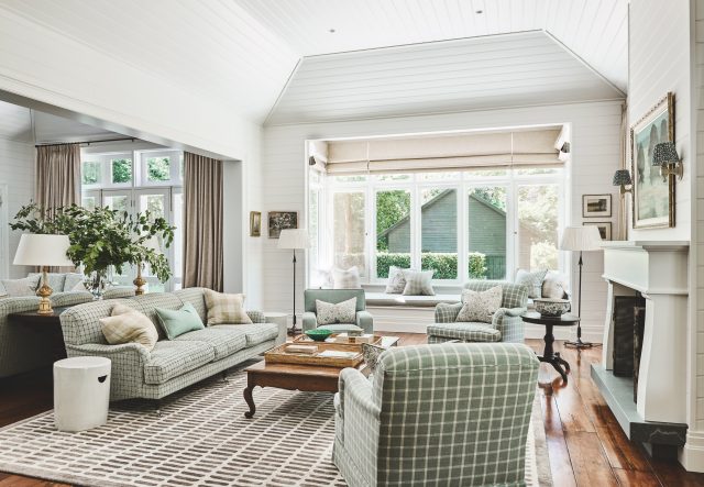
For more on Landart

Categories
Decorating 101 Shopping Styling

New Linen House range will help you hibernate this autumn!

With autumn around the corner, Linen House’s new Winter Sun collection is all about hibernation staples and getting cosy in style.

“This season’s collection embodies a winter utopia with gorgeous earthy tones, made to use not only for the colder months but all year round. A celebration of the desire to hibernate in staples that not only keep you warm but look and feel good is key!” said Emily Treganowan, head of design. 

“Colours that are bold yet soft, materials that are warm but textured, and designs that stand out really do create both a homey but fashionable mood for your home this autumn and winter season.”

Retaining the brand’s iconic designs and fabrics from previous seasons, the collection boasts stunning palettes across numerous fabrics: lustrous and fluffy, knitted and ribbed, or quilted in velvet. Choose from cotton corduroy and cotton chenilles, as well as their best-selling pure linen.

Meanwhile, yarn-dyed cotton, textured cotton slubs, and cotton sateens are still omnipresent, all adorned by stripes and classic or abstract patterns with florals and geometric patterns.

For More on Linen House

Categories
Art Decorating 101 Design Designers Expert Tips Interiors Addict Styling

A hotel suite named after you? Neale Whitaker can now claim this!

Television personality and design aficionado Neale Whitaker, has had a hotel room named after him as part of a styling collaboration. The project came about “by accident” after several years of being allocated to the same room at Melbourne’s Laneways by Ovolo, leading to it being known unofficially as his personal suite.

“It became a bit of a standing joke,” Neale says of his connection to the room, formerly known as 303.

Even this artwork, by Flynn Cowan, features Neale’s face!

“The reason I love this room is because of its corner position, which has amazing windows looking to the most gorgeous tree and old stuccoed wall outside, leading through to views of the rooftops and towers of the CBD,” Neale said.

Working alongside Australian interior design studio Luchetti Krelle, Neale incorporated some of his favourite pieces into the 80s Memphis-inspired Neale Whitaker Suite. “I sourced a whole load of styling items and a few knick-knacks to put into the room, artwork as well, fitting with Luchetti Krelle’s design narrative.”

Sculptural lamp by Sarah Nedovic Gaunt

Guests who reserve the suite can expect to stay amongst a collection of original art, limited edition objects and soft furnishings – each hand selected by Neale – as well as a 100-song Spotify playlist of his favourite tracks. “These are all the things that are incredibly important to me,” Neale says, adding that he wanted to showcase a cross section of Australian artists when curating the room. “There are three big ticket items: a large painting by artist Nunzio Miano, a Sarah Nedovic Gaunt lamp and a portrait by Flynn Cowan.”

Nunzio Miano painting

Nunzio Miano is a Melbourne-based artist whose flamboyant and generous use of colour brings high-octane energy to the scheme. The lamp by Sarah Nedovic Gaunt was the last of the highly sought-after ‘Lady’ collection, similar to a piece which Neale has in his own home. The artwork featuring an illustration of Neale himself, created by former Ovolo staffer Flynn Cowan, leans into Warhol-like themes, using repetition and colour-blocking to bring the room to life.

Book your stay

Neale Whitaker is in collaboration with Laneways hotel by Ovolo Group. For more on Laneways.

Categories
Decorating 101 Design Expert Tips House Rules Styling

The ultimate guide to designing a modern masculine home

Fact: there’s a fine line between the point where your swanky bachelor pad becomes a full-blown man cave. Rome wasn’t built in a day, and nailing stylish interiors takes time too. The key is not rushing into it, keeping an eye out for cool pieces, observing how rooms look throughout the seasons (and thus different levels of light), and above all, not being afraid to move furniture around and try different arrangements until you land on a configuration and design that works for your specific needs. 

According to Shaye Ford, interior designer at Miss Amara, when it comes to striking a balance between a masculine home that combines great style with a smart and snazzy space, these are the design elements every guy should know about to elevate his domicile.

The colour palette

If you’re looking to go all-out with this modern bachelor pad, then you might want to veer away from the bright side of the spectrum. A dark colour palette often characterises a more masculine space. Black, grey and white are obvious neutral options, but you could also go for rich, bold colours for a dramatic effect. Navy blue, deep violet, and even chocolate brown are safe choices. For accent colours, try warm metallics like copper and bronze. Whether you’re opting for one colour and combining it with lighter and darker tonal shades or using saturated colours with accents of white for high contrast, it’s worth keeping a singular palette in mind for the subsequent accessorising and furniture.

Clean lines

Modern spaces typically incorporate geometric elements, and the best way to do this is to stick to clean lines to maintain a sophisticated aesthetic. If you want to step into something more exciting though, opt for interesting geometric patterns for your furniture, rugs, and wallpaper.

Play with texture

Although keeping it sleek is the best way to approach a bachelor pad, don’t be afraid to add exciting touches via different textures within the same colour palette of your choice. Just remember that less is more, so be careful not to over-design. Bear in mind that very masculine designs can sometimes feel stark and clinical, so balance this by introducing warmth with plenty of texture, wood and layered lighting to add interest. 

Understanding symmetry

Symmetry in interior design is a vital component in a masculine space. Use this approach to create balance and a feeling of tranquillity – perfect for enhancing space in a small living room. The best way to use symmetry in a room is by having an architectural feature as a starting – or centre – point, whether a pair of identical windows or even a living room sofa. However, you can create symmetry in a non-symmetrical space with a pattern, an area rug or simply a living room accent wall.

Define the floor plan

Another handy approach to designing a room is to first consider the floor plan. With the bird’s eye view of the room in mind, it’s easier to consider the importance of statement pieces and how they will fit together. A common mistake in many homes is overcrowding. We’re not necessarily saying all interior plans should be based around minimalism, but if you’ve got a few key pieces of furniture waiting for a room, it’s worth planning the space so that items can be moved around whenever a refresh is required whilst leaving enough room for potential new additions once you’ve had the opportunity to live in the space.

Statement pieces

An area where you’ve got to be careful but is also a crucial part of expressing yourself, investing in a few statement pieces will bring your space to life. Whether it’s a mirror, an ornate table, a home bar trolley, a chair or a dramatic rug, just ensure it doesn’t jar against the room’s colour palette and fits the space.

Purchase the rugs featured above at Miss Amara

Categories
Decorating 101 Design DIY Interiors Addict

DIY interior design kits delivered to your doorstep

We have talked extensively about the impact of COVID on our homes. With more people working from home, suddenly they wanted to improve their surrounds and thus the renovation industry has exploded because of the pandemic. According to the ABS, Australians spent about $12.3 billion renovating their homes in 2021 – a figure that was up 33 percent on the previous year. Tapping into this trend is colour specialist Michal Goodman who has just launched Styl Studio – a business intended to support the DIY renovation industry through its unique style kits.

“I created Styl Studio in an effort to bridge the gap between professional interior designers who charged a premium for their services, and home renovators interested in DIY design, but not really sure how they could actually bring their creative visions to life,” says Michal who offers end-to-end design kits (Styl Sets) for DIY designers and home renovators.

Styl Studio creator Michal Goodman

With five options to choose from, each of Michal’s Styl Sets includes a curated collection of surface samples including engineered timber and vinyl flooring options, carpet samples (twist pile and loop), tiles for wet areas (floor, wall and feature), splashback and stone options as well as a full interior paint colour scheme. And if you’ve ever been down a Pinterest rabbit-hole (ahem, guilty as charged!) you’ll know how easy it is to become totally confused by the number of options out there. This is where the Styl Studio kits remove the guesswork for you.

Styl Studio box
Each scheme comes packaged in this chic box and is delivered straight to your door

The schemes range from the Hamptons-inspired ‘Midnight Mood’ to ‘Bare Beauty’ which is a Scandi-inspired look. There’s the delicate Tuscan vibe of ‘Subtle Blush,’ the deep, moody and modern ‘Grounded’ and the monochromatic and timeless ‘Mono Magic.’

The Subtle Blush sample set
The ‘Subtle Blush’ Styl Set
'Subtle Blush'
A kitchen featuring the ‘Subtle Blush’ palette

An e-book accompanies each scheme, and it includes styling tips, a specification guide with step-by-step instructions on product features, price points and ordering details. There’s also detailed 3D renders so that you can visualise the outcome as well as ‘shop the look’ links for furniture and exclusive discounts to save you money.

E-book
The Styl Studio e-books are full of information to support your renovation

“Styl Sets arm those interested in renovating their own homes, with the tools to help them overcome ‘option overwhelm’. They allow you to see how the textures and surfaces of your design elements will work together and complement each other before you commit to making a costly financial decision or, even worse, a mistake!”

For more

Categories
Decorating 101 Furniture Homewares Interiors Addict Shopping Styling

Seasonal styling on a budget: 20 Kmart homewares under $20

Our intern Jekyll Chau, picks 20 homewares at $20 or under from Kmart.

1. Teal Tiered Vase – $12

2. Rectangle Braid Rope Basket – $15

3. Maya Reversible Quilt Cover Set – Queen Bed– $20

4. Siciliy Curtain – $15

5. Starfish Framed Print – $17

6. Rupert Throw – Pink – $11

7. Layla Cushion – Tan – $14

8. Mason Cushion – $9.50

9. Large Coastal Palm Canister – $6

This image has an empty alt attribute; its file name is 5efcd691-34c5-41e5-a08c-5ebe0574851b-640x640.jpg

10. Resin Candle Tray – $12

11. Lyla Throw – Blue – $13

A cool blue throw with detailed fringes.

12. Self-adhesive Film – Terrazzo Look – $7

13. Rattan Look Toilet Roll Holder with Lid – $15

14. Madison Cushion – White

15. Small Water Hyacinth Pot Holder – $18

16. 8 Pack Vinyl Floor Tiles – Quartz Look – $15

17. Ceramic Pillar Holder – $12

18. Vivienne Shell Light – $15

19. Multi Board – Oak Look – $10

20. Outdoor Rectangle Floral Cushion – $9

Shop Kmart Home & Living

Categories
Decorating 101 Expert Tips Interiors Addict Styling

Considered patterned curtains? Neale Whitaker shares his tips

Window treatments might be the last thing you think about when designing your space but they’re the finishing touch that every room needs. When it comes to curtains, they can make or break the look of a room. Not only do they make a space feel finished, but they have the ability to transform an interior, whether it’s creating the illusion of a higher ceiling, drawing the eye across a room, or framing views to a beautiful vista outside.

Luxaflex has added all-new curtain prints to its collection with nine designs on offer. The patterns are sourced from creative houses across the globe, and inspired by biophilic design, water impression paintings and botanical motifs.

Styles available range from traditional flora designs, such as the Vintage Garden or Fuji Canopy prints, to ones with more modern and bold patterns and colours such as the Peijing range. Multiple colours are available for each print, and the curtains come in various fabrics, such as velvet, faux silk and linen.

Neale Whitaker, interior design expert, says, “Choosing a print curtain is similar to choosing a large artwork or wallpaper. Ask yourself these questions: What statement are you looking to make? Do you want a print that complements your existing colour palette and decor, or contrasts with it? Do you want the print curtain to be the main focus of the room, or be a backdrop to other furnishings?”

If the answer is the former, then Neale suggests a more decorative print; otherwise, softer, more abstract prints should be chosen. “Full-length print curtains will always make more impact than short curtains, and a contemporary twist is to use prints in conjunction with blinds or sheers. Not only will they look beautiful, but the additional layer will protect your print from the strong Australian light.”

Neale is a firm believer in bending the rules when it comes to interior design, and sometimes even breaking them. However, prints should always be considered carefully, as you want them to be a focus of your room.

“Whether you’re installing print curtains or using prints on furniture, consideration must be applied – too many prints will cancel each other out, so it’s about finding the right balance,” says Neale.

When it comes to mixing prints, Neale warns that it requires a skilled eye. His advice is to limit your choice of prints to two to avoid clashing, and opt for contrast. For example, prints with defined tones or simple patterns will blend perfectly with the more decorative patterns. They contrast yet complement each other, especially when linked by a common colour.

Prints can be used anywhere in the home but work especially well in bedrooms. Teamed with crisp white bed linen, print fabric cushions added to the bed bring a relaxing and welcoming feel to your room. To complement the room and grab attention, consider adding the same print fabric to cover an armchair, to finish off your space.

“Australians have long embraced prints – think of our love of brands like Marimekko and Missoni, but it’s great to see a new audience appreciating more complex, decorative prints,” says Neale. “I predict we will be seeing more traditional prints used in conjunction with contemporary furnishings. The contrast will be interesting and exciting.”

More from Luxaflex

Categories
Decorating 101 Design Furniture Interiors Addict Interviews

How to avoid waiting for furniture amid pandemic delays

When Bianca and Marcus Jowett established Perth-based online furniture and styling hub Granite Lane, they not only wanted to develop and curate their own furniture and homewares collection but to source locally while doing it. Seven years on – and as the pandemic has fundamentally changed the way people live, buy, and think, Aussie consumers are increasingly looking local.

Granite Lane
Pieces from the Granite Lane collection

“Customers don’t want to be waiting nearly a year to receive their products and we don’t want them too either. We want to deliver their products and bring their design vision to life as quickly as possible,” says Bianca Jowett who found that being able to manufacture locally has meant her business hasn’t been affected by COVID-led supply chain issues.

Granite Lane custom designs (or source within Australia) their collection of sofas, armchairs, ottomans, and bed frames which is great news for consumers who are frustrated with ongoing furniture delays. “We’ve never really seen anything like what’s happening now. Consumers are buying furniture in record numbers, but the average delivery delays from a lot of retailers are staggering,” says Marcus Jowett, who manages Granite Lane’s supply chain.

The Granite Lane team

Marcus also explains the latest twist for furniture suppliers has seen factory closures in Vietnam due to COVID-19, meaning that furniture stores have seen lead times of up to 10-12 months when ordering products from overseas. By comparison, Granite Lane can offer a lead time of 8-10 weeks as well as full customisation.

“Also, we love that we can collaborate with our customers on the design of their sofa to match their space perfectly. Because we source locally, we can customise the sofa, ottoman, armchair and even bed instead of being stuck with a design that is pumped out of a factory,” says Bianca.

Granite Lane

And while sourcing locally has had an expensive reputation in the past, when you add in pandemic-led delays and the rising cost of shipping containers, the cost difference is diminishing. “To source internationally you need to ship goods overseas and everybody’s fighting for space on the containers, so they’re bidding them up,” says Marcus who has always struggled with the comparison between a better-quality product made locally to that of something mass-produced. 

“It’s evident that once you weigh up the cost of the sofa, the cost to the environment, the cost of the client’s time, and the cost of quality all outweigh the monetary value,” says Marcus.

Granite Lane
Granite Lane has a gorgeous rug and mirror collection too

Shop Granite Lane

Categories
Bedrooms Decorating 101 Designers Expert Tips Interviews RENO ADDICT Styling

Julia Green on renovating with paint & latest styling secrets

As many of you will know, interior stylist Julia Green has transformed a 600 square metre heritage warehouse in Geelong into a stunning retail concept flagship store for her business Greenhouse Interiors. A gorgeous space, complete with fully functioning kitchen, bathroom, bedroom and lounge (where every room is shoppable – whoop!), Julia partnered with Dulux to create the bedroom, using the Flourish palette from the paint brand’s 2022 colour forecast.

Julia Green
Julia Green in the Greenhouse Interiors flagship bedroom space. Artwork ‘The Chandelier Project 003’ by Regan Glazner for Greenhouse Interiors.

“Our aim was to demonstrate how much difference just a touch of colour can make. The Flourish palette was perfect for this. It’s sophisticated without any sense of ego or pretension; sometimes earthy, sometimes daring, and easy to style. It’s also highly versatile with hues that are both soft, beautiful, and timeless,” says colour guru Julia who loves singing the virtues of a paint change when it comes to renovating. 

Julia Green bed
Bedside details

“Not all renovations start out as a blank canvas, in fact, many people buy renovated homes that are not styled to their liking. That’s where a fresh coat of paint and injection of colour can really come in handy. It’s one of the best ways to change up the look and feel of your home, without committing to a full-blown renovation,” says Julia.

Julia used Dulux Clay Pipe Half (a soft neutral with pink undertones) and Dulux Kenepuru Sound (a deep, rich blue with a hit of purple) on the walls and incorporated other tones from the Flourish palette through furniture and styling objects. All in all, it’s a warm and inviting result.

Julia Green

Julia’s top styling tips

  • Adding colour to your home can be transformative, so don’t be afraid to experiment and explore. It may not always work out the first time, but it’s worth persisting until you achieve the perfect balance.
  • Colour evokes emotions, so it’s best to consider how certain hues make you feel – whilst you may love a bold red, living with a whole room of it may be overwhelming. The good news about paint is, if you don’t love it, you can always paint over it. If in doubt, ask a friend or get a second opinion from a trade specialist – they are there to help!
  • Don’t be afraid to mix the old with the new and use bolder hues as accents rather than solid colours en-mass to avoid being too overpowering.
  • When decorating, always start with a blank canvas and add one piece at a time to ensure the balance is right. Sometimes how you edit your space can be more important than adding the homewares itself, so go slow.
  • Purchase Dulux A4 swatches, colour stickers or sample pots from the Dulux website of from your local paint shop to accurately test the colours around the room and view them at different times of day. That way, you’ll feel assured you’ve selected a colour(s) you’ll love.
Julia Green
One last look at the gorgeous space

Styling: Julia Green | Photography: Armelle Habib| Assistants: Justine Lanigan and Jessica Retallack

For more from Dulux

Categories
Decorating 101 Expert Tips Reno Trends Styling

Change up your seasonal decor with these autumn styling tips

Property stylist Justine Wilson shares her expert tips and tricks for her favourite season of the year. From colour palettes to adding some ambience, here’s how to create a cosy feel in every room of your home this autumn.

Colour palette

Autumn encompasses earthy and warm tones. Spruce up your interiors with colours such as rust, amber, mustard, brown, caramel, and deep greens. You can introduce colour through a variety of ways, such as artwork, accessories, florals, and soft furnishings. Or, go for rich colours like red, deep browns and tan across furniture, pillows and accessories. The trick is to not overdo it, rather work in small accents throughout your home.

Texture

Styling this season is all about layers. Think heavy coverlets and blankets on your bed, snuggly throws on your sofa, lots of plush cushions and warm rugs underfoot. You can also layer many textures together with materials such as velvet, wool, cashmere and flannel and thick natural linens, creating an inviting and cosy feel in your space.


“It is a time of year where there is the perfect mix of warm sun and cool breezes, coupled with the beautiful colours of the turning landscape,” Justine says. “When it comes to interiors, autumn is the perfect time to embrace this transitional feeling – and use it as a time to reset, refresh, and prepare your abode for the cooler months.”

Pattern

Expect lots of patterns in decoration trends; classics such as tweed and tartan will be back with force, especially as many embrace the ‘cottagecore’ aesthetic. More classic patterns such as gingham and check will make a comeback. As well as florals with more moody, muted colourways in dark emeralds, navy and warm rust tones. Try broadening your horizons and incorporating more woodland motifs and leather.

Ambience

There’s a number of ways you can represent autumn within. Lots of pumpkins and root vegetables displayed around the kitchen foster a feeling of abundance. Whilst pears in a bowl, jars of nuts and herb cuttings displayed in urns or vessels on your counters, and beautiful vases of greenery also set the natural fall mood. This time of year is all about feeling cosy and being prepared. As the light fades, use muted lighting with candles, and table and floor lamps to set the desired relaxed scene.

-Justine Wilson is owner of Vault Interiors and selected stylist for Space Invaders on channel 9.

Categories
Decorating 101 Design Designers Furniture Interiors Addict

The furniture layout rules you need to know

The following is an excerpt from Colour Is Home, the new book by Australia-based international interior designer Charlotte Coote.

Rooms designed to enhance conversation, comfort and functionality are, to me, the most successful. In a space that is comfortable and considered, you don’t have to shout to be heard by the person sitting opposite at the dinner table, or get up from your armchair to set down a drink or book.

When deciding how the furniture in a room will be arranged, it is important to consider all the different ways the space could be laid out. Compare the various options, and weigh the problems and advantages of each. Often the best solution will be a combination of one or more of your potential layouts. By following some simple guidelines, the most fitting layout will soon reveal itself.

Creating a Floor Plan

When designing the layout of any room, it is essential to create a scale floor plan. This plan shows the exact dimensions of the room, and the placement and size of each element you will include. If you don’t have the skills to draw up a plan yourself, enlist the help of a designer, draftsperson or architect.

An accurate floor plan will allow you to check your proposed layout for functionality and flow. For example, you can easily measure whether walkways are wide enough, or whether there is ample space for dining chairs to be pushed in and out. A floor plan may need to be revised many times before you arrive at your final layout.

Creating a Great Focal Point

The focal point of your room should be a central item or asset, like a fabulous big rug, a beautiful fireplace, a striking artwork or even a spectacular view. Choose your focal point first, then build the layout of the room around it. Begin by looking at the architecture of the space and then consider which pieces you will use to fill it.

Creating Balance & Symmetry

It is important to create balance and symmetry in your layout. The various pieces of furniture must work together harmoniously. To achieve balance, follow the ‘opposites attract’ principle: combine furniture that is big and small, curved and straight, tall and short, hard and upholstered, old and new, or masculine and feminine. 

To create symmetry, place similar or matching pieces opposite each other in the space (try this with chairs, side tables and lamps). The eye should be drawn around the entire room, not to one element in particular. If one piece is standing out too much, it may be an indication that the layout is not balanced. Conversely, if a certain component is getting lost among the scheme, you may need to try rearranging things.

TIPS ON FURNITURE LAYOUT

Below are some of my golden rules for furniture layout. However, remember that in design, as in life, some rules are meant to be broken. If you do decide to break the rules: never complain, and never ever explain.

  • Ensure that ample walkways are included in each room and that they are not too narrow. A main thoroughfare through any given room (e.g. between the back of an armchair and the wall) should be a minimum of 80 centimetres (30 inches) wide.
  • A big room can often work well with less furniture, while a small room is more appealing when it has lots of furniture.
  • Every seat in a room should have a table within arm’s reach.
  • All chairs, whether armchair, dining chair, breakfast-bar stool, or sofa, must be inviting and comfortable.
  • In living and dining spaces, there should be enough chairs to accommodate the home’s residents, plus additional seating that can be utilised for guests.
  • Occasional chairs, which are light and easy to move, are a good option for extra seating. Placed symmetrically around the perimeter of a room, they can be a feature of interest until needed.
  • Avoid placing sofas in front of floor-to-ceiling windows, as they will block out too much light.
  • Rugs should be positioned at least 40 centimetres (16 inches) away from walls, and away from solid pieces of furniture like television consoles and book cases. Ensure the front legs (at least) of your sofa or armchair stand on the rug.
  • Design any built-in joinery joinery – wardrobes, cabinetry and shelving – to be as tall as possible. Not only will this provide more storage space, but it will make the ceiling feel higher by drawing the eye upwards.
  • Free standing furniture can be be more interesting and storied than built-in joinery. If you can’t find a piece that is quite the right size, you can make it appear larger by flanking it with a pair of chairs.
  • Choose bedside tables that are as large as will fit in the room, to provide plenty of space for lamps, books, reading glasses, cups of tea and vases of flowers.

Colour Is Home by Charlotte Coote published by Thames & Hudson. $59.99.

Buy online

Categories
Decorating 101 DIY Interiors Addict RENO ADDICT

The most popular Facebook groups for interiors and reno addicts

If you’re a renovation or interiors enthusiast, it has never been easier to connect with like-minded individuals. Online design communities are seemingly infinite but we’ve done the research to bring you the most popular Australian Facebook groups in this space. From where to find the perfect tile to advice on flooring, landscaping, kitchens, bathrooms and more, these groups are a fabulous free resource for interiors and reno addicts.

The Reno Club

With almost 50k members, this home improvement group is a great forum for members to have discussions, ask for advice and inspiration with respect to all things construction and design. Popular discussion points include flooring and tiling conundrums and many members post fabulous before and afters of their handiwork.

Women who Design, Decorate, Renovate & Build

Set up by BuildHer Collective, as the name suggests, this group is designed to help women renovate and build. It’s a great adjunct to the BuildHer Collective business which runs a popular course designed to guide women through every step of the building journey, with the support of like-minded people.

The Hamptons Home Decorator AU

As the name suggests, this group is one for Hamptons-inspired home enthusiasts. The group’s 80k members regularly trade advice on a variety of topics including wainscoting, coastal-inspired paint colours and the final finishing Hamptons styling touches.

Renovating Mums – Sydney

Designed for Sydney-based women who are in the process of renovating, this 15k strong group offers support, knowledge and guidance within the space. “This is the place for any women currently renovating or thinking about it, to come together, ask questions, get ideas and find out top tips that have helped others,” says the group that also has a local recommended services directory as well as a supporting blog and resources. All trade recommendations have been referred by personal use or by fellow renovators.

The Profitable Designer Community

Created by Clare Le Roy of The Little Design Corner, this industry group was set up as a resource for interior designers, decorators, architects and landscape designers who are thinking about starting a design business.

This group is an adjunct to Clare’s courses that are designed to help designers and architects find more clients and grow professional and profitable businesses. The group also allows members the opportunity to connect and collaborate with other designers from around the world.

Interior Design & Decor

This very popular Sydney-based group has almost 164k design obsessed members who tune in for their daily dose of interiors and architectural inspiration. From a hotel in Asia to a fabulous commercial fit-out in South America, the wide ranging spaces originate from all corners of the globe.

Renovation Ideas and DIY Forum Australia

This is a group for people interested in renovating their property to share stories, ideas and photos. This group has a particular focus on DIY and there’s plenty of great before, progress and after shots of projects too.

Mums Who Build, Decorate & Renovate

Another large group (it has almost 132k members), this group was started by mums Rachael and Karlie who have built a community designed to help Aussie women get advice on a range of renovation topics. The large group is friendly and supportive and it’s a great platform for people to share and ask about all sorts of home building, renovating and decorating tasks.

Are there any other hidden treasures you’d add to our list? Please comment below!

Categories
Before & Afters Decorating 101 Expert Tips Interiors Addict Interviews Living Room Real Renos RENO ADDICT

90s revival: Is burgundy paint the latest interior trend?

Dulux colour forecaster and stylist Bree Leech put the brand’s Flourish palette to the test recently with an autumnal inspired makeover that proves the power of colour. Flourish is part of the 2022 Dulux Colour forecast and it pairs warm and natural shades including Dulux Basic Coral and White Dune Quarter with the bold, rich tones of Dulux Murray Red and Discretion. All in all, it’s a striking result. Especially when you consider the clever use of burgundy (Murray Red) – a colour not seen since the feature walls of the 1990s!

BEFORE
BEFORE lounge room
AFTER
AFTER lounge room. Artwork (large) ‘2021 Serpent Series’ by Barbara Kittallides. Artwork (small) ‘Clay Bird’ print by Stacey Rees via Modern Times.

To help showcase the colour palette, Bree overhauled a modern, open plan living and dining space by incorporating soft pinks, warm whites and rich reds – all of which built on the room’s existing features.

“The space is a beautiful, light-filled modern extension in a family home with great architectural details – we wanted to showcase this by using the natural, muted tones from the Flourish palette on the wall as a tonal backdrop to the stronger accent colour and then punctuate the interior with bold, daring colours in the decor to create a more distinct look and feel,” says Bree.

BEFORE dining room
BEFORE dining room
AFTER dining room
AFTER dining room. ‘Connor Ives C’ artwork by Elsbeth Shaw via Studio Gallery.

When applying colour, Bree recommends starting with a tonal palette that connects with your main furniture pieces. “To add an edge to the interior, select some smaller statement pieces that feature bold colours and interesting finishes, such as natural stone and coloured glass, to provide contrast, however, still complement and harmonise your overall colour scheme.” She also highlighted bold colour in the room’s artwork and soft furnishings. In these spaces, blue, black and cream really serve to add contrast within the spaces.

AFTER lounge
AFTER lounge. Artwork (large) ‘2021 Serpent Series’ by Barbara Kittallides. Artwork (small) ‘Clay Bird’ print by Stacey Rees via Modern Times.

Autumn colour tips from Dulux colour expert Andrea Lucena-Orr

  • Autumn palettes tend to consist of warm hues – both neutral and rich tones – and you can layer beautiful variations of these colours to add depth to your space. 
  • Consider the intent of the space. Softer warm hues of pinks and earthy reds can create a light and cosy atmosphere whilst selecting the deeper hues of blues and greens can create a calm and moody space. 
  • Ensure you love the colour(s) before you make your final decision. As we know, colours can differ greatly due to lighting and surrounding colour, so make sure you sample your colours before you commit to a purchase. 
  • If you want to replicate the Flourish palette, test a a couple of key colours you initially gravitate towards and leave them up on your walls for 2-3 days to ensure the colour(s) work in your space and under different lighting conditions, both natural and artificial. You can also add some other colours from the palette in the shape of furnishings and décor items. 
  • For an autumnal bedroom look, bring more depth into the scheme by adding the gorgeous Dulux Murray Red to your bedroom walls with Clay Pipe Half and Discretion tones as inspiration for your bed linen. 
AFTER
AFTER kitchen

Photographer: Lisa Cohen | Stylist: Bree Leech

For more on Dulux

Categories
Art Decorating 101 Design House Tours Interiors Addict Interviews Styling

How to personalise your rental home with colour and more

With the Australian property market one of the world’s most expensive, home ownership is out of reach for many people. But being a renter doesn’t mean you can’t put a personal stamp on your home, as demonstrated by Melbourne hair colour educator Candice Johnson’s apartment.

Lounge room
Lounge room

Located in Brunswick, the bright, eclectic rental abode now has almost 10k Instagram followers who tune in for a daily dose of colour-packed inspiration and to see how Candice doesn’t let renting get in the way of her creativity.

A former t-shirt factory, the three-level apartment does have great bones – it features high ceilings, large open spaces, and a massive void (you can see through the middle from the top to the bottom floor). But bones aside, US born Candice has certainly put her own stamp on the rental that features an impressive array of colour and lots of pink.

Candace Johnson
Candice Johnson

“Pink has always been my go-to colour. I have always worn it and now I even have pink hair. The more pink I have around me, the happier I am,” says Candice Johnson who pairs vintage Facebook Marketplace finds with IKEA pieces and colour pops from Australian homewares brands Castle and Things and Sage & Clare. Candice’s home is also proof that you don’t have to own your home to truly make your mark on it, which is why we thought it would be interesting to hear her thoughts on how to make a rental your own.

Paint

“Paint is a cheap and easy way to make a space feel like home and it can completely change a space. I always ask my landlord before painting and I’ve never had one say no,” says Candice, whose apartment was quite sterile when she moved in. The all-white walls didn’t last long though – painting a few walls and beams pink instantly made the place feel much warmer. “Usually, I have to paint it back but some landlords will let you leave it. A lot of people don’t mind a feature wall or a small colour pop,” says Candice. 

Candace has personalised the apartment with pops of pink paint
Candice has personalised the apartment with pops of pink paint

Art

“I change my prints constantly as I get bored,” says Candice who cites Society6 and little FY! as her favourite places to purchase affordable art. “The prints are usually priced at around $30-to-$50 and rather than just being mass printing places, they use independent artists that are less cookie cutter. They offer quick shipping too,” says Candice who puts her old prints into storage and pulls them out again when she’s after a change of scene.

As for hanging, Candice uses removable 3M hooks; often double the recommended amount just to be sure they won’t fall. “I use the velcro ones and I have used many over my rental history. I love how you don’t have to worry about nails,” says Candice.

Lounge room
Lounge room

Textiles

Candice uses a variety of colourful cushions, throws and rugs to imbue her home with personality. “I have well over 60 cushions and when I’m bored, I swap them all around. You can add a lot of fun that way,” says Candice.

Bedroom
Bedroom

House plants

“I counted over 60 house plants. It’s a lot of work as they’re all different and require different things but I do think they give character, personality, and make the place feel homely,” says Candice who often relies on plants if there’s a blank spot to fill in her home.  

Dining room
The dining room chairs were Facebook Marketplace finds and the lightning bolt mirror is from Melbourne’s Bride & Wolf.

Thrifty buys

“Some of my favourite things have come from Facebook Marketplace,” says Candice who found her orange dining room chairs on the platform. “They were from this elderly man, and they are pristine and gorgeous,” says Candice. Other finds include a vintage timber bar and Candice loves attending warehouse sales too. “Many fancy brands have annual sales and I’m always first in line.”

This vintage mirrored bar was found on Facebook Marketplace
This vintage bar was found on Facebook Marketplace

Follow Candice’s home

Categories
Decorating 101 Design Expert Tips

Feng Shui 2022: tacky “lucky” objects not required, expert says!

By Jane Langof, Feng Shui Master

Feng Shui is about our relationship with our surroundings and how this affects our moods, psychology and luck. The aim of Feng Shui is to design spaces with the right energy flow to promote wealth, great health and harmonious relationships.

Bedheads should be placed against a solid wall

Energy is all around us, in the things we can see and in how we feel when we walk into a space. You might have heard that we’re influenced by the people we spend the most amount of time with? The same is true for where we live. The energy in our homes affects the way we think, feel and act.

Feng Shui originated in China thousands of years ago. Ancient Chinese Masters discovered that when people were aligned with positive energy they experience periods of great fortune, and when they were aligned with negative energy they would experience obstacles and bad luck. Guidelines, calculations and systems were developed that form the basis of traditional Feng Shui. True Feng Shui is not based on superstition or religion – it is a technical practice based on formula, arrangement and the principles of yin and yang.

Each home has a unique map of energy based on the orientation, building date and layout of a home. This is like a horoscope that indicates how well the home supports finances, health and relationships for the people living there. This map of energy indicates where positive zones are, such as the Wealth sector, and where the toxic energies can be found that exacerbate sickness, arguments and obstacles.

A sample flying star chart – this is the energetic map of a home, and each set of numbers refers to a configuration of energy that a Feng Shui master will read to determine the location of positive and toxic energy zones.

As a Feng Shui Master, I maximise the energy through the art of arrangement and by using the five elements of Fire, Earth, Metal, Water and Wood. For example, if a room contains negative energy relating to sickness, we would decorate using metallic accents. Each element relates to specific colours, shapes and materials, which can provide inspiration in an elegant design scheme. Tacky lucky objects are not required!

When people think of Feng Shui, one of the first things that comes to mind is clutter. De-cluttering is associated with modern Feng Shui practice because of the huge impact clutter has on the energy in a home. It causes stagnant energy and obstacles (both mentally and physically) and there’s also a link between clutter, depression and health.

Feng Shui Master Jane Langhoff (right) working with a client

Over recent years, many people have felt overwhelmed, out of control and disconnected. Health has been a concern and there’s a lot of negative energy to let go of.

You can banish stagnant energy by decluttering, spring cleaning and using clearing techniques like sage burning.  

Get rid of anything with toxic energy like dead plants and stagnant water. Decorate with things you love, like beautiful artwork, fresh flowers or plants, pictures of happy occasions and special people.  

To improve wealth and career, start with your office. If possible, sit with your back to a solid wall where you can see the door, to enhance your authority and vision. A view out of a window will improve creativity and ideas. Connecting with nature is proven to be a mood booster, so get a plant that suits the orientation of the room you’re in. My personal favourites are fiddle leaf figs, orchids and maidenhair ferns.

To enhance relationships, work on your bedroom. Place your bedhead against a solid wall where you can see the door (but not in direct alignment), as this will provide a feeling of security and protection. De-clutter around your bed and organise spaces such as walk in robes. Avoid having mirrors reflecting the bed and heavy electrical equipment.

The kitchen is regarded as the heart of the home and energetically impacts health.  Avoid decorating with the colour red in large expanses, as it amplifies the Fire element which is already very strong in a kitchen.

One of the best ways to enhance the wealth sector of a home is with a water feature. From a Feng Shui perspective it is important to get placement right as water amplifies energy regardless of whether it is positive or negative. 

Focus on the front of your home to attract more opportunities. Do this by sprucing up the front entrance, fixing the garden, clearing the path to your door, and having easy to read numbers so that your home can be easily found.

The best time to incorporate Feng Shui principles is at the concept stage of design, as this is where you will have the best opportunity to maximise energy for abundance and success, and avoid potentially expensive mistakes.

Jane Langof is a Feng Shui Master at Feng Shui Concepts. For more Feng Shui tips and advice follow her on Instagram.

Jane Langof
Categories
Decorating 101 Design Designers Expert Tips Interviews Outdoor & Exteriors Styling

Christmas tabletop styling advice from stylist Steve Cordony

If you’re not following Steve Cordony’s gorgeous personal account and that of his Rosedale Farm property you’d best get amongst it! A veritable treasure trove of inspiration, Steve manages to make things look glamorous but welcoming at the same time. And it’s for this reason that we caught up with him to find out how to elevate our festive season tabletop styling this season.

Steve’s tabletop styling is always elegant

Festive but stylish
One of the central challenges when creating a Christmas theme for your home is how to make it work with the existing aesthetic, but Steve has a trick. “The easiest way to do this is to play with one hero colour that is derived from your interior, and add a metallic accent. Whether that’s gold, chrome or rose gold, the pop of high polish automatically makes it feel like Christmas, and adds glamour to any tablescape,” says Steve.

Steve Cordony tabletop styling

Get resourceful
With the cost of Christmas already pretty sky-high, using what you already own is a great way to save a few dollars and this is especially true when it comes to flowers. “Styling with what you have in the garden is the best way to make your styling feel authentic and creative. Using what surrounds you, adds to the drama of outdoor entertaining, which then becomes an extension of your landscape,” says Steve.

Steve has used eggplants on this tabletop to great effect. We love the splash of aubergine!

Outdoors vs indoor Christmas tabletops
The Australian climate means that we often spend the summer holidays, and festive period, outdoors but just how should you differentiate your indoor and outdoor tabletops?

“For outdoor styling I like to be a little more informal and add more textures and softer styling. A loose folded napkin, having no tablecloth, and more whimsical loose ‘garden’ florals always feel tailored yet informal for outdoors,” says Steve. 

By contrast, Steve likes to take a more formal approach to indoor dining with layering, formal dinnerware, en masse florals, candles and tailored linen on his Christmas tabletop.

Steve
Steve with a styled up King’s Luna Outdoor set

Steve’s Christmas Day tabletop look
This year Steve will be in Sydney for both Christmas lunch and dinner but he will be bringing inspiration from his rural property in Orange, Rosedale Farm. “I am styling the table with fresh green herbs, garden flowers and fruit and vegetables, as I think it’s so important to use elements that can be re-used post event, whether that means planting the herbs in the garden, or using the edible elements for the next occasion,” says Steve. He will finish the look with beeswax candles, natural linen napery and hand written place cards for a personal touch. 

Steve Cordony

For more on King

Categories
Decorating 101 Styling

Christmas 2021 decor: The farmhouse look is trending

I don’t know about you, but I love a clear decor theme at Christmas time. Typically, I defer to a specific colour palette (rose gold and blush for example) and when looking for inspiration, Pinterest is my first port of call. With 400 million global users I’m certainly not alone and with such a huge volume of searches, the platform is a great way to gain insight into what is trending. Unsurprisingly, this month’s findings centre around beautiful, festive ideas. 

Farmhouse Christmas decor
Searches for ‘farmhouse Christmas decor’ have increased by 60 percent locally over the past month; it seems that many people will be embracing laid-back, rustic charm over the holiday season. Pinterest is brimming with tablescape ideas on this front including rustic reindeer bunting, eucalyptus leaf ornaments and personalised stockings.

Pinterest
The farmhouse Christmas theme is a real vibe. Image: Pinterest/onekinddesign.com
Pinterest
Reindeer bunting. Image: Pinterest/favorlaneparty.com

Gingham, check and plaid
With gingham a hot design trend it is no surprise to see searches for that, check and plaid are all up. A super easy way to incorporate the pattern into your Christmas tablescape is via a table runner. This particular tabletop item had fallen out of favour over the last decade but it seems to be back with Pinterest reporting a 35 percent increase in searches for ‘Christmas table runner.’ 

Image: Pinterest
Plaid is such a classic look for Christmas. Image: Pinterest/shop.stylemepretty.com

Summer Christmas ideas
There’s no denying that an Australian Christmas is a very different experience to one in the Northern hemisphere and our festive eating and drinking habits reflect it. Too hot to crank up the oven and feed people heavy meals and mulled wine, Aussies go for less traditional food choices such as seafood and salad and this year, finger food is trending. Pinterest has seen a 75 percent increase in local searches for ‘finger food appetizers’ alongside a 35 percent increase in searches for ‘outdoor entertaining.’ Unsurprising really!

Image: Pinterest
Image: Pinterest

For more

Categories
Decorating 101 Design Designers Expert Tips RENO ADDICT Reno Trends Styling

Refresh your home this summer with these stylist’s expert tips

With summer on the horizon, now is the time for a home refresh! Justine Wilson, a Sydney property stylist and founder of Vault Interiors, says by adding pops of colour you can quickly and easily get your interior and outdoor spaces looking amazing for alfresco dining and entertaining.

Justine’s top 5 tips for a party-ready summer home include:

1. Create an alfresco zone

This will depend on the type of outdoor space available to you. For a small balcony, ensure you have a cute café or pod set so you can enjoy those late summer nights outside. For larger homes, an outdoor lounge or outdoor dining table is a must to have long lunches and dreamy dinners. Bunnings is my pick for affordable yet stylish outdoor furniture.

2. Accessorise!

Add colourful pops with outdoor rugs, outdoor cushions, coloured planter pots or lanterns. There are so many great coloured outdoor items available, and summer is a time for bright happy tones like yellow, pink, teal or green. Try Freedom for great outdoor dressings. Also, don’t overlook outdoor crockery, serving ware and glassware. Having fun coloured plates or glasses can be an easy way to dress up a casual dinner.

3. Light it up!

Consider adding fairy or party lights so you have a pretty and festive twinkle to your outdoor zones. Also, flameless LED candles are a great way to get ambient lighting without the mess or risk of candles melting.

4. Swap out inside

For your interiors, swap out any heavy rugs throws or cushions and introduce soft, light airy materials such as sisal rugs, sheer curtains and cotton blankets or throws. Linen cushions will also add a relaxed summery feel to your sofas.

5. Greenery

Whether inside or outside, nothing says summer holidays like lush greenery; this could be leafy branches or cuttings from a florist in a vase, planter pots or larger outdoor plants for outside. Either way, having real plant life is a wonderful way to bring the outdoors in and create a lush resort-style feel. Palm trees, Ficus and Fiddle Leaf are wonderful selections for your indoor spaces, while outside architectural style plants such as Yuccas are great.

For more styling tips