“My year eight art teacher told me I had ‘a creative license’ after I got full marks for an art project by executing the piece in the opposite way to how she had instructed. I’m an art brat, I’m going to do it my way and I’m not going to listen to anyone!” says Sydney interior designer Anna Price who has recently made a very successful career pivot to full-time painting.
Artist Anna Price with a recent work. Image: Chloe Lambert
While originally trained as an interior designer, with a degree from UTS, Anna had been working in modular construction for her business Container Kit since 2005 until COVID hit and all her design jobs got pulled. “I would call the painting a career pivot as I still use my design skills when I plan artworks – their colours, scale and locations,” says Anna who, remarkably, only picked up the brushes for the first time in 2018 after renovating and looking for some affordable artwork solutions.
“We were short of cash and while I’d always been an illustrator, I’d never painted.” She bought a large canvas and painted it for her living room. That work ended up being donated to her local kindy fundraiser. “Much to my surprise it sold for $800 which encouraged me to do more and as I did, friends and friends of friends started asking for pieces for their own homes,” says Anna who is entirely self-taught and works out of a studio in Chatswood.
Favouring abstract expressionist and cubist styles, Anna moves between the two depending on her mood and self-confessed short attention span. “When I’m a bit over the expressive abstracts, I start a cubist style painting but with the perfect rigid lines I get over that pretty quickly and start throwing paint all over another canvas, expressive style!” She also draws inspiration from her luscious backyard, scenery at her parents’ rural NSW property and urban graffiti. “The latter influence comes across more in my drippy pieces,” says Anna.
Rather surprisingly, given her beautiful use of colour, Anna struggles with this aspect of painting. “I find that good colour palettes don’t come naturally to me, and I firmly believe a cohesive palette is 90 percent of what makes a painting beautiful, so it’s something I’m working hard on nailing,” says Anna who finds it hard to control herself when selecting from all the colours of the rainbow. “My problem is when I see all the paint pots, I want to use all the colours so finding restraint is something that I’m trying to practice. This is where some art education would probably come in handy.”
Incredibly, Anna manages to work on her art while raising four children, using a combination of daycare, kindy, school, grandparents and working as a team with her husband. With four kids arriving in four years (including a set of twins), Anna finds refuge in her art.
“I separate my work hours from my family hours so I can focus on each component properly. My household is pretty full-on so needless to say my work days are an absolute treat and they go way too fast.”
Photographic art online: Where to buy & how to choose
Established in Sydney in 2013, blinq.art sells some of the world’s finest photographic art prints and after more than five years at Westfield Bondi Junction, the business has relocated its…
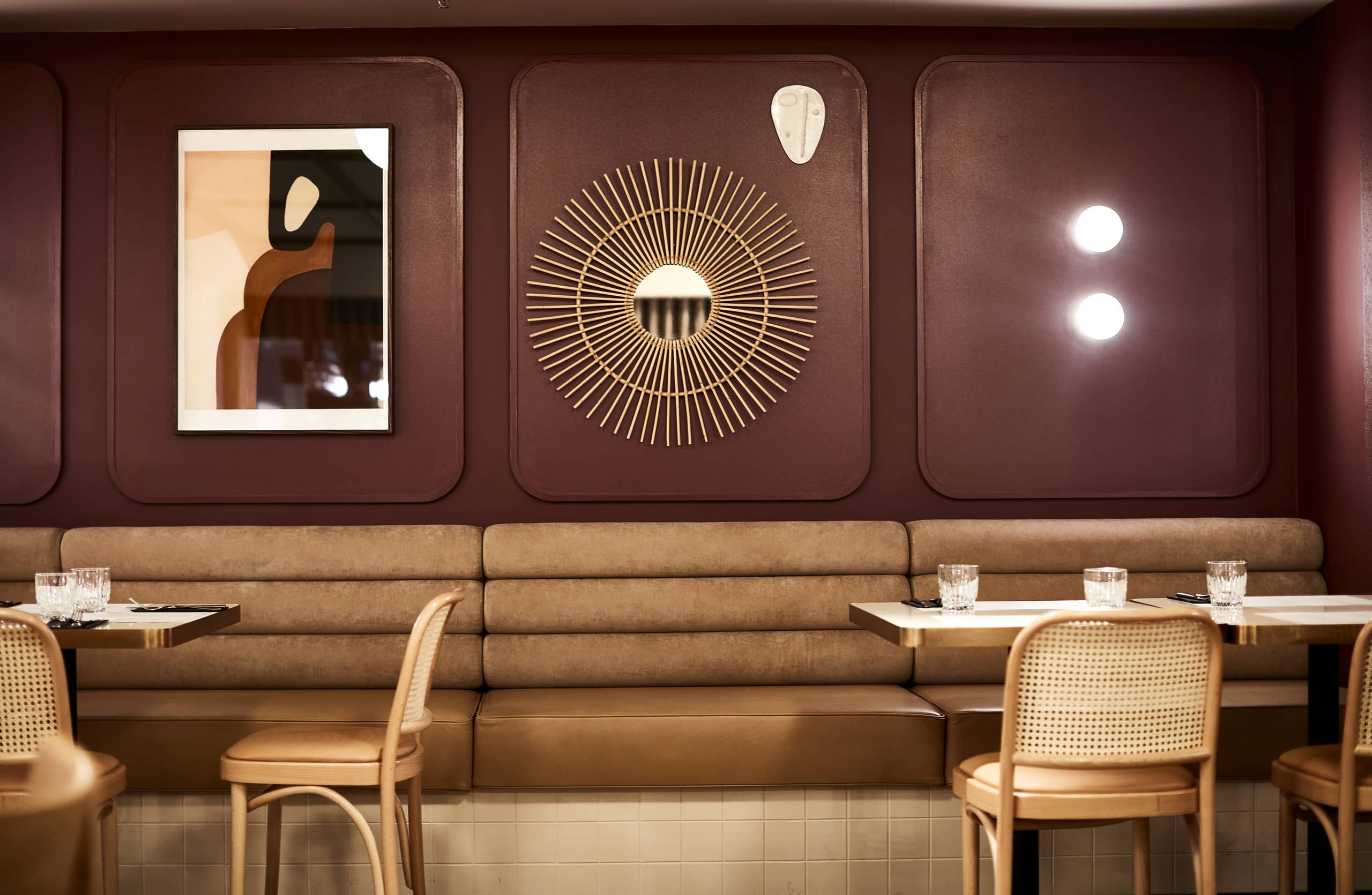
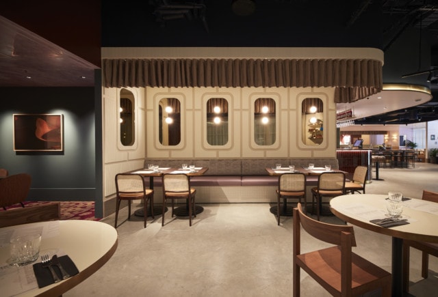
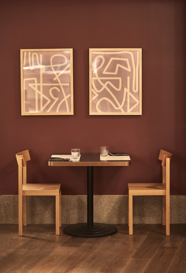
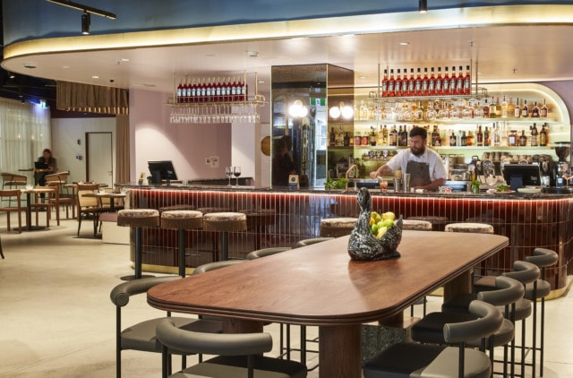
While a trip to Italy is off the cards for a while, Sydneysiders can get a taste of Rome courtesy of the food and interiors at the new restaurant Cucina Porto, located at The Star Sydney. The nostalgic interiors were designed by the talented female design trio TomMarkHenry.
“The overall finishes palette is not predictably Italian but more internationally reflective of European style, warm and contemporary design rather than a traditional trattoria. We wanted the design to have the familiar comfort of home and feel welcoming and comforting,” says Lisa Zelinger, Group Manager of Design at The Star.
The rich colour palette features teal, aubergine, tan and this year’s unlikely breakout star – burgundy. The latter shade has brushed off all it’s 1990’s feature wall associations to emerge as a tone to be reckoned with. We love its appearance on the restaurant’s bar front where it features in the form of a large gloss finger tile.
Bar
“While the palette may seem unexpected, we wanted to use a series of Italian style to give the grounding and relevance to the cuisine and tradition,” says Lisa. To this end, the spaces feature Italian marble stones in various hues and there’s plenty of aged brass too.
Spatially, the restaurant has been zoned to appeal to different audiences. There’s the pared back comfort of the aforementioned bar (which is perfect for a quick drink and snack), the main dining room and there’s a very Instagrammable private dining room too. “Each zone has been intentionally given a different sense of character to create interest and suit a variety of diners,” says Lisa.
Private dining room
The restaurant is home to lots of gorgeous styling elements including a mixture of contemporary and vintage artwork and photography, a variety of coloured glassware, glass vases, pottery, vintage picture frames and Italianate sculptures.
Banquette seating
“Cucina Porto has been designed to feel like home, warm, welcoming and memorable. A place you want to come back to over and over again.”
A young company with fresh ideas and lots of passion, Sydney-based interior architecture firm TomMarkHenry, is the brainchild of school friends Chloe Matters, Jade Nottage and Cushla McFadden. Founded in early 2014, Chloe’s…
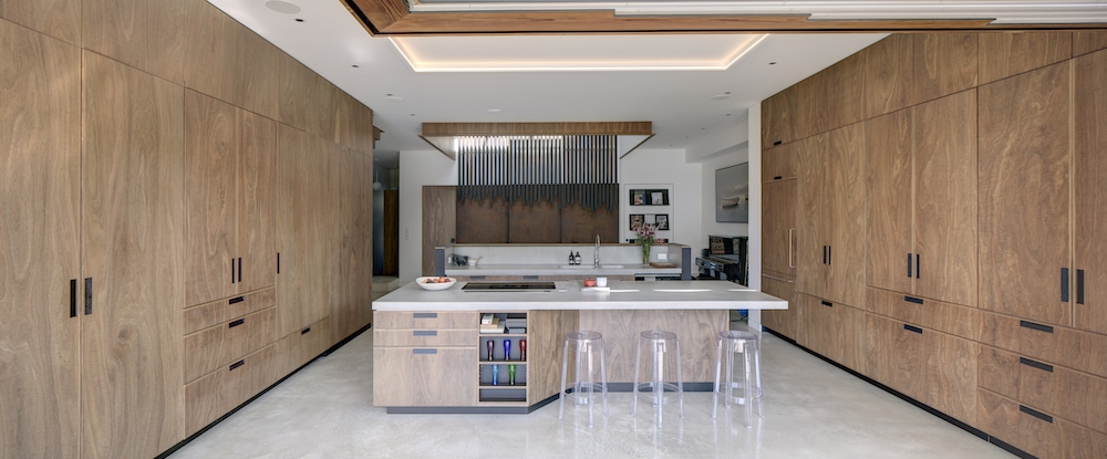
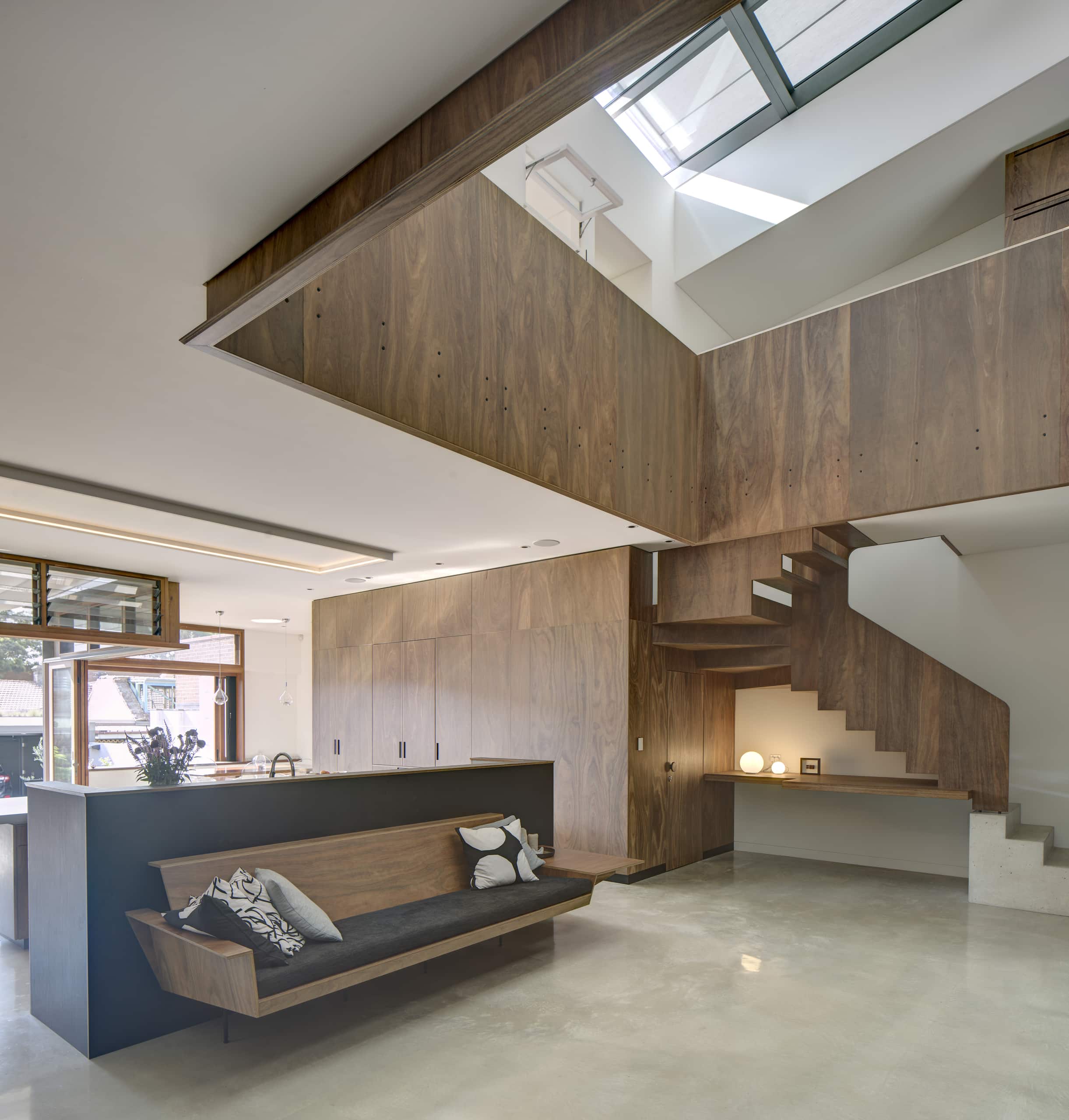
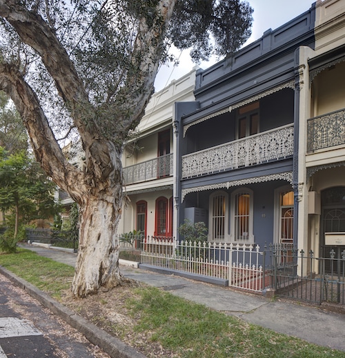
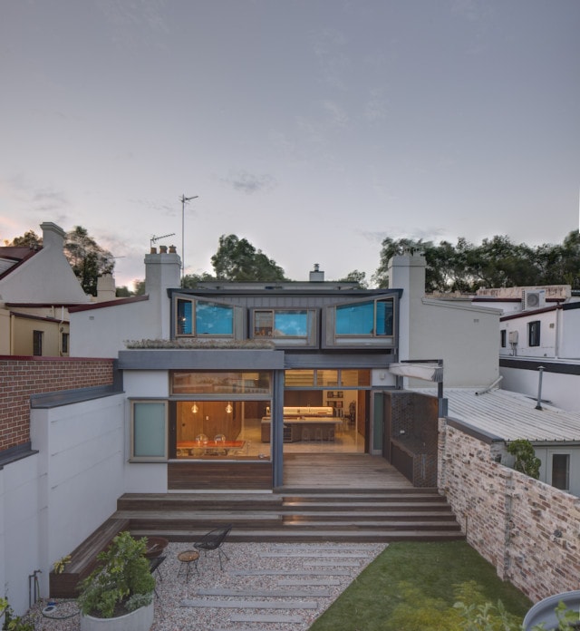
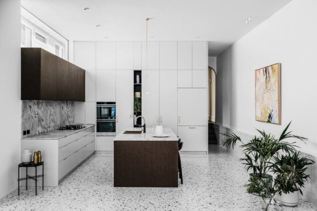
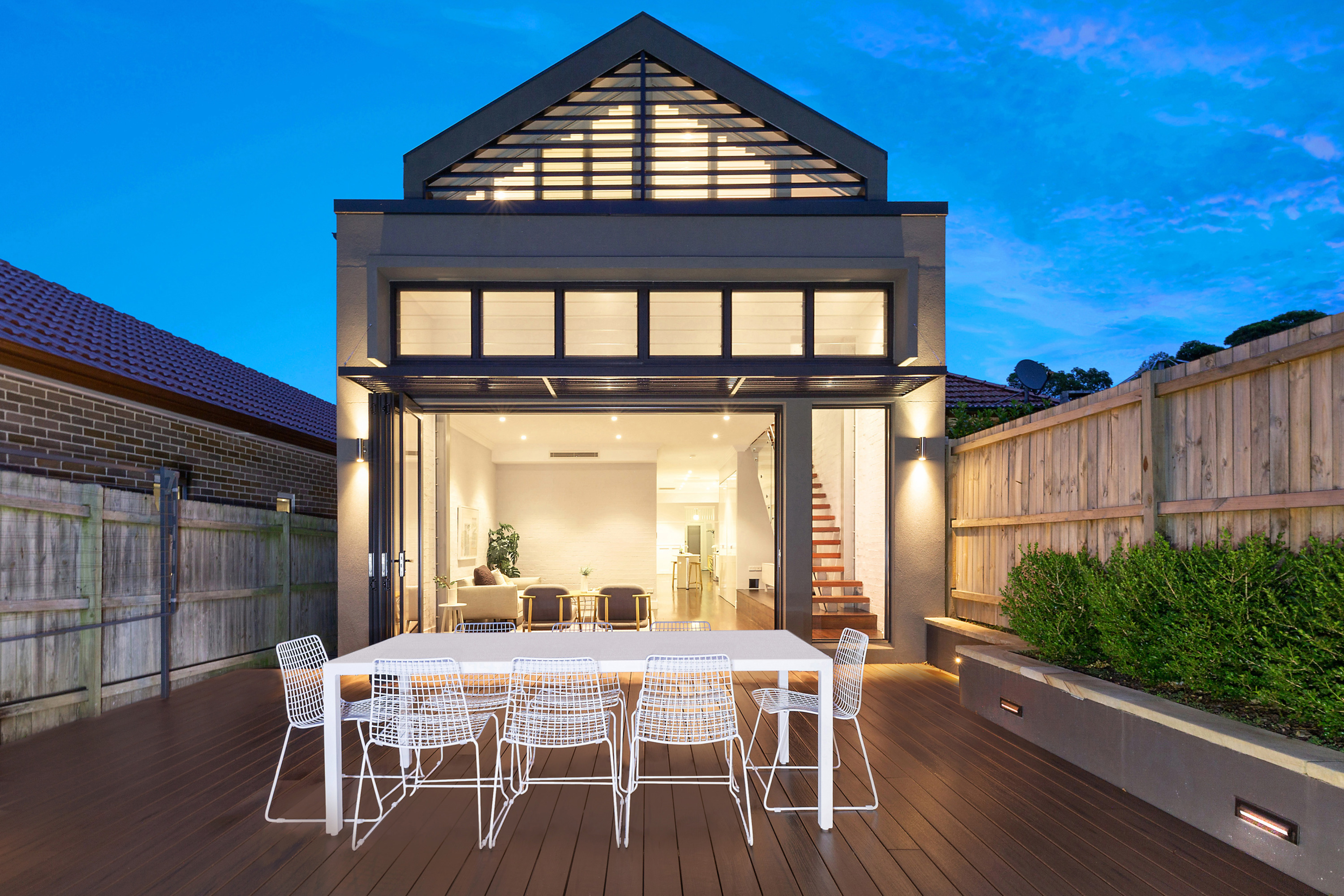
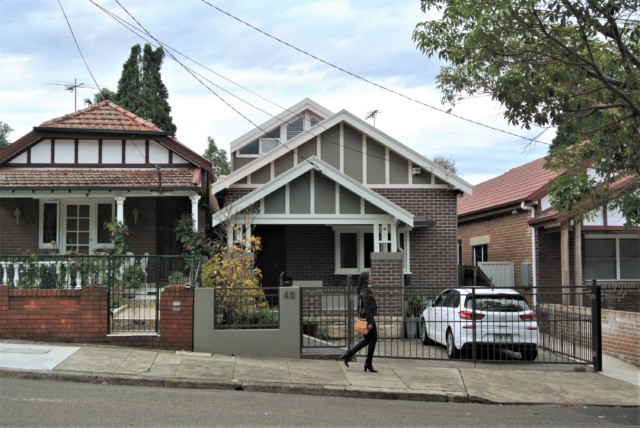
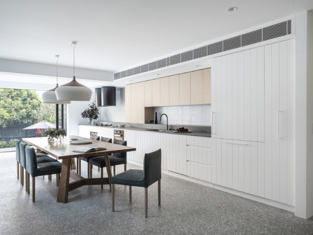
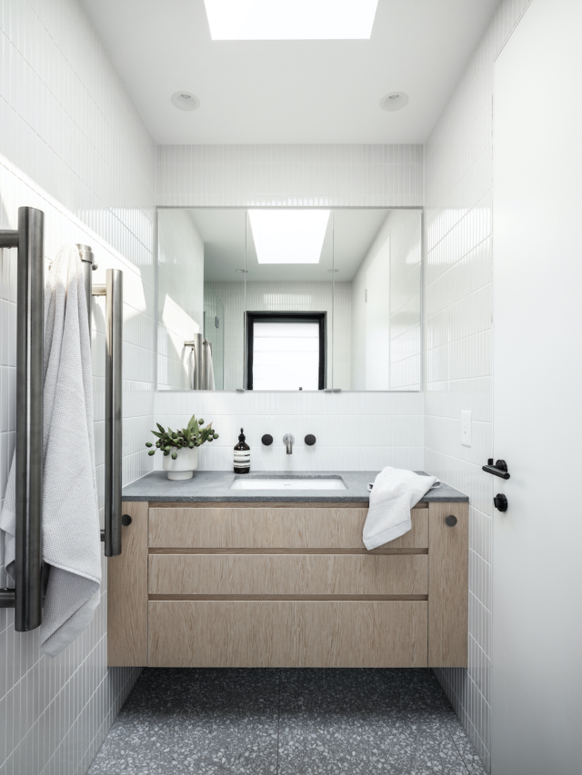
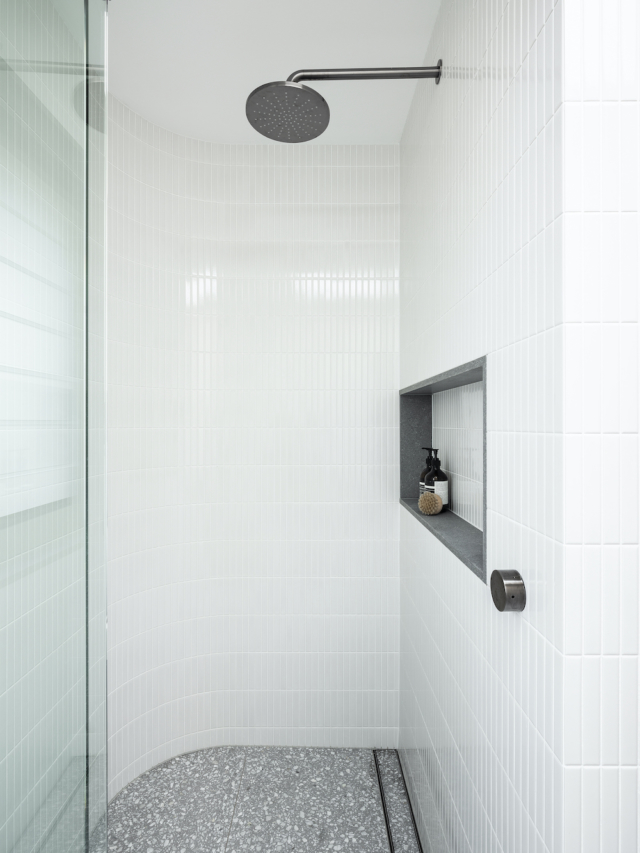
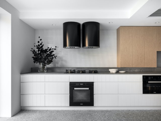
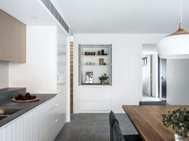
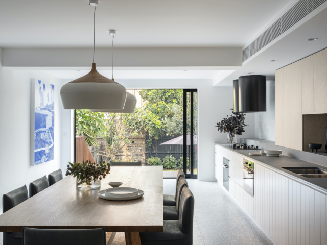
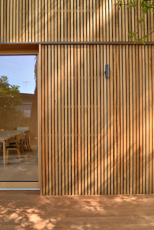
Just like retro design staples velvet, classical archways and terracotta have been subject to modern updates over the past few years, the heavily wooded interior appears to be back on the interiors scene – with a decidely modern spin. Today’s house tour, located in Sydney’s inner-city Redfern, was designed by the talented team at Marra + Yeh architects who have produced a striking, modern take on the ‘Paddington terrace.’
Lounge room
Kitchen
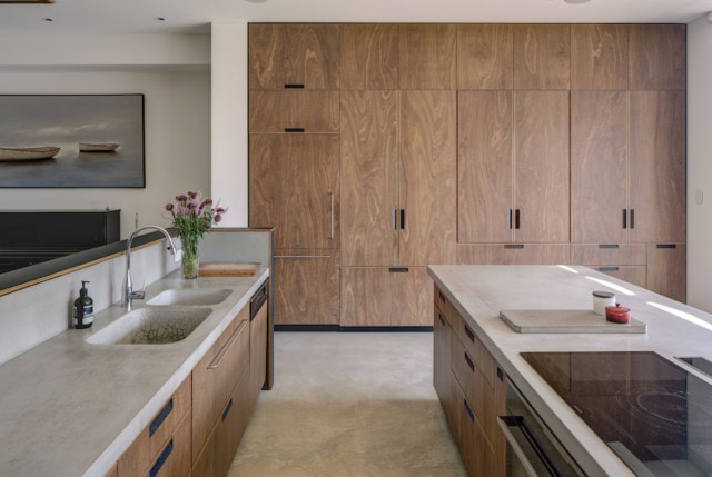
Home to a family of five, the project saw two adjoining terraces combined to create one large contemporary, flexible family home where timber is centre stage. Built as a ‘forever home,’ the design was developed to suit an ever-evolving and ageing family over the next 20 years.
“The clients, a family of five, had lived in one of these terraces for nearly a decade and had strong attachment to the local community. However, with limited scope for expansion they found the house unable to accommodate their needs as the family grew. Fortuitously, an adjoining terrace came on the market for the first time in 36 years, setting off a process of rebuilding and consolidation,” says Carol Merra, Director of Marra + Yeh Architects.
The unassuming terrace front belies the beauty and originality inside
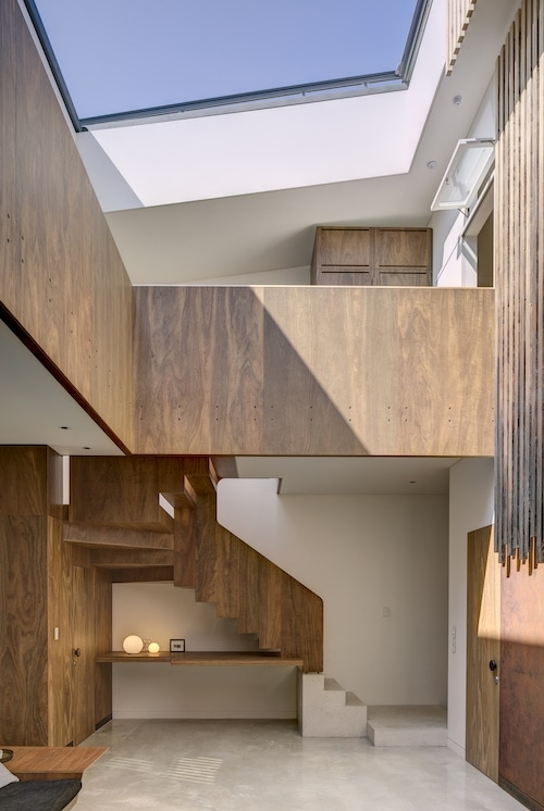
Far from the dark and claustrophobic spaces that one often associates with terrace houses, the rear extension has a unique atrium feature in the centre of the building. A pane of retractable glass ensures fresh air and light can always be welcomed in.
“The way the house is calibrated to climate and environment is not normally found in terrace houses. This is showcased through the internal atrium and sky window, which opens the heart of the house to the outdoors and connects occupants to nature on a daily basis,” says Carol.
The home’s timber staircase and sky window make quite a statement
“The house is part of an ongoing search to create climate-responsive buildings that address living in the age of climate change. The operable sky-window is the primary climate-adaptability element, a double glazed, argon-filled assembly complemented by an external sunshade resulting in multiple open/close combinations, enabling the occupants to modify the building in a dynamic response to prevailing conditions,” says Carol.
Spotted Gum plywood features in the kitchen and throughout the home
With sustainability a top priority for the home’s owners, Big River Group’s locally sourced, sustainable Spotted Gum plywood proved a natural fit. “The family took great care in all materials being used for the creation of their dream home and this is why the use of Big River products was crucial in the process,” says Carol.
Backyard
An ambitious project, Carol is very satisfied with the overall result. “I am proud of achieving both the aesthetic and sustainability ambitions of the brief within the constraints of an existing building in a heritage context.”
When Hydrowood co-founder Andrew Morgan first flew over Tasmania’s Pieman Lake in 2012, little did he know about the treasures that lay beneath. “Everybody knew there were trees in Lake…
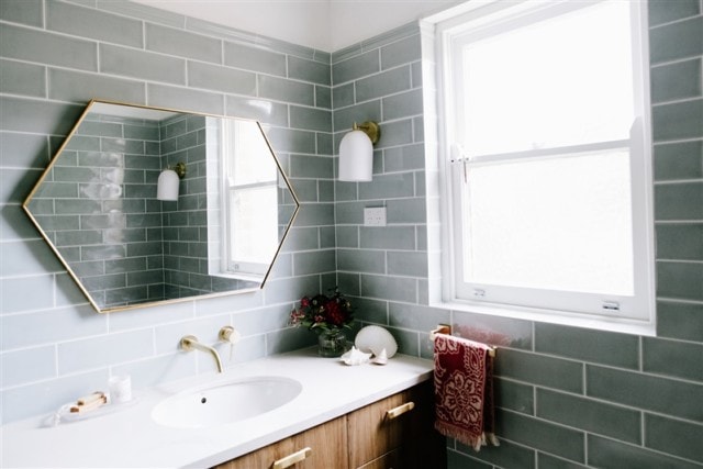
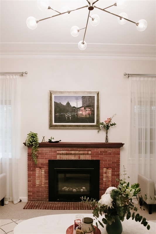
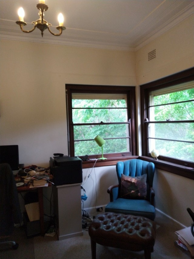
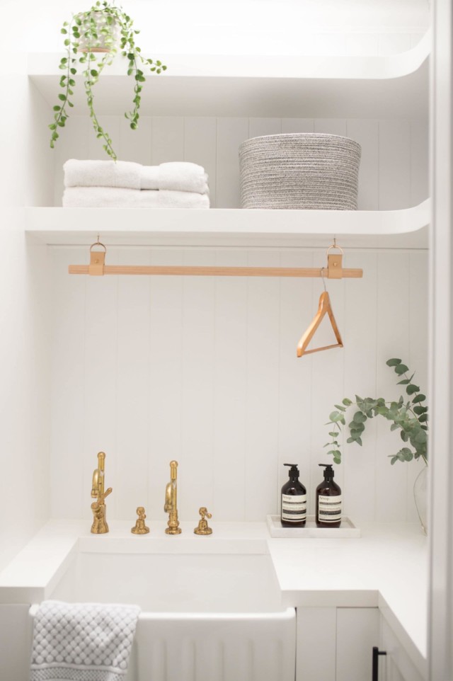
Located on Sydney’s North Shore, this 1940’s family home was updated recently by interior designer Joanne Yeomans of Issy and H Creative who was engaged to overhaul three key spaces – the master bathroom, laundry, study and lounge.
“My clients loved the charming Victorian architecture of their home, but despite its graceful ageing, the more tired spaces needed some magic to bring them back to life,” says Joanne, who used vintage-inspired colours and finishes to update the home.
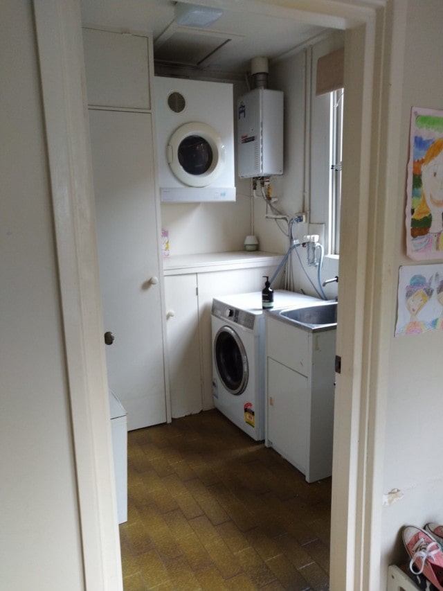
BEFORE laundry
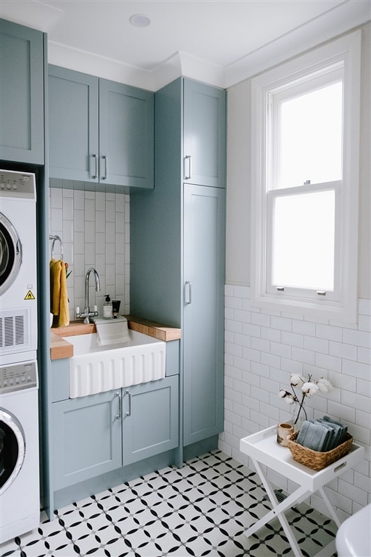
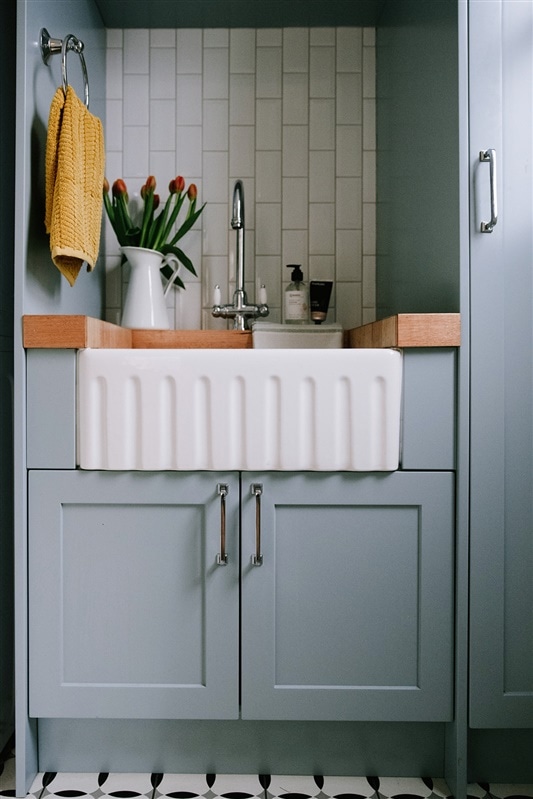
AFTER laundry
First up, Joanne tackled the laundry which was disorganised, cramped and lacking in functionality. “We took advantage of the fact that our client loved colour and pattern,” says Joanne who specified Shaker style cabinetry in duck egg blue, a butcher’s block bench top, butler’s sink and statement black and white floor tiles that reference the home’s Victorian origins. “This is my favourite space as I love the combination of finishes – especially the pop of mustard which works so well against the blue,” says Joanne.
The new laundry features lots of gorgeous period-inspired details
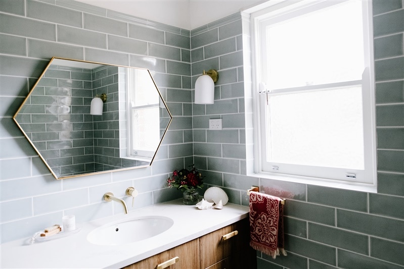
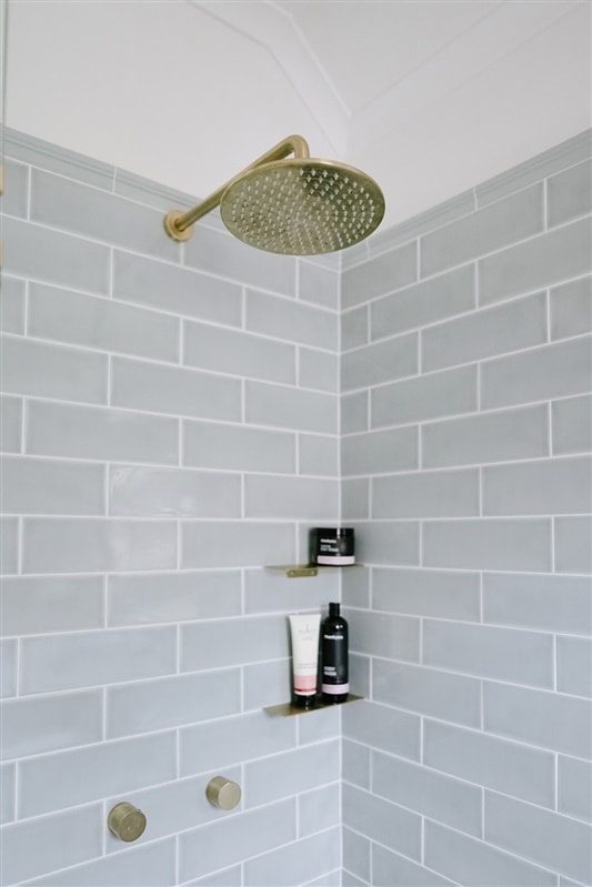
The master bathroom was previously lacking in functionality too, its outdated finishes ripe for renovation. In this space, sage green subway tiles from Kaizen Tiles perfectly complement a custom vanity (Lamicolor Chalet Oak Tabac) and a Caesarstone Calacatta Nuvo benchtop.
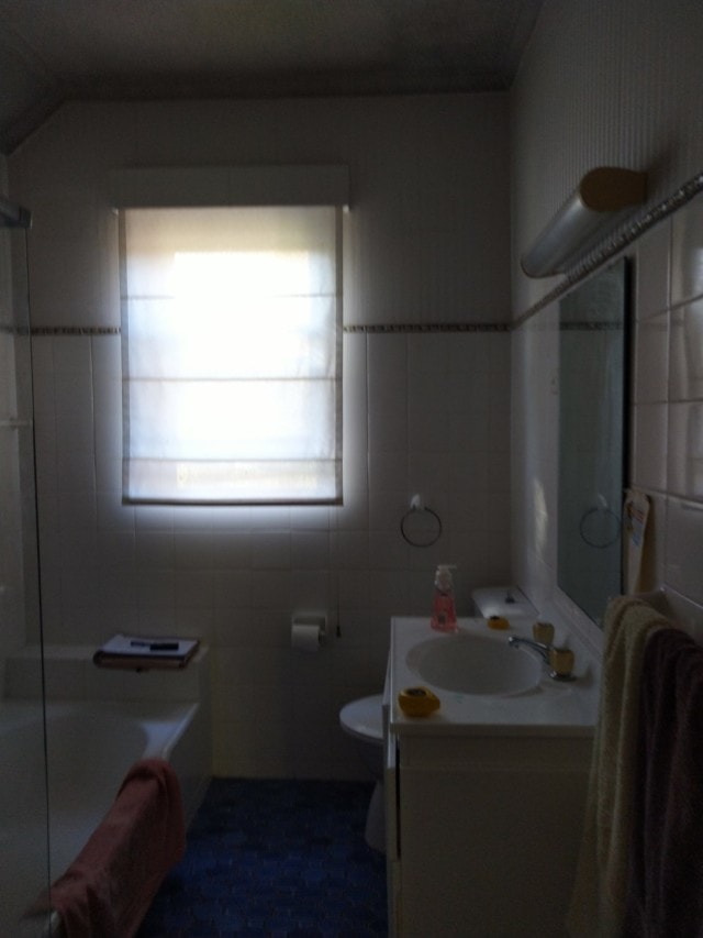
BEFORE bathroom
AFTER bathroom
“Brushed brass accents add an elegant touch, with the hexagonal mirror from Life Interiors giving it a modern twist,” says Joanne.
AFTER bathroom
The home’s formal lounge had great existing features including whimsical wallpaper and period details such as a red brick fireplace. The space was softened with custom curtains, custom scatter cushions in Art Deco-inspired fabrics, a large Freedom marble coffee table and west elm floor lamp.
“This has become a great adult entertaining space and has been well used as an escape from the busyness of family life, especially during the last few months,” says Joanne.
BEFORE lounge room
AFTER lounge room
AFTER lounge room
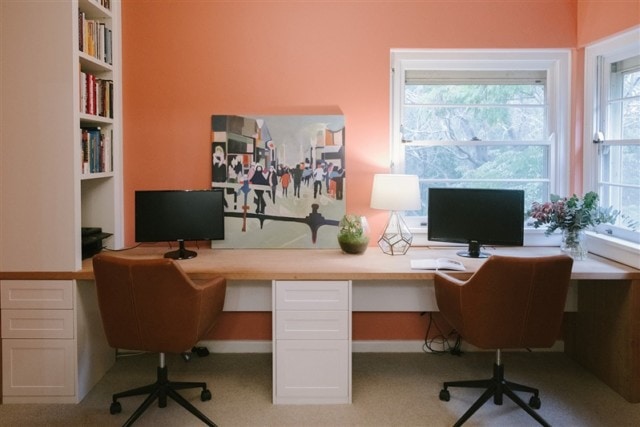
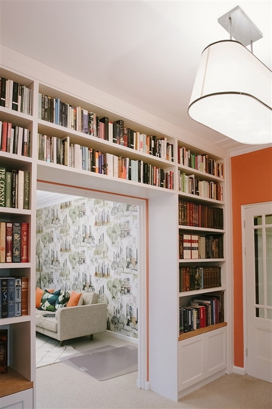
The nearby study was given an aesthetic and organisational overhaul with a fabulous new bookcase becoming the hero of the space. The full height bookcase wall is complete with a reading corner and built-in drinks cabinet.
“We created a two-person, 3.5 desk in recycled Blackbutt timber and the wall paint colour, Taubmans Red Squirrel, was chosen by my clients. It adds a wonderfully warm and vibrant feeling to the room.”
BEFORE study
AFTER study
Fabulous full-height book shelves house the owners’ large collection of books
IKEA before and after: a family living room transformed
As part of its commitment to providing relevant interior design solutions, IKEA regularly ventures out into Australian communities to find out what people really need and want in their homes.…
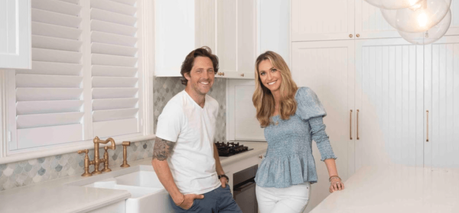
With two sons, it didn’t take long for Aussie landscape designer and TV host Charlie Albone and his interior stylist wife Juliet Love, to outgrow their two-bedroom home. After going on the real estate hunt, they eventually stumbled upon a two-storey beachside semi in Sydney’s eastern suburbs that was ripe for renovation. Despite falling for it, the couple thought it was out of their price range but decided to put in an offer anyway.
Juliet and Charlie in their newly renovated kitchen
“As it turned out, the former owners needed to sell quickly, and a lot of buyers were put off by the dated interior, so we made a low offer and to our amazement they accepted it!” says Juliet, who has since renovated the home on a relative budget with a mix of clever styling tricks, secondhand and affordable finds.
Lounge and kitchen
“Our last home was a little more Hamptons with lots of navy and white, but this time around we wanted a more laid-back, calm feel. We went for a soft colour palette of white, blue and seafoam green,” says Juliet.
A largely cosmetic renovation, the biggest change took place in the kitchen and lounge area that was transformed from a pokey nineties kitchen full of black granite to a much more modern space courtesy of a mint green marble fishscale tile splashback, brass tapware, round glass pendant lights and large Caesarstone island bench. When it came to the flooring, Juliet used Porter’s Paints Wood Wash in ‘Conifer’ to update the original home’s yellow-hued pine.
In a clever move, she specified matching joinery in the nearby living area to ensure a seamless transition from the kitchen. The joinery houses a television, concealed shelving as well as open shelving that displays photos of family and friends and sentimental objects. “By using matching joinery, Caesarstone and brass hardware, it really makes the room flow,” says Juliet.
Complementary joinery in the nearby living room
“The stylist in me is forever changing vignettes around the house, so I like to have some open shelving to display objects, but also added enclosed shelving below to hide some of the mess that comes with family life!”
Juliet hung an inexpensive marble cross, tassle beads, straw fans, and a tribal necklace above the fireplace in the dining room, as a point of visual interest
Bedroom
With budget concerns top of mind, Juliet employed clever tricks and secondhand finds to realise her vision. “I like to mix high and low end generally, as I find you get the most visually interesting outcome for the least expense. I’m a big believer in having one or two big ticket items to elevate a home – if everything is cheap, it will look cheap. For us, we decided to invest in the marble splashback in the kitchen.”
Fish scale marble tiles make a statement in the kitchen
Money was saved elsewhere by reusing old furniture including a chest of drawers that used to belong to Juliet’s grandfather and that she didn’t initially think would work. “I didn’t think the drawers would fit with our vision of a breezy coastal abode, but we’ve placed them on the landing at the top of the stairs, and they works perfectly there.” She then added a round sisal rug, vintage pineapple lamp with a hessian shade, and some coral to work the piece into her interior scheme.
Juliet’s grandfather’s chest of drawers look at home on the landing
Affordable art is scattered throughout the home – another one of Juliet’s budget-friendly tips. “I love affordable artwork to dress your walls and elevate a space. Art literally changes the feel of a room in an instant,” says Juliet who sourced most of the pieces through Hop Home.
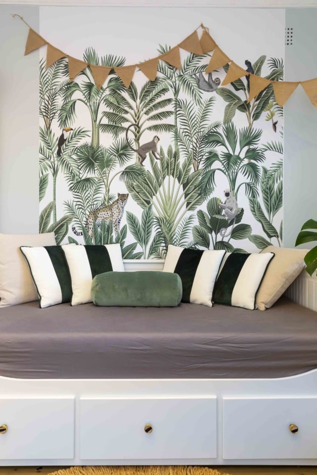
The kids’ playroom was created on a budget using IKEA furniture upcycled with unique brass hardware. Olive et Oriel jungle-themed wallpaper makes a statement in the space too where it hangs above the IKEA daybed. “With the wallpaper, I just used one panel behind the daybed, which was enough to give impact, without the expense of papering the entire wall or room,” says Juliet.
Playroom
Boys’ room
Other kid-friendly design decisions include slipcovers on the sofa, wash and wear paint, replica Philippe Starck Ghost dining chairs that can be wiped down, a glass coffee table that stores decorative items underneath as well as many multi-purpose furniture items. “Our ottoman in the lounge room opens for storage, the day bed in the kids’ playroom rolls out into a double bed for when visitors come, and the floors are scooter-proof!”
We had to ask, does Charlie, who switched from Selling Houses Australia to Better Homes & Gardens this year, get a say in the decorating or does he stick to the outside? “He has excellent taste and is usually always right when it comes to style choices, which is quite frustrating! He always says that he’ll leave it to me, but he is quite opinionated, so ends up having a say in absolutely everything! I don’t mind that though because we work well together, and we end up with a better result in the long run!”
Of course, there are plans for the back yard, which will be stage two of the renovation. “We have a DA in to council for a small pool and a pavilion with an organic vege patch on top,” Juliet shares.
The couple also have a farm on the Central Coast, Charlie’s happy place where Juliet says they’d spend every weekend if he had his way! They’ve even established a small plant nursery there for landscaping projects for clients. “We like to get up there as much as possible, but now that both boys are at school, it is becoming more difficult as weekends are full of sports and kids parties! When we do go to the farm, Charlie goes straight into the garden and spends all weekend there.”
Photography: Brent Wilson
Covet my coffee table: with Juliet Love & Charlie Albone
Photography by Susan Papazian This week, we’re excited to give you a glimpse of the home of interior-exterior design duo and husband and wife, Juliet Love and Charlie Albone. Juliet…
Located in the Sydney suburb of Gymea, this home was originally built in 1964 but when the last surviving original owner passed away, rather than put the home on the market, one of his children decided to buy it and give it a new lease of life.
After growing up in the house, Chris Romao moved closer to the city for many years but had always reminisced about returning to Sydney’s southern suburbs. “We decided to make a huge move from our busy inner-west life to create our dream home and enjoy the Shire life,’” says Chris’ wife Yolanda, who engaged interior design Vivian Panagos to refresh the home’s key spaces; the kitchen, laundry, main bathroom and master bedroom.
Main bathroom
“It was really important to Chris to create something really special within these walls, to honour his beloved mum. Chris knows she would be so proud of what we have created and that we now get to enjoy the home for many more years,” says Yolanda.
And while Yolanda gave Vivian a ‘Hamptons glam’ design brief, the designer brought her own creative ideas to the project, the most interesting of which Vivian calls a ‘thin black line feature.’ “It is seen in the kitchen cabinetry handles, the black double French doors, thin black kitchen cabinet, thin black shower frame in the bathroom and ensuite, and a delicate thin black rattan bedhead in the master bedroom,” says Vivian.
Master bedroom & ensuite
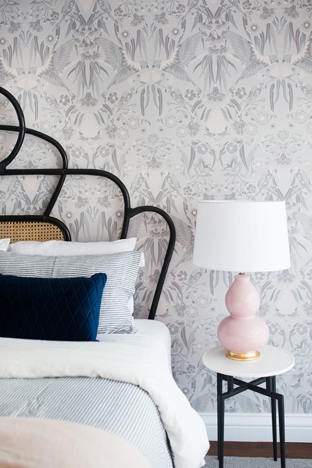
A gorgeous space, the master bedroom makeover included a custom rattan bedhead and House of Heras Australiana themed wallpaper. “The wallpaper provides a connection with the leafy trees viewable beyond the large bedroom window,” says Vivian who softened the space with layers of pure linen, velvet and blush pink lamps.
Master bedroom
The nearby ensuite, accessible via a sliding barn door, houses a statement navy vanity with marble top. A bespoke bone inlay mirror hangs above it – a detail not lost on Yolanda. “In every room Vivian has brought in what I like to call little treasures. Everything was chosen with such thoughtfulness for us. For example, every time I use the ensuite, I feel happy that the mirror hanging in there was handmade in India,” says Yolanda.
Ensuite
Main bathroom
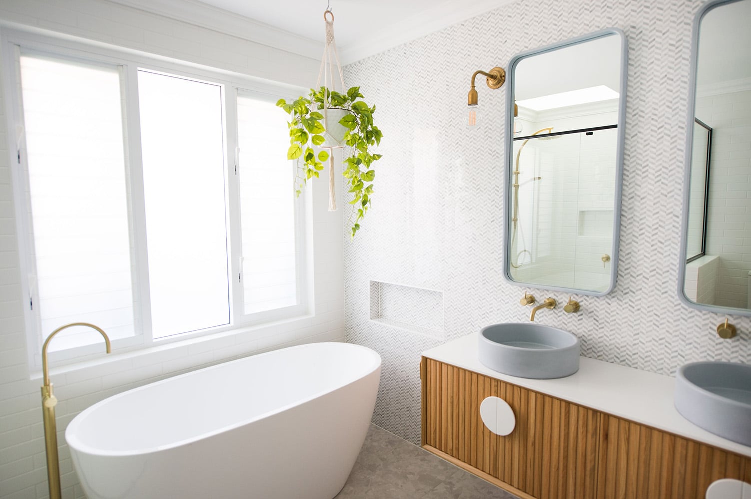
A textured and inviting space, Vivian’s design work continued in the main bathroom which is flooded with natural light courtesy of the large window over the freestanding bath and a skylight in the shower space.
The wall is lined with herringbone marble tiles on which large concrete double mirrors hang – round concrete sinks sit atop the oak vanity that features vertical timber detailing and statement round handles.
Main bathroom
“Spacious room for a freestanding bath and a large shower was created by stealing space from a bedroom and it transformed what once was a small dark bathroom into a luxurious space,” says Vivian.
Master bathroom
Kitchen and laundry
Chris and Yolanda’s favourite part of the renovation, Vivian completely redesigned the existing kitchen and added a laundry/butler’s pantry while she was at it. “It truly is the heart of the home. It was a unique space, given it’s in the middle of the house, and it took a lot of planning. We feel it’s absolutely perfect in look and feel and flow to the rest of the house now,” says Yolanda.
The kitchen cabinetry paint colours are Dulux Lexicon Quarter and Dulux Domino
The laundry and pantry are tucked away behind the kitchen but each of the spaces feature similar cabinetry and hardware, raw brass tapware and large farmhouse sinks. “The owners had the clever idea to install skylights in both of these spaces and it is just glorious to stand in them when the sun shines,” says Vivian. Green velvet and brass stools provide a pop of colour at the kitchen island bench.
Butler’s pantry
“I’m most proud of how we reorganised the layout of both the kitchen and laundry spaces best utilising every centimetre of space we had available while making them look beautiful too,” says Vivian.
Nestled in the Sydney suburb of Paddington, this gorgeous home’s one-storey heritage façade hides a pretty incredible split-level renovation behind. Home to interior designer Nina Maya, who is using it…
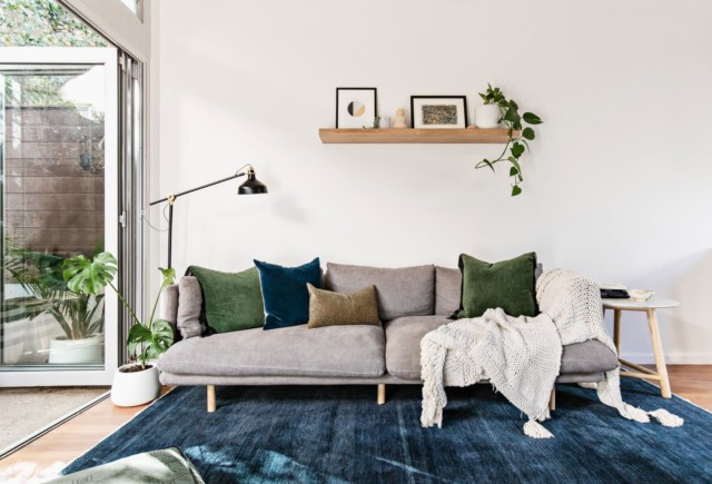
Tucked behind the bustling main drag of Sydney’s vibrant Newtown, this small 1980’s era terrace was transformed into an urban sanctuary recently by the talented interior stylist Jessi Eve. “The owner is a female entrepreneur that was looking to create a home that suited her social, laid-back lifestyle and mindful values,” says Jessi who deftly guided the transformation.
Lounge room
In keeping with the owner’s eco-conscious values, Jessi selected quality investment furniture and homeware pieces that are built to last; selections that shouldn’t end up in landfill as trends change. “We favoured ethically sourced, natural materials and supported local artisans and businesses along the way,” says Jessi of the quality Australian wares that pepper the home.
The master bedroom’s minimal timber furniture suite was handcrafted by surf coast duo Al & Imo Handmade. It sits atop a textured wool rug by Melbourne’s Armadillo & Co. whose rugs are also featured in the living area. The lounge room’s stylish linen sofa is by the talented Aussie-based designer Sarah Ellison.
Master bedroom
The dining table setting is by Aussie father and son duo, Icon by Design. “They have a strong focus on creating quality-crafted, timeless, designer-calibre furniture made with natural, ethnically-sourced materials, minus the high-end price tag,” says Jessi.
Dining room
More local flags fly in the guest bedroom where planter pots and the guest bedside table/stool are by Pop & Scott, and the bed linen is by Cultiver and I Love Linen. “There’s a lot of local talent producing quality pieces that will stand the test of time, that were used in the making of this home,” says Jessi.
The lounge room looks out onto a lovely courtyard
When it comes to the materials palette, the cohesive selection includes timber, marble, linen, wool and pops of velvet. Jessi also disproved the old adage that ‘blue and green should never be seen’ with the colour combination proving a hit in the lounge room.
“I don’t agree with most of those rules. In fact, I also love a playful combo of orange and pink when the space calls for it! It’s all about balancing out those ‘louder’ elements with calmer ones,” says Jessi who paired deeper moodier jewel tones such as navy, emerald, maroon and mustard with pops of natural timber, warm white and soft grey.
Gorgeous coffee table details
Eco-conscious considerations aside, maximising the home’s small footprint was the other main focus of Jessi’s design brief. “Custom joinery was added throughout to ensure everything was absolutely fit-for-purpose,” says Jessi.
The entry way features a piece of built-in joinery that includes a mirrored coat-closet, shoe cabinet and storage bench surrounded by high open shelving that acts as a library. Talk about multi-tasking!
The entry features clever multi-purpose joinery
“In the guest bedroom, the bedside table doubles as a stool for the built-in dressing bench which can also be used as a laptop nook. The attic-style storage space, off the master bedroom, was transformed into a custom walk in robe with all the clothing, shoe and accessory storage required.”
Guest bedroom study nook
Another home highlight is the charming outdoor area that runs off the living room. “Ultimately, the vibe is casual yet considered, cosy and comfortable with a courtyard fit for an ambient dinner party with friends.”
“I love contemporary design overlaid on a historical backdrop,” says retail designer David Cook-Doulton who, together with his partner Martin Shew, is responsible for the gorgeous overhaul of this grand…
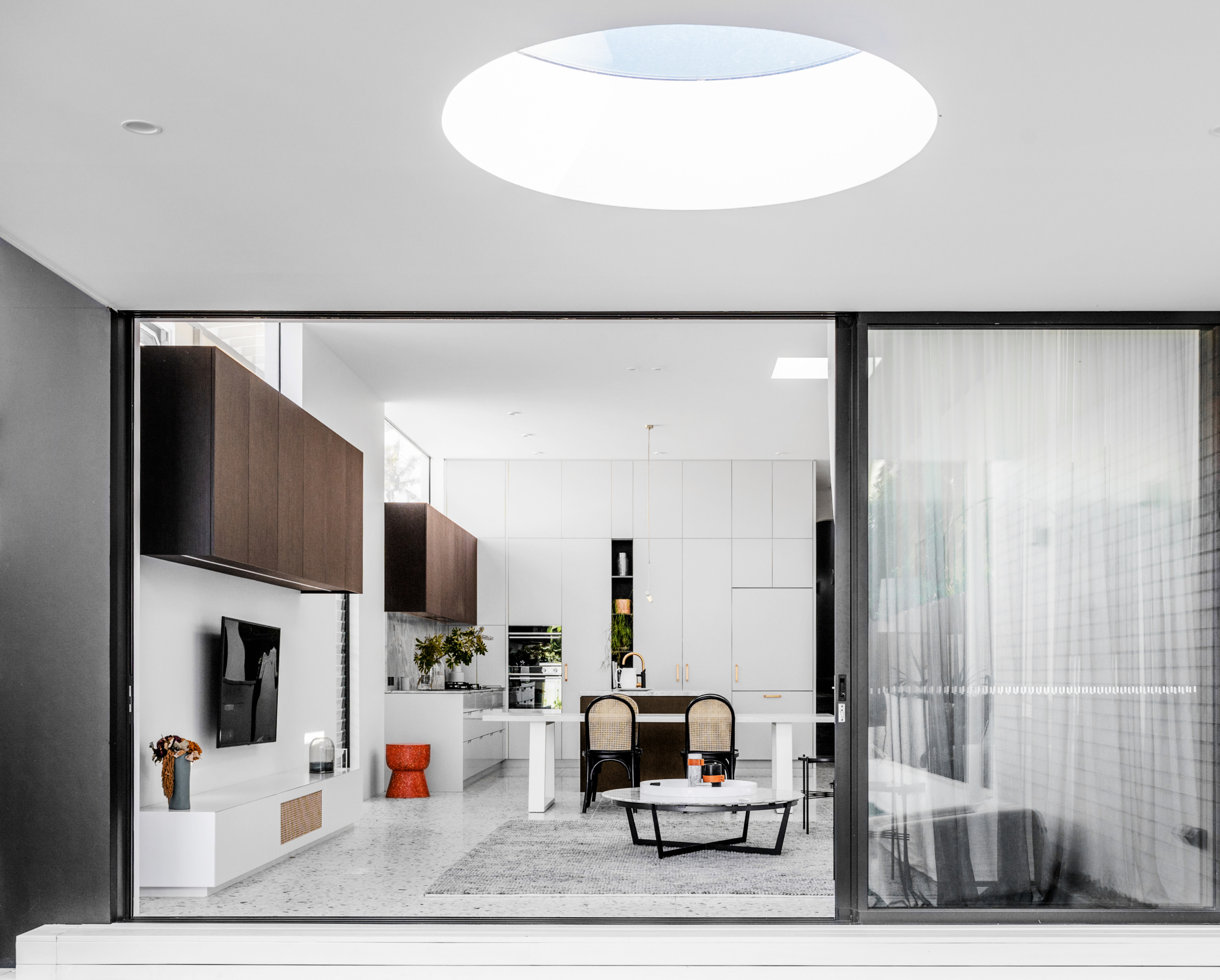
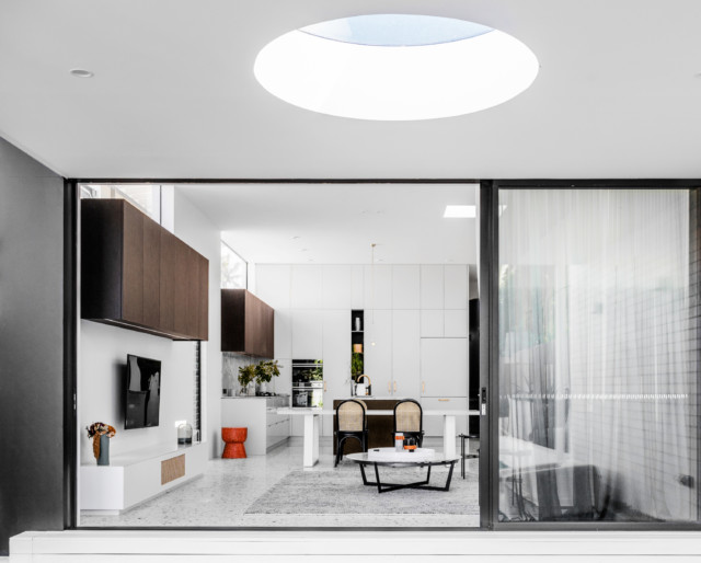
The rear extension includes a statement circular skylight within the exterior awning
While a fail-safe option, neutral beachy interiors can run into bland territory, but that is certainly not the case with this seaside Sydney residence. Layers of texture including terrazzo, marble and dark timbers combine with light filled spaces to make this renovation a much more sophisticated take on coastal cliches.
The rear extension includes a statement circular skylight within the exterior awning
“We wanted to create beachside elegance, so we combined sandy terrazzo colours with the formality of a dark veneer. For example, the marble bench top and splash back in the kitchen is quite formal but the terrazzo floor tile makes it feel more casual,” says interior architect Emily Hollier of the home’s tactile materials palette.
Dark elements bring sophistication to the otherwise white spaces
Circle motifs run throughout the home, inspired by the original 1920’s home’s decorative arches. “The front door handles are circular, and there’s circular shapes in the bathroom cabinetry and wall lights. This was taken from that language of the original arches,” says Emily.
Hallway
Located beside the ocean in Clovelly, the original semi-detached house was very rundown before Emily and her team commenced works on it. Key to the design brief was increasing the home’s height and volume to create space for the owners and their two small children. “We opened the house right up to create a much bigger feeling house,” says Emily.
Bathroom: Zuster vanities and a Gubi wall sconce elevate the space
Bathroom: That Marble Hub basin is something special
After the existing rear of the south-facing home was removed, a brand-new structure was built, designed to capture the light. “Bringing a maximum amount of light into the space was key so we utilised skylights and windows in different forms to do this,” says Emily.
The new rear extension has several highlight windows and four other skylights were included in the design too; one of which is outside. “The owners wanted an enclosed awning that allowed them to sit outside year-round, but they wanted light to penetrate through it,” says Emily of the unique design feature (first picture above).
Ellie Cashman wallpaper is stunning and unexpected in the powder room
The home’s spatial flow was also redesigned with Emily adjusting the levels in order to create a more fluid experience when moving from the interior living area to the backyard. “We lowered the living area so that it connected with the backyard as the owners wanted to be able to watch their children playing outside. Having that visibility was important,” says Emily who chose hardwearing and sturdy finishes with the children in mind.
Green timber panels star in celebrated coastal home
The inaugural Inside Out Brickworks Home of the Year awards took place last night with a stellar line-up of Aussie houses singled out for their design originality. And while it…
Do you love the area you live in, but you’ve outgrown the house? It’s a classic conundrum and it’s one that a young Sydney family had recently when deciding whether to move to a new house or stay put and renovate. But after doing the sums, and weighing up the various pros and cons, the couple went with the latter, a decision they believe was ultimately cheaper than moving.
Living room and backyard
“I’d say the main savings were all the usual costs involved in selling a home and purchasing another, such as stamp duty, agent’s fees and mortgage exit fees. We estimate the saving was north of $70,000,” says Luke Carter of Sandbox Studio, the architect responsible for the renovation of the home that is located in Marrickville, in Sydney’s inner-west.
Dining room
Master bedroom
With a young growing family, the couple wanted two extra bedrooms as well as improved connections between the house and rear courtyard. “The interior was dark and a series of ad-hoc additions over time had resulted in an awkward layout with the laundry marooned at the back of the house, and no clear connection between the living space and small rear garden,” says Luke.
The renovation opened up the house to the outdoors
The home’s original footprint already covered the block which meant the only way was ‘up’ in terms of an extension. “We managed to retain the existing kitchen, dining area, master bedroom, and front bedroom, while turning a two-and-a-half-bedroom home into a four-bedroom refreshed home,” says Luke.
Upstairs bedroom
Upstairs bathroom
And when it came to specific budget-conscious design decisions, Luke tried to retain as much as possible of the existing building fabric. “We basically built less!” says Luke. Existing floorboards were sanded and refinished, existing brick walls were exposed, and the internal exposed brickwork was painted.
Another contributing factor to the cost-saving was the fact that the owners project managed the build themselves rather than outsourcing to a project manager; a decision that potentially saved 25 percent on construction costs.
The second storey references the original home rather than simply being a typical ‘box on top’ addition
But as previously mentioned, the cost saving wasn’t the only decider in staying put. Aside from loving the home’s location, the couple also love its easy walking distance to transport, parks, schools, shops and cafes; all serious lifestyle factors to consider when weighing things up.
“Also, being a renovation, the owners could customize the home exactly to suit their lifestyle, as opposed to buying something that’s new or renovated by someone else.”
Renovation ideas: Chic Sydney terrace now light filled
Located in the inner-city Sydney suburb of Redfern, this terrace home was transformed recently under the talented eye of Rebecca Elms, of the fashion and homewares store Elms. The Surry…
Home to a professional couple, their three young children and two lively dogs, this North Bondi semi-detached home was originally built in the 1980’s. Purchased almost exclusively for its location, the home has since undergone a highly considered renovation courtesy of architect Josephine Hurley. “When the client bought the home, it was all about the location as they knew they could work with an architect to remodel it and make it perfect,” says Josephine.
The kitchen and dining flows out to the rear garden
Key considerations included expanding the home’s liveable footprint, and improving its natural light and ventilation while making the spaces elegant, robust and timeless. “They spend a lot of time at home with their young family and they ultimately wanted a home that felt calm and relaxed,” says Josephine.
Bathroom
Shower recess: “The curved wall in the bathroom was a way of introducing something special into what is quite a restrained space,” says Josephine.
Key to the feeling of tranquillity is the neutral and consistent materials palette; white ‘kitkat’ mosaics, soft grey Italian terrazzo tiles, oak and v-groove joinery all bring gorgeous textural and tactile qualities to the home. “The tiling is consistent throughout the house. The white ‘kitkat’ mosaics from Surface Gallery feature not only in the bathrooms but also in the laundry and kitchen.”
Living room
Creating more liveable space was another key part of the brief to which Josephine responded by enclosing both rear balconies. “I reimagined the interiors to utilise every available space in what is a compact floor plan,” says Josephine. In another clever redesign, the first-floor hallway was transformed into a walk-in robe for the owner who had always wanted one, but didn’t have the space.
Master bedroomChild’s bedroom
Child’s bedroom
The Qasair overhead extraction fans draw the eye in the kitchen; the matte black finish ties in with the black appliances. “The client enjoys cooking and was after a statement piece that also had great functionality,” says Josephine. And with so many family members, minimising clutter was essential; everything from wine to dog food has a designated storage space.
KitchenAppliances hide behind v-groove joinery in the kitchen
The kitchen and dining spaces are elevated, allowing for full visibility and a strong connection to the outdoors. Retractable glass doors and timber bleacher steps overlook the garden and let the children and dogs run free.
“It’s always hard to select a favourite part of a property, however the combined kitchen and dining room is particularly successful as there is plenty of storage and natural light. It is a clutter-free, bright and naturally ventilated space where the family enjoys gathering together to cook, enjoy a meal and entertain with family and friends.”
Designed by architect Madeleine Blanchfield and constructed by One Up Building, this Sydney renovation is one of the most beautiful projects we’ve come across. Monochromatic in scheme, it’s elevated by brass and timber accents while polished concrete and specialty plasters seamlessly blend the original Arts and Crafts era home with its new extension.
Lounge room
The fireplace is something else!
Located in Sydney’s beachside suburb of Coogee, the house is home to Brett and Libby Newman and their three teenage children, who were looking to create a home that was beautiful but functional too. “It has spaces and places we can come together as a family, and with large groups of friends, but we can also find our own space in the house as well,” says Brett.
The front of the home
Sitting room
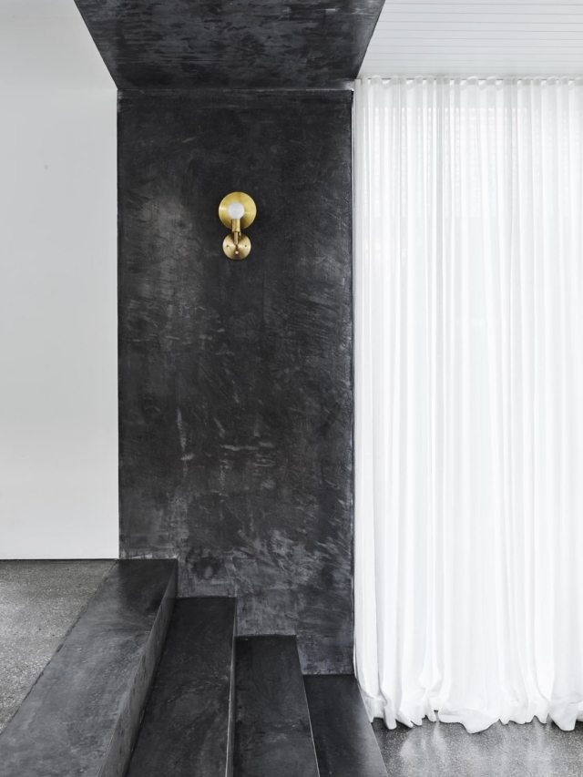
The home is a seamless blend of old and new; its monochrome palette working to unite the spaces. “We realised we needed some form of expression between old and new, so we provided a colour application to the new concrete stairs and the entire wall and ceiling which created a portal-like effect,” says Rick Simmons, co-founder of One Up Building, of the home’s sumptuous Portuguese plaster detailing. Offset with a brass wall sconce, the finish really emphasises the light’s beauty.
The stunning Portuguese plaster
With five family members, each with varying needs, the home’s spatial flexibility is highly prized. Everything from the children’s study needs to parental work commitments and parties can be accommodated easily, making for a very liveable home.
“We wanted a place that was beautiful, well designed, comfortable to live in but not high maintenance, over engineered or over designed. We didn’t want something that we didn’t feel comfortable living in,” says Brett, touching on the home’s understated, easy luxury.
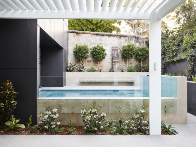
Pool
“Nothing looks forced or purposely added without consideration. It is a simple thing – walking through a space feeling like it has been considered and was always meant to be. That’s how I feel when I walk through this home,” adds Rick.
Creating an air of casual sophistication wasn’t always easy though; the home’s staircase design proved a significant challenge. Originally designed as a steel spine, the heritage section of the home couldn’t hold the weight so Rick and his team had to improvise. “To realise the architect’s design intent, we modified the structure to create the same effect. Anything can be done; you just have to approach working with heritage and renovations with an open mind,” says Rick.
Staircase
The design dedication certainly paid off with the family genuinely loving their home. “I’m proud of it, and we enjoy living in it immensely. This is a place I can see us living in for many years and enjoying as the kids go from teens to adulthood and then hopefully coming home!”
Paddington terrace renovation is a modern visual feast
The following is an extract from the new book, Hare + Klein Interior by Meryl Hare, published by Thames & Hudson and available in all good bookshops. Crisp detailing throughout…
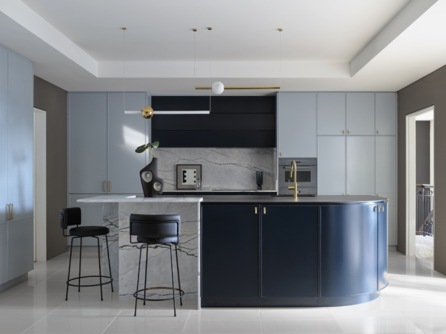
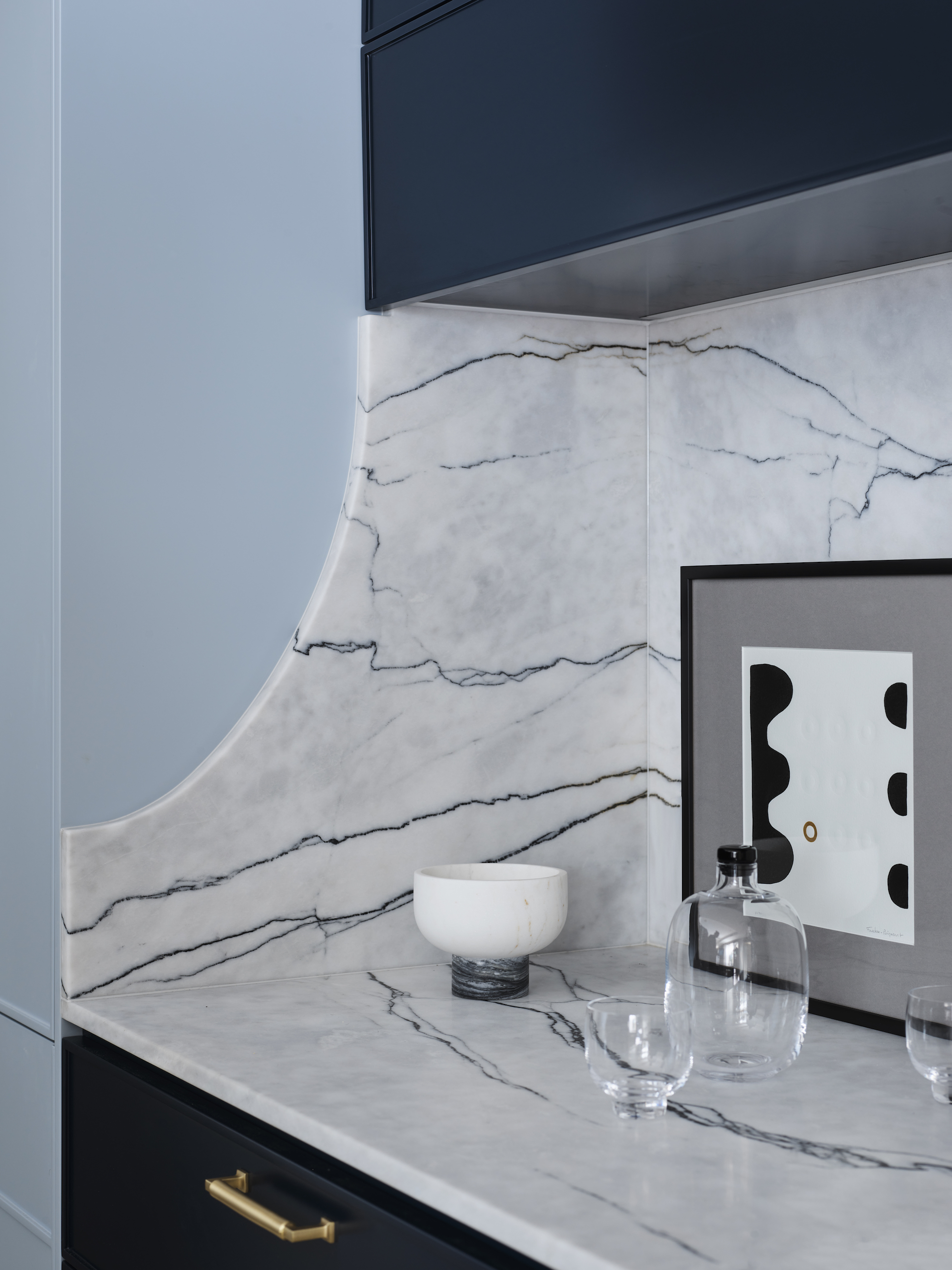
Located inside a grand three-storey home on Sydney’s Upper North Shore, this newly renovated kitchen certainly looks right at home in such a salubrious setting. Featuring sculptural curves and multiple luxe finishes, plus two sophisticated shades of blue, the kitchen’s talented designer Lynne Bradley has really excelled herself this time.
Just, wow!
“I used two contrasting blue colours for the purpose of creating scale, depth and design interest,” says Lynne who balanced the colours (Dulux’s Oxford and Prestige Blue) with two bench surfaces; New York Marble from WK Quantum Quartz and Dekton Sirius in black.
Curved marble detailing mirrors the curve of the nearby island bench. The door hardware is from Style Finish.
“The use of luxury materials, sculptural forms, curated appliances, beautiful lighting and generous storage with brass hardware, all combine to create a uniquely designed kitchen tailored perfectly to this home,” says Lynne. Standout fixtures include a pair of stunning Lee Broom pendant lights that hang over the island bench; they provide ambient and task lighting and contrast beautifully with the dark blue overhead cupboards.
We love the pops of brass
With two adult children still living at home, and grandchildren often visiting, the home’s owners love to entertain with the kitchen at the heart. And given the kitchen’s location in an open plan living area, Lynne was careful to conceal as many appliances as she could with a dedicated appliance cupboard.
Look at that gorgeous dedicated appliance cupboard on the left
“It’s a highly considered cupboard with pocket doors and LED lighting. Also, being fully lined in stone and Dekton, it provides easy maintenance as well as visual impact when opened,” says Lynne.
Grazia & Co stools and sculptural homewares really complement the space
The kitchen also boasts a highly practical breakfast bar area complete with discrete electrical equipment charging space plus two ovens; one for baking and one for savoury creations. “Ultimately I’m most proud of balancing the materials and colour palette as well as creating a sculptural and highly functional kitchen that my clients adore.”
Real reno: A luxe guest suite you’d never want to leave
You know what they say about house guests and fish? Well I’d certainly be doing my utmost to stay more than three days in this gorgeous guest wing, newly renovated…
Chalk paint kitchen cabinets: 2 amazing before & afters and how-to
Making over your kitchen is remarkably easy using chalk paint. So, if you’ve been bitten by that lockdown DIY bug, we’re here to share a very easy way to transform your…
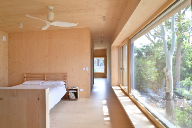
With the environment and energy use top of mind for many Australians, we’ve seen many sustainable design and building practices emerge; the latest of which is the ‘passive house.’ Originating in Germany in 1990, the Passive House standard is a leading international low-energy design standard that is a scientifically proven, cost-effective way to improve indoor comfort, air quality and lower your heating and cooling bills. But with only around 25 Australian houses officially certified, we spoke to Sydney-based German architect Knut Menden, who is passionate about the movement.
A gorgeous passive house in Sydney’s Balgowlah
“In the Sydney climate, a passive house will reduce your heating and cooling needs by 90 per cent while maintaining a comfortable 20-to-25 degree temperature all year round, with no heating and minimal cooling,” says Knut who recently designed one such house for a young family in the leafy Sydney suburb of Balgowlah.
Kitchen and dining
With a focus on sustainability, good air quality (asthma and dust mites were a concern), as well as general occupant health, this home leant itself to the passive house model, even though the owners didn’t originally ask for one.
“The mass-timber structure provides solid walls, slabs and roofs with an inherent thermal insulation property. The timber mass stores carbon, which is the opposite of traditional construction, where a large amount of CO2 is emitted in the production process,” says Knut who explains that exposed timber surfaces can store and release humidity depending on the relative humidity in the air. Again, impressive eco credentials.
Bedroom
Lounge room
An extension to the original home, the two-storey timber structure was prefabricated and, rather amazingly, installed in just 15 hours on site.
“Apart from the fast installation process, reduced building time, and reduced cost of labour on site, the works were all relatively quiet compared to traditional construction,” says Knut who explains that the home’s main construction material, cross-laminated timber (CLT), was key to the home’s passive status.
The pre-fabricated timber structure was installed on site in just 15 hours!
With biophilic design principles underpinning the home’s aesthetic, it’s not surprising that timber takes centre stage. “The design is based on a simple form and honest materiality expressed as the same material throughout,” says Knut. Also, the timber connects beautifully to the large gumtrees that were retained in the backyard.
As for the Aussie sustainability movement, Knut is excited that we are starting to catch up with many other parts of the world. “I believe that after the bushfire season last year, and with more and more awareness of climate change, people are starting to ask for sustainable construction much more now,” says Knut.
Kids’ bedroom
Environment aside, living in a sustainable house (particularly a passive one), should be a much more comfortable experience when it comes to the weather too. “People seem to accept that our houses are cold and draughty in winter and hot and stuffy in summer but it doesn’t need to be that way,” says Knut who, while acknowledging the significant start-up costs, believes that once you have lived in a truly sustainable and energy efficient building, it is difficult to go back.
“While some things can be more expensive when installed, overall if well planned, there is a short payback period with regard to energy use. And as for the health benefits, that is something that is hard to rate against a dollar figure anyway.”
The home is clad in Blackbutt timber which will eventually age to a silver grey colour
This home is part of the upcoming Sustainable House Day this Sunday 20 September. Due to COVID-19, this year’s event is completely virtual.
Sitting on a diminutive 195 square metre block in the Melbourne suburb of Brunswick, this weatherboard workers’ cottage was renovated recently, with Gardiner Architects at the helm. The front section…
Why biophilic design is increasingly important right now
Renovator Ozge Fettahlioglu shares her recent experience and views on biophilic design. She explains why connecting our homes with nature is more important than ever following a lockdown and in…
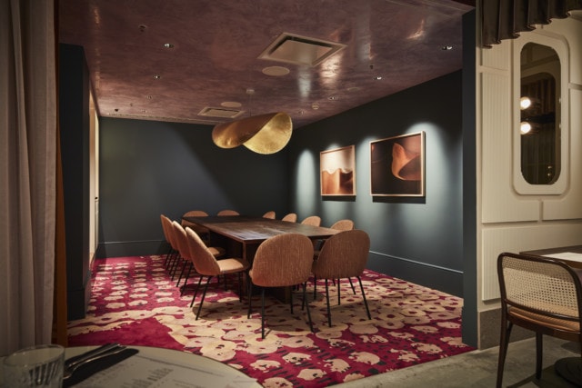
At a time when the hospitality industry is really hurting, due to lockdown measures and the general economic downturn, this year’s Eat Drink Design Awards finalist announcements do feel bittersweet. That said, perhaps there’s no better time to celebrate the best designed hospitality venues across Australia and New Zealand, in recognition of the joy they provide.
“Perhaps it is no coincidence that in a time of such upheaval, we have seen designers create spaces that provide familiarity in their appearance and comfort in their feel. Many designers appeared to be in search of an air of nostalgia for the interiors they created, with numerous venues showcasing a modern take on traditional spaces. This year’s designers have one foot in the past whilst firmly looking towards the future,” says Cassie Hansen, Eat Drink Design Awards jury chair and editor of Artichoke.
And while the awards recognise excellence in design across many spheres (hotel, bar, cafe and retail design to name a few), this year we’ve decided to showcase the finalists in the restaurant category; an impressive bunch indeed.
Mya Tiger by Techne Architecture and Interior Design, St Kilda VIC. Photo: Shannon McGrath
Madre by RADS with Voice Design (identity). Photo: David Sievers
New York Grill by CTRL Space. Auckland, NZ. Photo: Sarah Grace
Shutters by AZB Creative and Schiavello Construction. Coogee, NSW. Photo: Tyrone Branigan
Niubi by T A Square. Melbourne, VIC. Photo: Tom Roe
Alala’s by Pony Design Co. Neutral Bay, NSW. Photo: Phutang
Glorietta by Alexander and Co. North Sydney, NSW. Photo: Anson Smart
Bathers Pavilion by Luchetti Krelle. Mosman, NSW. Photo: Michael Wee
Fino Vino restaurant shot for Studio Gram Architects. Adelaide, S.A. Photo: Kate Bowman
Poodle Bar and Bistro by Bergman and Co. Fitzroy, VIC. Photo: Derek Swalwell
Firebird by Ewert Leaf. Windsor, VIC. Photo: Jana Longhorst
The Albert Park Hotel by Six Degrees Architects. Albert Park, VIC
Chocolate Buddha by Maddison Architects. Melbourne, VIC. Photo: Will Watt
Frederic by SJB Interiors. Cremorne, VIC. Photo: Sharyn Cairns
Ichiro Izakaya Bar by Studio Grayscale. Burwood East, VIC. Photo: Michelle Jarni
Lagoon Dining by Olaver Architecture. Carlton, VIC. Photo: Ben Hosking
Lilian by CTRL Space. Auckland, NZ. Photo: Sarah Grace
Martha’s Table by Melissa Collison. Mornington Peninsula, VIC. Photo: James Geer
Omnia Bistro by Architects EAT. South Yarra, VIC. Photo: Shannon McGrath
Osteria Tedesca by Cox Architecture. Red Hill, VIC. Photo: Tommy Miller
Paper Crane by CTRL Space. Cairns City, QLD. Photo: Cathy Schulser
Poly by Anthony Gill Architects. Surry Hills, NSW. Photo: Clinton Weaver
Rengaya by Giant Design Consultants. North Sydney, NSW. Photo: Andrew Worssam
The Beach House by Studio Gram. Jindalee, Western Australia. Photo: Dion Robeson
SK Steak and Oyster by Richards and Spence. Fortitude Valley, QLD. Photo: David Chatfield
Superhiro by T A Square. Melbourne, VIC. Photo: Tom Roe
Nagambie Brewery and Distillery by Six Degrees Architects. Nagambie, VIC. Photo: Greg Elms
The Eat Drink Design Awards is Australia’s only hospitality design awards program and the overall winners will be announced Wednesday 18 November.
2019 hospitality design awards: Rural areas feature
Recognising the best in design across restaurants, bars, cafes, hotels and more, the Eat Drink Design Awards are Australia’s only hospitality design honours, and 2019’s coveted trophies have just been…
Since launching six years ago, with a primarily Scandi-inspired aesthetic, Australian furniture company Brosa (it means ‘smile’ in Icelandic), has expanded its range to include mid-century, Hamptons, traditional, modern and coastal inspired pieces. While offering a great online furniture buying experience, it’s also a one-stop shop for stylish looks that won’t break the bank.
Brosa’s ‘Slim chest of drawers’ (right) is one of its most popular designs
Occupying that mid-tier space, between IKEA and more high-end furniture brands, Brosa keeps costs down by owning its supply chain and doing most of its business online. While traditional furniture retailers have an array of middlemen standing between the production process and the customer, Brosa has streamlined the process, allowing it to deliver very accessible prices straight to you.
The gorgeous ‘Greta’ sideboard (right) is a customer favourite
Promising a better way to buy furniture, Brosa has built a business around delivering a seamless browsing and buying experience, while providing practical advice throughout the purchasing journey. Customers can search by room or style (categories include mid-century, traditional, modern boho and Hamptons) and can order up to five free fabric samples. And to make purchasing even easier, the company has a dedicated interior design team that offers in-depth styling consultations, mood boards, floor plans and 3D visualisations.
Brosa’s popular ‘Christoph’ sofa range
And while Brosa originally launched as an e-commerce brand, it has since opened two showrooms (in Sydney and Melbourne) in response to customer demand. But, rather than acting as traditional retail spaces, they’re staffed by qualified interior designers and stylists, offering all the advice above, in-person. The brand opened the showrooms, because many of its customers wanted to touch and feel its products. It has plans to open more showrooms soon.
Brosa’s popular ‘Enzo’ wide chest of drawers is pictured with one of its bed designs
Brosa also offers ‘white glove’ delivery with any purchase. With this service, the delivery team will move your item to the room of your choice, assemble the item, and take its packaging away for recycling. As furniture delivery goes, does it get much better than that?
Brosa ‘Seta’ modular sofa
To celebrate Brosa, we’re giving away two of its best-selling pieces; the Mia Coffee Table With Shelf, $379 and Mia Nest of Tables, $329.
Mia Nest of Tables
Entries close 5pm Sydney time on Wednesday 8 April 2020. Please complete the form below.
Noa's room is my favourite space in the home. So much joy!
Located in the inner-city Sydney suburb of Redfern, this terrace home was transformed recently under the talented eye of Rebecca Elms, of the fashion and homewares store Elms. The Surry Hills store is home to many fabulous brands (including Bonnie & Neil, Marmoset Found and Kip & Co) and Rebecca used many of them to style the renovation which is her family home.
Lounge room
Kitchen
“We wanted to create something homely, open, light-filled and that was great for entertaining,” says Rebecca who lives in the home with her husband David, their seven-year-old daughter Noa, and the family dog Maggie. The home is considered a new build, as all that remains of the original structure is the heritage listed street frontage. “Literally every wall was knocked down,” says Rebecca.
Open-plan lounge, dining and kitchen
And while it can be sad to see original features go, the demolition has certainly created a light-filled interior which isn’t something that could be said of most terrace houses. “One of my favourite design features is the amazing black steel doors that open the whole house up to the backyard. For an inner-city terrace, it’s so great to have so much light in what can be a dark and narrow space,” says Rebecca.
Bathroom
A highlight of the home, and the room that initially caught my eye on Instagram, the upstairs bathroom is gorgeous meld of black, white and blush pink herringbone marble tiles. “The tiles are one of my favourite things in the house,” says Rebecca who used Dulux Antique White USA throughout the home, for fear that a cooler white would be too stark. “The creaminess of that colour helped to keep the house homely and warm,” says Rebecca.
I love that Bonnie & Neil artwork in the master bedroom. VJ wall panels create texture in the new space.
As for her most beloved part of the home, Rebecca is rather chuffed with the layout; in particular the openness of the ground floor and the way that the kitchen leads out into the backyard to create an ideal entertaining spot. “I also love the honed granite in the kitchen and the marble tiles in the bathrooms because they’re timeless and really easy to care for.”
My favourite space in the home, Noa’s room is filled with so much joy!
Perched atop a hill in Sydney’s Bellevue Hill, and boasting enviable bay views, this gorgeous home was renovated recently with interior designer Kathryn Bamford at the helm. “A driven, entrepreneurial CEO lives there with his partner and two dogs,” says Kathryn of the home that is part of an old mansion that has been divided into four separate residences.
Kitchen. The custom-made velvet bar stools are from Cocolea
“Absolutely everything was gutted, removed and redone. Walls were removed and moved – the lot!” says Kathryn of the home that has been renovated with a modern Hamptons-inspired aesthetic and a punchy colour palette of bold blue and green. The builders were Integriti Projects.
Guest bedroom. The custom-made bedhead is from Heatherly Bedheads.
An elegant space, the lounge room features open shelving styled with an array of interesting books and objects. Dulux ‘Blue Lobelia’ adorns the fireplace, with a Samsung ‘The Frame’ television atop. “With such beautiful finishes we didn’t want a TV to detract from the space. This way the client can alternate the artwork and still use it as a TV. The shelves also have mirror backing, so when facing them, you can also watch the city skyline and bay,” says Kathryn.
Lounge room
Arguably two of the home’s most striking spaces, the bathrooms certainly deliver a luxe hotel vibe too; both have been furnished with statement feature walls created with Bisazza mosaic tiles. “Given they were from Italy they had a bit of lead time, and they weren’t cheap. We spent $29,000 just on tiles for the two bathrooms!” says Kathryn.
Main bathroom
Main bathroom
The luxe hotel feel continues in the guest suite where Bisazza mosaic tiles feature alongside a custom Heatherly Designs bedhead and chic pendant lights. The room also has double doors that lead to a private courtyard.
Guest suite
As for what she is most proud of in the renovation, Kathryn loved being able to deliver more storage and functionality without extending the property. “Also, seeing the transformation from the existing space and how much it’s changed has been great. It’s been both lightened and opened up.”
Photography: Michelle Young from Lantern Studios | Styling: Kathryn Bamford
The home's lounge and kitchen takes in the home's statement staircase
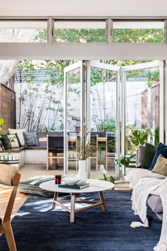
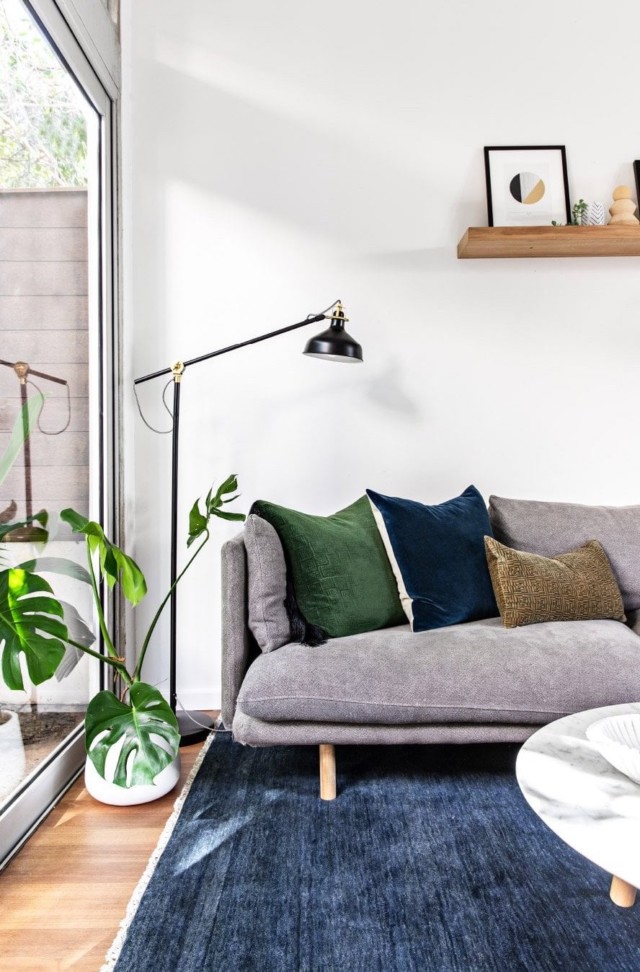
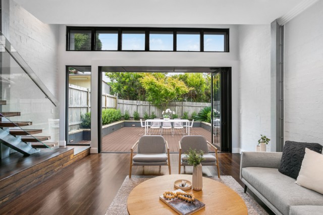
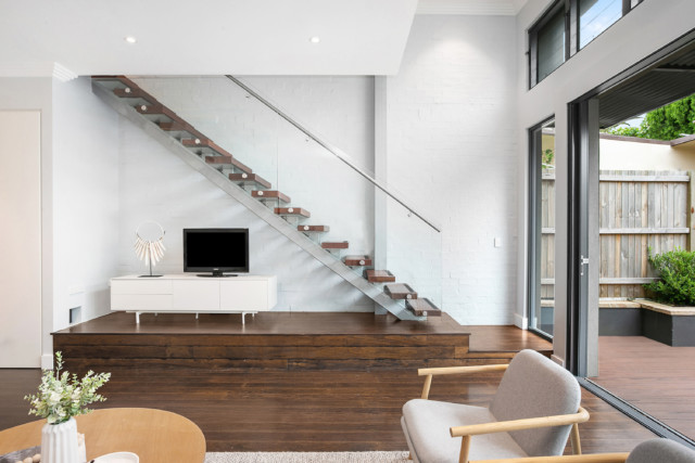
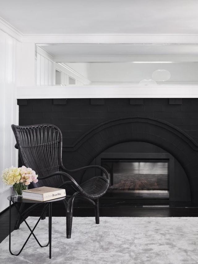
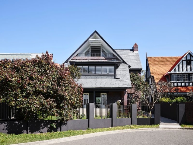
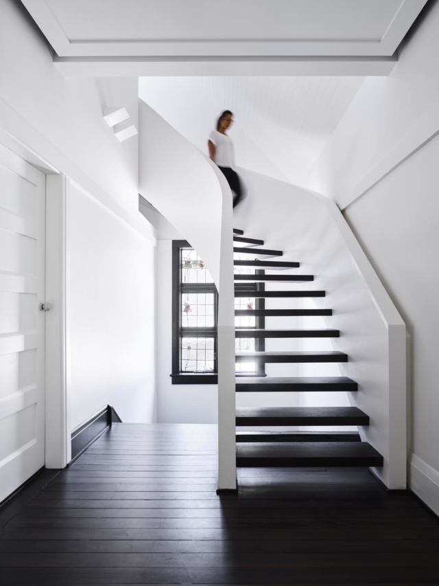
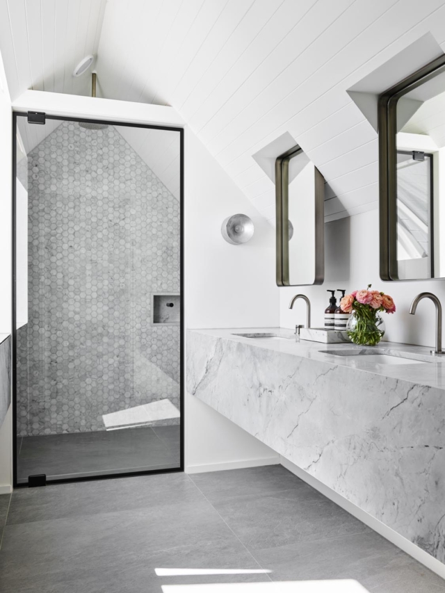
Nestled in the Sydney suburb of Paddington, this gorgeous home’s one-storey heritage façade hides a pretty incredible split-level renovation behind. Home to interior designer Nina Maya, who is using it to showcase her business (and act as a family abode), the house is called ‘The Glasshouse’ in a nod to the material that was integral to the transformation.
The home’s statement staircase sits behind the lounge and kitchen
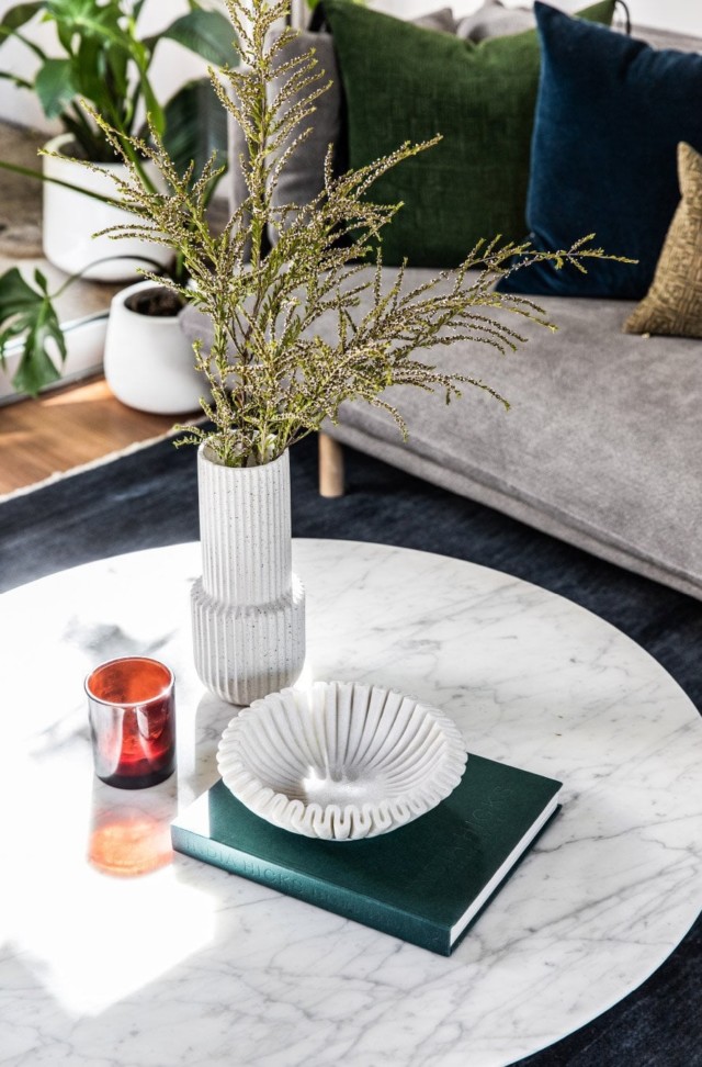
Kitchen. That statement marble is super luxe.
Lack of windows and the subsequent lack of light is a common problem in heritage homes, and this one was no different. “In many ways, the remodel was dictated by its challenges, the biggest being its dark, narrow living area. The addition of the central staircase created a column that could be fully glazed on two sides to let in light, while saving floor space,” says Nina of the home’s statement feature.
The staircase
“I like to start any design with a clean base, so the ability to remove distracting frames from the view of the bamboo in our courtyard, was perfect,” says Nina who chose Stegbar’s Alumiere range for the home as it allows for larger expanses of glass with smaller frames.
The lounge room looks onto the courtyard
Fireplace details
Given the home’s dense urban location, privacy regulations were one of the main design obstacles to overcome. Nina specified architectural automated louvres, that obscure the interior from neighbouring properties, as a solution. This negated the need for a screen across the lower section of windows while creating a striking silhouette at the rear of the home.
The rear courtyard. Second storey automated louvres were a clever design solution to privacy concerns.
Powder room
Another innovative solution to privacy issues can be seen in the master ensuite, where an Alumiere fixed lite window with translucent glazing sits behind a double sink and mirrors. “A lot of elements of the Glasshouse are not as they seem. On first look, you would assume that the room is artificially lit, but when you look closer, you can see how the light changes with the clouds and time of day. It’s a small detail that adds unexpected interest to the room,” says Nina.
Master ensuite
A skylight lets light permeate the shower recess
“The Glasshouse gets its name from being more than just a house with a lot of windows, it has glass at its core and throughout, from the two-storey mirrors to the subtle shower screens and the translucent windows to the fully glazed lightwell. It’s amazing what you can do with glass when you work with the right options.”