Looking ahead to 2023, what paint colour trends do you think will take over in Australia? Luckily for us we can find out with Benjamin Moore releasing their 2023 colour of the year. And in 2023 their colour of the year is…
Raspberry Blush 2008-30
Raspberry Blush! It’s a saturated red-orange that enlivens our surroundings while awakening our senses with charismatic colour. This vivacious colour is unapologetic in its boldness as it encourages a confident colour statement.
“Colour is coming back into Australian homes and Aussies should feel empowered to move away from pure white walls. Raspberry Blush and the Colour Trends 2023 palette deliver whole bodied paint colours that can be used to form statement transformations for incredible results,” commented Brian Hamilton, general manager for Tenaru, the Australian distributor of Benjamin Moore paints.
Raspberry Blush
Leaning into deeply saturated colours with undeniable charisma, the Colour Trends 2023 palette celebrates the use of colour to influence dramatic transformations. As living spaces are often an expression of individuality and personal style, Australians should move towards a bold statement and the palette empowers designers and homeowners to take colour to unexpected places.
Here are seven other Benjamin Moore paint colours from the Colour Trends 2023 palette:
Conch Shell
Wenge
Cinnamon
New Age
Starry Night Blue
North Sea Green
Savannah Green
Savannah Green 2150-30
To commemorate this year’s selection, Benjamin Moore enlisted Canadian electro-funk duo Chromeo to underscore the upbeat and optimistic tone of the palette and the dynamic role colour plays in self-expression, much like music. Chromeo’s new single, Raspberry Blush, celebrates the positivity and enjoyment of life that both colour and music can influence. Designers and DIYers alike can experience the Colour Trends 2023 palette through eight specially curated playlists that reflect the personality of each colour and the spirit of the palette on Spotify. It’s certainly different!
A winter weekend is the ideal opportunity to take on a DIY project, allowing you to stay cosy at home and update your space. To help you pick the perfect project, British Paints has shared their top three options that can be completed in just 48 hours.
1. Give an old piece of furniture a new life
Transforming an old piece of furniture is a great way to save money and help the environment. While it might seem like a challenging task, with the right paint and equipment, it can be done in just a few days.
To get started, you’ll need to remove any hardware and give your piece a good sand. Next wipe down the surface with a damp cloth then apply an undercoat.
Once your undercoat is dry, give your piece of furniture another light sand before adding your topcoat.
You’ll need to add two coats but wait until the first is fully dry before adding the second. Now, all that’s left to do is reattach your hardware and your freshly painted piece is ready to enjoy!
2. Make a great first impression with a fresh front door
A coat of paint on your front door can instantly transform the look and feel of your home. It’s an easy project to complete in a day, so the perfect one to try this weekend!
To get started, you’ll need to take the door off its hinge and lay it flat across a couple of sawhorses, chairs or even a table. Next it is time to prep! Start by removing any hardware, then sanding and wiping down with a damp cloth.
If you’re painting over a dark colour, paint that is both an undercoat and topcoat in one is handy. Only two coats are needed for full coverage, and you can paint over a water or oil based paint, so you don’t need to worry if you don’t know what type of paint was previously on your door.
Once you’ve finished painting, it’s time to re-attach your door and watch as your guests are wowed as they enter your home!
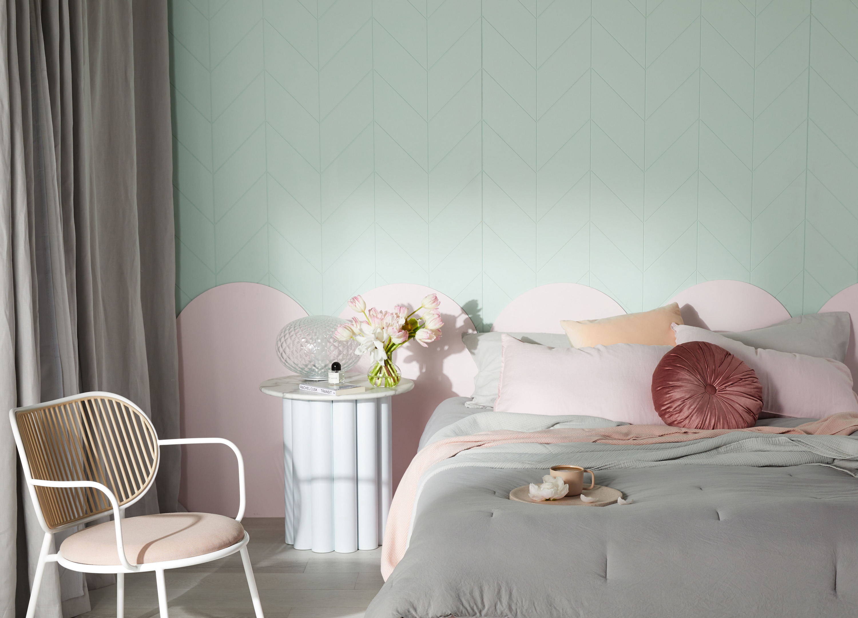
3. Add some style to your space with a feature wall
Feature walls add impact to any space. They’re quick and easy to complete and a great way to start building up confidence in your painting skills.
Remember, you don’t need to paint the entire wall to create a stylish statement. Consider quirky and unique options like painting half the wall, a painted bedhead or arch.
Before you start painting move all your furniture away from the wall, lay a drop sheet to protect your flooring and mask up any skirting boards or electrical switches.
Next, clean your surface with sugar soap. Then it’s time to start painting! For the best results, you’ll need to use a paint roller to paint your feature wall. Make sure your roller has been cleaned well before you start, to ensure a smooth paint finish.
Once you’re ready to roll, place your feet towards the wall and grip the roller with firm but relaxed hands. You’ll need to start at one side of the wall and work towards the other, never starting in the middle, as this can result in an uneven finish.
Finally, as you let your roller work its magic, remember to always paint in a W pattern for best results.
Painting your walls is one of the simplest, most affordable ways to freshen up your home. Even so, starting a painting project can be daunting, especially when the fear of mucking up outweighs your excitement! Luckily, some planning and the right products are all you need to settle your pre-painting nerves and lend you some much needed confidence.
British Paint have provided a step-by-step guide to freshly painted walls in just one weekend.
1. It’s all about the prep
Before you get started, don’t forget to clear your room of all furniture and lay a drop sheet down to catch any little spills.
Next, you’ll need to clean your walls and ceiling with sugar soap. It’s tempting to skip this step, but remember, a clean surface is your best insurance against a ruined paint job.
If your walls have a trim that is a different colour, make sure to mask up your edges to keep this area clean. You’ll also want to cover up any accessories like power outlets and light switches.
2. Purchase a time-saving paint
Now your space is prepped and ready to paint, it is time to find the right product to get the job done quickly and efficiently. Paints that include a topcoat and undercoat in a single can mean you’ll only need one type of paint to complete your entire project, and won’t have to apply several coats.
3. Make friends with your paint roller
Your surface is clean, and you’ve found the perfect paint for the job, which means there is only one thing left to do. Get painting!
Paint rollers are perfect if you want to get the painting project done quickly, without compromising on results.
When using a paint roller, you’ll work from one side of the wall to the other. Place your feet facing towards the wall and grip the roller with a firm but relaxed hand. Begin by working in sections, rolling in a large W pattern at first, then filling in the blanks of your W pattern with some extra zigzagging strokes.
Once you’ve covered your first section of wall using the W pattern, finish by using a technique called laying off to ensure there’s no messy streaks and you achieve an even finish. It’s simple, just use long vertical strokes and light pressure to paint over the area you recently covered.
Keep rolling with a combination of the W pattern and laying off until your entire wall is complete.
4. Don’t forget the ceiling
The ceiling is often considered one of the hardest parts of a room to paint, but it doesn’t have to be that way.
Painting from side to side – left to right movements, never front to back – can make all the difference. Try to keep your feet shoulder width apart and your arms below your shoulders while you paint your ceiling, it’s more comfortable and will deliver a better finish!
5. Have fun!
Remember, painting doesn’t need to be difficult or scary! Transforming your home with paint should be fun and enjoyable.
Make a day of it by getting friends or family involved in the project or by turning up your favourite playlist so you can sing along as you paint.
By Naomi Findlay Before guests step foot inside your home, what is the first thing they see? If the answer is a façade covered in flaking paint or last century’s…
White paints: how to choose the perfect shade
A fresh coat of white paint is one the easiest ways to make a room look and feel brandnew! Whether you’ve just moved into a new home that needs a…
Warm, grounded colours that speak of security and comfort are set to dominate winter decorating trends, according to Dulux forecasters.
“There’s a collective yearning for reassurance and a return to simpler times,” says Andrea Lucena-Orr, Dulux colour and communications manager. “We want our homes to provide comfort, a sense of safety and to remind us of better days ahead. And this will be reflected in more than just colour in 2021 – expect to see a rise in plush, comfy seating, handcrafted furniture with an artisanal feel and a greater focus on ‘purposeful decorating’ rather than just decorating to make an aesthetic statement.”
The Retreat palette – one of three trend colour palettes identified in the 2021 Dulux Colour Forecast – captures the mood of this coming winter.
“These earthy tones and muted colours are all drawn from nature – think oceanic blues, nourishing greens, soft greys and touches of mustard,” Andrea explains. “They bring the outside in – ideal for a time when most of us are stuck indoors for long stretches – and plug into the growing movement for wellness in design.”
To give you ideas on how you can use these comforting hues in your own home, Dulux worked with stylist Bree Leech to re-energise a child’s bedroom using colours from the Retreat palette.
Before and after
“You want your child to love spending time in their room – it should be somewhere they can escape, relax, read and play. The quickest and easiest way to switch up the mood is with colour,” Bree says.
Bree kept the big-ticket items in the room – the bed, bedhead and solid timber bedside table, and focused on updating the room with bold colour. She chose shades that worked with the neutral tones in the foundation pieces, adding plenty of textures to dial up the cosiness. She started by adding deep blue to the walls and a gentle neutral to the ceiling and window detailing.
“We opted for pale greige rather than a classic white for the ceiling and windows to soften the contrast with the blue. A sharp colour contrast can be very effective in a space, but in a room that’s all about relaxation, you want it to be a little less pronounced,” she explains.
“Inky blue works well here – it’s cosy and timeless and sits beautifully alongside the natural materials in the room, such as the timber and woven-rattan,” adds Bree. “A woven wall hanging adds accents of rust and quirky bedside lighting creates a playful mood, adding contrast against the deep blue.”
Artwork: “Fast Forward” by Liam Snootle
“To make the space feel more inviting, I layered the bed with cosy cushions and snuggly, fringed woollen blankets. Curvy furniture is a great addition to break the architectural angles in the room to make it feel more relaxed,” she says.
Bree created a place to read in a sunny spot by the window, complete with a velvet-upholstered armchair and a pair of side tables, perfect for keeping a book or two nearby. “Don’t be afraid to bring in pieces from another room, like this armchair, so long as they serve a purpose and fit with your colour palette,” she says.
Artwork (top): “Long Doggie Print” by Rachel Castle
“If you’ve been all about white for as long as you can remember, get a taste of using stronger colours by starting with a single wall – say the wall behind the bed,” says Andrea. “This can also stretch your new confidence into using colour elsewhere in your home.”
If you’re inspired by this amazing bedroom transformation, Bree has provided some tips for redecorating your child’s bedroom.
Bree’s kids’ bedroom styling tips
Invest in quality: Kids are tough on furniture, so it’s worth paying more for well-made pieces that will last. You can save money on smaller items, such as bedlinen, art prints and rugs.
Add an upholstered bedhead: It makes for a comfortable spot to sit up and read.
Size it right: As a guide, when choosing a rug for a child’s bedroom it should fit two thirds under the bed and extend at least 30cm beyond the sides of the bed – any smaller and it will look lost in the space.
Think multi-purpose: Children’s rooms are often small, so seek out flexible pieces that can be used in different ways, such as an ottoman that doubles as storage and seating.
Make storage easy: Add in baskets for toys and cupboards or shelves to hide mess away.
Wall paint: Dulux Winter Sea, Vintage Linen, and Five Fingers Peninusla.
Dulux colour forecast 2021: soothing colours for challenging times
With most European design and architecture shows cancelled this year, the Dulux Colour Forecast for 2021 has been informed by extensive virtual research into global trends to stay abreast of…
Paint: the cheaper, easier way to refresh your home office
With most of us spending more time working from home than ever before, there has never been a better time to show your workspace some love. “Your study should be a space…
With all the effort that goes into painting your walls, you want to make sure that the paint you’re using is the exact colour you want. Your two main options until now have been using printed paint chips that aren’t always an exact match to the paint colour, or painting sample swatches until your walls become a patchwork mess. This is a struggle that Jodie Milwright knows all too well, leading her to found The Big Paint Sample.
When Jodie decided to change the colour of her home, she painted sample swatches of seven different paints all through her house. The time, cost, and clean up led her to wonder if there was a better way to do things. After two years of research and testing, she has developed an innovative solution that means you don’t need to pull out the paint rollers and coveralls until after you’ve chosen your perfect shade.
“We are so excited to be offering what we believe is a fantastic new way to choose paint colours,” Jodie says. “These super-sized, removable and reusable paint samples are the easiest way to select the perfect colour for each room in the house.”
Dulux Ocean Current paint chip compared to real paint swatch
The Big Paint Sample’s swatches are covered with two coats of real paint, instead of the printer ink approximations used by paint chips. This means you can be sure of a perfect colour match between your sample and the paint you want to use. Plus, they’re 20 times larger than standard paint chips, so you don’t have to squint to tell if the new colour suits your house.
What really sets The Big Paint Sample apart is that the swatches are easy to remove and can be reused. Colour changes based on lighting, location, and the furniture surrounding it, and with their swatches, you can make sure that your chosen paint colour suits every nook and cranny of your home.
If you’re looking to repaint your home, The Big Paint Sample offers a wide range of paints and can supply others upon request. Swatches start at $8.95, and you can purchase them from their website.
This year, the way in which the home functions has fundamentally altered, as it has played a more meaningful role than ever in our daily lives. Wattyl have reflected this…
White paints: how to choose the perfect shade
A fresh coat of white paint is one the easiest ways to make a room look and feel brandnew! Whether you’ve just moved into a new home that needs a…
The Australian housing market is currently seeing huge growth, but you don’t need to rely solely on movement in the market to generate capital growth in your property.
You can manufacture growth, or add value to your home, by making just a few simple changes. I’ve put together our top tips to drive the price of your property up without breaking the bank – it’s a win-win!
High-pressure hose down
Borrow, rent or buy a high-pressure hose and wash down your façade. Particularly if you’re planning to paint, you’re going to need to prep the surface first. External paved or deck areas also really benefit from a pressure wash. Steam cleaning grime away from exteriors is another very effective technique, especially if you have a large concrete area that could use some TLC.
Adding a security feature and other tech gadgets is a great way to add value to your home. There are some great gadgets around which can keep an eye on your home whilst you’re not there. Devices like Ring’s video doorbell 3 Plus, or a wired version such as Ring’s video doorbell wired, can be placed near your front door so you can accept packages from your couch, add security and drive the value of your front doorstep. This will be appealing to buyers looking for a secure property without wanting to install an expensive system.
Paint your exterior
A good freshen up is key to adding value to your property, so paint your front fence and façade. Preparation is key to a flawless finish, therefore ensuring your surfaces are clean, dry and sanded is the best way to achieve perfection. Not only does a coat or two of paint change the look of our home and amp up the street appeal, it also protects the underlying materials from the elements and actually increases the lifespan of the building. Taubmans Endure/Sunproof, Dulux Weathershield and British Paints 4 Seasons are all good options for exteriors.
Tidy up your front, side, and rear gardens by clearing, weeding, mowing, and planting. Not only will this drive value, but we also think gardening is rather therapeutic and there is something satisfying about going out and picking herbs for dinner. Visual appeal when it comes to real estate is everything, and when you create an instant positive reaction with your front garden it can add huge value to your home. Planting options are almost limitless but when you’re unsure, stick to planting one or two varieties and you can’t go wrong.
Visit Ring’s website for more information on the video doorbells.
-Tabitha Robb is a licensed estate agent and director at Prop Culture.
Top renos that add value & how to visualise them easier
A recent study conducted by PerfectRoom revealed that when a real estate agent asked buyers to visualise the end result of cosmetic work, 82 percent could not picture what these…
Secrets of a property stylist: How to add value and attract buyers
There’s an art to selling a home and it doesn’t just involve finding the right real estate agent. A lust-worthy interior can have buyers lining up at the front door…
Based in northern New South Wales, self-taught artist and farmer Kate Owen didn’t have to look far for inspiration when working on her latest collection Rose Coloured Glasses. “As farmers, when we look at our surroundings at the moment, it is easy to have a heavy heart because of the extreme drought situation. But by looking through rose-coloured glasses we interpret what we see into visions of lush colour, growth and prosperity in our mind’s eye,” says Kate.
And it’s this glass half full approach that has resulted in a gorgeous series of colourful abstract works that are available to purchase through online art purveyor The Interiors Assembly. “I think a lot of my work is a form of positive manifestation of what I would like to see,” adds Kate.
‘Daisy’
While interested in art as a child, Kate has no formal art training beyond the occasional workshop (where she experimented with oils, acrylics and clay sculpture) but has found her formal fashion training to be integral to her work. “The work I have done in fashion and homewares has definitely had an influence on the type of work I like to produce and also the colours I favour,” says Kate who has been painting full-time for the last two and a half years, since her youngest child left home for boarding school.
Artist Kate Owen in her home studio
‘Playing in the tulips’
“With the kids having gone away it has freed up my time enough to devote myself to a regular practice. It’s been a huge relief to finally be able to paint all the time instead of storing away the ideas and impulses in my head,” says Kate who has a keen interest in colour and loves to experiment with different combinations, working mainly with acrylic paint.
‘The Beehive’
“I like working with acrylics because they dry quickly which allows me to capture spontaneous gestural marks and not have too much time to think about what I’m doing,” says Kate. Although most of her work is done on canvas she uses paper to collage at times as well as graphic sticks and oil pastels. As a final touch, Kate will often scratch back through her finished works to reveal layers of paint underneath.
Kate outside her studio with her dog Bella
And though it’s been a tough time of late, the artist’s daily view (beautiful, undulating farm country) provides constant inspiration – as does her time spent on the road. “I’m constantly on the lookout for inspiration when driving and make frequent stops on my trips, to capture those moments. At the moment I have a particular affinity with the cactus, and you’ll see those organic shapes appear abstractly in my work often. To me the cactus represents resilience which is a value I hold in high esteem.”
While Bendigo based artist Marcia Priestley (of Bibi Ana + Co) lives far from the ocean, it’s a major source of inspiration for her work and particularly her latest collection titled Coast. “I describe Coast as being a littoral experience of original art. Unfortunately, I’m not lucky enough to enjoy the ocean every day like I would love to so instead I often catch myself reminiscing about the places I have relished visiting,” says Marcia of the colourful, abstract works that she markets under the Bibi Ana + Co. brand. Both words are Indian – bibi means ‘woman’ or ‘man’s wife’ while ana translates to ‘anecdote’ or a short story about a person.
‘Cocomo’ original painting
“Coast is based on the foreshores of the sea. It’s about the tropical escapes I captured in my memory across the Pacific to the Atlantic Ocean and what unifies them is my love for the palms, hot sand and the clear, pristine water,” says Marcia who paints from her Bendigo studio immersed in a very different landscape.
‘Ravello’ original painting
“I paint surrounded by the rugged Australian bush, listening to whatever is on the radio. When I painted ‘Cocomo’ over the summer, I bet you can you guess the song I was listening to at the time! It’s one of the happiest paintings I have ever painted!” says Marcia who uses acrylic and oil paints and pastels to create her works.
‘Byron’ original painting
With professional artistic training, Marcia has spent a lifetime honing her skills which includes line drawing also – a passion that began after her two daughters were born and she wanted to capture every moment. “I loved sketching my girls when they were little. Every second I could I would draw them, which they loved,” says Marcia whose sketches of the female silhouette are beautiful in their simplicity
‘Cer Mien’ (colour) limited edition print
“I eventually fell in love with sketching women in general. Every woman has a story to tell and that’s where my line art came from. I’ve really tried to capture an emotion we all feel behind each drawing I have created. I try my hardest to be completely original with my art. I enjoy other artists’ work, but I don’t study it because I try my hardest to stay true to myself,” says Marcia who used to produce a greeting card range also that was stocked Australia wide in retail outlets such as David Jones, Card & Caboodle and Dymocks book stores.
Marcia Priestley of Bibi Ana + Co. Image: Leon Schoots
“I loved creating the greeting card range but I soon realised it was a lot of effort for my family to pack cards on their weekends! You can say illustrating, painting and designing is my life. Without it I would feel completely lost.”
Photography: Armelle Habib | Styling: Julia Green for Greenhouse Interiors, assisted by Aisha Chaudhry, Janneke Coyle and Sara Huckett
With so much focus on creating the perfect space, it can be extremely easy to overlook the entry points of a room. A door is the first hint of what lies beyond; a bare wood finish can put a “plain Jane” vibe on an otherwise contemporary interior. Likewise, a battered door covered in scratches and peeling paint is the equivalent of pairing a beautiful evening dress with house slippers.
Photo by Philipp Berndt on Unsplash
Choosing the right paint
Choosing the right type of paint and colour is a crucial an inviting entry to the rest of your space – the first thing to consider is the current look and feel of that space. If you are planning to makeover your entire room, it is a good idea to have all walls and ceilings painted first (for tips on painting walls and ceilings, take a look at our previous articles). That way, it will be easier to pick a door shade that complements the fresh look and colour of that space.
When you have chosen the perfect colour, go to Taubmans’ online calculator to help you determine the amount of paint you will need for your doors.
Prepare the doors
It can be tempting to leave doors hanging on their hinges. Although this may save you some time initially, you may find that the dripping paint will have you backtracking and spending extra (unnecessary) time and effort on painting. For best (and quicker) results, always remove the doors and lie them flat on a raised surface – this will guarantee the smoothest finish.
If removing a door is not an option, you can leave it hanging upright – just be sure to wedge the door in place so there is no movement while painting.
Photo by Annie Spratt on Unsplash
Protect and sand
Protecting surrounding surfaces from accidental paint drip is the key to a quick and pain-free DIY project. Lay down drop sheets on floors and use masking or painter’s tape to cover the hinges. If your doors are still attached to the wall, use tape to shield the door frames from any stray brush strokes.
Grab an electric sander (a sanding block or sandpaper will do just fine) and use it to remove any flaking paint or shiny surfaces. A well-sanded door will help paint stick and give you professional results.
Paint
Begin by giving your paint a good stir (this will ensure all the pigments are mixed through), then pour some paint into a paint tray. Use a brush to paint the hinged edges first, switching to a roller for the rest of the door. Roll the paint on in a ‘W’ or ‘M’ motion to ensure an even distribution and coating of paint.
Give the first coat about 10 minutes to dry before picking up the roller again for the second coat. If the first coat seems a bit bumpy, give it a light sand, then apply the second coat in the same way as the first. The type of paint will determine your final drying times; a water-based paint will need two hours to dry completely, whereas a water-based enamel paint will take four hours and an oil-based enamel will be the longest at 16 hours.
Re-attach the doors once the paint is completely dry – and enjoy your freshly painted entries!
–Naomi Findlay is Australia’s Rapid Renovation Expert and works with people around the country helping them create wealth and freedom using her Rapid Renovation Formula. She is the founder of the International Institute of Home Staging and author of ‘Ignite Your Property Mojo’ and ‘Selling Your Property for More Money’. In 2018, she created and launched the Rapid Reno Mate smartphone app, the first app that can manage your renovation budgets, timelines and trades all in one hub.
When deciding to renovate or refresh a room, the first points of focus tend to be the walls, the floors, the doors and even the tiles. The ceiling is an important element that is often overlooked until everything else has been updated. This ‘fifth wall’ needs to complement the rest of the space, otherwise it can completely change the look and feel of your room.
Prepare and protect
Painting a ceiling isn’t too different to painting any other wall in your home. A professional-looking DIY job will depend on the careful preparation you do beforehand. Since most light fixtures are located on the ceiling, even the smallest of bumps can attract attention. Take a look at the previous guide on preparing a room for tips on patching up existing damage.
Remove any furniture or fixtures that can be removed, and cover the rest – lights, ceiling fans and cornices, for example – with drop sheets, rags, and painters tape.
Consider and calculate
Before you rush off to buy the first tin of white ceiling paint you find, give it some good thought. Your ceiling doesn’t need to be white. Consider what colours and textures would complement the rest of the room; an exposed concrete look or a bold pop of colour could be the antidote to a boring and dated design.
Once you have decided on colour, you will need to calculate how much paint you will actually need. Taubmans have a very handy online calculator that will take the guesswork and calculations out of the equation – leaving you with the perfect amount of paint.
Paint
If you are dealing with brand new plasterboard, be sure you seal it before applying your coats of paint. Otherwise, give your paint tin a good stir, and get ready to paint!
It will take about half an hour to paint an average-sized ceiling – give yourself enough time to coat the whole surface without rushing. Starting with the cornices, use an angled paintbrush to apply the paint along the edge of your ceiling. Once you have coated around 10 centimetres of the edges with paint, use a roller and roller tray to coat the rest of the ceiling.
After coating the roller in a small amount of paint, tap each side thoroughly to get rid of any extra paint. Ceilings are a little trickier to paint as, unlike walls, they are located above you. This means painting can get tiring and messy very quickly – hence why it is super important to ensure your roller isn’t going to drip every time you dip it into the paint tray.
Attaching the roller to a pole will help you easily reach the ceiling. Apply the paint in small sections in a ‘W’ or ‘M’ motion, keeping the roller flat against the surface at all times. When you are halfway through, go over the already painted area with a very light coat of paint – this will help create a smooth finish and remove any dripping paint.
Allow the first coat to dry for a full two hours before starting on the second coat.
Before guests step foot inside your home, what is the first thing they see? If the answer is a façade covered in flaking paint or last century’s colour scheme, it may be prime time for a paint redo. A few fresh coats can give your home some serious curbside appeal – but before you run off to Bunnings, you need to take the time to prepare.
Preparing the exterior surface of your home is crucial. Considering the type of surface and surrounding environment will ensure beautiful, long lasting results. This pre-painting stage should take around half a day per wall – depending on whether you will be applying fillers.
BEFORE
AFTER
Clear the area
Before you start cleaning, caulking or sanding, make sure any potential obstacles are removed. The last thing you want to do is position a ladder precariously far away from the actual walls because of a pot plant. Remove any pot plants, garden hoses and other transportable items that are blocking access to the exterior. There is no need to dig up shrubs or trees, though – simply cover them with drop cloths or rags to avoid damage. Plastic drop sheets are perfect for any delicate flowers (not to mention very budget-friendly). Use painter’s tape on window frames and trim to protect them from paint splatter.
Clean the walls
Once all obstacles have been removed or secured, use a sponge and some warm soapy water (or sugar soap) to give the walls a good rinse. A home’s exterior tends to attract a lot more dirt than the interior walls, so you need to ensure any stubborn dirt, dust and spider webs are cleared before the paint goes on. Pay particular attention to any mould, usually found lurking in dark corners that aren’t exposed to light very often. Give any mouldy areas special treatment using a mix of bleach and water, letting the bleach do its work for 15 minutes. Finish off with a thorough hose down to remove any soapy residue.
An exterior painting transformation
Sand and fill blemishes
Once the walls have dried, assess the existing paint for any peeling or flaking. A good way to test the existing paint for adhesion is to cut a small ‘X’ through the old paint. Apply painter’s tape firmly over the ‘X’, then rip it off quickly; if the old paint comes off, it needs to be removed entirely prior to repainting. If not, you can move on to touching up blemishes and gaps.
Use a scraper to scrape down any flaking areas of loose paint. Fill any dents or nail gaps with a premixed filler, and use an acrylic gap sealant for any cracks where there might be movement (such as near doors or windows). Make sure you use paintable sealants (not silicone!) on areas you plan to paint – otherwise you will end up with paint that doesn’t stick to the wall and starts to peel. Once all the sealants and fillers have dried, give the entire exterior a light sand. The aim is to produce a clean, smooth finish ready for fresh paint to adhere to – so pay particular attention to any shiny spots when sanding.
Finish off the preparation with an undercoat primer and get ready to paint!
NEXT WEEK: How to paint your newly prepped exterior!
–Naomi Findlay is Australia’s rapid renovation expert, an internationally renowned renovator, award-winning property stylist and speaker. She’s an industry leader in creating healthy wealthy spaces and creating wealth and profit from renovating property. Naomi is founder of the Rapid Reno Mate app, CEO of staging company Silk Home and founder and principal of education provider, the International Institute of Home Staging (IIHS).
I am an artist who specialises in creating large scale commission-based artworks and I absolutely love it.
It can be overwhelming knowing where to start if you would like a custom created artwork. It is a pretty easy process and the same kind of questions arise with varying clients, so here is a bit of a rundown on commissioning artwork and some steps to help you adorn your walls with a creative piece you will love!
Firstly, pick an artist you love! The artwork will be something you look at every day, so you want to find the right style for you, and your space. Look through their pieces and find two artworks to reference for different reasons. For example, you might like one for colour and one for subject matter. Be thorough in your research here, look through their website and socials to get a broad view of their work.
Artist Libby Watkins
Secondly, size matters! You will need to be really specific on the finished size. Look at where you might want to hang your artwork. Create a mock artwork by taping the pages of a newspaper together to make a large piece. Always start large and slowly reduce the size until you are happy with it. Leave it on the wall for a day or two, reducing or adding to size until you are satisfied. This is the exact measurement you can now give the artist for a framed or unframed piece.
Now it’s time to engage your artist! The fun begins. Contact them and request a custom piece. Tell them why you have chosen them as the artist as this allows them to understand what kind of piece you aspire to own. You don’t want to give too much detail or direction at this point, as you want their creativity to flow naturally. Remember, you have chosen this artist for a reason — you already love their work and in that must be trust. Give them your two reference pieces and why you chose them. You can tell them the exact size. They will love that you have done your homework as this helps them; in most cases the artists can’t visit your space and a photograph can only provide a limited perspective.
You can touch on any specifics now, but remember keep it brief as to not cram their artistic thought pattern.
You will now want to ask them how they work. Do they sketch up for you? Or will they commence work and come back to you later to show progress of the piece? Make sure you are comfortable with the way in which they create your piece. Do you want more or less collaboration? If you see a problem now, speak up.
Time is money. Confirm the timeframe. When will you see a progress photo? (if applicable, refer to above paragraph). Or when will the piece be completed and delivered (I have been known to create mermaid tails in under a week, sometimes, even months at other times.)? You want to ensure this timeframe suits you, but you also need to be mindful not to rush the artist as it’s a creative process for them. They may do two or three versions before showing you a progress photo. They want to get it right! Be generous in your expectation as they may have a heavy workload at the time or varying intricacies in the piece you are requesting. Or neither of these, and they will knock it over in 24 hours! You may be given a range for example of two-to-four weeks from start to completion of the artwork. Rarely will you be given an exact date unless it’s a special request.
Enjoy the journey of creating your commission artwork. You want something at the end of it that you can stand in front of and feel what you set out to feel. You want to look at it and be proud to know you had creative input, or at least a vision, for the piece, and it’s now hanging in your home or workplace for all to admire.
–Australian artist and designer, Libby Watkins creates large scale artworks from her dreamy island home ‘Paradiso’ on Sydney’s Northern Beaches. A small limited edition collection is also released every few weeks online and in selected boutiques.
For Claudia Damichi, pursuing something other than art was never an option. As a young girl she would spend hours immersed in paintings and drawings… and in many ways that hasn’t changed, except for the fact that her hobby is now her full-time job!
Claudia
With her practice encompassing several different mediums, from paintings on canvas and walls to a new series of adhesive prints, all of Claudia’s work is interested in colour, pattern and geometry. “I draw on a wide range of influences from Sonia Delaunay’s fabric designs through to the optical installations of Sol LeWitt,” explains Claudia. “I am essentially focused on the effects of colour and pattern and how they charge a space, be it real or imagined.”
Claudia’s art has been exhibited in galleries across the country and abroad, as well as on the walls of city laneways and celebrity homes. Borne out of an interest in architecture and the built environment, her Artwalls – as she names them – are large scale, colour filled, site specific murals. “I respond and create an original work that is specific to the space and environment,” says Claudia. “These works push art beyond the boundaries of a picture frame and propose the idea that every surface or wall is a blank canvas.”
Two Attachables
However Claudia’s most unique work – in our opinion – are her Attachables: adhesive fine art prints that can be attached to any flat surface. The initial design is entitled Round About, with two more launching next year. “These are created with the idea that art can go anywhere – wall, floor or ceiling! They work as an individual art pieces, but also have the potential to be applied in multiples.”
As you know, we recently finished a couple of major jobs in our own reno: a new kitchen and a new floor. The photoshoots for these are imminent so I look forward to sharing the before and afters soon!
Kitchens and floors are pretty major investments but there are lots of other things you can achieve in your home for a few thousand dollars which make a huge impact. Here are some of my top suggestions:
Lighting: When we moved into our nanna house we changed all our lighting, swapping old and very dated pendants for gorgeous new brass chandeliers with LED filament-style bulbs as well as rattan pendants from Beacon Lighting. Total cost including the electrician was less than $3,000 and the difference it made was priceless!
New lights and shutters in our living room (before we changed the floors)
Window treatments: We went for plantation shutters from DIY Online Blinds which aren’t the cheapest option but they make a huge difference (in our case, hiding some old and yellowing window frames which is a lot cheaper than replacing all the windows and the window treatments!). You could probably do all new matching blinds in your home for less than a couple of grand.
Paint: We had our whole house painted internally before we moved in (so much easier than moving furniture!). It cost a few thousand but it made the world of difference. We did most of our home in Haymes Greyology 4. We are now saving up to have the red brick exterior painted. This is a more expensive job but it really will be the icing on the cake! And then there’s the driveway (it never ends when you buy an older home!).
Walls painted in Haymes Greyology 4 in our bedroom
Doors: The last job on my list before Christmas is replacing all my internal doors, and my front door, with some new ones from Corinthian Doors. I’ve found the more we update things around here, the more the older/cheaper things stand out! It’s time for some quality doors and I’m confident they will make a huge difference. I can’t wait to share them with you.
Bathroom on a budget: With all the work we’ve been doing, we sadly can’t afford a full bathroom reno (or two!) just yet. But after Christmas we’ll be embarking on a family bathroom refresh on a budget which I hope you’ll all love. The idea is to have the bath and tiles professionally sprayed, paint the walls, replace the vanity and possibly tile over the floor, all for well under $5,000.
I talk more about these ideas in this latest video with Jess Aloi from our partners Latitude Financial Services.
For help achieving your reno dreams, speak to Latitude about your best borrowing options.
About to take on a renovation or just revamp your outdoor space? Well put down that paintbrush and read this. The team at Nexus Designs have shared their predictions on what’s in store for 2018 and there’s a few surprises. Two words… red bricks!
Texture
Increased awareness of texture is coming to the forefront. This is being expressed in two key ways, contrasting textures and self-patterned textures. Contrasts between gloss levels of the same material are highly effective. This trend has been increasing in the interiors sphere and is now extending to the exterior.
Self-patterned textures are being seen with the increased popularity of bricks, particularly in the new, more elongated shapes that are now available. This textural trend brings a level of craftsmanship to exteriors which is a welcome relief to acres of render.
Embrace textural contrast by using COLORBOND steel Matt for the roof and standard COLORBOND steel for the gutters and trims.
Red bricks
They’re back! But they will be used in a more considered way. Red brick has been used beautifully in heritage buildings and not-so beautifully in generic suburbia where it was a default choice. Now this classic, ancient building material (the Romans used it exceptionally well) is coming back and bringing with it a warm, premium finish. It’s not being used for whole houses but rather to enhance the building’s form, alongside other curated materials in a very contemporary way.
Natural finishes
With the resurgence of interest in mid-century Modernist houses, we are flagging an interest in a more authentic, natural approach to building materials. Referencing the way ground-breaking firms of that era (like Merchant Builders in Victoria and Pettit & Sevitt in NSW) used materials honestly, timber is being finished with a clear, natural or lightly stained coat rather than being disguised by heavy paint.
Photography by James Geer | Architecture by Sally Draper | Interiors by Nexus Designs
Neutrals
The appeal of neutral colours – greys, beiges, off-whites – is not going away, but it is becoming more sophisticated. The neutrality is being subtly enhanced by the use of different materials within one colour palette ie silvery grey concrete, mid grey bricks and dark grey roofing, which links back to the texture trend.
Photography by Mark Roper | Architecture by Inarc Architects | Interiors by Nexus Designs
Upgraded landscape elements
We are seeing new attention being paid to the peripheral elements of the house including garage doors, fences, sheds and water tanks, and how they work with the house and the streetscape. The trend is for these to be integrated into the overall exterior scheme, rather than being less important afterthoughts. Their impact on the landscaping is being recognised and being used to greater advantage.
As summer approaches, outdoor living is back on the agenda. So who better to speak to than Block judge, Taubmans brand ambassador and all round design guru Shaynna Blaze?! The right use of paint and colour, paired with the perfect furniture and accessories can create an entirely new outdoor space, effectively adding an extra room to your house. But how to pick the right colour? Below Shaynna unpacks four different colour palettes to suit a multitude of tastes, decorating themes and architectural styles.
Shaynna Blaze
White Heat
Taubmans Snowbank and January Dawn sit perfectly together in this beautiful white palette, creating a modern classic look with soft timber and natural accents. The contrast between the trims and walls is very subtle, giving the exterior a simple, textural feel that focuses on the setting rather than the architectural features. However, this is a palette in danger of becoming clinical if not styled right, so make use of your surrounds with large trees for a canopy, potted plants and natural timbers.
Taubmans exterior in Snowbank and January Dawn
Flaming Hot
Taubmans Stormy Shadow on the decking with Akimbo on the walls, set up a base that heroes the ‘cube’ feature in Black Flame, Taubmans 2018 Colour of the Year. The palette has strong contrasts that highlight the features of the architecture. The white showcases the doors and balcony with almost a traditional touch, allowing the Black Flame to add a contemporary focal point. When you have such strong contrasts just be careful to keep your features minimal so as not to overpower the overall look. This style is right on trend — modern minimalist is the new Hamptons!
Taubmans exterior in Akimbo, deck in Stormy Shadow and ‘cube’ in Black Flame
Fade to Grey
There are layers of grey but still so much romance in this colour scheme. This house has multiple lines and angles so having a grey tonal palette softens the impact, as long as you stick to greys that are close together tonally. For instance, don’t mix a blue grey with a green grey as this will highlight features rather than soften them. A perfect palette of greys would be Taubmans Grey Castle, Cable Ash and Grey Haze, with trims in Alpine Snow.
Taubmans outdoor living room by Corella Construction
Fifty Shades Darker
Kyal and Kara have here created a dramatic, inviting space that you want to explore. This house is all about the windows and the combination of charcoal and white highlight this feature. To pull off the look, pick one hero feature and stick with it, but don’t overdo it! Their wall is in Taubmans Mojo, but also try Viking Grey or Black Fox with trims in Snow Drop.
Launching today, the Artisan collection by Haymes Paint brings together a unique range of hand-crafted, imperfect, textured finishes; designed to transform a space, both inside and out. Divided into three core product ranges: Surface, Metallics and Textures, each has its own colour palette and application techniques. The extensive range of finishes, textures and colours ensures you won’t be short of options!
Surface – Gravity
The first range, Surface, offers an extremely versatile finish. With just one product, it can be applied in four ways: Bloom, Brushed, Gravity and Industrial, it also comes in 18 custom colours. Talk about versatility! The subtle qualities of the product bring out the beauty in the finish, giving your walls a contemporary yet timeless feel and adding a sense of movement and tactility.
Metallics – Matte Polish
The Metallics range was inspired by the Haymes team’s recent trip to Milan. A favourite of colour and concept manager Wendy Rennie, she says it stands out from its competition: “In the past, I have found the metallic finishes in paint to be too glossy and a bit tacky but this range provides a level of sophistication that takes metallics to a new level. My absolute favourite product is the Matte Polish, which we describe as understated silken metallic. It reminds me of the Venetian plaster look and in the Pink Drift colour it is exquisite.” Alongside Matte Polish, the collection encompasses Metal Trace, Real Iron, Real Copper and Patina, each offering gritty, high-end qualities and an ultra-premium finish.
Textures – Mortar
Textures – Sand
Last is the Textures range that pushes the boundaries in both residential and commercial settings. Each of the textured finishes: Rendercoat, Mortar, Soft Chalk and Sand, are available in their own colour ranges and have been carefully considered in the context of where they will achieve the best results, inside or out.
Metallics – Patina
While some of the finishes and techniques seem a bit daunting from the photos — I can’t be the only one who looked at the Surface range and thought ‘Agh!’ — Haymes promise it’s not that hard. “The finishes have been developed with the end consumer in mind, ensuring each effect is easily achieved,” says Wendy. “To support consumers we have uploaded instructional videos to our website. We also offer trained Haymes painters for those who prefer to remain hands off.”
We’ve had our eyes on the work of Melbourne artist Morgan Jamieson for quite some time. In fact we featured her all the way back in 2014! Her style is extremely memorable; fun, vibrant and clashing (in a good way). However, while florals have long been the subject of choice, Morgan’s latest collection has seen her mature, transitioning away from her once go-to technique of watercolour.
“The series was created using a combination of acrylic and oil paints,” explains Morgan. “Working with oils was completely new to me — so it was very much an experiment! I’ve learned to love working with them, the colour is so much brighter and denser than that of acrylics so it was a nice balance.”
Heavily inspired by flowers, particularly dahlias, proteas, wattles, ranunculus and peonies, Morgan has also drawn inspiration from the intricate details of fabrics and patterns. “My latest series is bold, imperfect and experimental like actual living florals,” says Morgan. “The technique, mediums and colours have evolved from my previous collection. I think its important that the work is still recognisable as my own but equally as important to evolve from series to series.”
Morgan is kept busy. Working as a graphic designer for a boutique agency, she also runs a print and stationery label, Colour & Skulls. But earlier this year, Morgan added another string to her bow… becoming a mother. “The juggling act is going slowly! I timed it so that I could release this series just after Bass arrived and I am planning on getting back into the studio in December… watch this space.”
With the dream to hold a solo exhibition, that’s Morgan’s next goal. But for now, she’ll be having a much deserved break, with baby Bass in tow.


