Categories
Architecture Bathrooms Bedrooms Design Designers House Tours Interviews Kids Rooms Living Room

Three Birds Renovations latest: resort-style, rural family abode

A resort-style oasis on a bush block in the rural outskirts of Sydney’s north-west, this new build is the latest project from the talented trio at Three Birds and it is quite the beauty. Situated on a 2.1 hectare block in Annangrove, the home is light-filled and beautifully styled, combining coastal and luxe resort-style touches. And in these unprecedented times, when we’re all spending so much time at home, we’re rather envious of the staycation vibes.

Entrance
Entrance

Home to Three Birds’ in-house designer Louisa Shield, her husband and two growing boys, the family bought the block in 2018 with a view to living permanently in a place that was more connected to nature. Landscape aside though, the sheer size of the block has allowed for a grand and palatial single-storey home that would be out of reach for most city-dwellers. The home has multiple formal and private rooms including a kids’ wing, guest rooms, a kitchen, multiple bathrooms and a pool house.

Living room
Open plan dining and living room

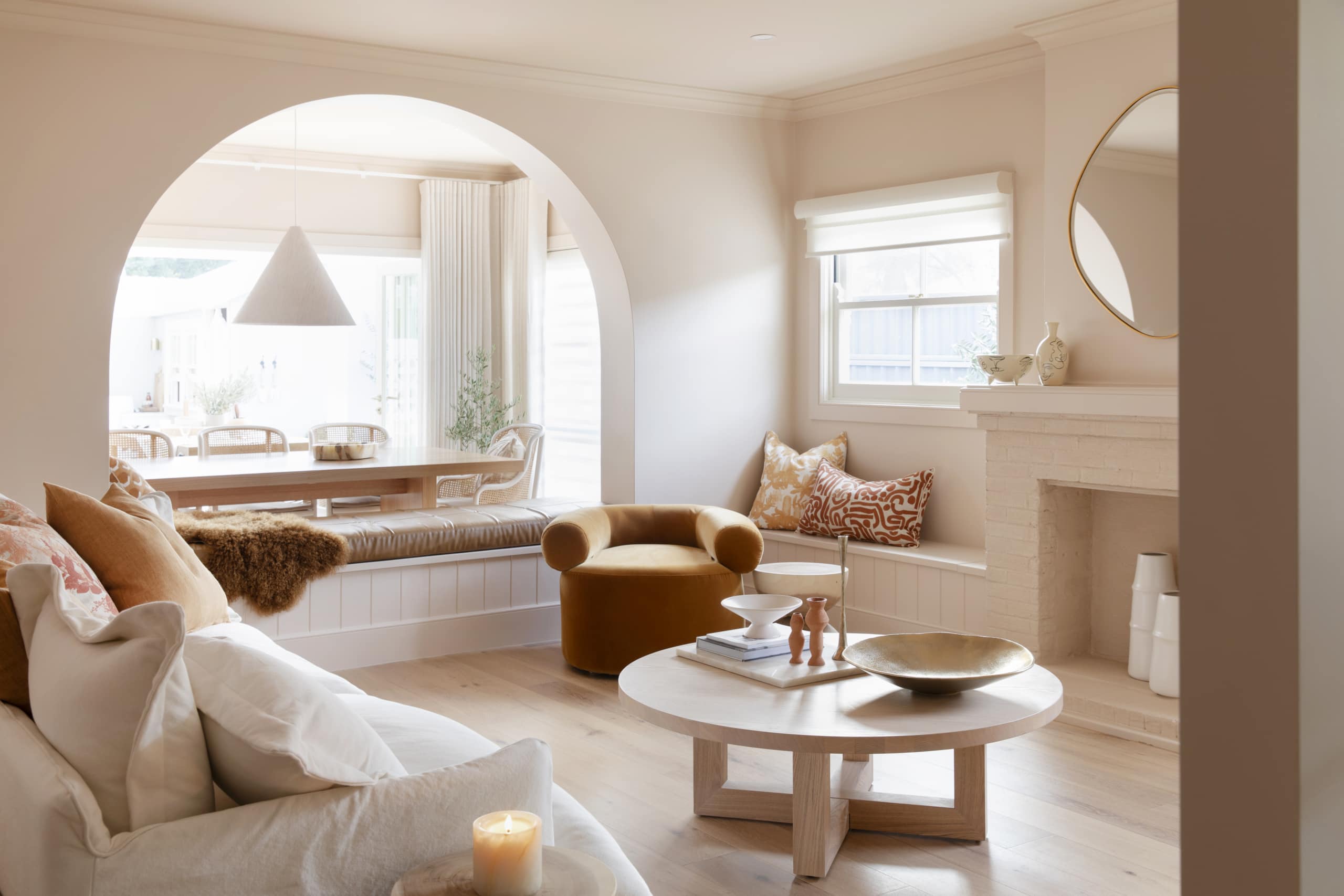
If first impressions count (and they do!), this home certainly delivers – the front of the home features two huge brick pillars and a patio inspired by the ornate Indian city of Jaipur. The front entrance and hallway are framed by a huge, raked ceiling and dramatic arched windows flood the property with natural light and allow for myriad bush views. “It’s definitely the most beautiful entrance we’ve ever done,” says Three Birds marketing director Lana Taylor.

Living room
Living room

And with so many spaces, lofty and varied ceiling heights allow for the open plan living to be segregated. “The beauty of this house is you’ve got so many ceiling heights. You’ve got the main entrance that is really high, then the ceiling height drops lower as you enter the house, then into the kitchen and it’s raised,” says Three Birds creative director Bonnie Hindmarsh, who specified 1770 square metres of Gyprock plasterboard throughout the home!

Master bedroom
Master bedroom
Ensuite
The master bedroom zone features a rather epic ensuite!

Despite the luxury feel of the home, with two young boys in residence, it was designed with family living in mind. Warm tones, and natural lighting make for a gorgeous indoor living space. 

The boys’ wing is a highlight of the home with its double bedroom, walk-in robe, ensuite and upstairs media/playroom. A unique choice, the huge bedroom features two large beds paired with a custom striped bedhead that runs the length of one wall. The team decided to do a feature ceiling and architraves in Dulux Blue Metal, instead of feature walls. The playroom sits above the boy’s bedroom zone.

Boys' zone
The boys’ zone
Playroom
The loft playroom sits above the boys’ bedroom

Gyprock Superchek was specified in that zone because it provides a 15 percent reduction in perceived loudness compared to standard plasterboard – a rather clever choice with two busy boys living there!

For more 

Categories
DIY Expert Tips Shopping Styling

Three Birds Renovations’ dirty blush office makeover

Sponsored by Intrim

Has there ever been a better time for a bit of home office inspo? The Three Birds Renovations team recently made over their office, and although they’re not currently able to work from it (they’re #safeathome like the rest of us), it’s a great example of how much difference the look and feel of your office can make.

Being creative types, working somewhere beautiful was always going to be important to them. “We are inspired by beautiful interiors so it only makes sense that our own workplace is beautiful and inspirational too,” says Lana Taylor.

Now, their ‘old’ office was hardly plain, but two years on from moving into their first Three Birds HQ, the girls felt it needed some loving. “It was looking a little tired and didn’t really reflect how our design style and business had grown in that time. With a growing team of gorgeous girls, we wanted to create a luxe, feminine space where everyone loves coming to work each day.”

With busy work days, they wanted the office to have a calming vibe and to be full of pretty things to make it an enjoyable place to spend each day.

“We called our vision board the #dirtyblushcrush! It was all about gritty pretty: feminine pink tones with a bit of grunt, so that it doesn’t look like Barbie’s office! Our vision was for lots of detail like panelled walls, patterned wallpapers, many different complementary textures and a mixture of natural and plush materials.”

What you won’t see is a bunch of individual desks. “We prefer collaborative workspaces so we can sit around the tables together to roll out some floorplans, or grab a coffee and sit back on in the lounge area for a creative brainstorming session. Our creative juices really flow best in a relaxed and inspiring environment,” Lana adds.

In terms of what made the biggest difference, the Intrim moulding on the walls is right up there. “This feature really takes the space from corporate office to elegant lounge room, which is how we wanted it to feel. The beauty of Intrim mouldings is that they’re custom-sized so we could choose how we used them.

“We have a full wall of panelling at one end of the office, which frames our huge Jai Vasicek artwork. Around the rest of the walls we just ran the moulding one third of the way up, to make way for the beautiful wallpaper which Grace Garrett made for us.”

The girls have generously shared their vision board for this project, and they recommend this as the best way to start any design project.

“This should help people pick out the key elements they’ll need to recreate this style at home: a dirty pink colour palette, lots of Intrim moulding on the walls, patterned wallpaper and natural rattan furniture with pops of gold. Voila!”

For more on Intrim

For more on Three Birds Renovations | Roxy Jacenko’s new house: a kitchen to die for!

Categories
Bathrooms Expert Tips RENO ADDICT

Three Birds Renovations on being creative with tiles

Lauded for their fabulous renovation projects, Three Birds Renovations recently undertook their biggest project yet – the home of the company’s creative director Bonnie Hindmarsh. Located on five acres in Sydney’s Hills District, the sprawling self-described ‘modern coastal barn’ is home to her family of six and brings the designer’s love of coastal style to the country.

And while the home boasts multiple swoon-worthy features, its tiles are at the top of the list. Sourced entirely from National Tiles in Melbourne, the lineup includes penny round, subway, ceramic and terracotta tiles laid in random, herringbone, grid and brick fashion. Proving that stunning results can arise just as much from the type of tiles selected as from the way in which they are laid, Bonnie shares her creative tile tips below…

“Many of our previous renovations have been flip houses so when we were tiling we kept the patterns fairly simple so that they appeal to a wide range of buyers. But when you’re designing a forever home, you’ve got license to be more creative in tile choices and how you lay them. At the end of the day you’ve got to love them because you’ve got to live with them,” says Bonnie.

“You can turn a room from drab to fab depending on the way you lay the tiles and in my forever home, there was no way I was going to be conservative in my choices,” she adds.

Herringbone
“The herringbone pattern is a gorgeous way to accentuate a plain rectangular tile,” says Bonnie, who chose a subtle apricot gloss tile, laid in a herringbone pattern, for the laundry. “The decision to lay them like that, rather than the stretcher bond pattern we often see for subway tiles, adds so much detail and interest to my over-sized laundry.”

Laundry
Laundry

The tiles on the laundry room floor are also herringbone, but smaller-scale mosaics. “The Carrara marble white tiles are laid in sheets so there’s no fuss for your tiler to create a perfect herringbone pattern with tiny tiles.” Genius!

laundry herringbone
A closer look at the floor tile

When it came to the gorgeous pale blue powder room, Bonnie chose to lay the tiles in a herringbone pattern again. “The stunning Cotto Glamour Rombo feature wall tiles in the powder room are diamond shaped and could have been laid in a number of ways. I chose to create a herringbone pattern with these tiles too, for maximum detail and impact on the wall.”

powder room
Powder room

Straight
If pattern isn’t your thing, you can always play it straight and Bonnie’s laundry tub is a great example of this. Purpose built to wash her beloved dogs, the tub features square tiles in two colours – apricot and greige. “The tub is laid in a straight lay, an almost basic pattern, but the two complementary colours make this feature look anything but ordinary,” says Bonnie.

The laundry tub features straight lay tiling to great effect

The main bathroom features some straight lay too. “The shower is also tiled in a straight (sometimes called stack bond) pattern, but you’d never guess,” says Bonnie of the randomly placed Crayon Bianco Matt and Crayon Azzurro Gloss tiles that combine to create a feature that is truly stunning.

main bathroom

Ceiling mosaics
It’s an unusual choice but Bonnie’s home features a number of ceilings covered in mosaic tiles, and it works.“I immediately fell in love with the pillar of Carrara marble white diamond tiles in National Tiles’ Melbourne showroom and knew they’d be perfect to wrap right around the shower in the ensuite, ceiling included.”

ensuite
Ensuite

And boy are they beautiful!

mosaics
Close-up

The main bathroom features another mosaic-covered ceiling but this time the adornment is a marble penny round tile. “The vision for the main bathroom was inspired by an underground train station and the Carrara white penny rounds were perfect for covering the huge curved ceiling, walls and floor,” says Bonnie.

Main bathroom
Main bathroom

Basket weave
Bonnie chose to use the basket weave tile lay pattern for the first time ever in her boys’ ensuite bathroom and it’s a gamble that has paid off. It’s also a great example of how you can make a simple tile look interesting if you lay it in a creative way. “Get creative! Even if you’re on a tight budget, the simplest of tiles can create a standout feature, if laid well.”

boys' bathroom
Boys’ bathroom – the navy gloss tiles make a standout feature wall and ceiling in the shower

More on National TilesMore on Three Birds Renovations


Categories
House Tours RENO ADDICT

From beach shack to ultimate seaside pad with Three Birds

The holiday home of Bonnie Hindmarsh was once a humble beach shack in Pearl Bay on the NSW Central Coast. But then, Bonnie’s life changed. With best friends Erin Cayless and Lana Taylor, they started Three Birds Renovations, the now well-known team flipping uber stylish houses for insane profits. So it was decided, it was time for Bonnie’s home to get a makeover! Today, they’re sharing the living room.

The shack had been renovated over the years but was certainly not perfect! They’d ripped up the old carpets and painted the walls and ceilings white, white-washing the original pine flooring and adding a couple of French doors to the lounge area and dining. The deck was another new addition which they extended, as well as renovating the kitchen.

Three Birds teamed up with online retailer Zanui to finish the home off with beautiful furniture and homewares. With the brief to create a fresh and relaxing home with a distinctly beachy vibe, the interior decorating was made easy thanks to Zanui’s extensive options.

“I just love their wide range of choices and it’s really easy to shop,” says Bonnie. “Take their artwork for example, you can filter by colour, theme and price – and then you get a heap of options. Their products cover absolutely everything from sofas to beds to bar carts and crockery. I was like a kid in a candy shop! We loved the challenge of making over every single space with their range, it was like putting together a giant fun puzzle where everything fits seamlessly. We’re seriously thrilled with the results.”

In this video Bonnie, who is the styling queen of the trio, talks us through what she chose for the room and why:


When it comes to renovating a holiday home, Bonnie has a few tips for keeping it in tip-top shape. “Consider adding an outdoor shower and tap so you can wash yourself off after a beautiful day down at the shore! And consider light-coloured flooring to hide any sand that happens to sneak past the outdoor shower!”

Giving your home a makeover can quickly add up, so forget about any form of structural change if cash is tight. “If you can afford to, repaint the walls and floors as it’ll make a big difference,” explains Bonnie. “If that’s still a stretch, change the space using new furniture, homewares and artwork. As a last resort, a few new cushions on your couch is a step in the right direction for that extra pizazz.”

More from Three Birds Renovations | Other house tours

Categories
Designers House Tours RENO ADDICT Styling

House tour: Santorini style on Sydney’s north shore

Dubbed their biggest renovation challenge ever, best friends turned expert renovators Lana Taylor, Erin Cayless and Bonnie Hindmarsh (of Three Birds Renovations) recently completed a three-storey, three-bedroom, three-bathroom, modern Mediterranean-style villa in Sydney’s north. But there was some added pressure, with the house being Lana’s family home! “It’s been a beautiful house and I love it to death but the floor plan wasn’t built for a growing family,” explains Lana. “Our main aim was to build a beautiful home to last a lifetime.”

The new design involved completely flipping the house layout on its head, by placing the kitchen and living areas downstairs and linking it to the garden. The middle level, aptly named ‘kid’s world,’ became the domain of Lana’s two young children; while the top floor was converted into the ultimate parents’ retreat for Lana and her husband Jason.

The parents’ retreat boasts a luxurious master bedroom, walk-in wardrobe, ensuite, open-plan office space and a sunny terrace. Inspired by Greece, the ensuite is white with a turquoise fish-scale tiled feature wall and just like the beautiful white-washed Santorini homes, a skylight above the shower bathes the room in natural light.

On the middle level, each child has a large bedroom, plus there is mud room, a large bathroom and a media room with glass balustrade that overlooks a void into the family area below. “I’ve always wanted a well-fitted out mud room,” says Lana. “So I created an ‘urban mud room’ with floor-to-ceiling shoe shelves for my family to take shoes on and off and get rid of those bulky school bags.”

Once a self-contained granny flat, the bottom level is now home to an open-plan kitchen, living and dining area. Large windows, glass doors, high ceilings and white walls provide a light, fresh and welcoming space for the family to cook, eat, play and relax.

The all white kitchen is paired with neutral stone benchtops and a matching splashback. “I wanted the stone to be the hero of the kitchen,” explains Lana. Connecting the interior to the exterior is a large gas-strut window, allowing for easy al fresco dining all year round. And on the other side of the kitchen is not a butler’s pantry but a butler’s office! “The butler’s office was simply born out of the lifestyle that we lead,” says Lana. “I’m always on my laptop and I don’t want to be hidden away in a study when my kids are in the family space.”

The finished home is beautiful (what we’ve come to expert from the girls at Three Birds!) and Lana couldn’t be happier: “It’s not just the perfect family home, it’s also an expression of my style and showcases the expertise and attention to detail we have to all our projects.”

–The Birds used Gyprock in this renovation. To create a private oasis for Lana and Jason, Gyprock Soundchek™ plasterboard was used in the master suite. A high-density plasterboard with increased noise absorption properties, Soundchek has been specifically designed for internal walls and ceilings to reduce noise transfer. Gyprock Sensitive plasterboard  was selected for the kids’ area.  It’s a revolutionary hypoallergenic plasterboard that is the first and only residential plasterboard to be approved by the National Asthma Council Australia’s Sensitive Choice program as a better choice for asthma and allergy sufferers. Treated with a powerful but gentle anti-fungal agent, Sensitive is designed to resist mould growth.

More from Three Birds Renovations | Other house tours

Categories
Before & Afters Design DIY Expert Tips House Tours Kitchens Real Renos RENO ADDICT

Real Reno: Three Birds Renovations share latest six-week flip

Presenting Part 2 of the tour through our six-week transformation of House 4. Before we begin, did you know that a combined kitchen, living, dining space is called a Great Room? I only learnt that the other day #thanksgoogle.

So here is our Great Room …. plus a staircase!

three_birds_northmead-191

three_birds_northmead-201

three_birds_northmead-202

three_birds_northmead-20

KITCHEN

How did we make it so much bigger? There was an external laundry sitting on the other side of the wall with the cooktop on it so we knocked through it and stole that floor space to make it part of the kitchen with our trade mark gas strut window.

Where are those stools from? Those Oz Design tractor stools set our social media on fire when we shared the pics.

Why is the bottom shelf not aligned to the bottom of the overhead cupboards – was it a mistake? No that wasn’t a mistake. It was a design choice we made to give the kitchen a slightly more open and relaxed feel than if the shelf was aligned with the cupboards.

Budget buy? The picked up the pendants from our local hardware store.

BEFORE kitchen
BEFORE kitchen

KITCHEN after
KITCHEN after

LIVING

What transformed this room the most? You can see from the pics that we didn’t change the shape or size of this room, but it looks completely different as a result of the fresh white paint (our staple – Taubmans Snow Drop) and white-wash laminate flooring (from our local hardware store). The styling also helped a bit 😉

Is that a double rug? We’re loving this trend right now. On face value it seems a bit silly to put one rug on top of another, but forget about the practicality of it – it looks divine and brings a warm, layered feeling to the room.

BEFORE living
BEFORE living

AFTER living
AFTER living

DINING

How did we make the space so much bigger?  The original wall on the left ended up in the skip bin and this allowed us to stretch the dining space across two rooms. The double set of French doors allowed an abundance of natural light to fill the room and we spent a lot of time looking for a dining table that was not too big, not too small.

Where are those matching dining chairs from? Those Chinese bamboo chairs belong to one of our Instagram followers. We ran a competition to find a piece of old furniture to upcycle and feature it in our house. We painted and re-upholstered them and the best bit was giving them back to their owner, Fiona, once the house was sold.

What type of flooring is that? White wash oak laminate.

BEFORE dining
BEFORE dining

three_birds_northmead-80
AFTER dining

STAIRS

What did we do to the stairs? We actually didn’t do much to the original staircase in terms of the balustrade and treads. We didn’t touch them. We cut back the wall on the right to open up access to the kitchen and then used the recessed space underneath to build in a bench seat and create a welcoming reading nook with its own lamp. The Scyon wall cladding was the finishing touch to add further dimension and texture.

Are white stairs practical? We painted the balustrade and treads white but if you use the right paint like an Ultra-Enamel it should withstand the wear and tear. Having said that, the treads could be easily rejuvenated with a DIY fresh coat of paint twice a year to keep them looking amazing.

BEFORE stairs
BEFORE stairs

AFTER stairs
AFTER stairs

With House 4 complete, we’re already busy working away on the next reno!To see how the first few weeks are unfolding tune into Three Birds TV here. Erin’s far too calm as the foreman (is she serious? Bonnie’s designing the house on the hop (is SHE serious?) and I continue to add little value onsite, providing a few too many “Oh My God!” moments (and the sad thing is, I’m serious).

–Lana Taylor is one third of Three Birds Renovations alongside Bonnie Hindmarsh and Erin Cayless, and one of our Resident Experts. The best friends and busy mums walked away from their corporate careers in pursuit of a more fulfilling life. They created Three Birds Renovations – a boutique renovation company where they buy, renovate and sell suburban homes. Their ultimate ambition is to build a life they love, hoping to inspire others to do the same.

Read all Three Birds Renovations’ posts.

Categories
Before & Afters Design Expert Tips Real Renos RENO ADDICT Styling

Real Reno: Three Birds Renovations share House 4 in every detail

By Lana Taylor

House 4 is done and dusted and to take you on the journey, I’ve got some obligatory B&As (before and afters) along with some Q&As that I pose to myself and then answer myself #slightlyawkward #multitasking.

BACKYARD

Before
Before

After
After

Before
Before

Backyard 3 AFTER
After

Before
Before

After
After

Did we keep anything from the original backyard? The existing concrete porch proved a god-send as we anchored a new deck off it and then painted it and the deck the same colour to make it look like one large alfresco space.

Is that timber decking? No. In all our previous renos we’ve built timber decks (as you do) but at this house we branched out into fibre-cement decking called HardieDeck. It has the strength and durability of concrete (and is fire-proof), but with the smooth look and feel of a modern boat deck. And the best part is you can paint it any colour you want.

Who doesn’t love a privacy screen? Nobody, that’s who! A privacy screen offers so many benefits: 1) it hides you from your neighbours and vice versa 2) it helps create the feeling of an outdoor room and, if built used Scyon wall cladding, it can become an architectural feature of the house. PS – we are slightly obsessed with Scyon walls so you’ll start to see them popping up in many more of our renos.

Why did we remove the upstairs balcony? The rickety wooden balcony was both unattractive and structurally unstable. Rebuilding it would have been costly and only worthwhile if it had provided our future homeowners with a nice vista to look out on. Given that this one looked straight over the back fence into all the neighbouring houses (no thanks) we decided to scrap it altogether!

Best budget buy outside? We saved some cash with our external servery. We bought solid timber benches from our local hardware store and had our builder cut and install them.

MASTER SUITE

Before
Before

After
After

Before
Before

After
After

Before
Before

After
After

Is that a clad wall behind the bed? Yes – and would you believe me if I told you it is the SAME Scyon wall cladding from the outdoor privacy screen? Who would have thought it could translate so well inside!? #bonnieknew

Where’s the wardrobe? Behind the wall, behind the bed. We love a walk-around robe almost more than a walk-in version.

Where is that gorgeous painting from hanging above the bed? This stunning artwork is called ‘We are Sole’ by artist Danielle Cross.

Which tiles did we use in the ensuite? All the tiles came from Amber. We used 600×600 Statuario Grey Polished Porcelain on the walls for a touch of marble style luxury and charcoal Durastone Herringbone 25×50 on the floor. The seafoam subways (Spanish handmade Menta) were our favourite and kick-started Bonnie’s love affair with this lightest shade of green.

What if people don’t want an open ensuite? We love an open ensuite but recognise we might not be in the majority. For those who prefer the privacy of a closed-in ensuite, this design can easily be adapted by installing two cavity slider doors in each nib wall.

FORMAL LIVING ROOM

Before
Before

After
After

Before
Before

After
After

Is it the same room? Yes …. and no 😉  The before shot is of one of the rooms, but we removed the wall between it and another bedroom to turn the space into one large formal lounge with separate tapas bar.

Did I just say tapas bar? Every Aussie home needs a tapas bar, right!? Well maybe not, but we couldn’t resist in this reno. The formal lounge room was big so it worked to create two zones in the one space. 

Why didn’t we keep the yellow walls? I know this is the question on everyone’s lips but we opted instead for our fave white, Snow Drop by Taubmans. 

Our budget buy in this room? To save money we used cheap-as-chips IKEA sheer curtains ($12 for two).

Most practical decision? We learnt from House 3 that it’s best to separate your living spaces, so that one is truly an escape from the other. This was a challenge with the floor plan, but we solved it easily by adding French doors that can section off this zone from the rest of the house.

So that was Part 1 of the journey through the transformation. Next month we’ll share Part 2, which will showcase the kitchen, living and dining, along with the unlikely hero of the house –the stairwell.

–Lana Taylor is one third of Three Birds Renovations alongside Bonnie Hindmarsh and Erin Cayless, and one of our Resident Experts. The best friends and busy mums walked away from their corporate careers in pursuit of a more fulfilling life. They created Three Birds Renovations – a boutique renovation company where they buy, renovate and sell suburban homes. Their ultimate ambition is to build a life they love, hoping to inspire others to do the same.

Read all Three Birds Renovations’ posts.

Categories
Before & Afters Design Real Renos RENO ADDICT Styling

Real reno: Three Birds Renovations’ latest spectacular transformation

Lana Taylor, one third of Three Birds Renovations, our new Resident Experts, tells us all about their latest reno success story…

With a purchase price of $1.3m, we risked more money than ever on this four-bedder in Beecroft, NSW. We had to increase its value by at least $350,000 in seven weeks to make it worthwhile. Welcome to Three Birds Renovations’ third reno in 10 months!

After: exterior
After: exterior

For this transformation, we changed the whole floorplan, moved the kitchen downstairs, cut in a void, created a luxury master with dressing room and built an alfresco wonderland in the backyard. Did I mention we did it in seven weeks!?

I could write and write and write about the finer details of this reno but let’s face it – we all just want the highlights package, right?

Biggest transformation – the kitchen

Before: kitchen
Before: kitchen

At1w_Aww26AnT730TGtsIYSQfk2VEBkQb-OwFKkmZoo
After: kitchen

The kitchen originally sat upstairs on the entry level of the house – unfortunately this meant it had no connection to the backyard (a big no-no for any family home). So we knew we had to move it downstairs but that was easier said than done. Downstairs was a dungeon (no joke, I could see the remnants of medieval shackles on the walls). It was a long, dark, skinny space. We had to make that kitchen look as ‘fat’ as possible so of course we employed a lot of white and tried to let in loads of natural light.

1FtooAG9ZEQ5gPXrnm-Qnl3nAiIHpfauUnMkuJ6NYns
After: kitchen

We cut in as many French doors as our engineer would allow and to be sure of a bright kitchen, even on the darkest days, we didn’t scrimp on down lights. We considered doing a window splashback, but that only looks good when there’s a lush rainforest growing outside of it. With our barren land, we weren’t going to grow anything in seven weeks! Instead we chose Calacatta Gold Talostone for the splashbacks – they looked light, bright and just like marble. Of course we ‘bookmatched’ them. Bookmatching has nothing to do with a trip to the library (as I discovered in a rather embarrassing conversation with our stonemason), rather it means the veins from the splashback were joined/matched with the veins on their corresponding benchtops. Still not clear? Trust me, it’s cool.

Biggest gamble – the void

Before: void
Before: void

After: void
After: void

A void, by definition, is nothing, but it meant everything to us when we decided to add one to this house. With the kitchen moving downstairs we simply had to lift the lid on the dungeon — so we cut out the floor from the bedroom above to flood the downstairs with natural light. It was our biggest structural change and we lost floor space upstairs, but the new floorplan couldn’t have worked without it. The void (and its African mud chandelier) became the hero of the house.

Quickest transformation – spraying the bricks

Before: exterior
Before: exterior

After: exterior
After: exterior

Obsessed! That’s what we are with the concept of spraying brick. It’s just too easy and so impactful! We (when I say we, I mean our painter!) transformed the back of this house in just a couple of hours with a tin of paint and a spray gun. Between breakfast and lunch it had changed from a red brick eyesore into a gorgeous Gibraltar Grey estate. Of course the white trims were crucial in finishing the look but the major makeover came from spraying the bricks. Not only is this method quicker and cheaper than rendering, but we love the look of painted brick as it adds texture and dimension to an otherwise flat surface.

Overall winner – the backyard

Before: backyard
Before: backyard

After: backyard
After: backyard

The backyard proved our saviour! We used it to double the living space downstairs. Inside the house was skinny (have I mentioned that before?) — only 3.5 metres wide — so to make it feel like a suburban family home rather than an inner-city terrace we needed to add width (dare I say girth?), to the living, dining and kitchen. Our solution was to create an outdoor precinct running the length of the house.

Before: backyard
Before: backyard

After: backyard
After: backyard

When styling, we defined the outdoor zones to show potential buyers how to live in the space. Up one end we built an outdoor lounge pavilion with pergola, at the other end was an alfresco dining area just a stone’s throw from the kitchen, and in the middle we added wow factor with a sunken fire pit (which could easily convert into a sun lounge in summer). Last but not least, we anchored outside to in using our trademark gas-strut window and servery bench – and this is where I chose to sit when we popped the cork on the champers when all was said and done!

Our favourite room – ???

There’s a room in this house I haven’t mentioned – it’s our favourite room ever so it deserves its own post… stay tuned.

— Lana

For more before and after photos and to find out how much Three Birds Renovations sold this house for, visit their website.