Categories
Bedrooms Expert Tips The Block

The Block master bedrooms: a builder’s thoughts on the scoring

Matt Meinchelli, who Scotty dubs “the miracle worker”, is a familiar face on The Block, working as the builder for winning teams in both 2017 (Elyse and Josh) and 2019 (Tess and Luke). He understands the important role that a builder plays in any renovation, but especially on The Block, to bring a homeowner’s dream to life – whatever they may be. 

Builder Matt Menichelli shares what he’d have scored the bedrooms

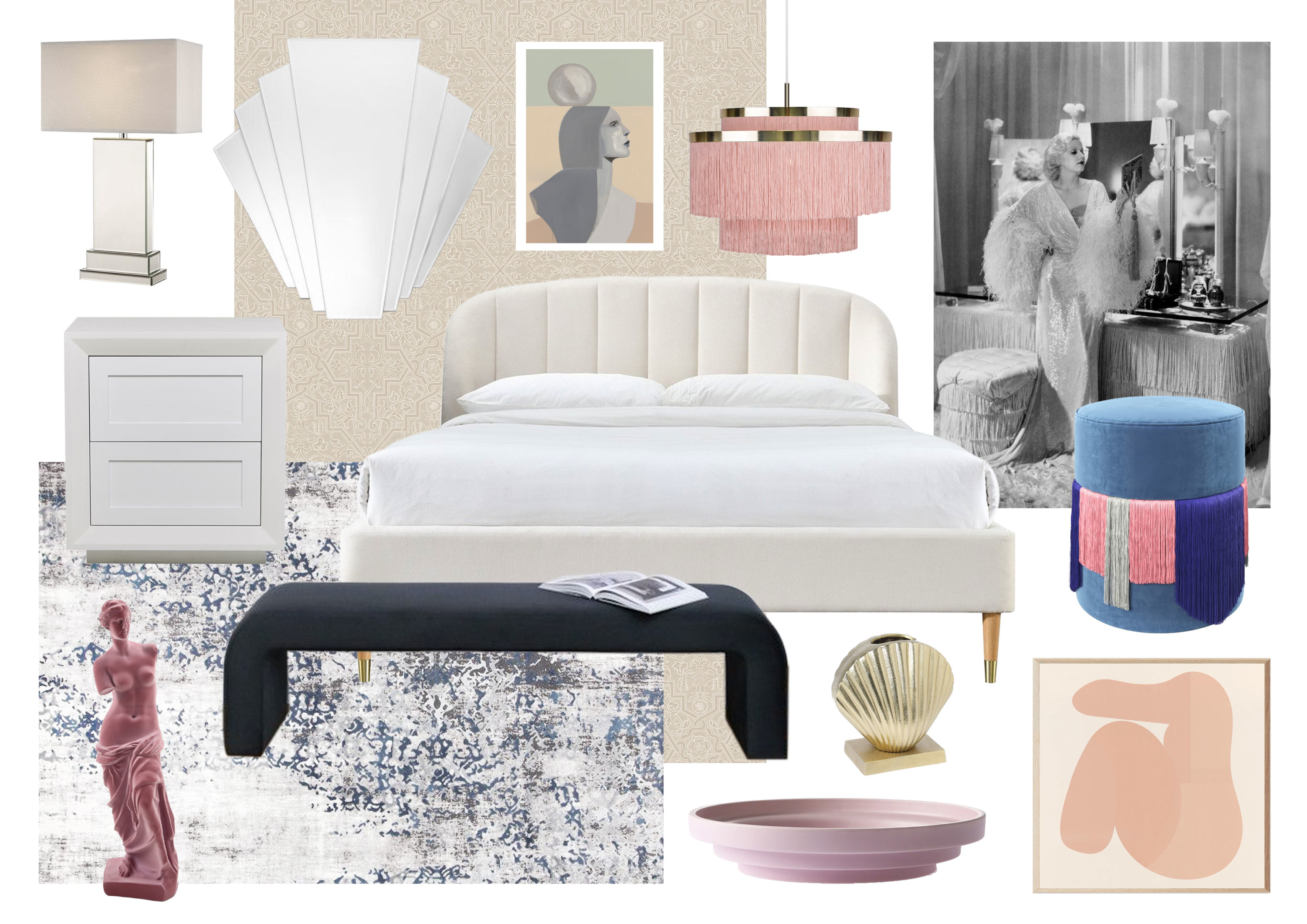
When it comes to master bedrooms, Matt says he’s a big advocate for functionality. “The layout of a master bedroom needs to be practical and versatile to cater to different couple’s needs. The owner of the home will typically occupy this room so a statement piece is always a good way to wow potential buyers.” He adds that when renovating your own master bedroom, it’s important to create a space you want to spend time in and feel comfortable in. 

Having been part of The Block’s master bedroom week, Matt shares his thoughts on each of the room reveals. 

House 1: Ronnie & Georgia

What did you like about this room? 

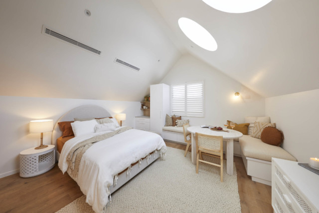
The ceiling skylight detail was a standout, along with the tactile feature wall. They also had a great colour scheme.

What did you not like about this room? 

The overall height was overkill. The room was only 4mx4.5m so a 6m ceiling throws out the proportions. A 3.5m ceiling would have been perfect. I also think the walk-in robe was far too small – again, proportions were all wrong.  

Did you agree or disagree with the judge’s feedback / scores? 

I think the judging was a bit too harsh. I would have given them an 8/10.

House 2: Mitch & Mark

What did you like about this room? 

It was a very cosy space with the ceiling coffer to complement the skylight. The walk in robe was also well designed. I did also like the oversized door leading outside. 

What did you not like about this room? 

I personally prefer slightly deeper tones – the colour scheme was a bit soft and light for me. Would have liked to see more space at the toe of the bed for a reading chair also.  

Did you agree or disagree with the judge’s feedback / scores? 

I think the scores were fair. I would have given them an 8/10.

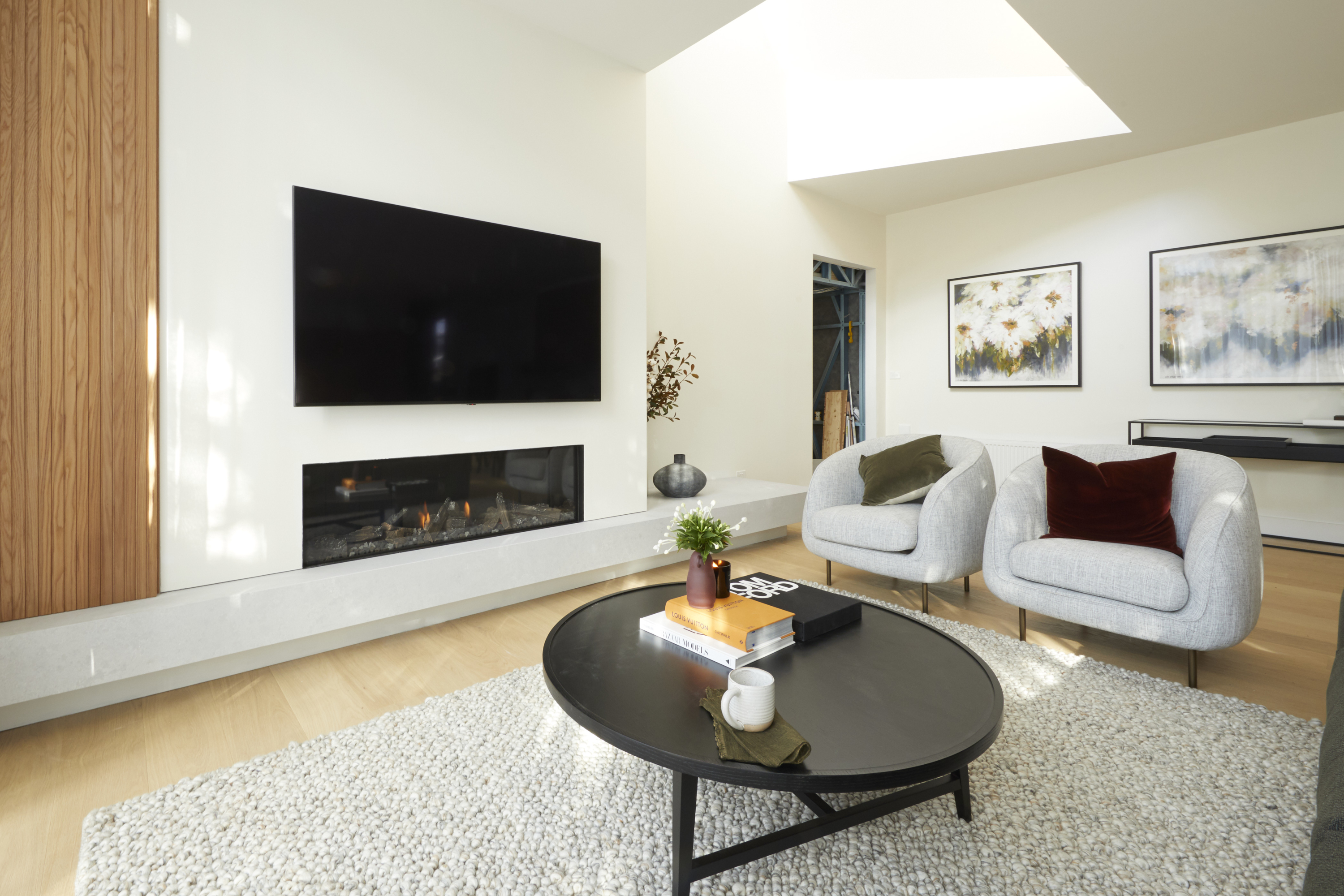
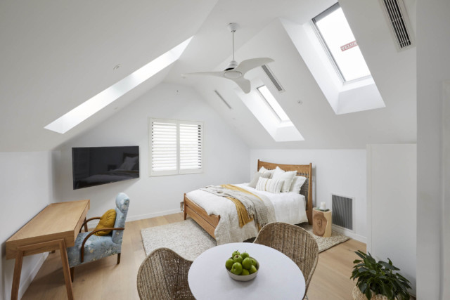
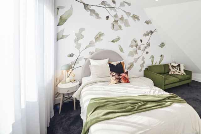
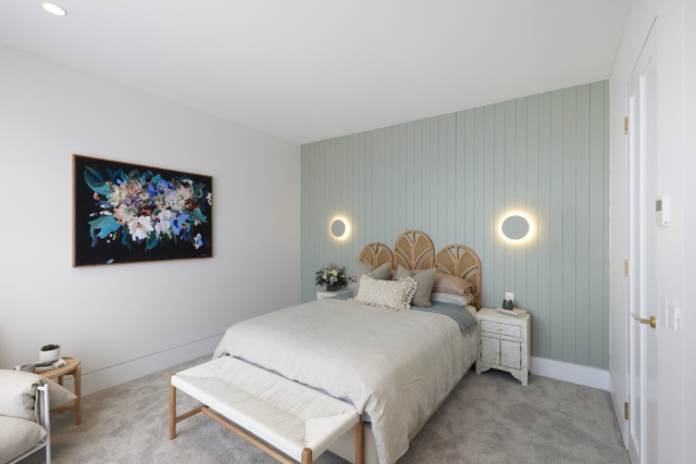
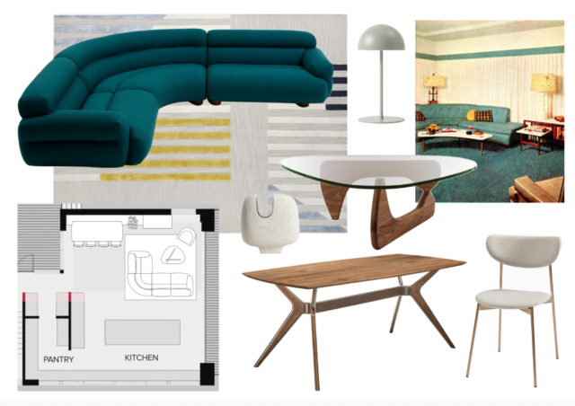
House 3: Tanya & Vito

What did you like about this room? 

They played into the mid century style well. They also had a really different bedhead which I like! 

What did you not like about this room? 

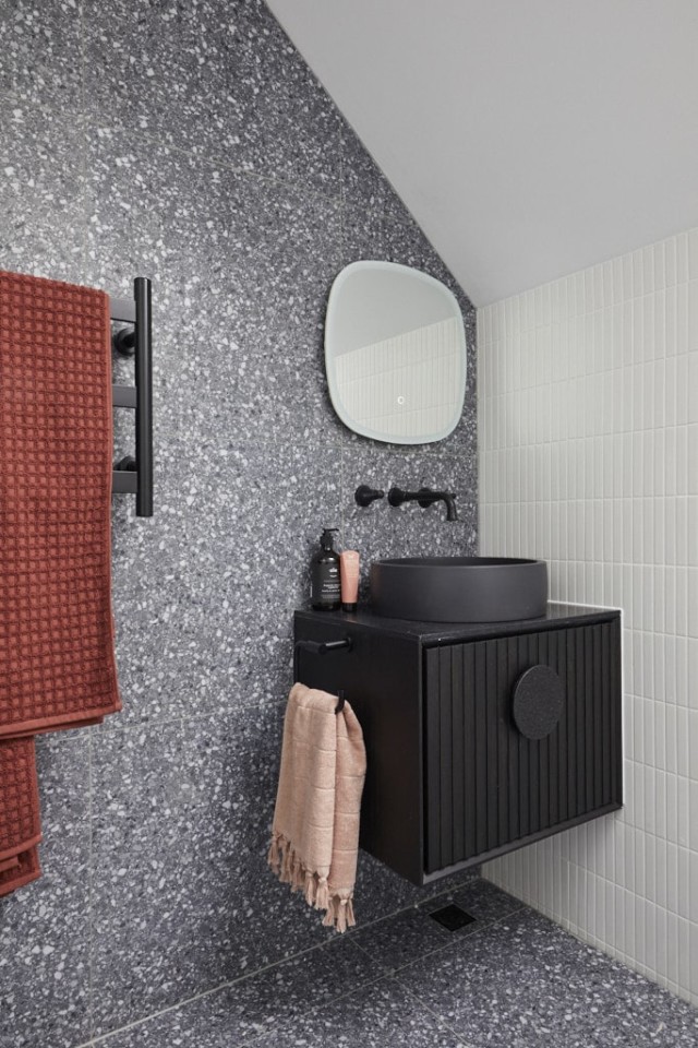
The entry nook. It was a waste of space and feels jarring when walking in. The walk-in robe was too bland as well. 

Did you agree or disagree with the judge’s feedback / scores? 

I would have given it a 7.5/10. 

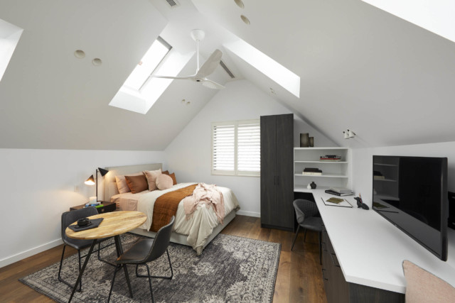
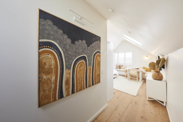
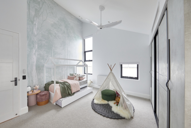
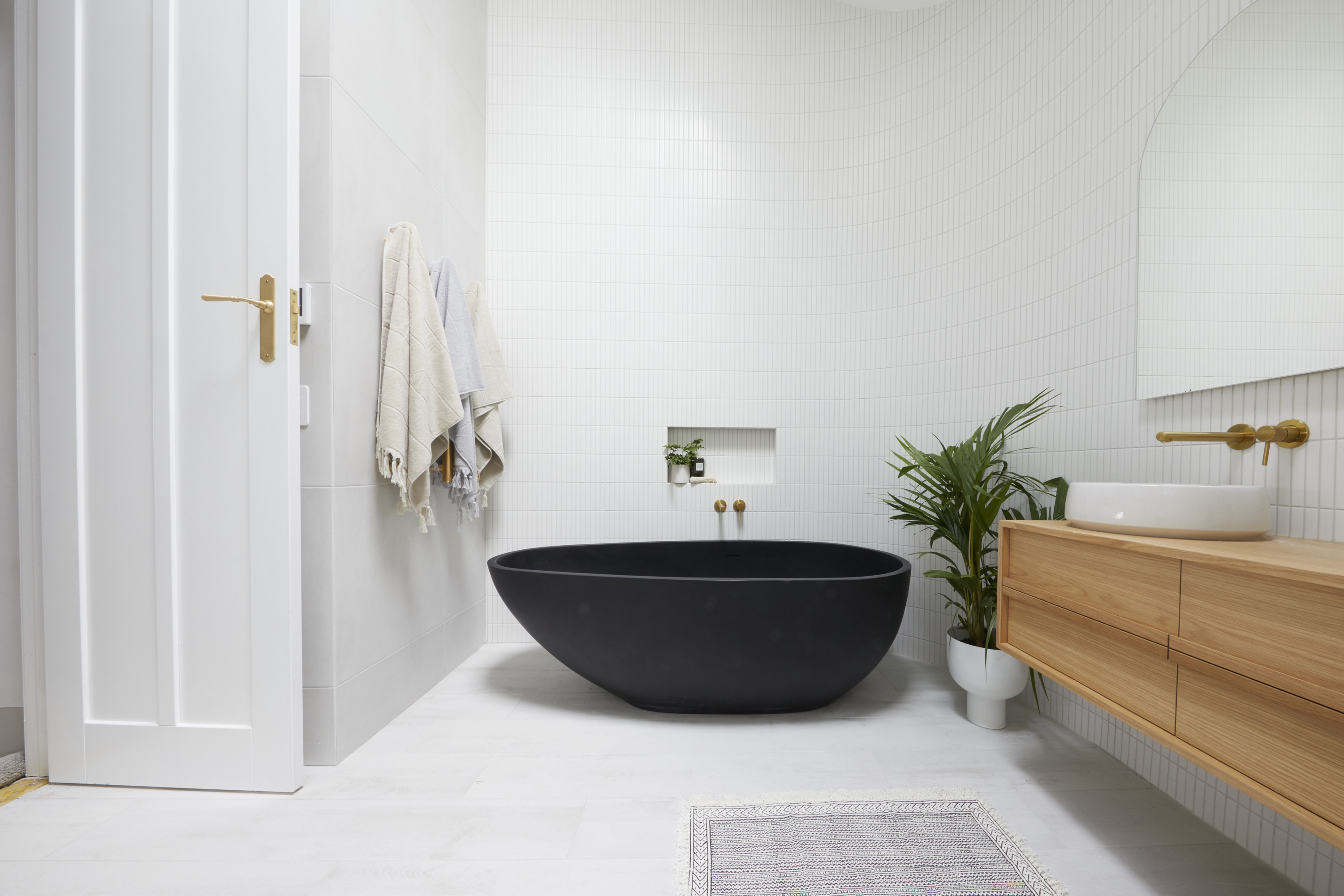
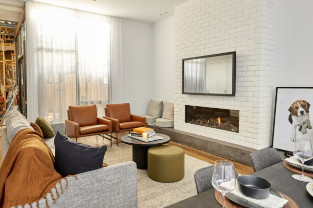
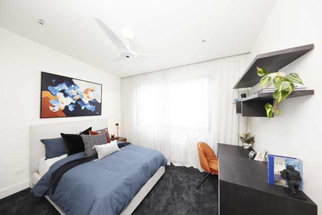
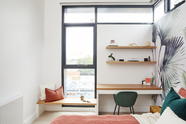
House 4: Josh & Luke

What did you like about this room? 

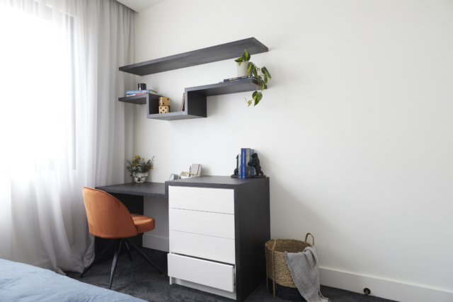
It is a perfect sized space. It has a really good walk-in robe for functionality and style. The subtle polished render and great ceiling detail with commercial style linear lighting also adds to the room. The robe space sets you up for a very special ensuite. 

What did you not like about this room? 

I think the three series artwork needed a bit more punch as it was too washed out. I also think the bench seat and buffet table needed more bulk as the room felt a bit empty, and the mirror TV was overwhelming. 

Did you agree or disagree with the judge’s feedback / scores? 

I think the boys received a fair score. I would have given them 9/10. 

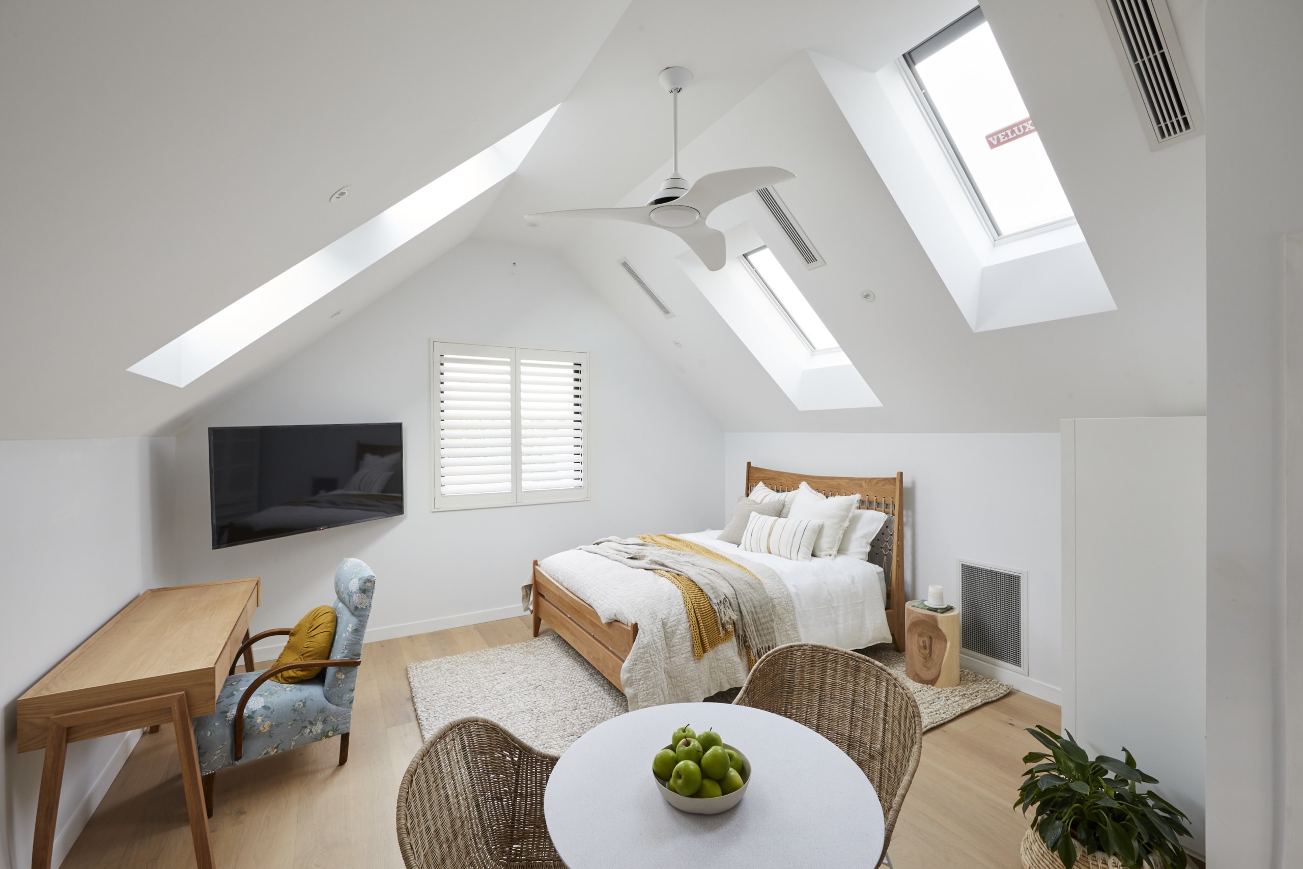
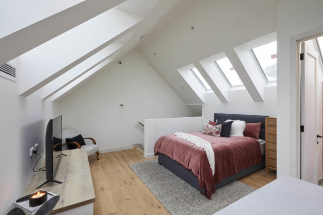
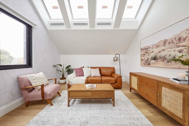
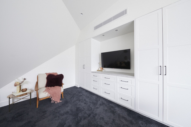
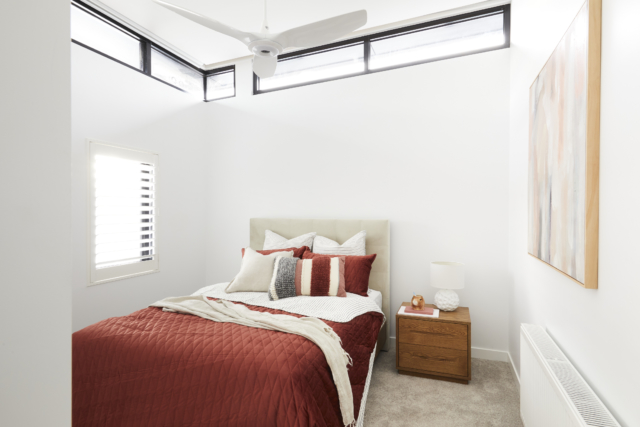
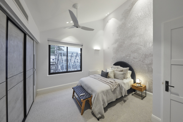
House 5: Kirsty & Jesse

What did you like about this room?  

The room has a great colour scheme and I really liked the raked ceiling detail, filling the space with natural light. Convex wall panelling is something really special as well that gives a modern twist on the old dado panels. 

What did you not like about this room? 

I don’t think the cornice details were necessary, and the walk-in robe was far too small. The bedside tables and chest of drawers also didn’t suit the room. 

Did you agree or disagree with the judge’s feedback / scores? 

I think they received fair scores. I would have given them 7.5/10.

Matthew Menichelli is a builder and owner of Elevate Building Group and hipages tradie on The Block. hipages is the online platform that connects Australia with trusted tradies to simplify home improvement.

Categories
Bedrooms Shopping The Block

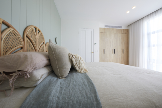
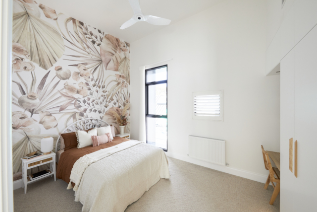
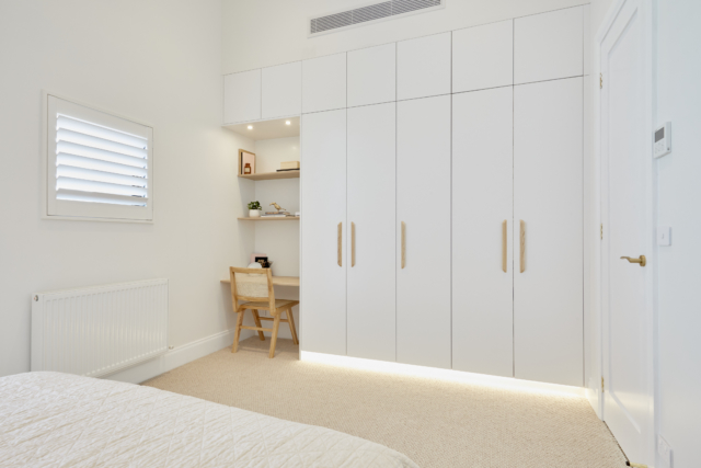
The Block 2021: master bedroom & walk-in robe reveals

This week didn’t see the faves as the obvious frontrunners. Ronnie and Georgia came fourth while Mitch and Mark came second. And Josh and Luke managed to pull first place out of the bag after last week’s somewhat disastrous ensuite! Tanya and Vito made more bold and quirky choices and Kirsty and Jesse didn’t quite get it right.

Ronnie & Georgia: Fourth

Score: 23.5/30
Spent: $24,500

“Enormous, Vast, Cathedral-like” and more – Ronnie and Georgia’s master bedroom certainly stopped the judges in their tracks and it’s easy to see why. With its soaring sloped ceiling leading up to Velux skylights, a massive floor to ceiling window, chic Laminex panelling, disguised television and more this was a statement room.

All agreed the walk-in robe could have been more generous, a fact Ronnie and Georgia might want to remember when it comes to make-over room time. Shaynna called it “teeny tiny” and “miniscule”. It was well styled though.

But overall, said Neale, with this room, the team stamped themselves as “the masters of sophisticated subtlety”.

Get the look: Alfa sideboard

Personally I think they were robbed! Yes, the wardrobe was too small but this room wasn’t fourth place at all!

Mitch & Mark: Second

Score: 26.5/30
Spent: $20,376

With its generous walk-in robe, balcony hinting at a secluded outdoor sanctuary and beautiful finish, Mitch and Mark’s master bedroom retreat showed the judges they’ve well and truly moved on in style and execution from their first Block!

A traditional, yet contemporary room, they decided, with features such as ceiling a standout, drawing the eye to perfectly place pendants over ample tables flanking a bed so beautifully styled Neale was left asking for tips. For Shaynna it was the artwork – matched to the bed – and colour palette that combined to scream luxe!

They were frothing over the wardrobe too. Neale said it was very well thought through and beautifully styled and Darren said it was Tardis-like.

Get the look: Jonathan Gemmell art print

Personally I hated the bedhead and although I loved the wardrobe, I couldn’t get overly excited about the bedroom and didn’t think it was a second place room.

Tanya & Vito: Third

Score: 24/30
Spent: $25,649

Light bright and colourful, Tanya and Vito’s master bedroom was the “Goldilocks room” for the judges this week – not too big and not too small, but just right. Bringing the Moroccan feel of the guest ensuite into the space, the pair created a haven away from the house but still connected.

Shaynna immediately fell for the bedhead, the side tables, the wallpaper and the artwork – including another Tanya original – with Darren warming to the quirky styling touches. While the wardrobe certainly had lots of space, Neale said it lacked the glamour and luxury and Shaynna wasn’t a fan.

Get the look: Tanya’s own artwork

Personally I love how this couple have committed to their quirky style. Wasn’t a fan of either wardrobe but the crazy bedhead and light combo did kinda work, didn’t it?!

Josh & Luke: First

Score: 27/30
Spent: $19,830

One of the most controversial choices of The Block so far, Josh and Luke were always heading for controversy when they flipped the original intent and placed their master suite where the double garage had been aimed, but did it work? Apparently, yes!

Spacious, light soaked, separated from the rest of the house with its own view to the courtyard, the judges finally saw why the twins had put themselves through so much. Architecturally clever enough to forgive the obvious styling flaws (fake flowers, guys? Really?), it’s fresh, sophisticated and puts the pair back in the game, Neale said. 

Shaynna loved the wardrobe! They all did. “This is a master bedroom in a multimillion dollar house,” said Darren. “Space is a luxury.”

Get the look: Drip Flowers artwork

Personally, I thought the wardrobe was way nicer than the bedroom which although spacious, I just found a bit bland! And as for that mirror over console combo? No thanks.

Kirsty & Jesse: Last

Score: 22.5/30
Spent: $24,920

With wide North-facing windows, a generous layout that draws focus to the beautifully styled bed, arches adding a softness and warm tones from the rich carpeting to the walls, the judges were immediately impressed by Kirsty and Jesse’s master bedroom.

A closer look however revealed a few problems – the artwork wasn’t exactly what Shaynna would have liked to see, the tallboy looked out of place and in general there seemed to be a clash between the contemporary and classic styles. Add in a beautiful, but undersized walk-in robe and the country couple were left wondering if the pluses the judges found would outweigh the negatives.

There was too much joinery squashed into the wardrobe space, although it was nicely styled and they liked the finishes. Darren said they needed to start again. The judges said the whole space needed to be re-planned.

Get the look: Ashlee blanket box

Personally, I agree this room should have come last. The wall opposite the bed was all wrong, the wardrobe was tiny and although on first glance the whole bed setup was lovely, on closer inspection, like Neale said, there was a lot I didn’t love. Including the arches.

What did you think?

All our Block coverage

Photography: David Cook Photography.

Categories
Architecture Design Designers Interviews RENO ADDICT The Block

Mitch and Mark on their new season on The Block

With an entirely new format (five houses in one Melbourne cul-de-sac) and a line-up of contestants that includes former Blockheads and newbies (Fans vs Faves), the latest season of The Block looks set to provide entertainment plus. And we’ve no doubt that much of that will come courtesy of Block veterans Mitch Edwards and Mark McKie who are back for a second round on the show.

“It’s such a privilege to be on The Block once but to be invited back for a second time is amazing. We didn’t hesitate when we were asked,” says Mitch who has been working alongside his partner Mark in their interior design business since the couple’s first appearance on The Block in 2019. The couple also have a home fragrance line and are in the midst of renovating their own home on Sydney’s Northern Beaches.

Mitch and Mark
Mitch and Mark

As for the couple’s house on The Block it had a federation façade, but not much else, when they took it on. “We wanted to take the home in a direction that paid homage to the history of the home but in a modern, practical way. It’s a version of a coastal look with a hint of federation and a country feel,” says Mitch. The home’s colour palette takes inspiration from the original leadlight windows. Viewers can expect to see plenty of soft pink, sage green, and dusty grey throughout.

“We will be exploring a new look. We think, from an interior design perspective, that you need to be able to do different styles and to make sure the home’s style and layout reflects the market. You can’t be a one trick pony,” says Mark.

Mitch & Mark
Mitch and Mark’s guest bedroom came last in the first reveal of this season

When it came to the home’s layout, it was left entirely in the hands of the couple who spent many hours space planning the design. “We weren’t even given a footprint. We had to work out the boundaries and rooms within the house,” says Mark. The design also reflects the new COVID reality where people live, work and play from home. “The needs of the home are not the same as they were two years ago. You have to flexible about the use of spaces and we took this into account,” says Mitch.

As for the ethics of pitching experienced renovators against total newbies, the couple believe the judges are holding them to a higher standard than the new contestants. “Personally, we don’t have an issue with that. We should be delivering to a higher standard and while they haven’t explicitly said it, we believe they are judging us more harshly,” says Mitch. And the couple have come both last and first in room reveals thus far.

Mitch and Mark's guest bedroom
Mitch and Mark’s guest bedroom

And as for charges that The Block should have more design and less drama (we hear it every year!), the boys tend to agree, but concede that it’s the drama that viewers want to see. “It’s the design aspect that drew us to The Block in the first place, but the drama, intrigue and personal relationships are part of show how and people want to see that stuff,” says Mark.

Mitch and Mark's bathroom came first in last night's reveal!
Mitch and Mark’s bathroom came first in last night’s reveal!

On the topic of drama, Channel Nine has said that this season features the biggest cheating scandal in the history of The Block. “There’s a thing that really splits the show when someone gets information that they shouldn’t have. It was entirely out of left field and our jaws were on the floor. It impacts the rest of the show, right to the end!” says Mitch.

And as for winning, the boys believe they have built the best house but that anything could happen on auction day. “The house that the judges consider the best in terms of scoring is not generally the house that wins The Block. We’d like to think our house will win, but in the end we’re just so happy to be in the race.”

Categories
Bathrooms RENO ADDICT The Block

The Block 2021 room reveals: guest en suite

Pretty damn good for week two, don’t we think? Mitch and Mark went from last place last week to win this week. Nice one! Although I must admit Ronnie and Georgia’s, which came second, was my favourite. Bathrooms are not easy rooms to get right, so it’s perhaps no surprise the two experienced faves couples came first and second?

How good was bringing the judges face to face with the contestants for the first time ever?! Awkward! But I loved it! More of this please! Super useful for them to get feedback “We don’t tell you this stuff to be mean,” says Darren. “We want you to do well,” said Neale.

FIRST: Mark & Mitch

Score: 28/30 | Spent: $20,833

“Beautiful!” Shaynna said when she walked into Mitch and Mark’s guest ensuite and from the vibrant feature tiles to the double vanity, aged brass tapware, matte finish bath and basins and more, her fellow judges agreed.

Even the layout impressed, with Darren noting it’s not a larger room than their competitors, but a better room, with more thought put into placement including the toilet tucked out of sight, the central door and the wall to wall strip drain. Throw in the fun touches like Mitch’s unique gold bath ducks and they were in love. “It’s a jewel!” Neale summed up.

“It’s punchy as hell,” said Darren. “This is a bathroom which is really making me smile because I feel that Mitch and Mark are back in the game and I’m seeing some of that old spark,” added Neale.

Get the look: Their own brand candle

SECOND: Ronnie & Georgia

Score: 26½/30 | Spent: $24,500

Mirroring the soaring ceilings of the bedroom it services, Ronnie and Georgia’s guest ensuite wowed the judges with its skylights and feature slab behind the bath.

The marble-effect slab behind the bath married into a very calming colour palette, Darren said, with the soft tones of the finger tiles and accent tiles working against the brass fittings to create the same amount of drama as its neighbouring room – but still pared back. Add in ample storage and it is, Shaynna said, a room that will last well into the future.

Shaynna would have preferred a matte rather than gloss bath and basin. And also thought that the mixer taps were too far away from the shower.

Set aside the little details and the execution made it very luxe, according to Neale. Darren said they’d got the lighting right.

Got to say, this was my personal favourite!

THIRD: Tanya & Vito

Score 24.5/30 | Spent: $35,237

Terrazo flooring? Check. Bold feature wall? Check. Exotic ceramic pendant? Double check! And it all added up to a functional bathroom just dripping with Tanya and Vito’s unique style and a definite Moroccan feel – and the judges were happy to have made the trip.

No toilet in the room was controversial, as were the lack of towel rails, but the benefit was a huge shower area and uncluttered walls that all combined to create a feeling of space. On pure ambiance, Neale said, this room delivers.

Shaynna thought they’d perhaps taken too much floorplan for this en suite though. And didn’t like the design or position of the black lights above the bath either. Neale said the plant was too spindly and Darren didn’t like the bath mat.

Get the look: Peach concrete basin

FOURTH: Kirsty & Jesse

Score: 24/30 | Spent: $19,022

Neat, compact and well appointed, Kirsty and Jesse’s guest ensuite skated the edge of being too small, the judges said, but managed to glide past any potential issues to win them over.

With space created by the skylights over the perfect vanity, blue sink and matching colour palette that married well into the existing bedroom outside, Shaynna said a few styling touches – and possibly some additional towel rails! – could bring what is already a functionally perfect space into a slick coastal chic bathroom.

The judges questioned the need for the nib wall and said it made the room feel even smaller. Shaynna said the brass shells were cute but they weren’t needed to tell people they were near the beach! Neale said despite the small size it felt very appropriate for the other rooms and the execution was to a high standard.

Get the look: Brass scallop wall clip | Powder blue concrete sink

LAST: Josh & Luke

Score 20.5/30 | Spent: $25,356

From the dark colour choices, Venetian plaster feature wall and ceiling to the massive shower screen, varied metals in fixtures and unusual chocolate and cheese styling on the bath board, this was a room that polarised the judges.

Too large? Too generic? Too dated? They all had criticisms, but even they all agree on one thing. As a Jack-and-Jill bathroom to service not only the guest room already in place but a future room planned on the other side, the size was enough that things would never feel cramped.

Darren wasn’t into the Venetian plaster ceiling and thought it was a waste of money. Shaynna agreed, saying it was beautifully done but not the place to spend money. Neale said it felt “incredibly dated” and cold. “I never want to see this grey-grey-grey palette again.” Shaynna didn’t like the “weird” shower niche that was smaller than a tile or the under vanity lighting highlighting the waste! And the styling was “atrocious”! “One wall does not make a room.”

Get the look: Timber bath caddy

NEXT WEEK: Master bedrooms, and it’s looks like it’s going to be good!

Categories
Bedrooms Shopping The Block

The Block room reveals 2021: guest bedroom

Firstly, let’s talk about what’s new with The Block judging this year: defect lists! What a great idea and something that has probably been lacking thus far. Keith and Dan do an inspection before the judges and make a report on any defects, which is then presented to the judges, just in case they were to miss something! Fair’s fair, I reckon! A great addition to the process!

Ronnie & Georgia’s winning guest bedroom

And what an episode it was, with the returning faves taking out both first (Ronnie & Georgia) and last (Mitch & Mark) place! Not to mention the twins staying in a luxury hotel the night before (which is against the rules) and then getting breathalysed and not being allowed to start until they sobered up. And then Luke got sick (nothing to do with the night before, of course!) but the boys still managed to pull off second place.

Poor Tanya and Vito (the sweetest people ever) had to sack their builder after Keith and Dan pointed out how much he had done wrong, leaving Tanya in tears (bless!). She’s such a soft touch she went into full mothering mode with hungover Luke!

Anyway, onto the rooms and the judging!

Ronnie & Georgia

Score 24.5/30: FIRST

Spend: $11,305 (the least of anyone)

With soaring ceilings and a playful style that manages to be (as Neale Whitaker said) neutral but still interesting, Block faves Ronnie and Georgia showed they were back to win with this stylish room. And win they did!

From the Velux skylights to the perfect layered bedding, this is a room that Darren Palmer called “aspirational classic contemporary”. He said it showed how much the pair have grown from the dark and moody palette that was their Elsternwick trademark. 

“So impressive!” says Shaynna. “It’s so considered, it’s frightening and talk about a massive amount of cabinetry.” Darren said: “There’s so much to love!”

Shop the look: Photographic prints | Arch side table

Mark & Mitch

Score 22.5/30: LAST

Spent: $13,823.20

Goodbye Palm Springs, hello contemporary modern said the judges to a guest bedroom that clearly says there is more to Mitch and Mark than their Oslo build showed. With its statement Grafico wall and soft colour choices, the pair created a guest sanctuary complete with study nook (or work space) perfect for a post-covid home, and a sun-drenched extra bedroom.

Shaynna said it was great to see them try a new style. Neale’s first impressions were that it was small, oppressive even. Shaynna said the desk was too shoved in. And she spotted that the door wasn’t fixed. Neale even said it was a little bland!

Shaynna loved the pelmet lighting, Darren loved the bed linen and the palette. Neale said he really liked the boys but he felt the room was too generic and he was surprised.

Shop the look: Mitch & Mark’s own brand candle | Tall glass rainbow vase

Tanya & Vito

Score 23/30 EQUAL THIRD

Spent: $14,199.98

Tanya’s unique and vibrant palette brought a sense of fun to the room, with wood panelling topped by a terrazzo shelf behind the beautifully styled bed, flowing sheers over the window, streaming sunlight from the Velux skylights and a hanging plant making this a soft space.

Darren liked the colour combos and the way the art worked with the bed linen without being too matchy-match. But the judges blasted their cheap-looking sheers, especially as Vito works in the window furnishings business!

And sadly so many of their (fired) builder’s defects were still not fixed. But Neale said there were lots of nice touches and Darren liked the way there was room to swing a cat!

Shop the look: Flower Fields canvas print | Crested cockatoo set

Josh & Luke

Score 24/30 SECOND

Spent: $20,722.80

With its dark colour palette accentuated by a beautifully styled bed against a soft-upholstered wall and bold glass-fronted cabinetry, Josh and Luke’s guest bedroom is, the judges decided, sexy, cool and very different. For Darren it was the big architectural decisions, such as the bi-fold doors that worked best, and he can’t wait to see what they’ll open out to when the rest of the house is built.

It was definitely one for the boys though. Darren said it was “waaaaaaay better” than last week and was impressed by the glam, glass-doored wardrobes. Neale said it was sexy. Shaynna however, said she hated the wardrobes and they were destined to end up looking a mess in reality! Got to love a bit of controversy!

Darren said there was so much he liked and Shaynna said the way they styled the bed (wonder if Mitch & Mark regret helping them!) was stunning. She said they stepped up five levels from last week (have to agree!).

Shop the look: Abstract watercolour canvas

Kirsty & Jesse

Score 23/30 EQUAL THIRD

Spent: $14,757.58

From the soft blue walls with wainscoting and accent architraves to the plantation shutters and highlight window, Kirsty and Jesse created a guest bedroom retreat with an obvious space for a generous en-suite to come. Throw in ample storage courtesy of the twin bedside tables and built-in cabinetry and the result is, to quote Darren: “coastal chic, a little bit plantation and a little bit country!”.

Shaynna said the Hamptons style would be very popular with buyers in the area. Neale said they’d chosen to be very discreet and similar to last week, and he didn’t want them to become a one-trick pony. He and Shaynna didn’t like that all you could see from bed was a window which was too high to see anything out of. That’ll be their expensive new highlight window. Eep.

The judges loved the spacious size of the room and the generous storage and said the execution was great but the styling needed to go up a notch.

Shop the look: Gold wardrobe mirror

Of course I’d love to know, WHAT DID YOU THINK?

Photography: David Cook Photography

Categories
RENO ADDICT The Block

The Block auctions 2020: results

It started with Jimmy and Tam in tears having been given the double-edged sword of getting to pick the Block 2020 auction order (putting themselves second) which set everyone else off! And it ended with their happy tears when they won, and they won big!

Photo: Nine

Let’s recap how it went. Scotty explained auctions were allowed on site but must be outside and only 10 people allowed, with a Zoom for any overflow.

First up were Luke and Jasmin, the carpenter and teacher from Perth with a reserve of $3.35m. It was a great start! They very quickly surpassed the reserve with bids in person and via Zoom, declaring they’d paid off their mortgage when they hit $440k profit. But it kept going. They sold for $3,856,000, meaning $506k to take home.

Second up were Brisbane plumber and barmaid Jimmy and Tam. But would choosing the order end up working out for them? They’ve said all along they were on The Block to get a better future for their daughter Frankie. I’ve loved how they stuck to the heritage brief all along with their 50s house, more than any of the others. They had a reserve of $3,290,000. A lot of jaws hit the floor with Danny Wallis’s opening bid of $4,200,000. I think Jimmy and Tam were almost having heart attacks as it kept going and their profit edged towards a million. It sold for $4,256,000 with a profit of a whopping $966k! It was the highest result ever in Block history and made Luke and Jasmin’s result look distinctly average! The successful female buyer said she fell in love with the house watching the show and loved what Jimmy and Tam did with it.

How do you follow that?! Sarah and George, the teacher and sparky from NSW, were up third. It took this couple a while to find their stride but they got there! Danny Wallis, no stranger to the show, started the bidding high again at $4million, and Sarah burst into tears. It sold for $4,000,002. $650k profit for the couple; enough to start their family mortgage-free. Woohoo! Danny bought Mitch and Mark’s house last year and another Block property back in 2012.

Fourth up, SA farmers Daniel and Jade, whose daughter has a rare disorder. They came on the show keen to make some money and take the financial stress off their family, meaning they could spend more quality time together. Their reserve was $3,340,000. It went for $3,800.000, with $460k profit. A little bit of an anticlimax, I have to say! But they were happy nonetheless and the money will no doubt make a big difference to their lives.

Unlucky last perhaps were father and daughter Harry and Tash, the proud Greek Cypriots from Melbourne. Their reserve was $3,350,000. Bidding was very quickly at $4m (from Danny of course, buying his third!) and a $650k profit. And that’s where it ended. And there was no disappointment but plenty of happy tears!

So Jimmy and Tam, the Queensland battlers, did it, taking the additional $100k for winning and adding it to their profit to make $1,000,066!

Did you watch? Were you surprised?!

Categories
RENO ADDICT The Block

The Block 2020: back yard and pool reveals

It’s the last reveals of the season! And I must admit I haven’t watched them yet so today’s writeup comes courtesy of our friends at The Block Shop. You’d better believe I’ll be tuning in for the auctions though! This week saw Sarah and George pick up the perfect 30 out of 30. Read on to see how all the couples fared!

Harry and Tash | Last | 22.5 /30

The huge oak tree is the real hero in the backyard of Harry and Tash in House No.1. It was a pared back effort this week as they had to change some original plans because of budget issues.

The pool tiles were a perfect choice but the space but it was obvious to the judges that Harry and Tash ran out of money because of their lack of styling. 

Harry and Tash installed a wall between the front and back gardens, which the judges thought was the wrong decision but they are sticking with it. Tash believes privacy from the front of New Street is more important. So after some ups and some downs, the build is done for the Melbourne father and daughter.

Sarah and George | First | 30/30

Where do we start with this amazing effort by Sarah and George? The lovely Japanese Maple tree in the courtyard immediately caught the eyes of the judges, as did the black timber fence.

In the backyard the outdoor table was a perfect addition as was the pizza oven. The pool area could easily be a magazine shoot or Instagram post, with a beautiful tile choice. Sarah and George ended up winning the Ford Puma, which is perfect as they were on the hunt for a new car once The Block was over. Talk about a strong finish to the build. 

Daniel and Jade | Fourth | 24/30

How about that stunning magpie themed artwork in the courtyard? The judges loved it.

They did feel that the space could have been more comfortable and better laid out. Walking into the backyard they loved the sculpture and the effect of the Velux skylights.

The outdoor shower was a great idea, but it lacked a bit of functionality because of where it was positioned right above the dirt in the garden. While the pool was lovely, the judges felt Daniel and Jade could have done more with sprucing it up a bit.

Luke and Jasmin | Second | 29.5/30 

This loss by half a point really hurt the Perth married couple as they threw literally everything into the last week on The Block.

The daybed in the courtyard was very well received, perfect to lay on with a book and glass of wine. The judges thought the execution across the board this week for of a gold standard. The pizza party pit, amazing.

Jasmin’s styling choices in the pool area were spot on. So while they didn’t win yet again, there was a lot to be proud of this week for Luke and Jasmin. They started slow on The Block, but finished very well.

Jimmy and Tam | Third | 27.5/30

The coral painted breeze block wowed the judges in the courtyard, setting the scene for another positive week for Jimmy and Tam.

Their choices of plants, cactus and bamboo, was a hit. Shaynna loved the simplicity of the backyard. The pool had a couple of daybeds that would be perfect to lay on, on a hot Melbourne summer day.

They judges did feel the space next to the pool was not right, but Jimmy and Tam maintain it is all about storage.

So another strong week for Jimmy and Tam in what has been a very strong few months on The Block with their 1950s unique house.

Shop what you saw at The Block Shop

Categories
RENO ADDICT The Block

The Block 2020: studio and garage reveal

There was a lot of rushing this week as the couples took on the massive task of what come called a “mini house”. While some of the garage/studios were very unfinished, others were impressive multi-functional spaces, adding no doubt huge value to this year’s Block homes. Here’s a recap of the judges’ comments and scores and our picks to buy.

Harry and Tash | 20/30 LAST

The judges weren’t impressed with all the unfinished elements but once they got up the stairs, it did get a bit better. That said, Darren wasn’t sure a studio kitchen needed such a large island. He said the space would be better as a workspace. Shaynna wasn’t impressed with the bar fridge. Neale and Shaynna said there were a lot of blind spots in the lighting.

Then into the bathroom there were a lot of unfinished elements including the lack of shower screen! The judges although it was a badly planned space. “It’s a bit of a disaster frankly,” said Neale.

It was really no surprise when they came last.

Our picks: Adele Naidoo (love her!) Just Breathe caves print & Eadie Lifestyle cushions (I have these at home).

Sarah and George | 29.5/30 FIRST

From one extreme to the other! Sarah and George were right to feel confident this week.

The judges loved the finish and the extra storage of the garage then up the stairs, the laundry. The bonuses just kept coming! A work space with proper desk, a wardrobe.

“Beautifully done,” said Neale. “They’ve ticked all the boxes in terms of how an owner can interact with the space,” said Darren. “I see a lot of flexibility here and it ticks so many boxes for me,” said Shaynna. Neale said a multifunctional space was more and more essential. “It’s real estate gold,” he added.

All this before they even saw the bathroom! “This is a crescendo,” said Shaynna. “I love it!” Darren said the tiling was exceptional.

Our picks: The Baths print by Colour Clash Studio & Freshwater Farm soap

Daniel and Jade | 25.5/30 JOINT THIRD

The powder room made a great first impression. The judges said it was clever and perfect for the garage, the yard or the pool. But then it went downhill with the unfinished stairwell. But then got better again with the studio!

“A great looking room with a very nice kitchenette.” No cooktop though? Shaynna said the TV was too big and the room wasn’t as resolved as Harry and Tash’s. She said an office/bedroom would be more useful than a full bedroom. Darren noted there was no power near the desk and Neale said the office functionality was very underplayed. “It’s got about as much personality as the average serviced apartment,” Neale said. There was no emotional connection.

Shaynna wondered why they didn’t choose a cavity slider for the bathroom. They loved the vanity and tile choices and the skylight. “It feels tiny,” said Shaynna. Overall it’s a nice little bathroom completing a nice studio space. “Definitely a B+'” said the judges.

Our picks: Oval bathroom mirror & Rope bed by SATARA

Luke and Jasmin | 25.5/30  JOINT THIRD

The round skylights and the artwork went a long way to distracting from the unfinished stairwell. The studio though, impressed the judges! “Lovely as this is, it is presented as just another bedroom,” said Neale. The lack of workspace was a real problem. Shaynna said they simply needed to style it a bit differently to suggest the ability to work from there.

They loved the bathroom with its fluted glass, timber and great tiles. “Stunning and so spacious,” Shaynna said.

Darren said it was the most consistent house from front to back. The lack of bathroom door was a problem though. Neale said it was clear they never saw it as anything more than a studio apartment. Most people wouldn’t be comfortable going to the toilet with no door, if anyone else was in there!

Our picks: Lauren Freestone limited edition print & Pill sink by Nood Co

Jimmy and Tam  | 29/30 SECOND

The only studio with a home gym, this really impressed the judges. “A lot of people will be working out from home now,” said Shaynna. Neale said an equal amount of buyers won’t be interested in it though.

When they got upstairs, Darren loved how the galley kitchen blended in with the functional workspace. And it had a dishwasher! No bed though, just a sofa bed. Which caused mixed feelings amongst the judges.

Darren loved the flexibility. Neale said jimmy and Tam always think outside the square.

The bathroom was neutral, calm and serene. They loved the vanity and tiles. Shaynna said it felt luxurious and beautiful.

Our picks: ISSY Halo vanity & al.ive body hand wash and lotion duo with tray

Categories
Bedrooms The Block

The Block 2020 upstairs room reveals

Everyone approached their spaces slightly differently on The Block this week but all but one had a home office alongside their bedroom. And nobody can argue how important they’ve become! Finally, Sarah and George got their first win (hooray!) and it was last place for former favourites Jimmy and Tam.

Let’s recap!

Harry and Tash | 28/30 | Second place

The judges loved the home office and how it reflected nature outside and thought it showed great restraint. The paintwork was heavily criticised, but that was all.

Into the bedroom itself and Shaynna said it was stunning. Darren said the corner must have been really hard to work with but that they’d managed to make it a great feature. “It’s a really good, private, useful adult space.”

Neale said demonstrating multi-use was really important from a real estate perspective. Shaynna said: “This house can grow into whatever the family wants to throw at it.”

Darren and Neale loved the sheer curtains too. “We feel the joy and brightness and life that’s in this house. Harry and Tash have hit their stride.” Shaynna said paintwork aside, the room was flawless and they were peaking at the right time!

Picks to buy: Fern Siebler artworks | Dior Catwalk coffee table book

***

Sarah and George | 28.5/30 | Winners!

Sarah and George finally got a win for their upstairs rooms that included a work from home space, a powder room and a kids room.

Shaynna loved how spacious and bright the hallway was. She thought their last study was claustrophobic but liked this one much better. Neale loved how it had been styled. Darren said the attention to detail in the finishes was great.

Into the powder room. Darren said the matching floor and wall tiles were impactful in a small room. Neale loved the little black sink but thinks they could have had more fun with the room, and created more contrast.

Into the kid’s room and that’s where they got really excited! Darren wanted to be a little kid again! “When you’re going to do a kid’s room, go all the way,” Shaynna said.

Neale thought it was very clever because although it was beautifully styled as a kid’s room, it could easily become something else. “Everything they’ve chosen is so right. It creates a wonderful sense of whimsy and emotion. There’s something very childlike about the mural but it could also work for an older child or an adult.”

“This whole level works,” says Shaynna.

Picks to buy: Kids’ lace teepee | Upholstered console

***

Daniel and Jade | 27.5/30 | Third place

The South Australian farmers had a different space upstairs to everyone else; as well as a third bedroom, they had a secret attic that can be used for storage. 

Shaynna loved how large the study/rumpus room was. Darren loved the multipurpose room. Neale said it was a very thoughtful design.

But Shaynna felt the styling wasn’t quite right and the couch was a little too stiff. Neale said it didn’t have the emotional pull of the previous two rooms but buyers would see it as a real value add.

The judges all loved that there were five bedrooms in the main part of this house. “There’s no doubt this adds massive value,” Neale said. Shaynna loved the wardrobes. Neale said it was a useful room for a guest or you could use it as an entire floor for the kids.

Then they found the secret attic! The judges said they’d got the most out of every spare inch of their home.

Pick to buy: Octavia Tomyn art

***

Luke and Jasmin | 26/30 | Fourth place

Darren said the big hallway was a real bonus. They loved the barn door and hardware but hated how it was mounted and thought it needed a brass handle too. Once inside though, there was a lot to like! Shaynna said the styling was superb. Neale said there was a feeling of luxury and elegance. Darren liked how the room was an office/TV room and much more conducive to watching TV than in the last house with its big comfy modular.

They said it felt modern and coastal and right on the money. Shaynna thought it was a shame they hadn’t used plantation shutters. And then Darren noted the bottom drawer didn’t open properly. But overall they were impressed.

The hallway paintwork needed a lot of attention. But once into the bedroom, they were happy again. Neale loved the green VJ wall and the rattan bedhead. Darren loved the lights on the VJ. Shaynna thought the bed could have been styled better and wondered why they didn’t choose brass handles for the wardrobes.

“The standard this year is so high that we are nothing the imperfections,” Neale said. Darren felt the rooms had great emotional appeal.

Picks to buy: Brass clam shell | LED wall lights | Barn door hardware

***

Jimmy and Tam  | 25.5/30 | Last place

The judges loved the “epic” pocket door. They loved the little TV space although the TV was way too high for the sofa. Neale thought not having an office even suggested was a mistake.

Darren did love the joinery, the sofa and the colour palette. Neale said it wasn’t really tugging at his heart strings. And Shaynna said smart spending was starting to look a bit stingy!

The bedroom though was a success. Shaynna said it had a sense of luxury. Darren said it was gorgeous and he loved the materials palette.

Neale hated the dried floral arrangement and said it was “funereal in its ugliness”. He admitted though that the colour palette was gorgeous. “They’ve made brown look beautiful, they’ve made brown sing.”

Lastly Neale said if they weren’t planning a study in their studio apartment they had made a big mistake and that they had to have one.

Picks to buy: Slim Aarons framed prints | Brushed gold side table | Satin brass door handles

Categories
Designers Styling The Block

The Block 2020: how Jono would re-do Jimmy and Tam’s living/dining?

Interior designer and stylist Jono Fleming has been a busy bee this week, taking Jimmy and Tam’s lowest-scoring living/dining room and coming up with not one but two alternative layouts!

Jono Fleming

Another week and another room reveal has come and gone on The Block and look, maybe I’m a little biased because I have a very loud (but curated) colourful living room, but everything seemed a little bit safe and generic on Sunday night. It seems that all the teams have thrown away any semblance of referencing specific eras which is a real shame because there are some really beautiful inspiration ideas they can take from these decades. 

Today though, I’m focusing on our lowest scoring team of the evening and that is the Jimmy and Tam and the 1950s house. They made a bold call not to include a dining table in their space and it didn’t pay off. It was an odd choice because there was in fact plenty of space in their room so let’s unpack the 1950s living room a bit and see what other options they could have gone with.

Shaynna said these chairs were set up like camping chairs!
The lack of dining table was a big no-no for the judges

The 1950s saw a boom of the model home and people started to have more space in their homes and living areas. The furniture was less stuffy and ornate than the eras before, it was all about bolder colour, timber frames and interesting shapes. Curved sofas became a way to create flow around a room, with organic shaped coffee tables adding to the free form furniture design. Influence from Scandinavia was here and teak framed armchairs with felt or woolen fabrics dominated every home. It’s an often referenced era in design, the real start of the ‘mid century modern’ look.

Jono’s first mood board and alternative layout for Jimmy and Tam’s space

To take this into a modern age is really simple. The 1950s room reveal had some great reference points in their build. The brick fireplace was inspired and really hit the nail on the head for the era, the armchairs from Freedom were very appropriate but then the rest fell a bit flat. The 50s introduced bolder colour to the home, sofas were no longer only floral prints, they were big, bright, deep tones. Yellows, reds and teals were all of the norm. Darren Palmer suggested the Valley sofa from Jardan which happens to come in the most divine teal however, Jardan is all custom made (all made in Australia!) and comes with long lead times so that probably wouldn’t suit for the quick timelines on The Block. However, curved sofas are starting to pop up through many different brands. It helps create flow in a room and makes it less boxy. 

To solve the dilemma of not enough space for a dining table, the team could go with the option to build in their seating in a banquette on one side. It not only saves space but you can include storage underneath the seat, and it looks extremely bespoke to have a custom piece of joinery like this. Neale Whitaker made a big point about lamps in the homes and I couldn’t agree more. Lamps in the 50s in particular were extremely important. They went from being solely functional to extremely decorative. There are so many interpretations on the market of retro and updated lighting, we’re truly spoilt for choice!

Getting the right layout in a room can be hard. The key is to approach it in different ways, the obvious plan may not work. By switching it up, playing around, and looking to the past for different design ideas, it can all help to create a unique and functional design for your home, packed with personality.

For more on Jono | Follow him on Instagram

Categories
The Block

The Block 2020: living/dining reveals

Finally, we got to see how the main open plan living/dining/kitchen spaces come together as a whole! There were mixed reviews from the judges last night but Harry and Tash took out the win and I have to say, I think the judges chose well. Here’s the recap…


Harry and Tash | Winners | 28.5 /30

The judges couldn’t believe how big the space looked. Shaynna said the furniture positioning made it seem grand. Neale said he felt like he was walking in and seeing the work of a professional interior designer. “There’s a level of sophistication and cohesion in this room that blows me away.” Shaynna said the void was impressive.

Darren said the furniture choices and the spaces left empty made the best use of the dappled light. “I love this, I love it so much,” he said. Neale said: “It really creates a strong sense of itself.” The lighting bothered him though. There was nothing apart from downlights and this wouldn’t allow for any ambience in the evening.

They noticed the dodgy paintwork around the fireplace but otherwise it was perfect. “They should be proud,” Shaynna said.

Pick to buy: 8-seater black dining table and dining chairs. Art from Artist Lane.

Sarah and George | Third | 25/30 

Darren loved the wide fireplace with its statement brick and solid concrete. He wasn’t sure it felt beachy though. Shaynna liked it however. Neale said he loved the brick which gave it a sense of heritage and age. He felt the monochrome colour palette was starting to become overkill though, and a little cold and unwelcoming.

Neale was harping on about the lack of lamps again. And Shaynna said there wasn’t enough interest at eye level. She said she just wasn’t feeling it.

Darren said the dining table was too small for a house with a huge entertainer’s kitchen. He agreed it needed more emotional drawcards too.

Neale said they’d done a lot well but it needed more. “It’s a case of injecting a bit more warmth so that it feels like just that: a living space.”

Picks to buy: Asher coffee table and vintage linen fringe cushion

Daniel and Jade | Second | 28/30

Darren was in sultry, moody heaven! Shaynna said the curved wall took confidence and was stunning, especially with the lighting. Neale said they’d done it again after their impressive kitchen.

Darren thought the dining table was gorgeous and Shaynna went one further and said it was sexy! But still no lamps for poor Neale!

Shaynna said the rug needed to be the next size up and to have a bit of pile to it. Neale thought the styling was a little ordinary. And Darren noted there was zero art but it was one of very few spaces where it wouldn’t have benefited from it, so that was okay. Darren said this was the sort of space which would help sell a house.

Pick to buy: (but not if you’re on a budget!): Christian Cole dining table

Luke and Jasmin | Fourth | 24.5/30 

Neale and Darren agreed it did feel like a beach house and it matched the kitchen. Darren said they’d used the palette, the materials and the curved profile really well. He said the perfect luxury beach home would look like just like this. Neale said it was a really appropriate continuation from the kitchen.

Shaynna thought the room worked well with the rest of the house and loved the timber on timber and the pendant light.

None of them could get over the fireplace shoved in the corner though. “It’s quite obvious it’s in the wrong spot,” said Shaynna. Darren said it was nonsensical and Neale said it would be very expensive to rectify. Neale said it was a dealbreaker and that a lot of people would walk in, see it in the wrong place and think it would be expensive to shift.

Pick to buy: Pinnacle woven rug

Jimmy and Tam  | Last place | 21.5/30

It wasn’t off to a good start with the judges all saying the living space felt too small. And the missing dining table of course! Neale said it felt incredibly compromised. Darren and Neale said in a family home with 4 or 5 bedrooms it was a real misjudgement not to include one. Shaynna asked “what were they thinking?!” Neale said it wasn’t adequate for a house of that size.

Shaynna said the armchairs looked like they were set up for camping and it really needed to be rectified. A modular would work better. Darren said the space between the kitchen and the sofa was wasted. Neale said it was very, very odd. “It doesn’t feel like I’m in a living room.” Darren said they hadn’t allocated the right amount of space for the lounge.

Darren suggested they bought an expensive curved modular from Jardan to fix it! Neale said it was a “complete fail”. Ouch!

Pick to buy: Sulis lounge chair by Satara

Categories
The Block

Who will win The Block 2020? Mitch and Mark weigh in.


Last year’s flamboyant The Block contestants Mitch Edwards and Mark McKie, are back this week to share their thoughts on who has the best chance of winning the show come auction day.

The Block 2020 is now halfway through and hurtling toward the most unusual sales campaign and auction in its history.

As Melbourne begins to slowly emerge from Stage 4 lockdown, and the houses from The Block 2020 have begun their campaign for sale, advertised with price guides of $3.2m to $3.4m – these are big numbers. Reserve setting will be key as to whether contestants will earn any money from their hard work and efforts during such a strange season of The Block.

With five vastly different houses, the win could be anyone’s.

The auction order selection this year will have a different sense of drama about it. Giving one couple the power to choose the auction order is almost like giving them a blank cheque book (remember those?!) to decide how much each couple will win! For some this would be an enviable position, and for others it would be a hard burden to carry.

So far, it’s looking like Jimmy and Tam will be making that decision, but so much can change, it really is too early to tell. With the perfect scores for Luke and Jasmin (yes, even with a bathroom not connected to plumbing – we’re not sure either), they could easily be deciding the order. We will be extremely interested to see how couples position themselves to influence the decision makers as things get closer to D-Day.

As we write the favourites, according to the bookies, to take out the win are Jimmy and Tam followed by George and Sarah. The Block auctions throw up some unusual results, and history has shown this. Tess and Luke were unexpected winners of 2019, winning only two rooms from the judges with the lowest average score and the lowest cumulative score. In 2018 Hayden and Sara took out the win, with only one room win from the judges. It is so hard to tell!

When it comes to winning The Block, there is no formula, all we know is that in the auction room the judges’ opinions and scores are not indicative of what is the preferred property amongst buyers.

Turning our attention to the 2020 properties, these our views on the pros and cons of each house, heading into auction;

House 1 – Harry and Tash

While House 1 was the last to be ‘chosen’, being left for Harry and Tash to ‘select’, we think the location is the most preferred of all five houses. The floorplan and orientation of the house gives it a private sunny courtyard that none of the other houses can boast. While some of the styling and layout is concerning, they have the largest master suite on The Block, which is also an asset for buyers in this price range. All said, we think House 1 is in a good place to take out the win, which would be in keeping with Block history.

House 2 – George and Sarah

It’s been hard to get the overall picture of their house. Their first guest room, with the built-in study, now seems so sensible given how many of us are working from home! They have not really played with the overall floorplan and the aesthetic is neutral, which would have broad appeal, but so far there is nothing significant that makes this house stand above the rest.

House 3 – Daniel and Jade

Week 5 of The Block saw Daniel and Jade take a gamble by adding an extra bedroom to their floorplan. With a house already boasting four bedrooms, adding a fifth seems redundant, especially if they are small. However, if the fifth bedroom is easily transformed to a home office, they might just be onto something. For a buyer in this range, they might need two home offices, making this change to the floorplan attractive!

House 4 – Luke and Jasmin

Jasmin and Luke started slow, and in the last few weeks we have seen their competitive sides come through fast and strong…creating some drama along the way. They have created beautiful rooms that are not polarising and would sit well with many buyers who would be able to imagine themselves in this house. There seems to be a sense of calm in their design, and the house is back from the busy street corner.

House 5 – Jimmy and Tam

Throughout the season, Jimmy and Tam have been fan favourites and received great scores from the judges. History would therefore suggest this house will not win. Looking at their design aesthetic it is quite polarising, and we think they have reduced the appeal of their house to quite a specific buyer. This may reduce the number of buyers, and competition for their house. The corner block position is also not appealing, and this may reduce buyer demand.

Our pick for the win? Flip a coin! The Block is full of surprises!

Mitch Edwards and Mark McKie are hipages ambassadors.

Categories
Kitchens The Block

The Block 2020 kitchen week: What Would Jono Do?

Kitchen week is always one of the biggest on The Block. They say kitchens can sell homes and as someone who likes to cook a lot, I can definitely relate to this.

This year’s winning Block kitchen

The Block kitchens are famously kitted out, from the winning Gaggenau prize pack to butler’s pantries as big as small apartments, it’s always a bit of spectacle and flash. This year there’s been all the emphasis on creating a period home for a modern buyer but I have to admit, I wasn’t seeing many features or even slight nods to specific eras.

But, like each week, I’m not here to judge, I’m here to provide some insight into what I would have done were I to approach these rooms. I went down a huge rabbit hole of vintage kitchens this week so join me as I explore what are some of the key features of the era and how you can update them to a modern day home. 

Jono’s 1940s kitchen inspo, via Pinterest

This week, I’m going to focus on two eras, the 1910s and the 1940s. I’m mainly doing this as so many hallmarks from these particular eras carried through going ahead and you can see the influences right through the 20s and 50s. 

Starting with 1910, previously in history in larger luxury homes, the kitchen was not a space on show. It was tucked away at the back of the house, or even the basement where the staff would attend to meals. Working class families would have smaller spaces for their kitchens but as running water became available to houses, the modern kitchen space as we know it started to take shape. There were the main players we see nowadays–cooktops, a sink and an icebox that would eventually become a fridge–but benchtops, islands, built-in cupboards were all still to come.

Furniture was freestanding, things were stored in cabinets, it was still part of the era to have handmade furniture and the kitchen was no different. Sinks were often mounted to the wall with two legs at the front, again, echoing that look of a piece of furniture. And whilst a bench top or island as we know it wasn’t in the picture, there would often be a freestanding table that was a work surface but not for dining.

Surface wise it was pretty simple. Floors were tiled in simple, period patterns or just left in a plain square tile. Lots of timber, porcelain and steel were used throughout. To update this into a modern home, it is easy enough to keep the tiles simple, a plain white square, as I’ve done (below) at my farm house, paired with a timber bench and dark cabinets. We don’t use kitchens the same way they were back then but visual cues in materiality can help act as a nod to the era. A large, porcelain butler’s sink would work beautifully and detail on drawer and cupboard fronts would lend to the handmade timber furniture look.

As our habits at home changed, so did our spaces and the kitchen started to slowly become a more communal space for the family. The eat-in kitchen would start to appear in the 20s, with built-in seating and banquettes popping up in corners of the room. The evolution of kitchen design came with overhead cupboards, bench top surface for preparation and eating, fridges, and other mod cons that are still prevalent today. Curved bench tops were all the rage! A note for the two teams battling it out for the curved island!

The materials and colours that were in these kitchens were also becoming more personal, more experimental. Since the introduction of linoleum floors in the early 20th Century, they were being pushed to the limits with patterns, shapes and colours. There are some really great examples on how these shapes and colours could be updated for a modern home. With progress in our own kitchen tech, coloured laminates and engineered stone have given greater ease to add personality into the kitchen.

The contestants may not have delivered era appropriate, or even inspired, kitchens in the way I would have loved to have seen, but they definitely produced kitchens that will sell their homes come auction day. And whilst it’s easy to play it safe, in a $3 million home, I don’t think any buyer would be turned off by an incredible, well thought out designer kitchen! 

For more on Jono | Follow him on Instagram

Categories
Kitchens The Block

Daniel and Jade get first ever win in kitchen week on The Block 2020

Daniel and Jade bagged their first win in kitchen week after using their extra gnome point. It was a very competitive kitchen week on The Block, with high scores and high praise all round. Harry and Tash and Jimmy and Tam came joint close second by just half a point. Nail-biting stuff!

Let’s recap the rooms from what is always one of the most exciting weeks on the show…

Harry and Tash | 29/30 | Joint 2nd

The judges immediately loved the 4m+ island bench, which Shaynna called a catwalk!

Neale said it was the perfect kitchen for 2020 with all the touchpoints of luxury. They loved the floor, the stone, the timber doors, the sliding covers on the sink, the (very expensive) coffee machine and the ducted vacuum (me too!).

They criticised the lack of powerpoints in the island bench, the mismatching taps and the lack of bin in the main kitchen space but they were minor problems. They also loved the butler’s pantry which did everything it needed to.

“Everything in here looks, presents and is pretty much perfect,” said Darren.

Pick to buy: THAT coffee machine!


Sarah and George | 28/30 | Joint 3rd place

There were a lot of curves on The Block this week, including in Sarah and George’s house! Their stone curved kitchen bench was a work of art according to the judges. Darren hugged it, he loved that much. “That is a monolith, that is amazing,” said Neale. Darren said it was next level stone masonry.

The one criticism in the kitchen was that the cupboards were too high. So much so, Shaynna could hardly reach them at all.  But the glass in them referenced the 1940s period of the house, which was a nice touch.

They wished they’d put a single sink in the island top and a double in the butler’s.

“It’s a kitchen where anyone is going to walk in and be absolutely blindsided by this bench,” said Neale, so much so they’d forgive some of its minor issues.

In their butler’s pantry the judges were very impressed with the louvre glass cupboard (I’d hate to clean them, anyone else?!).

But even with a high score of 28/30, it was such a competitive week, it only put them third place!

Pick to buy: Billi sparkling, boiling and chilled filtered water system and tap

Daniel and Jade | Week 6 | 28.5 + 1/30 | 1st place

Getting master craftsman Christian Cole on board for their curved timber bench this week paid off. Big time!

Shaynna said it was beyond a work of art. Neale said it was a beautiful nod to the Deco era too. “This is like an heirloom, this will stand a lifetime,” Shaynna said. Darren said it was great how you could comfortably sit five people to eat together too.

Darren didn’t like the pendant lights and felt there weren’t enough powerpoints. The judges loved the cabinetry and handles though. Darren said all the details were fantastic.

They liked that they split up the ovens between the main kitchen and the butler’s pantry. “It’s a very well thought family kitchen but it’s also perfect for a passionate cook and entertainer,” Neale said.

Daniel and Jade used the extra point gnome they won at the pottery challenge to take out their first win on The Block. They needed the money so the $10,000 from Ford couldn’t have come at a better time!

Pick to buy: Precinct oak timber flooring

Luke and Jasmin | 28/30 | Joint 3rd place

Shaynna said the curved wall really tied in with what they’d done in last week’s bathroom. “We’re really experiencing some exceptional kitchens today,” said Neale. “I feel like these are kitchens that are ahead of the curve.” Pardon the (unintentional) pun!

Darren said the brass tapware gave a real sense of warmth and tied in well with the palette. Shaynna and Darren loved the pendant too. They also loved the timber laminate on the bottom of the cabinets.

Shaynna wasn’t sure about the oven placement and thought they could have been stacked. Darren took issue with the lack of powerpoints.

They loved all the pullout features in the pantry but didn’t like the basket storage.

“For me, this is a dream kitchen,” said Darren. “I just love everything about it.”

I think this one had to be my personal favourite this week, although if it could somehow be combined with Sarah and George’s curved stone island bench, that would be great!

Pick to buy: Dimmable pendant in brass.

Jimmy and Tam  | 29/30 | Joint 2nd

Their $120,000 of Gaggenau kitchen appliances certainly made an impression! And the judges kept saying the colours shouldn’t work but they did! Mint green, brass and dark charcoal!

Darren said it was “kooky” and Neale said it was very 1950s but also very appropriate to today. “This one to me is truly bespoke,” he added.

Shaynna couldn’t turn a blind eye to the too-tall stools but that aside, she said “it’s stunning from every angle.”

The thousands of dollars worth of wine in the wine fridge impressed them too.

Neale said as a magazine editor he would have liked to have published all of the kitchens because they were all trendsetting in their own way.

Pick to buy: Scala sink mixer in tumbled brass

Come back tomorrow for stylist Jono Fleming’s thoughts in his regular column!

Categories
Design Designers Expert Tips The Block

Block’s oldest contestants Mitch & Mark share their advice for this year’s couples

Mitch Edwards and Mark McKie were the oldest Block contestants ever when they took part in last year’s show, and they were certainly popular. Having had a chance to watch this year’s show, the couple reflected on their experience with us, sharing how they never fell out, what they learned and, importantly, what they’d advise the current couples.

Its’ been over 12 months since we completed the final week of renovating The Oslo and left The Block 2019, the biggest Block ever. It sometimes seems so long ago, and at other times like it was just last week. As the biggest Block ever, it was our biggest challenge ever.

As the oldest contestants to ever do The Block we took on the enormity of the renovation and succeeded. We won on the scoreboard but lost at the auction but we consider ourselves winners overall. We won amazing friends in our builders, and incredible support from so many people who watch the show. Our house was the most viewed online, we bought to The Block real interior design, rather than interior decorating and showed that at any age you can do whatever it takes.

Interior design is not just about styling and finishes but considering how people live in a space and the functional use of the space. Interior decorating sits within this framework, creating beauty amongst function.

We believe the two belong together, and you cannot consider interior decorating without considering function. Not all Block houses understood this relationship. This is the reason we completely changed the way our house was designed and engaged the architect in those changes. We drew up plans for all rooms, thinking about how they would work for the eventual owner. This planning was considered and we engaged with our builder from hipages and real estate experts about the market before we made the changes.

We loved that challenge and the excitement of doing something different. If we did it again, we do it the same way: plan, think, research and implement.

Once we made the big shift with the upstairs entertainment area, we saw other teams reactively redesign their floor plans. We took this as a compliment, that we could create the ‘permission’ for others to think laterally. For some teams, their reactive planning resulted in strange proportions between rooms, sacrificing functional living space and storage space (we never understood what a PM wardrobe really was? – does anyone?)

In our year, all the teams brought different levels of building expertise to The Block. In terms of building experience, we had the least ‘hands-on’ work, but we were the most experienced in project management and interior design.

Watching the new teams take on The Block 2020 brings back memories of early morning planning sessions with our building team, long days of removing rubble, late nights of painting, double guessing decisions. We lived on adrenalin during the 14 weeks of the build, and it wasn’t until we finished that we noticed the physical toll taken on our bodies. The current Block contestants will probably find the same thing.

The biggest thing we miss about The Block is working with our amazing building team; our hipages angels! We were the luckiest people on The Block; we got lucky with our team. We didn’t ‘sack’ people like some teams, or bargain tradies down to ridiculous hourly rates, or berate them for not working hard enough. Our job was to make their job easier, and that’s what we committed to do.

The result was clear, every week we were well ahead of all other teams. This comes from knowing how to create the best team to achieve great results. It wasn’t until we watched the episodes go to air that we realised some teams couldn’t understand this, and accused us of having more trades on site, with one team even suggesting we paid from our own money. No, we didn’t. We just created an amazing team we valued and respected, and therefore they were invested in us and achieved great results.

This is what makes us most proud about our Block experience. That and creating an incredible house that people loved. While we were on The Block, we learnt many things, but most of all we learnt how great we are as a team, and how much we respect and care for each other. When things were tough, and either of us wanted to walk away, the other would ‘lift the load’ and carry us through.

Many people we talk to said they were amazed that we never argued. We were the only couple on The Block in 2019 that didn’t argue. We didn’t always agree on everything, however we’re experienced enough to know what’s important and treating each other well was so important. We never understood people lashing out at each other, especially in front of cameras. There apparently was one couple that argued over text to make sure it didn’t get captured on camera.

We also learnt to trust our design decisions. When we second guessed ourselves, or took on too much feedback, we strayed away from what is unique to us, which is the fun and colour we brought to our rooms each week.

The Oslo was so big! We didn’t know anything different, and all the teams pushed through to deliver huge rooms with some amazing results. Watching The Block 2020 gives us a renewed appreciation for what we achieved in 2019. The scale of The Oslo was unique and will likely never happen again on The Block.

Every Block is unique and is the biggest for the teams who take up the challenge every year. For this year’s teams, we would encourage them to play hard, work hard, and don’t give up. When it seems overwhelming, that’s when you push through, and discover that as humans we can achieve some remarkable results.

Mitch and Mark are ambassadors for Hipages, a better, smarter way to connect tradies and consumers and get the job done well, proud sponsors of The Block.

Categories
Bedrooms Kids Rooms The Block

Kids room decor: What would Jono do?

Inspired by the latest The Block room reveal, each week, interior designer and stylist Jono Fleming shares his thoughts…

I’m breaking all my rules this week and not even referencing eras (there’s nothing scarier than a vintage kids room!). It was all about the extra bedrooms, and some more bathrooms, on The Block, and many contestants chose to style these spaces as kids rooms.

Styling and photography Jono Fleming

So today, we’re delving into the world of kids rooms. What makes a good one, what are the key things you need and how to you convince your child they don’t want that Peppa Pig poster for their wall (hint: you’re probably buying them the poster).

Whilst I don’t have kids of my own just yet, I approach designing a room for kids the exact same way I would any client. Questions I ask are what are they interested in, will this stand the test of time and most importantly, is it functional? When I used to design kids bedrooms at Inside Out magazine, we always approached the room from the angle of problem solving. What is this child’s interest and how do we translate this into a designer room?

Styling Jono Fleming, photography Sam McAdam Cooper, as seen in Inside Out

There were two main things I always tried to tackle: how to make branded merchandise chic and storage, storage, storage!

We can all dream of having a perfectly styled children’s room, in dusty pastel colours, with frayed edge cushions neatly placed on a chair next to the bed, but in reality, kids really love stuff. Lots and lots of stuff. And stuff with characters on it. It’s not their fault, it’s specifically branded to attract them and there’s no escaping it.

There are some ways to get around this though. Pick out key colours and shapes from these characters. Brands like Pottery Barn Kids often do beautiful interpretations of iconic characters. Things like wall decals are perfect to stick on and off the wall, as interests change, you can swap them out. Most importantly, realise that even if you do everything you can to make the perfect designer kids room, that’s mainly going to be your taste, and as a budding interior designer who painted his bedroom a variety of colours over the years, you have to let kids grow into the space and personalise it themselves eventually. 

Styling by Jono Fleming, photography Kristina Soljo, as seen in Inside Out

The other huge consideration in a kids room is storage. You can never have too much! Think about how your child plays with their belongings though. Some kids (raising my hand slowly…) might shove all their toys and clothes into their wardrobe for a quick fix to clean their room. Others might be a bit more organised, collectors even, and want to display their wares neatly on shelves. Again, it can be a personal thing on how they use their space so find storage that can adapt to this.

Something many parents are considering as well is not too gender specific rooms; pink for girls, blue for boys. This week I’ve put together a dinosaur themed room that any child could grow into, still with lots of colour and pattern but with enough space to add their own taste. The idea is to have a room that fits in a traditional home but could be fun for a child of any age.

Like I said, let them have the space to make it their own, with your help of course. It’s an inevitability and you may as well embrace it!

For more on Jono | Follow him on Instagram

Categories
Bathrooms Bedrooms The Block

The Block 2020: Luke & Jasmin’s week 5 perfect score

We couldn’t watch The Block last night so this week’s judging recap comes from our friends at The Block Shop. This week, the couples had to tackle a guest bedroom AND another en suite. Phew! But there were some very high scores, including the first 30 out of 30 for Luke and Jasmin.

Harry and Tash | 23.5/30 LAST PLACE

It was initially all positive feedback from the judges for the Melbourne father and daughter. The judges thought the bedroom referenced the Art Deco period of the 1920s-inspired house. The Kinsman wardrobe was a hit, and the judges loved the artwork from Art Lovers.

The bathroom was also very well done, in particular the beautiful terrazzo tiles. However Darren was first to pick up a big mistake; the bathroom wall was out of plumb around 40mm and was crooked. A huge setback for Harry and Tash, they may have to pull the bathroom out and start again.

Sarah and George | 29/30 JOINT SECOND

The Western Sydney married couple have come back from the break in the build with a healthy new attitude. One of the first things the judges noticed was the stunning Grafico wallpaper mural in the bedroom, and the sheer size of the room.

There was so much storage with the Kinsman wardrobes, and we all know the judges love lots of storage. With huge ceilings, there wasn’t much wrong with the bedroom. In the bathroom they loved the tiles. One of the only criticisms was the position of the tap in the shower, but overall, a fantastic week for Sarah and George. 

Daniel and Jade | 25.5/30 THIRD

The South Australians did something unique to the other couples this week on The Block; they had two bedrooms and a bathroom. It’s a move that will surely add to the value of their family friendly 1930s-inspired home. The judges loved that the bedrooms were designed for a boy and a girl. Shaynna loved Jade’s styling, something the hairdresser takes very seriously on The Block.

However as far as the bathroom goes, it wasn’t brilliant feedback. Jade loved her mint green basins From Nood Co, and Shaynna thought they was a great addition. But Darren in particular wasn’t a fan of much at all in the room. So while the bedrooms were nearly perfect, the bathroom was a let down for Daniel and Jade this week. 

Luke and Jasmin |  30/30 FIRST

WOW. That’s probably the best word to describe the bedroom and bathroom that Luke and Jasmin delivered this week. Whimsical and gorgeous were two words thrown about while judging the bedroom, which was made for a child.

Stunning wallpaper, a hanging chair, and the bunk beds were a highlight. They also loved the small touches including the elephant and lion mounted on the wall. The bathroom was executed perfectly, including beautiful terrazzo and subway tiles. 30/30 for Luke and Jasmin, you can’t get much better than that. 

Jimmy and Tam  | 29/30 JOINT SECOND

The nature of the space in Jimmy and Tam’s upstairs bedroom would have been difficult to work with, but they nailed it. The bench work-from-home space overlooking the back yard was just perfect, according to the judges.

Once again the incredible Grafico wallpaper stood out. As for the bathroom, the bold choice of peach paint had a mixed reaction, with Shaynna calling it the Donald Trump of bathrooms. Everything else though was amazing. The big question is, will Jimmy and Tam’s build appeal to the Brighton buyer, as it is so specific? They are certainly taking the 1950s brief very seriously. 

Next week: kitchen week!

Shop last night’s rooms at The Block Shop

Categories
Bathrooms The Block

What would Jono do: bath tubs over the decades

Interior designer and stylist Jono Fleming shares his views on the latest Block room reveals, how bath tubs have changed over the decades and if they’re worth investing in. Over to you, Jono…

After last week’s master bedrooms, we moved onto the all-important Block master ensuites on Sunday night. This bathroom is always a big deal and has given us some of the series’ most memorable moments. From classically beautiful bathrooms from Darren and Deanne on the Glasshouse series to Josh and Elyse’s giant (winning) zen soup bowl tub. And who could forget Hayden and Sara’s $75k bathroom that had that feature black and brass $8,000 bathtub?!

Some of Jono’s favourite bath tubs

So my point of discussion this week isn’t tiles or tapware (although for the record, black, chrome, brass, gold, it doesn’t matter, go with what you like and suits the house best); I’m focusing on the bath tub, the infinite styles available and how much money should you really be dropping on one?

I preface this with a well known fact: I’m not a bath person. My attention span is too short and I get really bored easily, but that being said, when I designed the main bathroom at my farm, I knew there had to be a beautiful clawfoot tub for guests who liked a soak, and it’s been a big hit!

Jono’s farm bathroom. IMAGE: Inside Out, styling by Jono Fleming, photography by Anson Smart

From a purely aesthetic perspective, pairing the traditional clawfoot with the sleeker, modern black and white palette in the bathroom there really helped make it the standout of the room, adding depth and personality to the simple colour scheme.

For me, I don’t need a bathtub in the master ensuite, personally not being a bath fan myself. I like to put the tub in the guest bathroom which can sometimes be bigger and often is the ‘kids’ bathroom.

Either way, to sell a house, I think it is important to include one, but what style do you choose and how much is price a factor?

Shaynna loved Harry and Tash’s bath

If we’re looking through history, in the 1910s, the clawfoot bath was the norm. A holdover from the Victorian era, these heavy, cast iron baths were found in homes big and small. Some were painted in beautiful patterns but often just left white with ornate feet. Porcelain clawfoot tubs were made but by the 1920s, we started to see more inbuilt baths start to pop up. More boxy, built into corners of rooms and with soft curves around the edges.

By the time the 1930s rolled around, the bath was no longer freestanding, alcove baths were all the rage and were not only built into the wall but often adorned with an archway around the tub. The 40s and 50s ditched the architectural elements such as the arches but kept true to the alcove and inbuilt tub, still in the matching colour sets with the sink and toilet. 

Where does this leave our contestants? There were plenty of organic, pebble-shaped baths, smooth, round composite options, maybe even some made of stone. But I would have loved to see a clawfoot in the mix. Even a freestanding bath with a lip at the floor would be a stunning statement.

Luke and Jasmin’s winning bath

For those who chose a more modern route, there are some amazing coloured concrete baths popping up on the market that are a nod back to that wild matching pastel suite. A streamlined freestanding would be a great way to interpret the period brief to modern day.

Hayden and Sara copped a lot of flack for their OTT choice on their series but to be fair, these are sold as multimillion dollar properties, so in the grand scheme of things, an $8,000 tub isn’t too much of a stretch.

There’s plenty of options out there, and the way I look at it, if the bath is taking up a lot of real estate in the bathroom, let’s make it something special to talk about.

For more on Jono | Follow him on Instagram