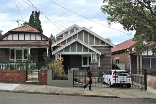
Located in Melbourne’s affluent, inner-city suburb of South Yarra, this salon was refurbished recently with interior designer Angela Neylon, of Joanne Green Landscape & Interior, at the helm. While the building had housed a salon for a very long time, the existing space was dated and dark when Peter Dunn of Frankie Salon engaged Angela to transform the space.
The second Frankie Salon to be designed by Angela (the first is located in Richmond), she wanted the South Yarra iteration to have a subtle connection to the original. “I carried across materials such as leather, brass and timber to the South Yarra design to establish a sense of consistency. I also looked to incorporate something a little more opulent,” says Angela Neylon who specified Articolo Fizi pendant lights and handmade Moroccan Zellige tiles to create a luxe feel.
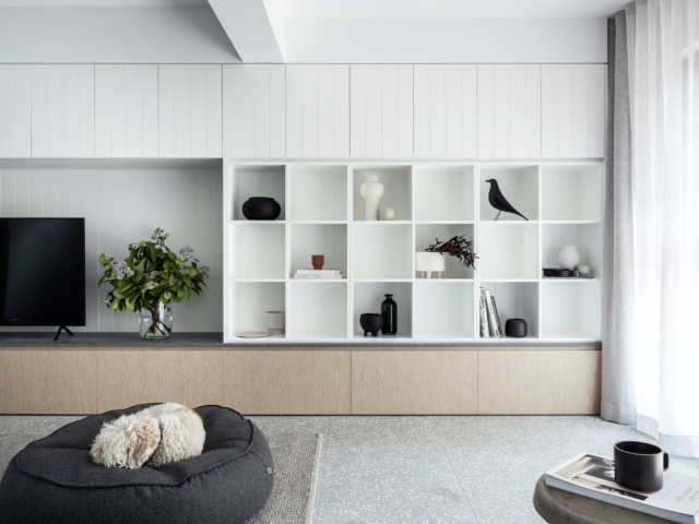
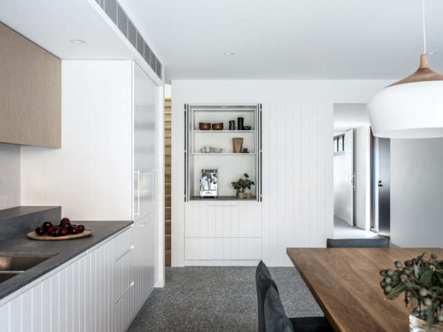
Curves were used to highlight important elements throughout the salon from the product display to the station mirrors and the doorway through to the basin room.
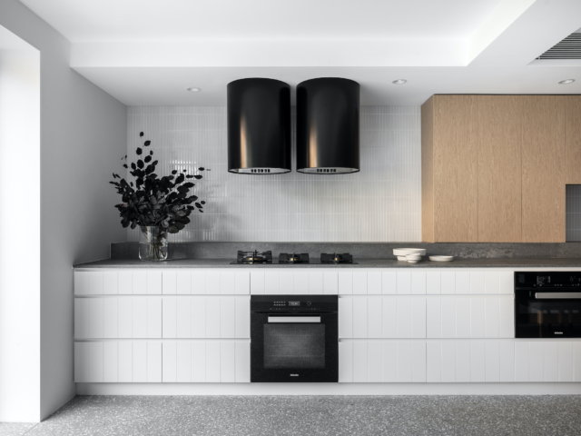
Taking centre stage inside the fresh, modern front of the space is a custom island bench that greets customers upon entry – it’s topped with Caesarstone’s ‘Fresh Concrete’ and wrapped in the aforementioned glossy Zellige tiles. This bench doubles as a colour station and reception counter creating a space where clients can interact. The Articolo Fizi pendants hang above while backlit arch mirrors sit behind with tan leather chairs at each station.
With so many hard surfaces, arched mirrors really soften the space
While the overall feeling is light and bright up front, this contrasts with the haven-like feel of the adjacent basin room. “I wanted to give the basin room a separate aesthetic to really distinguish that moment of leaving the busy salon and walking into a space of serenity; layers of dark green textures were used to create a moody and relaxing interior,” says Angela.
The cosy basin room
The front of the building had a complete overhaul too as it was desperately lacking in street appeal. Black aluminium framed windows and double doors as well as a new canvas awning in navy work to frame the building and create a boutique feel. “It’s located in an unassuming street in South Yarra, so it was important that passers-by immediately understood what the space was.”
Art Deco Melbourne home renovation a colourful blend of old and new
“I’m a maximalist at heart and colour makes me smile,” says Erin Katsavos whose Art Deco Melbourne home renovation caught our eye recently, in large part due to its beautiful…
Award-winning photographer Yasmin Mund has released Concrete Jungle, a retrospective of one of Sydney’s ugliest buildings, Glenview Court. She has explored and documented life in the iconic Tamarama apartment block where she herself resided for three years prior to its closure for a multimillion dollar redevelopment.
Glenview Court, Tamarama, was known for its stunning views from inside, and ugly facade
A building often loathed from the outside but adored from within, anyone who hadn’t lived in the building perhaps couldn’t understand its appeal. Outside was one of Sydney’s most beautiful beaches, and inside was a diverse and convivial community of retirees, backpackers, creatives, and even squatters. The juxtaposition of living in such a derelict building in one of Sydney’s most glamorous and expensive suburbs provided a truly unique experience.
That view
A brutalist white concrete block perched on a clifftop overlooking Tamarama Beach, it has been nicknamed The Beast, the Tamarama Toaster, the Soviet Hospital, and the Housing Commission. Originally designed by Australia’s most celebrated architect, Harry Seidler, it was modified and corners were cut by the notorious Rene Rivkin’s developer father, Walter Rivkin. Over ensuing years, the 78 apartments rapidly descended into dilapidation and disrepair. It hit major trouble 10 years ago when it was served with numerous fire orders and was discovered to be riddled with concrete cancer.
Photographer Yasmin Mund
As a documentary photographer residing in the building, Yasmin knew she had to try and capture what it was like to live there. “I was able to approach the project with a more intimate and integrated ‘this is my home too’ attitude, embracing a genuine curiosity and empathy for how my neighbours were living, and why they had also chosen this place as their home.”
Her photographic study looks across 15 apartments and their residents, bringing to light what living in Glenview Court was like for the first and last time. Subjects include Archibald Prize-winning artist Craig Ruddy, TV Director Adam Kiers, Karen Halabi, a freelance journalist and editor, as well as many other creatives.
Craig Ruddy & Roberto
“With all the new development in the world, especially in cities like Sydney, there seems to be at times a lack of reflection on the history of old buildings before they are leveled or redeveloped,” Yasmin continues. “I wanted to document not just this building, but the people who bring the building to life.”
The now newly renamed Sky Tamarama is also making history as the largest redevelopment project on Sydney’s eastern seaboard. The way the development was maneuvered through the application process and funded is innovative and pioneering. It saw the body corporate taking out Australia’s biggest strata loan – originally $9 million – to fund the upgrade. Its unique model has since been replicated by other strata developments and has created a template for hundreds of similarly decrepit apartment blocks around the city.
“This story of gentrification is universal,” says Yasmin. “This project is a time stamp of the past, which captures the residents before the upgrade, and before the building becomes shiny and new again. This is why the project is so valuable and universal, because our homes, or lack thereof, represent a huge part of our human existence.”
There’s an exhibition, with a limited number of prints available to buy, at Tamarama Surf Life Saving Club until this Sunday 18 April 2021. For more information.
Love of beach cottages inspires beautiful book
Former real living magazine editor Deborah Bibby shares seven beach houses in her new book, The Originals. And it’s one of the most gorgeous books (full of very real and…
Dated and dark apartment opened up and given luxe new life
Whoever gets to live in this stylish apartment on Sydney’s Lower North Shore is one lucky renter! The investment property was recently taken from dark and dated to light and…
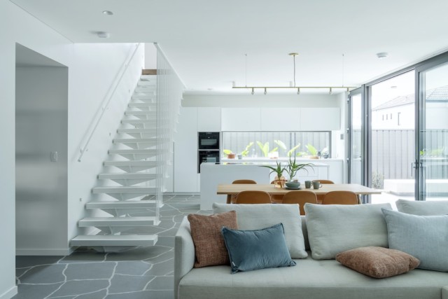
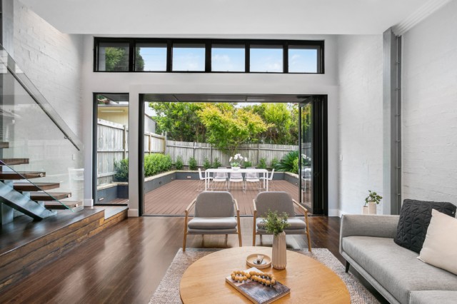
While mid-century design influences are evident, this very special Sydney home pays homage to Japanese design and the very specific concept of Shakkei, which centres around the idea of framed views. “The windows create a poetic connection to the rear,” says the home’s architect Ryan Ng of CplusC Architectural Workshop.
Home to a family of five, the house features a repeated circular motif that provides glimpses of the elements beyond. Where most houses looking to create a connection with the outdoors use large sliding glass doors, this house uses feature windows instead. “The circular windows were very intentional and they were designed to create a series of visual surprises,” says Ryan.
BackyardLounge room. Timber beams run from inside out to create a connection with the outdoors.
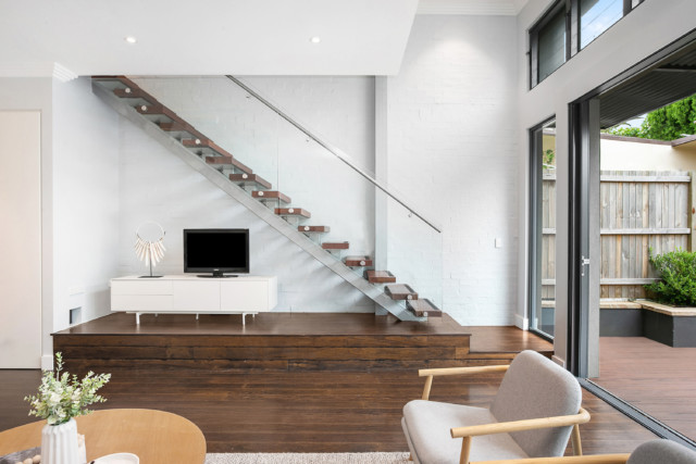
The home’s multi-level design is a response to the sloping nature of the block. Originally a federation home, the front of the house has been renovated with a new extension to the rear that features a kitchen, dining and living area that flows through to the outdoors.
“The old kitchen really needed overhauling as it was too small and too dark,” says Ryan. The new kitchen features a curved island bench clad in vertical timber strips with Spotted Gum timber on the floor. The dining area boasts a large round burnished concrete element that works to anchor the space.
Kitchen and dining. A large round burnished concrete element repeats the circular motif.
“This is also one of the key elements of the concept. Instead of creating a very separate three spaces (kitchen, dining, living) we wanted a more wholistic approach,” says Ryan. Slate tiles flow from the living room to the sun deck and outdoor dining area.
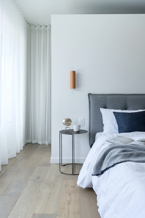
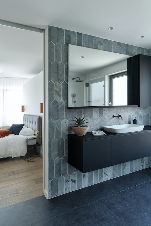
The master bedroom was expanded with the addition of an ensuite. A highlight of the home, the master features an openable round window that is surrounded by greenery on the exterior.
Master bedroom. The window frame acts as seating for young children.
The master bedroom features a gorgeous green wall on the exterior.
“We were looking for a cost-effective way to cover the existing brickwork,” says Ryan of the metal grating that clads the exterior of the master bedroom. Eventually, over time, it will become a very dense green wall with a round opening. “Almost like if you search for Totoro’s lair which was a green wall with a hole,” says Ryan, referencing another of the home’s influences – the cult Japanese animated fantasy film My Neighbour Totoro.
“The family that live in the home have a very close-knit relationship which is like the closeness that we see in the Totoro story,” says Ryan who adds that fairly lights give the outdoor space a very dreamy feel at night.
Latest home design trends: Japandi, neon lights & shelfies will be hot in 2021
With more than 400 million people around the world using Pinterest each month, it’s a great place to spot a trend. So when the platform’s annual ‘Pinterest Predicts’ report landed…
After working in oncology for 15 years, Yolanda Aarons decided to scratch the renovation itch via a home in Melbourne’s Northcote that was in dire need of an overhaul. After considering demolition, Yolanda decided to peel back the ugly 1980s era layers and found a gem of an original 1920’s Edwardian home underneath, along with photos and original period features that had been hidden for decades.
BEFORE front elevationAFTER front elevation. It’s hard to believe all this beauty was concealed for so long!
“One by one the old wire cut mission brown bricks were removed, to reveal the original rough cast render which has since been restored based upon historical photos obtained through council and state library archives, ancestry and the local photographer David Wadelton,” says Yolanda.
BEFORE master bedroomAFTER Dulux Sicily Sea features in the master bedroom.AFTER ensuite
Sitting on a generous 650 square metre parcel of land, with a north-facing rear and city skyline views, the home clearly had potential. “Unfortunately, the house had fallen into a state of disrepair after decades of neglect and thus was earmarked for demolition. However, once we began the strip out, we unearthed details that had been hidden for years, including photos, original period features and the original façade,” says Yolanda, a member of The BuildHer Collective.
At that point, the demolition plans were put on hold, Yolanda consulted the architect Michael Bellemo, and the decision was made to undertake a full restoration with his assistance and local builder, The Building Chapter.
BEFORE bedroomAFTER bedroom
“The brief was to create a family home, with a hint of drama,” says Yolanda. This was relatively easy to achieve at the front of the home, where the original ceilings were 3.3 metres high and this part of the home now houses the master bedroom (complete with original ornamental fireplace), adjoining ensuite and walk-in robe.
There are two other bedrooms in the original part of the house as well as a main bathroom. “All the bedrooms are painted in sage greens and earthy whites which make the space feel calm and authentic. They’re made to look very different to most homes that aren’t brave enough to explore colour,” says Yolanda who used the organic green tone Dulux Sicily Sea, to great effect.
BEFORE bathroom
AFTER bathroom
The sense of drama continues at the rear of the home where the new extension sports a raked ceiling that reaches nine metres in height above the dining table. The nearby kitchen is one of the standout spaces courtesy of its curved marble island bench, with brass shadow line detail. That gorgeous element is echoed throughout the custom joinery and nearby hallway architrave.
AFTER Kitchen, lounge and diningAFTER The stunning new kitchen
Another unique feature, the staircase appears to ‘float’ in mid-air. “I love it because not only does the fluted glass balustrade allow light to penetrate into the middle of the house from the large window above, but the folded white steel makes it look more like a sculpture than a staircase,” says Yolanda.
The new sculptural staircase
The second floor was designed as a self-contained suite, with a study area, bathroom, second living area and bedroom that captures the city skyline. “There’s a mezzanine style opening that overlooks a large void to the dining area below and has spectacular views to the landscaped garden, pool and park to the rear of the property,” says Yolanda.
UPSTAIRS lounge
Triangular in shape, the bespoke pool was the biggest splurge of the renovation. “We intentionally limited the size as we didn’t want it to overwhelm the outdoor space but mirrored the triangular shape of the house to give it an extra special design element,” says Yolanda.
AFTER backyard
Yolanda is proud that she took the road less travelled, and decided to restore the property, instead of undertaking a standard knockdown and rebuild. “I often think to myself what would have happened to this house, if I wasn’t in charge of its future. Would it have been knocked down to be replaced by a subdivision? Would it have remained as an eyesore in its less than ideal mission brown state for years to come?”
Art Deco renovation the perfect blend of old and new for family living
When a builder builds their dream home, it’s always interesting to take a peek inside. Nestled within trees in a picturesque part of Wollongong, this home was originally built in…
With the Scandi trend having endured for so long, it’s fair to say that we’ve been in the grip of light timbers for some time now. Which is why it was so nice to come across this Brisbane renovation and its dark, chocolatey timber accents. Rather than simply painting over the home’s original dark timber (as so many heritage renovations do), architect Allison Smith, of Studio 15B, made a feature of it.
Front elevation
“The existing house had original dark stained timber windows, doors and trims and we were drawn to these aspects,” says Allison Smith of the 100-year-old Queenslander that is at the centre of the home’s recent renovation. Not only do dark timber stairs help connect the old and new areas of the home but dark joinery elements were included throughout to create a cohesive whole.
Master bedroom
Bathroom
Most notably, a dark stained timber tongue and groove clad feature wall runs from the home’s entry and wraps around into the dining area; it’s a stylish reference to the home’s original VJ panelling. “These dark touches helped to tie the interiors together while blending original and new elements,” says Allison.
Dining
Located in New Farm, the overhaul of this home wasn’t exactly straightforward; the original home was raised and renovated, before a brand new level was built underneath. The new parts of the home are on the lower level, and there’s new small extensions to the side and rear.
“It sounds difficult and it’s not without its challengers, however it’s very common with old timber Queenslander homes so it’s a well oiled operation. It’s a great way to significantly increase the area of a home without increasing the footprint and taking up too much of the site,” says Allison.
Kitchen
Located on a sloping site, the ground floor sees visitors step down into the rear of the home with high ceilings an added bonus of the new design. “The slope created high ceilings in the kitchen, living and dining areas. A 4.2 metre ceiling height was achieved in the living room which allowed for a striking wall of glass that overlooks the landscaped rear and pool.”
The lounge room looks out onto the backyard
As for the home’s owners, they had lived in the original abode for many years and while outgrowing it, didn’t want to move. “They loved living in the street and saw the value in a complete renovation that would service their needs and growing family for the long term,” says Allison who was tasked with designing a flexible family home with separate zones for the home office, entertaining, guests and family needs.
Backyard
“One of the main goals was to design the home in a way that did not create the feeling of two separate houses – old and new. The new areas needed to blend with the old, retained fabric in a contemporary way,” says Allison of the home that had last been renovated in the 1970s.
Upstairs original hallway
The new downstairs entry and hallway
“We are proud of the way we have achieved the many brief requirements on a small lot, while still paying homage to the original home. The result is a home the clients will utilise well into the coming years.”
This renovated Queenslander is giving us all the feels
You know you’re looking at something special when a property has its own name. ‘Pen Y Llechwedd’ is a stately 104-year-old Queenslander, located in Ipswich, that was renovated recently resulting…
With its rough sawn hardwood beams, plywood ceilings and exposed brickwork it’s difficult to believe that this stunning home is a new build. Located on a working cattle station in the Byron Bay hinterland, with a two-pavilion design inspired by Australian wool sheds, the home was originally conceived via a collaboration between the architect Angus Munro, of Marc and Co, and the property’s owner, Tim Mundy.
The rugged, masculine interiors were designed by the talented team at The Designory and today, we’re lucky enough to step inside and take a look.
Not your typical homestead!
Nestled on 40 sprawling acres in the lush hinterland hillside, just 10-minutes from the centre of Byron Bay, Walker Farm feels opulent but very modern given its understated materials palette of timber, leather and stone. The landscape is arguably the most prominent feature of the property, and thus framing framing the views and capturing the light were paramount to the home’s design.
Lounge room
As mentioned, the home is comprised of two pavilions, yet both serve very clear purposes. One side houses the generously proportioned living, dining and kitchen spaces while the other contains a series of gorgeous bedrooms and bathrooms.
Open plan kitchen, living and dining
In the central living area, a dramatic cathedral ceiling competes for attention with a basalt stone-clad combustion fireplace; the result is pretty dramatic. The adjacent kitchen features high-end appliances alongside stone and timber bench tops and exposed timber integrated shelving gives the kitchen joinery a lived-in, decorative feel with plenty of room for personal touches.
Kitchen
The bedroom pavilion houses a rumpus room and a stylish kids’ room with built-in bunk; the space saving custom solution has become something of a Designory signature. There’s a further two children’s bedrooms and guest rooms in this wing along with a master suite too.
Kids’ room. That blue paint is absolutely stunning.
The large master suite is another highlight of the home. One end of the room features a huge leather clad wall that serves to ground the space, while injecting more of that glorious earthy texture. The nearby ensuite is clad in green andesite and while private, it enjoys views of the surrounding pine forest and farm below.
The master bedroom features a large leather-clad wall
Ensuite
All of the bedrooms have been designed with the natural landscape in mind with layers of natural texture and nature images featuring prominently. The resulting spaces all feel distinct yet connected to one another, thanks to the organic materials palette that was inspired by the surrounding environment.
Bedroom
Bedroom
The outdoors features a communal firepit area and a stunning mineral enriched pool by Theralux. Substantial decks and integrated bench seats allow the beautifully bucolic view to take centre stage.
Jason Grant & west elm update The Atlantic Byron Bay
The stylish Byron Bay boutique hotel The Atlantic got the west elm via Jason Grant treatment recently when its communal spaces, and one of its best-loved rooms, was beautifully refreshed –…
Green scheme: holiday home a lesson in luxe
The talented team from The Designory are back and this time they’ve created the ultimate holiday home; in Byron Bay no less! Inspired by the raw Aussie coastline, the five-bedroom, five-bathroom…
Family farmhouse in WA transformed into Hamptons estate
In Toodyay, WA, a small 1860’s farmhouse has been transformed into an Australian Hamptons mansion sprawling over 1,000sqm. Now known as ‘The Farm Estate’ the property, which has been in…
When a builder builds their dream home, it’s always interesting to take a peek inside. Nestled within trees in a picturesque part of Wollongong, this home was originally built in 1956 but was recently renovated and extended by its owners Dane and Zoe Cartwright of the Illawarra construction group, Projection Build. Drawing on the home’s original Art Deco curves, Sherson Architecture is responsible for the redesign while Lee Talbot of Maven Home worked on the understated yet luxurious interiors.
Lounge room
Bathroom
“We wanted to celebrate the curved brick façade and curved balcony that were features of the existing Art Deco home,” says Zoe Cartwright of the five bedroom, five bathroom home that she shares with her husband and three young boys.
Soft, curved archways and internal windows abound – all designed to allow natural light to flow throughout. Art Deco inspired curvature features in other ways too – there’s plenty of rounded corners including the custom Vigo Lena marble kitchen island bench and the nearby handmade timber dining table.
Kitchen
Dining room
The lounge room is another tranquil space that features a custom designed pink lounge with fluted detailing. “Our interior designer Lee designed it and we worked with Heartwood and Upholstery Stitches to bring it to life,” says Zoe. A Sarah Ellison coffee table, two mustard Jardan occasional chairs and a Bam Bam rug complete the room.
Lounge room
Bar: Keen entertainers, the custom bar area gets plenty of use
Nearby in the library, fluted Carrara marble was used to restore the original fireplace turning it into an eye-catching statement piece. “A focal point of the space, the Vigo Lena marble curved floor slab and mantelpiece by Artedomus is highlighted by the natural light in the space,” says Zoe.
Library: The stunning fireplace was revamped with fluted marble
When it comes to the colour and materials palette, Zoe was inspired by boutique hotel and resort looks – particularly Brisbane’s Calile Hotel and Rae’s on Wategos in Byron Bay. “Our family loves Byron Bay for its coastal vibes and Rae’s became a big inspiration for the organic tones, white curves and natural looking arches,” says Zoe.
The master bedroom features stunning custom curved wardrobes
Ensuite
The home’s mostly muted colour palette features pops of dusty pink, eucalyptus and sea foam green, most notably in the wet areas. Sourced locally from Wollongong suppliers Inigo Jones & Co. and Vulcano Design, ‘Moroccan Bejmat’ hand crafted tiles are paired with honed terrazzo on the floors.
Bathroom
“It’s my dream home. We always have visitors and we love entertaining. There are so many areas to discover and relax in – it feels like our own secluded resort. The master retreat feels like a hotel room or day spa. Overlooking Wollongong, the views are spectacular, especially at night with all of the lights. It’s heaven!”
Art Deco style: Our top furniture & homeware picks
With the latest season of The Block having just kicked off, and its focus being squarely on period design, suddenly everyone is talking heritage details again. One of our favourite…
The popularity of the modern white kitchen (with wood accents) remains if the popularity of this design (by Blakes of Sydney) is anything to go by.
The world’s leading platform for home renovation and design, Houzz is a great place to peruse the work of the globe’s leading kitchen and bathroom renovators, architects, interior and landscape designers. Which is why the annual Best of Houzz awards offering interesting insights into what is trending and making the average homeowner tick.
With awards across three categories, the Best Of Houzz 2021 recognises design, customer service and photography. The design category honours professionals whose work was the most popular among the Houzz community while customer service honours are based on several factors, including a professional’s overall rating on Houzz and client reviews for projects completed in 2020. Photography badges are awarded to architecture and interior design photographers whose images were the most popular.
Awards highlight: An indoors-outdoors hallway, featuring glass sliding doors, by Justin Loe Architects.
It’s not hard to see why this infinity pool, by Justin Long Design, was one of the most popular designs on the site. Photo by Erin Sierins.
“The Best Of Houzz awards are an emblem of trust and credibility for home professionals across Australia and around the world, and we are excited to celebrate this year’s winners,” says Tony Been, Managing Director ANZ at Houzz of the award that recognises just three per cent of the more than 2.5 million active home professionals and interior/architectural photographers on the platform.
Awards highlight: A spa-like bathroom featuring oversized chevron tiles by MMAD Architecture. Photo by Jack Lovel.
Awards highlight: This modern white kitchen (with timber accents) was created by Blakes of Sydney and is one of the most popular designs on the site
“The COVID-19 pandemic has highlighted our critical need as homeowners to feel comfortable before inviting pros into and around our homes, and the Best Of Houzz badge is a powerful way to communicate the trust that homeowners have in a pro’s business. It’s just one of many tools on the Houzz platform that help pros convey their unique expertise, and help homeowners find the right professionals for their projects,” says Tony.
This bright and airy living space by Kube Constructions proved popular. Photo by Dylan James.
Awards highlight: An inviting garden with fire pit, by Bayon Gardens. Photo by Tim Turner.
A “Best Of Houzz 2020” badge, specifying category won, appears on winners’ profiles to help homeowners identify popular and top-rated home professionals on Houzz locally and around the world. ‘Houzz Pro’ members can also add the ‘Best of Houzz’ standout tag to their profile, which will appear in their directory listing and convey credibility. Winners have been announced globally.
Awards highlight: A monochrome contemporary home exterior by Big House Little HouseThe coastal trend remains solid if the popularity of this living space by Jodie Cooper Design is any indication. Photo by DMax Photography.
Growth in kitchen reno spend according to Houzz survey
With the kitchen increasingly the hub of the home, it isn’t surprising to hear that Aussies’ spend on kitchen renovations grew by 16 per cent in the past year (to…
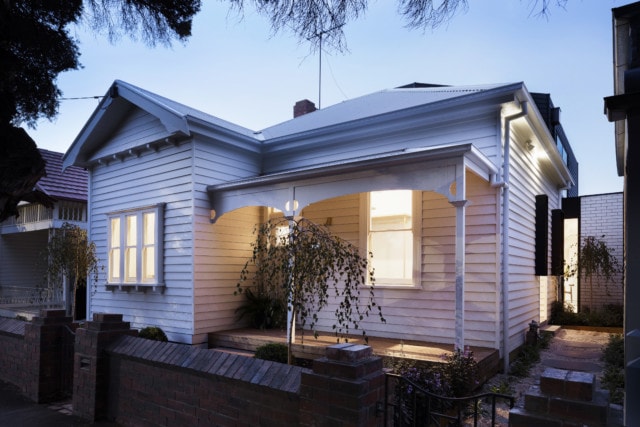
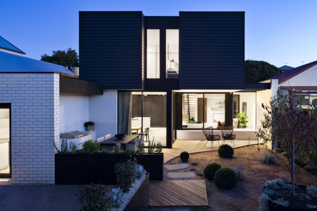
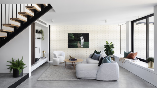
When architect Nathanael Preston was tasked with transforming this Melbourne heritage home for a developer, not only was it severely dilapidated and virtually unliveable, but heritage constraints made things rather tricky.
The heritage listed front of the home
“The main challenge of this project was trying to achieve our client brief in terms of designing a large house on a medium size block with a heritage overlay,” says Nathanael who restored the front of the home to its former glory before adding a stylish extension at the rear.
The rear extension viewed from the backyardLiving room
The client brief called for a four-bedroom house with two living areas as well as off-street parking via a rear lane – being a developer the client was trying to maximise the amount of liveable space.
Powder room
“Four-bedroom houses are not that common in Brunswick and they’re quite sought after by young families so this was received very well by the market,” says Nathanael of the stylish home that has since been sold.
Master bedroom
Lovely original details can be seen in the master bedroom walk-in robe
The front two rooms of the original home were converted into a master bedroom suite while the original entry was retained from a streetscape point of view. The home now houses the parents at the front, the living spaces at the back and the children’s bedrooms upstairs.
The family bathroom features a Signorino terrazzo tile on the floor and Artedomus Inax mosaic wall tiles
Matching custom terrazzo knobs are a nice touch
“Given the new extension was built boundary to boundary, a large void was inserted to allow eastern light deep into the plan above the kitchen space as well as connecting the upper-level kids’ living room with downstairs,” says Nathanael.
Kitchen: A large void lets light in
The kitchen bench top is a terrazzo slab from Signorino
As for any significant challenges, council heritage constraints proved the most problematic. “Council heritage consultants were very strict, and we had to really convince them about the bulk of the second storey’s visibility from the street,” says Nathanel.
Dark weatherboards were an obvious choice for the upper-level as they complement the front of the home.
Interestingly, the rear extension’s dark paint colour wasn’t a deterrent. “The dark colour and contrast to the existing house really helped in defining old and new which they looked upon favourably.”
“I love contemporary design overlaid on a historical backdrop,” says retail designer David Cook-Doulton who, together with his partner Martin Shew, is responsible for the gorgeous overhaul of this grand…
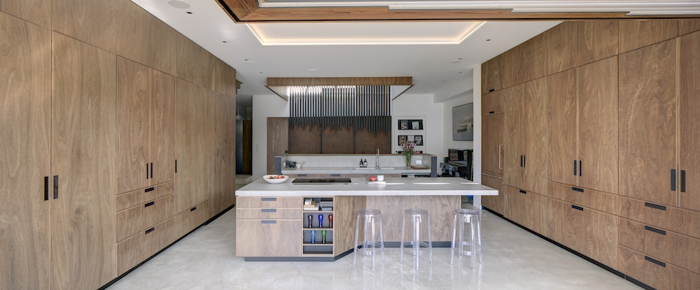
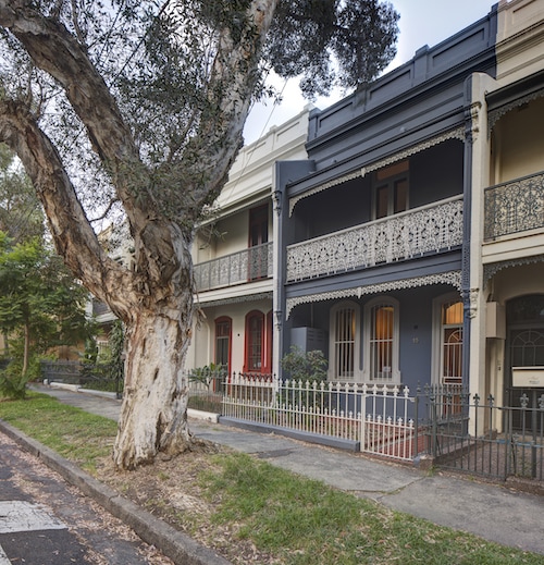
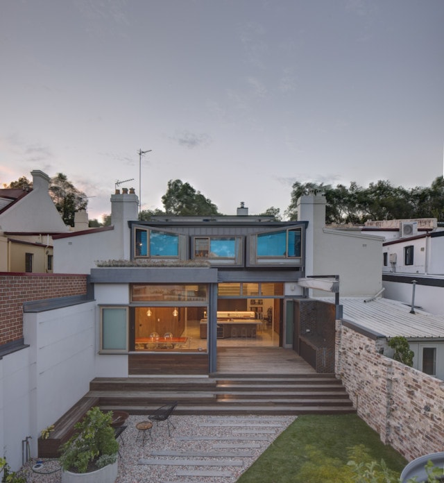
Just like retro design staples velvet, classical archways and terracotta have been subject to modern updates over the past few years, the heavily wooded interior appears to be back on the interiors scene – with a decidely modern spin. Today’s house tour, located in Sydney’s inner-city Redfern, was designed by the talented team at Marra + Yeh architects who have produced a striking, modern take on the ‘Paddington terrace.’
Lounge room
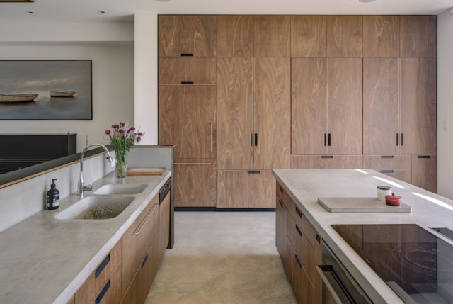
Kitchen
Home to a family of five, the project saw two adjoining terraces combined to create one large contemporary, flexible family home where timber is centre stage. Built as a ‘forever home,’ the design was developed to suit an ever-evolving and ageing family over the next 20 years.
“The clients, a family of five, had lived in one of these terraces for nearly a decade and had strong attachment to the local community. However, with limited scope for expansion they found the house unable to accommodate their needs as the family grew. Fortuitously, an adjoining terrace came on the market for the first time in 36 years, setting off a process of rebuilding and consolidation,” says Carol Merra, Director of Marra + Yeh Architects.
The unassuming terrace front belies the beauty and originality inside
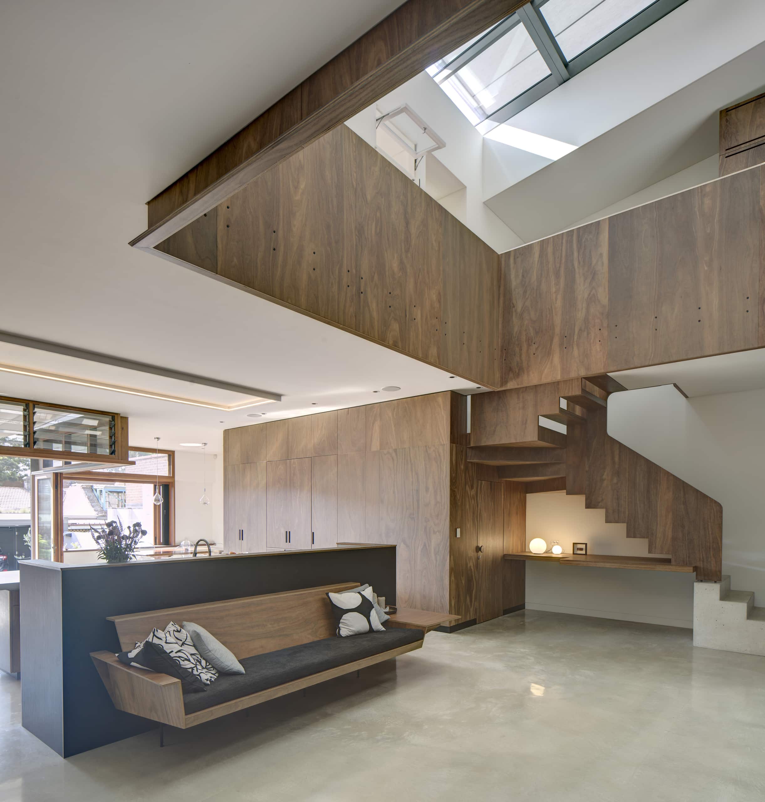
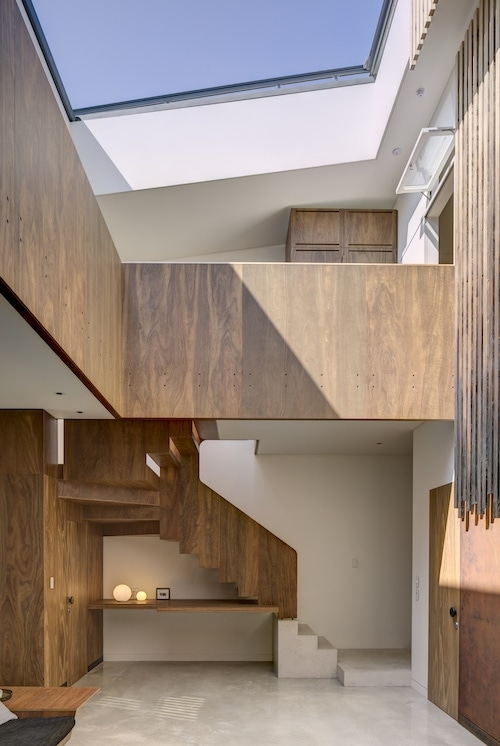
Far from the dark and claustrophobic spaces that one often associates with terrace houses, the rear extension has a unique atrium feature in the centre of the building. A pane of retractable glass ensures fresh air and light can always be welcomed in.
“The way the house is calibrated to climate and environment is not normally found in terrace houses. This is showcased through the internal atrium and sky window, which opens the heart of the house to the outdoors and connects occupants to nature on a daily basis,” says Carol.
The home’s timber staircase and sky window make quite a statement
“The house is part of an ongoing search to create climate-responsive buildings that address living in the age of climate change. The operable sky-window is the primary climate-adaptability element, a double glazed, argon-filled assembly complemented by an external sunshade resulting in multiple open/close combinations, enabling the occupants to modify the building in a dynamic response to prevailing conditions,” says Carol.
Spotted Gum plywood features in the kitchen and throughout the home
With sustainability a top priority for the home’s owners, Big River Group’s locally sourced, sustainable Spotted Gum plywood proved a natural fit. “The family took great care in all materials being used for the creation of their dream home and this is why the use of Big River products was crucial in the process,” says Carol.
Backyard
An ambitious project, Carol is very satisfied with the overall result. “I am proud of achieving both the aesthetic and sustainability ambitions of the brief within the constraints of an existing building in a heritage context.”
When Hydrowood co-founder Andrew Morgan first flew over Tasmania’s Pieman Lake in 2012, little did he know about the treasures that lay beneath. “Everybody knew there were trees in Lake…
Wattyl has recently launched its Villa Carmelina colour palette – the result of a collaboration with architect Scott Weston that has spanned more than two years.
Villa Carmelina, a grand 1889 Victorian Italianate terrace, was bought by Scott in 2016. It was in a dilapidated state but, for Scott, it represented the opportunity to fulfil a long-held desire to invest his 25 years of architectural practice in his own home.
The main two-storey terrace was restored to its former grandeur, with a few minor adjustments to the interior to accentuate the building’s high ceilings and maximise the natural light. The result is a unique fusion of contemporary design and original Victorian architecture.
To the rear is a modernist two-storey addition in glass and steel containing expansive kitchen and living room plus bedrooms and bathing areas.
Wattyl’s new range takes inspiration from the remnants of Villa Carmelina’s original 1950s colour scheme – rose pink, acanthus green, lemon chiffon, studio mauve, and earl grey.
These colours appear in various guises throughout the home – some have been custom-matched by Wattyl and others taken directly from the Wattyl fandeck.
The architect
Scott Weston is regarded as one of Australia’s most inspiring architects, with a passion for colour, pattern, texture, art, light, functionality and beautifully crafted, artisanal materials and finishes.
In his meticulous reincarnation of Villa Carmelina, Scott has expressed a long-held philosophy of tailoring spaces to embrace and celebrate the interests and passions of the occupants – he has paid homage to the generations who lived in Villa Carmelina before him while creating a unique and deeply personal living space for he and his partner.
Entry hall
Serving as an introduction to the Villa Carmelina colour palette, this is the harmonious meeting point of eight of the project’s custom colours.
Lady Gray is seen on the timber dado while the wall above features the velvet grey-lilac of Studio Mauve. The Victorian ceiling is washed in the sorbet lemon hue of Lemon Chiffon, bordered with Ivory Grey piping in order to highlight the decorative cornice and ceiling rose.
Living room
This elegant room, flooded with indirect light from the over-sized doors either side of the fireplace, has as its focus the contemporary glitter artwork by Reuben Paterson.
The walls and decorative plaster moulds above the fireplace are washed in the understated, faded pink of Miss Havisham Rose. Timberwork, in the ivory tone of Marcasite, highlights the original architectural details, while the lathe and plaster ceiling provides a plane of light grey, using Ivory Grey.
Dining room
Referencing a 1950s Hong Kong tea house, the dining room walls are finished in a soft Matcha Tea shade that was custom-matched to the beautifully textural hemp wallpaper used on the feature doors of the joinery unit.
Having no direct light, the dining room ceiling was highlighted in Modernist, a darker grey. The antique Chinese moongate (seen above, pictured with Scott) is unquestionably the focal point of this room, framing views and showcasing a collection of beautiful treasures.
Kitchen
The living heart of Villa Carmelina, the kitchen is strategically placed within the expansive living room and features a black and white terrazzo floor and timber hemlock walls.
Two horizontal bands of custom architectural joinery have been hand-rolled in the saturated, deep blue of Curious Planet.
Studio
A grand room that looks out onto the main staircase whose walls are washed in the beautiful grey lilac of Studio Mauve – a hue that changes colour throughout the day, thanks to the northern glass roof.
The studio walls are finished in the sophisticated soft grey of Marcasite with a horizontal line of Jazz Age Coral applied to the perimeter above the tall doors, enveloping the cornice and ceiling in one dramatic gesture. The ornate Ivory Grey ceiling rose is crowned by a George Nelson 1950s pendant light.
Guest room
Highlighting a display of rare and beautiful objects, the grey-blue tones of the guest bedroom’s Celadon Blue walls provide a quiet background to the ensuite’s dramatic floral cascade in miniature glass mosaic tiles.
Scott chose Wattyl I.D Advanced Ultra Low VOC interior paint for Villa Carmelina, citing the fact that it far exceeds green-building requirements (with less than 1g of VOCs per litre) and can be custom-matched to any colour, as the reasoning behind his choice.
Wattyl I.D Advanced is available in water-based matt, low sheen and satin finishes, plus Ceiling White.
This year, the way in which the home functions has fundamentally altered, as it has played a more meaningful role than ever in our daily lives. Wattyl have reflected this…
Stylist Jason Grant creates new paint colours for Murobond
Now with 70 paint colours to his name as part of his collaboration with Murobond, creating new hues is as exciting a process as ever for Byron-based stylist Jason Grant.…
Inspired by Desert Modernism, an architectural style that originated in Palm Springs in the 1950s, this Perth home pairs retro inspiration with modern sustainable design principles to create a gorgeous abode that also happens to be a certified Passive House.
The house is located in the Perth beachside suburb of Scarborough
Originating in Germany, the Passivehaus international standard relates to the relationship between how comfortable a home is (specifically in terms of temperature and air quality), and the amount of energy needed to provide that comfort.
Living room
“Though Perth has a fairly temperate climate, we still get really cold nights and really hot days and most people just run air conditioners or gas heaters to get them through,” says Perth architect Ben Caine, of Leanhaus who explains that this approach is not only terrible for the environment, but it’s not great for our wellbeing either.
“There are health issues when you block up your house and crank up the heater – it’s thought that this approach is contributing to rising rates of asthma and respiratory issues.” Ben was drawn to passive house principles for their positive environmental and health impacts.
Master bedroom
Ensuite
Central to the home’s passive design is insulation, airtight construction, high-performance windows and a simple 80-watt ventilation unit that costs approximately $140 per year to run. Wow.
“Designed to act like a thermos, fresh filtered air is provided continuously to provide an optimum level of comfort without the need for additional heating or cooling and results in energy savings of around 90 per cent compared with standard homes,” says Ben.
Lounge room
Incredibly, this home doesn’t require any additional cooling or heating which is remarkable when you consider that Perth temperatures range from 2 to 40 degrees celsius, depending on the season.
Dining and staircase
Powder room
“The temperatures are consistently perfect and fresh, filtered air fills the house. Our electricity bills are now trivial. My house is proof that the science behind a passive house is spot on. I don’t know why anyone would be happy to live in anything less,” says owner Jason Edmiston.
Pool: Minimalist desert-inspired landscaping, including cactus and succulents, complement the simple Modernist form of the home
With the environment and energy use top of mind for many Australians, we’ve seen many sustainable design and building practices emerge; the latest of which is the ‘passive house.’ Originating…
The rear extension includes a statement circular skylight within the exterior awning
While a fail-safe option, neutral beachy interiors can run into bland territory, but that is certainly not the case with this seaside Sydney residence. Layers of texture including terrazzo, marble and dark timbers combine with light filled spaces to make this renovation a much more sophisticated take on coastal cliches.
The rear extension includes a statement circular skylight within the exterior awning
“We wanted to create beachside elegance, so we combined sandy terrazzo colours with the formality of a dark veneer. For example, the marble bench top and splash back in the kitchen is quite formal but the terrazzo floor tile makes it feel more casual,” says interior architect Emily Hollier of the home’s tactile materials palette.
Dark elements bring sophistication to the otherwise white spaces
Circle motifs run throughout the home, inspired by the original 1920’s home’s decorative arches. “The front door handles are circular, and there’s circular shapes in the bathroom cabinetry and wall lights. This was taken from that language of the original arches,” says Emily.
Hallway
Located beside the ocean in Clovelly, the original semi-detached house was very rundown before Emily and her team commenced works on it. Key to the design brief was increasing the home’s height and volume to create space for the owners and their two small children. “We opened the house right up to create a much bigger feeling house,” says Emily.
Bathroom: Zuster vanities and a Gubi wall sconce elevate the space
Bathroom: That Marble Hub basin is something special
After the existing rear of the south-facing home was removed, a brand-new structure was built, designed to capture the light. “Bringing a maximum amount of light into the space was key so we utilised skylights and windows in different forms to do this,” says Emily.
The new rear extension has several highlight windows and four other skylights were included in the design too; one of which is outside. “The owners wanted an enclosed awning that allowed them to sit outside year-round, but they wanted light to penetrate through it,” says Emily of the unique design feature (first picture above).
Ellie Cashman wallpaper is stunning and unexpected in the powder room
The home’s spatial flow was also redesigned with Emily adjusting the levels in order to create a more fluid experience when moving from the interior living area to the backyard. “We lowered the living area so that it connected with the backyard as the owners wanted to be able to watch their children playing outside. Having that visibility was important,” says Emily who chose hardwearing and sturdy finishes with the children in mind.
Green timber panels star in celebrated coastal home
The inaugural Inside Out Brickworks Home of the Year awards took place last night with a stellar line-up of Aussie houses singled out for their design originality. And while it…
Do you love the area you live in, but you’ve outgrown the house? It’s a classic conundrum and it’s one that a young Sydney family had recently when deciding whether to move to a new house or stay put and renovate. But after doing the sums, and weighing up the various pros and cons, the couple went with the latter, a decision they believe was ultimately cheaper than moving.
Living room and backyard
“I’d say the main savings were all the usual costs involved in selling a home and purchasing another, such as stamp duty, agent’s fees and mortgage exit fees. We estimate the saving was north of $70,000,” says Luke Carter of Sandbox Studio, the architect responsible for the renovation of the home that is located in Marrickville, in Sydney’s inner-west.
Dining room
Master bedroom
With a young growing family, the couple wanted two extra bedrooms as well as improved connections between the house and rear courtyard. “The interior was dark and a series of ad-hoc additions over time had resulted in an awkward layout with the laundry marooned at the back of the house, and no clear connection between the living space and small rear garden,” says Luke.
The renovation opened up the house to the outdoors
The home’s original footprint already covered the block which meant the only way was ‘up’ in terms of an extension. “We managed to retain the existing kitchen, dining area, master bedroom, and front bedroom, while turning a two-and-a-half-bedroom home into a four-bedroom refreshed home,” says Luke.
Upstairs bedroom
Upstairs bathroom
And when it came to specific budget-conscious design decisions, Luke tried to retain as much as possible of the existing building fabric. “We basically built less!” says Luke. Existing floorboards were sanded and refinished, existing brick walls were exposed, and the internal exposed brickwork was painted.
Another contributing factor to the cost-saving was the fact that the owners project managed the build themselves rather than outsourcing to a project manager; a decision that potentially saved 25 percent on construction costs.
The second storey references the original home rather than simply being a typical ‘box on top’ addition
But as previously mentioned, the cost saving wasn’t the only decider in staying put. Aside from loving the home’s location, the couple also love its easy walking distance to transport, parks, schools, shops and cafes; all serious lifestyle factors to consider when weighing things up.
“Also, being a renovation, the owners could customize the home exactly to suit their lifestyle, as opposed to buying something that’s new or renovated by someone else.”
Renovation ideas: Chic Sydney terrace now light filled
Located in the inner-city Sydney suburb of Redfern, this terrace home was transformed recently under the talented eye of Rebecca Elms, of the fashion and homewares store Elms. The Surry…
Home to a professional couple, their three young children and two lively dogs, this North Bondi semi-detached home was originally built in the 1980’s. Purchased almost exclusively for its location, the home has since undergone a highly considered renovation courtesy of architect Josephine Hurley. “When the client bought the home, it was all about the location as they knew they could work with an architect to remodel it and make it perfect,” says Josephine.
The kitchen and dining flows out to the rear garden
Key considerations included expanding the home’s liveable footprint, and improving its natural light and ventilation while making the spaces elegant, robust and timeless. “They spend a lot of time at home with their young family and they ultimately wanted a home that felt calm and relaxed,” says Josephine.
Bathroom
Shower recess: “The curved wall in the bathroom was a way of introducing something special into what is quite a restrained space,” says Josephine.
Key to the feeling of tranquillity is the neutral and consistent materials palette; white ‘kitkat’ mosaics, soft grey Italian terrazzo tiles, oak and v-groove joinery all bring gorgeous textural and tactile qualities to the home. “The tiling is consistent throughout the house. The white ‘kitkat’ mosaics from Surface Gallery feature not only in the bathrooms but also in the laundry and kitchen.”
Living room
Creating more liveable space was another key part of the brief to which Josephine responded by enclosing both rear balconies. “I reimagined the interiors to utilise every available space in what is a compact floor plan,” says Josephine. In another clever redesign, the first-floor hallway was transformed into a walk-in robe for the owner who had always wanted one, but didn’t have the space.
Master bedroomChild’s bedroom
Child’s bedroom
The Qasair overhead extraction fans draw the eye in the kitchen; the matte black finish ties in with the black appliances. “The client enjoys cooking and was after a statement piece that also had great functionality,” says Josephine. And with so many family members, minimising clutter was essential; everything from wine to dog food has a designated storage space.
KitchenAppliances hide behind v-groove joinery in the kitchen
The kitchen and dining spaces are elevated, allowing for full visibility and a strong connection to the outdoors. Retractable glass doors and timber bleacher steps overlook the garden and let the children and dogs run free.
“It’s always hard to select a favourite part of a property, however the combined kitchen and dining room is particularly successful as there is plenty of storage and natural light. It is a clutter-free, bright and naturally ventilated space where the family enjoys gathering together to cook, enjoy a meal and entertain with family and friends.”
Designed by architect Madeleine Blanchfield and constructed by One Up Building, this Sydney renovation is one of the most beautiful projects we’ve come across. Monochromatic in scheme, it’s elevated by brass and timber accents while polished concrete and specialty plasters seamlessly blend the original Arts and Crafts era home with its new extension.
Lounge room
The fireplace is something else!
Located in Sydney’s beachside suburb of Coogee, the house is home to Brett and Libby Newman and their three teenage children, who were looking to create a home that was beautiful but functional too. “It has spaces and places we can come together as a family, and with large groups of friends, but we can also find our own space in the house as well,” says Brett.
The front of the home
Sitting room
The home is a seamless blend of old and new; its monochrome palette working to unite the spaces. “We realised we needed some form of expression between old and new, so we provided a colour application to the new concrete stairs and the entire wall and ceiling which created a portal-like effect,” says Rick Simmons, co-founder of One Up Building, of the home’s sumptuous Portuguese plaster detailing. Offset with a brass wall sconce, the finish really emphasises the light’s beauty.
The stunning Portuguese plaster
With five family members, each with varying needs, the home’s spatial flexibility is highly prized. Everything from the children’s study needs to parental work commitments and parties can be accommodated easily, making for a very liveable home.
“We wanted a place that was beautiful, well designed, comfortable to live in but not high maintenance, over engineered or over designed. We didn’t want something that we didn’t feel comfortable living in,” says Brett, touching on the home’s understated, easy luxury.
Pool
“Nothing looks forced or purposely added without consideration. It is a simple thing – walking through a space feeling like it has been considered and was always meant to be. That’s how I feel when I walk through this home,” adds Rick.
Creating an air of casual sophistication wasn’t always easy though; the home’s staircase design proved a significant challenge. Originally designed as a steel spine, the heritage section of the home couldn’t hold the weight so Rick and his team had to improvise. “To realise the architect’s design intent, we modified the structure to create the same effect. Anything can be done; you just have to approach working with heritage and renovations with an open mind,” says Rick.
Staircase
The design dedication certainly paid off with the family genuinely loving their home. “I’m proud of it, and we enjoy living in it immensely. This is a place I can see us living in for many years and enjoying as the kids go from teens to adulthood and then hopefully coming home!”
Paddington terrace renovation is a modern visual feast
The following is an extract from the new book, Hare + Klein Interior by Meryl Hare, published by Thames & Hudson and available in all good bookshops. Crisp detailing throughout…
A humble beachside restoration in the Gold Coast suburbs has been awarded the 2020 Australian House of the Year. Chosen by a panel of industry experts, Cantala Avenue House by ME is a modest home, rich in thought and consideration.
The house is significant in the way it evolves the idea of an antipodean coastal home. With strong considerations towards sustainability and affordability, it rejoices in the idea of simplicity with a design that mirrors the no-fuss nature of the Australian home.
Celebrating their 10th year, the Houses Awards have set a benchmark of excellence in Australian residential architecture. Seeking to uncover emerging talent and celebrate the industry’s leading designers, the Awards recognise the ability to challenge architectural norms and explore the true meaning of “home”.
Within the broader context of the world’s current challenges, Cantala Avenue House teaches us to reflect on what is truly important and what we really need to live well. “Architect Matthew Eagle has solved ordinary design problems in an extraordinary way, reconsidered the suburban status quo and pushed boundaries, literally and figuratively, all within a reasonable budget.” said the jury.
Matthew himself says: “The existing dwelling is extruded to the east and north establishing a private north-facing courtyard and re-engaging the public components of the dwelling with the street and wider neighbourhood. Planted courtyards permeate the plan providing access to light, ventilation and nature.”
The home champions the capacity for modest residential architecture to significantly impact the way we live in Australia. Despite being sited within an unremarkable yet incredibly familiar suburban context, this alteration and addition of a ramshackle 1970s-era house offers its neighbourhood a welcoming communal space.
The new brickwork entry sequence, planting and seating under a mature poinciana tree presents a skilful navigation of the balance between public and private spaces, with the public zones of the home being pushed to the street edge. The experience of the dwelling is expanded to encompass the street, demonstrating how design interventions can genuinely build community and neighbourhood.
The jury said the house is a contemporary reinterpretation of the traditional beach shack – carefully avoiding replication, it is a playful and refreshing reinvention. It has civic respect, yet individualism. Standard or everyday materials and accessories, and the reuse of the existing structural systems, reveal the architect’s masterful ability to create architecture where it might otherwise not exist.
Equal priority has been given to indoor and outdoor spaces, appropriately embracing the subtropical climate. Both the existing plan and the new addition are punctuated with planted courtyards to maximise natural light and ventilation while minimising heat from the harsh western sun.
Presented by Houses magazine, the House Awards is an annual program celebrating Australia’s best residential projects.
Architecture Media’s Katelin Butler said, that in her decade-long standing, there has been an undoubted evolution in Australian residential architecture as well as an emergence of a distinctly Australian design sensibility that responds to our climate and specific social culture.
Cantala Avenue House is joined by many outstanding architectural works this year. The 2020 Houses Awards winners are:
For 10 years, the Houses Awards have shone a spotlight on Australia’s most outstanding homes, celebrating ambitious design and the very best in residential architecture. Today, we’re sharing just a…
2019 Houses Awards: Winners include a farm & tiny unit!
The latest architecture and interior design awards to be handed down, the 2019 Houses Awards feature an array of phenomenal Australian talent across a variety of projects including a Daylesford…
Nestled in the streets of Surrey Hills, Victoria, lies a house that is inspired by the elements of earth, fire, water and air, yet goes beyond them to embody a truly Australian modern look and lifestyle.
Named Akasha, a word found in ancient Hindi and Sanskrit relating to wide spaces or voids, the property embodies open plan living and minimal design to create a one-of-a-kind home.
“Akasha is a truly unique house that stems from our love of organic materials and creating a link between everyday life and nature,” says John Coen, director of Comdain Homes, which built the property over 12 months.
“It may seem counterintuitive, but a big part of celebrating the material choices was what’s not visually there. Stripping back to a minimal style, especially through the use of glass, was essential,” he adds.
This approach is immediately apparent on the ground floor, which seamlessly incorporates into the garden space thanks to bespoke, floor-to-ceiling windows and stacking doors. The high-performance range by Stegbar offers a unique design that allows for larger spans of glass of up to three metres for unobstructed views.
“The Alumiere range was a perfect fit for our modern Australian aesthetic, as it creates an almost invisible wall that looks out onto to the pool and firepit areas, which embody the water and fire tenets of the design. The striking black frames also tied back to our use of natural rock within the home that ties it to the element of earth,” John continues.
Glass continues to be a central theme seen in the partition wall between the alfresco and garden, as well as the balustrading of the central staircase, leading to the light flooded top floor, where glazing plays a key role.
“Window placement was a big consideration when building Akasha,” says John of the property, which sits on a north-facing block. “Capturing light on the northern end of the building and ensuring the bedrooms were lit up in the morning, were essential to creating the best liveability and energy ratings.”
Throughout the upper floor, the windows are accentuated with black hoods to avoid glaring light from the west in the evening and at midday throughout the summer months. This was part of the overall window solution developed in partnership with Stegbar’s experts to gain a six-star energy rating.
The ability to open up the lower level to the outside also encourages cross ventilation, using the element of air to create a more environmentally-friendly home.
The glass motif is continued through into the bathrooms with frameless showers: “Showerscreen frames can add a level of complexity and structure that help define a bathroom, however for this property we wanted to draw the eye to the materials and elements of water in baths, sinks and showers.”
Keeping to this minimal aesthetic, each bathroom features bespoke shaped mirrors, specifically tailored for each space and positioned to be functional and to help bounce natural light within the rooms. The curved lines of the rounded rectangular and circular mirror designs help to soften the angular cabinetry and windows to create a more organic look.
“Custom made options, such as mirrors and windows, ensure an elevated style that turns an average house into an exceptional home,” John adds.