Categories
Interiors Addict Outdoor & Exteriors

7 perfect exterior colour palettes that will inspire homeowners

Trying to pair colours on the exterior of a house is no easy task. The bricks, pavers, roofing and downpipes must complement each other to reinforce your home’s feeling and genre. Thankfully Wattyl paint and CSR PGH Bricks & Pavers have done the hard work for you. Together they have created seven exterior colour palettes illustrating perfect pairings of exterior paint colours for a wide variety of architectural styles and locations.

1. Hamptons

Inspired by the classic Hamptons aesthetic, this palette has been given a distinct Australian coastal style with the ocean blue of Wattyl Solagard Mystic Blue teamed with the fresh, crisp white of Calcium and the warm, soft grey of Bubbling Mud. Complete the look with PGH Bricks Simply Hamptons Breeze and Fresh White, plus Colorbond in Wattyl’s Dune.

2. Coastal

The quintessential coastal palette – the classic white of Wattyl Solagard Astor White, the beachy blue of Kinfolk and the soft, grey hues of Wattyl Colorbond Dune, reminiscent of weathered driftwood and ocean-worn pebbles. PGH Bricks Coastal Hamptons Washed White paired with PGH Bricks Morada Blanco are the perfect light and effortless beachside partners.
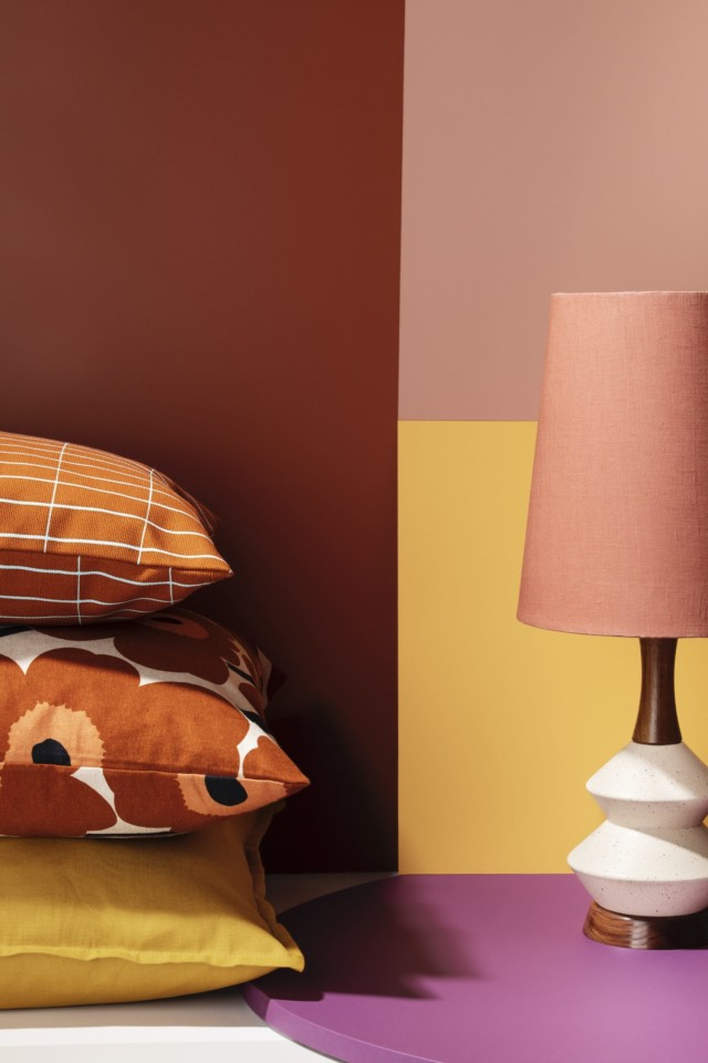
3. Mid Century

Designed to highlight the structural elements of contemporary design, featuring a combination of white (Wattyl Solagard Dobson), charcoal (Wattyl Colorbond Nightsky and PGH Bricks Dark and Stormy Zephyr, plus the sophisticated PGH Bricks Morada Nero Gloss and the beautifully grounded neutral of Wattyl Solagard Safe and Sound.

4. Modern

A slick, tonal palette of greys from the deep neutrals of Wattyl Solagard Pitchstone and PGH Bricks Dark and Stormy Whirlwind to the tailored contrast of Wattyl Solagard Cold Rush and PGH Bricks Morada Gris. The richness of Wattyl Solagard Black Tied anchors the palette.

5. Natural Neutrals

Inspired by nature and designed to blend with the landscape, this exterior palette combines the muted earthy hues of Wattyl Colorbond Pale Eucalypt and Solagard Light Earth, alongside Dhimba. The beautiful natural texture of PGH Bricks Essentials Heathwood, accompanied by the cool muted grey of PGH Bricks Morada Ceniza Linear, strikes the balance between traditional architecture and the beauty of the natural Australian colour palette.

6. Urban

Combining the strong, deep charcoals of Wattyl Solagard Grey Ember and Colorbond Monument with PGH Bricks Alfresco Espresso. Beautiful, earthy contrasts are introduced in the form of Wattyl Solagard Magic White and Lavish Tan plus PGH Bricks Manhatten East Hampton.
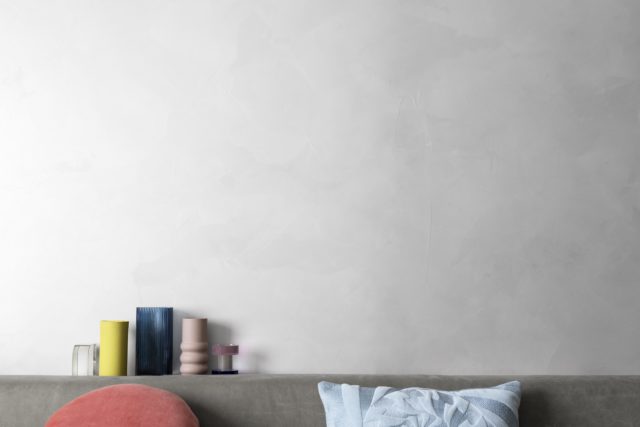
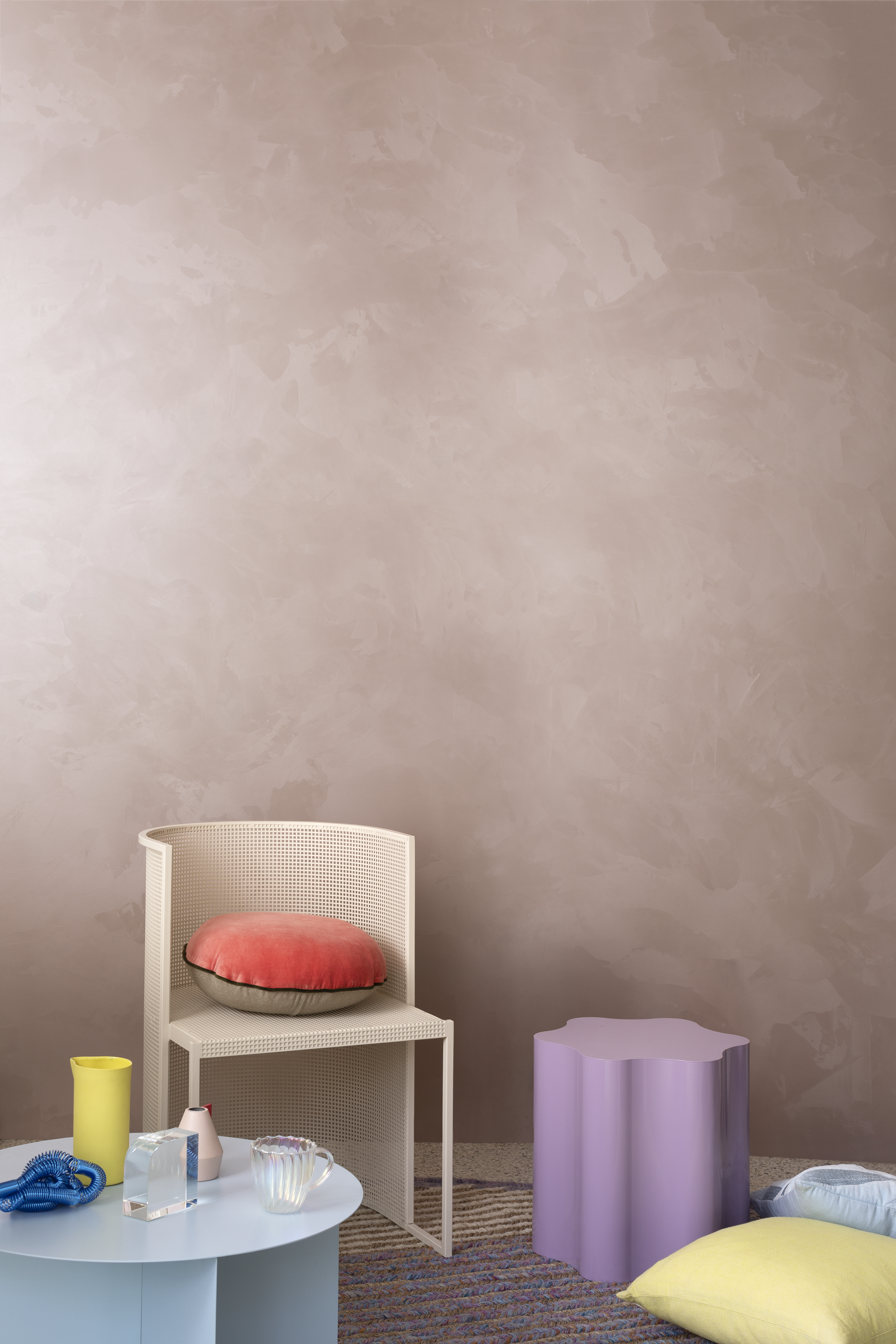
7. Whimsical

This uplifting, upbeat palette of washed pinks and greys is equally well suited to coastal and urban locations. The dusky pink of Wattyl Solagard Tombola, alongside the soft, cool tones of Soft Apparition, creates a sense of whimsy, with the cool hue of Feather Dawn introducing a fresh contrast. PGH Bricks Botanicals Sandalwood and the chalky texture of PGH Bricks Zen by Nature Salt add softness and natural texture to this dreamlike palette.

For more information visit Wattyl or CSR PGH Bricks & Pavers
Categories
DIY Expert Tips Interiors Addict RENO ADDICT

How to pick the right paint colour: expert tips

To ensure your next project is easy and avoids wasting money on making bad colour choices (we’ve all been there!), the experts at British Paints share their guide to selecting the right shade.

Lean into your lighting

First, figure out which way the room you wish to paint is facing. This is crucial in understanding the natural lighting of the space and colours that can accentuate it.

In Australia, north-facing rooms tend to receive more natural sunlight. These rooms are well suited to cool colours like grey, blue, or green. If you go for white paints, stick to cool undertones, which will give you a crisp, modern look.


South-facing rooms, on the other hand, can be underlit. They will be well suited to warm colours like yellow, peach, pink and red. Adding warmth and cosy vibes while compensating for the lack of natural light. If you opt for a shade of white here, go for an option with a warm undertone.

Highlight your existing home

Remember to consider how the paint colour will work with existing elements in your home like the floorings, curtains, and furniture. Especially, as these can be pricey, difficult things to alter. Go for a wall colour that matches what’s already there. This can be a wonderful opportunity to hero a statement piece of furniture too. Whether it’s a beautiful velvet couch, bold piece of artwork or vintage desk.

If you’re feeling stuck and confused, neutral shades, like beige and taupe, are the most versatile. They make an excellent canvas for any style and don’t go out of style. It’s a smart choice for your existing home or if you are looking to sell in the future.

Get inspired by the unexpected

Inspiration can be found anywhere! “Bring the outside in” is a popular adage for colour schemes. Try looking outdoors and conceptualizing your local area within. Choosing colours such as Green Life or Blue Forge will foster a welcoming atmosphere for you to relax and unwind.

Alternatively, if you have a favourite piece of artwork on your wall or item of clothing in your wardrobe, look within for inspo. A fun colour idea is never far. Whether you decide to go bold with a shade like Red Alert or look on the bright side with a tone like Happy Home, you’ll appreciate the new hues daily.

A handy tool

If you’re then unsure of which exact colour to commit to, British Paints has also launched a free, online Colour Wall Assistant. Apps like this make settling on a specific choice much easier. It even suggests on-trend colour options to choose from!

Get sampling

Most of all, there is no such thing as too many sample pots. Once you have a few faves, pick up three or four different sample pots to test out in your space. Instead of painting directly onto the wall, paint a piece of white A4 paper and adhere to the preferred wall with blu-tack. Make sure to observe the colours at different times throughout the day so you can see how they appear in various lighting. Only when satisfied, start small on a feature wall or door. This gives you the freedom to see if you still like it or need to change course.

For more on British Paints

Categories
Expert Tips Reno Products Shopping

2022 Wattyl colour forecast: the new normal

Wattyl’s colour forecast for 2022, presents ‘the new normal’, comprised of more than half brand new colours. The collection includes 16 natural and feel-good colours, within four distinct palettes, that aim to reflect our collective desires to instil a sense of calm and serenity within our homes.

Return to simplicity

Serene pale blue hues work to perfectly balance whites, off-whites and soft beige tones to create a sense of simplicity and peace. When paired with subtle, tactile surfaces and textures you can create an atmosphere of peace and relaxation, where you can slow down and live in the moment.

Local comfort

Warm neutrals in ivory, greiges and browns create the perfect cocooning colour palette. When paired with lush foliage, handcrafted local objects, art and sculpted feature walls, they welcome us into soothing spaces of comfort and beauty.

Resilient optimism

Bolder contrast colours reflect strength and optimism, prompting a desire to reconnect, share and celebrate resilience. New life and energy can be introduced into a space by choosing uplifting yellow-based colours contrasted with reassuring blue and grey tones.

Conscious connection

Our desire for wellness and connection to the natural environment is the strongest trend influence for 2022. The layering of several greens and grey-greens paired with textured walls, timber and stone, lots of foliage and nourishing daylight creates a palette that will not only satisfy your desire for nature but also blur the lines between indoor and outdoor living.

Wattyl is available nationally at Wattyl Paint Centres, selected Mitre 10 stores, Home Timber Hardware and Crowies Paints.

For more information.

Categories
Design Expert Tips Reno Products

5 ways to create sanctuary zones at home using colour

When we’re working from home, it’s all too easy to spend entire days hunched over a computer – a habit that we know isn’t good for either our physical or emotional health. Research tells us that taking time to step away from our desks, to clear our mind, stretch and recharge – even for a few minutes – makes us happier, healthier and more productive.

Dulux Australia: Green wall – Dulux Pale Sage; White trim – Dulux Lexicon.

In today’s world, it has never been as important to create sanctuary spaces within our homes, spaces where we and our families can disconnect and instead focus our attention on self-care activities such as reading, journaling and yoga, taking extra care of our physical and mental wellbeing.

An easy and effective way to create these sanctuary zones at homes is through the use of colour. The team at Dulux, lead by colour and communications manager Andrea Lucena-Orr, have created a helpful and comprehensive colour guide focused on using natural-inspired colours to create calming and soothing zones at home with ease.

1. Unwind in your yoga zone

Gentle earth-based greens make us feel relaxed and connected to nature – perfect for creating a dedicated yoga zone in your living area. Try painting the walls a soft green, such as Dulux Pale Tendril, while adding in touches of grounding clay colours on upcycled décor pieces carrying the colour through soft furnishings for a sense of flow and balance. Keep the look simple and clutter-free, with pale timbers, natural textures and a medley of indoor plants. Then, roll out the yoga mat, light a candle, breathe deeply and relax.

Dulux Australia: walls – Dulux Pale Tendril; trim – Dulux Lexicon Half.

2. Chill out in your cushion corner

If you’re concerned about your little ones spending too much time on their devices, how about setting up a cosy chillout zone in the corner of their bedroom or playroom where they can read a book, do a puzzle or play quietly – all it takes is a lick of paint and some comfy cushions. Begin defining the area by painting a section of the wall, Andrea recommends using a serene light blue, such as Dulux Vanilla Ice, and using a cool white on the remaining walls, such as Dulux Vivid White to create a gentle contrast. To finish the look try adding pops of inky blue, such as Dulux Grid, on accessories and décor pieces, Andrea says, as well as soft furnishings to help ground the space.

Lastly, increase the comfort factor with a soft, textured rug and layers of generous, squishy cushions that your little one can snuggle into.

Dulux Australia: white walls & trim – Dulux Vivid White; Blue Teepee – Dulux Vanilla Ice Half.

3. Let your sofa cove nurture your soul

By creating your own little oasis at home, where you can practice your daily meditations, you can significantly improve your wellbeing. Designate a spot where you’ll feel comfortable and settled, such as a nook in the living area or a corner of your bedroom. “Decorate it with natural, earth-based colours that make you feel safe and cocooned, such as Dulux Clay Pipe Half and Dulux Teahouse on the walls, and a warm white, like Dulux Natural White, on the ceiling and trims,” Andrea says. You’ll want minimal distractions in your meditation space, so take a ‘less is more’ approach to furnishings. Opt for pared-back furniture in organic materials, positioned with plenty of breathing space around them. Make comfort a priority; choose a curvy armchair in a tactile fabric such as boucle, layered with sheepskin or faux-fur throws and cushions, and a textured rug underfoot. From there, dim the lights, light a candle and turn your attention inward.

Dulux Australia: Beige wall – Dulux Clay Pipe Half; Charcoal wall – Dulux Teahouse; Trim – Dulux Natural White.

4. Imagine and travel in your reading nook

With travel off the agenda, for now, books are your child’s ticket to faraway places. Help make this quiet activity a joy by carving out a dedicated reading corner. “Set the scene with a welcoming and laid-back palette of mossy green across a feature wall (try Dulux Pale Sage), with accents of forest green and clay in furniture and accessories,” Andrea says. Arrange a daybed or spare sofa with blankets, throws and cushions of differing shapes and sizes, add a side table to store books, magazines and indoor plants to emphasise a natural connection. “Mindfulness is a great way to help our kids – and ourselves – build resilience, self-awareness and gratitude we need to navigate these difficult times,” says Andrea. “Just be sure to choose the space for your mindfulness zone thoughtfully – ideally it should be away from busy spots such as the kitchen and TV room so you can really tap into your zen.”

Dulux Australia: Green wall – Dulux Pale Sage; White trim – Dulux Lexicon.

5. Empower your children to repose in their bedroom oasis

Having spent so much time at home in the past year, chances are your teenager is sick of the sight of their bedroom. Help them fall back in love with their personal space by giving it a quick and uplifting colour refresh. Styling the room with calming pinks, soft layered textures and fresh flowers makes it feel captivating and inviting and, according to colour psychologists, will help in creating a positive outlook. “Create a unique bedhead by painting a circle shape on the wall behind the bed in a dusty pink such as Dulux Victoriana, and remaining walls in a more subtle, tonal shade of Dulux Porcelain Half,” Andrea says. Keep the room bright and open by painting the trims and ceiling in Dulux Natural White. Pile the bed high with soft, tactile bedding – think natural linens, cottons, chunky woollen blankets and decadent velvet cushions – to create a chillaxing bedroom they’ll love,” Andrea adds.

Dulu Australia: Outer circle wall – Dulux Porcelain Half; Inner circle wall – Dulux Victoriana; Trim – Dulux Vivid White.

Find your perfect colour to create a sanctuary at home

Categories
Decorating 101 Expert Tips RENO ADDICT Reno Trends Shopping

The 2021 colour trends to shape our interiors revealed by Haymes

Haymes Paint has launched its latest colour library, Awakening, offering a first glance at the vibrant new shades that will define the year’s interior trends.

As the world adjusts to the new normal, Haymes Paint hope to inspire people to embrace change. We are grounded, reinvigorated, and ready to break free (literally!).

A set of three unique colour palettes: Game Changer, In the Moment and Clearview, dares customers to break the status quo while maintaining a sense of calm and wellbeing throughout their spaces. The range features hues that combine the concepts of strength and change. These concepts evoke passion and a sense of drive to embrace new opportunities as we emerge to new experiences and realise the true essence of what it means to be alive.

Haymes Paint colour and concept manager, Wendy Rennie, says: “Our new colour library is influenced by Australia’s slow rekindling after what has been an unimaginable time. We wanted to use colours to inspire our customers to create a space that is uniquely theirs and embrace the new way we live and grow in our homes.”

Game changer

The Game Changer palette encapsulates newfound freedom to be yourself and challenge everything with a playful vibrancy and fresh optimism. Powdered blue, shades of sunset pinks, aqua greens, and mustard yellows will bring a sense of fun and lively energy into our homes.

Game Changer encourages us to break free from the limitations that have constricted our creativity and find the courage and drive to be truly free and original.

In the Moment

A fresh take on the Australian landscape, the In the Moment palette features an array of varying shades of rust, earthy browns, burnt oranges, and organic neutrals to promote a sense of groundedness. The array of tones reminds us to find value in what we have around us.

Using layers and tactility, we can create spaces within our homes that reinforce a sense of security. Our surroundings are truly linked to our wellbeing and it’s the details of the things we love that provide us with the strength to face the new normal, by creating a home that is connected to the essence of the Australian landscape with a robust aesthetic.

Clearview

Clearview represents the idealised tree change, sea change, and everything in between. Whether it’s an aesthetic we can now adapt to the style and feel, or a true location change, this palette brings these ideals to life. Its colours range from deep tones of ink blues and dark forest greens to light greys and powder blues. The new normal is to look for ways to promote idealism and to live in a way that is reflected in our day-to-day lifestyle, the core of what makes us feel the most fulfilled. Clearview enables us to create an everyday feeling of harmony, as we live more aware and in sync with what it is that truly aligns with our core values.

Haymes Paint is the largest Australian made and owned paint manufacturer. It has maintained its head office and manufacturing in the same town where it all began, a decision which has been instrumental in providing employment and growth in Ballarat and has allowed the business to maintain its local identity.

Categories
Architecture Design House Tours Real Renos RENO ADDICT Shopping

Architect’s Victorian villa comes alive in colour

Wattyl has recently launched its Villa Carmelina colour palette – the result of a collaboration with architect Scott Weston that has spanned more than two years.

Villa Carmelina, a grand 1889 Victorian Italianate terrace, was bought by Scott in 2016. It was in a dilapidated state but, for Scott, it represented the opportunity to fulfil a long-held desire to invest his 25 years of architectural practice in his own home.

The main two-storey terrace was restored to its former grandeur, with a few minor adjustments to the interior to accentuate the building’s high ceilings and maximise the natural light. The result is a unique fusion of contemporary design and original Victorian architecture.

To the rear is a modernist two-storey addition in glass and steel containing expansive kitchen and living room plus bedrooms and bathing areas.

Wattyl’s new range takes inspiration from the remnants of Villa Carmelina’s original 1950s colour scheme – rose pink, acanthus green, lemon chiffon, studio mauve, and earl grey.

These colours appear in various guises throughout the home – some have been custom-matched by Wattyl and others taken directly from the Wattyl fandeck.

The architect

Scott Weston is regarded as one of Australia’s most inspiring architects, with a passion for colour, pattern, texture, art, light, functionality and beautifully crafted, artisanal materials and finishes.

In his meticulous reincarnation of Villa Carmelina, Scott has expressed a long-held philosophy of tailoring spaces to embrace and celebrate the interests and passions of the occupants – he has paid homage to the generations who lived in Villa Carmelina before him while creating a unique and deeply personal living space for he and his partner.

Entry hall

Serving as an introduction to the Villa Carmelina colour palette, this is the harmonious meeting point of eight of the project’s custom colours.

Lady Gray is seen on the timber dado while the wall above features the velvet grey-lilac of Studio Mauve. The Victorian ceiling is washed in the sorbet lemon hue of Lemon Chiffon, bordered with Ivory Grey piping in order to highlight the decorative cornice and ceiling rose.

Living room

This elegant room, flooded with indirect light from the over-sized doors either side of the fireplace, has as its focus the contemporary glitter artwork by Reuben Paterson.

The walls and decorative plaster moulds above the fireplace are washed in the understated, faded pink of Miss Havisham Rose. Timberwork, in the ivory tone of Marcasite, highlights the original architectural details, while the lathe and plaster ceiling provides a plane of light grey, using Ivory Grey.

Dining room

Referencing a 1950s Hong Kong tea house, the dining room walls are finished in a soft Matcha Tea shade that was custom-matched to the beautifully textural hemp wallpaper used on the feature doors of the joinery unit.

Having no direct light, the dining room ceiling was highlighted in Modernist, a darker grey. The antique Chinese moongate (seen above, pictured with Scott) is unquestionably the focal point of this room, framing views and showcasing a collection of beautiful treasures.

Kitchen

The living heart of Villa Carmelina, the kitchen is strategically placed within the expansive living room and features a black and white terrazzo floor and timber hemlock walls.  

Two horizontal bands of custom architectural joinery have been hand-rolled in the saturated, deep blue of Curious Planet.

Studio

A grand room that looks out onto the main staircase whose walls are washed in the beautiful grey lilac of Studio Mauve – a hue that changes colour throughout the day, thanks to the northern glass roof.

The studio walls are finished in the sophisticated soft grey of Marcasite with a horizontal line of Jazz Age Coral applied to the perimeter above the tall doors, enveloping the cornice and ceiling in one dramatic gesture. The ornate Ivory Grey ceiling rose is crowned by a George Nelson 1950s pendant light.

Guest room

Highlighting a display of rare and beautiful objects, the grey-blue tones of the guest bedroom’s Celadon Blue walls provide a quiet background to the ensuite’s dramatic floral cascade in miniature glass mosaic tiles.

Scott chose Wattyl I.D Advanced Ultra Low VOC interior paint for Villa Carmelina, citing the fact that it far exceeds green-building requirements (with less than 1g of VOCs per litre) and can be custom-matched to any colour, as the reasoning behind his choice.

Wattyl I.D Advanced is available in water-based matt, low sheen and satin finishes, plus Ceiling White.

For more on this palette

Follow Scott Weston’s Villa Carmelina journey on Instagram

Categories
Shopping

Paint trends 2021: Haymes Paint announces tranquil new palettes

Haymes Paint has launched its Volume 14 colour library, with new shades designed to reflect the shifting home trends in the wake of this tumultuous year.

Calm Mind palette

Embrace is inspired by the concept of embracing the ever-changing and unexpected challenges of the current world, and finding solace within the home space through colour. The movement is characterised by tones that elicit comfort and reassurance, aimed to create nurturing environments as a respite from the – often overwhelming – uncertainty that has defined our lives recently.

Calm Mind: Shell Pink

Comprising of three unique colour palettes: Grounded, Calm Mind and Happy Home, the range features hues that have been crafted to reflect the natural world, and produce a calm and joyful interior; attitudes that are expected to be a staple of the paint trends predicted for 2021.

Colour and concept manager, Wendy Rennie, says: “This year’s colour release has been interesting to put together as the world and climate we live in has changed dramatically.

Grounded: Arboretum

“The current focus on wellbeing is more important than ever and using colour as a way of connecting us to emotions and improving the environments we are in will help people to make an impact where it counts most, showing us that home truly is where the heart is.”

Grounded

The grounded palette draws inspiration from the earthy tones of the natural world, offering an escape from the speed and stress of our everyday lives. Its rich colours range from deep tones of ink blue to warm sandy neutrals and olive greens, emulating the calming force of the ocean, the earth and forest.

Grounded: Rubicon

These colours promote the creation of spaces within our home that reinforce this important connection to nature, and the sense of serenity and “groundedness” that will act as central tenets of 2021 interior design trends.

Calm Mind

Despite what is going on in the world around us, by looking inwards we can attempt to recapture our innate sense of calm and peace. The focus of this palette is to restore balance and inspire harmony, through emulating a “spa retreat” feel within the home. Soothing tones of creamy green and blue blend with muddied peach, pink and rusts to create a tranquil fusion of colour that nutures the mind and soul.

Calm Mind palette

The new normal is to look for ways to promote self-care and relieve stress within environments you can control, and the Calm Mind palette was created to highlight just this; the power that the intentional choice of colour can have in creating a tranquil living space.

Happy Home

The Happy Home palette encapsulates a relaxed approach to interiors by introducing an uplifting array of tones and hues created to promote joy. Bold blues, rusty reds and pops of bright yellow bring a sense of fun and hope back into our homes.

Happy Home palette

The palette inspires interiors that are characertised by quirky styling, bold colour blocking and smack of zesty exuberance. This theme is all about youthful design elements and injecting energy into spaces to reinvigorate the senses.

Imagery styled by Ruth Welsby with photography by Martina Gemmola.

For more on these 2021 palettes

Categories
Homewares Styling

Stylist Jason Grant creates new paint colours for Murobond

Now with 70 paint colours to his name as part of his collaboration with Murobond, creating new hues is as exciting a process as ever for Byron-based stylist Jason Grant.

This week sees the launch of his sixth collection, Paradigm Shift, created in isolation during lockdown. But like the others, it’s mostly inspired by nature. “I like to take it all in and notice all the details, and of course I see all the colours,” he says. “The new colours highlight earth elements and nature’s beauty.”

Jason art directed, produced, styled and photographed the collection solo in his studio during isolation. “I was doing some deep thinking too,” he said. “The palette is named Paradigm Shift, a concept that I discovered and spiralled into. It’s the notion of a major change that happens when the usual way of thinking about doing something is replaced by a new or a different way – a concept that inspires me and gives me hope and hope is what we need. I’ve always been a hippy at heart, focusing on positivity and high vibrations.”

He loves how a paint can transform room, an object or even a mood. “Nothing beats a fresh coat of paint for a new lease on life. It’s all in your mindset.”

Although it had been a while since he created new colours for Murobond, Jason said it came easily. “It comes naturally because I love that I get to do this. With everything I do, I love to create the process to create the result.

“Creating colours gets easier. I work in quite an analogue way, first conceptualising then creating the colour references that we colour match. This time we pretty much nailed the colours that were in my head first go.”

Because he likes to tell stories with words as well as pictures, Jason enjoys coming up with the colour names too. “These colours are inspired by a few clever people and a few favourite moments or objects.” Names include the very Aussie Flowering Gum, Wattle Seed and Davidson Plum, as well Guacamole, Vagabond, Kai and more.

“I love them all,” Jason says. “Flowering Gum in a soft pink; Vagabond, the subtle light shade of uplifting grey; and Kai, based on the leaf of a gum tree, are three standouts.”

Jason’s currently busy with a variety of projects, creating content for brands, working on a few residential and commercial spaces, including a restaurant. The biggest interiors trends he’s seeing for 2020 are creating the ultimate in home comforts, simple things becoming luxuries and simplification of living.

Jason is part of Denfair’s virtual design event this week. Tune into his online masterclass Live Your Best Creative Life, on Thursday at 12 noon.

Shop Paradigm Shift on the Murobond website | Check out Jason’s website

Jason was one of Interiors Addict’s first interviewees 9 years ago:

Categories
Interviews RENO ADDICT

Visualise paint colours with new digital render service

Paint colour selection can be one of the trickiest parts of building or renovating. Not only are many people unable to see pictures in their mind (ie. they literally don’t have a mind’s eye), but even those that can often struggle to decipher the differences between shades. And when you consider there are thousands of white variations alone, it’s easy to see why the whole process is rather fraught!

But this is where the entrepreneurial painter Gary Wilson of Imago comes in. Recently launched, Gary’s online offering includes colour consulting and a digital render service that enables people to realistically visualise their future colour schemes thereby avoiding costly mistakes. The service is available for interiors, exteriors and commercial premises too.

Queenslander renders

“With so many colour options out there, it can be daunting trying to choose the right colours. Again and again over the years, I’ve really noticed people are either unable to make a decision on what colours to select or are unsure if the colours they have chosen are right,” says Gary who is also the director of Brisbane’s Applied and Decorative Painting and has been a painter for 25 years.

BEFORE existing home
BEFORE original home

AFTER digital render
AFTER A digital render of a proposed new colour scheme

“I often thought to myself there had to be a better way, to ultimately remove the guess work before people spend all that money painting their place,” says Gary, who offers digital renders illustrating up to three colour schemes from a seriously affordable $49.

BEFORE existing interior
BEFORE original interior

AFTER What a great way to experiment with interior paint!
AFTER digital render. What a great way to experiment with interior paint!

“Digital imaging lets you realistically see how colour schemes will look before you spend all that money painting your home. I offer digital renders to all my clients now and they love them and I really believe everyone embarking on a painting project should inform themselves on how it will look in advance,” says Gary.

BEFORE existing church

AFTER digital render
AFTER A digital render illustrates how the church would look painted a shade of grey

And renders aside, Imago also has a team of professional colour consultants that can step in if you’re really in a paint quandary. From just $125 per consultation, customers simply answer a quick questionnaire before uploading images of their property after which an online colour consultant delivers colour scheme recommendations within three business days.

BEFORE existing home

AFTER digital render

For more | How to choose white paint for walls

Categories
Expert Tips Styling

Mr Jason Grant’s interiors trend forecast for 2016

By Jason Grant

My job as a stylist is to share what I see happening in the market here, there and everywhere. As always, I don’t suggest you be a slave to trends but there is no escaping their influence. Choose to get onboard or ignore completely, it’s up to you!

image001

The biggest trend on the radar is soft brights. They are going to be big! Pantone led the way with the announcement of their two colours of the year for 2016: Serenity and Rose Quartz. This pale blue and pale pink will be the leading colours in this trend of soft shades. Minimal black and white and the Scandi look are at saturation point, so it’s time to embrace colour and add some to your space. A new year and a fresh start — no need to reinvent, just a little evolution.

I understand colour isn’t for everyone but these soft shades are easy to work with. For those not brave enough to play with colour in a big way, start small with textiles, cushions and accessories. And, for those more brave, think floor rugs, bed linen and artworks for a bigger statement. I recommend Urban Road for affordable and fashion forward artworks. These dream-like shades have a nod to nostalgia and a touch of ’50s retro. Add a fresh update with some new linen, perhaps Aura Home, they are always up to date with on-trend textiles and a mix of colour and patterns.

In general, 2016 will be pretty but not too feminine.

Another trend to keep in mind coming into the new year is a focus on comfortable homes. We take pride in our homes and now more than ever, our emphasis will be on entertaining and relaxing in our individual spaces. So collect and surround yourself with things that make you happy as well as secure and comfortable. Remember it’s your home and it should feel good!

— Mr Jason Grant is a stylist, author and the newly appointed ambassador for Life Instyle, Sydney (18-to-21 February, 2016).

Categories
Designers Expert Tips Styling

Shaynna Blaze’s tips for injecting fresh style into your home

By Shaynna Blaze

As we transition into the warmer months we have the opportunity to embrace the seasonal changes around us and use them as inspiration for updates we can make inside our homes. Everything from the brighter light of ever-present sunshine and the warmth in the air to the fragrant and colourful bursts of blooming flowers can be used as cues to transform your interiors.

This summer, take the time to clean and cleanse your space physically, visually and emotionally by utilising my top tips for injecting a fresh style into your home, inspired by the climbing temperatures.

Refresh with a splash of colour

A fresh new colour palette is a great way to inject freshness into a room. And the best thing about the Taubmans spring/summer trend colours is that you can incorporate them easily into your home, through paint, furnishings and accessories, or all three!

DR_4346-A
Before

After
After

For instant impact, paint your walls in one of my favourite trending hues. Cool colours, such as Taubmans Swordfish and Dancing Waters (pictured above), give energy to a room, which will help you invigorate your space. If you prefer a warmer palette, then use a pink, like Taubmans Really Rose or Pink Clay Pot. Pink is surprisingly versatile as a wall colour as it works well in combination with a range of other colour palettes.

[contextly_sidebar id=”QCJjM7kGaWbhldb3soyXHZU1f2rqF0Vm”]Another great, subtle way to introduce these colours into your home is to paint a piece of furniture, like a side table in your bedroom, in one of these colours. To create a cohesive look, ensure your bedding and cushions feature hints of the colour you choose. You can also add a surprising pop of colour in your dining room by painting the legs of a timber dining table and chairs.

Make an impact with all-important accessories

This year’s trend shades make for great feature colours in accessories. Small, simple updates like changing your cushions or swapping artwork can make a huge difference in a room and transform the feel of your home without undertaking a major project.

DR_4375-A_2

Deeper grey shades – like Taubmans Snow Goose (above) or Metal Glow – on the walls work well as the perfect backdrop for pops of pinks, greens and teals. Accessories like vases and cushions are a great way to affordably update your look, and in these vibrant hues they will leap out against grey walls and give a renewed energy to your room. An alternative high-impact option is to introduce colour in the fabric of a wing chair, which will make an impressive style statement against a grey, white or neutral wall.

Fill the air with fresh fragrances

The summer months are also associated with the sweet floral fragrances that fill the air. Bring a little of the outdoors into your home by accenting your room with a vase of fresh flowers, such as sweet peas, tulips or lilies. As well as looking effortlessly stylish, they smell amazing.

DR_4449-A

I also love to introduce some scented candles in invigorating fragrances like gardenia and jasmine. Not only will you feel fresher but you’ll also bring a revitalised energy to your whole home.

— Shaynna Blaze is Taubmans’ brand ambassador and colour creative director, host of Selling Houses Australia and judge on The Block.