Categories
Design House Tours Interiors Addict

Old Newtown bakery sustainably reimagined as unique family home

Two century-old commercial buildings in the heart of Sydney’s Newtown have been  magically – and sustainably – reimagined to create a welcoming home by Anna Carin Design Studio, for a family of four intent on the best of modern living.

The Bakery, comprising a small corner shop built in 1909 and a bigger warehouse  property that served as a bakery from 1922, was reconfigured, restored and redesigned to fit a very particular brief: create an unexpected city oasis with an emphasis on light and nature.

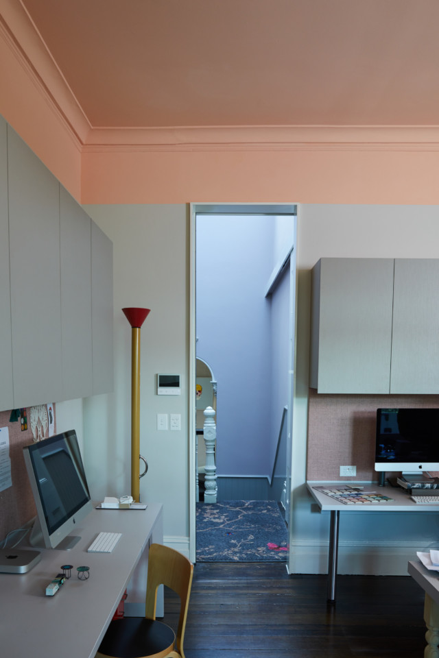
Fine workmanship and a high attention to detail were key to the realisation of the vision – the project was a celebration of talented trades. Metal-framed windows and doors were custom-made, joinery was hand-painted and all demolished bricks were hand-scraped and reused for new walls.

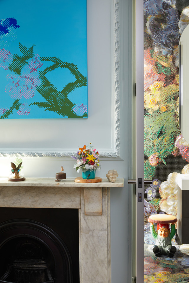
The colour palette was key to its overall success and was very much inspired by the courtyard, where the pebbles were the inspiration for the wall colours and the olive trees informed the choice of green marble in the bathroom and ensuite.

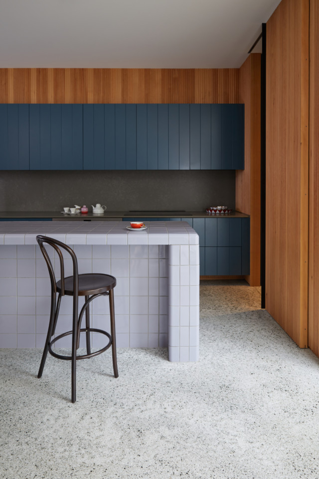
“Nothing could be too crisp, it had to be aged and raw to sit within this industrial setting,” said Anna-Carin McNamara, founder of Anna Carin Design Studio. “We opted for hand-painted kitchen cabinets (Wattyl Black Hole) so you can see each brush stroke, and the painted red brick walls of the courtyard were stripped and then carefully sealed with Wattyl Granosite to preserve and showcase their raw texture.”

The final palette comprised a subtle mix of whites and warm stone hues along with black and a beautiful forest green (Wattyl Rainforest Fern) on the front door.

“A wall in one of the bedrooms in the cottage featured multiple layers of weathered paint – much loved by the client – so we retained this, in its original condition, by sealing it with Wattyl GranoGlaze Satin.” 

The mix of aged and degraded surfaces, both interior and exterior, from timber and exposed brick to rendered masonry and steel, required careful and painstaking attention to preparation and preservation. Wattyl’s technical team was on-site to advise on the best products to use, both for aesthetics and durability.

External painted brickwork, in both the internal courtyard and the street façade, was primed and then finished with Wattyl GranoSahara in Smoke Pearl to create a fine sand texture. All window frames, both timber and steel, were finished in Wattyl Black Hole semi gloss.

“The Bakery is testament to the beauty that can be created with passion and integrity along with a team of trades that value authenticity and sustainability,” says Anna-Carin. “But with all projects of this kind, the secret ingredient is always love.”

The Wattyl paint finishes are ultra-low VOC and 95% of the Wattyl products are GBCA (Green Building Council of Australia) compliant. The Wattyl I.D. Advanced and Aqua Trim interior finishes are also GECA certified.

More on Anna Carin Design Studio

Photography: Justin Alexander

Categories
Expert Tips Reno Products Shopping

2022 Wattyl colour forecast: the new normal

Wattyl’s colour forecast for 2022, presents ‘the new normal’, comprised of more than half brand new colours. The collection includes 16 natural and feel-good colours, within four distinct palettes, that aim to reflect our collective desires to instil a sense of calm and serenity within our homes.

Return to simplicity

Serene pale blue hues work to perfectly balance whites, off-whites and soft beige tones to create a sense of simplicity and peace. When paired with subtle, tactile surfaces and textures you can create an atmosphere of peace and relaxation, where you can slow down and live in the moment.

Local comfort

Warm neutrals in ivory, greiges and browns create the perfect cocooning colour palette. When paired with lush foliage, handcrafted local objects, art and sculpted feature walls, they welcome us into soothing spaces of comfort and beauty.

Resilient optimism

Bolder contrast colours reflect strength and optimism, prompting a desire to reconnect, share and celebrate resilience. New life and energy can be introduced into a space by choosing uplifting yellow-based colours contrasted with reassuring blue and grey tones.

Conscious connection

Our desire for wellness and connection to the natural environment is the strongest trend influence for 2022. The layering of several greens and grey-greens paired with textured walls, timber and stone, lots of foliage and nourishing daylight creates a palette that will not only satisfy your desire for nature but also blur the lines between indoor and outdoor living.

Wattyl is available nationally at Wattyl Paint Centres, selected Mitre 10 stores, Home Timber Hardware and Crowies Paints.

For more information.

Categories
Architecture Design House Tours Real Renos RENO ADDICT Shopping

Architect’s Victorian villa comes alive in colour

Wattyl has recently launched its Villa Carmelina colour palette – the result of a collaboration with architect Scott Weston that has spanned more than two years.

Villa Carmelina, a grand 1889 Victorian Italianate terrace, was bought by Scott in 2016. It was in a dilapidated state but, for Scott, it represented the opportunity to fulfil a long-held desire to invest his 25 years of architectural practice in his own home.

The main two-storey terrace was restored to its former grandeur, with a few minor adjustments to the interior to accentuate the building’s high ceilings and maximise the natural light. The result is a unique fusion of contemporary design and original Victorian architecture.

To the rear is a modernist two-storey addition in glass and steel containing expansive kitchen and living room plus bedrooms and bathing areas.

Wattyl’s new range takes inspiration from the remnants of Villa Carmelina’s original 1950s colour scheme – rose pink, acanthus green, lemon chiffon, studio mauve, and earl grey.

These colours appear in various guises throughout the home – some have been custom-matched by Wattyl and others taken directly from the Wattyl fandeck.

The architect

Scott Weston is regarded as one of Australia’s most inspiring architects, with a passion for colour, pattern, texture, art, light, functionality and beautifully crafted, artisanal materials and finishes.

In his meticulous reincarnation of Villa Carmelina, Scott has expressed a long-held philosophy of tailoring spaces to embrace and celebrate the interests and passions of the occupants – he has paid homage to the generations who lived in Villa Carmelina before him while creating a unique and deeply personal living space for he and his partner.

Entry hall

Serving as an introduction to the Villa Carmelina colour palette, this is the harmonious meeting point of eight of the project’s custom colours.

Lady Gray is seen on the timber dado while the wall above features the velvet grey-lilac of Studio Mauve. The Victorian ceiling is washed in the sorbet lemon hue of Lemon Chiffon, bordered with Ivory Grey piping in order to highlight the decorative cornice and ceiling rose.

Living room

This elegant room, flooded with indirect light from the over-sized doors either side of the fireplace, has as its focus the contemporary glitter artwork by Reuben Paterson.

The walls and decorative plaster moulds above the fireplace are washed in the understated, faded pink of Miss Havisham Rose. Timberwork, in the ivory tone of Marcasite, highlights the original architectural details, while the lathe and plaster ceiling provides a plane of light grey, using Ivory Grey.

Dining room

Referencing a 1950s Hong Kong tea house, the dining room walls are finished in a soft Matcha Tea shade that was custom-matched to the beautifully textural hemp wallpaper used on the feature doors of the joinery unit.

Having no direct light, the dining room ceiling was highlighted in Modernist, a darker grey. The antique Chinese moongate (seen above, pictured with Scott) is unquestionably the focal point of this room, framing views and showcasing a collection of beautiful treasures.

Kitchen

The living heart of Villa Carmelina, the kitchen is strategically placed within the expansive living room and features a black and white terrazzo floor and timber hemlock walls.  

Two horizontal bands of custom architectural joinery have been hand-rolled in the saturated, deep blue of Curious Planet.

Studio

A grand room that looks out onto the main staircase whose walls are washed in the beautiful grey lilac of Studio Mauve – a hue that changes colour throughout the day, thanks to the northern glass roof.

The studio walls are finished in the sophisticated soft grey of Marcasite with a horizontal line of Jazz Age Coral applied to the perimeter above the tall doors, enveloping the cornice and ceiling in one dramatic gesture. The ornate Ivory Grey ceiling rose is crowned by a George Nelson 1950s pendant light.

Guest room

Highlighting a display of rare and beautiful objects, the grey-blue tones of the guest bedroom’s Celadon Blue walls provide a quiet background to the ensuite’s dramatic floral cascade in miniature glass mosaic tiles.

Scott chose Wattyl I.D Advanced Ultra Low VOC interior paint for Villa Carmelina, citing the fact that it far exceeds green-building requirements (with less than 1g of VOCs per litre) and can be custom-matched to any colour, as the reasoning behind his choice.

Wattyl I.D Advanced is available in water-based matt, low sheen and satin finishes, plus Ceiling White.

For more on this palette

Follow Scott Weston’s Villa Carmelina journey on Instagram

Categories
Design DIY Expert Tips

Colour trends 2020: paint has power to cocoon us

The power of colour to de-stress, nurture and cocoon will be a key antidote to the uncertainties of a post-Covid world, according to colour experts across the globe.

Sarah Stephenson, paint brand Wattyl’s colour expert, says many of us will satisfy our craving for wellness, happiness and safety by surrounding ourselves with colours that invoke calmness and security, as well as those that forge a stronger connection with nature.

Wattyl has just announced four new palettes for 2021 that deliver an uplifting injection of carefully curated colour, cleverly walking the line between timeless and contemporary. “These palettes, designed with a focus on wellness and nurturing, are for painting on walls, for soft furnishings and other decorative elements, from bedlinen to artworks. Colour really can transform our home into our sanctuary, something most of us are craving,” said Sarah.

The palettes span the spectrum from uplifting lights and nourishing earth tones, to shadowy darks and humble whites.

Nourishing earth tones

Colours: Brandy Snap and Moccacino

Natural earth tones will become even more important in a post-Covid-19 world – these warm, nourishing plant-based colours will help us to reconnect with nature and the outdoors. Terracotta tones, such as Brandy Snap, continue to be a much-loved and important element in interiors as they feel timeless, authentic and natural.

This trans-seasonal colour palette sees paler, beige tones being replaced with richer, warmer honey tones and classic neutrals being swapped for mid-tone blues. Greens of 2021 are deep and olive in tone.

Nourishing earth tones will create a mood of warmth and cosiness, at once friendly and organic – something we all crave in these challenging times.

Uplifting lights

Colours: Snow Rose and Light Aqua

Pastels, traditionally associated with calm, comfort and a desire for a balance between body and mind, take on new meaning, leaving the sugary tints behind in favour of beautifully dusted pastels that evoke a deeper sense of harmony.

Wattyl’s gentle pales add a warmth and tactility to minimalist spaces, especially when paired with natural silks, organic cottons and soft wools in relaxed forms.

Shadowy darks

Colours: Dark Dream and Black Hole

The rise of tinted blacks and saturated darks is a direct response to the current mood of fear and anxiety – they have become even more relevant in these post-pandemic times. These richer, darker hues can feel luxurious and cocooning – the mood is one of timeworn comfort encompassing a classic mix of eras, with an embrace of botanical decorative elements, while ribs and curves feature in architectural details and furniture.

Humble whites

Colour: Ice Volcano

Minimalism continues to reign supreme in many homes, but it is warming – it is less pristine in both detail and styling. Personality and emotion are introduced into the mix by virtue of authenticity, craft and history in both design and materials – without any loss of functionality.

Comforting hues, natural materials and softened forms are key to the look, adding a calming and restorative feel to these pared back spaces. The principles of wabi-sabi design – imperfect beauty – add further depth, think artfully worn surfaces and considered imperfections.

Using a limited palette of colour and materials, such as timber, leather and vegetable-dyed textiles creates a mindful ambience, one of simplicity and purity.

Low VOCs

The air we breathe in our homes is equally important to our wellbeing – Wattyl I.D Advanced Ultra Low VOC interior paint far exceeds green building requirements with less than 1g of VOCs per litre (up to 16 times lower than other ultra-premium brands). Wattyl I.D Advanced is available in water-based matt, low sheen and satin finishes plus Ceiling White. Available nationally from Wattyl Paint Centres, Mitre 10, Home, Timber & Hardware and other leading paint specialists.

For more information

Categories
Appliances Design Kitchens Shopping

Australian kitchen trends: Autumn 2020 edition

From open shelving (perfect for styling up a shelfie), to a stunning coral hued stone and Gaggenau’s new high-tech oven, Autumn kitchen pickings are looking pretty inspiring indeed.

Fibonacci Stone latest: Fibonacci Stone has released four gorgeous new designs. ‘Bloc’ has a grainy grey and black-fleck base (anchored by light to mid-grey Carrera marble chips), while ‘Brackish’ has a subdued palette of white and faded grey. ‘Striker’ is perfect for a contemporary Australian project with its palette of bisque, olive, tan, sand and beige and my personal favourite ‘Coral Underground’ has diamond-like silver grey shards set into the palest coral base. It’s feminine without being girly.

Fibonacci Stone
Fibonacci Stone (clockwise from top left): ‘Coral Underground,’ ‘Brackish,’ ‘Striker’ and ‘Bloc’

Fibonacci stone
The stunning ‘Coral Underground’ stone

Kaboodle Kitchen open steel frame shelving units: A stylish and on-trend alternative to standard kitchen cabinetry, this new shelving range doubles as a practical storage feature that’s perfect for displaying your favourite things. Designed to be used in conjunction with Kaboodle cabinetry, or as a standalone piece, the shelves are available in powder coated black.

Kaboodle

Kaboodle

Fisher & Paykel touchscreen built-in oven: These new ovens are equipped with a high resolution digital interface that gives step-by-step instructions for a wide range of pre-loaded recipes. Precise measures and ideal cooking times and temperatures are provided, and the ovens are available in stainless steel and black, or monochromatic all-black.

Fisher & Paykel oven

Fisher & Paykel oven

Caesarstone ‘New Darks’ range: This new range of quartz surfaces was created in response to the black kitchen trend. Suitable for bench tops, splash backs and walls, the collection also introduces a brand new ‘natural’ surface finish – the slightly textured finish emulates the tactile experience of stone, and has a satin sheen and slight grain.

Highlights include ‘Empira Black’ which is a lustrous polished finish with a dense black base and overlay of fine white natural veins. ‘Black Tempal’ combines the new rough ‘natural’ finish with a deep charcoal base which is in direct contrast to the subtle, marbled veil of soft mineral deposits across its surface.

Caesarstone
Caesarstone ‘Empira Black’

Caesarstone
Caesarstone ‘Black Tempal’

Caesarstone & Wattyl Perfect Pairings II: The collaboration between Caesarstone quartz surfaces and Wattyl paints has been expanded after the initial launch was warmly received by consumers keen to take the guesswork out of what can be a daunting process. Homeowners can access a diverse selection of Caesarstone and Wattyl pairings alongside metallic tapware finishes from Sussex and door cabinetry from Polytec. The latest pairings include terracotta and mustard paint hues (for the more adventurous), as well as more neutral options too.

Wattyl Caesarstone
Wattyl ‘Red Ochre’ with Caesarstone ‘Cloudburst Concrete’

Wattyl 'Grey Ember' with Caesarstone 'Vanilla Noir'
Wattyl ‘Grey Ember’ with Caesarstone ‘Vanilla Noir’

Wattyl 'Sirens Call' with Caesarstone 'Airy Concrete'
Wattyl ‘Sirens Call’ with Caesarstone ‘Airy Concrete’

Gaggenau combi steam oven: Gaggenau’s combi-steam oven not only allows the amateur chef to steam, braise, bake, cook, grill and gratinate, but it’s self-cleaning too.

The latest version of the oven features a fixed water connection. Using a cleaning cartridge, the oven’s water supply descales and removes any heavy soiling from the inside, leaving it pristine in less than four hours. The fresh water connection also means water is constantly available which is a vital feature when cooking using the oven’s sous-vide functionality. The high-tech oven features a temperature probe too. What more could you want?

Gaggenau combi steam oven

Gaggenau combi steam oven

Cosentino Dekton Liquid collection: Comprised of three new colour ways inspired by nature, this new surface range was designed in collaboration with London pattern experts and designers PATTERNITY. All three surfaces have rippling and marbled patterns across backgrounds of inky black and pearlescent white.

Dekton Liquid Shell
Cosentino Dekton ‘Liquid Shell’ finish

Cosentino Dekton 'Liquid Embers'
Cosentino Dekton ‘Liquid Embers’ finish

Australian kitchen trends: Summer 2019 edition

Categories
Appliances Design

Australian kitchen trends: Summer 2019 edition

When it comes to kitchens, summer seems to be the season of the surface. There’s a new marble-look finish from Caesarstone, five new colours from Laminex, new glass splash backs and a collaboration that makes pairing your kitchen bench top and paint colours even easier.

Stegbar splash backs: Stegbar has collaborated with interior designer and trend forecaster Marylou Cafaro to launch the Stegbar Create Splash backs Series, including mirror, metallic and colour collections. “The aim was to create understated refined spaces that speak to quality and longevity. A decade ago splash backs stood out, but now they need to blend in with the whole home design and be an integral part of the joinery and space,” says Marylou.

Stegbar 'Metallics' splash back range
Stegbar ‘Metallic’ splash back range

And while the glass splash back has fallen out of favour of late there’s no denying its appeal; a single pane of made-to measure glass per surface, the Create Splashback Series offers a seamless look, free from grout lines. Also, a special coating repels oil and water, removing the need for harsh chemicals and reducing cleaning time too.

Stegbar 'Mirror' splash back range
Stegbar ‘Mirror’ splash back range

Caesarstone Empira White: The new Caesarstone quartz finish ‘Empire White’ is the brand’s latest interpretation of authentic white marble and combines a white base with shadows and fine black veins. But unlike marble, it is scratch, heat, chip and stain resistant.

Caesarstone 'Empira White'
Caesarstone ‘Empira White’

The finish was used in the recent series of The Block where Deb and Andy combined it with shaker-style matte white cabinetry, brass fixtures and natural timber; a combination that resulted in the couple winning the competition’s kitchen category.

Caesarstone Empira White
Deb and Andy’s winning kitchen on The Block 2019, featuring Caesarstone ‘Empira White’

Smeg: One for the Dolce & Gabbana fans, Smeg has just expanded its ‘Sicily my love’ range (created in collaboration with the iconic Italian fashion designers) to include a stand mixer, slow juicer, and four slice toaster. Each piece is emblazoned with Sicilian symbols including golden yellow lemons, fiery red cherries and the intense cerulean blue of the Sicilian sky.

smeg X Dolce & Gabbana toaster
Smeg X Dolce & Gabbana toaster, $999

Smeg X Dolce & Gabbana stand mixer
Smeg X Dolce & Gabbana stand mixer, $1899

Laminex: Laminex has added five new colours to its ever-growing collection with two new woodgrains, two minerals and a reclaimed shade in the mix. The new colours include ‘Black Birchply’ (a very dark timber), ‘White Painted Wood,’ ‘Avenza Bianco’ (a classic Italian-style marble),’ ‘Urban Pezzato’ (concrete look) and ‘Reclaimed Denim Fibre’ which looks as it sounds.

Laminex 'Avenza Bianco'
Laminex’s new ‘Avenza Bianco’ is inspired by classic Italian-style marble

Of the line-up, ‘Reclaimed Denim Fibre’ is an interesting one given it’s made with offcuts from clothing production and captures the classic indigo look of denim jeans. Reused denim makes up 60 per cent of the finished product and the texture is jean-like too.

“Laminex is committed to sustainable and innovative design practices. In moving towards a waste-less future, we welcome the challenge to transform something that would otherwise have gone to waste into a value-added material with its own design aesthetic,” says Sacha Leagh-Murray, general manager of marketing at Laminex.

'Reclaimed Denim Fibre'
‘Reclaimed Denim Fibre’

Samsung: Samsung has expanded its fridge line-up with a new side-by-side range available in a choice of silver stainless steel or matte black. Interestingly, in response to consumer insights, the brand now offers over 20 black refrigerators across its range.

Samsung fridge

The fridges feature flat door designs, recessed handles and Samsung’s SpaceMax technology which uses high-efficiency insulation to keep the internal walls thin, thereby creating more storage space inside the fridge without increasing external dimensions.

There’s also the option of a non-plumbed water and ice dispenser model which is perfect for Aussie renters. You simply fill the 4.5 litre water jug inside and you’re good to go! Prices start from $2,099.

Caesarstone & Wattyl: Given that visualising colour and surface pairings can be a tough gig for the novice, Caesarstone quartz surfaces and Wattyl paints is the latest Australian interiors duo to collaborate in a bid to reduce the associated guesswork.

Wattyl 'Mermaid's Smile' paired with Caesarstone 'Airy Concrete'
Wattyl ‘Mermaid’s Smile’ paired with Caesarstone ‘Airy Concrete’

Homeowners can access a diverse selection of Caesarstone and Wattyl pairings alongside metallic tapware finishes from Sussex and door cabinetry from Polytec. The palettes range from crisp white and soft grey to neutrals, dark charcoals and black. Wattyl has also provided a couple of saturated hues, for the more adventurous.

Wattyl 'Turbine Grey' paired with Caesarstone 'Black Pearl'
Wattyl ‘Turbine Grey’ paired with Caesarstone ‘Black Pearl’

“Consumers can lack confidence in their ability to pull a successful colour palette together.  They want something that expresses their personality and has the sophistication of a designer-led project – but they are unsure of how to get there.  This collaboration has enabled Wattyl, Australia’s longest standing paint brand, to give some really creative – and practical – examples of customised colour pairings.  Ones that are foolproof and yet inspirational,” says Sarah Stephenson, colour expert and Wattyl senior brand communications manager.

Australian kitchen trends: Spring 2019 edition

Categories
Interviews

Paint trends 2020: Wattyl forecasts two distinct looks

As colour palettes they couldn’t be more disparate, but that’s because Wattyl’s 2020 trend release draws on two very different themes; the fast-paced digital world and our desire to get back to nature. “We are moving forward, whilst looking back. The digital and the natural are so close – and yet worlds apart!” says Sarah Stephenson, Wattyl’s colour and design expert.

WATTYL
Wattyl’s earthy ‘Natural Connection’ palette

Bright Future
With its saturated, bright and bold primary colours, this palette evokes the paintings of Piet Mondrian. “There is a growing focus on artificial and digital tones that pop on screen as much as they do in real life.  The youthful, tech brights of Bright Future create the feeling of an art installation,” says Sarah.

Bright Future
The ‘Bright Future’ palette

Cobalt blue (Space Odyssey), bold red (Firefly), bright yellow (Secret Shrine) and orange (Made in Mars) sit alongside the calmer almost duck egg blue (Pretty Polly) and charcoal (Grey Ember). A palette for the brave, these colours would work best in a child’s playroom or a commercial space.

Bright Future

Bright Future

Natural Connection
By contrast, the Natural Connection palette is rooted in the gorgeous organic tones that bring us back to earth and many of the shades would look glorious at home.

'Natural Connection'
The ‘Natural Connection’ palette

“Our homes become sanctuaries with a priority for calm and comfort.  The harmony of mid-tone colours creates a calming, cosy environment,” says Sarah of the palette that is comprised of six colours that draw on grounded, mineral hues, textured surfaces and sustainable materials.

The 'Natural Connection' palette
The ‘Natural Connection’ palette

There’s a gorgeous pinky-terracotta tone (Red Ochre), a shade that evokes red wine (Sea Grape), a pinkish purple (Ridgey), a gold tone (Indiana’s Gold) as well as the cooler toned teal (Point Byron) and Moccacino which looks just as lovely as it sounds.

The inspiration behind the 'Natural Connection' palette
The inspiration behind the ‘Natural Connection’ palette

For more

Categories
Expert Tips

Wattyl release their colour trend palettes for 2018

Wattyl have released their colour trends forecast for 2018. Having monitored and analysed the global trends – looking at living behaviour and design styles – Wattyl have translated them into four colour palettes. Findings point to an increased focus on the home being considered a refuge, a place to retreat from the fast pace of everyday life… FOMO (fear of missing out) has been replaced by JOMO (joy of missing out)! So what colour palettes did these trends amount to? Let’s take a look.

Nowstalgia: A desire to return to a time when life was simple and optimism ruled. The look echoes the mid-century modern design of Palm Springs with a hint of luxe! Colours include Midnight Seas, Silver Shadow, Gold Mine, Fifi and Space Odyssey.

Nowstalgia

Nowstalgia

Grounded: This reflects our desire to gain meaning and purpose in our lives, and regain a connection to the environment. Botanical and mineral palettes set the scene; for example Grey Ember, Sashimi, Fossilised, Bobby Brown and Calcium.

Grounded

Grounded

Mood monitor: Reconnecting with ourselves, taking time to reset and strengthening our bodies and minds are all key focuses in this palette. Colour and light stimulate our dormant senses and we can breathe. Be relaxed with the colours of Coastal Views, Posh Pink, Alta Sierra and Imperium.

Mood monitor

Mood monitor

The slow down: We are searching for ways of slowing down in a bid to manage our connected and busy lives. We want to spend more time at home, the fear of missing out is no more! Colours are soft and quiet; think Baby Seal, Subtle Hint, Pilbara Sand and Sheer Granite.

The slow down

The slow down

The 2018 colour palettes are available in Wattyl’s premium paint range, in a range of styles.

For more | Paint inspo