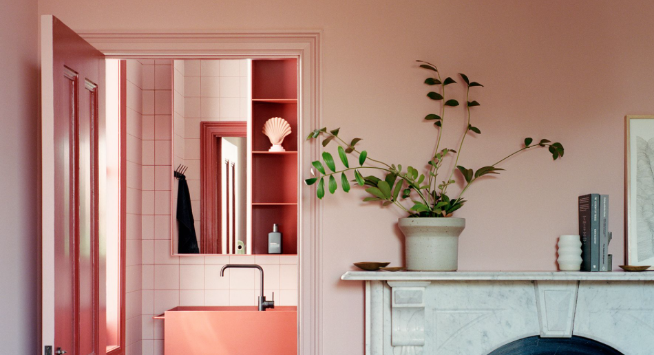
House K by Kart Projects. Photographer: Rory Gardiner.
The 2022 Dulux Colour Awards were handed out in Melbourne on 1 June at a live-streamed gala function that saw a handful of winning projects chosen for their exceptional use of colour and creativity in design.
“Our renowned industry awards program recognises the epitome of colour use in design and architecture, and it is especially significant that we acknowledge and celebrate the array of exceptional projects this year, given the challenging circumstances in which they were created,” says Dulux colour and communications manager Andrea Lucena-Orr.
Autumn House by Studio Bright got two commendations. Photographer: Rory Gardiner.
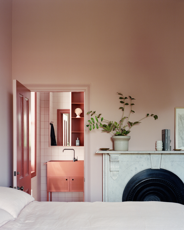
And while the competition spans commercial, workplace and retail spheres it’s the residential winners that we are obviously most interested in. The winner of this year’s ‘Residential Interiors’ category is Lachlan Seegers Architect for its Erskineville House project and judge David Welsh praised the success of the project’s vision which was ‘to bind the home’s atmosphere with the ever-changing presence of nature.’
Erskineville House by Lachlan Seegers Architect. Photographer: Rory Gardiner.
“In an elegant, unforced manner, a soft palette of pale yellow, warm grey and hues of green supports the narrative and moderates the atmosphere of the interiors. The result is a subdued, cocooning moodiness that gently changes and evolves with the movement of natural light. We commend the architect’s commitment to the vision in what appears to be a simple response but is, in fact, a highly considered and finely wrought design,” says David of the home that is centred around a beautiful Spotted Gum.
Erskineville House by Lachlan Seegers Architect. Photographer: Rory Gardiner.
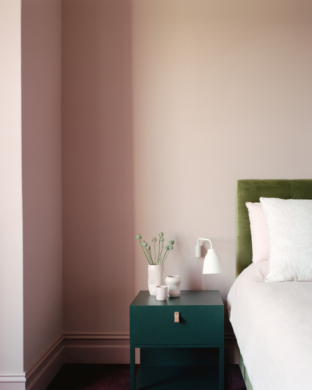
Studio Bright’s Autumn House received commendations in both the ‘Residential Interior’ and ‘Single Residential Exterior’ categories. “Tasked with creating a new extension to a Victorian original with an 80s’ addition, the architects have struck a fine balance between cohesion and distinction, largely orchestrated by their colour selection,” says David.
Autumn House by Studio Bright. Photographer: Rory Gardiner.
“Bathrooms of sea blue and mint green are calming, standalone sanctuaries. Extending the respective palettes to joinery and furniture throughout, the varied tones, textures and touchpoints combine to create an immersive, sensory experience,” says David.
Autumn House by Studio Bright. Photographer: Rory Gardiner.
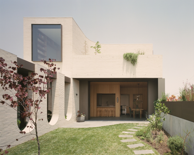
Kart Projects’ House K was the winner of the ‘Single Residential Exterior’ category and was celebrated for its use of colour to distinguish between the old and new parts of the home. “Rejecting the oft-used strategy of blending old and new in residential additions, this design not only opts for an obvious delineation, but a bold, forthright one, with colour as the primary mechanism,” says judge Cushla McFadden.
The original part of the home was restored with a muted, respectful nod to its heritage while the new extension features dark cladding combined with a statement making orange red.
House K by Kart Projects. Photographer: Rory Gardiner.
“Though largely concealed from the front, the addition’s bold scheme is hinted at in a bright orange-red sweep of fence along the street front. The volumetric demarcation, which is also continued within the home, provides a colour-blocked backdrop to the developing landscape,” says Cushla.
House K by Kart Projects. Photographer: Rory Gardiner.
My favourite awards on the design calendar, the Dulux Colour Awards always deliver an incredible amount of interiors inspo for the colour obsessed. Currently in its 36th year, this year’s 103 finalists were drawn from Australia and New Zealand with the highlighted projects displaying innovative use of colour across commercial and residential spaces.
Grid House by Doherty Design Studio. Photographer: Timothy Kaye.
Grid House by Doherty Design Studio. Photographer: Timothy Kaye.
“We were excited to see such an exciting and imaginative use of colour in this year’s entries. Architects and designers have really pushed the boundaries with colour application to create inspiring, engaging – and often surprising – interior and exterior spaces,” says Dulux colour and communications manager, Andrea Lucena-Orr.
Nelson Road House by Bloom Interior Design. Photographer: Armelle Habib.
Nelson Road House by Bloom Interior Design. Photographer: Armelle Habib.
I couldn’t help but notice the strong embrace of more dramatic tones in the residential category – with particular emphasis on greens and blues. “Deeper tones of blue and green were popular amongst residential interiors, showcasing diverse moods in areas and differentiating functional use in a space – from deep and dark, to bright and lively – applied to cabinetry, trims and walls to create a peaceful, relaxing interior setting,” says Andrea who noted that washed walls are emerging as a trend, bringing moody sophistication to interiors.
Sorrento House by Fiona Lynch Interiors. Photography: Dave Kulesza.
Nido House by Angelucci Architects. Photographer: Dylan James.
This year’s judging panel includes Adriana Hanna, director of architecture at Kennedy Nolan; Cushla McFadden, director at Tom Mark Henry; Olivia Macfarlane, director at UNDERCURRENT NZ; Adam Pustola, principal at Lyons Architecture; and David Welsh, principal at Welsh+Major.
Arch Deco by Hindley & Co Architecture and Interiors. Photographer: Tatjana Plitt.
Bondi Terrace by Studio Quarters. Photographer: Prue Ruscoe.
The winners announcement will take place at a gala event in Melbourne and will be live streamed via the Dulux Facebook page. Details of the event will be announced in the coming months.
Malvern House by Lande Architects. Photography: Derek Swalwell.
Casa Luna by Biasol Studio. Photography: Timothy Kaye.
The Dulux Colour Awards are always a feast for the eyes and this year’s finalists are no exception, despite being produced against the challenging background of a global pandemic. 105 finalists were selected from a pool of 437 entries across Australia and New Zealand, with six categories up for grabs including commercial and residential interiors and exteriors. It’s obviously the latter that interests us and there are some truly amazing finalists in this year’s list.
Sydenham Residence by Keta Interiors. Photographer: Martina Gemmola
Clifton Hill Residence by Studio Tate. Photographer: Armelle Habib
“We can’t help but view this year’s projects through a slightly different lens. While our focus is always on recognising innovation and excellence in the use of colour, our appreciation of the quality of work is heightened given the challenging climate in which these projects were created and completed,” says Dulux colour and communications manager Andrea Lucena-Orr.
Owston Hill by Meagan White Architect. Photography: Jack Lovel
And while several trends were identified, the move towards biophilia in design was singled out as a recurring theme – getting back to nature is no doubt a response to what feels like an uncertain world. “There’s a resulting swing towards more nurturing tones and natural finishes. The prevalence of concrete, stone and timber, as well as warm metals, paired with warm earthy hues and deep greens and blues, indicates the need for a return to nature and its grounding effect in chaotic times,” says Andrea.
Erskine House by Kennedy Nolan. Photographer: Derek Swalwell
Brunswick Apartment by Murray Barker and Esther Stewart. Photographer: Benjamin Hosking
It wasn’t all earthy tones though with plenty of vibrant blues, terracotta, coral and dirty yellow tones featuring too. “Despite these tendencies to earthy, natural tones, there is still an evident willingness to be playful with the use of colour, in unexpected highlights and accents. We commend designers and architects on their capacity to remain highly creative and to lead their clients to embrace innovative concepts when faced with such challenging and extenuating circumstances,” says Andrea.
Pony by WOWOWA Architecture. Photographer: Martina Gemmola
Art House by Lynne Bradley Interiors. Photographer: William Horner
Timeless, monochrome schemes featured heavily too with plenty of dark cocooning exteriors (think deep greys, charcoals and black), contrasted with light, warm interiors. “These combinations are no less innovative, but they are suggestive of designers and clients seeking reassurance, permanence and security,” says Andrea.
Yarraville Residence by Wall Architects. Photographer: Aaron Pocock PhotographyCunningham street residence by Studiofour. Photography: Shannon McGrath
The judges will select winners and commendations across the six categories, with awards and prize money being handed down at a Melbourne gala event (live streamed interstate) later in the year.
Dulux colour forecast 2021: soothing colours for challenging times
With most European design and architecture shows cancelled this year, the Dulux Colour Forecast for 2021 has been informed by extensive virtual research into global trends to stay abreast of…
The 2020 Dulux Colour Awards winners have been announced! The winner of the single residential interior category was Perfect Storm (NSW) by Green Anvil Co, Killing Matt Woods and Set For Art, a truly breathtaking apartment if you ask us! And perhaps not surprisingly, it’s the latest in more than a handful of awards the “concrete bunker” home has already won.
The judges said: “Avoiding the ubiquitous industrial cliché, this warehouse renovation is instead a Brutalist–inspired marvel. Its minimalism and clean, clutter-free aesthetic signals a commitment to the vision by both the clients and their design team.
“The use of a single colour and finish, with the appearance of concrete, on all painted surfaces, has a surprisingly warm cocooning effect, which is amplied by the soft curve where walls meet ceilings. It is utilitarian chic at its best – intimate, moody, balanced – and awarded for its simplicity and singularity.”
We love the project that was commended in this category too: Ruckers Hill House (VIC) by Studio Bright. This home, conversely, had a much more obvious and personal use of colour.
“At first sight, the unashamed distinction between old and new in this period home refurbishment and new addition is striking for its balance. Upon closer inspection, the embrace of individuality and its expression in saturated colour are equally remarkable elements of this project,” said the judges.
“Palettes have been devised to reflect the personal nuances of each room’s main occupant: the yellow of a beloved football team, a powder blue for its subtle femininity, and greens as backdrops for teen paraphernalia.
“The main bedroom incorporates its owner’s eclecticism, in contrasting pinks and greens. It is a unique palette that has driven design decisions and been cleverly employed to distinguish between the old and new architectural components, as well as the unique personalities within.”
Photography: Kat Lu (Perfect Storm) and Rory Gardiner (Ruckers Hill House)
“Concrete bunker” Sydney apartment takes out top gong
The inaugural Design Files Design Awards were handed out last week with Matt Woods Design taking out the ‘Interior Design’ award for its beautiful Sydney apartment project ‘Perfect Storm’. Dubbed…
Dulux Colour Awards 2019: Winners announced
Currently in its 33rd year, the 2019 Dulux Colour Awards were announced last week and this year’s crop show some of the most courageous and sophisticated use of colour yet.…
When it comes to our mood, the transformative power of colour is well documented. And while we’re all searching for little pick-me-ups (to escape the unfolding horror), the arrival of the 2020 Dulux Colour Awards finalists is a welcome distraction indeed. Currently in its 34th year, the 107 finalists span a variety of categories, but it’s the residential ones that interest us the most. From suede effects to bold coloured joinery, there’s an abundance of inspiration to be found.
Dulux Colour Awards 2020 – Residential Interior. St Kilda Residence by Doherty Design Studio. Photographer: Derek Swalwell
“Architects and designers have set a new precedent with this year’s awards program submissions. They have exhibited original and masterful use of both colour and texture in their design approach, creating sophisticated interior and exterior spaces,” says Andrea Lucena- Orr, Dulux Colour planning and communications manager.
Suede effects No longer a 1990s’ relic, suede effect walls appear to be back on trend, though interpreted through a modern lens. “We have seen the emergence of textures, such as concrete effects, patinas, French ash and Suede Effects in both commercial and residential spaces. Repetition of these textures paired with unexpected tones was apparent, such as yellow, red and coral in the form of accent walls, cabinetry, doors, skylights and trims,” says Andrea.
Dulux Colour Awards 2020 – Residential Interior. Perfect Storm by Green Anvil Co, Killing Matt Woods, Set for Art. Photographer: Kat Lu
Dulux Colour Awards 2020 – Residential Interior. Orchard House by Chelsea Hing. Photographer: Rhiannon Taylor
Dulux Colour Awards 2020 – Residential Interior. Budge Over Dover by Amber Road. Photographer: Prue Ruscoe
Coloured cabinetry From emerald green to coral and a variety of blue shades, there’s barely a white cabinet to be found in the finalist list. Statement making, we think these bold shades are a fabulous alternative to run-of-the-mill, neutral tones.
Dulux Colour Awards 2020 – Residential Interior. Orchard House by Chelsea Hing. Photographer: Rhiannon Taylor
Dulux Colour Awards 2020 – Residential Interior. Centennial Park House by Balmoral Blue House by Esoteriko Interior Architecture.Photographer: David Wheeler
Dulux Colour Awards 2020 – Residential Interior. Brunswick Residence by Lucy Bock Studio Photographer: Derek Swalwell
Dulux Colour Awards 2020 – Residential Interior. Ruckers Hill House by Studio Bright. Photographer: Rory Gardiner
Dulux Colour Awards 2020 – Residential Interior. Bourke Street Apartment by Fowler and Ward. Photographer: Tom Blachford
Green & timber Our obsession with the outdoors continues with many of the projects using tranquil green tones alongside timber in all its forms. “Many briefs discussed the need for the space to be conducive for rest and a connection to nature, which translated to the employment of botanicals and natural materials, such as timber in both interiors and exteriors,” says Andrea.
Dulux Colour Awards 2020 – Residential Interior. Concrete Blonde by Carter Williamson. Photographer: Katherine Lu
Dulux Colour Awards 2020 – Residential Interior. Gillies Hall by Jackson Clements Burrows. Photographer: Peter Clarke
Dulux Colour Awards 2020 – Residential Interior. Angophora Pavillion by Ava Shirley Architect. Photographer: Michael Nicholson and James Deck
The judging panel will select winners and commended projects across the six categories. The Australian Grand Prix title is also up for grabs with a $5000 AUD prize in Australia, and $5000 NZD on offer in New Zealand.
The judging panel includes Adele Winteridge, Director of Foolscap Studio; Jean-Pierre Biasol, Director of Biasol Design Studio; Jonathan Richards, Director of Richards Stanisich Architecture; Kathryn Robson, Director of Robson Rak Architects & Interiors; and Toni Brandso, Director of New Zealand’s Material Creative.
Flack Studio's 'Elmore Homestead' project received a commendation in the 'Residential Interior' category. Photography: Sharyn Cairns
Currently in its 33rd year, the 2019 Dulux Colour Awards were announced last week and this year’s crop show some of the most courageous and sophisticated use of colour yet. “Architects and designers have really set a precedent with their masterful employment of colour to create unexpected, lively, playful and refined interior and exterior spaces,” says Dulux colour planning and communications manager Andrea Lucena-Orr.
Flack Studio’s Elmore Homestead project received a commendation in the ‘Residential Interior’ category. Photography: Sharyn Cairns
Caroline House by Kennedy Nolan. Photography: Derek Swalwell
“Classic black and white with a punch of colour is eternally effective, and its articulation in this home is especially inspiring. At the home’s core is an inspired interaction of colour – the near-apple green hue on the stair, including its underside and hand rail, is a central connecting device, mirroring the greens of the pool, itself a focal point of the home, and subtly aligning inside and out,” says judge Carole Whiting, director of Carole Whiting Interiors + Design.
Caroline House by Kennedy Nolan. Photography: Derek Swalwell
Perennial favourite David Flack received a commendation for his Elmore Homestead project. “Much like a curated gallery, this is a finely wrought design whose effect relies upon the courageous use of colour. Unexpected moments are created as dark tones give way to splashes of brightness, delineating informal and formal spaces, while also serving as a strong foundation for the contemporary art and sculpture peppered throughout,” says Carole of Flack Studio’s dramatic project.
Elmore Homestead by Studio Flack. Photography: Sharyn Cairns
Elmore Homestead by Studio Flack. Photography: Sharyn Cairns
John Wardle Architects’ Tasmanian restoration project Captain Kelly’s Cottage received a commendation too. “Colour and paint is an important factor in restorations, and this project demonstrates their thoughtful use. It is not just the applied colour, but also the removal of colour to retain the original surface of the cottage and preserve its history that is so impressive. The use of green in the bedrooms is neither stark nor overbearing, and the matching of original colours is respectful and appropriate,” says Carole.
Captain Kelly’s Cottage by John Wardle Architects. Photography: Trevor Mein
The ‘Single Residential Exterior’ category was an interesting one too with Studio Gorman’s Alma Residence project taking out top honours. “From the fabulous front door to the charming extension, the use of many and varied colours in this residence is sophisticated and refined. Anything but conservative, the subtle palette is full of surprising layers and complexity,” says judge Mardi Doherty, director of Doherty Design Studio.
Alma Residence by Studio Gorman. Photography: Prue Ruscoe
Alma Residence by Studio Gorman. Photography: Prue Ruscoe
Making fabulous use of blue too, Mario Danos Architecture’s converted 1850’s bank project The Bank received a commendation in the ‘Single Residential Exterior’ category. “A strikingly simple structure, this converted 1850’s bank has been given new life as a dwelling by strategic injections of colour. The faded original exterior, its warm, soft-red bricks and sandstone base, is punctuated by a perfectly contrasting blue on the front door and window frames, articulating these elements in a simple, impactful gesture,” says Mardi.
The Bank by Maria Danos Architecture. Photography: Trevor Mein
With awards season in full swing, I was thrilled to hear that the finalists for the Dulux Colour Awards have just been announced. For a colour obsessive like myself, there’s always so much original colour inspiration to be found within these awards and this year is no exception with blue and green strong recurring themes.
Wrixton House by Lynne Bradley Interiors. Photographer: Anson Smart
Beechwood by KWD. Photographer: Armelle Habib
Currently in its 33rdyear, the awards continue to grow, and this year there were a record-breaking 435 entries from Australian and New Zealand designers. Ultimately the 114 finalists were chosen for their creative and innovative use of colour with this year’s entries some of the best I can recall.
Who would have thought that a green staircase could look so good? Caroline House by Kennedy Nolan. Photographer: Derek Swalwell
“We were thrilled to see the calibre of submissions for this year’s awards program. Architects and designers have really set a new precedent with their masterful and innovative employment of colour to create unexpected, lively, playful and refined interior and exterior spaces,” says Andrea Lucena-Orr, Dulux colour planning and communications manager.
Ivanhoe Residence by Flack Studio. Photographer: Sharyn Cairns and Caitlin Mills
Aqua is a bold choice but somehow this works. Cydelia House by fjmt. Photographer: Nicole England
Cleveland Rooftop by SJB. Photographer: Felix Forest
A couple of colour trends stand out with statement shades of blue and green used in countless projects. “Deep shades of blue were a popular choice in residential interiors – from azure through to dark navy – seen in cabinetry, trims and feature walls. Meanwhile, greens ranging from soft sage to emerald have lost none of their appeal adding sophistication, character and a sense of quiet luxury,” says Andrea.
How fabulous does this khaki green shade look? Wrixton House by Lynne Bradley Interiors. Photographer: Anson Smart
With earthy hues another solid interior trend, it’s no surprise that those tones featured heavily too. “There has been a shift away from greys and cooler neutrals which have dominated interiors in previous years, with nature-based warm hues, such as beiges, terracotta and caramels coming to the fore,” says Andrea.
Pepper Tree House by Alwill Interiors. Photographer: Prue Ruscoe
Lilyfield residence by Woods & Warner. Photographer: Simon Whitbread
House and Cart by Khab Architects. Photographer: Aaron Citti
“Classic all black and all white remains popular, particularly in residential exteriors – they are shades being used to contrast against red brick or layered to create a modern textured and tonal look,” says Andrea.
Centennial Park House by Madeleine Blachfield Architects. Photographer: Prue Ruscoe
Stanton Road
All of the Australian finalists are in the running to take home the Australian Grand Prix title (worth AUD $5000) while New Zealand entrants are eligible for the New Zealand Grand Prix title (worth NZD $5000). Winners will be announced at a gala event at the National Gallery of Victoria on 8 May, 2019.
Percy St residence, Bagnoli Architects. Photography: Ari Hatzis
In its 32nd year, this year’s Dulux Colour Awards had a record number of entries (more than 300) from across Australia and New Zealand, many of which were pretty incredible. I’ve no doubt the judging panel (including industry luminaries Miriam Fanning, David Flack and David Hicks) had a tough time of it before the awards were handed down recently at a gala event at the National Gallery of Victoria.
Hawthorn residence, Bagnoli Architects. Photographer: Ari Hatzis
Taking out the top award in the ‘Single Residential Interior’ category was the ‘Percy St’ residence by Bagnoli Architects. The original Victorian cottage was renovated and extended and features the most glorious pastel paint shades.
Dulux Colour Awards 2018 – Single Residential Interior winner. Percy St by Bagnoli Archiects. Photographer: Ari Hatzis
“Underpinned by an innovative approach to its philosophy and execution, this entry has a beautiful energy and innocence, which captures the essence of what the Dulux Colour Awards mean to us. The exploration of colour is soft and serene, yet commanding, and responds to the architectural form rather than being simply applied to a surface. With greys, blacks and splashes of colour, the interior scheme flows seamlessly to the exterior, demonstrating how the consideration of colour in a design concept can add light and depth to a home,” says judge David Flack.
Dulux Colour Awards 2018. Percy St Residence by Bagnoli Architects. Photography: Ari Hatzis. Styling: Ruth Welsby
Special commendation went to Fiona Lynch’s ‘Elsternwick House’ project which another grand Victorian restoration. “This classically beautiful and sophisticated residence has been pared back for all the right reasons, and the monochromatic palette fits the architecture: white and black highlight structural elements and openings, while a range of greys tint the walls,” says David.
Image credit: Dulux Colour Awards 2018 – Single Residential Interior commendation. Elsternwick House by Fiona Lynch. Photographer: Sharyn Cairn
Another special commendation went to Arent&Pyke’s ‘Amarelo Terrace’ project which is a glorious celebration of blue. “The considered delivery of the whole project, fully resolved in composition, style and design, is evident here. It wasn’t forced, and results in a timelessness that is heightened by clever layering, materiality of finishes and an intimacy in the design and use of colour,” says David.
Image credit: Dulux Colour Awards 2018 – Single Residential Interior commendation. Amarelo Terrace by Arent&Pyke. Photographer: Felix Forest
The ‘Multi-residential Interior’ category was taken out by Perth architect Simon Pendal for his daring ‘North Perth Townhouse’ project. “A clear, concise concept at the heart of this entry separates it from the rest. With bold hues cutting through a base of white, the internal spaces are cleverly defined, while a play of gloss and matte paint finishes adds another dimension to the form. There is no subtlety here; instead there’s an unwavering commitment to the use of contrasting tones to delineate the interior,” says David.
Image credit: Dulux Colour Awards 2018 – Multi Residential Interior winner. North Perth Townhouse by Simon Pendal Architect. Photographer: Robert Frith
Image credit: Dulux Colour Awards 2018 – Multi Residential Interior winner. North Perth Townhouse by Simon Pendal Architect. Photographer: Robert Frith
With a record-breaking 305 entries from Australia and New Zealand, this year’s Dulux Colour Awards is perhaps its best yet. From blue to yellow, green and pink the bold and inventive use of colour this year is next level – honestly, there are so many amazing finalists I found it hard to play favourites.
That pale blue is beautifully sophisticated. ‘The Matlock House by Danielle B for The Stylesmiths. Photographer: Nicole England
“We were thrilled to see such dynamic and inventive use of colour in this year’s entries. Architects and designers have really pushed the boundaries with colour application to create uplifting, engaging – and often thoroughly surprising – interior and exterior spaces,” says Andrea Lucena-Orr, Dulux colour planning and communications manager.
Such inventive use of colour. ‘Modernist Wonderland’ by WOWOWA Architecture. Photographer: Martina Gemmola
A celebration of the exceptional use of colour, this year’s 305 entries have been eliminated down to a list of 124 finalists (across commercial and residential spaces) with the final awards due to be presented at a gala event on May 10, 2018 at the National Gallery of Victoria. The judging panel includes design experts including David Hicks, Miriam Fanning and David Flack.
Fitzroy North Townhouse by Lisa Breeze Architect. Photographer: Caitlin Mills
“Darker tones of black and charcoal continue to dominate in commercial and exterior spaces, but this year they’ve been punctuated with fun, vibrant accents of red, yellow and lime green in the form of panelling, door and window trims. There’s an unmistakable sense of 80’s nostalgia creeping in,” says Andrea.
North Perth townhouse by Simon Pendal Architect. Photographer: Robert Frith.
“At the other end of the spectrum, we’re seeing a trend towards softer, warmer palettes in commercial interiors – chalky grey-greens, diluted pinks and earthy terracotta that add character and a cocooning vibe,” says Andrea.
I love that chalky grey green. ‘Classic Mosman’ by Ann King Design. Photographer: Amanda Prior.
“Blue is emerging as a popular choice in residential interiors – warm denim tones are adding a relaxed elegance to bedrooms and kitchens, while funky turquoise is being used to energise and excite. Impactful tones of yellow are also making an appearance, often in unexpected places, such as ceilings and interior trims, adding a sense of unbridled joy into interior spaces,” says Andrea.
An unexpected splash of yellow on the ceiling. ‘Joyful House’ by Mihaly Slocombe. Photographer: Tatjana Plitt
“Grey has lost none of its appeal, particularly in residential exteriors, but rather than opting for a single shade, designers and architects are layering up multiple shades of the one colour for a more sophisticated and interesting, tonal look,” says Andrea.
‘The Matlock House’ by Danielle B for The Stylesmiths. Photographer: Nicole England
In its 31st year, the iconic Dulux Colour Award winners were announced recently in Melbourne with some fabulous, inspiring projects recognised. Working to a theme of ‘Bold, Forward, Tilted,’ the winning projects were awarded for their super creative use of paint.
‘Burleigh Street House’
“The Dulux Colour Awards looks to uncover the most inventive use of colour in built environments across Australia, New Zealand and beyond. Each year we look for the submissions that take creativity to new heights and this year’s award winners broke free of all tradition to deliver concepts that truly represent the future of colour and design,” says Dulux colour planning and communication manager Andrea Lucena-Orr.
‘Coppin Street Apartments’ featuring Dulux Sulphur
MUSK Architecture Studio took out the ‘Multi Residential Interior’ category for their use of Dulux ‘Sulphur’ in their gorgeous ‘Coppin Street Apartments’ in the Melbourne suburb of Richmond. “We’re seeing a shift towards people changing colour palettes more regularly to align with fashion trends. The bright colours on the doors are a key focus in each apartment and offset the industrial material palette of the background. This submission pulls together its colour scheme in a refreshing way whilst ensuring all elements work well together,” said the judges.
‘Coppin Street Apartments’ – the sliding doors are such a clever design offering fabulous versatility
It’s a slick yet sunny vibe (no mean feat!) and I love the way that the door colour can be so easily changed when the occupants tire of it.
‘Burleigh Street House’ featuring Dulux Melon Baby and Dulux Black Water
The winner of the ‘Single Residential Exterior’ category was the architectural firm ME who used multiple Dulux colours to fabulous effect in their ‘Burleigh Street House’ project. Dulux Duck Egg Blue features alongside Dulux Mondrian Blue and there’s a gorgeous melon tone in there too. “This submission demonstrates the importance of why people should be inspired by and explore colour matching,” said the judges. We couldn’t agree more.
‘Burleigh Street House’ – I love that pop of Mondrian blue!
“To create a joyful apartment renovation in Footscray, Melbourne, the palette was selected to complement and soften the tones of the existing structure to add warmth and visual interest to the space. By using very muted palettes, this witty and effective design is refreshing,” said the judges.
‘Footscray Apartment’
Photography: Ben Hosking, Christopher Frederick Jones & Haydn Cattach
Bronte Terrace by Arent & Pyke. Image by Felix Forest
With greater renovation confidence and consumers taking cues from their favourite eateries and venues, we are seeing dark and bold colours, less typically not seen in residential spaces, inspiring homeowners. While a commercial trend would traditionally take three years to appear en masse in residential spaces, we are seeing this transition shorten, with homeowners instantly introducing creative ideas from commercial designs into their home.
Colour and communications manager at Dulux Group, Andrea Lucea Orr, says: “Being bold with colour isn’t something to fear, it’s a look to embrace. Highly colourful interiors are a way to show your personality and create a space you love. With blacks, dark and light blues, and eclectic mixes of bright pops, we are seeing more and more homeowners move away from safe neutrals and make their mark with colour in a way previously not seen.”
For consumers willing to be bold and brave with colour, we’ve identified three striking looks from the 2015 Dulux Colour Awards, announced earlier in the year:
The cafe style look
The café style look uses materials not commonly seen in the home, such as plywood and concrete, paired with practical applications such as Chalkboard paint, a look that can be achieved with Dulux DryErase.
Local House by MAKE Architecture. Image by Peter Bennetts
Typically paired with a bold base colour, such as Dulux Black or Black Caviar, this mix of materials create spaces perfect for entertainers who want the same experience at home as they get from dining out.
McGill House by Jacinta Preston. Image by Michael Malherbe
Block colour used for impact
Moving away from traditional whites, there is a movement towards a range of blues used to create stunning and calming interiors. Both of these looks by Arent & Pyke reference a chic, romantic and effortless style, created through the shades of blue and timber tones.
The Avenue by Arent & Pyke. Photo by Anson Smart
Bronte Terrace by Arent & Pyke. Photo by Felix Forest
Recreate these looks (above) with Dulux Blue Steel (Bronte Terrace) and Dulux Hildegard (The Avenue). These blues are great choices with the former displaying a dark, dramatic essence and the latter a lighter hue. To finish the look, blues work beautifully alongside various natural earthy and brown tones.
Colour in unexpected places
Colour is being used differently and we are seeing great results when people think of innovative ways to introduce colours into a space.
In the Awards, we saw colour used to create interest, through appealing shapes and patterns. Colour was used in nooks above doorways, it was used on the ceiling and also moving down the ceiling onto the walls. To achieve this look in your home, find areas you could introduce pops of colour, such as nooks and the ceiling, then think about how colour could enhance the feeling and sense of function in this space.
Courtyard House by Aileen Sage Architects. Image by Tom Ferguson
In the commercial categories in the 2015 Dulux Colour Awards we saw a brilliant graphic trend appearing. Keep an eye out for graffiti style art making its way into interiors very soon.
Anglesea House 4 by Emma Mitchell. Image by Dianna Snape
Grand Prix and Installation & Events winner: Lexus Pavilion by Mim Design
The bold and inventive use of colour defined the winners of the 2015 Dulux Colour Awards, with – as usual – the residential categories being our standouts.
Multi Residential winner: Polychrome by David Boyle Architect. Photo by David Boyle.
The Multi Residential prize went to David Boyle Architect for the NSW Polychrome project. Fun and energetic, the exterior was reminiscent of a modernist painting and with red brick remaining in the space; the chosen palette of bright hues was a clever and lively decoy.
Single Residential Interior winner: The Courtyard House by Aileen Sage Architects. Photo by Tom Ferguson.
The Single Residential Interior prize went to Aileen Sage Architects for their NSW project, The Courtyard House. An innovative design, they cleverly used colour, not only in bold pops but also in neutrals, to beautifully highlight and complete a bright and playful palette.
Grand Prix and Installation & Events winner: Lexus Pavilion by Mim Design. Photo by Sean Fennessy.
The Grand Prix winner — while not residential — must also be mentioned. Beautifully crafted by Mim Design, the installation at the Lexus Design Pavillion in Victoria used a subtle ombre colour to great effect, providing a dimensional impact which flat colour alone couldn’t achieve. The sage green gave the illusion of a floating sea while the floral ceiling displayed a beautiful upside-down Monet’s Garden.
The winners were announced last night at a gala event in Melbourne.
Single Residential Interior: Domain Residence by Travis Walton
After a record-breaking number of entries, the finalists for the 2015 Dulux Colour Awards have been announced, with the field narrowed down to 78 finalists in the search for the best application of colour to transform a space.
Single Residential Interior: Domain Residence by Travis Walton
Now in its 29th year, the Dulux Colour Awards recognises and rewards innovative use of colour across nine categories, with the best of the category winners awarded the Grand Prix prize.
Single Residential Interior: Manly Beach Pad by Brett Mickan Interior Design
As usual we can’t go pass the residential finalists, with the interiors using daring colour, with highlighted ceilings, interesting patterns and juxtaposed colour combinations.
Single Residential Interior: McGill House by Jacinta Preston
A panel of design leaders will now judge the finalists, with the winners announced at a gala event in Melbourne on Wednesday 25 March.
For more information on the 2015 Dulux Colour Awards and a list of the finalists visit Dulux’s website.
Bricolage House: Winner of Residential Interior 2014
With just a week left until entries close for the 2015 Dulux Colour Awards, now’s the last chance for architects, designers and students to submit their latest projects featuring inspiring use of colour.
The entry process for the awards has been simplified from previous years, making it easier for those in the industry to gain recognition for their work. Entrants are no longer required to submit a board as part of their initial entry, with only those who make it to the finalist stage asked to complete a showcase board for review by the judging panel.
With four new categories, there are more opportunities to showcase and celebrate great work in the industry. The categories include:
Commercial Interior – Public Spaces & Hospitality (New)
Commercial Exterior
Single Residential Interior
Single Residential Exterior
Multi Residential Interior
Multi Residential Exterior; International (New)
Installations and Events (New)
Student.
Bricolage House: Winner of Residential Interior 2014
They’ll be judged by an esteemed industry judging panel including: Andrea Wilson – senior associate at ARM Architecture; Hannah Tribe – principal and founding director of Tribe Architects; David Bromley – contemporary artist; Sian MacPherson – interior designer and editor of EST magazine and Simon James – contemporary furniture designer from New Zealand.
The Dulux Colour Award entries close on Thursday 12 February, with finalists announced on Tuesday 24 February and winners announced on Wednesday 25 March.
Entries are now open for the 2015 Dulux Colour Awards, Australia’s premier showcase of paint application in commercial and residential environments.
The newly expanded competition will see the introduction of three new categories, increasing the possibilities for innovative examples of inspiring colour application.
Commercial Interior – Public Spaces & Hospitality (New)
Commercial Exterior
Single Residential Interior
Single Residential Exterior
Multi Residential Interior
Multi Residential Exterior
International (New)
Student.
The 2015 program also sees a change in the entry process with entrants not required to submit a board as part of their initial entry, making it easier for industry professionals to gain recognition for their work. Only those who make it to the finalist stage will be required to complete a showcase board.
Each category winner will receive prize money and a certificate. All entries, except for the student category, will also stand the chance of taking out the Grand Prix title. The Grand Prix winner will receive $5,000 cash and a certificate.
Entries for all nine categories are open until Thursday 12 February 2015. For information on how to enter visit their website.
Headed up by Miriam (Mim) Fanning, Mim Design is a Melbourne interior design studio doing some seriously cool, award-winning work.
Miriam’s first design job was at the Buchan Group in Melbourne, where, she says, her interest in retail was combined with working in a stimulating and diverse practice. “Starting as a junior and eventually growing into the position of associate director, I was inspired by the many facets of design I experienced while working across a variety of projects.”
Mim Design’s Miriam Fanning
Having a family led her to launch Mim Design in 2000. “My main aim was, and is, to be continually inspired; I love the ability to work on a diverse range of projects within the growing and ever changing design industry.” Mim Design has grown too, from the days of just Miriam, to a busy studio of 17 staff with two fellow directors and two associates. “Our projects now range from interior design to architecture as well as place-making, styling and brand direction.”
No matter how big they grow though, they work hard to keep the business very boutique. “We maintain a close level of communication and contact with our clients throughout each project,” says Miriam. “Right from the initial briefing through to the build, it’s this close connection with our clients that allows us to take an individual approach with each project. The boutique feel is essential to our studio as it allows us to focus on the finer detail as well as create custom design and identify with a unique, timeless design element to each project.”
The talented, happy and enthusiastic team hasn’t happened by accident. “Every one of the team has an insatiable appetite to contribute creatively so, as a practice, we nurture that as our culture. We encourage everyone to bring their diverse backgrounds, styles and strengths to the table. As a studio, we use this to our advantage and have fun fusing these differences to create unique spaces. It is important that we design to suit the space, brief, and clients’ personality even though we do have varied tastes in the studio. It is important that our client’s sense of personality is implemented in each project.”
If Melbourne has its own interior aesthetic, it’s one that relies heavily on making the most of natural daylight and texture. “Inspiration is everywhere, from texture, spaces and colour for everyday living,” Miriam says. “Visualisation has always been a huge source of inspiration to me, whether it’s through travel, film or someone else’s individual philosophy and interesting critique. I’m always seeking out new inspiration and have become addicted to some fantastic design blogs recently. I must admit a trip away clarifies design sense and detail for me.”
Keeping things fresh is a challenge for all interior designers but Miriam’s approach is quite straightforward: “I find that combining true classics with contemporary designs create unexpected and satisfying elements to a project that help to keep things interesting and current. Ideas are kept fresh by ensuring each project is unique to each client. I also believe the study of form in the ‘macro’ sense opens up your eyes to deliver elements of surprise in a project through the finer detail.”
Mim Design has not one but seven projects shortlisted in the Australian Interior Design Awards 2014, with winners due to be announced in May. They also have a project shortlisted in the Dulux Colour Awards 2014, whose winners are being announced tomorrow.
Evolving as a designer is really important too, however much you’re known and respected for a certain look. “At Mim Design, we definitely have a consistent palette of finishes and products that stay true to our aesthetic, reflect a timeless quality and meet a certain functionality. And although we don’t pounce on emerging trends, we’re always incorporating aesthetics that reflect what’s going on in the global design world. For us, it’s more about finding that balance between the classic and the contemporary that creates a certain design synergy and reflects our aesthetic and ethos on every project. For us as a studio, it’s important that there is consistency in quality proportion, symmetry and form.”
The practice currently has a huge 55 active projects, with about 70 percent of it residential work. They recently started working in an architectural capacity across some jobs which, says Miriam, felt like a seamless move. “It allows for a more defined integration of interior services by enabling the architectural shell to consider joinery elements within the concept phase. The relationship between the structure of a home and its interior decoration is important to the design of any project .”
Adding to Mim Design’s holistic offering, is a growing custom furniture and lighting design function. “This side of the design process has evolved very organically and has always been something we take great pride in doing. As part of our brief to satisfy the interior needs of our clients, the idea to custom craft particular pieces made complete sense and has been really successful. Over the past few years, we’ve been lucky enough to have built close working relationships with some very talented local joiners, which makes for the perfect collaboration.”
For Miriam, as a mother and business owner, priorities always need to be balanced. “To be extremely honest, the balance is difficult. Being a business owner means living, breathing and driving your business. At the same time, as a mother, it is essential that quality time and experiences are consistent. I can’t say there is always an even balance, but as a woman (as most would agree) we are always striving for this balance.”
Her family home is simple; a meld of Victorian with a contemporary architectural addition to the rear of the property. “Our interest in art led us to a property with high ceilings and large expansive walls. Proportion and space were paramount when renovating our home and having two active boys made it important that all the spaces worked comfortably. It is also important that it is a home we can have fun in, whether it’s playing bowls down the hallway or chasing the dog around the house.
“Our home is also a relaxing and comfortable sanctum– particularly on the weekend. It’s an enjoyable space to spend time in and relax with our kids. Careful consideration was taken when designing to maximise the use of natural daylight through the casual living zone. We have just recently completed all works on the house and funnily enough I’m getting itchy to work on another project. That’s the typical designer in me!”
19 Vincent Street, Glen Iris by Austin Design Associates
After reviewing close to 200 entries from some of the top names in the Australasian design community, the judges of the 2014 Dulux Colour Awards have narrowed the list down to 76 finalists.
Murphy’s House by Alex Fulton Design
Now in its 28th year, the Dulux Colour Awards recognise the imaginative use of colour by architects and interior designers, to redefine the spaces they have created.
Standouts this year include Murphy’s House by Alex Fulton Design, a renovated 1903 villa, whose colour palette of a vibrant, bold and at times kooky theme, reflects the creativity of the owners.
Little Red Riding Hood by Nexus Designs is also a frontrunner, with the bold use of colour on the built-in joinery allowing for a simplistic look that feels complete without layers of accessories.
Little Red Riding Hood by Nexus Designs
Both finalists are in the Single Residential Interior category, one of the nine categories. A winner will be announced for each, with the best of the category winners going on to be awarded the Grand Prix prize.
Dulux’s Andrea Lucena-Orr, said 2014 was another inspirational year, with submissions reflecting key commercial and residential trends: “The use of block colour was prominent in the [residential] categories. For the Single Residential Interior category, red, green and grey were popular colours.”
Another finalist in the Single Residential Interior category: 19 Vincent Street, Glen Iris by Austin Design Associates
Winners of the 2014 Dulux Colour Awards will be announced at a gala event in Melbourne on 27 March. More information and all the finalists can be found here.
Last year's Dulux Colour Awards Grand Prix winner – Atherton Gardens HUB Development
Entries for the 2014 Dulux Colour Awards close on 6 February, meaning there is less than a month remaining for designers, architects and students to showcase their imaginative use of colour.
Last year’s Dulux Colour Awards Grand Prix winner – Atherton Gardens HUB Development


