Categories
Expert Tips Styling

Pantone colour 2022 Very Peri: how to add touches to your home

Stylist Justine Wilson shares her tips to incorporate Very Peri into our homes so we can bask in the bright, joyous violet tone.

Described as the perfect rainbow purple, the brand new custom colour has hints of blue with a deep red base. It is symbolic of the desire to adapt and reinvent ourselves after the last few years as well as a need to understand, accept, heal toward a new path forward. It’s an interesting colour that still feels warm and inviting with its cool tone, so it will work in any current interior design scheme, as a contrast or to complement your existing theme.

For general interiors

Bright tones have always been popular, and they can be used in both classic and contemporary style interiors. Very Peri can be used as a colour accent with accessories, rugs, curtains, or cushions, or as a big bold element in a room, such as a feature wall or the full room being painted in that colour. Key furniture can be painted or upholstered to showcase the colour.

A simple refresh

Easily and affordably introduce this purple tone through florals, candles, books, throws or even through your own personal fashion choices. Playing with the colour of the year as inspo is a great way to refresh your interiors and inject new life into any space.

For the spiritually inclined

Purple colours embody creativity, thoughts, feelings and inventiveness. Purple is the colour of both the crown (violet) and third eye (indigo) chakras. You can bring this colour into your environment in many ways, and you may find that it encourages you to focus on your thoughts and creative outputs. As a fun nod, purple tones have always been associated with magic. Think of witchy stories, Halloween décor and dried herbal and floral items like lavender. Purple crystals such as amethyst are not only beautiful, but are also meant to awaken spiritually and heal the mind.

“Overall Purple is a dynamic colour, and one that is sure to energise your home and mind, and thus the perfect choice for 2022,” said Justine.

Justine is the owner of Vault Interiors

Categories
Design Styling

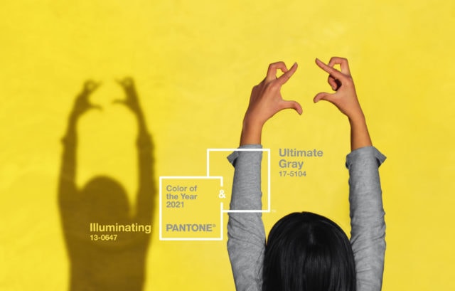
Pantone Colour of the Year 2022: Very Peri

A striking violet-blue shade that reminds me instantly of hydrangea, the Pantone Colour of The Year 2022 was recently announced – Very Peri. Taking its name from periwinkle blue, the gorgeous hue is a direct response to the period of transition and upheaval the world has been experiencing. And in a reflection of just how unprecedented these times have been, Pantone has created a brand new colour to mark the occasion.

“Displaying a carefree confidence and a daring curiosity that animates our creative spirit, inquisitive and intriguing PANTONE 17-3938 Very Peri helps us to embrace this altered landscape of possibilities, opening us up to a new vision as we re-write our lives. Rekindling gratitude for some of the qualities that blue represents complemented by a new perspective that resonates today, PANTONE 17-3938 Very Peri places the future ahead in a new light,” says Pantone.

Lounge Lovers Bronte sofa in periwinkle linen: I love a bold, coloured sofa and this one ticks all the right boxes. Inspired by the Pantone announcement, the sofa isn’t available just yet but interested buyers can join the waitlist.

“Pantone’s inspiration for Colour of the Year was partly informed by the impact of COVID-19 lockdowns – something Australians have known all too well. During this time, our couches and living rooms became more important to us than ever. It’s the first time in 22 years that Pantone has created a bespoke colour for the year, and with its links to creativity, joy and imagination, it feels very positive after the last two years,” says Lounge Lovers’ head of merchandising, Kylie Burgon. $2,499.

Lounge Lovers sofa

Desenio Amour poster: Perfect for those looking for a subtle nod to the bold hue, this cute neon-themed print is a steal with prices starting from $17.97.

Desenio print

Mustard Made lilac lockers: An Aussie success story (did you know they just launched in the US?), Mustard Made debuted a lilac range earlier this year proving they were right on trend. From $229.

Mustard made

Fenton & Fenton Spikey Crystal Vase in Blue & Violet: Equal parts vessel and art piece, this two-toned crystal creation makes quite the statement with, or without, flowers. $450.

Fenton & Fenton

Lisa by Sofia Bonafti, unframed art print: Part of The Block Shop offering, this quality giclee art print has been produced on luxurious 100% cotton rag textured art paper and is perfect for adding a splash of Very Peri to your living room. $79.

Block Shop

Wattyl Turkish Bazaar: The brave among us might consider using the hue in the form of paint and Wattyl’s Turkish Bazaar is a perfect match. “Wattyl Turkish Bazaar is a colour consumers can really have fun with – be it painting a single feature wall in a bedroom or living area or introducing pops of the colour in the form of cushions, throws or ceramics,” says Wattyl.

Wattyl
Image courtesy of Pantone

Arthide Oleada periwinkle rug: Available in oval, circular and rectangular iterations, this rug is really rather special. A fabulous way to add a pop of periwinkle to your interior, this rug is made from cow hide laid in a soft, geometric pattern. From $1,495.

Arthide
Arthide
Categories
Design Shopping Styling

Pantone Colours of the Year 2021: ‘Ultimate Gray’ & ‘Illuminating’

In a year that has been punctuated by highs and lows, light and shade, it’s little surprise that the Pantone Colour(s) of the Year for 2021 are comprised of a bright lemon yellow and a rather safe shade of grey. A response to the pandemic, Pantone describes the duo as “a marriage of colour conveying a message of strength and hopefulness that is both enduring and uplifting.”

Unashamedly optimistic, ‘Illuminating’ is a sunny shade of yellow sparkling with vivacity while ‘Ultimate Gray’ is a solid and dependable earthy shade designed to quietly assure while encouraging composure, steadiness and resilience.

Freedom Cosh table lamp in grey: With its classic dome-shaped shade, this vintage-inspired metal design will make a statement in the living room or on a bedside table. It’s available in white and black too. $55.

Freedom Cosh lamp

Annie Sloan paints: Perfect for an up cycling project, the iconic chalk paint brand offers to Pantone-perfect colours in ‘English Yellow’ and ‘Chicago Grey.’

Annie Sloan

Ferm Living ripple glassware in smoke: A modern design classic, this gorgeous range features a rippled surface, geometric silhouettes and delicate hand feel. From $79.

Ferm Living

Superfresco Easy wallpaper: Instead of having to apply glue to the paper, this easy to use range features new ‘paste the wall’ technology making a weekend wallpaper job accessible for even the most novice DIY-er. Prices start at $60 per roll.

Supefresco

Pillow Talk Lunar towel range: Boasting a stylish tassel edge and raised geometric texture, this towel range comes in ten on-trend colours but the yellow is super fun. From $4.95.

Pillow Talk towels

Brosa Sophie set of bar stools: Reminiscent of French parlour style, these stylish stools feature plush grey velvet upholstery atop a minimal back frame. $429.

Brosa velvet bar stool

Bonnie & Neil ‘Big Major 2’ tea towel: Handmade in Melbourne, this linen tea towel features a gorgeous screen printed image of a cockatoo. It’s perfect for adding a pop of colour in the kitchen. $39.

Bonnie & Neil tea towel
Categories
Design

Pantone Colour of the Year 2020 ‘Classic Blue’

Pantone’s much-anticipated 2020 Colour of the Year was revealed a few days ago, and I’ll admit to finding it a bit underwhelming at first – it certainly pales next to last year’s vibrant and inspiring shade. But while the colour does have an almost corporate feel, there’s no denying the enduring appeal of blue – what better hue is there to provide comfort through uncertain times?

Pantone Classic Blue

“We are living in a time that requires trust and faith. It is this kind of constancy and confidence that is expressed by Pantone Classic Blue, a solid and dependable blue hue we can always rely on. A boundless blue evocative of the vast and infinite evening sky, Classic Blue encourages us to look beyond the obvious to expand our thinking,” says Leatrice Eiseman, executive director of The Pantone Color Institute.

Annie Sloan ‘Napoleonic Blue’ paint: Taking inspiration from Pantone’s Classic Blue, Annie Sloan’s ‘Napoleonic Blue’ is reminiscent of the ultramarine and cobalt blue pigments used in neoclassical interiors.

Annie Sloan Napoleonic Blue

“Blue is one of my favourite colours, especially in interiors, because of its calming, recessive qualities. I’m so glad Pantone have chosen to highlight this blue for 2020, as I think we all need a little calm and tranquility for the coming year!” says Annie Sloan.

Annie Sloan Napoleonic Blue

Artistudio ‘Botanicals 1’ limited edition print: Artist Arti Shah combines her background in graphic design, painting and photography to create her unique works. I love this gorgeous, moody blue floral. From $395 (unframed)

Aritstudio print

Canning Vale Spendour bath towels in Mezzanotte Blue: A staple for over 30 years, this towel range is constantly updated to reflect the trends; Classic Blue is in the current mix. From $19.99 (face washer)

Canning Vale towels

Madoki Pantone 2020 Classic Blue and concrete clock: Incorporating the hue quite literally, this  minimal clock comes with a choice of frames including natural bamboo, black and white. $46.67.

Pantone clock

Highgrove Bathrooms Oliver wall hung vanity: A fresh alternative to the usual neutral suspects, this deep blue vanity is a fabulous hero piece for the bathroom. From $458.

Highgrove Bathrooms Oliver vanity

Highgrove Bathrooms Oliver Vanity

Adairs Home Republic Vespa denim blue pot: Useful as a place to store knick-knacks or your favourite plant, the textured finish is the best thing about this pot. $19.99.

Adairs denim pot

Fenton & Fenton Lapis Lazuli tray: Made from Lapis Lazuli (which usually exhibits a varied but deep, celestial blue), this is one statement making tray. $310.

Fenton & Fenton

Globewest Theodore Louis occasional chair: Merging classic French style with Art Deco details, this velvet chair has a tufted back and brass-tipped tapered legs. It’s the perfect blue accent piece. $1605.

Globewest chair

Check out Pantone’s 2016 colours of the year – Rose Quartz & Serenity

Categories
Bathrooms Furniture Homewares Styling

Pantone Greenery: Amy’s top homewares picks

When I saw this year’s Pantone colour of the year, Greenery, I’ll admit that I wasn’t exactly whirring with enthusiasm. According to Pantone, the zesty, acid green shade is supposed to “satisfy our growing desire to rejuvenuate and revitalise and symbolise the reconnection we seek with nature, one another and a larger purpose.” And while I understand the fresh hue is intended as a calming antidote to the tumultuous social and political environment we currently find ourselves in, it doesn’t make it any less tricky to decorate with.

For my money, I’d use it in small doses – a pop here or a splash there can be surprisingly effective and is often all you need to dip your toes in. And if you really can’t find room for it, use the shade purely as inspiration and embrace green in its myriad other glorious shades.

Chalk Paint by Annie Sloan in Antibes Green: The perfect choice for your next up cycling project, Annie Sloan’s chalk paints really can transform an old piece of furniture from drab to fab. This shade of green is particularly lush. $59.95 per litre.

Urban Road Solo Plum cushion: Evoking a rainforest, this cushion is perfect for those wishing to simply dabble in the hue. $79.

Danish Red Skipper Furniture Uni sofa: Who would have thought that an acid green sofa could look so good? I think it’s the blonde beech wood legs that make it – oh and it’s beautiful Danish curves. From $3855.
Alex & Elle Bjorkar wall art: Featuring an abstract water colour, this dual-tasking wall panel offers acoustic insulation too. From $595.

T2 Pearly White green teapot: It’s the runway inspired delicate lace pattern that reeled me in with this one. Plus, I love the combination of bright silver and vibrant green. $68.

Living Edge Tank S1 Suspension light in pea green: Obviously a splurge but this pendant light would make quite the statement over a beautiful wooden dining table. $1400.

Lorena Gaxiola Soft Rocks glasses in lime: Mouth-blown, each one of these glasses is entirely unique. From $75.

Kohler Toobi single lever basin mixer: This modernist tap design takes inspiration from the shape and form of bamboo. The pop of green at the spout is a playful touch. $354.

Categories
Art Styling

Pantone’s 2016 colours of the year – Rose Quartz & Serenity

Eagerly anticipated by design enthusiasts, Pantone’s colour of the year is usually a pretty accurate harbinger of the colours that are likely to be adorning our interiors going forward.

pantone-color-of-the-year-rose-quartz-serenity-woman-fabric
And for the first time in Pantone’s history, they have chosen the blending of two shades – Rose Quartz (a warm pink) and Serenity (a cool violet-toned blue that evokes a beautiful bunch of hydrangea).

1 Adairs urban print Adairs Home Republic Urban Print Solaire, $55.95

A response to the zeitgeist, the combination is both warm and embracing and cool and tranquil – an antidote to the stresses of modern life.

2 Aura Kali dinner plate
Aura Kali dinner plate, $24.95

“Rose Quartz is a persuasive yet gentle tone that conveys compassion and a sense of composure. Serenity is weightless and airy, like the expanse of the blue sky above us, bringing feelings of respite and relaxation even in turbulent times,” says Pantone.

3 Matt Blatt
Matt Blatt Mike Loh sofa with chaise, $2950

We love the combination and while it could easily slip into girlishness, pair it with touches black and copper or silver metallics to keep it looking clean and modern.

4 Zanui marble cushion

Zanui Bambury marble cushion in lilac, $44.95

Screen Shot 2016-01-13 at 8.47.12 PMThe appropriately named Dulux Cuddle is perfect for a feature wall.

Screen Shot 2016-01-13 at 8.50.31 PM copy
Taubman’s Flowering Cherry

See Pantone for more.

Categories
Appliances Kitchens

Warm up your kitchen with a Pantone approved oven

A destined favourite for those who love daring colours, ILVE’s Majestic Freestanding Cooker warms up the kitchen with its wine hues and rich earthy tones. It’s also a dead ringer for Pantone Colour of the Year 2015 Marsala.

ilve kicthen interiors addict

With tepanyaki plate, electric oven and a 90cm canopy hood, the range of freestanding ovens come in eight colours; including burgundy.

ilve kicthen interiors addict 2

Renowned for having one of the largest and most diverse freestanding oven ranges on the market, with over 1,000 different models available, ILVE has already found the burgundy freestanding oven to be a favourite.

“These wine tones especially fit in the kitchen landscape as they are not particularly overly masculine or feminine, meaning they are versatile and cater for a broader spectrum of buyers,” explains marketing manager, Daniel Bertuccio. “As the oven is the centerpiece of the kitchen, it’s fit to dress the largest appliance in a bold, eye-catching colour.”

ILVE’s M90FDMP Freestanding Cooker retails for $11,099, with bronze fittings $11, 749, and the 90cm Majestic Series Canopy Hood retails for $4,449. For more information.

Categories
Interiors Addict

Pantone colour of the Year Marsala inspires new paint shade

With the announcement of the 2015 Pantone Colour of the Year (the reddy-brown and much maligned Marsala) Annie Sloan’s legendary decorative paint range now includes a rich and warm Burgundy.

SAMSUNG CSC

Annie says: “Burgundy, as the name suggests, is a rich, claret red which I was drawn to because of its classical French Napoleonic connections.”

The Chalk Paint range comprises 32 decorative and historic colours and the colours can easily be mixed together to provide an even larger colour palette. As Annie explains: “Burgundy is a timeless favourite, a regal colour that works well on its own, or with my own favourite pairing for this colour – Château Grey. Add some Primer Red and a little Old White and the colour takes on a more contemporary personality, becoming a delicious, raspberry pink like Marsala, the Pantone Colour of the Year, giving a little shocking jolt to a room!”

Burgundy_01

Chalk Paint can be applied straight on to furniture without the need to prime, sand, or even remove old wax, paint or varnish — the paint will adhere to wood, plastic, stone, brick, concrete and metal. Much more than just an indoor paint, it lets you instantly upcycle, revamp or redecorate your favourite outdoor piece without sanding or prepping.

The colours have been developed to mix beautifully together so you can either take a colour straight from the tin or create your own by mixing two together. The paint can also be used to achieve a variety of looks and finishes; apply it thickly to create a chippy look or dilute it with water to make a wash. You can even use it to paint and dye fabric! What’s more, it’s water based and eco-friendly, containing virtually no VOCs, and it is highly concentrated to produce extensive covering power.

Burgundy_Open Lid

The best part? The paint dries quickly with a beautifully velvety, matt finish and for most purposes, one coat is enough. So you can easily complete your project in a day and still have paint left over for more projects.

$59.95 RRP for 1 litre. Australian stockists.

Categories
Designers Expert Tips The Block

Shaynna Blaze on how to use Pantone’s Radiant Orchid in your home

By Shaynna Blaze

Earlier this year, Radiant Orchid was named as the 2014 Pantone Colour of the Year and it certainly ruffled some feathers with many (including Interiors Addict’s Jen!) questioning the bold choice of colour. Whether you love it, or are yet to be convinced, here are my tips for confidently incorporating the bold shades of purple into your interior colour scheme.

Purple has always been a colour of contention as some love it and others really don’t. I’ve heard a lot of talk of people fearing this new colour direction or being lost for how to make this work in their home. With any new trend it takes a while for people to embrace it, so in the spirit of embracing change, here are some of my suggestions for how to incorporate the purple jewel tones into your interior palette.

Recently, I have been talking a lot about using ‘grown up’ pastels in interior colour schemes and purple provides the depth of colour required for such a scheme, as it’s dramatic and rich, which adds punch.

There are two ways to incorporate such a bold colour into your home. You can either use it as an accent/feature colour in a room or be brave and use it on your walls as a bold statement. I’ll demonstrate this by looking at the same room but using the colour in two different ways:

As an accent colour:

The introduction of a new trend colour doesn’t mean you have to redecorate a room from scratch. You can alter the look of a room by adding accessories in various purple colours. As you can see in the picture, the bottles and accents on the cushions are a purple colour, beautifully accompanying Taubmans Endure Bald Mountain on the walls. This is an easy way of leaning gently into a new trend.

As a bold wall colour:

If you’re feeling bold you can paint your walls in Taubmans Balloon Pop. The use of neutral white, black and charcoal in the furnishings such as the couch, rug and mirrored tables allows you to be more adventurous with your wall colour and accessories. With this bold wall colour, you may choose to remove the bottles and instead have a small vase of flowers and replace the patterned cushions for textured ones in more neutral tones.

In order to embrace a bold colour, you need to know which colours it complements. There are two ways to approach it:

Select colours of a similar hue:

The first way is to select a colour that is in a similar tone to your starting colour, such as Taubmans Ellie May Rose, Taubmans Leaden Sky and Taubmans Spring Mauve. Using these colours in a lower intensity makes them blend together, creating a more harmonious look.

Taubmans Ellie May Rose, Leaden Sky and Spring Mauve

Choose a cool colour:

For a more dramatic look, you can choose a cool colour like Taubmans Grand Gusto and Taubmans Blueberry Bush with accents in Taubmans Crisp White. This colour palette creates a fresh and impactful colour scheme for your interior.

Taubmans Grand Gusto, Blueberry Bush and Crisp White

When using complementary colours, the key to creating the perfect look is to use the colours in different proportions, so one colour is dominant and the other is an accent. For example, you may decide to have your walls in Taubmans Leaden Sky and then introduce the trend colour through painting a chair in Taubmans Balloon Pop.

Taubmans Balloon Pop

For those who love a crisp look, you can paint your walls in Taubmans Crisp White and accent the room with artwork and cushions in different shades of purple.

The most important thing to remember is that trend colours are supposed to be a starting point for inspiration to bring to life your perfect interior scheme, not to create colour stress. Embrace it!

For more tips for using colour in your home visit Taubmans. Interior designer Shaynna is a judge on The Block, host of Selling Houses Australia and creative director for Taubmans.


Categories
Interiors Addict

Pantone’s colour of the year Radiant Orchid: I’m just not a purple person!

Hmm… Pantone’s new colour of the year, Radiant Orchid, has left me screwing up my nose a bit. Really?

pantone radiant orchid homewares

I mean, it’s pretty and all, but I’ve just never been a purple person, with interiors or fashion. Same goes for red. Give me a nice pink or fuchsia any day and don’t get me started on my love affair with good old classic and dependable navy blue (check out my wedding stationery).

Categories
Interiors Addict

Green Penguins, for all your styling needs!

So remember how Penguin brought out those popular titles with the orange covers and stylists and designers started using them decoratively like EVERYWHERE? Then came the hot pink covers for charity and now, my personal favourite (although I never have been a crime reader) the green covers are here! Could it be merely coincidence that emerald is the Pantone colour of the year?

GREEN_PP_Cover135fe4

Thank you Penguin, for the endless, colour-coded styling inspiration.

Categories
Interiors Addict

Pinterest Green Crush competition

To celebrate the new Pantone Colour of the Year, Emerald, I’ve teamed up with the lovely folks over at In A Designer Home to run a fun little Pinterest comp were you could win a set of Muuto Green Dots worth $199. Find out how to take part here.

Categories
Interiors Addict

5 cost-effective ways to refresh your home

Interior designer Lorena Gaxiola shares 5 cost-effective tips to refresh your home this New Year, from painting a blackboard wall to incorporating the colour green.

Interior designer Lorena Gaxiola

“Our home is the perfect place to start when it comes to kicking off a successful new year. It’s our bedrock, our retreat and for many of us, the centre of our universe. It makes sense to spend some time making it a place we feel good about,” says Lorena.

Try one or more of these five ideas!

Categories
Interiors Addict

Pantone colour of the year 2013 is emerald

Goodbye Tangerine bloody Tango. I do not like orange. I find it really hard to work with. I feel like it’s been colour of the year for way longer than a year and I have been waiting for this day! I’m much happier with Emerald (17-5641), described by Pantone as “a lively, radiant, lush green”.

To arrive at the Colour of the Year selection, Pantone quite literally combs the world looking for color influences. This can include the entertainment industry and films that are in production, traveling art collections, hot new artists, popular travel destinations and other socio-economic conditions. Influences may also stem from technology, availability of new textures and effects that impact color, and even upcoming sports events that capture worldwide attention.