Categories
Design Shopping Styling

Pantone Colours of the Year 2021: ‘Ultimate Gray’ & ‘Illuminating’

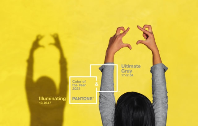
In a year that has been punctuated by highs and lows, light and shade, it’s little surprise that the Pantone Colour(s) of the Year for 2021 are comprised of a bright lemon yellow and a rather safe shade of grey. A response to the pandemic, Pantone describes the duo as “a marriage of colour conveying a message of strength and hopefulness that is both enduring and uplifting.”

Unashamedly optimistic, ‘Illuminating’ is a sunny shade of yellow sparkling with vivacity while ‘Ultimate Gray’ is a solid and dependable earthy shade designed to quietly assure while encouraging composure, steadiness and resilience.

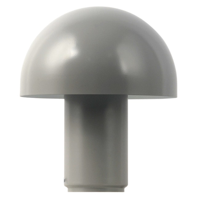
Freedom Cosh table lamp in grey: With its classic dome-shaped shade, this vintage-inspired metal design will make a statement in the living room or on a bedside table. It’s available in white and black too. $55.

Freedom Cosh lamp

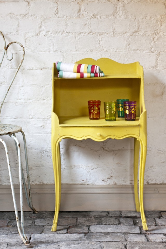
Annie Sloan paints: Perfect for an up cycling project, the iconic chalk paint brand offers to Pantone-perfect colours in ‘English Yellow’ and ‘Chicago Grey.’

Annie Sloan

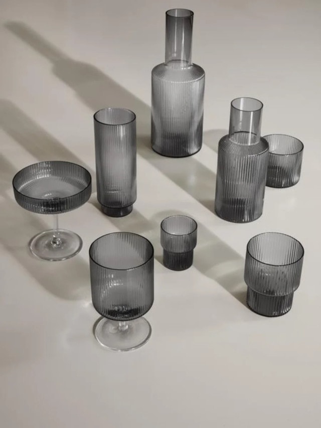
Ferm Living ripple glassware in smoke: A modern design classic, this gorgeous range features a rippled surface, geometric silhouettes and delicate hand feel. From $79.

Ferm Living

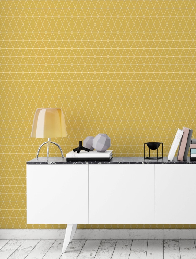
Superfresco Easy wallpaper: Instead of having to apply glue to the paper, this easy to use range features new ‘paste the wall’ technology making a weekend wallpaper job accessible for even the most novice DIY-er. Prices start at $60 per roll.

Supefresco

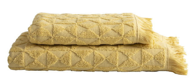
Pillow Talk Lunar towel range: Boasting a stylish tassel edge and raised geometric texture, this towel range comes in ten on-trend colours but the yellow is super fun. From $4.95.

Pillow Talk towels

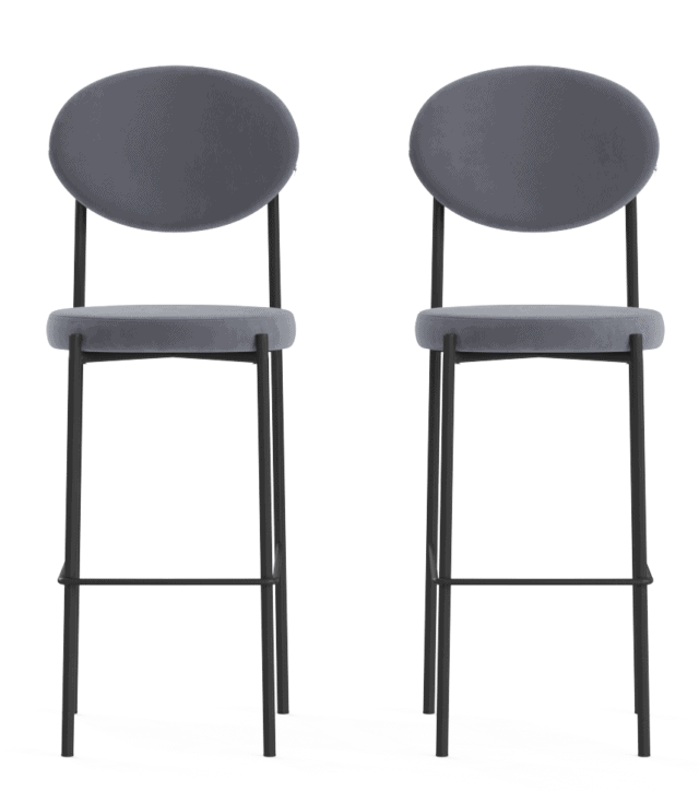
Brosa Sophie set of bar stools: Reminiscent of French parlour style, these stylish stools feature plush grey velvet upholstery atop a minimal back frame. $429.

Brosa velvet bar stool

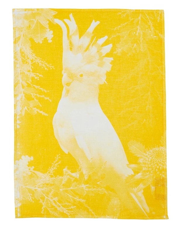
Bonnie & Neil ‘Big Major 2’ tea towel: Handmade in Melbourne, this linen tea towel features a gorgeous screen printed image of a cockatoo. It’s perfect for adding a pop of colour in the kitchen. $39.

Bonnie & Neil tea towel
Categories
Decorating 101 Expert Tips Interviews

Grey paint shades: How to choose between them

An enduring and versatile interiors trend, the popularity of grey never seems to waver but navigating its myriad shades can mystify even the most seasoned interiors addict. From cool to warm and even blue, how can you tell grey shades apart and just where should you use them in your home?

“First up, an important factor to consider is what are you trying to achieve by introducing grey? Do you want your grey to be moody, to create a sense of warmth or simply add a little more depth to your walls to avoid your home looking a bit too stark?” says Henley Design’s showroom manager and interior designer Vicki Gillingham.

And while grey works for full internal wall paint and statement walls it’s also a solid choice for artwork, cushions, rugs and vases. “Grey really does go with everything and with its broad spectrum, as long as you are following one of the shades and not mix matching, it really is fail-proof,” says Vicki.

Cool grey
“Cool greys are lovely and crisp and work wonderfully in airy, open, well-lit spaces that are streaming with natural light, while introducing them into smaller rooms helps the space to appear larger,” says Vicki who explains that the cooler you go with grey, the bluer it appears. “For a cool grey, try Dulux Platinum Glass, Grey Pail and Miller Mood or Colorbond Shale Grey, Windspray and Basalt,” says Vicki.

Cool grey features in Henley's Ashbury display
Cool grey tones feature in Henley’s Ashbury display

Greige
A popular option, greige is a blend of beige and grey and is a good choice for the indecisive. “By adding grey to beige, you create a richer colour that can work alongside a cool or warm colour scheme. The level of beige you add to the grey determines whether it is a cool or warm neutral,” says Vicki who cites Dulux Silkwort, Diesku and Bleaches or Colorbond Dune and Wallaby as her favourite greige shades.

Greige
Greige features in Henley’s Lexington display

Soft grey
“Soft greys are used when you want a hint of colour but still want the appeal of a neutral scheme. Soft greys create cosy warm living spaces ideal for layering and relaxing,” says Vicki who favours Dulux Unforgettable and Silver Aura when heading down this route.

Pinterest image
Walls painted in Dulux Unforgettable. Image source: Dulux Australia, styling by Bree Leech and photography by Lisa Cohen.

Deep grey
A strong choice, and a personal favourite of mine – deep greys such as Dulux Domino and Ticking or Colorbond Monument are perfect for creating atmosphere. “Deep greys are darker and classified as statement greys which are great for moody back drops,” says Vicki.

Stylist Heather Nette King made a statement with Dulux Domino in her lounge room
Stylist Heather Nette King made a statement with Dulux Domino in her lounge room. Photograph by Mike Baker.

For more | Dulux’s grey green the star of winter 2018 palette

Categories
Bedrooms Competitions Homewares

Win latest Rachel Castle bedding in gorgeous slate linen

The new printed and plain slate linen bedding from Castle was designed with the boys in mind but could equally be styled up for girls (little ones or grown-ups)!
 RC-MASTER-EDITED-22_7
Rachel Castle says: “We’re so excited about our new slate 100% linens, such a bedding staple. We wanted to make something that the boys would like too for once, as we are very much known for our love of a floral and a spot!
quilt_linen_charcoal_960x560
“So you can make a pretty bed with the floral and spot pillowcases and some soft pastel velvets, or a more masculine bed with the new linen stripes. Give it as much or as little colour as you like.”
pillowcase_linen_jumbospot_960x650
As a mother of a teenage boy, Rachel herself struggled with what to put on his bed. “The simplicity of a slate linen — all that texture and crinkly goodness, cause he’s never going to keep it neat — with a black velvet pillowcase and a simple blue stripe, was perfect,” she said. “The slate also happily takes you all through spring to summer, still warm but crisp.”
pillowcase_linen_flora_960x650

I have to say readers, my Castle grey linen sheet and quilt cover is some of the nicest I’ve slept in. So soft!

Available in double, queen and king. Quilt cover from $235, sheet from $130 and pillowcases $59 each.

Competition time 

We are giving away one queen size set of quilt cover, fitted and flat sheet and two pillowcases from the range, of your choice. For your chance of winning, complete the form below by 6pm AEST on Monday 12 September 2016.

Not feeling lucky? Buy online.

[gravityform id=”33″ title=”false” description=”false”]

Categories
Designers Expert Tips RENO ADDICT

How to pick the right grey paint: expert advice

Grey is the new neutral that stylists love to work with. It’s sophisticated, versatile and can add depth or lighten up any room.  But there’s one problem – finding the right shade without professional advice can prove extremely difficult. Unfortunately, I know from experience. Despite trying numerous samples in the room, in different lights, I painted our bedroom walls lilac not once, but twice. Ahh! So, how can you avoid making the same mistake? I quizzed colour consultant Lisa Harragon to find out.

Tip 1. A grey with a beige base will stop your walls looking purple. To identify the base colour look at the darkest colour on the fan deck or colour atlas, then run your eyes up to find the shade you’re after.

Tip 2. Don’t assume the grey in your friend’s home or on Instagram will work in your home too. Natural light, the colour of the floor, overhead lighting and the aspect of the house all play tricks on the eye and transform the colour.

IMAGE 3
This is Dulux Celtic Sky on the living room walls of one of my favorite Insta accounts, @the_stables_

IMAGE 4
…then in my home (with sample attempts over the top).

Tip 3. Always buy a sample pot and test the paint on every wall in the room. Make sure the test patch is at least one metre squared and apply two coats. A small test patch and one coat won’t give a true indication of the colour.

Tip 4. Don’t rush out and buy 4 litres of paint before you’ve checked the grey on all walls, at different times of day, with the lights switched on and off. A wall with no natural light looks much darker than the colour chip in store and as the sun sets, more of the base colour will show. It takes patience but this is the only way to get an accurate idea of whether you really like the colour or not.

IMAGE 6 OR SPARE
My spare bedroom wall in Dulux Narrow Neck Quarter (beige base).

So there you have it. Simple tips that will hopefully save you from painting your walls twice, like me!

–Lauren Ellis is a reporter/senior producer for TODAY, the face of Interiors Addict TV and a graduate of ISCD. Follow her on Instagram @mypicketfence_

Categories
Bedrooms Styling

Steve Cordony styles Sheridan’s SS15 range for a hotel feel

This season, Sheridan collaborated with renowned Australian stylist, Steve Cordony, and asked him to show us how to transform your home with hotel inspired luxury.

“The hotel luxe look is about checking into a lovely hotel and having crisp sheets and warm towels – so why shouldn’t we apply this to our everyday lives? As with everything, it’s the small details that make your space beautiful and more importantly make you feel special,” Steve says.

Hotel Luxury: three different ways.

“Structure is important when creating a hotel luxe bedroom. Clean crisp lines, and tailored pillows create a sense of elegance and formality. I love layering with European pillows, with standard in front and a smaller breakfast accent cushion in front. I love having a throw at the base of the bed and using a bed topper and deluxe feather and down quilt all create a luxuriously indulgent looking bed. Each look is about creating a contemporary, luxurious space that feels indulgent and super chic while remaining warm and inviting.”

Contemporary chic. Everyone knows hotel luxury begins with layering of high quality 1200 thread count sheeting. With Palais Luxe in Dove, I wanted to make sure the environment was light, airy and more feminine. I love using shades of grey and this particular tone of grey is warm but still contemporary. I kept the accessories monochromatic and accented with a touch of gold to give a hint of the unexpected.

Palais Lux 1200TC Queen Quilt Cover $599.95, Tailored Pillowcase $99.95, Tailored European Pillowcase $99.95, Standard Pillowcase Pair $109.95, Queen Flat and Fitted Sheet $269.95 in Dove, Lanham Silk Pillowcase in Snow $99.95.

Boutique style. The classic Millennia receives a boutique-hotel makeover in a new midnight tone. Deep navy is one of my favourite colours as it has so much depth and the subtle stripe pattern of the bed linen adds that touch of sophistication. I accented with a tonal colour palette of natural rattan on the bedhead, which gives great texture, aged brass, gold, mirror and chrome.

Millennia 1200TC Queen Quilt Cover $599.95, Tailored Pillowcase $99.95, Tailored European Pillowcase $99.95, Standard Pillowcase Pair $109.95, Queen Flat and Fitted Sheet $269.95 in Midnight.

Graphic and masculine. Anyone who knows me, knows I love black and white – it’s a classic and luxurious palette. For styling 1200 thread count Palais in Silver I wanted to create a graphic, more masculine look. Keeping the shapes strict and formal with accessories and furniture work perfectly with the structure and subtle pattern of the linen. Think Tom Ford meets Palm Beach.

Image courtesy of Sheridan
Palais 1200TC Queen Quilt Cover $599.95, Tailored Pillowcase $99.95, Tailored European Pillowcase $99.95, Standard Pillowcase Pair $109.95 and Queen Flat Sheet $269.95 in Silver. Vachon wool throw in Smoke $249.95.

Create a sanctuary. The bathroom is one of the most important rooms in the home. It is a sanctuary that should feel personal and comfortable and styled like any other room in the home. Simple ideas such as rolling or folding hand towels on a side table beside the bath with some fresh flowers and a scented candle adds an elegant touch. There is nothing more indulgent than monogramming and having personalised initials on your towels – it’s all about the details!

Palais Hand Towel $32.95 and Bath Towel $54.95 in Silver and French Blue, Personalisation additional $15.00.

Shop Sheridan online.

Categories
Interiors Addict

The perfect carpet colours to warm you up this winter

Sponsored by Choices Flooring

Now in the second week of June there’s no denying the fact… winter is here! So this season, make sure your home is a cosy haven and a beautiful space to retreat from the unwelcoming elements of the outdoors!

One of the best ways to make your home warm is by investing in flooring, especially carpet and rugs. Because sure, concrete, tiles and timber look great, but the comfort and warmth of carpet really can’t be beaten! So to update your home this winter consider these gorgeous on-trend colours.

Marsala

Choice Flooring's TruSoft Escada Hue
Choices Floorings’ entrend Escada carpet in Hue

Deep, rich colours like Pantone’s colour of the year, Marsala, are a sure-fire way to warm up a space. Like it’s sister colour burgundy, the timeless hue is perfect for creating a regal and classic room. Ideal for a living room, man cave or office, use it as a show stopping carpet or as rug to make the space warm and welcoming.

Navy

Choice Flooring's Evolve rug in navy
Choices Flooring’s Evolve Navy Blue rug

Very versatile, the classic and enduring colour can work with all colour palettes and styles. Able to make a room feel cosy with sophistication, navy flooring works well as a backdrop, allowing the furnishings to be the focus. If you’ve already done black and charcoal, deep blues like navy and indigo are ideal for giving a room drama and a sense of richness.

Pastel

TruSoft_Escada_Riche
Choices Floorings’ entrend Escada carpet in Riche

Perfect for opening up a dark room and creating a spacious and airy effect, the softness of pastels allows you to mix and match colours without being over the top. Working beautifully with light colours and white, it creates a soft, organic and warm space.

Grey

Buchan in Spectacular_Plantino-Wideboard-Calabria
Choices Floorings’ STAINMASTER®EverSoft® Buchan carpet in Spectacular

For adding a touch of elegance to your space grey is the perfect choice. Seen as this year’s ‘neutral’ the subdued and earthy tones create a quieter, cosier mood. The perfect companion for deep winter hues, whilst also working well with white and pops of colour, grey is another shade of flooring that really lets your furnishings do the talking.

For more information visit Choices Flooring.

Categories
Interiors Addict

Pastels are most definitely cool again

Over on the Haymes Paint blog this week, I’m guest posting about the latest colour trends and pastels are right up there. I’m loving a subdued palette myself and having just moved into a new home, I’m going for cooler, more muted tones, which is really very unlike me! As for grey, I can’t get enough of it in all its shades!

resizedimage600900-Haymes-MG-NEWSKIN-5993-lowres

Read more of my thoughts on the Haymes Paint blog.

Categories
Interiors Addict

Jen guest blogs on Europe and colour trends

I’m guest blogging over at Haymes Paint’s blog today.

Read the full article.

Categories
Interiors Addict

Shades of grey from AURA Home

Another month, another linen range I absolutely LOVE from AURA by Tracie Ellis. Same same! This one’s called Oliver and he’s very brooding and handsome!

Available at Myer nationally or the AURA website.

Categories
Kitchens