Categories
Design Expert Tips Interiors Addict Interviews Styling

Dulux latest: 2023 colour forecast reflects a post-pandemic shift

Just as skirt lengths and lipstick sales can be indexed to the social and political landscape, so to can interior trends. And, after a chaotic couple of years, it’s not surprising to find that many of us are feeling a desire to live more simply and authentically. We’re stripping away the superfluous (we’re truly thinking about how we spend our time and who with) to create space for more meaningful connections and the Dulux Colour forecast 2023 is reflective of this.

“Colour forecasting for interiors is an evolution. While fashion is an important influencer, the shifts in interiors are more subtle and nuanced. The palettes we can expect to see in our homes in 2023 are predominantly warm and nurturing, with nature continuing to be a key driver of trends. Brighter hues continue; however, they are deeper than last year,” says Dulux colour and communication manager Andrea Lucena-Orr.

Dulux Revive
Revive palette

The forecast is based on year-round research into the latest global and local trends that are predicted to influence Australian design and how we live. Led by Dulux colour and communication manager Andrea Lucena-Orr, in conjunction with Dulux colour forecaster and stylist Bree Leech, the latest forecast has been informed by seminars (including Future Laboratory London and Milan Design Week) as well as trend reports, editorials, fashion, product and design launches as well as customised research through Dulux’s extensive networks in the UK, Italy and France.

Connect palette
Connect palette

“We have all reacted to the upheavals of the last couple of years in different ways – some people crave lightness and whimsy, whilst others seek order and reassurance. The three palettes in the Dulux Colour Forecast 2023 reflect these differing needs, allowing you to create beautiful living spaces that reflect where you are in your life’s journey,” says Andrea.
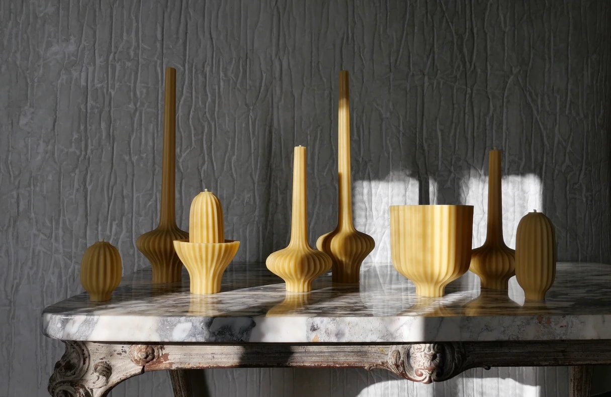
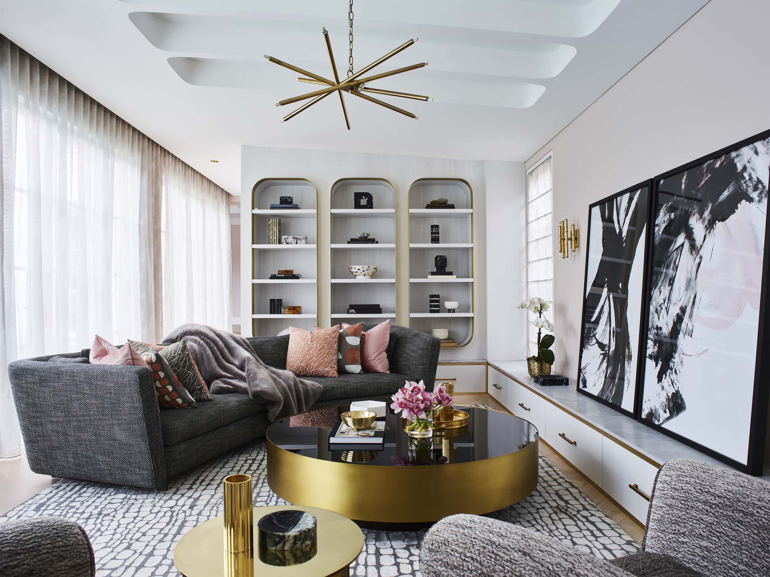
Balance
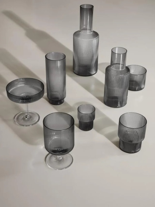
A refined palette of serene marine inspired hues, gentle greens and accents of deep garnet, Balance evokes the ocean and shoreline. “Balance is very much inspired by a ‘less is more’ philosophy, with minimal detailing and a restrained approach to decorating. Instead, the focus is on immersive colour and the beauty of complex, structured patterns found in nature, such as a simple seashell or fern frond,” says Dulux colour forecaster and stylist Bree Leech.

Dulux Balance palette
Balance palette

Balance inspired styling includes lush textures (velvet and silk), furniture with exaggerated, curved silhouettes, abstract art and décor pieces with organic shapes and delicate pleating. “Balance has an elegant, understated feel that would work beautifully in an inner-city apartment or terrace home,” says Bree.
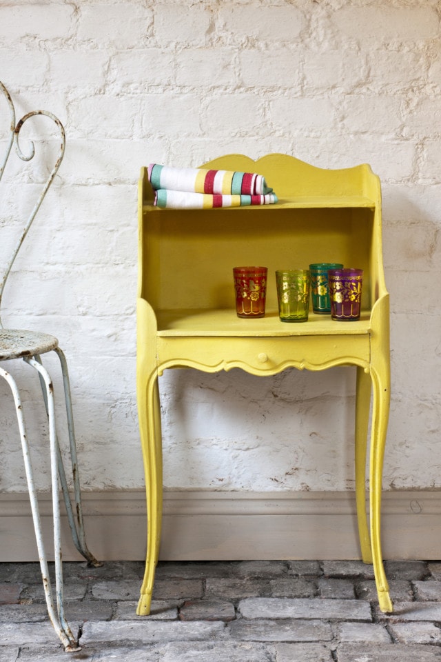
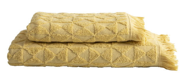
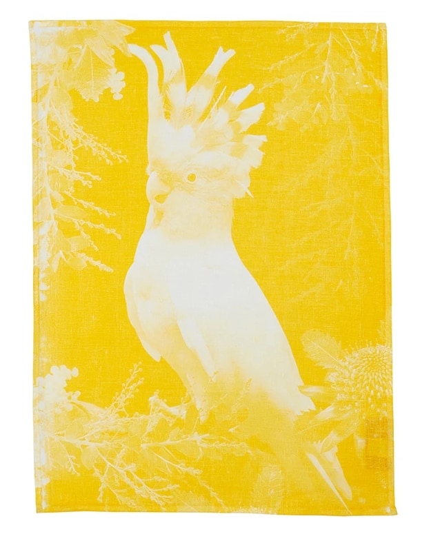
Balance palette
Balance palette

Connect
By contrast, the Connect palette is all about the great outdoors and features earthy tones of moss, wasabi, sandstone, muddied yellow-green and burnt charcoal. “It speaks of calm, comfort and an honest approach to living, and brings in many of the pastimes we experienced during lockdown, such as a hiking, cooking, quilting and gardening. Muddied yellow-green has something of a nostalgic, country-house feel, cinnamon is grounding, whilst rich, purple-brown adds an indulgent and contemporary twist,” says Andrea.

To complete the Connect look, the palette looks fabulous when with rustic furniture (in timber, leather or rattan) as well as stone flooring and bespoke, modern lighting made from recycled materials. 
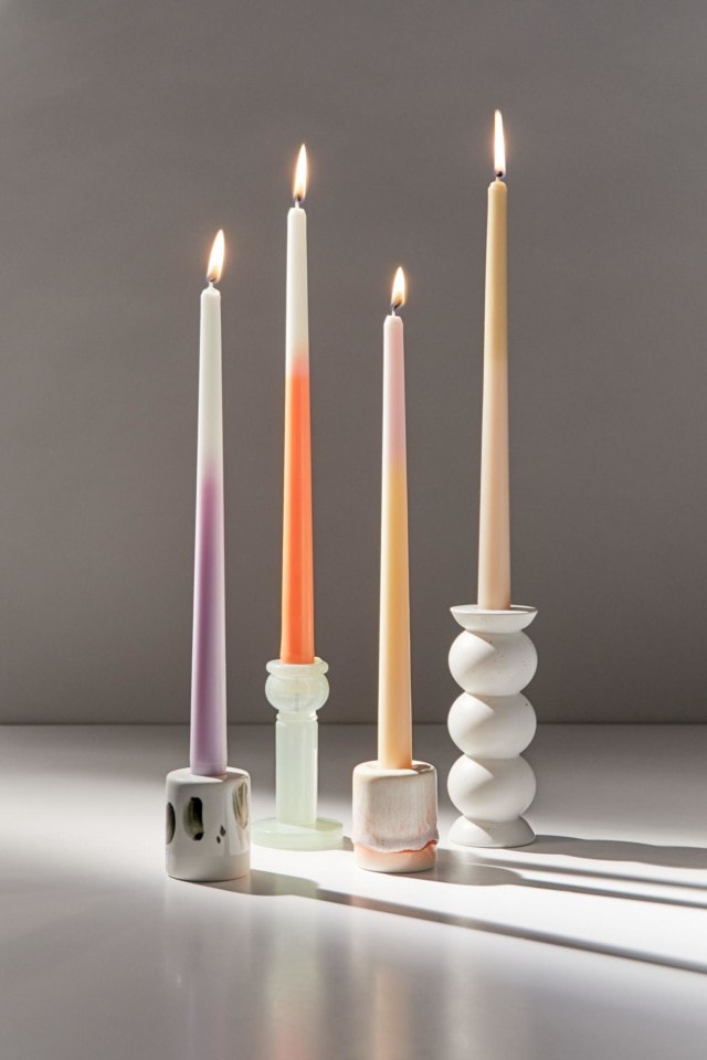
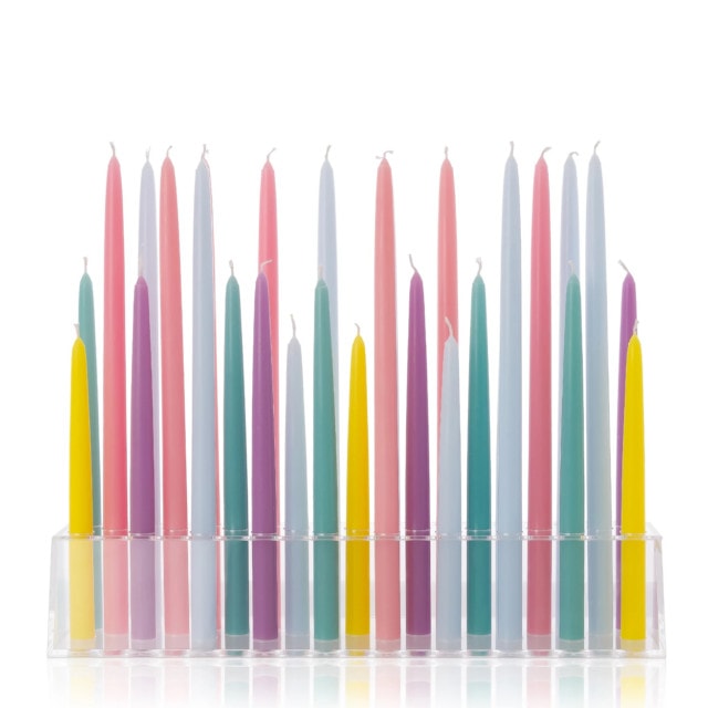
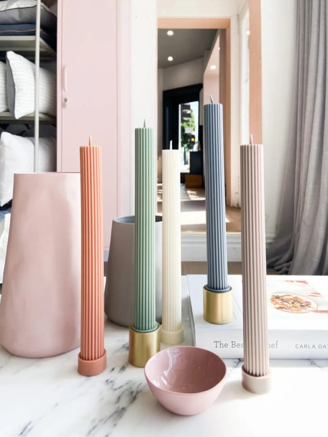
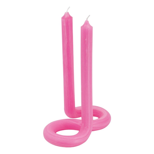
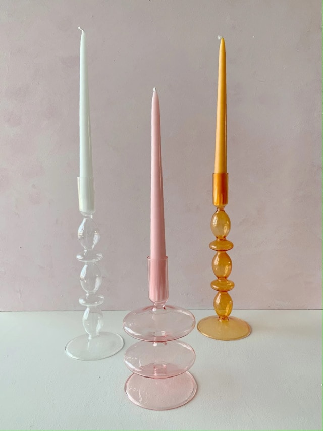
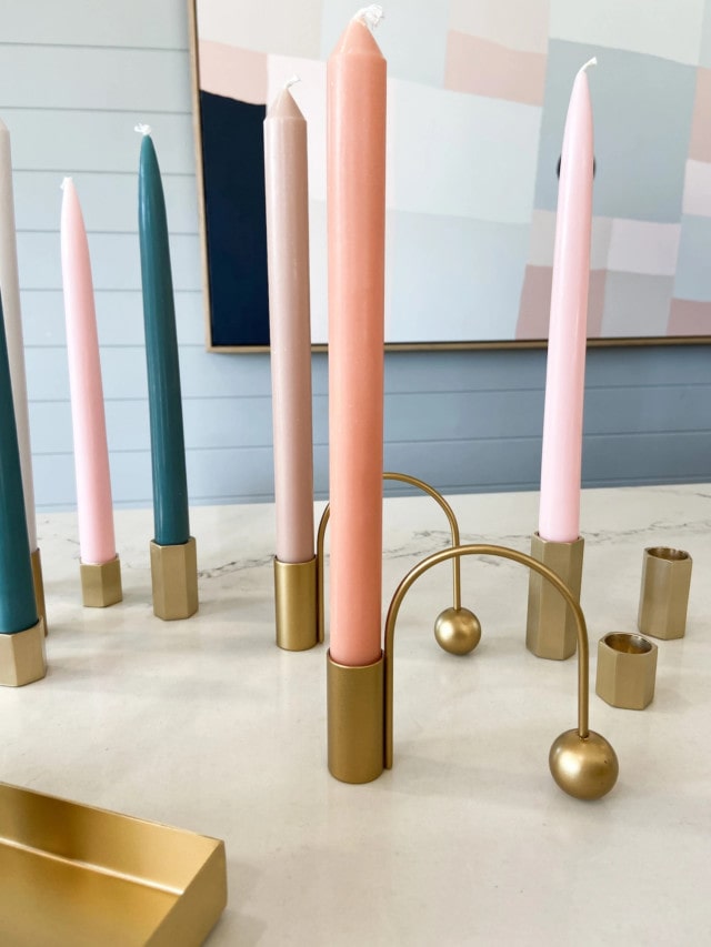
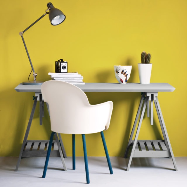
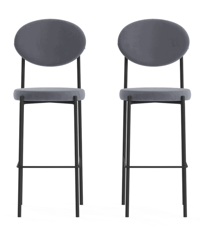
Dulux Connect
Connect palette

Revive
The most playful of the palettes, Revive features an array of uplifting, bright tones including rose pink, blue, sunshine yellow, emerald, violet and burnt orange – all designed to lift the mood after a tense couple of years. “As we emerge from trying times, we’re looking for lightness and a sense of freedom to revive our spirits. So, when it comes to our homes, it’s out with the rule book, and in with the possibilities to create something truly magical,” says Andrea. 

Revive palette
Revive palette

“Pairing retro influences with futuristic features, such as pixel patterns and digital art, the Revive palette cleverly merges the past and present. And with its colourful, look-at-me accent walls and statement seating, it creates the perfect Instagrammable moment,” says Andrea. 

Revive palette
Revive palette

Photography: Lisa Cohen | Stylist: Bree Leech

For more

Categories
Expert Tips Styling

Pantone colour 2022 Very Peri: how to add touches to your home

Stylist Justine Wilson shares her tips to incorporate Very Peri into our homes so we can bask in the bright, joyous violet tone.

Described as the perfect rainbow purple, the brand new custom colour has hints of blue with a deep red base. It is symbolic of the desire to adapt and reinvent ourselves after the last few years as well as a need to understand, accept, heal toward a new path forward. It’s an interesting colour that still feels warm and inviting with its cool tone, so it will work in any current interior design scheme, as a contrast or to complement your existing theme.

For general interiors

Bright tones have always been popular, and they can be used in both classic and contemporary style interiors. Very Peri can be used as a colour accent with accessories, rugs, curtains, or cushions, or as a big bold element in a room, such as a feature wall or the full room being painted in that colour. Key furniture can be painted or upholstered to showcase the colour.

A simple refresh

Easily and affordably introduce this purple tone through florals, candles, books, throws or even through your own personal fashion choices. Playing with the colour of the year as inspo is a great way to refresh your interiors and inject new life into any space.

For the spiritually inclined

Purple colours embody creativity, thoughts, feelings and inventiveness. Purple is the colour of both the crown (violet) and third eye (indigo) chakras. You can bring this colour into your environment in many ways, and you may find that it encourages you to focus on your thoughts and creative outputs. As a fun nod, purple tones have always been associated with magic. Think of witchy stories, Halloween décor and dried herbal and floral items like lavender. Purple crystals such as amethyst are not only beautiful, but are also meant to awaken spiritually and heal the mind.

“Overall Purple is a dynamic colour, and one that is sure to energise your home and mind, and thus the perfect choice for 2022,” said Justine.

Justine is the owner of Vault Interiors

Categories
Design Furniture Homewares

Interior trend: Boucle is the perfect antidote to minimalist interiors

Interior design trends are always fascinating because, like every aspect of culture, they don’t exist in a vacuum. Take our current obsession with boucle for example. Coco Chanel’s favourite fabric, boucle translates to ‘yarn with a looped or curled ply’ and it offers just the right amount of cosiness in these uncertain times. It also happens to be a fabulous complement to modern minimalist house design.

Life Interiors boucle collection: From the gorgeous Monet ottoman ($395) to the Monet armchair ($945) and Blake dining chair ($345), Life Interiors has certainly embraced (and nailed) the boucle trend.

Life Interiors
Life Interiors

McMullin & Co. curved boucle bedhead: A statement design, it’s the asymmetrical curve that caught our eye with this unique bedhead. From $1299.

McMullin bedhead

James Said Palla large boucle cream pillow: Inspired by vintage Berber textiles, this round ball cushion provides a great way to dabble in the trend. $200.

Brosa Seta four seater sofa with chaise: Generously proportioned, this sofa is available in a variety of fabrics but the ‘Pavilion’ bouclé option has a lovely exaggerated texture and a soft woolly look. $1999.

Brosa sofa

Adairs Home Republic Bree coconut boucle quilt cover: Available in this gorgeous off-white colour and mustard too, this set is perfect for layering up the bed in the cooler months. From $159.99.

Adairs bedding

Milana fabric lounge chair in ivory boucle: Elegant curves and minimalist lines make this mid-century inspired occasional chair a talking point. $780.

Milana fabric lounge chair

Kmart boucle ottoman: Even Kmart has jumped on the boucle bandwagon with this compact little number. $29.

Kmart ottoman
Categories
Homewares Shopping Styling

Taper candles take over from the jar variety in new trend we’re loving!

Given the fast-paced tech-driven world that we live in, there’s something charming about the latest trend to invade our Instagram feeds – the taper candle. Low-fi and nostalgic, the taper candle has a long history in the home (they found their way into gothic, baroque and colonial interiors mainly out of necessity) but the latest designs have a distinctly modern flavour. There’s unusual shapes, neon colours and a gorgeous array of contemporary vessels to house them in.

De Crecy candles: Designed and hand poured in Bondi by Tony Assness, these gorgeous candles have taken over our Instagram feeds – no doubt due to their unique, sculptural shapes. They’re made from Australian-sourced butter beige wax and are priced from $44.

De Crecy taper candles

Urban Outfitters Ombre Taper candle set: Bring a colourful glow to your next tabletop display with these ombre-hued taper candles. They’re very reasonably priced at $18 for a set of four.

Urbar outfitters ombre candle set

XRJ Celebrations taper candles: Never one to do things in halves, Roxy Jacenko’s candle foray certainly packs a visual punch. Styled en masse, the key to this look is the sheer number of candles in the mix. The acrylic and wooden bases are available for purchase too. From $100.

XRJ taper candles
XRJ taper candles

Black Blaze Colour Pillar candles: Available in an array of gorgeous hues (eucalyptus, honey and peach to name just a few), these candles (from $16) are made in Sydney from pure plant based wax. The matching minimalist solid brass candle holder, $59, completes the look.

Black Blaze pillar candles

Lex Pott ‘TWIST’ twisted candle in pink: Made in the Netherlands from paraffin wax, this fun sculptural piece is a fabulous blend of form and function. It’s available in an array of colours. $44.

Smallable twist candle

Gloria Speaking Alias candlestick in pink: The perfect vessel in which to hold a taper candle, these delicate glassware pieces are giving us major mid-century modern vibes. The matching taper candles are also available for purchase. $44.

Oh it’s Perfect Twist Duo candle in peach/blue moon: Handmade in Denmark, these ombre twist candles are sure to be a talking point on your next tabletop display. $48.

Twisty candle

NorsuHOME Brass Balance candlestick holder: A statement candle holder if ever there was one, this brass beauty combines style with practicality. $39.

NorsuHOME candle holder
Categories
Design Shopping Styling

Pantone Colours of the Year 2021: ‘Ultimate Gray’ & ‘Illuminating’

In a year that has been punctuated by highs and lows, light and shade, it’s little surprise that the Pantone Colour(s) of the Year for 2021 are comprised of a bright lemon yellow and a rather safe shade of grey. A response to the pandemic, Pantone describes the duo as “a marriage of colour conveying a message of strength and hopefulness that is both enduring and uplifting.”

Unashamedly optimistic, ‘Illuminating’ is a sunny shade of yellow sparkling with vivacity while ‘Ultimate Gray’ is a solid and dependable earthy shade designed to quietly assure while encouraging composure, steadiness and resilience.

Freedom Cosh table lamp in grey: With its classic dome-shaped shade, this vintage-inspired metal design will make a statement in the living room or on a bedside table. It’s available in white and black too. $55.

Freedom Cosh lamp

Annie Sloan paints: Perfect for an up cycling project, the iconic chalk paint brand offers to Pantone-perfect colours in ‘English Yellow’ and ‘Chicago Grey.’

Annie Sloan

Ferm Living ripple glassware in smoke: A modern design classic, this gorgeous range features a rippled surface, geometric silhouettes and delicate hand feel. From $79.

Ferm Living

Superfresco Easy wallpaper: Instead of having to apply glue to the paper, this easy to use range features new ‘paste the wall’ technology making a weekend wallpaper job accessible for even the most novice DIY-er. Prices start at $60 per roll.

Supefresco

Pillow Talk Lunar towel range: Boasting a stylish tassel edge and raised geometric texture, this towel range comes in ten on-trend colours but the yellow is super fun. From $4.95.

Pillow Talk towels

Brosa Sophie set of bar stools: Reminiscent of French parlour style, these stylish stools feature plush grey velvet upholstery atop a minimal back frame. $429.

Brosa velvet bar stool

Bonnie & Neil ‘Big Major 2’ tea towel: Handmade in Melbourne, this linen tea towel features a gorgeous screen printed image of a cockatoo. It’s perfect for adding a pop of colour in the kitchen. $39.

Bonnie & Neil tea towel
Categories
Expert Tips

Interiors trends 2020: Nature, wallpaper, & greige!

Sponsored by Sydney Gift Fair

Reconnecting with nature and sending less to landfill has become a real focus, while grey is slowly being replaced by ‘greige’ and velvet is going nowhere! Here are our top interiors trends for 2020.

Dulux Grounded Palette. Styling by Bree Leech, photography by Lisa Cohen

Dulux’s latest nature-inspired palette draws on our desire to escape the digital onslaught and reconnect with the natural world. “These colour trends are influenced by what’s happening in the world around us. With more focus on mental health, the wellness movement continues to gain momentum, as does an emphasis on natural materiality,” says their communications manager Andrea Lucena-Orr.

“Colours for 2020 are more restrained than in previous years. Brights are pulled back and influenced by nature. They appear in smaller doses – think feature walls and details – and are often used tonally as a backdrop for hero furniture pieces. Neutrals are soft and sophisticated, with a gently faded feel that speaks of stillness and calm. Clay, with its warm, earthy appeal, is emerging as a key neutral,” says Andrea.

Greg Ollerhead of One World Collections, agrees that the consumer is becoming more environmentally conscious. “I think people are over cheap throwaway wood and plastic novelties that just end up in landfill. Buy a bit less but better quality as the mass cheap market seems to be running out of steam a bit, both here and in the USA.”

Image: One World Collections

With much of the brand’s range coming under the very popular Hamptons aesthetic, Greg says their philosophy is to create timeless furniture pieces that are on trend now. This year, he sees sage green and baby blue as key hues and adds that velvet is going nowhere: “Everyone thought that was a one-year wonder but on the right piece it is still selling really well and I think will continue to be a part of furniture design for the next few years.”

Award-winning interior designer Lynne Bradley, of Sydney’s Lynne Bradley Interiors, says the huge trend for grey is waning, but there’ll always be a place for it in our homes because it pairs with almost everything. “I think there has been a big decline in the use of grey this year however, grey is a wonderful neutral that is timeless and can be either feminine or masculine. Grey is a staple in the designer’s tool kit and no two greys are the same. However, there is a trend towards brown being a replacement for grey, transitioning from ‘greige’ through to caramels and dark browns,” she says.

Browns are making a comeback! Project: Lynne Bradley Interiors | Styling: Steve Cordony | Photo: Anson Smart

The growing use of wallpaper is another key trend to watch and one which Lynne is very happy about! “No longer seen as old fashioned or difficult to remove, it is fast becoming the new vernacular in adding personality to a space and offers an inexpensive way to create depth and scale as well as cover imperfections,” she says. “Wallpaper can be calming, bold or energising and seriously transform a room.”

Read the full trend report in the Sydney Gift Fair catalogue. Presented by the Australian Gift & Homewares Association (AGHA), the leading industry event starts on Friday this year, and is at Sydney Olympic Park from 21 to 24 February 2020. We’re delighted to be this year’s media partner for the second time, and I’ll be running a workshop on branding and getting your business in the media.

For more information, visit the Sydney Gift Fair website. This is a trade-only event which is free to attend. One World Collections are exhibiting at this year’s event for the first time.

Categories
Homewares Shopping Styling

Home styling trends 2019: Our fave olive green finds!

A natural complement to the ochre, terracotta and rust shades currently trending, olive green certainly appears to be one of the key colours of the moment. I first noticed the emergence of the shade when it was embraced by leading Australian architects and interior designers in the form of paint – from staircases to bedroom and bathroom walls it suddenly feels like the murky, verdant hue is everywhere!

Beechwood by KWD. Photographer: Armelle Habib

But if you’re not feeling brave enough to embrace it in paint form, read on for our favourite olive green furniture, lighting and homewares buys.

I love this statement green staircase by Kennedy Nolan in its Caroline House project. Photographer: Derek Swalwell

Mustard ‘The Skinny’ locker in Olive: Perfect as extra storage and lightweight enough to move around the house when your needs change, there’s a reason why these lockers have reached cult status. $299

Mustard Made

Globewest Bogart block three seat sofa: I love the masculine yet pillowy vibe of this gorgeous lounge and the deep green velvet only makes it more sumptuous. $4840.Globewest Bogart sofaCapra Designs etch pot: Hand crafted in small batches, this vintage inspired pot even comes with a handy tray so your plant can adequately drain. $69.

Capra Design pot

Lovely Linen bed linen in Jeep Green: Made from 100 per cent European long flax, this range has that glorious relaxed rumpled texture that only linen can provide. As with most linen, this bedding will soften even more with use. From $108.

Lovely Linen

Bastille and Sons Riviera pendant and wall light: From French designer Maison Sarah Lavoine, the Riviera collection is smart, chic and timeless and combines rattan with lacquered green wood. I love the vertical lines and gorgeous green hue of both these pieces. $425 (pendant) and $695 (wall light).

Bastille & Sons pendant light

Bastille and Sons

2019’s fringing trend

Categories
Design Expert Tips Interviews Styling

How to make a mood board + expert summer styling tips

We caught up with stylist, interior designer and television presenter Juliet Love recently for a chat about summer interior trends and how to tackle a mood board before embarking on a new styling project. Not only does a mood board help to define and refine ideas but it’s a great source for you to refer back to as the room comes together.

Juliet Love portrait
Juliet Love

“Always start with a plan and work out what it is you want to achieve. Ask yourself how the room is going to be used and then start collecting anything that inspires you. It might be tear sheets from magazines, images from Pinterest, tile and fabric samples, paint swatches – anything that you love and that tells your story,” says Juliet

“You can then play around with your pieces on a corkboard or piece of cardboard. Edit as you go so you omit anything that isn’t working. You should start to see a theme emerging that will guide you,” says Juliet who shared her thoughts on summer 2019 styling trends too.

Sunset colors
“The colors to watch out for in 2019 will be yellows and oranges reminiscent of pretty sunrises and sunsets. According to Pantone, shades such as Living Coral (just announced as colour of the year last week) and Turmeric will be in. Living Coral is a new take on the 1980’s classic peachy coral but the new hue has a gold and orange undertone making it more modern,” says Juliet.

“Positive, uplifting, and a nod to nature, these colours have come to the fore as a result of us focusing our attention on the environment and world around us. Incorporating these colours into your home can be as simple as a couple of new cushions, or as elaborate as splashing your walls with one of the intense hues for more impact.”

Natural stone
“Natural stone is timeless and will cool a room down in the heat of summer. Amber Tiles has a great selection of natural stone choices – I particularly love travertine and limestone. You can also introduce some gorgeous patterned feature tiles for a summer vibe all year round. Encaustic tiles, or mosaics in blue shades reminiscent of the sea, are perfect for this. The right tiles are a vital element in any chic interior and can make or break a room,” says Juliet.

Summer mood board
Summer mood board by The Stables

Rattan
“Rattan is really popular again, so a couple of feature pieces in a light, bright space will work well for a summery feel. An oversized woven armchair in a natural fibre or an indoor hammock in a light fabric with fringing will also give that modern bohemian feel.”

Accessorise with art
“Artworks of exotic destinations always work well – either paintings, prints or photographs of recent travels, blown up and framed. Printing photos in black and white often lends a more upmarket vibe if you’re using personal photos and will work with most colour schemes.”

Go troppo with leaves, flowers and coral
“Elements of nature are a great touch for a summer vibe. Tropical leaves and fresh flowers in exotic shapes are an affordable update that will give your home instant pizzazz. I also love large pieces of coral and ginger jars as a summer statement. Just make sure the coral you choose is grown sustainably or is a quality artificial piece to protect our beautiful environment. Large pieces of ornamental coral and driftwood will also give your home a coastal feel, even if you’re miles from the water!”

Trailing plants
“I love houseplants, and I’ve become quite good at keeping them alive after years of killing them off! It’s all about choosing the right species and placing them in appropriate spots in your house where they’ll thrive. My favourites at the moment are Zanzibar Gem, Lady Palms, succulents such as Hen and Chicks, and in particular, ivy trailing from shiny metallic pots from elevated positions such as bookshelves or floating shelving,” says Juliet.

Light it up
“Anything light and bright featuring glass and woven natural fibres will help create an airy, light summery vibe. I love pendant lights as they create a dramatic focal point and become a design statement in the room so look out for these on your mood board too,” says Juliet.

Juliet and her husband Charlie Albone are both brand ambassadors for Amber Tiles.

Summer 2019 paint trends

Categories
Interiors Addict

PANTONE Colour of the Year 2019 ‘Living Coral’

Lobster, blood orange or even deep peach in tone, the 2019 Pantone Colour of the Year ‘Living Coral’ is certainly no shrinking violet. Described by Pantone as an “animating and life-affirming coral hue with a golden undertone” the colour promises to energise and enliven but with a soft edge. Unlike a true red or orange, this colour has a creaminess to it that makes it bold yet soft – a delicate balance to strike.

Pantone Living Colour

“With consumers craving human interaction and social connection, the humanising and heartening qualities displayed by the convivial PANTONE Living Coral hit a responsive chord,” says Leatrice Eiseman, executive director of the PANTONE Color Institute.

A perfect complement to on-trend matte black and indoor greenery I can see this optimistic colour swiftly invading the interiors space. A long-term fan of the hue, here’s my top interior picks for the early adopters out there.

Kip & Co smokey pink velvet tassel cushion cover: 100 per cent cotton velvet velour, it’s the tassels that got me. $89.

Kip & Co cushion

Maison Sarah Lavoine Riviera side table: Rattan detailing, lacquered wood legs and a coral top make this vintage inspired side table a pretty irresistible piece. $2450.

Maison Sarah Lavoine: Riviera side table

Meri Meri hexagonal star plate: I can see these in the festive season table top styling mix. $11.99 (pack of 8).
Meri Meri plate

Big W Mirabella Iza table lamp, coral: Stylish and understated, this lamp is also available at a fabulous price. $39.

Big W lamp

Citta Daisy Chain velour beach towel: With its plush velour front and absorbent terry back this flowery print whispers summer to me. $59.90.

Daisy velour towel

SUNNYLIFE poolside lounge, coral: Ideal for lazing by the pool. $249.95.
Sunny Life pool lounge

Kaz Morton Coma vase: Kaz Morton is one of our favourite ceramicists and this gorgeous, painterly vase affirms that view. $88.

Kaz Morton vase

Bonnie & Neil ‘Holiday Tile’ cushion, peach: Finished with black piping, this cushion’s fabric design reminds me of a chic encaustic tile. $135.Bonnie & Neil cushion

Pantone’s 2016 Colour of the Year | Pantone’s 2017 Colour of the Year | Pantone’s 2018 Colour of the Year

Categories
Design

Deep green shade named Taubmans 2019 Colour of the Year

Just as Pantone’s Greenery was considered a calming antidote to the chaos and distraction of modern life, Taubmans’ 2019 Colour of the Year has similar aspirations. Called Night Watch, it’s a deep luxe green that is the perfect way to bring the outside in. It’s also bang on trend with indoor plants, jungle motifs and green of almost every shade popular at present.

Taubmans 2019 Colour of the Year 'Night Watch'
Taubmans 2019 Colour of the Year ‘Night Watch’

“Green is a colour we will be seeing so much more of in 2019, from forest to sea foam and all tints and shades in between. It makes perfect sense that we are seeking to bring the calmness and soothing power of Night Watch into our decor given the trend to bring the outdoors in,” says Taubmans colour consultant Grace Garrett.

And with apartment living on the rise, and the 2016 Australian Census revealing that people in developed countries are spending 90 per cent of their time indoors, it makes sense that we are longing to bring some greenery inside.

Taubmans 'Night Watch'

The dramatic green shade is also a highly adaptable one. “Night Watch uses a tone that can be adapted to an array of styles using a variety of furniture and accessories from the velvet and marble of Hollywood glamour to the raw, natural materials that belong to the eclectic and tribal trends. In terms of a colour palette, Night Watch’s versatility means it pairs well with a multitude of tones such as Taubmans Ionian, Dusky Taupe and Rusty Rail,” says Grace.

Taubmans 'Night Watch'
Taubmans ‘Night Watch’

Taubmans colour palette
Complementary colours

Master renovator Cherie Barber recently used the colour to transform a small apartment. “I made over a small apartment using Taubmans Endure Interior in a matte finish to maximise the depth of colour. Creating a feature wall of Night Watch and using Taubmans Crisp White on the others means that you can bounce and regulate the light in the room. If you wanted to create a cosier feel, you could even use Night Watch on all of the walls,” says Cherie.

Cherie Barber reno
Cherie Barber used ‘Night Watch’ in this small apartment

The Taubmans Colour of the Year is the result of an annual workshop that the paint brand holds, bringing together over 20 global colour stylists from the automotive, consumer electronics, aerospace and home paint industries. Night Watch is just one of the 200 colours in the brand’s 2019 Global Colour Trends Forecast which looks to guide homeowners, designers and architects alike.

For more | Big W home latest is all about green too

Categories
Design Furniture Homewares Styling

Trending on Pinterest: Round décor

Tired of all those hard edged, minimalist square interior shapes? Proof that the pendulum always swings back, round décor is having a moment on Pinterest with Australian searches for ‘round décor’ and ’round furniture’ up 135 per cent and 100 per cent respectively, over the past month.

From round mirrors to round furniture and circular styling pieces, curves are officially in! And it’s a look that transcends all interior styles – from Scandinavian to mid-century modern and rustic themed interiors, the trend offers something for everyone.

The round mirror
Nothing says ‘you’ve arrived’ quite like a large mirror in a home’s entryway and I don’t think there’s any reason why it shouldn’t be of the round variety – especially if the below is anything to go by. That large mirror pops against the black wall behind.

Pinterest round mirrors
Image source: Pinterest/Kim

Perhaps a round bathroom mirror is more your flavour? It’s certainly a trend with legs – the collective penchant for round mirrors has been on our radar for some time now.

Pinterest oval mirror
More oval than round but the sentiment is the same. Image source: Pinterest/Sharon Morgan

Round furniture
From a bar cart with a chic circular shape to round shelves, circles are well and truly back when it comes to furniture too.

Pinterest bar cart
I love this gorgeous round bar cart. Image source: Pinterest/Stephanie Webber Barry

The round coffee table is a perennial favourite and the black and marble iteration below is seriously chic.

Pinterest image - round coffee table
Image source: Pinterest/Elizabeth Ashlea

From tufted to more minimalist versions, the round ottoman is trending too.

Round ottoman - Pinterest
Gorgeous colour aside, this round sage green velvet ottoman provides excellent extra seating. Image source: Pinterest/Ez v

The round shelf has also been a massive hit over the last year with brands like Kmart doing their own take on the trend too.

Pinterest - round shelf
Image source: Pinterest/Sharra Stannard

With rectangular dining tables the firm favourite for a good part of the last decade it’s nice to see that round ones are making a comeback. They make dinnertime conversation even easier.

Round dining table
Image source: Pinterest/Nikki M

For more | The latest bathroom trends

Categories
Bathrooms Kitchens

Trending on Pinterest: Monochrome kitchens & bathrooms

There’s no denying the enduring appeal of monochrome but it’s certainly had a massive resurgence of late with Pinterest saves for ‘monochrome’ ideas up 115 per cent globally since last year. From slick, ultra-modern interpretations to more traditional spaces, the kitchen and bathroom scene has never looked more black and white.

Monochrome kitchen. Image source: Pinterest/Stephanie Kate

Kitchens
Black joinery, black tapware and black light fittings are the current order of the day with saves for ‘monochromatic kitchen’ ideas up 230 per cent over the past six months in Australia. And with all that dark colour, it’s no surprise that white, and often milky marble finishes, are brought into the mix to provide contrast.

Monochrome kitchen. Image source: Pinterest/lisa.

The timber floor provides warmth in this monochrome kitchen. Image source: Pinterest/A Girl Called Fred
Timber provides warmth in this monochrome kitchen. Image source: Pinterest/A Girl Called Fred

Bathrooms
With saves for ‘monochromatic bathroom’ ideas up 30 percent in Australia since last year, it’s safe to say that black and white are most certainly back in the washroom too. While black tapware has been trending for a while, black shower frames are suddenly flooding our feeds also. In fact, from black exterior paint to black kitchen sinks, ebony Pinterest searches are up 252 per cent globally since 2017.

Monochrome bathroom. Image source: Pinterest/Marisa Robinson Beauty

Patterned monochrome tiling (on the floor and wall) is a big look at the moment. I love monochromatic cement encaustic tiles (as in the image below). They’re a great way of incorporating pattern and texture in a way that is hard to tire of, given that they work like a neutral.

Monochrome tiling is the standout feature in this bathroom. Image source: Pinterest/Cushla Cappie

Monochrome shower. Image source: Pinterest/First Sense

For more | A fabulous monochrome before & after

Categories
Appliances Expert Tips RENO ADDICT

Finding the perfect lighting mood in your home with Clipsal

Sponsored by Clipsal

Lights and switches aren’t simply a functional electrical accessory or a source of illumination. Lighting affects your mood and the ambience throughout your home.

Adobe Photoshop PDF

There was a time when homeowners had little choice in lighting design. However, with the options now vast, spending the time to choose the perfect lights and switches in the home can achieve an outstanding outcome and create that wow factor. LED technology and its ability to produce warm or cool light output, now allows you to match the appropriate light output for the room. Warm lights offering calming tones are ideal for use in living areas such as bedrooms and family rooms, while bathrooms and kitchens are more suited to cooler lighting options, providing brighter light output.

Dimming lights to match the mood of a room

interiors addict clipsal

Adding a dimmer option to the light is a great way to create atmosphere in a room. For example, dimming the lights a little in the dining room sets the mood for a meal with friends and family around the table. A good tip is to make sure your new LED lights and dimmers are compatible to achieve optimal results; Clipsal’s extensive offering helps you make this selection process easy.

Keeping a low profile

Sometimes lighting options don’t always need to make a bold or obvious statement in a home. Sleek and low profile downlights are the perfect solution for areas like the kitchen to highlight features such as glass splashbacks and granite bench tops. Concealed lighting in bulkheads or joinery is a great way to complement downlights to create different moods and subtle effects in the home.

Additionally, low-level LED lighting options are a great way to ensure the perfect illumination level in your lounge or home theatre when you want to settle down and watch a movie or your favourite TV show. Clipsal by Schneider Electric offer a range of downlight options using LED technology for the home renovator to choose from.

Don’t leave any area unlit

modern interior

Ensuring a consistent lighting feel throughout your home is also important, so this means not forgetting areas such as staircases and hallways. LED recessed wall lighting options are a great way to highlight these features in your home, with the warm lighting creating the perfect setting alongside some of the statement areas in the home.

If you are stuck for inspiration on where to include the perfect lighting in your home or what room could use a splash of ambiance, use the Clipsal iSelect app which helps homeowners choose electrical products for their home.

With so much choice on the market it is easy to choose an innovative lighting solution that can meet individual needs, tastes and budgets. Whether this is making a bold lighting statement or achieving an understated subtle touch in a home, carefully selecting your lighting is key to ensure every room has the perfect ‘light up’ moment.

For more information and inspiration visit Clipsal by Schneider Electric.

Categories
Appliances Expert Tips RENO ADDICT

Light switches can be colour co-ordinated too…

Sponsored by Clipsal

Colour coordination is important with all aspects throughout the home, whether it is matching cushions to wall colours, coordinating accessories in the bedroom or even complimentary towel choices in the bathroom. Light switches are not an exception to this rule! However, we all know colour and interior trends change as quickly as they come into fashion.

pillarbox_red_lounge_compressed & cropped

With the Clipsal by Schneider Electric range of switches, adding colour or texture to your home is simple and styles can be updated quickly and easily to suit or change the look and feel of any room in the house.

A0004664The simple elegance of the Saturn range complements classical interior design looks through its textural and metallic finishes that are available in a variety of colours, including: Ocean Mist, Espresso Black, Pure White, Horizon Silver and Horizon Black. Through the silky smooth push button operation, subtle blue LED push button option and glass-look fascia, the Saturn range creates a classic style which can be integrated to any room to create a subtle and timeless statement without clashing with colour schemes or finishes.

A00053451But if a splash of colour in your home is what you’re after, the Strato 8000 series switches make a statement. The interchangeable coloured surrounds means when a new trend appears, the colour can be quickly and easily updated. The Strato 8000 series has a vast selection of colours to choose from for any room in the home. If one of the standard 20 interchangeable coloured surrounds, including Juicy Green or Moleskin White don’t suit, then custom colour surrounds from the Laminex range mean switches can easily be changed to suit all future trends and styles.

With so much choice on the market it is easy to choose a beautiful and innovative light switch that can meet individual needs and tastes, whether this is making a bold colour statement, or achieving a classic, understated subtle touch in a home.

To discover more, visit Clipsal.com.