Categories
Design Styling

Pantone Colour of the Year 2022: Very Peri

A striking violet-blue shade that reminds me instantly of hydrangea, the Pantone Colour of The Year 2022 was recently announced – Very Peri. Taking its name from periwinkle blue, the gorgeous hue is a direct response to the period of transition and upheaval the world has been experiencing. And in a reflection of just how unprecedented these times have been, Pantone has created a brand new colour to mark the occasion.

“Displaying a carefree confidence and a daring curiosity that animates our creative spirit, inquisitive and intriguing PANTONE 17-3938 Very Peri helps us to embrace this altered landscape of possibilities, opening us up to a new vision as we re-write our lives. Rekindling gratitude for some of the qualities that blue represents complemented by a new perspective that resonates today, PANTONE 17-3938 Very Peri places the future ahead in a new light,” says Pantone.

Lounge Lovers Bronte sofa in periwinkle linen: I love a bold, coloured sofa and this one ticks all the right boxes. Inspired by the Pantone announcement, the sofa isn’t available just yet but interested buyers can join the waitlist.

“Pantone’s inspiration for Colour of the Year was partly informed by the impact of COVID-19 lockdowns – something Australians have known all too well. During this time, our couches and living rooms became more important to us than ever. It’s the first time in 22 years that Pantone has created a bespoke colour for the year, and with its links to creativity, joy and imagination, it feels very positive after the last two years,” says Lounge Lovers’ head of merchandising, Kylie Burgon. $2,499.

Lounge Lovers sofa

Desenio Amour poster: Perfect for those looking for a subtle nod to the bold hue, this cute neon-themed print is a steal with prices starting from $17.97.

Desenio print

Mustard Made lilac lockers: An Aussie success story (did you know they just launched in the US?), Mustard Made debuted a lilac range earlier this year proving they were right on trend. From $229.

Mustard made

Fenton & Fenton Spikey Crystal Vase in Blue & Violet: Equal parts vessel and art piece, this two-toned crystal creation makes quite the statement with, or without, flowers. $450.

Fenton & Fenton

Lisa by Sofia Bonafti, unframed art print: Part of The Block Shop offering, this quality giclee art print has been produced on luxurious 100% cotton rag textured art paper and is perfect for adding a splash of Very Peri to your living room. $79.

Block Shop

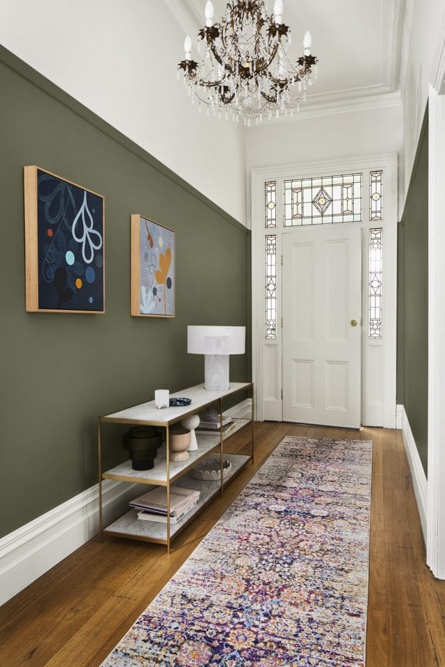
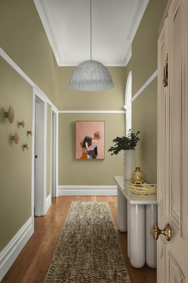
Wattyl Turkish Bazaar: The brave among us might consider using the hue in the form of paint and Wattyl’s Turkish Bazaar is a perfect match. “Wattyl Turkish Bazaar is a colour consumers can really have fun with – be it painting a single feature wall in a bedroom or living area or introducing pops of the colour in the form of cushions, throws or ceramics,” says Wattyl.

Wattyl
Image courtesy of Pantone

Arthide Oleada periwinkle rug: Available in oval, circular and rectangular iterations, this rug is really rather special. A fabulous way to add a pop of periwinkle to your interior, this rug is made from cow hide laid in a soft, geometric pattern. From $1,495.

Arthide
Arthide
Categories
DIY RENO ADDICT

Popular New York paint brand launches in Australia

Founded in New York in 1883, the leading US paint brand Benjamin Moore has just arrived in Australia and with more than 3,500 colours to choose from, the range has something for every taste and interior style.

Benjamin Moore
Benjamin Moore’s Wildflower makes a statement in this room

“Benjamin Moore recognises Australia’s passion for renovation and is excited to provide homeowners, interior decorators and painters with exceptional paints in unique and unmatchable colours,” says Brian Hamilton, general manager of Tenaru, the Australian distributor.

Interestingly, the company uses its own proprietary colourants in manufacturing which means that they can never be matched by other brands.

Benjamin Moore paint
The brand’s latest trend forecast is filled with tranquil hues

“The Benjamin Moore difference is its quality ingredients, process and Gennex colour technology, which deliver truer colours, a long-lasting result, and reduces the need to repaint over time,” says Brian.

Benjamin Moore 'Hint of Violet'
Benjamin Moore’s ‘Hint of Violet’ paint colour

In other news for the brand, it recently announced its Colour of the Year alongside a 2022 Colour Trends palette that draws inspiration from flowers. The Colour of the Year, October Mist 1945, is a gentle sage green that is complemented by the rest of the trends palette that includes a variety of tranquil shades including lilac, linen and yellow.

Benjamin Moore's 'October Mist' was named the brand's Colour of the Year
Benjamin Moore’s October Mist was named the brand’s Colour of the Year

Different flowers and their green stems were explored, when coming up with the latest palette. “By using greens as connecter colours, homeowners and interior decorators can be creative with colour to bring an overall colour scheme together.”

Colour Trends

Currently available to buy online only.

Categories
Design Styling

Dulux colour forecast 2022: Comfort and optimism in uncertain times

With the events of the last 18 months changing the way we interact with the world in an irrevocable way, it’s no wonder that many of us have rekindled our relationships with our homes. Let’s face it, with much of the country in lockdown we haven’t really had much choice! So, it came as no surprise to read that the Dulux Colour Forecast for 2022 has been shaped by the COVID-19 pandemic.

“When it comes to future trends, comfort is key. We want our living spaces to calm and nurture us, so we can process everything we’ve experienced over the last year, and at the same time, help us rediscover our zest for life looking forward,” says Andrea Lucena-Orr, Dulux colour and communication manager.

The sumptuous Flourish palette is part of the trend forecast
The Flourish palette is part of the colour forecast. This room features Dulux Dark Door, Benang and Red Terra.

After months of arduous restrictions, a couple of key trends have emerged – people have a desire to be bold, expressive and try new things in their homes while simultaneously seeking comfort and security. Furthermore, people are not only seeking great design and functionality from their homes but improved wellbeing and quality of life too.

Dulux Restore palette
The soothing Restore palette is part of the colour forecast. This room features Dulux Winter Terrace.

“Having spent so much time isolated and on devices, we find ourselves craving authentic connection. In our homes, we desire textured, natural materials and finishes that ground us and provide those tactile experiences we’ve been missing. We are excited to spend time with friends, family and colleagues, and find ourselves viewing the simple and mundane parts of life – things we once took for granted – with a new sense of wonder and excitement,” says Andrea.

Reflecting the trends, the latest Dulux colour forecast is comprised of three palettes – Restore, Flourish and Wonder.

Restore
Containing earth-based neutrals alongside more rugged, natural tones, the Restore palette is awash with gorgeous colours including buttercream, pumice, deep blue, clay, rich forest green, moss and a charcoal purple. 

“This palette is inspired by our innate need for authentic connection and experience. Interiors have become our cocoon and a place where we can practice wellness and self-care rituals. We’re choosing less, however, focusing on more quality items that last and provide comfort above all else,” says Andrea.

Dulux Restore palette
Dulux Restore palette. Dulux Opononi Double and Black Caviar feature in this room.
Dulux Restore palette
Dulux Restore palette. The walls are Dulux Rice Crop and joinery is Dulux Finnegan.
Dulux Restore palette
Dulux Restore palette. The walls and ceiling (left) are Dulux Stowe White and the right wall is Dulux New Penny.

Flourish
With its bold colours including petrol blue, desert red and vintage gold, the Flourish palette captures our desire to break free from restrictions in every sense. “As we move towards more freedoms, these colours enrich our feelings of empowerment and spark our imagination. With this comes unrestricted expression, inclusivity, and a celebration of the diversity in our community,” says Andrea.

Dulux Flourish palette
Dulux Flourish palette. The room features Dulux Dark Door, Deep Leather, Bongo Drum and White Dune Quarter.
Dulux Flourish palette. The room features Dulux Kenepuru, Gold Vintage and White Dune Quarter.
Dulux Flourish palette
Dulux Flourish palette. Colours include Dulux Clay Pipe Half, Discretion and White Dune Quarter.

Wonder
As we emerge from plenty of time spent indoors, there’s a sense of reawakening and celebration as we prepare to connect with friends and family. The Wonder palette is a visual representation of this with its playful, summery, 80’s inspired tones of cornflower blue, lilac, lemon, green and rose gold. 

“These colours set the stage for regeneration and growth, with unexpected tones drawn from the natural world around us. As we add more colour to our interiors, our imaginations are rekindled.”

Dulux Wonder palette
Dulux Pax is part of the Wonder palette
Dulux Wonder palette
Dulux Edvard features in the Wonder palette
Dulux Sandpaper features in the Wonder palette

Photographer: Lisa Cohen | Stylist: Bree Leech

For more

Categories
Design Designers Expert Tips Reno Products Shopping Styling

Interior design expert Neale Whitaker shares four things to make your house a home

When it comes to transforming a house into a home, interior design expert and TV personality Neale Whitaker, certainly knows a thing or two.

Neale, pictured in his own home, says he has four fundamental rules when it comes to interior design. To transform a house into your own personal castle, you absolutely have to consider colour, light, functionality and mood.

Colour

When it comes to decorating, colour has a profound influence on our mood. The ‘60/30/10’ rule is a useful place to start when planning a colour scheme, especially for an open-plan environment.

“The rule means using approximate percentages of colour to create balance,” says Neale. “For example, using 60% of neutral or white, adding 30% of toning shades and finally a 10% flourish of contrasting colour.”

This creates an even palette and avoids stark colour clashes. Another simple rule is that blue-based colours will work best with cool whites, while red-based colours work with warmer whites. Neale recommends experimenting with colour in smaller areas first before committing to larger spaces. 

“Neutrals don’t sit on the colour wheel, but they have hints of colours that do and these should be considered when mixing neutrals and colours,” he explains. “Find out where stronger colours sit on the colour wheel and this will determine whether you opt for cool or warm neutrals.”

A key colour trend for the coming year is warm, earthy and spicy tones. These include pale beige, biscuit and parchment shades vying with whites and greys as a backdrop to rich colours like bark, olive and ochre. They have a subtle intensity that can be incorporated in spaces to create a cosy vibe. 

Light

Correct lighting is fundamental to how spaces function and how we react to them. According to Neale, there are three types of lighting to consider in the home: general lighting, task lighting, and accent lighting.  

“General lighting is a light source such as downlights or pendants that are used to illuminate a space from a functional perspective,” says Neale. “Task lighting is used for specific tasks such as reading, desk work, crafts and can have an aesthetic value… accent lighting creates ambience.”

However, more recent lighting trends to hit the market include natural light control and skylights. Australia luckily has extraordinary natural light, and harnessing this can actually improve the livability of our homes.

“A recent popular trend is using sheer curtains in conjunction with blinds,” Neale says. “It’s a combination that feels perfect for our light and our climate, and it can also add depth and interest to a room.”

To create this clever combination of sheers and window coverings, Neale suggests using window coverings such as Luxaflex’s Pirouette Shadings or Duette Shades for the base layer of the window. For the finishing layer, he recommends using Luxaflex Curtains, which give homeowners the opportunity to expand their design options.

Controlling natural light with the sheers plus window covering combination also comes with the perks of privacy, insulation and energy efficiency.

Functionality

The quality of your life inside your home really depends not only on comfort but also how functional and useful it can be. With the pandemic shifting our relationship with our homes, most of us are spending more time at home than ever before.

“Considering your priorities and what you need to live well and comfortably is crucial to sticking to a budget and creating a functional living and working space,” says Neale.

Kitchens and bathrooms are important focal points of our homes but also the most likely to be personalised. When redecorating spaces of function such as kitchens and bathrooms, it’s important to consider current trends and question if they will impact functionality in years to come.

Mood

Creating the mood of your home is what makes it unique and individual. The three most popular interior design styles in Australia are Hamptons, Scandinavian and Contemporary. Identifying the characteristics of these looks can help you decide where you are stylistically, and how you can create mood in your own home.

“Identify a general style that appeals to you and then layer it with your personal choices,” says Neale. “Don’t be afraid to mix styles and eras.”

It’s important to remember to style your home not only to your aesthetic appeal but to your comfort. The most impactful ways of adding mood and personality to your home are art and books. However, Millenials and Gen Z tend to opt for house plants which are also a great way to add depth, texture, and personality to your home.

“Make art choices independent to what is happening elsewhere in your home and go with what you love.”

After all, your home is for your comfort, pleasure, and happy place.

Neale is national brand partner for Luxaflex

Categories
Decorating 101 DIY Reno Products Styling

Hallway styling ideas to make the best first impression

Kids, pets, shopping bags bumping against the wall – a busy hallway can take a battering. “Whilst it might not be a functional room, your hallway is a hardworking space that deserves decorative attention,” says Andrea Lucena-Orr, Dulux colour and communications manager. “It’s the first thing guests see and it sets the tone for the rest of your home.” Is your hallway looking a little worse for wear? A fresh coat of paint and a few decorative tweaks can make all the difference.

Artwork by Rachel Castle and Things, Royere vase by Sarah Ellison via Life Interiors, porcelain fruit bowl by Karen Morton via Greenhouse Interiors, Bold console via Domo Australia.

Stylist Julia Green gave a classic hallway three inviting looks using different palettes from the Dulux Colour Forecast 2021 to show you just how easy a refresh is to achieve. “This hallway had great bones – a high ceiling, decorative mouldings and trims, with a generous width – but it lacked energy. Being a relatively small space, it didn’t take much time, effort or outlay to jazz it up, and livening up the colour was the perfect place to start,” she said.

“Colour is such an emotional thing. It’s really about identifying those hues you instinctively respond to and having the confidence to use them in your home. And remember – it’s not a lifelong commitment. If you change your mind, you can simply paint over it.”

Look 1

For the first look, she chose colours from the Reset palette to create a cosy and contemporary feel. She ran deep, dusty pink (Dulux Wash&Wear in Terra Rose) up to the picture rails, and warm white (Dulux Wash&Wear in Snowy Mountains Half) on the upper section of walls and the ceiling. She used the same white to highlight the beautiful original mouldings and trims.

Artworks by Doulene Walker via Greenhouse Interiors. Halston Console by Sarah Ellison via Life Interiors, Tall Poppy vase by Formantics via Greenhouse Interiors, Sierra Pastel Geometric Hallway Runner Rug from Miss Amara, Salvador Table Lamp in Terracotta via Few and Far, Muuto Under The Bell Pendant White Melange via Surrounding

“Choosing a darker colour for the lower part of your walls can be a great way to disguise scuffs and marks, while a lighter colour above keeps your hallway feeling open and airy,” Julia said. “A few smart styling touches completed this look. You don’t want clutter in a busy hallway, so I kept my focal points to the walls, floor and console table. A joyful artwork at the end of the hall adds interest, whilst a geometric-patterned rug creates softness and hides a multitude of sins in a high traffic spot. All these elements are in tones of pink and coral, creating a lush, layered effect against the dusty pink walls.

“To create a cohesive feel, look for opportunities where you can replicate shapes and themes. Here, I chose a curvy console table that echoes the arched doorway. The ribbed base adds texture, whilst a pretty vignette consisting of a lamp, vessels and a trailing plant makes for an easy-to-achieve and eye-catching feature on the tabletop.”

Look 2

“I wanted to give the second look a more luxurious feel whilst drawing attention to the home’s original features, so I selected timeless colours from the Retreat palette. Rich bottle green (Dulux Wash&Wear in Mangrove) on the walls picks up on the tones in the stained-glass window, and warm white (Dulux Wash&Wear in Whisper White) above the picture rail keeps the entrance light and inviting.

Artworks by Castle and Things, Bizerte Floral Multicolour Runner from Miss Amara, Asola Table Lamp via Domo Australia, Long Low Shelving by Sarah Ellison via Life Interiors, Bloom Shallow Bowl Speckle by Alice Bell Ceramics via Greenhouse Interiors, Buee Vases via Domo Australia, tray and cup by R. L. Foote Design, digitally generated porcelain cup bubble plate, Goblet Planter Orchid via Lightly.

“Mixing old and new elements is a great way to add character. An ornate chandelier contrasts beautifully with a sleek modern table lamp, while graphic, contemporary artwork adds a touch of the unexpected. The old-meets-new runner has a traditional look, but in bright, modern colours.

“If space or budget is tight, invest in one or two pieces that really make an impact. Here, I splashed out on a marble and brass console – it feels luxurious and contrasts beautifully with the green walls,” says Julia.

Look 3

“To provide a calm and comforting welcome, I chose soft, nature-inspired colours from the Nourish palette for the third look. These tones are incredibly easy to work with as they sit comfortably alongside the whites many of us already have in our homes. Plus, they bring a sense of the outside in – which you can emphasise by styling with natural textures and greenery.

Artwork by Castle and Things, Bold Console via Domo Australia, hooks on the left wall – Oak The Dots via Huset, Porcelain Fruit Bowl by Karen Morton via Greenhouse Interiors, Royere Vase by Sarah Ellison via Life Interiors, Dibaya Abstract Runner via Miss Amara, Muuto Under The Bell Pendant White Melange via Surrounding

“I used soft pistachio on the walls (Dulux Wash&Wear in Sedia), pale pink (Dulux Aquanamel in Skip To) on the front door, and cool white with a neutral undertone (Dulux Wash&Wear in White Exchange Half) on the trims and ceiling.

“To boost functionality without sacrificing precious floor space, I added timber storage hooks to the walls for coats and bags.

“A bright and cheery painting picks up on the pink of the front door and draws guests into the home. I chose a console with curved legs to add volume without crowding the space, in a grey-white that matches the trims. A fern-print rug ties in with the natural theme, and its busy pattern means it won’t show every bit of dirt and dust.

“Each of these looks took less than a day to create – and turned a drab hallway fab.”

Which is your favourite?

Julia’s top hallway styling tips

  • Create a focal point:
    Draw guests into your home with a striking artwork, a gallery wall or a mirror at the end of the hallway.
  • Choose a durable paint finish:
    Busy hallways require a tough, washable paint finish – Dulux Wash&Wear Low Sheen has a velvety finish and it’s hardwearing and easy to clean.
  • Test it out:
    Purchase a sample pot or colour sticker online and live with the colours for a few days.
  • Choose the right rug:
    A robust, flatweave rug in a forgiving colourway is the best choice for a high-traffic area.
  • Light it right:
    Add warmth with a layered lighting scheme consisting of overhead lighting and lamps at different heights.
  • Mirror magic:
    Make a narrow hallway feel bigger and brighter with a strategically placed mirror.
  • White and bright:
    One of the best ways to visually lift a low ceiling, bounce light into a space or for colour contrast is to have a white ceiling – from the picture rails to beyond.

Learn more about Dulux’s 2021 Colour Forecast

Styling: Julia Green of Greenhouse Interiors | Photography: Armelle Habib

Categories
Design Shopping Styling

Pantone Colours of the Year 2021: ‘Ultimate Gray’ & ‘Illuminating’

In a year that has been punctuated by highs and lows, light and shade, it’s little surprise that the Pantone Colour(s) of the Year for 2021 are comprised of a bright lemon yellow and a rather safe shade of grey. A response to the pandemic, Pantone describes the duo as “a marriage of colour conveying a message of strength and hopefulness that is both enduring and uplifting.”

Unashamedly optimistic, ‘Illuminating’ is a sunny shade of yellow sparkling with vivacity while ‘Ultimate Gray’ is a solid and dependable earthy shade designed to quietly assure while encouraging composure, steadiness and resilience.

Freedom Cosh table lamp in grey: With its classic dome-shaped shade, this vintage-inspired metal design will make a statement in the living room or on a bedside table. It’s available in white and black too. $55.

Freedom Cosh lamp

Annie Sloan paints: Perfect for an up cycling project, the iconic chalk paint brand offers to Pantone-perfect colours in ‘English Yellow’ and ‘Chicago Grey.’

Annie Sloan

Ferm Living ripple glassware in smoke: A modern design classic, this gorgeous range features a rippled surface, geometric silhouettes and delicate hand feel. From $79.

Ferm Living

Superfresco Easy wallpaper: Instead of having to apply glue to the paper, this easy to use range features new ‘paste the wall’ technology making a weekend wallpaper job accessible for even the most novice DIY-er. Prices start at $60 per roll.

Supefresco

Pillow Talk Lunar towel range: Boasting a stylish tassel edge and raised geometric texture, this towel range comes in ten on-trend colours but the yellow is super fun. From $4.95.

Pillow Talk towels

Brosa Sophie set of bar stools: Reminiscent of French parlour style, these stylish stools feature plush grey velvet upholstery atop a minimal back frame. $429.

Brosa velvet bar stool

Bonnie & Neil ‘Big Major 2’ tea towel: Handmade in Melbourne, this linen tea towel features a gorgeous screen printed image of a cockatoo. It’s perfect for adding a pop of colour in the kitchen. $39.

Bonnie & Neil tea towel
Categories
Design

Paint colour trends 2021: Wattyl forecast organic, reassuring tones

This year, the way in which the home functions has fundamentally altered, as it has played a more meaningful role than ever in our daily lives. Wattyl have reflected this in their newly-released 2021 colour forecast, which takes the form of four unique palettes, spanning a wide array of shades.

These predictions highlight the way in which curved or rounded shapes, soft textures and considered colour palettes have become the go-to options for creating a sense of calmness and serenity while also proving useful in establishing different areas within an open living space.

The richer, darker hues of the Shadowy Darks palette – Dark Dream, Black Hole, Deep Forest and Seductress – are luxurious and cocooning and create a mood of timeworn comfort, especially when teamed with textured wall panels such as Easycraft’s Ascot Vogue dado panel, velvets, corduroy and dark timbers. Shape and texture become the heroes!

Uplifting Lights, a collection of four beautifully dusted pastels – Snow Rose, Light Aqua, Cave and China Mauve – add a warmth and tactility to minimalist spaces and lend themselves to soft curves in furniture and detailing that are balanced with the geometric chevron profile on the main wall. 

The tonal equality between hues such as Wattyl Snow Rose and Light Aqua inspire a balance between body and mind – the perfect combination for bedrooms.

Nourishing Earth Tones will be even more important in a post-Covid-19-world, their warm, nourishing plant-based colours helping us to reconnect with nature and the outdoors. Terracotta tones such as Wattyl Brandy Snap are given extra depth and visual interest when applied to a textured wall lining  and mirrored in furnishing textiles such as leather, linen and wool. 

Other beautifully organic, earthy hues within the palette are Moccacino, Run Forest, Denim and Honey Honey. 

Humble Whites – and minimalism in general – continue to reign supreme in many homes but the look is warming; becoming less pristine in both detail and styling.  Personality and emotion are introduced to this palette by virtue of authenticity, craft and history – attributes we crave in a post-Covid-19 world.  Materials such as timber, vegetable-dyed textiles and hand-made ceramics are key to the mix and create a mindful ambience, one of simplicity and purity.  

Humble whites such as Wattyl Lushious White, Confetti Shower and Ice Volcano sit quietly – and comfortably – next to timber lined walls that imbue the space with a sense of authenticity and earthiness.

Paint can be such a wonderful way to transform a living space, and the use of curves, texture, and colour can be utilised in order to fundamentally shape an interior that is calming, nurturing and multi-functional.

For more on these 2021 colour palettes

Categories
Design Expert Tips

Dulux colour forecast 2021: soothing colours for challenging times

With most European design and architecture shows cancelled this year, the Dulux Colour Forecast for 2021 has been informed by extensive virtual research into global trends to stay abreast of key product updates and launches.

This includes research from Maison & Objet in Paris and Stockholm Design Week & Furniture Fair, a virtual tour on Dezeen, reports from London’s Future Laboratory, and more.

The forecast comprises of three soothing palettes, inspired by nature along with moments of stronger colour to lighten the mood and brighten our outlook. “Surrounding colour can be a remedy for the soul in challenging times,” says Andrea. “This year’s soft, earthy neutrals, muted greens and gentle mauve-greys provide a reassuring connection with nature, whilst richer and brighter hues, such as coral and stormy blue awaken our senses and allow for moments of optimism.”

The global pandemic has changed our relationship with our homes – not just on a practical level, the lines between our work and home have blurred beyond recognition. This also affects us on an emotional level,” says Andrea Lucena-Orr, Dulux’s colour and communications manager. “We need exible spaces that can multi-task as spaces to conduct our professional lives and perform household tasks, however, at the same time we need our homes to provide balance, calm and a sense of comfort and security.”

Retreat is a palette of warm whites, brown-based neutrals and dusty blues that conveys a sense of a soft luxury, alongside vintage-inspired tones of burgundy and deep ocean blue.

RETREAT palette. Styling by Julia Green and photography by Armelle Habib. Wall in Diffused Grey, ceiling in Whisper White.

“The Retreat palette feels tranquil and sentimental – reminiscing tradition, whilst hinting at better times to come,” says Andrea. “It speaks of renewal and growth. As work-life boundaries blur, we look to style our interiors to be hybrid and high-functioning; spaces are mindfully curated with versatile pieces in authentic designs and materials, and art and decoration that has personal meaning.”

With gentle, buff neutrals and touches of tan, soft olive and muted ochre, the Nourish palette captures our renewed appreciation for natural beauty.

NOURISH palette. Styling by Julia Green and photography by Armelle Habib. Walls in Warm Neutral, skirting, architrave and fireplace in White Exchange Half, ceiling and cornices in Vivid White, cabinet in Skip To.

“These colours allow for moments of stillness and quiet; an opportunity to reduce the stress and digital fatigue we’re currently experiencing,” says Andrea. “Use them to delineate areas in your home where you can switch off and ground yourself in the moment. Pair them with simple, handcrafted pieces with raw textures and matte finishes.”

NOURISH palette. Styling by Julia Green and photography by Armelle Habib. Wall in Olive Blend, cornices, ceiling and skirting in Tuft.

Reset is an uplifting and optimistic palette of enriching and brighter hues; rich blue and coral, warm rust and playful mash-ups of pink and terracotta hint at 70s nostalgia and evoke memories of travel and fun.

RESET palette. Styling by Julia Green and photography by Armelle Habib. Back wall in Snowy Mountain Half, side table and planter in Light Ceramic.

“As we retreat indoors, fond memories of past adventures and discoveries inspire our home spaces,” she says. “Life may be slower, but there’s joy to be had in a less frantic pace. We draw closer to family and our local community, building new connections with those around us. There is much to be grateful for and building resilience is our latest attribute.”

RESET palette. Styling by Julia Green and photography by Armelle Habib. Wall behind artwork in Treeless, cupboards in Light Ceramic, IKEA stools in Hot Chillie

Styling is eclectic and inviting; old and new sit side by side, furniture is durable and generously proportioned, and soft furnishings are tactile and forgiving – think boucle and quilting.

Andrea’s tips on which palette to pick & how to use it

“Months of being stuck indoors staring at the same four walls creates the urge to pick up a paint brush that’s impossible to resist,” says Andrea. “Taking inspiration from the 2021 palettes is a great place to start when choosing colour for your home. You’ll also need to consider existing colours in your scheme, such as sofa upholstery, carpet tones and joinery finishes, to ensure the colour(s) you love will sit comfortably together.”

  • The important decision is to understand what look and feel you’re trying to create. For a subtle, neutral look, Nourish is a good palette to work with. For something moodier and more dramatic, try the Retreat palette. If you’re keen to incorporate bold tones that won’t overwhelm a space, consider the brighter hues in the Reset palette. And don’t forget, you can always select colours between the palettes to create a look that’s all your own.
  • Simple ways to introduce colour include painting your front door, creating an accent wall behind your bed or in a study nook, or adding a cheery, welcoming colour to your hallway. Many of the colours in this year’s forecast will work beautifully on exteriors too.
  • My top tip is if you’re just starting on your colour journey, start with one space and complete it – this will give you the con dence and encouragement to keep going. The bedroom is a great place to kick o your colour adventure as it’s so personal, which gives you the freedom to experiment. From there, introduce colour to create di erent moods in the various rooms in your home – for example, add shades that make you feel creative and inspired in your home office and something cosy and relaxing in the living room.
  • Small or large volumes of colour – it’s up to you. Once you start on your colour journey and experience the positive emotional connections, you’ll never want to stop!

For more on Dulux

Categories
Designers Expert Tips

Colour forecast 2020: what’s new and how to make it work

Dulux’s colour forecast for 2020 showcases the latest colour palettes to hit the interior world this year – and quite a few tricky paint colours have made their way in! Warmer whites and tonal blues are both featured heavily as hot trends in the world market, whilst grey shades still prove popular amongst Australians.

Henley Design’s colour and design consultant Heidi Schwieters, shares her tips for using these sometimes tricky colours:

White noise

Regardless of what is currently trending, whites are always a leader in interior design. White shades are a perfect backdrop colour to highlight contemporary finishes. They can be used to showcase bold feature pieces of artworks, rugs or cushions. This can then be incorporated with colourful accents or used with a subtle contrast of furnishings that layer similar tones or materials such as linen, woven fabrics or raw timbers.

Current trends of white with a warmer tone are seeing a rise, giving a feeling of warmth and comfort from the uncertainly of the outside world. To complement these warmer whites, is an increased use of grounding shades like coffee, stone, dark tans and soft burgundies. These colours give us a warm, inviting naturalness with a feeling of comfort and richness in earthy accents.

Singing the blues

Surprisingly, bolder and soft blues tones have made a revival. Tonal blue colours with accenting rich terracotta shades and subterranean greens, mixed with eclectic vintage, retro inspired pieces and luxe materials such as terrazzo, create a feeling of comfort in the familiarity of homeliness. It also enables us to showcase a break from the norm, inspiring rejuvenation and creativity.

Making it grey

Although greys are still present in colour selections, the trend is steering away from the colder tones of the past, and becoming warmer, much like the trend of whites.

Use greys with textured feature pieces of pine, rattan, wool and handcrafted raw timber furniture, to incorporate neutral tones of beige and blush highlights.

More than meets the eye

What denotes a trickier colour can be the undertones of the shade, so it is very important to observe colour samples in natural lighting.

Colours reflect warmer and cooler undertones and mixing these can be complicated to achieve. Usually it is best to keep one dominant and accent where needed, with paint features or furnishing pieces to cool down or warm up the interior space. Alternatively, keeping consistent with shades all from the warmer or cooler family will avoid issues of the selections not gelling.

Look around you

Any aspect of the home can be worked to showcase these trickier paint colours. Like with any colour scheme, it just requires an awareness of the surrounding environment, whether it’s the quality of light or a consciousness to visualise what mood is required. If ever in doubt, patch tests are always imperative to view shades in your home space.

Keeping it simple

These sometimes more difficult paint colours are on trend with a focus on warmth. Creating schemes that emphasise comfort whilst focusing on raw beauty and the grounding natural colours of the environment, are becoming the priority. 

-Heidi Schwieters is a colour and design consultant from Henley, one of Australia’s leading homebuilders with over 30 years of experience in the building industry.

Categories
Expert Tips Furniture Homewares

Cobalt blue: the new millennial pink for interiors?

By Lexi Kentmann

Matisse. Picasso. Yves Klein. They all had it in common.

To Matisse it signified volume and distance. For Picasso it denoted a period in his life. And for Yves Klein – he is known for “inventing”  it – his deep blue hue. That rich state of ultramarine that’s synonymous with his work. He even trademarked “International Klein Blue” in 1957!

Add drama with this linear design – there’s plenty to play with; featuring indigo and cobalt – this is virtually an artwork for your floor

Bringing it closer to home – our own Brett Whiteley once said that “blue ultramarine blue hits my nervous system in such an exciting way – there’s no other colour – I mean you go to an art supply house and there’s 48 colours available and instinctively I go for this and just squirt it out…”

It’s the colour of a summer ocean, and an our expansive sky. The art world’s love of this inky, energetic cobalt blue is well-documented. And they’re not alone!

Sculptural and functional, the ethereal nature of the Totem candlesticks add height to a table or vignette with a subtler hit of colour

Psychologically blue is shown to lower the pulse rate, create a sense of calmness, stability – and it’s been known to boost productivity (it supports mental acuity, vitality and alertness).

So why do we love cobalt blue so much?

With its electric charge and ability to instantaneously uplift – the right hue of blue is bold as it is beautiful. People like blues more than any other colour – we’re naturally drawn to saturated colour.

Perfectly paired with terracotta, this cushion adds dimension, texture and colour – all in one pop!

A lightning bolt of blue can be just the hit of colour you need in your interiors. This colour chameleon (it’s wildly versatile) can quickly up the ante in your home and energise a space.

It pairs beautifully with natural warm tones – think timber and brick tones; it’s contemporary when worked back with white; and when paired with other vibrant colours – it has a lively effect.

If you’re looking to update your space, cobalt will do the trick.

Perfect with or without flowers, these pieces are just the hit of cobalt

The purest form of cobalt pigment was discovered in 1802 by Louis Jacques Thenard – in a French Sevres porcelain factory. Today we want you to get inspired and add an air of sophistication to your interior with some cobalt pieces. Now being touted as ‘hyper blue’ – it’s also being charged with replacing ‘millenial pink’.

The silhouette is already a firm-favourite, but in this new colourway the Carlo becomes a luxe addition and a confident way to add colour to your space.

Luxe, sophisticated – can do a whole room or just add a pop to lift your space. Cobalt is on the rise – so get in early and make your mark!

Click on any of the above images to shop the look.

–Lexi Kentmann is Director – PR and Brand Marketing­, Williams-Sonoma Australia Pty Ltd

Categories
Expert Tips

Wattyl release their colour trend palettes for 2018

Wattyl have released their colour trends forecast for 2018. Having monitored and analysed the global trends – looking at living behaviour and design styles – Wattyl have translated them into four colour palettes. Findings point to an increased focus on the home being considered a refuge, a place to retreat from the fast pace of everyday life… FOMO (fear of missing out) has been replaced by JOMO (joy of missing out)! So what colour palettes did these trends amount to? Let’s take a look.

Nowstalgia: A desire to return to a time when life was simple and optimism ruled. The look echoes the mid-century modern design of Palm Springs with a hint of luxe! Colours include Midnight Seas, Silver Shadow, Gold Mine, Fifi and Space Odyssey.

Nowstalgia

Nowstalgia

Grounded: This reflects our desire to gain meaning and purpose in our lives, and regain a connection to the environment. Botanical and mineral palettes set the scene; for example Grey Ember, Sashimi, Fossilised, Bobby Brown and Calcium.

Grounded

Grounded

Mood monitor: Reconnecting with ourselves, taking time to reset and strengthening our bodies and minds are all key focuses in this palette. Colour and light stimulate our dormant senses and we can breathe. Be relaxed with the colours of Coastal Views, Posh Pink, Alta Sierra and Imperium.

Mood monitor

Mood monitor

The slow down: We are searching for ways of slowing down in a bid to manage our connected and busy lives. We want to spend more time at home, the fear of missing out is no more! Colours are soft and quiet; think Baby Seal, Subtle Hint, Pilbara Sand and Sheer Granite.

The slow down

The slow down

The 2018 colour palettes are available in Wattyl’s premium paint range, in a range of styles.

For more | Paint inspo

Categories
Expert Tips

The top home trends to try in 2018, according to Pinterest

The results are in, and there’s a lot to look forward to in 2018! Wallpapered ceilings, giant knitting and finger tattoos are just a few of the emerging trends people on Pinterest are excited about. The Pinterest 100 has it all—100 trend predictions across Pinterest’s top categories backed by global data.

People use Pinterest to plan their lives, so rather than taking a look back at the year, Pinterest gives us a look forward, at what pinners are searching for and saving to do in the future. Every category in the fourth annual Pinterest 100 is full of surprises and must-tries, but of course there’s one category in particular we are interested in: the home!

Decorating a home is personal and evolves over time. The notion that design is never done couldn’t be more true; it’s what keeps pinners coming back. With over 14 billion ideas, home continues to grow with a 75% increase in pins year on year. From full renos to stylish accents, here’s what trends are set to be big in 2018.

Resort-inspired styleSpa-inspired bathrooms and rattan furniture bring the vacay vibes home.

Credit: decocrush via Pinterest

The magic of metallicsMetals mesh with any colour palette, but to really amp up a space, mix different finishes together.

Credit: ru.pinterest.com via Pinterest

Hello, terrazzoThe forgotten flooring of the ’70s is brightening up ceilings, entryways and everything in between.

Credit: Fall For DIY via Pinterest

The fifth wallA statement ceiling can transform a room from the top down with bold paint, striking wallpaper or intricate texture.

Credit: vintageindustrialstyle.com via Pinterest

Beautiful to the boneBone inlaid tiles take an ordinary piece from meh to marvellous with maximalism drama and geometric designs.

Credit: Cityscape Bliss via Pinterest

Wood winsWall tiles and flooring in a herringbone pattern are versatile and add dimension to make any space more modern.

Credit: copperline.co via Pinterest

Statement doorsA colorful, painted front door or friendly message on a mat is the new way to welcome guests.

Credit: A Lady in London via Pinterest

Patterned plantsHouseplants, like the popular prayer plant, go beyond green, with vibrant, patterned foliage and flashes of colour.

Credit: minoo via Pinterest

Wall art is bigBye bye blank space! Large posters, works of art and photography prints are blowing up.

Credit: Murals Wallpaper via Pinterest

Sage adviceSoften up a space with sage, the new neutral.

Credit: rooms-decoration.com via Pinterest

Start pinning now | 2018 trends

Categories
Expert Tips Styling

Heat up your home with Dulux’s tropical-inspired accents

This summer, interiors will be eclectic and tropical, think vibrant colours paired with crisp white walls. I love this look, it’s totally 80s glamour!

Identified by Dulux as one of their summer colour trends for 2018, the Escapade palette features a medley of playful, tropical colours, such as pale mint and soft pink. Guaranteed to stimulate the senses and add a sense of energy and fun to any neutral space, it’s about creating that holiday feeling all year round.

If you’re hesitant to branch out into colour, fear not! Even small doses of these exuberant shades can have a huge impact. You can create fun, eye-catching accents in unexpected places, such as doors, the inside edge of a wall or door frame, along a staircase or in a storage nook. Go one step further and complete the look by painting one or two smaller pieces of furniture in the same striking hue.

Colour in the home is nothing to be afraid of. Rather, introducing new colour schemes can invigorate a space – making you more positive and productive. And the beautiful thing about paint is if you decide you don’t like it, you can simply paint over it!

Finish the look with Dulux’s summer styling tips by Dulux colour trends contributor Pip Brett.

1. Declutter your interiors so that furniture and accessories have plenty of room to breathe.

2. Seek out retro furniture with organic shapes and simple lines.

3. Add in plenty of luxe textures – think soft furnishings and accessories in sumptuous velvet, silk and sheepskin.

4. Introduce bright artworks that pick up on the season’s bold, tropical hues.

5. Touches of gold will add a glam feel.

6. Don’t forget greenery – indoor palms and ferns will bring a botanical-inspired interior to life and help you create a happier, healthier home.

Photography by Lisa Cohen | Styling by Bree Leech

Categories
Interiors Addict

Copper & cool hues: Peruse the Dulux winter 2017 colour trend

Quite the contrast to the warm colours celebrated in summer, Dulux released their 2017 winter colour trend this week and it’s full of cool, moody hues (there’s plenty of blues and greys) combined with Copper and Concrete Effect paints. “These colours are very diverse and can be used in most interior spaces. Being predominantly neutral, they are extremely accessible, from the lightest variation, Dulux Winter Terrace, a soft greige, right through to the darkest hue, Dulux Ahoy, which is an alluring deep blue,” says Dulux colour expert Andrea Lucena-Orr.

Walls in Dulux Winter Terrace. Upcycled table in Dulux Concrete Effect and Dulux Copper Effect

And there’s no need to be turned off by the darker hues, as not only do they look great when paired with lighter neutrals, but they also make great accent shades if you’re cautious about diving right in. “The dark blues in this palette such as Dulux Ahoy contrast beautifully against a concrete surface – whether this be an entire wall, a fireplace or an upcycled piece of furniture. It’s important to remember that these paint colours can be used on a lesser scale too as even the smallest changes can transform a room,” says Andrea.

Paint colours: Dulux Panda Pod, Tirau Double and Ahoy

Given the colour palette is rather understated it makes sense that Dulux thought to add copper into the mix – the contrast lends a luxe air. “Incorporating textured surfaces such as Copper Effect adds further dimension and creates focal points in a predominantly minimalist colour space. This touch of copper is ideal for highlighting architectural details and can also be applied to home accessories,” says Andrea.

Paint colours: Dulux Panda Pod, Tirau Double and Ahoy

Personally, I’m interested in the Concrete Effect paint (perfect for industrial styling) and can imagine many a DIY project with that one. For this, Dulux creative consultant and stylist Bree Leech has a handy tip. “Concrete and Copper Effect can be used on furniture details as well as walls to create unique bespoke pieces. Just make sure that if you are upcycling furniture such as a table that you add a glass top to safeguard the paint,” says Bree.

Paint colours: Dulux Reckless Grey, Tirau Double and Five Fingers Peninsula

Photography: Lisa Cohen | Styling: Bree Leech and Heather Nette King

See more online

Categories
Expert Tips Styling

8 tips for using colour and texture in your home this summer

With Dulux having just released their colour trends for summer 2016 (it’s all about earthy tones and muddy pastels), we spoke to Bree Leech, Dulux’s creative consultant and stylist, on how to best style your home this summer.  

dulux summer 1

1. Use combinations that provide some contrast and interest such as warm and cool shades together or light and dark. Try using unexpected mixes of pastel mauves and muddy neutrals.

2. Counterbalance the softness of the hues with striking angles. Inspired by geometric forms introduce these angles through furniture detail, pattern, art or feature wall designs.

3. Dulux’s summer palette, Bio Fragility, celebrates the perfection of imperfections – soften paint lines between colours by creating a rough brushed edge that plays on this trend detail

dulux summer 3

4. Texture is an important element – use cushions with different fabrics or introduce another textural layer to the space with an area rug.

5. Add living things to your home. Feature plants that are curious and provide interest such as cacti, succulents or bromeliads.

dulux summer

6. Always consider the lighting in the space to ensure you are making the most of natural daylight to create a beautiful summer experience.

7. Remember to review existing furnishings to ensure these colours will work with fittings that cannot be changed easily.

8. Look to your surrounding environment and colours in your garden for inspiration.

For more information.

Photography by Lisa Cohen | Styling by Bree Leech and Heather Nette King

Categories
Expert Tips Styling

Earthy pastels dominate Dulux’s colour trends for summer

This season, interiors are set to be inspired by a softer collection of muddy pastels derived from nature and living matter; with Dulux’s colour trends for summer 2016 consisting of delicate hues such as greys, dirty pinks, nudes and natural greens.

dulux 4

Dulux’s summer palette, Bio Fragility, creates a beautiful, tranquil setting that is very easy to live with, as Dulux colour expert Andrea Lucena-Orr explains: “The summer palette for 2016 is quite neutral and has easy-to-use colours that most consumers would feel confident using in their homes. The palette has evolved from a more pastel feel last year, offering subtle muted undertones with a certain earthiness.”

dulux summer 2

Homeowners can create a relaxed interior with beautiful detail by introducing these gentle summer hues that add a touch of colour, but are not overwhelming. Pale colours derived from natural matter create softness in a space and can be counterbalanced with unexpected mixes of warm and cool shades.

dulux summer 1

With summer calling for a more refined offering, the season’s colours can be easily adapted to virtually any room. For those not bold enough to transform an entire room, try using these refreshing and light colours in smaller volumes on accents, trims and accessories. “For a mini summer makeover a lighter shade can be introduced in smaller applications to complement colours in soft furnishings such as cushions and ceramic items,” explains Andrea. “Neutral accessories work really well with these more subtle and muted shades as well as soft and subdued combinations.”

dulux summer

Dulux’s Summer predictions are the product of research into global design, colour and finishes inspired by trade shows, fashion, technology, media and trends agencies.

For more information.

On Monday, Dulux’s creative consultant and stylist Bree Leech shares her style tips for using colour in your home this summer.

Photography by Lisa Cohen | Styling by Bree Leech and Heather Nette King

Categories
Designers Expert Tips RENO ADDICT Styling The Block

Shaynna Blaze on the 5 colour trends to use this winter

By Shaynna Blaze

Keeping an eye on new colour trends is a great way to spark inspiration and give your interiors a fresh, modern update. The key to using trend colours is just to have fun with them! Don’t be afraid to put a personal spin on a trend and embrace it in your home.

For first timer painters, you should try using trend colours in a smaller or more personal space like an entryway, hallway or bedroom. For more experienced painters or daring decorators, you can make a real statement in your lounge or open plan living area with a trend colour. Here are my top tips for incorporating five different colour trends into your home this winter.

Perfect pastels

Walls in Taubmans Endure Castawy Isle & Hedonist. Photo credit: Freedom

Pastels are one of my favourite trends this year. The softness of the hues allows you to mix and match opposing colours on the one wall without creating an eyesore. They also work really well with white, blonde or light coloured timber furniture.

To re-create this look, use painter’s tape to divide your wall and paint one side in a pale blue, like Taubmans Castaway Isle, and the other in a soft pink, like Taubmans Hedonist. For those wanting to create an edgier look, paint two-thirds of your wall in one colour and the remaining third in the second colour rather than an even half and half. Complete the look with artworks predominately featuring brighter or darker shades of blues and pinks as they’ll really pop against the pastel wall.

Peachy keen

This winter we’ll begin to see a shift towards muted, warm tones mixed with whites and greys in our homes. Taking the lead from the trends of metallic colours like copper and bronze, hues of orange and salmon will also emerge into our winter palettes. Pastel orange tones like Taubmans Rosette Royale and Sweet Peach, work well with blonde timbers. Try this combination to create a modern look with an organic feel, which also adds a sense of warmth to a winter palette.

Darker days

Walls in Taubmans Endure Black Forest. Photo credit: Freedom

I love using dark colours to create a winter palette. Charcoal greys, navy blues and deep-sea greens can make any room feel cosy with a hint of sophistication. These colours work well as a backdrop for bolder coloured accessories in reds, oranges and yellows. The trick for this look is to use a simple palette of up to only four colours so as not to overwhelm the eye with too many shades. For example, a dark blue, like Taubmans Endure Black Forest, works well with grey, red and white. Ensure there is an even balance of your chosen colours in your bed linen, carpets and other room accessories.  The combination of blue, red and white gives a gender-neutral, slightly nautical look without feeling kitschy.

I also love using less traditional winter colours like deep charcoals and indigos in my interiors. If you go with this trend, make sure you layer your tones from the dark wall colour through to a soft grey or white in your trims and accessories. Utilizing five or six hues ranging from dark blue, to grey blue to white, will create the perfect moody look this winter. My favourite combination is Taubmans Gypsy Rose, Dusty Violet, Snow Goose and Ice Princess.

Teal burst

Walls in Taubmans Endure Orchid Child. Photo credit: Freedom

If you’re a first time painter who doesn’t feel confident enough to paint with bright colour or a homeowner who’s fond of neutrals, you can still incorporate trend colours in your room design with statement artworks, soft furnishings and quirky room accessories.

When adding colour to a predominately neutral room it’s best to select three to four different colours making one dominant over the rest. Vibrant teals are becoming increasingly popular this year and can add a playful burst of energy to any neutral interior palette. The incorporation of bright teal in the artwork of this room creates a focal point on the wall without overwhelming it with colour. Various shades of teal also appear in the cushion and table accessories alongside subtle hints of yellow, red and blue.

Shades of grey

For an unexpected winter palette, try a nice shade of grey. Taupe greys on your walls give a warm base palette for crisp coloured bed linen and black accents, such as bedside lamps. Slightly reflective materials like silky timbers for bedside tables and copper flecks in details of cushions and bedside candles will bring the room to life.

— Shaynna Blaze is Taubmans’ brand ambassador and colour creative director, host of Selling Houses Australia and judge on The Block.  

Categories
Design DIY Expert Tips RENO ADDICT Styling

How to choose paint colour with Alisa & Lysandra

The impact of colour can completely transform your home during a renovation, but with endless colour palettes, how do you begin to choose the right paint colour for your walls? We show you how!

A&LWallColours

What’s light got to do with it?

Ever walked into a room that was big, white and just too bright? Natural light is a must for beautiful interiors, but if it burns your retina it’s time you tone it down. Before you choose a wall colour, you need to make an assessment of the amount of natural light in your space. If it’s too bright, tone it down with neutral hues; shades of grey, and biscuit will compliment almost any decor and can work well with existing furniture. Small rooms on the other hand, call for light walls to make them feel larger, but choose wisely because not all whites are the same.

How to choose your whites

With over 180 shades of white paint available on the market, choosing the right shade can seem like a laborious task, but don’t fret. First you need to determine if your room calls for a warm white, or cool white. Cool whites have a blue or black base added to them and they are ideal for neutralising bright modern rooms. Warm whites have a yellow undertone that can make a room feel cosier, and work well with more classic interiors; but be cautious, because a white with a heavy yellow or pink base can turn somewhat peachy, and let’s be honest, no one wants to go back to 1992! Our favourite is Vivid White by Dulux.

Jazz up monochromatic interiors

Are you a fan of simple, monochromatic walls? Don’t let others question your colour audacity, because by adding various shades of one hue, you can add a playful depth to your colour scheme.

2015 colour trends

Bringing nature into interiors is expected to be huge this year and the colour spectrum is wide. Living green walls and indoor plants are on trend, and when it comes to paint colour, think rich pine greens, mustard yellows and mineral hues, which will seamlessly introduce a raw earthiness into your space.

If you like light and dark colours in combination, 2015 is the year to marry them up. Embrace charcoal hues with earthy cool whites. Use your darkest colour to accentuate a wall that features artwork, or intricate architecture like an ornate fireplace in a period home.

Craving colour? Vibrant ocean blues, with bright Miami beach pinks and yellows are guaranteed to add brightness and energy to your room. Team these colours with modern, understated, perhaps even more vintage or retro furniture pieces, and accessories such as patterned cushions and throws. Nautical blues featuring bold patterns such as chevron and stripes are also popular and the look can be easily applied outside on a balcony or patio.

For something more punchy and elegant, you can’t go past Marsala; the 2015 Pantone colour of the year. Its’ rich terra rossa colour resembles the soil of Cabernet Sauvignon vineyards so this one’s for the wine lovers. Use shades of Marsala as feature walls, or if it feels too pink, choose a lighter hue of the colour and carry it through with accessories.

Image: Annie Sloan via Interiors Addict

And lastly, grey is the new black; and we love it because it is so versatile. Think dirty denim, comfort, softness, and easy living. Yes, grey can be all that!

Draw colour inspiration from accessories

When choosing a wall colour, draw inspiration from artwork, or other accessories such as throws, rugs or cushions, where you may discover both your main and accent colours. Snap photos, collect samples, or even bring the actual accessories along to the hardware store so you can match the colours. Even if you’re sure you have found your wall colour, it’s a good idea to spend a few dollars on getting sample pots first; then either paint large white cardboard swatches, or add a couple of brush strokes on the wall. Let the paint dry, and inspect in the next 24 hours throughout different times of the day to see how the colour changes with light.

Feature wall dos and don’ts

The days of the random feature wall are long gone, and today’s interiors demand you to be bold, so yes, go ahead and paint the entire room with the colour you love. If you must have a feature wall, ask yourself why you need it in the first place? Feature walls serve as accents, so if that’s what you’re looking for, make sure you are accentuating the right wall. A wall that features intricate architecture, a fireplace, or a hideaway nook, are more deserving of an accent colour, otherwise you might be drawing attention to the wall that hosts your alarm control panel or air conditioner; not much to admire there, is there?

Primed and ready

You’re ecstatic with your choice in wall colour and can’t wait to get started, but before you do, consider priming your walls with a coat or two if they are fairly dark or have a heavy yellow tinge. This is particularly important for bright colours, which need a pure white base so that they can reflect their true brilliance.

If your walls are chalky, give them a good wash before priming with sugar soap; chalky walls indicate that the existing paint has started to deteriorate, which is quite common in 1960s fixer-upper properties.

Now, let’s get painting shall we?

Read all the twins’ posts.