Categories
Bedrooms Decorating 101 Designers Expert Tips Interviews RENO ADDICT Styling

Julia Green on renovating with paint & latest styling secrets

As many of you will know, interior stylist Julia Green has transformed a 600 square metre heritage warehouse in Geelong into a stunning retail concept flagship store for her business Greenhouse Interiors. A gorgeous space, complete with fully functioning kitchen, bathroom, bedroom and lounge (where every room is shoppable – whoop!), Julia partnered with Dulux to create the bedroom, using the Flourish palette from the paint brand’s 2022 colour forecast.

Julia Green
Julia Green in the Greenhouse Interiors flagship bedroom space. Artwork ‘The Chandelier Project 003’ by Regan Glazner for Greenhouse Interiors.

“Our aim was to demonstrate how much difference just a touch of colour can make. The Flourish palette was perfect for this. It’s sophisticated without any sense of ego or pretension; sometimes earthy, sometimes daring, and easy to style. It’s also highly versatile with hues that are both soft, beautiful, and timeless,” says colour guru Julia who loves singing the virtues of a paint change when it comes to renovating. 

Julia Green bed
Bedside details

“Not all renovations start out as a blank canvas, in fact, many people buy renovated homes that are not styled to their liking. That’s where a fresh coat of paint and injection of colour can really come in handy. It’s one of the best ways to change up the look and feel of your home, without committing to a full-blown renovation,” says Julia.

Julia used Dulux Clay Pipe Half (a soft neutral with pink undertones) and Dulux Kenepuru Sound (a deep, rich blue with a hit of purple) on the walls and incorporated other tones from the Flourish palette through furniture and styling objects. All in all, it’s a warm and inviting result.

Julia Green

Julia’s top styling tips

  • Adding colour to your home can be transformative, so don’t be afraid to experiment and explore. It may not always work out the first time, but it’s worth persisting until you achieve the perfect balance.
  • Colour evokes emotions, so it’s best to consider how certain hues make you feel – whilst you may love a bold red, living with a whole room of it may be overwhelming. The good news about paint is, if you don’t love it, you can always paint over it. If in doubt, ask a friend or get a second opinion from a trade specialist – they are there to help!
  • Don’t be afraid to mix the old with the new and use bolder hues as accents rather than solid colours en-mass to avoid being too overpowering.
  • When decorating, always start with a blank canvas and add one piece at a time to ensure the balance is right. Sometimes how you edit your space can be more important than adding the homewares itself, so go slow.
  • Purchase Dulux A4 swatches, colour stickers or sample pots from the Dulux website of from your local paint shop to accurately test the colours around the room and view them at different times of day. That way, you’ll feel assured you’ve selected a colour(s) you’ll love.
Julia Green
One last look at the gorgeous space

Styling: Julia Green | Photography: Armelle Habib| Assistants: Justine Lanigan and Jessica Retallack

For more from Dulux

Categories
Design Expert Tips Interviews Styling

Julia Green’s new coffee table book is a gorgeous celebration of colour

Part travel compendium, part colour celebration, Vivid: Style in Colour is a gorgeous new interiors coffee table book compiled by interior stylist and colour queen Julia Green alongside her long-time collaborator, the photographer Armelle Habib. 

“The fear of colour and using it is palpable. I speak to people every day that are scared of colour and don’t know where to start. So, after 11 years of styling and writing about colourful interiors, it was time to put it all together and create a ‘bible’ that would hopefully instil people with colour confidence,” says Julia, who embarked on the project with Armelle during Melbourne’s gruelling first COVID-19 lockdown.

The book includes eight chapters divided by colour – orange, red, blue, green, pink, yellow, neutrals and black – and it’s filled with plenty of gorgeous interiors and practical advice alongside travel vignettes that illustrate how different palettes are interwoven in our lives. And with international travel off the cards for a while yet, it’s a wonderful escape for those suffering with wanderlust.

“Armelle, my collaborator, and I have both travelled extensively and really wanted to share some of our favourite images. It’s like armchair travel which is more pertinent now than ever before,” says Julia. 

Gathered over a decade, from all corners of the globe, Armelle’s beautiful travel photographs showcase how colour is used around the world. There’s the blues and greens of Sicily, that reference the Mediterranean, and the bold bright shades that are an antidote to the desert surrounds in Morocco. “Colour is a universal language, but each country uses it differently, so it was fascinating to see the colours emerge, and understand why,” says Julia.

Brimming with inspiration and practical advice there’s short essays on colour in styling and design as well as an exploration of the science of colour and colour psychology. There’s also information about using colour to connect or divide spaces, layering colour for depth and texture as well as building your confidence around embracing the colour spectrum.

“There is a lot to say about the psychology of colour but in the end, colour is emotive – it is energy made visible. I like to think that each colour represents an emotion and to ensure the colours selected match the mood you want for a space,” says Julia.

The book also features interviews with leading colour proponents including Martyn Thomson (Sydney), Jessica Bettenay (Melbourne), Marielle Ienna (Palermo), Los Enamorados (Ibiza) and the fabulous LRNCE from Marrakech. “It made sense to capture some of our favourite designers from across the globe that are colour confident and give the images some rigour with words and advice on how to break it down for people to use in their own homes,” says Julia.

And as for Julia’s favourite colours, she explains that it’s like choosing a favourite child. “If I had to narrow it down  I’d select green for the ‘life’ it represents and the energy it brings to a room,” says Julia who is a massive fan of pink too, in all its many iterations. “I love its versatility and find it is a colour that works back with so many others as a companion. Both bright and soft versions bring different things to the table, but I am up for them all.”

Julia’s top five colour tips

  • Only surround yourself with what you love and don’t listen to others – it’s your space.
  • Start slowly with colour. You can easily build on it but it’s always harder to edit.
  • Use old fashioned magazine cut outs, Pinterest or even social media to collect images you love and look for colour patterns within them. Often the answers are within your own instincts.
  • Seek professional advice for bigger decisions, if you need reassurance before outlaying large sums of money.
  • Pantone has an excellent app that will show you companion colours if you are unsure of what to use when pairing them up.

Photography: Armelle Habib

Buy the book online

Categories
Art Interviews Shopping Styling

Greenhouse Interiors’ autumn/winter ’21 collection a triumph of Australian art

Greenhouse Interiors‘ autumn/winter ’21 art collection campaign landed this week and boy is it a beauty. Brimming with the brand’s trademark colour, the meticulously styled imagery not only celebrates the artist stable’s latest output, but it provides plenty of interiors inspo too. “Our vibe is always colourful, regardless of the season. Our artists all have their own distinct style, but the common thread is always a celebration of colour despite the varying compositions,” says Greenhouse Interiors’ Julia Green. 

Greenhouse Interiors newcomer Amanda Ketterer’s gorgeous work can be seen on the left.

And while longtime Greenhouse Interiors artists are featured (think Georgie Wilson, Kate Mayes and Anna Cole), there are plenty of talented new artists represented too. “We have a swag of new clever creatives. Deborah Moss resides over the ditch in New Zealand and is inspired by her natural surroundings, especially trees! Lucy Cashmore is a new Melbourne artist, who painstakingly spends hours and hours creating graphic bold colourful works that are then framed in coloured perspex to great effect,” says Julia.

Lucy Cashmore
This gorgeous perspex framed artwork is by newcomer Lucy Cashmore
Artwork by Deborah Moss
One of newcomer Deborah Moss’ moody, abstract pieces

Recently joined Amanda Ketterer produces fluid-like abstract compositions while newbie Rishelle Kent’s magical paintings of the countryside sell before Julia has a chance to even promote them. “Madeline Jovicic’s style is playful and whimsical with references to food street carts, sardines and gelato stands amongst other fun subject matter!” says Julia.

Madeline Jovicic's works will transport you to Italy
Brittany Ferns’ mermaids are featured on the left while Madeline Jovicic’s works (right) will transport you to Italy

Other recent recruits include Nadia Dusselberg who paints joyful childlike subject matter in a sophisticated way, while Tegan Frank’s aerial beach scapes really evoke the Australian summer. “Her works already have a long wait list and have been super popular,” says Julia.

Tegan Franks
It’s easy to see why the works of Tegan Franks are super popular

And as always, the styling takes centre stage; an approach that Julia believes is key to helping clients visualise how artwork translates inside real homes. “Visualisation is not an easy thing for some, so seeing the work in context can be really helpful. We would like to think the imagery is aspirational but achievable,” says Julia who creates two styled art campaigns every year.

Work by Anna Cole
Anna Cole’s ‘Green Pastures’ is a striking, graphic piece

And for those looking to add to an existing collection, or start from scratch, Julia cites several artists who create pieces at affordable price points but says that Britt Ferns is a current favourite. “You cannot go past Britt Ferns if starting out or wanting to add a textured, considered work to a gallery wall.”

'Lovers Loop' by Laura Horrocks Lovers Loop by artist Laura Horrocks is a soft pink hued abstract
‘Lovers Loop’ by Laura Horrocks Lovers Loop by artist Laura Horrocks is a soft pink hued abstract

But if large and eye-catching is more your jam, the works of Georgie Wilson, Kate Pittas, Jen Sievers, Lou Martin, Kate Mayes, Morgan Jamieson and Katie Wyatt pack a fabulous visual punch. “Their works make for beautiful statement pieces for a home. Despite their differences, they all are eye catching, and all of these artists are very comfortable and accomplished at painting in large scale to great effect.”

Morgan Jamieson's 'Look up and see the palm trees'
Morgan Jamieson’s ‘Look up and see the palm trees’ is a gorgeous statement piece

Photography: Armelle Habib | Styling: Julia Green for Greenhouse Interiors, assisted by Aisha Chaudhry, Kate Moss and Jessica Retallack 

Shop online

Categories
Decorating 101 DIY Reno Products Styling

Hallway styling ideas to make the best first impression

Kids, pets, shopping bags bumping against the wall – a busy hallway can take a battering. “Whilst it might not be a functional room, your hallway is a hardworking space that deserves decorative attention,” says Andrea Lucena-Orr, Dulux colour and communications manager. “It’s the first thing guests see and it sets the tone for the rest of your home.” Is your hallway looking a little worse for wear? A fresh coat of paint and a few decorative tweaks can make all the difference.

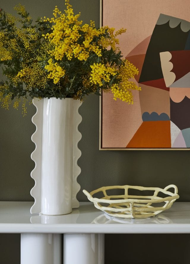
Artwork by Rachel Castle and Things, Royere vase by Sarah Ellison via Life Interiors, porcelain fruit bowl by Karen Morton via Greenhouse Interiors, Bold console via Domo Australia.

Stylist Julia Green gave a classic hallway three inviting looks using different palettes from the Dulux Colour Forecast 2021 to show you just how easy a refresh is to achieve. “This hallway had great bones – a high ceiling, decorative mouldings and trims, with a generous width – but it lacked energy. Being a relatively small space, it didn’t take much time, effort or outlay to jazz it up, and livening up the colour was the perfect place to start,” she said.

“Colour is such an emotional thing. It’s really about identifying those hues you instinctively respond to and having the confidence to use them in your home. And remember – it’s not a lifelong commitment. If you change your mind, you can simply paint over it.”

Look 1

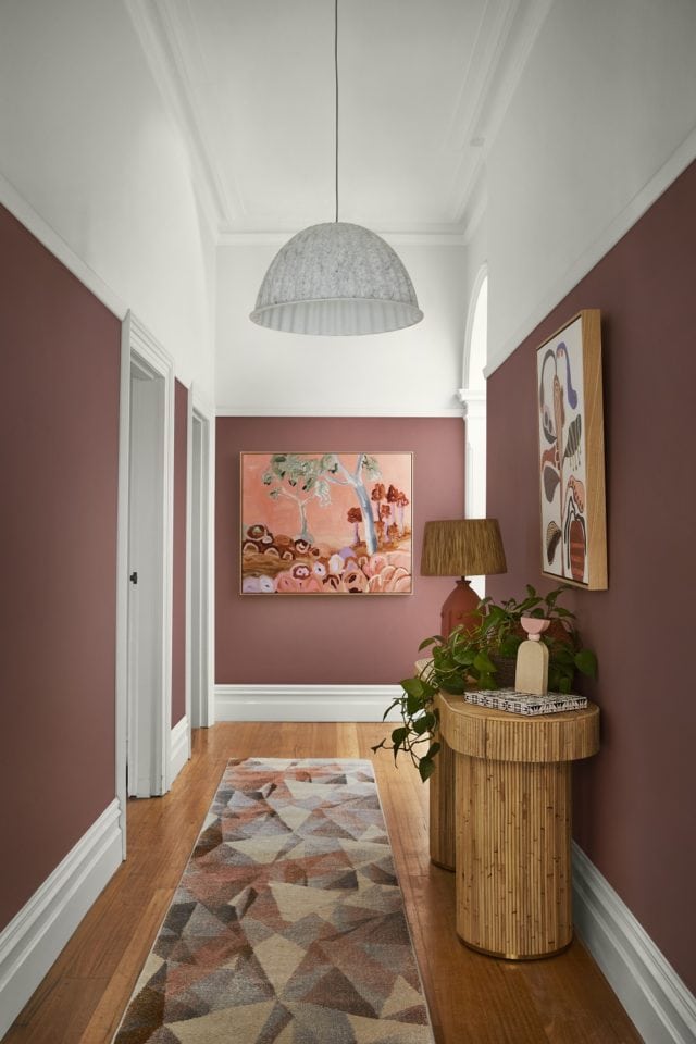
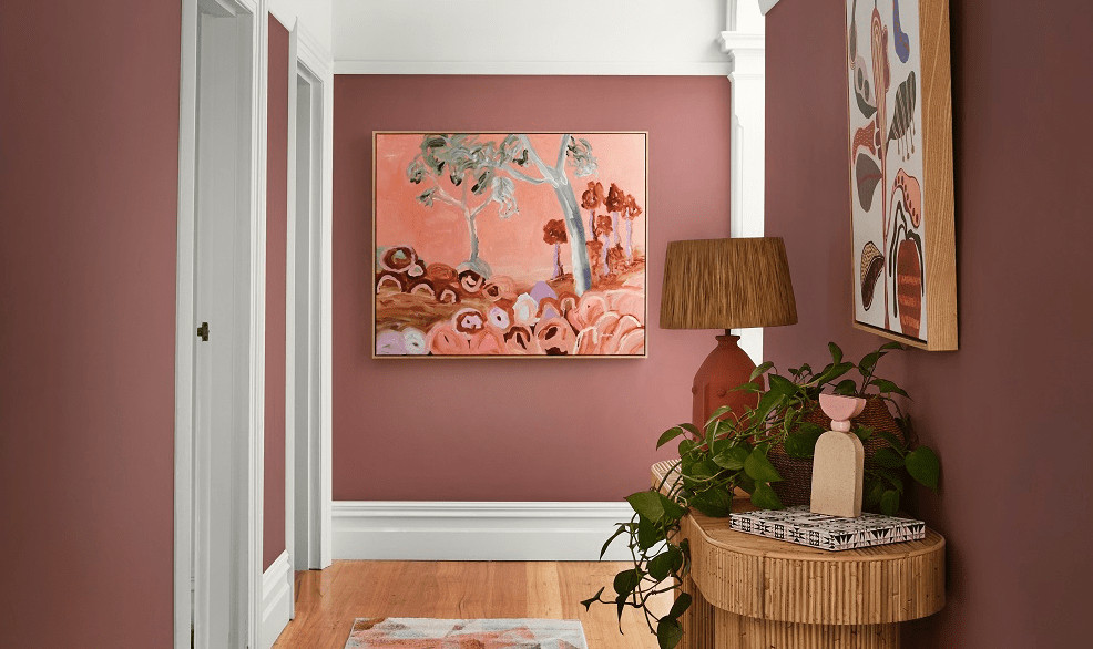
For the first look, she chose colours from the Reset palette to create a cosy and contemporary feel. She ran deep, dusty pink (Dulux Wash&Wear in Terra Rose) up to the picture rails, and warm white (Dulux Wash&Wear in Snowy Mountains Half) on the upper section of walls and the ceiling. She used the same white to highlight the beautiful original mouldings and trims.

Artworks by Doulene Walker via Greenhouse Interiors. Halston Console by Sarah Ellison via Life Interiors, Tall Poppy vase by Formantics via Greenhouse Interiors, Sierra Pastel Geometric Hallway Runner Rug from Miss Amara, Salvador Table Lamp in Terracotta via Few and Far, Muuto Under The Bell Pendant White Melange via Surrounding

“Choosing a darker colour for the lower part of your walls can be a great way to disguise scuffs and marks, while a lighter colour above keeps your hallway feeling open and airy,” Julia said. “A few smart styling touches completed this look. You don’t want clutter in a busy hallway, so I kept my focal points to the walls, floor and console table. A joyful artwork at the end of the hall adds interest, whilst a geometric-patterned rug creates softness and hides a multitude of sins in a high traffic spot. All these elements are in tones of pink and coral, creating a lush, layered effect against the dusty pink walls.

“To create a cohesive feel, look for opportunities where you can replicate shapes and themes. Here, I chose a curvy console table that echoes the arched doorway. The ribbed base adds texture, whilst a pretty vignette consisting of a lamp, vessels and a trailing plant makes for an easy-to-achieve and eye-catching feature on the tabletop.”

Look 2

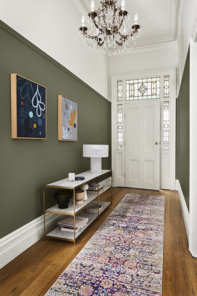
“I wanted to give the second look a more luxurious feel whilst drawing attention to the home’s original features, so I selected timeless colours from the Retreat palette. Rich bottle green (Dulux Wash&Wear in Mangrove) on the walls picks up on the tones in the stained-glass window, and warm white (Dulux Wash&Wear in Whisper White) above the picture rail keeps the entrance light and inviting.

Artworks by Castle and Things, Bizerte Floral Multicolour Runner from Miss Amara, Asola Table Lamp via Domo Australia, Long Low Shelving by Sarah Ellison via Life Interiors, Bloom Shallow Bowl Speckle by Alice Bell Ceramics via Greenhouse Interiors, Buee Vases via Domo Australia, tray and cup by R. L. Foote Design, digitally generated porcelain cup bubble plate, Goblet Planter Orchid via Lightly.

“Mixing old and new elements is a great way to add character. An ornate chandelier contrasts beautifully with a sleek modern table lamp, while graphic, contemporary artwork adds a touch of the unexpected. The old-meets-new runner has a traditional look, but in bright, modern colours.

“If space or budget is tight, invest in one or two pieces that really make an impact. Here, I splashed out on a marble and brass console – it feels luxurious and contrasts beautifully with the green walls,” says Julia.

Look 3

“To provide a calm and comforting welcome, I chose soft, nature-inspired colours from the Nourish palette for the third look. These tones are incredibly easy to work with as they sit comfortably alongside the whites many of us already have in our homes. Plus, they bring a sense of the outside in – which you can emphasise by styling with natural textures and greenery.

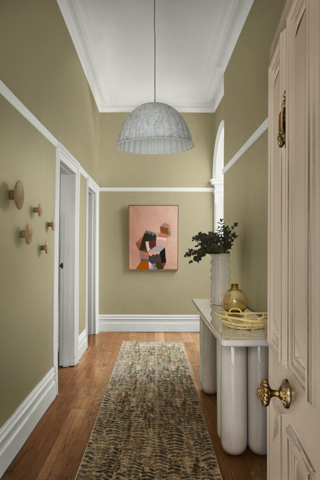
Artwork by Castle and Things, Bold Console via Domo Australia, hooks on the left wall – Oak The Dots via Huset, Porcelain Fruit Bowl by Karen Morton via Greenhouse Interiors, Royere Vase by Sarah Ellison via Life Interiors, Dibaya Abstract Runner via Miss Amara, Muuto Under The Bell Pendant White Melange via Surrounding

“I used soft pistachio on the walls (Dulux Wash&Wear in Sedia), pale pink (Dulux Aquanamel in Skip To) on the front door, and cool white with a neutral undertone (Dulux Wash&Wear in White Exchange Half) on the trims and ceiling.

“To boost functionality without sacrificing precious floor space, I added timber storage hooks to the walls for coats and bags.

“A bright and cheery painting picks up on the pink of the front door and draws guests into the home. I chose a console with curved legs to add volume without crowding the space, in a grey-white that matches the trims. A fern-print rug ties in with the natural theme, and its busy pattern means it won’t show every bit of dirt and dust.

“Each of these looks took less than a day to create – and turned a drab hallway fab.”

Which is your favourite?

Julia’s top hallway styling tips

  • Create a focal point:
    Draw guests into your home with a striking artwork, a gallery wall or a mirror at the end of the hallway.
  • Choose a durable paint finish:
    Busy hallways require a tough, washable paint finish – Dulux Wash&Wear Low Sheen has a velvety finish and it’s hardwearing and easy to clean.
  • Test it out:
    Purchase a sample pot or colour sticker online and live with the colours for a few days.
  • Choose the right rug:
    A robust, flatweave rug in a forgiving colourway is the best choice for a high-traffic area.
  • Light it right:
    Add warmth with a layered lighting scheme consisting of overhead lighting and lamps at different heights.
  • Mirror magic:
    Make a narrow hallway feel bigger and brighter with a strategically placed mirror.
  • White and bright:
    One of the best ways to visually lift a low ceiling, bounce light into a space or for colour contrast is to have a white ceiling – from the picture rails to beyond.

Learn more about Dulux’s 2021 Colour Forecast

Styling: Julia Green of Greenhouse Interiors | Photography: Armelle Habib

Categories
Design Homewares Interviews Shopping

Currently coveting: Greenhouse Interiors’ arty new homewares

With a host of great artists in her stable, Greenhouse Interiors’ Julia Green is spoilt for choice most of the time. So, when it came to select prints for her latest art-inspired range of homewares she decided to base the collection around a nature theme. “The collection celebrates the beauty of a life by the sea; whistling winds in the outback, warm salty air and a sense of calm amongst the chaos of daily life. And most importantly, our Native collection nods to the fact that art is indeed, all around us,” says Julia.

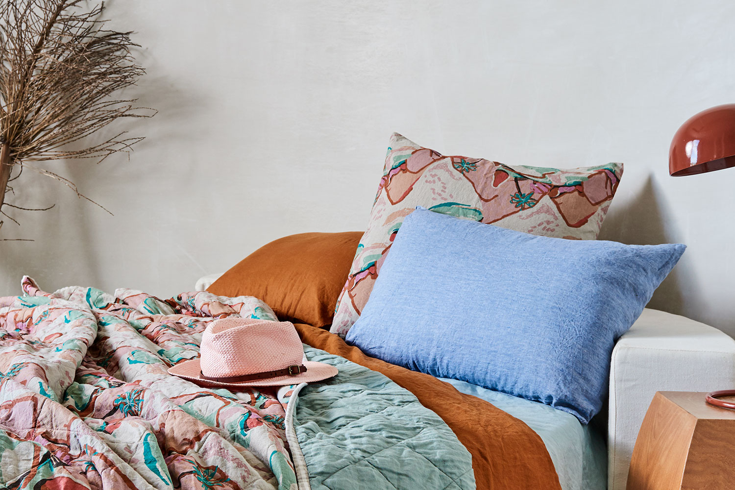
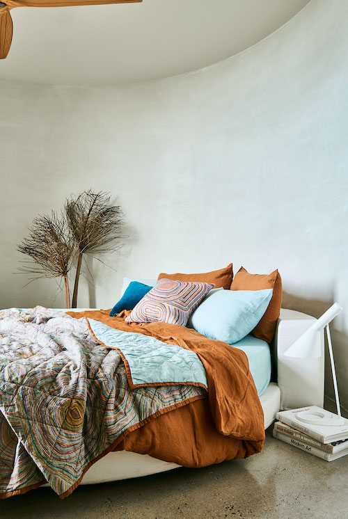
Greenhouse Interiors bed linen

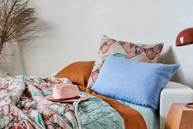
The gorgeous range sees Julia collaborate with notable artists; Marcia Priestly, Jen Sievers, Kimmy Hogan, Natalie Jade, Janey Forbes and Kate Mayes. “We have brought their art to life via deliciously textured limited-edition bed linen, alongside a swag of other lifestyle products and apparel,” says Julia. The brand’s famous art quilts are back as well as a strong cushion line-up, tote bags, bath robes, tea towels, napery, cosmetic bags and more.

Greenhouse Interiors

Australian landscapes provided the inspiration behind the prints in the collection which range from bold booms to craggy clifftop views as well as contemporary Aboriginal designs. “Each artist has been carefully selected to represent a ‘native’ collection of wares that quintessentially places their very own values, soul and surrounds at the forefront of their designs.”

Greenhouse Interiors

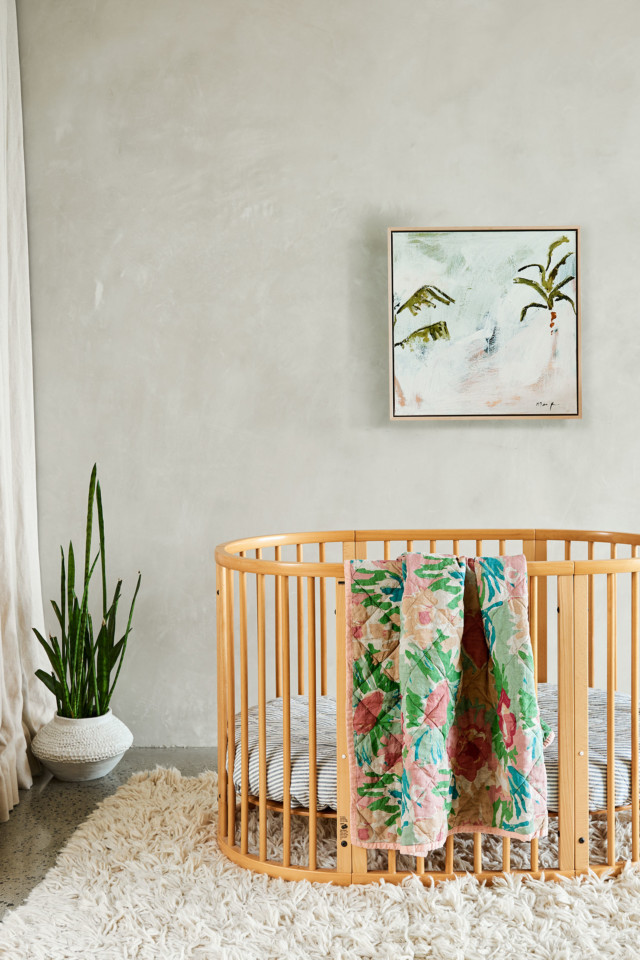
A highlight of the range, the art quilts have been reprised in a couple of wonderful new prints. “I don’t think you can go past our signature limited edition printed art quilt – it’s the most incredible quality, the most snuggly soft French flax linen. With only 100 ever made, they are truly special,” says Julia who styles hers on the bed and couch.

Greenhouse Interiors

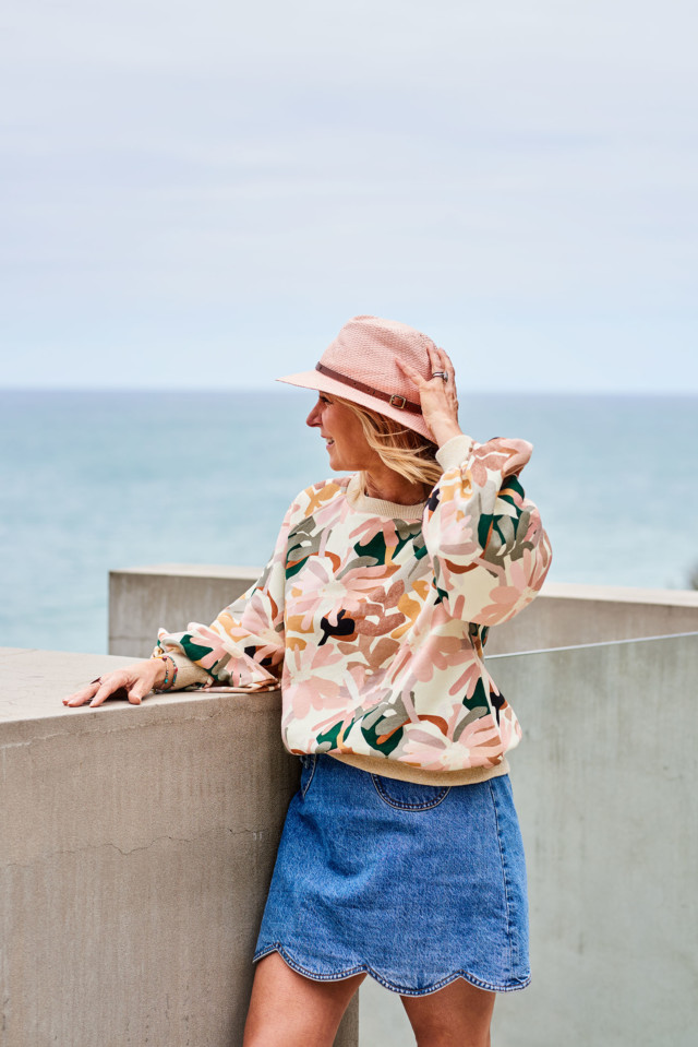
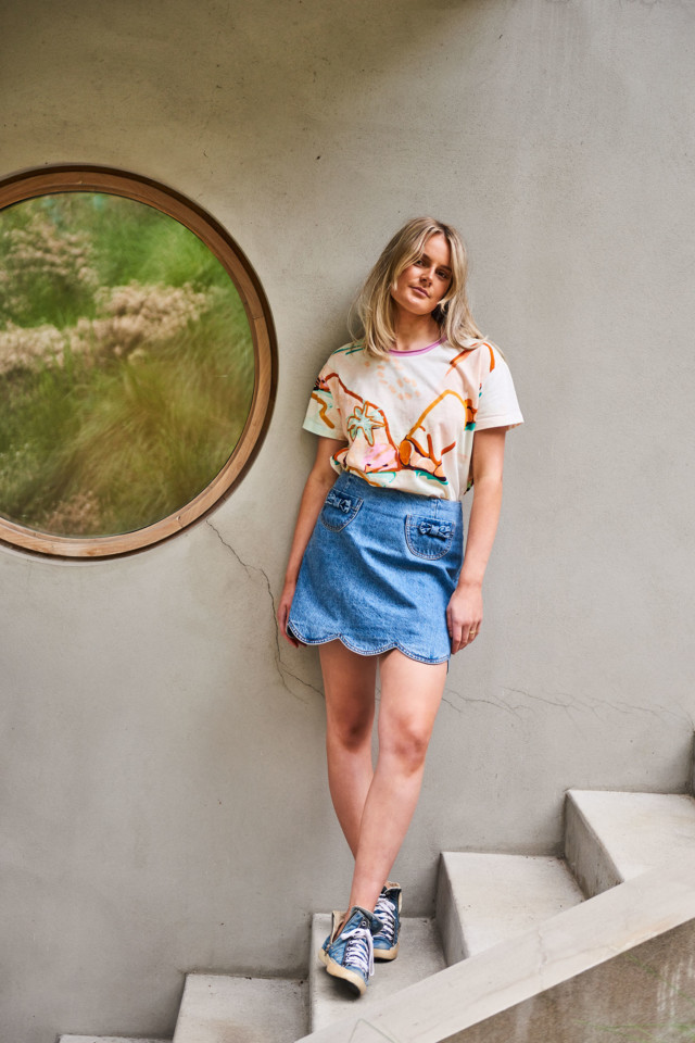
The apparel line-up is strong too (I love that Kimmy Hogan sweater!), and Julia points to the art-tees also. “I have been thrashing our cotton tees. They are so fun to wear and attract lots of lovely compliments,” says Julia, who is also a big fan of the overnight bags and thinks they are the perfect price for gifting.

Julia Green
Julia in the fabulous Kimmy Hogan print sweater
Greenhouse Interiors

Ultimately though, what makes this range really special is its limited edition status; a very small run has been produced so as not to saturate the market. “Our work is largely limited edition, which sets us apart from all of the other linen brands that repeat patterns time and time again.”

Greenhouse Interiors

Photography: Nicole Ramsay | Styling: Greenhouse Interiors including @hygge_liv_australia @genevievemanleystylist | Styling assistants: @bibianaandco @chaisepriestley 

Shop online

Categories
Art Expert Tips Styling

Coveting: Greenhouse Interiors’ latest art collection

The Greenhouse Interiors artist stable is one of Australia’s most impressive, so when they shared their latest group photoshoot with us recently, we couldn’t wait to share. The shoot started with each artist being asked to produce a colourful new capsule collection of original artworks (inspired by summer and autumn), that were styled up together. “Life is better with colour,” goes the Greenhouse Interiors tagline and this latest shoot proves it really is.

Greenhouse Interiors
What a delicious gallery wall!

“In true form, the pieces of the puzzle all came together as they always do. It all sat beautifully together, like they had all shared a studio space and co-created in the same room. The synergy and spirit in our team of artists is palpable. We are a unique bunch of like-minded colour lovers and when we get together, magic happens. We hope you love this collection as much as we do!” says Greenhouse Interiors’ Julia Green.

Greenhouse Interiors

Aside from acting as a fabulous showcase for the Greenhouse Interiors artists, the shoot provides plenty of excellent styling insight too. “We like to give our customers ideas about how best to hang work, how to cluster it, and what kind of companion colours work. We also like to share the happy vibe created by using colour in one’s home!” says Julia.

Greenhouse Interiors
Artist Madeleine Stamer’s works draw inspiration from Mexican folk art, nature, old school tattoos, 70′s design and the natural world

Shot inside a home on the coastline of Jan Juc (a suburb in Victoria’s Torquay), luckily for the team, the abode was already filled with an array of gorgeous furniture. “It’s a beautiful, textured space so all we had to was move on in and hang the work,” says Julia.

Greenhouse Interiors
Monica Henry’s gorgeous hand stitched pieces take 8-10 hours to complete

Of the overall fun, colour-loving vibe, Julia wanted the shoot to convey the idea that true style often has nothing to do with how much money a person has. “We believe style is never about money or your bank account. It’s instead about creating warm, inviting spaces with love and colour always. And we think that was definitely achieved.”

A piece by Anna Cole

Julia’s artwork styling tips

  1. Size matters
    The scale of an artwork is really important for maximum impact. Always make sure you measure up the space with masking tape first, to see how it will really translate onto the wall. Greenhouse Interiors has a clever 3d augmented reality App that makes this task even easier.
  2. Colour
    Try to pick out some of the colours in the work and repeat them in soft furnishings or textiles, as this will sew the room together like a tapestry and make the space feel very harmonious.
  3. Come to the dark side
    Don’t be afraid of darker wall colours. The bedroom in our house was a clear favorite and it made all of our artworks go BOOM! Darker colours really mood up a space and create fab ambience. Give them a go!

A Kimmy Hogan piece pops on the dark bedroom wall
A Kimmy Hogan original pops on the dark bedroom wall

Photography: Armelle Habib | Art direction: Julia Green | Styling: Aisha Chaudhry, Jessica Rettalack | Styling assistants: Kate Moss, Catherine Cornehls, Lisa Hunter, Lisa Kozsik

For more on Greenhouse Interiors | Artist Joan Blond’s work filled with joie de vivre

Categories
Design Interviews Styling

Becoming a stylist: Aisha swaps IT for interiors!

An IT career seems an unlikely beginning for an interior stylist but it’s the story of Melbourne’s Aisha Chaudhry. Like many women, the career change was initiated by a maternity leave stint, when Aisha decided to leave the IT world behind and study a Certificate IV of Interior Design & Decoration at RMIT.

“I spent three years completing the course part time while raising kids,” says Aisha, who also used the time to assist family members with renovation advice, build two different homes for her family’s property portfolio and work in a design capacity on a series off-the-plan townhouses. Busy much?

Aisha Chaudhry
Styling: Aisha Chaudhry for Greenhouse Interiors | Stylist assist: Jessica Retallack, Justine Lanigan and Sophie Barratt | Photography: Armelle Habib

But it’s one thing to complete a course and quite another to actually find work in the uber-competitive interior styling field. Which is where Aisha’s relationship with Julia Green of Greenhouse Interiors proved integral.

“Everywhere I looked employers wanted experience, and no one was interested in hiring a fresh graduate. So, I started attending different events to network and see if I could volunteer my time somewhere to gain experience.” She attended a couple of Julia’s styling masterclasses before asking if she could assist on a shoot.

Aisha Chaudhry
Styling: Aisha Chaudhry & Jessica Retallack for Greenhouse Interiors | Stylist assistant: Kendall Troon | Photography: Armelle Habib

“Julia was kind enough to offer me the opportunity but after assisting her on my first shoot, I was not sure if I was going to get another opportunity. I learnt a lot on the day and saw how much effort goes into creating one shot and seeing the final images just blew my mind.” Aisha was instantly hooked.

Aisha Chaudhry
Aisha Chaudhry

“The hardest part for me was to put myself out there and trust in my abilities,” says Aisha whose courage has since reaped reward after reward. Not only has she gone onto assist Julia myriad times, but she’s also had the honour of styling her own shoots too. “Aisha has become my most loyal and trusted style assist over the years and is now so accomplished I trust her with entire campaigns, and this is a first for me,” says mentor Julia.

Aisha Chaudhry
Styling: Aisha Chaudhry for Greenhouse Interiors | Stylist assistant: Jessica Retallack | Photography: Armelle Habib

Aisha’s Pakistani background was certainly an easy fit for the colourful Greenhouse Interiors aesthetic. She moved from Pakistan to Melbourne with her family in 1995. “Coming from a heritage that is full of colour, I am naturally attracted towards colour and pattern. I still go back to my home country and always come back inspired. In our traditional clothes we use a lot of colour and pattern which is the main influence for me.”

Aisha Chaudhry
Styling: Aisha Chaudhry, Jessica Retallack, Justine Lanigan and Sophie Barratt for Greenhouse Interiors | Photography: Armelle Habib

Photography: Armelle Habib | Styling: Aisha Chaudhry

For more on Aisha and her business Interior Designstein | Before & after: Stylist Julia Green revamps living room

Categories
Design Designers Homewares Interviews Shopping

Marmoset Found latest: Balloon shaped glass vessels

Following on from the success of the brand’s hugely popular ‘Omari Glass’ range, Melbourne’s Marmoset Found is back this month with another covetable line-up of glass and ceramic vessels. The Balloon collection is inspired by its namesake as well as the rich landscapes of Sri Lanka; lush tea plantations, waters filled with sea turtles and bright sari-clad women.

The Balloon collection
The Balloon collection is named after the balloon-like shape of this design

Marmoset Found owner Nareen Holloway recently spent a month in the island country; an experience that proved integral in creating the new range. “I spent several days amongst the tea plantations where I watched the Tamil women gracefully fill their sacks with fresh tea leaves. The women were easily spotted amongst the huge lush mountains by the colourful saris they were in. Their gorgeous rich blue and pink hues inspired the palette for the new collection,” says Nareen.

Marmoset Found

But unlike the bold colours found in a sari, the colours in the range are fairly muted; something of a Marmoset Found design signature. There’s rose pink, ink blue, stone grey and a brand new soft green.

A highlight of the range, the Balloon vase works equally well with foliage, as a stand-alone piece or grouped in a cluster. The refined, spherical shape is designed to catch the light.

Balloon vase
The Balloon vase

The brand’s hugely popular Memphis and Aswan styles both sold out within weeks from launch last year; they’ve been reimagined in green. “We have introduced the softest green to these designs which looks lovely clustered with the Rose or Storm vases,” says Nareen.

The Aswan and Memphis vases have been created in soft green

A brand staple, since its inception almost a decade ago, the Tulip ceramic vase line-up has been expanded beyond its colour range that includes icy pink, dove grey, moss green and steel blue. “I absolutely love the new Tulip vase in terracotta! It is such a rich, earthy tone and looks so beautiful paired with our icy pink pieces. This colour works for just about any interior colour scheme,” says Nareen.

The Tulip range has been expanded to include a rich terracotta tone
The Tulip range has been expanded to include a rich terracotta tone (seen here in the centre)

Photography: Armelle Habib | Styling: Julia Green for Greenhouse Interiors, assisted by Jessica Retallack

Shop Marmoset Found online | Target’s fab new ‘Jaspandi’ homewares range

Categories
Art Interviews

Feliz Home co-founder launches painting career

If you’re a long-time reader, you’ll be familiar with the lovely homewares label Feliz Home as we’ve featured it many times. Specialising primarily in bedding, the boutique brand was co-founded by Geelong-based Janey Forbes who recently made the decision to sell the business to explore a full-time career as an artist.

“Designing, painting and drawing were always the most enjoyable parts of running a bedding business and I’ve always had a burning desire to paint and create. The time feels right to move a bunch of obstacles out of my way and see what happens if I have the chance,” says Janey, who recently joined the Greenhouse Interiors stable after Julia Green got in touch.

Jane Forbes
‘Pretty Young Thing’

Describing her career trajectory as ‘really curvy,’ the latest move doesn’t look that surprising when you consider Janey’s past which has included roles in event management, product development at Hallmark Cards and a stint in the not-for-profit sector inspired by a year spent in South America. “After all that, I had my first child, and while on maternity leave, I felt I had to do something!” says Janey who started Feliz Home with her friend and former work colleague Melissa Alessi in response.

Jane Forbes
‘Air Waves’ and ‘Wanderlust’

“We threw ourselves into Feliz with very little experience in bedding, screen printing, running a business and motherhood; we were both juggling it all!” says Janey who started the business by importing an array of organic cotton from India and simply taking the plunge. “Our dream was to be creative and in control, rather than world domination. We earned some amazing exposure early on and grew a loyal customer base. It was exciting and I’m so proud of the path that the brand took. It was the hardest thing I’ve ever done, but by far the most rewarding,” says Janey.

'The Florist'
‘The Florist’

Seven years on, Janey and Melissa decided to sell Feliz Home, rather than simply close it. “We felt that we had put so much work into this little baby of ours, we really wanted to see it live on with some new energy,” says Janey who advertised, and was thrilled to find new owners eager to inject more love into the business.

'Shapely' and 'The Diva'
‘Shapely’ and ‘The Diva’

As for her paintings (featured here), Janey is inspired by the way that children paint without inhibition and she’s a colour lover too. “My work is colourful, layered, a bit quirky and evolving. Whatever it is about the human brain, colour has so much power over us. I love colour and shapes that you want to wrap yourself in. Ultimately, my paintings are all trying to express some fun and beauty.”

Photography: Armelle Habib, assisted by Edwina Hollick | Styling: Jessica Retallack & Aisha Chaundhry for Greenhouse Interiors, assisted by Kendall Troon

Shop Janey’s work online | The artist who saved a house deposit by drawing houses

Categories
Expert Tips Interviews Shopping Styling

Successful homewares business branding tips you need!

When stylist, curator and brand consultant Julia Green was looking to showcase the latest line-up of Greenhouse Interiors wares she chose a novel alternative to the traditional trade fair. Taking over an entire St Kilda home (including relocating the family that lives there), Julia set about creating the ultimate ‘Greenhouse Interiors’ abode  – think texture, fun, beautiful art and a kaleidoscope of colour. By all accounts the immersive experience was wonderfully received and you can check it out yourself via the pictures in this story.

A pic from Greenhouse Interior's recent St Kilda trade fair
A pic from Greenhouse Interior’s recent immersive trade fair

“We dressed every bed in our linen, hung all of our new art collections, burnt our bespoke candles, put our hand soaps in the bathroom and encouraged all visitors to truly experience what it’s like to live in amongst our wares and by all accounts people loved it,” says Julia who squeezed extra promotional mileage out of the stint via the creation of a short video tour of the space and a lovely suite of still imagery. And according to Julia, the whole venture was produced for a fraction of the traditional trade fair costs.

Julia Green
Julia Green

With 10 years’ experience working on over 40 start-ups, Julia has become highly sought-after in the interiors industry – an industry that has changed monumentally with the advent of digital marketing, social media and online shopping. “I began my career in this industry just prior to the interiors explosion, excessive noise and competition, before ‘The Block’ rose to fame, and in era where things were done in a ‘certain’ way,” says Julia. With retail goal posts changing on the daily and more competition than ever before, the changing retail landscape means only the most nimble will survive.

Greenhouse Interiors

“There is an increased number of people vying for their share of the market – it’s noisy. Also, the days of owning a store only, without an online presence, are gone. The savvy marketers all seem to have a bricks and mortar presence but are using it as a hub for a more active digital footprint,” says Julia who shares her top tips for brand success with us today.

Hobby vs full-time
While most creatives don’t have the luxury of giving up their day job in the first instance, Julia believes it’s important to eventually make the jump to ensure your brand’s success.  “You need to know when to tip the balance from hobby to full time maker/creator. Dabbling rarely works, but commitment usually does,” says Julia.

Greenhouse Interiors

Creative vs salesperson
Diametrically opposed in some respects, it’s no surprise to hear that creative people are often not that great at selling their wares. “I often refer people to outsource this part if it is not their skillset, so they can concentrate on making and not be distracted by customers!” says Julia.

Greenhouse Interiors

Storytelling
Ensuring they take their fans on a journey is key. It’s like telling a story. People want to know WHO they are buying from,” says Julia. From static imagery to video content, embracing the digital realm is key to this aspect of winning the brand war. “Brands need to have a ‘face’ for the public and not just push their sales pitch. Brands must sell a lifestyle and not a product,” says Julia.

Greenhouse Interiors

The power of pictures
“In our industry, there is no denying the importance of the visual, and the tactile. People want to see inspirational imagery that promotes a lifestyle they wish to be a part of. Producing imagery and video is expensive, undoubtedly. But there are some economical ways to do it, that don’t all revolve around a crew of 20 with expensive equipment,” says Julia who has found that brands almost always get their ROI in this regard though the resulting imagery must end up in the right people’s hands – magazines, influential blogs and the like.

Greenhouse Interiors

Social media
“I’ve learned and have seen first-hand the power of social media, and the influence it has. I run an excellent workshop on this and teach people how to maximise their influence here,” says Julia.

When it comes to social media, Julia believes a brand must have a clearly defined point of difference that can be articulated in 30 seconds or less, must maintain authenticity at all times, provide outstanding customer service (nobody wants to wait anymore) while creating a ‘story’ (as mentioned above). “People want to know who you are out. Come out from behind the camera even if it pains you. Failing that, get a staff member to do the honours,” says Julia.

From a phone consult to a full day in person with an individual or company, Julia is now formally available for brand consulting. “This service is not a one size fits all, as I like to review each business, and find their strengths and weaknesses before delivering change on a platter. In short, after consulting to over 40 start-ups in a decade, many going on to become household names, I have a good idea of a recipe that is foolproof, and my recipe is up for sharing!”

 For more | Jumbled: Ruling homewares retail on the global stage!

Categories
Before & Afters Interviews

Before & after: Stylist Julia Green revamps living room

Bringing her signature sophisticated use of colour to the project, stylist Julia Green transformed this plain white living room recently with a few clever styling tricks and paint shades from the lovely Dulux Wholeself palette – one of the four palettes in the 2019 Dulux Colour Forecast.

“This living room in a heritage apartment building had lovely bones – high ceilings, plenty of natural light and a little nook with bay windows – but it felt cold and one-dimensional. Think bare, white-washed walls and furniture in various shades of grey. It was crying out for personality, layers and colour,” says Julia.

BEFORE living room
BEFORE living room

AFTER living room
AFTER Living room. The large rectangular original artwork above the grey sofa is by Georgie Wilson from Greenhouse Interiors

The Dulux Wholeself palette proved the perfect mix of shades on which to hang all of her design decisions on. “With its muted pinks, greens and mauve-greys, there’s something incredibly soothing and gentle about this palette. The colours feel fresh, modern and relaxing – the perfect choice for a living room,” says Julia.

Upcycling
To minimise costs, Julia made sure that her paint colour choices complemented the existing furniture in the room – most notably the more expensive items such as the grey sofa and mid-tone timber coffee tables. “It’s important to work with what you’ve got when making over a room – this can really help keep costs down, particularly when you’re talking big-ticket items such as sofas and flooring,” says Julia.

BEFORE
BEFORE coffee tables & accessories

AFTER coffee tables & accessories
AFTER The coffee tables and accessories were upcycled with paint

And for the pieces that just didn’t work, such as side tables and storage, Julia upcycled them with a lick of paint. The stylist freshened up the coffee tables by painting the top of the larger one with Dulux Aquanamel in New Life and the legs of the smaller one in Gold Dust. She also brought the fig-leaf planter to life by repainting it in Dulux Aquanamel in Italian Clay.

Feature paint
“To make a feature of the bay-window nook, we painted the walls a soft apricot shade, Dulux Wash&Wear in Pinkham, and kept the remaining walls in their existing colour, Dulux Wash&Wear in Natural White. Painting the walls in different colours this way is a great trick for creating individual zones in an open-plan room,” says Julia.

BEFORE
BEFORE

AFTER Dulux Pinkham pops agains the white window frames
AFTER Dulux Wash&Wear in Pinkham helps to create two zones in the open-plan space

Julia then paired the soft apricot wall with an abstract artwork filled with soft shades of duck egg blue and deep pink. “We also picked up these colours in the smaller pieces of furniture and accessories to add depth to the room,” says Julia.

AFTER
AFTER The new feature wall features a Katie Wyatt original painting available from Greenhouse Interiors

Cosy seating
A must in any living area, cosy seating is key and Julia added to the mix of existing seats by bringing in a pair of curved-arm rattan and velvet armchairs. “They add textural interest to the room and their round shape helps soften the harsh lines of the room’s architecture. We finished off by livening up the plain sofa with a sumptuous throw and a medley of scatter cushions in different shapes and fabrics that pick up on the colours in the main artwork,” says Julia.

Julia Green
Stylist Julia Green

Pick a palette
“This makeover is a great example of the power of colour. The brilliant thing about working with a palette like this is that Dulux has done all the hard work for you in choosing the perfect combinations – all you have to do is find a palette you love, and you’ll be able to transform rooms in your own home in no time by working within these tonal confines.”

Imagery courtesy of Dulux Australia
Photography: Armelle Habib | Styling: Julia Green

For more | Dulux Colour Awards 2019: Winners

Categories
Design Designers Expert Tips

Sibella Court & Julia Green to speak at Decor + Design

Decor + Design returns to Melbourne for the 16th year this July with an impressive array of exhibitors, events, experiences and local and international speakers. And when it comes to all-important trends, attendees can expect to see the latest in furniture, lighting, textiles, kitchenware, bathware, workspace design and contemporary art all in one engaging space.

Decor + Design

“We’re ecstatic to host a dynamic selection of industry heavyweights to share their invaluable knowledge and experiences at this year’s show. Celebrating our 16th year, we are also pleased to welcome 350 exhibitors in 2019. Many longterm and exciting new exhibitors will be showcasing classic and contemporary styles and launching new products too,” says the event’s director, Chris May.

Decor + Design

Leading the speaking line-up (and always popular International Seminar Series), will be keynote speakers and super successful celebrity design duo Cortney and Robert Novogratz. With over 20 years’ experience designing and developing unique properties in New York, Los Angeles and beyond they will no doubt bring a unique perspective to the event.

Cortney and Robert Novogratz

The local speaking line-up is rather exciting too with an array of Aussie design luminaries set to hit the stage. From interior stylist and style director for Belle magazine Steve Cordony to interior designer, presenter and style writer James Treble to interior designer Diane Bergeron and stylists Sibella Court, Megan Morton and Julia Green.

Sibella Court speaking at a past event
Stylist Sibella Court speaking at a past event

Just as in past years, UK trend forecasters Victoria Redshaw and Phil Pong from Scarlet Opus will return for another year with their uber-popular Trend Tours where designers, retailers and stylists will be taken on a tour of the showroom floor to highlight 2019’s most popular textile and colour trends. The Trend Hub and the Trends Champagne Lounge will also feature alongside the Homemade exhibition where independent Australian studios will exhibit.

Décor + Design will run alongside the Australian International Furniture Fair (AIFF), Australia’s largest furniture industry buying and networking destination.

Decor + Design 2019/Australian International Furniture Fair (AIFF)
Melbourne Exhibition Centre
1 Convention Centre Place
South Wharf VIC, 3003

Thursday 18 July, 10am– 5pm
Friday 19 July, 10am – 5pm
Saturday 20 July, 10am – 4pm
Sunday 21 July, 10am – 3pm

For more | 2019 home styling trends

Categories
Before & Afters Expert Tips Interviews

Stylist Julia Green uses bright, bold colour in bedroom

It’s a familiar scene – the room is a nice enough space, but it’s been painted a safe shade of white, the overall effect of which is rather underwhelming. It’s a predicament that stylist Julia Green of Greenhouse Interiors found herself in recently when Dulux asked her to overhaul a bland bedroom.

“The room was a blank canvas. While it had lovely features such as wooden floorboards, white walls and shutters, it was crying out for some character,” says Julia who looked to the Dulux ‘Repair’ palette for inspiration before making over the space with lashings of vibrant colour and texture.

BEFORE bedroom
BEFORE bedroom

AFTER bedroom
AFTER bedroom

“The colours in the Repair palette felt calm yet invigorating – for me, it was love at first sight. When it comes to choosing colour, I believe it’s the emotional connection we make that is the most important thing – perhaps even more important than how we dress a space. I knew the deep greenish blues and hints of cinnamon from the palette would be perfect for creating a warm, welcoming feel in this bedroom,” says Julia. And I’d have to agree! While there was nothing ‘wrong’ with the original space, the result showcases Julia’s formidable talent for colour. Who would have thought that a bright teal shade (Dulux Sea Creature) could feel so invigorating yet simultaneously serene?

Dulux
BEFORE bedside table

AFTER bedside table
AFTER bedside table – Julia used Dulux Plasticine to upcycle it

As she is inclined to, Julia built the room around the artwork – a bold piece by artist Georgie Wilson. “I chose an artwork for the back wall that was filled with beautiful, earthy tones, all present in the Dulux Repair palette, and used this to inform the rest of my colour choices,” says Julia who then layered paint, accessories and soft furnishings into the space to complement.

“I selected a bold hue for the back wall to give the room depth – Dulux Wash & Wear in Sea Creature, which is a luscious, green-blue. I layered this up with touches of rich green by painting the existing bedside-table drawer with Dulux Aquanamel in Plasticine and adding lush velvet soft furnishings and tall potted plants on either side of the bed,” says Julia.

Julia Green
Julia Green

Julia also used a variety of other accent shades to complete the look – Dulux Aquanamel in Cinnamon Sand (a soft terracotta shade) was painted on the mirror trim while Dulux Auburn Flair was painted on the base of the large ceramic pot in the corner. A sizeable blue tonal rug, touches of raw timber, velvet and linens were then brought in to finish the space.

“You don’t have to be an expert to achieve great results with colour – it’s such fun to experiment, and you’ll be amazed at how quickly it can transform a space. Safe is boring; my advice is to step outside your comfort zone and try something new. Chances are, you’ll fall in love with playing with colour and never want to stop!”

Photography: Armelle Habib | Styling: Julia Green

For more | 2019 Dulux Colour Awards finalists

Categories
Art Decorating 101 Interviews Styling

Stylist & art curator Julia Green shares top art tips

Many of you will be familiar with the formidable interior styling talents of Julia Green but few realise her glittering career has evolved to encompass art curation too. It’s a journey that was a little accidental but Julia’s savvy move to make original art accessible through her colourful and eclectic online store has certainly paid off.

Julia Green
Stylist and art curator Julia Green

“I found that when I started shooting, I was often asked to source artwork for empty walls to fill homes, and realised there was a gap. I started Greenhouse Interiors as a result, and have carved out a niche now for picking up emerging talent, and helping artists build their brands with solid marketing and PR assistance. Their work and my work is widely published, and a strong social media presence helps get the word out on the street,” says Julia who started with a select few and now represents over 40 brands.

And with over 100 submissions coming in every week, Julia has worked hard to cut through the noise and curate a spectacular line-up of Australian artists and homewares brands. “I look for a lot of different things. The first thing is I have to love the work myself, and see it as being on brand for my colour loving audience.  The next thing is to talk to them, and understand them and what they want, and make sure our goals are aligned,” says Julia whose no-nonsense approach is refreshing in what can be a pretentious space.

Greenhouse Interiors group shot

“I think attitude is everything, and I don’t wear egos too well, so as long as they sound like they are on the same page, we make plans for the next steps. We are like a family and I am always keen to ensure that our collective brand name is held in high esteem,” says Julia whose commitment to demystifying the art buying scene is no doubt integral to her success.

“Many of our clients have told us that they are intimidated to shop in gallery spaces, or don’t feel like they will have budget to afford ‘original’ works, so we have tipped that on its head, and offer a broad range of work at different price points, and are very welcoming and non-intimidating to deal with,” says Julia.

Greenhouse Interiors group shot

“But the most important thing of course, is to have credibility with what you do, and with Greenhouse Interiors now powering into its tenth year, we have developed a very loyal clientele that love us almost as much as we love them!”

Greenhouse Interiors group shot

“The art world is always evolving, but I have noticed more artists moving away from galleries with the spread of online exposure. Sites like ours are highly credible, have excellent imagery and the work can be seen in every state of the country, rather than in one place alone,” says Julia who shares her top tips for buying and styling art below.

1. Where to begin?
“Just look for a pure love. Art is so subjective, and personal. It matters little what anyone else thinks – it just matters that you love it. Art should evoke emotion, make you feel something, and that’s when you know it has found the right home. There’s nothing high brow about that. It’s a simple connection,” says Julia.

1. There are no styling rules!
“The great thing about it is there are no rules! You can do as you please. I personally like to use the art to dictate the palette and inform other styling decisions in the house. For example, I have used a new Katie Wyatt piece in my home and pulled out lilacs and chartreuse colours in accessories for a considered look. I equally love a pattern clash or bold colour clash,” says Julia.

2. Hanging
“When it comes to hanging, just think about the height at which it hang – not too high! Also, play around with configurations on the floor before taking hammer and nail to wall. I also love a gallery hang that shares a horizon line, where they all hang at the same height from the top,” says Julia who recommends her site’s free 3D art app to really get a sense of how a piece will look in situ.

“It allows you to try the art on your own walls, to scale and with depth. Lots of people offer the ‘Photoshop it in’ thing but it’s only one dimensional. Our app makes it feel real, and really instils confidence to buy. We have had so many fab stories of purchases that have come as a result of our app,” says Julia.

3. Colour
If you had to describe the Greenhouse Interiors aesthetic, ‘colour’ is the first word that comes to mind and there’s no doubt its presence is fundamental to Julia’s styling. But just how important is colour when choosing art for the home?

“Colour is a language. You turn the volume up or down. So if you want bright bold colour, and it makes you feel happy, do it! On the contrary, if you want a quiet, peaceful space, you could dial it back and have a more softly hued space. Think about how you want to feel in each room of the house and choose the right colour for the mood.”

Photography: Armelle Habib | Styling: Julia Green for Greenhouse Interiors assisted by Aisha Chaudhry and Jessica Retallack
Shop online | Julia’s flower arranging tips

Categories
Design Homewares Shopping

Currently coveting: Marmoset Found’s pleated glassware

Known for its gorgeous range of sculptural ceramics and lighting, Marmoset Found is back this month with a stunning glass line-up and I’m hard pressed to pick a fave! “I have wanted to expand our collection for many years to include glassware – it has been a long time in the making! I wanted to explore glass that made an impact, where stems could be placed at various indentations to create depth for floral displays. It was important the design celebrated form, function and beauty symbiotically,” says Marmoset Found’s owner Nareen Holloway of the ‘Omari Glass’ range.

Just stunning!

Established in 2010, Nareen also designs lighting and ceramics with almost all of it made entirely by hand. “I love raw, textural finishes but wanted to explore the translucency and finish of glass as it so beautifully contrasts this. There are just eight pieces in the Omari Glass collection and they look so lovely grouped together in a small cluster,” says Nareen of the range that comes in subtle jewel tones including rose, ink blue, storm grey and coffee.

Marmoset Found
A single stem is elevated when housed in gorgeous pink pleated glass

“As with our ceramic pieces I wanted to create shapes that are timeless. I am not interested in churning out seasonal designs but rather pieces that, although affordable, are special and will be used for years to come. The shapes are simple with subtle pleating and allow the beautiful soft jewel tones to really shine,” says Nareen of her creations that are perfect for adding sculptural interest to any space, and ideal for styling a vignette.

Marmoset Found

Designed to be functional and filled with blooms, or simply displayed as a sculpture, the ‘pleat vase’ is a definite highlight. “I like that the pleat vase can be used with the wooden base or without giving two quite different looks with the one vase. The wooden base looks wonderful in a pared back, natural setting whilst displaying the vase without the wooden base looks quite sophisticated,” says Nareen.

Marmoset Found vases
I love the versatility of the ‘pleat vase’ as it looks very different styled with or without the wooden base

The Marmoset Found range is designed by Nareen before being handmade by artisans in small family run businesses in India, Vietnam, Thailand, the Philippines and Japan. Nareen developed an interest in social responsibility and empowering communities in the supply chain while working for The Body Shop.

“I have done a masters of international development and I really enjoyed working in partnership with organisations such as Oxfam and The Red Cross throughout my studies to understand how powerful development can be. What I learned during this time formed the basis of Marmoset Found and meant I was confident in negotiating fair and safe work practices for the makers of my products,” says Nareen.

Marmoset Found ceramics
The brand creates beautiful ceramics too

Photography: Armelle Habib | Styling: Julia Green

Shop online | Jones & Co’s fun hand-painted ceramics

Categories
Art Interviews

Discover Artist Anna Cole’s bright, geometric works

Artist Anna Cole’s works have a geometric, loosely Cubist feel and her latest collection ‘Revamped’ sports a sumptuous rainbow of colour. “Creating this new body of work has been insightful for me and my creative process moving forward. I’ve also used over 30 different colours in each piece and they have all been mixed by hand. Painting for me is like Pringles – once I pop the lid off my paint pods, I just can’t stop!” says Anna.

Anna Cole art

“When I paint, I not only paint for my stockists, audience and clients, I paint for myself too. Painting for me is methodical and it’s my Zen and I hope when people purchase my work they get an understanding of this. For me, a world with no colour would be boring and there are millions of colours in this world. So I mix each from scratch. Nothing comes from a tube or tub,” says Anna.

Anna Cole art

Anna’s latest collection sees her experiment with overlapping. “I’ve been mixing my previous paintings in Photoshop, using the shapes and colours as my inspiration. Of course, when mixing the colours or drawing on a larger scale canvas they do present differently, so this makes them loosely based on two older original pieces to create more depth, detail and colour,” says Anna.

Anna Cole art

“I’ve wanted to evolve as an artist and create pieces that are even bolder than my last collection but not to dissimilar. I want people to recognise an evolutionary growth path in my paintings. And finally, so much love and planning goes into each piece and I still pinch myself everyday knowing I get to do what I love for a living,” says Anna.

Anna Cole art

Photography: Armelle Habib | Styling: Julia Green for Greenhouse Interiors and Harlow + Willow

Shop online | A colourful modernist real home

Categories
Art Interviews

Artist Elle Campbell’s background in fashion & makeup

Given her penchant for painting on silk and linen, and her training in fashion design, it’s no surprise that Perth’s talented Elle Campbell calls herself a textile artist. The young artist also worked as a make-up artist for a decade, which may explain why her large, dramatic, abstract works use colour to such breathtaking effect.

Elle Campbell's 'Soma Vision' and 'Bleeding Dogs' original artworks
Elle Campbell original works ‘Soma Vision,’ $3100 and ‘Bleeding Dogs,’ $2400.

“I would describe my work as luminous, large-scale, expressive and abstract,” says Elle. She paints mostly on silk and linen and usually in a fast, emotionally driven way.

And when it comes to inspiration, Elle draws on her natural surroundings – a practice that perhaps has its beginnings in childhood where she grew up on a farm in rural Dandaragan in Western Australia. “I am influenced by my current surroundings, imminent impulses and emotional response,” says Elle. She now works out of a studio set up in her garage in the Perth suburb of Inglewood.

Elle Campbell
Elle Campbell

“I predominantly use acrylic and enamel paint, markers and oil pastels on silk and linen base cloth. To paint cloth to endless limit has, and will stay, my biggest aim,” says Elle who has an Advanced Diploma of Fashion and Textile Design from Perth’s Central Institute of Technology.

'Butterfly versus monsters' original art, $3400.
‘Butterfly versus monsters’ original, $3400.

“There has been the more recent emergence of subtle figurative narrative in my work too,” says Elle with reference to her latest collection titled SOMA and Nightmares that just launched through Greenhouse Interiors where she forms part of stylist Julia Green’s coveted artistic stable.

'We are all going to die' original artwork, $3800.
‘We are all going to die’ original artwork, $3800.

Elle has a civic focus too. “After experiencing a variety of public and community art projects I have grown a desire for rural health-based art projects.”

'Dogs on a hill crying,' $3100 and 'Nightmare' $2400.
‘Dogs on a hill crying,’ $3100 and ‘Nightmare’ $2400.

Photography: Armelle Habib | Styling: Julia Green for Greenhouse Interiors and Sarah Huckett – Lennox Rd

Shop original works and prints online | For more on Elle

Categories
Art Interviews

Kimmy Hogan’s new collection looks freshly picked

We’ve long been fans of Melbourne digital artist Kimmy Hogan. A graphic designer by trade, she spent many months developing a technique that combines her love of botanicals and oil painting with a digital brush. ‘Gathered’ is her latest collection and it was inspired by the look and feel of flowers freshly picked.

Kimmy Hogan Gathered collection
The ‘Gathered’ collection

“I wanted this collection to look loose and relaxed – just the way you would throw together some flowers you have gathered from your own garden. Messy and beautiful,” says Kimmy whose limited edition works are available through Greenhouse Interiors where she is the top selling artist in Julia Green’s stable.

“That just blows my mind – completely! I feel so privileged to be represented by Julia who works so hard for all of her artists. I could never have imagined that my art was going to have the success that it has – I feel really grateful it has been so well received and I’m really enjoying the journey it’s taken me on.”

Kimmy Hogan 'Gathered III'
‘Gathered III’

As for a favourite piece, Kimmy is most taken with Gathered IV which crops in on some detail. “I like that it has a really loose more abstract feel where the elements are free to dance all over the page. It’s one that could be hung in any direction, depending on how you prefer it,” says Kimmy.

Kimmy Hogan 'Gathered IV'
‘Gathered IV’ is Kimmy’s favourite piece from the new range

You’d better be quick though as this collection has a more limited run than Kimmy’s previous ones, with only 30 prints per piece.

Kimmy Hogan 'Gathered I'

‘Gathered I’“My business has grown and evolved alongside my family and I. Hiring my assistant Rose a year ago was the best thing I ever did – it was essential to have the extra hands to keep up with demand but it also means I can focus more on the creative process. And with three little boys to raise I have less time in the studio, so I’ve really focused on getting streamlined systems in place,” says Kimmy.

Kimmy Hogan 'Gathered' collection

Kimmy Hogan ‘Gathered’ collection prints start at $310.

Photography: Armelle Habib | Styling: Julia Green for Greenhouse Interiors

Shop online | More floral art