With the cost of renovating wet rooms ranging anywhere from $10,000 to $30,000, it’s little wonder that people often delay the process or avoid it altogether. And while some people are handy on the tools, most of us must look to a professional when it comes to laying tiles, grout and replacing outdated cabinetry.
But one budget option worth considering is the always-evolving world of renovation paint, as demonstrated by the fabulous bathroom and laundry makeovers we’re bringing to you today. Incredibly, both of them were carried out for just $700 each.
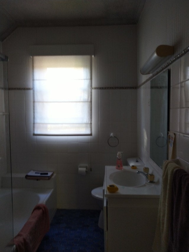
BEFORE bathroomAFTER This gorgeous bathroom was transformed using Dulux Renovation paint in Rainford and Italian Clay
Created with the Dulux Renovation range, these wet rooms were updated for a fraction of the cost of engaging a professional. With a simple paint brush, paint roller or a spray gun application, the product can be used to refresh everything from tiled flooring and walls, plastic and vinyl cabinet doors, through to stone or laminate benchtops. There’s even a nifty grout pen that will whiten stained and painted grout, meaning you can avoid re-grouting altogether.
As for this particular bathroom makeover, an all-white space was completely transformed with pastel paint colours and pops of timber for a gorgeous nature-inspired look. And it’s a look endorsed by Dulux colour and communications manager Andrea Lucena-Orr. “Those looking for a little nod to decades past can try peach tone colours or pink neutrals like Dulux Vintage Beige on cabinetry and cupboards to draw the eye up and away,” says Andrea.
BEFORE bathroomAFTER bathroom
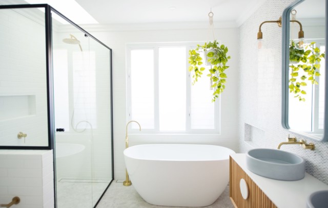
Unsurprisingly, when it comes to bathroom renovations, white is an enduring favourite, particularly on the walls and vanity tiles. “White is flattering on the skin under both natural and artificial light – important where mirrors are frequently used – and can make a space appear bigger than it actually is,” says Andrea.
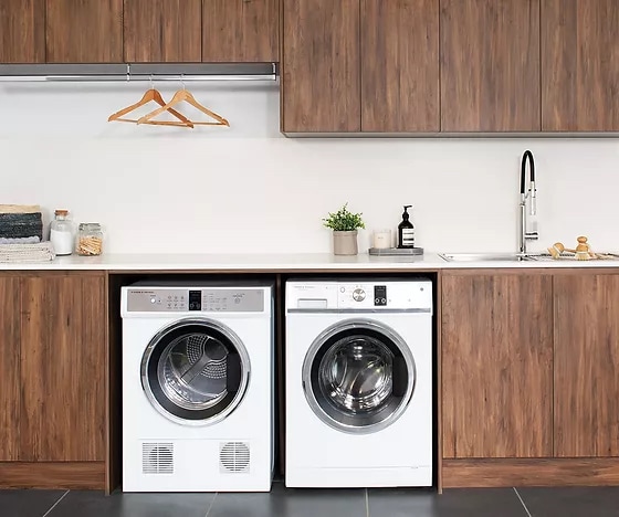
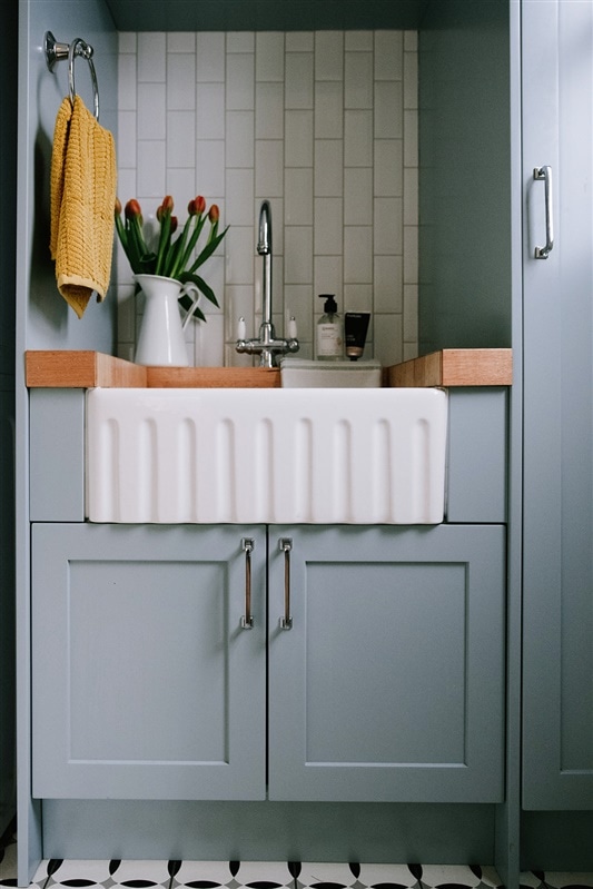
BEFORE laundry
AFTER This laundry was transformed using Dulux Renovation paint in Vintage Beige and Ticking
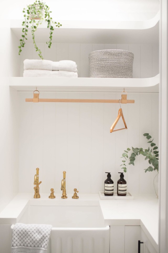
As for the laundry makeover, the soothing grey-toned Dulux Ticking made all the difference to the dated beige bench tops. “Adding a bold accent colour, like a deep blue or light grey, to your bench tops can help delineate the space and give the room a contemporary and fresh appeal. Finish the look with a woven laundry basket and wooden hangers to tie in with your natural timber windows,” says Andrea.
Styling: Heather Nette King | Photography: GOS4 MEDIA and David Mitchener
The 2020 Dulux Colour Awards winners have been announced! The winner of the single residential interior category was Perfect Storm (NSW) by Green Anvil Co, Killing Matt Woods and Set…
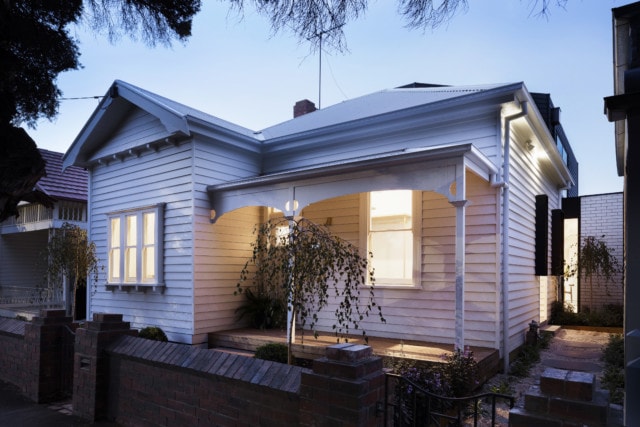
Located in the inner-west Sydney suburb of Haberfield and home to a family of four, this heritage listed semi received quite the glow-up recently courtesy of a full renovation and extension designed by Weir Phillips Architects and constructed by Bayside Built. “The house was inspired by French homes and is bright, refined and timeless,” says Doug Carey, the director of Bayside Built.
Lounge roomCustom joinery creates a study nook in the hallway
A traditional federation semi, the original home had plenty of lovely existing features to work with including a 1.5-metre-wide hallway, high (and pressed) ceilings and lovely coloured glass casement windows. The original home was fairly dark though, which is the antithesis of its current state where all of the federation details have been sensitively restored.
“At the front of the home there’s refurbished timber floors, custom joinery in every room, a meticulous selection of stained-glass windows to match the original ones, as well as ornate ceilings that have been given a new lease on life,” says Doug.
BedroomBathroom
And while the owners were keen to respect the home’s history, they also wanted to make it more modern, liveable and far less dim. Key to this process was the addition of a light-filled extension at the rear complete with a double pitched, gazebo style roof that features 360 degrees of automatic windows. “This is the main architectural feature of the space and brings light and breeze into the originally enclosed semi,” says Doug.
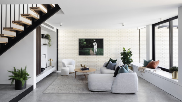
The rear extension features a kitchen, living and dining
Another standout design feature is the gorgeous kitchen – a stylish mix of timber, marble and pale grey joinery combines with concealed appliances for a stylish and minimal finish. “The simplicity of using concealed appliances allows the cabinetry surfaces to be showcased. The real oak veneer by Briggs and the beautiful quartzite Artedomus slab, that has been used on the benchtop, splashback and shelf, are real showstoppers.”
Kitchen. We love the oak herringbone floor.
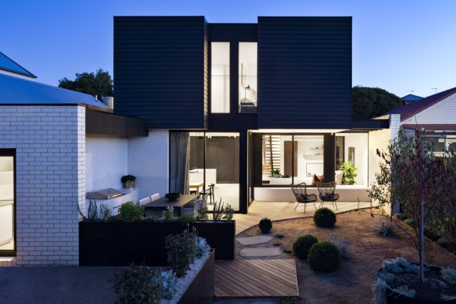
The open plan living, dining and kitchen space flows seamlessly into the outdoors where the new in-ground concrete pool features a custom steel balustrade giving unobstructed views of the pool from the house. “The steel fence looks sleek, and modern yet organically fits within the landscape of the backyard,” says Doug.
Pool
“Overall, it’s sophisticated and luxurious, yet subtle at the same time which will allow the house to stay modern and current for generations,” says Doug.
Photography: Sebastian Photography
An interior designer’s thoughtful and successful heritage renovation
We love a period home renovation around here and when this one crossed our desks, we couldn’t help but sit up and take notice. A modern yet authentic take on…
You know how they say that if you want something done you should assign it to a busy person? Well, that maxim certainly holds for one Melbourne homeowner who carried out a DIY bathroom renovation recently, while working as a full-time frontline health worker.
“This project was done during Tomi’s days off and it was his way of unwinding during a difficult period,” says Anri McHugh of his partner Tomi Ahonen who took four weeks to renovate the couple’s bathroom with a budget of $8,000. The couple purchased the beachside 1970s Elwood apartment three years ago and have been slowly renovating it since.
BEFORE bathroom
AFTER bathroom
The bathroom’s brown tiles and peach fixtures were replaced with a chic mix of matte black fixtures, grey paint, white penny round tiles and a luxurious freestanding bath – ‘city farmhouse’ was the design brief. “It’s a style that blends cosy farmhouse charm with traditional wood panelling and contemporary elements in an urban environment. It fits in with the rest of the apartment’s look and feel,” says Anri.
Tomi carried out all of the renovation, aside from the plumbing, while Anri was on hand to help with painting and general labour. Tomi stripped out all of the tiles and fittings, laid the pennyround tiles and installed the Easycraft wood panelling too – incredibly, it was the first time he had ever done any of those things!
Stripping the existing bathroom was no mean feat
Novice DIYer Tomi laying tiles for the first time in his life
Arguably the most onerous task was removing the original cast iron bathtub as it had been cemented into the wall. “We had to use an angle grinder to remove it which created lots of dust. We live on the top floor with no lift so getting it down two flights of stairs was also pretty difficult,” says Anri. The bathroom tile disposal was an equally arduous task.
The bathroom vanity was made from an upcycled bedside table found on Gumtree
Essential to the brief, the freestanding bathtub is a highlight of the room. “There’s something pretty special and indulgent about a hot bath on a cold winter’s night in Melbourne. It just feels like an escape and a place to shut out the world and relax. We created a sanctuary that we can retreat into when the world gets too much.”
One last look
What’s new in bathrooms: April 2021
With overseas travel still out of reach (well aside from the New Zealand experiment!), many Aussies are creating resort and spa-like bathrooms at home. From sumptuous stone-like porcelain panels to…
Originally built in the eighties, this two storey Gerringong home was purchased by Sydney interior designer Aimee McKechnie, and her builder husband Blair, before it was given an extraordinary makeover recently. Designed to function as a holiday home for the couple (and their two children), and a beautiful retreat that could be rented out to guests, the home’s understated luxury is lightyears away from the home’s original dated and dilapidated aesthetic.
BEFORE upstairs livingAFTER upstairs living
AFTER upstairs living. Shiplap boards were added to the ceiling, completely changing the feel of the space.
Affectionately referred to as the ‘80s tiled beast,’ the home was in a state of significant disrepair when Aimee and Blair accepted the renovation challenge. “The home had received a few add-ons over the years but had no love or maintenance which is critical when you’re situated so close to the ocean,” says Aimee.
None of the sliding doors closed, due to corrosion from the salty air, and the balcony was comprised of rotten timber, rendering it completely unsafe.
BEFORE dining
AFTER kitchen and dining
With a renovation timeline of six months, and a budget of $700k, Aimee worked to a specific brief (warm minimal with a Mediterranean vibe), and sourced lots of local furniture and art with that in mind.
“In all of my projects I’m quite passionate about showcasing Australian artists and craftspeople. In this house, I combined these pieces with wall hangings and ceramics from Morocco as well as a selection of beautiful tiles throughout to add interest and warmth,” she says.
BEFORE master bedroom
AFTER master bedroom
BEFORE bathroom
AFTER bathroom
Key to the design brief was the use of natural materials. From engineered oak floorboards to travertine tiles as well as soft furnishings made from linen and leather, the spaces have a textural, comfortable feel. “We then added in a bit of brass and a few unique vintage items to elevate the look,” says Aimee.
BEFORE downstairs kitchenette
AFTER downstairs kitchenette
With its vaulted ceiling and northern ocean and mountain views, the upstairs living area is the undisputed centrepiece of the home. The kitchen was reorientated to face the living space and views, while the ceiling and upstairs balcony were lined with shiplap boards which completely transformed the space.
“The renovation really focussed on this area as the social hub of the home and the whole area became one large cocoon. You can cook while friends sit at the bench, banquette or nearby fireplace. It’s such a fantastic entertaining space now,” says Aimee.
BEFORE kitchen and dining
AFTER The kitchen area features Aimee’s beloved banquette seating
As for holiday bookings, the property has been fully booked out for almost six months in advance since launching. “It’s been a COVID success story given people are so limited in their travel options at the moment. We’ve hosted so many wonderful guests that have celebrated everything from weddings to 80th birthdays. I love the variety of guests we have and the feedback from those that have stayed has been so positive.”
Barefoot luxury: unwind at this boutique holiday home in Noosa
As the Queensland borders have re-opened, a summer getaway in the sunshine state seems like the perfect way to celebrate reaching the end of a tough year! For those looking…
Darren Palmer’s latest holiday home styling project
Located in a fabulous, central part of Byron Bay, this holiday home was given the makeover treatment recently courtesy of The Block judge Darren Palmer. A long-time holidaymaker in the…
While we love a good trend, sometimes there’s something so visually soothing about a series of classic elements coming together in an understated way. The work of Bondi Kitchens, this recent heritage terrace renovation in Sydney’s Coogee is a case in point. Natural marble, smoked mirror and moody timbers make for a series of casually elegant spaces, the likes of which are classic without being dull.
“It’s the subtle elegance of the home that we love the most. The simple yet refined selection of materials marry to make something quite beautiful, without the snobbery. There is nothing complicated about the spaces, that I think makes you feel instantly relaxed and welcomed,” says Charlotte Riggs, brand director of Bondi Kitchens who was responsible for the renovation.
Home to a young professional couple and their pooch, the small two-level home was originally built in 1910 and consisted of 1.5 bedrooms and one bathroom. “It was a tiny heritage terrace house and while liveable it wasn’t necessarily functional in its state. There was room for improvement, and also investment for the young owners,” says Charlotte. The extensive overhaul resulted in a much larger home that boasts three bedrooms, two bathrooms and an extension that includes a larger living and kitchen area.
Kitchen
A central hub, the kitchen sits in the middle of the house and is accessed from a traditional terrace entrance hallway. “For the kitchen, the main consideration was the use of classic and understated, tasteful finishes with subtle elegant European-esque accents. The owners were very clear in not having a trend-driven, showy kitchen but rather something that just relaxed into the room – a natural beauty,” says Charlotte of the hardworking space that is easy to use.
Large overhead cupboards encourage height while providing a large amount of storage
Alongside the kitchen, there’s additional pantry and cupboard storage as well as a dining area opposite that features a custom upholstered floating banquette seat. “This banquette’s curves add softness and texture to a very sharp-lined kitchen. The clients allowed us full creative license with this design, and it’s a beautiful statement piece that complements the kitchen with its laid-back charm.”
The dining room banquette seat was upholstered in Warwick Fabrics ‘Kumi Vapour’ jacquard
Upstairs, the renovation continued in the master bedroom which features a pair of unusual, mirrored wardrobes with recessed handles. “Very heavy, they were challenging but rewarding to make. The mood that smoked grey (compared to standard silver) mirror creates is like no other. The mirror also bounces light and makes the bedrooms feel super luxe, and larger than life!” says Charlotte.
Bedroom
Custom smoke mirrored wardrobes are a feature in the master bedroom
The wardrobes are another example of the way in which the renovation maximised space within the home’s diminutive footprint. A small and narrow block, the Bondi Kitchens team worked hard to make layout changes that were highly functional while imbuing the home with a sense of openness.
“Overall, creating long and slim proportions and using neutral, yet interesting materials allows the home to feel open, flowy and also bounce light.”
Meet Jen at Brisbane’s Reno + Design Show in March!
After assuming a COVID-19 induced virtual format last year, Queensland’s Reno + Design Show is back in physical form next month when it returns to the Brisbane Showgrounds from March…
After assuming a COVID-19 induced virtual format last year, Queensland’s Reno + Design Show is back in physical form next month when it returns to the Brisbane Showgrounds from March 13-14. The mastermind of interior designer Renee Watson, the show is ideal for renovators and interiors obsessives and will feature design world luminaries including our Jen, who will be imparting her reno knowledge at the event.
Workshops at last year’s event
“Our virtual edition was an amazing success. We learnt so much and we’ve been able to carry through a lot of elements to this year’s event at a time when our homes have taken on a whole new purpose and meaning,” says Renee Watson.
With more than 100 of Australia’s best designers, stylists, home builders, architects, trades, product suppliers and special guests coming together, it really is a one-stop shop for keen renovators. And with renovation activity going into overdrive in 2020 (no doubt courtesy of lockdowns and new working from home conditions), we suspect there will be plenty of people in attendance.
Last year’s Reno + Design Show
“During the global pandemic, our homes have been working harder than ever before. They have served as offices, gyms, home schools and holiday retreats, changing the way people choose to design, renovate and decorate their homes,” says Renee who says that with many more people working from home, high use areas such as kitchens and bathrooms have really come into the spotlight.
Aside from Jen, other renovation experts slated to appear include Amelia Lee of Undercover Architect, Lucy Glade-Wright of Hunting for George, Kerrie-Ann Jones of The Stylist, Ania Forster and Kasia Clarke of Zephyr + Stone, Marianne Taylor of The House Detective, Katherine Persoglia of Property Before Prada, Nikki and Rupert Rowe of Weaver Green Australia, Prince Seeva of Comoda Design and Renovation, Ben Spencer of Spencer Constructions, Chloe Quintal of Garsden & Clarke, Josh Alexander of Eco Timber Group and many more.
There will be plenty of interesting conversations, workshops and styling sessions also including a Mood Board Masterclass with interior designer Lee Talbot of mavenHOME and landscape sessions with Better Homes and Gardens’ Charlie Albone, who will be teaching how to create liveable outdoor spaces.
And for those that can’t attend in person there’s a virtual edition available. Reno Circle membership includes access to the virtual edition hosted by Milly Bannister of GRLKND with exclusive online events, a live interview with Crystal Bailey on how to design your home to improve your wellbeing and guest appearances by Julia Green of Greenhouse Interiors and Georgia Ezra of Tiles of Ezra.
Virtual attendees can also expect lots of practical video content from headliners and partnering businesses, product discounts and their very own home delivered “Inspire Box” filled with fabric samples, design palettes, stone squares, paint pots and other fun reno goodies from exhibiting businesses.
Reno + Design Show 2021, Brisbane Showgrounds, March 13-14 Tickets: $17.99
Top tips to maximise a small kitchen or bathroom space when renovating
Written by Josh Mammoliti, Managing Director, The Blue Space A small kitchen or bathroom can sometimes seem like the bane of your existence when trying to plan a renovation. While…
Part of a wider Sydney family home renovation, that involved both layout and material changes, this clever laundry relocation piqued our interest recently because it’s not something we’ve seen before. Keen to gain more space for a combined home office/rumpus room, the home’s original laundry was relocated to a small spot, concealed behind stylish doors, under the stairs. Genius!
Before: The space under the stairs housed a random assortment of toys
After: A much more clever use of space! Fish scale mosaics from Kaizen Tiles, Polytec Ravine Natural Oak veneer and brushed bronze Castella handles complete the look.
“The first stage of a project is nearly always space planning, but in the case of the under-stair laundry, my clients had already worked it out. It may have seemed like crazy thinking at the start, but it turned out to be a masterstroke!” says interior designer Joanne Yeomans of Issy and H Creative who presided over the renovation.
Originally housing some impractical toy storage, the laundry relocation has resulted in a far more sensible use of space. And while the area under the stairs is smaller than the old laundry, clever joinery means the family still has everything it needs. “It’s neat and compact, with a stacked washer/dryer, overhead storage, sink and pull-out laundry drawer. What more do you really need?” says Joanne who also included more storage under the foot of the stairs to house towels and linen.
And the best part about the design is that you can close the laundry off completely when it’s not in use, and you wouldn’t even know it was there. “The doors were designed to look as if they were part of the wall,” says Joanne.
But while the family had fairly solid layout ideas, Joanne’s expertise was sought when it came to the material selections. “They wanted to go with a real Hamptons feel but weren’t confident they could do it themselves,” says Joanne. The original harsh black and white palette didn’t sit well with the family who wanted a much lighter feel for their home that is located on Sydney’s Northern Beaches.
“They always wanted splashes of blue and I suggested the limed oak floor. The overall result is that the home feels a lot lighter and airier.”
My new navy and gold laundry revealed: before and after
Our kitchen was the very first room we renovated in this house, almost four years ago. It was a case of “I’m not buying the house unless we can afford…
Tired 40s house given colourful new lease on life by interior designer
Located on Sydney’s North Shore, this 1940’s family home was updated recently by interior designer Joanne Yeomans of Issy and H Creative who was engaged to overhaul three key spaces…
When writer, stylist and former magazine editor Alexis Teasdale bought her 1920’s Tudor-style home in Adelaide a few years ago it was with a view to renovating it. But with three small children and no clear renovation direction as yet, she decided on a low-cost DIY main bathroom overhaul in the meantime.
“The bathroom is in a bit of an odd spot and comes off a living space that you can see from the kitchen. It’s also the logical bathroom for guests to go to, which is why it’s been high on my makeover list,” says Alexis of the space that is part of a nineties extension to her heritage home.
BEFORE vanity
AFTER vanity
Completed for just $550 (which includes the purchase of two lots of paint after Alexis wasn’t happy with her first choice), we love how she’s managed to transform the space on such a modest budget. “The plan was never for this to be anything fancy. I really wanted to just paint the tiles and do the floor. Then it occurred to me that I could easily change the handles and the mirror, and once I found the black arch mirror it all came together,” says Alexis.
AFTER
A key renovation component was the flooring – after agonising over paint colours for weeks, Alexis opted for Winton vinyl floor tiles from Bunnings instead. Having used them in another area of the home, she felt confident to use them again. After watching several YouTube videos, she scrubbed, sprayed and washed the original tiles with mould protector before fixing the new vinyl ‘tiles’ on top with adhesive.
The most challenging part about using the vinyl tiles was cutting them to fit around door jambs and the toilet. “You need extra tiles on hand because that is so easy to mess up. And don’t tile over the drain in the middle of the bathroom as it’s hard to go back and cut it out. Take it from me!” says Alexis.
BEFORE
AFTER: Alexis gave the ‘tiles’ a light sand to take the glossy edge off and so that her children wouldn’t slip
Next up Alexis painted the bathroom’s wall tiles and benchtops with Dulux Renovation Tiles and Benchtops Paint in ‘Snow Season’ – not an easy job given her family needed to use the bathroom throughout. “This was not ideal, but I chose some really hot days for quick drying time and I will say the paint dries remarkably fast!” says Alexis.
AFTER: Alexis sourced the wall shelves from Kmart for $19 each
Floor and wall paint aside, it’s the finishing touches that really elevate the room. These include handles, a towel ring, toilet roll holder, towel rail, bathroom shelving, mirror, accessories and plants. “My favourite buy was the Kmart arch mirror which was an absolute last-minute decision,” says Alexis.
The Mondella towel ring was $24 from Bunnings
“I am shocked by how happy this little space makes all of us. I’m also really proud of myself for having a go. It could have all gone pear-shaped, but it would have been easy to fix, so why not have a try at DIY. You might just surprise yourself!”
Real reno: This incredible bathroom makeover cost just $2,000!
It’s fair to say that we’re privy to plenty of renovation projects here but there’s something about this one that really piqued our interest. Aside from its stunning good looks,…
How to paint tiles and save a fortune!
By Naomi Findlay It’s no secret that kitchens and bathrooms are the highlights of the modern home. A tacky blue tile in the shower or 70s floral design can make…
Before & after: A fab bathroom reno for under $2000!
Located in the Melbourne suburb of Cheltenham, this dated brown bathroom received the makeover treatment recently at the deft hands of Amelia Boal from Soleil Styling and Design. Inspired by…
“I’m a maximalist at heart and colour makes me smile,” says Erin Katsavos whose Art Deco Melbourne home renovation caught our eye recently, in large part due to its beautiful colour and materials palette. We were even more enthralled to learn that the scheme was derived from a couple of Jai Vasicek art prints that were purchased before house plans had even been drawn up.
“Everything was chosen from the colours in the paintings. In fact, I think it’s a great idea to buy your art first and then design your house around it!” says Erin.
The kitchen/dining features one of the Jai Vasicek prints that inspired the home’s colour schemeKitchen
The home’s original Art Deco exterior is painted with Dulux ‘Ecology Green’ which sets the tone for the scene that lies within – a gorgeous mix of dark and mint green accented by blush and pops of brass.
The front of the home
“It was so nice to work with Erin’s bold colour choices. They have great impact and impart a real sense of warmth and earthiness throughout the home,” says Amanda Oakley of Mayché, the company responsible for the home’s build.
Master bedroom
Located in Ascot Vale, and originally built in 1930, it was the period features that drew Erin to the home when she purchased it a few years ago with her husband Evri. Working closely with Anna Todorova of Instyle Design, the team at Mayché were tasked with retaining as many original features as possible at the front of the home while creating a contemporary extension at the rear, complete with open plan living and ample light.
Master bathroom
A vital part of the renovation was the creation of a parent’s retreat at the front of the home – hugely necessary given Erin and Evri are parents to a blended family that includes six children. “We had to include a parent’s retreat so that they could have some down time! We incorporated this at the front of house which is connected to the master bedroom via double doors,” says Amanda.
Parent’s retreat
The timber in the front four original rooms remains untouched – it wasn’t sanded and varnished as part of the renovation. “It gives the rooms such a warm feeling as it has all the little nicks that show it has lived a life. I love that we have kept so many of the home’s original features because many of these houses are painted white to give them that popular Scandi feel,” says Erin.
Another Jai Vasicek print can be seen from the parent’s retreat. Look at those gorgeous doors!
The home has five bedrooms, three living areas and a fabulous outdoor space that includes a pool and entertaining area. “We love the open plan kitchen, dining and living area with its large sliders and windows that look onto the pool and alfresco. The burnished concrete floor finish in here looks absolutely amazing too,” says Amanda.
Outdoor entertaining and pool
Powder room
And with that many family members you can imagine that practical storage solutions are a must. “One of my favourite design elements is the custom bench seat joinery in the living room as I can hide the toys away in the hidden seat,” says Erin.
A custom bench seat provides clever toy storage
One of the children’s bedrooms features an upcycled IKEA bunk bed that Erin spray painted before covering it, and the nearby wall, in decals from Blonde Noir. “They have great designs. Those decals are so awesome because you can peel them off, leaving nothing behind, and move them making them great for rentals too. You can even store and reuse them later,” says Erin.
Children’s bedroom
Children’s bathroom
The bathrooms are a visual treat complete with Meir tapware, Concrete Nation basins, terrazzo and mirrors from West Elm. “The biggest splurge was the real terrazzo in the adult bathroom which I chose just for me. As you can imagine, with so many children, there’s not a lot that I get to do for me these days!” says Erin.
Master bathroom: Look at those gorgeous details
Overall, it’s the seamless flow from old to new that really stands out in this home. “I remember doing a walk-through during construction with Evri and he was amazed at how it all flowed and thought it was hard to remember where the old house ended and the extension started. We focus on attention to detail and this home showcases it perfectly,” says Amanda.
Art Deco style: Our top furniture & homeware picks
With the latest season of The Block having just kicked off, and its focus being squarely on period design, suddenly everyone is talking heritage details again. One of our favourite…
When architect Nathanael Preston was tasked with transforming this Melbourne heritage home for a developer, not only was it severely dilapidated and virtually unliveable, but heritage constraints made things rather tricky.
The heritage listed front of the home
“The main challenge of this project was trying to achieve our client brief in terms of designing a large house on a medium size block with a heritage overlay,” says Nathanael who restored the front of the home to its former glory before adding a stylish extension at the rear.
The rear extension viewed from the backyardLiving room
The client brief called for a four-bedroom house with two living areas as well as off-street parking via a rear lane – being a developer the client was trying to maximise the amount of liveable space.
Powder room
“Four-bedroom houses are not that common in Brunswick and they’re quite sought after by young families so this was received very well by the market,” says Nathanael of the stylish home that has since been sold.
Master bedroom
Lovely original details can be seen in the master bedroom walk-in robe
The front two rooms of the original home were converted into a master bedroom suite while the original entry was retained from a streetscape point of view. The home now houses the parents at the front, the living spaces at the back and the children’s bedrooms upstairs.
The family bathroom features a Signorino terrazzo tile on the floor and Artedomus Inax mosaic wall tiles
Matching custom terrazzo knobs are a nice touch
“Given the new extension was built boundary to boundary, a large void was inserted to allow eastern light deep into the plan above the kitchen space as well as connecting the upper-level kids’ living room with downstairs,” says Nathanael.
Kitchen: A large void lets light in
The kitchen bench top is a terrazzo slab from Signorino
As for any significant challenges, council heritage constraints proved the most problematic. “Council heritage consultants were very strict, and we had to really convince them about the bulk of the second storey’s visibility from the street,” says Nathanel.
Dark weatherboards were an obvious choice for the upper-level as they complement the front of the home.
Interestingly, the rear extension’s dark paint colour wasn’t a deterrent. “The dark colour and contrast to the existing house really helped in defining old and new which they looked upon favourably.”
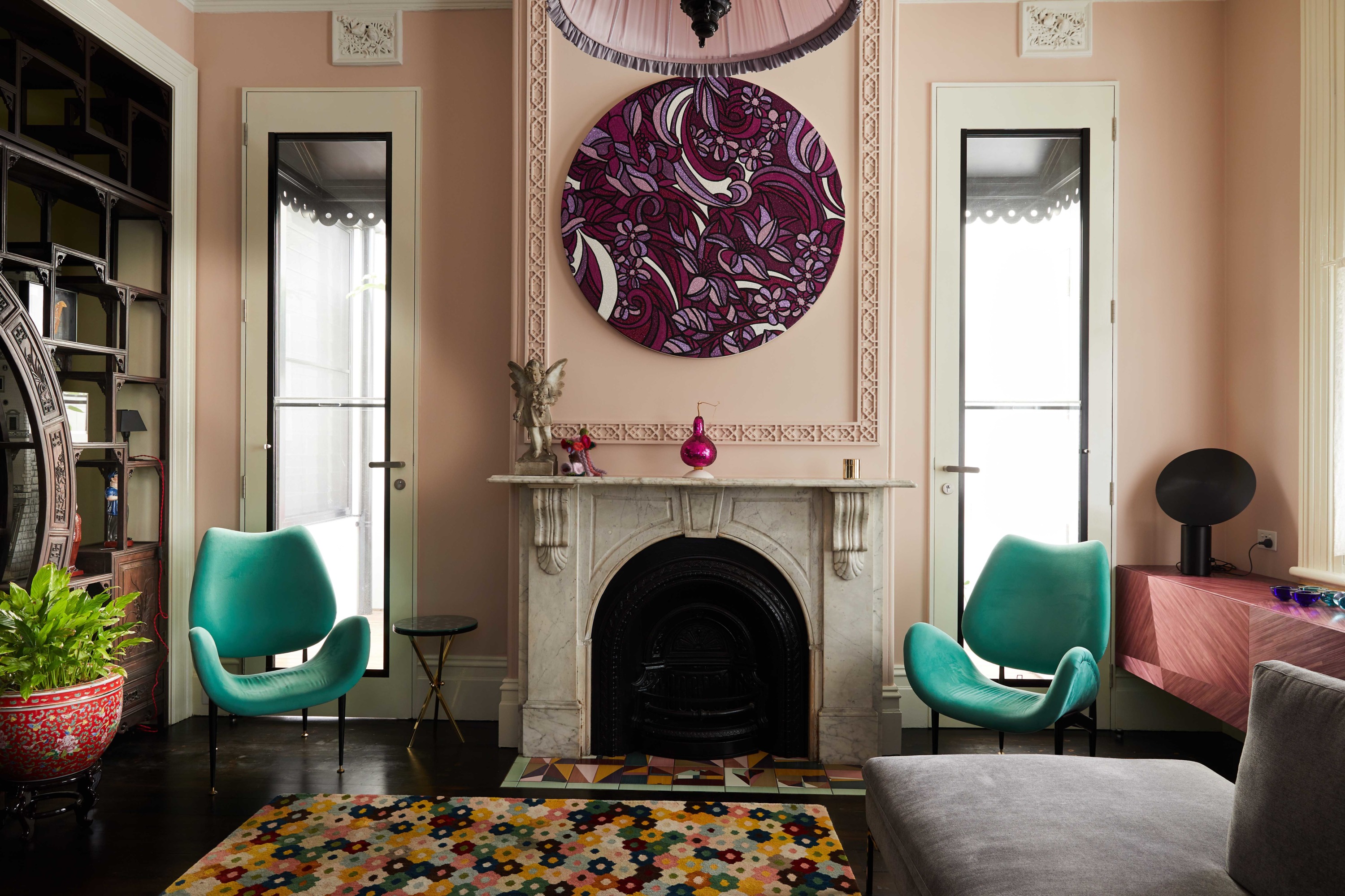
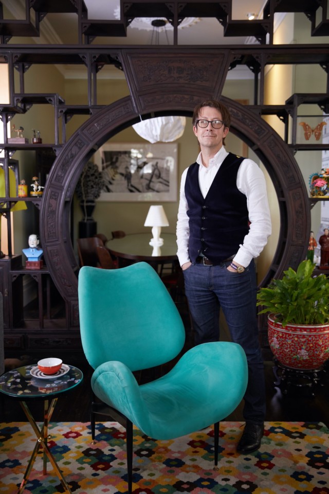
“I love contemporary design overlaid on a historical backdrop,” says retail designer David Cook-Doulton who, together with his partner Martin Shew, is responsible for the gorgeous overhaul of this grand…
The value of residential alterations and additions has risen to the highest level in more than four years, according to the Australian Bureau of Statistics (ABS).
The ABS Building Approvals for August found that the value of alterations and additions to residential buildings was strong in August, up seven percent to $784 million, to be the highest level recorded since April 2016.
The stellar result is likely partly due to the HomeBuilder scheme, but also to an increase in the number of people undertaking renovations during the lockdown, according to a NSW renovation expert.
The Happy Renovator author, Werine Erasmus, says many Australians are choosing to use the downtime to start or finish renovation projects on their homes or investment properties.
“The problem with many renovators who attempt to complete projects in their ‘spare time’ is that they often don’t have any time to spare!” Werine says. “However, the lockdown created the ideal conditions for many people to restart or finish their renovation projects.”
Werine believes renovations will continue to grow in popularity in the months ahead as more people work from home or perhaps move to part-time employment.
However, renovating property is something that can be a steep, and expensive, learning curve if people don’t understand all of the necessary ins and outs, she says.
“While I advocate a part-time work and part-time renovation strategy, it’s vital that you don’t attempt a renovation or upgrade without educating yourself about what’s really involved,” Werine says.
“The reason why we see so many half-finished renovation projects come up for sale is that people spend too much and run out of money, or they make costly mistakes that they can’t afford to fix.”
“Renovation projects are nothing like what you see on reality television, but by educating yourself on the process, there is no reason why anyone can’t complete a renovation that achieves their goals and, most importantly, makes them happy.”
Almost half of Aussie homeowners renovated last year, survey shows
Median spend for home renovation projects stabilised at $20,000 in 2019, according to the annual Houzz & Home Australia survey of more than 4,500 Australian respondents. At the higher end…
10 top tips for managing your reno budget
Wouldn’t it be nice if the word ‘budget’ didn’t have to co-exist with the word ‘renovation’? Unfortunately, for the vast majority of us, our reno budget is one of the…
10 of the best online tools to help you plan your renovation
In partnership with Latitude Financial Services As most of you know, I’m knee-deep in renovations at my house, so I thought I’d put together a list of handy online tools…
Wattyl has recently launched its Villa Carmelina colour palette – the result of a collaboration with architect Scott Weston that has spanned more than two years.
Villa Carmelina, a grand 1889 Victorian Italianate terrace, was bought by Scott in 2016. It was in a dilapidated state but, for Scott, it represented the opportunity to fulfil a long-held desire to invest his 25 years of architectural practice in his own home.
The main two-storey terrace was restored to its former grandeur, with a few minor adjustments to the interior to accentuate the building’s high ceilings and maximise the natural light. The result is a unique fusion of contemporary design and original Victorian architecture.
To the rear is a modernist two-storey addition in glass and steel containing expansive kitchen and living room plus bedrooms and bathing areas.
Wattyl’s new range takes inspiration from the remnants of Villa Carmelina’s original 1950s colour scheme – rose pink, acanthus green, lemon chiffon, studio mauve, and earl grey.
These colours appear in various guises throughout the home – some have been custom-matched by Wattyl and others taken directly from the Wattyl fandeck.
The architect
Scott Weston is regarded as one of Australia’s most inspiring architects, with a passion for colour, pattern, texture, art, light, functionality and beautifully crafted, artisanal materials and finishes.
In his meticulous reincarnation of Villa Carmelina, Scott has expressed a long-held philosophy of tailoring spaces to embrace and celebrate the interests and passions of the occupants – he has paid homage to the generations who lived in Villa Carmelina before him while creating a unique and deeply personal living space for he and his partner.
Entry hall
Serving as an introduction to the Villa Carmelina colour palette, this is the harmonious meeting point of eight of the project’s custom colours.
Lady Gray is seen on the timber dado while the wall above features the velvet grey-lilac of Studio Mauve. The Victorian ceiling is washed in the sorbet lemon hue of Lemon Chiffon, bordered with Ivory Grey piping in order to highlight the decorative cornice and ceiling rose.
Living room
This elegant room, flooded with indirect light from the over-sized doors either side of the fireplace, has as its focus the contemporary glitter artwork by Reuben Paterson.
The walls and decorative plaster moulds above the fireplace are washed in the understated, faded pink of Miss Havisham Rose. Timberwork, in the ivory tone of Marcasite, highlights the original architectural details, while the lathe and plaster ceiling provides a plane of light grey, using Ivory Grey.
Dining room
Referencing a 1950s Hong Kong tea house, the dining room walls are finished in a soft Matcha Tea shade that was custom-matched to the beautifully textural hemp wallpaper used on the feature doors of the joinery unit.
Having no direct light, the dining room ceiling was highlighted in Modernist, a darker grey. The antique Chinese moongate (seen above, pictured with Scott) is unquestionably the focal point of this room, framing views and showcasing a collection of beautiful treasures.
Kitchen
The living heart of Villa Carmelina, the kitchen is strategically placed within the expansive living room and features a black and white terrazzo floor and timber hemlock walls.
Two horizontal bands of custom architectural joinery have been hand-rolled in the saturated, deep blue of Curious Planet.
Studio
A grand room that looks out onto the main staircase whose walls are washed in the beautiful grey lilac of Studio Mauve – a hue that changes colour throughout the day, thanks to the northern glass roof.
The studio walls are finished in the sophisticated soft grey of Marcasite with a horizontal line of Jazz Age Coral applied to the perimeter above the tall doors, enveloping the cornice and ceiling in one dramatic gesture. The ornate Ivory Grey ceiling rose is crowned by a George Nelson 1950s pendant light.
Guest room
Highlighting a display of rare and beautiful objects, the grey-blue tones of the guest bedroom’s Celadon Blue walls provide a quiet background to the ensuite’s dramatic floral cascade in miniature glass mosaic tiles.
Scott chose Wattyl I.D Advanced Ultra Low VOC interior paint for Villa Carmelina, citing the fact that it far exceeds green-building requirements (with less than 1g of VOCs per litre) and can be custom-matched to any colour, as the reasoning behind his choice.
Wattyl I.D Advanced is available in water-based matt, low sheen and satin finishes, plus Ceiling White.
This year, the way in which the home functions has fundamentally altered, as it has played a more meaningful role than ever in our daily lives. Wattyl have reflected this…
Stylist Jason Grant creates new paint colours for Murobond
Now with 70 paint colours to his name as part of his collaboration with Murobond, creating new hues is as exciting a process as ever for Byron-based stylist Jason Grant.…
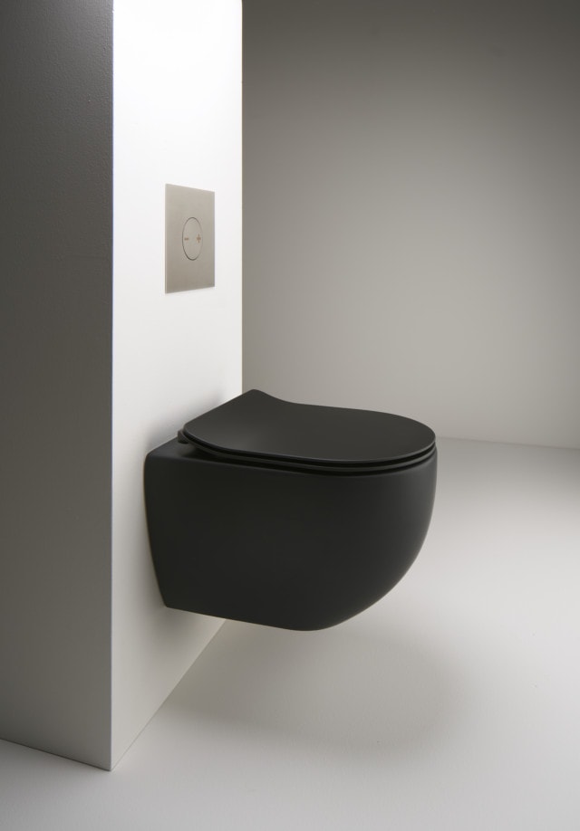
From a matte black toilet to fully assembled laundry units delivered Australia wide, there’s plenty of interesting news on the kitchen, bathroom and laundry front this month.
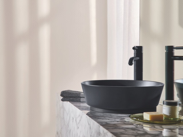
Reece: The bathroom brand’s latest Australian bathroom report was delivered recently offering key insights into Aussie bathroom trends. ‘Hotel inspired’ style is still the favoured bathroom design trend (30%) followed by day spa (16%) and traditional (15%).
A gorgeous hotel inspired bathroom
And while chrome is still the most popular tap finish, matte black is hot on its tail (42% vs 16%). Hitting the market in March are a couple of new additions to the Reece matte black family including the matte black Alape Scopio washbasin and the AXA Uno rimless toilet in a sleek matte black edition.
The Alape Scopio washbasin in matte black
The AXA Uno rimless toilet in matte black
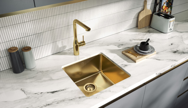
From kitchens to bathrooms and laundries, metallics are still a solid trend too. And as of February the lovely Memo Zenna sink will shine in two new metallic finishes – bronze and gunmetal.
Memo Zenna sink in gold
Beaumont Tiles Wave vanity: As the name suggests, the Wave vanity has a fluted timber front that takes design cues from the ocean. Available in five cabinet finishes, you can choose from three bench top options also. And when it comes to sizes there’s 12 in the collection (ranging from 600mm to 1800mm wide), making it a great choice for powder rooms, ensuites and main bathrooms alike.
Utilising the latest thermolaminating technologies, the Wave vanity is made from moisture resistant medium-density fibreboard coated in a fluted timber gain.
Drawer detail
Caesarstone: The latest finish from Caesarstone, Calacatta Maximus is the brand’s latest interpretation of Calacatta marble. It blends oversized soft grey and copper veining atop a pure white base.
Caesarstone Calacatta Maximus
The brand has also just released its brightest, most pure white in the form of Vivid White. It’s a great choice for small spaces and for those seeking a feeling of light and space.
Caesarstone Vivid White
ADP modular laundries: This stylish range of mix and match laundry cabinets is made in Wollongong and delivered Australia-wide in fully assembled form, making for an easy installation process. Simply select from a range of sizes and configurations to suit your space, then have the design delivered to your door. Talk about convenient!
ADP ‘Pure Silk’ laundry
ADP ‘Decor’ laundry
ADP ‘Vogue’ laundry
What’s new in bathrooms: August 2020
Let’s take a look at what’s new in bathrooms this month, from coloured concrete freestanding sinks on cylinders to a deep bath tub perfect for relaxing, to navy vanities and…
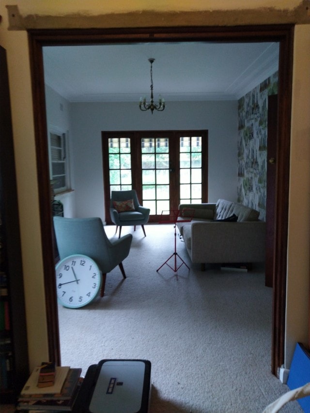
Located on Sydney’s North Shore, this 1940’s family home was updated recently by interior designer Joanne Yeomans of Issy and H Creative who was engaged to overhaul three key spaces – the master bathroom, laundry, study and lounge.
“My clients loved the charming Victorian architecture of their home, but despite its graceful ageing, the more tired spaces needed some magic to bring them back to life,” says Joanne, who used vintage-inspired colours and finishes to update the home.
BEFORE laundry
AFTER laundry
First up, Joanne tackled the laundry which was disorganised, cramped and lacking in functionality. “We took advantage of the fact that our client loved colour and pattern,” says Joanne who specified Shaker style cabinetry in duck egg blue, a butcher’s block bench top, butler’s sink and statement black and white floor tiles that reference the home’s Victorian origins. “This is my favourite space as I love the combination of finishes – especially the pop of mustard which works so well against the blue,” says Joanne.
The new laundry features lots of gorgeous period-inspired details
The master bathroom was previously lacking in functionality too, its outdated finishes ripe for renovation. In this space, sage green subway tiles from Kaizen Tiles perfectly complement a custom vanity (Lamicolor Chalet Oak Tabac) and a Caesarstone Calacatta Nuvo benchtop.
BEFORE bathroom
AFTER bathroom
“Brushed brass accents add an elegant touch, with the hexagonal mirror from Life Interiors giving it a modern twist,” says Joanne.
AFTER bathroom
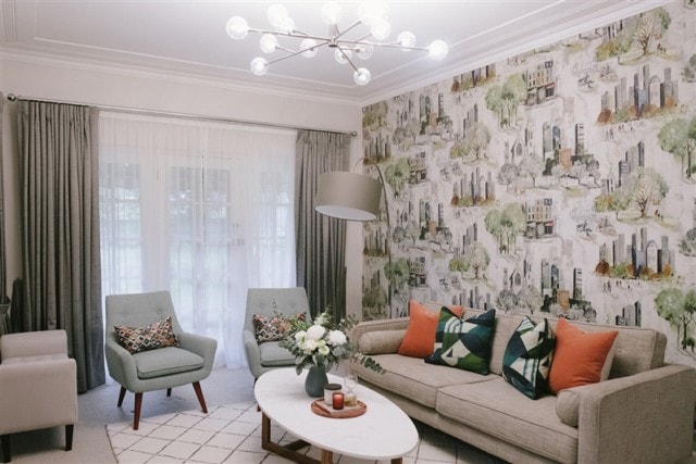
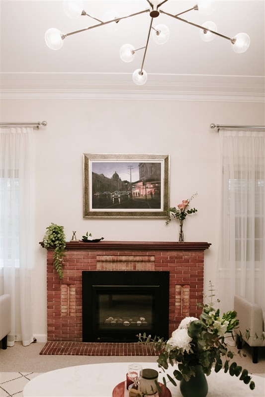
The home’s formal lounge had great existing features including whimsical wallpaper and period details such as a red brick fireplace. The space was softened with custom curtains, custom scatter cushions in Art Deco-inspired fabrics, a large Freedom marble coffee table and west elm floor lamp.
“This has become a great adult entertaining space and has been well used as an escape from the busyness of family life, especially during the last few months,” says Joanne.
BEFORE lounge room
AFTER lounge room
AFTER lounge room
The nearby study was given an aesthetic and organisational overhaul with a fabulous new bookcase becoming the hero of the space. The full height bookcase wall is complete with a reading corner and built-in drinks cabinet.
“We created a two-person, 3.5 desk in recycled Blackbutt timber and the wall paint colour, Taubmans Red Squirrel, was chosen by my clients. It adds a wonderfully warm and vibrant feeling to the room.”
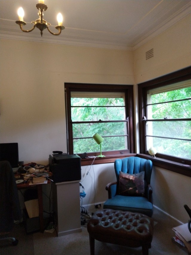
BEFORE study
AFTER study
Fabulous full-height book shelves house the owners’ large collection of books
IKEA before and after: a family living room transformed
As part of its commitment to providing relevant interior design solutions, IKEA regularly ventures out into Australian communities to find out what people really need and want in their homes.…
This 1980’s Italian mansion extreme makeover is one of our most popular posts so when we heard the team behind it had recently completed another project, we were keen to take a look. Located in the Brisbane suburb of Clayfield, this 1990’s project home was updated by Zou Build who were brought into the fold to give its owners the home they had always wanted.
BEFORE kitchenAFTER kitchen
“Being a project home, it was very cookie cutter. The owners had never had the opportunity to make it their own because selections are always so limited with that type of build,” says Christal Fysentzou of of Zou Build who was tasked with transforming the home while its owners were living in London.
BEFORE loungeAFTER lounge
“They were 11 years in London but had seen one of our renovations in Better Homes and Gardens magazine which prompted them to get in touch,” says Christal. The interior demolition process took place while the owners were still living in the UK, but Christal had to wait for them to return to Australia (quarantine period and all!) before she had final sign-off on all the interior finishes.
“When they returned, we took a day to finalise everything – I took them to tile shops, bathroom stores, carpet suppliers and more,” says Christal of the project that took five months to complete.
BEFORE diningAFTER diningAFTER sitting room
As for the home’s new feel, it was designed to complement the owners’ extensive array of art and objects that were amassed throughout their European travels. “We left the design style minimal and monochromatic because they have so many artworks and objects,” says Christal who created a series of neutral spaces to give the home an almost gallery-like feel.
BEFORE ensuite
AFTER ensuite
AFTER ensuite
A design highlight of the home, the new bathrooms feature custom vanities, Meir tapware and minimal, neutral tiling. “In the main bathroom, space was a bit tight, so we created a wet room to enable them to fit a bath and shower in there,” says Christal.
BEFORE bathroomAFTER bathroom
Perhaps the most amazing part about the renovation is that it was purely cosmetic – no internal walls were removed or relocated. “The house was all in original nineties form but now feels so much lighter and spacious, purely through changing the finishes and colours.”
AFTER powder room
Photography: Rachael Lane Pictures
Before & after: An amazing California Bungalow transformation in Melbourne
Built in the 1930’s in the Melbourne suburb of Bentleigh, this Californian Bungalow was in a pretty sorry state when its owner Anita Woods decided to bid on it at…
Before & after: 1980’s Italian mansion extreme makeover
Built by an Italian builder in the 1980’s this Brisbane home underwent an extreme makeover recently by its owners Chris and Christal Fysentzou of Zou Build who live in the…
With two sons, it didn’t take long for Aussie landscape designer and TV host Charlie Albone and his interior stylist wife Juliet Love, to outgrow their two-bedroom home. After going on the real estate hunt, they eventually stumbled upon a two-storey beachside semi in Sydney’s eastern suburbs that was ripe for renovation. Despite falling for it, the couple thought it was out of their price range but decided to put in an offer anyway.
Juliet and Charlie in their newly renovated kitchen
“As it turned out, the former owners needed to sell quickly, and a lot of buyers were put off by the dated interior, so we made a low offer and to our amazement they accepted it!” says Juliet, who has since renovated the home on a relative budget with a mix of clever styling tricks, secondhand and affordable finds.
Lounge and kitchen
“Our last home was a little more Hamptons with lots of navy and white, but this time around we wanted a more laid-back, calm feel. We went for a soft colour palette of white, blue and seafoam green,” says Juliet.
A largely cosmetic renovation, the biggest change took place in the kitchen and lounge area that was transformed from a pokey nineties kitchen full of black granite to a much more modern space courtesy of a mint green marble fishscale tile splashback, brass tapware, round glass pendant lights and large Caesarstone island bench. When it came to the flooring, Juliet used Porter’s Paints Wood Wash in ‘Conifer’ to update the original home’s yellow-hued pine.
In a clever move, she specified matching joinery in the nearby living area to ensure a seamless transition from the kitchen. The joinery houses a television, concealed shelving as well as open shelving that displays photos of family and friends and sentimental objects. “By using matching joinery, Caesarstone and brass hardware, it really makes the room flow,” says Juliet.
Complementary joinery in the nearby living room
“The stylist in me is forever changing vignettes around the house, so I like to have some open shelving to display objects, but also added enclosed shelving below to hide some of the mess that comes with family life!”
Juliet hung an inexpensive marble cross, tassle beads, straw fans, and a tribal necklace above the fireplace in the dining room, as a point of visual interest
Bedroom
With budget concerns top of mind, Juliet employed clever tricks and secondhand finds to realise her vision. “I like to mix high and low end generally, as I find you get the most visually interesting outcome for the least expense. I’m a big believer in having one or two big ticket items to elevate a home – if everything is cheap, it will look cheap. For us, we decided to invest in the marble splashback in the kitchen.”
Fish scale marble tiles make a statement in the kitchen
Money was saved elsewhere by reusing old furniture including a chest of drawers that used to belong to Juliet’s grandfather and that she didn’t initially think would work. “I didn’t think the drawers would fit with our vision of a breezy coastal abode, but we’ve placed them on the landing at the top of the stairs, and they works perfectly there.” She then added a round sisal rug, vintage pineapple lamp with a hessian shade, and some coral to work the piece into her interior scheme.
Juliet’s grandfather’s chest of drawers look at home on the landing
Affordable art is scattered throughout the home – another one of Juliet’s budget-friendly tips. “I love affordable artwork to dress your walls and elevate a space. Art literally changes the feel of a room in an instant,” says Juliet who sourced most of the pieces through Hop Home.
The kids’ playroom was created on a budget using IKEA furniture upcycled with unique brass hardware. Olive et Oriel jungle-themed wallpaper makes a statement in the space too where it hangs above the IKEA daybed. “With the wallpaper, I just used one panel behind the daybed, which was enough to give impact, without the expense of papering the entire wall or room,” says Juliet.
Playroom
Boys’ room
Other kid-friendly design decisions include slipcovers on the sofa, wash and wear paint, replica Philippe Starck Ghost dining chairs that can be wiped down, a glass coffee table that stores decorative items underneath as well as many multi-purpose furniture items. “Our ottoman in the lounge room opens for storage, the day bed in the kids’ playroom rolls out into a double bed for when visitors come, and the floors are scooter-proof!”
We had to ask, does Charlie, who switched from Selling Houses Australia to Better Homes & Gardens this year, get a say in the decorating or does he stick to the outside? “He has excellent taste and is usually always right when it comes to style choices, which is quite frustrating! He always says that he’ll leave it to me, but he is quite opinionated, so ends up having a say in absolutely everything! I don’t mind that though because we work well together, and we end up with a better result in the long run!”
Of course, there are plans for the back yard, which will be stage two of the renovation. “We have a DA in to council for a small pool and a pavilion with an organic vege patch on top,” Juliet shares.
The couple also have a farm on the Central Coast, Charlie’s happy place where Juliet says they’d spend every weekend if he had his way! They’ve even established a small plant nursery there for landscaping projects for clients. “We like to get up there as much as possible, but now that both boys are at school, it is becoming more difficult as weekends are full of sports and kids parties! When we do go to the farm, Charlie goes straight into the garden and spends all weekend there.”
Photography: Brent Wilson
Covet my coffee table: with Juliet Love & Charlie Albone
Photography by Susan Papazian This week, we’re excited to give you a glimpse of the home of interior-exterior design duo and husband and wife, Juliet Love and Charlie Albone. Juliet…
Located in the Sydney suburb of Gymea, this home was originally built in 1964 but when the last surviving original owner passed away, rather than put the home on the market, one of his children decided to buy it and give it a new lease of life.
After growing up in the house, Chris Romao moved closer to the city for many years but had always reminisced about returning to Sydney’s southern suburbs. “We decided to make a huge move from our busy inner-west life to create our dream home and enjoy the Shire life,’” says Chris’ wife Yolanda, who engaged interior design Vivian Panagos to refresh the home’s key spaces; the kitchen, laundry, main bathroom and master bedroom.
Main bathroom
“It was really important to Chris to create something really special within these walls, to honour his beloved mum. Chris knows she would be so proud of what we have created and that we now get to enjoy the home for many more years,” says Yolanda.
And while Yolanda gave Vivian a ‘Hamptons glam’ design brief, the designer brought her own creative ideas to the project, the most interesting of which Vivian calls a ‘thin black line feature.’ “It is seen in the kitchen cabinetry handles, the black double French doors, thin black kitchen cabinet, thin black shower frame in the bathroom and ensuite, and a delicate thin black rattan bedhead in the master bedroom,” says Vivian.
Master bedroom & ensuite
A gorgeous space, the master bedroom makeover included a custom rattan bedhead and House of Heras Australiana themed wallpaper. “The wallpaper provides a connection with the leafy trees viewable beyond the large bedroom window,” says Vivian who softened the space with layers of pure linen, velvet and blush pink lamps.
Master bedroom
The nearby ensuite, accessible via a sliding barn door, houses a statement navy vanity with marble top. A bespoke bone inlay mirror hangs above it – a detail not lost on Yolanda. “In every room Vivian has brought in what I like to call little treasures. Everything was chosen with such thoughtfulness for us. For example, every time I use the ensuite, I feel happy that the mirror hanging in there was handmade in India,” says Yolanda.
Ensuite
Main bathroom
A textured and inviting space, Vivian’s design work continued in the main bathroom which is flooded with natural light courtesy of the large window over the freestanding bath and a skylight in the shower space.
The wall is lined with herringbone marble tiles on which large concrete double mirrors hang – round concrete sinks sit atop the oak vanity that features vertical timber detailing and statement round handles.
Main bathroom
“Spacious room for a freestanding bath and a large shower was created by stealing space from a bedroom and it transformed what once was a small dark bathroom into a luxurious space,” says Vivian.
Master bathroom
Kitchen and laundry
Chris and Yolanda’s favourite part of the renovation, Vivian completely redesigned the existing kitchen and added a laundry/butler’s pantry while she was at it. “It truly is the heart of the home. It was a unique space, given it’s in the middle of the house, and it took a lot of planning. We feel it’s absolutely perfect in look and feel and flow to the rest of the house now,” says Yolanda.
The kitchen cabinetry paint colours are Dulux Lexicon Quarter and Dulux Domino
The laundry and pantry are tucked away behind the kitchen but each of the spaces feature similar cabinetry and hardware, raw brass tapware and large farmhouse sinks. “The owners had the clever idea to install skylights in both of these spaces and it is just glorious to stand in them when the sun shines,” says Vivian. Green velvet and brass stools provide a pop of colour at the kitchen island bench.
Butler’s pantry
“I’m most proud of how we reorganised the layout of both the kitchen and laundry spaces best utilising every centimetre of space we had available while making them look beautiful too,” says Vivian.
Nestled in the Sydney suburb of Paddington, this gorgeous home’s one-storey heritage façade hides a pretty incredible split-level renovation behind. Home to interior designer Nina Maya, who is using it…
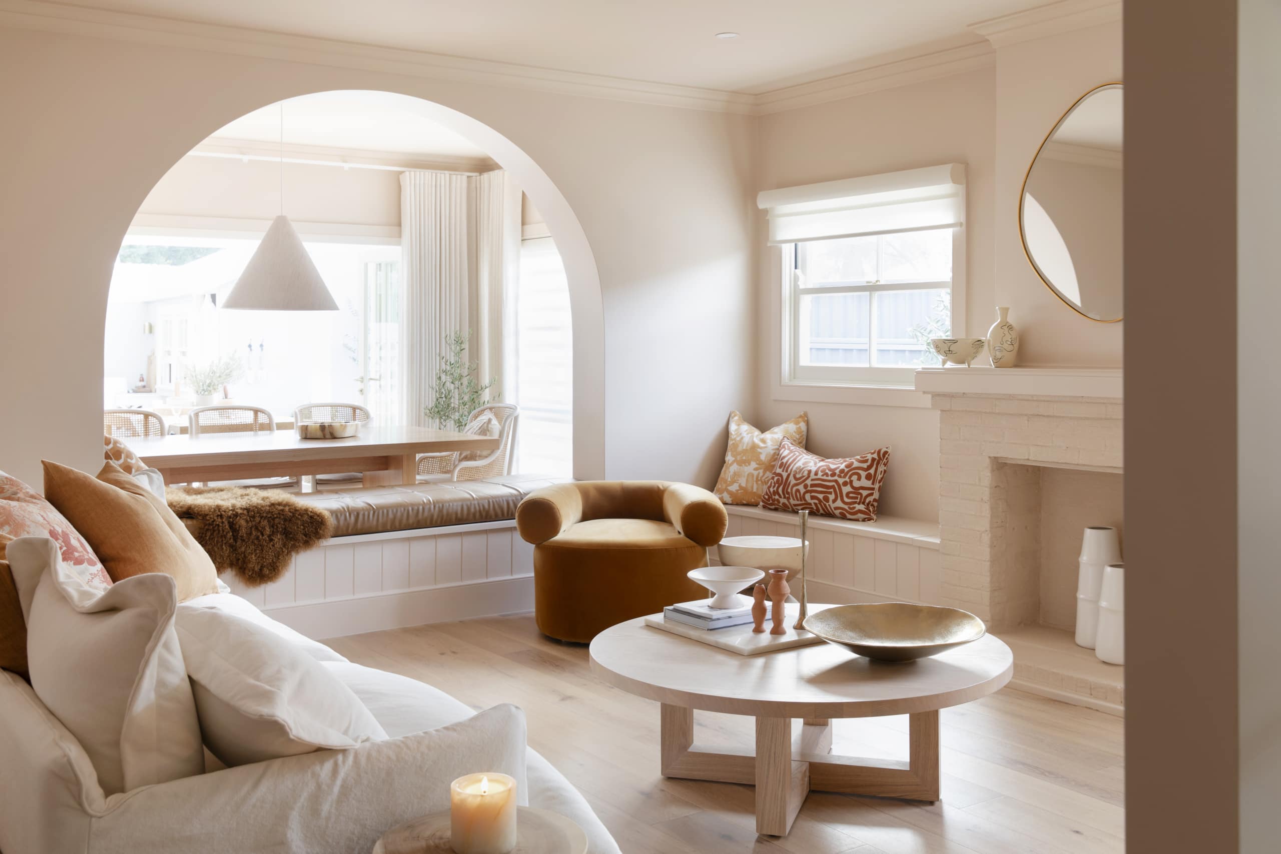
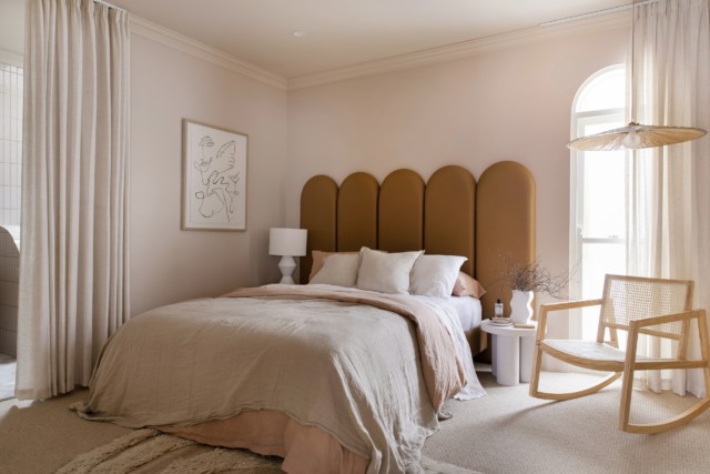
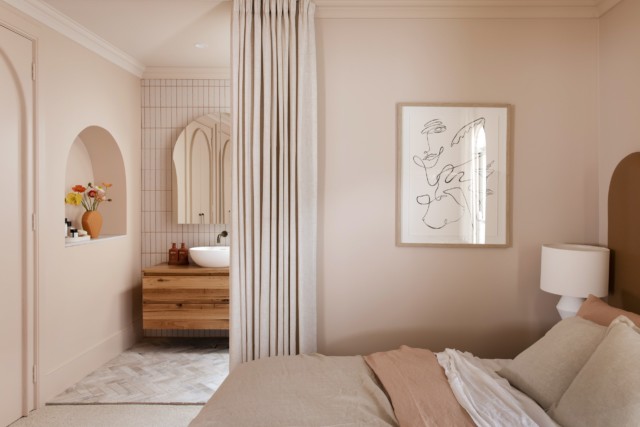
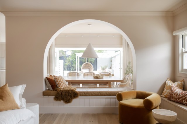
Utilising space, championing storage, and building a home fit to last are vital elements to consider for families looking to renovate and modernise their homes. These factors were key when the Three Birds undertook a renovation for two of their followers, Cath and Sarah, and their sons, Chaise and Addison, in their latest project, “Contemporary Cottage”.
Situated in the historic town of Windsor NSW, this cottage hosted features that were slightly outdated and didn’t offer the much-needed space for a family whose two boys were growing. Finding ways to open up the internal rooms and make the most of the space within the existing footprint of the home by rethinking spaces and adding interesting niches and secret storage, Erin, Bonnie and Lana were able to transform this tight home into a spacious family retreat.
One of the standout ways they created more space was through the clever use of curves that can instantly enhance the flow of different rooms, while still defining the different spaces. As the home already had quite a lot of original curved features, such as corner walls in the corridor, it made sense to pay respect to the more fluid and softer style and embrace it in their new design.
To modernise the living area and reveal the space’s full potential, the decision was made to knock down the wall extending the living room space into a dining area “We’re massive fans of open-plan living for families and in a home of this size, removing a wall to increase living space makes a world of difference,” says Erin.
“Once this wall was down, the rest of the changes were cosmetic. This is the perfect example of a cosmetic reno and what can be done on a smaller, more achievable scale with less budget but big impact,” Erin adds.
To differentiate between the two rooms without losing that sense of flow, an arch wall was incorporated using Gyprock Flexible plasterboard. “We’re really happy with how these rooms turned out,” says Lana. “The lounge room is my favourite room in the whole house. The arched wall beautifully frames the dining area and automatically injects versatility into the property. The space is now multi-functional, offering rooms to entertain or relax.”
Space saving and storage was a special request from homeowners Cath and Sarah, so inclusions such as multi-purpose seating were a no brainer for the designer trio. Underneath the curved arch wall, they built a large double-sided bench seat which offered not only additional seating for both rooms but also provided plenty of storage room inside.
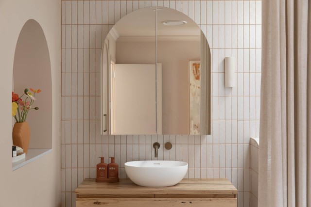
To marry the curved style throughout the house, the bathroom features include a rounded mirror, shower screen and stunning recessed arch. Perfect for extra storage and display space, recesses are great if there is the wall cavity space to fit them in.
“In the master ensuite, we created a curved recess shelving unit using Gyprock Flexible and finished with a Talostone engineered stone benchtop, delivering a high-end look that also provides a gorgeous nook for special pieces,” says Bonnie.
An important element they needed to tackle in the renovation was noise reduction. The cottage is located on a busy commuter road, up from a Royal Australian Air Force base. Couple this with two young children who love to play, and a solution for better acoustics and blocking out external noise was required.
Gyprock Superchek plasterboard was selected as the interior wall lining due to its sound resistant qualities, to reduce both the noise coming from outside and the noise transmission between the rooms inside the house.
This renovation shows how rethinking your floor plan and using creative design to open up rooms can really change the way you live in your house, and allows your home to grow as your family does.
Three Birds Renovations’ dirty blush office makeover
Sponsored by Intrim Has there ever been a better time for a bit of home office inspo? The Three Birds Renovations team recently made over their office, and although they’re…
From beach shack to ultimate seaside pad with Three Birds
The holiday home of Bonnie Hindmarsh was once a humble beach shack in Pearl Bay on the NSW Central Coast. But then, Bonnie’s life changed. With best friends Erin Cayless and…
Three Birds Renovations: laundry design essentials
No matter the size of your laundry, no matter your reno budget, here are the hard and fast rules for a successful laundry refurb. From where to locate the laundry if…