Categories
Expert Tips Interiors Addict

The 2023 wallpaper and colour trends to look out for

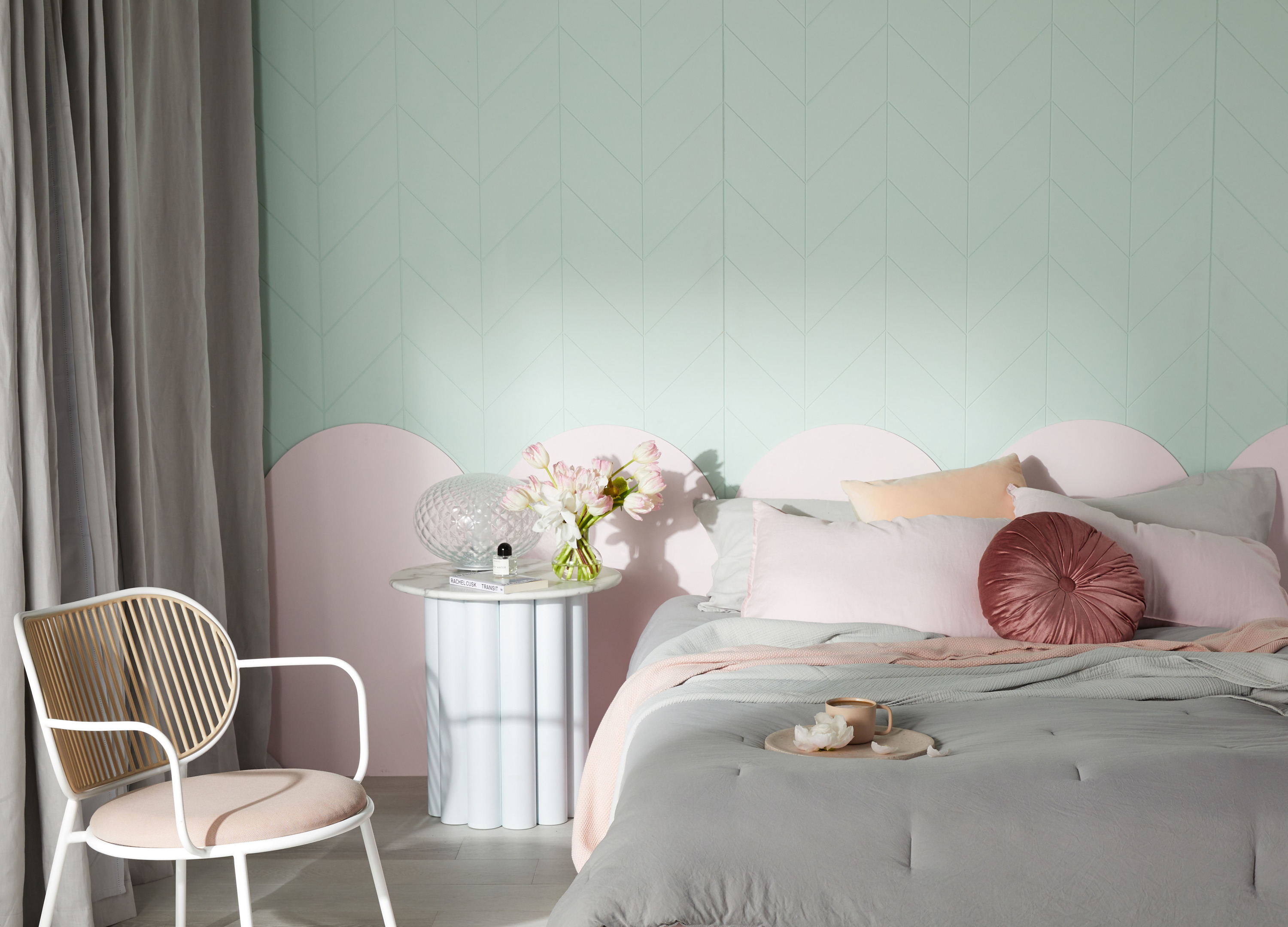
It’s that fun time of year where we can start to consider what trends will define 2023. Wallpaper remains a key complement to creating the perfect ambience, as colour and pattern continue to have a meaningful impact in our homes. So, to help you decide on next years wallpaper and colour, Superfreso Easy’s trend and deign expert Paula Taylor has shared her insights on what to expect.

Grecian Grey Wallpaper

Neutrals

Traditional neutrals such as grey, taupe, and timber brown add calmness and sophistication to interior home design and will always be popular due to its subtleness, while warmer rich tones will pull through in 2023. According to Paula, terracotta red and rich browns are coming to the fore. Celadon green and navy will still remain key.

Neutrals introduce a calming atmosphere that is often balanced with darker layers. Silvery geometric outlines deliver wallpaper that is both masculine and contemporary. Styling is easy, work with black and grey interiors. Alternatively, bring colour back the space by selecting colourful soft furnishings that will act as a fun feature look.

Wall Panel Grey Wallpaper

Teal is a shift away from true greens, but brings subtle green and blue elements of the ocean and nature to interiors, without the blaring intensity other greens and blues bring. The Contour Tegula Teal (RRP $93.50) wallpaper design oozes style with sophisticated copper detailing. This product is extra durable and designed to suit your bathroom or kitchen needs.

Tegula Teal Wallpaper

Wood, brick, panels and tiles

2023 will see a lot of realistic wallpapers that replicate wood, bricks, panels, and tiles. “This is a much easier and inexpensive way to achieve a look or trend in your room than going to the expense of the real thing,” says Paula. “Biophilia is still a key trend. Bring the outside in with lush green imagery and combining this with the realistic woods creates a really contemporary vibe.” Paula also notes geometrics will continue to be popular in 2023. “Repetitive grids and fine lines bring harmony to a room and reduces stress and anxiety,” said Paula.

Natural Wood Clad Wallpaper

For those seeking middle ground between stripes and shapes, geometric wallpaper designs are a popular option. Tile-themed wallpaper and its simplified, structured design is on trend. Geometric arrangements with monochrome colour schemes offer pattern and routine, bringing a sense of tradition and comfort to rooms. The Contour Grecian Black wallpaper transports you to a traditional Greek island. Extra durable, this wallpaper is designed to suit your bathroom or kitchen needs.

Giving a naturally rustic, cosy feel to rooms, wood effect wallpapers are perfect for delivering a traditional aesthetic. Bringing a wood effect wallpaper into a contemporary space delivers modern rustic appeal. Superfresco Easy’s wooden slats Natural Wood Clad design adds depth and style to any interior space with its 3D design.

Grecian Black Wallpaper

Add a touch of architectural detail to walls through timber panel designs. Providing  depth and definition to walls, wood panelling look wallpaper also adds a chic look. The Superfresco Easy Wooden Panel design brings an element of luxury to any space.

Once a major investment in a home’s look, wallpaper is now a design element that can be easily changed with the trends thanks to removable options like Superfresco Easy. Its ‘paste the wall’ technology allows homeowners and even renters alike to quickly put up wallpaper without the need for messy pasting tables and can be peeled off by hand without fear of ruining the wall beneath.

More information here

Categories
Bedrooms Design Kitchens Reno Products Shopping

Laminex add a whopping 17 new options in latest collection

Laminex have added 17 options to their expansive range in the new Living Pigments and Calm Character collections. They explore warm, earthy tones and rich greens that bring energy and optimism, and the subtle organic textures of stone and timber.

Wardrobe doors in charred red, Kalamata

They offer a world of possibility for those wanting to incorporate pops of organic earthy colours into their spaces, whether they be residential, commercial, or for work.

Morrocan Clay, reminiscent of the dusty North African terracotta

“With this new collection, we wanted to create a modern yet classic take on neutrals, offering a muted version of colours that had previously not been thought of as natural tones,” says Sacha Leagh-Murray, general manager at Laminex.

Pastel forest green with Hushed Pine

These include a warm, dusty red (Moroccan Clay), a dramatic blackened red (Kalamata) and a pastel forest green (Hushed Pine).

Conversely, the Calm Character range showcases two new woodgrains and eight new patterns that celebrate the textural beauty of marble, terrazzo and timber. These decors sit harmoniously with other existing materials and finishes.

Figured Limestone and Surf

The woodgrains include a cool walnut (Danish Walnut) and a worn charcoal (Shou Sugi) which emulates the glossy, cracked surface of  Japanese charred timber.

The sleek Shou Sugi

Check out the range or order a free sample

Categories
Interiors Addict

Haymes Paint 2020 colours: A new millennial pink?

Something of a cultural barometer, the 2020 Haymes Paint colour forecast ‘Calibrate’ was released this week; its soothing hues an antidote to the chaos of modern life.

“Our new colour library is influenced by the conversations that are currently inspiring society, such as climate change, equality and work balance. We have listened, and our new colours reflect on the attitudes and feelings of our audience,” says Haymes Paint colour and concept manager Wendy Rennie.

Comprised of three palettes (Equilibrium, Positive Light and Home Grown), the collection looks to the natural world for inspiration – the green of plants, the blues of the ocean and the terracotta tones found in the earth.

Equilibrium
This palette explores our connection to nature and is dominated by soothing green shades. With sage, olive and moss in the mix, this fresh colour palette offers a fabulous, contemporary alternative to the usual neutral tones.

The Equilibrium palette

Equilibrium
Equilibrium’s ‘Abstract Mood’ is a gorgeous green shade

Surprise entry, ‘Pastel Pine’ is a fabulous neon mint colour that Haymes is pitching as a gender-neutral, ageless alternative to millennial pink. We love!

'Pastel Pine'
The new millennial pink? The fresh and minty ‘Pastel Pine’

Positive Light
One for the blue lovers, this is the boldest palette of the three, with the colours taking their cues from our beautiful oceans.  There’s a bold cobalt, rich indigo, deep midnight and powder blue; Haymes explains that this palette is inspired by rising sea levels and more general climate change concerns.

'Positive Light'
Positive Light’s ‘Danish Blue’ (left) and ‘Royal Fair’ (right)

'Debonair' forms part of the Positive Light palette
Positive Light’s moody ‘Debonair’

Home Grown
The ‘safest’ most user-friendly of the palettes, these elegant skin-toned neutrals are inspired by natural dyes and the wider Australian landscape. There’s colours ranging from varying shades of rust and earth to complex neutrals with red undertones.

Home Grown palette
The warm and inviting Home Grown palette

Home Grown palette
The Home Grown palette

Photography: Annette O’Brien | Styling: Ruth Welsby

For more on Haymes Paint | Visualise paint colours with new digital render service

Categories
Furniture

5 reasons I’ll always love a tan leather lounge

Not all leather sofas are created equal. Let’s face it, there are some serious crimes against furniture out there. You know the ones I’m thinking about! But a leather sofa done well is a gorgeous investment piece and a showstopper for your living room. There’s just something about tan leather, be it handbags or lounges, that I’ve always loved. Read on for my top reasons tan leather lounges are a must-buy.

(Disclaimer: I do not currently have a tan leather lounge because I fell in love with a big squishy grey fabric modular with removable, washable covers. Yup, parent life!).

The Winston sofa by LoungeLovers

Leather lasts

Leather lounges cost you more in the first place but there’s no doubt they will last and, if cared for properly, could look just as good in a few years’ time as they did the day you bought them.

Tan leather is a classic

While other leather colours, like navy, might come and go, people have been making things from tan leather forever! According to the history books, tanning (which is actually the process of turning animal hides into durable leather) was being carried out by the inhabitants of Mehrgarh in India between 7000 and 3300 BC! It was only later that we started dyeing leather other colours. So, it’s basically been around forever and has not gone out of fashion!

The Hugo from LoungeLovers

Leather is wipe clean!

While you should always read your leather care instructions carefully and consider getting your lounge treated so it withstands spills etc better, the wipe-clean factor of leather is a godsend. I found this out when I had a newborn and spent way too much time expressing and then feeding milk to Sebby on my old leather lounge. I also spill a lot of coffee when I’m sleep-deprived. Say no more. Had that sofa been fabric we would have been in so much trouble! Every spill just magicked away with the ever-useful baby wipes! (Again, read your care instructions properly!).

Tan goes with (almost) everything

It really does though. Think of the multitude of colours which work well with tan: navy, cream, turquoise, orange, burgundy, green, blue! This gives you so many cushion options and means your lounge can last through a room redecoration and still work. And you can’t beat a sheepskin thrown nonchalantly over your tan lounge. Perfection! Tan is a neutral and while it’s worth remembering it’s a warm colour when working out what to pair it with, this means it is pretty easy to work into your home. There’s a tan hue for everyone, from the lighter, more orangey tan, to the cooler, browner version.

The Boston from LoungeLovers

Tan leather gets better with age

There’s something about tan leather in particular that gets better with age as the colours change and it gets softer and more worn in. For whatever reason, tan lends itself to this ‘getting better with age’ thing more than other colours. And to come back to that handbag analogy, they can withstand a few imperfections, knocks and spills and somehow look better for them! I still have very fond memories of my tan Mulberry Roxy bag (I wish they still made it!); a seriously big purchase for me in my early twenties. I carried that baby to death, and it just kept getting better! While other lounges might start looking tatty, it’s quite likely your leather one will look better. Can’t say better value than that!

–All the sofas pictured are from LoungeLovers’ new range, available online and in store. They use top grain Italian leathers.

Photography: Kristina Soljo | Stylist: Corina Koch

Categories
Bathrooms Expert Tips

Bathroom trends: What’s new in tapware?

By Rob Sinclair

When it comes to predicting what’s hot in interiors, it usually pays to look to the northern hemisphere, two seasons ahead of us, for inspiration and what is set to hit Australian shores.

Image: Martina Gemmola for e&s

I saw these trends first-hand this season after attending the ISH bathroom fair in Frankfurt, with all the powerhouse brands from around the world under the one roof. Overall when it comes to the bathroom, we’re seeing people wanting to create luxurious spaces for relaxation and escapism. Bathrooms are becoming a spa and wellness retreat in their own right, with people investing in things like rain showers and tapware with beautiful finishes that are not only functional but create a sense of luxe in the bathroom.

A standout at ISH was the sheer amount of tapware in different colours, finishes and textures. And with tapware being an easy way to update your bathroom without necessarily undergoing a complete renovation, I thought I’d share some of the biggest trends to come out of ISH.

Colours

Tapware has come a long way in recent years, with so many options available when it comes to colours. Matte black is popular, and I can’t see that trend going anywhere, as well as copper, brass, rose gold and bronze. I think we are also going to see more of white tapware as it creates a crisp and fresh look.


Finishes 

The trend is growing towards natural, matte finishes on fixtures and fittings offering a raw, industrial and old-world look. PVD, or physical vapour deposition, is a method of producing thin films and coatings for your tapware, guaranteed to provide durability and sustainability. Layers of colour are usually deposited onto stainless steel to replicate copper and brass looks. Gessi offered more than 20 different types of these finishes to choose from at ISH, and Hansgrohe had 16, which demonstrates this look will be here to stay.

Image: Brodware


Texture

We will see tapware – both the base and spouts – treated with a kind of three-dimensional effect or structure on its surface. Think dimples (like a golf ball), ‘pimples’ and other 3D shapes. Brodware is another one of my favourite tapware brands, and their new Yokato series has a knurled surface that adds to the vintage textured look.

Image: Gessi

Trending colours:
Copper
Bronze
Brass
Matte black
Rose gold
White
 
Finishes:
Raw
Industrial
Vintage
3D

Brands to look for:
Gessi
Astra Walker
Brodware
Hansgrohe

–Rob Sinclair is joint managing director of e&s

Categories
Design DIY Outdoor & Exteriors RENO ADDICT Shopping

How to choose a roof colour: 5 tips

Creating street appeal for any home is about achieving the right balance of style and exterior colours and tones. As the largest surface area of a home, the finish of the roof can make or break this balance.

Slimline Shale LOT4114_VillageCct_GregoryHills_003_RET - HR

Boral’s Mark Dell offers the following tips for homeowners choosing a roof colour:

·        Research the architectural style and colour characteristics of the home’s design. For example, Federation homes draw on the traditional reds of terracotta roof tiles, contemporary home designs may use darker flat roof tiles to accentuate straight lines and sharp angles, and Cape Cod inspired homes typically feature grey or brown toned roof tiles.
·        Consider the surrounding natural environment. Lighter toned roof tiles may better suit coastal areas, while earthy tones complement the Australian bush.
·        Streamlining roof colour with neighbours’ homes can create a cohesive streetscape and enhance overall exterior appeal.
·        Consult the local council on roof colour and design guidelines, as this will ultimately influence the building approvals process.
·        When selecting roof colour and finish, consider the guttering and fascia colours. As a guide, look for colours that are in harmony or contrast. For example, complement white fascia and guttering with light grey roof tiles, or create a striking contrast with deep red or black roof tiles.

To help homeowners and renovators make a sky high statement, building materials specialist Boral has refreshed its palette of concrete roof tiles. The addition of lighter greys and earthy tones adds depth to their existing range of darker toned concrete roof tiles.

Contour_Group_HR

“Over the course of building or renovating, homeowners will make hundreds of decisions about the colours and finishes of building materials. As the largest single surface area of a home, the roof is an important architectural feature and choosing its colour and profile can help to shape the broader exterior design vision,” says Mark, national sales and marketing manager at Boral Roofing and Masonry East.

“The refreshed range of Boral concrete roof tiles now includes a full and carefully chosen spectrum of colours and tones to simplify the roofing decision for homeowners. Catering for the emerging interest in lighter roofing and the lasting trend of dark roofs, the range offers a sophisticated and relatively cost-effective roofing solution.”

For more information on the new range of Boral concrete roof tiles, visit www.boral.com.au/roofing or call 1300 134 002.

Categories
Appliances Kitchens

Smeg small appliances finally available in Australia

In this job, you get pretty good at spotting what’s going to be popular and I’m convinced these new Smeg small appliances are going to FLY off the shelves. I was lucky enough to attend the launch of these in Milan last year and have been waiting (im)patiently for them to land in Australia. Last week, Olivia attended a glamorous launch in Sydney and ever since we shared pictures on Instagram, our readers have been going mad for them!

Smeg Kettle PG-Toaster P

Smeg say Italian design, award-winning style and enduring performance are the trademark features of the new collection of small appliances – the latest extension to the brand’s iconic FAB retro refrigerators. While we would all love a FAB fridge (I’ve been obsessing over the thought since I was a teenager and still don’t know which colour I’d choose but it WILL happen one day!), they aren’t the cheapest out there. Now, there’s an entry level Smeg option with a two-slice toaster ($179 to $199) through to the space age looking signature kitchen mixer at $799.

Designed in collaboration with Matteo Bazzicalupo and Raffaella Mangiarotti of Deep Design Studio, there’s also a kettle ($199) and a four-slice toaster ($199 to $219). Each retro style appliance pays homage to the Golden Age of the fifties while showcasing Smeg’s signature elegance and sophistication. Indeed, the aesthetics of the stand mixer and toaster have already received the GOOD DESIGN Award from the Chicago Athenaeum Museum of Architecture and Design plus the prestigious international iF Design Award for 2015.

Smeg Mixer R-Kettle C-2-2

There are up to seven colours — silver, black, red, panna and pastel blue across the range — plus pastel green and pink for the kettles and two-slice toaster.

And while style is always a standout feature of any Smeg appliance, it goes hand in hand with the brand’s commitment to the very latest technology and highest performance. The kitchen mixer, for example, sets new benchmarks in terms of power and versatility. Attributes include 800W high torque motor, 10-speed variable power and the all important soft start (no more splatters when starting at a high speed) and a planetary mixing action to ensure all areas of the bowl are reached. There is also a low-speed front attachment hub for optional attachments such as pasta roller and cutters. A blender, with a capacity of 1.7 litres, an 800W motor and four speeds will be added to the range later this year.

Smeg Kettle PB-Mixer PB-Toaster P

The Smeg kettle is feature rich with quiet-boil technology, soft-opening lid, cord-free swivel base and auto shut-off when the body is lifted from the base. It also has automatic switch-off at boiling point. A variable temperature model will be added to the range later this year.

Toasters include both a two and four-slice model with extra wide slots, reheat, defrost, cancel and bagel settings plus self-centring racks, six browning levels and removable stainless steel crumb tray.

Each of the small appliances features an enamel-coated stainless steel body and has been manufactured to the highest standards. Smeg provides a 12-month replacement warranty on all kettles and toasters, a three-month replacement warranty and five-year full manufacturer’s warranty on all kitchen mixers.

The complete range of Smeg small appliances is available from electrical and appliance retailers nationally from May. The range is already available at Myer.

For more information.

Categories
Interiors Addict

Haymes releases 2014 colour forecast and more than 200 new colours

Melbourne paint brand Haymes met with me recently to share their 2014 Colour Expressions Forecast and the addition of more than 200 new colours to its range. That’s a lot of new colours!

Head Space Tepee 2

The annual forecast is an interpretation of 4 themes and how they are expressed through 48 key colours. Developed by colour and concept manager Wendy Rennie, it’s based on research into the latest trends in design, interiors and colour for the year ahead. The palettes chosen have a specific focus on colour directions that will work in Australian homes.

Categories
Interiors Addict

Jason’s Grant’s gone fishing with Murobond

Allegedly, it will be 24 degrees in Sydney this afternoon and stylist Jason Grant’s latest colour collection for Murobond, out on Thursday, has me feeling very Spring like. It’s called Gone Fishing and it’s really rather lovely.

His fourth collection for the paint company conjures up notions of summer escapes and getting away from the city and relaxing over the summer months, never far from the shore line. “It’s inspired by nature and the nautical, combining soft earthy neutrals, seas greens and ocean blues with a few pops of punchy reds and pinks, all in my signature style,” he says. “This collection is all about dreamy coastal adventures.”