Interior stylist and director of Hunting for George, Lucy Glade-Wright has partnered with Dulux to demonstrate how colour and styling can transform your bedroom, taking your space to the next level.
When it comes to redesigning your home, there aren’t many spaces as versatile as the bedroom.Whether it’s soothing colour schemes, luxurious bedding, or interesting decor pieces, there are countless ways to refresh your room.
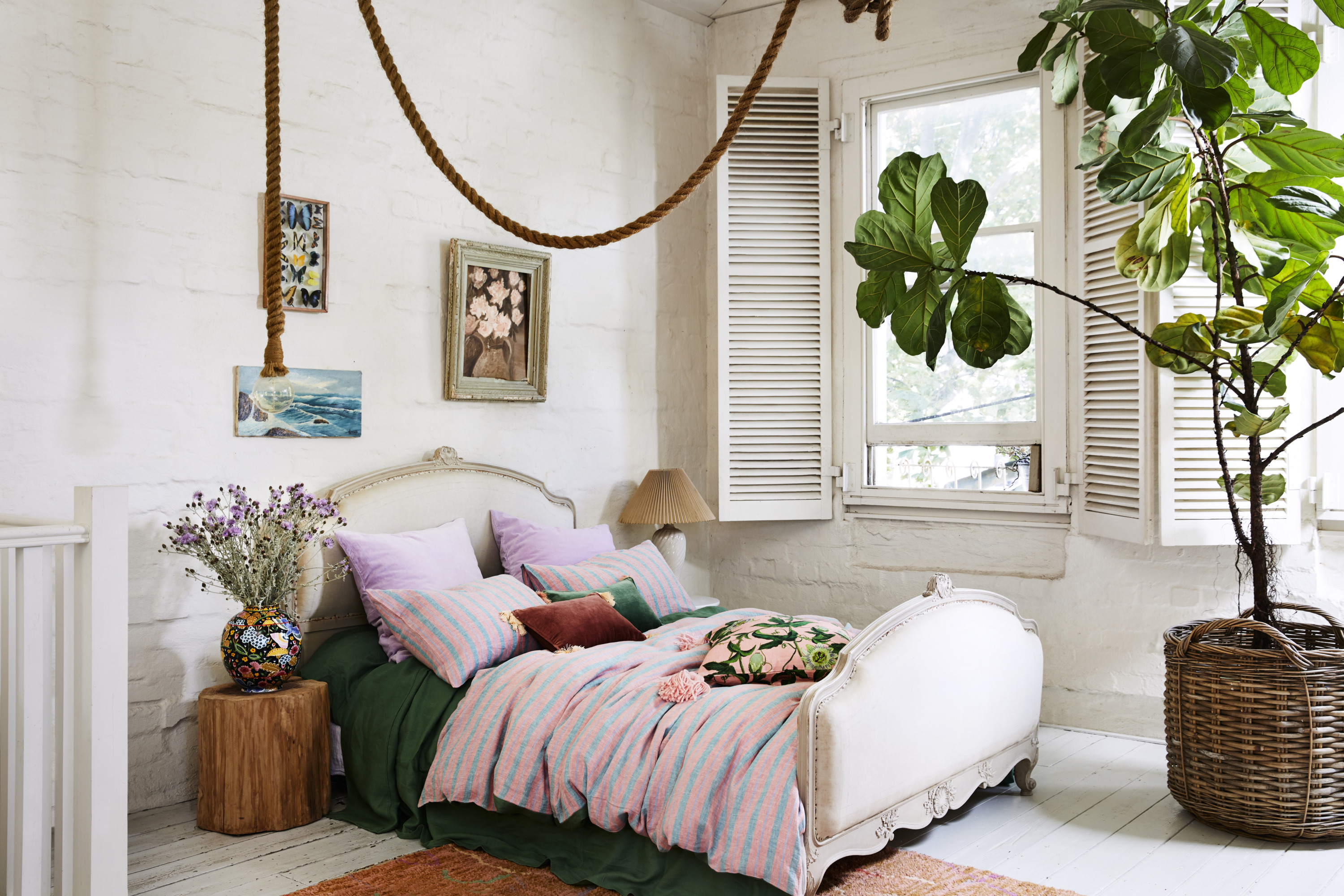
Before vs After of Lucy Glade-Wright’s bedroom makeover, using Dulux colour New Penny. Photographer: Jonno Rodd.
Lucy transformed her own bedroom, from an 80’s timber shack into a cosy bedroom sanctuary using Dulux colour New Penny.
Before vs After of Lucy Glade-Wright’s bedroom makeover, using Dulux colour New Penny. Photographer: Jonno Rodd.
Here are Lucy’s top styling secrets to transform your bedroom.
Embrace colour – Colour is an incredible tool, so don’t be afraid to use it. The Restore palette (2022 Dulux Colour Forecast) features colours that are strong yet soothing, providing the perfect base to style your room.
Artwork left – The Best of Days by Steph Wallace – Bungalow Trading CO; Artwork right – Small Surprise by Min Pin Designs – Pepite / Min Pin Designs.
Simplicity is key– Keep your styling elements and décor to a minimum, allowing the colour within the space to breathe. You want your furnishings to complement the space, not compete with them.
Ignite your senses – When styling your bedroom, choose elements, objects, textures and tones that warm your soul. Layer textural elements to create an inviting interior. Choose objects and materials that have an organic, natural feel to them. A great way to do this is through bedlinen and curtains, woven rugs and upholstered furniture, or handmade ceramics and artwork.
Artwork – Something New Something Different by Nick Olsen – Studio Gallery.
Check before you paint – Make sure to view your desired paint colour in the room first before painting. Colour can vary depending on its environment, lighting and other primary elements in the room so it’s important to make an educated decision based on this. Pick up some A4 samples or sample pots from your local Bunnings store to accurately test the colours around the room at different times of the day. That way, you’ll feel assured you’ve selected a colour(s) you’ll love.
Establish a colour palette – When selecting colours for your additional furnishings and decor, stay within a similar colour palette and tone to create a cohesive, sophisticated look.
Artwork left – The Best of Days by Steph Wallace – Bungalow Trading CO; Artwork right – Small Surprise by Min Pin Designs – Pepite / Min Pin Designs.
Final 3 images: Dulux Summer forecast 2022 Wonder palette | Styling by Bree Leech and photos by Mike Baker
Pretty in pink: ways to add this popular colour to your bedroom
Sponsored by Manchester Collection Pink never goes out of fashion but it can put some people off with the idea that it’s too feminine. But there are plenty of ways…
A nice bit of variety on The Block last night with guest bedrooms, kids bedrooms and the re-do rooms. Here are the scores, the judges’ comments and where to buy what you saw.
Ronnie & Georgia: 1st place
Score: 29/30 Spent: $24,680
From the traditional yet contemporary wallpaper to contrasting yet matching bedhead and cushions, Ronnie and Georgia threw a curveball at the judges with their bedroom this week, but it was one they loved. Declaring this her favourite colour palette of The Block so far, Shaynna thought this was a room with its own style, but still a complement to the rest of the house. Even the challenge artwork seemed to fit, said Neale!
Neale and Darren thought the bedsides were perhaps too low or the bedside lamps too small, but Shaynna disagreed.
Moving to the re-do room – a larger walk-in wardrobe – they were blown away by the transformation. More spacious, better fittings, this was a room that completes the master wing.
Whimsical, playful, cute and fun, the judges said and that’s just what Mitch and Mark wanted to hear for their children’s bedroom. With bunkbeds, pistachio-green wardrobes and beautifully styled to lure in a young buyer. Neale noted this is a kids room right now, but one that could be easily converted to an older child’s room or even an office easily. And that’s smart planning.
Shaynna said the roofline was too much with all the skylights as well as the large window. Darren liked it though. They loved the wardrobe and thought the styling was magic.
So too was the re-do bedroom, now a smart addition to the home with its own feel and colour scheme. Neale said it has a bit more pizazz back.
A built-in bunk, generous wardrobe and ample storage space, a desk and funky styling make this an ideal kids bedroom, perfect to show Tanya and Vito’s house could easily become their home. Neale’s big concern was how easily the room could be converted for an older child or another purpose – the built-in fixtures might make things tricky – but all agreed it’s a great value add for the home.
Shaynna said she found it a bit cold and the edges needed softening.
Re-do bathroom sans brown tiles
So too was the re-do room, now without its polarising brown tiles. Thank God! said all three judges. It’s still a room with personality, but one that won’t divide the market. Darren said it now definitely adds value to the house.
From the highs of the master wing to the lows of this bedroom, Josh and Luke’s rollercoaster Block ride continues with the judges declaring this space a mismatch of style with a colour palette that’s too cold. Some fresh styling was needed, the judges agreed, to bring it into line with the rest of the home.
Let’s face it, nothing went with anything!
Then to the re-do bathroom. Once again the styling and colour palette weren’t what the judges were hoping for, with the floor to ceiling toilet screen the only obvious change… and not one they loved. Shaynna said it looked worse and Neale couldn’t really see what was different.
A Hamptons style kids’ room, styled for a little girl right down to the Dolly Parton storybooks on the shelves, Kirsty and Jesse’s room had a definite style and a definite theme in mind. Not even an upside-down lampshade could dampen the judges’ enthusiasm with Shaynna loving the valance, Neale the Grafico wallpaper and all agreeing it’s a space that shows what a home this can be – while still able to be converted to other uses.
Also converted, was their opinion of the guest bedroom, with Kirsty and Jesse’s re-do bringing a new shade of blue, new bedding, new bedsides and more, winning them over.
This week on The Block, they revealed the master en suites. Read on for the scoring and to see the rooms. FIRST: Ronnie & Georgia Score: 29/30 (after using their…
The Block 2021 room reveals: 4 cinemas & a steam room
I’m going to leave this week’s drama and cheating scandal at the door because if you watched The Block this week, I’m sure you’ve already had enough! Onto the media…
Inspired by old world glamour and shot in Melbourne’s iconic Beverley Hills apartment building, Kip & Co.’s High Winter 2021 collection is designed to transport you to another era with its luxe, decadent fabrics, colours and textures.
The range features three key prints – a signature animal print ‘Madagascar Earth’ which was designed to evoke Hollywood glamour, a bold oversized black and white gingham and ‘Bush Flowers’ which is a delicate floral inspired by the Australian wilderness.
We love this oversized gingham design
“It’s something of a miracle that we’re able to share this range with you – the collection was designed in 2019 and was originally due to launch in 2020 but due to lockdowns faced by our beautiful suppliers, and then some wild decisions by the freight gods, it’s only just landed now,” says Kip and Co.’s co-founder Alex McCabe.
The ‘Madagascar Earth’ design is a warm zebra print
For the first time ever, the brand has introduced two Kantha quilts – a small, straight running stitch is a hallmark of the design that originates in Bengali embroidery. “These are a modern take on the traditional South Asian Kantha blanket. Our edition is hand-embroidered, quilted and filled to create the perfect trans-seasonal blanket keepsake,” says Alex.
The brand’s new Kanthi quilts are a timeless buy
Range aside, the collection images are an excuse to step inside the stunning and very ‘grammable home of interior stylist Heather Nette King. Located in South Yarra, Heather’s home is inside the Beverley Hills apartment building, which was designed and built in 1935 by the architect and developer Howard Lawson. The Spanish Mission meets Hollywood glamour vibe proved perfect for the latest Kip & Co collection.
The original stained glass window is something else!
There’s no denying that winter is with us with plummeting temperatures seen across Australia in the last couple of weeks. So, there couldn’t be a more perfect time to bring…
Kip & Co. Spring Summer 2020 range inspired by vacationing at home!
While Kip & Co.’s latest Spring/Summer collection ‘Vacay’ was designed last summer, its inspiration has since proved rather prescient. In an eery twist, it was centred around the idea of…
Mum of two and founder of Incy Interiors Kristy Withers, knows first-hand how quickly children can grow and their tastes can change. While growth spurts can result in overhauling children’s wardrobes year on year, the interiors enthusiast shares five considerations parents should make to ensure their child’s bedroom stands the test of time.
1. Splurge on a larger bed
“If there is one furniture item that you are going to invest in, make sure it’s the bed!” says Kristy. “Investing in a high quality bed straight up can save you money in the long run. Of course, with a good quality bed you can hand it down to other children but if you really want to avoid having to upgrade your bed every few years and both your space and budget permit, consider purchasing a bigger bed from the beginning.”
Double beds are a great size for kids, not just because they give off the grown up vibes that kids crave, but you are almost guaranteed an upgrade won’t be required until they hit their mid-teens.
2. Choose convertible pieces wherever possible
When you are creating a space for a newborn, it is difficult to consider the functionality beyond those first few years, but there are some items that you can purchase that will still serve a purpose for your child as they grow. Kristy recommends looking for a change table that also doubles as storage.
“All of our Incy change tables either convert to a dresser or a bookcase so you can continue to use the product for many years to come,” she explains.
3. Keep sheets and linen plain
“I always recommend that people keep their sheets simple and stick with plain linen. It is not only difficult to ‘outgrow’ plain linen but a neutral, unpatterned colourway means décor can be interchanged without needing to overhaul every part of the room. It is much easier and more cost effective to update a bedroom with throws and cushions,” Kristy says.
Be sure to invest in quality bedding too – it’s essential for both comfort and assurance you’ll get to enjoy it (and not update it) for a while!
4. Think about smart storage solutions
Regardless of age, you’ll always need somewhere to clear the clutter! A neutral storage ottoman or trunk is perfect for this and can store anything from stuffed toys to books. Kristy loves ottomans in particular, as they double as a place to sit and always look great at the end of the bed.
5. Choose a plain, timeless colour for the walls
While it can be tempting to paint the walls in pastels for newborns, Kristy recommends keeping the walls in neutral tones that will stand the test of time. “Instead, add colour with removable wallpaper and decals,” she says. “There are so many great companies out there now that offer removable wallpaper and wall decals and they are a great way to set a theme or a room, but as they are removable, it’s only as permanent as you need it to be!”
A gender-neutral theme/colourway will ensure a bedroom’s longevity, but Kristy suggests complementing this with little personal touches, like artworks, drawings, mementos and precious keepsakes, turning your child’s bedroom their own personal haven. “Additionally,” she says, “updating the artwork allows personality to be injected, but it can be easily updated as your child grows and changes.”
Home school ideas: creating a great kids’ study space
Children’s spaces are fast becoming a creative extension to the family home and Nicole Rosenberg of Liberty Interiors is quite the expert at creating stylish and practical spaces for kids,…
I don’t know about you, but I’m forever bringing ideas home from hotels to try and incorporate into my own bedroom. Because there’s nothing like that comfortable, luxurious hotel room look and feel when it comes to wanting to jump into bed and have the best, most peaceful sleep (and maybe even an elusive sleep-in if I’m there sans kids)!
My own bedroom is my sanctuary. When it’s tidy! Pic by Jacqui Turk
I haven’t been sleeping the best recently and I’m sure I’m not alone. These are massive, life-changing, unprecedented times we’re going through, and things aren’t going to change any time soon. So to help us all relax and unwind a little better, I’ve pulled together some expert tips. Because if we can retreat to a beautiful, comfortable sanctuary at the end of the day, there’s a good chance we will have a better night’s sleep.
Interior designer, stylist and renovator Naomi Findlay, is a big believer in what she calls space medicine, which is very much about how your space feels as well as looks and the effect this can have on your physical and mental health.
Image: TEMPUR
“My tips for getting those hotel bedroom feels are to play with scale. Think about, for example, an oversized bedhead. It gives that opulent feel, so go a size bigger than your bed. My next tip is if you have a queen bed, go for a king quilt and so on, so you have a big overhang and plumpness. It looks more luxurious.”
We definitely want to avoid the bad hotel look of a strip of red comforter across the bottom of the bed and a solitary matching red cushion! “What will look and feel great though, is to layer from the floor up and the ceiling down, not just on the bed. So you could start with a great rug so when you first get out of bed, your feet hit the beautiful softness of it. The rug should extend past the bottom of the bed too, framing it, and giving it that hotel feel.”
She adds: “To add everyday luxury for you, not in a shiny or over the top way, look at how you can have a room that supports your mind, your body and your soul. To do that in your bedroom, you can look at integrating nature (which could be as simple as a few plants), art with recurring patterns (like we’d see in the ocean or a mountain scape which help release endorphins), and natural materials and textures like linen, rattan and timbers.
Image: The Pillowslip Store
“Think about how you can bring in elements from the earth to support you in that room. Even look at bringing in a mirror to reflect the light, bringing more light in, or to reflect a view you may have.”
{Different countries have different mattress and linen sizes which can get confusing. Check out TEMPUR’s expert guide for straightforward information to help you choose.}
Cheree Poole, who owns The Pillowslip Store, says to create that hotel look and feel at home, you need to start with a quality cloud-like mattress. “If we’re talking luxe hotel, a king size is the ultimate. You will also need to treat yourself to some quality sheets. And controversially, it’s not about the thread count, it’s more about the feel. For a hotel vibe, you want crisp, white cotton sheets and make sure to practice your hospital corners. A neatly made, tightly tucked-in bed screams housekeeping!”
Image: The Pillowslip Store
She suggests adding a beautiful oversized, quilted velvet comforter for that added sense of luxury. “And for me, it’s a big no on the pillow and cushion count. I know this might be a little shocking for some of you to hear, but it’s all about paring back and keeping it simple. I prefer two king pillows and two standard pillows stacked on top for a hotel look. That’s it!”
If you just can’t cope with that minimalist an aesthetic, Cheree says to add either one central feature cushion or two lumbar cushions.
“Now draw the curtains, grab your snack of choice and a sneaky little drink, it’s time for Netflix!”
Image: TEMPUR
Nothing feels, supports or adapts to your body like a TEMPUR mattress or pillow. Quality at its core and made to last, TEMPUR material was first developed by NASA in the 1970s to absorb pressure, and cushion and support astronauts during lift off.
“Even at a young age, being neat and tidy gave me a sense of relief and calmness. Looking back, I had always understood that having the right objects in your life can make you feel happier and more balanced,” says professional organiser Gemma Quinn, Australia’s first person to be officially trained by the Japanese organisational guru Marie Kondo.
And I don’t know about you but my wardrobe, with its limited space, is a bit of an organisational nightmare so I was keen to glean some wardrobe organisation tips from Gemma after her Kondo immersion. “Using the KonMari Method allows all your items to be visible at once, allowing you to see and enjoy all your clothing and you don’t forget to wear the items you love due to not being able to see them,” says Gemma. I would love to be able to see all of my clothes, shoes and accessories and for the space to ‘spark joy’ and here Gemma, who has teamed up with Freedom Wardrobes, shows us how.
Vertical folding Given the column inches devoted to the art, the KonMari folding method still remains a little elusive to me but Gemma elucidates. “Using the vertical folding method allows you to see all of your clothes at once, rather than being hidden under layers, and makes for a more efficient use of space,” says Gemma who explains that folding protects delicate clothes from unnecessary damage as some fibres stretch out of shape when hung.
Marie Kondo’s vertical folding method
Dirty laundry storage While doing laundry may not ‘spark joy,’ finding a practical space to store it before washing certainly can. From a chic laundry hamper that matches your décor, to a hanging hamper (yes please!), keeping dirty clothes stylishly out of sight is the goal.
“Once people have tidied their belongings with the KonMari Method, they generally cherish and want to take care of their items; this includes their laundry and not wanting to just throw it on the floor anymore,” says Gemma.
Find the joy While the KonMari Method prides itself on decluttering, it does also encourage us to include sentimental items in our everyday lives. “For instance, using glass display shelves in a wardrobe allows you to arrange and engage with those items that touch your heart the most. Imagine opening your wardrobe and seeing a photo of a loved one, your favourite perfume or a magical rock given to you by your child.”
Glass display shelves work a treat in this Freedom Wardrobes walk-in robe
I have a confession: I am addicted to house porn… and don’t worry it’s not as X-rated as it sounds. Rather, it’s the act of checking out the most lust-worthy, jaw-dropping residences and dreaming of winning the lottery so you can call them home!
Designed by Adelaide Bragg
The 2017 House & Garden Top 50 Rooms is perfect for fellow addicts. Now in its 19th year, the competition celebrates the crème de la crème of Australian residential design. Whittled down from hundreds of entries, the rooms are as diverse as they are stunning with beautifully functional kitchens to ingenious living spaces and dreamy bedrooms.
Designed by Lisa Burdus
This year’s overall winner is a luxurious sunken living room, designed by Melbourne architect, Dina Malathounis of Junctions90. Blending a neutral palette with a spectacular open fire, it has oversized glass windows that lead to the backyard.
Designed by Dina Malathounis
With an esteemed judging panel including Australian House & Garden‘s editor in chief Lisa Green, interior designer Dana Tomic-Hughes of Yellowtrace and colour expert Lucy Sutherland; the categories range from Best Kitchen to Best Use of Colour and Best Use of Materials.
Designed by Louise Walsh
Designed by Splinter Society
Six states are represented in the Top 50, with a blind judging process guaranteeing an unbiased result. As Room of the Year designer, Dina receives a trip for two to Paris for the Maison & Objet fair in January 2018. We are jealous!
With a diverse range of adult homewares it was only going to be a matter of time before Arro Home expanded into kids wares.
“We just couldn’t resist,” explains designer Alice Oehr. “We had a lot of ideas of things for children and we always wanted Arro Home to be available to the whole family.”
Launching their debut kids bedding collection 10 November, true to Arro Home’s distinctive style, it’s all about bold colours, creative prints and tactile fabrics. “It’s so much fun designing things for kids. You can tell a story with the product in a different way to an adult collection. You can go a little crazy with the colours and patterns and it allowed us to re-live some of our own childhood favourite things.”
Entitled In the Sky, as the name suggest, the range is inspired by everything from up above. Deep dark space, vibrant colours of the solar system, sparkly constellations, fluffy clouds and a smiling sun and moon.
Kicking off with two prints, Cloud Nine and Astro, it is featured across doona covers, pillow cases, and cushions. To pair with the prints is Constellation — a simple grey and white sheet set — four new cushions and a knitted cotton blanket.
Soft and simple, it is sure to inspire kids at play and (hopefully) settle them into slumber!
OK, who knew about this and has been keeping it from me? Super Amart has some cute and affordable homewares and I recently got to discover them. Armed with $200 to do a little bedroom refresh, I went shopping.
I LOVE orchids but I always kill them within two weeks which is an expensive fail. There are some great fauxs out there including this beauty from Super Amart. At $69.95 I thought it was a great buy but please note they are currently on sale for just $39.95!
My favourite purchase however has to be the timber Raintree lamp, which looks a lot more expensive than its $64.95 price tag. This neutral number looks great in any room. I can’t decide whether or not to move mine to the kitchen as it seems to suit there really well too!
One of my top tips for buying bargain homewares that look expensive is to choose simple shapes and lines, neutral colours and matt textures, like this linen-look lampshade. Avoid the shiny at all costs, my friends!
Likewise, you can’t go wrong with classic colours like those in the two cushions I picked for my bed, which were 24.95 and $29.95. I do love a bargain!
Some of the many cushions available at Super Amart
Super Amart have everything for your bedroom from the bed, mattress and rug to linen, lamps and finishing touches. You can shop online with Super Amart but you’ll find a much bigger range in store. Also, note you can’t get homewares items delivered but you can buy them online and pick them up at your nearest store for free.
Disclosure: As well as paying for this post, Super Amart gave me $200 to shop with them and write about my experience. All views are my own.
With the Redbacks’ (Jess and Ayden) furniture delivery truck broken down with only an hour to go, it looked like the Blue Tongues (Carly and Leighton) had it in the bag. But, in an incredible act of sportsmanship, the Blue Tongues left their house to help the Redbacks in a mad dash to the finish line. And both houses were finished!
In just 48 hours the teams had to renovate a master bedroom and a second bedroom each (they’ll renovate the rest of their houses over the coming days), so what did judges Darren Palmer and Romy Alwill think?
Blue Tongues
Master Bedroom — 17/20
Nailing the brief of contemporary Australian, the bedroom was fresh, upbeat and young. The judges loved the sanded floors and the colour palette of cool colours juxtaposed against blonde timbers and neon pops. Darren liked the art and hanging dots on the wall and Romy was equally impressed with the bedside pendants (though thought five pendants in the one room was way too many!). However, the judges thought there should have been more storage and that it was a huge miss not to have it across the whole wall.
“I immediately like this room more,” said Darren upon entry. Loving the colour palette, the bedside pendants, the restored fireplace and rug, he did criticise Carly and Leighton for replacing their original oversized ceiling rose with a smaller version. Romy as a whole wasn’t a huge fan of the bedroom, believing it felt “murky” while the other room felt fresh. Darren disagreed wholeheartedly.
While their brief was tricky, classic contemporary with a twist of plantation, both judges thought the bedroom was bang on brief. Very elegant, the judges were astonished by how brilliantly the period features had been restored, especially the skirting boards which had been stripped back and painted. Darren loved the bed and plantation shutters and Romy liked the contrast between the sanded floor, dark timbers and white walls. The room had great character, with the only misses being the rug and artwork.
While there were elements of classic contemporary and plantation, both judges agreed the room didn’t mesh. “It feels like Jekyll and Hyde in here,” said Romy. The judges like the storage solution and many of the furniture pieces individually, however felt the rug and lamp were particularly off brief and everything else just felt thrown together.
In the end the Blue Tongues took out the reveal by just one point! Meaning Carly and Leighton go into part two of the grand finale with a small yet substantial lead (past weeks have seen teams win by just half a point!). With a whole house each to complete in just a few days, in a happy twist Scotty Cam brought out eliminated couples Kyal and Kara and Ben and Jemma to help the Redbacks and Blue Tongues respectively. I’m thinking they’re going to need all the help they can get! May the best team win.
Having designed her own home and helped her friends do the same; Kate Sparks found out very quickly that she had a passion for interior design.
An early childhood teacher and a mother herself, it seemed like a match made in heaven to begin her business Little Dwellings, a styling service primarily for children’s spaces.
With a range of styling packages from eBoard designs to full room instals, her most popular service is in-house styling, where she visits clients’ homes and goes through which products would best suit their space. And while Kate has now transitioned to also styling adults’ spaces, she will always have a soft spot for decorating nurseries and kids’ rooms.
“They are so much fun. Older kids can have an input as to what they want, whereas designing a nursery is so exciting as you watch the room come together and become a reality for the parents.”
When decorating a room for your little one, Kate has many tips: “When decorating on a budget, I’d recommend a lick of paint, DIY, and being minimalistic. Then change the bedding, update prints and gradually introduce more age appropriate accessories. In terms of budget friendly, on trend pieces, think wall decals or wallpaper, funky beds and linen, storage baskets (felt and wire), rugs and prints.”
While Kate’s personal style has a strong Scandinavian edge, she always puts her client’s taste first. “My house is very Scandinavian influenced, however Little Dwellings aims to provide a service that meets the needs and wants of each individual client. But in saying this, we always aims to be on trend.”
What excellent viewing last night was! A return to my favourite Sunday night Block room reveals and not three but SIX with three by the newbies and three by the returning all-star couples. Plenty of emotion (mainly from a tearful Bec, bless her) and some honest judging that spanned from downright harsh through to glowing. This is what reality TV’s all about!
Controversial Darren and Dee won the all stars’ contest
Judges Darren Palmer (we love his new specs!) and Neale Whitaker were joined by real estate guru John McGrath for the big task this week. The winners of the newbie round were my current faves Ayden & Jess and Bec & George and Matt & Kim went home, despite producing great rooms, while Darren & Dee got to stay and become the fourth couple.
Ayden and Jess were judged best out of the newcomers
JUDGES’ COMMENTS
First, to the newbies. The judges didn’t think any of their rooms were really good enough. The judging was pretty harsh but, in my opinion, warranted. It’s early days though!
Charlotte & Josh (second place)
Charlotte spent up big at Coco Republic but expensive furniture was not enough. Darren said there was a lot of stuff in the room and loved the wall finish, the simple linen and smart choice of flooring. The bedside is one of his favourite pieces out there at the moment but he felt it too big for the room. Neale had an issue with the art, even though it referenced the neighbourhood (too young and poppy to go with the furniture). The art jarred with the neutral look and feel. John agreed the decor didn’t quite work. Darren and John hated the built-in doors and handles (a bit dated). No more Mr Nice Guy with Darren tonight who said the window dressing was a bit asylum-y. Eek! Neale said their elimination challenge rooms were better and he was disappointed. John said it seemed they hadn’t realised the competition had started. Ouch all round!
The automatic blind impressed Darren and John who said it was what buyers in this market were looking for. Not surprisingly, the judges spotted the hideous toy cat on the windowsill (why?!) and they were NOT impressed. Neale said he felt he’d seen everything in the room many times over and called it generic. John said it felt decorated out of a seaside gift store. Cringe! Neale was again disappointed. John found the crosses theme “annoying” and said the room was not all things to all people and rather nothing to no one. At this point, Darren declared himself definitely cranky Daz! Distinctly awkward!
Ayden and Jess’ dynamic continued to make me giggle this week. They’re definitely my favourites to watch. Darren said the room was off to a good start. Neale said it had soul to it and personality. They all liked the wing-backed bedhead and even Darren said there were too many cushions on the bed (nine!) and he didn’t love the pendants. Darren said the flooring was a little plasticky. Neale concluded it wasn’t perfect but had a sense of creativity and flair. Darren said they had shown a fighting spirit and tried to up the ante.
Then onto the all-stars… The judges were not told who did each room or even which all-stars they were judging. It seemed so mean that two of the three had to go home when they all did so so well and in a class above the newbies (and let’s face it, they’ve had a lot more experience). I picked the winners straight off though: Dee and Darren. But wow, they were all good! Painful!
Bec & George
Darren immediately said “we’ve stepped into a whole different level of the game. There is no comparison to the rooms we’ve just been in”. John said it proved a great idea was all about execution not budget. Neale said the room said experience and it was in a different league. The flooring was amazing. Neale said the artwork was stunning. Darren loved the warmth of the timber and the lights. Neale said it said modern luxury. John said it spoke to the market. All the judges like the custom gold leaf plant holder. Bec was so wowed by the positive comments that she cried, saying even if they didn’t stay they’d achieved everything they wanted to. Which was just as well as sadly, they did end up going home.
This pair really seemed to take the opportunity seriously too, making brave choices. I loved their paneling and elegant choices. The judges were wowed by the different aesthetic and approach. Neale thought it felt very romantic and elegant. He said the detailing was very special. Darren liked the timber floor on a diagonal. They said it was a room that would appeal to anyone with design savvy. Darren said it felt like a jewellery box to him and that when the newbies walked through these all-star apartments they would freak out! Darren said whoever went home, it was a big shame.
Darren said the apartment was beautiful and he loved the grasscloth wallpaper. Neale said it was seamless, calm and relaxing and this was the room he felt like unpacking his bag in. Darren said it was the first bedhead he’d seen that he really wanted to sleep in. John said it was neither harsh contemporary nor classical and steered a nice road down the middle. Darren loved the dropped ceiling and the shadow line (Daz’s choice, which wasn’t popular with Dee!) and said they looked expensive. Less is more definitely won!
I have to say I agreed with pretty much all of the judges’ comments this week. All three all-star couples did brilliantly. I was most surprised and impressed by Matt and Kim in a way, taking into account their attention to detail, effort and the huge difference to anything of theirs we have seen before. The paneling was fab and the lighting was perfect. Winners Dee and Darren had my favourite room but Bec and George’s was also great (that floor worked much better then I predicted).
[contextly_sidebar id=”LLyvoP3LOeooSBEuodjPlUTbe7JzgC62″]It seems pretty unfair that the newbies’ work had to be compared to the more experienced former contestants’ this week as they were never ever going to match up! I really didn’t vibe Tim and Anastasia’s room at all and the soft toy dog they left on the windowsill killed me (I don’t care if it was your neighbours’ kid’s! What were you thinking?!). A tacky toy on the windowsill of what is supposed to be a high-end apartment is never going to go unnoticed or go down well. I found the colour scheme a bit jarring and the styling uninspired. As the judges said, Josh and Charlotte’s room was a bit too much about the art, which I didn’t love, and I hated the opaque glass built-in doors. I still have high hopes for this pair though. And Ayden and Jess, my favourites at this point, did the best in my view. Their room looked less embarrassing compared to the all-star couples’ slick efforts. The floor was a bit wrong though.
And before I go, can I just say, once again, how disappointing and ridiculous I find the huge amounts of bitching on The Block Facebook page and elsewhere (Darren and Dee’s page too) about the result and the show supposedly being rigged. And people being massively over the top about winners being announced on social media before all states have had a chance to see the outcome? Calm down, people, it’s just a TV show! I personally couldn’t watch the show last night because I was having dinner with my in laws. So I recorded it and then deliberately stayed off Twitter and Facebook until after I’d watched it a few hours later (in order to write this post and for my own enjoyment). Had I accidentally found out before I watched, well do you know what? It’s really not that big of a deal. Sigh. I just wish people would put as much effort and passion into fighting some of life’s real injustices rather than spouting venom about a reality TV show and its contestants.
So, what did you think? I’m sure the all stars’ winner decision will be controversial being that Dee and Daz are a bit love ’em or hate ’em! And simply because all three couples made top efforts. Poor judges, that was hard! But that’s reality TV for you! Roll on this week!
As an interior stylist for little people, Mel Spurling of Hello Little Birdie always encourages her clients to get their kids involved. “When I first meet a client I encourage them to bring their children, as it is a great way to gauge their little personalities and incorporate a little of them into their newly designed bedroom. In fact, you could argue that the little person is my client and they have to bring their parents!”
Designing both nurseries and kids rooms, Mel is a lover of anything that is unique and original and pushes the boundaries. With an aim to design rooms that last a lifetime (or at least past the toddler years!) she believes creative thinking combined with clever shopping, can lead to rooms rich in detail and cheap to pull together. “It is definitely possible to put together a gorgeous nursery, which will work for many years to come. DIY should not be ignored; not everything has to have a dollar sign on it. You should always start with paint or wall decals; a new colour creates a whole new look. That means that you can spend the majority of your budget on furniture that can grow with your child, such as a high-quality dresser or side table, and save on items that they will quickly outgrow.”
Mel also recommends places like eBay, Gumtree and garage sales for finding those cheap but good quality finds. “Take an outdated or damaged piece of furniture, give it a fresh coat of paint and all of a sudden you’ve given it a whole new life. You can finish off your entire new look by accessorising your room with inexpensive wall art. Try framing your little birdie’s artwork, or an image from a book, magazine or even greeting card!”
Originally working in IT as a business analyst (“I am part geek too!”), Mel’s love for interior design began as a young child when she shared a room with her grandmother and longed for a room of her own. “As a little girl, I’d spend endless hours imagining what my room would look like if I had my own little space. By the time I had grown up and had my very first baby, I swore she would have the most whimsical, stylish and dreamy room. One like no other! But once I started looking into children’s decor, I found that most items were boring at best, and horrible at worst. That’s when I realised that I could put all of my skills and experience together to start creating wonderful, imaginative and fun spaces for little people.”
With both online and on-site services, Mel designs for both boys and girls and in her opinion there are some key differences to remember: “We all know boys are boisterous and love to create clutter. Bearing this in mind, a boy’s room can’t go without storage. For boys, fresh white bedroom walls set a neutral backdrop that pair perfectly with any decorating style as tastes change. Add some bold prints and you are well on your way!”
And for girls? “Girl’s rooms are timeless and I always find decorating them with wallpaper will last for many years. We all know little girls like to call themselves little ladies, so I love creating rooms which incorporate on-trend furniture to give the room a more mature look. Once the foundations are set, adding a bunch of accessories and toys to the room, makes it come to life. I love adding lots of layers; quilts, throws and cushions.”
Last night’s episode drove me a little bonkers. HURRY UP! I wanted to shout! Seemed like most of the contestants were on a go-slow and nobody seemed to care enough. And when you consider how many people must want to get on the show (I am definitely not one of them, unless they’re offering a guest judge spot!) that’s a little frustrating.
So I was the last person to expect Neale Whitaker to be saying it was a tough call when six rooms of a high standard had been delivered. That’s clever TV editing for you I guess! And I have to say, when it came to the end results, despite some dodgy finishes, I was eating-my-words surprised! I think most of the viewing public expected the ditsy cousins Brooke and Aimee to be a dead cert to be eliminated but oh, how wrong we were! They ended up in second place. So, all in all, it was a good episode!
So, in order of judging…
Tim & Anastasia. Came 5th and stayed in the competition by the skin of their teeth (half a point!):
Tim & Anastasia’s room
Darren and Neale said completing this room in 24 hours was mind-boggling, but then at this point, they had nobody else’s to compare it to. Neale said the artwork was a bold, good choice and set the tone for the whole room. Both loved the timber walls but the dodgy finishing where they met the ceiling didn’t escape Darren’s beady eye. The powerpoint and TV aerial socket in the middle of the wall were also clangers. But Neale said overall it was a pretty strong start.
Pre-judging, Ayden described the room as “us on a platter,” and said they wouldn’t change a thing. I liked his confidence! The judges said it was very fresh and inviting. Darren loved the linen (I have the same on my bed from Aura as it happens), cushion and art choices. Neale said it was young, cool and sophisticated. They both raved about the open-shelved wardrobe but Darren said the paint work and plaster work were a dog’s breakfast! And those curtains certainly needed ironing!
Mark & JJ came last and were eliminated. I bet she’s glad she doesn’t have to be called JJ anymore:
It was clear from Darren and Neale’s comments, by the end of the judging, that these two were heading home. Neale said it was hard to know where to look first. Although the wallpaper was very brave and very well done and the mix of retro and contemporary was good, there were too many styles going on and nothing tied together well. And the deal was sealed with terms like “chaos” and “panic styling”. Bye bye, guys!
Brooke & Aimee. Came 2nd despite looking like they wouldn’t even finish:
Brooke and Aimee’s room
And their door didn’t shut either! But Neale really liked it, coining the term ‘industrial country’ and both judges loved the vintage style, mint green bed. they even said the wardrobe was an extraordinary achievement in the timeframe. But nobody could ignore that black curtain rod, drooping in the middle!
Ebony & Luke came 4th and were visibly shocked to still be in the game:
Luke & Ebony’s room
The blue wall went down a treat and the judges noted the rest of the room was subtle and restrained. Darren was not happy with the chest of drawers as the only storage option, or the poorly finished skirting and bedhead. And no window dressing despite a pelmet! Darren said though, that it was a well designed room with good choices, just bad finishes. Neale found it frustrating that some bits were so right and others so wrong.
Charlotte & Josh took out the top spot and came 1st with their subtle scheme:
Josh & Charlotte’s winning subtle room
Josh was confident too, saying before the judging that he thought they’d get through to the next stage. On entering the room, Neale and Darren both said wow and they were even more impressed when they realised the timber wall was real and not wallpaper. Neale loved the pared back glamour and called it ‘industrial glam beach house’! There’s a new one! And Darren said the wall was magnificent for so many reasons. Neale rounded the compliments off with “superb”! The only downsides were the lack of window dressing and the seam of the lampshade facing out to the room.
Surely I wasn’t the only one surprised about last night’s room reveal winner, eh? It was another week of double room reveals for the Blockheads and I liked what I saw.
Michael and Carlene really lifted their styling game this week. I loved their master bedroom! Neale’s first words were “Wow! Very cool!” and I have to agree. It may or may not have to do with the fact I love all the finishes they’ve used. The sheers were gorgeous and those pendants! Tom Dixon, need I say more? Shaynna loved the artwork in the entrance and described the room as sexy with a simple colour palette and lots of texture. Neale loved the natural linen look bedspread and thought the overall room was very contemporary but also very neutral; a very sophisticated blank canvas. To be perfectly honest, I felt it seemed smaller than the other bedrooms, but I loved it nonetheless.
I’m all for dark wooden finishes in a wardrobe, it’s just classy, it seemed to be a consistent theme cross the wardrobes and Neale also loved the dark wood. Shaynna was a fan of the storage (surprise, surprise), but there was no wow factor or anything to get the buyers excited in their wardrobe.
Did you see that copper wall? How’s that for a statement? I’m all for copper; that and gold are my current obsessions. But as much as I love it, I think it’s too much for a bedroom. That would have cost an absolute mint. Do you think it was worth it? Darren and Neale were truly wowed and Shaynna said it was insane! It was definitely a million dollar wall, however Neale said it leaves him completely cold and if you walk into this room and don’t like it, it’s all over. The judges agreed that to pull off the wall they needed to up the other finishes and I tend to agree. I loved that they used every inch of space in the wardrobe and thought the kickboard drawerss were a great idea.
Neale said now that is what he called a master bedroom. All the judges loved the colour scheme but personally I thought just a tad too much orange, however it did feel bigger than the first two rooms and I liked that they kept it relatively simple. Darren loved the bedhead, the high quality linen and that big bronze mirror; he said bronze mirror was one of his favourite things ever.
I liked the natural light coming through the wardrobe with the dark wood. The jewellery draws were a nice touch and Darren thought it was hot. Storage queen Shaynna was so excited about the laundry chute, and so was I! (it’s the little things, right?). Neale loved how they interpreted luxury and was really impressed.
The bedroom kings are back! The boys’ master bedroom felt huge — more like a master suite than a master bedroom. I absolutely loved it and it was hands down my favourite this week. The boys absolutely nailed it (from my armchair anyway!). Shaynna walked in and commented that it was huge and she loved the lounge space they created within the room. Darren liked that you could sit in the window and take the sun in and I have to agree. He loved the textures and said the boys have good style and taste and make good decisions. I loved the bedhead, those copper pendants and that throw (ok, let’s be honest, I loved it all). I also love that the boys know how to create a sense of scale within each of their rooms. Neale loved the splashes of colour and said he’d never seen a bedhead like that before (obviously not reading Interiors Addict often enough, Neale!).
Wow, wow, wow! That wardrobe is huge and I want it. Simon and Shannon’s wardrobe definitely felt substantially bigger than the other couples’ and I loved the sense of open space in it. The judges weren’t too keen on the exposed LED lights, however overall, were impressed.
It was kind of the Blockheads to style Darren and Deanne’s room in their absence attending to family matters. Shaynna did not expect the fireplace and all the judges were impressed with it. I think buyers will love the idea of a fireplace in the bedroom, especially during those freezing Melbourne nights. Neale said they are really really good and Shaynna said it suited the apartment they have created. I definitely think Darren and Deanne have the most consistent apartment so far. I thought the panelling behind the bedhead was amazing but think it would be a nightmare to keep clean. Their wardrobe was humongous and took full advantage of the ceiling height. It will be interesting to see how close the Blockheads got the styling and whether it have looked completely different had the couple done it. What do you think? Did they do Deanne proud?
It was a close call again with but Max and Karstan took out the win by half a point (to my surprise) with 28. Michael and Carlene came in a close second with 27.5 and bedroom kings Simon and Shannon came in third with 27.
I thought the boys would have had it in the bag! What were your thoughts? Did you agree with the judges’ scoring?
Kathryn is our girl on the ground in Melbourne and Block correspondent while Jen and Olivia are overseas (the globetrotters!). You can follow her design adventures on Instagram @thedesignrookie.
The familiar look of a traditional four-poster bed has been given a modern makeover with Megan Morton calling it the little black dress of the bedroom world! The new range from the super stylist and Incy Interiors features a simple metal design, complete with a matte finish in your choice of black or creamy white. Of course, it being Incy, you can request custom colours too.
Initially specialising in children’s interiors, Incy have more recently granted the requests of fans by branching out to include queen size, and finally, king size beds (I have long had my eye on the Eden in rose gold). Founder and director Kristy Withers said that a collection as special as this one should be shared by children and parents alike, hence the four-posters coming in single size too. “The classic design of the Megan Morton Collaboration will suit bedrooms for people of all ages. Its simplistic lines and neutral tones will complement rooms with both classic and modern designs.”
Megan and Kristy met last year when the Incy team attended Megan’s children’s bedroom workshop at The School. “We learned a lot about how customers might be decorating their rooms with our beds,” Kristy said.
“I once designed a bed (for a client) to suit the joys of using an iPad in bed,” Megan said. “This is my tonic to that bed: a bed that doesn’t encourage a virtual life! This bed is in favour of sleep and love and fun only. But I also wanted a bed that wasn’t a low rider. Something princess and the pea-ish, but without all the pomp. Something you can hang your clothes over if you need to, or dress with flowers. Something that would take antique linen as well as sateen cotton. A bed that would add a feature to a featureless room or work to downplay any inherent architecture.
“What I have learned from years of bed styling and room drooling is that most people do have a lovely bed but then feel the need to fill that space above bed with painting or large scale ‘something.’ This bed does away with that and fills the room perfectly.”
Kristy reveals her own bedroom is a family affair: “Having two kids who like to hop into bed with us in the early morning, a king size bed is mandatory for us. I am almost beside myself with excitement that the four-poster comes in a king size as a queen has been the largest we have gone to in the past. Now I just need to decide on the colour – I can’t choose between the navy and pistachio!”
Megan says she designed the bed to be an ultimate bedroom solver, giving you the framework to add your own twist. “I see it as the little black dress of the interiors world, it’s so versatile and adaptable, you can dress it up one day and give it a completely different look the next. I want to get one for sleeping on and a second to hang all my clothes and maxis from. The structure really is perfect!”
Incy Interiors have grown quickly and built a reputation for themselves. “We come from a big family (our dad is one of nine) and we have been brought up with strong family values. Not only is most of the Incy team family, but our two manufacturers are also family businesses. It’s so great to see our manufacturers grow as we do. The manufacturer we have had since inception is two brothers who were also a start-up company. They have since grown from five employees to over 40.”
We love your Aussie business success story Incy, can’t wait to see what you do next!
The four-poster beds are available in single ($799), queen ($1,299) and king ($1,599) from Incy Interiors online. Their new Chatswood Chase store in Sydney is due to open at the end of September. More stockists will be announced soon.
I’ve done a fair bit of traveling lately, as you may have noticed (I know, I know, understatement!).
We’ve been lucky enough to stay in some amazing hotels recently. Here are just a few of them.
The Thompson, Chicago
The Molitor by MGallery, Paris
The College Hotel, Amsterdam
The Boscolo Exedra, Nice
It has got me thinking about what makes a great hotel room design and how many of these features can be replicated at home to create that hotel or sanctuary feel, or even just a touch of everyday luxury.
I don’t think I’ve ever seen an AURA by Tracie Ellis collection I didn’t LOVE and the latest offerings are no exception. What’s really exciting though, is that the brand has branched into towels, meaning the gorgeous looks that were previously reserved for your bedroom can now brighten up the often neglected bathroom too.
This is not the first time I’ve highlighted the very small range of fashionable towels on the Australian market so these are a very welcome addition. If you like what you see, you could win a $200 voucher to snap some up yourself. More on that later…
The latest AURA releases, including bed linen, cushions and table linen, are definitely nodding towards summer with their bright and happy hues. Those pictured are already available so if you’re fed up of the winter weather, no need to wait until the sunshine comes back to get things looking a little more summery in your home.
I’m a big believer in accessorising your bathroom to make it a more inviting and personalised space. You obviously don’t want to fill it with dust-attracting clutter, but towels are a necessity, right? So if they can double as decoration, you’re winning. And any excuse for an update!
For your chance to win the $200 AURA voucher, simply complete the form below by midnight on Tuesday 5 August 2014. Giveaway open to Australian residents only. Voucher can be spent on anything in stock on the AURA website.


 I’m a big believer in accessorising your bathroom to make it a more inviting and personalised space. You obviously don’t want to fill it with dust-attracting clutter, but towels are a necessity, right? So if they can double as decoration, you’re winning. And any excuse for an update!