With Australian property prices still sky-high, many of us have abandoned the quarter-acre dream in favour of apartment living. And when it comes to the art of apartment living, interior designer, media personality and Interiors Addict fave Neale Whitaker has lots of fabulous, practical advice. From creating discrete zones to selecting supersized furniture and artwork (controversial, I know!), Neale has lots of great apartment styling tips – many of which he explored when creating this Melbourne apartment in conjunction with KING and Mirvac.
Neale Whitaker in the Melbourne apartment that he styled recently
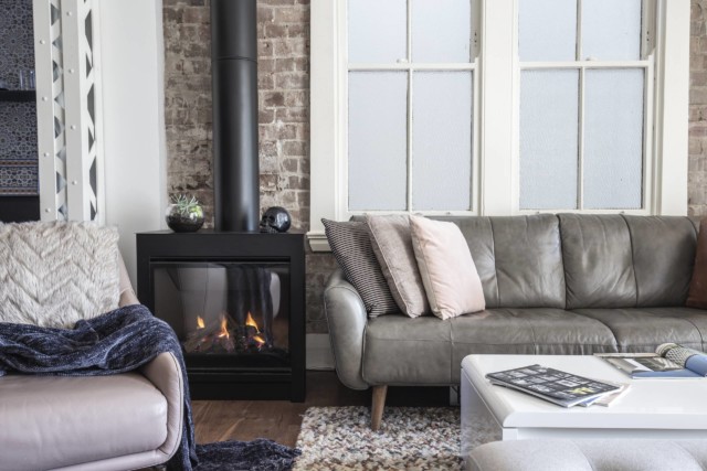
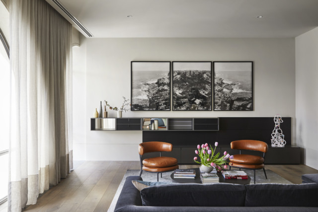
Upsize furniture & artwork With many people downsizing from larger homes into apartments, Neale says that many people wrongly assume they must scale everything down and fill the space with smaller pieces. “This creates a doll’s house effect where because everything is smaller, it creates the illusion that the space is smaller. To create a feeling of space, it’s far better to upsize and have fewer pieces overall,” says Neale.
For instance, rather than opting for a two-seater in the apartment pictured, Neale chose a 2.5-seater as well as an occasional chair, ottoman and set of two complementary coffee tables from KING. “This apartment really isn’t that big but choosing larger pieces made it feel that way,” says Neale.
Lounge room
And this idea holds for art and mirrors too – upsizing both not only draws the eye up but makes a space feel instantly larger. “Basically, when in doubt, go bigger as it will allow a small space to feel like a large one,” says Neale.
Create distinct zones Whether you live in a house or apartment, most of us are familiar with open plan living and understand the pressure to create specific living zones – this tension is amplified with apartment living but Neale has some practical solutions.
“In this apartment I used contrasting rugs to delineate the dining and living zones, but I also like to use room dividers where possible,” says Neale. The designer used the KING Vertio wall unit as part of the design – in this case it was wall mounted but the design can be used as a freestanding room divider. “A room divider creates distinct zones within an open plan area while giving you extra storage and display areas too,” says Neale.
The KING Vertio unit can be seen on the left. Artwork by Kerry Armstrong.
Multifunctionality “With people spending much more time at home, all of us are seeking greater functionality from our houses and furniture items that double up are at a premium,” says Neale who explains that this is even more pressing when living in an apartment. Great multi-tasking furniture items include the aforementioned room divider as well as gas-lift storage beds. “KING has some great sofas and desks with built-in phone chargers too,” says Neale.
Neale included a multipurpose study nook in a recess in the apartment’s hallway.
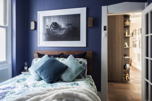
Embrace the full colour palette – not just neutrals When it comes to your colour and materials palette, don’t assume that you must revert to white and bright. In this apartment, Neale chose a medley of colours inspired by the Australian landscape – rusty red, terracotta, greens and brown.
“There’s a lot of rules about compact spaces that don’t necessarily make a lot of sense. You don’t need to limit yourself to neutrals and blonde wood to make things feel bigger,” says Neale who used dark timber and a moody contrast wall in this apartment also – neither of which made it feel smaller.
The master bedroom features a moody contrast wall. Artwork by Daniel Butterworth.
The master bedroom’s contrast wall is painted in a Porter’s Paint tone that sits somewhere between dark grey and dark brown. “Again, it’s counterintuitive but that dark tone really made the room pop.”
After formal graphic design training and a stint in fashion marketing and PR, Auckland native Beck Wadworth noticed a gap in the market and launched her stylish stationery business An Organised Life. “When I moved to Sydney a few years ago, I wanted a diary but couldn’t find one that was functional yet complemented my monochrome and minimalistic aesthetic,” says Beck who sells a range of diaries, journals and wall calendars through retailers and her own e-commerce site.
Beck in her home office
And while it’s worth mentioning her gorgeous product range, today we’re going to step inside an extension of her brand – her home in Auckland where she has been located since the Coronavirus pandemic began. “My team is all based in Sydney at our headquarters. Prior to COVID-19, I spent three weeks in Auckland and one week in Sydney per month,” says Beck who has been working out of her gorgeous Auckland rental ever since the pandemic kicked off.
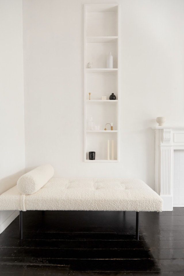
Lounge room
Beck’s apartment is one half of a two-storey, traditional weatherboard house with water views that was built in 1900 before being separated in two. With dark timber floors and plenty of white, it’s filled with a stylish curation of furniture and homewares finds that are perfectly on-brand.
Dining room
“My interior style is very minimal, relaxed and pared back. I love fresh white walls, wooden floors and I prefer to add texture and tones rather than lots of colours! Less is more for me,” says Beck who is also a big fan of investing in pieces that merge form and function. “I favour pieces that serve a functional purpose while fitting within my aesthetic.”
Perhaps the best example of form meeting function is Beck’s home office – a space that has been in heavy use courtesy of countless Zoom meetings with her Sydney team. “My home office is very functional yet motivating and I love that I can close the door at the end of the day and separate my personal and professional life,” says Beck.
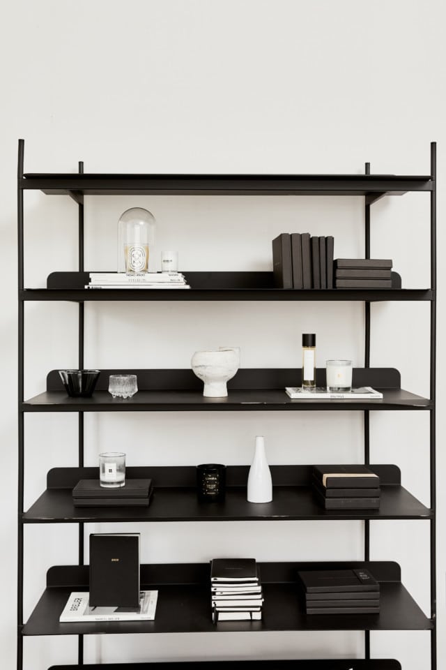
Beck’s office is home to this chic, very organised book shelf
The nearby lounge and dining room are another highlight of the home – a key piece in the space, the Minimalist Emilee daybed was designed by Beck in collaboration with furniture designer David Shaw.
Beck co-designed this gorgeous daybed that’s upholstered in a textured ivory jacquard by Warwick
“I’ve always loved being at home! Home is my safe haven, the place that I feel the most comfortable and relaxed.”
Balancing a growing family, a new job and a renovation is no small achievement. Further complicate that with heritage restrictions on a company titled property and competing design objectives in a compact space, and you have a truly acrobatic undertaking.
Such was the challenge facing Spanish interior designer Jesus del Toro and his family as they embarked on the redesign and build of a 1920s Walter Leslie Nielsen apartment in inner-city Sydney. After months of open houses and budget-busting auctions, and having reluctantly abandoned their hopes of finding an affordable home near the beach, Jesus and his wife Agnes were charmed by the central location and Art Deco setting of an elongated unit in Potts Point with views of St Mary’s Cathedral and the CBD skyline.
Jesus del Toro’s family of four are loving life in their tiny Potts Point apartment
The apartment was in sore need of renovation, however, with a dated, compartmentalised layout that squandered the abundant natural light. And, bound by exacting heritage conservation regulations, the task of adapting the space to the needs and tastes of a modern family of four promised to be challenging.
“This unit was not in our brief for house-hunting,” says Jesus. “We were looking for something completely different. But this was very eccentric, urban, well-connected, and we were excited by the classical style and also the potential to do renovation works.”
The old, early thirties layout was dark with one long corridor and single rooms. Moreover, the kitchen was designed as a cubicle to be occupied solely by household staff, and the bathroom needed decades worth of updating.
“But there was huge potential to turn it into something awesome, to flip it around and make it contemporary, while respecting the existing features and empowering them with new ones in the same style,” Jesus explains.
Even with the freedom to rearrange the layout, the task of how to coax all the needs of a young family out of an 80sqm space remained complicated. For Jesus, however, finding resourceful solutions in limited spaces was a familiar challenge. “In my house when I was growing up, we were nine people, including my four older brothers and two grandmas. That means everything inside the house needs to do two or three things. My room was shared with one of my older brothers. I still had my little desk for studying, which doubled for table tennis and foosball. My mum or my grandma was, usually, doing the ironing or the washing in there too. It was a multi-use sort of room, with fold-down beds.”
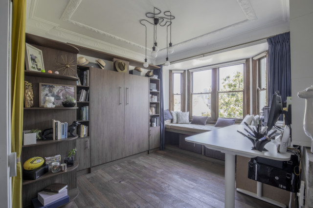
Unsurprisingly then, Jesus’ design included a number of occasional or versatile areas: “In the living space, we have a day bed, a massive standing desk and a library. Here we dry our clothes, practise yoga, play soccer, do ballet, play the ukulele, perform theatre acts for the kids and even take salsa lessons!
“Even though it may seem a little bit scary to have such an open plan home and not be able to have your own space, it is surprising how many little spots you can be in by yourself or as a family in the exact same way,” he observes. “You don’t even realise that it’s the space doing that for you. Plus we get the advantage of having the Art Deco designed glass doors with blackout velvet curtains, blocking visually and acoustically as needed.”
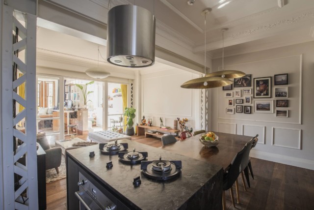
As well as pairing the constraints of the unit with the needs of his family, Jesus wanted to preserve as much of the building’s heritage flavour within the apartment as possible, sustaining elements from common areas in the unit’s interiors. From the preference for pendant lights over downlights, to the French panelling chosen to match existing cornices and ceiling bands, the rich details of the Art Deco era peek through an otherwise more contemporary, pared back aesthetic. The ensemble is completed by a lashing of industrial texture, courtesy of the exposed steel trusses of the portal frames with their Harbour-bridge evoking lattice steel motif.
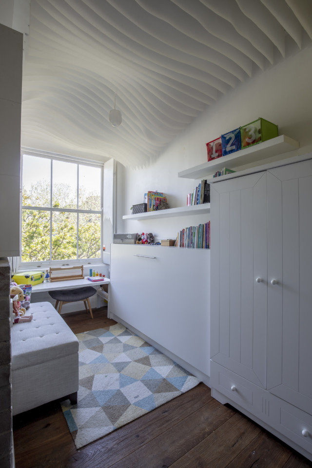
Storage has also been carefully considered and integrated wherever possible beneath or behind furniture and joinery, and the family tradition of multi-functional spaces lives on. Their four-year-old daughter Noah’s 8sqm play area morphs into her bedroom with a wall-mounted fold-away bed. The home’s spaces comfortably satisfy a variety of functions, with the added advantage of promoting an intimate, convivial environment.
Jesus was also committed to preserving a sense of fluidity and play in the apartment, especially in his daughter’s room. He chose to experiment with the ceiling, and developed a simultaneously sophisticated, simple and economical decorative feature in the form of hanging sheets of paper arranged to create a flowing, wave-like effect.
“It adjusts its height to the shelving edge. It reacts to where the lamp is. It adjusts its curvature to the window to allow more light in. It’s one of those little exercises that is in fact really inexpensive. It’s just paper and Blu-Tack.”
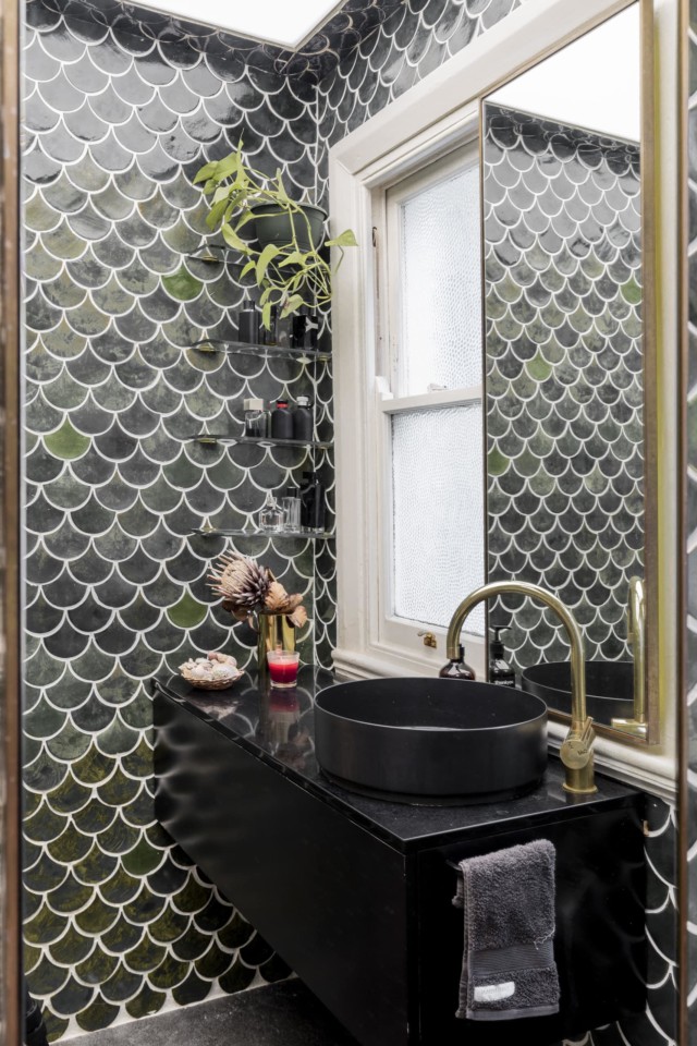
The ceiling feature’s affordability and ease of execution, however, are contrasted by the masterpiece that is the bathroom! Riding a wave of creativity and inspiration, Jesus recalls how one morning he was browsing designs for tiles, frustrated at their prohibitive cost. Deep in a YouTube tile-manufacture-video rabbit hole, he was surprised to see how mechanised the allegedly ‘handmade’ process was. “They were absolutely spotless and perfect, as if they were manufactured by a machine,” he criticises. “It didn’t have the impression that it was actually made by hand.”
He remembers thinking, “I don’t have the budget but I do have patience”. So was born a DIY tile-making project that would see Jesus, his family and friends hand-make more than 3,000 glazed, fish scale tiles over the course of 15 weekends – including preparation and testing of clay, glazing and moulds. And, while at times he questioned his initial enthusiasm, the end result speaks for itself: the bathroom nestles among walls clad in the cool, mossy green tiles, each slightly different to the next, carrying in their warp and weft the story of their origin. With a wry smile, Jesus reflects: “It was a much more lengthy approach. It was absolutely, totally worth it.”
With its blend of modern and heritage, work and play, and its deceptive ability to accommodate a multitude of activities and moods in a limited space, the apartment is a role model for how we might intelligently and happily embrace inner-city living – an ever more pressing aim as more of us grapple with the demands of working from home. Coupled with Jesus’ attention to detail and investment of personal creativity (and time), this compact home is ready to host many years of comfortable, beautiful family life.
Heritage home brought back to life for family living
This Federation home on Sydney’s lower north shore was in a bad state when Jon and Nikki Moss bought it in late 2015. But you’d never know it now, looking…
“I love contemporary design overlaid on a historical backdrop,” says retail designer David Cook-Doulton who, together with his partner Martin Shew, is responsible for the gorgeous overhaul of this grand…
Chic Perth heritage reno a seamless blend of old & new
The heritage home with modern extension, is certainly not a new concept. Regardless of heritage restrictions, many a run-down old character home has been lovingly restored simply because people love…
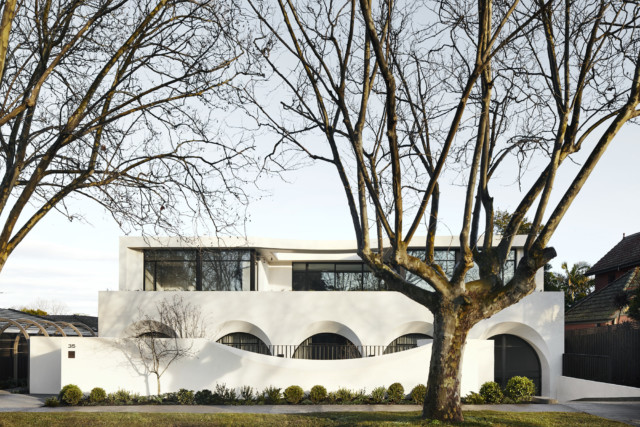
Affluent Melbourne downsizers are certainly spoilt for choice these days, a situation that has been underscored by the arrival of the Huntingtower Road development. A boutique development of 10 residences located in the leafy suburb of Armadale, the gorgeous apartments are framed by a series of sculptural archways that pay homage to classical Italian loggias.
To the passer by, Huntingtower Road looks like a singular house
“Huntingtower Road has classical proportions with a contemporary edge. This is best expressed in the classical, rhythmic flow of the series of arches, which are contemporised by the purposeful deep carve to their form. The way the light plays on this form is very pleasing,” says Mat Wright of Jolson architects.
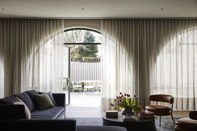
Lounge room: The arches look equally as beautiful from inside
Covered in a textural render on the outside and a smooth finish on the inside, the curves bring a softness to the overall design. “For this project, the soft curves and splays, and the way the light falls on them, informed a lot of the interior details,” says Jolson’s Mat Wright.
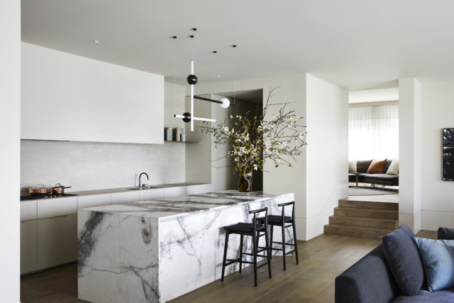
Kitchen
Said interiors are equally stunning; neutral, soft and textured they have a timeless feel. Each apartment boasts elegant three-metre ceilings, large living areas, stone fireplaces and an upscale materials palette including natural oak floorboards and marble. There’s double basins, deep-set freestanding baths and custom-designed joinery in the bathrooms while the kitchens boast three-metre-long island benches finished in luxurious Cȏte D’Azur marble.
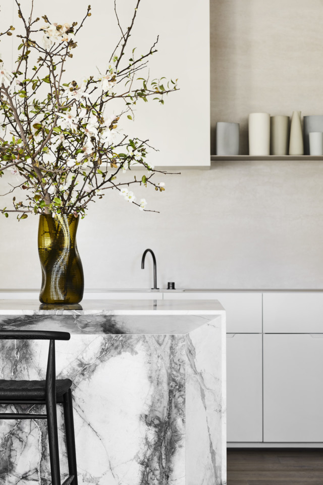
Look at that gorgeous marble!
Other sumptuous details include custom perforated wall sconces that house the exterior lights, curved steel-framed glass windows under the archways and Poliform walk-in-robes custom to each individual residence.
Lounge
Bathroom
With the gardens so integral to the design, the developer Orchard Piper engaged landscape architect Myles Baldwin to design the green spaces. Each plant species has been specifically selected to provide texture and contrast; vines and creeping figs are paired with 20-year-old Dogwood trees for a classic feel.
“It’s a planting scheme that was originally developed from my background working with the Royal Botanic Gardens. Essentially, it’s a contemporary spin on a planting style inspired by the ‘gardenesque’ aesthetic – the grand mid-1800s planting style you would find throughout Europe,” says Myles Baldwin.
The low-maintenance gardens have an understated, classic feel
And while the gardens pack a visual punch, they are purposely low-maintenance in order to complement the projected occupants’ desire for a lock-and-leave lifestyle. “The gardens can’t be overly manicured or tended to, we wanted to rely on the natural form and habit of the plants to provide the aesthetic; nothing forced. Downsizers who might’ve experienced having a large garden don’t want it to be a chore. This was very much considered in the design.”
Photography: Sharyn Cairns | Styling: Tamsin Johnson
Former Melbourne property stylist now styles homes for living
After eight years of styling homes to sell, Melbourne interior stylist Kylie Tyrrell decided she would much rather style spaces to live. “If I had to dress one more bed…
Georgia Duncan may be a stylist but that doesn’t mean her own Melbourne home is picture perfect at all times. And she’s totally okay with that! Living above her favourite coffee spot in the middle of Richmond’s high street, she has surrounded herself with objects that she holds dear while also managing to keep things clutter-free.
And, most importantly, how her home makes her feel is everything to Georgia, who lives there with her partner Jack and their dog. “It is by no means perfect and never will be, but I love it.”
They’ve lived in the 2.5-bedroom 1880s above-shop apartment since 2014, renovating one of the bathrooms, replacing lights and painting throughout.
Georgia’s home studio space
Georgia describes her style as eclectic, calm and in many parts ‘half-minimalist’. “I like to layer pieces within my styling work, however at home, I find I really need the space to be organised and clutter-free! Especially when the same four walls are staring back at me 24/7 (hello 2020)! It is vital that I feel relaxed in my home.”
The studio
She adds: “I am very lucky to have some amazing storage; this is a game changer. I have lots of indoor plants and bringing the outdoors in does so much for your mental health! And I am never without a fresh bunch of flowers; they add colour and vibrancy to an otherwise simple space.”
The 28-year-old surrounds herself with special pieces, some with sentimental value and some which she has collected because she loves and appreciates their design. “My mum passed away when I was 13, and prior to that, every birthday she would give me a keepsake item. Because of this, I have artwork, vintage meat-safes, an antique Japanese writer’s chest and other things.
“I inherited the chest of drawers in my bedroom, which my mum moved out of home with at around 20 years old. My desk is a kitchen table which was my great aunt’s farmhouse table, and my dining table is the one I grew up eating around. Most of my artwork I have had re-framed; new life into gorgeous older pieces inherited from my maternal grandparents and my parents.”
Other favourites include a set of secondhand Cesca dining chairs, her Melbourne made Heimur bed base and an Objekto Paulistano armchair from the days when she worked at Hub Furniture. The Aboriginal art in her bedroom was bought while visiting her brother in Alice Springs.
While the character of the apartment, the first home she’s owned, has dictated how she has decorated, Georgia says she was lucky she already had so many vintage pieces. She loves its high ceilings, fireplaces and spacious rooms.
“The pieces I have added in are all classic, yet fresh and fun, and in many cases, in keeping with what I already own. However, with the bathroom renovation I went all out modern for a harsh juxtaposition. I hope to put a rooftop on soon, and do a similar thing.”
As someone who dislikes driving, living on a high street suits Georgia down to the ground! “Being able to roll out of home, to the cafe, supermarket or bar is heavenly! I am also known for my ability to sleep at any stage, so the hustle and bustle below my bedroom window doesn’t bother me.
“I like to think everyone feels welcome here. I have friends all over the city, making my home the perfect central meeting hub. I love being safely curled up in the comfort of my home and knowing there is so much happening just downstairs. FOMO is rare here!”
Georgia Duncan
Georgia studied Interior Design at RMIT but found that styling was her favourite part of the process. “I love everything to do with architecture and design, but it has to be the icing on the cake; the final finishings, styling and sourcing of objects, art, soft and hard furnishings, that I absolutely adore! I work a few days a week from home, and usually on a few photoshoots in one week.
“My home workspace is simple. I need it to be tidy and simplistic so I can spread samples and ideas out everywhere for specific projects and not be sidetracked by other objects and colours. I have a cabinet full of props right next to my desk, and a little reading nook, where I catch up on all my favourite magazines and blogs.”
Along with Jack, a builder, Georgia dreams of one day buying and renovating a ‘shack’ or farm outside Melbourne. “I fancy the idea of growing flowers, a vegetable garden and chooks, but not too much land that we can’t look after. I dream of my own studio, storage for all my props and he dreams of a shed full of all his tools and toys to make the reno happen!”
But for now, they’re more than happy living the inner city life.
Georgia’s tips for making your home FEEL nicer
There is something about natural light. You cannot create it. If you do not have a lot of it, fill your home with mirrors, light objects and warmth in textures and colours. I am so lucky that my home is north-facing in the Southern Hemisphere (this is by no means an accident; it was a must on my list of house non-negotiables).
Where possible, do not purchase pieces that are ’on trend’ and very importantly (if you ask me) invest in pieces you will keep for a long time, not for yesterday and today. And do invest, although I don’t shy away from an IKEA piece as needed! Only purchase pieces you really love.
In terms of comfort, I do not want to be too obvious, but ensure your home is welcoming (both for you and for when guests are allowed to visit)! I often have a scented candle lit, a fire in winter, fresh flowers, a cuppa or glass of wine on hand and without a doubt can whip up a platter without much notice!
The current Melbourne lockdown has made Georgia appreciate her home more than ever. “I am so fortunate to have a roof over my head at minimum, and not just a roof but a space I feel both safe and comfortable and also love to be in.
“Do not get me wrong, it has taken me the five-plus years I have lived here to create this. I am a strong believer in creating a home. As humans we move into a house, and over time you turn it into a home.”
Photography: Emma Pegrum | Styling by Georgia, assisted by Emma Hirst (Phy Design).
Sentimental homes: why they can make us happier
Interior designer Sarah Yarrow, believes that displaying sentimental objects is important and can have a positive affect on our wellbeing. And we wholeheartedly agree! Here, she shares her tips: Why incorporate sentimental items…
While lockdown got us all talking about working from home, home office and study nooks had already been an increasingly sought-after feature for some time. With many of us living in smaller spaces these days, creating a home office that doesn’t take over an entire room, is a great option. Here, we round up some great examples.
Photos: Sue Stubbs
Interior designer Kate Maguire designed this space (above) to be a part of the joinery in the family room of her own Sydney home, as they don’t have a separate office space. “It is tiny but mighty and functions very well, though it doesn’t usually look this tidy! I use it every day, as I work and study from home.”
Previously Kate, of Kate Maguire Interiors, had a hutch desk in the same room, but admits it didn’t look or function half as well! The joinery was part of a larger renovation, making the home a lot more functional in general.
Kate’s expert tips for creating your own office nook:
Think about how you plan to use the space and make sure you consider everything. Not pictured is my big ugly A3 printer, which is essential for my work, so I had to make sure that the desk area would be big enough for me to work comfortably and still have space for the printer to live.
Consider the placement of powerpoints and IT equipment. This will help to keep the space tidy and clutter-free.
Shelving with baskets, as well as drawers, helps to give everything a place, which again makes it much easier to keep the space tidy.
Task lighting will help to make the space more comfortable to work in.
Apartment dwelling forced interior decorator Briar Stanley, of Sunday Collector, to get creative with storage in a previous home, where she created this office nook:
Photos: Jacqui Turk
When renovating the kitchen, she had the extra cupboards added for all her work samples. They sat alongside a handy desk nook with pocket doors that hid away the clutter when she didn’t want to be thinking about work.
Fellow apartment dweller Ellie Jeffery, says her husband thought she was slightly mad when she suggested this office nook when they renovated their laundry!
“I’ve been watching a lot tiny house tours on YouTube and I love the concept of having multiple uses for a room or piece of furniture. It makes perfect sense, particularly when you live in Sydney and real estate is so expensive! So when we decided to redo the laundry, I thought it would be good to make it as versatile as possible. A study nook just made sense.”
Ellie lives on Sydney’s Upper North Shore in a two-bed apartment with her husband, young daughter and another baby on the way. The office nook was completed just as lockdown began. “It was great timing. I will definitely be using it going forward. I usually work a day a week or so from home.”
The financial controller has also set up her dining room to do double duty as a playroom, making their home work for their growing family. “Having watched all the amazing things you can do with a tiny house, I definitely don’t think it’s necessary to dedicate a whole room to one use. One of the working from home tips I see frequently is to pack away at the end of the day. It’s so easy to do that with my study nook and it does help me switch off.”
Belinda Rosenbaum painted the mural in the study nook for her girls, below, which was created by cabinetmakers J and K Badewitz:
“Our little house in Merimbula (a holiday shack in its previous life) is pretty tight on space so this was like adding a whole new room!”
Shelley Boyd’s home office (below) is tucked under the stairs. “It’s a great use of dead space which has been turned into a room of its own. My advice for utilising spaces like this is to introduce storage options so that paperwork and mess can be moved out of eyesight. Lighting is also important for both practicality and atmosphere. My space has lots of natural lighting as well as a statement desk lamp.”
The Boyd Blue owner says: “I am inspired by bold colour, texture, tone and hand crafted finishes and my office is filled with samples, inspiring images and an array of knick-knacks I have collected from various travels across the world. My fur babies Hugo and Daisy are never far away and I love the company they bring.”
The last three examples below, are by Brisbane interior design duo Anju Designs, who are experts at getting the most out of smaller homes.
Incorporated into the custom joinery with floating shelves, this study area works beautifully adjoining the kitchen and dining area, and provides a generous workspace in a two-bedroom apartment:
The architecture of this bedroom allows for the perfect little study nook. A small space with lots of natural light, and great use of an area that otherwise would have had no purpose:
This study nook utilises a walk-through space adjacent to the kitchen which leads through to the laundry. The built-in shelving provides ample storage space but by keeping it open, the area still feels light and spacious:
So, if you thought you didn’t have space for a home office, it may be time to think again!
Small space design ideas: a beautiful apartment reno
Size, as they say, isn’t everything, and Anju Designs made the most of every inch in this stunning Brisbane apartment makeover. We take a closer look at all their clever…
Kerrie Hess: Illustrator’s chic home office
The creative tools are never too far away for illustrator Kerrie Hess who let us take a peek inside her chic home office recently; an ultra-feminine, largely monochrome space that…
Working from home? Interiors experts share tips
By Lexi Kentmann As many of us make the shift to work from home, potentially from a busy household bustling with both kids and adults, we’re looking for ways to…
Beauty influencer Leigh Campbell, as you might expect, has a lot of skincare! So the original seventies bathroom and ensuite that came with her apartment weren’t cutting it. The overflow had to be kept in baby Alexander’s room! But her new bathrooms are storage heaven and a lot more stylish!
Managing to combine husband Rich’s industrial taste with her love of Moroccan/Turkish vibes, they’re serene but small spaces, where every inch has been maximised. Leigh splurged on handmade Moroccan feature tiles and saved on Bunnings tapware to achieve the reno, which wasn’t really in the budget.
“The original bathrooms were typical of 50 years ago: cream mosaic tiles (not in the good way), thick frosted glass shower and tiny vanities. Storage was dire,” says, Leigh who is executive editor at Mamamia, where she presents the very popular You Beauty podcast. When Leigh reviews makeup and skincare, whether it’s budget or luxury, people sit up and listen! But buying a home when you’re 37 weeks pregnant and then moving in with a newborn, isn’t something she recommends!
“We renovated the kitchen right away because it was unliveable but hadn’t planned on doing the bathrooms so soon after. Then we were heading overseas for a wedding so figured it made sense to do them (and the laundry) while we were already going to be out of the home and the cats would be in boarding. Two birds with one stone and all that.”
“I really needed a lot of face-level storage. I kept asking for it to be bigger! Before we renovated I had secondary storage in my son’s room. He’s one now and accumulating ‘stuff’ of his own so I really needed a proper solution in the bathroom.”
They moved the toilet in the main bathroom so they could accommodate a bigger vanity and also changed the separate bath and shower to a shower over bath. “Not the chicest option but good for resale and the spot for the bath before was simply too small.” Leigh couldn’t handle the thought of cleaning behind a freestanding tub, but getting rid of it altogether was never an option as she enjoys a relaxing soak.
Beauty cupboard goals!
While Rich definitely had a say in the reno of the three-bedroom apartment in Sydney’s Randwick, he left most of the decisions to Leigh. “He stopped me when I wanted a teal concrete sink though, so I knew my limits!”
If the reno newbies had their time again, they’d have done the kitchen, bathrooms and laundry all in one go, before moving in, for cost and consistency. “Renovating when the apartment has your things in it is not ideal. I am still cleaning dust off surfaces, mostly inside my wardrobe, every single day,” Leigh, 38, says.
The improved storage has been the best improvement to the functionality of the bathrooms, and a bigger bath to bathe Alexander too. And while those handmade feature tiles were $200 per sqm, Leigh says they make her heart sing and you can’t put a price on that! “All our matte black tap ware is Mondella from Bunnings; really good prices but still with a 10-year warranty, which was important.”
The Concrete Cloudburst Ceasarstone vanity tops with their textured finish, are another favourite element. Leigh no longer cringes every time she takes a shower, and her evening bath has become much more enjoyable and spa-like.
When it came to the laundry, she had the ingenious idea to incorporate a built-in kitty litter for her two much-loved cats. “Before, we had a huge plastic dome in the laundry for their kitty litter. Not chic. When I was designing the space, I opted for a shallow basin so I could fit their toilet underneath. A doggy door was cut into the cupboard door and there you have it: a built-in kitty toilet.”
While the multitude of decisions can make bathrooms one of the most stressful rooms to renovate, Leigh’s a woman who knows what she wants, and the hardest thing for her was actually wait times. “That’s a lesson learned for next time.”
With everyone likely to be spending a lot more time at home in the near future, we want to help you fall in love with your space. We’ve put together…
Small bathroom ideas: An incredible before & after
Home to Pinterest partner manager Kim Hollis, is it any wonder that this luxe Sydney bathroom renovation has serious design cred? But creating a moodboard was just the beginning of the…
5 plumbing tips for small bathroom renovations
A plumber only plays a small part in a bathroom renovation. But the plumbing in a bathroom plays a vital part, because if it’s not installed correctly it can be…
Concrete and brass bathroom update is luxe and warm
Nestled in the Sydney coastal suburb of North Curl Curl, this 20-year-old bathroom got a stylish upgrade recently by interior designer Deanne Crowther, of Bathrooms by Oldham. And while there…
Size, as they say, isn’t everything, and Anju Designs made the most of every inch in this stunning Brisbane apartment makeover. We take a closer look at all their clever tricks as they share their top tips for achieving the most from a small space.
The brief for this project was to make the most of the space available, and to keep the aesthetics very current and in keeping with the local Teneriffe area. The apartment is long and narrow and was previously quite dark. By using a minimal and beautiful palette of materials, mother-daughter design duo Penny Middlemiss and Rebecca Reiken have made it feel a lot more generous than its 115m2.
“It was compromised by low ceilings due to a large bulkhead that ran down the centre of the kitchen and living, with only one row of lighting in it,” Penny says. “We removed the scotias and bulkhead, then added a 50mm drop ceiling throughout the entire apartment, giving a feeling of added height and allowing us to add LED down lights throughout.”
Penny adds it’s a misconception that small places should have smaller joinery and furnishings. “This often makes the space look smaller, usually the opposite of what they are trying to achieve. We would normally oversize objects such as joinery, rugs, artwork, mirrors, and add items like lamps.
“There was no room for a traditional dining setting so we made the most of every inch and incorporated an extensive island bench in the kitchen with plenty of storage and room for seating. The kitchen then becomes the focal point of the home.”
The pair created the feeling of space in the kitchen by keeping the colour scheme light and fresh with an industrial edge. “We used open shelving, along with great lighting – including a lot of low level lighting to brighten and open up the space,” Rebecca says.
“The use of a continuous stone splashback and a beautiful stone double waterfall-ended island bench adds to the seamless effect. All the appliances were integrated which included a pantry with retractable sliding doors to hide the everyday appliances such as coffee machine, toaster, kettle and other go-to items. All these integrated appliances gave very clean lines to a stunning kitchen.”
When working with a small home, Rebecca says it is so important to select the correct appliances to fit your client’s needs and space. “We were able to incorporate a double set of ovens, which is often not possible in such a small space, but by incorporating a Siemens combination oven/steamer and a Siemens combination oven/microwave we were able to meet our clients’ needs as they love to cook and entertain. We were also able to include an oversize Fisher & Paykel refrigerator by integrating it, again adding to the seamless effect.”
The main bathroom had no natural light so they installed mood lighting, as well as LED lighting behind the mirrors, for makeup application. A frameless shower screen helped to visually create a feeling of spaciousness.
In the master bedroom, they designed a custom built-in bed, with storage below, in the side tables and in cupboards surrounding the upholstered bedhead. “We really maximised all of the space we had and in the process and created something a little different and quite beautiful,” Penny adds.
The other space that was a high priority to maximise in this apartment was the balcony. “Our clients wanted if to feel as if it were an extension of their living area. So again we custom-designed a built-in BBQ area which included an integrated cool drawer, and a remote controlled pop-up television. Their small apartment is now an entertainer’s dream!”
Rebecca adds: “Overall the apartment now feels light, vibrant and contemporary and our clients love their new home.”
Anju Designs’ top 5 tips for making the most of small spaces:
1. Keep colour schemes light and minimal.
2. Incorporate appropriate lighting as this sets the right mood.
3. Be creative with storage solutions.
4. Integrate appliances where possible.
5. Don’t be afraid to ‘oversize’ when it comes to joinery and furnishings.
Penny Middlemiss and Rebecca Reiken are experts at making the most of small homes
Melbourne interior designer Emilie Smith is on a mission to inspire people to furnish and decorate their homes with confidence and intention. Her latest work features in the newly developed East Brunswick Village (EBV) apartments and is big on locally made. And the great news is, you can shop the look online from home!
Emilie’s approach to interiors is considered, resourceful and creative. The furnished apartments display nuanced living spaces that feature personality and good design sense, as well as handmade details created by her on site.
For example, the handmade slipcovers on the couches were made at the kitchen islands in the apartments! In the kitchens, there are also knitted potholders handmade from local yarn – a pattern Emilie has developed so that others can create their own potholders at home.
“Furniture will be from local makers, craftspeople, antique and secondhand shops like Immy + Indi, Nord Modern and Hope Street Space, among others. It’s so important to support their businesses, especially during this time of uncertainty.”
One striking artwork is by local Robert Hague as part of his plates print series. The same print is also an impressive seven-metre work pasted to the side of EBV.
And some timely advice for us all staying home right now, Emilie says: “A well-executed interior can influence our emotions, shifting our mindset. The spaces we inhabit can build us up and support our daily lives.”
Her top three interior design principles:
1. Don’t discard old furniture in favour of the new and shiny. Bring in that old, shabby couch and purchase some beautiful fabric, and make a simple slipcover.
2. Display treasures and mementoes from your travels. That rug from The Silk Road, your Japanese kimono and your Moroccan vase can all have pride of place.
3. Purchase new things you’ve been dreaming of and lusting after. Think luxurious linen, uniform storage baskets throughout, or the perfect dining suite. If you’re buying new, consider handmade before mass-produced. Handmade doesn’t have to equate to more expensive.
–-East Brunswick Village is a new village to call home. Construction has commenced on a modern community where sustainable development, urban living and home comfort take precedence. Located only 6km from Melbourne’s CBD, EBV is bringing the best of apartment living to the city’s vibrant inner north.
There aren’t many modern designers more revered than Britain’s Tom Dixon. The British designer, perhaps best known for his iconic round copper pendant lights and table lamps, has a distinct aesthetic that’s certainly resonated with people across the globe. And while he is involved in many architectural projects globally, never before has he created something in the Australian residential space. That is, until now.
Melbourne’s Tom Dixon designed luxury apartment complex, Rondure House
Based in the Melbourne suburb of Kew, Rondure House is a high-end residential apartment development that will sit in the Studley Park precinct of Melbourne’s Kew. The project will come to life through a partnership with Dixon, as well as the acclaimed Australian firms Cera Stribley and Eckersley Gardens. Melbourne based property developer Above Zero is driving the project.
“With our shared appreciation of brutalist architecture, high quality materials and rough textures, we are delighted to partner on this unusually high quality and well thought out project and believe we can add a series of innovative interventions in luminosity, texture and comfort to a world class project,” says Tom of the project that will house 14 apartments including a whole-floor penthouse.
Interior
Brutalist design aspects feature on the building’s exterior where off-form concrete hyperbolic concrete columns serve as both decorative and structural functions – the effect being almost organic. And there’s hand-made bricks recall the 1960’s where materials were minimal and long-lasting.
“To celebrate this milestone, we will be delivering bespoke features across the residences, communal spaces and lobby including yet to be released furniture items. Our intention is to deliver an exceptional experience for future residents. From the building entrance to the proposed customisable furniture in each apartment – each detail is considered,” says Tom.
Balcony: Large open and expansive gardens can be seen from each apartment
Often forgotten spaces (from a design sense), the lobby and communal spaces have been particularly well thought out. Residents will be greeted with a grand lobby and art gallery on the ground level as well as the Tom Dixon designed and furnished Opal Bar & Lounge where residents can enjoy a morning coffee or evening drink with guests and neighbours.
The Opal Bar & Lounge
Another unique aspect of the project is the creation of ‘vaults’ for each residence – these are privately titled multi-purpose rooms that are separate from each apartment and can be customised to suit individual preference. Each vault will be approximately 10 square metres in size and will act as an extension of each resident’s home – a place to escape or entertain. The design team imagines they will take the form of a private office, cigar room, wine or whiskey cellar, art or collector’s studio, private theatre or meditation room.
Rondure House will launch to market in early 2020 with private VIP display suite appointments for pre-registered buyers starting prior to Christmas this year.
With just 33 square metres to work with, architect Jack Chen has maximised every last centimetre of this 1970’s Melbourne apartment through a very clever renovation. And while small, Jack’s apartment really packs it in – it features a four-metre-long kitchen, wine store, sunlit window seat, green house and home studio area too!
Entry & lounge room
“I was renting in the unit below for over a year and this project came about to fix all the awkwardness I was experiencing while renting which included a tiny kitchen, a lack of sufficient daylight and lack of working space. This renovation addressed all of this and hopefully a bit more, and I now have a feeling of comfort and a place I can unwind in at the end of the day,” says Jack who lives and runs his architectural business Tsai Design from the apartment too.
Jack’s apartment features a four-metre-long kitchen
Working within the constraints of the original floor plan, the modest budget was poured into creating floor-to-ceiling, multifunctional cabinetry and wall systems created by a cabinetmaker that specialises in high-end hotels.
The apartment features a slide-out dining table
Three prototyped versions of the fold-down dining table were created to determine the best solution
The largest multi-tasking zone is the lounge room has been cleverly designed to transform easily from tv room to home office. Clever joinery hides a tv, flip-out desk, computers and filing area.
Lounge room mode
Office mode
And with its statement green wall and privacy film wall between it and the kitchen, the bathroom is a highlight of the home. “As the apartment has no outdoor space, I wanted to create an environment that gives the outdoor vibe, hence the full height green wall, various planting, and timber texture porcelain tile in the shower that creates an outdoor shower experience,” says Jack.
The view from the kitchen to the bathroom with the privacy screen off
“The green wall is made of preserved moss so there’s no maintenance required. It comes on cork backing in a 30-centimetre x 30-centimetre tile format,” says Jack.
A simple press of a button turns the the privacy screen on
The privacy screen between the kitchen and bathroom is the only change that Jack made to the existing walls – the opening was created to let in the northern light from the bathroom to kitchen. “It is a standard glass fixed window, with a privacy film on top of it. When activated the film goes from transparent to frosted to achieve privacy when required, and allows for a clear view of the green wall and daylight the rest of the time. Activation is by simple press of the remote,” says Jack.
Bedroom
And while Jack is proud of the overall transformation, he does concede that small living is perhaps not for everyone. “It is very easy to clutter up a small space, so you have to choose each furniture item carefully. But it’s important to have your personal items around too so the hardest thing is to strike the perfect balance.”
Smart multipurpose storage at the entry houses a helmet, shoes, wine rack and even an umbrella stand
Jack’s apartment will be open to view as part of the upcoming Open House Melbourne 2019 Weekend that is taking place on Saturday 27 and Sunday 28 July.
With property prices still relatively sky-high, apartment living is becoming the new normal in many capital cities. And it’s a trend that cuts through demographics. Whether you’re an older downsizer or a first home buyer, it’s a style of living that is on the increase as people are increasingly drawn to the affordability, convenience and amenities an apartment provides. And what has been interesting to note is the way in which apartment design has become more sophisticated in response and Steller’s Laila development in Melbourne’s Carnegie, with its ‘flexible space’ option, is a great example of this.
The flexible space can be set up as a nursery
Designed to give home owners maximum flexibility, all of Laila’s one-bedroom apartments include a flexible space that allows purchasers to choose between incorporating a butler’s pantry, study or nursery into their floor plan. The clever design is an affordable way for purchasers to add value to their homes while adapting to their own individual requirements.
“Design expectations for off-the-plan developments continue to rise as buyers become savvier about their home and how it needs to function. This flexible space component opens up a world of possibilities for our Laila first home buyers, downsizers and expecting families,” says Steller’s project sales and marketing director James Cirelli.
The room can also be set up as a butler’s pantry
“Where traditionally one-bedrooms have been favoured by young single buyers and downsizers, Steller’s flexible space component now means that young couples and expectant families can enter the housing market with an affordable product that caters to current demands but also offers room to grow,” says James.
The office option
“Each multipurpose space can be fitted out with a desk forming an office space, act as a second kitchen to offer more space for entertaining, or it may suit as a nursery for young buyers that want to start a family,” says James.
I’m sure many of you will remember the iconic Aussie drama The Secret Life Of Us and the fabulous Art Deco apartment building location where much of the filming took place. Well Hunting For George’s Lucy Glade-Wright loved it so much that it factored into her first real estate purchase – a beautiful two bedroom Art Deco apartment in the Melbourne suburb of Armadale that she renovated recently.
Lucy’s gorgeous Art Deco apartment building was recently restored externally
“My favourite thing about this apartment and also the main reason why I bought it, is its epic rooftop. As you can imagine, being a 20-something obsessed with The Secret Life Of Us, I thought that I had clearly found real estate jackpot! I used to hang out on the rooftop a lot, it is so peaceful up there and you get incredible views of the city. Whilst I thought I’d be having a ton of parties up there it was more often than not just me and a good book in the sun,” says Lucy of the heritage listed 1940 Art Deco building.
Lounge room leading to the courtyard
And with such great original features, Lucy didn’t need to do much to freshen up the home. “I kept styling to a minimum to allow the unique layout of the apartment to speak for itself but also on a practical level, to fully maximise the smaller spaces. To reflect the exterior Palm Springs aesthetic I decided to carry out a modern coastal theme internally,” says Lucy.
Lucy Glade-Wright
“This apartment had great bones and there was little I needed to do to improve it structurally. I focused more recently on cosmetic changes, namely new window furnishings to accentuate the gorgeous curves of the building and then in order to enhance the light I painted all the internal walls and replaced the light fixtures,” says Lucy who was active in the transformation of the stunning exterior of the building too.
Bedroom
“We were very keen to restore the building to its former glory, we’ve since painted and updated its colour scheme to be more in line with its original light colour. We also just completed the landscaping with a Palm Springs inspired garden at the entrance to complement the Art Deco nature of the building,” says Lucy.
Kitchen
“It is a very much loved building in Armadale and known by many of the locals, it was so wonderful hearing such positive feedback about the cosmetic restoration of the building from those that lived in the area. People seem to feel an attachment to this building, even those who don’t live here. It’s quite special in that way,” says Lucy.
The apartment is filled with gorgeous Hunting For George wares
A delve into the history of the building reveals a really interesting story that perhaps explains where the Australian affection for the Art Deco apartment block first began. “The properties that surround my building were once part of the extensive grounds of a mansion that was built in 1880 for C.J. Ham. Following his death in 1909 the estate was progressively subdivided into suburban allotments. As the demand for housing became greater, the development of flats increased, but there was fear that these residential flats were going to ruin the character of the suburb. So to counter the criticism, leading architects were employed to design these apartment blocks so as not to upset the local residents or ruin the charm of the area,” says Lucy.
The view from the building’s rooftop
Regrettably, after 10 years in the home, Lucy is selling. “I have so much love for this apartment block and I really hope that it finds itself a new owner who loves and respects it as much as I do. So if there’s any Art Deco fans out there that would love a piece of architectural history, this is it!”
With urbanisation and smaller living spaces on the rise, clever interior design and decoration that creates the illusion of more space has never been so important. While a smaller space may have its challenges, there are many ways to fake space with colour, which will make your apartment feel like a castle.
The size of an apartment and the abundance or lack of natural light plays a major part in your colour palette selection. Likewise, the direction your apartment faces as well as the era your apartment reflects will all influence your options.
Most people put off painting their house as they look at the whole picture and get overwhelmed before even starting. With an apartment, you can feel a sense of achievement quickly, as you only have to work with the interior, so the amount of time and money is significantly reduced. However, the same rules apply to apartments as they do houses – it is all about planning and preparation.
My seven commandments for apartment living:
1. Aesthetically speaking
The secret is to use rich colours to extend the visual width of a room. For example, a great way to get impact in a kitchen is to use a rich colour on the walls and use the same colour for the cabinets, creating a completely new personality. To achieve this, I like working with rich emeralds, aubergine and ink blues, and partnering them with metallic tones, granite or colours rich in earth tones, partnered with rustic timbers and exposed brickwork.
Paint colour: Taubmans Pleasant Hill
2. Tonal vs contrast
Smaller apartments call for simplicity but this doesn’t have to mean boring. Keep your palette for doors, trims, ceiling and cornices in the same colour family, and then select one main colour for the walls. When you get to the bedrooms you can be a bit more playful, but I recommend the same colour palette, with minimum contrast so it does not feel like a ‘jolt’ when you walk into the room.
Paint colour: Taubmans Rose Nude
3. Impactful over oppressive
Apartment living does not need to be about white and stark colour palettes, however too many contrasting colours and patterns can often take over a space. Make sure your colours have a white, grey or blue/green base as these colours reflect light and cool colours recede. Some of my favourite whites are Taubmans’ Crisp White, Akimbo and Cloudburst. Also, look at timbers that are either grey or lime washed or oak and pine to balance strong colours, as they add a natural warmth to the space.
Paint colour: Taubmans Violet Verbena
4. Making small look large
The trick is to connect the largest space in the room (walls) to the second largest impact space (the floor). To make the room feel larger, I like to connect similar colour palettes and make the skirting in that area the same colour as the wall, so that the eye travels from floor to ceiling, taking everything in as one big space.
5. Decorating approach for modern vs period inspired
The key here is to know what you are working with — modern apartment living requires minimal focus on trims, skirtings and ceilings and keeping the palette quite simple, with the addition of a couple of extra colours thrown in. On the other hand, interiors inspired by period styles often have many details, so in this case it is best to work out one main type of feature to highlight in colour so the room does not become visually overloaded. Decide which feature you want to draw your eye, for example feature panelling or cornicing, and go from there.
6. Decorating disasters not to be repeated
One of my pet hates is the common perception that apartment living needs to be treated as one big white box. Just adding a hint of colour to the walls can take the apartment from feeling clinical to full of life.
7. The three do’s
Formulate a plan, tackle painting in stages and focus on rooms as single projects.
–Shaynna Blaze appears on TV’s The Block, Selling Houses Australia and Deadline Design and is a brand ambassador for Taubmans.
With compact living on the rise, never has maximising small spaces been so relevant. Whether your square footage is by circumstance or by choice, Lounge Lovers’ in-house designer Jeannett Hojer shares how best to make the most of your small home.
Use mirrors and gallery walls
It might seem counterintuitive, but you can create the illusion of space by filling it up. Hojer suggests using both mirrors and artwork to create a gallery wall. Start as low as possible and work your way up– by utilising entire walls, it alludes to more space than there actually is.
Image: Patrick Cline for Lonny. Click for details
Not sure where to start? Choose a mirror as the central focus, then work the rest in around it. A good mirror will do two things for a small room; it will reflect natural light and the light from lamps and it will create the illusion of a wider, deeper space.
Make use of lighting
A small room with poor lighting can start to feel claustrophobic so if you want your home to feel bigger, make use of natural light whenever possible. That can be as simple as throwing open the curtains or the blinds as much as you can to allow your rooms to be lit with real light. If this isn’t possible, use floor and table lamps around the room to bounce light off the walls and give the room breadth.
Choose multifunctional products
At the heart of my designs is the customer, their everyday use of products and finding the perfect balance of practicality versus design aesthetic. This approach has seen me design many chic and stylish pieces, including sofa beds, ottomans and extendable dining tables.
The key to maximising space is not to overcrowd it. Multifunctional products – for example an ottoman that can be transformed into a bed or used as a coffee table – are the perfect choice for smaller living. It’s about being smarter with your space. Sofa beds are great choices for one-bedroom apartments as they can cater to overnight guests or visiting family with ease.
Lounge Lovers’ Hendrix sofa in Lavender
Give your space personality
Keeping your overall colour palette neutral will help to create the feeling of space, however a pop of colour will give your home personality – and that’s really what it’s all about.
A colour can give particular products their own personality. I love using colour to bring a bit of character to my pieces and when used in the right way, can really open up a living space.
Lounge Lovers’ Harriett sofa. Click for more info.
Whether it’s a piece of art, a throw or cushions or a statement sofa, don’t be afraid to bring some life to your room with a touch of colour.
And, in the bedroom?
A bedroom should be a calm, relaxing space, where nothing is too disturbing to the eye. Keep it simple and uncluttered – a tallboy over a dresser will lead the eye from floor to ceiling to visually make the room feel bigger and uncomplicated. Side tables will keep your room streamlined without being fussy.
If your bedroom is particularly small, skip the bed frame and get a base with legs. You can then use big pillows to replicate a headboard, and you don’t lose any precious floorspace.
–Jeannett Hojer is Lounge Lovers‘ in-house designer.
Designed by architects Woods Bagot and developed by Perri Projects, The Englefield development in Melbourne’s South Yarra not only looks super slick, it boasts home automation, personalised valet services and remote control technology too.
A render of how the apartments will look inside
Comprising seven penthouse-sized apartments that offer all the benefits and privacy of a freestanding home, without the upkeep, the development is a response to research that suggests that more and more people are seeing the benefits of apartment living.
“Our experience and research have indicated that there is a new demographic of purchasers seeking out luxury apartments in curated developments that offer convenience as well as space and privacy. These purchasers seek either two or three bedrooms, a study and a large outdoor entertaining space, in a low-rise, premium address that affords them the privacy they desire,” says Perri Projects Director, David Scalzo.
Technology-based features abound within the development where residents will be able to control their home’s lighting, cooling, heating and blinds through a smartphone. “This technology is currently already used in state-of-the-art luxury homes, but it’s rare to see it incorporated into boutique apartment developments,” says David.
The complex will also feature a unique valet service concept. Located in the lobby, each apartment will have its own valet store which will facilitate the private collection and delivery of items – think shopping and dry cleaning, cleaning, housekeeping and home maintenance. “Each year, the residents will select the service providers they deem to be the best in their area, and entrust them with access to the private lobby space to service the residents and their homes,” says David.
With lush landscaping and a high-end build, the apartments have been designed with three sides of natural light and soaring ceilings which increase the feeling of space and make them feel more like a freestanding luxury residence.
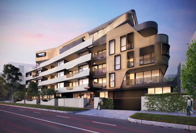
Initial purchase data from the Melbourne multi-residential project Alexa, has revealed an interesting new trend. With extra living space in mind, buyers are purchasing multiple apartments in the one development with the intention of creating one larger dwelling.
The Alexa exterior
“We don’t believe in providing ‘one-size-fits-all’ apartments. By providing a range of types in Alexa, we’ve allowed buyers to determine whether it’s a one, two or three bedroom that they’re after,” says Steven Langeveld, development director at Accord Property Group.
Expansive outdoor spaces
With one, two and three bedroom-plus-study apartments up for grabs and amenities such as multiple storage spaces, car parking and outdoor spaces, this development is a great example of thoughtful urban design.
We are swooning over those rose gold bathroom fixtures!
We’re particularly impressed by the fact that all ground floor apartments come with their own private outdoor terrace area of up to 75.3 square metres – a pretty generous size for inner-city living and ideal for pet owners.
Expansive living spaces prove apartment living needn’t be claustrophobic
We also love the imaginative exterior of the building – its organic lines and dark bronze paneling in particular. “The design was actually the reason the council granted two additional storeys to be built on top of the five storeys traditionally approved for this area,” says Steven of the building that was designed by Melbourne architectural practice ClarkHopkinsClarke.
Having not seen a lick of paint since the 1960s, the dated apartment in Sydney’s Neutral Bay was cold and uninviting. That was until Daniele Mantovani and Marj Silva of boutique interior design firm, Décor Project, stepped in.
“Our brief was to create an easy and comfortable space with plenty of display areas to show off our clients’ beautiful collection of indigenous artefacts,” explains Marj. “So we decided to keep the entire scheme very neutral to be the backdrop for all the art.”
While they let the beautiful objets d’art do the talking, they did add some drama in the living room, installing a custom wall unit and display cabinet. “The living room wall unit was our focal point for the space,” says Marj. “In this instance we had to push the clients outside their comfort zone but having their trust paid off with great results. This became everyone’s favourite feature in the home. Its simplicity, sleekness and scale is a great backdrop for all the colourful objects.”
[contextly_sidebar id=”cbInIFJQyFsBrKPutC3qrTLMofke6mNK”]Undertaking a cosmetic but expansive renovation, they replaced all the finishes and fittings including the flooring, wall colour, appliances and furniture and started afresh in the kitchen and bathroom. “The original kitchen was very dated and its layout wasn’t ideal,” explains Marj. “Despite being a small space it had to be functional. We decided on matte cabinet finishes for ease of cleaning and design longevity. And the marble was the starting point for the design, setting an elegant tone to the entire kitchen. Now we can say we’re utilising the space to its full potential.”
Another key request from the clients was to maximise storage solutions, and as fellow apartment livers will know, there is no such thing as too much storage! “We looked into every nook and cranny to ensure no space was going unaccounted for,” says Marj. “We then added a storage unit under the stairs to house extra books and their printer.”
Home to a couple and their teenage daughter, the apartment that was once far from their dream home, now features contemporary and subdued joinery and finishes that are the perfect background to an extensive collection of global treasures.


 The Alexa exterior
 Expansive outdoor spaces
 We are swooning over those rose gold bathroom fixtures!


