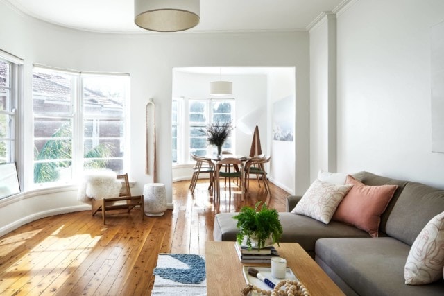
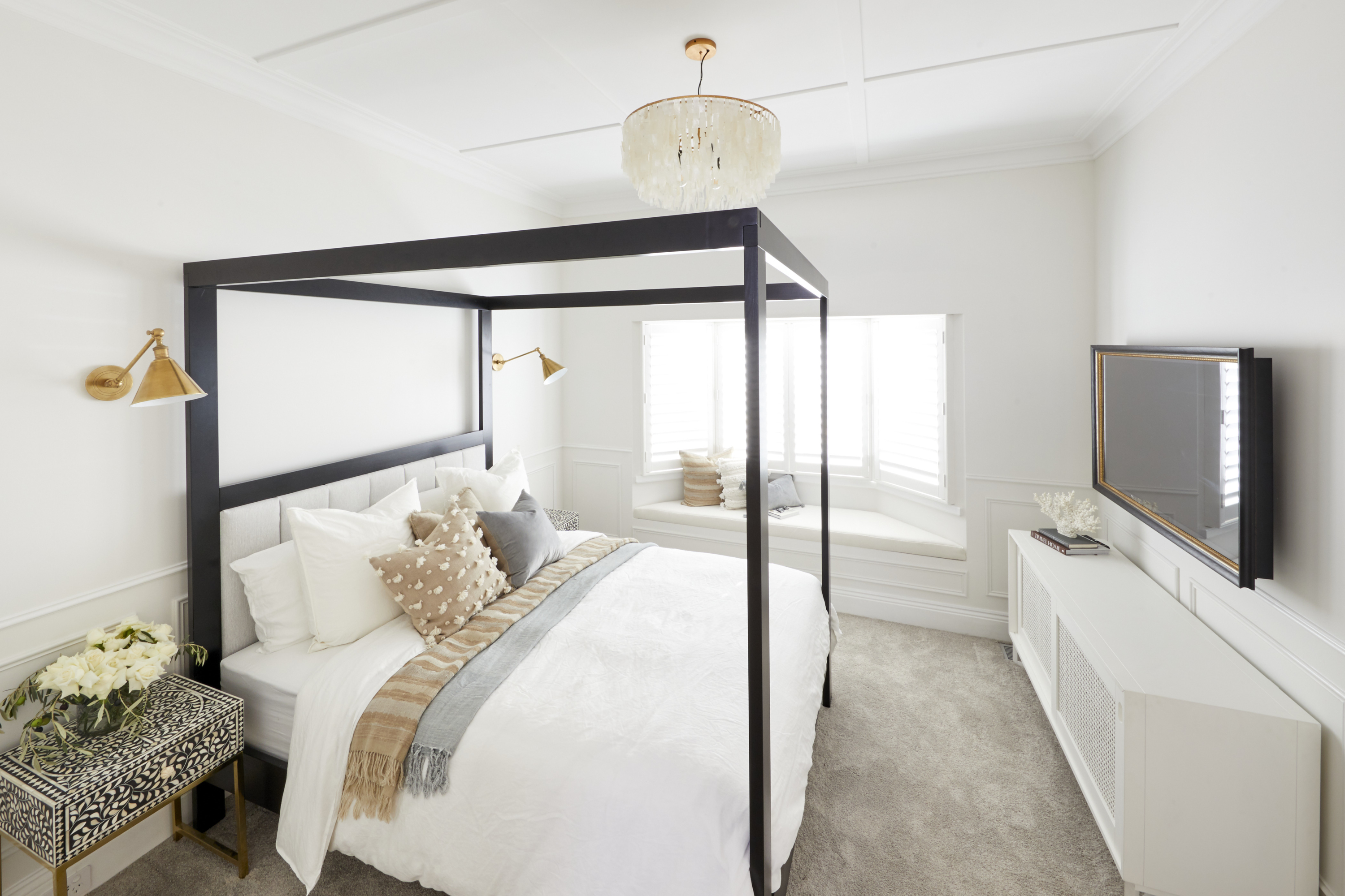
This sun-drenched Art Deco apartment in Sydney’s Elizabeth Bay was the perfect blank canvas to create a retreat for a busy young professional couple, and interior designer Liz Hayward thoroughly enjoyed the project.
The apartment is a great reminder that even homeowners with great taste can need a little helping hand in bringing it all together. Interior designers are definitely not just for people who have no idea!
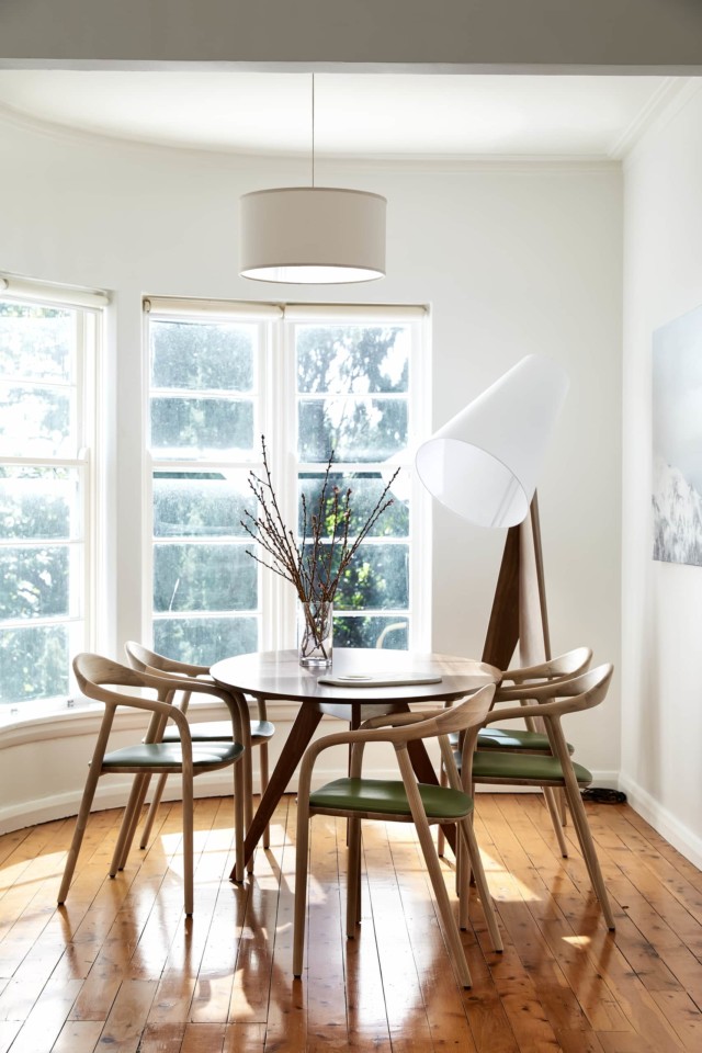
“The brief was to design a classic timeless concept with touches of soft colours. The couple loved to entertain friends with intimate dinner parties, which meant the dining area was a real focal point,” says Liz, of Hayward & Co.
A client with a great eye for design which made the process run very smoothly. “She knew what she wanted and had her eye on a few key pieces but just wasn’t sure how to make them all work together.
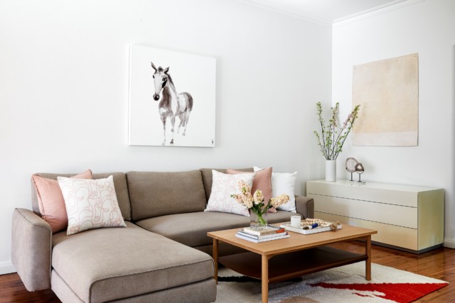
“We ended up using such a great mix of pieces including custom dining chairs from Spence and Lyda, mixed with a West Elm rug and lamps. The artwork was all selected by the client and was used as a guide for the decor selection by picking up the blush tones and working those in.”
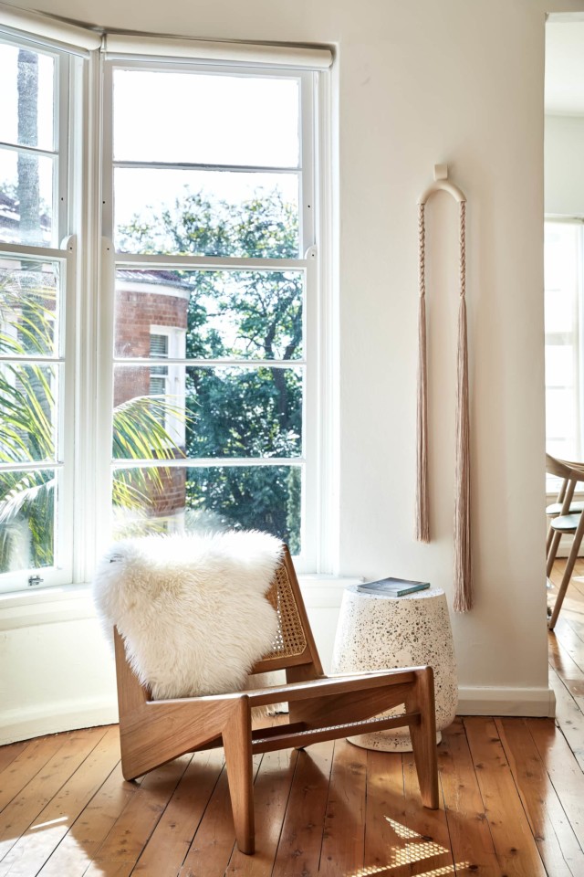
Being a one-bedroom apartment, Liz decided to keep the colour scheme consistent throughout, making it feel like one cohesive space.
“I loved having the opportunity to reach out to local and international artisans and incorporate their works into the space. The wall hanging was from LA-based artist Cindy Zell. I stumbled across her work on Instagram one night whilst mid-way through the project and knew it was the absolutely perfect piece. After a quick message to the client, the piece was on its way to us just a few hours later!”
The sofa showcases cushions from local textile designer Grace Garrett whose work Liz loves using in her projects.
“This final result is a classic design with elements that can be switched out and updated if the clients choose to in years to come. I was so fortunate to work on this project and be able to create a beautiful and calm space that they can come home to after a busy day and feel instantly relaxed in.”
Couple reno to sell, then fall in love with home and stay
Liz Hayward , owner of Hayward & Co – Interior Decoration and Styling Studio, takes us on a tour of a recent project. The design brief for this Inner West residential…
Real homes: Stylist Georgia Duncan’s imperfect apartment with heart
Georgia Duncan may be a stylist but that doesn’t mean her own Melbourne home is picture perfect at all times. And she’s totally okay with that! Living above her favourite…
In our new regular feature, stylist and interior designer Jono Fleming shares his research on decor across the decades and what he would have done with those Block master bedrooms. And we are LOVING his mood boards. A lot! Over to you, Jono…
There’s a lot to unpack with the eras but this week I’m going to be focusing on the 1920s and 30s. These two eras are often confused and for good reason: trends carry across decades (we saw pedestal basins for almost 50 years last week!). So I’m here to clarify a few key differences and focus on some particular styles within this era.
Let’s start with the elephant in the room. I’m going to be very clear here: I don’t hate velvet bedheads. I think in the right context, in the right room, they can be amazing. But velvet bedheads don’t automatically transport you to the roaring 20s and make the room instantly luxe.
That’s a good jumping off point for a bit of context. People associate the 1920s with the Art Deco style. Think Baz Lurhman’s Great Gatsby, black posters with ornate gold trim adorning movie theatres, shimmery tinsel! It was all very glam. But when it comes to a 20s home, there are many different styles to go off.
What winners Harry and Tash did in their 1920s-inspired bedroom
The 1920s was the end of a period called the Arts and Crafts movement where there was a focus on the handmade, carved timber and ornate art. Beds in the 20s, especially the first half of the decade, reflected this and were often carved timber, with beautiful detailing. But since this is the master bedroom week, let’s step away from the homier style of the Arts and Craft movement and go all in on the grand deco references.
If you look at the bed in the master bedroom in The Great Gatsby movie, it’s actually a sleek, lacquered timber base with chrome detailing. It looks more like a sports car than a bed, it’s got sexy curves and it’s incredibly simple in design by comparison.
The glamour and detail from this period came from overly patterned rugs, wallpapers and elegant timber side tables. Fabric wise, it was all about silks and jacquards with patterns, Yes, velvet was around but it wasn’t quite as prolific as we see in modern interpretations.
Which brings us to the 1930s, specifically the ‘Hollywood Glam’ style room that Shaynna Blaze wanted to see. The 30s of course had their versions of the bungalow home with the more working class houses still having beautiful crafted timber bed bases, but we’re wanting glam! Material wise, there’s still lots of lacquered timber everywhere in the home, especially the bedroom. Beautiful deco arches are translated into bedheads (in timber), sideboards with inlayed timber into geometric patterns and when it comes to fabrics, there’s silk, and lots of it.
Jono’s take on a 1930s-inspired bedroomWhat Daniel and Jade did in their 1930s-inspired bedroom
One of my favourite things about the Hollywood Regency period is the shapes that come with it. Curtains, chairs, lighting; there was scalloped detail everywhere. In a weird turn of events, shell shapes have become extremely trendy again nowadays and these shell-like shapes were all over the Hollywood 1930s bedroom.
When it came to the walls, they were adorned in padded features, Chinoiserie wallpaper, mirrors; if it was shiny and lavish, chuck it in the room! Really fun details like tassels were hanging off everything: tying up a curtain, the base of a chair, the end of the bedhead, everywhere! This was definitely the appropriate time to use a velvet bedhead! Velvet was very in vogue at the time and is completely appropriate to the era.
There’s so much to unpack with each of these eras, and when you’re designing your home, whether or not it’s a heritage building, it is completely up to you what you put in it. If you love velvet, no one is stopping you! I know I made it seem like there are rules but there really aren’t. However, since this series is all about respecting the era the homes are designed in, attention to detail can help create a layered and interesting room. And that’s the key, isn’t it? If we’re designing, styling or creating, we want the final product to be a treat to look at and live in.
Let’s recap who scored what, the judges’ comments and our picks to buy. Winner: Harry & Tash | 25.5/30 The father and daughter duo really needed their first win, especially…
The Block guest bedrooms & ensuites 2020: What would Jono Do?
This season, The Block contestants have been tasked with staying true to the heritage of their homes while making them appropriate for a modern day buyer; certainly no easy task!…
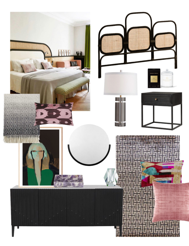
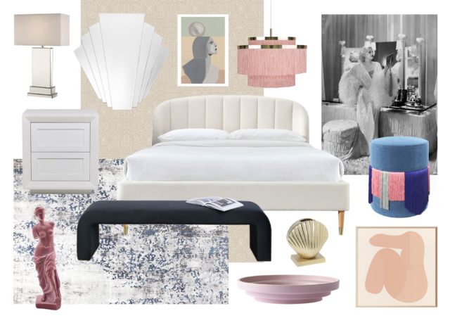
With the latest season of The Block having just kicked off, and its focus being squarely on period design, suddenly everyone is talking heritage details again. One of our favourite periods, Art Deco reached the height of popularity in the 1920’s, 30’s and 40’s, and is characterised by rich colour, bold geometry and decadent detail work. What’s not to love? Here’s our pick of some gorgeous pieces to help you get the look.
Fenton & Fenton Bone Inlay Deco sideboard and bedside, Orleans: Bone inlay furniture pieces were originally handcrafted for the royal palaces of Rajasthan, India. Fit for royalty, we love the Deco inspired clean lines and geometric pattern of these two pieces. Bedside, $1,300 and sideboard, $3,900.
Designer Rugs ‘Delaunay’ rug by Greg Natale: “French Art Deco is definitely more aligned with modernism. It’s cleaner than the American version which is heavier and a lot more decorative,” says Greg Natale of the inspiration behind this delightful round rug. $4050.
The Block Shop Fan mirror: I’m not sure there’s an object that says ‘Art Deco’ more than this one. It’s a bona fide classic. From $325 (70cm).
West Elm Embellished Deco Shapes pillow covers: Combining eye-catching geometric motifs with beaded accents and hand-embroidered metallic details, these cushions offer a contemporary take on Art Deco. $39.95.
Life Interiors Ipanema bedside table in black: Constructed from solid timber and powder coated metal, it’s the curved corners and linear details that give this gorgeous bedside that extra something. $595.
Not only is The Block all about houses this season, they’re also period houses! And we’re onto the first room reveals already! That’s what we’re all here for, right?! It…
New IKEA products: our top August picks
There’s a lot of exciting new products at IKEA this month. Here are our top four! New IVAR mesh doors The IVAR storage system in untreated wood has been a…
Not only is The Block all about houses this season, they’re also period houses! And we’re onto the first room reveals already! That’s what we’re all here for, right?! It was pretty good feedback from the judges last night for this early on in the competition. Although it remains to be seen how crucial sticking to the homes’ eras will be and I think this could get interesting!
Jimmy and Tam’s winning room in the 1950s house
Jimmy and Tam, with their high ceilings, skylights and palm tree wallpaper won, and Luke and Jasmin, who were slammed for not taking the heritage cues of their house at all and doing their own (contemporary) thing, came last.
Read on for more of what the couples did, what the judges thought and where you can buy our favourite picks.
THIRD: HARRY & TASH (1920s house) 24/30
The feedback was so good for the show’s first father-daughter team, it left Tash in happy tears of relief!
The judges loved (of course) the skylights and the sense of space. Shaynna loved the Venetian blinds saying they worked with the period, and the colour scheme.
Neale couldn’t believe it was the team who came last in last week’s challenge. He said it was a contemporary home with a nod to the twenties. “It feels like a very confident room. Those little touches give you a sense of period but feel very in keeping with today. To come through with something as accomplished as this is amazing.”
Darren said: “This colour palette his spot on trend, very 2020.” And all the hardware in the wardrobes said luxury. He said the painting was mostly very good and he loved the grey and white.
Shaynna didn’t like the carpet, saying it was more office than luxury, but that was about as far as the negatives went.
These two were brave in deciding to split their massive guest bedroom into a bedroom plus study which they hoped would give them an edge. But they were left deflated by the judges’ feedback.
Shaynna loved the colour palette but was disappointed at how they hadn’t worked with the beautiful period features, rather recreating their own idea. The execution though was “pretty good”. She wished they’d done a walk-in robe rather than use the space for a study. Neale found the study dull and bland.
Darren loved the ceiling rose, the door handles and the cabinetry, but hated walking straight into a corner. Moving the door would have made a big difference. He said the painting finish was very good and the finishes in the study were excellent. “As a luxury addition, I’m confident this adds value to the house.”
Neale acknowledged the 40s was a challenging period to represent. He said they’d done just enough. He didn’t like the lights but loved the wardrobes.
Darren was immediately wowed by the ceiling rose, the skirting and pendant light. Neale said it had a beautiful vintage feel but felt modern too. Shaynna was not happy with the shutters though as they weren’t Deco style at all.
The judges loved the use of green. Neale said the greys and greens in the bed linen were perfect. Darren noted there were no bedside tables, but loved the “delicious” wardrobe handles!
Execution wise, the paintwork was perfect. “How is this week one?” said Darren, with Neale adding that they’d set the bar very high.
This couple weren’t quiet about the fact they weren’t keeping to the period and that they preferred contemporary. Whoops! Because the judges immediately picked up on this and weren’t impressed!
They said it was a contemporary room with some generic heritage touches which was a shame. Shaynna said it was the least relevant room to its era they had seen. “This is the first house that shutters are truly relevant. What it doesn’t work with is Venetian plastering!”
Darren however said it was a fair interpretation. Shaynna argued it was a crying shame! And Neale said it was a very accomplished, glamorous, contemporary room.
Shaynna wouldn’t let up though, eventually talking Neale and Darren around to her way of thinking!
“The shutters, the wardrobe and the doors: tick, amazing, gorgeous!” Shaynna said. “The rest of it? Goodbye!”
Period-appropriate or not, we love that artwork, The Exception by Prudence De Marchi. Buy it from $290.
FIRST: JIMMY AND TAM (1950s house) 25.5/30
Of course the high ceilings and four skylights made a great first impression. “I’ve walked into this room with an evident, powerful, emotional attachment, Darren said.
Shaynna even did a little dance! “This one has got me by the heart strings. It feels so beautiful.” Darren said it was light, bright, cool and edgy.
They loved the secret door to the (future) en suite and said the execution was excellent.
“This is not what I thought this house was going to be but now I’m in here I absolutely bloody love it,” Neale said. But he also said he didn’t see much that was fifties.
And there ensued a debate about how fifties it was, or not! Wth Shaynna, unusually, sitting on the fence!
NEXT WEEK: The couples are facing their first bathrooms!
What did you think? Which was your favourite? Do you think the couples are sticking to the periods of their homes?
The Block starts on Sunday (finally!) with 5 houses from 5 decades.
After some Covid filming setbacks, The Block returns this Sunday for the 16th time. This season will take us on a new journey, from the beginning of the 20th century…
The understated glamour of the Art Deco period has never been more popular in interiors and, perhaps because the look was so ahead of its time when it began, it just hasn’t dated. Increasingly, people are adding Art Deco touches to their modern, as well as period homes, and let us tell you, it looks good! Really good!
Noticing this trend, Intrim have been smart enough to start 2020 by adding new Modern Art Deco profiles to their timber mouldings range, with the power to transform even the most blank of canvases. Recently, celebrity PR agent Roxy Jacenko chose to use this profile in her renovations, to great effect.
Roxy Jacenko’s recent kitchen reno using Intrim mouldings. Pic: Inhaus Media
Intrim’s Candace Brigden says Art Deco has enduring appeal because it exudes glamour and class without being over the top. “Its traditional use of rich colours, daring geometric patterns and features, as well as intricate details and finesse, mean it can work with many personal tastes and blend well with other styles. It’s both elegant and bold, intricate and striking and always an impressive display of artistry and design.”
Many homes can use elements of Art Deco, according to Candace. “If your home is modern, you can draw from the clean lines and large spaces on skirting for a modern, edgy appeal. Edwardian homes suit the period particularly well, and we are even seeing Art Deco inspired skirting appear in more relaxed, coastal Hamptons homes.”
We are big believers that architectural mouldings can make a huge difference to your home. The devil’s in the detail, as they say! There’s a plain blank canvas and then there’s a beautifully finished, consistently detailed blank canvas. We know which we prefer!
So, how can you incorporate them in your home? It could be as simple as just replacing your skirting and architraves or you might want to go the whole hog and install wall panelling, as shown above.
We love this Art Deco mouldings look when a skirting block is used where the architrave and skirting meet.
“Timber mouldings add a depth of character to an interior you cannot replicate in any other way,” Candace adds. “They create a personality for the home and add a level of luxury. Wall panelling, for instance, can be applied differently according to the style looking to be achieved without taking up valuable floor space (which is particularly important in smaller homes).”
It’s pretty safe to say that BIG W isn’t exactly synonymous with glamour but that looks set to change with the arrival of the store’s latest home release ‘Dark Wonder.’
With a dash of mid-century, more than a splash of Art Deco, industrial influences and plenty of on-trend 1970’s inspired colours, the range is as fabulous as it is eclectic and we’re predicting a stampede – particularly given that prices start from just $9!
I suspect the ‘Kodu’ velvet storage ottoman, $49, will be in hot demand!
Art Deco Of all of the collection’s reference points, the Art Deco one seems the strongest. From super affordable prints featuring 1930’s inspired fonts to the abundance of velvet and the brass touches, the collection has more than a whiff of the jazz age.
Felt print with gold foil framed canvas, $39 and ‘New York’ framed print, $19
The hottest item in this category will no doubt be the classic ‘Kodu’ velvet slipper chair. It’s available in grey and emerald and retails for just $99. My personal pick is the statement making ‘Geo’ print cushion – a steal at just $12.
‘Kodu’ velvet slipper chair, $99
‘Geo’ print cushion, $12
1970’s palette
With 1970’s inspired colours simply everywhere at present, BIG W has jumped on the trend with the sumptuous ‘Dark Wonder’ palette running the gamut from teal, mustard, berry and emerald. Ooh la la!
Round hand pleated cushion, $19
‘Wonder’ velvet coverlet in gold, $49
‘Clarice’ royal trim cushion, $15
Brass meets glass From a side table to a bar cart, jewellery box and lamps, the collection is punctuated by pops of brass, often paired with glass. Aside from infusing a dose of glamour, these pieces balance the heaviness of the collection’s moody colours and heavier textiles.
‘London’ gold metal bar cart, $49
‘Darcy’ round foot stool, $39
‘Scarlet’ gold and black tinted glass table lamp, $29
Oversized florals The oversized floral trend is one with serious legs and it gets a run in this range too. Bold yet feminine I am particularly taken with the berry toned ‘Dharsh’ quilt cover set and its giant, beguiling floral.
‘Heathrow’ bedside table, $39 and ‘Dharsh’ quilt cover set, $29
‘Serena’ quilt cover set, $19
The collection is in store from next Wednesday April 24.
I’m sure many of you will remember the iconic Aussie drama The Secret Life Of Us and the fabulous Art Deco apartment building location where much of the filming took place. Well Hunting For George’s Lucy Glade-Wright loved it so much that it factored into her first real estate purchase – a beautiful two bedroom Art Deco apartment in the Melbourne suburb of Armadale that she renovated recently.
Lucy’s gorgeous Art Deco apartment building was recently restored externally
“My favourite thing about this apartment and also the main reason why I bought it, is its epic rooftop. As you can imagine, being a 20-something obsessed with The Secret Life Of Us, I thought that I had clearly found real estate jackpot! I used to hang out on the rooftop a lot, it is so peaceful up there and you get incredible views of the city. Whilst I thought I’d be having a ton of parties up there it was more often than not just me and a good book in the sun,” says Lucy of the heritage listed 1940 Art Deco building.
Lounge room leading to the courtyard
And with such great original features, Lucy didn’t need to do much to freshen up the home. “I kept styling to a minimum to allow the unique layout of the apartment to speak for itself but also on a practical level, to fully maximise the smaller spaces. To reflect the exterior Palm Springs aesthetic I decided to carry out a modern coastal theme internally,” says Lucy.
Lucy Glade-Wright
“This apartment had great bones and there was little I needed to do to improve it structurally. I focused more recently on cosmetic changes, namely new window furnishings to accentuate the gorgeous curves of the building and then in order to enhance the light I painted all the internal walls and replaced the light fixtures,” says Lucy who was active in the transformation of the stunning exterior of the building too.
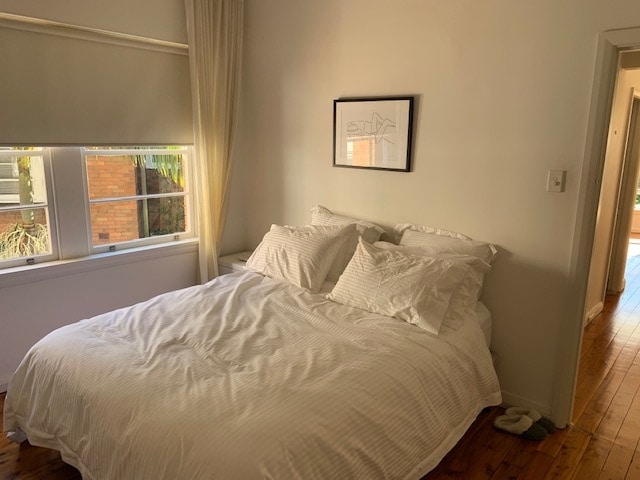
Bedroom
“We were very keen to restore the building to its former glory, we’ve since painted and updated its colour scheme to be more in line with its original light colour. We also just completed the landscaping with a Palm Springs inspired garden at the entrance to complement the Art Deco nature of the building,” says Lucy.
Kitchen
“It is a very much loved building in Armadale and known by many of the locals, it was so wonderful hearing such positive feedback about the cosmetic restoration of the building from those that lived in the area. People seem to feel an attachment to this building, even those who don’t live here. It’s quite special in that way,” says Lucy.
The apartment is filled with gorgeous Hunting For George wares
A delve into the history of the building reveals a really interesting story that perhaps explains where the Australian affection for the Art Deco apartment block first began. “The properties that surround my building were once part of the extensive grounds of a mansion that was built in 1880 for C.J. Ham. Following his death in 1909 the estate was progressively subdivided into suburban allotments. As the demand for housing became greater, the development of flats increased, but there was fear that these residential flats were going to ruin the character of the suburb. So to counter the criticism, leading architects were employed to design these apartment blocks so as not to upset the local residents or ruin the charm of the area,” says Lucy.
The view from the building’s rooftop
Regrettably, after 10 years in the home, Lucy is selling. “I have so much love for this apartment block and I really hope that it finds itself a new owner who loves and respects it as much as I do. So if there’s any Art Deco fans out there that would love a piece of architectural history, this is it!”
When Lucy Glade-Wright showed up at a rental inspection five years ago, the first thing she saw was a queue of eager potential tenants lining out the door. Not swayed, she – and what seemed like the rest of Melbourne – fell in love with the Art Deco apartment and its show-stopping arch windows. She knew she had to have it. And lucky for Lucy, and partner Jonno Rodd, they got it!
Lucy and Jonno
As two of the masterminds behind homewares juggernaut Hunting For George – Lucy is the co-founder and Jonno the marketing manager – it’s no surprise that their Elwood home is beautifully decorated. With a style that is constantly evolving, their look is modern, with the addition of some nostalgic pieces to complement the building’s heritage. “We have taken our time to invest in key pieces around the home as we have not been able to afford to decorate in one big swoop,” explains Lucy. “In terms of decor, I like to switch up my cushions and bedlinen as I’m often taking samples from work to trial.”
While it’s a constant challenge not to bring everything home from the Hunting For George warehouse, the products Lucy designs do make their way into the apartment… for work purposes of course! “I always take the wares I design home so that I can live with them, test them out and get a better understanding of them.”
Having lived in the two-bedroom apartment for five years, it was important from the get-go that it felt like theirs, despite it being a rental. They’ve changed the lighting: “It’s lifted the entire look of our home and really helped to modernise the space,” plus painted the kitchen, both bedrooms and the sunroom.
“Not everyone is willing to invest in a rental but we think it’s important to treat your rental as you would your home,” says Lucy. “Although it’s always important to have respect for the owner by improving aesthetics, rather than completely changing them.”
With a look that is relaxed, practical and cosy; the palette is monochromatic with a touch of blue. Their favourite spaces include the living room, home to their much loved sound system, and their garden, a luxury for apartment living. “We do a lot of barbecuing so we’re often outside cooking up dinner. We mainly use it to grow herbs and Jonno has a pretty mean chilli plant collection and makes chilli sambal every year.”
A self-confessed homebody, Lucy loves nothing more than spending her weekends at home. And if my home looked like that, I would feel the same!
It was love at first sight for Michelle Macarounas when she laid eyes on the dilapidated Art Deco building which would soon become her home. Yes it was tired, but who could resist the curved bay windows and views of Sydney’s Coogee Bay?
Buying the home, she renovated it in 2005, but you’d never guess; it remains contemporary, current and adaptable. A designer herself and somewhat of a nomad — she spent her twenties living in Geneva, Paris, London and Sydney — the style of the home combines the luxury and eclectic elegance of Europe with the relaxed and casual ease of Australia.
Key to the renovation was reconfiguring the interior to create spacious living areas and bedrooms that took full advantage of the ocean views. No more cramped, dimly lit rooms! A central spine from the rear to the front of the property separates the bedroom and living areas and provides the home with the structural integrity required for open-plan living.
The design perfectly balances Art Deco references with a contemporary aesthetic. Art Deco was all about creating furniture and spaces that celebrated luxurious materials and polished surfaces and the Coogee Residence follows suit. The home features Indian limestone-tiled bathrooms, vivid white gloss joinery with Calcutta marble, Wenge timber floors finished in Black Japan and a wall of golden hexagonal tiles that reflect the ocean view.
Designed by Michelle and her team at Infinite Design Studio, the Miami-inspired Art Deco home is colourful, eclectic, vibrant and elegant.
The new Cool Modern Collection combines the iconic design and cool Nordic minimalism of Bang & Olufsen with gleaming, brass-toned aluminium structures and dark beautiful textile colours to create a warm, polished ambience.
Inspired by the Art Deco movement of the roaring 20s (also the same time as Bang & Olufsen was founded), the collection introduces an entirely new style choice to the B&O universe, by presenting a line of its most popular sound systems, speakers and televisions draped in warm colours, rarely seen in electronic products.
There are also two new jewel-toned fabric colours for speaker covers: Purple Heart delivers a warm nuance of aged wine and dark heather, while Parisian Night suggests a velvety deep blue night sky.
As part of the new collection, BeoLab 18 and BeoVision 14 are fitted with smoked oak lamellas on the speaker covers. They are paired with new matte black stands and wall mounts to ensure a cohesive interaction with the soft glow from the new brass-toned frame. Other products available include the new BeoVision 14 television, the wireless music system BeoSound 35, the iconic BeoLab 18 speakers, and the wireless speakers system BeoSound 1 and BeoSound 2.
Cool Modern Collection is a permanent collection commemorating Bang & Olufsen’s 91st anniversary and will be available exclusively at Bang & Olufsen stores nationally. Products will cost the same as their standard counterparts.
I think I actually shed a tear when underdogs Kim and Chris took out the master bedroom (sorry, suite) win last night because oh my goodness, didn’t they deserve it?! It was divine! And massive. And absolutely nothing like the previous week’s confused country-style living/dining. It was amazing to see such a change and such progress. I felt so proud of them!
Chris and Kim’s winning master suite. The pictures don’t do it justice in my opinion.
So, the results were:
First place: Kim and Chris
Second place: Julia and Sasha
Third place: Will and Karlie
Fourth place: Dan and Carleen
Last place: Ben and Andy
And here’s what the judges had to say…
Karlie and Will
All three judges were wowed by the timber feature wall and rightly so. Wasn’t it gorgeous and so much work involved! I always love it when Darren Palmer comes out with comments like “holy moley!” He also said it showed extraordinary workmanship. Neale Whitaker agreed it was absolutely stunning and obviously the big idea they’d been working up to. “It just works.”
The black double doors also got lots of praise. Neale said: “It’s a very contemporary bedroom, I love it.”
They found the wardrobe, although it great storage plus powerpoints, a bit of a letdown, and said it felt like an afterthought.
Darren said the room was so calming and tranquil and Neale was in love with the original deco pendant lights (from the vault). The judges said they’d got the balance just right; contemporary but with well thought through references to deco. There was lots of pattern but it worked because it had been subtly done.
The wardrobe however clearly lost them a lot of points when it was revealed the top section was not deep enough to hang a jacket or shirt in. The judges said it was a big letdown on functionality.
I liked this room but it didn’t wow me. The curtains were gorgeous though as were the West Elm bedsides.
Andy and Ben
Although the boys lost half of their wardrobe to their en suite, Darren said you could hardly notice and it didn’t feel any smaller. Winning!
While Neale said it had a nice, fresh feel, Shaynna was underwhelmed and said it was a bit impersonal, and a bit of a bachelor pad. Darren agreed, although he said he could see the boys had given it a really good shot, but it needed an extra layer of luxury. And Neale said the styling was a bit off!
Things got more positive in the walk-in, where the bench seat, dressing table and shoe carousel went down a storm!
I loved the Jessica Skye Baker resin artwork! Buy similar.
Julia and Sasha
The judges loved the smart technology and the mega bedhead (me too) by Heatherly Design in this room. Neale said it felt like they’d really raised their game this week and hit it spot on. Personally, I don’t like it half as much as some of their other rooms and just felt it wasn’t very cohesive. Shaynna loved it too though, saying it was luxurious and the artwork was very clever and incredibly art deco.
Neale said the walk-in (which was amazing!) felt like an extremely high end boutique. “It’s really quite beautiful. Darren loved everything about it; the lighting, the handles and the gloss.
I preferred the wardrobe to the room!
Kim and Chris
Well, well, well, this is where it got really good with Kim and Chris’s huge suite, which Neale said was bigger than his house (which just sold at the weekend)!
Again, I don’t think the photos do it justice.
Shaynna said “ridiculous,” Darren said “insane,” and Neale said “absolutely magnificent”. Darren was totally in love with the bed and said the furniture all tied beautifully together.
Neale said it was penthouse living and they’d found a level of luxury he didn’t think they were capable of finding. “Luxury in spades.”
Darren said it lifted the calibre of the whole apartment, he just would have loved to see a door to the bathroom.
Neale, who loved seeing old fashioned doors on the wardrobes for once, put it out there, saying: “I think this is the most glam bedroom I’ve ever seen on The Block.”
Here we go with all the pictures, judges’ comments, scoring, my thoughts and where to buy from last night’s room reveals!
Will and Karlie: last with 20.5 points
First impressions seemed to be good but the judges’ comments soon turned to criticism, mainly about the use of space and having too much in it!
Neale said he felt hemmed in and he didn’t know why they would choose to make the column bigger by cladding it with timber.
Shaynna said they’d made the room feel half as big as it was.
My thoughts? Wasn’t keen on the timber cladding or the large artwork and agreed about it being too busy but it was still a nice room. Loved the West Elm rug.
Dan and Carleen: won with 26.5 points
Lucky these two chose to use their bonus point from last week as it ended up making all the difference. Until that point (literally!) they’d been tied with Julia and Sasha, who were then pushed into second place.
Shaynna said the space felt open and twice the size of Karlie and Will’s. Neale said it had a different vibe to the rest of their apartment; quite luxe and glamorous. “They’ve taken the Deco theme and turned up the dial.”
Darren loved the feature TV wall, saying it felt like it was from a high end furniture store.
Neale said a young, design savvy buyer would appreciate what had been done and that they’d upped their styling game.
Shaynna thought the dining table and chairs were beautiful but Darren questioned why they’d picked tiles for the floor and then not used underfloor heating. In often-chilly Melbourne!
Neale concluded they’d really grown in the last few weeks and that the room felt expensive.
Shaynna said the artwork real was a real signature for the boys now but Neale said they were in danger of overdoing the big artworks referencing the building’s history. Enough now!
Neale liked the feel and palette but Shaynna said the dining area and couches weren’t high end enough. Darren agreed, saying it felt like a display suite. Oh, and the couches were too far from the coffee table and the TV, too high!
Shaynna concluded the boys had come a long way and if they took advice on board it would be great. Neale said the room had enough visual interest to keep them in the game.
My thoughts? Not a patch on some of their other rooms and didn’t feel cohesive at all. Needed a much bigger rug too! I agree with Neale that the they’re in danger of overdoing the wall mural art. I hope they’ll be back on top form next week because they can do so much better!
Julia and Sasha: second with 25.5 points
Shaynna and Neale LOVED the new window and the city views. If only they knew the trouble it had caused them with Chris and Kim! The judges said it was well worth whatever they’d paid.
Darren and Shaynna were wowed by the “amazing” artwork and Neale said it looked like a magazine cover! “This is the modern take on Deco. Absolutely right. So now.”
They also loved their use of the paneling they’d last seen in challenge week.
My thoughts? IN LOVE with so much in this room! The art (buy a cheaper limited edition Megan Weston print here), the dining chairs (swoon), those blush velvet West Elm chairs! Great choices! The girls were robbed! Although I really think they need some rugs to zone the space and anchor the furniture more.
Chris and Kim: fourth with 21 points
Poor Chris and Kim came in for some criticism again this week. Neale said he didn’t know where to look because it felt like they’d thrown everything but the kitchen sink into this room.
Shaynna loved some of choices and the colour palette but said she felt like her head was going to explode.
Darren loved the fireplace but again the TV was way too high for comfortable viewing. Shaynna feared it felt like a country house; a country house interior in the penthouse, Darren added.
My thoughts? I thought the judges were perhaps a little harsh but agreed the look was too country for a Port Melbourne penthouse. It was so cosy though! The exposed brick didn’t work here like it has in Karlie and Will’s rooms. I always feel bad for these guys because they try so hard and they’re so nice!
I love how each week is throwing up a new contender for the top prize this season, with no clear favourite yet. This week was no exception with the boys not just taking out first place but receiving 30 out of 30!
This week’s scores:
First: Andy and Ben with 30
Second: Karlie and Will with 26.5
Third: Dan and Carleen with 26
Fourth: Kim and Chris with 24.5
Last: Julia and Sasha with 24
Karlie & Will
That bedhead! Divine! And clever. I love the way these two are giving Art Deco a modern spin but I’m still not 100% on the exposed brick. The bed styling was a bit all over the place and I would have liked to have seen something more simple and chic.
What the judges said:
The all loved bedhead with the geometric print and brass
They all loved the restored original feature
Neale felt the styling (particularly cushions on the bed) went too far and weakened the impact of the bedhead
Neale was not a fan of the artwork and said it had been done too much before. Shaynna and Darren agreed.
They were all fans of walk-in robe but would have preferred the colour of the timber to be darker.
Dan and Carleen
Although that Incy Interiors velvet bedhead is just delicious, I really didn’t like this room as much as the judges did. I do love those West Elm Terrace side tables though and would totally have them in my bedroom if I didn’t have a toddler!
What the judges said:
What an improvement on the last bedroom (the less said about that the better!)
Darren loved that the walls were white and they all loved the cornice
Neale liked the colour palette a lot and how it is in keeping with what was popular during the period
All the judges were perplexed by the size of bedhead in relation to bed, as it had gaps on both sides
Shaynna had an issue with the extra down lights over the centre of the bed
The choice of the down lights weren’t popular and they would have preferred sconces
Neale felt it didn’t hit the mark compared to their bathroom. He said the walk-in robe had nothing special or luxury about it
Overall, it was a great improvement.
Andy & Ben
Who would have thought, based on their first bathroom with the dollar razors out on display, that these likeable youngsters would pull off such a great room, and a 30 out of 30?! Changing the walk-in into an en suite, giving the judges back the toilet they were so upset about losing last week, proved to be a master stroke. They really have improved each week. We love an underdog!I love what the boys did this week, with its subtle monochrome palette and Deco touches that were somehow perfectly modern as well. Amazing progress! Although the wallpaper mural was a big statement, in general, this week I felt like they showed that less is sometimes more.
What the judges said:
They were impressed to see an ensuite and Darren said they have knocked it out of the ballpark
Neale said they were not just flying through the competition but soaring!
Shaynna and Darren loved the wallpaper and Neale said the colour palette was very sophisticated. He appreciated the use of subtle pattern and print in the bed linen
The execution got top marks
Shaynna was very impressed that they were able to pull off the ensuite and bedroom in one week.
Julia & Sasha
After last week’s stunner of a bathroom, it was all a bit of an anticlimax for the girls this week. Poor Julia had a crisis of confidence this week after the judges’ comments about her previous bedroom. While I loved their bed choice, I did feel the room felt a bit too plain and wasn’t cohesive. Top marks for using the same Antoinette Ferwerda print I have in my own apartment though! I still have faith the girls can bring it back next week, judging by their previous rooms. That is if they get over this week’s comments…
What the judges said:
Neale said he liked this bedroom better than the previous one but he said it lacked something and he wasn’t connecting with it
Shaynna said it was too “magazine-y” and she wants to “magnify the elegance”
Darren said it was the right balance to be very saleable
Neale agreed with Darren that it is friendly and familiar, it was just “nice” and not memorable and the pendants were “appalling”
Shaynna noted that everyone else in the building was pushing the boundaries and leaving their comfort zones but the girls need to let their guard down. The room is feeling uptight. Neale agreed.
“Julia is a stylist who is being out-styled” by some of the other contestants.
Ouch!
Kim & Chris
I thought this couple (who I have a total soft spot for, they’re so nice!) did great this week, although I had to agree with the judges in that it didn’t have anything standout. I couldn’t really fault anything either, I just didn’t love it!
What the judges said:
“It feels like they have found a style that they are comfortable with,” said Neale
Shaynna liked the dramatic artwork and lighting, and said it was memorable
Neale said it is a bit of a showroom; nice but lacking personality
Darren said it was big, friendly and broad enough to appeal to different buyers. He was impressed at the attention to detail like future use of power points
The judges want to see a little more emotion and their personalities in their rooms.
There was a lot to love about last night’s bathroom reveals, if you ask me. I wrongly assumed Julia and Sasha would win but they were knocked into second place by Dan and Carleen, who took out first place by just half a point. And, on reflection, while I really loved both their rooms, Dan and Carleen’s was certainly more true to the Art Deco period while cleverly feeling modern and on trend too. The top two bathrooms really were both beautiful.
Anyway, here’s a recap of the scoring and what the judges had to say…
Karlie and Will: 3rd place and 27 points
Last week’s winners continued to impress the judges this week with their sophisticated look, perhaps even more so because they’re only 25. Shaynna said the room was glamorous and she felt good in it.
Neale love the combination of the paneling (actually a money-saving measure) and the tiles and the simplicity of the colour palette. Darren also thought the panelling was a great idea.
Shaynna and Neale both loved the prints which referenced Melbourne in the era.
Darren was “completely, madly in love with” the basins and the light above the vanity was Shaynna’s favourite thing. She said: “It feels young and modern but also very sophisticated. These kids have style!”
After some shocking feedback (and some would say a shocking room) last week, Dan and Carleen certainly managed to bounce back and show everyone what they were capable of. I personally loved it and agreed with everything the judges had to say. Neale was wowed and said the couple were definitely back in the game (don’t you love it when this happens on The Block?) and that it had such a great sense of period.
Shaynna said the vanity was stunning and the basin, gorgeous. Darren said it delivered exactly what they were probably hoping to deliver in week one; it had all the trend notes and cleverly, still delivered something of a bygone era.
Neale was particularly pleased to see the pared back and simple styling and Darren called their look new traditional, reminiscent of trends he’d seen from Milan. They did get knocked for having their light switches outside however.
Andy and Ben seriously stepped up their game this week and I thought they produced a very good bathroom, if not my style. “These boys are growing before our eyes,” said Shaynna. Neale said the artwork was a touch of genius.
All the judges felt that visually, everything was spot on. But their decision (or mistake) in not including a toilet made no sense and it clearly lost them a lot of points.
That vanity! The gold tapware! The tiles and the double shower! Sigh! Just gorgeous. I really loved this.
Shaynna said the vanity was stunning and Darren agreed it was beautiful due to each detail. “Everything about that is just perfect.” Neale said it was a bit of a wow moment.
Shaynna said the feature tile was beyond beautiful and “it’s everything you’d want out of double showers.”
Neale said the bathroom will have massive appeal on auction day and styling wise, they’d really nailed it. He felt the lights should be a bit lower though.
I feel so sorry for these two because they seem so damn nice, and positive, and hardworking! But, as Shaynna said, they really don’t “get” Art Deco, I don’t think. Shaynna said it was a mish-mash of chrome, black and gold. Darren said (sarcastically, and while struggling to hide his horror!) that more was obviously, more. And Neale said he felt like they’d now delivered three rooms from three totally different periods and their apartment was in danger of becoming a museum of rooms through the ages! Eep.
“What is this panelling?” asked (again horrified) Darren, while Neale said he liked it. Darren clearly thought Neale had lost the plot but the overhyped TVCs promising a big fallout between the two male judges were, as I suspected, totally over the top.
Neale said despite the errors it was still an elegant bathroom with so much space (they changed their floor plan) and buyers would walk in and be impressed.
We'll still have columns from ex Blockheads like Julia and Sasha and plenty of real renos
Hooray! We’re back to Block room reveals on Sunday nights, my favourite! Last night didn’t disappoint with a mixed bag of finished rooms and as much disappointment as there was praise from the judges. I’m pleased to say my favourite room, Julia and Sasha’s, won. Let’s recap on what the judges said and who scored what…
WILL & KARLIE
With its mix of rose gold and black finishes (personally I’d prefer one or the other but the judges didn’t seem to have a problem with the inconsistency, so what do I know?!), they were impressed overall. Neale said the pair had raised the bar from the previous week’s pod challenge and Shaynna said that for a young couple, they’d shown maturity and a great understanding of the sense of luxury required. Neale liked the nod to deco in the black blinds while Shaynna said the vanity was all wrong and took away from a lot of the good points. The lighting too, although pretty, was totally impractical.
Overall though, feedback was good. Neale said the bathroom would help sell the apartment, Shaynna loved the styling and Darren said the couple had proven they knew what they were doing.
The couple ended up coming second place with 25 points.
DAN & CARLEEN
On first glance, I absolutely loved what this couple had tried to do, although on closer inspection, a few things did fall apart. I’m still mad for their subway tiles, gold tapware and black tub though! They made brave choices, even if some of them didn’t quite come off. And their look was certainly more Art Deco than anyone else’s. Perhaps a little too much.
Neale’s first impression was “wow” too. He said it ticked a lot of boxes. Shaynna agreed they had certainly taken on the whole deco look and loved the distressed subways and the patterned floor tiles. “The direction of the style is brilliant.” It was all going so well. Then…Darren! “I hate it!” While he couldn’t get past the unfinished floor tiles he also hated the raised bath and said it was a trip hazard and all wrong. The placement of the towels was also really awkward for anyone getting out of the shower.
None of the judges rated Dan and Carleen’s styling. The ‘I love the shit out of you’ candle was an odd choice in anyone’s book and I agreed with Shaynna that the Missoni towels, although high end, didn’t go at all. Sadly, the couple didn’t take the feedback well at all and found it all very personal. Hopefully they’ll get a little more used to being on a reality TV show as the weeks go on!
This couple came last with 17 points.
ANDY & BEN
All I want to say about this pair is “Oh bless!” I mean really, who uses Radox shower gel, disposable razors and toothbrushes as the finishing touches in a high end bathroom?! But these young beginners are so genuine and have such great attitudes you can’t help but love them! And while their bathroom wasn’t a showstopper, their call to change the floorplan and keep part of it as an extra bedroom was, as Darren said, a master stroke.
Sadly though, Neale said it all felt a little bit cheap and Shaynna said it was everything she didn’t want to see (apart from the aforementioned Radox and razors, also basic chrome tapware, a Scandi vanity and concrete look tiles). Neale said they’d created a bachelor pad feel and Darren noted that even if you know nothing about Art Deco, there’s nothing to stop you googling and finding out some pointers!
This likeable pair still managed to come third with 21.5 points. Again, bless!
JULIA & SASHA
This was my absolute favourite so I’m pleased the girls won with 26.5 points. Oh my, that gold tapware! I just love gold tapware but reluctantly decided it wasn’t the right choice for my own bathroom reno (starting today incidentally, so watch this space). So this bathroom left me feeling a tad jealous! The judges were also impressed with Darren declaring it “the business”; the perfect blend of contemporary and sophisticated with classic, bygone era.
Shaynna thought the cabinetry was perfection (agreed, so classy!) and Neale said it was very sophisticated and luxe.
While there were a few unfinished bits and the basin taps were too low, Darren still said the room was “spectacularly beautiful”.
A well deserved first place!
KIM & CHRIS
Oh dear. I hate to add insult to injury when these guys got such a bashing from the judges, but my eyes! I really was not a fan, but I was so impressed with the way the Newcastle couple took the feedback on the chin and vowed to learn from it. Brilliant attitudes and I really hope they go on to better things!
It did not start well with the judges with Shaynna asking ‘where are we?’ and Neale replying ‘in a time machine going backwards’! He added that it was completely soulless and off brief. Harsh but true. Shaynna said the shower tiles were ugly and just awful but thought the lighting and tapware were good choices (can’t say I agreed on the lighting). Where she was definitely right, and fair, was in saying that the quality of their work and time management were incredible.
They came in second from last with 19.5 points.
This season, The Block Shop has partnered with Matterport and Phoria to offer its customers a world first online retail experience. As of last night, you can now take yourself on a 3D tour of The Block and buy what you see from the comfort of your lounge room.
“We’re absolutely thrilled to be rolling out this technology to our customers,” said Julian Cress, co-creator and executive producer. “Online shopping is quickly becoming more and more sophisticated and to be able to take our fans behind the walls of The Block and let them get up close and personal with what the couples have created is really exciting.”
Trent Clews-de Castella, co-founder and CEO at Phoria (formerly Scann3d) said: “We’re working closely with The Block Shop to create a never seen before online retail experience. Each week, fans of the show can jump online and explore each room reveal directly from The Block Shop site. More importantly, using Matterport’s new Mattertag integration we can give users the ability to select products they like and click through to purchase within seconds. We’re excited by this new implementation, as we’re now witnessing these 3D tours evolve into intelligent environments that connect with rich media, all in the one holistic experience.”
I have a serious soft spot for heritage buildings reimagined for today and Sydney’s latest five-star hotel, the Primus, is nothing short of a magical transformation. The former Sydney Water Board headquarters in Pitt Street epitomises the expression ‘great bones’ but years of decay had left them needing some serious cosmetic work. And when you add to that the challenge of turning what was a building full of offices into a luxury hotel and restaurant, this was never going to be a straightforward task.
The design and architecture firm for the job was Woods Bagot, led by Wade Little. Heritage features of this once important public building have been preserved, repaired and used as inspiration, and the hints of Art Deco, both original and new-but-perfectly-sympathetic, are everywhere. At the same time, this is a beautiful, contemporary, city hotel with a rooftop pool overlooking China Town. I’m not sure there is anywhere more unique to spend a night in Sydney. I was lucky enough to stay there recently and fell head over the hells for the place, returning later to try The Wilmot restaurant for lunch (delicious!).
“The chance to work on a building of such significance was an amazing opportunity we didn’t want to miss, said Wade, of the project, which was a year in the design stages and 18 months in construction. “The architecture of the building was hidden behind layers of previous renovations and this was definitely something that excited me.” Heritage buildings are his favourite to work on, in fact. “Rejuvenating buildings which are often in a dilapidated state is not only very rewarding, but at times can offer some exciting challenges.”
It’s hard to imagine it now, but Woods Bagot was first introduced to the building as a derelict office building, not occupied in some time. “The interior was a graveyard of eighties workstations, with peach and pink finishes. Many of the original features were either covered up or gone altogether. We started by looking at what we could see; bronze window frames, travertine and green marble, the striking red columns created by Italian craftsmen and the dark timber dado on the ground floor.
“The geometric patterning of the Art Deco period was explored on a giant scale, from the central carpet of the atrium to the grand foyer, which gives the guest the experience of being in a luxurious grand hotel. The profile of new walls, counters and decorative elements all have some reference, no matter how fine.”
In terms of making a former office building feel like a luxury hotel, its great bones certainly helped. “It has ceiling heights and proportions that you can’t really recreate from a new building,” Wade said. “The foyer and building façade had solid stone finishes which really helped define a starting point for the grand polished granite floor, travertine walls and brass detailing. The softer touch of furnishing and carpets provided the luxurious finish to the amazing backdrop.”
Anyone walking through the front door cannot help but be instantly wowed by the incredible marble-clad columns in the vast double-height foyer. “The opening within the floor had been covered over, the glazed skylight was no longer waterproof and the giant red columns had been all but destroyed,” said Wade, principal and global hotel sector leader. He explained they used archive photography to recreate the detailing of the plaster and marble.
The bar at the far end, in the lobby lounge of the ground floor, was originally a counter with offices behind. All the detail had been demolished, but there were photographs of the layered stone and brass. “We were able to recreate the tiered layering of the marble, which is also curved. It was a significant challenge for the builder and they did an amazing job.”
All this and there’s also a rooftop pool! That’s right, smack bang in the middle of the CBD! Wade says it’s his favourite part of the whole project and is all about comfort, relaxation and being free of all the grand trappings of the lobby. “The rooftop is a green oasis in the middle of Chinatown,” he adds. “A playful attitude has been taken to furniture and fabrics. The mix is teak, green and abundant navy; all different patterns and shapes.”
All manner of guests have stayed at the hotel since it opened in December, from fashionistas to business people, to former employees of the water board; even a couple who met after working in the building ended up getting married.
Wade loves that they have opened up a building to the public which for so long remained hidden. “We have achieved a great result for our client and the building in the longer term. It has been the culmination of so many efforts from a large group of people and it was great to be involved and be part of such a fantastic project.”
You could easily miss this hidden gem, with its rather unassuming entrance off the street, but next time you’re in the CBD, or if you’re planning a trip to Sydney, make sure you stop in, if not to stay, then for a cocktail or lunch at The Wilmot restaurant (lunch menu from $35 for one course and a glass of wine). Rooms from $290 a night or $330 with breakfast.
Featuring their signature geometric look, Sly’s first foray into tableware is unlike anything I’ve seen before. Inspired by the Art Deco era, their set of four small trivets (or coasters) and one large trivet, are precision cut from natural bamboo, a highly intricate process.
“They are laser cut which can be a timely process considering how intricate these designs are,” explains Sly founder Lauren Finks. “I also spent many month sampling, as I wanted to see how the lines translated into the bamboo and how they would hold cups and plates. I didn’t want to make them too gappy as I still wanted them to be functional.”
Choosing bamboo for its natural, lightweight and durable qualities (it’s used as scaffolding in Hong Kong!), Lauren then conditions the final products with raw linseed oil, to give the trivets a bit of waterproofing and a nice golden colour.
All produced in Australia, prices start at $50 for the set of four trivets. Pre-order now for late October delivery. Shop online.
Paramount by The Office Space is something else: a beautifully conceived, creative office environment complete with concierge service to handle all your business support needs. This new shared office model certainly raises the benchmark in corporate offerings to a whole new level.
The landmark Paramount building on the edge of the Sydney CBD has been treated to a high-detail refurbishment at the hands of The Office Space Group, transforming it into a highly covetable 22-suite workplace for design-savvy business people. It was conceived and designed by partners Boris and Naomi Tosic, who led the charge for quality shared office spaces over a decade ago with a multi-floor office building in Reservoir Street, Surry Hills. The modern suites at Reservoir by The Office Space have since hosted and supported over 400 businesses, many over extended occupancies.
“I am passionate about the craft of creating beautiful things with precise functionality,” said Boris, who is also a keen art collector. “With Paramount, we wanted to achieve a decidedly modern space that merged seamlessly with the existing heritage-listed joinery of the building. The hand-crafted solution relies on traditional joinery and artisan skills and honours the building’s heritage, while exploring finely-honed design and functionality.”
Domenic Alvaro, Principal at Woods Bagot, was engaged to work alongside Boris, himself head of high end office fit-out specialists, Elan Construct, on the highly bespoke project. With the exception of the integrated desk phones and Walter Knoll Lead chairs, everything in the suites has been custom-made. Original Art Deco elements have been highlighted during the interior’s reimagining, with materials including American Cherry and Oak panelling, limestone, marble and goats-hair carpeting creating a cohesive narrative of discrete luxury that is in harmony with the building’s defining architecture and modernist ideals.
“We created the original Office Space in Surry Hills to provide a quality working environment and support services for small-to-medium sized businesses who were seeking a compatible space in which to work, and particularly for those more at start-up stage,” said Naomi, who manages leasing for the group. “For them, a larger scale office commitment was impractical, as was working from home, and the pick-up rate from the get-go clearly illustrated the demand was there.”
More recently, conversations with established business players seeking a separate space beyond their core business interests for a breakaway or satellite work model, for fly-in fly-out executives, or those perhaps wishing to downsize from a long-held office set-up, led the Tosics to create this distinctive and new working model. The result is an entirely bespoke offering at the highest level, the former Paramount Pictures building representing the ideal location and aesthetic for this new pillar of their business.
“We have had a longstanding love affair with this iconic Surry Hills building and we felt we could do something really special with the heritage-listed site to build on The Office Space story and produce something extraordinary,” said Naomi.
Beyond the exemplary architecture and interior of the Paramount suites, details like Marc Newson for Noritake glassware and floral arrangements by Hermetica provide stylish touches. A considered selection of Australian and international artworks from the Tosics’ personal collection is exhibited throughout the common spaces and offices.
Paramount has 22 individual suites and offices of varying scale and configuration, with several of the private suites having already been snapped up by the likes of Vince Frost (Vince Frost Design), as well as a leading global advertising agency. All tenancies include full concierge services, as well as access to a large and fully equipped boardroom, separate smaller meeting room and bar/kitchen facilities to rival the finest gentlemen’s clubs in Manhattan. In an era of colourful and at times gimmicky office fit-outs, the luxury and elegance of Paramount by The Office Space channels a particular period of masculine and high-end corporate office design reminiscent of New York in the ‘60’s (and more recently celebrated in TV series Mad Men).
This is an office environment like no other in Sydney, boasting a level of attention to detail that will not easily be eclipsed in a very long time. “For targeted and practiced business professionals not wishing to compromise on a high quality working environment, or polished support services to match, Paramount most assuredly provides the solution,” said Naomi.