From cleaning until every surface sparkles to lighting, decluttering and even creating optical illusions, making your property visually appealing is one of the most important things you can do as a seller because first impressions are everything. So, as a buyer, your first impression of a property is the last thing you should rely on!
It’s easy to laugh about having a batch of freshly baked goods at an open home, but sellers go to extraordinary lengths to entice buyers. Good styling has become a very profitable industry for experts (and is a worthy investment for sellers in our opinion). They can strike the perfect balance between making a room look spacious yet cosy, unique enough to be memorable yet easy for any buyer to imagine living there.
Michelle May, principal of Michelle May Buyers Agents and host of Buy Your Side is someone who’s gone to thousands of open homes and is privy to all the tricks vendors use to make a great first impression, she still feels the emotional pull created by impeccable styling.
But all that styling disappears the moment you get the keys, so it’s essential to look beyond the sumptuous soft furnishings at any open home. Michelle has shared her tips on some of the most common tricks to look out for.
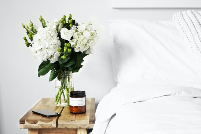
Removing the curtains
This makes a room look brighter, bigger and a lot cleaner but is often an impractical way to live, especially in bedrooms where light is an important factor.
Turning the lights on
Ensuring every switch is flicked on is an easy way to hide a lack of natural light, so don’t be afraid to switch the lights off to get a more accurate representation of lighting.
Swapping out furniture for smaller pieces
A bedroom looks bigger with a double bed over a king; the same goes for couches in living areas. You need to think practically about the size of your existing furniture in relation to the space and whether you’d be happy to downsize to a double bed if required.
Playing music
A curated playlist is an easy way to create a homely vibe in a property and also a great way to distract from unwanted noises such as arguing neighbours, traffic, barking dogs and screeching pipes.
Sending belongings to storage
The price of a storage unit for a few weeks is insignificant compared to many thousands on a sale price, which is what good styling can bring to a sale. Many sellers pack up their non-essentials while their home is on the market, so ask yourself, ‘what’s missing here?’ and ‘what do I need to fit in this space?’
Once you’ve looked past all of the creative ways sellers make their home more appealing, it’s time to get practical about the space and one major factor is often forgotten in the excitement of open homes: storage.
From appliances like air fryers and rice cookers in the kitchen to the ironing board, vacuum cleaner, tools, lawnmower, excess linen, suitcases, and even shoes. No matter how minimally you live, you’ll undoubtedly always have a few bulky items that need a home. Keep a checklist of things you own on your phone as you wander around open homes to avoid any rude shocks come move-in day.
My patchouli burning teenage self can barely believe it but in case you haven’t received the memo, incense is back. Undoubtedly another pandemic-led trend, it’s the perfect solution for those looking for extra-sensory excitement and a connection to nature while locked down at home. It’s also got an entirely new aesthetic – the hippy feel has been replaced by something far more sophisticated, as evidenced by the Melbourne based incense and accessories brand Kin North.
Kin North is a curator of luxurious incense and accessories from around the world
Eschewing all teenage incense associations, the Melbourne based brand is a purveyor of premium Japanese incense alongside an array of stylish complementary accessories. Founded by Tresna Lee, the brand works closely with artisans across the globe to create gorgeous objects and scents for the home.
“Taking time each day to light incense is a powerful reminder that it’s okay to rest. In a culture obsessed with hustle, incense allows us to pause and enjoy an evocative scent, not only in the 15 minutes that it burns, but for many hours as it lingers in the home,” says Tresna.
The Kin North range focusses on premium ingredients and ethical, small-batch production. It’s also the exclusive Australian distributor of Tokyo Kodo which is a French perfumery meets traditional incense brand founded in Tokyo. The Tokyo Kodo brand came about when third generation Japanese incense maker Chikako Perez travelled to Grasse France to study the art of French perfumery.
Kin North’s in-house range Home is made in collaboration with Tokyo Kodo too and combines Japanese incense with an Aussie bent – indigenous Australian Buddah wood, cedar, vetiver, nutmeg, cinnamon and baked fruit mingle with a touch of coffee that adds depth and is a nod to the brand’s Melbourne roots.
Tokyo Kodo incense
Far from new, burning incense is an ancient practice; the use of it dates back thousands of years and is synonymous with ritual and spirituality. The current popularity of incense may also come down to its eco-credentials – packaged in paper and leaving no trace once burnt, it’s a wonderful sustainable alternative to candles.
By Kathryn Bamford To me, candles always needed to be two things: beautiful aesthetically and fabulous smelling! I’ve recently added a third requirement: non toxic. I hadn’t ever given much…
Home has always been our refuge, but now more than ever before, the layout of our homes, backyards and communities has been placed under the spotlight.
Megan Morton
New research from Stockland, one of Australia’s largest residential developers, revealed the COVID-19 pandemic has significantly changed our expectations of home and neighbourhood. It’s no surprise that we are more likely to take better care of our mental wellbeing and physical health, the way we think about our home has shifted significantly. More than 80% of Australians are now more conscious that their home and environment is intrinsically linked to their wellbeing.
Space has always been an important factor to home design and satisfaction but with people spending so much time at home, it’s become vital. We’ve become less satisfied with at least one aspect of our current home or neighbourhood. The main grievance is a lack of indoor and outdoor space, with 62% of us more likely to consider space-related features than before the pandemic – such as in-home storage (44%), a separate study (40%), a private outdoor space (39%), open-plan living (36%) and a separate living area (33%).
Creating different spaces With one in four people working from home, we know have to consider spaces such as the ‘Zoom room’ or work from home office. With this in mind, we should also consider a ‘zen’ zone for ourselves. A place to counter the activity and energy of a designated work space, where there is quiet and a time for reflection
We ask so much of our open plan areas that I like the closed rooms to have very obvious uses. Toy room, craft room, Zoom room. A custom build can allow for all of this possibility so you can look to the future – a toy room is a future media room. A future craft room is today’s nursery.
Be very diligent with your furniture. Choose items that can reflect the real use of the room and furnish it to match.
How to create a feeling of solace? On a granular level, I think the first thing people can do is counter all the hard surfaces with soft textures. It seems a simple act but so effective. It’s a failsafe for every room. In the kitchen it can be mats, floor covering or a fabulous pendant light. In bedrooms it’s cushions and curtain trims. Living areas can be texturised with sofa fabric choices, throws and rugs.
How to create separation in the spaces? I use a series of rugs and lights to lead the separation. I never use lights and rugs in the same open plan room, only in the front closed rooms. By swapping out you get to carve away space by swapping out the hero from floor to ceiling within the same open plan.
Top tips to harness light Stockland’s research also revealed that we have a greater need for space and light in the home, as well as a desire to be closer to parks and green spaces.
Embrace natural light. No matter who you are and where you live, light control is so important as it can have a pivotal impact on mood. There are a couple of solutions to embrace the natural light. Firstly skylights will change the feeling of any room. Use only where you need as the idea is to use them to highlight a space. Another way to accentuate natural light sources, is by adding curtains over a beautiful window. Curtains need not be over the whole house, instead use them sparingly and show off the views you’re most proud of.
Bring the outside in. Mirrors are a great way to reflect the outside in. When you are dealing with straight lines, I prefer a rounded or archway mirror. Ensure you position your mirror to reflect a great view of the outside or garden. When we see green we know things are healthy and wonderful, to create this feeling in a home add elements of nature such as greenery or flowers to a room. This is an extremely simple but underused tactic.
How to make a home more liveable? Liveability is achieved through likeability! And likeability is won through understanding your own needs, then marrying your decorative preferences with your home’s existing foundations. All of this can be masterfully achieved when you build new.
There are so many new highly liveable communities where you don’t have to settle for less and that are meeting our changing needs in a post-covid world. I’ve been working with Stockland and have been impressed with how they have developed homes based around embracing the things that are increasingly important to people – such as more space, storage and light within the home, as well as parks and outdoor spaces.
Megan Morton’s top tips for styling a bedroom on a budget
By Megan Morton Look, all I know is that an expensive bedroom and an inexpensive one can share common goals. Whoever let money stand in their way anyway? Money can be…
Take 5 with Megan Morton
Each week we shine the spotlight on some of Australia’s best designers, artists and stylists and have them share with us what’s making them tick; anything from the best advice they’ve ever received to their favourite…
Testament to our homes being an extension of our personal style, global online apparel giant ASOS has just entered the home space (like many fashion brands before it) with an interesting array of on-trend pieces priced from just $20.
With exclusive prints created by the ASOS in-house design team, the range titled ASOS SUPPLY includes decorative hanging planters, modern kitchen and bathroom accessories, cosy throws, statement cushions and more divided into three categories. ‘Eclectic Luxe,’ ‘Cool Minimal’ and ‘Global Traveller’ ensure there is something for every interior taste.
Eclectic Luxe This homewares category has vintage rock star vibes written all over – think recycled glassware, retro-inspired statement plates, chintzy soft furnishings with quilted elements and animal prints as well as plenty of pom-pom and tassel details.
Cool Minimal
An antidote to the above, this range is full of much cleaner lines and cooler tones. There’s textiles (rugs, bedding and towels) covered in brushstroke patterns, conversational prints, animal shapes and quirky storage solutions.
Global Traveller
Full of traditional weaving techniques, hand-woven wicker baskets and 1970’s inspired rattan, this collection is full of natural materials with a smattering of bright colour pops too. Graphic geotextiles and contemporary fashion prints round out the mix.
IKEA’s Global Life at Home report delivered some interesting home ownership findings recently that challenge the traditional quarter-acre Australian dream. In fact, the report found that 70 per cent of Australians would rather live in a smaller residence in a great location than a larger home in a less ideal place.
The report, the fifth annual one for IKEA, is a study into global domestic living trends and as usual, its insights are super interesting. One sobering finding is that while 66 per cent of Australians still aspire to own a home, 28 per cent of us believe that home ownership won’t matter or even be desirable in the future. I suspect that soaring property prices mean many people can’t see home ownership in their sights but the interesting thing is that many Australians don’t feel that concerned about it. According to the report, two out of five people (41.7 per cent) are excited by the thought of living mortgage-free as our urban centres continue to change and improve.
Another key finding is that just over half (51 per cent) of Australians consider their home to go beyond their physical house – 46 per cent perceive their neighbourhood to be part of their home. This is especially true for renters who are a rising demographic in Australia. But there are other factors at play too – longer commute times mean that 29 per cent of people are watching television outside of the home, mostly on their mobiles.
“The way we live has become more complex as we’ve started bringing more of the outside world into our homes. This disruption means we’re now turning outside of our homes to meet our core emotional needs. At IKEA we believe that this gives people more opportunities to create the feeling of home, no matter where or how they live,” says IKEA Australian interior design leader Christine Gough.
For example, a quarter of Australians are cooking outside of their home multiple times a week (with a partner, family or friends) and 22 per cent shower outside of the home on a daily basis – either at the gym or work.
“At IKEA we understand what the heart of the home truly is and how to tap into those emotional needs to create that elusive feeling of home no matter the size, location or type of space you live in. Our goal is to make this feeling easier to achieve and to show all Australians how to redefine and take ownership of their space. Regardless of who you are living with, or if you’re owning or renting, your home should always be your sanctuary,” says Christine.
Recently published, This is Home: The Art of Simple Living is a richly-illustrated interiors tome that looks at all the ingredients that turn the humble house into a warm and inviting home. Written by writer and stylist Natalie Walton, the book uses a number of inspiring real homes to illustrate her ideas.
“The book was an idea that was percolating over a number of years during my work as a stylist for interiors magazines. I had visited all sorts of spaces – from highly specified architect-designed mansions to creative and quirky artist warehouse conversions, and started to question why some places felt more like a home than others. I realised that it was nothing to do with income or even where a person lived, but everything to do with how authentic the space was – that is, the homeowner was creating a place to meet their own needs, and tell their own stories rather than copying a look,” says Natalie.
Natalie believes there are ten key elements required to create a home and the book covers all of them with gorgeous real-life homes to illustrate. “So many books focus on the surface concerns of an interior, but they don’t consider how a place makes us feel. There’s not much point creating a ‘look’ if it has no meaning for you, because you will soon become bored or frustrated with elements of it as it isn’t actually meeting your needs, or part of your story,” says Natalie who also owns the online homewares business Imprint House.
“Another important element was to consider the life that is lived within a home – that places where we celebrate birthdays, mark important milestones in our lives, as well as places where we want to retreat from the world, and wind down from our days. They are where we can rest our bodies, restore our minds and revive our spirits,” says Natalie.
As for the book’s title, Natalie is keen to impress that ‘simple living’ isn’t about minimalism. “It’s not about stripping your home of all possessions. Instead it’s about being true to yourself, and your story. And creating a space that meets your needs – to create a place that will make you safe, secure, loved, nurtured and to become yourself, as defined by Maslow’s seminal hierarchy of needs,” says Natalie.
So, while it’s not a new idea, Natalie is championing the idea of the authentic home, rather than a derivative one which is a valid message in times when an Insta-scroll can prove a homogenous experience. And while she has many tips to impart, she shares her top two tips for people looking to create their own unique style below.
What do you value? Natalie believes it’s important to have a clear sense of what you value when making decisions for your home. “It might be artistry, sustainability, quality or innovation, for example. When you have an idea about what’s important to you and your way of living then you will have an easy way to navigate through decision-making processes. Think about this in relation to the type of dining table you might want to buy – what’s important to you about it – that it has been handmade or that it’s innovative in terms of its structure?” says Natalie.
Tell your own story Natalie believes Another important element is to tell your story at home. We can so easily get caught up in other people’s stories, what their homes look like, and how they live their lives. But it’s important to keep focussed on who we are, our interests, our journey and tell that story in our home. In other words, to live authentically.
Photography: Chris Warnes
This Is Home byNatalie Walton is published by Hardie Grant Books, RRP $55, and is available in stores nationally and online.
The results are in, and there’s a lot to look forward to in 2018! Wallpapered ceilings, giant knitting and finger tattoos are just a few of the emerging trends people on Pinterest are excited about. The Pinterest 100 has it all—100 trend predictions across Pinterest’s top categories backed by global data.
People use Pinterest to plan their lives, so rather than taking a look back at the year, Pinterest gives us a look forward, at what pinners are searching for and saving to do in the future. Every category in the fourth annual Pinterest 100 is full of surprises and must-tries, but of course there’s one category in particular we are interested in: the home!
Decorating a home is personal and evolves over time. The notion that design is never done couldn’t be more true; it’s what keeps pinners coming back. With over 14 billion ideas, home continues to grow with a 75% increase in pins year on year. From full renos to stylish accents, here’s what trends are set to be big in 2018.
Resort-inspired style: Spa-inspired bathrooms and rattan furniture bring the vacay vibes home.
Credit: decocrush via Pinterest
The magic of metallics: Metals mesh with any colour palette, but to really amp up a space, mix different finishes together.
Credit: ru.pinterest.com via Pinterest
Hello, terrazzo: The forgotten flooring of the ’70s is brightening up ceilings, entryways and everything in between.
Credit: Fall For DIY via Pinterest
The fifth wall: A statement ceiling can transform a room from the top down with bold paint, striking wallpaper or intricate texture.
Credit: vintageindustrialstyle.com via Pinterest
Beautiful to the bone: Bone inlaid tiles take an ordinary piece from meh to marvellous with maximalism drama and geometric designs.
Credit: Cityscape Bliss via Pinterest
Wood wins: Wall tiles and flooring in a herringbone pattern are versatile and add dimension to make any space more modern.
Credit: copperline.co via Pinterest
Statement doors: A colorful, painted front door or friendly message on a mat is the new way to welcome guests.
Credit: A Lady in London via Pinterest
Patterned plants: Houseplants, like the popular prayer plant, go beyond green, with vibrant, patterned foliage and flashes of colour.
Credit: minoo via Pinterest
Wall art is big: Bye bye blank space! Large posters, works of art and photography prints are blowing up.
When you hear the word renovation, you probably think knocking down a couple of walls and updating the kitchen. But for this holiday home, a renovation meant gutting the whole property, keeping only the ground floor slab and the two front walls! “The brief from the client was to build a new house on the existing footprint of the old house,” explains acclaimed designer David Hicks. “The main concern was to maximise the glazing towards the views and reorganise the layout and accommodation.”
Situated on the Mornington Peninsula’s Portsea, bringing the outside in was key for this holiday home. A modern beachside design, the house has a relaxed feel, with beautiful sandy tones mimicking the beach below. “We used a contrast between rough stone and honed stone along with distressed timber veneer and satin lacquer,” says David. “It’s all about texture and tactility.”
Pushing the limits of structure, the upper floor is a standout, with the internal spaces separated from the outside only by frameless glass. “The design is seamless and effortless, yet so complex to detail and construct. I love the simplicity that we managed to achieve. This kind of architecture really interests me and I feel it fits into the landscape beautifully.”
The top floor also contains the pool, a show stopping cantilevered glass oasis that is sure to be the envy of neighbours. “Incorporating a pool above a downstairs bedroom was no mean feat! In fact, the engineering of the entire project was a challenge, as we wanted the upper floor to have limited bulk obstructing the views.”
The end result certainly achieves this, modern and streamlined, it is both relaxed and sophisticated, bringing new significance to the classic beach house.
I am so excited to finally share my new kitchen with you today! Seeing these beautiful pictures makes the last two months of mess and chaos seem more than worth while!
They say the kitchen is the heart of the home and in this house, it really is. Not just because everyone hangs out in this room, but because it really is in the middle of our home. And the light here is the best in the house. It used to drive me nuts that people gravitated towards this room because of the light when it was unrenovated, as we had much nicer spaces to entertain in like the living room! Now I am no longer embarrassed of my kitchen, I am happy for people to congregate in here and admire it whenever they want!
Black barn door hardware from Bunnings
Bar stools from GlobeWest
This really is my dream kitchen. I’m going to blog about some of the finer details separately, but today’s post is just the first overview of what we chose, what we did and why. In terms of layout, this has not changed drastically, but we did get rid of the back door (see before pix at the end of this post) to allow the cabinetry to go right to the end of the kitchen. We were also able to move our fridge freezer into the kitchen (it’s the little things, right?!) because previously there was nowhere to fit it and it lived in the dining room!
The starting point for this room was the cabinetry from Freedom Kitchens. I always knew I wanted white shaker style doors so when I found out this was possible using their new, more affordable flatpack option, the Essential range, I was thrilled. I saw flatpack as an opportunity to make great savings, which would allow me to still have the other things I dreamed of like stone benchtops.
My good friend, TV interior designer James Treble, sketched me out a rough layout I loved over dinner one night and we were off! I then worked with Freedom Kitchens design consultant Nina Hughes to turn that sketch into a detailed plan, taking into consideration the flatpack options available. This in-home service is included for everyone buying from their flatpack range, as well as a site check to make sure nothing has slipped through the net, before your cabinets are made. This really made me feel confident. I think buying a kitchen off the shelf with no professional advice or checks would have made me worry myself sick!
The next thing I chose were the handles. Anyone who knows me or has been to my home knows I just love a brass accent! I was always going to have gold handles and I sourced these from Kethy (available through The Block Shop) after seeing similar in Julia and Sasha’s beautiful Block kitchen. It was a winning combo from the start. I didn’t look at another handle so this proved to be one of the easiest decisions!
Then benchtops: through my job, I know Caesarstone by reputation and I loved their designs. I had three samples on high rotation but I finally went for the most subtle, Noble Grey, for a few reasons. I liked the contrast of the grey with the white cabinetry, and while the Calacatta marble-look designs have been hugely popular recently, I wanted something a little different. Then I saw blogger Briar Stanley from Sunday Collector use Noble Grey in her amazing kitchen and that sealed the deal.
Of course, then I needed to decide on a complementary splashback. I absolutely love tiles but trying to choose some left me paralysed by indecision! There were just too many amazing choices. I could have opted for subways, and I am a fan, but again, I wanted something a little different. So I decide to carry the Caesarstone up the splash as well; a decision I have not regretted for one second! The splash behind the cooktop is really quite deep so it makes a real feature. When the light through the opposite window hits it, it really shows off the veins in it. I also think the streamlined look it has created has allowed me to add my other, more bling touches, without it feeling cluttered or over the top.
Speaking of bling, the gold tap is from Meir and I am so in love with it! Taps really are like jewellery in a kitchen. You can’t miss them so you might as well make a statement! Their new Tiger Bronze colour was released at just the right time a few months ago and I was lucky enough to be one of the first to get my hands on it! Would a gold sink as well prove too much? I must admit, I did really worry about my decision, but in the end, it all came together beautifully. And nobody can believe that sink came from Bunnings!
Of course, a kitchen can (and should!) look beautiful but it needs to function too! Having room for a fridge freezer was a great start! But I needed to think long and hard about the appliances, which I chose from Italian brand Ilve. I was really excited to get an integrated dishwasher from an aesthetic perspective but this one works brilliantly and even has a light inside, plus one which shines onto the floor so you know it’s on (being that it’s hidden behind a cabinet door). I just love how it seamlessly blends into the kitchen.
Choosing an oven was a lot harder than anticipated and something I’ve never done before. I eventually decided on a 90cm electric oven and having that extra space is already proving a Godsend when entertaining. I can’t wait to give it a really good workout on Christmas Day.
Then of course you have to match that with a 90cm cooktop even though I’m not sure I’ll ever use all six burners at the same time! We first wanted gas but had a delay finding out if we could get connected, which led us to opt for induction. I’m so glad we went this route because I bloody love it! I cannot believe how quick it is to heat up, it’s a dream to clean and, importantly, it’s safe, which when you have an adventurous climbing toddler around is one less thing to worry about. I’m also thrilled with our hidden rangehood which allows me to have an uninterrupted row of overhead cupboards.
So, we had the bones of a great kitchen, but there were two other things I needed to achieve: replacing the dated sliding door to the laundry, with a modern take on a barn door and black hardware was the first. I wanted the door to have VJ panelling so we did this by cutting Easycraft panels (I’m in love with this product) to size and fixing them to the front of a very cheap, plain door. We then decided what the hell, why not panel the entire wall and wow, wasn’t that the best call? This wall has become a real feature of the kitchen. We also did the back of our breakfast bar in the same paneling and colour.
Art by the Print Emporium
Secondly, I wanted to tie in the dining area, which adjoins the kitchen and previously had a cork floor, much better. I did this by adding VJ wainscoting to this room and painting it in the same grey (the panelling is in Haymes Paint Chinchilla Fur and the walls are Haymes Paint Greyology 4). It has made a huge difference. Of course, having the same floor helped massively too.
The icing on the cake of all this was our new Quickstep Impressive Ultra laminate floor (more on that next week) which we have also laid in the living room, hallway and my home office. Once that went down, we were finally finished!
A few other things I’m really glad we did and are worth a mention were:
adding bulkheads for a more finished, streamlined look (and no dust or clutter accumulating on top of the overhead cupboards)
putting a power socket in the back of the pantry so I could hide the Nespresso machine and toaster away in there
making sure there was a space for the microwave under the breakfast bar out of sight, so it didn’t have to use precious benchtop space
making one of the five powerpoints (you can never have too many) a USB one (we use this every day to charge a phone or laptop and it has proven really handy)
opting for a pullout double bin under the sink so there’s no ugly bin on show or in the way (I obviously need to get out more but I really love this!).
I could rave about my new kitchen all day but I’ll focus on some other aspects in future blog posts.
Overall, I am thrilled with kitchen and that it is finished before Christmas! I’m just waiting on my blinds (Romans) and looking for the perfect new kettle! A huge thank you to our friends at Integriti Bathrooms who helped project manage this reno.
Now, we could finish this without taking a look back at the before photos!
What do you think of the transformation? If you have any questions, please write them in the comments below and I’ll get back to you.
It’s officially December so we’re allowed to start curating the best of the year, right?! This year, we have been lucky enough to sticky beak inside some of the most gorgeous homes. From a houseboat afloat Sydney Harbour to a US$16 million Hamptons home; we’ve certainly not been disappointed! So I’ve undertaken the tricky task of putting together our top 10 favourite real homes of 2017. Enjoy!
Elwood, Melbourne: It may be a rental, but that hasn’t stopped Lucy Glade-Wright (the co-founder of Hunting For George) from turning the apartment into a home. With Art Deco features and show-stopping arch windows, the palette is monochromatic with a touch of blue.
Mosman, Sydney: This two-storey houseboat, afloat on Sydney Harbour, has picture-perfect surrounds and a beautifully restored and redesigned interior. With clean lines and a soft, pared-back palette; it’s the holiday retreat we all want!
Bondi, Sydney: As one of the judges on The Block we had high hopes for Darren Palmer’s home. Stylish and smart, it’s full of technology and gadgets.
Northbridge, Sydney: This modern Mediterranean-style villa has been transformed by our favourite renovators, Three Birds Renovations. With large windows, glass doors, high ceilings and white walls, it’s a light, fresh and welcoming home.
Ballarat, Victoria: This quirky design takes the ubiquitous pitched-roof country house form and splits it in half; with one pavilion housing an arrangement of bedrooms and bathrooms and the other a large, open living space. Raw and minimalist, it brings the beautiful bush setting indoors.
Darling Point, Sydney: An avid collector, the home of interior designer Alex Zabotto-Bentley is as much a gallery space as it is a private residence. Filled with a vast collection of art and books, the home references classic French apartments and old Hollywood set design.
Hamptons, USA: Yours for a little over US$16 million, this beautiful home is a great example of a modern Hamptons look, using a much more black and white palette instead of the traditional blue and white.
Malvern, Melbourne: Combining Mediterranean influences with 1970s and mid-century design, this experimental home works so well. With Tasmanian oak veneer paneling, beautiful handmade clay tiles and bespoke rattan joinery, the interiors are rich in texture.
Manly, Sydney: Timber takes centre stage in this cleverly designed home. Sitting on a subdivided plot that’s just 7.2 metres wide, the home manages to fill light, airy and full of space.
London, England: This renovated Victorian terrace is perfect for entertaining. Light-filled (a must with that dreary weather!), the kitchen and living space beautifully flow into the garden. A perfect example of indoor/outdoor living.
We all have those friends we text from time to time saying: “We must catch up!” But of course, we never do. I feel like that’s been us of late so sincere apologies, we’ve been swamped. The good news is there’s a lot to catch up on and I’m on my third coffee and ready to overshare. Let’s go.
Building a two-storey house is no cakewalk. It’s not as easy as whacking on a second level and wham bam, thank you mam. Oh no. There’s scaffold to build and trusses to move, roofs to attach and money to lose. (Dr Seuss, who invited you?!).
After shelling out a small fortune for staging equipment, it was time to settle on our biggest decision to date – the exterior colour scheme. I’d been extremely decisive up to this point but everyone has a catalyst for change and this was mine. I cannot tell you how many hours I spent driving around the neighbourhood gawking at houses. An elderly gentleman actually asked if I was checking him out and I awkwardly said: “Yes, indeed I was,” because I didn’t know what else to say. Truth be told, he had a lovely abode and I ended up pinching the colour scheme for Little Willow.
Exterior inspiration. Credit: The Block, New Zealand
Whilst most heritage homes boast galvanised iron roofs, we had our hearts set on something more intense. There were the traditional offerings of course, but they were all a bit blue or brown and we couldn’t embrace them. Enter Basalt, a perfect mid-grey reminiscent of lead. Our first instinct was to lock in matching gutters but our roof plumber called us ‘boring’ so we buckled and went with contrasting Monument. Opting for the two-tone effect was a risky move but my nickname as a child was ‘Drama Llama’ and as they say, if the name fits…
Basalt and Monument Roof
Choosing the right white can be an absolute mine-field. The first question you need to ask is: “Am I a warm or cool kinda person?” We’re obviously very cool and prefer whites with brilliant undertones. They elicit a sense of calm and are widely appealing, thus perfect for Little Willow. We tested a million paint samples before deciding on Crisp White by Taubmans. It’s the perfect stark-but-not-too-clinical shade and sets a lovely tone for the property. Pro tip: Only swatch on materials you are not actually using. I went to town on a sheet of plasterboard that ended up being redundant because the samples would forever shine through.
Sash helping weatherboard
Little Willow was built from the top down to allow for full scaffold and a safer worksite for our crew. Once the upper roof was secure, it was time to attach the weatherboards. I know people go mad for brick homes but they’ve never been my thing and seeing Little Willow clad in the good stuff made my heart soar. The painters did a stellar job and for the first time in a long while, she beamed again. It was like she’d spent an afternoon at Sephora sampling Make Up For Ever Ultra HD Foundation. She was literally flawless.
The top storey
Of course, things aren’t always as they seem and it’s what’s on the inside that counts. With the top level watertight, it was time to draft the electrical plan. Can you sense the excitement in my voice? No, no you can’t because there literally isn’t any. Lighting is so not my jam and I’d been avoiding it like the plague. As it transpires, it’s the stuff Sash’s dreams are made of so I handballed it quick sticks and got back to Younger. She spent hours marking out a legend with six different highlighters and proudly presented it to our electrician. Sash often says her biggest achievement was winning the Under 11 70m hurdles at Camberwell Little Athletics, but this almost pipped it. She opted for a mix of pendants, wall sconces, downlights, and lanterns but left me to supervise come rough in. That was an interesting day but I’ll spare you the details. Let’s just say I’m now an expert at laying under-floor heating because we all learn from our mistakes, don’t we?!
After what felt like eons, we were finally ready for plaster. Anyone who’s ever built or renovated a home will tell you this is by far the best bit. For the first time we could see the interior take shape and make sense of the space. In a nod to the home’s heritage, we reinstated the original gutter cornices. It really is next level and adds to the luxe vibe throughout. Sash left me to my own devices when selecting the ceiling roses for the formal rooms and immediately regretted her decision. She thinks they’re too elaborate but in my world there is no such thing so, next!
Cornice and ceiling rose
Whilst we were busy bickering, our trades made the great escape and started tiling the upstairs bathroom. Selecting tiles has never been my strong suit but I’m going to toot my own horn and say I absolutely nailed this choice. The marble rhomboid from Beaumont Tiles is the perfect focal point, balanced by soft grey on the floor and white matte on the walls. Our rule of thumb is to use contrasting grout on feature tiles and matching on all others, so we opted for white on the rhomboid as it really makes them pop. Given we’re all about consistency, we’ll be incorporating marble into all wet areas, albeit in different shapes. It’s worked a treat for us in the past so stay tuned for all the inspo.
Tiled bathroom
Now the majority of the building work is complete, it’s time for the fun stuff! In the next instalment we’ll reveal our kitchen and laundry design, courtesy of our dear friends at Freedom Kitchens. They’ve helped us create three stunning spaces in the past and we can’t wait to show you what we’ve come up with this time. They’re real show-stoppers so get ready to pin all the things.
Of all the judges on The Block, it’s Darren Palmer who gets most excited about the gadgets and technology. The term ‘kid in a candy store’ comes to mind! So it’s no surprise to us that he has made his own, recently renovated Sydney home, a smart home. Care to have a look around?
Darren and husband Olivier bought the house two years ago, following Darren’s tradition of buying homes in need of love and transforming them into beautiful spaces. As part of the renovation, he laid new floorboards and painted the whole downstairs (how good are those navy doors?!). He refreshed his home electrical by installing contemporary Saturn Zen switches and powerpoints, as well as a range of smart home technology, including Push Controls and Nero from Clipsal by Schneider Electric.
Of course, while fancy looking switches improve the aesthetics of a home, it’s the functionality and the sensory experience they give you which makes the biggest impact. “What I have done in changing the switches and lighting in this house has really changed the value – it feels more expensive now,” Darren says. “You interact with these switches every single day, they help you create the different moods of light, they look fantastic and they’re a simple thing to change, but they make a massive difference.”
When it comes to smart home automation (the really fun stuff) Darren says: “One of the coolest things about working on The Block is that I get to see all the latest and greatest in technology and all this smart home stuff has blown me away!”
Once he’d seen it, he just had to have Clipsal by Schneider Electric’s NERO and Push at home. “The NERO system is cool because you can control each and every light in your house with the press of a button. Tie it with scenes and you can group things together so it interacts with you the way you want your house to interact. When we wake up in the morning, all the lights are really low and then if we’re home during the day, all the lights become brighter.
“With geofencing [radio frequency identification] we’re able to light the way so when we get home we can get out of the car and it lights up the path, and it plays a playlist for me on Sonos when I open the door. It feels much more luxurious and it brings the house to life in ways we haven’t experienced before. It’s really fantastic and it’s amazing how useful it becomes once you get used to it.”
I know Darren’s recent renovation is only halfway to achieving the vision he has for this longterm home, but we think it’s looking pretty amazing already!
Launching today, the Artisan collection by Haymes Paint brings together a unique range of hand-crafted, imperfect, textured finishes; designed to transform a space, both inside and out. Divided into three core product ranges: Surface, Metallics and Textures, each has its own colour palette and application techniques. The extensive range of finishes, textures and colours ensures you won’t be short of options!
Surface – Gravity
The first range, Surface, offers an extremely versatile finish. With just one product, it can be applied in four ways: Bloom, Brushed, Gravity and Industrial, it also comes in 18 custom colours. Talk about versatility! The subtle qualities of the product bring out the beauty in the finish, giving your walls a contemporary yet timeless feel and adding a sense of movement and tactility.
Metallics – Matte Polish
The Metallics range was inspired by the Haymes team’s recent trip to Milan. A favourite of colour and concept manager Wendy Rennie, she says it stands out from its competition: “In the past, I have found the metallic finishes in paint to be too glossy and a bit tacky but this range provides a level of sophistication that takes metallics to a new level. My absolute favourite product is the Matte Polish, which we describe as understated silken metallic. It reminds me of the Venetian plaster look and in the Pink Drift colour it is exquisite.” Alongside Matte Polish, the collection encompasses Metal Trace, Real Iron, Real Copper and Patina, each offering gritty, high-end qualities and an ultra-premium finish.
Textures – Mortar
Textures – Sand
Last is the Textures range that pushes the boundaries in both residential and commercial settings. Each of the textured finishes: Rendercoat, Mortar, Soft Chalk and Sand, are available in their own colour ranges and have been carefully considered in the context of where they will achieve the best results, inside or out.
Metallics – Patina
While some of the finishes and techniques seem a bit daunting from the photos — I can’t be the only one who looked at the Surface range and thought ‘Agh!’ — Haymes promise it’s not that hard. “The finishes have been developed with the end consumer in mind, ensuring each effect is easily achieved,” says Wendy. “To support consumers we have uploaded instructional videos to our website. We also offer trained Haymes painters for those who prefer to remain hands off.”
Originally built in the 80’s, this humble Perth home featured (if you can call it that) a façade of dated and uninspiring brickwork. The interior similarly suffered from a disjointed floor plan and boring beige tiles throughout. And then there was the kitchen – don’t even get me started on the woeful state of the kitchen! (I think the before photos speak for themselves).
After
Before (*shudder*)
The brief for Amerex was one of total transformation; the homeowners wanted to completely expand and revamp the space, while adding more natural light to the key living areas.
The result? A spacious family home complete with functional open-plan living and stylishly modern finishes – one that’s up for a HIA award (impressive!).
After
Before
To accommodate the larger living area and provide a space for the stunning new kitchen (seriously, what a transformation!) and dining areas, an extensive structural extension had to be added.
“We also added an entertainer’s alfresco, complete with a wood fireplace – this way the home now had a seamless flow between the indoor and outdoor areas, and the owners could easily transition from indoor to outdoor entertaining,” says Suzanne Burke, GM of Amerex.
A complete reroof and external render of the entire property helped bring the home into the 21st century.
“The render was a no-brainer. We also added stone cladding to the front piers, which has really given the home a whole new look and feel. Finish that off with new cedar wood double front doors and a unique feature garage door and the owners are left with a complete overhaul of the front profile!” says Suzanne.
No room or space was overlooked, with a new master bedroom and guest bedroom featuring huge walk-ins and ensuites, a spacious family study and replacement of the dated timber staircase balustrade with a modern cable balustrade.
From a new storage room in the garage and a sneaky storeroom beneath the stairs, to overhead cabinetry in the laundry and a large walk-in pantry, enough storage space was added to make any storage lover coo with delight.
The team at Amerex specialises in transforming Perth properties with high quality home additions, home extensions, second story additions, and major home renovations.
Even though our “nanna house” is nowhere near finished and very much a work in progress, I thought it was time to share some of what we’ve done with you. And sometimes, when you have a seemingly endless list of jobs and expenses ahead, it’s really important to stop and look at how far you’ve come. It’s only been six months, after all!
So, today, I’m sharing the master bedroom. Only it’s not actually the master bedroom as per the floorplan. This brings me to a point about living in a new home as is for a while, if you can bear it, before getting stuck in. We immediately moved into the master bedroom (there are four all up) of this house because, well, the floorplan said so, it’s the biggest, and we are the grown-ups, right?! It also has an en suite, which is a very functional but dated eighties addition.
But the room just didn’t work. It’s all wrong with the feng shui and the only way to fix that will cost money. The same goes for the en suite. It’s hardly the stuff of sanctuary! So we made the call to move into a smaller bedroom at the front of the house. It just feels better for now! And I’m not that fussed about having a big bedroom, just a nice one! One day, when we have the money, we will rip out the robes in the ‘real’ master bedroom and reconfigure it, re-do the en suite and move the en suite door. But for now, we are in our ‘new’ room. And the master is a spare room.
I’m still in two minds about whether artwork will work above the bedhead or fight with it. This framed photo is of my treasured navy wedding shoes. The bedsides are last season’s west elm and came from the old place. I love the warmth of the timber.
Because it’s not that big, I didn’t want to clutter it up, so it was always going to be all about the bed. We started with a neutral base of grey carpet, grey paint (Haymes Greyology 4), white plantation shutters (from DIY Online Blinds) and the rattan pendant shades we have in all the bedrooms, from Beacon Lighting. We didn’t have carpet in the bedrooms at our old place, and I’m really glad we decided to have it in the bedrooms here. It’s also much cheaper than hard floor! And I knew this room would feature my favourite colour: navy. And what goes perfectly with navy for a little luxe factor? My favourite gold accents!
The ink art on the left is by Melbourne’s Casey Freeman, who I met through Instagram, and was in our previous bedroom.
I had been drooling over Heatherly Design Bedheads’ work for years, since we first featured them on the blog. When I saw the Sibella design it was love at first sight but I had to think about it for a while before I committed. I tend to play it safe and when I go a bit “out there” it doesn’t always work! But months later, I still loved Sibella so it was time to order her! Even better, Damian also loved Sibella (which I was not expecting, to be honest!). I was careful not to overdo it, but the Galleria lamps from Lighting Lighting Lighting were just the perfect complement.
This Freedom ottoman is completely surplus to requirements but it just goes so perfectly, it had to come in here from elsewhere in the house.
The mirror was a wedding present that lived in the dining room in our previous home. The white linen quilt cover is from Sydney brand Major Minor and it feels beautiful, I’m telling you! But it was too stark in contrast to the bedhead so I layered on this fab navy coverlet from my friend Naomi at Silk Home (she has her own made for staging). Rather than Euros, which would hide some of my statement bedhead, I chose kingsize pillows from The Pillowslip Store with their classic white cotton covers (they have some amazing patterned ones too, including gingham). Most of the cushions and the throw are from Adairs (their range is amazing, check it out).
Damian’s side of the bed, which always has flowers, honestly… The small bowl was from kikki.K.
There are built-ins opposite the bed (not pictured) and we have plans to replace them one day, as well as the skirting throughout the house. I’m still working out whether and what kind of rug this room can take. This room is right next to a large walk-in cupboard which we may turn into a walk-in one day, but for now, we just love having somewhere to store all our, well, crap!
This large mirror is on the wall to the right of the bed
So while this room does not have the sheer size of our old one, as stop-gap master bedrooms go, I’m really happy with it, and find it a restful space which is easy to keep tidy because of its simplicity and lack of stuff. I have resisted adding my usual pop of pink and I think the all-blue scheme works nicely. I am considering a wallpaper feature wall (perhaps the window wall). It would of course have to be quite subtle. But we’re almost done in here!
Co-ownership is becoming an increasingly popular trend. Owning a property with others can provide improved purchasing power. This can be particularly useful in capital cities where it can be difficult to break into the property market.
It can also balance out the expenses of owning an investment property including ongoing repairs, maintenance and fees. Additionally, co-ownership can provide improved depreciation deductions, allowing more items to be depreciated at a higher rate. This is where a BMT Tax Depreciation split report can assist.
How does a split report work?
A split report calculates depreciation deductions based on each owner’s percentage of ownership for each asset. This involves splitting the value of the assets based upon each owner’s interest in the assets before applying depreciation rules.
In a scenario where there is just one owner, legislation allows property investors to claim an immediate write-off for assets with an opening value of $300 or less. However, when an investment property is co-owned by two parties with a 50:50 ownership share, a split report allows the owners to each claim an immediate write-off for items where their interest in the asset is below $300. This means the owners can claim an instant write-off for items which are less than $600 in total value.
The same method can be used when applying low-value pooling. Where an owner’s interest in an asset is less than $1,000, these items will qualify to be placed in a low-value pool. This means they can be claimed at an increased rate of 18.75 per cent in the first year regardless of the number of days owned and 37.5 per cent from the second year onwards.
In a situation where ownership is split 50:50, by calculating an owner’s interest in each asset first, the owners will qualify to pool assets which cost less than $2,000 in total to the low-value pool.
Distributing the value of assets based upon the percentage of ownership first will increase the number of assets which investors are eligible to claim an immediate write-off or low-value pooling for. As a result, the rate at which depreciation deductions can be applied will be accelerated and the owners will receive increased deductions in the earlier years of ownership.
BMT’s split reports simplify this process and allow owners to get more from their investment. Each split report can also be provided in CSV format for easy importing into accounting software.
There is an option for owners who prefer a depreciation schedule without any split applied should this be required.
Bradley Beer (B. Con. Mgt, AAIQS, MRICS, AVAA) is the Chief Executive Officer of BMT Tax Depreciation. Click here for more.
It was love at first sight for Michelle Macarounas when she laid eyes on the dilapidated Art Deco building which would soon become her home. Yes it was tired, but who could resist the curved bay windows and views of Sydney’s Coogee Bay?
Buying the home, she renovated it in 2005, but you’d never guess; it remains contemporary, current and adaptable. A designer herself and somewhat of a nomad — she spent her twenties living in Geneva, Paris, London and Sydney — the style of the home combines the luxury and eclectic elegance of Europe with the relaxed and casual ease of Australia.
Key to the renovation was reconfiguring the interior to create spacious living areas and bedrooms that took full advantage of the ocean views. No more cramped, dimly lit rooms! A central spine from the rear to the front of the property separates the bedroom and living areas and provides the home with the structural integrity required for open-plan living.
The design perfectly balances Art Deco references with a contemporary aesthetic. Art Deco was all about creating furniture and spaces that celebrated luxurious materials and polished surfaces and the Coogee Residence follows suit. The home features Indian limestone-tiled bathrooms, vivid white gloss joinery with Calcutta marble, Wenge timber floors finished in Black Japan and a wall of golden hexagonal tiles that reflect the ocean view.
Designed by Michelle and her team at Infinite Design Studio, the Miami-inspired Art Deco home is colourful, eclectic, vibrant and elegant.
Country Road has long been a personal favourite, ever since as a tiny tot, my mum would take me in for our weekly pilgrimage! Their Summer Home collection has just launched, with something for every room and every style. Here are my top picks:
Save money and have a tapas night at home! Country Road’s stoneware Tapas range is hand-glazed to give a beautiful, glossy finish. Featuring a modern design and clean profile, the range is a stylish addition to the table.
Tapas range
Functional (but would also look great just leant up against the wall) the Albi Trivet is crafted from timber and designed to protect your surfaces from heat. It is available in four colours.
Albi Trivet
I adore art and the Luna A1 Poster is super chic and affordable. Win! Hang with their Tube Hanger or in one of their A1 frames.
Luna A1 Poster
Oh so cozy, the Rikka Knit Throw is made from a soft cotton blend in a chunky knit weave. Perfect for refreshing you space. It comes in two gorgeous colours, arctic blue and mid grey.
Rikka Knit Throw
I love a ladder as a place to hang towels, throws or garments. But the Nomi Storage Ladder goes a step further, having clever lock-in shelves which appear to float. Made from ash it comes in natural and black.