Categories
Interviews Styling

Porter’s Paints debuts impasto finish & 44 new colours

It used to be that painting a house white was fairly standard practice but (controversial opinion!) I predict those days are numbered. Yes, white paint is always a classic, clean look but it can be a little lazy from a design perspective which is why it cheers me to see so many people embracing colour inside. 

“Australians’ confidence with colour is growing, and with this the drive to create spaces that reflect our individuality and personal expression,” says Porter’s Paints colour expert Melanie Stevenson. Cue the brand’s latest release; a glorious palette of 44 rich and uniquely textured colours with a velvety matte finish, appropriately titled Smooth Impasto.

Porter's Paints Anchorage
‘Anchorage’ is one of the new shades from the Smooth Impasto range

Application is key for the range with the end result characterised by a lack of uniformity — subtle but visual brush marks create an undulating texture and shadow effect. I remember a similar look from the nineties but the paints look thoroughly modern here courtesy of the palette and stylist Heather Nette King’s sophisticated interpretation of them.

'Grenache'
‘Grenache’

The sumptuous colours run from a rich grenache tone to a verdant green, terracotta, burnished red and vintage blue and the 44 new shade are also available in existing Porter’s Paint finishes such as their signature wall paint Eggshell Acrylic or Low Sheen Acrylic which is perfect for high traffic areas.

Warm reds
“Warm terracotta and burnished reds, such as Dolce Vita and Santa Cruz hint at an Eastern influence, and pair beautifully with natural materials, such as warm timbers, stone and linens,” says Melanie. Heather Nette King has styled these earthy hues with an array of handmade ceramics in the campaign imagery — the perfect complement for tones that are grounded in nature.

Smooth Impasto 'Santa Cruz' and 'Dolce Vita' are paired here to lovely effect
Smooth Impasto ‘Santa Cruz’ and ‘Dolce Vita’ are paired here to lovely effect

Deep greens
One of my favourite tones from the range, Gulf Stream is a rich teal tone that looks fabulous with brass accessories and that rich red Derek Swalwell print. 

'Gulfstream' is a highlight
‘Gulfstream’ is a collection highlight – the print is by Derek Swalwell

“Complex deep greens like Nori and Andalusian Olive, decadent blue-greens such as Gulf Stream and Viridian, and vibrant olive tones like Castelvetrano and Extra Virgin create an elegance, moodiness and theatre, which can work well in studies, dining spaces or master bedrooms,” says Melanie.

'Castelvetrano'
‘Castelvetrano’ is a rich olive green

Blues & greys
“Smoky, cool and muted blue-greys, such as Anchorage, Duck Egg and Vintage Blue denote laid back drama, sophistication and simplicity, complementing furniture and accessories with minimalist lines, particularly in black and metallics,” says Melanie of the Smooth Impasto range’s blue based tones. Anchorage in particular works beautifully with the paint’s unique texture and is another collection highlight.

'Anchorage'
One last peek at the stunning ‘Anchorage’ shade

Photography: Mike Baker | Styling: Heather Nette King for Porter’s Paints

For more | 2019 paint trends

Categories
House Tours Jen's reno

Jen’s home office reveal

Photography: Jacqui Turk

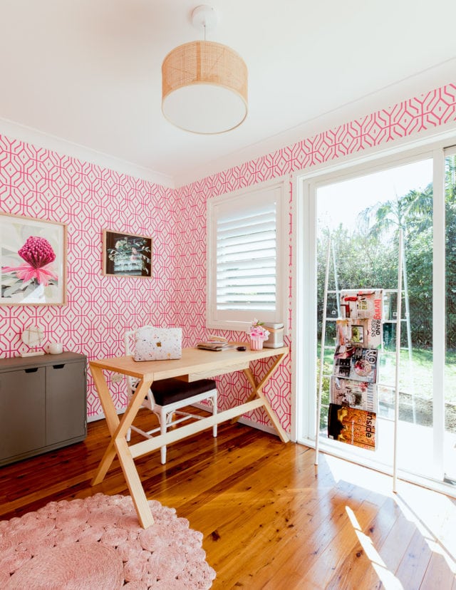
I’m excited to reveal my new home office; once a very dull and boxy little room, otherwise known as ‘bedroom 4’ on the floorplan! It did have a few great things going for it though: the best light in the house and a window and glass doors looking out onto the garden. Our house is very long and the office is right at the back, away from any noise and distraction.

It needed help though. And as this is a long term home, I really wanted to make an effort with this workspace and make it somewhere I really wanted to hang out and felt inspired and happy to work in. There’s nothing that transforms a small and featureless room more, in my opinion, than wallpaper. I’d wanted to use one of Anna Spiro’s designs for Porters Paints for years. Damian wasn’t sure about the pink so I compromised on the blue version. But when I found they were out of stock, I somehow managed to persuade him it was a good idea to revert to pink. At the end of the day, I’m the one who works from home so it’s really my domain. That and the fact the garage has been earmarked as his man cave and I’ll happily have nothing to do with what goes on in there!

Before the wallpaper, I’d already had a plantation shutter put on the window. Since these photos were taken I’ve also had sheer curtains put on the sliding door. They filter the light really well because the sun can sometimes be a bit too much and soften the room nicely.

I don’t need much furniture, being someone whose work is largely online and stored in the cloud. Laptop, printer, paper diary and a few notebooks and pens aside, I don’t need much physical stuff. Which keeps things tidy! I already had the two grey home office storage units from Pottery Barn. I love them because they’re grey and don’t look too corporate or officey. The one with the doors neatly hides the printer (never a good look!) and even if you don’t need storage, you’ve got to have somewhere to display pretty things, right?!

Speaking of pretty things, it was love at first sight for that cut glass lamp. Amazing. I’m still on the lookout for a more interesting shade to swap out for the white one it came with, just to mix things up a little. The rattan lampshade on the pendant light is the same one we’ve used in all the bedrooms. It’s a nice textured neutral.

The magazine rack is actually a bathroom ladder. I think I saw it used this way in a magazine and stole the idea, but I can’t remember which, sorry!

I’m having a major floral moment and these two prints by Kimmy Hogan (right) and Lamai Anne (left) seem to work well together and with the wallpaper.

It took a long time to work out where the desk should go (the doors make this room a tricky one to work with) but Damian finally cracked it and as soon as I realised the chair should be looking towards the door, that was it! I also have a thing about having my back to the door and not knowing who might creep up behind me, so this this works well! I imported that chair from Jonathan Adler years ago and while it is made of resin and thus super heavy and not ergonomically sound at all, I just love it so there. The desk itself is solid timber. I love its generous size, simplicity and the fact it has a small drawer where I store pens (not a fan of pen pots!).

The round blush pink rug helps balance the room a little as most of the action is happening at the far end.

This room is definitely polarising but I’m unapologetic! This is my space where I get work done and earn money so it’s important too. It doesn’t have to be everyone’s cup of tea! That said, I find most women love it and men just shudder and say the wallpaper would give them a headache! Each to their own!

It’s actually really fun and refreshing to have a room which can be so self indulgent (when you’re in a couple you do have to be at least a little conscious of your other half’s tastes!). And the fact that this room feels so good and is a pleasure to work in makes me happy every day. All in all, I’m glad I had the guts to go bold in this room.

The floors in here will be replaced with an oak laminate next month, and the sliding doors will eventually be replaced with French double doors.

What do you think?

Where’s it from?

Wallpaper: Rosey Posey Trellis by Anna Spiro for Porter’s Paints

Installation by AKRA Wallpapering

Grey storage units: Windsor range from Pottery Barn

Table lamp: Zoya table lamp from Lighting Lighting Lighting

Pendant light: Shore pendant in tan rattan from Beacon Lighting

Desk: Altar desk in natural ash from Contents International Design

Chair: Jonathan Adler Chippendale Armchair, available in Australia through Coco Republic

Plantation shutter and sheer curtains: DIY Online Blinds

Art: Kimmy Hogan and Lamai Anne.

Rug: Cochin blush hand stitched rug from Early Settler

Bathroom ladder (used for magazines): Home Republic Bath Storage Ladder from Adairs

Terrazzo MacBook Skin: Uniqfind

Gold stapler: Kate Spade (available at David Jones)

Bluetooth speaker: Bang & Olufsen (available at Myer)

Gold wall clock: Target

See my master bedroom

Categories
Art Designers RENO ADDICT Styling

Our top 10 names in Australian wallpaper

Wallpaper is a great way to revamp your room for less. Often all you need is a feature wall and in a matter of hours your room will go from bleak to chic! But like everything there are a lot of of options, so it’s important to find wallpaper that doesn’t just look good but also has longevity… because there’s really nothing worse than wallpaper with air pockets and rips. Below is a range of Australian labels we give the Interiors Addict stamp of approval to!  

Bethany Linz: Bethany trained in fine arts before moving to textile and wallpaper design, and boy can you tell. How intricate and beautiful is this botanical print? Available through Sparkk, the hand painted wallpaper is available in eight colour ways and the background can even be custom coloured to match your interior.

Bethany Linz

Quercus & Co.: A wallpaper and fabric label based in Sydney, Quercus & Co. love pattern and colour. More ‘art-paper’ than wallpaper, their latest collection, Suketchi, pays homage to Japanese art. Featuring symbols of the natural world — clouds, rivers, the sea and mountains — the designs are created via Ukiyo-e, a style of woodblock printing and painting that flourished in Japan from the 17th to 19th century.

Quercus & Co.

Anna Spiro: Designed by the Brisbane based interior designer for Porter’s Paints, Anna has applied her flair for layering fabrics with diverse pattern and colour to wallpaper. Bright, quirky and fun, Jen herself is a fan, having the below wallpaper in her home office.

Anna Spiro

Collette Dinnigan: Another collaboration with Porter’s Paints, wallpaper was a natural progression for the acclaimed fashion designer. Worldly taste is Colette’s signature… can’t you just imagine this wallpaper up against European antiques and artisan textiles? Refined and beautiful, her designs won’t go out of fashion any time soon.

Collette Dinnigan

Native Swinson: Quintessentially Australian, the prints of founder Kate Swinson are inspired by her memories of a rural childhood; think climbing up trees and floating down rivers. The detailed line drawings (you have to see them up close to believe them!) are screen printed by hand using non-toxic inks on eco-friendly papers.

Native Swinson. Photo Credit: Denise Braki for Temple & Webster

Signature Prints: The proud custodians of Florence Broadhurst’s design library, Signature Prints bring the design legend’s unique patterns from the ’60s to now. From the classic colour ways she made famous to some original new editions, the collections encompass the perfect blend of bright and neutral, graphic and simple.

Signature Prints. Photo credit: Emma Hack Artist

Luxe Walls: Options galore! Luxe Walls have partnered with Alamy, Australia’s biggest imagery supplier, so you literally have a million images to choose from. Oh my! They also have their signature collections if looking through a million images is a bit too overwhelming! Best yet, much of their collection is removable (including the concrete design below), which means you and your home can stay on top of the trends at an affordable price.

Luxe Walls. Photo credit: Home Loves

Annandale Wallpapers:  This family owned business has been supplying wallpaper for over 60 years! Home to one of Sydney’s widest selections — they have over 400 design sample books in store — Annandale Wallpapers offer something for everyone, from the more sensible geometrics to the free-spirited (dog-approved!) wallpaper below.

Annandale Wallpaper

Patricia Braune: After 20 years in advertising as a graphic designer, Sydneysider Patricia embarked on a new career in surface design. Very much at home with a pen in hand, her intricately drawn prints are rich in texture and layers, just like the flowers she draws.

Patricia Braune

Publisher Textiles: A favourite of Jen’s (she’s used them twice), Publisher Textiles are all about creating wallpaper the hard way, by hand! Using traditional hand screen printed techniques and small-scale production, everything is designed, printed and cut in their Sydney studio. Arguably the brand’s most iconic design is the Hibernian print (below), inspired by the heritage listed building in Surry Hills.

Publisher Textiles

We hope you enjoyed this list. Let us know what you would add.

More home inspo

Thanks to fellow wallpaper fan Lynne Bradley Interiors for sharing her favourites, some of which made it onto this list.

Categories
Homewares

Jen’s Lust List 23.05.17

How beautiful are these pieces by small Melbourne studio Felix Furniture? Cork and plywood never looked so good. The young couple behind the brand make everything by hand themselves  and are big on sustainability. It’s no wondered they’ve amassed a large following in just three years.

I’ve been getting a bit wallpaper obsessed lately as I really want some in the office. I love what’s on offer at Quercus & Co. as well as Greg Natale and Anna Spiro’s ranges (both really different!) from Porter’s Paints. And you may remember I’ve used the gorgeous Publisher Textiles’ Bugsey design in my last two homes, I loved it so much! But I think it’s time for something different. Any other great Aussie wallpaper brands out there I don’t know about? Please share with me in the comments!

Anna Spiro for Porter’s Paints wallpaper

Also, speaking of home offices, I’ve just bought this storage combo from Pottery Barn. I hate when office furniture looks too, well, officey! There’s nothing corporate about these lovely grey pieces and I think the price point is really good too. Windsor door cabinet, Windsor bookshelf and Windsor storage unit (at the time of writing, these are all on sale). There’s a matching desk too but I already have a timber one.

We featured these yesterday, but I’m really loving Mr Jason Grant’s new tile range with Di Lorenzo. So much so I’m reconsidering my stone splashback in my future kitchen in favour of the mini bricks in deep sea. Yes, we’re talking navy, you got me!

I’m so pleased with these pendants we recently installed in our living room. They were a brave choice and they definitely make a statement but they’re working so well in the big space. Everyone has loved them and even better, they take LED bulbs so they’re really energy efficient as well as beautiful! I’ll be sharing some more photos of the full room soon. Lancette 9 Light CTC in Brushed Brass, $299 from Beacon Lighting

I’m also loving these cool, all-natural handmade baskets from new brand J’Jute. From $149. Many other designs available. Toys, shoes, towels: I see endless potential uses!

And last but not least, I’m loving Georgia MacMillan’s third textile range, especially this gingham-look Farglioni Blue Check. Isn’t it divine?! Available in Australia via Nicola Lawrence Textiles and Papers, $189 per metre.

I’ll be back with more favourite finds next Tuesday!

Categories
Designers Styling

Collette Dinnigan creates wallpaper range for Porter’s Paints

Given that wallpaper could be considered fashion for the walls, it is rather fitting that the celebrated Australian fashion designer Collette Dinnigan has collaborated with Porter’s Paints to produce a feminine, sophisticated range of them. Bringing her signature Paris-meets-boho-meets world traveller vibe to interior spaces, the range mixes baroque and exotic motifs in colour ways including ‘Midnight in Paris’ and ‘Antique Rose’ that will no doubt appeal to the Francophiles among us.

porterspaints_cd_paisley_nufushcia
‘Paisley Botanique’ in Nu Fuchsia

“Since travelling the globe, I have always been inspired by the beautiful and exotic.  When Porter’s Paints approached me to design an exclusive wallpaper collection, I was excited to develop a range of signature Collette Dinnigan prints that combine my love of colour and artisanship, exquisite block prints and European detail, so that Porter’s clients and customers can enjoy them in their home,” says Collette Dinnigan. The designer’s love of intricate craftsmanship, Parisian flea markets and artisanal wares have most definitely underscored her creative output over the years. It’s also a signature that has been enjoyed by fashion lovers for a long time now so it’s fabulous for the interior lovers to get a taste of it too.

porterspaints_cd_fleurdiamant_midnightinparis
‘Fleur Diamant’ in Midnight in Paris

The signature design from the range ‘Paisley Botanique’ looks as sumptuous as it sounds. The designer has been continuously inspired by the traditional craft of Indian wood block printing on fabric and, with this design, it’s easy to understand the obsession. We love it in the pink colour way but aqua and gold combination is equally beguiling. Another design, ‘Fleur Diamond,’ is inspired by French royal emblems and subtle ornamentation while ‘Le Napoleon’ has a French neo-classic vibe and the design can be laid in several different ways – on its own or in combination with the other two designs.

Shop the range online.

Categories
RENO ADDICT Styling

Porter’s Paints release 238 new colours!

Having not released a major colour collection since 2006, we knew Porter’s Paints‘ Colour Collection 2015 wouldn’t disappoint.

porterspaints_lhasa

With a whopping 238 new colours (plus 90 essential signature colours) it is full of beautiful and complex neutrals, along with vibrant and unique brights.

porterspaints_babydoll

Embracing complex neutral soft greys and browns, whilst trending towards the “new neutrals” of dirty blues and moody soft greens, it offers unrivalled choice and depth of colour that will enable you to create your own inspired interiors.

porterspaints_feather

Created with not only broad wall areas in mind, but also furniture, floors and everyday objects that are enlivened with even the smallest addition of colour, the collection offers a myriad of opportunities to create a layered experience.

For more information.

Categories
Bedrooms Decorating 101 Designers Expert Tips House Tours

How to use wallpaper with wow by Greg Natale

As a teenager, I spent a whole summer holiday ripping down the bamboo wallpaper in my parents’ sitting room and repainting the walls pink, but as I point out in my book The Tailored Interior, the irony is that these days I’d be more likely to install the patterned wallpaper than rip it down!

That’s because I’ve come to absolutely love the magic that wallpaper can bring to a space. However I can still appreciate why some people are apprehensive about choosing wallpaper. They worry that it might make a room look smaller, that they’ll fall out of love with the pattern or that the look will date all too quickly. So they often default to the safer choice, paint.

IA wallpaper story Aquarius PP wallpaper

And while paint finishes are beautiful and classic, generally speaking they just don’t match the luxury and opulence that wallpaper can bring; patterns, materials and motifs that can actually touch emotions and the intellect simultaneously.

IA wallpaper story 2

So what’s the starting point? The first major factor is how much light there is in the room. For example, I’d never recommend using dark wallpaper in a space that’s not well lit, however dark walls, wallpaper and even ceilings can create a wonderfully dramatic space as long as there’s sufficient natural light. Textured wallpaper is another great visual treatment with the variable looks it takes on with different light and of course it also rewards your sense of touch with its natural fibres.

IA wallpaper story image 5

I’m known for my bold use of colour and pattern and it’s true that I love big prints to really make a statement and set a mood, but I also appreciate the use of smaller prints in the way they can create a more subtle and textural backdrop to a room rather than becoming a focus. So there’s bold or subtle, but wallpaper can also be fun and I sometimes like using it to make a light-hearted reference to a room’s purpose, for example using book-motif wallpaper in a library.

IA wallpaper story image 6

But whatever the design’s theme, I tend to prefer it applied across an entire room for a complete design statement rather than just as a feature wall, which I think can look a little disjointed and unresolved. You can even get adventurous and consider it for your ‘fifth wall’, the ceiling.

IA wallpaper story image 7

Wallpaper can really make a room sing, so it does strike me as odd that likening something or someone to ‘wallpaper’ means that they’re bland, invisible, plain or boring. Because I think of wallpaper as anything but!

PORTERS_PAINTS_SHOT_02 extended

[contextly_sidebar id=”tjIQ76CGMw5R8oaNsUb4YgjPQ5RRJRxh”]Wallpaper is a truly creative expression of your style and has huge sensory impact when it’s applied effectively. So get creative and experiment with colour, pattern, texture and lustre. Who knows, you might even end up choosing a retro bamboo print like the one I ripped down all those years ago!

Find more winning ways with wallpaper in Greg’s book The Tailored Interior, available at all good bookstores or online at Bookworld. Greg Natale Collection II, his second wallpaper collection for Porter’s Paints, launched last week and features sophisticated geometrics, dynamic lines and comprehensive colour ranges.

Categories
Designers Homewares

Greg Natale’s second designer wallpaper range for Porter’s

Following the successful Stripes collection, Porter’s Paints have teamed up with Greg Natale on his second wallpaper range and I like it even more than the first! Officially launching tomorrow, I can’t get enough of these new designs.

03

“With a shared affinity for pattern, we were eager to collaborate with Greg in an exploration of textural presence and form on a two-dimensional medium. Scale and colour were finely tuned to create depth, articulate and expand the sense of a room.”

Greg Natale
Greg Natale

Greg says: “I’m constantly inspired by pattern – its versatility, its energy and its endless possibilities. For the second time, Porter’s Paints have given me the opportunity to extend my love of pattern into the glorious world of wallpaper, and I couldn’t be more thrilled. The sophisticated geometrics, dynamic lines and comprehensive range of colours in this collection have something for all lovers of pattern.”

01

05

Available online and in store, Collection II offers six exciting new designs that are a chic play on primary shapes in a carefully curated range of colours. In true Greg style, the wallpapers tie into each other, creating a tailored continuity.

04

All these designs are so fab, I actually can’t pick a favourite!

Greg’s on a roll, as usual. It’s still only January and last week he revealed his first tile collection for Teranova!

[contextly_sidebar id=”6OC4wxPxmNa1HMviSHPh1UoQitfNEe2B”]

Categories
Appliances Furniture

The new chalk paints for creating distressed furniture

Chalk paint is the perfect choice for creating distressed and elegant effects on furniture, frames, shelving and flea market finds and Porter Paints’ Chalk Emulsion and Annie Sloan’s Chalk Paint are two of the best in the business.

PortersChalkEmulsion_120314_001
Porter Paints’ new Chalk Emulsion

Both have a decorative matt finish, with a chalky soft appearance that covers easily and is self priming, you don’t even need to remove old wax, paint or varnish! Coming in more colours than you can count, many effects are possible. Try using one or two colours for distressing with sandpaper, or watering it down a little or a lot for washed effects and for sealing.

AS_Jan2014_07
Annie Sloan’s new Chalk Paint

Watch a video about the new Porter’s product here and find out more about the more well known Annie Sloan paint here.

Categories
Interiors Addict

Spots and ikat in Porter’s Paints’ latest wallpaper collection

I’m dotty about this new wallpaper from Porter’s Paints. It’s simple but I can’t resist a random polkadot.

PORTERS_PAINTS_SHOT_08

Their latest collection of has both classic Porter’s designs, updated with fresh new colours, and some elegant new designs. Each of the 14 wallpaper designs come in a unique selection of colourways.

Categories
Interiors Addict

Anna Spiro’s new website plus news of a book and second wallpaper range!

Ever since I’ve written this blog, I’ve wished Anna Spiro had a website. Because I can’t get enough of her gorgeous work. And last night it finally happened! What has been a holding page, ‘coming soon’ for far too long, became a wonderful thing!

Looking at images of Anna’s work always makes me feel happy. It’s a riot of colour and pattern and she is undoubtedly the QUEEN of mixing and matching. She makes it look so easy! One of the things  I like about her is that she’s not much of a self publicist (not that there’s anything wrong with being one). She lets her work speak for itself. There’s her popular blog Absolutely Beautiful Things of course, but the fact she hasn’t had a website for years and has still remained so busy and well known is testament to her talent. The Queensland designer is also a great reminder that not all fabulous design happens in Sydney and Melbourne!

Perhaps even more exciting is the news Anna is working on a book with Penguin. Cannot wait for that one! And she’s also onto her second wallpaper range with Porter’s Paints (I love the first one so much that samples of it cover my fridge!). Hooray!

Categories
Designers

Greg Natale wallpaper launch at Porter’s

I’m sick so I was really disappointed to have missed the launch of my friend Greg Natale’s wallpaper launch at Porter’s Paints this morning!

Greg Natale Porters Paints chevron exterior

The Porter’s showroom in Waterloo was turned chevron for the occasion! How fabulous!

Greg Natale wallpaper launch

The bold striped collection made for a great display. My favourite is the chevron in gold (Palazzo).

Categories
Designers

Greg Natale’s striped wallpaper is finally in store!

Your reaction to my posts about Greg Natale’s striped and chevron wallpaper range for Porter’s Paints has been 100% excitement so I’m sure you’ll all be happy to hear it is finally available in stores.

Books, samples and stock are now available nationwide at Porter’s and will soon be available in the States through the Sydney Harbour Paint Company.

Categories
Interiors Addict

Check out Greg Natale’s wallpaper for Porter’s Paints, out next month

Here is the first professional photo of interior designer Greg Natale’s fantastic new wallpaper range for Porter’s Paints, out next month. What do you think of this burnt orange chevron? I love it!

Categories
Interiors Addict

First look: Greg Natale’s striped wallpaper for Porter’s Paints

I love a sneak peek and here’s an exclusive first glimpse at Sydney interior designer Greg Natale’s striped wallpaper designs for Porter’s Paints.

Greg looking at chevron prototypes

Greg says: “The collection will feature a horizontal, diagonal, 1cm and chevron stripe. I wanted to create a collection of stripes that I couldn’t find in the market. The collection will be available in over 20 different yummy Porter’s Paints colours.” (That includes gold, how exciting!)

Categories
Interiors Addict

Meeting Anna Spiro at Porter’s Paints

This morning I had the pleasure of meeting Queensland interior designer Anna Spiro at the Sydney launch of her gorgeous wallpaper range for Porter’s Paints.

Categories
Interiors Addict

Spiro designs wallpaper for Porter’s Paints

It’s a dream! Queensland interior designer Anna Spiro, known for her fabulous use of colour and pattern, has revealed on her blog that she’s designed a wallpaper range for Porter’s Paints. It will be released early next year. Super exciting! I interviewed Anna earlier in the year. You can read it here.