Categories
Interiors Addict

Dulux Colour Awards 2013 finalists announced

Awards season is officially upon us. And I don’t mean the Oscars; rather I speak of a far more exciting array of colour samples and trophy-yearning hopefuls: The 2013 Dulux Colour Awards. It’s the time when the crème de la crème of Australian design showcase their creativity through the application of colour.

Clarke Payne House Stanmore by Greg Natale Design

The excitement around the Dulux Colour Awards continued this year, with a record-breaking 229 submissions.

More than 60 finalists have been chosen. Seven will be named category winners but only one will walk away with the ultimate Grand Prix trophy and a cash prize of $1,500 alongside airfare and accommodation to an international design fair. I’m Dulux green with envy.

Categories
Interiors Addict

Pinterest Green Crush competition

To celebrate the new Pantone Colour of the Year, Emerald, I’ve teamed up with the lovely folks over at In A Designer Home to run a fun little Pinterest comp were you could win a set of Muuto Green Dots worth $199. Find out how to take part here.

Categories
Interiors Addict

The winners of the Haymes Paint competition

The lucky winners of the Haymes Paint Australia Day competition to have a room in your home transformed by professional painters are…

Wilma Brbot and Phoebe Netto! Congratulations and Happy Australia Day!

Wendy Rennie, colour and concept manager, Haymes Paint, said: ‘This competition certainly produced some wonderful submissions but the two winning entries stood out because of their creativity and strong links back to colour. Both represent the ‘Outback’ theme which was very popular but the  ‘Sun, Surf and Sand’ palette received the most entries for capturing what it means to be Australian. We look forward to sharing photos of the winners’ rooms in the next few months.”

Categories
Interiors Addict

Get your entries in for the Dulux Colour Awards

With the 2013 Dulux Colour Awards entries closing on 8 February, there are just weeks remaining for architects, interior designers, colour consultants and students of interior design or architecture to showcase their creative use of colour and be recognised and awarded as industry leaders.

The categories are: Commercial Interior; Commercial Exterior; Single Residential Interior; Single Residential Exterior; Multi Residential Interior; Multi Residential Exterior and Students.

Winners from each category will not only claim industry prestige, an abundance of well-deserved accolades and up to $1,000 prize money ($500 for students), they will also be automatically entered into the Grand Prix award. The Grand Prix award winner will receive an additional $1,500 and a return economy airfare and accommodation to attend a renowned design event.

Categories
Interiors Addict

Cool Edie’s team up with Murobond on glam and fun paint range

The ladies at Cool Edie’s are the latest stylists to team up with Murobond on their own paint range, and very cool it is too.

Jane Frosh and Lucy Weight have come up with four colours: a matt black (of course), a gold, an almost-emerald green (how on-trend) and a peach.

“We wanted a set of colours that really represented the Australian interiors industry as it stands and our Cool Edie’s approach to styling. A matt black (Cool Edie’s Religion), because it directly reflects on Cool Edie’s, our religion if you will. Who doesn’t love a matt black? It neutralises all other colours and adds a tough, chic element to any interior.

“The gold, well, does that need explaining?! Gold is a sense of humour, a touch of glam, a pop of insanity, hence the name Confetti Bomb. Boom! It just reeks of fun and parties and frocks and laughter.

Categories
Interiors Addict

Win paint and a professional painter to give your home a New Year facelift!

This post is sponsored by Haymes Paint

Christmas and New Year are over so you know what that means (as well as going back to work and the gym)? Countdown to Australia Day is on! To celebrate, I’m running a fab competition in association with Haymes Paints and the prize is to have a room in your home professionally painted in the colour palette of your choice. What a great way for two of you to kickstart any New Year renovation plans!

Haymes colour and concept manager Wendy Rennie has put together three Australian-inspired colour palettes. To enter, just tell us which scheme you think is most Aussie and why.

Here are your choices:

Palette one: The Outback

The Australian outback is rich with colour – deep oranges, reds and ochres coupled with contrasting charcoals and neutrals.

Haymes colours: Rapunzel, Night Moves, Black Pitch, Worn White, Moon and Stars.

Palette Two: Sun, Surf and Sand

The relaxed lifestyle of Australians is synonymous with the beach, particularly as we are lucky to have some of the best beaches and coastline in the world.

Haymes colours: Barely There, Basic Instinct, Blue Mosaic, Danube Sky, Valley of Stars.

Categories
Interiors Addict

Dulux predicts design trends for 2013 in annual colour forecast

Vintage design, fossicking and gathering, the meeting of old and new, and the rise of new technology are among the key influences that will dominate Australian design over the next 12 months – and with it our choice of colour.

The new Dulux Blur palette

That’s the message from Dulux, whose colour experts have studied global trends to develop six palettes for 2013.

The Dulux Colour Forecast this year draws on the themes of movement, social change, people power and the march of the digital age. It explores how colour is shifting and changing in modern times.

Categories
Interiors Addict

Entries open for 2013 Dulux Colour Awards

Architects, designers, specifiers and students are invited to show their imaginative use of colour with entries for the 2013 Dulux Colour Awards now open.

Now in its 27th year, the Awards is all about how architects and interior designs apply colour to transform the three dimensional spaces they create. Dulux Colour & Communications Consultant, Bree Leech, said: “Colour is an integral element in the overall design process. It has effects that are not only symbolic but also emotional, and in 2013, we’re looking forward to receiving entries that push the boundaries and use innovation, imagination and flair to showcase colour in architecture and interior design.”

Categories
Interiors Addict

Discover the perfect palette for your home

Do you dream of your home looking like a picture from a magazine? Have you fallen in love with a colour but don’t know how to make it work? Fiona Parry-Jones, owner of Von Haus design studio, launches her new colour workshops, sponsored by Murobond, to help you find the answers to some decorating dilemmas.

You will have the opportunity to explore and select colours for your home with confidence, learning about the latest trends in paint colours and how to apply them. Fiona will guide you through the practical process of creating a mood board in order for you to establish a colour scheme ready to use in your own interior project.

Categories
Interiors Addict

10 things people get wrong in their homes and how to fix them quickly & easily

1. Hanging artwork too high. I see it all the time and I’m afraid I will go to my friends’ homes and point this out (they thank me for it, most of the time). There must be something in human nature that says hang it up high, but think about it: art is there to look at, so it should be at eye level. Stick to this rule and you’ll find it all works much better. Go and have a look at where your art is. Is it too high? Does it make sense?

2. Buying rugs too small and placing furniture around them, not on them. My rule is this: buy rugs as big as you can afford. Put your furniture ON them, not around them. There are always exceptions to every rule but, in general, this approach looks and feels much better, grounds your furniture and defines spaces within multi-use open plan areas like living/dining rooms.

3. Forgetting about lighting. Lighting is key. It’s so important when it comes to creating a layered interior. It’s another layer all on its own. Overhead lighting, in most living areas, sucks. It might work in kitchens and bathrooms but it is often too harsh in living areas and does little to create ambience. Consider table and floor lamps at different heights and brightnesses to mix it up. Install dimmer switches where you can.

Categories
Interiors Addict

All glamour at the Taubmans look book launch

Unfortunately I couldn’t make it along to the Taubmans look book launch in Sydney this week and it looks like I missed a great event. Isn’t that always the way? A fashion show featuring pieces from Australian and New Zealand designers, including Trelise Cooper, Alice McCall and Josh Goot, represented the 5 key interior schemes and colour palettes.

Created in collaboration with interior designer, TV personality and Taubmans Colour Ambassador, Shaynna Blaze, the Taubmans Look Books highlight five styles loved by Australians and provide the inspiration people are looking for when they decorate or redecorate their home this Spring. They are Classic Interiors, Retro Revival, Beach Lifestyle, Modern Living and Eclectic Mix – with each book providing tips and inspiration on how to select the right colour scheme to achieve your desired style throughout the whole house.

Shaynna (above, at the event), says the Look Books are designed to help consumers become colour confident and equip them with the expertise to take decoration into their own hands and create interiors that reflect their own personal taste and style, regardless of trends.

“As an interior designer, I am frequently asked how I manage to bring different colours and pieces together to create one holistic style and look – and while this is something that comes naturally with practice, identifying the style that suits you and your home and recreating it can be daunting at first. We have created these Looks Books to give people the tools to assist in identifying a style first, then working with the colour palette second.”

Each style was brought to life and personified by live models and an accompanying fashion runway. Australian fashion designer, Josh Goot, who was at the launch, said; “This Spring is all about colour, and what better way to celebrate the amazing colours on offer than experiencing this unique marriage between interiors and fashion?”

Stylist Lydia-Jane Saunders, fashion designer Josh Goot and Shaynna Blaze

You can pick up the Look Books in Bunnings stores from next month.

Categories
Interiors Addict

Learn colour with Sibella Court

Sibella Court’s latest workshop is all about colour. It’s taking place next Wednesday 26 June from 6.30 to 8.30pm at Sun Studios in Alexandria and costs $80.

Sibella says: “I believe that every person has their own colour palette. It can be found by looking carefully at the things you surround yourself with: your clothes, the invitations and ephemera you keep, patterns you buy, jewellery you wear, even your teacups and plates! If you put your favourite things together you notice the same colours are repeated again and again. From this you can discover the colours that make you happy, how they can sit together and be applied into your interiors.”

Categories
Interiors Addict

Mr Jason Grant wants YOUR help!

Listen up, interiors addicts! Our friend Mr Jason Grant, stylist extraordinaire, wants to know which kind of colours you’d like to see in his next paint collection for Murobond.

His previous three collections have been hugely popular and captured the colour trends of the moment. You could be a part of helping him shape the next collection by sharing the kind of colours you’d like to see included. He knows, of course, that interiors addicts have great taste!

Categories
Interiors Addict

Mr Jason Grant’s new colour range for Murobond is inspired by summer

Bondi boy Mr Jason Grant loves summer and the beach and his second paint collection with Murobond consists of faded fun colours. Titled Road Trip, the collection is all about a summer getaway.

These photos were shot on location in Avalon NSW with a super cute kombi van, one of Jason’s dream cars.

“I LOVE colour so have included some fun bursts of colour mixed with some cool neutrals,” he says.

Drawing inspiration from the everyday and the hundreds of photos he takes, each colour has a story and a reference from his adventures. ‘Short Shorts’ came from a perfectly faded pair of shorts a friend wore over to his house, ‘Smoothie’ is the perfect shade of soft yellow (Yay! A yellow!) just like a classic banana smoothie, ‘Happy Days’ is just like a clear blue sky and ‘Porch’ is like a perfect weathered piece of timber.

The collection is available as of tomorrow (Saturday 5 November 2011) and I can’t wait to attend the launch!

www.murobond.com.au

Read my interview with Jason, former Real Living style director here.

Photos by Felix Forest

Categories
Interiors Addict

ATTENTION! Superstar stylist line-up  Want to learn from some seriously cool people from the styling

ATTENTION! Superstar stylist line-up Want to learn from some seriously cool people from the styling
Categories
Interiors Addict

Interiors Addict goes to Colour School!


Earlier this month, I attended the day-long Colour For Interiors Masterclass at Coco Republic Design School in Sydney and I had a ball! I learnt so much more than I expected to and it really got my creative juices flowing and made me look at everything interiors in a new light (or should I say shade, tint or chroma?).

I really think colour is so important to interior design. It’s something a lot of people get wrong while others wrestle with potential colour schemes for months and years, all the while sticking with boring beiges and neutrals because they’re basically scared!

This course was a real eye-opener. Being back in a classroom environment (and on a Saturday) was a bit of a shock to the system and it started out much like a science lesson with Newton’s electromagnetic spectrum and some basics on how we actually see colour and what it is. And I thought we’d just be playing around with colour wheels! It was fascinating though, and the teacher, Annamaria di Cara, was excellent.

We learned about hue, value and chroma (I had no idea what any of these meant beforehand, to be honest with you) and left much more able to articulate what we like and why. My classmates ranged from interior designers to renovators and those who simply had a passion for interiors. We did eventually get on to the colour wheel (HOURS of fun!), which helps you understand the relationships (related and contrasting) between colours (primary, secondary and tertiary) when mixed in certain ways. I could go on for hours here about split complementary and triadic schemes but if you’re interested, you really need to sit yourself down with a colour wheel for a couple of hours and apply some serious concentration. I promise you, you’ll be hooked when you work out why it is that red and red-purple plus green and yellow-green (yes, all four of them!) can work together in a scheme. That’s a double-complementary colour harmony if you were wondering…

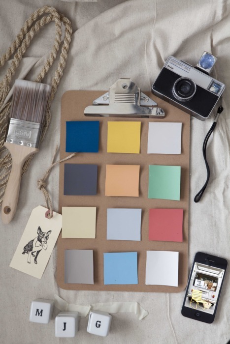
While all the theory was great, what I loved most was with the practical elements of the class, cutting and sticking and using a glue stick for the first time in years. Fun! We collected paint swatches, fabrics and images from magazines to create various mood boards which we then shared with each other.

I learned so much more, like how colours can make a room seem larger or smaller, warmer or cooler, calmer or busier, but I’d be here all day! You would think a day would be more than enough to just learn about colour, but I could happily spend many more days on this subject. It’s a very thorough introduction but it does leave you fascinated to learn more!

I would really recommend this course to anyone. Find out more here.

Coco Republic Design School courses are developed and presented by The Design Centre Enmore, part of TAFE NSW. Coco Republic Design School is in O’Riordan Street, Alexandria. This one-day course costs $450 and includes lunch.

Categories
Interiors Addict

I’m feeling girly this afternoon!

I’m feeling girly this afternoon!