A mainstay in American homes, we’ve seen the mudroom concept surge in popularity in Australia over the last few years. A practical space at the entrance of your home, used to store all your household belongings, a mudroom is the perfect place to house shoes, hang up your bag, keys, dog leads and more.
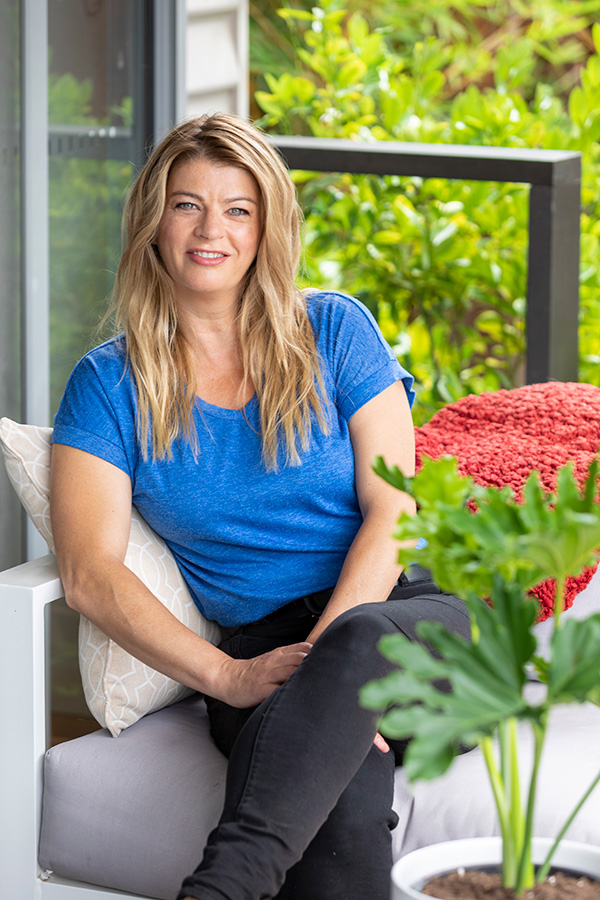
These spaces are beginning to become popular DIY projects, as people crave functionality within the home and embark on a spring-cleaning refresh. And you don’t need a dedicated space to create a mudroom – a hallway, nook or alcove will suffice. Wendy Rennie from Haymes Paint has some great tips to share.
Colour is everything when creating a mudroom The first and most essential step of creating a DIY mudroom is differentiating the space from the rest of the house through the use of colour.
The great thing about a mudroom is that you can create one out of nothing. Often, these handy little spaces can be used to fill up an entryway or transform a hallway, inviting guests to take a moment to kick off their shoes or hang up their jacket as they enter your home. But to make this space feel like its own, colour is required.
“Since the mudroom is the entrance to the home, it is key to select a colour theme that is consistent with the rest of the house, but still creates impact. You want the impact of the first impression to flow harmoniously throughout the entire home,” says Haymes Paint colour and concept manager Wendy Rennie.
“I recommend using a darker shade to differentiate the mudroom from the rest of the house, especially if you do have an alcove or separate entryway to use. If your mudroom is simply an extension of your hallway then a lighter neutral, complemented by accents of a darker tone that may feature elsewhere in the home is a nice introduction for your guests of what is to come,” says Wendy.
You can choose any colour theme you desire, as long as you steer clear from bright primary colours. Reds, yellows or even blues will be too overwhelming when first entering the house.
Bring it to the next level with furniture Not everyone has a dedicated room or nook that they can designate for this space, and the good thing is you don’t actually need one. You’d be amazed at what you can create with simply the right colour themes and a few simple pieces of furniture.
A set of hooks you can drill into the wall, a hall table and a cute wooden shoe rack is all you need to create a ‘mudroom vibe’ without requiring a designated room. The best part about these furniture pieces is that they are practical but also aesthetic, adding character and style to a hall or entryway.
This mudroom features the Haymes Paint Artisan Surface Industrial finish on the walls
Accessorise! Once you have selected the furniture you can inject your personality into the mudroom through the accessories you choose.
To warm up the mudroom, Wendy suggests laying down a rug to add a pop of colour and act as an entryway for your guests. Potted plants by the door and in the corners will also enliven the mudroom with the freshness of greenery, acting as the perfect transition from the outdoors to the indoors.
A dark and drab apartment in the heart of Redfern, has been transformed into a calm and contemporary oasis for a retiring couple by interior stylist Jessi Eve. Faced with the challenge of merging two completely different briefs from each client, Jessi found a balance that honoured both. One of the clients preferred an all-white, cool-toned, clean and fresh look while her partner requested a slightly more masculine vibe. Jessi delivered a cohesive interior, bringing life and light to this much-loved home.
BEFORE dining
AFTER dining
“The greatest challenge was merging the two polar-opposite design briefs. It’s not unusual for couples to have completely different design preferences and there is an art to finding a balance between two extremes to ensure a cohesive result. A skilled eye will be able to identify and extract the similarities to form the basis of the scheme,” says Jessi Eve.
A key objective was to incorporate a contemporary and timeless interior to the dated apartment. Jessi achieved this with beautiful new cabinetry in the kitchen and entry, replacing the chocolate brown cabinetry with white fronts. “We did a mini kitchen reno in the sense that we kept the original stone splashback, stone benchtop and internal cabinetry and just refreshed the overall style by swapping out the heavy brown cabinetry and island benchtop,” says Jessi.
BEFORE kitchen
AFTER kitchen
The main living, dining, entry and kitchen areas of the home feature a black, white, grey and navy palette with hints of tan leather. To appease both clients, a minimal and clean aesthetic was chosen with touches of masculinity connecting the spaces together. A navy blue Molmic sofa is paired with a Trit House leather armchair and textured braided rug from Rug Culture.
BEFORE lounge
AFTER lounge
Existing bedroom joinery was removed to allow for more movement and flow while a coat of paint, new window treatments and new Hycraft carpet further elevated the spaces. The two bedrooms became the perfect space for Jessi to bring the polar opposite client briefs to life.
In bedroom one, a white-on-white palette is featured against a cool grey backdrop of curtains and carpet. The client’s existing Lone Swimmer artwork by Aquabumps was a sentimental piece incorporated into the space and Jessi drew inspiration from the minty hues of this artwork to add accent styling in the room.
BEFORE bedroom one
AFTER bedroom one
And although the two briefs are contrasting in aesthetic, Jessi created synergy between them by selecting another Aquabumps artwork in moody tones for the more masculine bedroom. Create Estate custom bedheads were created for both spaces – for the masculine room, a bedhead fabric was matched to the custom sofa in the living room to create a subtle link between the spaces.
Patterned Cultiver linen is featured in the masculine room alongside black rattan Globewest bedside tables.
BEFORE bedroom two
AFTER bedroom two
The result of this design transformation is a home that blends the best of both worlds for the lucky owners, who can ease into retirement with a space that brings joy and relaxation.
Proving the transformative power of colour yet again, the latest Dulux makeover is a bright, bold confection designed to showcase this summer’s hottest paint trends. A predominantly white lounge room and tween bedroom were overhauled using the Revive palette – one of three palettes from the Dulux Colour Forecast 2023.
“As our world opens up and we adapt to new ways of doing things, we’re looking for lightness and joy in our surroundings. This is a time for reconnecting with the ones we love, and we want guests to walk into our homes and feel a sense of happiness and celebration. At the same time, after two years of restrictions, many of us are yearning for fun, freedom and the chance to try new things,” says Andrea Lucena-Orr, Dulux colour and communications manager.
BEFORE loungeAFTER lounge
The formerly all-white lounge room was overhauled with Dulux Paper Brown paint on the walls and Dulux Breezy Half on the ceiling. “The brown instantly added warmth and character while the soft blue ceiling really brightens up the space. “Taking the ceilng colour part-way down on the wall, as we’ve done here, is a design trick to make the ceiling feel higher,” says Dulux colour forecaster and stylist Bree Leech.
The Revive palette perfectly captures the mood with vibrant hues including a rich blue (Dulux Integra), lively green (Dulux Diorite) and a whimsical lilac (Dulux Perplexed) paired with over-scaled patterns, voluptuous furniture and bold, abstract artworks inside the renovated lounge room. “If you’ve never swayed from whites and neutrals before, using saturated colours like these can feel daunting, but there’s really nothing to fear,” says Bree.
A colourful vignette is displayed on the lounge room side board
Bree styled the room with a mash-up of futuristic and retro influences including curvy, statement seating in 80’s inspired electric blue paired with a 70’s inspired textural feature chair and foot stool in mustard. A powder blue sideboard topped with a bright green vessel completes the scene. “Design trends today are heavily influenced by the idea of ‘creating a moment,’ whether it’s the perfect Instagrammable photo or a great Zoom backdrop,” says Bree of the inspiration behind the room.
BEFORE bedroom
AFTER bedroom
In the nearby tween bedroom, Bree balanced calm with a sense of fun. “As a sleep space, we wanted this bedroom to feel restful, so we painted the walls in soothing and immersive Dulux Integra. For something a little unexpected, we used Dulux Diorite on the skirting boards, window trims and door, rather than traditional white.”
AFTER bedroom door
Bree’s summer styling tips
Add colour in unexpected spots: The element of surprise can be a powerful decorating tool; consider adding colour to your ceiling, timber window frames, door edges or the back of shelves.
Exaggerated curves: Whether it’s a curvaceous sofa, a chubby accent chair or rounded coffee table, this look calls for curves.
Be bold with pattern: Forget the so-called rules on mixing patterns – have fun combining thick or thin stripes, geometrics, over-sized floral prints and more, all in the one space.
Keep artworks casual: Think unframed, abstracts and digital artworks casually propped, even overlapping, on a shelf or sideboard.
Textural contrast: Add depth and interest to your rooms décor by mixing different textures, such as boucle armchairs, thick woven rugs, imperfect ceramics, matte finish joinery and touches of high-shine metallics in furniture legs.
Highlight interesting furniture shapes: Having a backdrop in a contrasting colour allows pieces like curvy, statement seating to shine.
Scheming: The Dulux curated palettes are designed to be used as schemes for paint, as well as soft furnishings, artwork and décor – to ensure all colour references work cohesively.
Much-loved Australian media icon Deborah Hutton has drawn inspiration from her recent move to the NSW South Coast to create her latest spring /summer collection.
“Since moving to the South Coast, every day has felt like a weekend getaway and I want to give others the opportunity to create a sense of holiday and relaxation in their homes too,” she said.
“The idea behind my latest collection is to bring a relaxed weekend vibe to you. Whether you’re by the beach, in the city, even in the country you can add a touch of coastal luxe in your own home. And you can do so without breaking your budget, either.”
Quilt cover set
The collection features a range of luxurious bed linen, coordinating throw rugs and cushions, coverlets, towels, décor items and tableware.
While the recent sea change has been the main focus of Deborah’s newest collection, memories from travelling near and far have helped bring it together.
From a much loved trip to Morocco (Amira), walking through local palm forests (Palmetto) and wearing her favourite relaxed linen shirts (Sinclair) there is a touch of vacation throughout Deborah’s entire collection.
It includes bed linen sets, European pillowcases, coverlets, throws, blankets and cushions.
The HOME with Deborah Hutton collection is available now, exclusive to HOUSE Bed & Bath, in store and online.
If you’re anything like me, your indoor plants don’t last too long. Whether you are a first-time plant owner like me or a well-seasoned gardener these simple tips and tricks from gardening expert and Scotts Osmocote ambassador Melissa King can help you be a better plant parent (without having to spend endless hours refining that black thumb).
Tip 1: Don’t drown your plants with love
Over watering is the biggest killer of indoor plants. Wilting leaves can be a sign of too much or too little water (among other things). So if your house plants are sulking, don’t always assume that they are thirsty. Poke your finger into the soil first to see if it’s dry down to your second knuckle before getting out the watering can.
Tip 2: Some extra TLC never hurt
Give your house plants a regular wipe down with a moist cloth to prevent an accumulation of dust on the leaves. To give them a thorough clean, pop them in the shower every month or so to remove any build up, helping make them look shiny and healthy. You could also put them outside in the rain or sprinkle them with the hose before bringing them inside again.
Tip 3: Lighting is key
Some houseplants grow well in low light, others need it a bit brighter to flourish, so position them around your home according to their required light levels and keep them away from heaters and blasts of cold and warm air.
Here’s a good rule to live by; If it’s bright enough to be able to read a book in a room with the lights off, then there’s enough light for your indoor plants to thrive.
Tip 4: Plants like dinner too
They key to thriving plant babies? Food! Pick up Scotts Osmocote pour + feed. You don’t have to mess around diluting it in a watering can, simply pour a capful into the base of your plant every fortnight or when your plants look like they need a boost.
Tip 5: When was the last time you changed your potting mix?
If your plant babies are looking a bit tired or practically jumping out of their pots then it might be time to repot them. I recommend trying Scotts Osmocote potting mix for indoor plants, which is tailor-made to bring out the best in your green beauties. It doesn’t contain compost or pine bark, which are known to shelter pesky fungus gnats. Instead, it’s based on an expert recipe of Scotts Coir, Sphagnum Peat and Perlite, which provides the ideal foundation to keep your indoor plant babies looking fresh, green and lively.
The houseplants trending in 2022 and how to care for them
Melissa King, Better Homes and Gardens presenter and Scotts Osmocote ambassador, shares her horticultural wisdom! #SentimentalPlants It’s not surprising that…
Jason Hodges’ expert guide to a Hamptons style outdoor area
For over a decade Australians have had a love affair with the Hamptons style, with the trend increasing throughout the…
Looking ahead to 2023, what paint colour trends do you think will take over in Australia? Luckily for us we can find out with Benjamin Moore releasing their 2023 colour of the year. And in 2023 their colour of the year is…
Raspberry Blush 2008-30
Raspberry Blush! It’s a saturated red-orange that enlivens our surroundings while awakening our senses with charismatic colour. This vivacious colour is unapologetic in its boldness as it encourages a confident colour statement.
“Colour is coming back into Australian homes and Aussies should feel empowered to move away from pure white walls. Raspberry Blush and the Colour Trends 2023 palette deliver whole bodied paint colours that can be used to form statement transformations for incredible results,” commented Brian Hamilton, general manager for Tenaru, the Australian distributor of Benjamin Moore paints.
Raspberry Blush
Leaning into deeply saturated colours with undeniable charisma, the Colour Trends 2023 palette celebrates the use of colour to influence dramatic transformations. As living spaces are often an expression of individuality and personal style, Australians should move towards a bold statement and the palette empowers designers and homeowners to take colour to unexpected places.
Here are seven other Benjamin Moore paint colours from the Colour Trends 2023 palette:
Conch Shell
Wenge
Cinnamon
New Age
Starry Night Blue
North Sea Green
Savannah Green
Savannah Green 2150-30
To commemorate this year’s selection, Benjamin Moore enlisted Canadian electro-funk duo Chromeo to underscore the upbeat and optimistic tone of the palette and the dynamic role colour plays in self-expression, much like music. Chromeo’s new single, Raspberry Blush, celebrates the positivity and enjoyment of life that both colour and music can influence. Designers and DIYers alike can experience the Colour Trends 2023 palette through eight specially curated playlists that reflect the personality of each colour and the spirit of the palette on Spotify. It’s certainly different!
Designed by Smac Studio’s Shona McElroy, this semi-detached/duplex house is in Sydney’s Dover Heights and is home to a busy young family that loves to entertain. A relatively small home, the recently renovated abode manages to fit in four bedrooms, two bathrooms, storage and several entertaining areas without compromising on style.
Lounge, dining and bar
“The brief was very relaxed. They wanted it to feel really welcoming and calming and like a sanctuary and also to reflect their family. They have three young daughters and a little girl dog too so it was a very feminine energy! The owner is really drawn to things that are quite glam, but she also wanted the home to feel quite calm,” says Shona.
Bar
The owners have a large family and spend a lot of time entertaining, so Shona included details such as a big bench seat across from the kitchen – perfect for perching on at parties. “For a small house, it has a lot of entertaining capacity,” says Shona.
Sentimental items are showcased in large shelves above the kitchen and in the niche next to the kitchen bench seat. “The have some beautiful ornamental items that they like to showcase. They also like to collect pretty items when they goes overseas.”
Kitchen bench seat
The open plan kitchen features shaker style cabinet doors and a curved island bench made from Palladian marble. “We loved the idea of an interesting stone profile on the bench, and then we ribbed the underside,” says Shona. There’s also a hidden pantry, concealed by pocket sliding doors, which houses a variety of appliances and extra storage.
Kitchen
The ensuite is a luxurious space that combines bronze framed mirrors that work to make the space feel larger, Murano glass wall sconces, sheer curtains and a double vanity trough sink carved out of stone. “That beautiful stone had all the pink and bronze tones through it. It’s a very harmonious, functional and really gorgeous place to be.”
Ensuite
Master bedroom
The bespoke dressing table was designed to evoke memories of the owner’s grandmother
Another standout space is the powder room which features a blush hued stone, Venetian plaster, panelled mirrors and a beautiful Spence & Lyda pendant light. “I always like to pack a punch with the powder room. I think it’s somewhere where you can have the most fun in the house. And I think it should be a real reflection of the overall design of your house and what you want your guests to experience.”
Amidst all the focus on Christmas food and decor it can be easy to overlook the power of scent in setting a festive tone. We’ve done the work and rounded up our favourite Christmas scents based on good looks and fabulous smells.
Ecoya Christmas: Strawberry Spritz Madison Candle: Created by Australian candle Ecoya, this limited edition scent has a very summery feel. It combines spritzy pink grapefruit, pineapple, strawberry, passionfruit, guava and malt. $46.95.
Diptyque limited edition Neige candle: Inspired by snow, this candle’s stylish midnight blue wax is scented with white musk and heliotrope. Its glass vessel is adorned with white, gold and silver stars that glow in the dark. A golden metal lid protects the wax. $66.
Arty Bub Christmas tree candle: Available in green, red and white, we love this candle’s elegant shape. Decidedly Aussie, these candles are scented with an Australian Christmas bush scent. $34.99 each.
Trudon Felice Christmas 2022 Classic Candle: While this candle smells gorgeous (think citrus, Christmas spice and fruity notes), it’s the gorgeous vessel that caught our eye. The pretty glass jar is emblazoned with a shining star, champagne bottle, sparkling ring and musical notes too. $159.
Peppermint Grove Australia Christmas Pine Large Soy Candle: Housed in a lovely faceted green glass jar, this candle combines spearmint and bergamot with eucalyptus, sage, caramel, pine, rosemary vanilla, patchouli and more. It’s quite the festive mix! $44.95.
Oh It’s Perfect Snowflake Glass Vessel Candle: This one features a sweet and fresh aroma of flowers, coconut and caramel. We love its octagon shape, coloured glass and retro-inspired label. $65.95.
Circa Pine & Snow Gum candle: Another Aussie take on Christmas, this candle features the unmistakable scent of fir balsam, pine resin and tangy red fruits mingled with a sprig of minty Australian eucalyptus. $46.95.
Christmas entertaining: How to create a stylish tabletop
Earlier this year we reported on the ‘tablescape’ trend which saw table decorating elevated to a fine art. And if…
How to prep now to get your kitchen ready for Christmas entertaining!
Sponsored by Glem Gas With summer and seasonal entertaining just around the corner (hooray for having visitors to our homes…
We’ve profiled interior designer Dylan Farrell before so when we heard he was selling his beautiful Sydney home we couldn’t wait to take a peek inside. Located on Paddington’s salubrious Hargrave Lane, the 19thcentury character home playfully mixes gothic archways with gelato hues and an impressive collection of furniture and artwork. The colourful abode is a complete and utter delight.
Lounge room
Originally built in the 1890s, the home was later renovated and expanded from its original cottage size into a larger family home. The renovation involved reclaiming architectural elements from a nearby church which now comprise some of the home’s most interesting details.
Lounge roomKitchen, dining & entry
Since Dylan and his wife Nicolette purchased the home four years ago they have made many improvements including turning a pre-existing second floor study into a private master suite with a balcony that overlooks the neighbourhood. The changes incorporated high-end tiles, carpets and accent hues.
“We played with bold yet tasteful colours to challenge what would be the typical Paddington playbook, but while still honouring the history of the building,” says Dylan.
The home has such lovely use of colour and art
And unlike many older homes, this one is filled with light, primarily due to its north-facing yard which allows light to stream into the rear. It’s the light and the home’s privacy that Dylan and Nicolette love the most about it.
Master bedroomBathroom
“The ample skylights at both the front and upper level allow for a summery feel year-round. It is rare to have a walled front entry and rear yard in Paddington, especially while on such a quiet laneway. We can leave the doors and windows open without generally worrying. It truly feels like an oasis.”
The courtyard features a beautiful wooden arch sourced from a nearby church
The extraordinary Greg Natale has released his third book The Layered Interior. The following is an extract from the book.
The language of interior design has many layers. We talk a lot about furniture and accessories—the sofas we sit on, the cushions we sink into, the ornaments we choose to inject our personal style. But so much of a house’s character comes from the interior architecture—the floors under our feet, the walls that surround us, the hallways we traverse, the portals and doors we walk through. These different framing elements and the intriguing spaces in between have much to say, and their materiality can define the narrative of a house.
When you step through the oversized bronze doors of this remarkable contemporary villa in the harborside Sydney suburb of Mosman, you experience a moment that encapsulates the essence of the design in more ways than one. First, there are the floor tiles. Outside the doors, large slabs of marble in shades of burgundy, pink, and ivory are laid in a classical Palladiana mosaic style. Inside, the combination of marble tiles shifts to a geometric pattern of burgundy, pink, green, and ivory. Those four colors set the scene for the palette of the four-story, five-bedroom house, and marble plays a significant role throughout as one of its most expressive materials.
But there is more at play in this vignette.The pattern of the interior tiles reveals an art deco influence, which continues in the triangular fluting on the timber walls. Then there is the brutalist style of the glass mirror hanging on one wall. And lastly there are those statement doors with their large bronze and glass panels, inspired by Italian rationalism.
These three styles were my main influences for the design of this grand house. How they came to work together was a response to the structure of the building itself, the owners’ brief, and my European sojourns.
Travel is always a doorway to fresh inspiration, and prior to this project I was fortunate to have enjoyed several trips to Italy and France. One of the most significant experiences for me was visiting Milan’s Villa Necchi Campiglio, built in the 1930s at the height of the Italian rationalist movement. I fell in love with its blend of pared-back classicism and modernity, and the beauty of its marble and granite floors and portals, timber-paneled walls, and metal doors.
Those features came to mind when I began the interior design of this house, which centered on merging the classical and the contemporary. The building may have been modern but still had elements like a pitched roof and eaves, and rather than a minimalist style the owners wanted some traditional attributes like cornices and a design full of warm tones. He had a fondness for art deco, she liked late ’70s furniture, and both requested blond oak floors. My travels inParis led me to incorporate the chevron pattern of the floorboards that appear in some bedrooms and living areas.
But it was the introduction of marble and granite that unifies the design of this house. Modern builds can be blank canvases and all-white spaces can overwhelm, especially in large rooms. To me, the unique colors and patterns of stone not only help to break up those spaces and add detail and warmth, but they also bring their own sense of history. In a“forever” house like this, for the couple and their two older children who come to stay on and off, the marble and granite in the floors, walls, portals, and furniture create a new design history, layering the classical over the modern. The fact that there are twenty-eight different types of stone in this house makes that history more interesting.
With the view of the sparkling harbor beyond, the huge open-plan living, sitting, and dining area owes its sense of grandeur to the granite that defines the spaces. In generous strips that run along the floorboards and up the walls, in substantial beams that wrap around white lacquered ceilings, its gray, ivory, and black veins provide a beautifully decorative frame. Within that, the palette is made up of neutrals, gold and white in shapely pieces that range from the curve of a cream wool sofa to the solidity of a brass brutalist chair. Artworks at each end of the space echo the lines of the granite and create their own dialogue with the furniture in the room, which is a mix of vintage, contemporary, and custom designs.
In the adjacent kitchen, under a pink Murano pendant light, late ’70s touches appear in the metal stripes of the island cabinetry and the pantry with its square timber paneling, a finish that features on cabinetry in the house. These brutalist elements take their cue from a courtyard at the center of the house, surrounded by bronze-framed glass windows and spanning two floors. To amplify the silhouette of a Japanese maple tree in the courtyard, I designed a sculpture on the wall behind, using fluted travertine panels overlaid with a form in green marble that suggests the tree’s shadow. The delicate old tree and the bold new sculpture make a powerful pairing.
A spiral staircase continues the neutral palette with its ivory marble steps and fluted timber walls, while the pink accents that appear upstairs begin here, in a stunning quartz pendant light. On the first floor, the bedrooms, ensuites, and study zones are arrayed around the courtyard, linked by timber fluting on the ceiling. The master bedroom and ensuite, situated above the living area and enjoying that same incredible view, are serene spaces that are rich in materiality yet still restrained in style. In the bedroom, beige leather-paneled walls offer a luxurious setting, with marble featuring in the bedhead, bedside tables, skirting, and trim.
Pink tones appear in the furnishings, lights, and art deco–inspired rug, while the pinky gray lines of Greek marble in the ensuite create a striking display. The influence of Italy returns in the gray terrazzo floor—lined, Villa Necchi–style, with strips of marble—and in the sculptural ’70s look of the custom bath, which was inspired by street furniture I saw in southern Italy. Again, classical and contemporary combine to great effect.
The rich burgundy and green of the marble entrance tiles play their part on the lower floors. In the family room near the front door, burgundy marble walls melt into a stucco ceiling to create a moody space that is intensified by black-stained floors, a black sofa and light, and a vintage brass console. Burgundy continues on the floor below in a series of rooms that form their own apartment within the house. Here, across the same Palladiana tiles of the entrance, the rich red hue appears in a velvet sofa and a marble bar, even extending to a marble barbecue on the terrace outside.The scheme is lightened by vast white coffered ceilings, a feature that I integrated throughout the house to increase the sense of height and drama.
Green marble makes its mark on the next floor down, in a different arrangement of Palladiana tiles but also in the portals of a mesmerizing tunnel that leads from the house’s other entrance to the garage. That lush mossy green was inspired by the couple’s Aston Martin cars and, accompanied by timber-fluted walls, brings another sophisticated layer to the design.
A final glimpse of the house through its rear door sees another defining moment. The same bronze and glass used for the front entrance open onto that lovely green marble of the floor and walls, while a set of stairs lead up to the pool. The stairs are paved in Roman bricks, a favorite of modernist architect Frank Lloyd Wright, which I saw in his famous Robie House in Chicago. Another trip, another inspiration, but still with a little Italy at its heart, drawing classicism and modernism together with love.
The Layered Interior (published by Rizzoli) is available now. Photography by Anson Smart.
The annual Airbnb Host Awards have just been announced, shining a light on Australia’s top holiday home hosts. Several fabulous properties have been spotlighted but there are two that really piqued our interest – the ‘Best Designed Stay’ and ‘Best Unique Stay’ are giving us serious wanderlust.
“I was blown away by the finalists included in this year’s Airbnb’s Host Awards and the task of choosing a winner was incredibly difficult. It is clear these hosts put a lot of love and effort into their listings, and it certainly pays off,” says Airbnb Superhost Merrydith Callegari who sits on Airbnb’s global host advisory board.
Coombs Hill Barn, Australia’s ‘Best Designed Stay’ for 2022
The ‘Best Designed Stay’ was awarded to Coombs Hill Barn which is in the Victorian town of Merrijig. A 160-year-old barn from America, the home’s owners got the idea while travelling in the US where they found an old barn, had it dismantled and shipped to Australia where it was re-erected and restored on their family property in Victoria’s High Country. The process took three years and the gorgeous home takes cosy to another level with its beautiful rustic vibes and colour palette inspired by the surrounding landscape.
Coombs Hill Barn
“Coombs Hill Barn is the most stunning barn conversion I have ever seen! Katherine and Wade designed the interior themselves and were influenced by the colours of the old timber beams of the barn itself. They describe the aesthetic as a perfect combination of traditional, rustic and industrial but I just call it perfect,” says Merrydith.
Coombs Hill Barn
The ‘Best Designed Stay’ award was taken out by The Winged House in Tasmania’s Table Cape region. Designed by renowned Australian artist and architect Richard Goodwin, from the outside, the unique abode stretches over a cliff and looks like a bird or plane about to take off. But the real spoils are found inside where guests can enjoy a 180-degree perspective of the ocean, eagles above and the occasional seal.
The Winged House
“I think the location of this listing and its design as well as the attention to detail of the hosts makes this a very worthy winner. Guests have said that the photos don’t do it justice, and the experience of staying in this unique home is worth any sacrifice you have to make to experience this place. I have it on my bucket list now!” says Merrydith.
The Winged HouseThe Winged House
This year’s winning hosts were selected based on extensive Airbnb data, guest scores and reviews and with oversight from a panel of experienced judges.
Unfortunately the laundry can be under-appreciated, overlooked and filled with clutter, making it the unsung hero of the home. However, with a few simple design changes, you may even enjoy doing the laundry (you never know!).
Gaston pulldown sink mixer
Andry Grigor, head of design and innovation at Methven, shares his advice for a laundry makeover.
Storage is key
Making use of small spaces has been a hot topic in recent years, particularly as Australians are increasingly living in smaller homes and apartments. Storage solutions are central to a functional laundry space and are key to ensuring an efficient laundry system. Incorporate as much cabinetry as possible for extra storage space. Add a utility cart to provide additional storage and movability, or a range of baskets and hampers, for an organised and practical laundry system, or try mounting the iron on the wall for added floor space. A sink mixer with a longer neck allows for more room in the sink area, for improved cleaning and washing.
Think about fittings and tapware
By simply replacing your tapware you can drastically improve the look of a space. In modern homes, laundries are an extension of the bathroom and kitchen. To create a seamless flow throughout the home, add fixtures and fittings with the same range of colours and styles to help create a sense of unison. Consider how you want your finished space to look and feel. How will it fit in with the rest of your home?
Urban pullout sink mixer
Tiles can make a big difference
A change of tiles can transform the overall style and feel of your laundry. For a timeless and simple design, stick to the ever-popular white tile in either a square shape for a classic look, or try something new such as the slender finger-like kitkat tiles which look gorgeous as a splashback. If you’re after a unique feel, try adding block-coloured tiles or experimenting with patterns. If updating to new tiles is not attainable due to budget restraints, try giving them a refresh by regrouting. This will brighten the space up, as discolouration can show a room’s age.
Kiri sink mixer
Layout matters
Often, when undertaking renovations, we tend to reconfigure the entire layout of a room. Whilst changing the location of certain features can transform a room, others can be unnecessary and not cost-effective. If possible, try to work with the current plumbing layout. Changing the location of the faucet will result in more work and a higher cost. Also, consider the placement of the washing machine chosen suits the layout of the room. For example, avoid placing a front loader near a door or a top loader near desired bench space. To complete your laundry space, add design accents that soften the space and add a personal touch, such as plants or a mirror. These will enhance the room and make it feel lighter and more spacious.
Continuing its mission to partner with homegrown artists and makers, Adairs has partnered with the talented Geelong artist (and Interiors Addict fave) Kimmy Hogan for a limited edition collection. Available in store and online from today, the range is floral, feminine and warm and features bed linen, wall art, cushions, homewares as well as children’s bedding and nursery wares.
The Kimmy Hogan x Adairs range includes a variety of soft furnishings
“I am so looking forward to my range for Adairs being launched. This has been a real collaboration where I have been a part of the design process right down to the fabric selection,” says Kimmy of the range that is sure to delight shoppers with its dreamy colour palette and lovely botanical prints.
The bedding line-up is rather gorgeous
Standouts from the range include a stunning bed linen offering as well as timber serving ware, throws, cushions and bed linen. “I’m excited to be the first collaborating artist to use Adairs’ glorious 100% linen for the quilts and I think my artwork translates so well on this fabrication. I am so happy with the products – I want all of them in my house,” says Kimmy.
The Geelong based trained graphic designer is known for her love of illustration, art and interiors making the collaboration a very natural one. Kimmy works with illustrations and sketches to create her initial compositions before each of them are redrawn by ‘hand’ using digital tools. The fresh, botanically themed designs certainly do lend themselves to the homewares space.
We love the collections throw rugs
Echoing Kimmy’s physical artworks, the Adairs x Kimmy Hogan collection is crafted with botanic landscapes and florals – all of which feature a pop of colour layered on a neutral base. “I’m getting better at following my heart rather than overthinking what people might be wanting or expecting. All my artworks hold a special meaning to me; they are created with huge consideration, thought and feeling,” says Kimmy.
Just as skirt lengths and lipstick sales can be indexed to the social and political landscape, so to can interior trends. And, after a chaotic couple of years, it’s not surprising to find that many of us are feeling a desire to live more simply and authentically. We’re stripping away the superfluous (we’re truly thinking about how we spend our time and who with) to create space for more meaningful connections and the Dulux Colour forecast 2023 is reflective of this.
“Colour forecasting for interiors is an evolution. While fashion is an important influencer, the shifts in interiors are more subtle and nuanced. The palettes we can expect to see in our homes in 2023 are predominantly warm and nurturing, with nature continuing to be a key driver of trends. Brighter hues continue; however, they are deeper than last year,” says Dulux colour and communication manager Andrea Lucena-Orr.
Revive palette
The forecast is based on year-round research into the latest global and local trends that are predicted to influence Australian design and how we live. Led by Dulux colour and communication manager Andrea Lucena-Orr, in conjunction with Dulux colour forecaster and stylist Bree Leech, the latest forecast has been informed by seminars (including Future Laboratory London and Milan Design Week) as well as trend reports, editorials, fashion, product and design launches as well as customised research through Dulux’s extensive networks in the UK, Italy and France.
Connect palette
“We have all reacted to the upheavals of the last couple of years in different ways – some people crave lightness and whimsy, whilst others seek order and reassurance. The three palettes in the Dulux Colour Forecast 2023 reflect these differing needs, allowing you to create beautiful living spaces that reflect where you are in your life’s journey,” says Andrea.
Balance A refined palette of serene marine inspired hues, gentle greens and accents of deep garnet, Balance evokes the ocean and shoreline. “Balance is very much inspired by a ‘less is more’ philosophy, with minimal detailing and a restrained approach to decorating. Instead, the focus is on immersive colour and the beauty of complex, structured patterns found in nature, such as a simple seashell or fern frond,” says Dulux colour forecaster and stylist Bree Leech.
Balance palette
Balance inspired styling includes lush textures (velvet and silk), furniture with exaggerated, curved silhouettes, abstract art and décor pieces with organic shapes and delicate pleating. “Balance has an elegant, understated feel that would work beautifully in an inner-city apartment or terrace home,” says Bree.
Balance palette
Connect By contrast, the Connect palette is all about the great outdoors and features earthy tones of moss, wasabi, sandstone, muddied yellow-green and burnt charcoal. “It speaks of calm, comfort and an honest approach to living, and brings in many of the pastimes we experienced during lockdown, such as a hiking, cooking, quilting and gardening. Muddied yellow-green has something of a nostalgic, country-house feel, cinnamon is grounding, whilst rich, purple-brown adds an indulgent and contemporary twist,” says Andrea.
To complete the Connect look, the palette looks fabulous when with rustic furniture (in timber, leather or rattan) as well as stone flooring and bespoke, modern lighting made from recycled materials.
Connect palette
Revive The most playful of the palettes, Revive features an array of uplifting, bright tones including rose pink, blue, sunshine yellow, emerald, violet and burnt orange – all designed to lift the mood after a tense couple of years. “As we emerge from trying times, we’re looking for lightness and a sense of freedom to revive our spirits. So, when it comes to our homes, it’s out with the rule book, and in with the possibilities to create something truly magical,” says Andrea.
Revive palette
“Pairing retro influences with futuristic features, such as pixel patterns and digital art, the Revive palette cleverly merges the past and present. And with its colourful, look-at-me accent walls and statement seating, it creates the perfect Instagrammable moment,” says Andrea.
Practical yet beautiful crittall doors draw the eye in the lounge room
Renovated over an eight-year period, this Sydney family home, which backs onto beautiful bushland, was originally built in the 1970s. Purchased by artist Daniela Minns and her husband in 2014, the couple worked on the Lindfield house in three stages – first up they landscaped the garden, then they updated the exterior of the house and finally they tackled the interior. “Unfortunately we started the inside on day one of Sydney’s lockdown last year. We had to move to my parent’s house with our three children as we weren’t allowed to live in the home and have trades visit,” says Daniela. Talk about a spanner in the proverbial from day one!
BEFORE front elevation
AFTER front elevation
But the effort was well worth it with the couple turning the home from a dated 70s pad into a modern, clean-lined family home. “Apart from modernising the home it backs onto the bush, and we wanted to maximise the impact of that. We can now can see the garden from many areas inside the home,” says Daniela.
BEFORE gardenAFTER garden
Much of the original home was reconfigured – the kitchen and dining room were flipped so that the kitchen opens to the garden and a large wall was removed from the middle of the house. It was replaced with a gorgeous crittall style sliding glass door. “We lived in Amsterdam for a couple of years and it’s a design we saw used there. We love it because it allows full light through the rooms, but we can still partition the spaces when required,” says Daniela. This means that when Daniela’s children have friends visit, they can watch TV while the adults converse in the adjacent dining room. And when the family are hosting bigger events, the rooms can be joined to accommodate larger gatherings. Genius!
AFTER Practical yet beautiful crittall doors draw the eye in the lounge room
“Overall, I’d say that we wanted to make the home a bit cleaner and more contemporary while still being realistic about having three kids and a dog,” says Daniela who also had the original ceiling raised by 20 centimetres to create large gallery style walls to hang her colourful artworks on.
AFTER Daniela’s artworks adorn the walls of the home
The kitchen is another one of the home’s most impactful features – the large kitchen island benchtop is crafted from Calacatta Monet marble which features soft sage green and soft purple veining through it. “Choosing the benchtop material was very hard as there are so many options. But I did discover that, when it comes to price, marble is similar to composite stone but it just costs more to install,” says Daniela.
BEFORE kitchen
AFTER kitchen. A large picture window affords the room beautiful garden views.
Other notable materials include the apricot-coloured Italian terrazzo in the bathrooms and the green sink in the powder room. “In the end, my favourite things in the home are the things I went a little bit braver on. In hindsight I wish I’d taken a few more risks but we’re still really happy with the result.”
A glorious Sydney Harbour garden featuring King Living furniture
While outdoor spaces are often overlooked in winter, they can be wonderful places to entertain and enjoy in the cooler months. In fact, with clever design, an outdoor garden can improve the functionality of your home all year round and it’s something that horticulturalist, landscaper and stylist Adam Robinson is well versed in.
“Everyone feels better in nature. If we can have that daily check in with nature, even in winter, it can heighten cortisol levels and help with your mental wellbeing,” says Adam. Whether it’s entertaining in the evening or enjoying a coffee on a terrace, clever garden design can allow you to take full advantage of an unused garden or balcony when the temperature cools.
A glorious Sydney Harbour garden featuring King Living furniture
While the words ‘winter’ and ‘sun’ often don’t belong in the same sentence, it’s important to utilise natural light when designing an outdoor lounge or dining area and lush plants help to really finish a space. A fire pit is a great way to create a warm and inviting outdoor area and they work well as a centrepiece too.
Outdoor expert Adam Robinson
Square metreage is a big factor in designing an outdoor space also – a smaller space may force you to choose between lounging and dining whereas a larger space will permit both. On this front, Adam recommends choosing versatile, multi-functional furniture pieces that work in different ways to help give you more options.
King Living Olive outdoor table with Luna outdoor dining chairs
Adam’s top tips for winter and spring garden design
You don’t want your garden to become a burden so think about the size of your lawn and how much time you’ll need to spend maintaining it.
Place your furniture on paving pads to blur the lines between the hard and soft elements in the garden. Plus, you don’t need to mow under the furniture, giving you more time to enjoy the space.
In smaller spaces, avoid chunky furniture and instead choose furniture that breathes in the space.
Deciduous trees are a great option as they provide shade in summer and let the sun in during winter. But, like lawns, they do require maintenance when they drop their leaves in autumn. Evergreen shrubs are a good, lower maintenance alternative.
When choosing fabrics for your outdoor furniture, we usually go with plain fabrics. It’s not as obvious if they fade in the sun as it would be with a patterned fabric.
In an industry dominated by men, the female property developer is a bit of a rarity which is why we were interested to hear about Charlie Pachula of Charlie’s Interiors. With a background in construction, Sydney based Charlie not only renovates and builds homes, but she fully furnishes them with ethically sourced, sustainable products before they hit the market.
Charlie’s recent Kingsford development which is now her family home
Charlie’s interest in sustainability was first piqued in 2007 after the birth of her first child – becoming a mother awakened her to the value in living more in tune with the environment and adopting a ‘whole life cycle’ approach to her business and life.
“Ultimately it was a trip to Northern India, where I immersed myself in manufacturing, visiting cottage industry manufacturers and artisans in small villages, that I came back to Australia with the idea of designing, developing and furnishing considered luxury family homes incorporating sustainable materials and design, and ethically sourced furniture and homewares,” says Charlie Pachula.
Charlie’s Kingsford development
Her first foray into property development was a fully furnished four-bedroom home in Kingsford that features an array of eco-friendly features such as eco decking, passive windows and recycled, insulated external wall cladding. But after furnishing it with individually sourced artisan furnishings and homewares, Charlie couldn’t bring herself to sell it and decided to turn it into her family home.
Kingsford kitchen
Currently on the market, Charlie’s latest development is located just 300 metres from Maroubra Beach, and it showcases the same eco-friendly approach as her Kingsford home. With three bedrooms, 2.5 bathrooms, two living areas, a dining room, and a designer kitchen, the property features striking jet-black wood floors and lofty, cathedral ceilings.
Maroubra kitchen
Original art works from Jai Vasicek and Johnny K, Papaya linen sofas, marble and wood side tables, artisanal Italian ceramics, a hand-crafted wooden statue and Brazilian crystal pendant lights are just some of the home’s eclectic highlights.
Maroubra lounge room
Where possible, the furniture, homewares and artwork featured in both properties have been sourced from cottage industry manufacturers, local craft makers and artisans in Australia and abroad; from village weavers in the Italian hills to roadside potters in the Indian lowlands. The overall aesthetic has a bit of a world-traveller vibe and, if you’re keen on it you can purchase Charlie’s wares online or from her Maboubra bricks and mortar store.
It’s no coincidence that the tablescape trend coincided with people spending more time at home. A fabulous way to transcend the every day, there’s something so lovely and nostalgic about properly dressing a dining table. And from wavy details to multicoloured check designs there’s nothing stuffy about the latest round of table linen.
Little Tienda: Based on the Gold Coast, fashion and homewares brand Little Tienda has just launched two new tablecloth designs – there’s a pink and melon green iteration as well as a zesty check. “I love to entertain and setting the table is a big part of creating a special night for guests. Lovingly hand-blocked by our team in India, each tablecloth is a work of art in vibrant and refreshing hues,” says Little Tienda founder Emily Dezentje. From $90.
In the Roundhouse: We are massive fans of this brand’s ever-expanding dinner plate line-up but its napery is next level too. And while the brand makes simple two-toned, multi-coloured linen napkin sets it’s the scalloped edged placemats and napkins that are really something special – they are available in a variety of hues. From $70.
Kip & Co x Jessica Nguyen: This collaboration is a match made in heaven. Created with Insta-famous cook Jessica Nguyen, the latest table linen from Kip & Co features two designs; a very fun chilli/tomato/vongole design as well as a bold check print. This collab has us longing for la dolce vita. From $29.
Aura Home: If plain table linen is more your thing you can’t go past the Aura Home collection of 100 per cent linen table cloths and napkins. There’s standard black and white options as well as seasonal hues including tobacco, clay, khaki and limestone. From $59.95.
Bonnie & Neil: Screen printed by hand, on gorgeous high-grade linen, the Bonnie & Neil table linen collection is so beautiful that it’s hard to pick a favourite design. From gingham to stripes and retro-inspired blooms, the brand’s colour palette is always on point. From $125.
L&M Home: From plain linen to stripes and hand block printed cotton designs, L&M home has a gorgeous line-up of pieces to dress your table. Most of it can be mixed and matched for a truly bespoke feel. From $75.
Mosey Me: Colourful Melbourne textile brand Mosey Me has a range of fabulous retro-feel table cloths and napkins featuring a series of fabulous prints. We especially love the ‘Garden’ and ‘Clay’ designs, both of which are printed on linen and handmade in India. From $75.
Mosey Me’s ‘Garden’ design
Mosey Me’s ‘Clay’ design
Today’s tablescape is colourful and fun. We’re here for it!
It used to be that if you set the table for a dinner party and made the effort, everything was…