Despite its relatively diminutive proportions (it sits on 405 square metres of land and has a 10 metre frontage), this Scandinavian inspired Brisbane home sits proud on the street. “Even though our house is only eight metres wide it looks quite grand because we don’t have a garage attached to the side,” says the home’s owner and interior designer Christal Fysentzou.
Front elevation
Designed in collaboration with Koda Design, Christal managed the interiors while her husband Chris Fysentzou was across the build – all under the banner of their company Zou Build.
“We wanted to create a different form of Queenslander as we are in an area with a traditional character overlay. We really like Scandinavian design and there are lots of gables in Queenslanders too,” says Christal. Gable aside, the balcony and balustrade details are two more obvious nods to the classic Queenslander design vernacular.
Multiple skylights flood the lounge room with natural light
Inside, the interior looks to the Mediterranean for inspiration with lots of organic tones and finishes including a rendered, textured finish that features on the downstairs living room wall, kitchen island bench and rangehood. The kitchen also features Stone Ambassadors engineered stone in ‘Ottoman Grey’ and plenty of curves. “The kitchen curves work to soften the space and give it that Mediterranean feel,” says Christal.
Kitchen
Grey limewashed American Oak timber floors work to further soften the spaces. “We tried to make the house light and bright and kept the interior neutral and fresh,” says Christal. 16 internal skylights were key to realising that dream and ensure that neighbouring properties will never be able to build out the home’s light.
Master bedroom
Ensuite
A clever design feature, that really works to maximise the block, there is a multi-purpose space that sits under the house. The area can fit four cars but also acts as an extension of the backyard and pool. “It’s a great place for the kids to play,” says Christal of the outdoor area that gets a lot of use by the couple’s two daughters Andrea and Sophia.
The girls’ rooms feature loft beds so that they can entertain their friends without encroaching on the communal areas
A statement spiral staircase connects the home’s alfresco area with the pool and outdoor fireplace and nearby Astroturf was a low-maintenance option. “We love that we can entertain all year round in our garden – the pool in summer and fireplace in winter. We have such great weather in Queensland and it’s important to emphasise that in our houses,” says Christal.
We recently got almost all new windows at home which left me needing to find new window coverings and fast! We had less than a week’s notice that the new windows were coming and we knew we wouldn’t be able to put our plantation shutters back on afterwards because they simply wouldn’t fit.
Our new roman blinds which we measured and installed ourselves
Roman blinds are a great way to let in maximum light in the daytime
Now I absolutely love the look of shutters and five years ago, when we first bought this house (which looked a lot different!), they were the perfect update and, frankly, a great way to disguise our crappy old windows). However, in time we came to realise that our house isn’t blessed with great natural light in the bedrooms and the living room (although we now have skylights, yay!) so we often had to have the lights on in the daytime. Shutters do block quite a lot of natural light so if it’s in short supply in your home, I wouldn’t necessarily recommend them. Looks wise alone? Love ’em!
The same blinds, shown half closed, in the boys’ shared bedroom. The blockout lining is very effective!
We love seeing the greenery out of the window now which was hidden by the previous shutters
Close-up of the blinds in Cotswold Soft Grey with blockout lining
So while I was sad we couldn’t reuse the shutters, it was also a blessing in disguise as it meant we could choose something else to let in not only more light but also the lovely garden and green hedge views we have from many rooms. I gave them away on Facebook Marketplace to some very grateful renovators so they haven’t gone to waste or landfill.
Now I am a big sheer curtains lover too but they weren’t going to work in our living room for several practical and layout reasons (it’s not always easy is it?!) and in our bedrooms we have huge wide windows with beds too close to them for curtains to work in them either. Onto my next favourite: roman blinds! I do genuinely think these are an underrated options these days! While I went for a safe grey for mine (because I have a lot of colour in my home already and I like to have fun with that on a neutral base), there are so many options to add colour and pattern which can make a big statement for not a lot of money.
I ordered lots of free fabric samples, even considering patterns for the boys’ rooms and a pale pink for the master bedroom! This really helps you narrow it down.
Once I decided on romans, I got a quote from a custom blind company which ran into several thousand dollars for just four windows, and having just paid for some rather big reno jobs (like a new driveway!) I decided to go with Tuiss Blinds Online (formerly just Blinds Online) instead. I’d used them before for the navy romans in my kitchen. I remembered the price was ridiculously good and I’ve had so many compliments on them since, many from people who hadn’t considered romans before. Another important factor was that the measuring was easy (I managed not to stuff it up) as was the install (you all know my long suffering husband isn’t the handiest!).
This do it yourself blinds option, combined with the great value, really does seem a bit too good to be true and I get it if you’re skeptical. But do you know what, it ain’t rocket science, and having now used them twice, I’m very confident to honestly recommend the process.
Tuiss Blinds Online also have an insane amount of fabrics to choose from (they also do S-fold and classic curtains, roller blinds, outdoor blinds, honeycomb blinds, plantation shutters and much more, by the way). Their designer textiles include William Morris in collaboration with the V&A, Clarissa Hulse, Emma Bridgewater, Scion, Sanderson Home and Harlequin Additions. But yeah, sorry but I went for a pale grey textured choice! Mine was called Cotswold Soft Grey (fitting for someone who grew up near The Cotswolds in England, no?!).
TUISS Blinds Online roman blinds in a customer’s home
You can order multiple fabric samples online for free which really helps, and they arrive in a few days.
Another example of Tuiss’ patterned fabrics
When it comes to measuring yourself, they give great step by step instructions on the site but there really is no trick to this. You then choose between blockout and light-filtering lining (same price) and recess or face-fitting (again, this is all explained in plain English). I went for blockout in the bedrooms and let me tell you, they do their job! I’m a light sleeper and the shutters didn’t block out as much light as these do, so that’s a welcome benefit too. I didn’t choose a blockout lining for the other rooms as it really wasn’t necessary when nobody sleeps in them. This also keeps down the ‘bulk’ of the fabric when the romans are pulled up (concertina-like).
Then you can choose a manual chain system or electric smart raise (for an extra $139 per blind). The latter is powered by an integrated rechargeable battery pack. While I loved the idea of it, I know what our family is like at losing remote controls (as well as how much my kids would try and play with the blinds!) so decided to keep it simple! Incidentally, the install process of the blinds is just the same either way.
What I love about the website is that you get instant quotes by entering your width height and fabric choice etc, so you know exactly what you’re in for.
The four blinds for the living room and playroom came to just over $1,000 and blinds for our three huge (2.5m long) bedroom windows with blockout lining came to just over $1,200. This is so much cheaper than many other places and I’m thrilled with ours. That’s blinds for more than half the windows in our four-bedroom home for $2,200. Amazing, right?! And most people’s windows are smaller than our bedroom ones so that’s probably on the higher end of your average cost.
As for install, it honestly isn’t hard and Damian would back me up here! You literally need a drill and a screwdriver and you install brackets which the blinds then click into. The bedroom windows were a little trickier being so long, but the ‘normal’ sized windows were an absolute piece of cake!
We are thrilled with the look of our blinds and they fit just perfectly. They were, after all, made to measure!
Apart from shutters and Venetian blinds, the Christmas cutoff for all other products hasn’t happened yet so you still have time to order yours in time for the festive season. I’m still deciding what we will do in a few of our rooms as we are tossing up swapping playroom and office which will affect which room is the guest bedroom (it never ends here!) and the boys are currently enjoying sharing a bedroom having previously had one each (why did we move to a four-bedroom house in the burbs again?!). I like the fact I can just order the rest when I’m ready. They’re dispatched within 10-to-14 days for most of Australia.
The company has been around for 15 years (but much longer offline) and I’d encourage you to check out their online reviews which are excellent. This post isn’t sponsored although Tuiss did gift me the blinds. My views are 100% honest and like I say, I have used them before, independently, at my own cost. Delivery is free on orders over $499 with a few exceptions and there’s a free extended five-year warranty on everything.
If you have any questions or want to check on delivery times of certain products to your area of Australia, you can call customer service on 1300 761 179 or email [email protected]
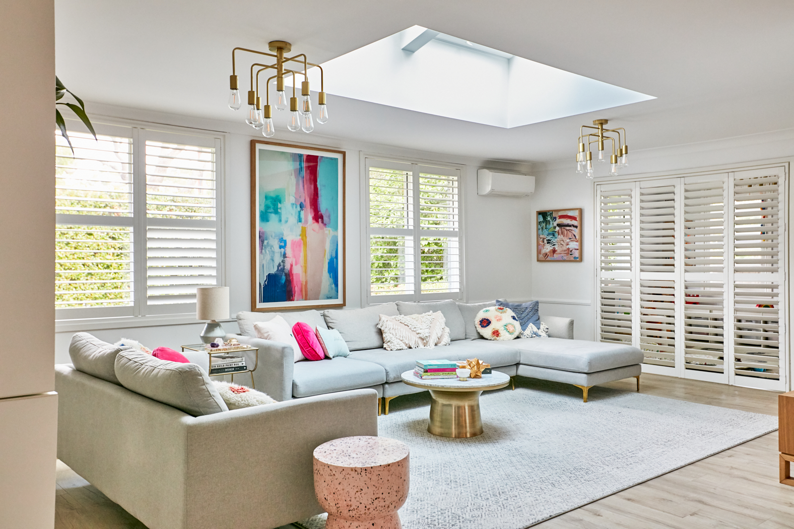
Skylights have transformed our living room: here’s all the details
Never underestimate the importance of natural light. You should never buy a house with poor natural light because once you’re in, you can’t do anything about it. Only you can.…
You know that old cliché about saving the best until last? I think we may have just done that with our family bathroom! This was the last major (indoor) project in our house and it’s been a long wait; 2.5 years to be precise. For quite a while now, it’s no longer been the “Nanna house” we purchased but a really nice house with a terrible bathroom (and WC) and a very average exterior. Now those two rooms are one beautiful, surprisingly spacious, elegant and sanctuary-like space. It’s a dream come true and I couldn’t be happier with it!
I’ve written before about how I’m an anxious renovator. I overthink everything, not least because I’m Interiors Addict, and I shared this whole process with you from start to finish (not just the pretty after photos) so there’s some pressure with feeling like 92,000 people are watching on Instagram and the fear that something will go wrong or it may just not turn out that well!
I picked the Eden back-to-wall bath from Highgrove Bathrooms for the look and soft curves of a freestanding bath without having to clean behind it!
There really was never any question of knocking the WC and (tiny) main bathroom together, although a previous builder’s quote did suggest we’d have to keep them separate if we ever wanted to afford to get it done! I’m so glad we went ahead and did it properly though (and for less money with a different builder), because a bathroom the size it was really didn’t do justice to a four-bedroom family home.
Little details like the ceramic waste in our Duravit basin from Bathe make me happy! We have a gold waste in the bath which matches the Meir tapware.
So we knocked down the wall between them and moved the doorway so it would open into the centre of the bathroom. It still didn’t create a huge space though, and I was determined to have a decent-sized bath (regular readers will know I’m in the tub every single night!), so we needed to make the most of every millimetre of the room (2700 x 2500mm to be precise). I called on the help of my clever friend Kathryn Bamford to get the floorplan just right. It took many many revisions and I’m probably lucky I can still call her my friend! I’m also pretty confident to say (after many sleepless nights about how the 1700mm bath would fit) that we nailed that layout!
The build went like a dream, despite a few hiccups thrown up such as very wonky walls (like everywhere in our home it seems!) that needed a lot of packing out and a lot of old timber formwork under the house getting in the way of the new plumbing, which had to be cut out and removed. What I loved most about our builders was that they always had a solution and having worked on so many other older homes, none of this came as a surprise to them and they were so experienced it made me feel at ease.
The beauty and craftmanship of the vanity and cabinet from Ingrain Designs speaks for itself, not to mention SO MUCH STORAGE!
Having an open shower proved key to the layout working and feeling spacious.
The reno would have been done in an impressive six weeks, but for our vanity getting damaged by a forklift on the way from Melbourne. But listen up folks, six weeks is good! The absolute biggest misconception out there is that bathrooms shouldn’t take as long or cost as much. When you live through one (and this is my second), you see why they take so long and cost so much. You still need to make sure you get multiple quotes though! In the end, ours took more like eight weeks while we waited for the vanity to be fixed and delivered, and then final touches like silicon. As they all say, it was all worth it!
I never knew I could love a toilet, but I love this one, (and its white glass flush plate) from Bathe. I love that it tucks behind the door and when you open it, you can’t see it (but a doorstop stops the door banging into it). The fact it is wall hung gives the illusion of more space and it just, well, blends in!
The tiles couldn’t have turned out any better. I knew I wanted an organic looking, handmade tile and something a little different to the ever popular subway (did them in my last bathroom reno) so I went for a square and white grout. I was visualising walls of white with texture and light bouncing off the gloss finish, and that’s exactly what I got! Keeping the floor tile simple has definitely added to the sense of space. The design of this bathroom was a lot about restraint, like choosing not to have a feature tile in the niches, but instead going for a brass tile trim.
LED lighting in the bath niche and under the vanity (on a sensor so it comes on when you use the bathroom at night) were the builder’s idea but I’m so glad we spent a bit more on these features.
The tapware from Meir was a no-brainer as we have the same in our kitchen, but the shower really is something else!
I also wanted to show you the difference we made to the light in here by installing an Illume “skylight”. There was previously an old skylight in the bathroom. It did the job but it wasn’t exactly a looker! We put in a new, lower ceiling in this bathroom and didn’t have budget to install a real skylight. So we opted for an Illume, which is basically a solar-powered LED light which you can have on all the time and gives the look and feel (and most importantly light!) of a skylight. I am so impressed with how it exceeded my expectations, we’ve put a big one in the hallway too. I’ll share more about Illume in a separate blog post soon.
The Illumes have an isolation switch so even though they’re solar-powered, you can turn them off if you wish.
I chose robe hooks over towel rails
I have so much more to share with you about the bathroom, including why I chose everything I did, what has surprised me most, the things that were worth spending a bit more on, how to choose a builder and how to live through a reno, but for today I just wanted to share some of these photos with you because hooray, it’s finished!
All the best finishing touches can be found at Oliver Thom
Would I change anything? I actually wouldn’t! Thanks for coming along for the reno ride. I hope you like the finished bathroom and I’m happy to answer any questions in the comments. I’ll be sharing lots more details soon but the suppliers can all be found below. Let me know what you’re interested to hear more about too.
But let’s just remember what this space, as two separate rooms, used to look like. I can barely believe it’s the same!
Today’s recipe is from Maxwell & Williams, inspired by their Cashmere Luxe and Teas & C’s Contessa collections.
Prep time 15 mins | Cooking time 40 mins |. Makes approx. 24
Ingredients
300g (2 cups) plain flour
½ cup dark cocoa powder
1 tsp baking soda
1 tsp salt
90g salted butter, softened
1 cup caster sugar
2 large eggs
2 tsp vanilla extract
1 tbsp The Tea Collective x Contessa ‘The Princess & The Tea’ tea blend*
1 cup blanched almonds
To garnish
The Tea Collective x Contessa ‘The Princess & The Tea’ tea blends*
200g dark chocolate, melted
Method
Preheat oven to 160°C fan forced (180°C conventional). Prepare a large baking tray by lining with baking paper.
In a medium bowl sift together flour, cocoa powder, baking soda, and salt.
In a separate bowl, use an electric mixer to beat together butter and caster sugar until light and fluffy.
Add eggs and beat until well combined. Add vanilla extract and mix.
Stir flour mixture into butter mixture to form a stiff dough. Mix in tea leaves & blanched almonds.
Divide dough in half. Flour hands and form dough into two slightly flattened logs on prepared baking trays, each approximately 20cm long and 10cm wide.
Bake for 40 minutes, or until slightly firm to the touch. Cool on tray for 5 minutes.
Transfer to a cutting board and cut logs into quarter-to-half cm thin slices. Arrange slices of biscotti on baking sheet and bake for about 10 minutes, or until crisp. Cool on a rack.
Melt the dark chocolate. Dip half of each biscotti into the chocolate. Sprinkle with extra tea leaves and place on a baking paper lined tray to set.
Store in airtight containers for 1-to-2 weeks.
Note: *Can be substituted for any good quality tea leaves. **Edible flowers can look equally delightful as a finishing touch.
Today’s recipe from AYAM is perfect for those chilly evenings in!
Serves: 4 | Prep: 15 min | Cook: 10 min
Ingredients
1 tablespoon olive oil
1kg medium green prawns, peeled, deveined, leaving tails intact
3 tablespoons AYAM™ Thai Red Curry Paste
270ml AYAM™ Pure Coconut Cream
2 tablespoons fresh lime juice
1 tablespoon grated palm sugar
2 kaffir lime leaves (optional)
1/4 cup (60ml) water
1/2 cup fresh coriander leaves
Method
Heat 1 tablespoon olive oil in a frying pan over a high heat. Add 1kg medium green prawns, peeled, deveined, leaving tails intact and cook for 2-3 minutes or until cooked through. Reduce the heat to medium.
Add 3 tablespoons of AYAM™ Thai Red Curry Paste, 270ml AYAM™ Pure Coconut Cream, 2 tablespoons fresh lime juice, 1 tablespoon grated palm sugar, 2 kaffir lime leaves (optional) and 1/4 cup (60ml) water to the pan. Cook for 5 minutes.
If you and I were to play a game of word association and I said ‘coastal interior’ I’m fairly positive your first response would be ‘white!’ Am I right? When it comes to beachside styling, white has always reigned but that’s set to change according to Perth interior stylist Alex Carter of Harlow & Willow who turned the white cliché on its head recently transforming a typical Aussie coastal home into a colour lover’s paradise. Today she tells us how to get the look.
The lounge room is a study in layers. Artwork: Morgan Jamieson (above fireplace) and Ian Gunn (left)
Ease yourself in “If you’re relatively new to introducing colour into your home, ease yourself in. There’s no need to break out the green paintbrush right away! Start off by swapping out your current cushions and throws for colourful and patterned ones and watch how it lifts your space!” says Alex.
Cushions are a relatively affordable way to take the colour leap
Select colours that make you feel good
“Even as a colour lover, I have some colours that I just don’t like. When injecting colour into your home and decor it is important to choose colours that make you feel good and that you find visually pleasing,” says Alex and it’s a sentiment I share. For example, as much as I love wearing red I would never have it anywhere near my house.
Tranquil yet colourful bedroom styling
Choose colour levels depending on the use of the room
“Colour can create a vast array of feelings and change moods. Consider this and the feeling that you want to create in each space. For example, you may opt for more relaxing shades in the bedroom like calming blues or deep greens and rich plum tones whereas living areas can take more vibrancy with brighter, bolder colours,” says Alex.
Bedroom. That stunning artwork is by Morgan Jamieson
Decorate depending on the feeling and not trends
“Don’t fall into the trap of decorating to a trend as you will get sick of this pretty quickly. Just because 75 per cent of Instagram seems to be using blush and grey doesn’t mean that you have to – except if you love it, then of course go for it!” says Alex who explains that it’s important to try and tap into your own distinct taste. “Choose colours that reflect the mood you want to create in your space,” she adds.
The dining room features mismatched chairs, greenery and colour pops
Hallway. Artwork: Georgie Wilson.
It’s okay to mix things up
“When it comes to your home, you don’t need to fit into a certain style or colour palette. Feel free to mix the vintage with the new, the colourful with the more minimal items and even colour combinations that may not be the norm. This is your sanctuary and should be a visual reflection of you so have fun with it!”
I love the wooden surfboard! Artwork: Katie Wyatt (top left) and Anna Cole (bottom left)
Photographer: Matt Biocich | Stylist: Alex Carter at Harlow & Willow | Stylist assistant: Julianna Love
It’s been more than 18 months since we bought our family home on Sydney’s upper north shore and, bathrooms aside, it’s largely unrecognisable from the dated home it once was. Lived in by the same lady for three decades, it was not exactly modern, but it was a great size with four bedrooms, and a decent floorplan which didn’t need changing (although we’re now constantly coming up with things we’d do if money– or over-capitalising– were no object!). Add to the a flat block, a decent, private, backyard and walking distance to a cafe, and the bones were great, although we had no character features to speak of (hello, sixties red brick)!
Anyway, the New Year seemed a great time to recap on everything we’ve done so far. Still on the to-do list is:
2 new bathrooms (yup, they’re bloody expensive!)
A new driveway (also, not cheap)
A new laundry (this is a tiny room behind the kitchen barn door but it’s low on my priority list if I’m honest!)
Skylights
Tiling the front veranda
New outdoor lighting
Air con in the bedrooms
New windows
Turning the garage into a studio
My favourite projects so far have been the kitchen (take a video tour with me here):
The flooring was a HUGE game changer for the house as we previously had parquetry, pine boards and, God help us, cork, all at different heights. We are still in love with our Quick-Step laminate more than a year on. Our floor is probably the thing I get asked about the most.
Our new wardrobe doors made a big difference to the bedrooms and we’ve actually changed almost all the doors in the house with Corinthian but we’re yet to shoot them.
My home office was one of the first rooms we did but I’ve increasingly found I just don’t use it! The nature of my job means I don’t need much other than my laptop, with everything stored in the cloud, and I always find myself in the kitchen/dining with the best natural light and proximity to the kettle and the front door when couriers knock! I often have Seb at home (with or without nanny), and for the foreseeable future I’ll have Charlie at home every day too, so it doesn’t make sense to be stuck up at the back of our long, single-story house.
It’s a beautiful room with the best wallpaper ever, but it’s about to be turned into a very lovely guest bedroom with doors out onto the back yard. I’m going to call it the garden suite 😉 Will shoot and share that one with you soon.
We also did Charlie’s nursery this year, although he is still sleeping in our room so it’s currently a very tidy and serene nappy-changing room!
We’ve also changed all the lighting, installed air con, painted throughout, put wainscoting in the dining room, replaced most of the skirting boards, gutted the linen cupboard and put in new shelves, put in plantation shutters throughout, carpeted all the bedrooms, and done a fair bit to the back yard (thank you, Damian!) and the front (including picket fence, painting all the trim and a new house number, but we’re not finished enough to shoot it just yet). The master bedroom has also had a big makeover but is also not quite finished enough to shoot and is currently a bomb site of baby stuff and a bassinet squeezed in!
The living room was one of the first rooms we made over and it’s recently been changed a lot, but here’s a video of the original if you’re interested! We’ll shoot version 2 soon too. And Sebastian’s room has hardly changed at all, which proves it is as timeless as we planned it to be.
What’s next?
The main bathroom is the thing we’ll be saving hard to get done this year so I’m about to start planning that. We may even have a crack at a cosmetic makeover on the en suite ourselves. Then there’s a list of smaller projects we’d like to crack too, especially skylights, but we shall see!
I hope you enjoyed the recap and I’m always happy to answer any questions you have about suppliers or what we’ve done and why.
It finally stopped raining long enough in Sydney for us to shoot these photos of the finished deck and I couldn’t wait to share it with you. I also can’t wait to spend as much time out here as possible over the holidays!
When we bought this house, although it needed a lot of work to bring it up to the 21st century, we loved the size, the flat block and the backyard which had both an entertaining area –now decked– and a lawn for the kids. Although we still have a few things to finish, seeing it come together like this makes me so happy. We intend to live here for many years and I am thrilled that we now have an outdoor area that really does function as extra living space and an outdoor room (or two). It’s also brought the exterior up to date in a big way!
My husband Damian and I agree it’s now our second favourite space in the house after the kitchen. This may sound like a half-baked compliment but when you consider it’s not actually an enclosed room, I think it’s high praise indeed!
Although the new Trex deck is no bigger than the paved area was before, it feels so much bigger. This is due to a few things: the planks laid horizontally give the illusion of a wider space, the deck comes out from the French doors at the same height which gives great indoor/outdoor flow, we’ve removed the old timber pergola which was about halfway down, plus the light grey composite deck gives a modern, clean aesthetic.
The addition of the steps down to the lawn give it a really slick, finished look and nicely separate the two distinct areas. They’re also great to sit on and put pots on! I’m really glad I went with the grey colour, Island Mist, of the Trex Transcend decking collection, because it has toned down our sixties red brick house and it looks modern (while still in keeping), light and bright.
Because we no longer have a big back step, we can make use of extra space near the French doors, so we now have two distinct areas: one off the dining room for lounging with a coffee or a glass of wine (this was always my dream!) and the other further back for the barbecue and large dining table for entertaining friends. We can look out onto the lawn from wherever we’re sitting and there’s still room for the paddling pool if needed. What more can a girl ask for (maybe a spa, Santa?!)?
If I had to say what I love best about our Trex deck apart from the aesthetics, it would be the low maintenance aspect. And the fact it is hardwearing means I don’t cringe every time Seb rides his scooter over it or drops food on it, knowing it won’t scratch and I can easily hose anything off it. We’ve had plenty of rain (too much!) lately so I can see it drains well and dries off in the sun. While it does get quite hot under direct sun (we’re getting a retractable awning soon), so does any hard surface, including timber. This is the only minor negative I can find but the many other advantages of a composite deck far outweigh it in my honest opinion. I don’t make habit of hanging around in direct sun anyway!
In a nutshell I am absolutely thrilled with the finished product and the process of having it delivered and built was exceptional. The new deck has massively improved the use we can get out of our outdoor area for entertaining, eating as a family and just simply relaxing, right in time for summer. But we love it so much I think we’ll be out there even when it’s colder, huddled around our firepit!
Our al fresco’s now almost finished with new lighting, retractable awning and vertical herb garden still on the list. The new life that has been breathed into this backyard with our Trex deck make the mortgage repayments and living out in the ‘burbs seem more worthwhile than ever!
And before I sign off, here’s a little reminder of what it looked like when we bought it!
We love the look of this new Smoked & Spiced Vitality Salad from Chargrill Charlie’s, one of three new anti-ageing salads developed with nutritionist, Liv Kaplan. They’re designed to leave your body full of energy and skin glowing heading in to Spring. Sounds good to us! In all 10 Chargrill Charlie’s stores for this month only.
Enjoy chicken and chickpeas cooked in a smokey paprika and lime marinade, on top of a tahini kale salad.
Serves 4 | Gluten and diary free.
Ingredients
Paprika chicken and chickpeas
500g chicken thigh
1 tbsp smoked paprika
2 garlic cloves, crushed
Juice of 1 lime
1 tbsp olive oil
1 tsp sea salt
1 cup chickpeas, rinsed and drained
Tahini dressing
2 tbsp tahini
Juice of 1 medium lemon
1 garlic clove, crushed
1 tsp sea salt
1-2 tbsp warm water
2 tbsp olive oil
Method
(Paprika chicken and chickpeas)
Preheat the oven to 180C.
In a bowl, combine the chicken with the paprika, garlic, lime juice, olive oil and salt.
Heat a medium pan to a high heat and sear the chicken thighs on each side, pouring the leftover marinade into the pan. Transfer to an oven safe dish and continue cooking in the oven for 20 minutes or until cooked.
Remove from the oven and shred roughly. Pour the chickpeas into the dish and toss chicken and chickpeas together to coat in the juices.
(Tahini dressing)
Combine all ingredients in a small bowl and whisk together until smooth.
(Kale salad)
Place the roughly torn kale in a large bowl and pour over dressing. Using hands or tongs, massage the dressing into the kale until it breaks down and is coated in dressing. Toss in cucumber.
To serve, use kale salad as a base, top with chicken and chickpea mixture, drizzle over extra tahini dressing and top with fresh chilli.
Important points: The chicken must be roughly shredded using forks as opposed to sliced. It must also be done while still warm so it soaks up the juices.
Kale is best massaged to break down the fibres and let it absorb the flavour of the dressing.
This is a fast and easy dish perfect for any weeknight dinner, from the Williams Sonoma test kitchen. Larb is a much-loved South-East Asian salad that can be made with almost any type of minced meat. Here, we use chicken, and wrap the savoury meat mixture in lettuce leaves for a fresh and light take on this dish. For a casual dinner, place the chicken mixture, lettuce leaves and garnishes on the table and let diners help themselves.
Ingredients
6 Tbs. (80 ml) soy sauce
2 Tbs. rice vinegar
2 Tbs. sesame oil
1 Tbs. fish sauce
2 tsp. sugar
Juice of 1/2 lime
2 Tbs. vegetable oil
1/2 cup thinly sliced green shallots, white and light green portions
1 1/2 Tbs. peeled and grated fresh ginger
2 garlic cloves, minced
1/2 tsp. chilli flakes
625 g minced chicken
Lettuce leaves for serving
Bean sprouts and fresh coriander and Thai basil leaves for serving
Method
In a bowl, stir together the soy sauce, rice vinegar, sesame oil, fish sauce, sugar and lime juice. Set aside.
In a wok or large fry pan over medium-high heat, warm the oil. Add the shallots, ginger, garlic and chilli flakes and cook, stirring constantly, until fragrant, about 2 minutes.
Add the chicken and cook, stirring occasionally, until the chicken is no longer pink, about 5 minutes.
Add half the soy sauce mixture and cook 1 minute more.
To serve, spoon about 3 Tbs. of the chicken mixture into a lettuce leaf, top with bean sprouts, coriander and basil, and wrap the lettuce around the filling. Repeat with the remaining chicken mixture, lettuce leaves, and garnishes, or allow diners to assemble their lettuce wraps themselves at the table.
Serve the remaining soy sauce mixture alongside for dipping.
As you know, we are constantly working behind the scenes to bring you new features and to make our content offering bigger, better and different! This New Year, I’m excited to tell you that our former sister site Reno Addict is no more, but fear not, it has been incorporated into this site as its own dedicated section.
We’re always testing and measuring to see what works, and to cut a long story short, it no longer made sense to keep the renovation content separate. There is no doubt that renovation is more popular than ever in Australia and more and more of the general public are interested in reading about it, whether it’s inspiration for a dream future project or that they’re actively renovating their dream home or investment property. That might be a whole home overhaul or simply a bathroom reno.
We know there’s a very good chance that if you’re interested in beautiful homes and interiors, you’ll have at least a passing interest in renovating too. So we decided to bring this renovation content in front of the eyes of our much larger readership here. We’ll still be concentrating on reno content, in fact perhaps now more than ever. We’d still love to see and share your real renos with our audience, so please email [email protected] if you’re proud of yours!
I’ll be sharing more of my own home reno this year. Pic by Jacqui Turk
As well as real reno inspiration, you can expect posts about new products, the latest legislation affecting you and expert advice covering topics like real estate, finance, home staging, health and safety and architecture.
We’ll bring you advice from the big names in the industry like Australia’s Rapid Renovation Expert, Naomi Findlay
A reno by Naomi Findlay
We know renovating can be daunting for first timers (I found this out myself last year!) so we want to demystify a lot of it and help you plan, find the right people to help you, make sure you spend wisely and are happy with the final result for years to come!
We’ll still have columns from ex Blockheads like Julia and Sasha and plenty of real renos
If you have any questions or you’re a reno expert who would like to write for us, please email [email protected]
As always, we welcome your feedback and ideas so feel free to comment below or contact us via the form at the top right of this page! This isn’t the last change for 2018, so I’ll keep you updated when we launch new things!
Much as I’d love to tell you renovations and interior design are all about aesthetics (and let’s face it, that’s the fun part!), there is a hell of a lot of practicality and functionality involved too. And the designs which combine the best of both worlds are always the most successful. Nowhere is practicality more important than in a kitchen. It can look as beautiful as a magazine spread but if it doesn’t work, well you’re soon going to get irritated with your expensive makeover!
When it came to appliances, I must admit, I was a bit overwhelmed, being my first kitchen reno. I’ve never been the one to choose the oven or cooktop, for example. So I had to get my practical head on. But I knew I needed these appliances to look great too, not just now but quite possibly in a decade’s time. I quickly settled on Italian brand ILVE (God bless those Europeans, they know a thing or two about good design!) as top of my wish list. Like all things handmade in Italy, these appliances are the best! One look around their Sydney showroom and I suddenly found myself more excited about kitchen appliances than I ever thought possible! Trust me, go and look!
The Sydney ILVE showroom: oven heaven!
If the kitchen is the heart of the home then the oven, surely, is the heart of the kitchen. This was the hardest decision for me, starting with gas or electric? I love a gas cooktop and we looked into getting our new home connected to mains gas but, to cut a long story short, this wasn’t possible. In some ways I was thankful as this cut down the plethora of choices!
I personally think of ILVE as being synonymous with beautiful free-standing ovens and for a long time, I decided this was the look I was going for. Their Majestic and Nostalgie models are beautifully traditional and a big part of me always leans towards a classic look. They’re also available in so many colours and with brass, chrome or bronze fittings. I had been lusting after a navy (blue) oven with brass hardware I’d seen in the showroom months before, but alas, I was not organised enough to give myself the waiting time required for many of the non-standard colours, so bear this in mind if you’re keen. Their Quadra series are more modern and industrial; they really remind me of serious chef’s ovens.
Ultimately though, the modern classic aesthetic I was going for in the new kitchen called for the oven to just blend in a little, rather than be the star of the show; I already had a lot going on with all the Caesarstone and the gold hardware, tap and sink. This eventually led me to the built-in 90cm oven with longevity in mind and the fact my family will (hopefully) one day be bigger than three. I chose knob controls over touch controls because I’m a bit old school like that (hello, paper diary!).
Once I’d made the very difficult oven decision (you just really feel like you need to get it right, and I was really grateful for the patience and knowledge of the lady I spoke to in the showroom), it was easy to choose the cooktop. As we couldn’t have gas, it had to be induction, and now I have induction I LOVE it! I’m kind of glad we were forced into this decision. It really had to be a 90cm cooktop to match the oven, which it sits above, and although I’ll rarely use all six burners, it sure doesn’t hurt to have options! As a mum, I find the safety of an induction system really appealing and comforting. There’s even a 90cm hybrid option which has induction plus a single gas wok burner. Best of both worlds!
If there are two things I didn’t want to make a feature of, they were the rangehood and the dishwasher. I really didn’t want my flight of overheard cabinets broken up by a big range hood so the quickest appliance decision I made was to go for the 90cm concealed rangehood. You just don’t know it’s there. I later decided not to put brass handles on those overhead cupboards either and I love the way they look so sleek and simple. You can choose to recirculate or duct and I opted to duct ours out through the roof as it just feels healthier to me. And it works a treat! We never have stale cooking smells in our house.
As for the dishwasher, it was always always going to be fully integrated. Luckily, ILVE keep it simple and only have one option, so that was an easy choice too! I love this dishwasher. It has a light inside, as well as a cutlery basket that pulls out above the one for cups and glasses (I’m embarrassed to admit it took me a while to realise it was there!). It’s really easy to program and I love that you can delay the start time by up to 24 hours. Another clever feature is the light which shines down onto the floor so you can see when it’s on (because everything is otherwise hidden by a cabinet front). It’s whisper quiet too, so this is quite necessary! It certainly beats our old, brown and beige museum-piece dishwasher which tripped the electrics most days!
Having actually lived with and used my new kitchen for a few months now, I am really happy with all my choices. The oven is a dream to use (and clean) and I love the size of it (it came into its own at Christmas!). It has nine modes including pizza, fan assisted and fan forced. And like the induction cooktop, the cool touch BIO-safe triple glazed glass door is another reassuring safety feature with a cheeky toddler around!
So, my top tips for picking appliances?
Take your time and start early as there’s more to it than you think!
Visit showrooms and speak to the experts. Don’t be afraid to ask the stupid questions!
Consider the look of your appliances in the scheme of your kitchen design as well as the practical side, before you plan your cabinetry.
I always love wading through Google Analytics at this time of year, getting a good insight into what our readers have enjoyed the most and hopefully learning from it for the year ahead in terms of what kind of content to create. So, here they are, our most popular posts of last year! There are some real crackers in here. The top post, about Melbourne furniture brand Barnaby Lane, proves that amazing styling and photography go a really long way towards getting your brand noticed (and shared, and pinned!).
I’m not at all surprised this next post from Cherie Barber ranked highly. Who doesn’t love a bargain, DIY before and after (in fact, any before and after!)? And bathrooms are probably the most expensive rooms to reno, so these two examples of overhauling them for $3,000 and $8,000 got thousands of hits.
Our biggest competition ever with Latitude Financial Services, was of course popular! It was a dream to be able to offer one of our readers $10,000 to better their home. We’ll be bringing you the results of the winner’s bathroom renovation later this year. Exciting!
I really enjoyed putting together this honest account of what I’d learned from doing our first bathroom reno (in the apartment we ended up selling two months after we finished it, lucky buyers!) and hoped it would be useful. It seems it was!
This next post aimed to educate people on how to use timber in their homes in a sustainable, no-guilt way and I’m thrilled to see it in the top 10, hoping it has inspired lots of you to use this beautiful natural material, but in the right way.
A second post by regular contributor Cherie Barber to make it into the top 10, this one showcases some real kitchen makeovers with details of how they were transformed on shoestring budgets.
The idea for this post just came to me randomly one day and I have to say it is often these unexpected lightbulb moments which lead to great content which you love! Here’s to many more in 2018! I wanted to share all the styling tips I’m lucky enough to pick up from being surrounded by talented interiors folk on a regular basis.
And to round it off we have a real home, and one of my personal favourites of the year. It belongs to interior designer Kate Walker. I love how individual this Mornington Peninsula home is; it doesn’t follow any of the usual trends, but features what Kate truly loves and has brought together so well.
I hope you enjoyed this roundup and discovered some posts you may have missed last year. I always love hearing what you’d like more of so feel free to comment below or email [email protected] at any time.
I am so excited to finally share my new kitchen with you today! Seeing these beautiful pictures makes the last two months of mess and chaos seem more than worth while!
They say the kitchen is the heart of the home and in this house, it really is. Not just because everyone hangs out in this room, but because it really is in the middle of our home. And the light here is the best in the house. It used to drive me nuts that people gravitated towards this room because of the light when it was unrenovated, as we had much nicer spaces to entertain in like the living room! Now I am no longer embarrassed of my kitchen, I am happy for people to congregate in here and admire it whenever they want!
Black barn door hardware from Bunnings
Bar stools from GlobeWest
This really is my dream kitchen. I’m going to blog about some of the finer details separately, but today’s post is just the first overview of what we chose, what we did and why. In terms of layout, this has not changed drastically, but we did get rid of the back door (see before pix at the end of this post) to allow the cabinetry to go right to the end of the kitchen. We were also able to move our fridge freezer into the kitchen (it’s the little things, right?!) because previously there was nowhere to fit it and it lived in the dining room!
The starting point for this room was the cabinetry from Freedom Kitchens. I always knew I wanted white shaker style doors so when I found out this was possible using their new, more affordable flatpack option, the Essential range, I was thrilled. I saw flatpack as an opportunity to make great savings, which would allow me to still have the other things I dreamed of like stone benchtops.
My good friend, TV interior designer James Treble, sketched me out a rough layout I loved over dinner one night and we were off! I then worked with Freedom Kitchens design consultant Nina Hughes to turn that sketch into a detailed plan, taking into consideration the flatpack options available. This in-home service is included for everyone buying from their flatpack range, as well as a site check to make sure nothing has slipped through the net, before your cabinets are made. This really made me feel confident. I think buying a kitchen off the shelf with no professional advice or checks would have made me worry myself sick!
The next thing I chose were the handles. Anyone who knows me or has been to my home knows I just love a brass accent! I was always going to have gold handles and I sourced these from Kethy (available through The Block Shop) after seeing similar in Julia and Sasha’s beautiful Block kitchen. It was a winning combo from the start. I didn’t look at another handle so this proved to be one of the easiest decisions!
Then benchtops: through my job, I know Caesarstone by reputation and I loved their designs. I had three samples on high rotation but I finally went for the most subtle, Noble Grey, for a few reasons. I liked the contrast of the grey with the white cabinetry, and while the Calacatta marble-look designs have been hugely popular recently, I wanted something a little different. Then I saw blogger Briar Stanley from Sunday Collector use Noble Grey in her amazing kitchen and that sealed the deal.
Of course, then I needed to decide on a complementary splashback. I absolutely love tiles but trying to choose some left me paralysed by indecision! There were just too many amazing choices. I could have opted for subways, and I am a fan, but again, I wanted something a little different. So I decide to carry the Caesarstone up the splash as well; a decision I have not regretted for one second! The splash behind the cooktop is really quite deep so it makes a real feature. When the light through the opposite window hits it, it really shows off the veins in it. I also think the streamlined look it has created has allowed me to add my other, more bling touches, without it feeling cluttered or over the top.
Speaking of bling, the gold tap is from Meir and I am so in love with it! Taps really are like jewellery in a kitchen. You can’t miss them so you might as well make a statement! Their new Tiger Bronze colour was released at just the right time a few months ago and I was lucky enough to be one of the first to get my hands on it! Would a gold sink as well prove too much? I must admit, I did really worry about my decision, but in the end, it all came together beautifully. And nobody can believe that sink came from Bunnings!
Of course, a kitchen can (and should!) look beautiful but it needs to function too! Having room for a fridge freezer was a great start! But I needed to think long and hard about the appliances, which I chose from Italian brand Ilve. I was really excited to get an integrated dishwasher from an aesthetic perspective but this one works brilliantly and even has a light inside, plus one which shines onto the floor so you know it’s on (being that it’s hidden behind a cabinet door). I just love how it seamlessly blends into the kitchen.
Choosing an oven was a lot harder than anticipated and something I’ve never done before. I eventually decided on a 90cm electric oven and having that extra space is already proving a Godsend when entertaining. I can’t wait to give it a really good workout on Christmas Day.
Then of course you have to match that with a 90cm cooktop even though I’m not sure I’ll ever use all six burners at the same time! We first wanted gas but had a delay finding out if we could get connected, which led us to opt for induction. I’m so glad we went this route because I bloody love it! I cannot believe how quick it is to heat up, it’s a dream to clean and, importantly, it’s safe, which when you have an adventurous climbing toddler around is one less thing to worry about. I’m also thrilled with our hidden rangehood which allows me to have an uninterrupted row of overhead cupboards.
So, we had the bones of a great kitchen, but there were two other things I needed to achieve: replacing the dated sliding door to the laundry, with a modern take on a barn door and black hardware was the first. I wanted the door to have VJ panelling so we did this by cutting Easycraft panels (I’m in love with this product) to size and fixing them to the front of a very cheap, plain door. We then decided what the hell, why not panel the entire wall and wow, wasn’t that the best call? This wall has become a real feature of the kitchen. We also did the back of our breakfast bar in the same paneling and colour.
Art by the Print Emporium
Secondly, I wanted to tie in the dining area, which adjoins the kitchen and previously had a cork floor, much better. I did this by adding VJ wainscoting to this room and painting it in the same grey (the panelling is in Haymes Paint Chinchilla Fur and the walls are Haymes Paint Greyology 4). It has made a huge difference. Of course, having the same floor helped massively too.
The icing on the cake of all this was our new Quickstep Impressive Ultra laminate floor (more on that next week) which we have also laid in the living room, hallway and my home office. Once that went down, we were finally finished!
A few other things I’m really glad we did and are worth a mention were:
adding bulkheads for a more finished, streamlined look (and no dust or clutter accumulating on top of the overhead cupboards)
putting a power socket in the back of the pantry so I could hide the Nespresso machine and toaster away in there
making sure there was a space for the microwave under the breakfast bar out of sight, so it didn’t have to use precious benchtop space
making one of the five powerpoints (you can never have too many) a USB one (we use this every day to charge a phone or laptop and it has proven really handy)
opting for a pullout double bin under the sink so there’s no ugly bin on show or in the way (I obviously need to get out more but I really love this!).
I could rave about my new kitchen all day but I’ll focus on some other aspects in future blog posts.
Overall, I am thrilled with kitchen and that it is finished before Christmas! I’m just waiting on my blinds (Romans) and looking for the perfect new kettle! A huge thank you to our friends at Integriti Bathrooms who helped project manage this reno.
Now, we could finish this without taking a look back at the before photos!
What do you think of the transformation? If you have any questions, please write them in the comments below and I’ll get back to you.
It’s been about eight weeks since we started our much anticipated kitchen reno and it’s near as damn it finished. Yes! We’ve done a photoshoot and will be sharing it with you very soon. In the meantime, I thought it would be fun for my husband Damian to interview me about the process and what we have done in this week’s podcast!
We’ve been wanting to launch a podcast for some time and today we’re delighted to share our very first episode! I’m so pleased with the content of this first one, where I interview James Treble from Ten’s The Living Room and Andrew Stenos, managing director of Sydney’s Integriti Bathrooms. You’ll learn everything you ever wanted to know about renovating bathrooms: what’s involved, how much it costs, why it costs that much, how to do a cosmetic upgrade on a budget, the biggest trends and more.
The idea behind the podcast series is for me to sit down and have a relaxed chat with the many personalities and experts we’ve been working with for years, giving you access to their amazing knowledge on a variety of topics which interiors addicts will love and learn from.
I renovated my first bathroom (with Integriti Bathrooms, which is how I know they know their stuff!) last year and it was a massive learning curve and eye opener. And while the actual reno process isn’t always fun (it’s long, noisy, dusty and expensive) I can’t tell you just how worth it it is when you have your brand new bathroom at the end. Those of you who have created your dream bathroom will agree, I’m sure!
Photo: Jacqui Turk
James Treble is well qualified to comment on bathrooms too. His backgrounds in both design and real estate mean he knows what works practically, what looks good and what adds value to a home. He’s also a regular visitor to European trade fairs where he brings back knowledge on the latest trends in furniture, bathrooms and tiles to share with an Australian audience. Plus, he likes a chat!
I really hope you enjoy the podcast and would love to know who you’d like me to have a chat with next and on what topics! Feel free to comment below. Please like and share the podcast too!
This episode is around half an hour. Why not listen on your way to or from work?
Even though our “nanna house” is nowhere near finished and very much a work in progress, I thought it was time to share some of what we’ve done with you. And sometimes, when you have a seemingly endless list of jobs and expenses ahead, it’s really important to stop and look at how far you’ve come. It’s only been six months, after all!
So, today, I’m sharing the master bedroom. Only it’s not actually the master bedroom as per the floorplan. This brings me to a point about living in a new home as is for a while, if you can bear it, before getting stuck in. We immediately moved into the master bedroom (there are four all up) of this house because, well, the floorplan said so, it’s the biggest, and we are the grown-ups, right?! It also has an en suite, which is a very functional but dated eighties addition.
But the room just didn’t work. It’s all wrong with the feng shui and the only way to fix that will cost money. The same goes for the en suite. It’s hardly the stuff of sanctuary! So we made the call to move into a smaller bedroom at the front of the house. It just feels better for now! And I’m not that fussed about having a big bedroom, just a nice one! One day, when we have the money, we will rip out the robes in the ‘real’ master bedroom and reconfigure it, re-do the en suite and move the en suite door. But for now, we are in our ‘new’ room. And the master is a spare room.
I’m still in two minds about whether artwork will work above the bedhead or fight with it. This framed photo is of my treasured navy wedding shoes. The bedsides are last season’s west elm and came from the old place. I love the warmth of the timber.
Because it’s not that big, I didn’t want to clutter it up, so it was always going to be all about the bed. We started with a neutral base of grey carpet, grey paint (Haymes Greyology 4), white plantation shutters (from DIY Online Blinds) and the rattan pendant shades we have in all the bedrooms, from Beacon Lighting. We didn’t have carpet in the bedrooms at our old place, and I’m really glad we decided to have it in the bedrooms here. It’s also much cheaper than hard floor! And I knew this room would feature my favourite colour: navy. And what goes perfectly with navy for a little luxe factor? My favourite gold accents!
The ink art on the left is by Melbourne’s Casey Freeman, who I met through Instagram, and was in our previous bedroom.
I had been drooling over Heatherly Design Bedheads’ work for years, since we first featured them on the blog. When I saw the Sibella design it was love at first sight but I had to think about it for a while before I committed. I tend to play it safe and when I go a bit “out there” it doesn’t always work! But months later, I still loved Sibella so it was time to order her! Even better, Damian also loved Sibella (which I was not expecting, to be honest!). I was careful not to overdo it, but the Galleria lamps from Lighting Lighting Lighting were just the perfect complement.
This Freedom ottoman is completely surplus to requirements but it just goes so perfectly, it had to come in here from elsewhere in the house.
The mirror was a wedding present that lived in the dining room in our previous home. The white linen quilt cover is from Sydney brand Major Minor and it feels beautiful, I’m telling you! But it was too stark in contrast to the bedhead so I layered on this fab navy coverlet from my friend Naomi at Silk Home (she has her own made for staging). Rather than Euros, which would hide some of my statement bedhead, I chose kingsize pillows from The Pillowslip Store with their classic white cotton covers (they have some amazing patterned ones too, including gingham). Most of the cushions and the throw are from Adairs (their range is amazing, check it out).
Damian’s side of the bed, which always has flowers, honestly… The small bowl was from kikki.K.
There are built-ins opposite the bed (not pictured) and we have plans to replace them one day, as well as the skirting throughout the house. I’m still working out whether and what kind of rug this room can take. This room is right next to a large walk-in cupboard which we may turn into a walk-in one day, but for now, we just love having somewhere to store all our, well, crap!
This large mirror is on the wall to the right of the bed
So while this room does not have the sheer size of our old one, as stop-gap master bedrooms go, I’m really happy with it, and find it a restful space which is easy to keep tidy because of its simplicity and lack of stuff. I have resisted adding my usual pop of pink and I think the all-blue scheme works nicely. I am considering a wallpaper feature wall (perhaps the window wall). It would of course have to be quite subtle. But we’re almost done in here!
In this recipe, softened butter combined with herbs, lemon zest and garlic adds flavour to a roast chicken for a deliciously heartwarming one-dish meal.
2. Rinse the chicken inside and out and pat dry with paper towels. Season the chicken inside and out with the salt and pepper and place half of the lemon slices inside the chicken cavity. Tuck the wing tips behind the back and tie the legs together with kitchen string.
3. In a small bowl, stir together the chives, thyme, oregano, parsley, tarragon, lemon zest and chopped garlic. Add the butter and stir until the mixture is thoroughly combined.
4. Starting at the cavity, slip your fingers underneath the chicken skin and loosen it all over, being careful not to tear it and reaching as far as possible into the thigh area. Using your fingers, rub the butter mixture under the skin, distributing it as evenly as possible.
5. Place the chicken, breast side up, in large round dish or Dutch oven and add the remaining lemon slices, garlic head and spring onions to the pot and drizzle with the olive oil. Roast the chicken until the skin is well browned, about 50 to 60 minutes.
6. Transfer the chicken to a carving board, cover loosely with aluminium foil and let rest for 10 minutes. Carve the chicken and serve immediately with the lemon slices, garlic and spring onions alongside. Serves 4.


 Today’s recipe is from Maxwell & Williams, inspired by their Cashmere Luxe and


