We love an affordable DIY renovation solution around here so when Dulux shared a couple of budget kitchen makeovers with us recently, we couldn’t click through fast enough. Created for just $700 each with the Dulux Renovation range, the results are rather impressive. And with the average kitchen renovation costing around $21,000, and taking upwards of a month to complete, it’s no surprise that many of us are turning to paint for a fast and inexpensive solution.
BEFORE
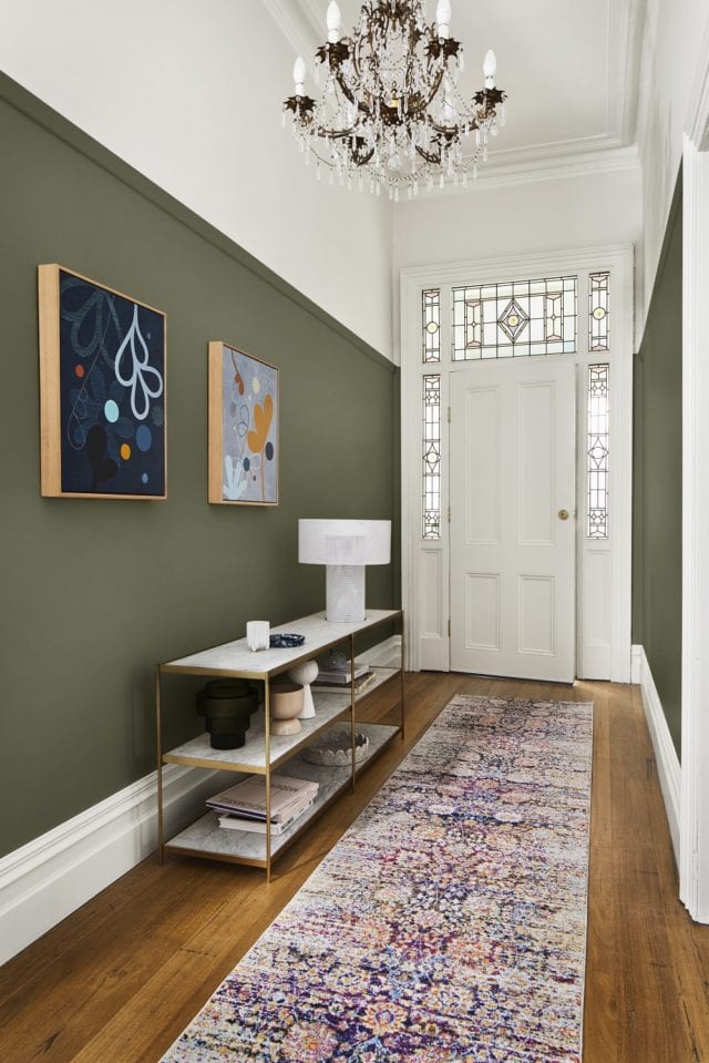
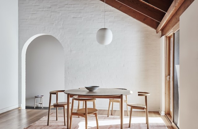
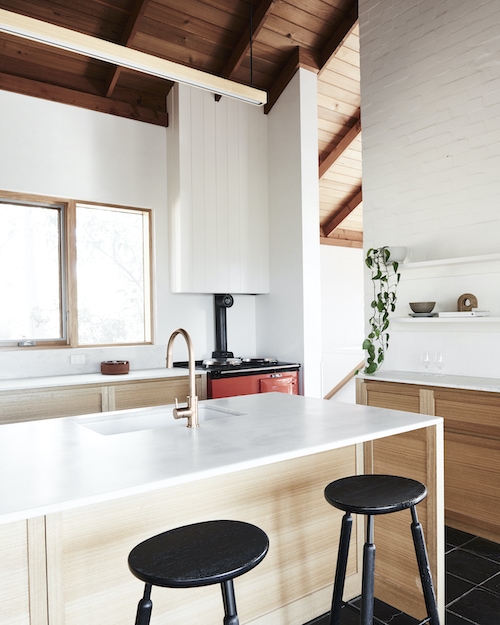
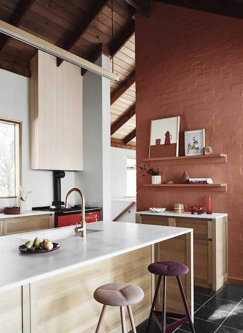
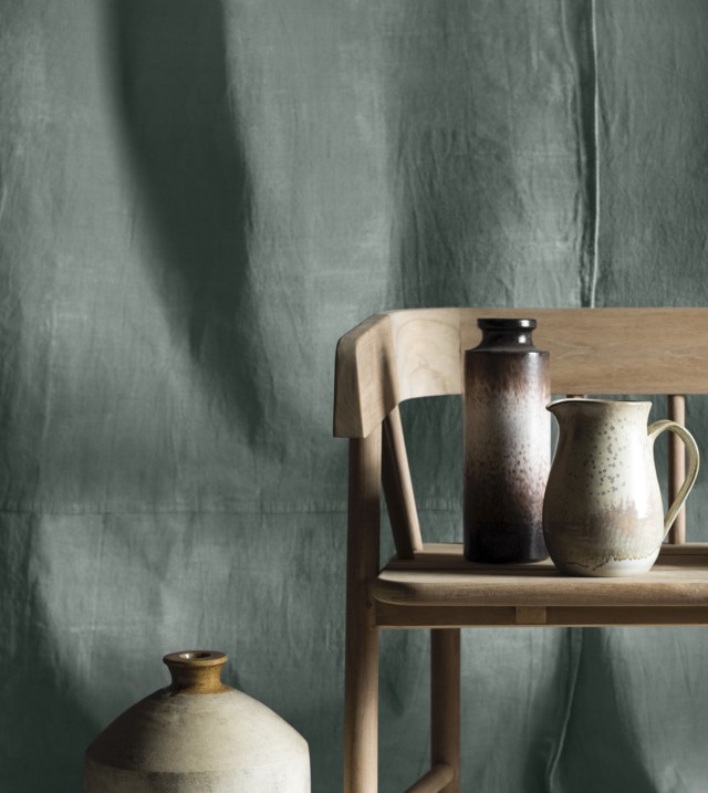
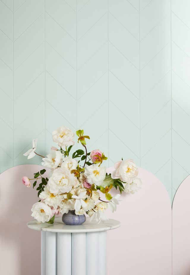
AFTER. Dulux Five Fingers Peninsula is paired with Dulux Whisper White.
A water-based interior paint range, the Dulux Renovation range is ideal for wet and high-use zones such as the kitchen. The formula is tailored to cabinets, tiles, benchtops, grout and floors making it the ideal solution for a budget kitchen reno. And rather than waiting for lengthy cabinetry installs or bench top and tile replacements, the product lets you renovate a kitchen over a few days.
BEFOREAFTER
And when it comes to colour selection, Dulux colour and communications manager Andrea Lucena-Orr has plenty of advice for would-be kitchen renovators. “Whether it is a high-end, luxurious look and feel you wish to create (as might be seen in your favourite restaurant) or a more relaxed, lived-in space for the whole family to enjoy, the right colours and products can make all the difference,” says Andrea.
For those who favour classic looks, Andrea suggests pairing Dulux Domino or Malay Grey on the benchtop or tiled floor and pairing it with a warm white like Dulux Natural White on splash back tiles. “This creates a classic and sophisticated look that can be tweaked over time with kitchen accessories and stainless-steel appliances,” says Andrea.
BEFOREAFTER. This kitchen’s bench tops were transformed with Dulux Malay Grey
From navy to teal and cornflower, blue kitchen cabinetry has been steadily increasing in popularity of late and it’s a look that is fairly easy to achieve according to Andrea. “Mid-tone blues, reds and pinks can be used for a daring and playful effect in the kitchen. For example, cornflower blues on cabinets or cabinet doors, complemented with soft grey on handles, can be tied together with a warm white like Dulux Whisper White on the tiles and walls for a statement look,” says Andrea.
Trendy and timeless: Designers share this year’s kitchen trends
Five respected designers have shared their thoughts on the ideas and inspirations currently shaping kitchen design across Australia this year. Whilst there may not be many surprises, it is reassuring to…
With most of us spending more time working from home than ever before, there has never been a better time to show your workspace some love. “Your study should be a space of calm and concentration, but most importantly somewhere you actually enjoy spending time,” says Andrea Lucena-Orr, Dulux colour and communications manager.
“We all need different things from our study/home office, depending on the type of work we do – you may want it be a serene spot where you won’t get distracted, or an energising and uplifting one that inspires creativity,” Andrea explains. “This is where colour comes in; if your study is drab and lifeless, a lick of paint is the fastest, cheapest and most effective way to switch up the mood and make it a space you’ll love.”
To show you just how easily it’s done, stylist Julia Green has used colours from the Dulux Colour Forecast 2021 to style three different study areas.
“Who amongst us hasn’t worried about their workspace not being camera-ready when it’s time for that video conference call?” Julia asks. “Fortunately, you don’t need a big budget or lots of time to add style to this space.”
Andrea adds: “Colour can be used in clever ways too. For example, if you don’t have room for a separate study and want to delineate a study nook within an open-plan room, simply choose tones for your nook that are different to, however harmonise with, the palette in the adjoining living/dining areas. You can then use folding screens to tuck your workspace away when it’s time to switch off.”
Whilst the three looks Julia created are all very different, she kept certain elements consistent throughout. “With each look, we fully committed to the colour palette, carrying it through from the walls and artwork to décor items, in order to give it a curated and intentional feel,” she explains.
“Natural light is important for wellbeing, so we used soft sheers on the window that let in filtered light. We added a statement artwork to each look – this anchored the desk set-ups and gave the user something beautiful to look at. Touches of greenery help clean the air and provide that all-important connection to nature.”
Design 1: Inspiration station
Colours: Dulux Aura and Natural White | Art: Charlotte Taylor via Greenhouse Interiors
For the first look (above), Julia took her cues from the Reset palette and painted the walls a soft grey-mauve, and the ceiling a warm white. These were combined with pink clay and punches of terracotta in artwork and accessories. “These colours will brighten your outlook without being a distraction – the perfect tones to surround yourself with if you’re in the business of ideas,” says Julia.
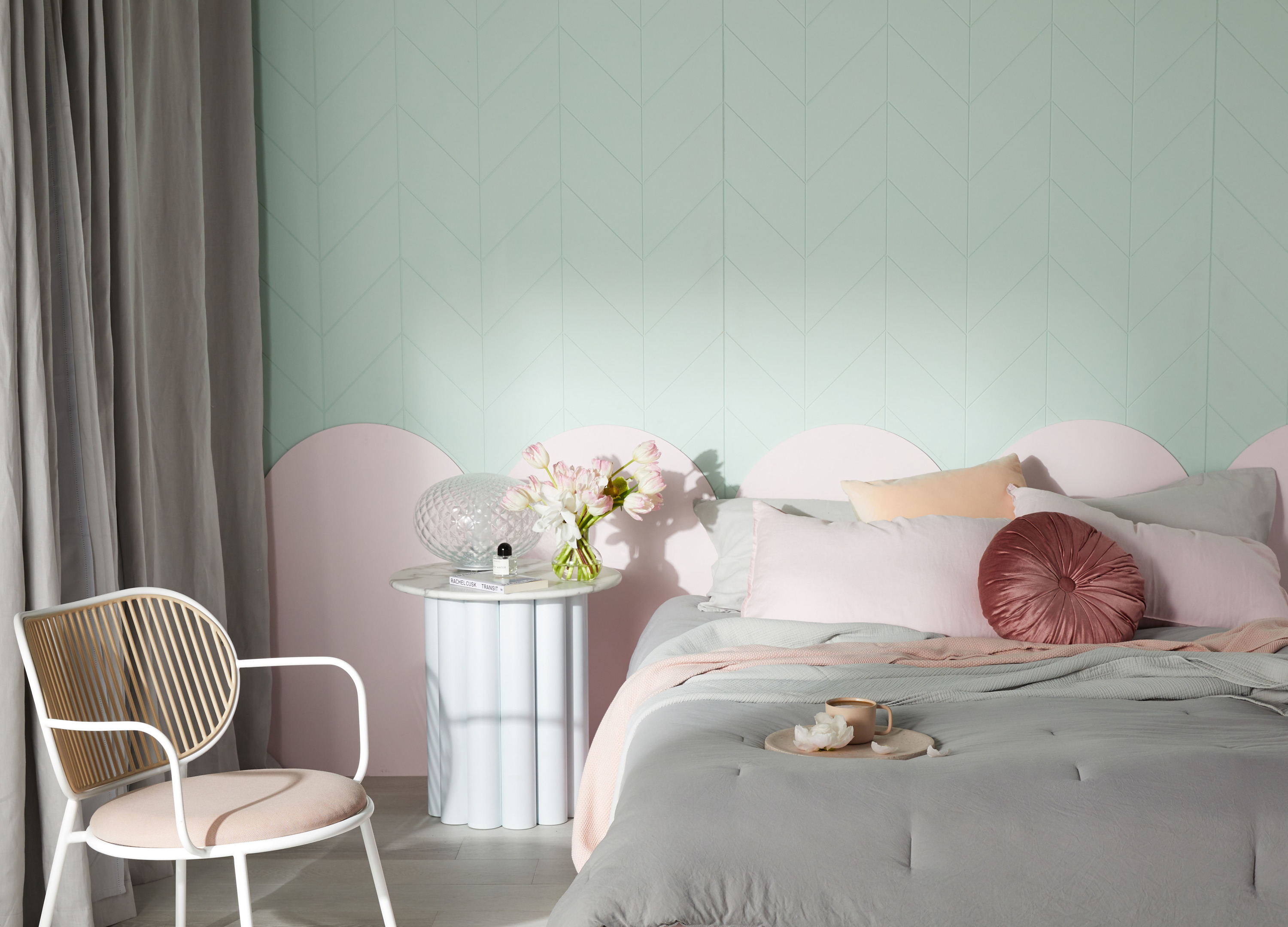
Design 2: Serene study spot
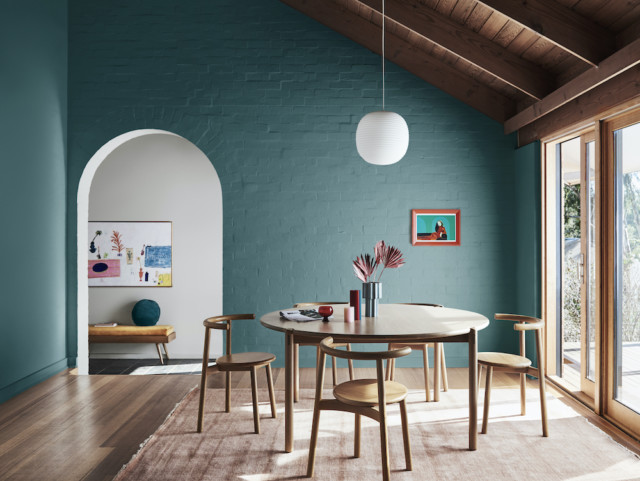
Colours: Dulux Five Fingers Peninsula and Whisper White | Art: Georgie Wilson via Greenhouse Interiors
When it came to the second scheme, Julia looked to the calming colours in the Retreat palette. She made a feature of the back wall by painting it a rich, oceanic blue, paired with a warm white on the ceiling. “Bold colour contrasts generally energise a room, but there’s a lovely muddiness to this blue that makes it feel tranquil and relaxed. It’s a classic scheme that would work beautifully in a traditional or contemporary home,” she says.
Design 3: Cosy workspace
Colours: Dulux Morrocco Tan and White Exchange Half | Artwork: Leah Bartholomew via Greenhouse Interiors
For the third scheme, Julia layered earthy neutrals from the Nourish palette for a look that speaks of warmth and comfort. The earthy hue of the wall combine with tonal shades of tan and clay in the artwork, rug, and furniture. Woven detailing in the rattan screen and desk chair add texture.
“We all respond so differently to colour – the key is finding the hues that speak to you and then having the courage to pick up that paint brush,” Andrea explains. “Like anything, it can feel daunting the first time, but chances are once you start your colour journey, you’ll never look back.”
Julia’s study styling tips
Consider mood: Choose colours to suit the mood you want to create. Warm tones will create a cosy, nurturing feel, while brighter hues are energising and inspiring – ideal for creative thinking.
Personalise: Family photographs and mementos from your travels can add character to your study and make it feel more welcoming.
Buy quality: A comfortable and supportive office chair and an adjustable desk lamp that allows you to see what you’re typing or writing are must-haves for a home office.
Greenery: Add plants or fresh flowers to purify the air and provide a connection to nature.
Dulux colour forecast 2021: soothing colours for challenging times
With most European design and architecture shows cancelled this year, the Dulux Colour Forecast for 2021 has been informed by extensive virtual research into global trends to stay abreast of…
Steve Cordony shares his home office must haves
Renowned interior stylist Steve Cordony says Australians had to pivot very quickly this year to create a workspace at home but one that may not have been their ideal setup. But…
With all the effort that goes into painting your walls, you want to make sure that the paint you’re using is the exact colour you want. Your two main options until now have been using printed paint chips that aren’t always an exact match to the paint colour, or painting sample swatches until your walls become a patchwork mess. This is a struggle that Jodie Milwright knows all too well, leading her to found The Big Paint Sample.
When Jodie decided to change the colour of her home, she painted sample swatches of seven different paints all through her house. The time, cost, and clean up led her to wonder if there was a better way to do things. After two years of research and testing, she has developed an innovative solution that means you don’t need to pull out the paint rollers and coveralls until after you’ve chosen your perfect shade.
“We are so excited to be offering what we believe is a fantastic new way to choose paint colours,” Jodie says. “These super-sized, removable and reusable paint samples are the easiest way to select the perfect colour for each room in the house.”
Dulux Ocean Current paint chip compared to real paint swatch
The Big Paint Sample’s swatches are covered with two coats of real paint, instead of the printer ink approximations used by paint chips. This means you can be sure of a perfect colour match between your sample and the paint you want to use. Plus, they’re 20 times larger than standard paint chips, so you don’t have to squint to tell if the new colour suits your house.
What really sets The Big Paint Sample apart is that the swatches are easy to remove and can be reused. Colour changes based on lighting, location, and the furniture surrounding it, and with their swatches, you can make sure that your chosen paint colour suits every nook and cranny of your home.
If you’re looking to repaint your home, The Big Paint Sample offers a wide range of paints and can supply others upon request. Swatches start at $8.95, and you can purchase them from their website.
This year, the way in which the home functions has fundamentally altered, as it has played a more meaningful role than ever in our daily lives. Wattyl have reflected this…
White paints: how to choose the perfect shade
A fresh coat of white paint is one the easiest ways to make a room look and feel brandnew! Whether you’ve just moved into a new home that needs a…
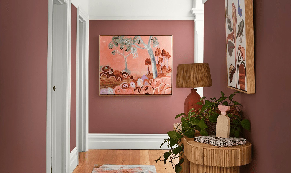
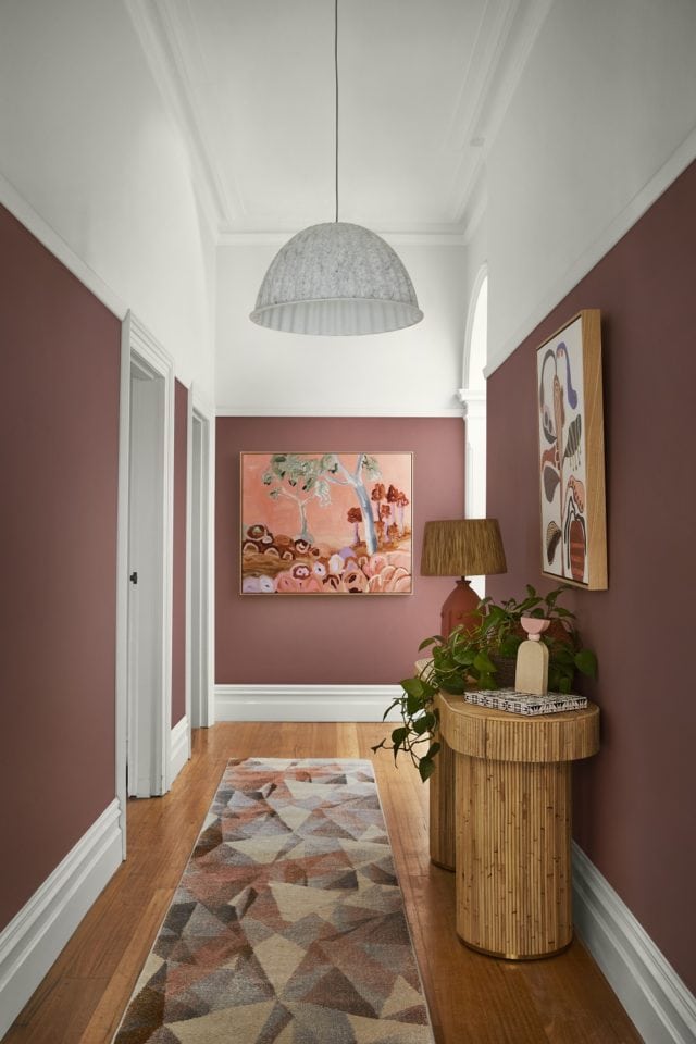
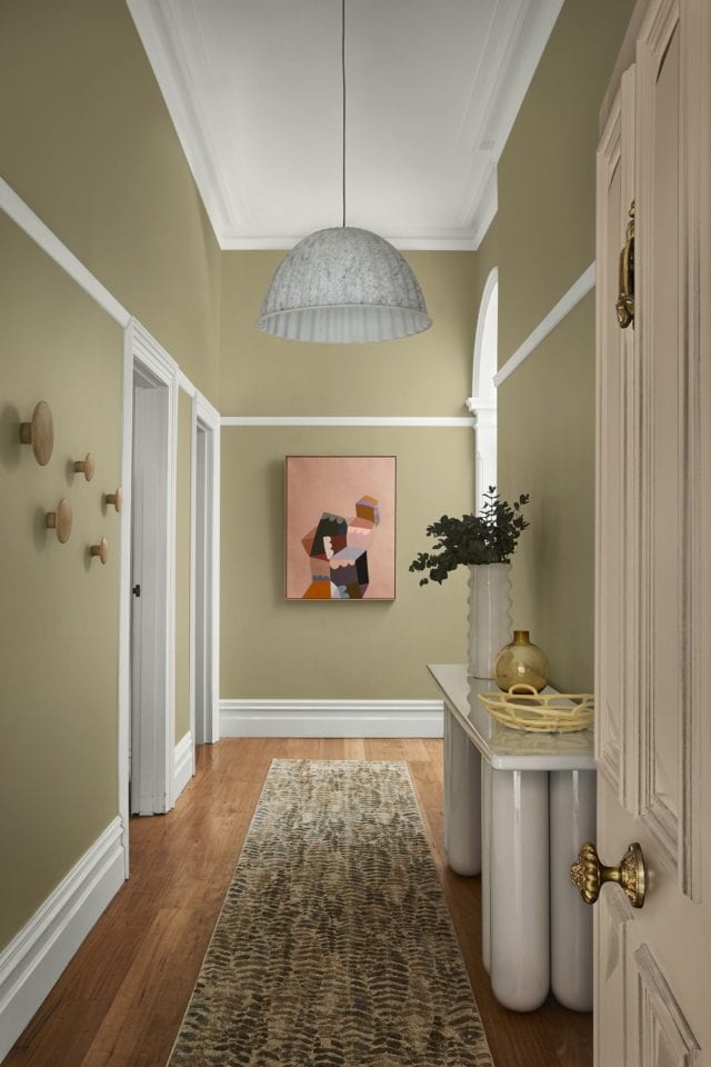
Kids, pets, shopping bags bumping against the wall – a busy hallway can take a battering. “Whilst it might not be a functional room, your hallway is a hardworking space that deserves decorative attention,” says Andrea Lucena-Orr, Dulux colour and communications manager. “It’s the first thing guests see and it sets the tone for the rest of your home.” Is your hallway looking a little worse for wear? A fresh coat of paint and a few decorative tweaks can make all the difference.
Artwork by Rachel Castle and Things, Royere vase by Sarah Ellison via Life Interiors, porcelain fruit bowl by Karen Morton via Greenhouse Interiors, Bold console via Domo Australia.
Stylist Julia Green gave a classic hallway three inviting looks using different palettes from the Dulux Colour Forecast 2021 to show you just how easy a refresh is to achieve. “This hallway had great bones – a high ceiling, decorative mouldings and trims, with a generous width – but it lacked energy. Being a relatively small space, it didn’t take much time, effort or outlay to jazz it up, and livening up the colour was the perfect place to start,” she said.
“Colour is such an emotional thing. It’s really about identifying those hues you instinctively respond to and having the confidence to use them in your home. And remember – it’s not a lifelong commitment. If you change your mind, you can simply paint over it.”
Look 1
For the first look, she chose colours from the Reset palette to create a cosy and contemporary feel. She ran deep, dusty pink (Dulux Wash&Wear in Terra Rose) up to the picture rails, and warm white (Dulux Wash&Wear in Snowy Mountains Half) on the upper section of walls and the ceiling. She used the same white to highlight the beautiful original mouldings and trims.
Artworks by Doulene Walker via Greenhouse Interiors. Halston Console by Sarah Ellison via Life Interiors, Tall Poppy vase by Formantics via Greenhouse Interiors, Sierra Pastel Geometric Hallway Runner Rug from Miss Amara, Salvador Table Lamp in Terracotta via Few and Far, Muuto Under The Bell Pendant White Melange via Surrounding
“Choosing a darker colour for the lower part of your walls can be a great way to disguise scuffs and marks, while a lighter colour above keeps your hallway feeling open and airy,” Julia said. “A few smart styling touches completed this look. You don’t want clutter in a busy hallway, so I kept my focal points to the walls, floor and console table. A joyful artwork at the end of the hall adds interest, whilst a geometric-patterned rug creates softness and hides a multitude of sins in a high traffic spot. All these elements are in tones of pink and coral, creating a lush, layered effect against the dusty pink walls.
“To create a cohesive feel, look for opportunities where you can replicate shapes and themes. Here, I chose a curvy console table that echoes the arched doorway. The ribbed base adds texture, whilst a pretty vignette consisting of a lamp, vessels and a trailing plant makes for an easy-to-achieve and eye-catching feature on the tabletop.”
Look 2
“I wanted to give the second look a more luxurious feel whilst drawing attention to the home’s original features, so I selected timeless colours from the Retreat palette. Rich bottle green (Dulux Wash&Wear in Mangrove) on the walls picks up on the tones in the stained-glass window, and warm white (Dulux Wash&Wear in Whisper White) above the picture rail keeps the entrance light and inviting.
Artworks by Castle and Things, Bizerte Floral Multicolour Runner from Miss Amara, Asola Table Lamp via Domo Australia, Long Low Shelving by Sarah Ellison via Life Interiors, Bloom Shallow Bowl Speckle by Alice Bell Ceramics via Greenhouse Interiors, Buee Vases via Domo Australia, tray and cup by R. L. Foote Design, digitally generated porcelain cup bubble plate, Goblet Planter Orchid via Lightly.
“Mixing old and new elements is a great way to add character. An ornate chandelier contrasts beautifully with a sleek modern table lamp, while graphic, contemporary artwork adds a touch of the unexpected. The old-meets-new runner has a traditional look, but in bright, modern colours.
“If space or budget is tight, invest in one or two pieces that really make an impact. Here, I splashed out on a marble and brass console – it feels luxurious and contrasts beautifully with the green walls,” says Julia.
Look 3
“To provide a calm and comforting welcome, I chose soft, nature-inspired colours from the Nourish palette for the third look. These tones are incredibly easy to work with as they sit comfortably alongside the whites many of us already have in our homes. Plus, they bring a sense of the outside in – which you can emphasise by styling with natural textures and greenery.
Artwork by Castle and Things, Bold Console via Domo Australia, hooks on the left wall – Oak The Dots via Huset, Porcelain Fruit Bowl by Karen Morton via Greenhouse Interiors, Royere Vase by Sarah Ellison via Life Interiors, Dibaya Abstract Runner via Miss Amara, Muuto Under The Bell Pendant White Melange via Surrounding
“I used soft pistachio on the walls (Dulux Wash&Wear in Sedia), pale pink (Dulux Aquanamel in Skip To) on the front door, and cool white with a neutral undertone (Dulux Wash&Wear in White Exchange Half) on the trims and ceiling.
“To boost functionality without sacrificing precious floor space, I added timber storage hooks to the walls for coats and bags.
“A bright and cheery painting picks up on the pink of the front door and draws guests into the home. I chose a console with curved legs to add volume without crowding the space, in a grey-white that matches the trims. A fern-print rug ties in with the natural theme, and its busy pattern means it won’t show every bit of dirt and dust.
“Each of these looks took less than a day to create – and turned a drab hallway fab.”
Which is your favourite?
Julia’s top hallway styling tips
Create a focal point: Draw guests into your home with a striking artwork, a gallery wall or a mirror at the end of the hallway.
Choose a durable paint finish: Busy hallways require a tough, washable paint finish – Dulux Wash&Wear Low Sheen has a velvety finish and it’s hardwearing and easy to clean.
Test it out: Purchase a sample pot or colour sticker online and live with the colours for a few days.
Choose the right rug: A robust, flatweave rug in a forgiving colourway is the best choice for a high-traffic area.
Light it right: Add warmth with a layered lighting scheme consisting of overhead lighting and lamps at different heights.
Mirror magic: Make a narrow hallway feel bigger and brighter with a strategically placed mirror.
White and bright: One of the best ways to visually lift a low ceiling, bounce light into a space or for colour contrast is to have a white ceiling – from the picture rails to beyond.
Wattyl has recently launched its Villa Carmelina colour palette – the result of a collaboration with architect Scott Weston that has spanned more than two years.
Villa Carmelina, a grand 1889 Victorian Italianate terrace, was bought by Scott in 2016. It was in a dilapidated state but, for Scott, it represented the opportunity to fulfil a long-held desire to invest his 25 years of architectural practice in his own home.
The main two-storey terrace was restored to its former grandeur, with a few minor adjustments to the interior to accentuate the building’s high ceilings and maximise the natural light. The result is a unique fusion of contemporary design and original Victorian architecture.
To the rear is a modernist two-storey addition in glass and steel containing expansive kitchen and living room plus bedrooms and bathing areas.
Wattyl’s new range takes inspiration from the remnants of Villa Carmelina’s original 1950s colour scheme – rose pink, acanthus green, lemon chiffon, studio mauve, and earl grey.
These colours appear in various guises throughout the home – some have been custom-matched by Wattyl and others taken directly from the Wattyl fandeck.
The architect
Scott Weston is regarded as one of Australia’s most inspiring architects, with a passion for colour, pattern, texture, art, light, functionality and beautifully crafted, artisanal materials and finishes.
In his meticulous reincarnation of Villa Carmelina, Scott has expressed a long-held philosophy of tailoring spaces to embrace and celebrate the interests and passions of the occupants – he has paid homage to the generations who lived in Villa Carmelina before him while creating a unique and deeply personal living space for he and his partner.
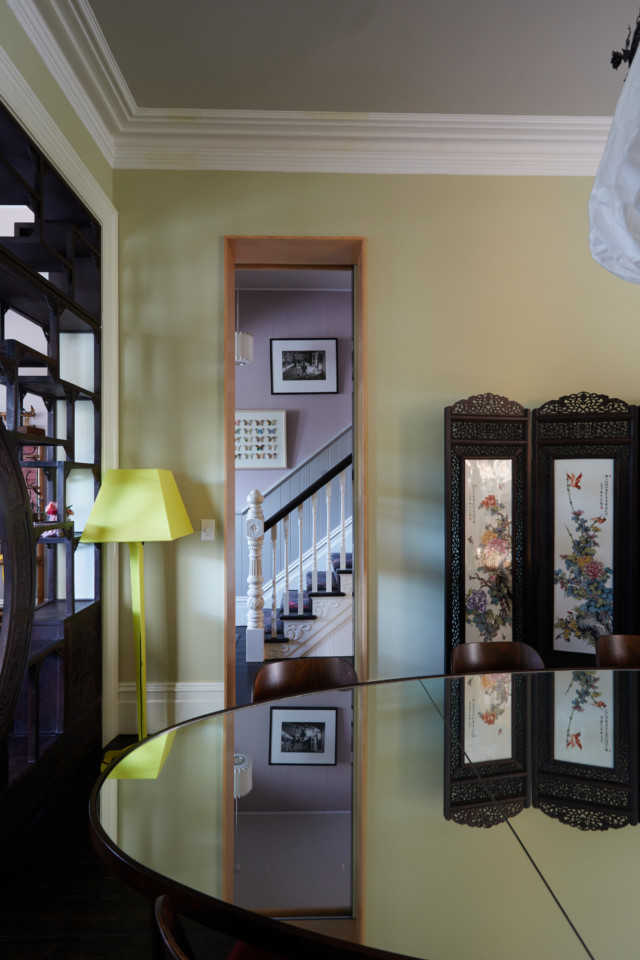
Entry hall
Serving as an introduction to the Villa Carmelina colour palette, this is the harmonious meeting point of eight of the project’s custom colours.
Lady Gray is seen on the timber dado while the wall above features the velvet grey-lilac of Studio Mauve. The Victorian ceiling is washed in the sorbet lemon hue of Lemon Chiffon, bordered with Ivory Grey piping in order to highlight the decorative cornice and ceiling rose.
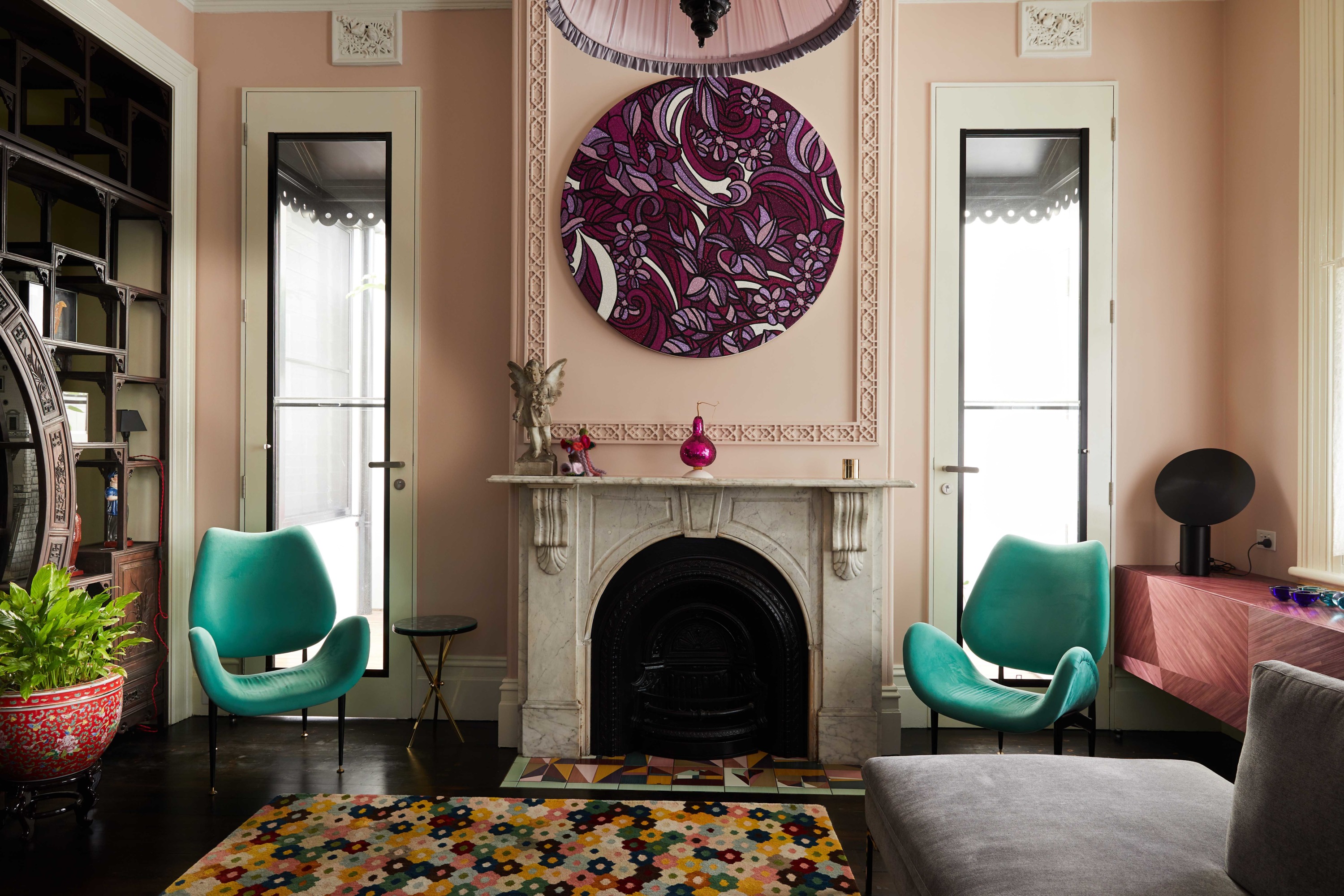
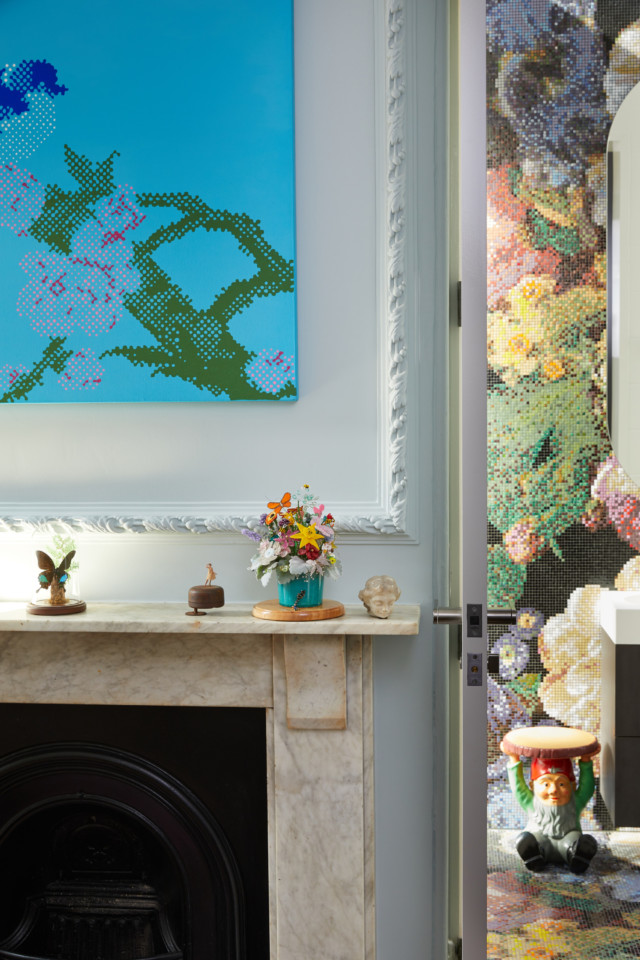
Living room
This elegant room, flooded with indirect light from the over-sized doors either side of the fireplace, has as its focus the contemporary glitter artwork by Reuben Paterson.
The walls and decorative plaster moulds above the fireplace are washed in the understated, faded pink of Miss Havisham Rose. Timberwork, in the ivory tone of Marcasite, highlights the original architectural details, while the lathe and plaster ceiling provides a plane of light grey, using Ivory Grey.
Dining room
Referencing a 1950s Hong Kong tea house, the dining room walls are finished in a soft Matcha Tea shade that was custom-matched to the beautifully textural hemp wallpaper used on the feature doors of the joinery unit.
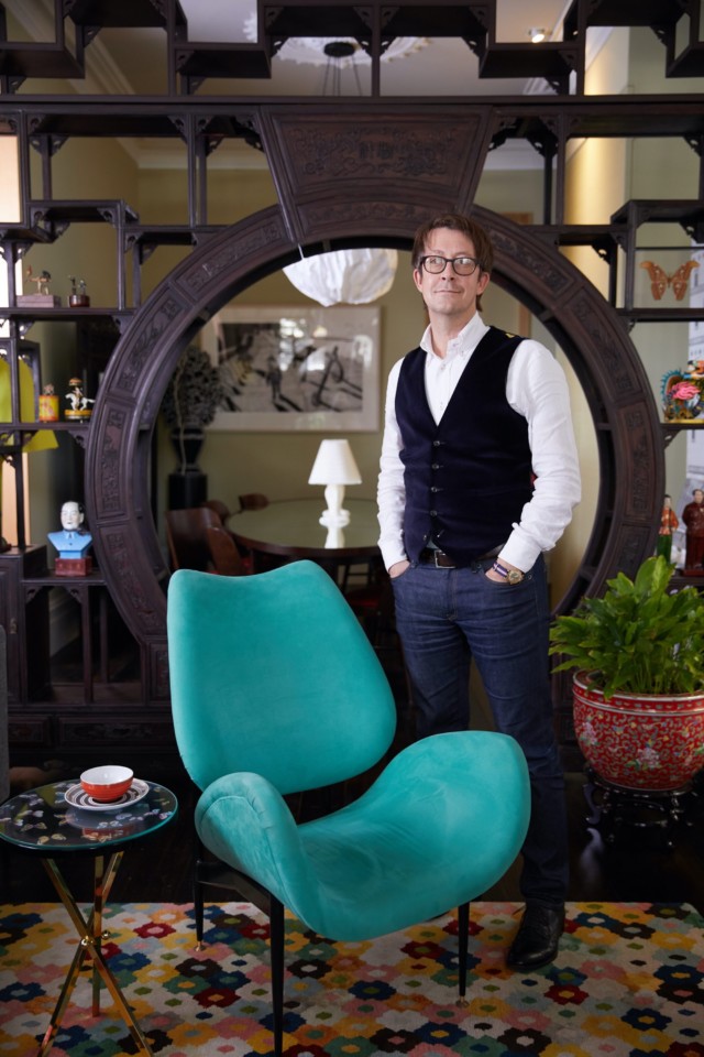
Having no direct light, the dining room ceiling was highlighted in Modernist, a darker grey. The antique Chinese moongate (seen above, pictured with Scott) is unquestionably the focal point of this room, framing views and showcasing a collection of beautiful treasures.
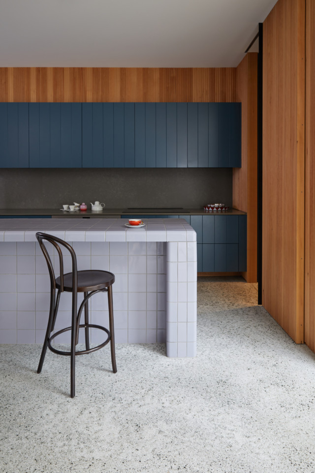
Kitchen
The living heart of Villa Carmelina, the kitchen is strategically placed within the expansive living room and features a black and white terrazzo floor and timber hemlock walls.
Two horizontal bands of custom architectural joinery have been hand-rolled in the saturated, deep blue of Curious Planet.
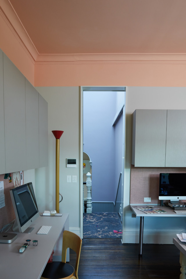
Studio
A grand room that looks out onto the main staircase whose walls are washed in the beautiful grey lilac of Studio Mauve – a hue that changes colour throughout the day, thanks to the northern glass roof.
The studio walls are finished in the sophisticated soft grey of Marcasite with a horizontal line of Jazz Age Coral applied to the perimeter above the tall doors, enveloping the cornice and ceiling in one dramatic gesture. The ornate Ivory Grey ceiling rose is crowned by a George Nelson 1950s pendant light.
Guest room
Highlighting a display of rare and beautiful objects, the grey-blue tones of the guest bedroom’s Celadon Blue walls provide a quiet background to the ensuite’s dramatic floral cascade in miniature glass mosaic tiles.
Scott chose Wattyl I.D Advanced Ultra Low VOC interior paint for Villa Carmelina, citing the fact that it far exceeds green-building requirements (with less than 1g of VOCs per litre) and can be custom-matched to any colour, as the reasoning behind his choice.
Wattyl I.D Advanced is available in water-based matt, low sheen and satin finishes, plus Ceiling White.
This year, the way in which the home functions has fundamentally altered, as it has played a more meaningful role than ever in our daily lives. Wattyl have reflected this…
Stylist Jason Grant creates new paint colours for Murobond
Now with 70 paint colours to his name as part of his collaboration with Murobond, creating new hues is as exciting a process as ever for Byron-based stylist Jason Grant.…
“Whites and pale neutrals might feel like the safe choice, but they might not always be the best choice,” says Andrea Lucena-Orr, Dulux colour and communications manager. And we couldn’t agree more. While white paint is virtually fail-safe, it can be uninteresting which is why we we’re pretty taken with this before and after when it landed in our inbox this week.
Dining BEFORE
Using a palette drawn from the Dulux Colour Forecast 2021, stylist Bree Leech transformed a neutral 1970s home into one with so much more personality. Oceanic shades, sage green and dusty terracotta all combine to fabulous effect.
Dining AFTER
“I wanted to show how you can create an entirely new look with little more than a paintbrush. The colours in the Reset palette have a fun, retro feel that’s perfect for this 70s family home,” says Bree. Luckily for Bree, the home was light-filled and already brimming with character features (a pitched, timber-lined ceiling and arched doorways to name just two) when she commenced the overhaul. “Whilst the all-white interior was neutral and unassuming, adding colour helped highlight the home’s best features and really brought the rooms to life!” says Bree.
The home’s most dramatic transformation took place in the dining room where Bree chose an uplifting deep blue-green (Dulux Wash&Wear in Daintree) which really elevated the previously white space. “This dramatic hue gives the room a distinct mood and enriches the space. The features of the room, such as the rustic brick wall, archway and timber lining, are all amplified through the use of colour and a backdrop is created to contrast against the crisp white pendant light,” says Bree.
The nearby living room was also given the makeover treatment but in a less bold fashion. Bree chose a gentle tranquil green (Dulux Wash&Wear in Light Ceramic) to highlight the hero of the space – the wall hung shelving unit. She then added a stylish edit of artworks and vessels in tonal shades of peach and terracotta alongside pops of red and green to complement the dining room palette.
Living room BEFORE
Living room AFTER
“A plump, vintage velvet sofa adds curves and a touch of retro cool to the space. A patterned rug adds softness underfoot and helps zone the living area in the open-plan space,” says Bree.
Inspired by the home’s original chili red oven, Bree chose Dulux Wash&Wear in Gold Pheasant to imbue the kitchen with warmth. “Painting the feature brick wall in Dulux Wash&Wear Gold Pheasant added that extra warmth I was after without taking away from the best feature – the oven. The accents on this wall didn’t need to contrast, so I painted the shelving to match the wall and added an eclectic display of artwork and vessels in tonal shades,” says Bree who also painted the rangehood a lovely blush colour (Dulux Wash&Wear in Treeless), to soften the contrast between the feature wall and the white paint in the room.
Kitchen BEFORE
Kitchen AFTER
“I completed the look by swapping out the black timber bar stools for seating in aubergine and blush. I chose styles with soft cushioned seats to encourage those in the household to sit, linger and connect in the kitchen.”
Dulux colour forecast 2021: soothing colours for challenging times
With most European design and architecture shows cancelled this year, the Dulux Colour Forecast for 2021 has been informed by extensive virtual research into global trends to stay abreast of…
Haymes Paint has launched its Volume 14 colour library, with new shades designed to reflect the shifting home trends in the wake of this tumultuous year.
Calm Mind palette
Embrace is inspired by the concept of embracing the ever-changing and unexpected challenges of the current world, and finding solace within the home space through colour. The movement is characterised by tones that elicit comfort and reassurance, aimed to create nurturing environments as a respite from the – often overwhelming – uncertainty that has defined our lives recently.
Calm Mind: Shell Pink
Comprising of three unique colour palettes: Grounded, Calm Mind and Happy Home, the range features hues that have been crafted to reflect the natural world, and produce a calm and joyful interior; attitudes that are expected to be a staple of the paint trends predicted for 2021.
Colour and concept manager, Wendy Rennie, says: “This year’s colour release has been interesting to put together as the world and climate we live in has changed dramatically.
Grounded: Arboretum
“The current focus on wellbeing is more important than ever and using colour as a way of connecting us to emotions and improving the environments we are in will help people to make an impact where it counts most, showing us that home truly is where the heart is.”
Grounded
The grounded palette draws inspiration from the earthy tones of the natural world, offering an escape from the speed and stress of our everyday lives. Its rich colours range from deep tones of ink blue to warm sandy neutrals and olive greens, emulating the calming force of the ocean, the earth and forest.
Grounded: Rubicon
These colours promote the creation of spaces within our home that reinforce this important connection to nature, and the sense of serenity and “groundedness” that will act as central tenets of 2021 interior design trends.
Calm Mind
Despite what is going on in the world around us, by looking inwards we can attempt to recapture our innate sense of calm and peace. The focus of this palette is to restore balance and inspire harmony, through emulating a “spa retreat” feel within the home. Soothing tones of creamy green and blue blend with muddied peach, pink and rusts to create a tranquil fusion of colour that nutures the mind and soul.
Calm Mind palette
The new normal is to look for ways to promote self-care and relieve stress within environments you can control, and the Calm Mind palette was created to highlight just this; the power that the intentional choice of colour can have in creating a tranquil living space.
Happy Home
The Happy Home palette encapsulates a relaxed approach to interiors by introducing an uplifting array of tones and hues created to promote joy. Bold blues, rusty reds and pops of bright yellow bring a sense of fun and hope back into our homes.
Happy Home palette
The palette inspires interiors that are characertised by quirky styling, bold colour blocking and smack of zesty exuberance. This theme is all about youthful design elements and injecting energy into spaces to reinvigorate the senses.
Imagery styled by Ruth Welsby with photography by Martina Gemmola.
This year, the way in which the home functions has fundamentally altered, as it has played a more meaningful role than ever in our daily lives. Wattyl have reflected this…
Dulux colour forecast 2021: soothing colours for challenging times
With most European design and architecture shows cancelled this year, the Dulux Colour Forecast for 2021 has been informed by extensive virtual research into global trends to stay abreast of…
Family-owned Haymes named Australia’s best paint brand
Haymes Paint beat stiff competition including Dulux, Taubmans and British Paints to be named Australia’s number one paint brand by Canstar Blue recently, for the second consecutive year. Not bad…
This year, the way in which the home functions has fundamentally altered, as it has played a more meaningful role than ever in our daily lives. Wattyl have reflected this in their newly-released 2021 colour forecast, which takes the form of four unique palettes, spanning a wide array of shades.
These predictions highlight the way in which curved or rounded shapes, soft textures and considered colour palettes have become the go-to options for creating a sense of calmness and serenity while also proving useful in establishing different areas within an open living space.
The richer, darker hues of the Shadowy Darks palette – Dark Dream, Black Hole, Deep Forest and Seductress – are luxurious and cocooning and create a mood of timeworn comfort, especially when teamed with textured wall panels such as Easycraft’s Ascot Vogue dado panel, velvets, corduroy and dark timbers. Shape and texture become the heroes!
Uplifting Lights, a collection of four beautifully dusted pastels – Snow Rose, Light Aqua, Cave and China Mauve – add a warmth and tactility to minimalist spaces and lend themselves to soft curves in furniture and detailing that are balanced with the geometric chevron profile on the main wall.
The tonal equality between hues such as Wattyl Snow Rose and Light Aqua inspire a balance between body and mind – the perfect combination for bedrooms.
Nourishing Earth Tones will be even more important in a post-Covid-19-world, their warm, nourishing plant-based colours helping us to reconnect with nature and the outdoors. Terracotta tones such as Wattyl Brandy Snap are given extra depth and visual interest when applied to a textured wall lining and mirrored in furnishing textiles such as leather, linen and wool.
Other beautifully organic, earthy hues within the palette are Moccacino, Run Forest, Denim and Honey Honey.
Humble Whites – and minimalism in general – continue to reign supreme in many homes but the look is warming; becoming less pristine in both detail and styling. Personality and emotion are introduced to this palette by virtue of authenticity, craft and history – attributes we crave in a post-Covid-19 world. Materials such as timber, vegetable-dyed textiles and hand-made ceramics are key to the mix and create a mindful ambience, one of simplicity and purity.
Humble whites such as Wattyl Lushious White, Confetti Shower and Ice Volcano sit quietly – and comfortably – next to timber lined walls that imbue the space with a sense of authenticity and earthiness.
Paint can be such a wonderful way to transform a living space, and the use of curves, texture, and colour can be utilised in order to fundamentally shape an interior that is calming, nurturing and multi-functional.
Dulux colour forecast 2021: soothing colours for challenging times
With most European design and architecture shows cancelled this year, the Dulux Colour Forecast for 2021 has been informed by extensive virtual research into global trends to stay abreast of…
Paint trends 2020: Wattyl forecasts two distinct looks
As colour palettes they couldn’t be more disparate, but that’s because Wattyl’s 2020 trend release draws on two very different themes; the fast-paced digital world and our desire to get back to…
Colour trends 2020: paint has power to cocoon us
The power of colour to de-stress, nurture and cocoon will be a key antidote to the uncertainties of a post-Covid world, according to colour experts across the globe. Sarah Stephenson,…
The power of colour to de-stress, nurture and cocoon will be a key antidote to the uncertainties of a post-Covid world, according to colour experts across the globe.
Sarah Stephenson, paint brand Wattyl’s colour expert, says many of us will satisfy our craving for wellness, happiness and safety by surrounding ourselves with colours that invoke calmness and security, as well as those that forge a stronger connection with nature.
Wattyl has just announced four new palettes for 2021 that deliver an uplifting injection of carefully curated colour, cleverly walking the line between timeless and contemporary. “These palettes, designed with a focus on wellness and nurturing, are for painting on walls, for soft furnishings and other decorative elements, from bedlinen to artworks. Colour really can transform our home into our sanctuary, something most of us are craving,” said Sarah.
The palettes span the spectrum from uplifting lights and nourishing earth tones, to shadowy darks and humble whites.
Nourishing earth tones
Colours: Brandy Snap and Moccacino
Natural earth tones will become even more important in a post-Covid-19 world – these warm, nourishing plant-based colours will help us to reconnect with nature and the outdoors. Terracotta tones, such as Brandy Snap, continue to be a much-loved and important element in interiors as they feel timeless, authentic and natural.
This trans-seasonal colour palette sees paler, beige tones being replaced with richer, warmer honey tones and classic neutrals being swapped for mid-tone blues. Greens of 2021 are deep and olive in tone.
Nourishing earth tones will create a mood of warmth and cosiness, at once friendly and organic – something we all crave in these challenging times.
Uplifting lights
Colours: Snow Rose and Light Aqua
Pastels, traditionally associated with calm, comfort and a desire for a balance between body and mind, take on new meaning, leaving the sugary tints behind in favour of beautifully dusted pastels that evoke a deeper sense of harmony.
Wattyl’s gentle pales add a warmth and tactility to minimalist spaces, especially when paired with natural silks, organic cottons and soft wools in relaxed forms.
Shadowy darks
Colours: Dark Dream and Black Hole
The rise of tinted blacks and saturated darks is a direct response to the current mood of fear and anxiety – they have become even more relevant in these post-pandemic times. These richer, darker hues can feel luxurious and cocooning – the mood is one of timeworn comfort encompassing a classic mix of eras, with an embrace of botanical decorative elements, while ribs and curves feature in architectural details and furniture.
Humble whites
Colour: Ice Volcano
Minimalism continues to reign supreme in many homes, but it is warming – it is less pristine in both detail and styling. Personality and emotion are introduced into the mix by virtue of authenticity, craft and history in both design and materials – without any loss of functionality.
Comforting hues, natural materials and softened forms are key to the look, adding a calming and restorative feel to these pared back spaces. The principles of wabi-sabi design – imperfect beauty – add further depth, think artfully worn surfaces and considered imperfections.
Using a limited palette of colour and materials, such as timber, leather and vegetable-dyed textiles creates a mindful ambience, one of simplicity and purity.
Low VOCs
The air we breathe in our homes is equally important to our wellbeing – Wattyl I.D Advanced Ultra Low VOC interior paint far exceeds green building requirements with less than 1g of VOCs per litre (up to 16 times lower than other ultra-premium brands). Wattyl I.D Advanced is available in water-based matt, low sheen and satin finishes plus Ceiling White. Available nationally from Wattyl Paint Centres, Mitre 10, Home, Timber & Hardware and other leading paint specialists.
Now with 70 paint colours to his name as part of his collaboration with Murobond, creating new hues is as exciting a process as ever for Byron-based stylist Jason Grant.
This week sees the launch of his sixth collection, Paradigm Shift, created in isolation during lockdown. But like the others, it’s mostly inspired by nature. “I like to take it all in and notice all the details, and of course I see all the colours,” he says. “The new colours highlight earth elements and nature’s beauty.”
Jason art directed, produced, styled and photographed the collection solo in his studio during isolation. “I was doing some deep thinking too,” he said. “The palette is named Paradigm Shift, a concept that I discovered and spiralled into. It’s the notion of a major change that happens when the usual way of thinking about doing something is replaced by a new or a different way – a concept that inspires me and gives me hope and hope is what we need. I’ve always been a hippy at heart, focusing on positivity and high vibrations.”
He loves how a paint can transform room, an object or even a mood. “Nothing beats a fresh coat of paint for a new lease on life. It’s all in your mindset.”
Although it had been a while since he created new colours for Murobond, Jason said it came easily. “It comes naturally because I love that I get to do this. With everything I do, I love to create the process to create the result.
“Creating colours gets easier. I work in quite an analogue way, first conceptualising then creating the colour references that we colour match. This time we pretty much nailed the colours that were in my head first go.”
Because he likes to tell stories with words as well as pictures, Jason enjoys coming up with the colour names too. “These colours are inspired by a few clever people and a few favourite moments or objects.” Names include the very Aussie Flowering Gum, Wattle Seed and Davidson Plum, as well Guacamole, Vagabond, Kai and more.
“I love them all,” Jason says. “Flowering Gum in a soft pink; Vagabond, the subtle light shade of uplifting grey; and Kai, based on the leaf of a gum tree, are three standouts.”
Jason’s currently busy with a variety of projects, creating content for brands, working on a few residential and commercial spaces, including a restaurant. The biggest interiors trends he’s seeing for 2020 are creating the ultimate in home comforts, simple things becoming luxuries and simplification of living.
Jason was one of Interiors Addict’s first interviewees 9 years ago:
Jason Grant, living his dream
Jason Grant left his prestigious role as style director for Real Living magazine last year and hasn’t stopped working since. It’s a good job he loves his work so much it feels…
With people isolated in their homes during the COVID-19 pandemic, there has undoubtably been an increased awareness and desire to improve how our home space looks and feels. Bearing in mind budget constraints and accessibility, Katrina Garrett and Millie Alison, co-founders of The Design Paddock, have compiled five attainable and cost-effective ways to revamp, uplift and refresh your interiors!
The Design Paddock’s Katrina Garrett and Millie Alison, Sheri McMahon Photography
The power of paint
One of the most effortless ways to reinvigorate and transform a space is a fresh coat of paint. A spot that’s often overlooked is the hallway or the entry to the home. These areas are important as they connect to the spaces you live in and can set the initial impression of the home. Over the years, walls, doors and trims can look battered and more commonly adopt marks or cracks. A fresh coat of paint can make the biggest difference here. We recommend a gloss trim paint to contrast against a matt or low sheen wall paint. You’ll be surprised with the impact it can make.
This doesn’t only apply to the interior. Consider redesigning or repainting your front door or even the garden pots in your entry for a powerful change. This can instantly achieve a more inviting entry!
2. Rearrange the furniture
It’s quite common to find that people become too comfortable in their home to realise that a slight rearrangement could transform a place and in turn, may provide a better layout. Many people tend to use the TV as the centrepiece of the living room, however, this should not be the case. Living rooms should be centred around conversation and comfort.
Between the warmer and cooler months, the perfect opportunity emerges to rearrange your home spaces. Fireplaces are the perfect centrepiece to arrange your furniture around in winter where the television becomes less of a focal point! Also consider moving your armchair beside a window to create a reading corner or a spot to wind down and enjoy some sun.
3. Switch up your lighting
Lighting plays a big part in determining the atmosphere and ambience within a room. Considering subtle changes in the home can have a dramatic impact on the way a space feels. Warm light globes around the home are a must in our books! Furthermore, consider where your lighting is focused and adjust it. You may like to highlight an artwork or incorporate a new feature pendant above your dining table.
It is important to note that lighting should be both beautiful and functional; thus, a directional light in a hallway is a great way to not only light up an artwork but will reflect onto the wall and light up the space beautifully. When considering your feature pendant, one should not only love it but include a suitable globe for illuminating the table appropriately when gathering around it in the evenings.
Alternating lighting throughout the house is another way to make spaces feel cosy. Incorporate varying scales and heights in your lighting such as table lamps, floor lamps, wall lights, dimmable ceiling lights and pendants in soft textures to create interest and an overall lovely ambiance.
4. Reprioritise and declutter
With the extra time people are spending at home recently, there is no better time to take charge and rid your home of clutter! Explore new ways to store and conceal possessions in cabinets or boxes and if there isn’t space and you no longer need items, let go. Interiors should feel full but not cluttered. Less is more!
Organising the bookshelves can bring life to a forgotten area. It’s always good to start with larger items such as bowls, jugs or artwork — this will help achieve the right scale and balance. Books are a beautiful inclusion to an interior. Try stacking books in varying directions on the shelf to add interest. Most importantly, the bookshelves are a reflection of your life and style. Add your treasured keepsakes on top of piled books – different heights can help balance your shelf styling.
5. Reinvigorate with soft furnishings
Soft furnishings present an opportunity to incorporate colour, texture or pattern to a space without the intensive labour! You can soften your bedroom with a rug beneath the end of your bed, introducing a bedhead, re-covering a chair or new throw cushions.
Deciding on your favourite fabric can often be difficult, particularly if you can’t afford your favourite. Be clever with the way you use your fabric. A cost-effective way of achieving a similar result may be to upholster the back of your cushions or bedhead with an affordable plain fabric. You can use some beautiful tea towels or fabric cuttings to frame for some affordable art!
–The Design Paddock is a unique interior design and decorating company that revamps interior landscapes for people in the bush and beyond.
5 cost-effective ways to refresh your home
Interior designer Lorena Gaxiola shares 5 cost-effective tips to refresh your home this New Year, from painting a blackboard wall to incorporating the colour green. “Our home is the perfect…
How to update your kitchen with just a splash of paint
Colour always packs a punch and by simply painting your splashback to be bright and bold you can instantly transform dated tiles into a modern feature wall. In this kitchen, I…
Before & after: Blogger’s $500 living room revamp
While we’ve always believed in the transformative powers of paint, this latest ‘before and after’ proves, yet again, just how wonderful it can be. The lounge room of stylist and blogger…
You can even let your kids help you with a perfectly imperfect chalk paint project! Depending, of course, on how much of a control freak parent you are! Here, we’ve rounded up other people’s masterpieces to give you some ideas!
Chalk Paint mural by @lucytiffney in Athenian Black, Barcelona Orange, English Yellow, Florence and Giverny. Blackboard, crafting station and chair painted in Antibes.
“Introduce little ones to the world of colour with practical projects from painting old tins to any Ikea pieces you might have hanging about,” suggests Annie Sloan, creator of the original chalk paint. “The easiest and most cost-effective transformer, updating nursery furniture is a simple weekend activity that even the smallest hands can help with. Use up leftover tins of Chalk Paint for larger projects and don’t be fussy about the palette. Let the kids go wild with their choices, it’s their space after all!”
Tamsyn Morgans wanted to add a cooler, more industrial touch to her son’s room and up cycled these drawers using Florence as the base colour, with Paris Grey as the top colour. She gave the chest two standard coats of Florence, before decanting some into a tub, and leaving the lid off so it could thicken up a little. In order to create texture, she then dabbed the paint on in a criss cross fashion to build up colour wherever she wanted it to show through. She did two coats like this then applied two coats of Paris Grey. When it came to sanding, she used a small mouse sander with very fine paper on it, with a very light touch, as she didn’t want to remove the Florence, just to let it show through. She finished it with clear wax and used a big brush to really dab the wax into all the texture before buffing to a sheen.
You could even create your kids their very own mural, filled with favourite patterns and motifs – a wall full of colour and imagination that will inspire bedtime stories for years to come!
Mural painted by Brand Director Felix, Annie Sloan’s son, using Detail Brushes and Chalk Paint. Bed painted in Giverny, desk and stool in English Yellow.
Available in 44 mixable colours, Chalk Paint can be applied to almost any surface without any priming or sanding. This kind of ease of use is music to our ears!
Water-based, odour-free and low in volatile compounds, Chalk Paint has even been independently tested and certified as toy-safe according to regulations.
Chloe Kempster from @masieshouse used Chalk Paint by Annie Sloan in Pure and her gloss lacquer on the Mid-Century drawers with a Neon Pink mix for the handles.
When it comes to our mood, the transformative power of colour is well documented. And while we’re all searching for little pick-me-ups (to escape the unfolding horror), the arrival of the 2020 Dulux Colour Awards finalists is a welcome distraction indeed. Currently in its 34th year, the 107 finalists span a variety of categories, but it’s the residential ones that interest us the most. From suede effects to bold coloured joinery, there’s an abundance of inspiration to be found.
Dulux Colour Awards 2020 – Residential Interior. St Kilda Residence by Doherty Design Studio. Photographer: Derek Swalwell
“Architects and designers have set a new precedent with this year’s awards program submissions. They have exhibited original and masterful use of both colour and texture in their design approach, creating sophisticated interior and exterior spaces,” says Andrea Lucena- Orr, Dulux Colour planning and communications manager.
Suede effects No longer a 1990s’ relic, suede effect walls appear to be back on trend, though interpreted through a modern lens. “We have seen the emergence of textures, such as concrete effects, patinas, French ash and Suede Effects in both commercial and residential spaces. Repetition of these textures paired with unexpected tones was apparent, such as yellow, red and coral in the form of accent walls, cabinetry, doors, skylights and trims,” says Andrea.
Dulux Colour Awards 2020 – Residential Interior. Perfect Storm by Green Anvil Co, Killing Matt Woods, Set for Art. Photographer: Kat Lu
Dulux Colour Awards 2020 – Residential Interior. Orchard House by Chelsea Hing. Photographer: Rhiannon Taylor
Dulux Colour Awards 2020 – Residential Interior. Budge Over Dover by Amber Road. Photographer: Prue Ruscoe
Coloured cabinetry From emerald green to coral and a variety of blue shades, there’s barely a white cabinet to be found in the finalist list. Statement making, we think these bold shades are a fabulous alternative to run-of-the-mill, neutral tones.
Dulux Colour Awards 2020 – Residential Interior. Orchard House by Chelsea Hing. Photographer: Rhiannon Taylor
Dulux Colour Awards 2020 – Residential Interior. Centennial Park House by Balmoral Blue House by Esoteriko Interior Architecture.Photographer: David Wheeler
Dulux Colour Awards 2020 – Residential Interior. Brunswick Residence by Lucy Bock Studio Photographer: Derek Swalwell
Dulux Colour Awards 2020 – Residential Interior. Ruckers Hill House by Studio Bright. Photographer: Rory Gardiner
Dulux Colour Awards 2020 – Residential Interior. Bourke Street Apartment by Fowler and Ward. Photographer: Tom Blachford
Green & timber Our obsession with the outdoors continues with many of the projects using tranquil green tones alongside timber in all its forms. “Many briefs discussed the need for the space to be conducive for rest and a connection to nature, which translated to the employment of botanicals and natural materials, such as timber in both interiors and exteriors,” says Andrea.
Dulux Colour Awards 2020 – Residential Interior. Concrete Blonde by Carter Williamson. Photographer: Katherine Lu
Dulux Colour Awards 2020 – Residential Interior. Gillies Hall by Jackson Clements Burrows. Photographer: Peter Clarke
Dulux Colour Awards 2020 – Residential Interior. Angophora Pavillion by Ava Shirley Architect. Photographer: Michael Nicholson and James Deck
The judging panel will select winners and commended projects across the six categories. The Australian Grand Prix title is also up for grabs with a $5000 AUD prize in Australia, and $5000 NZD on offer in New Zealand.
The judging panel includes Adele Winteridge, Director of Foolscap Studio; Jean-Pierre Biasol, Director of Biasol Design Studio; Jonathan Richards, Director of Richards Stanisich Architecture; Kathryn Robson, Director of Robson Rak Architects & Interiors; and Toni Brandso, Director of New Zealand’s Material Creative.
It’s been a while since I’ve swooned over a shed, but this backyard number, overhauled by the creative team at Dulux is really, rather gorgeous. And ‘gorgeous’ is not really a word typically associated with a shed, is it? A strongly utilitarian space, the humble shed is an oft-forgotten relic at the back of the garden, but that needn’t be the case.
Tone on tone: That soft mint green is a beautiful complement to backyard greenery
“It’s easy to get excited about sprucing up a living area or bedroom, but the practical parts of our home are no less deserving of attention. What many people don’t realise is how big an impact they can have on your home’s overall look. For instance, a shed that’s seen better days can really bring down the look of your garden. It’s details like these that friends and family, as well as potential buyers really notice,” says Dulux colour expert Andrea Lucena-Orr.
But rather than stumping up for a full replacement, a lick of paint can work wonders on an unsightly shed or garage; but first you must declutter and prep. Start by clearing our the shed, or garage, and get rid of what you no longer need or use. Then organise the space, so that everything has its place, before prepping the exterior surface. “If it’s damaged or old, this stage will probably take longer than the actual painting,” says Andrea.
“When it comes to choosing colour, think about what you’d like to achieve. Do you want your shed or garage to blend into the background or make a statement? Greens are trending for 2020 – from soft mint and sage green to earthy olive. Muted greens will add freshness to a tired exterior, and they harmonise beautifully with plants and foliage,” says Andrea.
This shed has been painted with a glorious mix of greens; the weatherboards are weather-resistant Dulux Weathershield ‘Gentle Calm Quarter,’ while the trims are Dulux ‘Natural White’ and the door is Dulux ‘Jungle Cloak.’
That chic green trolley is from GlobeWest
Garage & shed door refresh DIY steps
Gather your painting supplies and ensure the surface has been properly prepared (sanded and washed) prior to starting to paint. Follow the label on the Dulux Weathershield can for more information.
Once the surface is dry, apply Dulux Weathershield to the surface using long brush strokes, starting with the inner panels and working your way out.
Smooth over the wet painted section with long brush strokes. Do not reload the brush when you do this, a few strokes should be enough to smooth the surface.
Repeat this process for the second coat. Allow to dry, then give the surface a light sand with 400 grit sandpaper and repeat for a second coat.
If painting bare timber a third coat will need to be applied.
Images: Dulux Australia | Photography: David Mitchener | Styling: Bree Leech
After a decade where cool paint tones reigned supreme, warm neutrals are back on-trend if the latest from Dulux is anything to go by. The work of stylist Bree Leach, a bland white child’s room was imbued with gorgeous warmth courtesy of Dulux ‘Pancake Mix,’ a biscuity, putty-like clay tone that completely transforms the space.
Part of the paint brand’s ‘Grounded’ palette (one of four trend palettes identified in the 2020 Dulux Colour Forecast ‘Essence’), the palette combines warm biscuit tones derived from nature with touches of muted coral, mauve and gold for a contemporary edge. Who would have thought that such warm tones could look so modern?
BEFORE
AFTER: The ‘Grounded’ palette is versatile enough to work in a girl or boy’s room
“We’ve seen a much more tonal palette coming through this year. The bold colour contrasts of previous years have made way for subtle layering of natural hues. Depth is added through texture and materiality,” says Andrea Lucena-Orr, Dulux colour and communications manager.
While the original room was fairly monochrome, it did have great features for Bree to work with including a high ceiling, solid timber floor, French doors, plenty of natural light and a striking brick fireplace. The colour palette was less than optimal however; all-white, it was fairly uninviting which is not exactly the vibe that you want in a child’s room!
BEFORE
AFTER. That pretty lavender paint colour offsets the warmth in the room, keeping the look rather modern.
“I wanted to add warmth and personality to the space so that its little occupant would enjoy spending time here. I aimed to highlight the room’s best features, detract from the less appealing ones, and spend next to nothing,” says Bree who kept the budget in check by retaining key furniture pieces such as the room’s toddler bed (with timber detailing), and the curvy armchair and ottoman.
AFTER: Don’t add too much clutter to a child’s room, particularly if it’s small, as you want to give them space to relax and play.
“When you’re choosing a palette, it’s best to start with one main colour, which you can use across large expanses, such as walls, then a supporting hue and one or two accents,” says Bree.
The room’s existing warm white (Dulux Wash&Wear in Natural White) was retained for the fireplace and ceiling but Bree chose a soft clay (Dulux Wash&Wear in Pancake Mix) for the walls as a feature, to tie in with the warmth of the timber floor and the detailing on the bed. A muted lavender (Dulux Wash&Wear in Hint of Lavender) was chosen for the new door on the fireplace opening, and Bree added touches of coral in the bedding.
“We made the bed the hero of the room by piling it high with comfy pillows and using bedlinen in shades of grey and coral. An inexpensive rug adds softness underfoot – its round shape echoes the curves in the furniture. To accentuate the fabulous fireplace, we kept it white to subtly contrast with the walls.”
Having recently taken the plunge and had our sixties red brick house painted grey (Haymes Paint Rockslide if you’re interested!), I’m a bigger fan than ever of the transformative effect this can have on a dated home for a relatively small spend. I mean, you’re still talking thousands, especially if you have it done professionally (which we did because we would have made a terrible job of it, not to mention probably given up after a few hours!), but the difference is huge. I’ll be sharing more of our facade as we complete more of our exterior plans but you can find it on my Instagram if you’re interested.
Three generous readers who did the same, are sharing their before and afters with you today. I hope it gives you some inspiration if you’ve been thinking about painted brick. If you have any technical questions about painting brick, please drop them in the comments and we’ll get our painters BK Decor to answer them!
HOUSE 1
Olivia Stoeckel and her husband bought their house in Southern Barossa, SA, for the land, and many people told them to knock it down. “Early in the renovation, we decided to paint the exterior to freshen it up. No one told us to knock it down after that.”
“We looked at render briefly but wanted to keep the texture of the bricks. We think it would have lost some of its charm. We love the result!”
They used Taubmans Endure in Silver Dollar (matt) for the walls and Struan Grey (low sheen) for the windows and trim, and did the job themselves! “We used a really thick wool roller from a paint supplies shop. It gave great coverage and got into the mortar.”
HOUSE 2
Bree Pollock was inspired by Mid Century Palm Springs homes when she decided to transform her brick abode in Highett VIC, with white paint. “It seemed like the quickest and most cost-effective way to dramatically change the face of our home. I actually love the detail of brick, and our home was so well built, the bricks from 1965 were still in great condition. I wanted to honour some of the original detail in the home instead of simply covering it all up with render.”
Bree chose Dulux paint in Snowy Mountain quarter strength and her husband sprayed them himself.
“I am totally obsessed with the result! It has transformed our home into a light and airy paradise! If you’re thinking about painting your brick, don’t hesitate, it is totally worth it! The front of your home sets the vibe for what’s inside so for me, the front is a major aspect of any renovation.”
HOUSE 3
We love this before and after from Alison Scardetta using Dulux colour Wallaby and a spray gun.
“We decided to paint the bricks for two reasons,” she says. “We knew we were going to sell the house and we didn’t want to over-capitalise. Rendering is very expensive. Secondly, the roof line of the house is pretty extreme! I thought that by rendering it and making it a “solid” surface that it would actually accentuate the roof line instead of softening it. We changed the boards on the front of the house to make them horizontal as opposed to on an angle for the same reason.”
She loved the result. “It modernised the house very easily and it kept the textured look of the brick. I spent a long time choosing the right grey. You don’t want your house ending up looking like a jail!”
Alison said the key to painting brick is good quality paint and good preparation. “The bricks must be completely clean and dry.”
Got a question about painting the exterior of your home? Please ask it in the comments!
With a tight edit of 70 on-trend colours, a colour-matching service and express delivery, new Aussie online-only paint brand Tint is determined to simplify the paint-purchasing process. “The experience of shopping for paint hasn’t changed in decades and is about as exciting as watching paint dry. We want home paint buying – and ultimately home renovations – to be simple, fun and rewarding,” says co-founder, DJ Dikic who has launched the brand with business partner Rocky Liang.
The duo co-founded the award-winning company Palette in 2013, with its hero product (a paint-matching device called Pico) proving integral to their new venture. “Tint offers a curated collection of 70 beautiful colours based on the most popular hues as identified by more than one million colour scans from Pico users worldwide,” says DJ.
Tint also offers a full range of painting accessories and tools including rollers, trays, drop sheets and tape
And if you’re not keen on one of the brand’s 70 colours, you can very easily choose a bespoke colour by using the small Pico device (Tint will refund the cost of the device to your paint order provided you order within 100 days). “Simply use Pico to scan any colour on a painted surface. Pico connects to the Tint app to generate a unique colour code, and the custom colour is mixed up at Tint’s HQ,” says DJ.
Tint is the official supplier of Pantone colours in Australia, with 15 key shades in its line-up including this one; the 2020 colour of the year, Classic Blue.
The company has also come up with a solution for messy sample pots, via its large stick-on sample stickers; 21cm by 21cm, they won’t damage your walls and can be repositioned multiple times allowing you to see the colour in different light. Furthermore, the Tint app offers an interactive way to measure space, trial colours and calculate the amount of paint you need too.
Stick-on, reusable sample stickers
Time saving technologies aside, the range is also vegan, non-odorous, low VOC and has antibacterial properties; and all for a reasonable price. “By being a direct-to-consumer brand, Tint is able to offer premium products at better-than-competitive prices.”
Chalk paint and DIY doyenne Annie Sloan is known for producing beautiful imagery, but this year’s Christmas pics stopped us in our tracks. Completely free of the usual Christmas tropes, Annie has a sophisticated and stylish take on the festive season. We caught up with her to tease out her best Christmas styling tips.
This dreamy sage green is such a beautiful alternative for Christmas
The role of colour at Christmas Just like any other time of year, colour has an enormous impact on the way your home can feel at Christmas time. It pays to ask yourself, what is the holiday vibe you are going for? “Do you want your inside to reflect a winter wonderland in contrast to the warm summer outside? Or do you want to bring that warmth into your home too?” says Annie.
For instance, blues, silvers and whites can feel cold (which may be the frozen, stylish look you’re going for), while reds, golds and yellows will have a warmer feel.
Navy looks fabulous at Christmas time
Think beyond red, green & white Many people have been thinking well beyond the usual red, green and white for a while now and it’s something that Annie encourages. “Any colour scheme can be made to feel like Christmas, especially in warmer climates such as Australia. Play on the red and green scheme and use a pastel pink or go deep and royal with purple and gold. The colour you use doesn’t really matter, it’s what you do with it,” says Annie.
And as for the key to pulling a diverse colour palette together, it’s all about metallics. “Whether gold, silver or even copper, metallics make a space feel more festive,” says Annie. We concur!
Easy DIY decorations Christmas DIY projects are a great way to reuse old decorations and upcycle second-hand ones; both great options for minimising waste and environmental impact. “I love painting ornaments for Christmas – it’s an amazingly therapeutic exercise and one you can do with all ages, from grandchildren to grand friends!” says Annie.
Try painting or gilding pinecones – they can be used as table name holders, tree baubles or even bunting.
Christmas styling 101 “I have frames dotted all over my walls in varying size and placement, as well as furniture and sculpture dressing every wall. This keeps the eye moving throughout a room and makes the most of vertical space as well as horizontal space,” says Annie who recommends translating this idea to the festive season by placing presents and candles around the room at different levels – not just on the floor.
“Also, how about a bar stool with a gilded wreath on it? Or baubles hanging from the ceiling?” says Annie.